User Research Methode: Eye-Tracking

Bei der Überlegung welche User Research Methode getestet werden sollte, erschien die Eye-Tracking1 Methode als interessant. Hierbei wurde nach Programmen gesucht die, das Eye-Tracking erfassen sollen und dann auch getestet werden. Bei der Suche wurden zwei Apps ausgewählt:

App „Access“

Beim erstmaligen öffnen der App muss das Gesicht gescannt werden, indem man einen Punkt auf dem Smartphone verfolgt. Des weitern ist auszuwählen wie man weiter „klicken“ will, dazu stehen Optionen wie blinzeln oder Lächeln zu verfügen. Wenn dann alles kalibriert ist, bekommt man ein abgespecktes User-Interface in dem man Apps wie zB Facebook, Youtube, Netflix und Google nutzt. 

Fazit:
Die App lässt sich teilweise nur schwer bedienen(siehe Video), jedoch mit viel Geduld funktioniert sie. 

App Eye Camera

Die App funktioniert simpel, einfach aus dem App Store herunterladen und los geht es mit den Fotografien. Die Elemente, die beim Eye-Tracking erfasst werden, werden gelb markiert. 

Fazit:
Die App scheint zu funktionieren, jedoch wäre es spannend zu Wissen woher die App ihre Daten bezieht, leider habe ich im App Store keine alternativen gefunden, um diese Resultate zu testen bzw. zu vergleichen. 

Eye-Tracking by Brainwaves

Zusätzlich zu dem Thema Eye-Tracking möchte ich auf einen Ted Talk hinweisen der sehr spannend ist: „Eye tracking by brainwaves“ Hierbei wird ein Prototyp gezeigt, der einerseits die Bewegungen von den einzelnen Gehirnwellen und andererseits die Augenbewegung aufnimmt. Somit kann genau erfasst werden, ob jemand die Augen offen hat oder nicht, aufmerksam ist oder nicht und ob man sehr konzentriert ist oder nicht.

1Eye-Tracking: Mit der Hilfe eines Eye-Tracking-Geräts wird genau gemessen, wie der User auf natürliche Weise mit Websites, Anwendungen, physischen Produkten oder Umgebungen interagiert.

Emotional design

Emotional design describes a creative approach that not only touches the functional aspects of a product/service or ad but also implies an emotional component to an object’s appearance. Emotional design is not defined or influenced by any sort of style or a time frame. Every product, service, or advertisement can trigger intentionally or unintentionally a various field of emotions. Through emotions products, services or campaigns are able to create attention and are more often remembered by the consumer.  

Juicy Salif by Philippe Starck
Advertising: McCann

www.ole-beekmann.de/ux-blog/emotional-design-1-die-rolle-von-emotionen-im-design/www.designwissen.net/voll-im-trend-emotionen-und-emotional-design/ 

NMT and Alzheimer’s

In the previous article I wrote about neurological music therapy (NMT) and how it works in general. Here I want to give you a small example of how useful it could be to treat patients with dementia.

As these diseases progress, different areas of the brain are damaged and this leads to a loss in the ability to think, process and remember information.

Many areas are involved, but many others are still healthy and, among them, the areas where music is processed.

Therefore, music can reach and recruit alternative paths to improve the weak connection and at the same time bypass non-functional areas to have a better performance in recalling information and in its recognition.

Music is a powerful link with memory, and accessing the still intact part of the person’s brain in the midst of the disease opens the door to other areas of functioning.

Another important clue is the direct connection between hearing a rhythm and the output of a movement. This makes music a highly effective treatment tool for maintaining movement skills for people with neurological decline.

“When working with individuals with memory loss, combining movement with familiar music results in full brain activation, promoting engagement, interaction with others, and attention maintenance.

By addressing Alzheimer’s and dementia at the brain level, NMT can positively affect the skills and abilities a person needs to honor his/her identity, meaningfully relate to others, and engage in the highest possible quality of life” [1]

Reference:

[1] Neurologic Music Therapy Services of Arizona – NMT and Alzheimer’s/dementia

Typografie als visuelles Kommunikationmittel – 4

Themenbezogene Literaturfunde:

Buch: Handwritten: Expressive Lettering in the Digital Age
von Mirko Illic und Steven Heller, 2004

Handgezeichnete Grafiken markieren eine Rückkehr zur Unmittelbarkeit und zum Handwerk des Schöpfers. Werbekampagnen, CD-Cover und Branding nehmen zunehmend den rauen Stil der handgezeichneten Typografie auf. Dies ist die erste Publikation, die einen vollständigen Überblick über handgeschriebene Typografie bietet und dabei auf ein umfangreiches Spektrum an Buchstabenformen aus der ganzen Welt zurückgreift – im Mittelpunkt des Buches stehen Hunderte Beispiele, die in kreativen Themen präsentiert werden. In einem Zeitalter der digitalen Typografie kehrt Handlettering zu den Werten des Handwerks zurück.


Buch: Type Tells Tales
Steven Heller und Gail Anderson, 2017

Dieses Buch konzentriert sich auf Typografie, die integraler Bestandteil der Botschaft oder einer Geschichte ist, welche sie zum Ausdruck bringt. Typografie ist buchstäblich die Stimme des Erzählers und die Erzähler sind Typografen.


Buch: Typography Scetchbooks
Steven Heller und Lita Talarico, 2011

Dieses Buch bietet spannende Einblicke in typografische Skizzenbücher aus aller Welt. Über hundert renommierte Desiger und Typografen haben ihre Skizzen für die Veröffentlichung in diesem Buch freigegeben.


Buch: The Elements of Typographic Style
Robert Bringhurst, erstmals 1992 veröffentlicht, mehrmals überarbeitet, neueste Version 4.0 – 2012

Der renommierte Typograf und Dichter Robert Bringhurst bringt mit diesem Style Guide Klarheit in die Kunster der Typografie. Dieses Buch kombiniert praktische, theoretische und historische Aspekte und ist ein Muss für Grafiker, Redakteure und alle, die mit der gedruckten Seite mit digitalen oder traditionellen Methoden arbeiten.


Webseite: https://www.slanted.de/

Ist ein unabhängiger deutscher Verlag mit Sitz in Karlsruhe und veröffentlicht die Zeitschrift für Typografie “Slanted” und weitere Publikationen, die sich mit Illustration, zeitgenössischer Kunst, Design, Fotografie und Typografie beschäftigen.


Buch: BRIGHT! Typography between Illustration and Art
Julia Kahl, Hrsg. Slanted Publisher

“Kuratiert von Slanted präsentiert BRIGHT! eine einzigartige Auswahl an Typo-Kunst. Ästhetische Dimensionen stehen hier ebenso im Fokus wie die Auseinandersetzung auf inhaltlicher Ebene – wenn Sprache das Material der Arbeit darstellt. Nach einem einleitenden Essay von Christine Hartmann und sieben Interviews mit international renommierten Künstlern, folgen 344 Seiten mit Abildungen von typografisch inszenierten Kunstwerken, Objekten, Installationen und Experimenten.”

– Beschreibung zum Buch von Slanted Publisher auf dessen Webseite.

Clumsy Interactions through everyday objects 09: Culture influences our interactions

Have you ever eaten with chopsticks? I’m pretty sure you have, but if I ask you if you’ve always known how to use them, your answer will certainly vary depending on your culture of origin… As a westerner living in Europe, I did not have to use chopsticks on a daily basis to eat when I was a child. In my family, we ate very little Asian food and when we did I preferred to take cutlery that I knew either knife, fork, or spoon because it was simpler and required less effort for me. My interactions with chopsticks were for a long time very awkward and I had to face the problem by eating in a Chinese restaurant where having no choice but to use chopsticks I learned how to use them. This awkward interaction that I experienced with chopsticks is specific to my Western culture and is reversed for Asians when confronted with a fork and knife. Let’s try to understand how our cultures frame our behaviors and interactions.

The influence of our cultures

Each culture has its own conventions, these are cultural constraints that generally induce specific behaviors. These constraints define a set of authorized or prohibited actions in social situations as well as the use of specific objects whose origin may or may not have evolved over the course of history and may depend on the climate, the environment…. When we go to a foreign country and we are not familiar with the cultural norms, we can have awkward behaviors that will be badly perceived by the inhabitants of the country. Any designer whose ambition is to design new objects that will be used all over the world must therefore integrate these cultural constraints.

The examples that will follow are mostly based on cultural habits that can trigger awkward interactions for foreigners, the easiest cultural differences to identify from my point of view, exist between the West and Asia.

Why do we drive on the left in almost a third of the countries in the world?

Let’s first try to understand why this disparity in traffic. To do this, let us go back to antiquity to see that men already crossed each other on their right. The reason: most human beings being right-handed, our ancestors carried their sword on their left leg to draw it easily. When the horse became the mode of locomotion for noblemen and men-at-arms, the use of left-hand traffic continued for the same reason. Thus, when two knights crossed each other, their swords could not touch. This would have been clearly interpreted as a duel provocation.
It is said that right-hand traffic dates back to Napoleon, although the theories on this subject differ. Before the appearance of the French emperor on the international scene, soldiers attacked first from the left and then only from the right. Legend has it that Napoleon reversed the direction of the attack to cause confusion. Then, he would have imposed right-hand traffic in all the countries he had conquered. Another theory is that Napoleon was left-handed. This, it is said, is the reason for this great reversal: putting his opponents in difficulties, he could more easily attack them and thus optimize his chances of victory. Master of Europe, Napoleon then imposed right-handed traffic on the “national roads”. Everyone, except… the undefeated English. This disparity in traffic patterns today forces us to build different cars but also to adopt different driving behaviors depending on the country. It generates awkward interactions for any foreigner who has to integrate codes and behaviors contrary to his own.

Did you know that the Chinese are tetraphobic?

Indeed they do not like the number 4 because in the Chinese language the pronunciation of the number 4 is very close to the pronunciation of the dead word this number is therefore considered a symbol that brings bad luck. This could be an anecdotal fact yet it has its importance including in the design. In 2017 the OnePlus phone brand was changed from OnePlus 3 to OnePlus 5, thus avoiding the creation of the OnePlus 4. Why did this happen? Precisely for this reason, the Chinese company did not want to name its phone after a symbol of misfortune. It could be said that changing this name in reference to a superstition could be considered silly, yet it is certain that many Chinese would not have bought the model if it had contained the number 4 in its name, this would not have been the case in another country. We can therefore deduce that any interaction including the number 4 is doomed to failure in China.
This shows us that even if an object can be considered perfect, the symbolism it will have from one country to another, for example through its name, will have an impact on the use that people will have of it or even on the willingness of people to have it.

Hygiene, did you say hygiene?

I have a friend who has often been to Japan, it is a country she loves and whose inventions and culture she loves to discover. However, there is one thing she has never gotten used to Japanese toilets. The first explanation I had in mind when she told me about this toilet was that she didn’t understand how to use it. Then, while researching, I realized that the way Japanese people approach hygiene is different from ours. Indeed, for Japanese people, toilet hygiene includes a washing ritual. Thus, toilet washing features are considered essential for them and ¾ Japanese households are equipped with washing and drying toilets. While for my friend these functionalities are more of a gadget, funny to test once or twice but then she would come back to her use of the toilet as she does in France. So the object is not clumsy but the vision of the use we have of the object is different from one culture to another, so my friend was interacting clumsily with the object but this clumsiness was voluntary because she did not want to use the object in the same way as the Japanese.

Tea or coffee?

The Chinese who make our coffeemakers, however, hardly drink any coffee, at least not for the older generations. So they don’t have a coffeemaker in their homes.
Everybody knows that they are big tea consumers, but this goes beyond the consumption of a local product because over the centuries a strong tea culture has developed and has become a very representative element of Chinese culture. The practice of tea culture elevates the spirit and wisdom of human beings. Tea has a very close relationship with Chinese culture, and the study of this tea theme, with its rich content, covers a wide range of disciplines. Tea not only embodies the spirit of Chinese civilization, it also embodies an ideological form. There is no doubt that it has been beneficial in strengthening the social realization of the people and the appreciation of art.
This culture is, therefore, a major brake on the increase in coffee consumption. And despite the installation of Starbucks coffee shops the Chinese drink an average of 1 cup of coffee per year. I found it interesting to learn that in order to increase coffee consumption, a Chinese inventor developed a bag that allows coffee to be brewed in a cup, thus mixing the culture of tea and coffee. Will this attempt at interaction be successful? We will see.

Conclusion

Clumsy interactions can have cultural origins and take place during our travels abroad. However, cultures are increasingly moving towards a common or mixed culture. So what will happen in the future, what will be the place of our cultures of origin in our behavior and interactions?

Definition

  • A Clumsy interaction doesn’t happen at the moment we use the object, it was there before and can come from the designer and his personal vision of the use of the object.
  • A Clumsy interaction can depend on the conception of an object and more specifically on the design of the experience related to this object when trying to manipulate it, activate it, make it work, and understand it.
  • A Clumsy interaction has several causes, one of which is mostly conceptual. When the origin of the awkward interaction is inappropriate and deliberate behavior, it is then a human error of the user.
  • A Clumsy interaction can be the result of a lack of curiosity.
  • A Clumsy interaction depends on the level and type of emotions the object will generate in the user before, during, or after its use.
  • A Clumsy interaction can exist and not exist at the same time all depends on the society and culture in which one lives.

Sources:
Book: The Design of Everyday Things, Don Norman, 2020
Article: De l’art des toilettes au Japon, Saniclean.fr
Article: Pourquoi les Anglais roulent à gauche et nous à droite, lePoint.fr

The Conventions of TV Commercials

In my recent blogposts I have covered a lot of rules and techniques that established themselves over the time in the filmmaking landscape but as you could probably already guess, we only touched the tip of the iceberg. I briefly wrote about story structure, light, composition, look and even took a deep dive into the work of an award winning cinematographer in order to get a glimpse on how to create something that is not only cinematic but also valuable, emotional and simply works.

Over the years we learned and perfected the art of manipulating the audiences emotions, opinions and views through film. As this can be a quite a powerful tool, you would be right to assume that it’s not only used by artists that strive to tell compelling stories but also by states, religions, idealogies and also companies that want to sell their product. Commercial films are especially in todays world a very viable branch for filmmakers. The market is quite large and bigger commercials can actually come close to the production size and quality of triple A films, yet when watching a lot of commercials you might stumble upon a few recurring elements. In this blogpost I want to throw light on these elements and get an understanding for what conventional commercials are and how they look like.

The Story: 12 Types of Advertising

Every piece of film needs some sort of story, script or idea. Back in 1978 former creative director Donald Gunn identified 12 seperate categories of advertisments, convinced that every commercial applies to one of these types. To keep it short, here is a brief overview of the types:1

  1. Demo
  2. Show the problem
  3. Symbolise the problem
  4. Contrast with competition
  5. Exemplary story “show the actual benefit”
  6. Benefit causes story
  7. Presenter testimonial “tell it”
  8. Ongoing character & celebrities
  9. Show benefit through a symbol, analogy or exaggerated graphic
  10. Associated user imagery
  11. Unique personality property
  12. Parody or borrowed format

In the earlier days of TV Commercials we have seen a lot of demonstrations, problem showings, contrast with competition and exemplary stories. This changed when Marlboro introduced their ad campaign with the Marlboro man, as they were the first company to associate a lifestyle with a product.

How Marlboro Changed Advertising Forever by Coffee Break

Marlboro’s successful campaign quickly influenced other companies to put a message first, rather than the product they are trying to sell. Connecting the audience with a positive emotion to a brand instead of just information. This type of advertising allowed for more creative approaches and broke the seal for unconventional types of TV-Commercials.

Apple AirPods “Bounce” Ad

The Look: Equipment, Light, Color…

Television commercials usually look different than your classic Hollywood movie. This is due to many factors, for example nearly every advertisement is shot digitally and with sharp modern lenses whilst movies sometimes still get shot on film and/or with more stylized vintage lenses, as we learned in the previous blog entry about cinematographer Hoyte van Hoytema. Mostly because it’s cheaper and more versatile in production and post-production.

Advertisements tend to stay on the brighter spectrum. High-key lighting, vibrant colors and strong contrast seems to be the dominant commercial look.

Walk-On’s Bistreaux & Bar Commercial

This makes sense since companies like to appear modern, open and overall friendly whilst movies usually want to further enhance the emotion and mood with lighting and color. This is the reason why most TV-Commercials look very similiar, there a simply not a lot of options to choose from in order to make something that appears friendly and modern. Yet there are also some other more subtle reasons, for example eye sight gets instinctly drawn to points that are brighter and have more contrast. This is important to stick out in an 15 minutes ad block.

To show you what exactly I’m talking about I went ahead and compared two similar office scenes using the parade color scopes:

Movie: “Her” by Spike Jonze
Commercial: “Bruffen Office TVC” by Karol Kołodziński

When looking at the image itself we can see that the movie look is more washed out and stylized with its warm and soft approach whilst the commercial keeps it more neutral, bright and with more contrast. This gets further proven by the color scopes – the movie screenshot is keeping its values rather low with less colors in the heights aswell as in the shadows. The commercial on the other side is clipping on both fronts and doesn’t has a color that is more dominant, like the reds in the movie scene. It’s using the whole color range of Rec709 which is the color space most of our TVs and phone monitors have.

Ever since Marlboro proved that a emotion can be advertised and tied to a product, companies tend to further dive into the world “cinematic advertising”. Allowing for more creative freedom, telling interesting stories that actually have meaning and putting the product or company second. This is usually the point where the line between the look of advertisements and movies gets blurred, something we tend to see more and more in todays marketing world . Commercials like these have proven to be cabable of going viral, in fact even more than informational ads.

Edeka’s Christmas Commercial from 2015 which is now sitting at around 68 million views

Breaking the Conventions

Speaking about ads that did it different – there are quite a few of those that cleverly broke those conventions I mentioned earlier and went viral or atleast created a little fanbase around them.

One commercial that sticks out as an unconventional ad is Volvo’s “The Parents”. It tells a relatable story of young parents that face the hard times in the upbringing of their kids with the car beeing the solution in the end.

Volvo’s “The Parents” Commercial

It’s well written and the cast also provides a great perfomance, yet what makes this piece so unconventional is that it’s shot on 35mm film in a 4:3 format. They also used Japanese vintage lenses to further enhance this quite unconventional retro look. On Vimeo director Niclas Larsson pointed out that he liked the 4:3 format as he and DoP Linus Sandgren thought it fitted well to the way it framed the humor and characters in the commercial. Although in this case Volvo did decide to only release a 16:9 version of the film on their media channels, despite the vision of the director.

Sources:
1) https://chloewalkermedia.wordpress.com/simons-project-2/unit-19-advertising-production/12-types-of-advertising/


Sound Gestaltung im Produktdesign 2/2

In Bezug auf den Supermarkt geht es auch um Lebensmittel, hier spielt Sound Design schon seit vielen Jahren eine große Rolle. Das Ohr ist ein Sinnesorgan, welches wir nicht einfach abschalten können. Bewusst oder unbewusst nehmen wir ständig Informationen auf, welche uns beeinflussen und prägen. Dies machen sich Entwickler und Sound Designer zu nutzen, um den Klang und somit auch die Assoziation einer Marke zu prägen.[1] „Die Geräusche prägen das Image einer Marke und wirken auf die Kunden oft unbewusst.“[2] Daniel Gräfe schreibt weiter dazu: „Nicht nur das Auge, auch das Ohr isst mit. Nahrhaft ist, was dunkel und warm klingt. Je lauter und heller, desto frischer wirken Lebensmittel.“[3] Um den Sound von Lebensmitteln beim Kauen analysieren zu können wird die binaurale Aufnahmetechnik angewendet. Diese ermöglicht es einen realen Eindruck über das Gehörte einer Person zu erlangen.[4]

Aber nicht nur die Lebensmittel selbst, auch ihre Verpackung spielen eine wichtige Rolle, wenn es um die Beeinflussung des Kundenverhaltens geht. Laut Susi Weichselbaumer und Yvonne Maier wählen „rund 80 % der Kunden“ die Produkte anhand der Wertigkeit der Verpackung aus. Ein gutes Beispiel dafür sind Verpackungen von Chips. Die Tüten geben beim Öffnen ein ‚Plopp‘ ab, welches die frische des Produktes signalisieren soll. Genauso wird dies bei Babynahrung und den Gläschen angewandt.[5] „Der richtige Sound sorgt für ein Öffnungserlebnis.“[6]

Gräfe schreibt in diesem Zuge zum Zusammenhang von Sound und Marken folgendes: „Seit Mitte der 1990er Jahre ist das Verständnis, dass Marken nicht nur gut aussehen, sondern auch gut riechen, klingen und sich anfühlen müssen, gewachsen. Vorreiter war die kapitalstarke Automobilindustrie, hier tüftelte Becker-Schweitzer einst am Sound eines typischen Ford-Motors.“[7]

So nimmt Sound Design und die akustische Markenführung auch in der Automobilindustrie eine wichtige Rolle ein. Im Gegensatz zur Akustik in der Architektur, spielt beim Entwerfen von Autos der Sound schon in der Anfangsphase eine wichtige Rolle.[8] „In den 70er Jahren wurden Autos produziert – und dann das verbessert, was zu sehr dröhnte oder schepperte. In den 80er Jahren wurden sie vor allem leiser. Ab Mitte der 90er Jahre bekamen sie auch klanglich eine eigene Gestalt. Dafür sind schon bei der Konstruktion die Akustiker mit im Spiel.“[9]

Bei Autos geht es nicht nur um die Motorengeräusche. Auch der Sound der Autotüren vermittelt einen ersten hochwertigen oder minderwertigen Eindruck. Ebenso tragen die Klänge von den im Innenraum platzierten Drehknöpfen, Blinker usw. zum positiven oder negativen Gefühl des/der Konsument*innen bei. Natürlich wird von den Herstellern auch viel Zeit und Geld in den perfekten Motorensound für die jeweiligen Modelle investiert.[10]

Die heulenden Motoren vermitteln nicht nur dem Fahrer ein tolles Gefühl, sie sind auch gleichzeitig ein Warnsignal für Fußgänger und Fahrradfahrer. Bei Elektroautos fehlen diese Geräusche, was zu Problemen führen kann. Deshalb kommt mittlerweile auch dort Sound Design zum Einsatz, um ein künstliches Motorengeräusch zu erzeugen.[11] Motoren können also auch einen funktionalen Klang darstellen. Es scheint als wäre das Sound Branding in der Lebensmittel- und Automobilindustrie, anderen Bereichen schon weit im Voraus. Es stellt sich also die Frage warum sich andere Unternehmen noch nicht an diesen Methoden bedienen.


[1] Vgl. Gräfe 2011 o. S.

[2] Gräfe 2011 o. S.

[3] Gräfe 2011 o. S.

[4] Vgl. DPA Microphones A/S 2019 o. S.

[5] Vgl. Mockenhaupt; Deutschlandfunk Nova 2018 o. S.

[6] Mockenhaupt; Deutschlandfunk Nova 2018 o. S.

[7] Gräfe 2011 o. S.

[8] Vgl. Gräfe 2011 o. S.

[9] Gräfe 2011 o. S.

[10] Vgl. DW Deutsch 2011, [01:30 – 03:27].

[11] Vgl. Susi Weichselbaumer/Yvonne Maier 2018 o. S.


DPA Microphones A/S (2019): DPA. Binaurale Aufnahmetechniken. Online im Internet: URL: https://www.dpamicrophones.de/mikrofon-universitaet/binaurale-aufnahmetechniken (Zugriff am: 16.12.2020).

DW Deutsch (2011): Sounddesigner – für den guten Ton im Auto | Video des Tages [YouTube]. Online im Internet: URL: https://www.youtube.com/watch?v=v5yrduuWGTg (Zugriff am: 27.12.2020).

Gräfe, Daniel (2011): stuttgarter-nachrichten.de. Sounddesign: Lauschangriff auf Butterkekse. Online im Internet: URL: https://www.stuttgarter-nachrichten.de/inhalt.sounddesign-lauschangriff-auf-butterkekse.d1c45292-e263-4f2b-98de-465316344a1c.html (Zugriff am: 27.12.2020).

Mockenhaupt, Kristin; Deutschlandfunk Nova (2018): Deutschlandfunk Nova. Knistern, Knacksen und der Plopp – Sounddesign bei Lebensmitteln. Online im Internet: URL: https://www.deutschlandfunknova.de/beitrag/sounddesign-bei-lebensmitteln (Zugriff am: 27.12.2020).

Susi Weichselbaumer/Yvonne Maier, Bayerischer Rundfunk (2018): „Akustikforschung: Damit der Keks schön knuspert.“ In: (2018). Online im Internet: URL: https://www.br.de/wissen/akustik-forschung-geraeusch-knack-keks-wiener-gehirn-klingt-klang-sounddesign-hoeren-100.html (Zugriff am: 27.12.2020).

Sound Gestaltung im Produktdesign 1/2

Das Knirschen beim Öffnen eines Nutella Glases, das bekannte ‚Plop‘ der Hipp-Babygläschen, das Crunchen der Chips, das Aufheulen des Motors beim Starten des Autos. Dies alles sind Beispiele für Sound Gestaltung im Produktdesign. Hannes Raffaseder definiert Sound Design in der Produktgestaltung so: „Beim Produkt-Sounddesign werden jene Geräusche gezielt gestaltet, die beim Gebrauch eines Produktes entweder unvermeidbar entstehen oder für eine einfache und sichere Bedienung erforderlich sind.“[1]

Weiss kritisiert, dass unendliche Stunden in die Formen, Beschaffenheiten usw. eines Produktes investiert werden und dieses dann in der „ersten hörbaren Interaktion“ nur ein „PIEP“ von sich gibt. Denn Sound kann auch schon in so einer kurzen Zeitspanne einen prägenden Eindruck hinterlassen.[2]

„Selbst der kleinste Sound kann aber den Eindruck eines Objektes, eines Gerätes, eines Produktes, einer Maschine markant beeinflussen. Denn es dauert nur den Bruchteil einer Sekunde, in dem eine Person emotional auf ein Objekt reagiert und dieses als positiv oder negativ einschätzt.“[3]

Weiss führt weiter, dass Sound, Objekten eine Stimme gibt, das Design verstärkt und diese dadurch eine „neue Ebene der Lebendigkeit“ erhalten. Er vergleicht dies mit der Anwendung von Sound Design im Film und erwähnt in diesem Zuge auch die funktionalen Klänge.[4] „Wie im Film verleiht der Sound einem Objekt eine ganz bestimmte, bewusst gesteuerte Bedeutung. Beim Produktdesign sind es kleine Sounds, funktionale Klänge, die eine präzise Anmutung haben können und damit dem Objekt eine bestimmte Erlebnis-Aura und einen eigenen Charakter verleihen.“[5]

Weiss sieht in der Sound Gestaltung im Produktdesign noch viel größeres Potential und verurteilt fast schon die gängigen funktionalen Klänge, welche oft angewandt werden. Er ist auch für die Fusion von Produktdesign und akustischer Gestaltung im Raum. Eine seiner Visionen, welche er beschreibt, ist die Situation im Supermarkt und der piepsenden Kassen. Er meint, dass jede Kassa einen eigenen Sound bekommen sollte und dass aus dem zufälligen Zusammenspiel aller „eine kleine Klangskulptur“ entstehen könnte, was sich sowohl auf ein positives Einkaufserlebnis als auch auf die „auditive Atmosphäre im Raum“ auswirken könne.[6]


[1] Raffaseder 2010, S. 300.

[2] Vgl. Weiss 2015, S. 73.

[3] Weiss 2015, S. 74.

[4] Vgl. Weiss 2015, S. 74.

[5] Weiss 2015, S. 74.

[6] Vgl. Weiss 2015, S. 74ff.


Raffaseder, Hannes (2010): Audiodesign: akustische Kommunikation, akustische Signale und Systeme, psychoakustische Grundlagen, Klangsynthese, Audioediting und Effektbearbeitung, Sounddesign, Bild-Ton-Beziehungen. 2., aktualisierte und erweiterte Auflage. München: Hanser.

Weiss, Peter Philippe (2015): Wenn Design die Materie verlässt: Sound. Das Design der Emotionen, der Imagination und der Lebendigkeit. Norderstedt: Books on demand.

Funktionale Sounds – akustische Interaktionsgestaltung

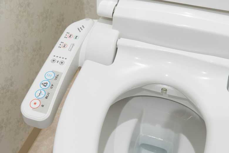
Ein Gebiet des Sound Designs ist das Sonic Interface Design / UX Design, welches unter anderem auch in der Automobilindustrie angewandt wird. Die im Sonic Interface / UX Design eingesetzten Sounds nennt man funktionale Klänge oder auch UI-Sounds, diese sind überall in unserem Alltag zu finden bzw. zu hören. Der Sound des Weckers, der Blinker oder Abstandsmesser im Auto, die Kirchenglocke, das Piepen im Supermarkt beim Kassiervorgang, bei Sprachassistenten, bei Messengern usw.[1] All diese Sounds geben zusätzliche Informationen und helfen Vorgänge besser zu verstehen. Eine gute und umfangreiche Beschreibung für funktionale Klänge findet man bei Georg Spehr:

„Funktionale Klänge übertragen Informationen, beschreiben Zustände und spiegeln Arbeitsprozesse. Sie helfen Vorgänge zu erkunden, unklare Situationen zu deuten und unbekannte Strukturen zu verstehen. Sie dienen als Werkzeug, verändern unsere nächste Umgebung und erzählen kleine Geschichten. Wir agieren mit ihnen, bewusst und unbewusst. Funktionale Klänge haben eine Bedeutung in unserem Leben, Wirken und Arbeiten, auch wenn wir sie nicht immer offensichtlich wahrnehmen.“[2]

Sonic Interaction Design ist Teil des User Interface Design. Dabei wird die visuelle Schnittstelle mit einer akustischen ergänzt, um die Benutzerfreundlichkeit von Geräten, Maschinen und Websites zu verbessern. Dabei lassen sich die funktionalen Klänge nochmals in zwei Gruppen aufteilen: die Benachrichtigungssounds und die Interaktionssounds.

Benachrichtigungssounds werden verwendet, „um die Aufmerksamkeit des Users auf ein bestimmtes Ereignis zu lenken“. Bei Interaktionssounds geht es darum, dem Nutzer ein Feedback über die richtige Ausführung einer Funktion zu geben.[3]Für User ist es immer angenehm, die Ergebnisse Ihrer Aktivitäten zu spüren und zu erkennen, dass alles gut gelaufen ist.“[4] Benachrichtigungssounds, sowie Interaktionssounds sind beide unabhängig von einer grafischen Schnittstelle und können in Situationen, wie z.B. dem Auto fahren, bei welcher der/die Nutzer*in nicht die Möglichkeit hat auf einen Bildschirm zu blicken, wichtige Signale oder Hinweise liefern.

Bei digitalen Produkten gibt es üblicherweise für den Anwender die Option die funktionellen Sounds stumm zu stellen, welches auch oftmals passiert. Rainer Hirt und Aron Brunsch meinen in ihrem Artikel dazu, dass sich in einem solchen Falle der Sound Designer nochmal hinterfragen sollte, ob diese Sounds wirklich sinnvoll und nützlich sind und einen Mehrwert bieten. Gleichzeitig betonen sie aber auch die Notwendigkeit von funktionellen Sounds in bestimmten Alltagssituationen.[5]

“Konzeptionell-gestaltete akustische Feedbacks können dazu beitragen, den Anwender zu entlasten und im Idealfall auch die Kundenbindung zum Produkt oder zur Marke zu stärken.[6]

Dies zeigt in jedem Falle, dass das Prinzip einer konzeptionellen Herangehensweise sehr wichtig für die Gestaltung von Funktionssounds ist. Dieser Meinung ist auch Spehr. Er sieht auch die Komplexität von Funktionssounds. Er meint, dass diese „nicht universell, sondern sehr spezifisch“ sind.[7]

Durch den richtigen Einsatz können bei Nutzer*innen auch positive Gefühle gegenüber einem Produkt oder einer Marke entstehen. „Werden Klänge jedoch bewusst gestaltet, können diese akustischen Informationen nicht nur die Benutzerfreundlichkeit und den “Joy of Use” erhöhen, sondern auch einen qualitativ wahrnehmbaren Mehrwert für das eigentliche Produkt und/oder für die jeweilige Marke generieren.“[8]

Für den Einsatz von Sounds im UI/UX-Design gibt es deshalb bestimmte Gestaltungsprinzipien:

  • Es ist eine konzeptionelle Herangehensweise nötig
  • Hörgewohnheiten und Erwartungshaltungen von Nutzern sollten berücksichtigt werden
  • Vorschriften in Bereichen wie der Medizin oder der Automobilindustrie, sollten beachtet und gekannt werden

Diese Prinzipien sollen zur Orientierung dienen und klären was man tun darf, kann und sollte. Sie decken jedoch nicht alle Gebiete ab, gerade wenn es um neue Einsatzbereiche geht.[9] Hirt und Brunsch schreiben: „Eine Ausnahme hingegen stellen innovative Anwendungsbereiche dar, deren akustische Grundprinzipien völlig neu definiert werden können.“[10] Gerade im Zeitalter der Digitalisierung spielt dies eine große Rolle. Durch die Häufung von neuen Produkten, besteht die Gefahr der Reizüberflutung. So wird es in Zukunft wohl eher an zurückhaltenden funktionalen Klängen bedürfen, welche trotzdem zum Nutzer durchdringen und ihre Wirkung entfalten können. Hirt und Brunsch sprechen hier „von einem Dilemma im Sinne von >>Reizüberflutung vs. Durchdringung<<“.[11]

Bezüglich Digitalisierung sind auf Smartphones und Tablets funktionale Sounds schon sehr etabliert, allerdings werden sie in Apps und auf Webseiten noch völlig außenvorgelassen.[12] „Während Sonic Interface Design auf mobilen Websites und Apps noch nicht nativ ist, ist er auf Smartphones nativ und informiert die User über neue E-Mails, eingehende Textnachrichten und Kalenderereignisse an.“[13]

Weiss sieht in der „auditiven Inszenierung“ von Websites und Apps großes Potential. Um der Gefahr der Reizüberflutung zu umgehen, bietet er eine einfache Lösung. Ein Button, soll dem/der Nutzer*in erlauben selbst zu bestimmen, ob der Sound abgespielt werden soll oder nicht.[14]

Bei einem Blick in die Zukunft sehen Hirt und Brunsch vor allem bei Sprachassistenten, Augmented  und Virtual-Reality Potential für UI-Sounds. Allerdings fragen sie sich auch was passiert, wenn die Mensch-Maschine-Interaktion nur noch mittels Sprache stattfinden würde und welche Rolle funktionale Klänge dann in diesem Bereich noch spielen würden, oder ob es diese dann überhaupt noch braucht.[15]


[1] Vgl. Hirt; Brunsch 2018 o. S.

[2] Spehr 2009, S. 9.

[3] Vgl. Online Solutions Group GmbH; Müller o. J. o. S.

[4] Online Solutions Group GmbH; Müller o. J. o. S.

[5] Vgl. Hirt; Brunsch 2018 o. S.

[6] Hirt; Brunsch 2018 o. S.

[7] Vgl. Spehr 2009, S. 12.

[8] Hirt; Brunsch 2018 o. S.

[9] Vgl. Hirt; Brunsch 2018 o. S.

[10] Hirt; Brunsch 2018 o. S.

[11] Vgl. Hirt; Brunsch 2018 o. S.

[12] Vgl. Online Solutions Group GmbH; Müller o. J. o. S.

[13] Online Solutions Group GmbH; Müller o. J. o. S.

[14] Vgl. Weiss 2015, S. 63.

[15] Vgl. Hirt; Brunsch 2018 o. S.


Hirt, Rainer; Brunsch, Aaron (2018): Host Europe Blog. UX-Sound-Design im Zeitalter der Digitalisierung. Online im Internet: URL: https://www.hosteurope.de/blog/ux-sound-design/ (Zugriff am: 12.12.2020).

Online Solutions Group GmbH; Müller, Florian (o. J.): Online Solutions Group. Was ist Sonic Interface Design / UX Design? | Online Marketing Glossar der OSG. Online im Internet: URL: https://www.onlinesolutionsgroup.de/blog/glossar/s/sonic-interface-design-ux-design/ (Zugriff am: 12.12.2020).

Spehr, Georg (Hrsg.) (2009): Funktionale Klänge: hörbare Daten, klingende Geräte und gestaltete Hörerfahrungen. Bielefeld: Transcript (= Sound studies).

Weiss, Peter Philippe (2015): Wenn Design die Materie verlässt: Sound. Das Design der Emotionen, der Imagination und der Lebendigkeit. Norderstedt: Books on demand.