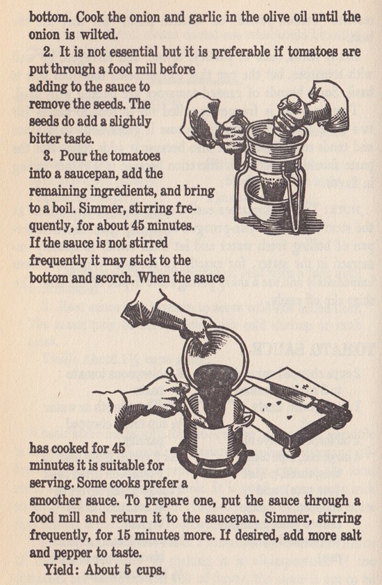
When thinking about all the endless posibillities when creating a AR app, it is very important to keep the user experience in focus. Even if there are excellent functions and fun features developed within the app, it is the same than with common software or digital products: if it is not user friendly, nobody will use it.
Especially when the AR app is used for marketing purposes it is important to show the values of your company with the app. Giving the potential customers a app that is not stable and very complicated, useres will transfer this experience on the product and this can end bad.
This can be avoided by taking the app as a serious product and taking it through the whole process of app design. Starting with defining the users need and the goals which should be reached by the app. Who is the target group and who should use the product later? This group also be the users of the AR app. Also when should the user use the app? In the shop or on the fly? At home in a confortable zone or in the train? How long does he has time at this point?
Next step would be to define the features which should be part of the app. Only the best features should be developed and rather limeted than overloaded.
A good example regarding this is the IKEA Place app. With just few very easy functions and interactions a well experience is gained.
AR is supposed to make our lifes easier and more fun. This should be kept in mind. To make sure the clients think the same than the developer of the app, multiple tests during the process of the app should be part of the development.
How can design contribute to the field of positive psychology? How can we consciously and deliberately use design skills in contributing to the happiness of individuals and communities?
Positive design deals with answering those questions and focuses on research and development of solutions that increase people’s subjective well-being and thus happiness. The goal is to stimulate and enhance positive emotions and reduce negative ones. [1]
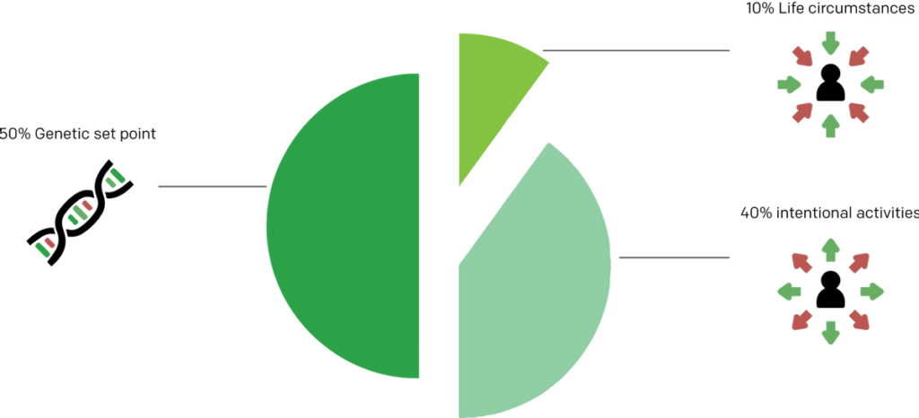
Happiness drives people to flourish—according to a research the performance of happy people can increase up to 12% whilst maintaining quality of work, but on the other hand performance can also lose up to 10% when people are unhappy. Therefore, that finding not only takes an important part when it comes to employee’s happiness and thus on productivity—subjective well-being plays a significant role in performance. And, of course, consumers are likely to value offered solutions/products better when they are happier, and vice versa when they are unhappy. Positive design is based on design theory and psychology. The latter is the science that focuses on understanding what makes people happy and what makes them flourish. Research has found that happiness is determined by three factors, and that two of these three determinants are possible to design for. [2]
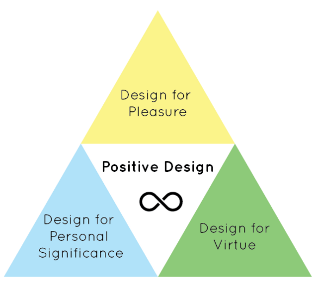
Positive Design Framework [3]
Positive design enhances positive emotions and reduces negative ones. That can be achieved by engaging personal character strengths and weaknesses, and by taking on evidence-based opportunities and threats as measures for a scientific design approach rather than a single designer’s perception. It is about providing solutions that helps people satisfy their growth-needs whilst taking into account their deficiency-needs. The Positive Design framework offers an overview of possible design applications for happiness, consisting of 3 layers that can be designed:
Design for Pleasure Here, the focus is on happiness, achieved by a person’s pleasures and derived from enhanced positive feelings or decreased negative feelings. There are four types of pleasures: physical, social, psychological, and ideological.
Design for Personal Significance Design for Personal Significance is about personal goals and aspirations. A positive affect can also be gained from achieving and remembering goals and getting a sense of accomplishment from certain behaviors. The focus clearly is on an individual’s interpretation of what makes life worth living and having the freedom in doing so.
Design for Virtue Virtuous behavior is about what is perceived as good and what is perceived as bad. “It is based on the proposition that there is an ideal mode of behavior, or a sense of excellence or perfection towards which one should strive, that leads to a virtuous life.” Correct translation of believes and values into design processes can be beneficial to people’s happiness.
Positive Design Ingredients [4]
Besides the above-mentioned framework in which one can apply positive strategic design, there is a set of ingredients of which the effect on someone’s happiness is proven to be successful. These ingredients are derived from research in positive psychology and act as important rules of thumb to incorporate in design and prevent obstruction.
Positive Emotion Positive emotion is simply about feeling good. The focus is on gaining positive experiences by satisfying deficiency need to a pleasurable experience and satisfying growth need to an enjoyable experience.
Engagement Engagement is about the activities an individual is engaging in. If one is acting in full envlolvement, that holistic sensation is called the flow state. The focus clearly is on challenging, fulfilling and interesting activities that captivate people to be fully engaged in the moment. Individual values and preferences have to be considered in this process.
Relationships There is a causality between social relationships and health, thus that aspect plays an important role. People want are in need of authentic connection and social cohesion and reacquire emotional and physical interaction.
Meaning Meaning defines understanding and making sense of ones existence and its impact on others—to have a purpose and goal to strive for.
Accomplishments The positive effect form having goals can be enhanced by achievement of those goals. Interest, ability and perseverance are therefore important factors to consider.
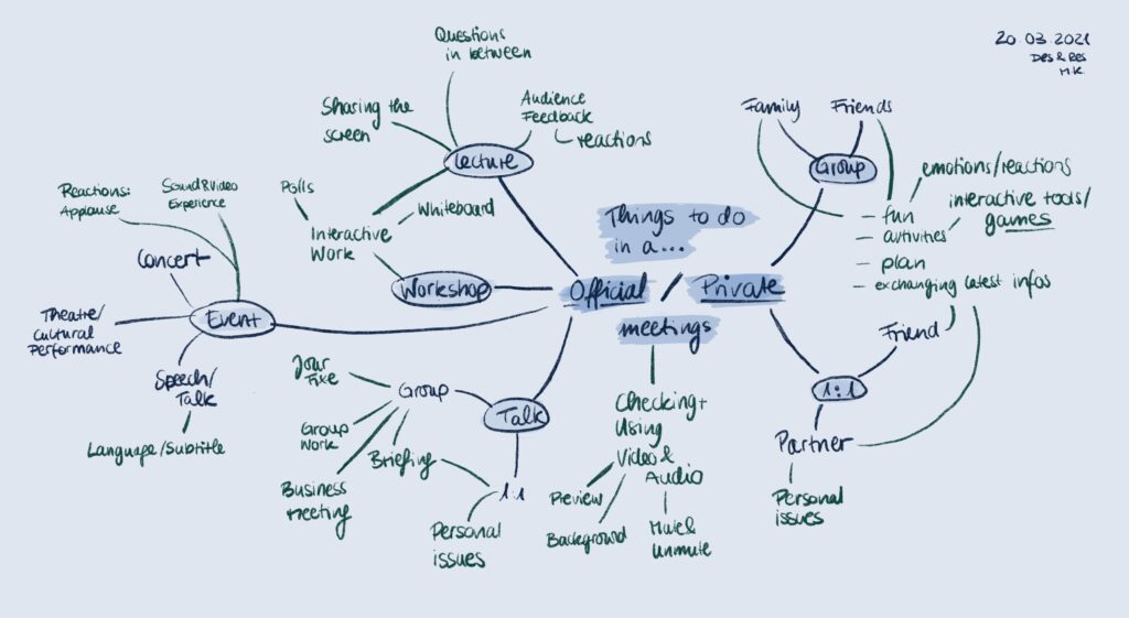
Why do we meet and what do we do during the meeting? A subjective point of view.
In this entry I want to examine the reasons to meet online ( – I know that they are often very individual and personal, but I think that there are currently some common reasons). In order to clear my mind, I made (again) a mind-map to collect every common and possible reason to meet online and the activities during. The mind-map is showing my own current observations and experiences from a subjective point of view.
In the mind-map I made a separation (blue-coloured & blue background) between “official” and “private” meetings which could also be described as formal and informal meeting occasions. For me, a formal meeting is for example at the workplace, in education or anywhere else where you come together with anyone other than your friends and family like colleagues, acquaintances or even strangers. But why make this separation? Imagine going to such a ‘formal’ meeting: The place, the people, your feelings. Would you act like in a private meeting with your best friend? Probably not. Therefore I think it is crucial to think about the meeting occasion in order to come up with the best design solution for the associated interaction tool. Within this separation, a further gradation can be identified (blue-coloured). It shows the possible meeting categories such as lectures, workshops or events as well as a meeting with a group or 1:1 with only one friend. The activities (green-coloured) around them show that the separation into formal and informal meeting occasions is not enough and has to be more specific on a deeper level. All these activities include specific needs and require individual consideration in upcoming design solutions.
If you have a more objective look at those activities, you can recognise that they are mostly redundant. This basis could be helpful in terms of creating an interaction tool that meets the most common and being individually adjustable for specific needs later on. Let’s sum up the mind-map in a list to find the common activities.
Before the meeting (could also happen during the meeting)
Checking own video (background, angle, lightning)
Checking own audio input (quality, device)
Checking the screenshare possibilities
Checking the chat possibilities
While the meeting
Using own video (turn on&off, switch background, use filters)
Using own audio input (mute&unmute)
Receiving video of others (adjusting video interface, checking who’s speaking)
Checking audio of others (quality, volume)
Using the screenshare possibilities
Using the chat possibilities
Official meetings
Lecture, workshop & talks (mostly work meetings; either in groups or 1:1)
Audio & Video input of lecturer/speaker/moderator
Screensharing
Interactive work (polls, whiteboard)
Give feedback (reactions, questions)
Receive feedback (reactions, questions)
Discussions with all participants (via audio or chat)
Event
Audio & Video input of speaker/moderator
Livestream
Give feedback (reactions, questions)
Receive feedback (reactions, questions)
Private meetings
Group
Expressing emotions/reactions
Receiving emotions/reactions
Interactive tools (polls, games, plan activities)
Talking / discussions (simultaneously)
1:1
Interactive tools (polls, games, plan activities)
Talking about personal issues (simultaneously)
All these activities have different reasons and goals within the digital interaction of web meetings. In order to reach a user friendly interaction tool it is necessary to provide the user an effective, efficient and satisfying way to reach their goals (referring to the Usability ISO Norm 92411). Because of the variety of the activity goals, I decided to group them in the following way:
The users input
Checking own video beforehand (background, angle, lightning)
Checking own audio (quality, device)
Using own video (turn on&off, switch background, use filters)
Using audio output (mute&unmute)
Screensharing/Livestream
Expressing feedback (emotions/reactions)
Insert a chat message
Active interaction between user and communication partner
Interactive tools (polls, games, plan activities)
Talking / discussions (simultaneously)
The output of the communication partner
Checking audio of others (quality, volume)
Receiving video (adjusting video interface, checking who’s speaking)
Using audio input (adjust volume)
Screensharing/Livestream
Receive feedback (reactions, questions)
Receive chat messages
The list shows that most activities can be divided into input and output which suggests that simultaneous interactive communication options are somehow lacking. This matches my findings of last semester: Online meetings are mostly not simultaneously what causes communication issues. While reflecting my findings, I recognised that the division in input and output reminded me of the Shannon-Weaver communication model and the variations of it2. Therefore I would like to go on with a deeper look into communication models as well as use case scenarios and other usability methods in my next entries. As usual I’d love to hear about your experiences with online meetings. Feel free to write me 🙂
An accelerometer measures the acceleration of an object, or in other words the rate of change of an objects velocity. It also uses earth`s gravity on a static object and measures its movement or vibrations. The most typical sensors have 3 axes, oriented on the x, y and z planes. One of the most common usages of accelerometer would be the orientation sensor in smart phones.
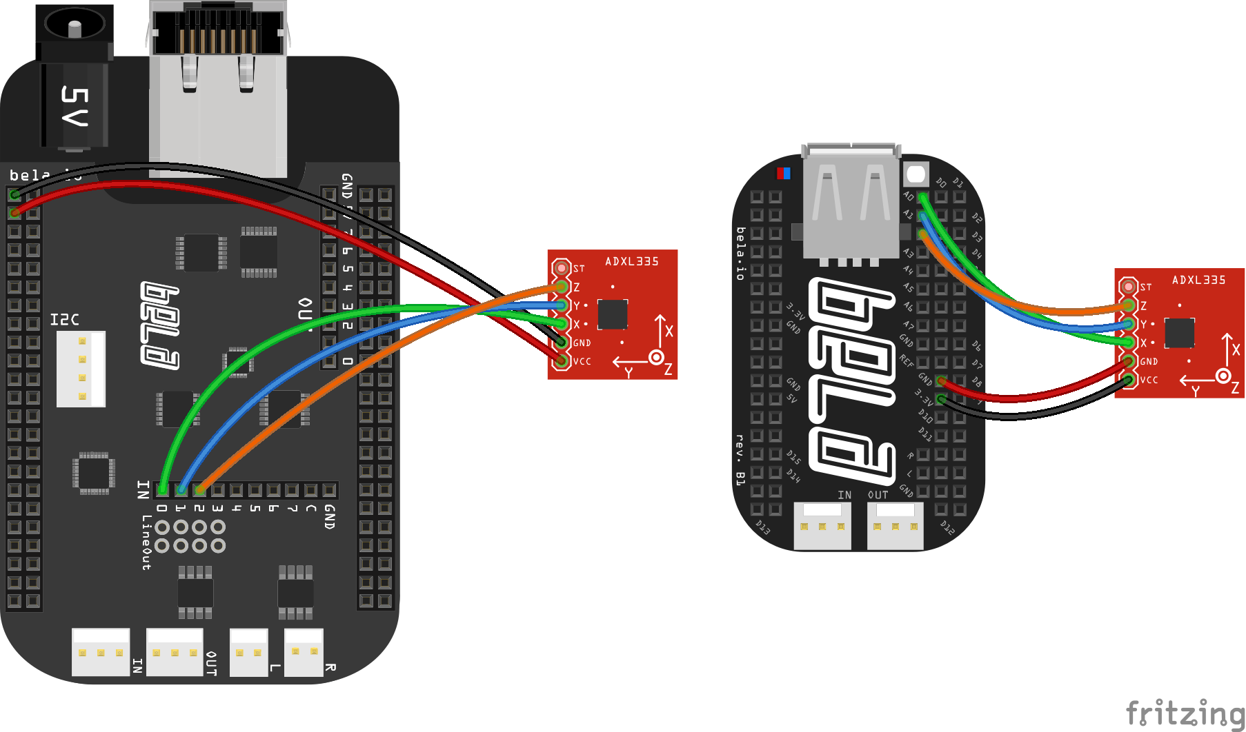
As we already know, accelerometers are analog sensors that provide a different amount of voltage for each axes. To connect it to the bela we need 5 wires, 3 for the axes, one for the power and the last one for the Ground.
Connecting Accelerometer to Bela Board; Source: bela.io
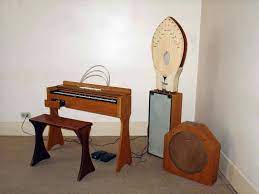
At the beginning of the XX century many electronic instruments have been invented, some have had better luck than others, and one of these unlucky ones is the Ondes Martenot.
This instrument was invented in 1928 by Maurice Martenot, a French cellist.
But what is it? It is somewhat of a cross between an Organ and a Theremin.
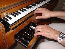
Originally, the main interface was a metal ring, which the player worn in the right index finger. The movement of the finger (up and down a wire) creates a theremin-like tone. Then a four-octave keyboard was added, yet not a normal one, because it has moveable keys that create a vibrato when wiggled. All this is enclosed in a wooden frame that features a drawer that allows manipulation of volume and timbre by the left hand.Volume is controlled with a touch-sensitive glass “lozenge”, called the “gradation key”; the further the lozenge is depressed, the louder the volume.
Early models produce only a few waveforms. Later models can simultaneously generate sine, peak-limited triangle, square, pulse, and full-wave rectified sine waves, in addition to pink noise, all controlled by switches in the drawer.
The inventor was fascinated by the accidental overlapping of tones of military radio oscillators and wanted to build an instrument to replicate it, but with the same tonal expression as a cello.
Four speakers were produced for the instrument, called “diffuseurs”.
The “Métallique” (imm. below, first from left) features a gong instead of a speaker cone, producing a metallic timbre.
The “Palme” speaker (imm. below, middle), has a resonance chamber laced with strings tuned to all 12 semitones of an octave; when a note is played in tune, it resonates a particular string, producing chiming tones
The last one is a normal cabinet.
It has been used by composers such as Edgar Varèse, Pierre Boulez and Olivier Messiaen, but its “rebirth” in the modern era and its diffusion in the context of popular music can be attributed to Jonny Greenwood, best known for his role as a guitarist in Radiohead .
Jonny, visionary musician and creator of a new way of thinking and playing music, was so fascinated by the Ondes Martenot that he decided to integrate them into Radiohead’s music. This “journey” began with their amazing album Kid A (2000) and has been played on some of their most important songs ever since. In live performances of their song Weird Fishes/Arpeggi they even use a group of six ondes martenot.
Here is a collection of Radiohead’s songs with Ondes Martenot
Greenwood also wrote Smear, a piece for two Ondes Martenot:
Thanks to Jonny Greenwood it has had a new light and has found many applications in modern popular music. For example, Yann Tiersen used it for the Amelie soundtrack and Thomas Bloch, Ondes Martenot virtuoso, also played it on records by Tom Waits, Marianne Faithfull and in Damon Albarn’s Monkey: Journey to the West Opera.
References
[1] Wikipedia – Ondes Martenot.
[2] The Guardian – Hey, what’s that sound: Ondes martenot.
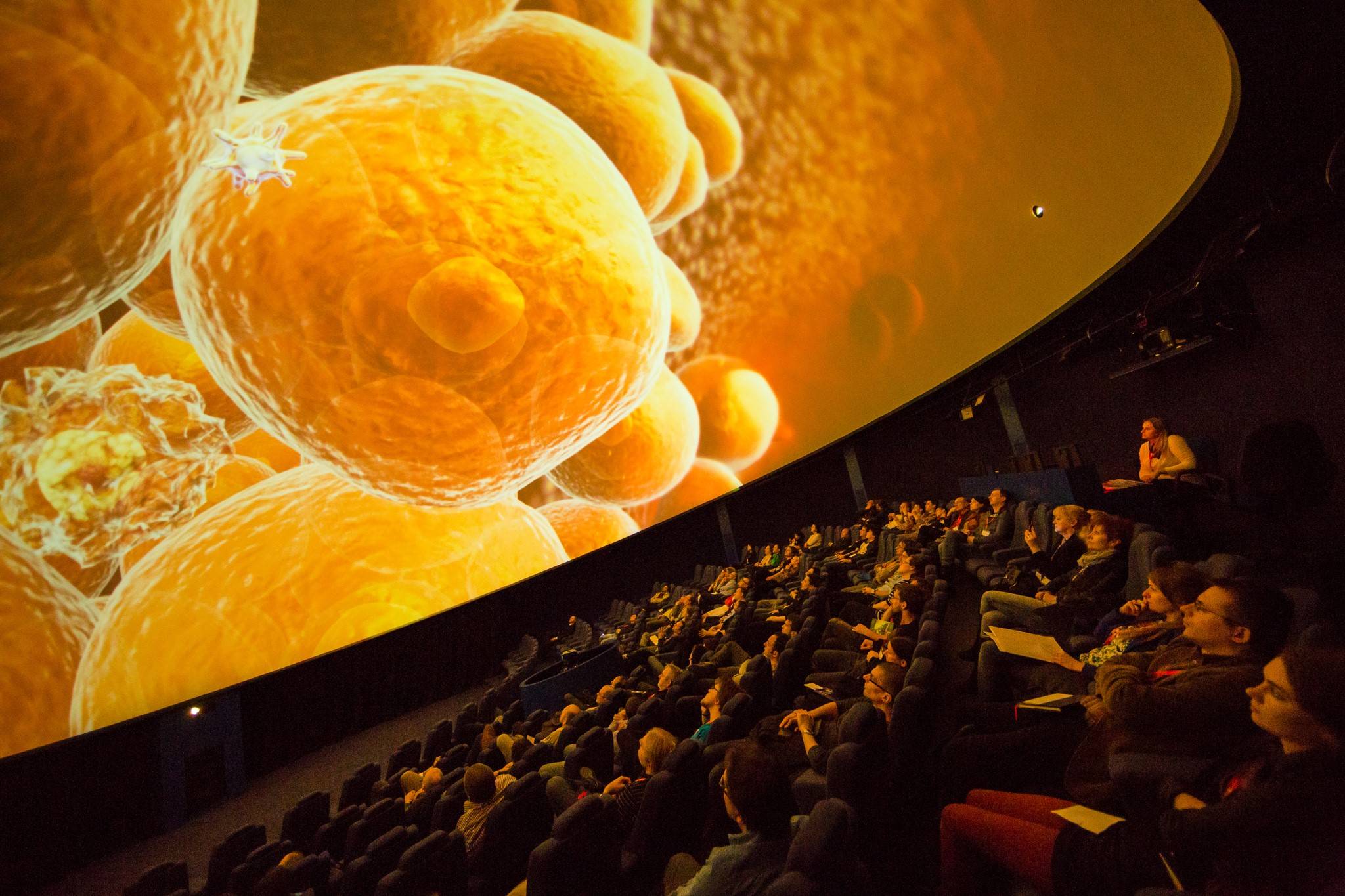
Fulldome refers to immersive dome-based video projection environments where the viewer is surrounded by the video projection in a hemispherical angle of view.
The dome, horizontal or tilted, is filled with real-time (interactive) or pre-rendered (linear) computer animations, live capture images, or composited environments. Even though astronomy is the most common topic, there are no content limitations and it’s now used also for entertaining shows and other hyper-realistic presentations. Morrison Planetarium California Academy of Sciences
Developement
Although the current technology emerged in the early-to-mid 1990’s (USA and Japan), fulldome environments have evolved from numerous influences, including immersive art and storytelling, with technological roots in domed architecture, planetariums, multi-projector film environments, flight simulation, and virtual reality.
Early live-action dome cinemas used wide-angle lenses and 35- or 70-mm filmstock. There are still around 125 giant screen dome cinemas operating in the world. However the expense and ungainly nature of the giant screen film medium has prevented more widespread use. Also, film formats such as Omnimax (Imax Dome) do not cover the entire dome surface, leaving the rear section of the dome blank (though, due to seating arrangements, that part of the dome was not seen by most viewers).
Early approaches to fulldome video projection utilized monochromatic vector graphics systems projected through a fisheye lens. Contemporary configurations employ raster video projectors, either single projectors with wide-angle lenses or multiple edge-blended projectors to cover the dome surface with high-resolution, full-color imagery. Planetarium Wenus Kepler Science Center
A great fast-growing immersive
The fulldome experience comes out as one of the most immersive and entertaining ways to engage a wide range of people with a limitless scope of applications, including education, arts, games and wellness.
Fulldome media is experiencing enormous growth with new planetariums and digital theatres being built around the world, reaching out to new audiences to make them fall in love with such beautiful technology. IX Symposium Société des Arts Technologiques
Um die Jahrtausendwende sind immer mehr Fernsehkochprogramme entstanden und der Zugang zu Rezepten bzw. Kochtechniken wurde über das Internet immer leichter. Bald darauf sind große Online-Communities entstanden, die sich mit Lebensmitteln beschäftigten, wodurch natürlich auch bildliche Darstellungen von Nahrung und Essen wichtiger wurden.
Zum Beispiel wurden in Kochsendungen spielerische Illustrationen von Essen, der Zubereitung und anderen Bildern eingespielt. Auch in Print- und Online-Magazinen wurde angefangen, lebendige Illustrationen zu präsentierten, um Rezepte und Artikel zu verbessern und den Trend auch ins Editorial Design zu bringen.
Die Zeit zwischen 1950 und 1980 war besonders wichtig für Food Illustration – schon damals wurde Food Illustration im Editorial Bereich immer beliebter. Heute ist Food Illustration überall.
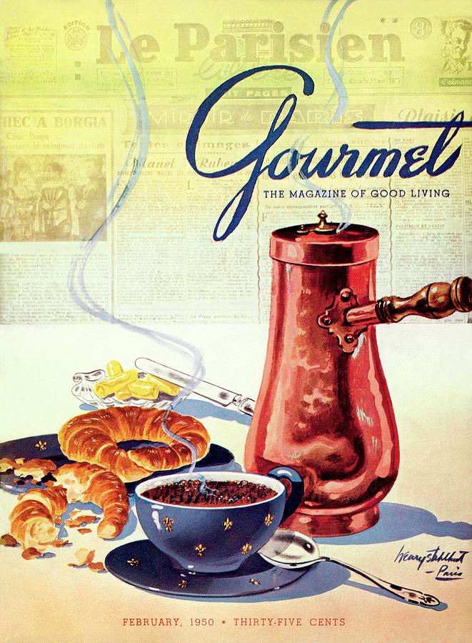
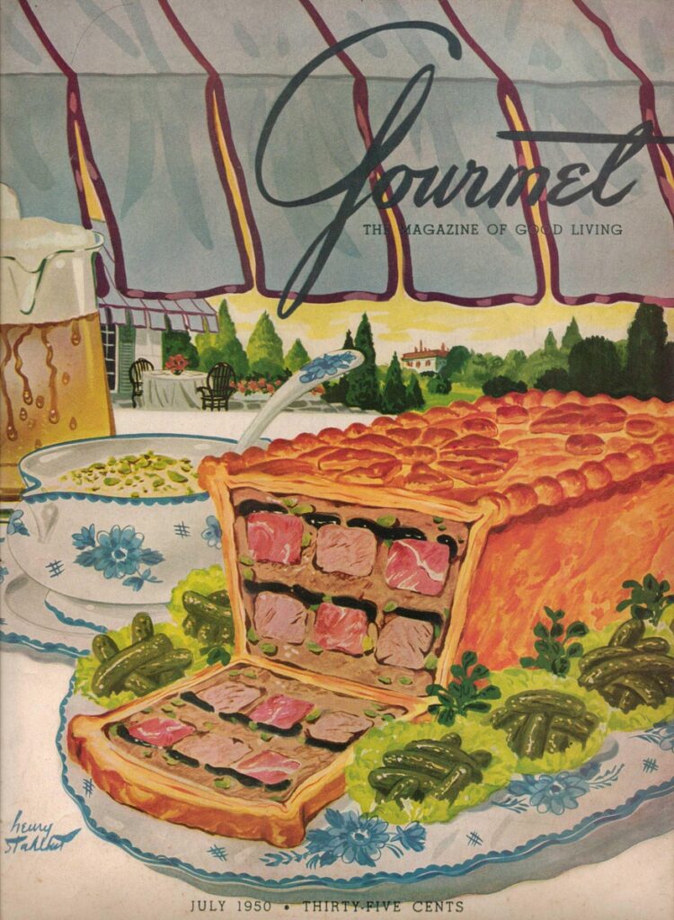
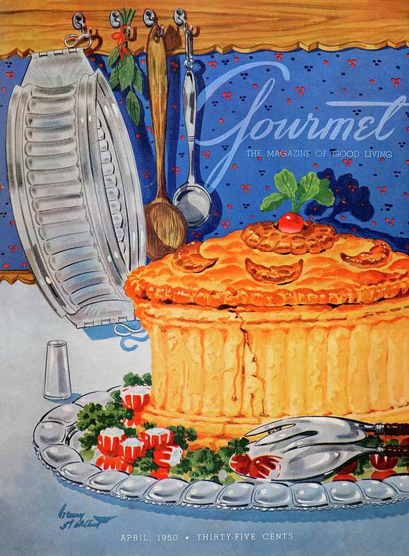
Gourmet Magazine Covers – 1950
Food Illustrations haben eine starke Entwicklung durchgemacht. In den Anfangszeiten, bevor es Kochshows im Fernsehen und Starköche gab, hatten illustrative Lebensmitteldarstellungen eine didaktische Aufgabe – sie mussten vor allem Informationen liefern und dem Betrachter ein Rezept oder bestimmte Handgriffe lehren und veranschaulichen – sie dienten rein als Infografik bzw. Anleitung. Dennoch waren sie stilvoll, elegant und einprägsam. Es waren vor allem Schwarz-Weiß-Linienillustrationen, die zeigten, wie man z.B. eine Hühnerbrust entbeint.
Illustrationen von Sidonie Coryn in “Mastering the Art of French Cooking” von Julia Child – 1961
Das Kochbuch „Mastering The Art of French Cooking“ (1961) von Julia Child hatte großen Einfluss auf die Art und Weise wie Kochbücher gestaltet und auch heute noch gestaltet werden – das Kochbuchkonzept wurde von sechs Rezepten pro Seite auf ein Rezept pro sechs Seiten geändert – damit alle illustrativen Details Platz hatten, die erforderlich sind, um die richtige französische Vorgehensweise zu vermitteln. Die visuelle Darstellung von Essen wurde immer wichtiger.
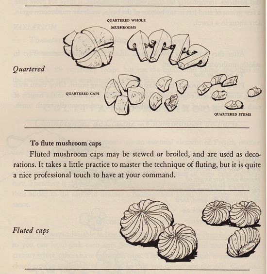
Wie man in dem nächsten Beispiel sieht gibt es schon allein bei Schwarz-Weiß-Illustrationen verschiedene Stile und Interpretationen der Illustratoren. Am einen Ende des Spektrums befindet sich “Craig Claiborne’s Kitchen Primer” (1969) mit Illustrationen von Tom Funk. Seine Linienzeichnungen sind ausgezeichnet.
Illustrationen von Tom Funk – 1969
Am anderen Ende ist das klassische italienische Kochbuch von Marcella Hazan (1976), das Zeichnungen von George Koizumi featured. Diese heben die Kunst der lehrreichen Schwarz-Weiß-Kochbuchillustration auf eine andere Ebene – sie sind bereits viel anspruchsvoller und detaillierter.
Illustrationen von George Koizumi – 1976
Wie man hier gut sieht, ist die Textur in der Lebensmittelillustration sehr wichtig, da sie dazu beiträgt, die Elemente, die man darstellen will, vom Untergrund zu trennen und dem Betrachter ein Gefühl für das tatsächliche Lebensmittel vermittelt, das man darstellen will – und sie sehen beispielsweise die Textur des Brotes und denken darüber nach, wie knusprig echter Toast ist.
Nur weil die Darstellung der Textur von Lebensmitteln wichtig ist, bedeutet das aber nicht unbedingt, dass man den realistischen Weg gehen muss – vor allem geht es darum die Textur von Lebensmitteln auf künstlerische Art zu interpretieren. Denn bei der Illustration von Lebensmitteln ist das Wichtigste, dass es sich lohnt Illustration zu verwenden.
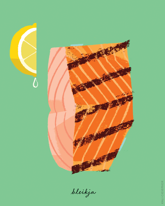
Kali Ciesemier
Eine gute Frage, die man sich stellen muss ist, warum man kein Foto verwendet. Die Lebensmittelfotografie ist offensichtlich der führende Konkurrent der Lebensmittelillustration. Wenn man Illustrationen verwendet, muss der Vorteil offensichtlich sein. Die Illustration von Lebensmitteln ist am aufregendsten, wenn man die Interpretation des Künstlers sieht und ein Gefühl für seine Beziehung zu Lebensmitteln bekommt. Bei der illustrativen Darstellung ist es nicht unbedingt genug, realistisch zu sein, es muss einen Charakter haben und zwar so einen, den ein Foto niemals einfangen könnte.
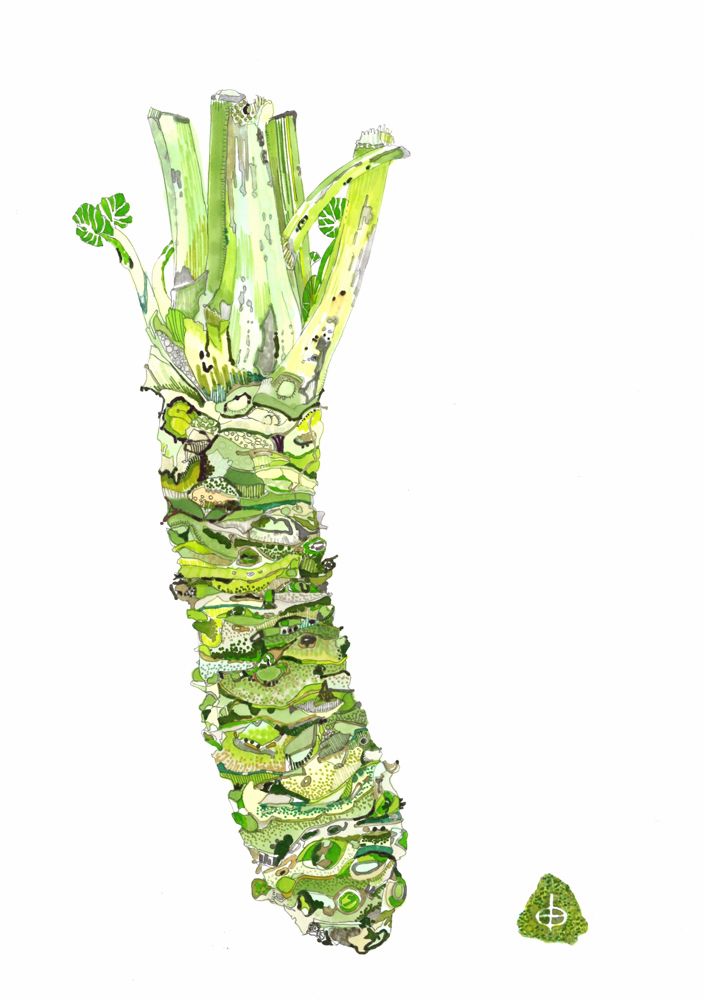
Yuko Kurihara
Viele Magazine verwenden Fotografie, um Essen zu zeigen – Food-Fotografie kann wirklich erstaunlich und inspirierend sein, aber sie können oft auch ein bisschen langweilig sein. Die Illustration von Lebensmitteln ist in der Redaktion und im Verlagswesen am weitesten verbreitet, daher sind dies die Schlüsselbereiche für die Illustration von Lebensmitteln.
Ein illustriertes Rezept kann viele Dinge darstellen, die ein Foto nicht kann. Es kann Erinnerungen wecken und eine Geschichte erzählen. Es kann lustig, süß, nostalgisch, albern, hübsch und total lecker sein. Es kann uns mit verschiedenen Kulturen verbinden und uns einen neuen Geschmack vorstellen.
Damit die Illustration von Lebensmitteln besser ist als die Fotografie von Lebensmitteln, muss man versuchen, eine Illustration zu erstellen, die nicht durch Aufnehmen eines Fotos erfasst werden kann. Die Illustration von Lebensmitteln kann mehr Emotionen, Geschichten und Übertreibungen vermitteln als mithilfe von Fotografie. Maßstab und Perspektive können in einer Illustration spielerisch geändert werden. Man sollte sich nicht nur darauf konzentrieren, das Essen genau nachzubilden. Mit illustrativer Darstellung hat man die Möglichkeit eine Geschichte in einer Szene zu erzählen und bestimmte Emotionen zu vermitteln.
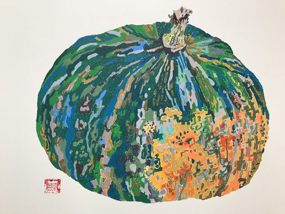
Jose Garcia
Die Illustration von Lebensmitteln muss die Aufmerksamkeit der Menschen auf sich ziehen und nicht nur versuchen, schön auszusehen. Dabei gilt jedoch trotzdem, dass das Wichtigste an Lebensmittelillustrationen ist, ob die dargestellten Objekte gut genug aussehen um sie zu Essen, ob sie ansprechend oder abstoßend sind.
Es gibt viele verschiedene Arten von Lebensmittelillustration, einige davon sind z.B.: grafisch, stilisiert, animiert, gestisch, realistisch,… Solange ein Foto nicht die gleiche Stimmung (oder besser) einfangen kann, spielt es grundsätzlich keine Rolle, auf welche Weise Essen illustriert wird. In Bezug auf realistische Darstellungen von Lebensmitteln, die durch Fotografie super leicht erzeugt werden können, müsste man die Illustration NOCH realistischer machen als das reale Ding/Objekt, um in dieser Hinsicht Fotografie als Medium zu übertreffen.
Aber grundsätzlich geht es eh nicht darum, Lebensmittel so realitätsnah wie möglich zu gestalten – Lebensmittelillustration muss überhaupt nicht realitätsnah sein. Es können die natürlichen Farben verbessert werden, die Dinge durcheinander gebracht werden, aber es muss immer noch appetitlich sein.
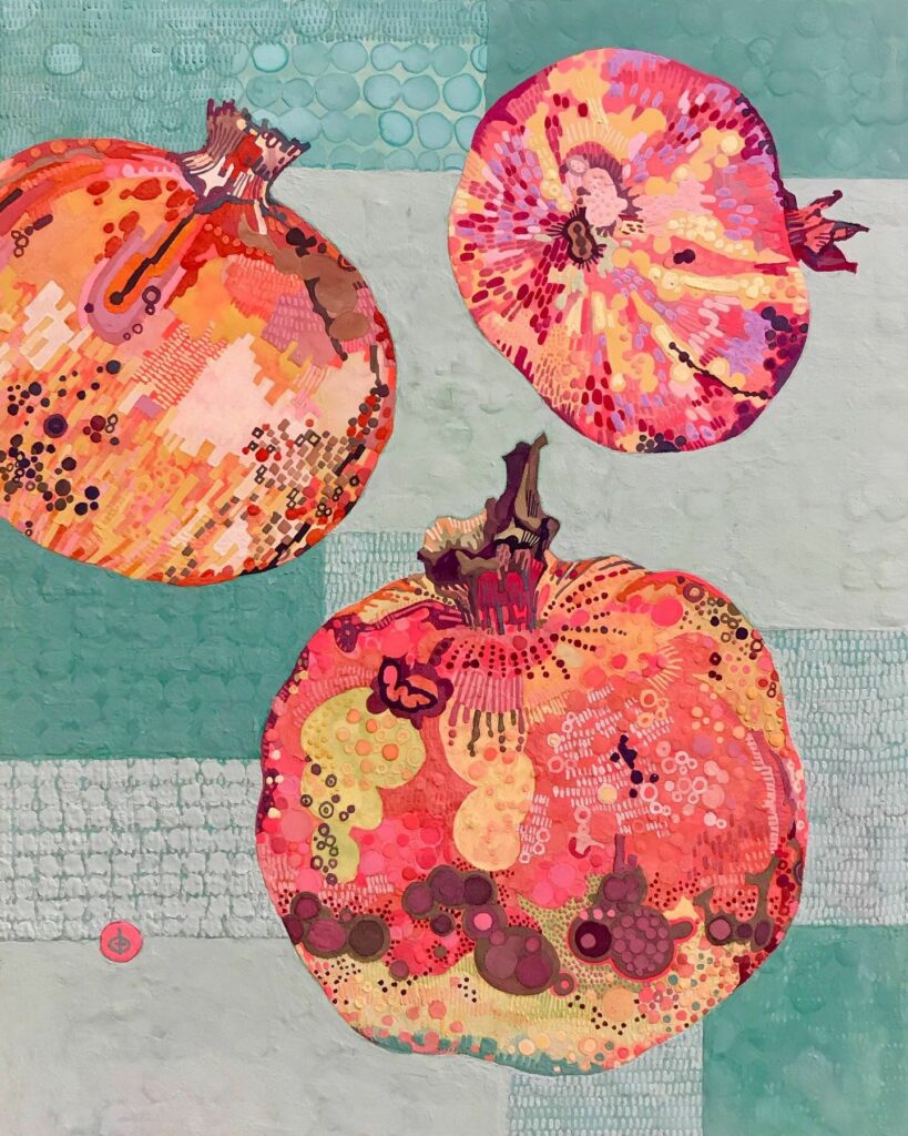
Maïté Franchi
Ein klarer Vorteil von Lebensmittelillustration ist, dass sie erfrischend und verspielter ist. Insbesondere bei Rezepten ermöglichen Lebensmittelabbildungen dem Leser eine Anleitung, wie das Lebensmittel aussehen soll, aber es ist völlig ok, wenn es am Ende etwas anders aussieht. Bei fotografischen Abbildungen kann es sein, dass man möglicherweise vom Endergebnis enttäuscht ist.
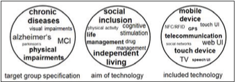
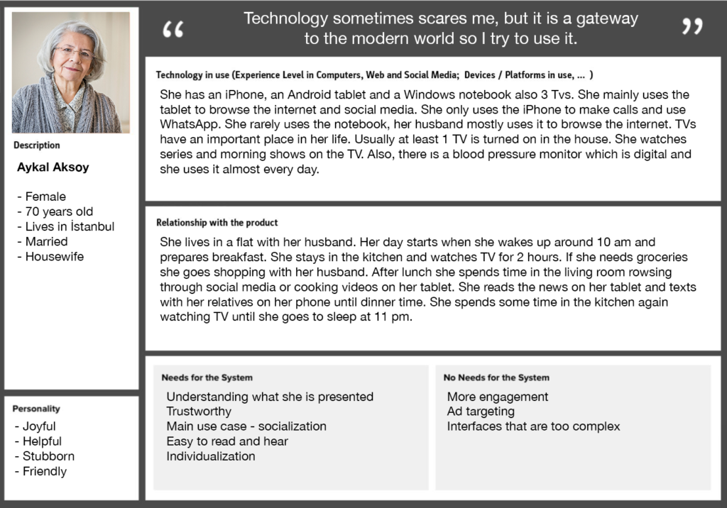
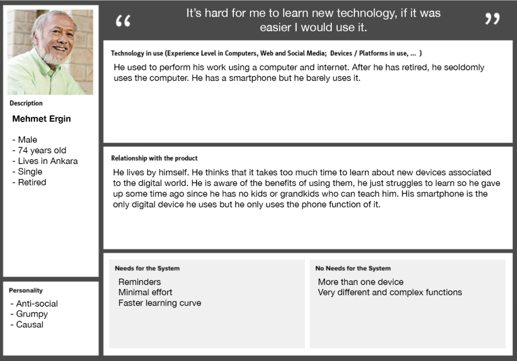
For setting up test series, some fictitious persons (personas) are developed, who are to represent the majority of the future actual users. The needs of these fictitious persons will be determined later on and run through the corresponding different user scenarios. Personas will not only help to fulfil the pure software-ergonomic requirements in the design process, but will also help to consider the desired user experience for the target group.
This preparation will support the research process in figuring out possible solutions and guidelines according to personas’ needs. So far the interviews from last term provided me with a lot of information and basis for this process but also some pain points and needs.
“Understanding and communicating the needs and characteristics of the target users is crucial for the development and success of products and services, especially when designing for older adults constituting a highly heterogeneous target group.” (Buber et al., 2012)
Sources
Wöckl, Bernhard & Yildizoglu, Ulcay & Buber, Isabella & Diaz, Belinda & Kruijff, Ernst & Tscheligi, Manfred. (2012). Basic senior personas: a representative design tool covering the spectrum of European older adults. ASSETS’12 – Proceedings of the 14th International ACM SIGACCESS Conference on Computers and Accessibility. 25-32. 10.1145/2384916.2384922.
González de Heredia, Arantxa & Justel, Dani & Iriarte, Ion & Lasa, Ganix. (2017). “Elderpersonas” adapting personas to understand the real needs of elderly people.
Während den letzten Recherchen über DATA, CODE, DESIGN bin ich auf an diversen Social Media Accounts gestoßen, deren Arbeiten ich in nächster Zeit präsentieren werde. Mein Hauptaugenmerk möchte ich aber auf die verschiedenen Tools und Herangehensweisen im Generativen Design bzw. Creative Coding widmen und etwas tiefer eintauchen.
Hier eine Entdeckung, welches man als klassisches Ausgabemedium bezeichnen kann. Es kombiniert Creative Coding mit Print? What could go wrong?
Wie es der Name schon beeinhaltet, ist ein Pen-Plotter ein “Plotter” mit einem Stift. Was ist nun der Unterschied zu Druckern? Im Vergleich zu regulären Druckern können Plotter Vektorgrafiken direkt weiterverarbeiten, ohne diese davor in eine Rastergrafik umwandeln zu müssen. Perfekt für meine Code Designs.
Diese Pen-Plotter stehen in der Regel auf einer flachen Oberfläche und können je nach ihrer Dimension verschiedene Oberflächen “bezeichnen”.
Je nach eingespanntem Stift, variiert das Zeichenergebnis: Von Textmarker, Lackstift bis Füllfeder. So können verschiedenene (flache) Materialien, wie Plakstik oder Metall mit einem Lackstift bezeichnet werden. Die Qualität der Oberfläche und des Stifts sind hier maßgeblich und beeinflussen das Endergebnis. Diese Kombination aus analoger Qualität und Ästhetik fasziniert mich.
Die Einsatzgebiete dieser Pen-Plotter variieren: – Artwork – Unterschriften, von Promis oder andere die oft unterschreiben haha – “Handgeschriebene” Briefe – “Personalisierte” Post/Kuvers – und viele mehr
Sogar Smartphone und Hardware Hersteller verwenden dieses Tool um etwa mittels Stylus deren Hardware zu testen.
Preise
Preise für diese Pen-Plotter variieren, von 70 $ Ali-Express bis hin zu ersten Roboterarmen für mehrere Hundert Kröten:
In the last years I became more aware of the impacts everything we purchase has on the natural environment, the people who make these products and us consumers.
It is as easy as ever to buy new things and throw old ones out, being surrounded by advertising in our everyday lives. Making a lot of us feel like we need new products which fit a certain lifestyle or we just want it because it is trendy or makes us feel like we belong. But did you ever think about who made the stuff you buy?
What resources were needed to produce it?
What impact it has on the planet and on people during its whole life cycle from the very beginning of the production cycle to the very end?
I started to think about this a lot lately. To find out more I had a conversation with Sigrid Bürstmayr and Lucia Jarosova to find out more. Sigrid is working and teaching the field of sustainable design at the University of applied sciences FH JOANNEUM in Austria, and Lucia is the co-founder of the womenswear label We Are Not Sisters. www.wearenotsisters.com
As an example for consumerism, I used the fashion industry.
After I had the conversation with Sigrid and Lucia, I also interviewed the founders of three businesses, which in my eyes lead with a positive example when it comes to sustainability:, Palm & Pine skincare, Flow Surf Co. and Sand & Palm. Before getting into the conversations with the three business founders, lets see what I found out in the conversation with Sigrid & Lucia.
AN INTRODUCTION TO CLOTHING PRODUCTION
Not that long ago, we used to make clothes out of available materials from our area, like linen, cotton, wool, silk. Then, with technical development, we started mixing those natural fabrics with chemical substances for a better feel and look. Both natural and synthetic fibers are valued for different reasons in the textile industry, as both types have their pros and cons. For example, artificial fibers have benefits including greater comfort, dyeing capabilities, water resistance, abrasion resistance, antimicrobial properties, and lower costs, even though the true costs are questionable. Adding synthetic fibers into a natural one can improve the performance of the textile. Innovators developed synthetic fabrics to overcome some of the inherent limitations of natural fibers (cotton and linens wrinkle, silk requires delicate handling, and wool shrinks). The industry began creating and using synthetic fibers as cheaper and more easily mass-produced alternatives to natural fibers.
Nowadays a lot of the clothes on the market are made out of polyester. Have you ever wondered what polyester is?
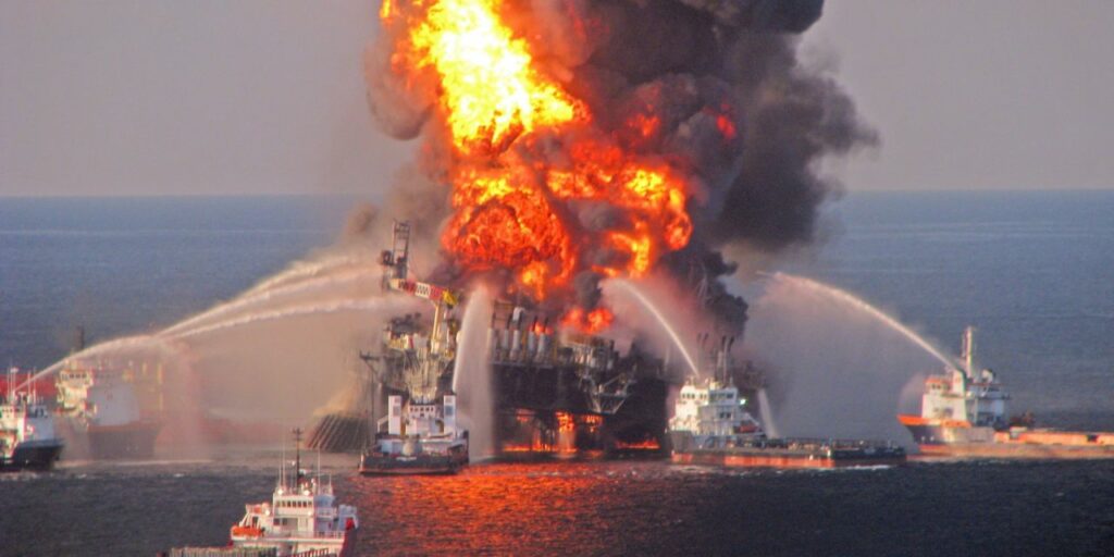
Polyester, or also called polyethylene terephthalate, is derived from a chemical reaction involving petroleum, air, and water. Petroleum is also called crude oil and, it is a fossil fuel, which means , so that your polyester clothes are made out of oil. Oil can be found in underground reservoirs and in tar sands near the earth’s surface. It can be accessed by drilling, on land or at sea, or by strip mining. Once extracted the oil is transported to refineries via supertanker, truck, train, or pipeline to be transformed into usable fuels such as gasoline, propane, kerosene, jet fuel and products such as plastics. Drilling for oil disrupts wildlife, air and water pollution hurt local communities, the emissions contribute to the climate change, the oil and gas development ruins pristine landscapes and oil spills can be disastrous on the wildlife in its area. Like the deepwater horizon oil spill from 2010, it is considered to be the largest marine oil spill in the history of the petroleum industry and one of the largest environmental disasters in American history.
https://images.app.goo.gl/7jhi7Moa6HkYnRxm8
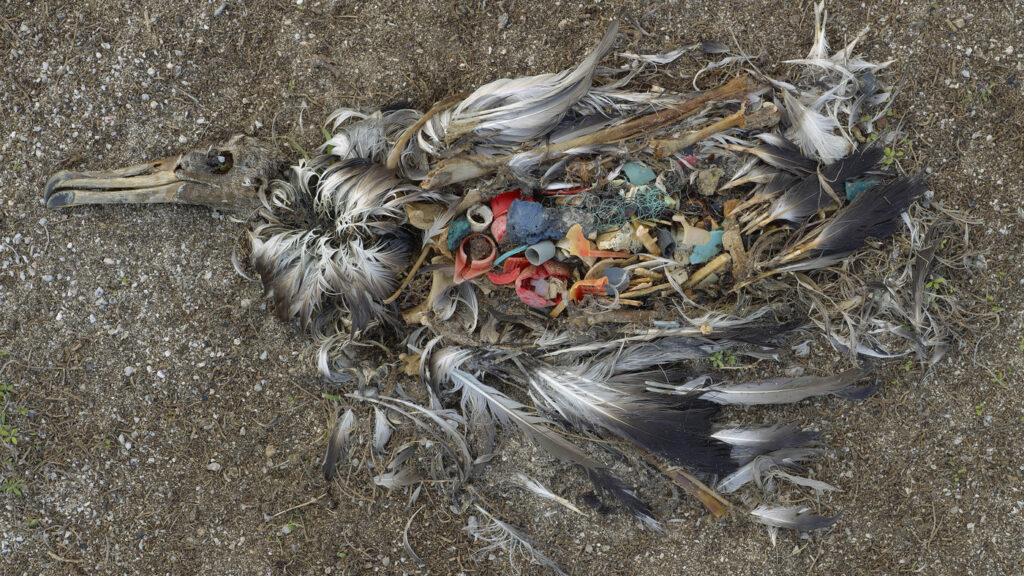
Besides the fact that the making of polyester is bad for the environment, oil based clothes produce micro plastic which scientists not only findfound in sea animals but also in our human bodies.
https://images.app.goo.gl/VRcchwuhB1gpLNW28A dead young albatross on the Midway Atoll in the Pacific Ocean. You can see more of photographer Chris Jordan’s work on the effects of plastics on seabirds at The Picture Show.
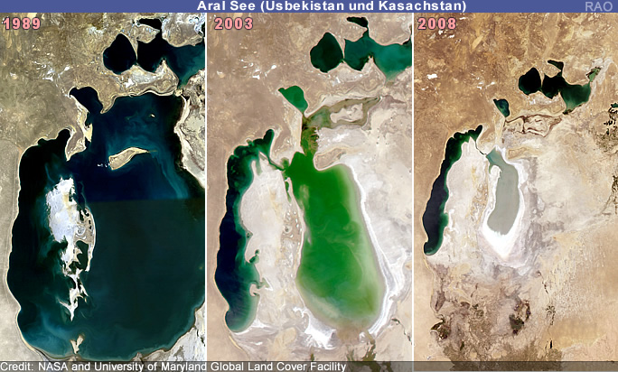
But also non organic cotton also has its problems, as the example of the Aral Sea shows. The Aral Sea was once the world’s fourth largest lake, home to 24 species of fish and surrounded by fishing communities, lush forests and wetlands. The unsustainable fashion industry is linked to the horror of the dictatorships and the environmental devastation of the Aral Sea as which dried up because the cotton crop was grown with the river water. One cotton shirt can use up to 2700 liters of water.
Conventional cotton (as opposed to organic cotton) uses a huge amount of water and pesticides which cause 350,000 farmer deaths a year and a million hospitalizations.
https://images.app.goo.gl/4fJ6QTHDD4DbsJis8
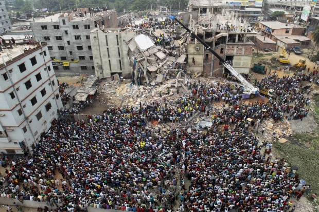
Also garment workers for most fast fashion companies are treated extremely poorly, they are often being forced to work 14 to 16 hours a day, 7 days a week. During peak season, they may work until 2 or 3 am to meet the fashion brand’s deadline. Their basic wages are extremely low. The collapse of the Rana Plaza in 2013, in which 1134 garment workers were killed, has revealed the unacceptable working conditions of the fast fashion industry to the world.
https://images.app.goo.gl/NvKmdz5wf9eJbU2Q8
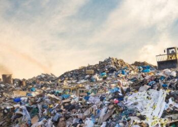
150 billion pieces of clothing are produced every year, 20% of those go unsold. To bring this in perspective we are 7.8 billion people living on earth, and we are adding 150 billion garment peaces a year to the once which already exist. 82 782 000 000 kg used and unused clothes end up in landfills each year, another big amount gets burned.
What can we do to avoid environmental disasters and unethical treatment?
THINK BEFORE YOU BUY
1.) Do you really need something new?
2.) Can you fix what you already own instead of buying something new?
3.) Can you buy it second hand or borrow it instead?
4.) Is the company you are buying from eco friendly and ethical?
5.) Is the company you are buying from transparent with what they are doing and not just greenwashing?
What are sustainable brands?
Sustainable brands are ones that have a meaning or purpose that goes beyond making money. They instead seek to increase the wellbeing of humanity and all life on our planet. It does not see people as consumers and it understands the lifecycle and environmental impact of all its activities, so that it can seek to continuously innovate and reduce its impact to a minimum.
I had conversations with the founders of the following three brands about their businesses and core values. In my opinion, they set a positive example on how to follow your dream of your own business, being environmental conscious with it and trying to educate others on problems the natural environment is facing.
PALM & PINE
It all started with a dream for a plastic and chemical free sunscreen with a stylish packaging. As the founder of Palm & Pine, Sarah Muir moved to Portugal and adapted a new beach lifestyle it meant two things for her – she needed good sunscreen and wanted to protect the ocean. She gave some natural sunscreens a try but didn’t like what she found. Thick, white formulas in plastic packaging.
So the idea for creating her own sunscreen arose and the first batch of sunscreen was created by Sarah’s husband in their kitchen. They got to work on creating the products that they couldn’t find.
Imagined on a beach in Portugal and developed in Cyprus, . Palm & Pine is of European origins with a mission to be loved worldwide.
What’s different about Palm and Pine? Standard sunscreens contain chemical UV filters and fragrances, packaged in plastic with pumps and sprays, producing plastic waste. That is bad for us humans and bad for our natural world.
All the products Palm & Pine offers are ocean friendly, from the cream itself to the packaging. No greenwashing and no harm to the ocean is made. Zero-plastic packaging. Recycled, recyclable, and reusable. Soon Palm & Pine sunscreen will be available worldwide. www.palmpineskincare.com .
FLOW SURF CO.
Inspired by the ocean and After years of traveling and working in different countries, Flow Surf Co. came to life. Flow Surf Co. is a passionate, environmentally conscious surf brand founded by Josh Ramsey. With his company, he Josh is aiming to be more than just a clothing range, but also a platform and community to help educate surfers, provide support for ocean activists and put the welfare of the planet and the people before profits.
The products life cycle :
Flow Surf Co. is leading by example in the battle against climate change by being eco-conscious at every stage. Their products are made out of organic cotton which is better for the producers and the ecosystem in which it is produced. Cotton is still a thirsty plant so the fields that grow the organic cotton for their products are located in the North of India, where the monsoons fill reservoirs that supply almost all the water needed.
In the processing, every part of the plant is used, what cant be used for clothes is turned into cow food or vegetable oil, no waste.
The products are made in a factory where the spinning, dyinge, weaving, cutting and sewing are integrated. Vertical integration leads to cost savings which can be reinvested in the facilities. This means that the environment is clean, light, modern and positive, like the Teemill factory in the UK where the apparel is printed.
Throughout the supply chain, renewable energy is used. The UK Teemill owns a solar farm and power manufacturing operations with renewables. In India, the factory owns two wind farms and a 150kw PV array. All products are real-time printed which means products are only printed after they have been ordered – no waste. Done with wearing your clothes? You can send them back to the Teemill factory where they make new products from the material they recover, the cycle itself is renewable. The products can be returned and remade again and again and again.
Packaging:
It is estimated that by 2050 there will be more plastic in the ocean than fish. Instead of plastic packaging, a rip and splash-proof mailer bag made out of paper is used, which also can be recycled.
Tree planting:
Besides looking out for the environment during production, Flow Surf Co. also partnered up with Ecologi to form a climate positive workforce. Ecologi plants trees and funds the worlds best climate crisis solutions. Each month, regardless of sales, tree planting is funded and projects that remove tonnes of CO2e, purely to offset their own carbon footprint at Flow Surf Co.
On top of their monthly tree planting, they also add more impact to each sale. Every sale contributes and each item sold plants one tree. The trees are planted in clumps of 25 trees + removing 0.5 tonnes of C02. Each time 25 items are sold a clump of 25 trees is purchased and Offset Earth plants these in the forest Flow Surf co. is supporting at that time, currently Madagascar.
Want to know more about the products of Flow Surf Co. or read their blog? Check out the website https:// flowsurfco.com or stay up to date by following their Instagram @flowsurfco.
SAND & PALM
After years of traveling to different surf destinations around the world and having designed swimwear for various companies, the idea for Sand & Palm arose. Vicki, the founder of Sand & Palm, has had the dream of creating her own brand for some time already, combining her artworks with her passion for surfing and the natural environment.
Sand & Palm offers beautifully designed swim and beachwear with a great fit, handmade by the founder herself in her studio, based in Cornwall, UK. With a focus on sustainability, Vicki sources environmentally friendly materials and uses production methods of the highest quality and standard.
The swimwear is made from lycra, which is made from regenerated ghost fishing nets and post consumer plastic waste. Lycra is a sustainable fabric, made of a ECONYL® regenerated Nylon that turns waste problems into fashion and interior solutions. It is versatile, hyper-resistant, thin, elegant, stretchy, soft and breathable: a unique mix of muscular compression and comfort. It is twice as resistant to chlorine, suntan creams and oils than other fabrics.
For Vicki, fabrics are a canvas for her artworks and illustrations, all designs are exclusive to the brand. The fabrics are digitally printed at an UK based company. Digital printing is one of the most eco-friendly methods, as it produces minimal waste.
The beachwear out of hemp is dyed using sustainably sourced natural plant dyes. It is then either screen printed using plant based inks, or hand painted using the same.
Sand & Palms mission is it to maintain a high level of environmental and social responsibility in all areas. Only non-harmful materials and production processes are used. By using sustainable and responsible materials, Sand & Palm aims to increase awareness of the importance of protecting the environment and people against the harmful impacts of mass clothing production.
 Morrison Planetarium
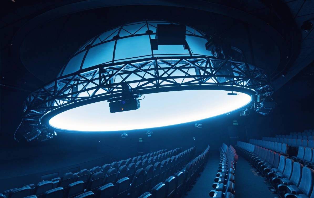 Planetarium Wenus
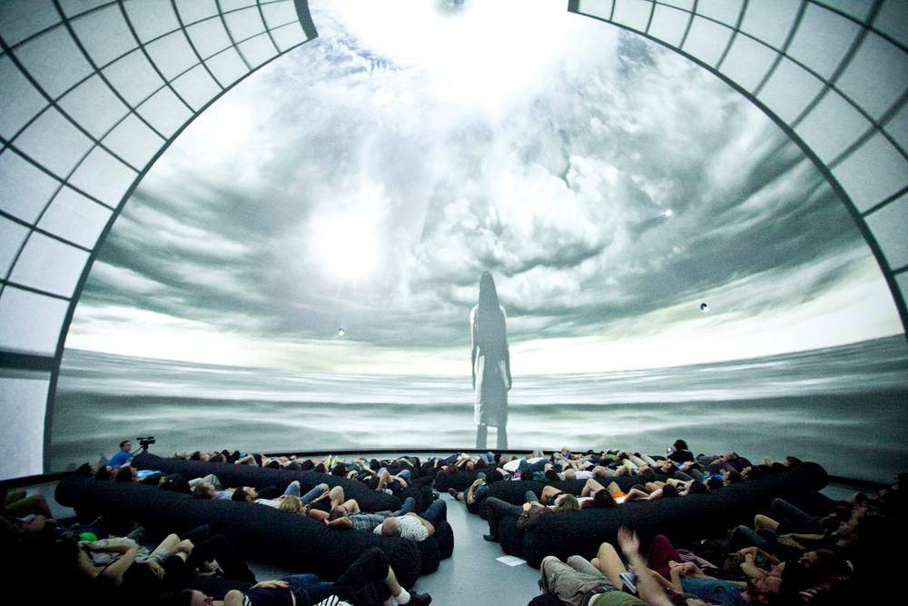 IX Symposium