In my recent blogposts I have covered a lot of rules and techniques that established themselves over the time in the filmmaking landscape but as you could probably already guess, we only touched the tip of the iceberg. I briefly wrote about story structure, light, composition, look and even took a deep dive into the work of an award winning cinematographer in order to get a glimpse on how to create something that is not only cinematic but also valuable, emotional and simply works.
Over the years we learned and perfected the art of manipulating the audiences emotions, opinions and views through film. As this can be a quite a powerful tool, you would be right to assume that it’s not only used by artists that strive to tell compelling stories but also by states, religions, idealogies and also companies that want to sell their product. Commercial films are especially in todays world a very viable branch for filmmakers. The market is quite large and bigger commercials can actually come close to the production size and quality of triple A films, yet when watching a lot of commercials you might stumble upon a few recurring elements. In this blogpost I want to throw light on these elements and get an understanding for what conventional commercials are and how they look like.
The Story: 12 Types of Advertising
Every piece of film needs some sort of story, script or idea. Back in 1978 former creative director Donald Gunn identified 12 seperate categories of advertisments, convinced that every commercial applies to one of these types. To keep it short, here is a brief overview of the types:1
- Demo
- Show the problem
- Symbolise the problem
- Contrast with competition
- Exemplary story “show the actual benefit”
- Benefit causes story
- Presenter testimonial “tell it”
- Ongoing character & celebrities
- Show benefit through a symbol, analogy or exaggerated graphic
- Associated user imagery
- Unique personality property
- Parody or borrowed format
In the earlier days of TV Commercials we have seen a lot of demonstrations, problem showings, contrast with competition and exemplary stories. This changed when Marlboro introduced their ad campaign with the Marlboro man, as they were the first company to associate a lifestyle with a product.
Marlboro’s successful campaign quickly influenced other companies to put a message first, rather than the product they are trying to sell. Connecting the audience with a positive emotion to a brand instead of just information. This type of advertising allowed for more creative approaches and broke the seal for unconventional types of TV-Commercials.
The Look: Equipment, Light, Color…
Television commercials usually look different than your classic Hollywood movie. This is due to many factors, for example nearly every advertisement is shot digitally and with sharp modern lenses whilst movies sometimes still get shot on film and/or with more stylized vintage lenses, as we learned in the previous blog entry about cinematographer Hoyte van Hoytema. Mostly because it’s cheaper and more versatile in production and post-production.
Advertisements tend to stay on the brighter spectrum. High-key lighting, vibrant colors and strong contrast seems to be the dominant commercial look.
This makes sense since companies like to appear modern, open and overall friendly whilst movies usually want to further enhance the emotion and mood with lighting and color. This is the reason why most TV-Commercials look very similiar, there a simply not a lot of options to choose from in order to make something that appears friendly and modern. Yet there are also some other more subtle reasons, for example eye sight gets instinctly drawn to points that are brighter and have more contrast. This is important to stick out in an 15 minutes ad block.
To show you what exactly I’m talking about I went ahead and compared two similar office scenes using the parade color scopes:
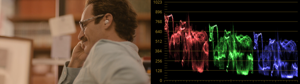

When looking at the image itself we can see that the movie look is more washed out and stylized with its warm and soft approach whilst the commercial keeps it more neutral, bright and with more contrast. This gets further proven by the color scopes – the movie screenshot is keeping its values rather low with less colors in the heights aswell as in the shadows. The commercial on the other side is clipping on both fronts and doesn’t has a color that is more dominant, like the reds in the movie scene. It’s using the whole color range of Rec709 which is the color space most of our TVs and phone monitors have.
Ever since Marlboro proved that a emotion can be advertised and tied to a product, companies tend to further dive into the world “cinematic advertising”. Allowing for more creative freedom, telling interesting stories that actually have meaning and putting the product or company second. This is usually the point where the line between the look of advertisements and movies gets blurred, something we tend to see more and more in todays marketing world . Commercials like these have proven to be cabable of going viral, in fact even more than informational ads.
Breaking the Conventions
Speaking about ads that did it different – there are quite a few of those that cleverly broke those conventions I mentioned earlier and went viral or atleast created a little fanbase around them.
One commercial that sticks out as an unconventional ad is Volvo’s “The Parents”. It tells a relatable story of young parents that face the hard times in the upbringing of their kids with the car beeing the solution in the end.
It’s well written and the cast also provides a great perfomance, yet what makes this piece so unconventional is that it’s shot on 35mm film in a 4:3 format. They also used Japanese vintage lenses to further enhance this quite unconventional retro look. On Vimeo director Niclas Larsson pointed out that he liked the 4:3 format as he and DoP Linus Sandgren thought it fitted well to the way it framed the humor and characters in the commercial. Although in this case Volvo did decide to only release a 16:9 version of the film on their media channels, despite the vision of the director.