Die Möglichkeit, dem Spieler die größtmögliche Freiheit in einem Videospiel zu geben, bedeutet Interaktionen zwischen dem Spieler und der digitalen Welt zu schaffen. Je länger es Videospiele gibt, desto größer, vielfältiger und interaktionsreicher werden sie. Aus diesem Grund benötigen heutige Videospiele in bestimmten Genres hunderte oder gar tausende verschiedene Animationen. Jedes Mal, wenn sich eine Figur oder ein Objekt in einem Spiel bewegt, musste ein Animator Hand anlegen, damit sich etwas in einem Spiel bewegt – es ist also eine Bewegung, welche innerhalb des Spiels “abgespielt” wurde. Um diese unglaubliche Handarbeit effizienter umzusetzen, werden prozedurale Algorythmen, welche meistens auf physikalischen Gesetzen beruhen, für Bewegungen in Videospielen verwendet. Dies können ganze Objekte oder Teile eines Objekts betreffen.
Beispiele ganzer Objekte:
rollende Fässer
im Wind wehende Stoffe
das physikalisch korrekte Hinfallen einer gesamten Person
Beispiele von Teilobjekten:
Haare von Menschen & Tieren
Kleidung
die Schuhbänder von Stiefeln
In den frühen 90ern war die Prozedur der manuellen Animationsgenerierung die einzige Möglichkeit, Bewegungen in Videospielen zu schaffen. Vordefinierte Bewegungen, die durch bestimmte Trigger ausgelöst wurden, vermittelten die Illusion, das Spiel und die darin passierenden Geschehnisse aus Sicht des Spielers vollkommen selbst zu beeinflussen.
canned animation triggered by the player
Auch wenn heute die prozedurale Animationserstellung nicht zu einer Neuheit zählt und fester Bestandteil in der Entwicklung von heutigen Videospielen ist, greift es das Prinzip von automatisierten Bewegungen sehr gut auf. Diese Technologie ermöglicht es, fertige Bewegungen möglichst realistisch und logisch zu verbinden, da es unmöglich ist, jede an eine andere anknüpfende Bewegung im Vorhinein animiert zu haben. Mithilfe einer Vielzahl an Parametern, ist die prozedurale Animation in der Lage, Bewegungen in Echtzeit zu berechnen, um Animationen zu generieren, welche von einer beliebigen Anzahl an Variablen manipuliert werden. Die häufigsten Variablen sind wie zuvor schon erwähnt, allgemeine physikalische Gesetze wie Schwerkraft, Wind oder Kollision, welche die prozedurale Animation in weitere Unterkapitel teilt. Sie kann aber auch durch den Spieler-Input beeinflusst werden. Beispielsweise werden durch schnellere Bewegungen der Spielfigur bestimmte Kleidungsstücke oder Haare physikalisch korrekt bewegt, ohne die Objekte mithilfe einer anderen Technik animiert zu haben. Diese Methode ist in vielen Game-Engines fester Bestandteil und zudem schnell anwendbar und effektiv. Denn oftmals sind es diese kleinen Elemente, welche eine Szene zum Leben erwecken.
procedural simulation in the Source engine called “S2FM”
Ein im Wind wehender Umhang, der an der Rückseite eines Kriegers befestigt ist, während er mit seinem Pferd Richtung Heimat reitet, kann aus visueller Ebene wahre Wunder bewirken. Je mehr Physik zu sehen ist, desto dynamischer und greifbarer fühlt sich das Gesamtbild an und befriedigt somit eher das Auge des Betrachters.
Next Topic: Vordefinierte Animationen – Ein Segen und Fluch zugleich
Guerilla marketing is a communication strategy that thrives on the surprise effect, in which topics and ideas are staged in an attention-grabbing way. The main aim is to draw attention to one’s brand, product, company or a specific topic through unconventional measures. Often a rather small budget is available, with which the greatest possible advertising effect is nevertheless to be achieved.
Behind the term guerrilla marketing is the marketing professional Jay C. Levinson, who developed the basic concept back in the 1980s. Moreover, the term is derived from military language. Guerrilla warfare is a form of warfare in which one tries to weaken the opponent through unconventional tactics.
The special thing about guerrilla marketing is that the actions normally can’t be repeated simply and unchanged; moreover, consumers are addressed directly and personally. The aim is that the surprise effect of the campaign creates enough buzz that it spreads by itself via word of mouth and social media. Since the surprise effect would be lost if an action were repeated exactly the same, one would also lose the interest of the public.
So how does guerrilla marketing work?
A guerrilla marketing campaign will mainly take place on places and objects where one does not expect advertising. There are the most diverse areas of application, such as escalators, furniture, cars, public benches or even street actions and stagings, such as flash mobs, can be part of it. The actions aim to shock or even scare consumers, break taboos or ridicule the competition. In summary, it aims to touch consumers emotionally through a personal experience.
In contrast to classic advertising, when using guerrilla marketing you do not struggle to stand out from thousands of other advertisements. However, this is exactly why such campaigns have to be planned precisely.
Risks of guerrilla marketing
One risk of guerrilla marketing that should not be underestimated is that the viral effect cannot be controlled. In the worst case, a campaign that goes viral can also develop in a negative direction, anger the target group, lead to a shitstorm, loss of image and sales. Therefore, it is also advisable to play through all possible scenarios and the necessary reactions in case of emergency when planning such campaigns. Moreover, guerrilla marketing often moves in legal grey areas.
Success factors of guerrilla marketing
It is important for a successful guerrilla marketing campaign that it fits the brand and its target group. In order for consumers to engage with the campaign, direct and immediate points of contact should be created during the campaign. With a cross-media approach, the chances of a successful campaign are even higher, for example by involving the target group and encouraging them to post content on the internet.
Four types of guerrilla marketing
Ambient marketing refers to surprising product stagings that reach consumers in their normal environment. This is the unusual implementation of outdoor advertising in public spaces. Ambient marketing can mean, for example, innovative advertising at the airport, on buses and trains or in restaurants. Possible advertising media are, for example, beer mats, postcards or toilet seats in pubs.
Ambush marketing is also called free-rider marketing. In this case, the attention for a topic or an event is used to put one’s own brand in the limelight. Ambush marketing is also frequently used at major events to carry out an image transfer to one’s own brand. This form of marketing is, however, controversial, as with this form of advertising an association with an event is, so to speak, tricked.
Sensation marketing involves unusual actions or spectacular installations, for example at the point of sale. Multipliers, such as promoters, are used for this. Examples of sensation marketing are surprising fashion shows or flash mobs in the pedestrian zone.
Viral marketing is about achieving as much attention as possible in the respective target group as quickly as possible. Viral marketing aims to spread content virally, for example by consumers recommending or sharing it personally via word of mouth or online via social media.
Beispiele klassischen Guerilla Marketings
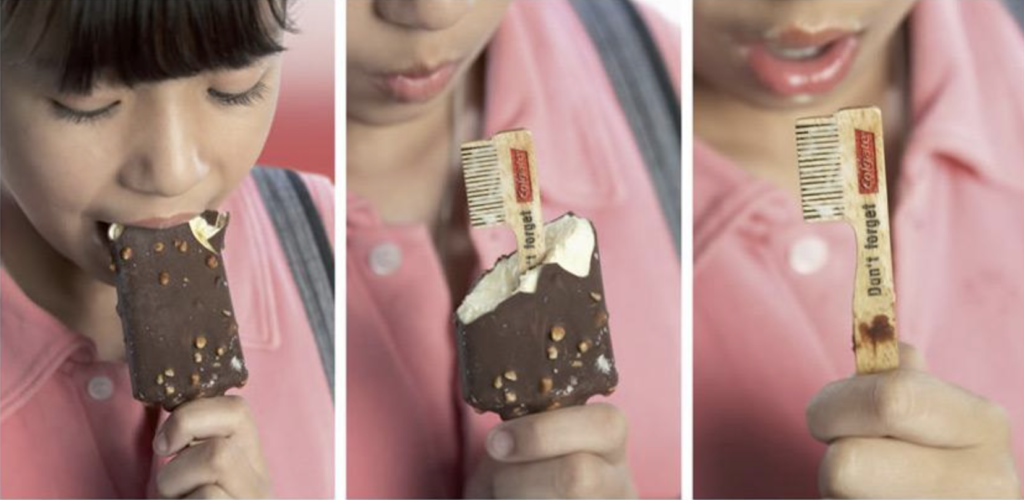
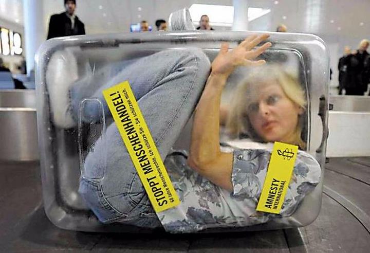
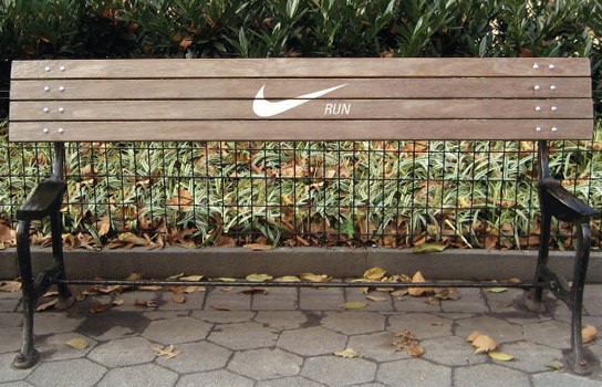
Once consumers are done with their ice cream, the message printed on the tip of the stick shaped like a toothbrush reveals “Don’t Forget” with the Colgate logo. This simple message effectively reminded consumers to brush their teeth.To draw attention to human trafficking, Amnesty International also decided to use sensation marketing. Suddenly, transparent suitcases containing real people appeared on the luggage tapes. A shocking advertisement that is sure to stick in the mind and be retold.Nike Guerilla Marketing to talk about, but also to get angry about
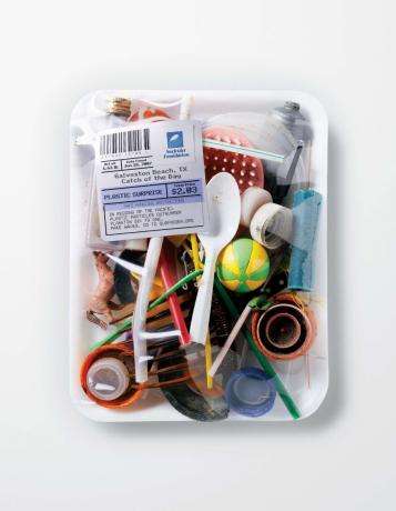
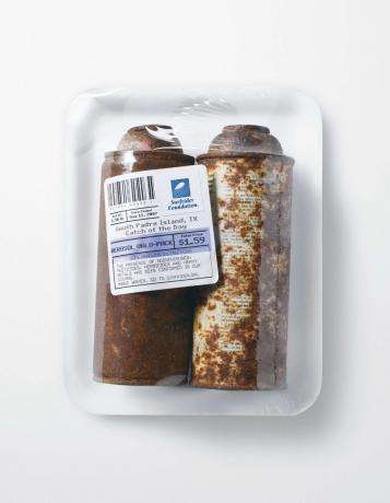
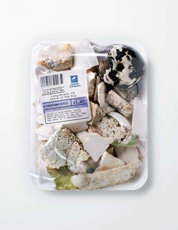
Guerrilla Campaign Packages Garbage as Seafood
The Advertising Agency Saatchi & Saatchi created a Guerrilla Campaign for Surfrider Foundation to put beach pollution into perspective. Therefore, trash was collected from various beaches, packaged, so that it looked like seafood and displayed at local farmers’ markets. With this campaign they wanted to raise awareness for the need to keep our oceans clean.
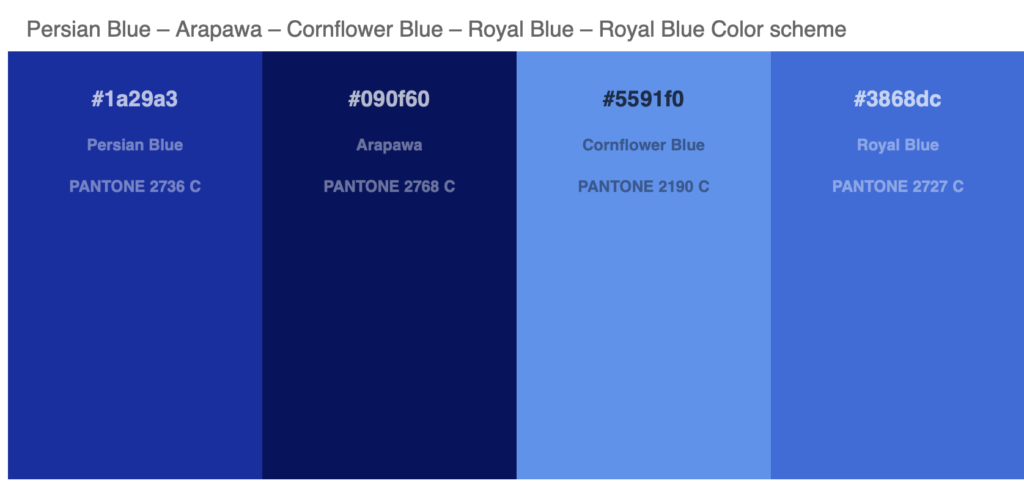
The power of seeing the colours and distinguishing them has changed people lives and their beliefs. During the history it caused people discovering more colours and bring them into their handicrafts, religion, science and many other aspects. Human beings have been always curious and creative, so they started creating colours, one of these colours which has a strong connection with my childhood and identity is Persian blue.
The color of Persian blue is a representation of the color of lapis lazuli which has been mined in Iran and Afghanistan since ancient times. The scarcity of the blue mineral lapis lazuli drove the earliest adopters to seek new ways of producing blue through chemistry. Because it was a rare and expensive mineral to acquire up until the dawn of the Industrial Age, it’s often associated with royalty and divinity, which is partly why it is widely a favourite color today. Blue can have a variety of meanings and symbolize a diverse range of ideals depending upon a culture’s beliefs. Largely, the color blue is considered beneficial to the mind and body. It is believed that it slows human metabolism, which produces a calming effect. Light blue is associated with health, healing, and tranquility while dark blue represents a more powerful, serious, but sometimes melancholic nature.
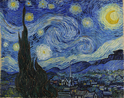
Starry Night, Van Gogh
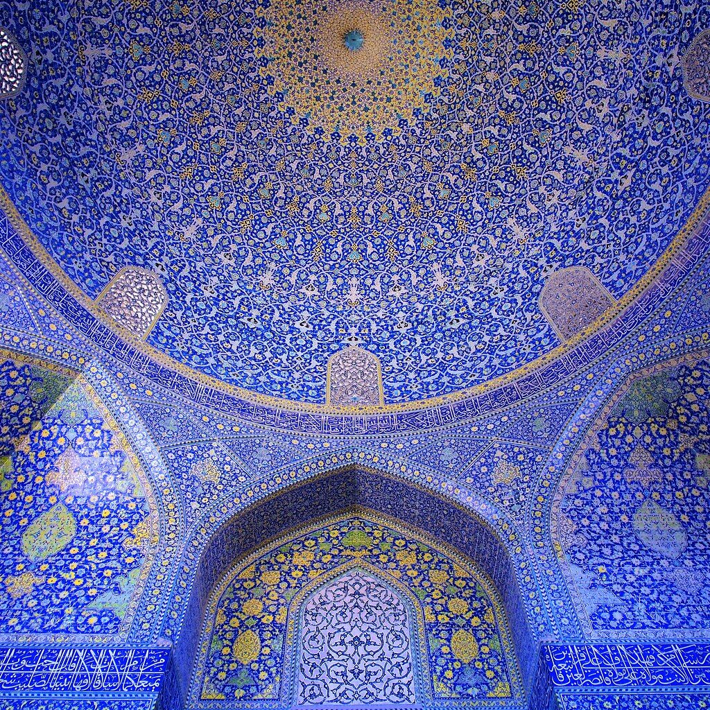
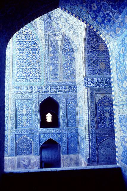
One of the most famous examples of using blue colour in the European arts, is the Starry night by Van Gogh. This works represents a melancholic and mysterious night. The most important point is that the blue is showing the sky and the relationship that the artist build with this meanings. As a contrast, there is a roof of a famous mosque in Iran, Masjed Shah, which has been also designed with blue color, but it shows the melancholy of the sky in a different way using abstract forms as well. This ceiling is also mentioning the sky however in a different way.
Blue has mostly the meaning of innocence and heaven in Iranian culture. The roof of mosques are mostly made from mosaics with blue color. As contrast for example in English language people say you seem blue, which means feeling sad or melancholic. I suppose, middle eastern people are also a little bit melancholic but in a different way, specially in iran, literature and poetry have melancholic meanings that could be connected with happiness as well as sadness and being away from the lover.
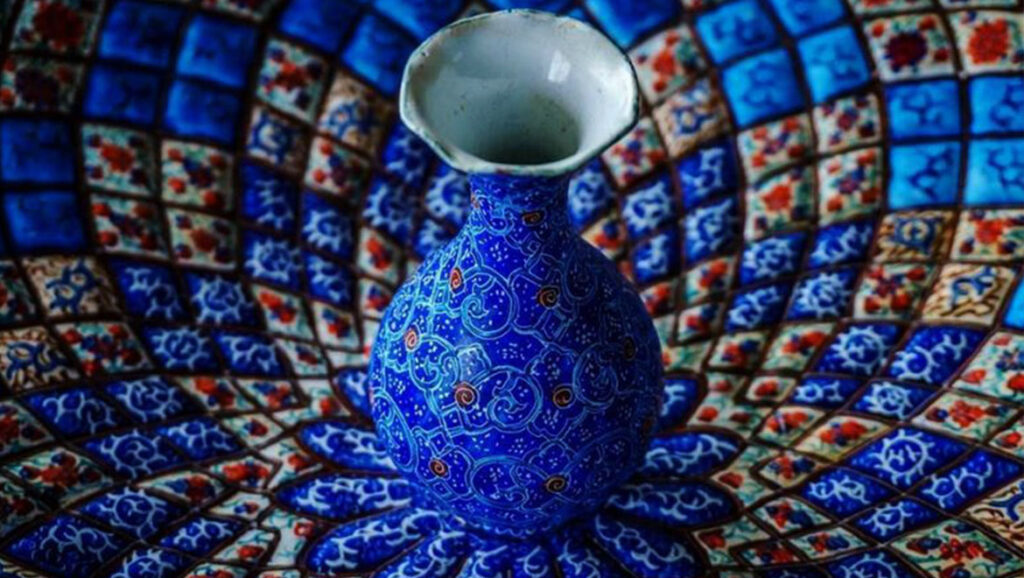
There is another art in Iran, which is very similar with architecture and using blue color, this art is more than 2500 years old and is called as Minakari. Minakara is about adding details and designing mugs, plates and jewelleries. It found its way during the Byzantine Empire through Europe.
A short film by Frederic Doazan about plastic surgery disasters and beauty standards.
A PLASTIC SURGEON CREATES IN REAL-TIME -THE NEW GODDESS OF BEAUTY
Inspiriert von “Plastic-Surgery-Disasters”, ist Frédéric Doazans Supervenus eine Darstellung der modernen Schönheitsstandards und deren Entwicklung mit der Zeit. Zweifelsohne haben sich das Konzept und die Standards der Schönheit im Laufe der Jahre verändert, und was einst allgemein akzeptiert war, hat sich in unseren modernen Gesellschaften weiterentwickelt – zusätzlich zum altbewährten Streben nach ewiger Jugend. Alle diese Punkte werden in diesem Video aufgegriffen und humorvoll veranschaulicht.
Doazan erstellte seine dreiminütige Animation mit Photoshop, After Effects und einem selbstgebauten Greenscreen (um seine Hände zu filmen) und wurde so zum virtuellen Schönheitschirurgen.
Timelapsevideo of the Photoshop Process of Supervenus / MAKING-OF
Der Film löste eine Diskussion über die Anforderungen an den Körperbau aus, die heute an Frauen gestellt werden. Beginnend mit einem medizinischen Diagramm einer Frau (“Femme Adulte”), zeigt das animierte Video eine systematische Überarbeitung der weiblichen Form, die unsere morbidesten Körpergedanken weckt und überraschend erschreckend endet. Supervenus vermittelt eine starke Botschaft über das Schönheitsbild in den Medien.
Der Begriff Installation wird in der Kunstpraxis oft als breitgefächerter Ausdruck verwendet und ist definiert durch eine Ansammlung bzw. Konfiguration von Objekten in einem definiertem Raum, wobei sowohl der Raum als auch die Objekte, die sich in diesen Raum zusammenschließen, eine Installation als Kunstwerk definieren. Eine Installation kann alle erdenklichen Medien beinhalten, jedoch unterscheidet sie sich vor allem durch die Art wie der oder die Betrachter diese Medien wahrnimmt. Oft ist auch die explizite Eingliederung des Standortes in die Installation eine wichtige Charakterisierung. Je nach Grad der Eingliederung kann ein Standortwechsel zur Zerstörung oder Verfälschung des eigentlichen Kunstwerkes führen. Installationen regen den Betrachter meist dazu an, aktiv mit der Installation zu interagieren. Die Interaktion kann aus einer reinen Änderung des Betrachtungswinkels bestehen oder, je nach Art der Installation, eine tatsächliche Interaktion oder Reaktion mit bzw. seitens der Installation sein.
Joan Soler-Adillon Definition für interaktive Installationen:
[…] have defined interactivity as “a series of related actions between two or more agents where (1) at least one of them is an artificial system that (2) processes its responses according to a behavior specified by design and (3) takes into account some of the previous actions executed by them”.
Aufgrund dieser Definition sind viele von Künstlern als interaktiv bezeichnete Systeme/Installationen tatsächlich als reaktiv zu bezeichnen sind da sie Punkt (3) der Definition nicht vollkommen erfüllen. Bei vielen scheinbar interaktiven PM-Installationen ist die Eingabe-Ausgabe-Funktionalität meist statisch und nicht vom System selbst veränderbar und somit reaktiv. Als interaktiv sind Systeme zu bezeichnen, bei denen die ausgelösten Inhalte während der Laufzeit neu berechnet werden.
Somit stellt die Reaktion von Dateneingaben in Echtzeit den Unterschied zwischen interaktiven und reaktiven Systemen dar.
Vor allem bei interaktiven PM-Installationen ist dies von erhöhter Relevanz, da der Betrachter gleichzeitig den Benutzer des Systems darstellt und durch etwaige Verzögerungen der Reaktion das Empfinden der Interaktion/Reaktion gestört wird .
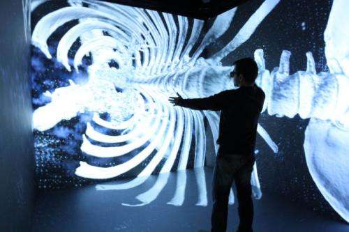
CAVE von Cruz-Neira et al.
Eine der bekanntesten und hervorragendsten interaktiven PM-Installationen ist Cave Automated Virtual Environment (CAVE). CAVE wurde 1992 von Carolina Cruz-Neira und einem Team von Wissenschaftlern an der Universität von Illinois’s Electronic Visualization Lab als ein universelles Visualisierungswerkzeug, basierend auf großen Projektionsflächen entwickelt. CAVE wird seit 1992 laufend weiterentwickelt und findet an einigen Universitäten und öffentlichen bzw. privaten Institutionen Verwendung. Auch wenn CAVE neben PM viele andere medientechnische Bereiche streift und einige Alleinstellungsmerkmale besitzt, bezeichne ich CAVE in diesem Blogeintrag als interaktive PM-Installation.
CAVE ist ein quadratischer Subraum mit mindestens drei und maximal sechs Projektionsflächen mit einer Seitenlänge von üblicherweise drei bis vier Metern und befindet in einem größeren dunkleren Raum der ihn umschließt. Die drei Seitenwände dienen als Rückprojektionsflächen und der Boden meist als normale Frontprojektionsfläche.
Um den Benutzer ein freies Bewegen zu ermöglichen und dennoch eine dreidimensionale Immersion zu schaffen, griff man bei CAVE auf ein Trackingsystem und stereoskopisches Darstellen des Inhalts zurück. Die 3D-Brille dient dabei gleichzeitig als Tracker der Bewegungen des Benutzers und der Inhalt der Projektion wird in Echtzeit daran angepasst. Durch die breiten Anwendungsmöglichkeiten der PM-Installation wie z. B. Visualisierung für Museen, Medizin, Architektur und Archäologie, hebt sich CAVE von vielen anderen Installationen ab. Einzig der benötigte Platz, die technologische Herausforderung des Setups und der damit verbundene hohe Kostenaufwand stellen Negativpunkte dar. Dennoch sind die resultierenden Möglichkeiten und Applikationen mit ihrer starken immersiven Wirkung bemerkenswert.
Veranschaulichung einer CAVE 3D Visualisierung eines Brustkorbs
Diese Icons durfte ich gemeinsam mit Christof Geramb gestalten. Ziel dieser Übung war, dass ich zuerst die Sounds aufgenommen habe und Christof im Nachhinein die Icons kreierte. Bei meinen Klängen habe ich mich hauptsächlich auf akustische Instrumente beschränkt. Zum Einsatz kommen zum Beispiel auch Handpans, Kalimba und Vibraphon.
Im Entstehungsprozess für den Sound haben wir uns vorgenommen ausschließlich akustische Instrumente zu verwenden. Da wir eine sphärische Aufnahme geplant hatten eigneten sich Instrumente mit viel Decay, mit denen man große Flächen erzeugen konnte. Zum Einsatz kamen exotische Instrumente wie Handpans, eine Kalimba, ein Vibraphon und kleinere Perkussionsinstrumente wie Chimes, Fingercymbals, ein Rain Maker und ein Crash Cymbal.
Die Handpan spielt eine getragene Fläche, die wie beim Atmen mit der Dynamik auf und nieder geht. Das Kalimba wird durch einen Grain Delay geschickt, der ohne bestimmten zeitlichen Verlauf, also eherer random, kleine Tonschnipsel in unterschiedlichen Oktaven wiederholt, was teilweise wie ein Shimmer klingt. Die Chimes werden reversed abgespielt, was auch innerlich die Erscheinung bringt, dass etwas zurückgespult wird. Das tiefe Grollen bzw der Bass kommt von einem recht großen 22“ Cymbals, das nur sehr leicht angeschlagen ist, aber extrem dicht ans Mikrofon gehalten wurde. Somit wurde die Bassabnahme sehr verstärkt und es klingt schon fast bedrohlich.
Das Vibraphon wird nicht wie üblich mit Mallets gespielt, sondern mit einem Geigenbogen gestrichen. Somit fällt die Attack des Anschlags weg. Dazu habe ich zwei unterschiedliche Takes gemacht und hard L R gestellt. So werden die unterschiedlichen Töne immer aus einer anderen Richtung aus und eingefadet.
Sound Vision
Dieses Projekt durfte ich gemeinsam mit Christof Geramb gestalten, der den visuellen Part umgesetzt hat.
Nach meinem ersten Test, aus seiner abstrakten Form eine durch Sound animierte Visualisierung zu erstellen ist gelungen.
Im nächsten Schritt möchte ich mich der Animation von Typographie annähern. Dabei soll diese aber nicht gewöhnlich bewegt werden, sondern wird vorab in Vektoren und Ankerpunkte umgewandelt. Gleich wie im ersten Beispiel wird Sound den Text in Bewegung bringen.
Umsetzung/Erkenntnisse:
Im Gegensatz zum ersten Beispiel wird hier kein von Sound-Designern kreierter Sound herangezogen, sondern ein gewöhnlicher Song. Dieser wird eingelesen und mittels Amplide-Analyzer analysiert.
Aus dem Text „ADAMS“ erstelle ich eine Shape, welche ich rechnerisch genau in das Fenster einpasse. Danach setze ich Segmentoren, Längen und Abstände der Ankerpunkte.
Since good usability should be the standard for anything that is designed to be used by humans, it is also important to ensure that the products are actually usable. The more complex a system is, the more work needs to be done. Usability testing is one of the most used methods to improve the usability of a digital system. It focuses on observing users while they are interacting with a system.
“Start earlier than you think makes sense.”
– Steve Krug
When should I start testing?
Based on when you are doing the tests, there are two different types:
Formative Testing Formative testing happens while the product is still in development. The main goal of this type is to identify and fix problems based on small tests with users. This type of testing is normally repeated multiple times during the development and can start with the first pencil sketches on paper or even a napkin.
Summative Testing Summative testing starts when the product is nearly finished or already finished. The main goal of this type is to establish a baseline of metrics and identify if the product meets the requirements.
If you are redesigning a system, it is important to start even earlier. Testing an existing product can give you a lot of useful insights and ideas for the redesign. It helps you with identifying the biggest pain points of the current product and which parts of the system are already working well and should be emphasized even more. If there is time left, you should also take a closer look at the systems from your competitors and ideally also test them. Testing them can also give you additional information about what they are doing better and where there is even more potential for your system.
Testing during a redesign (formative testing) is already quite common, but the majority of tests are still done during the end of the process (summative testing). There is no reason why you should not test your first sketches, paper prototypes, and wireframes in addition to the nearly finished prototypes. The more you test, the easier it is to identify problems and also fix them. Testing earlier saves time and money. Usability tests are especially useful after every important design decision.
How many participants do I need?
The number of users you should test with is also connected is the same as with the usability inspections. To identify the most important usability problems you should test with 3 to 5 users. After the fifth user, you already discovered 85% of the usability problems. Identifying the last 15% will take about 3 or 4 times more people than for the first 85%. That’s also the reason why you should stop at 5 people, especially when doing more expensive tests like the moderated usability test. It is much more efficient to do five smaller tests with a few people during the process than one big extensive usability study in the end.
There are a lot of different usability testing methods out there and every one of them has its unique advantages and disadvantages. Which method you should use always depends on the project and the stage you are in. They also cost different amounts of money.
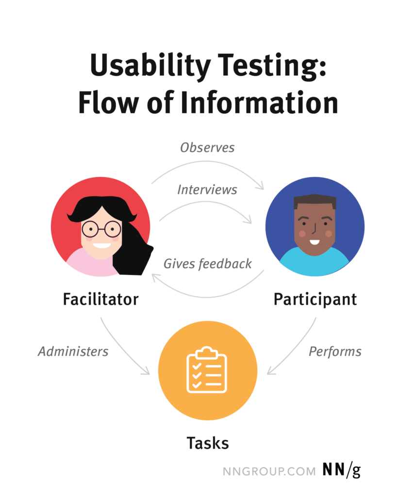
Moderated Usability Test
While moderated tests get you the richest and most detailed qualitative data from real users, they are also resource and cost-intensive. Although moderated tests would also work great with low fidelity prototypes or wireframes because the moderator can give additional explanations, it is better to use high fidelity prototypes for these tests because they also give you a realistic idea of how the users perceive the design.
During these tests, you usually record the screen, voice, and also face of the user. Based on the recordings you should also create a highlight reel with the biggest problems, suggestions from users, important quotes from them, and statements about what the thought would happen next.
Moderated tests can either be done in-person or remotely. But since the moderator plays an important role and should also be able to read the behavior and non-verbal cues of the participants, it is better to do them in person. Remote moderated usability tests are better if you have a limited budget, if you are testing with users from all over the world, or if you are working on a niche product with a very small number of potential users in your area. During the ongoing pandemic, most of the moderated tests were also done remotely. The biggest challenge for moderators during remote tests is reading the participant and finding the balance between letting the user know that you are listening and interrupting them.
Moderator
Since the moderators play an important role during these tests, they should have solid experience in the field of usability testing or user research. Moderators have to work directly with the participants, guide them through the process, reading them the tasks they have to do, and as follow-up questions to get even more information during specific steps. It is also important that the moderator explains to the participants that the system itself is tested and that they cannot do anything wrong.
Participants
The participants have to use the think-aloud method and talk about what they are thinking about while interacting with the system. Ideally, the participants should also be part of the main target audience of the system.
Observers
To get even better results, you can also give the designers and developers the chance to observe these tests so that they get real time information about the usability and design of the system.
The biggest disadvantage of moderated usability tests is that the preparing, recruiting, scheduling, coordinating, and sessions themselves cost a lot of time and therefore also a lot of money. Because you always need a moderator for the sessions, this method is also not as scalable as the others.
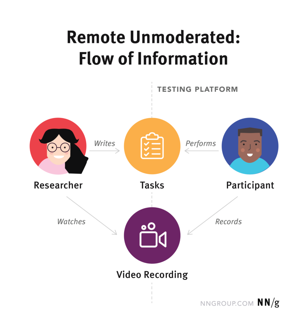
Unmoderated Usability Tests
Unmoderated usability tests work similarly to the moderated tests and are also a good source for qualitative data. The main difference is, that the moderator is not present during the test. But there is still a moderator or researcher involved that provides the task instructions and also watches and analyses the videos of the tests afterward. Since there is no moderator present, it is mostly used to test specific parts of a product, rather than a whole user journey.
The main advantage of this method compared to moderated tests is that there can be 5, 10, 20, 50, or even more tests simultaneously. Another big advantage is that these tests can be conducted anywhere, anytime, and with anybody. That is also the main reason why this method works best for remote tests. Since it can be conducted much faster and requires less time, it is not only more scalable but also cheaper than the moderated tests.
Moderator
Because the moderator is not present during the test, it is also harder to get the “Why” information. But if the unmoderated tests and tasks are prepared carefully, remind the participants to think aloud after every task and additional task-specific questions are asked before the next task, it can be almost as efficient as a moderated test.
Participants
The participants of an unmoderated test also have to use the think-aloud method. But the biggest advantage for the participants is that they can do the tests anytime and anywhere they want if it is done remotely.
Another big advantage of unmoderated tests compared to moderated tests is that there is a smaller chance for bias. Observed people are often acting differently when they are alone. This phenomenon is also called the observer-expectancy effect.
The biggest disadvantage of this method however is that the participants tend to be quieter because there is nobody reminding them of the thinking aloud if they forget it. That’s also the reason why different remote testing tools only pay their participants if they were also doing it correctly. Because there is no moderator present for guiding the participants through the test, it also just works well with high-fidelity prototypes or existing products.
Ideally, both of these testing methods should be used complementary during an iterative design process. You should start with moderated tests during the early phases of the process with a low fidelity prototype or wireframes and when you are finalizing the project you could do an unmoderated test to see how the product performs with real users around the world.
Resources
Books
Just Enough Research Erika Hall 2013
Usability Testing Essentials, Ready, Set…Test! Carol M. Barnum 2021
UX Optimization, Combining Behavioral UX and Usability Testing Data to Optimize Websites W. Craig Tomlin 2018
Inclusive Design for a Digital World, Designing with Accessibility in Mind Regine M. Gilbert 2019
Articles
The Elements of Successful UX Design, Best Practises for Meaningful Products UXPin 2015
Trying out the HoloLens 2 for the first time as I have never tried out AR glasses ever before.
The experience itself was very immersive and I had great fun playing a game after adjusting the glasses to my head and vision. While shooting robot spiders served the purpose of having fun and had nothing to do with the project itself or an education app, it was interesting to get to know the navigation of the interface and remember different commands for navigating through the experience. It brought my attention to think about signs in general and overlaps between signs of the navigation with sign language sings as well as the whole interaction with AR objects by using gestures.
own scribble
There are multiple human gestures and movements for free-form systems for navigating interfaces. I reviewed the book of Designing Gestural Interfaces by Dan Saffer from 2008. While this book was published more than ten years ago, it still helped to get an overview due to a lot of pages which showed pictures of a person doing different movements with the hands and the whole upper body so that for example the system is reacting by cooling the temperature down. It was a good first impression of the multiple possibilities that are given to interact with the body.
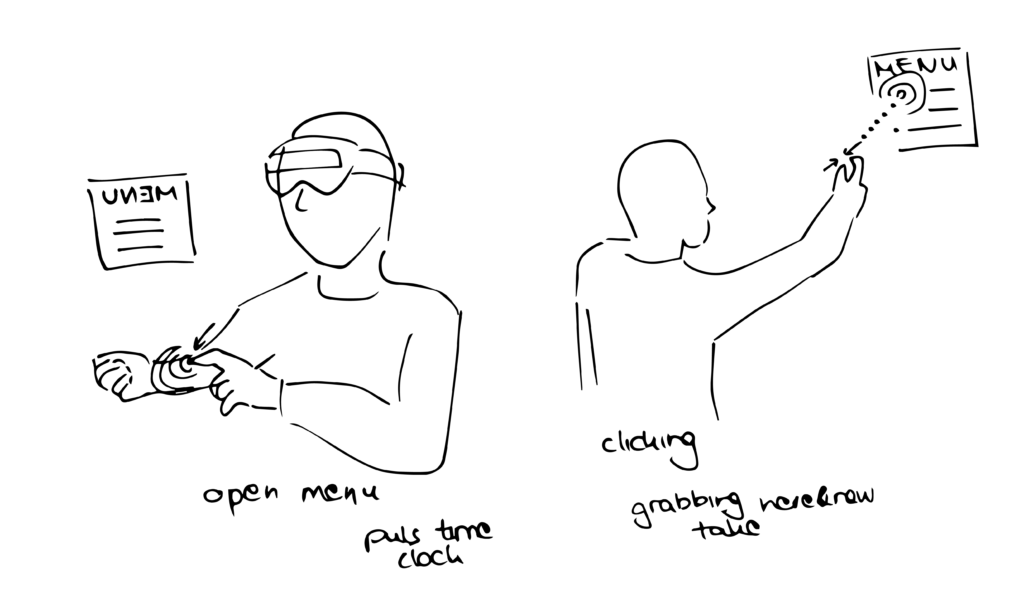
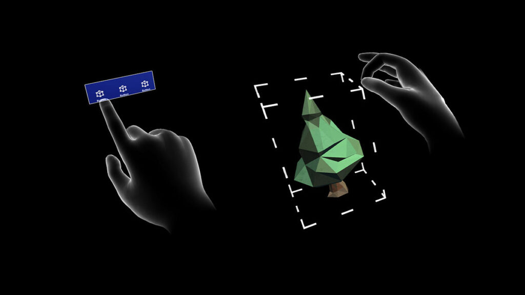
Today you can interact with the Holograms in many different basic actions and gestures like dragging, dropping, clicking, holding and releasing to get effects like scaling, rotating, repositioning and more. The hand-tracking in Microsoft HoloLens 2 provides instinctual interaction so that the user can select and position holograms by using direct touch as if he would touch it in real life. Other than the possibility of direct touching you can use hand rays to interact with holograms which are out of reach. I recognized that you have to get used to use your own body very quickly. For example you often want to open the menu so you have to tap on your arm. Another often used interaction in my experience was lifting the arm to set up the hand ray to then click on the holograms by putting the thumb and index finger together as seen above.
mrtk hand coach: https://docs.microsoft.com/en-us/windows/mixed-reality/design/hand-coach
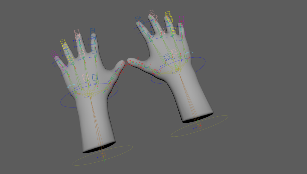
Looking into the Interaction Guides from Microsoft you can see which components are or can be taught to the users and how users are guided to learn gestures. This is done by viewing a hand coach which is just a 3D modeled hand repeatedly showing the gesture until the user’s hands are detected by the system and starts to imitate the movement. This means if the user does not interact with the hologram/component for a period of time, the hand coach will start to demonstrate the correct hand and finger placement again until the user understands the process. Interesting for my project is to to how the user gets educated just by hands and it was helpful for me to get to know how I can create my own hand coach as these information are provided in this guidelines as well by naming programs like unity as well giving the opportunity to download an asset of the hands to create an own controller setup.
maya example hands asset: https://docs.microsoft.com/en-us/windows/mixed-reality/design/hand-coach
It needs practice to learn to navigate through these AR tools and systems but it becomes clear that in this scenario people show willingness and technical interest to imitate gestures to get control over something. They are willing to get used to the navigation through gestures and learn to get to know them after a while until they remember them completly. After stating the issue the SAIL team talks about in my last post about that the depth perception must be learned for first time learners who are not used to use the space in front of themselves or the own body to communicate, it gives me hope that by giving the right amount of information and instruction AR will help people to overcome the phase where they use their body for communication more easily if they are interested into learning new interaction methods.