Eigene App zur Berechnung von Nachhallzeiten

Da ich im letzten Semester mit der Planung des Audiostudios der FH Joanneum beaufragt wurde, kam mir zunächst die Idee die Nachhallzeit der geplanten Umsetzung zu kalkulieren. Allerdings ist mir bei der Recherche nach einem geeigneten Tool aufgefallen, dass es keine kompakte Applikation gibt, die dies ermöglicht. Es gibt zwar komplexe Simulationssoftwares wie EASE der Firma AFMG Technologies GmbH, bei denen die Nachhallzeiten in einem 3D-Modell ermittelt werden und das Nachbauen eines Raumes mit einem großen Zeitaufwand verbunden ist, diese Softwarelösungen sind aber verhältnismäßig teuer und nicht im Sinne einer schnellen Nachhallzeitberechnung.
Da ich mich außerdem in meinem Project Work mit der Programmierung von Unity-Skripten in der Programmiersprache C# beschäftigt habe und tiefgreifendere Kenntnisse in dieser Sprache erlernen wollte, kam ich in den letzten Semesterferien auf die Idee, eine solche Applikation selber zu schreiben, um bei zukünftigen Projekten Nachhallzeitkalkulationen anbieten zu können. Außerdem wäre es in naher oder ferner Zukunft auch im Interesse aller Akustiker und Audioenthusiasten, eine solche Software zu veröffentlichen.

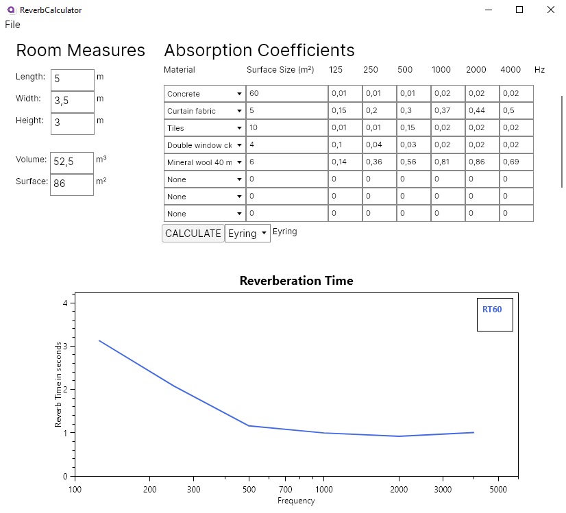
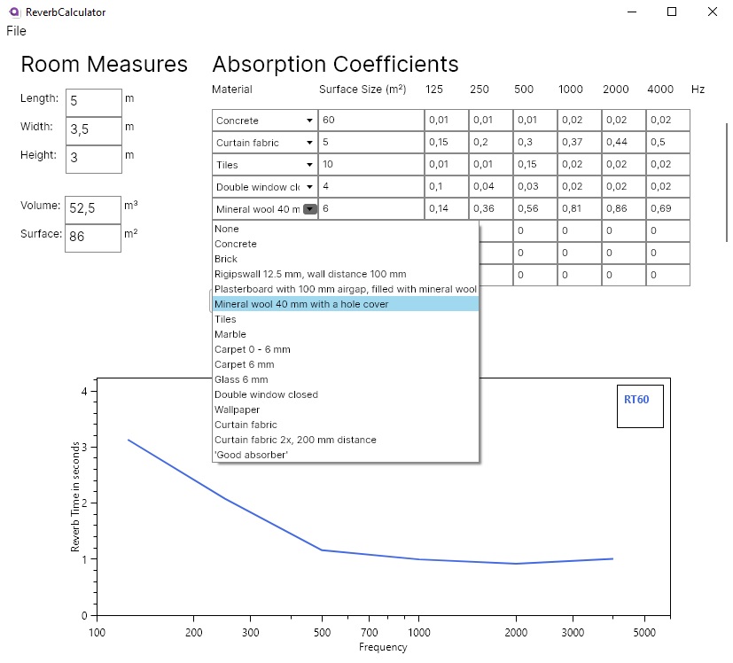
Grundsätzlich funktioniert die Applikation so, dass man zunächst die Maße des (rechteckigen) Raumes eingibt. Daraus wird das Volumen und die Oberfläche ermittelt, die für die spätere Kalkulation benötigt wird. Man wählt daraufhin das Oberflächenmaterial aus, aus welcher die Wände, Decken und Böden bestehen. Für die verschiedenen Materiale werden Oberflächengrößen eingegeben, die auch für die Kalkulation benötigt werden.
Im unteren Teil der Applikation wird nun nach dem Betätigen des “CALCULATE”-Buttons die Nachhallzeit in einem Graphen ausgegeben.

Prototyp des Programms

Behind The Scenes

Das Programm habe ich mithilfe des C#/XAML-Frameworks Avalonia geschrieben, das auf der Syntax des .NET-Frameworks WPF aufbaut, das für für User Interfaces entwickelt wurde. Der Unterschied zu WPF ist allerdings, dass Avalonia cross-platform ist und somit auch auf anderen Betriebssystemen als Windows ausführbar ist. Zusätzlich habe ich für die Applikation das MVVM-Konzept verfolgt, welches das User Interface streng von der Programmlogik und der Datenbank trennt. Dies ermöglicht in Zukunft leichtere Eingriffe in die verschiedenen Teilaspekte des Programms, wie z.B. des User Interfaces, ohne die Programmlogik verändern zu müssen.

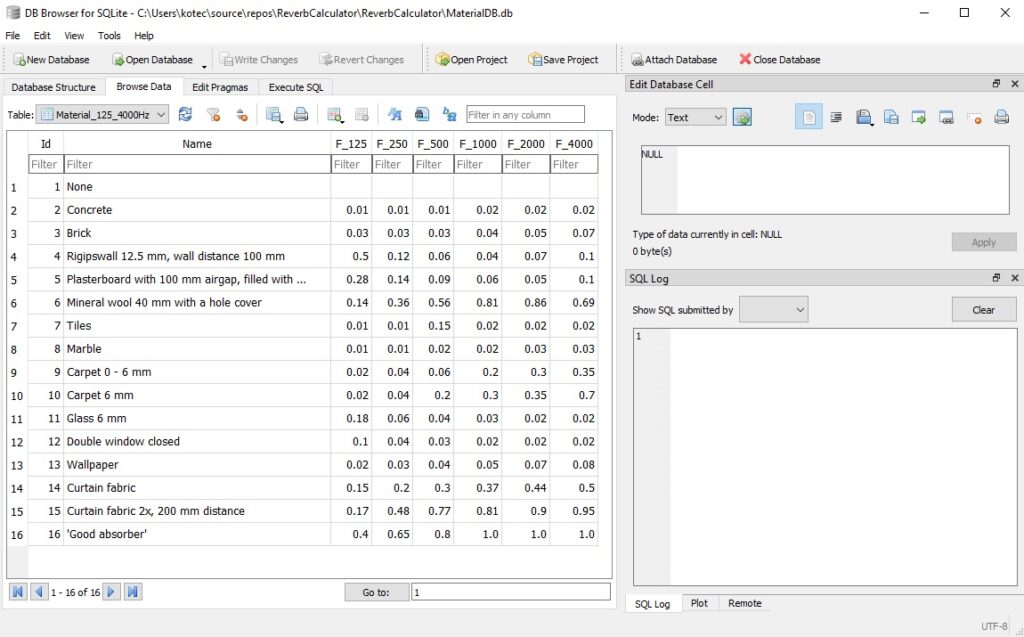
Die Auswahl der Oberflächenmateriale geschieht über ein Dropdownmenü, welches eine Liste verschiedener Materiale aus einer aktuell noch provisorisch angelegten Datenbank ausgibt.

Dropdown-Liste mit unterschiedlichen Materialen

Die Datenbank wurde mittels SQLite angelegt und in das Programm implementiert. SQLite ist eine kompakte SQL-Lösung, die sich hervorragend für lokal angelegte Datenbanken eignet und ohne Webserver auskommt.

Datenbank mit Materialen in SQLite

Der Kern der Kalkulation basiert auf statistischen Nachhallzeitberechnungen nach Eyring bzw. Sabine, die ich in einem meiner früheren Blogposts bereits behandelt habe. Man kann manuell zwischen der Berechnung nach Eyring bzw. Sabine auswählen. Graphisch wird die Nachhallzeit mit dem .NET-Framework OxyPlot, das praktischerweise auch mit Avalonia kompatibel ist, ausgegeben.

Das Programm funktioniert bereits im Kern, es gibt allerdings noch einige Sachen, die überarbeitet und verfeinert werden müssen für eine professionelle Nutzung:

  • Erweiterung der Bänder der Absorptionsgrade von Oktavbändern von 125 – 4000 Hz auf Terzbänder von 50 – 8000 Hz
  • Option zum Umschalten zwischen 125 – 4000 Hz und 50 – 8000 Hz
  • Automatische Auswahl zwischen der Eyring und Sabine-Berechnung je nach gemitteltem Absorptionsgrad
  • Manuelle Skaliermöglichkeiten des Graphen
  • Plotten des Graphen als PDF oder JPEG
  • Vergleich von Graphen mit verschiedenen Oberflächenkonfigurationen
  • Fehlermeldung bzw. Warnung, wenn Oberflächen der Materiale größer sind als die gesamte Raumoberfläche
  • Speicher- und Lademöglichkeit der Raumkonfiguration und der Berechnung
  • Manuelles Einpflegen und Speichern von Materialdaten
  • Auslesen von Materialdaten aus Excel-, CSV-Tabellen und SQL Datenbanken.
  • Überarbeitung des User Interfaces

Quellen:

https://www.afmg.eu/en/ease-enhanced-acoustic-simulator-engineer

https://avaloniaui.net/

https://docs.microsoft.com/en-us/xamarin/xamarin-forms/enterprise-application-patterns/mvvm

https://oxyplot.readthedocs.io/en/latest/index.html

Masterarbeit Evaluierung

Autorin
Eva Ganglbauer

Jahr der Veröffentlichung
März 2008

Universität
Institut für Gestaltung- und Wirkungsforschung der technischen Universität Wien

Titel
Möglichkeiten des User Interface (Re)Designs in späten Projektphasen

Art der Arbeit
Masterarbeit

Sprache
Deutsch

Seitenanzahl
88 Seiten

Gestaltungshöhe
Bei der Gestaltung der Arbeit würde ein Standardformat und Design gefällt, wie es in anderen Studiengängen üblich ist.

Innovationsgrad
Dieser Masterarbeit setzt sich mit dem Thema „Designprozess“ auseinander. Spannend ist es, dass diese Arbeit aus dem Jahre 2008 ist, aus einer Zeit, wo meistens die Softwareentwickler auch gleichzeitig die Designer waren. Das Ziel ist es Bewusstsein zu schaffen, dass Design eine wichtige Rolle in der Preproduction-Phase spielt.

„Ziel dieser Arbeit ist es, anhand der Auseinandersetzung mit dem Projekt und den theoretischen Grundlagen zu erörtern, mit welchen Aspekten Design in späten Projektphasen verbunden ist.“ (Eva Ganglbauer)

Selbstständigkeit
Es wurden Interviews und Meetings mit dem Kunden/Designer abgehalten. Während des Designprozesses wurden User-Tests durchgeführt.

Gliederung und Struktur
Die Gliederung und Aufbau dieser Masterarbeit ist klar und verständlich. Die erste Hälfte der Arbeit ist der Theorie gewidmet und die zweite Hälfte des Praxisbeispiels.

Umfang der Arbeit
Diese Arbeit setzt sich sowohl mit Theorie als auch mit der Praxis auseinander.

Orthografie und Genauigkeit
Die Autorin dieser Arbeit hat klar und verständlich geschrieben, sodass es auch für Personen nachvollziehbar ist, die sich beruflich nicht mit diesem Thema beschäftigen.

Literatur
Die Literatur wirkt auf mich vielfältig und gut recherchiert.

Master Thesis Evaluation

Title
Helping People Through the Grieving Process

Author
Danai Asteriadi 

University
The Estonian Academy of Arts

Degree and submission
Interaction Design, May 2021

Supervisors
Riina Raudne
Tanel Kärp
Nesli Hazal Akbulut 

Level of design
The design of the thesis accentuates the topic of mental health. It is friendly and easy to understand due to graphical support. However, viewed from a design perspective it is not particularly outstanding but rather the basic standard.

Degree of Innovation
The aim of the thesis which is to explore ways to help people through the grieving process is quite unique and rarely researched on I suppose. The outcome on the other hand is an interesting interactive board game that focuses on the time spent together while thinking of memories, which is a positive outcome but not necessarily innovative from my point of view. 

Independence
The author was intrinsically motivated to research on the topic, and was apart from inspiration completely independent.

Outline and structure
The outline and structure of this thesis are very good indeed, since it is based on the well-known double diamond design approach. It is a fluent order which makes a lot of sense in terms of understanding the methodology and the research process right up to the concept development of the author.

Degree of communication
At every section it is perceivable what the author means and wants to communicate. The language used is accurate yet colloquial. The content is enhanced by graphics and pictures which make it even more understandable.

Scope of the work
The thesis consists of 169 pages. To me it is well balanced, not too much, and not to little. For the aim of the author as well as for the reader the amount is perfectly sufficient. 

Orthography and accuracy
The thesis is very well written and it seems like there are no orthographical mistakes. I find the accuracy relative to the outcome of the board game totally fine as opposed to the research topic of the grieving process, which could’ve been described in a more accurate and scientific manner.

Literature
The author declares 53 references, which seem to be reasonably cited. The major content deals with design processes, and unfortunately the author has stated not too many references dealing with psychology.

Master thesis evaluation on reducing polarization in public debates

Title
Exploring perspectives in the public debate with emotional awareness: Design to reduce polarization

Name
Marieke van Dijk

University
Delft University of Technology, Design for Interaction

Date
2020-03-27

Level of design

The level of design is throughout the thesis, scientific poster as well as the presentation slides cohesive, clean and well-suited for the topic. The level of detail and variety of illustration ideas is really impressive.

Degree of innovation

Finding papers and thesis about polarization of public opinion is easy but finding possible theoretical or practical solutions is more difficult. In the section ‘strategies for depolarization’, she makes clear suggestions which are very useful for people working in the design field.

Independence

In several interviews with different people, such as experts in specific fields, journalists, and consumers. She held workshops with study colleagues and asked people on the streets for their opinion.

Outline and structure

A lot of different layout characteristics are used to structure the mass of findings she displays in her thesis. Her structure seems to be good but since her research as well as the description of the artwork is very detailed, the mass of information is kind of overwhelming. But a lot of highlighted text, illustrations, graphs and icons make it easier to access the needed information quickly.

Degree of communication

She explains every section and structures each section into sub-categories. The paragraphs are mostly divided into smaller parts which makes reading more delightful and easy to jump into a topic. In my opinion it is even a bit too much division, illustrations, graphs and quotes. It is interesting to look at and maybe read a passage here and there, but it feels more like an illustrated book rather than a scientific thesis. But I guess this look and feel was done on purpose.

Scope of the work

The scope of the work is probably a total overshoot. Next to her 104-page long thesis document which tons of self-made illustrations and graphs she made a website as a workpiece well-designed workpiece.

Orthography and accuracy Literature

In her literature you can find a lot of books and papers from other universities. Some of her literatures though, are older (from the 80’s and 90’s) and might not be suitable for today.

Source

https://repository.tudelft.nl/islandora/object/uuid:4ae735cb-989a-4a0e-911a-5079334dab36?collection=education

Master Thesis Evaluation

I chose this thesis for my evaluation because I have been doing a lot of research on this topic myself during the last three semesters. Because most of the theses in this field are either focusing on the engineering or development of human-machine interfaces in cars, I was really happy when I found the following thesis.

Title
Driver-centered Human-machine-interface design for a better takeover experience in level 4 automated driving

Author
Xinyi Wang

University
Delft University of Technology, Faculty of Industrial Design Engineering

Degree and submission
MSc Design for Interaction, April 2020

Supervisors
Chair of the supervisor team – Elmer van Grondelle
Mentor of the supervisor team – René van Egmond
Company supervisor – Wouter Kets

Level of design

For evaluating the level of design, I will rate the design of the thesis itself (layout) and the design of the final project (prototype) separately.

The level of design of the layout is good, but there are a lot of smaller things that would need improvement for it to become an excellent design. Even though the author designed some of the graphs and tables on her own, most of them were not designed at all and did not fit into the layout. The usage of different styles of images and illustrations for the same purpose was also not ideal for me. But the biggest problem I had with the design of the thesis is that there were different graphs and figures with a lot of text that was way too small to be readable. I sometimes even had to zoom in to more than 200% to be able to actually read them. One positive aspect of the layout was the usage of different colors for the literature study (yellow) and the project (purple). Based on all these factors, I would still rate the level of design as good with room for improvement.

The final design of the prototype can also be described as good with some very good elements. Because the design of the final prototype is using a lot of elements I have already seen in interfaces from popular car manufacturers, it’s probably not the most innovative interface I have seen, but I think that it fits the purpose of this project and works very well for doing user tests.

Degree of innovation

Even though the design of the final prototype is not really innovative for me, the degree of innovation of the rest of the thesis is really good. She did a lot of user research early in the project. She even asked five different experts from the field of autonomous driving, did a questionnaire with 28 drivers that have been using automated driving features regularly, and she also interviewed drivers about their experiences with the Tesla autopilot. Based on these results she then facilitated a creative session with four students from her degree to develop different concepts. These concepts were then evaluated and rated by 13 experts from different related fields. The best concept was then improved by her through an iterative design process. She even built a really nice prototype for her user testings. All in all the degree of innovation for me is very good.

Independence

Because this thesis was written as part of the MEDIATOR project, it is really hard for me as an external reader to evaluate the independence of this thesis. The only thing I am sure of is that the topic was not chosen independently, because it was based on a project brief of the company behind this EU-funded project. It is also really hard to evaluate if the ideas and concepts were based on her ideas because she facilitated a creative session with four more students for this purpose and got a lot of feedback from users and experts during the course of this project. Based on her reflection she was doing the project individually from start to end and was in charge of everything and it was quite challenging for her. Even though it is hard to tell if she tells the truth, I believe her and would rate the independence of this thesis as good.

Outline and structure

The general structure of this thesis makes a lot of sense to me. The introduction also includes her main research question and the objective of the project, but there was no additional information about her motivation or the problem that she wants to solve with this thesis. One highlight of the introduction for me was that she based the structure of her thesis on the double diamond design process starting with the project brief and ending with her graduation with all the chapters of the thesis in-between. The chapters were also done in a logical order and every chapter had a small summary at the beginning. My personal favorites however are the conclusion and the personal reflection of the author at the end of the thesis.

Main research question
When is it needed to communicate what kind of information and how to communicate the information with the driver during takeover?

The objective of the project
Design the HMI of autonomous vehicles in order to enhance situation awareness for a better take over transition/journey.

Degree of communication

The degree of communication of this thesis was one of the things I did not like as well. Even though there was a list with abbreviations, I sometimes had to get back to this list because she used so many abbreviations I have never seen before. Because I have already written different blog articles about Autonomous Driving, I was able to understand it but I am also sure that most of my colleagues would have had some trouble with understanding this thesis.

Scope of the work

Am I sure that the author spent a lot of time working on this thesis because she gathered a lot of data from different users and experts and qualitative research is always a lot of work. Her thesis is also 100 pages long, including a lot of empty pages or pages with not a lot of content on them. But for me, it also looks like she was not very keen on doing the literature study because this part is really short and does not have a lot of information in it. A lot of topics from this part could have benefitted from more detailed descriptions and more context.

Orthography and accuracy

The orthography and accuracy of the thesis are ok, but they are definitely not great. Even though I was not able to find any big mistakes while reading through this thesis, I was able to find a lot of small grammar mistakes and typos in there. Some of the sentences were also structured in a weird way but still ok for readability and understandability. The research question, for example, looks like it was written in another language and then translated into English.

Literature

The usage of literature was the most confusing part of this thesis for me. Even though she listed 32 different sources for her thesis and also did a lot of qualitative research with users and experts from the industry, I was not able to find any sources for most of the figures and tables she used. A lot of paragraphs in her literature study also did not mention any sources or were describing tables and figures without sources. The only positive aspect of her literature list is that she used a lot of books and journal articles and only a few online resources.

Thesis evaluation: Compendium of Persuasive User Experience Design Techniques

Title: Compendium of Persuasive User Experience Design Techniques
Author:  Bc. Miroslav Kolesár
University: Masaryk University Faculty of Informatics
Year: 2017

Die vorliegende Masterarbeit behandelt ‘Persuasive Design’ und dessen psychologischen Hintergrund. Ich habe sie gewählt, weil dies ein Teil meiner Masterarbeit sein wird. 
The Master’s thesis is about ‘Persuasive Design’ and its psychological background. I chose it because this will be part of my Master’s thesis.

Gestaltungshöhe / Level of design
Die Masterarbeit ist graphisch nicht an das Thema angepasst. Es scheint eher eine Standardvorlage für wissenschaftliche Arbeiten zu sein. Der Text ist gut lesbar, der Zeilenabstand etwas zu gering. Manche Bilder sind im Text eingebunden, andere sind im Anhang nachzuschlagen. Das stört den Lesefluss.
The Master’s thesis is not visually adapted to the topic. It seems to be more of a standard template for scientific papers. The text is easy to read, but the line spacing is a bit too small. Some pictures are embedded in the text, others have to be looked up in the appendix. This disturbs the reading flow.

Innovationsgrad / Degree of innovation
Die Arbeit beleuchtet Persuasive Design Techniken von Grund auf. Die Inhalte sind zwar gut recherchiert und übersichtlich dargestellt, kommen jedoch in meinen Augen nicht über eine Zusammenfassung hinaus: Eine innovative, ungewöhnliche Perspektive auf das Thema finde ich weder im theoretischen noch im praktischen Teil.
The work examines persuasive design techniques from the ground up. The content is well researched and clearly presented, but in my eyes it does not go beyond a summary: I do not find an innovative, unusual perspective on the topic in either the theoretical or the practical part.

Selbstständigkeit / Independence
Ein praktisches Beispiel einer Webseite taucht in allen Kapiteln zur Veranschaulichung auf. Ich schätze, dass das die Arbeit des Autors ist, was auf seine Eigenständigkeit hindeutet. Inhaltlich nimmt er in der Arbeit immer wieder Bezug zu anderen Wissenschaftlern. Eine Überprüfung dieser Bezüge und seine eigenständige Sichtweise tauchen erst am Schluss auf. 
A practical example of a website appears in all chapters for visualising the written content. I guess this is the author’s work, which indicates his independence. In terms of content, he repeatedly refers to other scientists throughout the work. A review of these references and his independent view only appears at the end.

Gliederung und Struktur / Outline and structure
Durch das oben genannte Beispiel (Webseite zur Veranschaulichung) lässt sich ein roten Faden in der Arbeit gut erkennen. Der Autor baut zu Beginn seine Kapitel logisch aufeinander auf. Im Mittelteil sind mir ein bis zwei Kapitel aufgefallen, die nicht unbedingt in den Lesefluss passen. 
The example above (website for visualisation) makes it easy to see a common thread in the work. At the beginning, the author builds up his chapters logically. In the middle section, I noticed one or two chapters that do not necessarily fit into the reading flow.

Kommunikationsgrad / Degree of communication
Der Autor nutzt eine recht informelle Schreibweise. So wird zum Beispiel oft in der Ich-Person oder der Wir-Person geschrieben. Damit ist der Text leicht verständlich und gut lesbar – als wissenschaftlich würde ich ihn aber nicht unbedingt bezeichnen. Es werden Argumente teilweise nicht zu Ende geführt. Inhaltlich fehlt der Arbeit in meinen Augen eine ausführliche kritische Reflektion über dieses doch sehr ethische Thema/Problem – sie wird zwischendurch nur angerissen.
The author uses a rather informal style of writing. For example, he often writes in the first person or the we-person perspective. This makes the text easy to understand and read – but I would not necessarily call it a scientific writing style. Some arguments are not taken to their logical conclusion. In terms of content, I think the work lacks a detailed critical reflection on this very ethical topic/problem – it is only touched in some sections in the middle part.

Umfang der Arbeit / Scope of work
Der theoretische Part ist umfangreich und ausführlich recherchiert. Das Testing und der praktische Teil am Ende sind dagegen sehr kurz und oberflächlich gehalten. Es fehlt eine ausführliche Reflektion sowie Ausblick auf die Zukunft.
The theoretical part is comprehensive and researched on a broad scale. On the contrary the testing and practical parts at the end are very short and superficial. There is no detailed reflection or outlook on the future.

Orthographie sowie Sorgfalt und Genauigkeit / Orthography and accuracy
Der Autor hat einen sehr gut verständlichen und lesbaren Satzrhythmus. Ich habe sehr wenige Satzfehler gefunden. Die Fußnoten sind leider nicht direkt auf der Seite sondern nur im Anhang zu finden. Im Bildverzeichnis fehlen die Quellen gänzlich. Zu Beginn gibt es leider keinen Gender-Hinweis und die User werden durchgehend als ‘he/him’ bezeichnet.
The author has a very understandable and readable sentence rhythm. I found very few typo errors. Unfortunately, the footnotes are not directly on the page but only in the appendix. In the list of images, the sources are completely missing. Unfortunately, there is no gender reference at the beginning and the users are referred to as ‘he/him’ throughout the work.

Literatur / Literature
Der Autor hat breit recherchiert und aktuelle sowie etablierte Quellen genutzt. Er hat mehr online Artikel/Quellen als Bücher genutzt, was für die Thematik jedoch nachvollziehbar und gerechtfertigt ist.
The author has researched on a broad scale. He used current and established sources. He has used more online articles/sources than books, which is understandable and justified for this topic.

Speculative Design

The design that surrounds us in everyday life is partly limited by its practicality. His goal is, first of all, to solve current problems, or at least to make the world a little brighter. But in 2021, that’s not enough. In an era of rapid technological development, this approach is becoming a form of denial of all the difficulties and challenges that the future presents for us.

Speculative design is one of the most interesting areas. Its purpose is to simulate possible scenarios for the future. Speculative design tends to question the things we are used to and ask strange questions: what if we give up our inalienable rights and freedoms in favor of the state? What if gadgets control our behavior? What if, instead of a human child, a woman decides to give birth to a shark? Sounds intriguing, right?

What is speculative design?

Speculative design emerged in the early 90s as a result of the fusion of discursive and critical design approaches. A relatively new phenomenon, it has managed to become a major platform for discussion of ethical, cultural, social and political predictions and consequences in a short time.

In Speculative World, pioneers Anthony Dunn and Fiona Raby say that speculative design owes its success to imagination. Working on such projects, designers get complete creative freedom. They are constantly looking for new solutions, since the goal of speculative design is to create products and services for different scenarios in the “What if …?” Style.

Practice shows that creatives prefer to reflect on the most terrible situations in which society may find itself in the future. We hope their projects will help make this world a better place.

5 impressive speculative design projects

Facestate

Facestate is a research project by the Amsterdam-based design studio Metahaven that criticizes contemporary liberalism.

On Facebook, we talk a lot about the importance of human rights and freedoms, we often share publications about the non-interference of the state in the economy, and we love posts about the free market. However, the most popular social network in the world is not going to follow these principles. Facebook is fighting for a monopoly and, having bought up WhatsApp, Instagram and a dozen other large companies, daringly changes the terms of user agreements in its favor.

The implications of Facebook’s influence on our lives in the Facestate project are described down to the smallest detail. What if this social network becomes an independent state that brings social contract theory to life? After blindly accepting any user agreement, we allow Facebook to control social processes.

To demonstrate what happens if people give up their rights in favor of a hypothetical state, the designers created the identity of the fictional state Facestate with a passport, a facial recognition device, a digital wallet and other attributes of the concept.

Metahaven’s Facestate / Walker

I Wanna Deliver a Shark

According to the non-profit organization Forum for the future, the world’s population will grow by another billion by 2025. This figure is staggering and alarming, but Japanese designer Ai Hasegawa did not lose her head and came up with a bold solution to the problem.

She suggested that in the future there will be alternative technologies that will allow women aged 30-40 years to carry and give birth to animals of endangered species. Thus, with the help of biomedicine, we can avoid overpopulation and use the reproductive capabilities of women for the benefit of humanity.

At first glance, the project seems like a fantasy of a mad scientist, but Ai Hasegawa’s theory is based on scientific evidence. The designer conducted research and developed a scheme by which this project can be put into practice.

In case, she have the project “I wanna deliver a dolphin” as well.

I Wanna Deliver a Shark / Ai Hasegawa

Natural history of Enigma

Eduardo Katz is a designer working on projects at the intersection of art and science. Its goal is to give biotechnology a poetic and philosophical meaning. For example, in the project “Natural History of Enigma” he traces the relationship and the possibility of combining different species of animals and plants.

It took the designer five years to create a new form of life – the genetically modified Edunia flower – a hybrid of petunia and the artist’s own DNA. The red veins on the flower are like veins, and the petals are colored in the color of human skin.

Although many questions arise regarding the realism of such a future, the project itself went far beyond the imagination and became a full-fledged scientific experiment, which scientist Neil Olszewski helped Eduardo to implement.

Thesis Evaluation – How digital Developments impact Brand Uniqueness

Title: How digital Developments impact Brand Uniqueness

Subtitle: A Case Study on Personalization and Brand Equity MASTER THESIS

Supervisor: Univ.-Prof. Dr. Oliver KOLL Department of Strategic Management, Marketing and Tourism

University: The University of Innsbruck School of Management

Author: Philipp JUEN, B.A. Innsbruck, May 2019

This thesis has only some similarities to Janina Schindlers and my thesis, but it was the closest I could find. It was done for a Strategic Management, Marketing and Tourism major, not a design-related discipline.

Level of design

The Master-Thesis has a pretty basic, standard design. It’s just done with Microsoft Word and there was clearly no focus on any further aesthetics needed.

Degree of innovation

Since it is a case study it is more of a representation of the state-of-the-art in the year 2019.

Independence

Philipp Juen wrote his thesis without company support (he was not paid for it or anything) and without any other team members. There was just the support of his family and his supervisor Univ.-Prof. Dr. Oliver KOLL. In addition, it is clearly visible in the work that the author has given his own thoughts to the researched topic and was thus able to present the connections.

Outline and structure

The work is well structured. Nevertheless, there is a major structural ambiguity. In my opinion I think it is better to place the list of tables, list of figures etc. at the end of the thesis and not in the beginning.

Degree of communication

Basically, the level of communication can be classified as good. Clear definitions of terms are given in the right place. This guides the reader well through the topic. However, there are some chapters in which many visual facts are described that could be made easier to understand with the support of pictures or graphics.

Scope of the work

I consider the total length of 93 pages to be appropriate for a master’s thesis. The topics are presented precisely and comprehensively.

Orthography and accuracy

Spelling as well as grammar, sentence structure etc. are in order. There are no serious errors to be found.

Literature

The number of sources used seems appropriate. The ratio of online sources to specialist literature (clear predominance of specialist literature) is also okay. However, the bibliography could be clearer, despite the alphabetical order (e.g. by dividing it into books, journals, etc.).

Thesis Evaluation – Mobile Map Applications Analyse und Evaluation von mobilen Kartendiensten bezüglich Interaction Design und Usability

The master thesis was written to create a catalogue of measures for the app „qando“, a mobile information service of the public transportation provider in Vienna to improve the usability.

Title
Mobile Map Applications –
Analyse und Evaluation von mobilen
Kartendiensten bezüglich Interaction Design und Usability“

University and year of publication
Univerisät Wien, 2014

Level of Design
The design of the work is not really special. It is well organized but the appearance is more like a scientific work and not special designed.

Degree of innovation 
The outcome of the thesis is not an innovation but more a statement about an existing app.

Independence
He work is done independence but with the focus on the app “qando”.

Outline and structure
The work is clearly structured and follows a red line. First the current state is defined and also a comparison with another app is done. Afterwards the testing is very well explained and in the end the outcome is written down.

Degree of communication
The structure is clear and easy to understand. The red line is well followed and the different modules with their submodules make the thesis easy to understand.

Scope of the work
It takes 40 pages to talk about qando the first time but then the testing is written in 4 pages. This is a bit short in my opinion and could have been a bit more detailed. But then the outcome is explained very detailed again. In total the work has 131 pages which is quiet a lot.

Orthography and accuracy
Pictures are all explained and sources are named. The language is in German and good, sometimes the sentence are a bit long.

Literature
There is a lot of literature uses, some are pretty old (from 1995, 1998) and some newer. There are no internet resources named so it seems like only offline literature is used.

Tilman Franz Harmsen. 2014. 

„Mobile Map Applications –
Analyse und Evaluation von mobilen
Kartendiensten bezüglich Interaction Design und Usability“

Universität Wien