Electric Vehicles (EV)

An electric vehicle is a vehicle that is powered entirely or partially by electric motors. The term electric vehicles is an umbrella term for all electric vehicles – E-Scooters, E-Bikes, E-Cars and E-Trucks.The biggest advantage of EVs is that they have a huge potential to significantly reduce pollution in the long term. There are already a lot of different types of electric vehicles on the market. Each type has its own advantages and disadvantages. Most of the following types are currently only available for cars, but some of them are also available for trucks.

Mild Hybrid

Mild hybrid cars use an electric motor, powered by a small battery. This motor is only used to provide assistance to the petrol or diesel combustion engine. It is providing additional power during accelerations and helps to make the powertrain more efficient. Mild hybrid cars cannot run purely electrically but they reduce the fuel consumption and emissions, especially in heavy traffic. The small battery is solely recharged by regenerative braking. Mild hybrid cars are currently sold by nearly every automaker but most consumers don’t really know it.
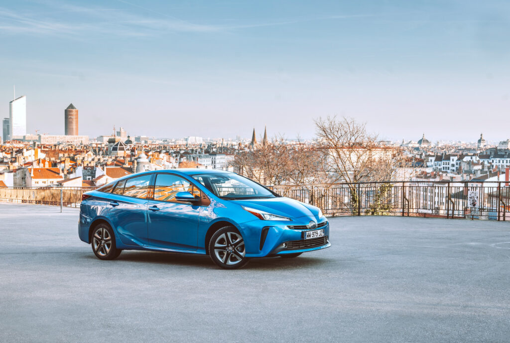
source: https://www.volvocars.com/at/v/cars/xc90

Full Hybrid

Full hybrid cars are also called self-charging hybrids. They are using a combination of an electric motor and a conventional combustion engine. Depending on the situation, these engines can work together or independently. That means that fully hybrid vehicles can also drive fully electric or fully on diesel or petrol. But most of the time the system of the car is intelligently distributing the power between the two engines to deliver the best and most efficient result. Pulling away and driving at low speeds is mostly done electric, while the combustion engine is more efficient when cruising on highways. For quick acceleration both motors can also combine their power and work together. The battery of self-charging hybrid cars can be charged by regenerative braking, like the mild hybrid car, or by the combustion engine itself. That is the reason why full hybrid cars do not need to be plugged in at all. Full hybrid cars are also offered by a lot of different automakers. But the most popular, especially for taxi drivers, self-charging hybrid that nearly everybody knows is the classic Toyota Prius.

source: https://newsroom.toyota.eu/media-library/

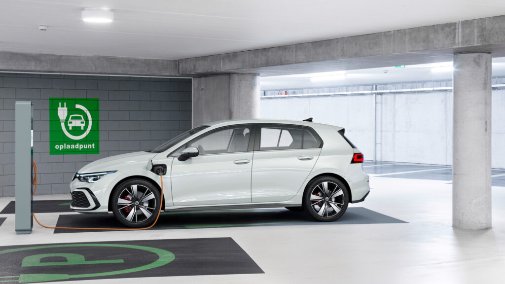
Plug-in Hybrid (PHEV)

The plug-in hybrid is a more advanced version of the classic full hybrid car. Most of the time, plug-in hybrids also offer the driver different modes to choose between power sources for themselves. In addition to that, they also offer larger batteries and therefore also allow the driver to drive longer distances fully electric. Because of these larger batteries, plug-in hybrid vehicles have to be plugged in to a charger to be able to fully charge the battery. While short trips like daily commuting and shopping can be done fully electric and emission free, plug-in hybrids also allow long trips without charging the battery by mainly using the combustion engine. Popular plug-in hybrid powered cars include the VW Golf GTE, Hyundai Ioniq and a lot of different models from Audi, BMW and Mercedes with the small letter “e” in the model identification.

source: https://www.volkswagen-newsroom.com/de/bilder

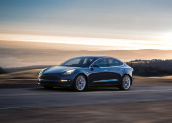
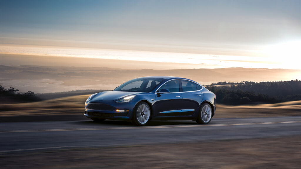
Battery Electric Vehicles (BEV)

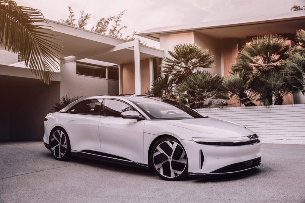
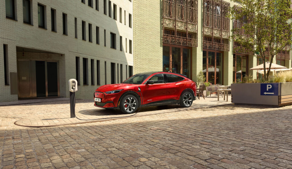
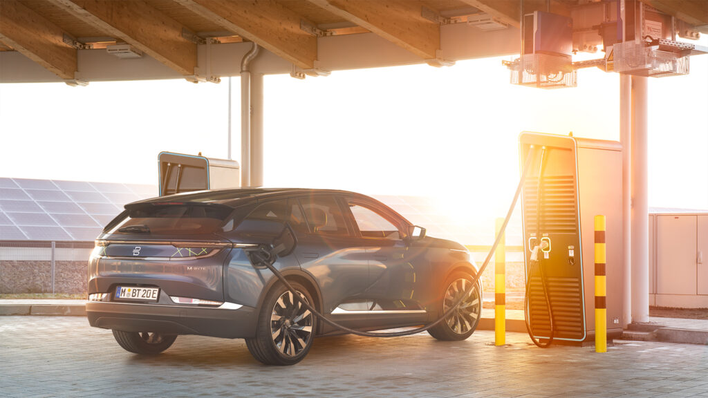
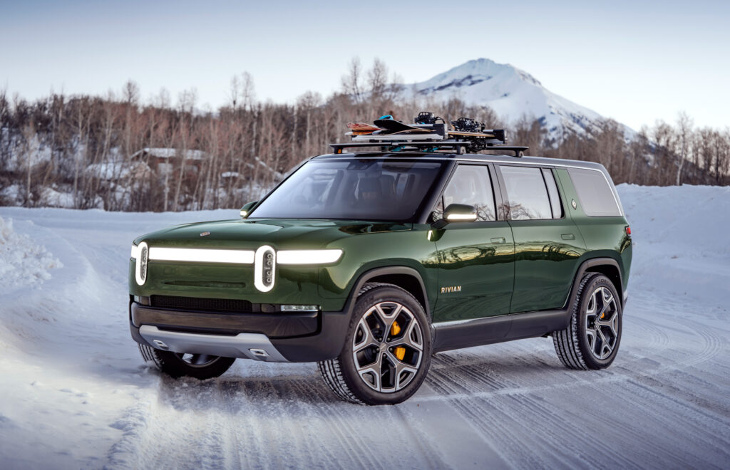
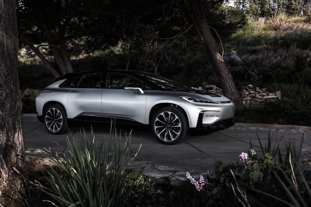
Battery electric vehicles are also called pure electric vehicles or fully electric vehicles. Most people also refer to BEVs when talking about electric cars, even though there are a lot of different types of electric cars. Battery electric vehicles do not include a conventional combustion engine. They are solely powered by electric motors and large batteries and therefore also need to be charged with dedicated chargers at home, work or during a trip. While BEVs can be more expensive to buy than equivalent combustion or hybrid cars, they are cheap to run on a daily basis and also offer emission free traveling. Because battery electric vehicles need to be charged to be able to drive, they also rely on the availability of charging infrastructure, especially during longer journeys. The most popular automaker for BEVs is Tesla. The Tesla Model 3 is also the battery electric car with the most units sold, followed by the Nissan Leaf, Tesla Model S and Renault Zoe. New models with this type of powertrain are announced nearly every month and include the Audi e-tron GT, Ford Mustang Mach-E, Polestar Precept, BMW i4, VW ID.4, Hummer EV, Lucid Air/SUV, Rivian R1S/R1T, Byton M-Byte, Lightyear One, Faraday Future FF91 and the Tesla Cybertruck.

Fuel Cell Electric Vehicles (FCEV)

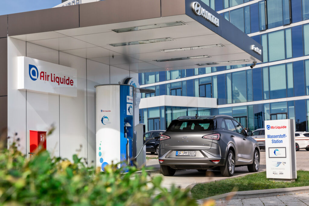
Fuel cell electric cars are also powered fully electrically, but they do not need to be plugged in to a charger. The fuel cells in these cars are using hydrogen from the on-board tank and oxygen from the air to generate electricity. Because the only waste product from this process is water, FCEVs are also considered as zero emission vehicles. While these on-board tanks have to be refilled only every few hundred miles and the process is much faster than the charging process from battery electric vehicles, the hydrogen refueling infrastructure is very limited at the moment. Another disadvantage of fuel cell electric vehicles is that they are more expensive compared to other types of electric vehicles and that there is just a limited amount of models available. The most popular fuel cell cars currently on sale are the Hyundai Nexo and Toyota Mirai. Mercedes-Benz also had the GLC F-Cell on sale but they stopped the production earlier this year. Hyundai is currently also testing trucks in Switzerland that are using two fuel cells of the Hyundai Nexo.

source: https://www.hyundai.news/de/pressemappen-modelle/gallery/images/7/Nexo/

Resources:

https://www.austrian-mobile-power.at/export/sites/www.austrian-mobile-power.at/.galleries/Factsheets/Austrian_Mobile_Power_Factsheet_02_Antriebsarten_E-Fahrzeuge.pdf

https://www.edie.net/definition/Electric-vehicle/134

https://www.marketwatch.com/story/what-is-a-mild-hybrid-electric-assist-not-electric-power-heres-how-they-work-2020-09-23

https://insideevs.com/news/447165/see-best-selling-battery-electric-cars/

https://www.digitaltrends.com/cars/hydrogen-cars-for-sale/

https://www.pocket-lint.com/cars/news/140845-future-cars-and-upcoming-electronic-cars-of-the-future-coming-soon

Still life has a life of its own II

Still life photography is an area that requires an excellent eye for light and composition. There are already many excellent examples of the arrangement and staging of a still life in photography. If that is not enough for you, it is advisable to take a look at the history of still life painting. If you only know the classics and their rules, it is easier to achieve successful results in photography.

The lack of recognition for still lifes has always been a problem, since for many people they are only seen as copies, practically without any creative effort. This medium is often criticized, especially in photography. Because arranging inanimate objects and then taking a photo of them does not count as an artistic personal contribution for many, because theoretically one would have little effort in this endeavor. The lack of artistic imagination also contributes to the criticism of the still life. However, the still life lives from the magic of inanimate objects that arise between mimesis and symbolism.

Idea

Many modern still life photographs are very unique in their concept and execution. In order to understand the variety of different designs and their basic ideas, it is very advisable to deal with examples. Photography offers the designer the possibility of almost 1: 1 reproduction, which painting has been striving for for centuries. One is limited to the truthful appearance of the motifs. Of course, these can be abstracted to a certain extent on the basis of change or exposure to light. The modern still life tries less to aim for a true-to-original image than to create a meaningful and surprising staging.

Still life as practice

Thanks to the rigid lingering, the still life offers itself as an exercise motif. Whether painting or photography, taking pictures of the still objects seems easier for us and offers space to practice the creative craft without any time restrictions. Still life was part of the classical art class and got an upswing due to the continuous technical improvement of the cameras. In addition, the current social media world makes almost everyone a still life photographer. The need to photograph and post one’s possessions, food or found objects is stronger than ever. On the other hand, the symbolic content of these fast-moving forums declines, and the mass of representations reduces the viewer’s desire to decode each work with the greatest of accuracy.

Design Activism – Good news for the planet

„If things are bad, that’s good.” – Bruce Mau

Because when things are bad, then people seek a solution. And this is especially true for designers, who feel the urge and obligation to take action and find a solution when complex problems arise. 
Above all, things are really bad when we have a look at climate change. Fortunately, there are designers out there, who take their responsibility to make an impact and develop solutions for the good.

In this blog post I want to introduce a few innovative projects for climate action. The platform “WHAT DESIGN CAN DO”, which has already published several books and articles on the subject, presents various brilliant ideas in its book “Good news for the planet. 31 brilliant ideas for climate action.”. The aim of this publication is to raise awareness for climate action, adapting to the consequences of change, and mitigating the causes. The following are examples which are illustrating the power of design to bring about change. 

01: Plastic waste can be made prettier 

Project: Pretty Plastic Planet
By: Reinder Bakker, Hester van Dijk and Peter van Assche, Designstudio’s Overtreders W
and bureau SLA 
Country: Netherlands
Discipline: Product Design, architecture
The Story of Pretty Plastic – from waste to resource: How it started

The first project, which the designers Reinder Bakker, Hester van Dijk and Peter van Assche from the designstudio’s bureau SLA and Overtreders W did together, was a café in an Amsterdam park called, Noorderpark, where all the materials were bought second-hand on the internet. 

Another co-production of the collaborating designers is a self -built Pretty Plastic Plant with idea of upcycle plastic waste. It started when they got hold of a shipping container full of household plastic garbage, where they immediately knew that this is more than just waste. They saw the potential of a beautiful building material and designed a tile from upcycled plastic. The designers visited the best plastic product producers in the Netherlands to present their design of the building tile, but there was only little interest.
To prove that plastic upcycling can be competitive and have identity and character they designed and built their own machine park – the Pretty Plastic Plant. Their solution is simple: sorting plastic household waste carefully by type and color before it is processed, it can become to a stronger and brighter result than the original product. Anyone who brings their plastic garbage to this hands-on recycling site can witness the whole transformation process from scrap to product.

For different interior design projects, the Pretty Plastic Plant produced more than a thousand unique tiles, what led to a n even greater project. In 2017, they designed the cladding of the facade of the main pavilion for the Dutch Design Week, the People’s Pavilion. It consisted of 9.000 unique plastic upcycled tiles, all made from resident’s household plastic waste. After that, the Belgium recycling company Govaplast became Pretty Plastic’s production partner and engineered the production.

Temporary recycling architecture: The People’s Pavillon in Eindhoven

Since 2019, Pretty Plastic tiles can be applied onto any building. In January 2020, the first new building with cladding of Pretty Plastic tiles was delivered. 

Sint Oelbert School in Oosterhout with cladding of Pretty Plastic tiles

02: Crazy Experiment to sway investors 

Corporate Knights – The Voice for Clean Capitalism 

Toby Heaps’ mission is to push companies to adopt more environmentally conscious practices. He is founder and CEO of Corporate Knights, which is a media and research company in Toronto founded in 2002. One of his tools is the Magazine for Clean Capitalism `Corporate Knights`, distributed quarterly as an insert in the Globe and Mail and Washington Post

Heaps sees ‘Corporate Knights’ as kind of a crazy experiment to see if it makes a difference and people will start to take better decisions when the right information is getting into the right people’s hands. Since 2005, the magazine is ranking the world’s 100 most sustainable companies as key strategy in shaping corporate culture. Today, ‘Corporate Knights’ is also known as a lobby group and a platform for such initiatives as the Council for Clean Capitalism, a multi-industry group of leading Canadian companies dedicated to advocating economic and social policy changes that reward responsible corporate behaviour and remove barriers to clean capitalism.

The vision of Corporate Knights is to provide information empowering markets to foster a better world. As one of the world’s largest circulation magazines focused on the intersection of business and sustainability, Corporate Knights is the most prominent brand in the clean capitalism media space. It is also the first print business magazine and research firm in the world to be a Certified B Corp. B Corps must meet rigorous standards of social and environmental performance, accountability and transparency. As an example, their website is powered by 100% renewable electricity from Canada.

03: Do for Nature what you did for Clients

“[…] If creative communications have persuaded us to consume in a way that impacts our planet for the worse, then it can be used to inspire us to try out things that have a more positive impact on the environment.”

This is what the online platform ‘Do the Green Thing’ by communication experts Andy Hobsbawm and Naresh Ramchandani stands for. They call for designers to get creative against climate change. The platform offers designers a chance to make a change for the world by doing the thing they do best – to get a message across to the public. Whether graphic designer, copywriter, animator, art director or photographer, everybody is invited being part of Doing the Green Thing. The aim is to use the power of creative work to make people pause, smile, think and act. Already more than 500 creatives contributed to this campaign by making films, posters, podcasts and products. 

With Do the Green Thing everybody has the chance to play one’s professional part in saving the planet. It is a public service for the planet that uses creativity to tackle climate change. More than 45 million people have been inspired to live more sustainably. 

Going Back West, Pt. 3

Der Italo-Western

Näher betrachtet wurden nun die Ursprünge des Westerns als Genre im zweiten und das Thema des Anti-Westerns im ersten Blogpost. In diesem Eintrag soll es nun um eine weitere klassische Spielart gehen: den Italo-Western. Unter diesem Namen – im Englischen auch als „Spaghetti-Western“ bezeichnet – versteht man Western-Produktionen, die vor allem durch italienischen Einfluss entstanden, und deshalb so benannt sind. Dabei kann es sich um gänzlich italienische Filme handeln – von Produktionsfirmen aus Italien, mit Drehplätzen vor Ort und italienischen Schauspielern – aber auch um Mischformen. Als das Besondere an den Filmen ist allerdings nicht der Italien-Bezug zu nennen, sondern die Stilistik, die von einem Namen maßgeblich geprägt wurde: dem Regisseur und Drehbuchautor Sergio Leone. Angefangen in den 1960er-Jahren mit dem Film „A Fistful of Dollars“ („Per un pugno di dollari“), wurden im Laufe der Jahre eine ganze Reihe an Western produziert. Leone hat bereits mit dem ersten Film der „Dollar-Trilogie“ („Trilogia del dollaro“) den stilistischen Grundstein gelegt für seine späteren Filme und Produktionen von anderen Regisseuren. Die Stilelemente gelten als wegweisend für den Italo-Western und waren auch prägend für das Western-Genre allgemein.

Abb. 1 – Still aus „The Good, the Bad and the Ugly“ (1966)

Ein besonderes Genre

Was aber sind nun diese stilgebenden Merkmale? Die visuelle Stilistik von Leone – mitentwickelt durch den Kameramann Tonino Delli Colli – speist sich aus den grandiosen Landschaftsbildern und extremen Nahaufnahmen der Darsteller in entscheidenden Szenen. Ein Element des Westerns ist seit jeher die Verortung im „unberührten Land“, welches in den Leone-Filmen in fast einzigartiger Weise eingefangen wurde und durch das damals verwendete Breitbild besonders gut zur Geltung kam. Inhaltlich war der Fokus in seinen Filmen und im Italo-Western allgemein klar; es sind Anti-Helden – ähnlich dem Anti-Western – die eine besondere Rolle einnehmen. Klassische Helden, die stets nach moralischen Grundsätzen handeln und nach höheren Zielen streben findet man hingegen selten. Damit wird auch ein Gegenentwurf zu den US-Western gezeigt, wo die die Hauptfiguren oft rein und selbstlos handeln. Im Spaghetti-Western sind die Figuren in der Regel schmutzig gezeichnet, sowohl in ihrem Handeln als auch ihrem Erscheinungsbild, was für eine Art „realistischere Darstellung“ sorgt. Trotz dieser Darstellung wurden die Handlungen im Film bewusst und gekonnt überzeichnet – sei es in den Schusswechseln und der übertriebenen Darstellung von Gewalt, mit vielen Toten usw.

Abb. 2 – Still aus „Once Upon a Time in the West“ (1968)

Musik als Baustein

Neben den bereits genannten stilistischen Merkmalen, spielt auch die Musik eine besondere Rolle in eigentlich allen Italo-Western. Die schon beschriebenen Landschaftsaufnahmen werden typischerweise mit großen Musikstücken untermalt, um ihnen noch mehr Emotionalität und Kraft zu verleihen. In anderen Szenen – besonders in den spannungsreichen Abschnitten, wie dem typischen „Showdown“ – wird die Musik auch ganz bewusst eingesetzt, die gezeigten Bilder in ihrer Dynamik nochmals zu steigern und zu erhöhen. Als Person hinter der Idee ist hier auf jeden Fall Ennio Morricone zu nennen, der zahlreiche Filmmusiken komponiert hat, die heute zurecht als Klassiker gelten. Durch seine Zusammenarbeit mit Sergio Leone wurde er bekannt und gilt für viele sogar als der einflussreichste Filmmusik-Komponist aller Zeiten. Seine Musik dient laut Leone in seinen Filmen als eine Art Erweiterung der Handlung und des Drehbuchs, die das sagt, was nicht explizit gezeigt wird. Als besonders eindrucksvoll sind hier die Musiken zu „The Good, the Bad and the Ugly“ („Il buono, il brutto, il cattivo“) sowie „Once Upon a Time in the West“ („C’era una volta il West“) zu nennen.

Quellen

  1. https://filmlexikon.uni-kiel.de/index.php?action=lexikon&tag=det&id=4002
  2. https://www.spaghetti-western.net/index.php/Einf%C3%BChrung
  3. https://de.wikipedia.org/wiki/Italowestern
  4. http://www.fistful-of-leone.com/
  5. https://www.britannica.com/topic/A-Fistful-of-Dollars
  6. https://en.wikipedia.org/wiki/Ennio_Morricone

The History of VR, AR and MR

1838: Sir Charles Wheatstone found that humans can only perceive 3D because the brain combines two photographs of the same object, but from different points. He later invented the stereoscope.

1935: Nearly 100 years later, sci-fi author Stanley Weinbaum presents a fictional model for VR. The story, “Pygmalion’s Spectacles,” is about VR glasses in which the character is fully immersed in an interactive environment when wearing them.

1956: Morton Heilig, a filmmaker and inventor, invented the Sensorama. It gave the feeling of an immersive 3D world. Six short films were developed for this booth and inside there were full-color displays, audio, vibration, smell and atmospheric effects like wind. 

1960: Four years later, Marton Heilig invents the first head-mounted display (HMD) called Telesphere Mask.

1961: Comeau and Bryan, both engineers, invent the first motion-tracking HMD. However, it was only used for the military to detect threats from a distance. After that, this technology was mainly used for the military because they had the money to fund it. It was then mainly used to build better flight simulators.

1968: Ivan Sutherland, a computer scientist, and Bob Sproull created the first virtual reality HMD. It was called “The Sword of Damocles.” It could only show simple virtual wireframe shapes, but they changed the perspective to the movement. That was the birth of AR. Because the device was too heavy, they had to strap it from the ceiling.

1969: Myron Krueger, a computer artist, created Glowflow, a succession to AR. The computer-generated environments could respond to the people in them.

1972: The General Electric Corporation built a computerized flight simulator. Using three screens, this simulator had a 180-degree field of view.

1975: Myron Krueger invented the first interactive VR platform VIDEOPLACE without the use of HMD or gloves. Through the use of projectors, video cameras, video displays, position sensing and computer graphics, the user could see the imitated movements of his silhouette.

1978: Aspen movie maps were developed. These maps were used to familiarize soldiers with remote locations. They made stop-motion images from a first-person perspective in a car. It was the first Street View version.

1979: McDonnell-Douglas Corporation integrated VR into an HMD. It was called the VITAL Helmet and was for military use only. To adjust the computer-generated images, the technology followed the pilot’s eye movements.

1980: StereoGraphics company invented stereo vision glasses.

1982: Sandin and Defanti invented the Sayre gloves. They monitored the movements of the hands. It is the beginning of gesture recognition.

1985: Thomas Zimmermann and Jaron Lanier founded VPL Research Inc. They were the first to sell VR glasses and gloves.

1986: Thomas Furness developed the Super Cockpit. It was the first flight simulator with computer-generated 3D maps. The pilot could control the plane through gestures, speech and eye movements. A year later, Jaron Lanier made the term “virtual reality” known to the public.

1989: Scott Foster founded Crystal River Engineering Inc. Through this company, real-time binaural 3D audio processing was developed.

1990: Jonathan Waldern introduces Virtuality. It was the first mass-produced VR entertainment system and was an arcade machine for gamers. That same year, Tom Caudell coins the term augmented reality.

1991: Antonio Medina, a NASA scientist, develops a VR system to control the Mars robot rovers. The company SEGA tries to release the first VR headset for the general public to buy, but it was never released because it was claimed that people could hurt themselves due to the VR effect being too realistic. However, the real reason could be that the processing power was too limited.

1992: Louis Rosenburg of Armstrong Laboratories, USAF, invents the first immersive mixed reality system, called Virtual Fixture.

1994: Paul Milgram and Fumio Kishino describe mixed reality as “anywhere between the extrema of the virtuality continuum.”

1995: Affordable VR headsets for home use were released

1997: Georgia Tech and Emory University created VR war zone scenarios for veterans to help them recover from PTSD.

2001: Z-A Production released the first PC-based cubic room. It was called the SAS Cube.

2007: Google introduced the Street View virtual map.

2010: Google adds stereoscopic 3D mode to Street View.

2012: Palmer Luckey develops the prototype of the Oculus Rift. He was 18 years old at the time.

2014: Facebook buys Oculus VR, Sony announces it is working on a VR headset, Google releases Cardboard, and Samsung announces the Samsung Gear VR.

2015: Since then, the technology has evolved significantly and is now used in many areas, from teaching to fighting diseases to gaming.

Sources:

  1. History of VR – Timeline of Events and Tech Development, Dom Barnard (06.08.2019), https://virtualspeech.com/blog/history-of-vr
  2. The History of Artificial and Virtual Reality AR/VR, o. A. (05.06.2020), https://avtsim.com/the-history-of-ar-vr/

AR: Commercial usecases

Arbibook

Arbibooks are children coloring-books that bring their pages to life with the help of AR. An AR application is generating 3D models of the 2D illustration and colors them in the painted style.

ARBI is a company, specialized in the development of educational projects such books and platforms based on Augmented Reality(AR) and Virtual Reality (VR). Their goal is to make learning fun again through the use of new technologies AR and VR.

Goggles ‘give back’ sight to Maisy so she can read again

The company “GiveVision” is developing wearable vision aid. Inspired by the latest developments in augmented and virtual reality technology,  “GiveVision” set out to create a device which would allow people with sight loss to regain much of their sight.

The british girl Maisy lost most of her vision six years ago due to a brain tumour. What vision she has, is limited to a tiny blurry circle in her right eye. 

https://www.bbc.com/news/av/technology-48501600

Sources:

https://www.givevision.net/en/about

https://www.bbc.com/news/av/technology-48501600

Arbibooks:

DATA, code, design | Daten-Visualisierung, Art + Science = ?

Definitionssuche

„Mit Visualisierung oder Veranschaulichung (Sichtbarmachen) meint man im Allgemeinen, abstrakte Daten (z. B. Texte) und Zusammenhänge in eine graphische bzw. visuell erfassbare Form zu bringen.“
https://de.wikipedia.org/wiki/Visualisierung

Data visualization (often abbreviated data viz[1]) is an interdisciplinary field that deals with the graphic representation of data. It is a particularly efficient way of communicating when the data is numerous as for example a Time Series. From an academic point of view, this representation can be considered as a mapping between the original data (usually numerical) and graphic elements (for example, lines or points in a chart). The mapping determines how the attributes of these elements vary according to the data. In this light, a bar chart is a mapping of the length of a bar to a magnitude of a variable. Since the graphic design of the mapping can adversely affect the readability of a chart,[2] mapping is a core competency of Data visualization. Data visualization has its roots in the field of Statistics and is therefore generally considered a branch of Descriptive Statistics. However, because both design skills and statistical and computing skills are required to visualize effectively, it is argued by some authors that it is both an Art and a Science.[3]
https://en.wikipedia.org/wiki/Data_visualization

Art + Science = Informationdesign?

Als Informations Designer und angehender Communication Designer trifft diese Definition den Nagel für mich auf den Kopf:

Information design is the practice of presenting information in a way that fosters an efficient and effective understanding of the information. The term has come to be used for a specific area of graphic design related to displaying information effectively, rather than just attractively or for artistic expression. Information design is closely related to the field of data visualization and is often taught as part of graphic design courses.[1] The broad applications of information design along with its close connections to other fields of design and communication practices have created some overlap in the definitions of communication design, data visualization, and information architecture.”
https://en.wikipedia.org/wiki/Information_design


Wenn man von solchen multidisziplinär erstellten Diagrammen spricht, spricht man meist von solchen:

  • Line chart  
  • Bar chart
  • Histogram
  • Scatterplot
  • Boxplot
  • Pareto chart
  • Pie chart
  • Area chart
  • Control chart
  • Run chart
  • Stem-and-leaf display
  • Cartogram
  • Small multiple
  • Sparkline
  • Table
  • Marimekko chart

Charles Joseph Minard

Wenn wir von Informationsgrafik sprechen wird oft auf den “Erfinder” Charles Joseph Minard (1781 – 1870) verwiesen. Minard gilt als „a cartographic pioneer in many respects“.

Bereits 1825 studierte Minard Passagierflüsse/Frachtflüsse im Schienenverkehr und hat hierzu Balkendiagramme angefertigt.

Minards erste statistische Grafik

1845 visualisierte Minard die erste und revolutionäre Flow-Map, welche von Edward Tufte als „vermutlich beste Infografik aller Zeiten“ bezeichnet wird. Sie zeigt den Straßenverkehr zwischen Dijon und Mulhouse.

Minards erste Flow-Grafik

Seine Infografik, später bekannt als Sankey diagram, zeigt Napoleons Russlandfeldzug 1812 in der „Carte figurative des pertes successives en hommes de l’Armée Française dans la campagne de Russie 1812–1813

“The original description in French accompanying the map translated to English:[5]
Figurative Map of the successive losses in men of the French Army in the Russian campaign 1812–1813.
Drawn by M. Minard, Inspector General of Bridges and Roads (retired). Paris, November 20, 1869.
The numbers of men present are represented by the widths of the colored zones at a rate of one millimeter for every ten thousand men; they are further written across the zones. The red designates the men who enter Russia, the black those who leave it. — The information which has served to draw up the map has been extracted from the works of M. M. Thiers, de Ségur, de Fezensac, de Chambray and the unpublished diary of Jacob, the pharmacist of the Army since October 28th.

In order to better judge with the eye the diminution of the army, I have assumed that the troops of Prince Jérôme and of Marshal Davout, who had been detached at Minsk and Mogilev and have rejoined near Orsha and Vitebsk, had always marched with the army.“
https://en.wikipedia.org/wiki/Charles_Joseph_Minard

Minards Infografik über Napoleons Russlandfeldzug

Wie man auf Social Media als Designer erfolgreich ist (Selbstversuch)

Präsent auf Social Media zu sein kann einige Vorteile mit sich bringen. Hat man eine gewisse Reichweite als Designer, kann man durch das Posten seiner Arbeiten und seines Designprozesses im besten Fall Jobaufträge bekommen und Geld verdienen. Allerdings werden vor allem durch die Änderung des Instagram-Algorithmus dem Nutzer einige Hürden gestellt, wenn es um den Ausbau der Reichweite und der Generierung neuer Follower geht.

Es gibt in Form von Büchern, Artikeln und anderem viele Ratschläge und Theorie dazu, wie man sich auf Social Media verhalten muss, am besten agiert und so schnell und effizient an Reichweite und Followern gewinnt. Ich möchte herausfinden, was hier zustimmt und welche Informationen einem wirklich helfen.

Es gibt unglaublich viel Konkurrenz auf den Plattformen. Sich abzuheben und auf sich aufmerksam zu machen ist sehr schwierig und erfordert vor allem Konsistenz, Persönlichkeit und hohe Qualität der Postings. Besonders im Punkto Persönlichkeit muss man sich selbst online zeigen, um Sympathie der Follower zu gewinnen, um sie auch längerfristig halten zu können. Das erfordert viel Selbstbewusstsein, Motivation und Mut, sich online so zu zeigen und auch bestimmte Dinge von sich Preis zu geben.

Mein Ziel ist es mit den in meiner Recherche ermittelnden Informationen und den danach angefertigten Zeitplan meinen Instagram Account zu pushen. Der Instagram Account wird voraussichtlich vorwiegend meine Tätigkeit und Projekte als Designer widerspiegeln. Meine Fortschritte, Erkenntnisse und Schwierigkeiten werde ich in Form eines Tagebuchs festhalten. Dadurch, dass ich Mittel aus meiner Recherche anwende, kann ich diese während diesem Selbstexperiments testen und bewerten.

Anfangs werde ich mich vor allem auf Instagram fokussieren. Mein Engagement auf dieser Plattform ist mit hohem Aufwand verbunden, jedoch findet man hier auch die meisten Quellen.


– Literatursuche –

Publikationen:

Follow me!: Erfolgreiches Social Media Marketing mit Facebook, Instagram und Co. Der Bestseller in der neuen 5. Auflage, Anne Grabs

Social Media Marketing – Praxishandbuch für Twitter, Facebook, Instagram & Co.: Mit Beiträgen von Thomas Schwenke, Wibke Ladwig und Tamar Weinberg, Corina Pahrmann

Social Media Marketing and Branding: The Micro MBA, Ankit Srivastava

In eigener Sache: Online-Marketing und Social Media für Kreative: Präsentieren Sie sich und Ihre Arbeiten im Web, Sébastien Bonset

Ideen schützen lassen, Thomas Wilmer

Kommunikationsrevolution Social Media, Michael Ehlers

Instagram-Journalismus für die Praxis, Selina Bettendorf
When Algorithms Shape Collective Action: Social Media and the Dynamics of Cloud Protesting, Stefania Milan

Developing a Model for Social Media in Project Management Communications, Herbert Remidez


Andere:
„how i DOUBLED my instagram growth + engagement !! (grow organically & fast)“
https://www.youtube.com/watch?v=FOU3lqbVP98

“So kommen Sie kostenlos an Instagram-Follower: 35 Tipps, die tatsächlich funktionieren“
https://blog.hootsuite.com/de/so-finden-sie-mehr-instagram-follower/

Zielgruppe: Beziehung zwischen Klängen und den kulturellen Zugehörigkeiten

Die Definition von Verbrauchergruppen hilft bei der “Quantifizierung” von Gruppen in messbare Einheiten, ein erster Schritt im Prozess der Bildung von Zielgruppen, deren Aufmerksamkeit an Werbetreibende verkauft werden kann. Durch Marktsegmentierung und demographische Analyse versuchen viele Werbetreibende Zielgruppen statistisch zu erfassen, um Strategien zur Steigerung des Verkaufspotenzials einer Anzeige zu erstellen.  Theoretisch verlassen sich Vermarkter auf demographische Statistiken, um ihre die Chancen zu erhöhen, dass eine Anzeige potenzielle Kunden erreicht, die in der Lage und bereit sind, eine bestimmte Marke oder ein Produkt zu kaufen. Das Definieren dieser “Zielgruppen” für Anzeigen, so glauben sie, konzentriert ihre Bemühungen und optimiert ihre Investitionen durch Verbesserung der Wirksamkeit der Werbung.

Auf der anderen Seite ist es jedoch relativ schwer eine gewisse Zielgruppe vorzugeben, durch die enorme Vielzahl an Einflüssen die täglich auf Menschen wirken. Die von den Werbetreibenden definierten Subjektpositionen überschneiden sich und schreiben wahrscheinlich Merkmale vor, die die komplexen Alltagserfahrungen der Menschen widerspiegeln können oder auch nicht.

Obwohl die Demografie immer noch eine Schlüsselrolle in der Praxis der Werbeproduktion zu spielen scheint, schreiben viele Werbetreibende über Zielgruppenerstellung und Konsumpraktiken im Sinne komplexer Verhaltens-, Beziehungs- und sozialen Handlungen, welche die kapitalistische Kultur charakterisieren.

Viele alte Methoden zur Untersuchung von Musik in der Werbung gehen von universellen Reaktionen auf Musik aus und dominieren immer noch häufig die Marketingliteratur. Seit den 1990er Jahren jedoch wurde mehrere Marketingstudien veröffentlicht, die sich auf die Semiotik und die Kulturwissenschaften stützen (Scott (1990); Murray und Murray (1996); Harvey und Evans (2001); Hung (2001)). Im Gegensatz zu Forschung, die auf klassischer Konditionierung basiert, gehen diese Studien davon aus, dass Musik kulturell variabel ist. Für jene Studien, die sich auf psychologische und statistische Methoden stützen, scheint Musik ein Objekt an sich zu sein, und die Reaktionen auf Musik sind universell. Für diejenigen, die Musik als kulturelles Artefakt betrachten, verschiebt sich die Betrachtung auf die Beziehung zwischen den Klängen und den kulturellen Zugehörigkeiten der Produzenten und Empfänger der Klänge. Dabei sind kulturell unterschiedliche musikalische Reaktionen ein Ausdruck der Beziehung zwischen Produzenten und Konsument, und diese Beziehung scheint neue Möglichkeiten für Werbetreibende zu bieten.

Joyce Kurpiers (2009) Reality by Design: Advertising Image, Music and Sound Design in the Production of Culture, Department of Music Duke University S. 30-40

Ich für meinen Teil denke jedoch, dass dies die oben stehenden Aussagen hauptsächlich für die in der Werbung eingesetzte Musik gilt. Für diese gibt es einige Modelle, wie auch schon in vorherigen Blogs beschrieben, welche versuchen zu beschreiben welche Musikrichtung am besten zu einer gewissen Zielgruppe passt. Betrachtet man jedoch das nur das Sound Design in der Werbung heutzutage, gibt es kaum unterschiede zwischen verschiedenen Zielgruppen, da dort hauptsächlich die Verbindung von Bild- und Ton-Ebene wichtig ist. Der Sound/ das Sound Design wird als Code und Metapher eingesetzt, um das Bildmaterial zu unterstützen, weniger um eine spezielle Zielgruppe anzusprechen.

Graphic Design Cake

Visual Languages als Basis von Grafikdesign 

Wenn man sich ein beliebiges Design als Kuchen vorstellt, von dem es drei Schichten gibt:

  • Visual Language – visuelle Sprache (Elemente wie Illustration/Grafik, Fotografie, Typografie)
  • Graphic Design (Mittel, Prozess)
  • Visual Communication – Visuelle Kommunikation (Ergebnisse)

Die visuelle Sprache oder Bildsprache bildet die Zutaten des Kuchens. Wenn diese visuelle Sprache verbalisiert würde, hätten wir Töne, Wörter, Pausen und Intonation.

Grafikdesign ist der fertige, vollständig gebackene Kuchen. Wenn Grafikdesign verbalisiert wird, haben wir Inhalte und gesprochene Nachrichten.

Die visuelle Kommunikation ist das Essen des Kuchens. In verbalen Begriffen entspricht dies einem Gespräch oder Dialog zwischen Menschen. 

Diese Metapher zeigt, wie Illustration und Fotografie als Gestaltungselemente, bzw. bildgebende Elemente in die Schicht der visuellen Sprache einzuordnen sind und welche Aufgabe sie im großen Ganzen übernehmen. Und je nachdem welche Elemente man verwendet, schmeckt der Kuchen anders.

Die visuelle Sprache von Illustration und Fotografie im Vergleich

Anhand der folgenden Beispiele sieht man sofort, wie unterschiedlich die Wirkung bzw. die Sprache und der Ausdruck der beiden Elemente ist. Hier muss jedoch dazugesagt werden, dass es sich hier um extrem reduzierte, flache und minimalistische Illustrationen handelt, was natürlich an sich schon eine sehr starke Bildwirkung erzielt.

Grundsätzlich lässt sich sagen, dass Illustration als Visual Language oft mehr Gefühl vermittelt, einem Design mehr Charakter verleiht, ihm mehr Stimmung gibt, oft nicht real wirkt, spielerischer, verspielt, kindlicher, humorvoll und lockerer. Illustrationen repräsentieren oft eher eine Idee, ein Konzept oder etwas Abstraktes oder Fiktives.

Das folgende Beispiel zeigt, wie viel Einfluss der verwendete Stil hat und wie schon allein dadurch die Wirkung einer Illustration beeinflusst werden kann. Illustration kann auch im Vergleich zur dokumentarischen Fotografie zusätzliche Information übermitteln. Man kann dadurch die Wahrnehmung und Wirkung beeinflussen, vor allem lassen sich durch die »Stimmung« einer Illustration bestimmte Gefühle erzeugen.

Eine Illustration hat immer eine stärkere emotionale Dimension als reine Fotografie, welche meist als sachlicher, und damit distanzierter und kühler empfunden wird. Illustrationen vermitteln eine gewisse Art von »Menschlichkeit«. Illustrationen werden meistens entweder positiv oder negativ wahrgenommen, wohingegen ein Foto meistens neutraler betrachtet wird. Die Assoziation mit abstrakten und allgemeinen Themen, die wir mit Illustration haben, führt dazu, dass dieses Medium eine stärkere emotionale Qualität hat. Im Gegensatz dazu sind konkrete Darstellungen eindeutig und klar und wir nehmen sie eher zur Kenntnis ohne darüber nachzudenken.

Eine Illustration muss man immer interpretieren und ist nie so schnell oder selbstverständlich wie ein Foto. Warum Illustrationen jedoch so beliebt sind, ist weil Illustrationen Gedanken anregen können, suggerieren, erzählen, narrativ wirken, Konzepte/Ideen abstrahieren, Geschichten komprimieren, Aussagen verdichten oder präzisieren können. Mit einer Illustration kann oft viel mehr ausgedrückt werden als mit einem Foto.

The Lord of the Rings: The Fellowship of the Ring by Matt Chase