Master Thesis Evaluation

I chose this thesis for my evaluation because I have been doing a lot of research on this topic myself during the last three semesters. Because most of the theses in this field are either focusing on the engineering or development of human-machine interfaces in cars, I was really happy when I found the following thesis.

Title
Driver-centered Human-machine-interface design for a better takeover experience in level 4 automated driving

Author
Xinyi Wang

University
Delft University of Technology, Faculty of Industrial Design Engineering

Degree and submission
MSc Design for Interaction, April 2020

Supervisors
Chair of the supervisor team – Elmer van Grondelle
Mentor of the supervisor team – René van Egmond
Company supervisor – Wouter Kets

Level of design

For evaluating the level of design, I will rate the design of the thesis itself (layout) and the design of the final project (prototype) separately.

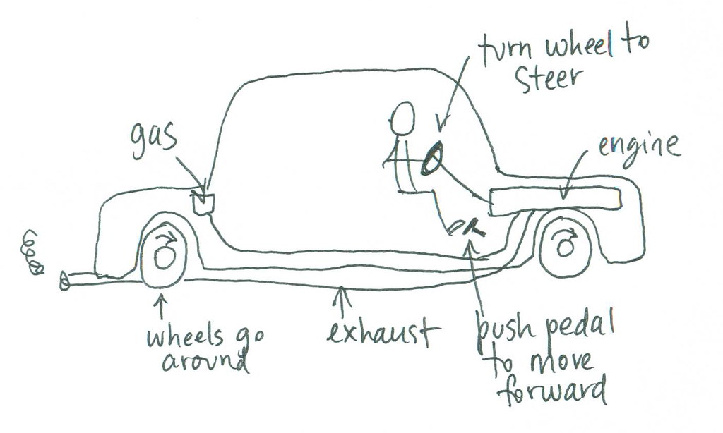
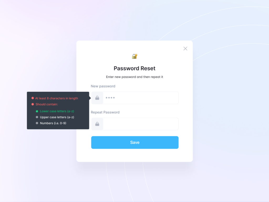
The level of design of the layout is good, but there are a lot of smaller things that would need improvement for it to become an excellent design. Even though the author designed some of the graphs and tables on her own, most of them were not designed at all and did not fit into the layout. The usage of different styles of images and illustrations for the same purpose was also not ideal for me. But the biggest problem I had with the design of the thesis is that there were different graphs and figures with a lot of text that was way too small to be readable. I sometimes even had to zoom in to more than 200% to be able to actually read them. One positive aspect of the layout was the usage of different colors for the literature study (yellow) and the project (purple). Based on all these factors, I would still rate the level of design as good with room for improvement.

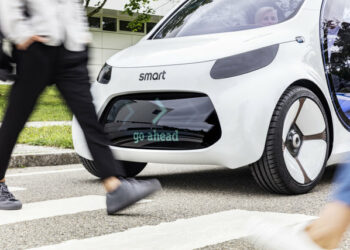
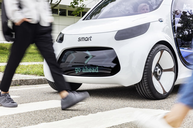
The final design of the prototype can also be described as good with some very good elements. Because the design of the final prototype is using a lot of elements I have already seen in interfaces from popular car manufacturers, it’s probably not the most innovative interface I have seen, but I think that it fits the purpose of this project and works very well for doing user tests.

Degree of innovation

Even though the design of the final prototype is not really innovative for me, the degree of innovation of the rest of the thesis is really good. She did a lot of user research early in the project. She even asked five different experts from the field of autonomous driving, did a questionnaire with 28 drivers that have been using automated driving features regularly, and she also interviewed drivers about their experiences with the Tesla autopilot. Based on these results she then facilitated a creative session with four students from her degree to develop different concepts. These concepts were then evaluated and rated by 13 experts from different related fields. The best concept was then improved by her through an iterative design process. She even built a really nice prototype for her user testings. All in all the degree of innovation for me is very good.

Independence

Because this thesis was written as part of the MEDIATOR project, it is really hard for me as an external reader to evaluate the independence of this thesis. The only thing I am sure of is that the topic was not chosen independently, because it was based on a project brief of the company behind this EU-funded project. It is also really hard to evaluate if the ideas and concepts were based on her ideas because she facilitated a creative session with four more students for this purpose and got a lot of feedback from users and experts during the course of this project. Based on her reflection she was doing the project individually from start to end and was in charge of everything and it was quite challenging for her. Even though it is hard to tell if she tells the truth, I believe her and would rate the independence of this thesis as good.

Outline and structure

The general structure of this thesis makes a lot of sense to me. The introduction also includes her main research question and the objective of the project, but there was no additional information about her motivation or the problem that she wants to solve with this thesis. One highlight of the introduction for me was that she based the structure of her thesis on the double diamond design process starting with the project brief and ending with her graduation with all the chapters of the thesis in-between. The chapters were also done in a logical order and every chapter had a small summary at the beginning. My personal favorites however are the conclusion and the personal reflection of the author at the end of the thesis.

Main research question
When is it needed to communicate what kind of information and how to communicate the information with the driver during takeover?

The objective of the project
Design the HMI of autonomous vehicles in order to enhance situation awareness for a better take over transition/journey.

Degree of communication

The degree of communication of this thesis was one of the things I did not like as well. Even though there was a list with abbreviations, I sometimes had to get back to this list because she used so many abbreviations I have never seen before. Because I have already written different blog articles about Autonomous Driving, I was able to understand it but I am also sure that most of my colleagues would have had some trouble with understanding this thesis.

Scope of the work

Am I sure that the author spent a lot of time working on this thesis because she gathered a lot of data from different users and experts and qualitative research is always a lot of work. Her thesis is also 100 pages long, including a lot of empty pages or pages with not a lot of content on them. But for me, it also looks like she was not very keen on doing the literature study because this part is really short and does not have a lot of information in it. A lot of topics from this part could have benefitted from more detailed descriptions and more context.

Orthography and accuracy

The orthography and accuracy of the thesis are ok, but they are definitely not great. Even though I was not able to find any big mistakes while reading through this thesis, I was able to find a lot of small grammar mistakes and typos in there. Some of the sentences were also structured in a weird way but still ok for readability and understandability. The research question, for example, looks like it was written in another language and then translated into English.
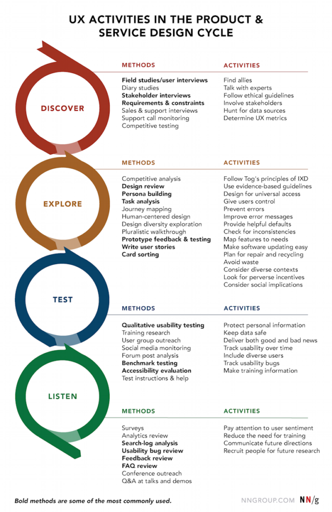
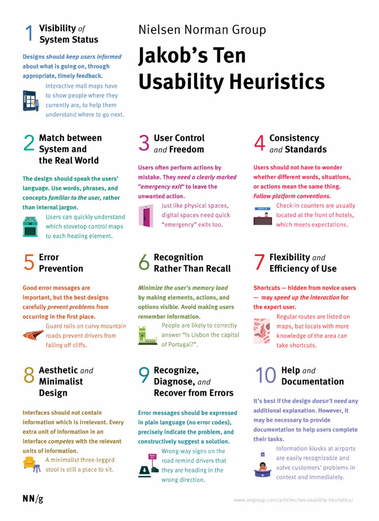
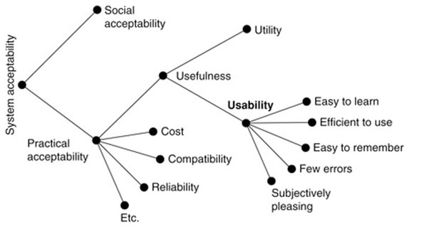
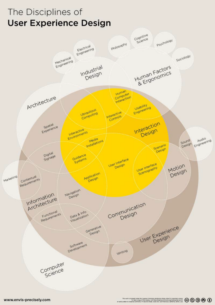
Literature

The usage of literature was the most confusing part of this thesis for me. Even though she listed 32 different sources for her thesis and also did a lot of qualitative research with users and experts from the industry, I was not able to find any sources for most of the figures and tables she used. A lot of paragraphs in her literature study also did not mention any sources or were describing tables and figures without sources. The only positive aspect of her literature list is that she used a lot of books and journal articles and only a few online resources.

Car Testing

The Vehicle Experience consists of a lot of different elements and each of these elements can be evaluated individually. Testing all elements of the vehicle experience is one of the most important steps during the development process of new cars. Vehicles can be evaluated objectively with standardized methods, driving maneuvers, and sensors or subjectively with the development team, external partners, or real users. With the rise of new technologies, the testing of the vehicle experience also gets more complex and complicated. There are a lot of companies out there that are specializing in testing specific features. Especially the ADAS, autonomous driving features, and other safety-relevant elements are tested meticulously during the development.

A lot of companies and public figures are also doing comprehensive tests of vehicles for their websites, blogs, magazines, YouTube channels, Instagram accounts, and many more. There are a lot of different resources where customers can get a lot of information about the cars they are interested in before actually visiting the dealership.

Examples for popular formats include Car & Driver, Evo, Motor Trend, Auto Motor und Sport, Motor1, Top Gear, Grip, carwow, and many more. Since a lot of modern vehicles also have a lot of techs inside, more and more technology-focused YouTubers and Influencers are also making comprehensive reviews of new cars. Because all of these formats also have a different target audience, they also test different features of the car in more detail. While most of these formats are also offering at least parts of their tests and videos for free on multiple channels, some still require subscriptions for more detailed information.

Car and Driver – Comprehensive Car Testing

Car and Driver Magazine has published a detailed overview of how they collect more than 200 data points for every single test they are doing. Since they are using the same procedure for every of the about 400 vehicles they are testing per year, the test results can also be compared with each other. Car and Driver are testing all cars in the following categories.

Performance Testing

To get a good overview of the performance, every car has to do different straight-line accelerations (standing quarter-mile, 5 to 60 mph rolling start, 30 to 50 mph, and 50 to 70 mph), a braking test, and a cornering test. Even though all of their data is recorded by a GPS data logger and therefore already very accurate, they are additionally accounting for wind, weather conditions, and a lot more external factors that might influence the performance of each car.

source: https://www.forbes.com/sites/alistaircharlton/2021/06/01/the-electric-rimac-nevera-can-sprint-to-60mph-in-185-seconds/?sh=1a86f741617d

Interior Sound Level

While measuring the performance on the test track, they are also measuring the sound-pressure level in an idle state, while accelerating and while cruising. Each of the sound tests is also done on the same section of the track to ensure the best comparability possible between the tests.

source: https://www.caranddriver.com/features/a32018270/how-we-test-cars/

Fuel Economy and Driving Range

Another important piece of information for a lot of their readers is the fuel economy or power consumption of cars. To get a realistic real-world result, they have developed their own highway fuel-economy tests for combustion engines, plug-in hybrids, and electric vehicles.

source: https://www.theaa.com/driving-advice/fuels-environment/official-fuel-consumption-figures

Cargo Space and Storage

Cargo space is often stated in liters by manufacturers. To get better real-world data, Car and Driver is measuring cargo volume with cardboard boxes the size of carry-on luggage and with ping-pong balls.

source: https://www.motortrend.com/news/2013-ford-escape-interior-spaces-measured-with-pingpong-balls-235287/

Visibility and Seating Height

Measuring the seating height is done with an H-point machine (HPM) that defines the theoretical location of the hip joint of the driver or passenger. With a laser that is mounted on top of this machine, they are also measuring the outward visibility and how much roadway is obscured by the car itself.

source: http://www.khiart.com/safety.html

Center of Gravity Height

The center of gravity (CG) is an important value for the dynamic of the car. The lower the CG is, the better the handling in corners and the lower the risk of a rollover in really tight corners or during a crash.

source: https://www.caranddriver.com/news/a18201745/explained-how-to-measure-center-of-gravity-height/

Safety and Warranty

The safety of a car is determined by combining data from crash tests with some subjective evaluations of safety equipment. In the US these crash tests are performed by the National Highway Traffic Safety Administration (NHTSA) based on the US New Car Assessment Program (US NCAP) and the Insurance Institute for Highway Safety (IIHS) based on the European New Car Assessment Programme (Euro NCAP). The Euro NCAP is also the basis for crash tests in Europe. Since the warranty can only be tested during long-term tests, Car and Driver has to rely on the numbers from the manufacturers in this case. But since they are also doing long-term tests with cars from a lot of different manufacturers, they already got a good overview of the coverage and services offered by each of them.

source: https://www.mercedes-benz.com/de/innovation/60-jahre-crashtest-auf-kollisionskurs-im-auftrag-der-sicherheit/

Editors Observations

The results of this category are based on the editor’s observation sheet (EOS) they created. Editors are usually collecting more than 170 individual observations during exterior and interior walkarounds. This sheet contains information about the year, make, and model of the car, paint quality, USB port locations, amount of cup holder, material quality, ergonomics, the usability of the infotainment system, and many more.

Infotainment

Since the infotainment system plays an important role in the in-vehicle experience, Car and Driver is also measuring input lag, response time, and the features that make up the infotainment system, including Apple CarPlay Android Auto.

source: https://www.carwow.co.uk/mercedes/news/4267/mercedes-eqs-price-specs-release-date#gref

Overall Rating

The results from all of these categories are then combined with subjective evaluations of the drivers and editors and converted on a ten-point scale. Another important factor for their overall rating is that they are evaluating cars only in comparison to the direct competitors. If they are rating the handling of an SUV, it is not compared to handling a sports car. Each test is also discussed within the team before it gets published to ensure better comparability and fairness.

More details on their testing method can be found online:

https://www.caranddriver.com/features/a32018270/how-we-test-cars/#hwteditorsobservations

Auto Motor und Sport – Elektroauto Supertest

The “Elektroauto Supertest” series from “Auto Motor und Sport” gives a really good overview on how they are testing electric vehicles and which categories are important to them.

Top Gear – Review

While Top Gear is mainly known for the TV show on BBC which is one of the most popular car shows on TV worldwide, they also post car reviews on YouTube.

Carwow – Drag Race

Carwow is mainly known for videos, where they are drag racing different cars against each other, but they (mainly Mat Watson) are also doing car reviews. 

Tech YouTuber – Car Review

As already mentioned, a lot of tech YouTubers are also doing reviews of modern, mainly electric vehicles. The most popular ones are probably Marques Brownlee (MKBHD) and Unbox Therapy, but also some German YouTuber started doing car reviews with the launch of the new Mercedes EQS.

Car YouTuber – Reviews

Of course there are not only tech focused YouTube channels with a lot of videos about cars. There are far more car focused YouTube channels that make videos about different cars. Some of them are mainly focusing on the technical parts of cars and how to tune them, some are mainly focusing on showing and optimizing their own car collection, and some are mainly focusing on reviews. Popular Englisch car channels include Car Throttle, Shmee150, DougDemuro, Drivetribe and many more. The most popular German car-focused YouTube channels include JP Performance, Philipp Kaess, Auto Bild, Motor Woche, Car Maniac and many more.

Resources

Web

https://engineering.mpt.magna.com/engineering-services/vehicle-prototyping-testing/vehicle-testing/

https://www.caranddriver.com/features/amp32018270/how-we-test-cars/

Usability Evaluation | part 3

Usability Testing Methods

Do-It-Yourself Usability Testing

If a company does not want to spend the time and money on an unmoderated or moderated usability test, there is also the possibility to do a DIY usability test. Although the data you get from this method cannot be compared with the data you get from its bigger siblings, it’s still better to do it yourself than to do no testing at all.

In the following table, you can see all advantages and disadvantages of the Do-It-Yourself tests compared to the moderated and unmoderated tests (he calls them the big honkin’ tests).

source: Rocket Surgery Made Easy, Steve Krug, page 25f

For even more details about this method I recommend watching his workshop.

Card Sorting

Another very popular testing method, primarily used for evaluating the information architecture of a system, is card sorting. It helps to organize the content of a site to match it to the way the actual users think. That’s also the main reason why it is so important that you are using actual users of the system for card sorting.

A card sorting can either be done in-person on a large table or a magnetic wall or remotely with specific online tools. These tools also offer you to ask follow-up questions and help you with gathering additional qualitative data to the quantitative data from the card sorting. Either way, card sorting is a very quick usability testing method.

During card sorting, you hand your participants a stack of cards with different topics written on them and they have to sort them and organize them into different piles. Depending on the type of card sorting you do they get labeled groups by the creator (closed card sorting), can label their groups on their own (open card sorting) or they can modify the groups given to them by the creator (hybrid card sorting). Card sorting helps you to understand the mental models of your users.

Click Test

Click tests are also often called first click tests and help with identifying navigation problems. It is not used for creating the information architecture or navigation like the card sorting, but it is used for seeing if the navigation from the card sorting works and helps the users to accomplish different tasks.

Click tests are done with an image of a sketch, wireframe, or design of a system and are therefore easy to set up and done really quickly. The Participants are then asked to click where they think they need to click to complete a given task. These clicks and the times it takes them to click are also recorded in the background and can be visualized in a heatmap and helps with visualizing the areas where the most clicks occurred. Since it is easy to set up and it also works with low fidelity sketches, you can start doing them early in the design process and repeat them along the process.

An example of a click test would be to show them an image of the homepage and ask them to sign up. After they have clicked the element they think will bring them a step closer to the sign-up process, you normally also ask them why they clicked there. These questions also help with understanding their mental models and getting more qualitative data.

Another important result of a click test is that you can easily find areas that are clicked a lot but are not actually clickable. This helps you with minimizing the number of wasted clicks.

The biggest disadvantage of this method is that you can only use them for single screens or a few of them and you cannot do a click test with longer and more complicated task flows. Additionally, because you are using a static image it is also not simulating a realistic surfing or browsing behavior of a normal user and the results may be different when elements are located below the fold of the screen on the live version of the system.

Eye Tracking

Eye-tracking is great for identifying elements that are helping and hurting the attention. It uses additional hardware and software to track the movement of the eye and measure the gaze points while a user is viewing the system. During this process, everything is recorded and can be presented as a heatmap or a gaze plot. The gaze plot can help you with identifying where the users are actually looking and where they are not looking. It also helps with identifying the order in which they are looking at different elements. Heatmaps are primarily used to visualize the elements that attract the most amount of attention and which elements are overlooked by the majority of users.

The main advantage of eye tracking is that you can identify how much attention every element gets. You cannot only identify important elements that get too little attention, but you can also identify elements that pull the attention away from the more important elements. For getting quantitative data out of the eye-tracking test it is also important that the facilitator also ask follow-up questions. 

The biggest disadvantage of eye tracking is that you need special hardware and software to actually start collecting data. That’s also the reason why you cannot do an eye-tracking test remotely and have to set up a room with your eye tracking device before the test starts.

source: https://medium.com/@TheRealTang/subtleties-of-eyetracking-heat-maps-and-gaze-plots-a7ba4207f20f

Preference Test

Another fast but effective method is the preference test. It helps to determine which design of several choices the users like best, why they liked it best and what they liked about this version. This method is especially helpful during the early stages of the design process or when the team is not able to decide which version they like best. A preference test can also be done online with a video call and screen sharing, without any special tools.

The biggest disadvantage of this method is that it does not mean that the users are also picking the version with the best usability or performance. Especially when you are presenting them with different high-fidelity designs, they will most likely focus on the aesthetics of the design.

Question Test and 5-Second-Test

The question test and the 5-second-test are similar methods. During both tests, you show the participant an image of the system and then ask questions about it. The biggest difference between the two is, that you only show them the picture for 5 seconds during the 5-second-test and during the question test they can look at it as long as they want. The 5-second limit is due to the fact that the vast majority of website visits are less than 10 seconds long and that users make up their mind about the quality of a website within 50 milliseconds.

The questions during these tests are mainly about the layout or content of a site but you can also ask them where they would complete a certain task or action on the page and what they would expect to happen if they click on a certain element.

Since these tests can also be done with only an image of the product, they are also fast to set up and can be easily done online with users from around the world. The biggest disadvantage of these tests is that they cannot solve design issues, they can just point out if there are potential problems somewhere.

Additional Methods

There are a lot more UX research methods out there that also help with testing the usability of a system. Additional examples include

  • Contextual Inquiries, Ride-Alongs, Field Visits, Ethnographic Field Studies
  • Diary Studies
  • Focus Groups
  • Surveys
  • Voice of the Customer (VoC) Tools including feedback forms, questionnaires, and ratings on websites, apps, or app stores
  • Interviews
  • Usability Lab Studies
  • Participatory Design
  • Concept Testing
  • Desirability Studies
  • Clickstream Analysis
  • A/B Testing, Multivariate Testing, Live Testing, Bucket Testing
  • True-Intent Studies
  • … and many more

Usability Benchmarking

Another really important summative testing method (end of the design process) is usability benchmarking. The main goal of this method is not to improve the usability of a system, it is about measuring the current usability of a system to provide a baseline against which future versions of the system can be compared.

It is a great tool to ensure that the changes you are making help you with moving in the right direction and that you have clear reference points. UX benchmarking involves collecting quantitative data that describes the current user experience. This data could include detailed numbers about the average time spent on the system, average time spent until they make a purchase or complete a certain task, the success rate or conversion rate, the retention rate, and many more.

Once you have done your UX benchmark, you can compare your data against an earlier version of the product, the data from a competitor, an industry standard, or a goal defined by the stakeholders of the product. Even when you just did your first benchmark, you can still compare your data to the competitors or the industry standard.

The main advantage of this method is that you can measure the progress you have made after a lot of design iterations and show this data also to stakeholders or clients to prove your good work along the process.

Conclusion

Since most of these methods can also be done remotely, there is currently a big boom in online tools that help companies with usability testing. These tools are offering different methods and different pricing models and are especially useful for testing with users all over the world. Popular testing services include UserTesting, Validately, UsabilityHub, UXTesting, Userlytics, and many more. Since I prefer to use the help of local companies, I would personally use Userbrain from Graz to do my usability tests.

Resources

Books

Just Enough Research
Erika Hall
2013

Usability Testing Essentials, Ready, Set…Test!
Carol M. Barnum
2021

UX Optimization, Combining Behavioral UX and Usability Testing Data to Optimize Websites
W. Craig Tomlin
2018

Inclusive Design for a Digital World, Designing with Accessibility in Mind
Regine M. Gilbert
2019

Articles

The Elements of Successful UX Design, Best Practises for Meaningful Products
UXPin
2015

Web

https://medium.com/adalab/the-importance-of-usability-10e9871a16d8

https://uxdesign.cc/usability-testing-in-design-and-why-is-it-important-cfddfbbdaac9

https://www.nngroup.com/articles/which-ux-research-methods/

https://www.interaction-design.org/literature/article/when-should-i-conduct-usability-testing-for-a-product

https://www.nngroup.com/articles/remote-usability-tests/

https://medium.com/thinking-design/usability-testing-moderated-vs-unmoderated-adbccc37404b

https://www.nngroup.com/articles/competitive-usability-evaluations/

https://xd.adobe.com/ideas/process/user-testing/top-7-usability-testing-methods/

Usability Evaluation | part 2

Usability Testing Methods

Since good usability should be the standard for anything that is designed to be used by humans, it is also important to ensure that the products are actually usable. The more complex a system is, the more work needs to be done. Usability testing is one of the most used methods to improve the usability of a digital system. It focuses on observing users while they are interacting with a system.

“Start earlier than you think makes sense.”

– Steve Krug

When should I start testing?

Based on when you are doing the tests, there are two different types:

Formative Testing
Formative testing happens while the product is still in development. The main goal of this type is to identify and fix problems based on small tests with users. This type of testing is normally repeated multiple times during the development and can start with the first pencil sketches on paper or even a napkin.

Summative Testing
Summative testing starts when the product is nearly finished or already finished. The main goal of this type is to establish a baseline of metrics and identify if the product meets the requirements.

If you are redesigning a system, it is important to start even earlier. Testing an existing product can give you a lot of useful insights and ideas for the redesign. It helps you with identifying the biggest pain points of the current product and which parts of the system are already working well and should be emphasized even more. If there is time left, you should also take a closer look at the systems from your competitors and ideally also test them. Testing them can also give you additional information about what they are doing better and where there is even more potential for your system.

Testing during a redesign (formative testing) is already quite common, but the majority of tests are still done during the end of the process (summative testing). There is no reason why you should not test your first sketches, paper prototypes, and wireframes in addition to the nearly finished prototypes. The more you test, the easier it is to identify problems and also fix them. Testing earlier saves time and money. Usability tests are especially useful after every important design decision. 

How many participants do I need?

The number of users you should test with is also connected is the same as with the usability inspections. To identify the most important usability problems you should test with 3 to 5 users. After the fifth user, you already discovered 85% of the usability problems. Identifying the last 15% will take about 3 or 4 times more people than for the first 85%. That’s also the reason why you should stop at 5 people, especially when doing more expensive tests like the moderated usability test. It is much more efficient to do five smaller tests with a few people during the process than one big extensive usability study in the end.

There are a lot of different usability testing methods out there and every one of them has its unique advantages and disadvantages. Which method you should use always depends on the project and the stage you are in. They also cost different amounts of money.

Moderated Usability Test

While moderated tests get you the richest and most detailed qualitative data from real users, they are also resource and cost-intensive. Although moderated tests would also work great with low fidelity prototypes or wireframes because the moderator can give additional explanations, it is better to use high fidelity prototypes for these tests because they also give you a realistic idea of how the users perceive the design. 

During these tests, you usually record the screen, voice, and also face of the user. Based on the recordings you should also create a highlight reel with the biggest problems, suggestions from users, important quotes from them, and statements about what the thought would happen next.

Moderated tests can either be done in-person or remotely. But since the moderator plays an important role and should also be able to read the behavior and non-verbal cues of the participants, it is better to do them in person. Remote moderated usability tests are better if you have a limited budget, if you are testing with users from all over the world, or if you are working on a niche product with a very small number of potential users in your area. During the ongoing pandemic, most of the moderated tests were also done remotely. The biggest challenge for moderators during remote tests is reading the participant and finding the balance between letting the user know that you are listening and interrupting them.

Moderator

Since the moderators play an important role during these tests, they should have solid experience in the field of usability testing or user research. Moderators have to work directly with the participants, guide them through the process, reading them the tasks they have to do, and as follow-up questions to get even more information during specific steps. It is also important that the moderator explains to the participants that the system itself is tested and that they cannot do anything wrong.

Participants

The participants have to use the think-aloud method and talk about what they are thinking about while interacting with the system. Ideally, the participants should also be part of the main target audience of the system.

Observers

To get even better results, you can also give the designers and developers the chance to observe these tests so that they get real time information about the usability and design of the system.

source: https://www.nngroup.com/articles/usability-testing-101/

The biggest disadvantage of moderated usability tests is that the preparing, recruiting, scheduling, coordinating, and sessions themselves cost a lot of time and therefore also a lot of money. Because you always need a moderator for the sessions, this method is also not as scalable as the others.


Unmoderated Usability Tests

Unmoderated usability tests work similarly to the moderated tests and are also a good source for qualitative data. The main difference is, that the moderator is not present during the test. But there is still a moderator or researcher involved that provides the task instructions and also watches and analyses the videos of the tests afterward. Since there is no moderator present, it is mostly used to test specific parts of a product, rather than a whole user journey.

The main advantage of this method compared to moderated tests is that there can be 5, 10, 20, 50, or even more tests simultaneously. Another big advantage is that these tests can be conducted anywhere, anytime, and with anybody. That is also the main reason why this method works best for remote tests. Since it can be conducted much faster and requires less time, it is not only more scalable but also cheaper than the moderated tests.

Moderator

Because the moderator is not present during the test, it is also harder to get the “Why” information. But if the unmoderated tests and tasks are prepared carefully, remind the participants to think aloud after every task and additional task-specific questions are asked before the next task, it can be almost as efficient as a moderated test.

Participants

The participants of an unmoderated test also have to use the think-aloud method. But the biggest advantage for the participants is that they can do the tests anytime and anywhere they want if it is done remotely.

source: https://www.nngroup.com/articles/usability-testing-101/

Another big advantage of unmoderated tests compared to moderated tests is that there is a smaller chance for bias. Observed people are often acting differently when they are alone. This phenomenon is also called the observer-expectancy effect.

The biggest disadvantage of this method however is that the participants tend to be quieter because there is nobody reminding them of the thinking aloud if they forget it. That’s also the reason why different remote testing tools only pay their participants if they were also doing it correctly. Because there is no moderator present for guiding the participants through the test, it also just works well with high-fidelity prototypes or existing products.

Ideally, both of these testing methods should be used complementary during an iterative design process. You should start with moderated tests during the early phases of the process with a low fidelity prototype or wireframes and when you are finalizing the project you could do an unmoderated test to see how the product performs with real users around the world.

Resources

Books

Just Enough Research
Erika Hall
2013

Usability Testing Essentials, Ready, Set…Test!
Carol M. Barnum
2021

UX Optimization, Combining Behavioral UX and Usability Testing Data to Optimize Websites
W. Craig Tomlin
2018

Inclusive Design for a Digital World, Designing with Accessibility in Mind
Regine M. Gilbert
2019

Articles

The Elements of Successful UX Design, Best Practises for Meaningful Products
UXPin
2015

Web

https://medium.com/adalab/the-importance-of-usability-10e9871a16d8

https://uxdesign.cc/usability-testing-in-design-and-why-is-it-important-cfddfbbdaac9

https://www.nngroup.com/articles/which-ux-research-methods/

https://www.interaction-design.org/literature/article/when-should-i-conduct-usability-testing-for-a-product

https://www.nngroup.com/articles/remote-usability-tests/

https://medium.com/thinking-design/usability-testing-moderated-vs-unmoderated-adbccc37404b

https://www.nngroup.com/articles/competitive-usability-evaluations/

https://xd.adobe.com/ideas/process/user-testing/top-7-usability-testing-methods/

Usability Evaluation | part 1

Usability evaluation methods deal with assessing the usability of a product. The main goal of evaluating usability is to define usability problems and obtain measures to make products more usable and pleasant to use. Since usability has already become a large part of the user experience (UX) and most of the methods can also be used to optimize more than just the usability, the following methods can also be called UX research methods.

Because of that, these methods can also be divided into qualitative and quantitative research.

Quantitative
Quantitative UX research is about putting numerical data to problems that can be modified to more usable statistics. Classical quantitative research methods include all types of surveys and polls. Although they started including a small amount of qualitative data, Google Analytics is also a big and important source for quantitative data, especially for digital products.

Qualitative
Qualitative UX research is about observations, user behavior, and the user’s perceptions. It involves collecting non-numerical data like text, audio, video, and images to understand the user experience in detail. This type of research is commonly used in all social sciences. Classical Qualitative research methods include interviews, observations, field studies, and also usability tests. According to Jakob Nielsen and William Bruce Cameron, you should also focus on qualitative research during UX projects because it often delivers more convincing results for less money.

“quantitative studies are usually too narrow to be fruitful and are oftentimes directly misleading.”

– Jakob Nielsen

“Not everything that can be counted counts, and not everything that counts can be counted.”

– William Bruce Cameron

Because there are a lot of different UX research methods and each method has its own unique advantages and disadvantages there is no list of best UX research methods. It always depends on the goal of your usability evaluation, the time and budget you have, the target audience of your product, the stage of the process you are in, and many more factors.

To get a better overview about which UX research you could use for your product, Susan Farrell created the UX research cheat sheet. It should not work as a checklist, it just shows which methods are available along the design process.

source: https://www.nngroup.com/articles/ux-research-cheat-sheet/

Usability Inspection Methods

Additionally to all the testing methods, there are also a number of different inspection methods available. Inspections are done by evaluators, usually usability professionals, and their main goal is to find usability problems in the design. Some inspections methods are also suitable for getting an overview about the usability of an entire system. Like the tests, these methods can also be performed early in the process of the project. Additionally to the following methods, you can also do a Heuristic Estimation but this method is not used very often.

Heuristic Evaluation

The heuristic evaluation is the most informal inspection method. Usability professionals identify where a product follows predefined usability principles (heuristics) and where it doesn’t. 

Heuristic evaluations are a quick and lower-cost way to measure the usability of a product before conducting user tests. They should be part of the process and used in conjunction with usability tests. According to a test conducted by Jedd Sauro, heuristics evaluations are able to detect between 30 and 50% of all usability issues, including all severe ones. Because this number also depends on the number of evaluators you should have about 3 to 5 professionals testing it to get the best value for your money.

Heuristics

The most well-known usability heuristics are based on the fifth chapter of Jakob Nielsen’s book “Usability Engineering” from 1993. Despite being nearly 30 years old, these guidelines are well established and still up-to-date. Jakob Nielsen has even slightly reworded them and added some newer examples last year.

But during a heuristic evaluation, a professional evaluator might also use different and more specific heuristic or additional product-related ones. Arnie Lund, Bruce Tognazzini, and Ben Shneiderman have also defined additional sets of heuristics. For modern apps, you can also use Apple’s Human Interface Guideline or Google’s Material Design Guidelines as Usability Heuristics.

Arniel Lunds “Expert Ratings of Usability Maxims”

Bruce Tognazzini’s “First Principles of Interaction Design”

Ben Shneiderman’s “Eight Golden Rules of Interface Design”

source: https://www.nngroup.com/articles/ten-usability-heuristics/

The Process

The process of a heuristic evaluation is divided into three sections: Planning, Executing, and Reviewing.

Planning
Since it is a usability inspection method with clear objectives, you should plan your desired outcome in advance. Setting goals and understanding exactly what needs to be evaluated is one of the most important parts of the planning phase. The evaluators must also be aware of the demographics, needs, motivations, and behaviors of the target audience. Although there are no real users present during the evaluation, the usability professionals should always keep the users and the situation the product is used in mind. During the planning phase, it is also important to choose the number of evaluators – in this case ideally between 3 and 5 to get the most results for as little money as possible. Additionally, you should also define the set of heuristics you want to use for the inspection.

Executing
During this phase, the usability professionals are actually doing the inspection of the interface. They will go through the user flow and analyze all pages based on the previously defined heuristics. This part of the inspection is normally recorded to get the best result out of the evaluation and be able to see exactly where the problems are, what the attempted tasks were, why it is a problem and usually they are also suggesting different ways on how to fix the problems.

Reviewing
After the inspection, it is important that the experts are creating a list with all usability issues and additional findings that should be addressed. Ideally, these usability problems should also be rated and prioritized based on how severe they are. These results are normally presented in the form of a report that describes the process of the inspection, all usability problems, and different suggestions on how to fix them. This report, together with the recordings, should also be the basis for the next steps the project team is going to make.

Cognitive Walkthrough

During a cognitive walkthrough, one or more evaluators work through some tasks and a set of questions from the perspective of the user. The goal is to simulate the user’s problem-solving process. It was originally designed for ticket machines, ATMs, postal kiosks, or other interactive systems where users have little or no training before using the system. Currently, it is mainly used for evaluating the learnability of a system for new and occasional users.

Pluralistic Walkthrough

A pluralistic walkthrough is a group evaluation of a design where users are guided through tasks while designers and developers address their concerns or questions about the interface. This method works best in the very early stages of the design process with a paper prototype or rough wireframes.

Consistency Inspection

Consistency inspections are usually done by designers on larger projects. It is used to ensure that the interface does things the same on all pages. The ultimate goal of the consistency inspection is that it looks like one designer did the whole project and every element that does the same thing also looks and feels the same.

Feature Inspection

The feature inspection emphasizes the importance of functionality in order to achieve good usability. It identifies critical tasks a user would perform while using a system and the features that would be used to perform these tasks. After that process, the features are then evaluated.

Standards Inspection

For a standard inspection, you need an expert on an interface standard that has to inspect the whole interface for compliance with the standards. Good examples for standard inspections of apps include checking if the Apple Human Interface Guidelines or Google Material Design Guidelines are met. Another important standards inspection determines if the product complies with all the ISO standards.

Apple Human Interface Guidelines

Google Material Design Guidelines

ISO Standards

Formal usability inspection

A formal usability inspection combines different elements from the heuristic evaluation and from the cognitive walkthrough. It is a process with six steps and clearly defined roles for every expert on the team.

Competitive Review

A competitive review is a process where a usability expert analyzes a series of related websites or products from competitors or other companies from the same sector. The expert tries to look for strengths, weaknesses, trends and differences and identifies room for improvement for his/her own product. A competitive review is also possible with just a small portion of a website. For example if you are building a webshop you can take a closer look at amazon and their ordering process.

Resources

Books

Usability Engineering
Jakob Nielsen
1993

Articles

The Elements of Successful UX Design, Best Practises for Meaningful Products
UXPin
2015

Web

https://www.nngroup.com/articles/usability-101-introduction-to-usability/

https://www.nngroup.com/articles/why-you-only-need-to-test-with-5-users/

https://www.scribbr.com/methodology/qualitative-research/

https://medium.muz.li/ux-research-methods-and-when-to-use-them-941f9e355083

https://www.nngroup.com/articles/which-ux-research-methods/

https://www.usabilitybok.org/cognitive-walkthrough

https://www.usabilitybok.org/pluralistic-walkthrough

https://www.usabilitybok.org/heuristic-walkthrough

https://www.brainbok.com/guide/pmp/glossary/heuristic-estimation/

https://usabilitygeek.com/heuristic-evaluation-introduction/

https://www.nngroup.com/articles/ten-usability-heuristics/

https://www.interaction-design.org/literature/topics/heuristic-evaluation

Importance of Usability

Utility + Usability = Usefulness

Utility is another important attribute and is about if the system provides the features the users actually need. If you are integrating a really usable feature with nearly none of your users’ needs, it’s going to be useless after all. Usability and utility together determine if a system is useful or not.

For analyzing and optimizing the utility of a system you can use the same methods and data you can use for improving usability.

The importance of Usability

Usability is actually not just important, it is a necessity. Especially the success of digital products strongly depends on the usability of the system. Websites and apps are a really good example of products that rely on good usability. Because if the usability of your product is not great, they will move on and use another system. That’s also the reason why bad usability is directly connected to losing users or customers.

If users
… are not able to accomplish their goals efficiently, they leave.
… cannot find what you are offering them, they leave.
… get lost, they leave.
… get stuck, they leave.
… cannot easily recover from an error, they leave.
… have difficulties using the system, they leave.

But usability is not only important for the number of users interacting with your product. It also directly affects how they feel about your product and is, therefore, an essential part of the user experience. Because of that, usability should also be an important part of your budget.

According to Jakob Nielsen, you should spend about 10% of a design project budget on usability. On average, this budget for usability will more than double the quality metrics of your website. Although the outcome might not be as great, it is also really important to emphasize usability in the design process of software or even physical products. Good usability will always improve the user experience and also increase the ROI significantly. According to Nielsen, businesses that spend only 10% of their budget on usability improvements will see, on average, a 135% increase in their desired metrics.

So spending money on usability is not only better for the users, but it also brings a lot of benefits for the company. Another reason for spending money on usability is that bad usability will cost you even more money. Dissatisfied users will not come back, tell their friends about it, stop using your product or even ask for a refund. Spending money on usability will not only make your customers happy and make them recurring customers, but it will also help you to grow your business.

According to Forbes, Jeff Bezos invested about 100 times more money in usability design than he invested in marketing during the first years of Amazon. In his eyes that is also the reason that led to such overwhelming access.

Another great example from the Interaction Design Foundation is

”When McAfee started integrating usability testing to learn more about its customers and their needs, the company saved 90% in support expenses costs.”

The Interaction Design Foundation also created a great list on how to design for good usability. This list is mainly about usability on websites, but most of the steps listed below are also important for other digital products and software.

  • Work with a clear understanding of users’ goals and show it in your design.
  • Mimic the real world regarding concepts, icons, and language.
  • Present instantly understandable, jargon-free messages and actions users can take – one chief action per screen.
  • Limit options to give a strong information scent on an uncluttered display – show essential information for completing tasks.
  • Keep content consistent.
  • Follow established norms regarding function and layout (e.g., logo positioning, tappable buttons).
  • Use proper font size, color, contrast, whitespace, etc. to:
    • combine aesthetic appeal with scanning readability,
    • present a clear, logical information hierarchy,
    • design for accessibility
  • Use chunking and emphasize key information at the beginning and end of interactive sequences.
  • Offer informative feedback about the system status.
  • Include helpful navigation systems and search functionality.
  • Allow for customizable controls, including shortcuts.
  • Avoid disruptions – e.g., forced logins/pop-ups.
  • Make forms easy to complete.
  • Include warnings and autocorrect features to minimize errors.
  • Make errors easy to diagnose.
  • Offer easy-to-understand help documentation.
  • Show clear contact options.
  • Provide a back button to undo actions.
  • Include ALT tags to show more information about images.
  • Consider server abilities regarding page-loading time and downtime.
  • Beware of in-app browsers and restrictions (e.g., scrolling) in mobile design.
  • Make links active.
  • Describe links accurately
  • Use user personas.
  • Do thorough usability testing

Accessibility, Usability and Inclusion

Accessibility, usability, and inclusive design are closely related topics and help with creating systems that work for everyone. All of their goals, approaches, and guidelines overlap significantly. That’s also the main reason why you should focus on them together. There are only a few cases where you should only focus on one of them.

Although the emphasis on these topics has been steadily growing in the last few years, it’s unfortunately still far away from becoming the new normal. That’s especially true for accessibility and inclusion. For a lot of designers and developers, accessibility is just a set of boxes they have to check before releasing the product. But actually it is a really big part of the usability of a product.

Accessibility

The term accessibility is officially defined as
“the quality of being easy to approach, reach, enter, speak with, use, or understand”,
“the quality of being usable, reachable, obtainable, etc.:” and 
“the quality of being suitable or adapted for use by people with disabilities:”

Accessibility in the context of design is related to the discriminatory aspects of the user experience for people with disabilities. Good accessibility means that they can contribute equally without any additional barriers. Despite the fact that accessibility is mainly focusing on people with disabilities, most of these requirements are also improving the usability for everyone else. For example, if a website is optimized for low vision, you can also see the content better if the sun is shining directly on your screen or when you’re sitting in a completely dark room.

source: https://www.esri.com/arcgis-blog/products/arcgis-storymaps/constituent-engagement/building-an-accessible-product-our-journey-so-far/

Accessibility focuses on the following disabilities:

Visual

  • Low Vision
  • Blindness
  • Color Blindness
    • Red-Green Color Blindness
    • Blue-Yellow Color Blindness
    • Complete Color Blindness

Hearing/Auditory

  • Hard Hearing
  • Deafness

Speech

  • Speech Disorders

Motor

  • Slow Response Times
  • Limited Motor Controls (inability to use a mouse, touch, …)

Cognitive

  • Learning Disabilities
  • Distractibility
  • Inability to focus on a large amount of information

The Web Content Accessibility Guidelines (WCAG) 2.1 from 2018 are already addressing these disabilities and are focusing on four key principles:

  • Perceivable
  • Operable
  • Understandable
  • Robust


They even offer web tools for websites to check if your own website is compliant with their guidelines. These guidelines are also defined as an international standard in the ISO 40500 norm.

Inclusive Design

Inclusive design was already defined as

“The design of mainstream products and/or services that are accessible to, and usable by, as many people as reasonably possible … without the need for special adaptation or specialised design.”

by the British Standard Institute back in 2005.

Inclusive design is not about designing a product that addresses the needs of the entire population, it is more about creating an appropriate design for the diversity of the population. According to the Inclusive Design Toolkit of the University of Cambridge, it is about:

“Developing a family of products and derivatives to provide the best possible coverage of the population.“,
Ensuring that each individual product has clear and distinct target users.” and
Reducing the level of ability required to use each product, in order to improve the user experience for a broad range of customers, in a variety of situations.”

To sum that up it is about taking a product to as many users as possible. In some regions, it is also called universal design or design for all. Another big advantage of inclusive design is that it also works great for people with temporary disabilities (injuries) or situational limitations (while carrying a baby or grocery bag).

source: https://alexanderskogberg.com/2018/02/new-guidelines-wcag-2-1-explained/

Inclusive design is addressing a wide range of issues:

  • accessibility for people with disabilities;
  • access to and quality of hardware, software, and Internet connectivity;
  • computer literacy and skills;
  • economic situation;
  • education;
  • geographic location;
  • culture;
  • age, including older and younger people;
  • and language.

Resources

Books

Inclusive Design for a Digital World, Designing with Accessibility in Mind
Regine M. Gilbert
2019

Articles

The Elements of Successful UX Design, Best Practises for Meaningful Products
UXPin
2015

The Basics of User Experience Design
Interaction Design Foundation
2020

Web

https://www.nngroup.com/articles/usability-101-introduction-to-usability/

https://www.interaction-design.org/literature/article/an-introduction-to-usability

https://medium.com/adalab/the-importance-of-usability-10e9871a16d8

https://medium.com/@bluehair.co/the-real-importance-of-usability-and-user-experience-c7bfd4cef11

https://www.interaction-design.org/literature/topics/usability

https://uxdesign.cc/usability-testing-in-design-and-why-is-it-important-cfddfbbdaac9

https://www.interaction-design.org/literature/article/improve-customer-experience-with-ux-investments-that-increase-roi

https://www.forbes.com/sites/forbesagencycouncil/2019/02/28/a-useful-experience-why-usability-is-essential-to-ux-design/

https://www.toptal.com/designers/ui/inclusive-design-infographic

https://www.dictionary.com/browse/accessibility

https://www.w3.org/WAI/fundamentals/accessibility-usability-inclusion/

http://www.inclusivedesigntoolkit.com/whatis/whatis.html

Good Usability

Jakob Nielsen already defined the components of usability in his book Usability Engineering back in 1993. His “model of the attributes of system acceptability” already defined the following 5 quality components that are still in use:

  • Easy to learn (Learnability)
  • Efficient to use (Efficiency)
  • Easy to remember (Memorability)
  • Few errors (Errors)
  • Subjectively pleasing (Satisfaction)
source: https://ridilabs.net/post/2014/09/21/The-Fundamental-of-Usability.aspx

Whitney Quesenbery also described five similar qualities that a product needs to be usable in 2001. Although his criteria may look different at the first glance, they describe basically the same things. His 5 e’s are:

  • Effectiveness
  • Efficiency (Efficiency)
  • Engagement (Satisfaction)
  • Error Tolerance (Errors)
  • Ease of Learning (Learnability)

Learnability and Ease of Learning

Good learnability helps the users accomplish their tasks without the need to learn how to use the system first. The easier it is to fulfill the tasks, the better the learnability of the system. The ease of learning can also be divided into the following five components.

Familiarity
Familiarity is about the way the users expect things to happen while they are using the system.

Consistency
Consistency basically describes that elements that look the same should also do the same. An example of internal consistency would be an “Ok” or “Next” button. They should always have the same label, look the same and also work the same throughout the whole system.

Generalizability
Generalizability is strongly connected to consistency and sometimes even called external consistency. It mainly refers to established conventions beyond our own system. A good example of that would be the logo on a website. People expect it to be on the top of your website and that it is linked to the homepage when you click on it because that’s what they learned from the other websites they are using on a daily basis.

Predictability
Predictability is about building a system that works the way the users expect it to. But since there are a lot of different user levels out there it is much harder to achieve than it sounds like. Because of these different user levels, it is also common to test a system with the “most stupid user possible”. An example for predictability would be that users on a Mac expect to personalize a program by clicking on the name of it in the top left corner and going to preferences.

Simplicity
Simplicity is all about simplifying the system and only displaying necessary elements. A good example of that is the Safari Browser. If you open it the first time it looks super basic and does not have a lot of functions for experts, but if you are an expert you already know that you can enable additional features in the preferences that allow you to use it for the development process. Android phones for example also have a similar feature. If you tap on the build number in the settings seven times you will get the additional android developer functions.

These and similar components are often also mentioned as part of one of the 5 principles for good website usability. There they are part of the “clarity” of a website.

The learnability of a system is also important when releasing new features or functionality so that users familiar with the system don’t become frustrated with it after an update. This frustration happens a lot when social media companies like Facebook or Instagram are releasing new features. Regular users are often complaining about new functions or layout because they are already used to the old one, even when the new one is much better and easier to learn.

To achieve good ease of learning it is important to match the system to the existing mental models of a user.

Mental Models

A mental model represents a person’s thought process for how something works and helps people to understand life and make better decisions. Although mental models need to be learned through previous experiences, assumptions, and observations, we are unconsciously working with a broad base of different mental models throughout our day.

In combination with usability, mental models are often described as a simple representation of something in the real world. For example, we all know that we need to push a button if we want something to happen and these physical buttons are also translated to the digital buttons we are using on a daily basis. The form of an unknown object should already trigger the appropriate action in the user.

A car also consists of a lot of different mental models. Users expect an ignition or start button to start the car, they also expect to turn the steering wheel for changing the direction to left and right and to find a gas and brake pedal at the same position most cars have. Because of all these mental models, you can use basically every car after learning how to use one.

source: https://www.flickr.com/photos/davegray/236316672

Memorability

Memorability is also strongly connected to the learnability of a system. It describes how easy it is to reestablish proficiency after a longer period of not using the system. Memorability is especially important for systems that are not being used on a daily basis. A good example of a system that would need good memorability in Austria is “FinanzOnline” because most users just use it once a year when they do their income tax. Although they have completely redesigned it earlier this year, there is still room for improvement.

Efficiency

Efficiency is about how quickly a user can perform their tasks once they know the system and learned how to use it. It is not only about the speed, it is also about the number of steps they need to accomplish their tasks. The ultimate goal of optimizing the efficiency of a system is to reduce the number of clicks.

For achieving this goal, it is important to use clearly labeled buttons, navigations with meaningful titles and also adapt the system to the users’ main interaction method. Elements designed for fingers on the smartphone or tablet should feel and look differently than elements that are mainly used with a keyboard and mouse. Another possibility to improve the efficiency is to integrate meaningful shortcuts like “cmd + a”, “cmd + c” and “cmd + v” on Mac or “strg + a”, “strg + c” and “strg + v” on Windows.

Effectiveness

Effectiveness and efficiency are commonly used interchangeably and it is not easy to separate them, but they are not the same. While efficiency is about how quickly a task can be accomplished, effectiveness is about how well the work is done.

An important point to improve effectiveness is about assisting the user to complete their goal with a high degree of accuracy. A good example would be to tell the users during the sign-up process which criteria the password has to fulfill and which criteria are already fulfilled while typing it in. This does not only reduce data entry errors but also prevents the user from getting frustrated.

Another point to optimize effectiveness would be to offer multiple ways to get to the same page because it makes it more likely that the user gets there. But you also have to pay attention to not offer too many ways because that would decrease the efficiency again.

source: https://dribbble.com/shots/15228153-Password-reset

Errors

This component is primarily about preventing errors from happening. It is also about minimizing the number of errors users make, how severe they are, and how easily they can recover from them. Creating a system without any errors would be the ultimate goal, but especially for digital products, it is nearly impossible to achieve because there are a lot of factors beyond the control of the designer, as the ecosystem.

According to Whitney Quesenbery, the system has to restrict the user from opportunities to do the wrong thing. Good examples for that would be disabled buttons, distinct labels, clear language, and meaningful instructions.

Another important part of errors is how to recover from them. Good systems offer the users support to get back to the right path if something went wrong. For example on a Mac, you can go back after deleting a file with “cmd + z” and recover the file without using the bin. 

Error messages are also a key factor in helping the user to recover from them. They should consist of a description of the error with additional information on how to fix it like “The upload was not possible because the file is too big. You can upload files with a maximum file size of 100 MBs.”. If the system created the error, there should also be a way to report it to the developers. This reporting function is a free way to get hints from real users about what is not working and the users also get the feeling that their opinion is valuable and that something changes based on their feedback.

source: https://uxplanet.org/how-to-write-good-error-messages-858e4551cd4

Satisfaction and Engagement

This quality is about the satisfaction of the user while and after using the system and how pleasant and engaging the experience is. Aesthetics play an important role in this component. But it’s not just about looking nice, it should also look proper and avoid them from using systems from competitors.

To achieve this goal it is important that the system is intuitive and works like the users think it works. It is also important to know that a system may satisfy just a small number of users so it is important to measure the satisfaction with real users and not the developers of the system. Although it is nearly impossible to satisfy all users all the time, the goal should be to satisfy most users most of the time. Therefore it is also crucial to know the target audience, their technical proficiency, and how they are interacting with the system.

Another way to come to this goal a bit closer is that developers, designers, and usability professionals have to work hand in hand. There is still a lot of software out there, especially open-source software, that is just done by programmers and is neither usable nor aesthetically pleasing at all.

source: https://www.ssw.com.au/rules/rules-to-better-interfaces-general-usability-practices

Resources

Books

Usability Engineering
Jakob Nielsen
1993

Articles

The Elements of Successful UX Design, Best Practises for Meaningful Products
UXPin
2015

The Basics of User Experience Design
Interaction Design Foundation
2020

Web

https://www.nngroup.com/articles/usability-101-introduction-to-usability/

https://www.interaction-design.org/literature/article/an-introduction-to-usability

https://www.crazyegg.com/blog/principles-website-usability/

https://www.wqusability.com/articles/getting-started.html

Usability vs. User Experience

Despite the fact that the terms Usability and User Experience (UX) have been defined for a lot of years already, they are still often confused with each other. To understand their meaning even better and be able to distinguish them more clearly, it’s necessary to take a closer look at the definition of these terms.

Usability

According to the ISO 9241-11 standard, usability is defined as
“extent to which a system, product or service can be used by specified users to achieve specified goals with effectiveness, efficiency and satisfaction in a specified context of use

Note 1 to entry: The ‘specified’ users, goals and context of use refer to the particular combination of users, goals and context of use for which usability is being considered.

Note 2 to entry: The word ‘usability’ is also used as a qualifier to refer to the design knowledge, competencies, activities and design attributes that contribute to usability, such as usability expertise, usability professional, usability engineering, usability method, usability evaluation, usability heuristic.”

Usability is often also used interchangeably with ease-of-use, but according to its definition, it is about much more than that. It also deals with the overall satisfaction of the user. Usability also refers to methods for improving the ease of use during the design process.

“Usability is about human behavior. It recognizes that humans are lazy, get emotional, are not interested in putting a lot of effort into, say, getting a credit card and generally prefer things that are easy to do vs. those that are hard to do.”

– David McQuillen

User Experience (UX)

According to the ISO 9241-210 standard, user experience is defined as
“combination of user’s perceptions and responses that result from the use and/or anticipated use of a system, product or service

Note 1 to entry: Users’ perceptions and responses include the users’ emotions, beliefs, preferences, perceptions, comfort, behaviours, and accomplishments that occur before, during and after use.

Note 2 to entry: User experience is a consequence of brand image, presentation, functionality, system performance, interactive behaviour, and assistive capabilities of a system, product or service. It also results from the user’s internal and physical state resulting from prior experiences, attitudes, skills, abilities and personality; and from the context of use. 

Note 3 to entry: The term ‘user experience’ can also be used to refer to competence or processes such as user experience professional, user experience design, user experience method, user experience evaluation, user experience research, user experience department. 

Note 4 to entry: Human-centred design can only manage those aspects of user experience that result from designed aspects of the interactive system.”

source: https://www.interaction-design.org/literature/topics/ux-design

Because this may be hard to understand, Dan Norman and Jakob Nielsen, the inventors of the term User Experience, also have an easier explanation about what UX is about.

“No product is an island. A product is more than the product. It is a cohesive, integrated set of experiences. Think through all of the stages of a product or service – from initial intentions through final reflections, from first usage to help, service, and maintenance. Make them all work together seamlessly.”

– Dan Norman

“User experience encompasses all aspects of the end-user’s interaction with the company, its services, and its products.”

– Nielsen Norman Group

When talking about a website, for example, usability is to make the website easy to use and help the users accomplish their goals efficiently. User Experience (UX) aims to make the user happy before, while, and after using the website. Therefore, User Experience Design deals with creating products that provide meaningful experiences to users.

Disciplines of UX

There are a lot of different models out there that try to explain the different disciplines of User Experience (UX) and how they are connected to each other. Since all of them do include similar disciplines and topics they are all relevant and everybody has to find his/her preferred model. The most popular models are:

The UX Intersection

source: https://usabilla.com/blog/10-best-ux-infographics-5/

The Definition of User Experience

source: https://usabilla.com/blog/10-best-ux-infographics-5/

Mapping the Disciplines of User Experience Design

source: https://uxdesign.cc/ux-as-a-byproduct-of-existential-marketing-43fc6ebb00e2

The Quadrant Model

source: https://careerfoundry.com/en/blog/ux-design/what-is-user-experience-ux-design-everything-you-need-to-know-to-get-started/

The seven core disciplines of User Experience

source: https://zonicdesign.ch/methods/typical-ux-disciplines

Qualities of UX

But you cannot only divide User Experience into different disciplines. Peter Morville explained the different qualities of User Experience with his honeycomb created in 2004.

source: http://semanticstudios.com/user_experience_design/

As you can see here, usability is just one of the qualities of the user experience – but a really important one.

The Importance of X (Experience Design)

The letter x normally represents a variable in math that needs to be solved. If we are talking about a business the x usually stands for the experience we want our customers to have. This concept of delivering outstanding experiences to customers is not new. B. Joseph Pine II and James H. Gilmore were already talking about “The Experience Economy” in an article on Harvard Business Review back in 1998.

But according to recent studies, this concept is getting more and more attention. According to recent studies, 3 out of 4 customers say that their experience is crucial for their purchasing decision. Nearly half of them are even willing to pay more for products that deliver a great experience.

“Good experiences grab customers, bad experiences push customers away”

– Brians Solis, 2015

Resources

Books

X: the experience when business meets design
Brian Solis
2015

User Experience is Brand Experience, The Psychology Behind Successful Digital Products and Services
Felix van den Sand, Anna-Katharina Frison, Pamela Zotz, Andrea Riener, Katharina Holl
2020

Articles

The Elements of Successful UX Design, Best Practises for Meaningful Products
UXPin
2015

Norms

DIN EN ISO 9241-11

DIN EN ISO 9241-210

Web

https://www.nngroup.com/articles/usability-101-introduction-to-usability/

https://www.interaction-design.org/literature/article/an-introduction-to-usability

https://usabilitygeek.com/the-difference-between-usability-and-user-experience/

https://www.interaction-design.org/literature/topics/ux-design

https://careerfoundry.com/en/blog/ux-design/what-is-user-experience-ux-design-everything-you-need-to-know-to-get-started/

https://www.interaction-design.org/literature/topics/usability#:~:text=It%20should%20contain%20these%20elements,appropriate%20for%20its%20industry%2Ftopic.

Human Machine Interfaces (HMI) in the Automotive Industry

Human Machine Interfaces, sometimes also called Man Machine Interfaces, help users to communicate with different machines. The term HMI is often just used for describing graphical interfaces, but theoretically, every interface that allows the user to interact with a machine is called HMI. Different buttons, knobs, levers, pedals, steering wheels and auditory displays are also common human machine interfaces, especially in cars. Like cars, some traditional machines also have multiple HMIs for different purposes. While some of them may allow the user to fulfill only one specific task, most of them will allow interaction with different parts of the machine. Because modern machines normally offer a lot of different functions, the people controlling them often need special training to be able to use the HMIs accordingly.

External Human Machine Interfaces (eHMIs)

The concept of External Human Machine Interfaces (eHMIs) is still relatively new in the automotive industry and not available yet. They will be used to communicate relevant information between pedestrians or other road users when drivers gradually become passengers in semi- and fully autonomous vehicles.

At the moment, the communication between drivers and road users is mostly facilitated by informal communicative cues like hand gestures, facial expressions and eye contact. Although eHMIs are not available yet, a lot of automakers and startups are already testing different colors, symbols, icons, lights, texts and where to place these interfaces so that the communication with all other road users works best.

smart vision EQ fortwo smart vision EQ fortwo
source: https://www.researchgate.net/publication/325464281_Autonomous_Vehicles_that_Interact_with_PedestriansA_Survey_of_Theory_and_Practice/figures?lo=1

Human Machine Interfaces (HMI) 

Modern cars are already offering a lot of different human machine interfaces. Drivers can control the direction the car is going with the steering wheel, the motor with the gas pedal, different lights with levers, air conditioning with buttons and knobs and the in-vehicle infotainment system with buttons, touch, voice- and gesture recognition. Most of the HMIs are placed in the head unit or the center console of the car and easily reachable for drivers and passengers.

source: https://medium.com/@autoustwo/the-near-future-of-in-car-hmi-5b34a76fc7a

Even in the future, when all cars are driving autonomously, these human machine interfaces will play an important role. Without proper HMIs, passengers would not even be able to tell the car where they want to go. While human machine interfaces will probably look completely different in the future, they will still serve their original purpose. HMIs should inform the passengers, ensure their safety, use their time more efficiently, entertain them and improve their overall driving experience.

source: https://www.bodyshopbusiness.com/vehicle-infotainment-systems-adding-distracted-driving-problem-aaa-says/

 The first human machine interfaces in cars were purely mechanical and provided the drivers with useful information about speed, gas level and the rev counter. At the moment, these HMIs are also strongly influenced by the technologies that passengers use on other devices during their daily lives. All automakers are already integrating more and more functions from smartphones like games, Netflix, app stores and other web-based applications.

source: https://www.teslarati.com/tesla-v10-firmware-smart-summon-release-date-august-2019/amp/

In-Vehicle Infotainment Systems (IVI)

In-vehicle infotainment systems are one of the key selling points when purchasing a new car. Cars have already evolved from hardware-driven machines to software-driven electronic devices, just like our smartphones. The main purpose of the in-vehicle infotainment system is to deliver information and entertainment and ensure comfort and safety to all passengers. With the rise of advanced driver assistance systems (ADAS), it is also important that the drivers get more real-time driving information. This information also helps the system to get trust from the passengers but also makes IVIs more complex.

source: https://www.continental-automotive.com/en-gl/Passenger-Cars/Information-Management/Multimedia-Systems

Because in-vehicle infotainment systems will get more and more functions in the coming years, the usability of the user interface and the performance will become even more important in the future. But responsible in-vehicle infotainment designs must also account for the risks of distraction. The distraction of the driver is not only based on the usability of the screen and the software, it is also influenced by the position, size, amount of screens in the car and the age of the driver. According to a study, especially older drivers from 55 to 75 years get distracted even longer by modern infotainment systems. Even though manufacturers are already working on minimizing driver distraction, there are still a lot of accidents happening every year that can be led back to this distraction.

To help avoid these and other accidents and make in-vehicle infotainment systems more user friendly in general, there are already different guidelines out there that should help automakers and OEMs to deliver a better user experience…

  • Different ISO norms like 15008:2017. It is about “Road vehicles – ergonomic aspects of transport information and control systems – specifications and test procedures for in-vehicle visual presentation” 
  • The Commission Recommendation of 26 May 2008 on safe and efficient in-vehicle information and communication systems: update of the European Statement of Principles on human-machine interface
  • NHTSA also released the Visual-Manual NHTSA Driver Distraction Guidelines for In-Vehicle Electronic Devices

Resources

Articles

External Human–Machine Interfaces for Autonomous Vehicle-to-Pedestrian Communication: A Review of Empirical Work
Alexandros Rouchitsas and Hakan Alm
10. Dezember 2019

How can humans understand their automated cars? HMI principles, problems and solutions
Oliver Carsten, Marieke H. Martens
12. Mai 2018

Designing infotainment systems that are interactive, not destructive
Mike Claassen
2019

Books

Automotive User Interfaces, Creating Interactive Experiences in the Car
Gerrit Meixner, Christian Müller
2017

Smart Automotive Mobility, Reliable Technology for the Mobile Human
Gerrit Meixner
2020

Web 

http://www.driverfocusedhmi.com

https://www.copadata.com/de/produkt/zenon-software-platform-fuer-industrie-energieautomatisierung/visualisierung-steuerung/was-ist-ein-hmi/

https://www.elektrotechnik.vogel.de/was-ist-human-machine-interface-definition-geschichte-beispiele-a-718202

https://www.intellias.com/what-s-really-important-about-designing-human-machine-interfaces-for-autonomous-vehicles/

https://www.infineon.com/cms/en/applications/automotive/infotainment/

https://www.ti.com/lit/wp/szzy012/szzy012.pdf?ts=1618695054661

https://newsroom.aaa.com/2019/07/vehicle-infotainment-systems-especially-distracting-older-drivers/

Extended Reality in the Automotive Industry | part 3

Additional XR use cases in the automotive industry

But Extended Reality technologies are not only improving the customer experience, they are also able to improve different processes for the automaker throughout the whole value chain.

source: https://softengi.com/blog/automotive-industry-xr-at-the-forefront/

Design and Visual Prototyping

The design and development process in the automotive industry is continuously getting more expensive and also more time-consuming. VR-powered prototyping solutions enable the automakers to simulate different model variants and allow them to get a better view 

of all systems and detect errors early in the process. This process also helps OEMs to reduce costs and accelerate development.

Although VR already offers a lot of possibilities, some automakers are still preferring real-life models of their cars to be able to see the different shapes, shadows and size-ratios better. Real model cars can also be used for visualizing different colors and models, by mapping digital projections onto the car.

Automakers like Mercedes and Volkswagen have already started using AR technology during the design and testing phase. Augmented Reality is also a lot better with visualizing proportions and sizes of different design and color variants of the vehicle

prototypes to better visualize the different proportions and sizes. Augmented Reality will also be used more and more during this process in the future.

Immersive Showrooms and Sales Experiences

If you are buying a car, you normally have to visit a car dealership. In the digital era, especially during the worldwide pandemic, customers do not need to visit the dealerships anymore. But with the development of immersive showrooms, they might want to do that anyway. VR-powered showrooms enable everybody to get a better feeling for their dream car. By using a VR headset, customers can see their future car in a 3D environment and browse through all the colors and additional equipment. By sitting on the right chair they could even take a virtual test drive. But this technology is not only great for customers, car dealerships can show their customers every variant of the model without the need of purchasing multiple cars for the showroom.

Training

XR applications can also help the employees to understand their working environment better and help them become more productive. Immersive technologies can also provide training for specific skills like welding and help them with avoiding dangerous situations at the production line. These training methods are also especially useful when the workers have to start building newly developed car models.

The same and additional training could also be relevant to employees in the after-sales and maintenance process. With future cars becoming more complex, car mechanics will also need different skills to repair these cars. AR training can help them with finding specific problems and solving them faster. Volkswagen already created a system called Marta for their VW XL 1 and Porsche launched the AR-powered Tech Live Look in 2017 and planned on distributing them to every dealership.

AR for Marketing and CGI

Augmented Reality is also used for creating images and videos for marketing purposes and showing the new models to the world. In the following video, Stephen Gray explains how General Motors is using AR for this purpose. (1:45 to 3:35)

Resources

https://www.bvdw.org/fileadmin/bvdw/upload/studien/AR_and_VR_in_Automotive_Presentation_Accenture_and_BVDW.pdf

https://www.allerin.com/blog/4-applications-of-ar-in-the-automotive-industry

https://blog.datamatics.com/9-ar-vr-use-cases-breaking-new-grounds-for-automotive-industry

https://techsee.me/blog/ar-automotive-technology/

https://www.toptal.com/virtual-reality/virtual-reality-in-the-automotive-industry

https://arvrjourney.com/developments-of-ar-that-will-change-the-automotive-industry-6021cb9c58a6

https://www.fiaformulae.com/en/news/2020/june/ar-vr

https://plat4m.com/future-of-ar-in-cars/?utm_source=medium&utm_medium=social&utm_campaign=ar

https://www.forbes.com/sites/bernardmarr/2019/08/26/are-you-ready-for-augmented-reality-in-your-car/?sh=620a4f143144

https://www.fiaformulae.com/en/news/2020/june/ar-vr