Masterarbeit Bewertung

Titel: Facilitating a Creative Growth Mindset: A Creative Process that Intergrates Gameplay with Maketools   

Autor: Sasha Yu

Universität: Design Master – Ohio State University

Jahr: 2020 

Sprache: Englisch

In der Masterarbeit von Sasha Yu geht es grundsätzlich um Kreativität und eine kreative Wachstumsmentalität, welche entscheidend für die Lösungen von immer komplexer werdenden Herausforderungen ist. Es geht außerdem darum, wie man seine Kreativität verbessern kann und welche wichtige Rolle es für die Leistung eines kreativen Menschens spielen kann. Außerdem beinhaltet diese Masterarbeit einen Spiel-Prototypen, welcher untersuchen den Prozess untersuchen soll, der eine kreative Wachstumsmentalität und die Kreativität selbst fördern könnte. Die Ergebnisse der Studien mit diesem Spiel-Prototypen zeigten eine positive Auswirkung des kreativen Selbstvertrauens und eine Verbesserung der kreativen Wachstumsmentalität. Das Spiel-Toolkit von Sasha Yu wurde von ihr aufgrund ihrer drei Studien, welche sie in ihrer Arbeit beschreibt, gestaltet und adaptiert. Das Ziel ihrer Arbeit war etwas zu gestalten, dass für alle Menschen im Alltag zugänglich sein könnte und die kreative Wachstumsmentalität der Menschen steigert. 

Gestaltungshöhe 

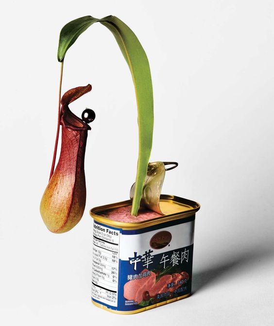
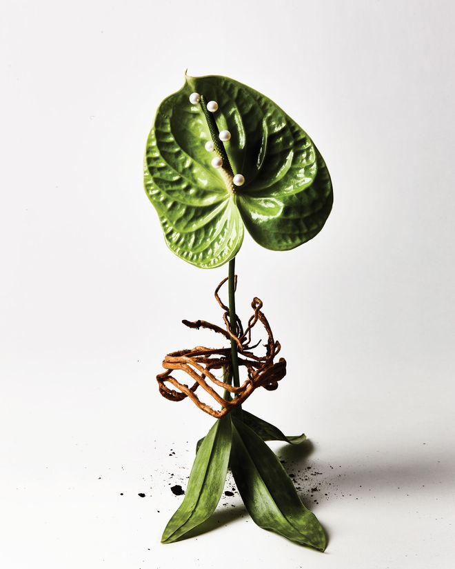
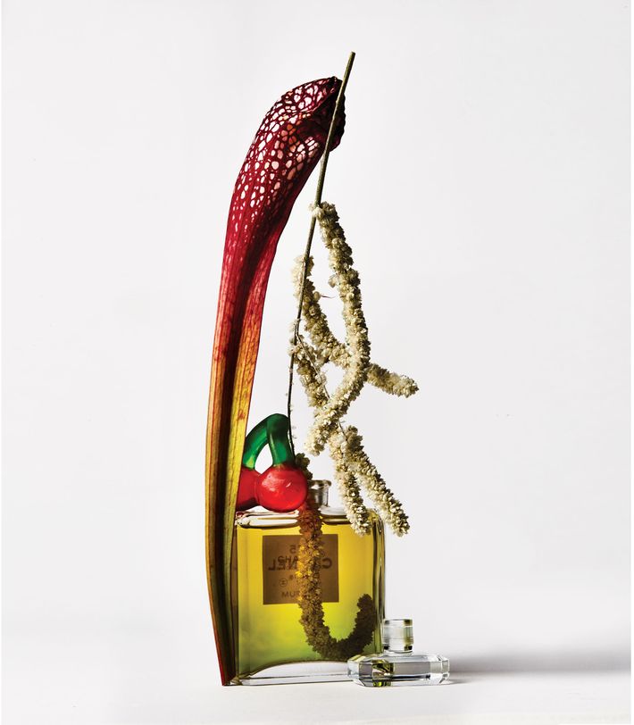
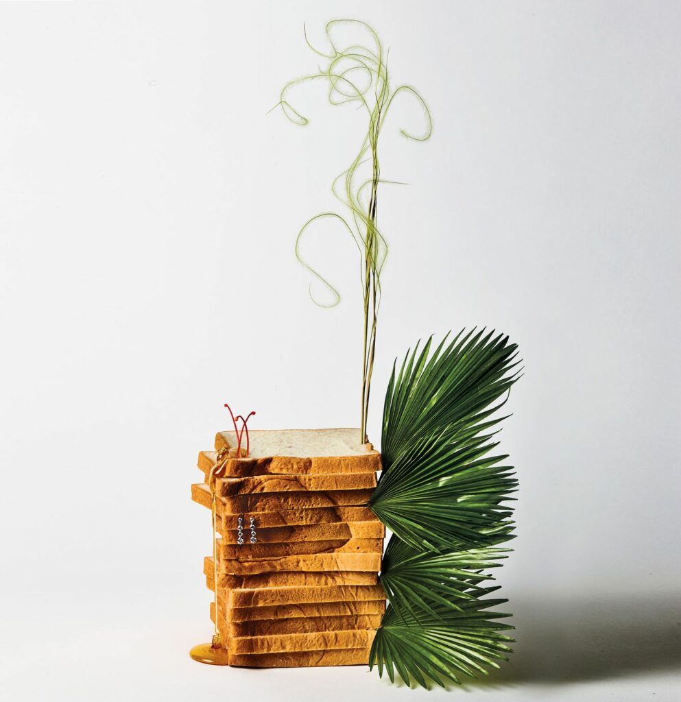
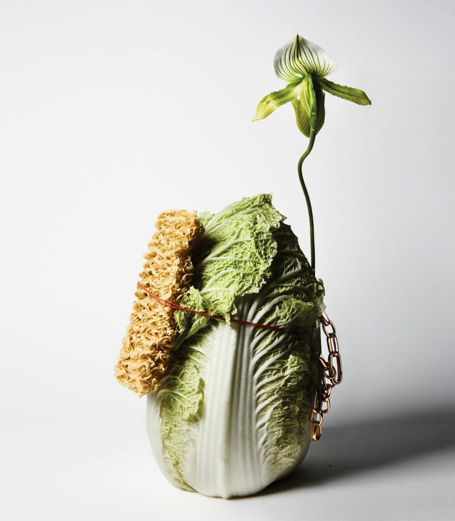
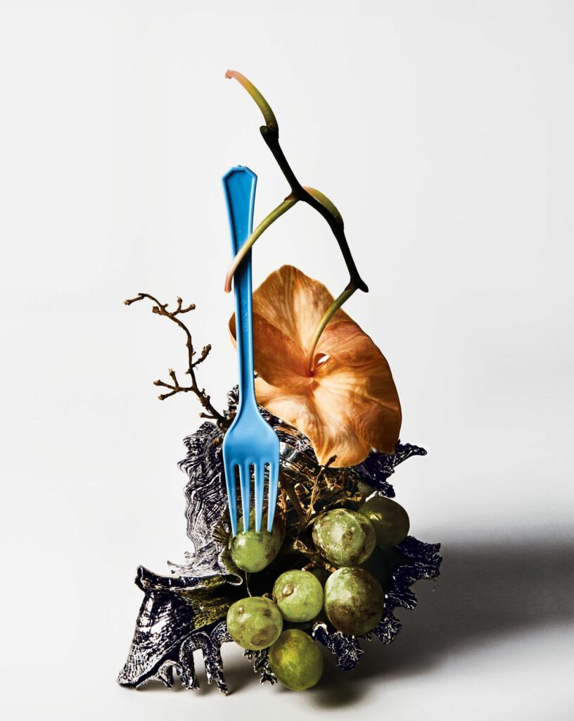
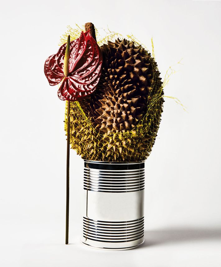
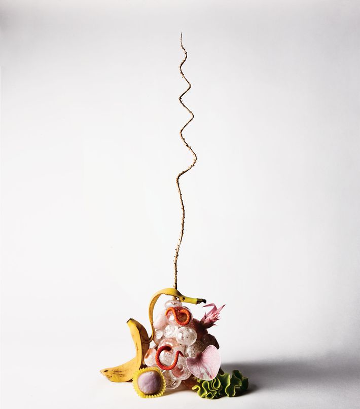
Die Masterarbeit ist sehr klassisch, eher wissenschaftlich gestaltet. Unterstützend für das Verständnis, hat die Studentin ergänzende Bilder eingebaut, die meiner Meinung nach die Arbeit auflockern und den Prozess der Studien besser beleuchten. Aus meiner Sicht könnte das Bildmaterial ,auch wenn die Masterarbeit möglicherweise nur ein klassisches Layout haben darf, besser gestaltet oder gewählt sein. Ich finde es in dieser Arbeit sehr schön, dass man die Gestaltung des Endprodukts, also des Spieles sieht. Aber auch hier wäre mein erster Tipp nicht, dass es sich bei der Autorin um eine Designstudentin handelt. 

Innovationsgrad

Ich finde den Gedankengang und die Idee der Masterarbeit sehr gut. Es ist wirklich interessant zu lesen und sehr spannend, inwieweit das Thema der Kreativitätsförderung in ein Tool verwandelt wird. Ich finde das der Innovationsgrad hier sehr hoch ist, da ich zu Beginn nicht damit gerechnet hätte, dass der erste Gedankengang im Endeffekt auf eine sehr anwendbare und durchdachte Art ausgearbeitet und erforscht wurde. 

Selbstständigkeit

In der Arbeit ist zwar vermerkt, dass die Betreuungsperson viele Hilfestellungen gegeben hat und auch andere Personen hatten Einfluss auf den theoretischen Teil der Arbeit. Dennoch wirkt es so, als wäre die Arbeit sehr selbständig geschrieben worden und vor allem auch bei den drei Studien merkt man, dass viel Aufwand und Herzblut darin steckt. 

Gliederung und Struktur

Das Inhaltsverzeichnis gibt einen guten Blick über die Arbeit und ansonsten finde ich, ist die Masterarbeit sehr gut gegliedert. Sie hat auch einen Art dramaturgischen Aufbau. Es ist außerdem sehr angenehm und verständlich zu lesen. Was mir aufgefallen ist, dass die Zitate erst in der Literaturliste vorkommen und nicht im Fließtext eingebaut sind. Demnach ist es schwierig die Literatur zu den Textpassagen nachverfolgen zu können. 

Kommunikationsgrad

Eigentlich ist die Arbeit sehr verständlich geschrieben und auch nachvollziehbar erklärt. Die gewählten Formulierungen sind nicht zu schwer verstehen. Nur muss man sich aus meiner Sicht ein bisschen einlesen, da ich anfangs beim Lesen des Abstracts nicht ganz verstanden habe, wie die Masterarbeit aufgebaut ist. Das Inhaltsverzeichnis hat dann sehr weitergeholfen, zu verstehen, in welcher Reihenfolge die Arbeit geschrieben und auch der praktische Teil gemacht wurde. Der Abstract war da leider nicht ganz förderlich geschrieben.  

Umfang der Arbeit

Ich finde die Arbeit hat einen guten Umfang, obwohl die Gestaltung des Spieles und der eigene Designansatz mehr herausstechen könnte. Ich finde das mit den Studien eine sehr gute Idee und es ist eine gute wissenschaftliche Arbeit, da sie ihre Vermutungen auch wirklich durch Tests bestätigen lies. Außerdem gefällt mir, dass diese Arbeit nicht so wirkt, als wäre sie nur aus Büchern recherchiert, sondern auch mit einem hohen Anspruch an das Ausprobieren und Anfertigen eines Protypens gemacht wurde. 

Orthographie sowie Sorgfalt und Genauigkeit

Bei der Sorgfalt und Orthographie gäbe es hier bestimmt noch ein bisschen Luft nach oben. Manche Statements wirken etwas vage und auch die Beschreibung der Studien könnte genauer sein. Es wirkt schon durchdacht aber manchmal enden die Erklärungen sehr abrupt.

Literatur

Es sind auf jeden Fall viel mehr Quellen angegeben, als ich anfangs dachte. Die Zitierweise ist hier natürlich anders, als die mir bekannte Form, dennoch wirkt es sehr korrekt. Nur wie schon vermerkt, fehlen mir die Zitate im Text, da die gesammelte Literaturliste schon ein bisschen zu umfangreich ist, falls man etwas nachschlagen möchte. Aber ohne Zweifel hat sich die Autorin sehr stark mit der gewählten Forschungsfrage auseinandergesetzt. 

Another still life medium – paintings II

After the tendency of still life paintings in an abstract direction, there a tons of contemporary examples, where artists try to interpret the still life theme for themselves. In painted artworks nearly everything is possible and therefore it became quite popular to not show the still life scenario in a realistic way. The next few examples are some recent works, which have quite different styles and most of them are obviously influenced by the 20th century.

The first example is made by Hilary Pecis, who works and lives in Los Angeles. Her style is quite colorful and also profit from a flat optic. The light in Pecis’ paintings bounces across the canvas as saturated color connects objects through pattern and manipulated perspectives. Her technique explores line, font, perspective, and color as stacks of books and vases of flowers sit on surfaces of rhythmic pattern. The art she creates includes many sites and scenes from her personal cache of photographs. These photographs focus on certain details, which help to portray the feeling of a captured moment. Her vibrant artwork found its inspiration in art-historical references, and with art itself. As a fun fact in her painted rooms there are often figurative and abstract canvases hanging which are recreated by her fellow artist colleagues. Moreover in her artworks there is a certain vibe domaining which makes the still life really dynamic and realistic. 

Another example, which shows an even more abstract approach than the first example. It is massively inspired by the cubism and its philosophy of  flat shapes and changing the thought of perspective. The artist Holly Coulis is fascinated by the stillness itself and she claims that we search for movement in every genres of paintings, even if they are abstract. But the still life has no movement before and after it was painted. It would be still as long as something disturbs the calmness. For her this still compositions are having an intimate personality. Coulis still lifes are showing an unseen character’s private things. Like solidly colored fruits, vases, knives, cigarettes and cats dancing around Coulis canvases, cheerfully bumping against one another. She crates forms in varied, bold hues, giving them radiant, vibrational auras. Pop art, Cubism, and abstraction inform the flat color, geometry, “off perspective,” and playfulness in Coulis’s paintings.

The next example also plays around with perspective and realistic optics. The artist Nicole Dryer deals with the presentation from branded objects in a pop art style. Her work is influenced by previous artworks from artist like Andy Warhol and more recently Katherine Bernhardt.  Dryer is interested in the people’s reaction towards products and if they trigger an intense emotional response. This could be a reaction such as nostalgia, commitment or hope. Therefore consumerism is a major topic for her paintings. Even though Pop art is the most direct influence, the artist also profits from much older aesthetic tradition from Dutch still life paintings. 

The last example is even more inspired by the classic tabletop composition. The artist is called Nikki Maloof and plays a lot with the presentation of set tables. The motives are often dead and alive animals like fish, oysters and lobsters. The food is combined with colorful table decoration and often shows a scenario of action, like a cat that is looking to the food. As dynamic and vibrant the paintings are, as much contrary emotions of anxiety and fear are transported through the picture. The artist is inspired by the “lush textures,” “hyperdramatic arrangements,” and “symbolism” of the Dutch vanitas tradition. She’s particularly drawn to the moments in the 17th-century canvases where it becomes clear that “the artists drifted into fantasy to achieve the drama they were looking for.” The closer she looks at these paintings, she said, the more they begin to “feel like stages for operas or plays about the everyday.”

Quellen:

https://www.artsy.net/article/artsy-editorial-17-contemporary-artists-reimagining-life

https://www.artsy.net/artist/holly-coulis

https://www.artsy.net/artist/nikki-maloof

Another still life medium – paintings I

It is already clear that still life photography comes from painting. Nevertheless, the development of painting in the 20th century was also an important inspiration for modern photography.

The 20th century was a century of revolution and emerging abstraction in terms of art. The new trends developed very quickly and overlapped. Above all, the tendency towards non-figurative and abstract motifs was new. The still life found its place here especially in the first half of the century, as in the second half the popular abstraction made the recognizable motifs disappear completely. So it can also be seen in photography how one goes from the classical representation more and more towards more abstract and experimental directions. So it is still exciting to see what very modern forms of painting look like, to see how, after this revolutionary development in the 20th century, the artists are redefining the topic.

About 20th Century

As examples of the well-known artists of this era, Paul Gauguin painted the sunflower still life to honor his deceased friend Van Gogh. Because one of Van Gogh’s most famous pictures is the flower still life with a bouquet of sunflowers. The group, Les Nabis, to which Gauguin belonged, took up his harmonic theories and adapted subjects that were inspired by the Japanese woodcut. Further examples of this period would be the flower still lifes by the French painter Odilon Redon.

Another representative who would be exemplary for still life painting is Henri Matisse. His scheme consisted of more or less flat contours and bright, radiant colors. He also reduced the perspective representation and used multicolored backgrounds. The useful objects, such as tables, which only have the purpose of the display area and, in Matisse’s case, already merge with the space and disappear. Other founders of Fauvism, such as Maurice de Vlaminck and Andre Derain, also experimented with pure color and abstraction in their still lifes.

To sum it up the still life theme is about the things, that belong to us and therefore define who we are. The contemporary still life artwork often reflect the real or suggestive surroundings they have or create through their projects. 

Paul Gaugin

Vincent Van Gogh

Odilon Redon

Henri Matisse

Quellen:

https://www.hisour.com/de/still-life-in-twentieth-century-27408/

https://www.daskreativeuniversum.de/stillleben-stilllebenmalerei/

Modern still life photography

Still life photography became an unbelievable big field of photography and it is always good the explore some contemporary artworks.

Freakebana

Freakebana is an attempt to make a still life relatively ugly and cool at the same time. Originally, this newly discovered fun can be traced back to a Japanese art form. Conventional flower arrangements are usually only draped with simple plants, so that the important flowers stand out. With this form, however, it is much more about using form, color and lines dominantly and loudly and still reducing the elements to the bare essentials.

Florist Brittany Asch collaborated with photographer Bobby Doherty on this series. The plants were chosen for their symbolism. This new style wants to provide surprises and makes use of objects that are not intended. The style can be channeled easily while sitting at a table with friends. You don’t need acres of land or deep pockets, just a willingness to see the potential in banal produce, flowers, and stray detritus – remixing them to seem intentional, maybe even beautiful. See photographer Bobby Doherty’s take on the trend, paired with luxury jewelry, below. 

Series by Lauren Bamford 

Photographer in Melbourne who creates images with a floral composition combined with beer cans.

Quellen:

https://www.laurenbamford.com/infolaurenbamford

https://www.curbed.com/2020/10/what-is-freakebana-the-new-style-of-arranging-flowers.html

Modern still life photography

Still life photography is a complex genre in which one can often create meaningful work with few materials. However, if you simply depict your inanimate objects without ulterior motives or the right know-how, this can result in a rather uninteresting picture. It is also always important to learn from contemporary artists and to see what messages they convey through their still lifes. The following photographers have created particularly interesting still lifes, although some are more or less well known:

Henry Hargreaves

Henry is a contemporary photographer currently based in Brooklyn, originally from New Zealand. He is best known for his still life and food photographs. His connection to photography came about when he worked as a professional model and got to know many photographers and their techniques. His still life photographs focus on depicting food and often contain humorous or critical messages. His photographs have been shown at the Venice Biennale, MAXXI in Rome and the Lunch Box Gallery in Miami.

Mat Collishaw

Mat is a contemporary artist who also does still life photography. He attends Goldsmiths College and has had various solo and group shows over the past three years. His works are exhibited in many famous art institutions such as the Center Georges Pompidou in Paris, the Museum of Contemporary Art and the Tate Museum in London. His work is often provocative, but you have to take a second look to see it.

Evelyn Bencicova

Evelyn is a visual creative from Bratislava. She specializes in photography and art direction. Evelyn studies at the University of Applied Arts in Vienna. It uses a visual language that is full of symbolic elements. In this way, the viewer looks at her still life photography for a long time, trying to understand its different depths. Evelyn’s pictures are always more than you think. She works with Gucci, Cartier and Nehera. She has also won several awards and her work has appeared in Vogue Portugal, Vogue Spain and Elle magazines.

Jonathan Knowles

He is a well-known commercial photographer who specializes in still life photography. He has a unique style and lighting technique. He mainly works commercially with drinks and liquids, as he has had a weakness for these representations since childhood. His work earned him multiple awards and Jonathan worked with clients such as Coca Cola, Smirnoff, Nescafe and Guiness. Here you can see a still life series of his, which is completely in the spirit of dark subjects with the name “Derelichte”. The other series shows a combination of organic objects with plastic.

Suzanne Saroff

Suzanne is a photographer based in New York, who is known for elegant and modern product photography. She perfectly represents recent trends which are based on visual weight and balance. As well as a specific vibe created through a thoughtful color scheme. In this series, she plays with the transparency and effects of glass materials. 

Quellen:

https://www.weekend-creative.com/thoughts/inspiration25

https://henryhargreaves.com

https://jknowles.com/photography/food/temptation/

https://matcollishaw.com/works/last-meal-on-death-row-texas/

http://evelynbencicova.com/vogue-still-life/

Tabletop photography II

The tabletop photography gives photographers the chance to hone their craft and develop their abilities and skills regardless of time, weather and lighting situation. Lights, backgrounds, props-in short, everything that defines an picture are under the control of the creator, who can design scenes that range from objective to realistic to elaborate. 

Tabletop photography basics

Whether there is the intention to take pictures for products, foundation exposures for composite images, or you just want to capture a culinary scene, shoe-mount flashes can take you quite far.  These flash units are small, light, and battery operated. Therefore you don’t have to worry about extension cords and power outlets. But more important is the fact that these types of flashes are widespread. A lot of photographers have these flashes as a part of the basic equipment.

There are only a few things that influence the exposure of a photo. The focal length of the lens determines the perspective, the aperture defines the depth of field, the focus determines what will appear sharp in the picture and the lighting is basically the mood of an image. The advantage working in a studio means the photographer is in the position of being able to control all these factors and there are countless variations for exposing a single subject. 

Sharpness and Blur

Furthermore to determining the depth of field, the aperture also defines the degree of blur. Blur and sharpness have an quite big influence on the the look and vibe of the photography. As a result they could make an objective impression or otherwise a romantic impression. Because all elements of the tabletop shoot are under the control of the photographer, there is no limit to affect the sharpness and blur by changing the aperture. There is also the possibility to adjust the composition of the picture or the relative distances among each of the elements of the image. This means, for example, that an element can be placed by intention, beyond the depth of field to give the impression of a greater space or to separate the elements of the image more clearly. 

The distance of the main subject from the background of an image and the positioning of the focus lines during an exposure are of the utmost importance. They help you to develop the sense of space in your pictures, or in other words lead the viewer to pay attention to important details.

Focal length

The choice of focal length also affects the effect of an exposure. A wide angle lens makes objects in the foreground appear larger and allows you to include a larger background. In contrast, a telephoto lens compresses a photo to make it appear more compact and also shows less background in relation to the main subject of the image. A standard lens, often a macro lens for tabletop photography, displays objects the same way the human eye sees them, so it is useful for product shots where you want an objective perspective.

The wider the opening, the smaller the depth of field at which the subject appears acceptably sharp.

Light

The most important design tool of a photographer is light or the ability to change the quality of light through shapes. Shaping light in this sense has two meanings: First, photographers can shape the light themselves to be flat, pointed, hard, soft, scattered, etc. Second, light shapers enable photographers to stylize their subjects by modulating the lighting to match their photographic ideas. This is the exact process – what we call photography – that enables us to create two-dimensional images of objects based solely on the interplay of light and shadow.

Design with a purpose

Last but not least, a photographer’s creative instinct and effective composition are essential factors for a successful image. This includes choosing the right background, taking appropriate props and establishing a visual style that matches the subject/object. The photographer needs to stay objective when creating product shots and knowing when it is appropriate to use the photography to tell an emotional story.

When working professionally, the intended purpose of a photo should always be the primary influence on the visual design. The elaborate staging of a screw with multi-colored lighting and strong focus could work very well for the cover of a product catalog, but the same image would not be suitable for conveying objective information. To do this, it is better to make a clear product shot in which all the details of the screw are presented neutrally.

This also applies to the world of amateur photography, of course. Whether you are creating a product collection or taking a picture for an invitation, you should always consider the context in which the photo will be used and the effect the picture is going to have on the Person who sees it.

Know technology by heart

Proper use of the required technology requires both knowledge of how it works and a certain amount of experience from its regular use. The combination of this knowledge and experience helps to use the devices in a targeted and intuitive manner.

Therefore it is a great idea to set up some assignments for yourself from time to time and practice creating multiple photographic variations of the same subject. Your subject can be an everyday object staged under different lighting conditions, or it can be a broader theme, e.g. B. Representations of glass or transparent objects or even abstract images of aroma, coolness, softness or the like. Compare the results of the images you have created and determine which techniques have produced the best results.

After all, it is always good to ask yourself the following questions before starting a shoot:

– Will my plan achieve the desired result?

– Will the background and props serve the message you want?

– Are the subject and the background properly lit?

– Is the viewer’s gaze drawn to the important details of the picture?

– Does the selected focal length, perspective and depth of field match the subject?

– Is the focus on the optimal shot?

Quelle:

https://fixthephoto.com/tabletop-photography.html

https://www.amazon.de/dp/B00VB46CK6/ref=as_li_ss_tl?dchild=1&keywords=Tabletop+Photography+book&language=en_US&sr=8-1&linkCode=gs2&linkId=85d6c21259fd88d66db1bdb417f5376c&tag=expertphoto02-21&asin=B00VB46CK6&revisionId=4ce23c0c&format=1&depth=1

Tabletop photography

Generally speaking for photographers, still life photography or, among them, tabletop photography is a good medium for further practice and to improve the technical and artistic skills . The following blog post explains tips from photographers on how to set up and design a tabletop photography. Since the still life photography basically benefits from inanimate objects such as decoration, plants, food, etc., it is a very thoughtful and calm type of photography that is not based on spontaneity or random snapshots.

Table photography is a type of still life photography that can be described by the composition of the elements on a table surface. Here, the disciplines of food photography and product photography come together. Since mostly the objects of these types are also on a surface or a table surface.

As already mentioned, many photographers do not always use the medium of tabletop photography purely for commercial purposes, as it gives you the opportunity to try out a lot. Here you can look closely at the various light situations and what influences the texture and color of a substrate have. For example, you would see how well a light from the side comes from a weaker light source that brings out textures and materials. In addition, you have a great responsibility as a designer, because ultimately every aspect of the image can be influenced by the photographer.

Away from the sales or presentation idea, table photography does not always have to advertise a product or food. It can also create a pure mood picture or try to tell a story. Because the objects themselves also have a strong narrative character.

What do you need for table photography? As a specialist, you naturally benefit from professional and correspondingly expensive equipment. Nevertheless, no designer should be stopped by this, as you can create amazing photographs alone in a living room with basic equipment. Here you can orientate yourself on many creative DIY solutions.

Guide to the necessary equipment

– Any kind of camera. Of course, the quality and the possibilities of post-processing increase if you use a digital camera and not your own mobile phone. However, you shouldn’t be limited to trying table photography even if you don’t have a professional camera model.

– Different materials in different colors and shades to line the sub and background for the scene.

– Reflectors are essential to guide the light back into the scene and thus to highlight it. Here, too, there are simple alternative solutions if you don’t have a reflector.

– A stable surface, which also fits in the format, is the base level for table photography, which with this medium always plays a role as a presentation surface.

– Props are crucial in order to steer the mood of the table photography into a certain style. Here it is of course interesting if you rummage through the attic or look for treasures at flea markets

– Light set ups decide in which direction the photo will develop. A low key setup creates a completely different mood compared to a high key set up and must also be made depending on the choice of object.

Quellen:

https://expertphotography.com/complete-guide-still-life-table-top-photography/

https://www.enjoyyourcamera.com/Blickschule/Foto-Tutorials/Foto-Tutorial-Tabletop-Fotografie::14865.html

https://de.wikipedia.org/wiki/Tabletop-Fotografie

Basics of still life

Still life photography is neither outdated nor restricted due to its painting background. It can be playful, mystical, reduced and minimalist or provocative. The spontaneous, chaotic snapshot or the conspicuous, extensive staging are especially in the process of being set up.

Control of composition

The motionless motifs hardly create time barriers and you can calmly devote yourself to your still life. There are two clear opposites in the modern structure of photography. On the one hand the minimalist arrangement of a few, precisely chosen objects, on the other hand the overloaded mixture of elements that create a massive overall impression. As in still life painting, the overloaded variant is a lot more difficult to structure than the minimalist one. However, some photographers still try to bring the spirit of Dutch painting into photography and strategically overload the image with contemporary objects.

Break the rules

As an approach, it is possible to choose the structure of a classic still life and replace it in a humorous and provocative way with current objects or foods, such as fast food. Another approach is to deal with objects that have an individual meaning for oneself or for the audience. This creates a personal still life, which has the highest, symbolic character. If you see an object that triggers a memory, this factor makes a still life interesting on a whole new level. We manage to associate feelings and moments with objects and when these are photographed in a suitable subject, the medium affects us in a very intimate way. Finally, there are still many modern approaches, such as the snapshot of a still life in which a movement is nevertheless shown. Practically a photograph of an event in a quiet environment. An example would be a lighted flame, a liquid running out or the appearance of an object falling.

Black & White

B / W photography is not nearly as popular in object photography as it is in portraits. At first glance, black and white still life photographs have something past or old about them. The stylistic decision for this color scheme sometimes looks unusual and therefore a bit strange. However, this does not apply to every composition. If you start with still life photography and are unsure of the compositional structure, it helps to set your pictures in black and white. The advantage here is that you can compare the dark and light areas more quickly. It also helps the designer to recognize the contrast and make possible corrections. Of course, there is always the possibility that one would like the photography of still life in black and white better and produce an exciting piece of work.

Quellen:

Symbolic in photography

Meaning of the objects

Almost all symbols or allegories are understood ambiguously. The meaning or allusion interpreted by the viewer only emerges within the context of the picture. The use of symbols in still lifes manifested itself in the 17th century. During this time still life painting experienced a high and during this time the use of the right motifs and what they mean played a major role. Even today, one would love to experience the vision of every design / photography and what it means. Thus, symbolically charged objects are still used in still life photography. In addition, it seems to be modern even in still life photography to increasingly use the classically defined subjects.

Examples:

Broken vessels stand for the vanity of everything earthly and the commemoration of death.

Flowers: transience of splendor and beauty, revelation.

Halved or bitten: refer to a fall, but also to the senses or taste.

Books: vain science or useless pastime.

Money: love that can be bought, often alludes to the female gender.

Sliced ​​lemon: questionable, symbol of the externally beautiful and internally deceptive.

Things upside down or upside down: empty life, death.

Effect of colors in photography

According to the photography legend Alexander Spoerl, a colorful photograph has the worst color effect. In photography, three possible types of design have become established with regard to color.

1: Conventional coloring, which is based on the objective appearance of the object.

2: Creative coloring, in which the attempt is made to achieve the “effective” color, does not have to be the same as the real color of the object.

3: Symbolic coloring, does not adhere to objective or effective color, but aims at the message of the end result.

Color is essential for the subject and therefore also for photography. In contemporary photography it can be seen that the common colors of our everyday life are by far not as exciting as unnatural colors. A strong and saturated picture beats pale tones by far. Delicate and soft pastel tones can be more pleasant to look at for a long time, but they are not as attractive at first glance. Shades that differ only by delicate nuances are very difficult to use. In addition, photographs in black and white or grayscale are less noticeable, unless they have a strong and concise contrast. However, the use of strong colors can also be a hindrance if one does not pay attention to the relationship between color and object. Furthermore, the color must support the meaning of the motif and be useful.

In the case of creative coloring, it is important to ensure that it is chosen in a way that is understandable. In addition, different materials have a different effect with different colors. It is advisable to choose an unusual color mood for not every material. This can irritate the viewer and lead to displeasure. Objects that can be used for creative coloring in still life photography are usually described as cheap, impersonal and short-lived.

Beispiele für Farbsymboli

Examples for the symbolic of colors

Red stands for energy, passion and danger / orange stands for creativity, youth and enthusiasm / yellow stands for happiness, hope and spontaneity / green stands for prosperity, stability and harmony / blue stands for trust, calm and intelligence / purple stands for luxury Mystery and spirituality

Beispiele für Farbsymbolik

Quellen:

http://dornhoefer-photography.de/bedeutungen-der-bildsymbole-im-barock/

https://www.bbc.com/culture/article/20180318-secret-symbols-in-still-life-painting

https://www.andreashurni.ch/bildgestaltung/farbe/gestaltung.htmhttps://99designs.de/blog/design-tipps/bedeutung-der-farben/

Still life has a life of its own II

Still life photography is an area that requires an excellent eye for light and composition. There are already many excellent examples of the arrangement and staging of a still life in photography. If that is not enough for you, it is advisable to take a look at the history of still life painting. If you only know the classics and their rules, it is easier to achieve successful results in photography.

The lack of recognition for still lifes has always been a problem, since for many people they are only seen as copies, practically without any creative effort. This medium is often criticized, especially in photography. Because arranging inanimate objects and then taking a photo of them does not count as an artistic personal contribution for many, because theoretically one would have little effort in this endeavor. The lack of artistic imagination also contributes to the criticism of the still life. However, the still life lives from the magic of inanimate objects that arise between mimesis and symbolism.

Idea

Many modern still life photographs are very unique in their concept and execution. In order to understand the variety of different designs and their basic ideas, it is very advisable to deal with examples. Photography offers the designer the possibility of almost 1: 1 reproduction, which painting has been striving for for centuries. One is limited to the truthful appearance of the motifs. Of course, these can be abstracted to a certain extent on the basis of change or exposure to light. The modern still life tries less to aim for a true-to-original image than to create a meaningful and surprising staging.

Still life as practice

Thanks to the rigid lingering, the still life offers itself as an exercise motif. Whether painting or photography, taking pictures of the still objects seems easier for us and offers space to practice the creative craft without any time restrictions. Still life was part of the classical art class and got an upswing due to the continuous technical improvement of the cameras. In addition, the current social media world makes almost everyone a still life photographer. The need to photograph and post one’s possessions, food or found objects is stronger than ever. On the other hand, the symbolic content of these fast-moving forums declines, and the mass of representations reduces the viewer’s desire to decode each work with the greatest of accuracy.