Master Thesis Evaluation

This master thesis written by Amanda Karen Speechly in 2019 is about „Writing for mobile media. The influences of text, digital design and psychological characteristics on the cognitive load of the mobile user“. I chose this topic because it will be part of my master thesis which will adress the topic app design. 

Level of design
This master thesis is oriented to the scientific format and is very structured and uniform, but it is not graphically prepared to a high standard. Everything is tidy, however, not particularly appealing when viewed from a design background.  

Degree of innovation
This study explores the relationship between the author, the reader, and the text, focusing on the mobile media author who is tasked with balancing the functionality and humanity of digital interaction. She describes some unique points throughout her theoretical work, e.g. reader response theory for mobile text, cognitive load theory in context to mobile media or the emotional attitude towards reading on digital screens but overall it is more like a summary of what is already existing. 

Independence
On the first page of her thesis, there is a declaration that this master thesis is her own work. She references everything that is based on other work.

Outline and structure
It is very fluent to read and the structure of the content is very coherent and comprehensible. The topics build on each other and illuminate the research question from all areas connected to the topic. However, a critical view/reflection on some parts may help as well, sometimes it seems to be a little unilateral. However, what I miss is a table of figures in the end, because she describes the figures in the text where you can also find the reference. You would have to read a whole paragraph to find the reference. Sometimes I could not find a reference to the figure, maybe she created them herself but I don’t know because there is no specification.

In the end she has two appendices, where in the first appendix she gives insights in the current practices in a South African context which is part of her practical work. She conducted interviews in Cape Town, focusing on identifying the typical processes used by digital designers and editors to develop and present content for mobile media. In the second appendix she presents the interview questions. Since the appendices are placed after the references, it doesn’t seem important I don’t understand why this practical part is appended (at the very end), because it is an important part of her research.

Degree of communication
She wrote in the First-person perspective to describe her opinion in her own words. Her work is very informative with a lot of references supporting her statements and giving a good overview. Personally I think you can feel how important this topic is to her and how convinced she is of her statements. 

Scope of the work
The work contains 169 pages. The theoretical research is very broad and concerning all areas on this topic.

Orthography and accuracy
She has a good sentence structure and the texts are fluently readable due to the good verbalization. I could not find any spelling mistakes. The texts are written neutral, not using pronouns, for example the user is always describes as „the user“. 

Literature
She uses a lot of references, they vary from 1997 to 2018. Most of the literature is already around 10 years old, which is not good especially concerning a work in the mobile field that is developing rapidly. But a lot of the psychological statements go way back, so the literature selection on this makes sense.

Source
https://open.uct.ac.za/bitstream/handle/11427/31274/thesis_hum_2019_speechly_amanda_karen.pdf?sequence=1&isAllowed=y
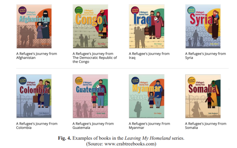
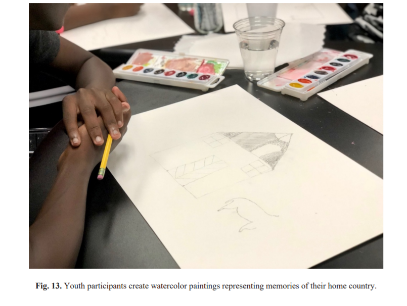
COLLABORATIVE CRITICAL PRACTICE: DESIGNING A CHILDREN’S PICTUREBOOK WITH RESETTLED REFUGEES

About the Thesis

  • Kelsey A. Johnson, B.A.
    Texas State University
    Master of Fine Arts
    with a Major in Communication Design
    May 2020

Level of design

It seems that the layout is not the same on all pages and the lines are not justified, the indent is too high, the distance between paragraphs and the topics are varies throughout the thesis, this inconsistency is confusing for the reader and makes the reading process complicated and time-consuming.

They used some small fonts in a context that are hard to read, some pictures are so small.

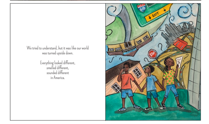
For evaluating the picture book designed by the authors, I will say they did a great job using painted pictures and nice fonts related to the story.

Degree of innovation

I think the other books for or about refugees even ones who told by the refugees don’t talk much about the cultural gaps which exist between refugees/immigrants and the local people, but in this case, they had a questionnaire, a great survey in existing data and books and held different workshops getting help from the refugee children, and that resulted in addressing many of the mentioned issues so I will consider this thesis innovative.

Independence

It is a very good example of how a study can be carried out independently and not get directed by the partners along the way.

Outline and structure

The outline is so well structured and it is very clear and easy to follow, the abstract is understandable even for the readers who are not familiar with the topic, also the readers will find what should they expect from this thesis.

The table of context is in detail but a little long, I think I will do mine in a shorter version, they have a storyboard and the rest of it is really well done.

Degree of communication

They managed to have a clear and understandable glossary which made the text easy to read.

Scope of the work

The authors worked a lot on reviewing and analyzing the exciting book, the gaps which children face as a refugee and immigrants, and the history of the books written in this field and also engaged children in their project so in my opinion they did a great job and made a lot of efforts.

Orthography and accuracy

I am not an expert in this field but I didn’t see any problem while reading.

Literature

Although the style and method they had used is so innovative but they managed to use and cite a lot of directed sources and the bibliography.

Evaluation of a Masters Thesis

Autor
Michael Hu Yang

Jahr der Veröffentlichung
2017

Universität
Appalachian State University

Titel
One-To-One Scale Modeling For 3D Printing

Art der Arbeit
Masterarbeit

Sprache
Englisch

Seitenanzahl
52

Gestaltungshöhe
Aufgrund des wissenschaftlichen Zugangs zu dem Thema ist das Design und die Gestaltung der Arbeit technisch und simpel. Das Design ist durchgängig, aber visuell wenig ausgefallen. Es handelt sich um ein wenig ausgefallenes, dennoch aber klares Design mit gut lesbaren Schriften, technischen Zeichnungen bzw. Grafiken und Bildern.

Innovationsgrad
Die Arbeit befasst sich 3D Scanning von realen Objekten, um möglichst detailgetreue 1-zu-1 Nachbildungen mithilfe von 3D Druck zu reproduzieren. Die verwendeten Werkzeuge beschränken sich laut Aussage das Autors bewusst auf günstig verfügbare Werkzeuge wie beispielsweise einen Kinect Sensor. Die Technik des 3D Scannings hat sich über die letzten Jahre stark weiterentwickelt, daher wirkt die Arbeit etwas veraltet. Im Hinblick auf verfügbaren Mittel im Jahr 2017 scheint der Innovationsgrad er Arbeit durchaus angemessen.

“Creating models for 3D printing has long been a very tedious manual
task. Models created using current 3D scanners were either not to the size or lacking sufficient details. Users are then required to edit models in modeling software manually to set the size and add detail. This thesis will try to address this tedious task.” (Michael Hu Yang)

Selbstständigkeit
Die Arbeit umfasst diverse theoretische Erklärungen, sowie einige praktische Beispiele die augenscheinlich selbst angefertigt wurden.

Gliederung und Struktur
Die Gliederung der Arbeit ist klar und verständlich. Der Autor führt über eine Einleitung zum theoretischen Hintergrund und leitet den Leser so zur Methode und den daraus resultierenden Ergebnissen und Erkenntnissen.

Umfang der Arbeit
Die Arbeit umfasst technische Erklärungen, sowie technische Hintergründe. Methoden und daraus resultierende Ergebnisse werden mithilfe von Grafiken erklärt. Aus einen designtechnischen Blickwinkel sind die Grafiken ausbaufähig, allerdings gut verständlich.

Orthografie und Genauigkeit
Aufgrund des technischen Zugangs zu der Thematik sind auch die Beispiele und die zugehörigen Erklärungen auch etwas kompliziert. Ein Glossar wäre zur Erklärung diverser Fachbegriffe hilfreich, fehlt in dieser Arbeit aber gänzlich.
Die verwendeten Grafiken bestehen zu großen Teilen aus Screenshots der verwendeten Software. Im Bildverzeichnis ist zwar eine Erklärung der Abbildung zu finden, in keinem davon wird aber die jeweils verwendete Software erwähnt. Lediglich am Ende ist eine Liste der verwendeten Programme zu finden. Die fehlenden Software-Erklärungen führen zu Verwirrung und zu Schwierigkeiten im Verständnis der gezeigten Beispiele.

Literatur
Mit insgesamt 34 verwendeten Quellen wirkt die Sammlung umfangreich. Die Quellen sind großteils aktuell (in Anbetracht der Veröffentlichung der Arbeit) und wirken auf mich angemessen. Nur einige wenige Quellen reichen bis in das Jahr 1998 zurück, was auch im Kontext der mathematischen Hintergründe angebracht ist.

Quelle
https://libres.uncg.edu/ir/asu/f/Yang,%20M_2017%20Thesis.pdf

Master Thesis Evaluation

I chose this thesis for my evaluation because I have been doing a lot of research on this topic myself during the last three semesters. Because most of the theses in this field are either focusing on the engineering or development of human-machine interfaces in cars, I was really happy when I found the following thesis.

Title
Driver-centered Human-machine-interface design for a better takeover experience in level 4 automated driving

Author
Xinyi Wang

University
Delft University of Technology, Faculty of Industrial Design Engineering

Degree and submission
MSc Design for Interaction, April 2020

Supervisors
Chair of the supervisor team – Elmer van Grondelle
Mentor of the supervisor team – René van Egmond
Company supervisor – Wouter Kets

Level of design

For evaluating the level of design, I will rate the design of the thesis itself (layout) and the design of the final project (prototype) separately.

The level of design of the layout is good, but there are a lot of smaller things that would need improvement for it to become an excellent design. Even though the author designed some of the graphs and tables on her own, most of them were not designed at all and did not fit into the layout. The usage of different styles of images and illustrations for the same purpose was also not ideal for me. But the biggest problem I had with the design of the thesis is that there were different graphs and figures with a lot of text that was way too small to be readable. I sometimes even had to zoom in to more than 200% to be able to actually read them. One positive aspect of the layout was the usage of different colors for the literature study (yellow) and the project (purple). Based on all these factors, I would still rate the level of design as good with room for improvement.

The final design of the prototype can also be described as good with some very good elements. Because the design of the final prototype is using a lot of elements I have already seen in interfaces from popular car manufacturers, it’s probably not the most innovative interface I have seen, but I think that it fits the purpose of this project and works very well for doing user tests.

Degree of innovation

Even though the design of the final prototype is not really innovative for me, the degree of innovation of the rest of the thesis is really good. She did a lot of user research early in the project. She even asked five different experts from the field of autonomous driving, did a questionnaire with 28 drivers that have been using automated driving features regularly, and she also interviewed drivers about their experiences with the Tesla autopilot. Based on these results she then facilitated a creative session with four students from her degree to develop different concepts. These concepts were then evaluated and rated by 13 experts from different related fields. The best concept was then improved by her through an iterative design process. She even built a really nice prototype for her user testings. All in all the degree of innovation for me is very good.

Independence

Because this thesis was written as part of the MEDIATOR project, it is really hard for me as an external reader to evaluate the independence of this thesis. The only thing I am sure of is that the topic was not chosen independently, because it was based on a project brief of the company behind this EU-funded project. It is also really hard to evaluate if the ideas and concepts were based on her ideas because she facilitated a creative session with four more students for this purpose and got a lot of feedback from users and experts during the course of this project. Based on her reflection she was doing the project individually from start to end and was in charge of everything and it was quite challenging for her. Even though it is hard to tell if she tells the truth, I believe her and would rate the independence of this thesis as good.

Outline and structure

The general structure of this thesis makes a lot of sense to me. The introduction also includes her main research question and the objective of the project, but there was no additional information about her motivation or the problem that she wants to solve with this thesis. One highlight of the introduction for me was that she based the structure of her thesis on the double diamond design process starting with the project brief and ending with her graduation with all the chapters of the thesis in-between. The chapters were also done in a logical order and every chapter had a small summary at the beginning. My personal favorites however are the conclusion and the personal reflection of the author at the end of the thesis.

Main research question
When is it needed to communicate what kind of information and how to communicate the information with the driver during takeover?

The objective of the project
Design the HMI of autonomous vehicles in order to enhance situation awareness for a better take over transition/journey.

Degree of communication

The degree of communication of this thesis was one of the things I did not like as well. Even though there was a list with abbreviations, I sometimes had to get back to this list because she used so many abbreviations I have never seen before. Because I have already written different blog articles about Autonomous Driving, I was able to understand it but I am also sure that most of my colleagues would have had some trouble with understanding this thesis.

Scope of the work

Am I sure that the author spent a lot of time working on this thesis because she gathered a lot of data from different users and experts and qualitative research is always a lot of work. Her thesis is also 100 pages long, including a lot of empty pages or pages with not a lot of content on them. But for me, it also looks like she was not very keen on doing the literature study because this part is really short and does not have a lot of information in it. A lot of topics from this part could have benefitted from more detailed descriptions and more context.

Orthography and accuracy

The orthography and accuracy of the thesis are ok, but they are definitely not great. Even though I was not able to find any big mistakes while reading through this thesis, I was able to find a lot of small grammar mistakes and typos in there. Some of the sentences were also structured in a weird way but still ok for readability and understandability. The research question, for example, looks like it was written in another language and then translated into English.

Literature

The usage of literature was the most confusing part of this thesis for me. Even though she listed 32 different sources for her thesis and also did a lot of qualitative research with users and experts from the industry, I was not able to find any sources for most of the figures and tables she used. A lot of paragraphs in her literature study also did not mention any sources or were describing tables and figures without sources. The only positive aspect of her literature list is that she used a lot of books and journal articles and only a few online resources.

The Effectiveness of Sound in Corporate Branding – Master Thesis

Die vorliegende Masterarbeit von Svea Laura Benad folgt den Konzepten des “Sonic Branding”, der Einbeziehung von Klang zu Markenzwecken, und der “Corporate Auditory Identity”, die als das auditive Gegenstück einer visuellen Unternehmensidentität verstanden werden kann. Untersucht wurde der Einfluss der Konsistenz von Branding-Strategien und des Einsatzes von visuellen, auditiven und audiovisuellen Elementen auf wünschenswerte Branding-Ziele für neue Marken, wie z.B. Markeninteresse, emotionale Markenbindung und Verbraucherbindung.

Die Gestaltungshöhe war meiner Meinung nach gut, da sehr umfangreich die Literatur behandelt wurde. Es wurde theoretische Gerüst bestand dabei aus Corporate Identity, Sonic Branding, Consistency in Branding Strategies, Brand Interest und Emotional Brand Attachment. Dabei war der Innovationsgrad in der Umsetzung des Experiments meiner Meinung nach auch vorhanden, durch ausgeklügelte Designs für Social Media Anwendungen. Das Thema ist zwar schon oft erforscht, aber noch immer aktuell.

Das Experiment wurde für meinen Erkenntnisstand Selbstständig erarbeitet, es ist keine Hilfe von außen direkt erkennbar. Die Gliederung und Struktur sind für mich nachvollziehbar und strukturiert. Das Einzige was mir fehlt ist ein Inhaltsverzeichnis. Die Autoren erklärt das Themengebiet sehr gut und geht auf viel Literatur ein. Der Umfang der Arbeit ist meiner Einschätzung nach ausreichend für eine Masterarbeit mit über 60 Seiten und einem Werkstück.

Sonst wurde die Arbeit ausreichen dokumentiert und es wurde sorgfältig und genau gearbeitet. Die Literatur ist am Ende zu finden und es sind ausreichen Quellen verwendet worden.

Literatur:

Benad, S. L. (2016). The Effectiveness of Sound in Corporate Branding. Masterthesis. University of Amsterdam. Amsterdam.

Extraction of biometrical features for identification of a 3D head model us ing Microsoft Kinect, Evaluation

Autor:
ANDRIJA SUČEVID

Titel:
Extraction of biometrical features for
identification of a 3D head model using
Microsoft Kinect

Subtitel:

Art der Hochschulschrift:
Master Thesis

Datum:
Mai 2014

Universität:
Alpen-Adria-Universität Klagenfurt, Information Technology

Gestaltungshöhe

Standardisierte, wissenschaftliche Formatierung (Schriftart, Zeilenabstände, Seitenabstände, Formatierung)

Kapiteltiefe: 2 Ebenen

Innovationsgrad

Der Autor hat zum Forschungszeitpunkt 2014 ein sehr relevantes Thema der 3D Gesichtserkennung untersucht und dessen Machbarkeit überprüft.

Selbstständigkeit

Die Arbeit umfasst einen hohen Anteil an selbst erstellten Testkriterien und Umsetzung. Annäherung an Verfahren und Herleitungen sehr gut herausgearbeitet.

Gliederung und Struktur

Die Gliederung ist 2 Ebenen tief gestaltet, für einige Themen wäre eine Dritte möglicherweise dienlich. Guter Einsatz von Diagrammen und Grafiken erleichtern die Aufnahme des komplexen Inhalts.

Kommunikationsgrad

Sehr viele Sätze fallen lang aus, bleiben aber dennoch sehr verständlich. Des Weiteren werden sehr viele Abkürzungen verwendet, welche technische Grundkenntnisse voraussetzen, da diese nicht erklärt werden. Ein Glossar könnte hier leicht Abhilfe schaffen.

Umfang der Arbeit

Der Gesamtumfang der Arbeit beträgt 84 Seiten, inklusive Deckblatt, Eidesstattliche Erklärung, Abstract, Inhaltsverzeichnis

Orthographie und Genauigkeit

Sehr genau ausgearbeitet, orthographisch keine Auffälligkeiten.

Literatur

Der Autor verweist gesamt auf 48 Quellen. Bis auf 5 Ausnahmen wird auf Fachliteratur und Fachartikel zurückgegriffen. Die ältesten Werke sind zum Forschungszeitpunkt maximal bis zu 10 Jahre alt.

“Designing better tourist maps: How can illustration be used to improve the functionality of a tourist map?”

Titel: Designing better tourist maps: How can illustration be used to improve the functionality of a tourist map? 

Autor: Mikko Airikka

Universität: Aalto-Universität 

Department: School of Arts, Design and Architecture: Visual Communication Design – Information Design

Jahr: 2020 

Sprache: Englisch

Seiten: 131+83

Gestaltungshöhe: 

Die Arbeit ist im allgemeinen eine eher schriftliche Arbeit, in welcher die Gestaltung selbst eher im Hintergrund steht. In der Arbeit geht es um die Gestaltung und Funktionalität von Touristenkarten und wie Illustration die Funktionalität verbessern kann. Sie ist verständlich verfasst und visuell sehr schön aufbereitet, man erkennt, dass es sich um eine Masterarbeit von einem Designstudenten handelt, die Arbeit ist jedoch nicht experimentell oder visuell herausragend gestaltet – aber stabil. 

Innovationsgrad:

Die Arbeit beschäftigt sich mit der Frage rund um die Funktionsweise und Funktionalität von Touristenkarten. Der Autor hat sich vorgenommen, herauszufinden, wie touristische Karten nicht nur ästhetisch ansprechend, sondern auch für die Informationsbeschaffung funktional erstellt werden können. Die Hauptfrage ist, wie man Touristenkarten funktionaler gestalten kann. In der Arbeit werden noch 3 weitere Fragen bearbeitet. Hier wollte er erforschen, welche visuellen Stile bei dieser Art der Gestaltung verwendet werden sollten und wie Illustrationen verwendet werden können, um die  Funktionalität solcher Karten zu verbessern. 

In Hinblick auf das Thema und die vorrangige Forschungsfrage würde ich sagen, dass der Innovationsgrad der Arbeit nicht extrem hoch ist, aber trotzdem sehr wertvoll. Auch sind illustrierte Stadtpläne für Touristen bereits sehr stark verbreitet, wodurch die Anwendung von Illustration keinen sehr großen innovativen Wert für diese Art der Karten hat. Viele Aspekte der Arbeit sind nicht unbedingt neu, aber die Kombination, bzw. die Herangehensweise haben einen wichtigen und vor allem wissenschaftlichen Charakter und sowohl das Thema, als auch der praktische Teil werden gut und sorgfältig dokumentiert. Mir hat besonders gut gefallen, dass der Autor die Ergebnisse, bzw. seine 3 Gestaltungsvorschläge mit messbaren Methoden untersucht und klassische Methoden aus dem UX Design auf dieses Medium überträgt. 

Selbstständigkeit: 

Die extrem ausgeprägte Materialrecherche und die vielen verschiedenen verwendeten Methoden lassen auf viel Motivation und Selbstständigkeit schließen. Das merkt man in dieser umfassenden Recherche über vorhandene Projekte, aber vor allem auch in der Auseinandersetzung und der Kombination von verschiedenen Themengebieten. 

Gliederung und Struktur: 

Die Gliederung der Arbeit ist sehr ansprechend und verständlich und folgt vor allem einer guten Logik. Die Arbeit beginnt mit einem theoretischen Teil in der sich der Autor mit Kartografie, Tourismus und place bzw. City branding, Wayfinding und Illustration auseinandersetzt. Danach kommt eine extrem ausführliche Materialrecherche, in der Charakteristiken und Funktionen von Illustration in Bezug auf touristische Karten analysiert wurden, deren Ergebnisse dann im praktischen Teil in Form von 3 verschiedenen Versionen einer Touristenkarte umgesetzt und in weiterer Folge mithilfe von Usability Tests auf ihre Funktonalität überprüft wurden. 

Die Arbeit enthält auch alle strukturell notwendigen Elemente (Einleitung, Inhaltsverzeichnis,…Appendix…) und gibt dem Leser/der Leserin auch einen sehr guten Einblick in die Wahl der Untersuchungsmethoden. 

Kommunikationsgrad: 

Das Thema erfordert kein außergewöhnliches Fachjargon und der Autor hat die Arbeit in gut verständlichen, relativ kurzen Sätzen formuliert. 

Umfang der Arbeit: 

Es ist eine sehr umfangreiche Arbeit mit einer extrem ausführlichen und sorgfältige nMaterialrecherche, auch die Dokumentation der praktischen Arbeit ist sehr umfangreich und sorgfältig aufbereitet. Insgesamt umfasst die Arbeit 131 Seiten, die den Hauptteil bilden und zusätzlichen 83 Seiten, die den Appendix, das Literaturverzeichnis und das Bildverzeichnis beinhalten. Alle Bereiche wurden sehr sorgfältig und detailliert ausgearbeitet. 

Orthografie sowie Sorgfalt und Genauigkeit: 

Wie schon erwähnt ist die Arbeit im Allgemeinen super angenehm zu lesen und sie ist auch orthographisch einwandfrei verfasst. Das Layout ist durchgehend, stringent und verständlich und der Autor hat auch auf richtiges Gendering geachtet. 

Literatur: 

Es wurde sowohl Literatur aus der Designtheorie und Designforschung in Bezug auf all die wichtigen Disziplinen, die in der Arbeit vereint werden, als auch Literatur über Illustration und Kartografie verwendet. Das Literaturverzeichnis umfasst insgesamt 19 gute Literaturquellen.

Source: 

https://aaltodoc.aalto.fi/handle/123456789/44900

Master Thesis Evaluierung

Autor: Aberham, Odo
Jahr der Veröffentlichung: 2019
Universität: Universität Wien, Masterstudium Musikwissenschaft
Titel: Englische Königsdramen in italienischen Opern am Beispiel von Johann Simon Mayrs und Giovanni Pacinis Werken
Art der Arbeit: Hochschulschrift (Masterarbeit)
Sprache: Deutsch
Seitenanzahl: 155

Gestaltungshöhe

Aufgrund der inhaltlichen Ausrichtung der Arbeit, besteht sie fast ausschließlich aus Text – die Gestaltung und Formatierung tritt dabei in den Hintergrund. Es lassen sich allerdings Tabellen und Grafiken in Form von Auszügen aus Notenblättern finden. Die Arbeit setzt sich mit dem Thema der italienischen Oper in Hinblick auf Dramen (englische Königsdramen im Speziellen) auseinander.

Innovationsgrad

Die Arbeit besteht im Grunde aus zwei Kapiteln. Da sind zum einen die Grundsätze des Themas hinsichtlich der italienischen Oper im 19. Jahrhundert und zum anderen die “Königsdramen” und die dazugehörigen Opern. Beide Kapitel weisen nochmals drei Subkapitel auf, in denen der Stoff verhandelt wird. Die Methode der Forschung ist klar der Literaturarbeit zuzuweisen, da der Autor sich durch zahlreiche Werke hinsichtlich der italienische Oper gearbeitet hat, inkl. der Opernliteratur selbst. Er hat sich dabei mit allen drei Dimensionen (verbal, musikalisch, szenisch) auseinandergesetzt.

Der Innovationsgrad ist nach meinem Ermessen als durchaus hoch zu bewerten. So schreibt der Autor in der Einleitung über die Beweggründe, dass die Thematik bisher nur eine geringe wissenschaftliche Aufarbeitung erfahren habe, und er das Gebiet in dieser Hinsicht erweitern möchte. Dafür legt er nahe, dass es den Zeitraum der italienischen Oper mit der fast monothematischen Ausrichtung tatsächlich als “Phase” gegeben hat, und die beinahe 100 Stücke nicht zufällig in dieser Spielart entstanden sind.

Selbstständigkeit

Was die Selbstständigkeit betrifft, so kann hier kein negativer Aspekt festgestellt werden. Die Arbeit wirkt in allen Details genau bis akribisch, ist umfangreich und beleuchtet eine Vielzahl von Gesichtspunkten. Darunter fallen historisches (über weite Strecken), konkret-inhaltliches zu den Werken und allgemeines über das italienische Operngenre. Im Anhang findet sich noch eine große Gegenüberstellung in Hinblick auf die Figuren der Dramen (Herscherïnnen der britannischen Krone).

Gliederung & Struktur

Durch die klare Gliederung der Arbeit behält man stets den Überblick, welches Thema gerade im Zentrum steht. Die Logik macht durchaus Sinn, und folgt dem Schema “vom Allgemeinen zum Speziellen” – nach der Einleitung folgt die eigentliche Einführung in den Stoff, mit historischen und stilistischen Bezüge etc. Damit wird die Basis geschaffen, um sich im zweiten Teil konkret mit zwei Komponisten auseinandersetzen zu können. In der Conclusio wird auf den Inhalt zusammenfassend zurückgeblickt und der Schluss hinsichtlich der Fragestellung gezogen. Es wird zudem nochmals auf den Stand der Forschung hingewiesen.

Umfang der Arbeit

Die Arbeit erstreckt sich auf rund 120 Seiten exkl. Verzeichnis und Anhang, was einem ordentlichen Umfang entspricht. Für einen wissenschaftlich-forschende Zugang (ohne Werkstück) ist das angemessen und mitnichten zu wenig. Das wird durch die sorgfältig ausgewählten Notenbeispiele nochmals verdichtet, wodurch die Arbeit an zusätzlicher Qualität gewinnt.

Orthographie / Sorgfalt / Genauigkeit

Hinsichtlich der Orthografie lässt sich feststellen, dass der Autor sehr sorgfältig gearbeitet hat. Ich konnte keine Fehler in der Rechtschreibung entdecken, was bei einer Masterarbeit aber durchaus erwartet wird. Die Satzstruktur ist klar (keine überlangen Sätze), wenn auch in der Sprache recht intellektuell und komplex gehalten. Als Alltagslektüre ist sie daher nur eingeschränkt zu empfehlen – was der Sache aber natürlich keinen Abbruch tut.

Literatur

Was die Literatur betrifft, so wird in der Arbeit auf 68 Quellen (der überwiegende Teil Bücher) verwiesen – allerdings exklusive Enzyklopädien und Klavierauszügen, auf die ebenfalls reichlich verwiesen wird. Eine handvoll audio-visueller Quellen runden die Nachweise ab. Alphabetisch sauber sortiert, findet man alles wie gewohnt auf den Seiten nach dem Textteil der Arbeit.

“Video game genres and their music” – an Evalutaion


About the Thesis:

“Video game genres and their music”
by Pieter Jacobus Crathorne
supervised by Prof. Winfried Lüdemann
submitted at University of Stellenbosch
in the Department of Music
in March 2010

I chose this specific thesis as this was the main inspiration for my bachelor’s thesis, and because I have been a fan of computer games and been fascinated by their music for over fifteen years.

Design:

Although this thesis was written in the general field of art & design, it is not styled in an outstanding or revolutionary way. I can imagine the University of Stellenbosch has predefined templates for Microsoft Word that each student utilizes for their project, to adhere to a general style the university pursues. This has the benefit of having a consistent style along all published theses but dispossesses students of their own branding.

Innovation:

For todays standards this theme is not innovative anymore as game studios nowadays often hire renowned composers and orchestras for their music. However, before 2007-2010 (the thesis was published in 2010, but was started in 2007 or earlier) computer game companies were just beginning to do so. And as Pieter Crathorne himself wrote, earlier games just had programmers develop the music and not musicians compose the music. Of course, other resources already existed on music in computer games, but nothing had been going into as much detail as Crathorne did. And the main chapter, comparing games in genres and the genres themselves, had not been touched before at all.

Independence:

As this thesis does not have a project associated with it, it only consists of literary work. Thus, the author had to work on the thesis independently. Also, writing about the games’ music implicates having knowledge about the game, hence he independently played all of them as well.

Outline and Structure:

Pieter Crathorne developed a thought-through and understandable structure. While first giving a very basic overview of the theme and purpose of the study, he then starts with topics about music in general and steadily dives deeper into the computer game theme. Along the way, before the main analysis the author explains every bit of information, he will look at including differences between sound and music as well as defining genres as these often can be up to the listener’s (or in case of games the player’s) interpretation. The main section, analyzing all the games and their music, is divided into genres and sub-categorized into games, with comparisons in-between genres and with other genres in the “discussion” section. The conclusions are then summed up in the final chapter. The only issue I have with this thesis’ structure is the number of main chapters, which I believe could be reduced by combining some of the introductory chapters. Other than that, I was very pleased with the structure, so much so that I completely copied it and applied it to my own bachelor’s thesis.

Degree of Communication

Because Pieter Crathorne wrote a long and thorough introduction, I believe also people who are not directly from this scene understand most of his work. A background in gaming is not required at all, but I believe at least a little bit of knowledge about music might clarify parts of the thesis.

Scope of the Work

The thesis has 55 pages of actual content (= excluding front page, abstract, table of contents, bibliography and appendix). As there are no pictures in this thesis, I would categorize it as upper medium-sized. Because of the great explanations in the first few chapters, a shorter version would not have been possible and actually not been useful at all, as cutting content would just confuse the reader.

Orthography and Accuracy

In my opinion, Pieter Crathorne did a very good job keeping the thesis understandable and accurate. I did not notice any syntactic errors while reading through it (though I am not an expert, especially on commas) and all sentences were semantically coherent.

Literature

As this thesis is mostly about music in games, a big part of the literature is made up of video games. Crathorne cited 28 games in this thesis. That being said, there are 46 papers and articles listed in the bibliography, many of which come directly or indirectly from the game developers & publishers themselves. I do not know which citation style has been used, but all the citations follow the same style and include access dates wherever online media was used.

Source

Direct Link:
https://scholar.sun.ac.za/bitstream/handle/10019.1/4355/crathorne_video_2010.pdf?sequence=1&isAllowed=y

Downloaded from the Stellenbosch University Library
https://scholar.sun.ac.za/handle/10019.1/4355

THE EDUCATION MARKET FOR DOCUMENTARY FILM: DIGITAL SHIFTS IN AN AGE OF CONTENT ABUNDANCE – master thesis evaluation

level of design:

I would say the person who wrote this thesis did not really pay attention on the design. The thesis is rather long, one font, two colors and multiple sizes, the smallest size is a little hard to read. It does not look like a designer made it, which is also not the case here. All in all design-wise it is ok to read, the font is not the best to rea in my oppinion and sometimes too small but it is readable.

degree of innovation:

The thesis is about the benefits of documentary practice in the Australian education sector as well as a valuable ancillary market for documentary producers and distributors. I know that some schools do show documentary films in schools, but I have never read about more deatils about how beneficial it really is, and there are also quite some books about film distribution. So I would say there is definitely some degree of innovation in the thesis, yet the topic is not totally new.

independence:

The thesis was written without cooperation with any other entities.

Outline and structure:

The outline describes in short the content of the thesis, which I think is done well. It brought to the point what the thesis is about. The structure is also very well done and everything is easy to find because of the well and very detailed structure of the table of contents. I am not too sure if I would made the table of content that long ( I would also have narrowed down the topic a little bit) but it definitely gives a very detailed few on what you can read in it.

Degree of communication:

The communication is good in my opinion, it is well to see what a quote is, though maybe a glossary would have been nice, in case someone who is not a filmmaker or film studies expert and wants to read this. But you can see throughout the whole thesis, it is not written for someone who has no knowledge about film yet.

Scope of the work:

The scope of the work is to show that the education sector in Australia has proven both a beneficiary of documentary practice as well as a valuable ancillary market for documentary producers and distributors. Digital distribution and access have contributed to unparalleled levels of choice for educators around the documentary content they can deploy in their teaching. However, scarce scholarly work exists on how educators are navigating this new abundance of digital content and to what extent this new variety and volume of documentary may be assisting the sustainability of the documentary sector within the attention economy. Consideration of documentary’s function within concepts of cineliteracy in media analysis will frame this research alongside the potential of cineliteracy to enhance outcomes for all stakeholders within the education market for documentary. Central outcomes of the research will include strategic industry analysis; impacts posed by digital innovations in distribution; and the challenges and opportunities facing both the documentary industry and wider education sector. Analysis of the formal and informal outreach work of key international film festivals, foundations and charities connecting documentary with education audiences will be undertaken. Findings from this analysis include best practice observations which may allow for improved approaches to documentary distribution, delivery and implementation in the Australian education sector.-Ruari Baroona Elkington. I think the topic is really interesting, because I want to create eductaional documentaries in the future.

Orthography and accuracy:

I think the thesis was well thought through, researched and checked. I am not an expert in the field, but I saw a lot of quotations from different sources, which shows me that the author researched the topic well. I also dont see any mistakes which would stand out to my eye.

Literature:

The bibliography is about ten pages long, it consists out of books, magazines and web articles.