Data Storytelling 01

Making data mean more through storytelling
Ted talk by Data Scientist Ben Wellington
@ TEDxBroadway

In his talk Ben Wellington tells the story of how he started doing data visualization of New York City. In 2011 a free public database called NYC Open Data was created. Using this data Evans created his first visualization about traffic accidents involving bikes, pinpointing hotspots in the city. After it got picked up by multiple online news sites, he realized that the closer you are to the data the more you care about it. You have to connect with people and their experiences and make it relatable. So the next data he visualized were which pharmacies cover which areas in the city, the percentage of male and female city bike riders as well as the percentage of parking tickets on cars with out-of-state plates. In his work he tried to focus on one idea, keep it simple and explore the things you know best to tell the most effective story. With data storytelling you should try and make an impact. Wellington does this by trying to impact city government and shows some of the best responses in his presentation. 


Turning Bad Charts into Compelling Data Stories
Ted talk by Data Storytelling Trainer Dominic Bohan
@ TEDxYouth@Singapore

Dominic Bohan is a data storytelling trainer talking about charts, studies, history and how to turn data into stories. He believes that data storytelling can save the world and even save lives. 

Data is useless unless human beings can interpret, analyse and understand it.

During his talk Bohan describes three simple principles to great data communication: Using a human friendly chart type, being ruthlessly minimalistic and having a clear key takeaway.

To dive into these principles Bohan describes an 1984 study by researchers Cleveland and McGill on which charts humans are good at interpreting. According to him, they found out that human beings are best at encoding numbers by length and position. By talking about history approaches, studies and their outcome as well as giving examples and using the recommended charts, Bohan shows how (not) to use data visualisation and how to utilize them to tell engaging stories that mean something to us. 


Additional Information:
Design activism – Design and political communication 2.0

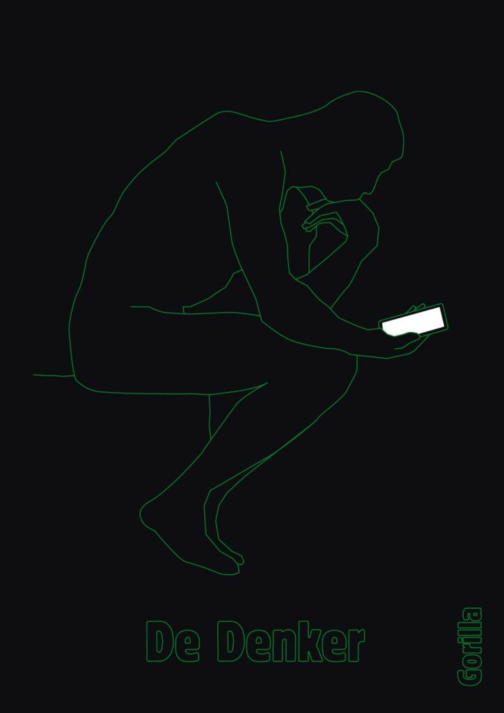
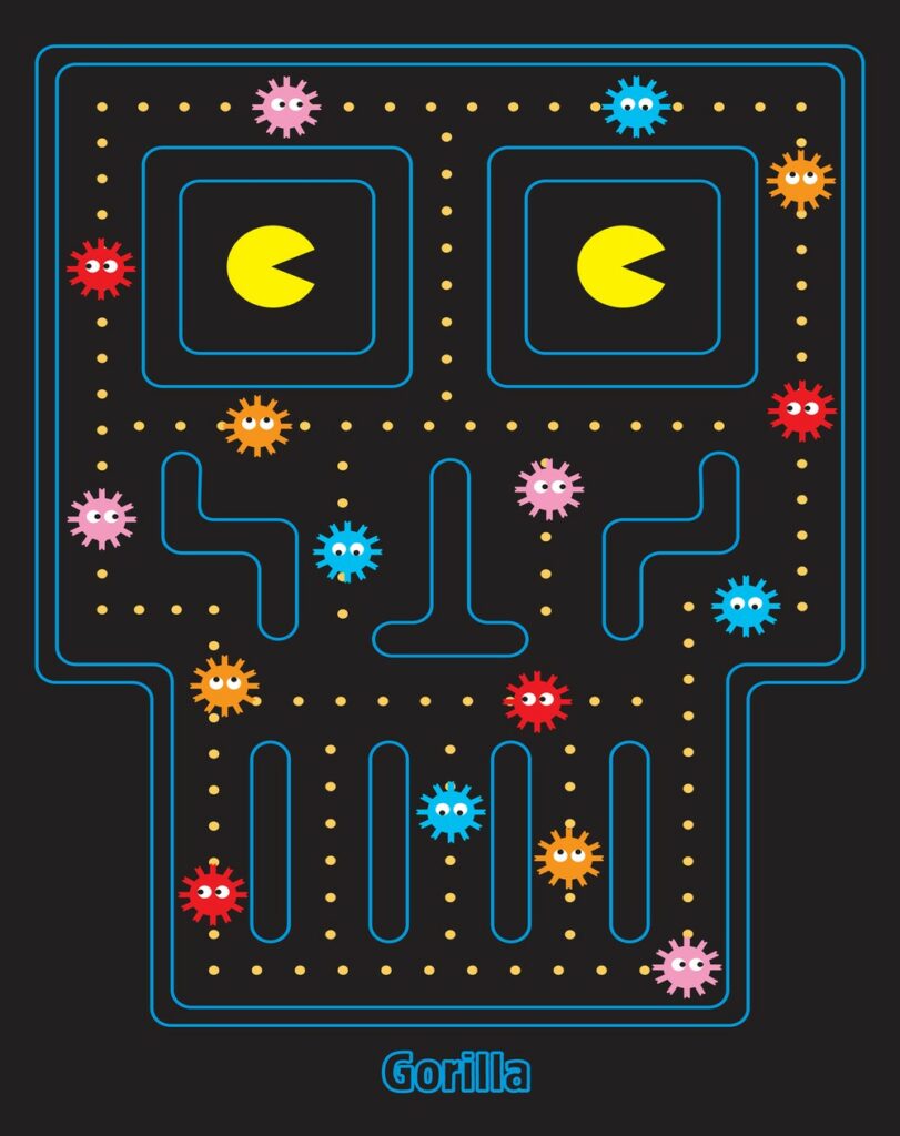
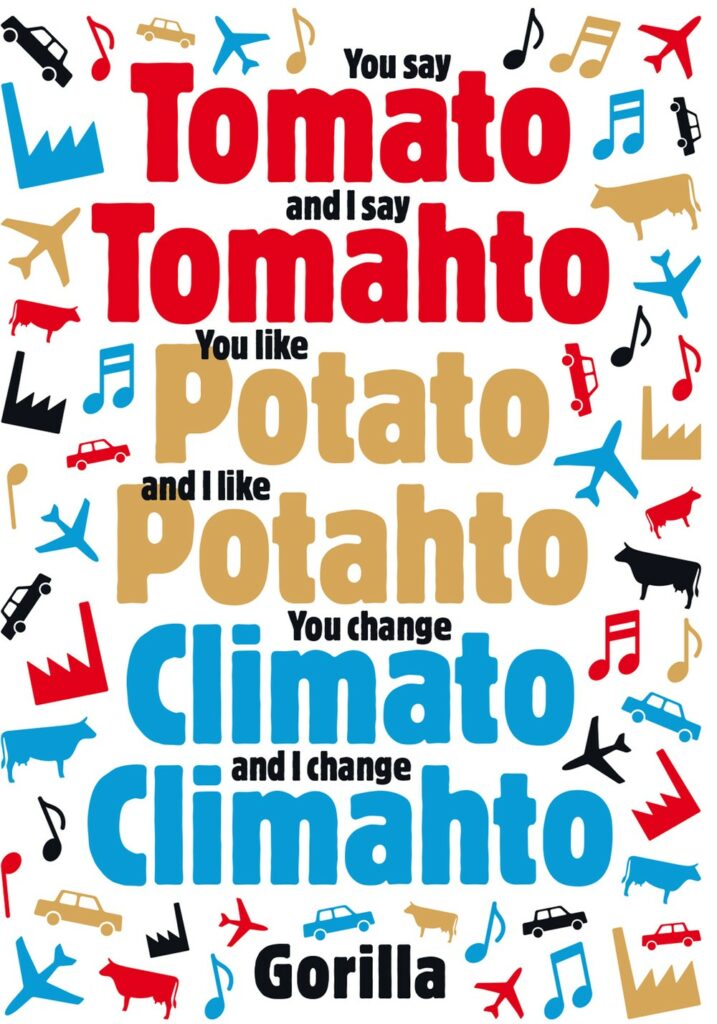
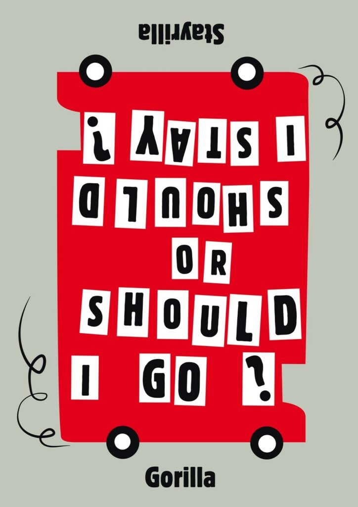
Design in the context of political events – The Gorilla Collective

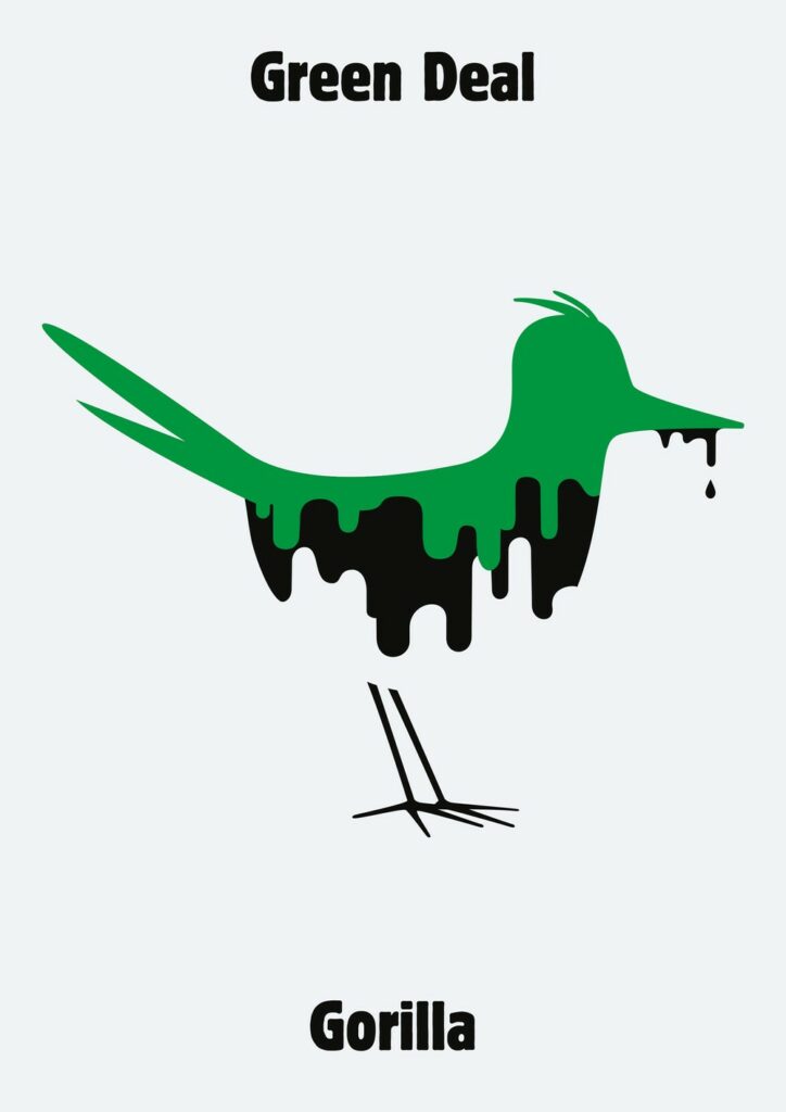
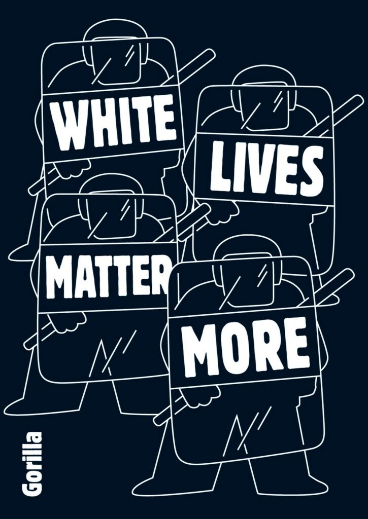
A good example of how to put political events in the context of design and art so that they reach a broad audience regardless of background and culture is the Gorilla Collective made up of five Danish designers. They comment on news stories by remixing the visual symbols and icons that surround us. 

In 2006, they launched their visual column in the front page of Dutch daily newspaper de Volkskrant, commenting six times a week on current events through persuasive images. They still publish their work in the weekly magazine De Groene Amsterdammer. The power of Gorilla lies in translating complex stories, the chaos of the news, into direct and sometimes iconic visual language. It can be seen as a current affairs column in the form of a picture – if it works, it shifts the perception of reality, and gives an alternative world view. Appearing for over a decade, their work covers a period of global turmoil. They cover various topics, from Islamic State, Donald Trump, Brexit and Climate Change to Credit Crisis and Fake News. The Gorilla columns are a reflection of how quickly our world is changing. At the same time, however, they also show in an alarming way how topical some issues remain.

For the collective, there are only a few rules while doing their visual art. They only use graphic tools and try to avoid cartoon elements like speech bubbles as much as possible. Their only no-no is photography, so that Gorilla is a unique visual commentary on the news. They are playing with cliches to twist an image to create a picture that say it all in one fell swoop. 
For the Gorilla Collective, cliches are a powerful tool, but you have to rework them to create a new image. A Gorilla always play on a familiar image taken from our collective memory bank. For examples, if you look on  topics like America, Aids, EU, oil, environment, angry leaders, refugees or natural disasters, they always try to find the icon that captures the context immediately

Graphicdesign&

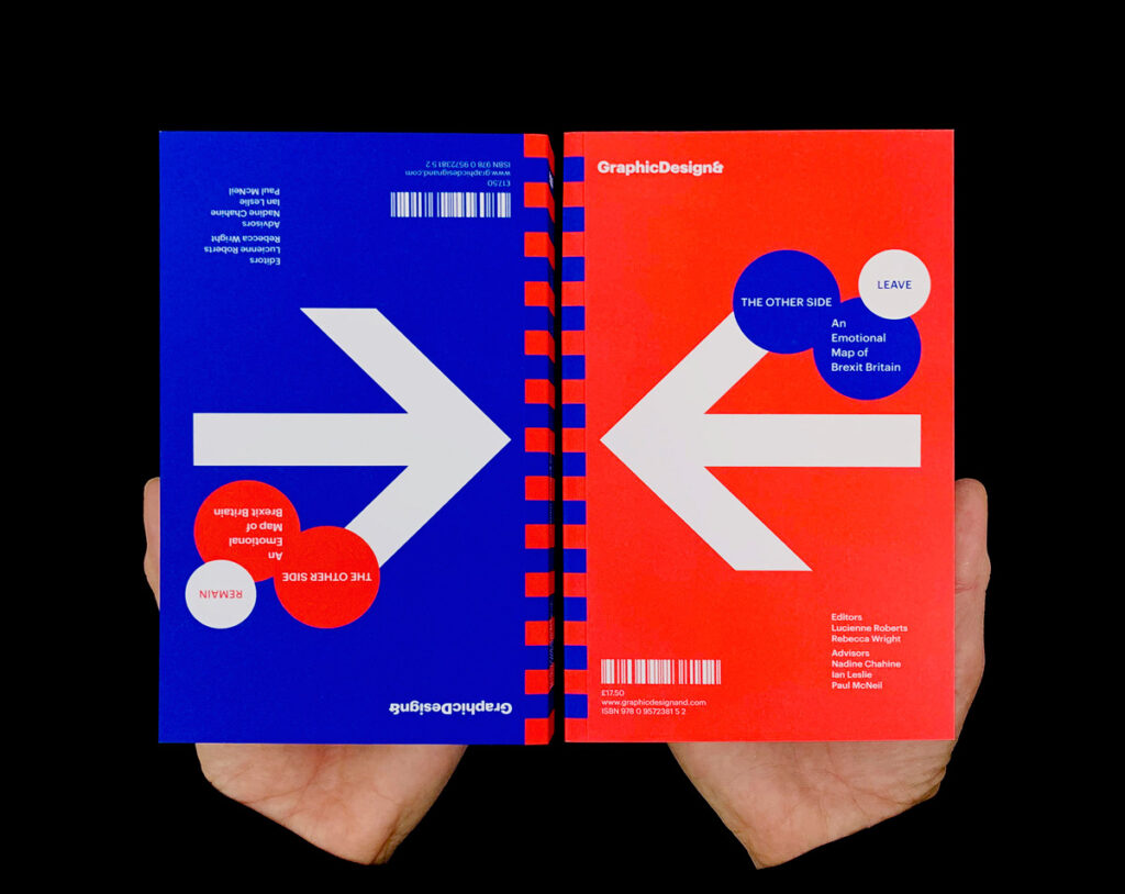
Two other designers, who deal with how graphic design can help mend a political divide are Lucienne Roberts and Rebecca Wright from the Designstudio Graphicdesign& in London. The studio advocates for what graphic design can do and why it matters. Intelligent books, vivid exhibitions and thought-provoking talks and events explore how graphic design connects with the wider world and the value that it brings. Informing, educating, entertaining, provoking – and challenging perceptions about what and who graphic design is for. GraphicDesign& has released several titles to date—books focusing on graphic design in the context of mathematics, health, social science, literature, and religion. With their new book The Other Side: An Emotional Map of Great Britain, they explore graphic design and politics and take on Brexit and the capacity of design for reconciliation.  

For the title, 26 Leave and 24 Remain voters cite one loss and one gain from the UK’s 2016 referendum results, as well as their reasons for voting the way they did. The book is double-ended so that neither side is favored—it simply has two beginnings and no end. The intention behind The Other Side is not to change minds, it’s more about the intention to encourage readers to consider the perspectives of those who voted differently from them. At its most radical, the book might even prompt empathy, most often, it reveals the depth of emotions the UK has felt in recent years – the pride, anger, revenge, relief, fear, devastation, and hope—forming a snapshot of a volatile moment in national history.

Their projects are about brokering a different kind of conversation. ‘The Other Side’ is a GraphicDesign& title because it uses graphic design to try to frame the conversation. Graphic design is the language they’re using, as well as examining—it can help understand things, challenge things and question things.

The Other Side: An Emotional Map of Brexit Britain

Gründe für User Research

Heutzutage sind viele Unternehmen der Ansicht, dass sie keine Ressourcen für User Research haben oder keine Notwendigkeit in der User Research sehen und auch nicht den Mehrwert daran erkennen. Doch aus welchen Gründen betreibt man jetzt User Research? Man führt User Research wenn man folgende Ziele verfolgt:

  • Ein Produkt zu erschaffen, das einen echten Mehrwert für die Nutzer hat
  • Ein Design zu erstellen, dass intuitiv nutzbar ist (Usability) und Freude bereitet (Joy of Use)
  • Dass es Nachvollziehbar ist, wie sich die „Return on Investment“ ergibt. 

Wie erreicht man nun diese Ziele? 
Die Antworten bekommt man nach dem durchführen der User Research, hierbei werden verschiedene Methoden aus der User Research angewendet (auf die verschiedenen Methoden werde ich in meinem nächsten Blog Eintrag genauer eingehen).

Doch was genau bedeutet das jetzt? Lassen Sie mich anhand eines Beispiels erklären warum die User Research wichtig ist:

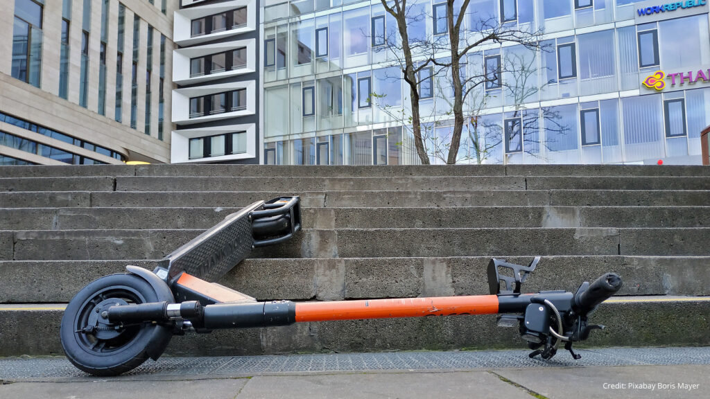
Betrachten wir die Markteinführung der E-Scooter: Man dachte, dass die E-Scooter eine Stadt umweltfreundlicher machen würden, es gäbe weniger Staus und der Mensch wäre dadurch mobil, ohne von den öffentlichen Verkehrsmitteln abhängig zu sein2 . Wer jedoch einmal in einer Stadt war, wo die E-Scooter verfügbar sind, der weiß, dass dadurch das Stadtbild merkbar beeinträchtigt wird. 

Hierbei wird deutlich verständlich, wie wichtig es ist, eine User Research durchzuführen und sich folgendes Fragen: Welche Probleme treten hierbei für die Menschen und das Umfeld auf? Wie können wir helfen, dieses Problem zu lösen?  

Das hier war nur ein Beispiel von vielen, jedoch wird einem hierbei bewusst, wie wichtig die User Research für unseren Alltag ist.


Referenz/Ressourcen/Literatur 

1 Semler, Jan/Tschierschke, Kira: App Design. Das umfassende Handbuch. 2., aktual. und erw. Auflage. Bonn: Rheinwerk 2019
2https://www.springerprofessional.de/mobilitaetskonzepte/mikromobilitaet/was-sie-ueber-e-scooter-wissen-muessen/17156852

Setting up the environment for VR designing

Canvas size

To apply mobile app workflow to VR UIs, you first have to figure out a canvas size that makes sense.
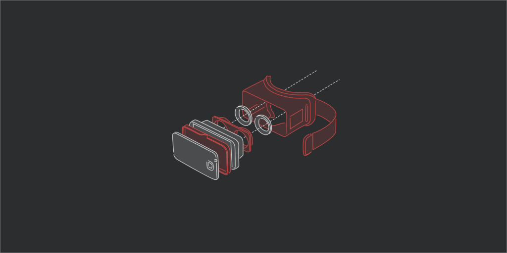
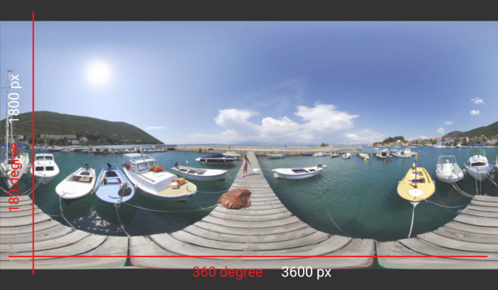
Below is what a 360-degree environment looks like when flattened. This representation is called an equirectangular projection. In a 3D virtual environment, these projections are wrapped around a sphere to mimic the real world.

The full width of the projection represents 360 degrees horizontally and 180 degrees vertically. We can use this to define the pixel size of the canvas: 3600 × 1800. Working with such a big size can be a challenge. But because we’re primarily interested in the interface aspect of VR apps, we can concentrate on a segment of this canvas.

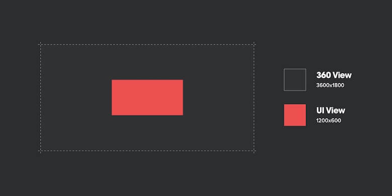
The area of interest represents the one-ninth of the 360-degree environment. It’s positioned right at the center of the equirectangular image and is 1200 × 600 pixels in size.

Let’s sum up:


“360 View“: 3600 × 1800 pixels
“UI View“: 1200 × 600 pixels

Pencil & Paper

Before getting into any software, it’s crucial to get your ideas out on paper. It’s fast, cheap, and helps you express ideas that may take hours in software. This is especially important because moving from sketches to hi-fidelity can cost much more in 3D than in 2D.

Software

Some designers start with tools they already know like Sketch, others use it as an opportunity to learn new tools. It really depends on what engine you are going to use to build your app. If you are building a 3D game, you’ll want to use Unity or Unreal Engine. Cinema 4D and Maya are also widely used, but mostly for complex animations and renderings.

Process for VR UI design

While most designers have figured out their workflow for designing mobile apps, processes for designing VR interfaces are yet to be defined. When the first VR app design project came through our door, the logical first step was for us to devise a process.

Traditional workflows, new territory

Interface-based VR apps work according to the same basic dynamic as traditional apps: Users interact with an interface that helps them navigate pages. We’re simplifying here, but just keep this in mind for now.

Given the similarity to traditional apps, the tried-and-tested mobile app workflows that designers have spent years refining won’t go to waste and can be used to craft VR UIs.

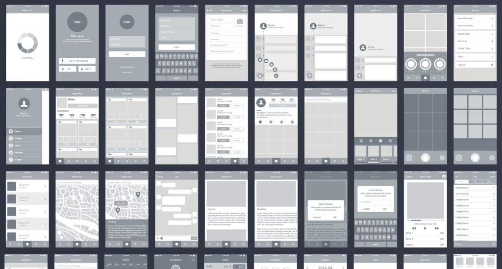
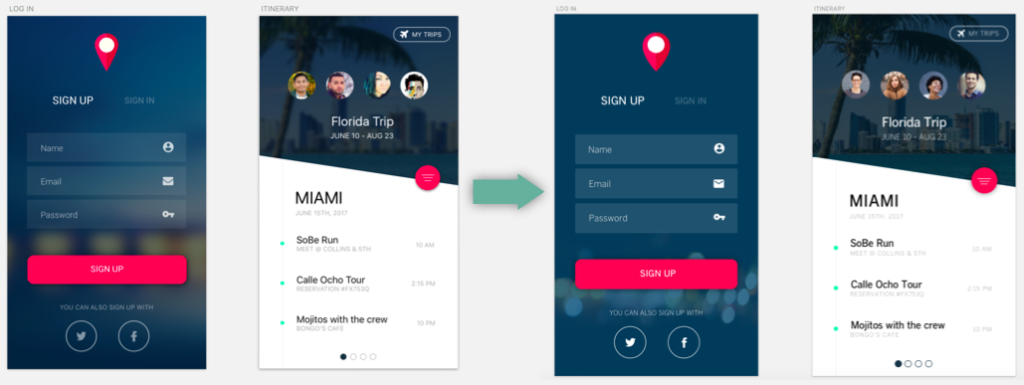
1. Wireframes

Go through rapid iterations, defining the interactions and general layout.

2. Visual design

At this stage, the features and interactions have been approved. Brand guidelines are now applied to the wireframes, and a beautiful interface is crafted.

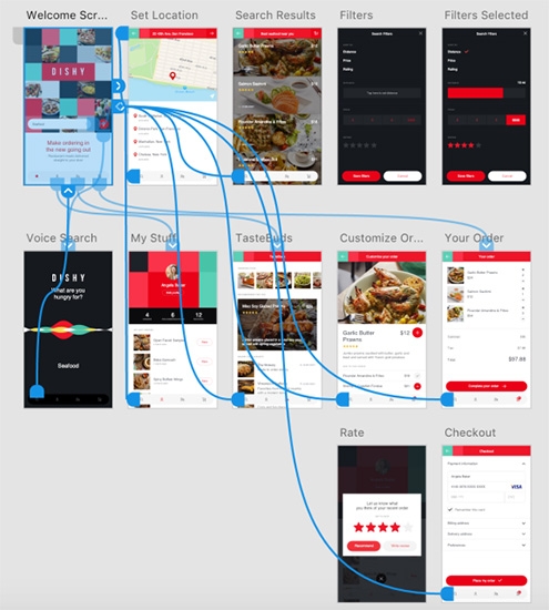
3. Blueprint

Here, we’ll organize screens into flows, drawing links between screens and describing the interactions for each screen. We call this the app’s blueprint, and it will be used as the main reference for developers working on the project.

Tools

Before we get started with the walkthrough, here are the tools we’ll need:

  • Sketch. We’ll use Sketch to design our interfaces and user flows. If you don’t have it, you can download a trial version. The sketch is our preferred interface design software.
  • GoPro VR Player. GoPro VR Player is a 360-degree content viewer. It’s provided by GoPro and is free. We’ll use it to preview our designs and test them in context.
  • Oculus Rift. Hooking Oculus Rift into the GoPro VR Player will enable us to test the design in context.

Design for VR

“You can think of an environment as the world that you enter when you put on a VR headset”

Sam Applebee

Taking into consideration the VR or Virtual Reality is a technology that requires details for building it. The question of how the design for VR application works around came out. What does it need? Where it goes? What is the most important requirement?

Many questions where raise but, I still think that the essential question indeed is, what means design for VR?

Environments and Interfaces

Think about an environment as the world that you enter when you put on a VR headset — the virtual planet you find yourself on, or the view from the roller-coaster that you’re riding.

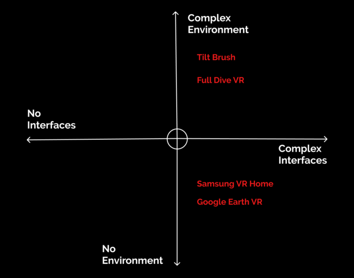
From the other side, an interface is the set of elements that users interact with to navigate an environment and control their experience. All VR apps can be positioned along two axes according to the complexity of these two components.

  • In the top-left quadrant are things like simulators, such as the roller-coaster experience linked to above. These have a fully formed environment but no interface at all. You’re simply locked in for the ride.
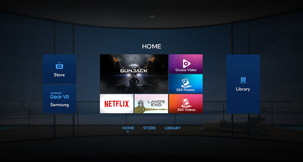
  • In the opposite quadrant are apps that have a developed interface but little or no environment. Samsung’s Gear VR home screen is a good example.

Designing virtual environments such as places and landscapes requires proficiency with 3D modelling tools, putting these elements out of reach for many designers. However, there’s a huge opportunity for UX and UI designers to apply their skills to designing user interfaces for virtual reality (or VR UIs, for short).

Joyful Design 08

Surprise

Triggering the emotional response of surprise can be an effective practice to create joyful experiences. In the following we will explore design considering surprise—one of the six primary emotions identified by Paul Ekman—with the intention to create a joyful experience.

Joyful experiences often happen to us at moments we do not expect them to happen—sometimes even tiny moments can capture our attention and turn into a memorable and joyful experience. According to Ingrid Fetell Lee those moments can be especially powerful in moments of stress or sadness—turning negative emotions into moments of opportunity/perspective. Those small bursts of joy can have an enormous impact on somebody’s mood. Unforeseen pleasures having the power to shift a bad mood are rooted in the nature of surprise: surprise has the purpose to quickly redirect our attention. [1]

“It acts like a warning bell for the brain, alerting us to a gap between what’s happening in front of us and what we had anticipated […] An unexpected noise or tap in the shoulder brings the mind and senses into a state of sudden vigilance.”—Ingrid Fetell Lee

Some suprises can be threads, but lets focus on the positive ones. If surprises signal opportunity our increased alertness and arousal of the surprise response can prepare us to take advantage of sudden joys. Those tiny moments of joy seem to be of short duration but they can have lasting effects because of their power to support upward spirals of positive emotions. [2]

“Joyful suprises bring our attention away from ourselves and back out into the world, prompting us to approach and engage. They incite curiosity, spur exploration, and increase the chances we’ll interact with others in ways that keep the positive vibes flowing.”—Ingrid Fetell Lee

Surprise acts as a magnet for joy by breaking the monotony of routines.

Even studies show, “that the majority of test subjects of a student population reported positive associations with surprise […] and also that variation in the level of surprise has a direct effect on consumers’ satisfaction. Since impulse purchasing implies an approach behaviour towards a product we can assume a positive connotation of surprise.”—Dorothea Baun, European University Viadrina, Germany [3]

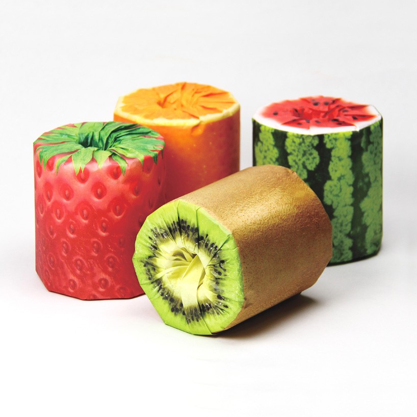
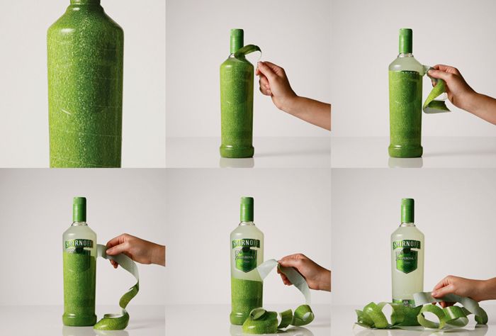
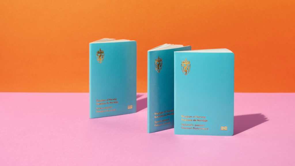
Packaging ideas considering surprise to catch the eye and trigger not only a feeling of curiosity but also a feeling of joy:

Toilet paper rolls by Kazuaki Kawahara [4]
Smirnoff Vodka: “Peel The Bottle” Design & Branding by J. Walter Thompson. [5]

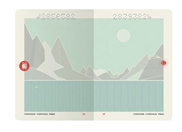
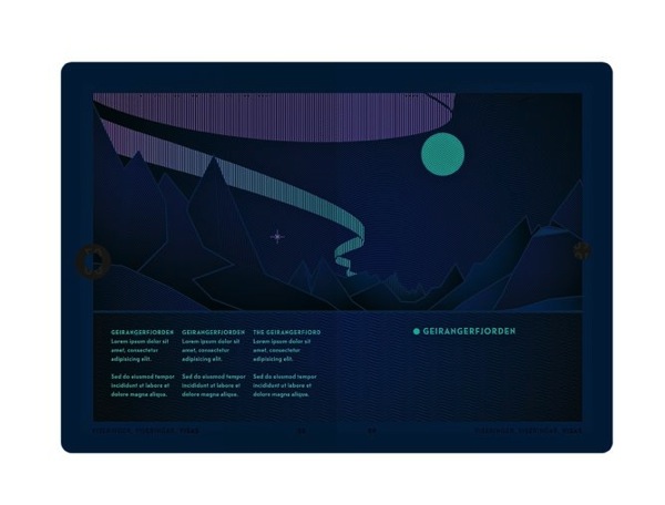
Norwegian Passport by Neue Design Studio [8]

Norways passport design is a sleek and modern approach, which already separates its visual appearance from the rest—but the actual surprise hides inside. The passports pages illustrate in an artistic way the country’s natural wonders. Another surprising and playful element: put them under UV light and day scenes turn into night—the sun turns into moon, northern lights and a hidden text appear.

[1]Fetell Lee, Ingrid: Joyful: The Surprising Power of Ordinary Things to Create Extraordinary Happiness. New York: Hachette Book Group 2018, p. 164 ff.

[2] ebda.

[3] Baun, Dorothea/Groeppel-Klein, Andrea: The Association for Consumer Research. Joy and Surprise As Guides to a Better Understanding of Impulse Buying Behaviour. URL: https://www.acrwebsite.org/volumes/11252/volumes/e06/E-06

[4] Designboom. kazuaki kawahara wraps toilet paper roll with juicy fruit packaging. URL: https://www.designboom.com/design/kazuaki-kawahara-fruits-toilet-paper-latona-packaging-japan-05-01-2016/

[5]. Canva.50 insanely creative and stunning packaging designs. URL: https://www.canva.com/learn/packaging-design/

[8] Neue. URL: https://neue.no/work/norwegian-passports/

Erotische Werbung & Skandale im Beispiel von Yves Saint Laurent

YSL Pour Homme
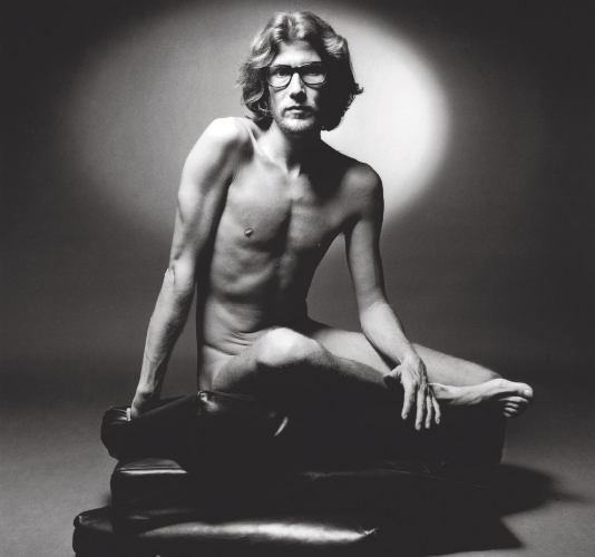
Den ersten Nackheitsskandal erfuhr das Modehaus 1971. Der Damals 32- jährige Modeschöpfer Yves Saint Laurent ließ sich für die Werbung seines Herrenparfums von Freund und Fotograf Jeanloup Sieff komplett nackt ablichten. Ein kalkulierter, inszenierter Skandal. Das Nacktporträt eines so berühmten Mannes erregte Aufsehen, vor allem als sich einige französische Zeitungen und Zeitschriften weigerten, es zu veröffentlichen, was dem Parfüm noch mehr Publicity verschaffte. Zusätzlich war die Kampagne ein Meilenstein der Modefotografie, zum ersten Mal warb ein Schöpfer eines Parfums selbst dafür.

Yves Saint Laurent 1971, nackt für sein Parfum

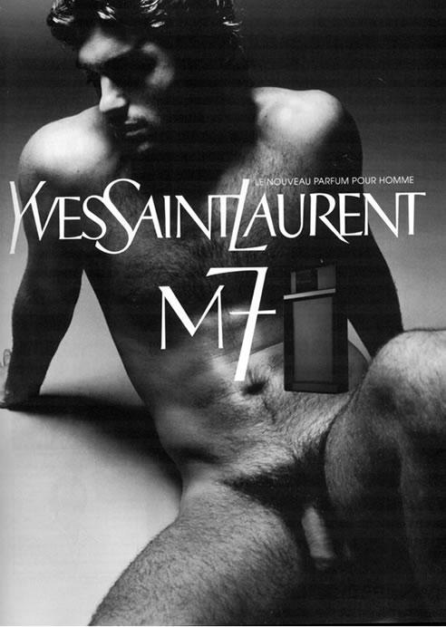
Duft “M7“
Mehr als 30 Jahre später, 2002 schaffte es der neue Yves Saint Laurent Chefdesigner Tom Ford erneut einen Nackheitsskandal zu erzielen und Nacktheit in der Werbung auf einen neue Ebene zu bringen.  Auch diesmal wirbt ein nackter Mann für ein Parfum. Der ehemalige Kampfsportprofi Samuel de Cubber zeigt sich vollkommen nackt und im Gegensatz zu seinem Vorgänger nicht mit geschlossenen Beinen. Die Kampagne ist eine Hommage an jene von 1971.

Samuel de Cubber, 2002

Parfüm wird auf der Haut getragen, warum also den Körper verstecken?

Tom Ford

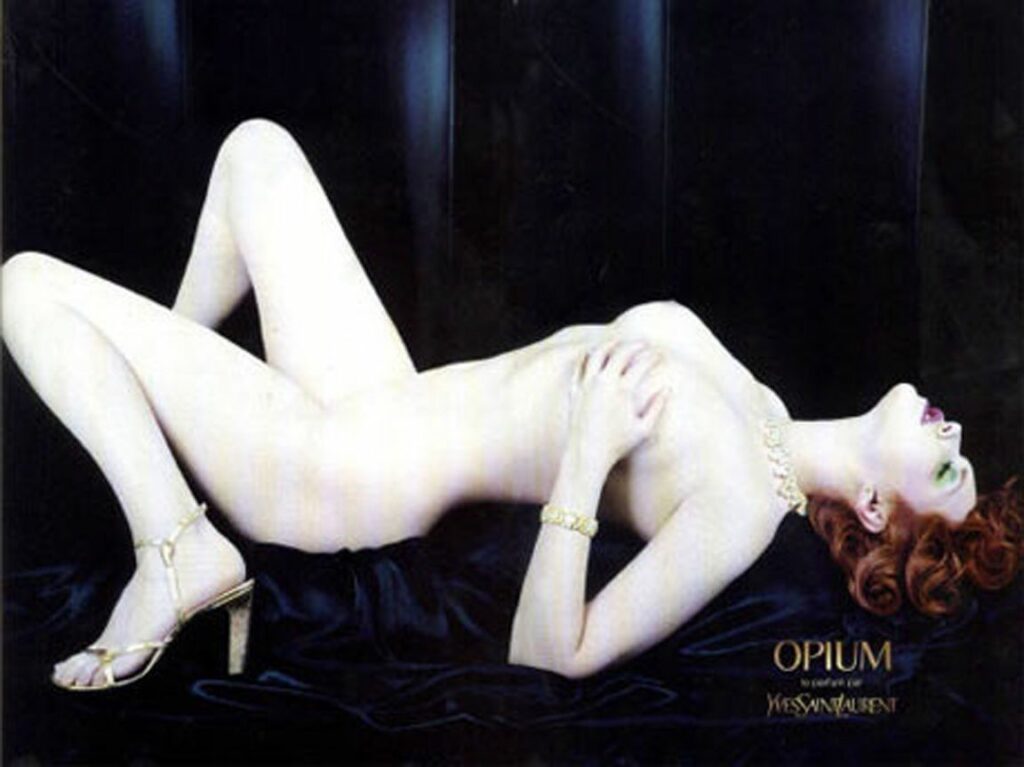
2002 gab es nochmal einen Skandal um die Werbung des Parfums Opium mit der nackten Sophie Dahls. Dasselbe Parfum bewarb auch schon Kate Moss wofür das Unternehmen zahlreiche Beschwerden erntete.

Sophie Dahl nackt für YSL

Nichts ist schöner als die nackte Haut einer Frau,
& das Schönste, was sie auf ihrer Haut spüren kann, ist die Umarmung eines Mannes.

Yves Saint Laurent


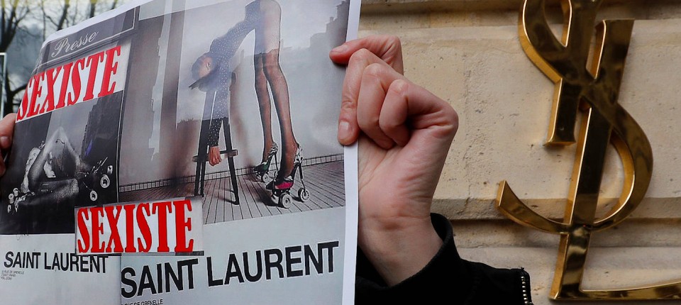
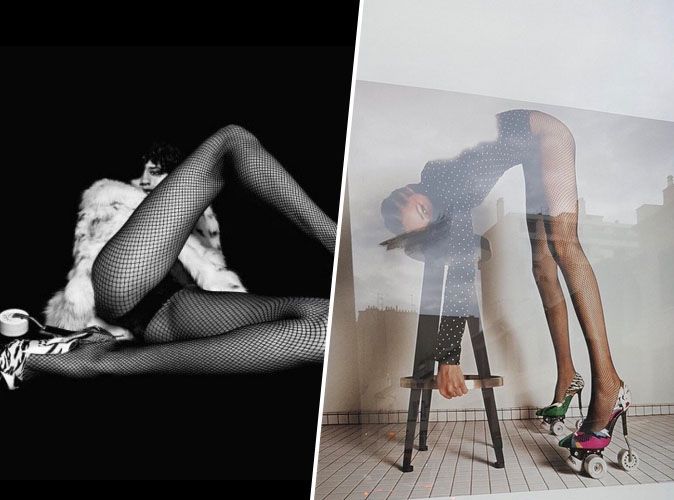
Aufgrund von mehr als 120 Beschwerden gegen eine Kampagne 2017 verlangte die französische Werbeaufsicht, umstrittene Werbeplakate von Yves Saint Laurent zurückzuziehen. Begründung war die Plakate seien frauenverachtend.

verbotene Werbung, 2017

Quellen:

Siermann, Kristin, 2006, Grenzen und Wirkungsweisen des Gestaltungsmittels Erotik in der Werbung, München, GRIN Verlag, 2006

https://www.fr.de/panorama/alleskoenner-11703869.html

https://www.derstandard.at/story/1100864/nackter-mann-in-franzoesischer-parfuemwerbung-erregt-aufsehen

augmented reality – learning a language | 5

AR technology

There are several types of AR in use today. For a better understanding of AR it is important to know the types and their advantages. There is marker-based and markerless technology.

Marker-based AR is:

  • easy to produce
  • most available technology (supports biggest variety of devices)
  • commonly used for marketing and retail

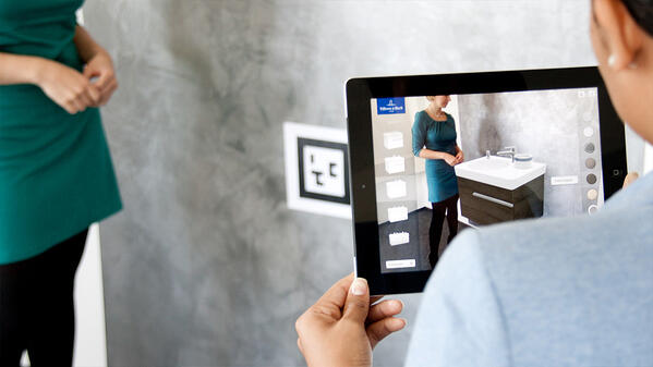
Markers can be images or signs that trigger an augmented experience and act as anchors for the technology. A marker has to have enough unique visual points — especially images with corners or edges do well. Logos, packaging, QR-codes, products themself (engine, bottle, chocolate bars) can serve as markers. The technology uses natural feature tracking (NFT) and can share AR content like text, images, videos, audios, 2D/3D animations, objects, scenes, 360° videos and game mechanic. For image recognition there are license based solutions (software development kits) on the market like Vuforia, EasyAR, Wikitude and more.

image courtesy of Villeroy & Boch, image from https://learn.g2.com/augmented-reality

Markerless AR is:

  • more versatile
  • not restricted to any surrounding
  • allowing a multi-person interaction in virtual environment

Different styles and locations can be chosen by the user who can also rearrange his surrounding virtual objects. The user’s device collects information through the camera, GPS, digital compass and accelerometer to augment realities into the scene. It is restricted to some devices: for iOS it has to be version 11 or up and for Android 7.0+ or newer. For placing objects in the real world, it uses plane detection which means that horizontal and vertical planes are detected. When ARKit or ARCore (Apple’s iOS and Google’s Android AR framework) analyse the real surfaces in the natural environment and detect a flat surface, it places a virtual object on the detected surface so that it appears to rest on the real surface. This happens with new virtual coordinates which are related to the real coordinates in the environment.

Following types technically fall under markerless AR as well:

  • Location-based AR ( Pokemon Go: characters in specific locations )
  • Superimposition AR ( recreating or enhancing a object in the real world )
  • Projection-based AR ( projectors instead of mobile devices: hologram-look )
  • and Outlining AR ( outlining boundaries and lines, e.g. on the lane )

A combination of both technologies — marker-based and markerless — in one application is possible as well.

As reviewing the last blog ( number |4 ) about current AR applications, regarding the use of flashcards to learn the sign language, the cards themself serve as markers and marker-based technology triggers augmented realities.

Developement of marker-based app

As an example will be described how a mobile AR marker-based letter recognition application was developed to get to know the rough technicalities. Suman Deb, Suraksha and Paritosh Bhattacharya analysed how a AR application should be created and developed to improve deaf-mute students’ sign language skills. The used media-cards showed a specific Hindi letter and triggered the application to display 3D animated hand motions for each letter.

A quick description:
  1. Upload pictures of markers To make an app response to certain images ( markers ) every image has to be stored in a Library. The developers of the app uploaded them to the Vuforia Library. As described above, the Vuforia Engine is a software development kit (SDK) and allows developers to add advanced computer vision functionality to any application, allowing it to recognize images and objects, and interact with spaces in the real world
  2. Download Unity Package which was downloaded from Vuforia was imported. Also along with Vuforiaandroid and vuforiaimage targets-android to generate Augmented Reality application
  3. 3D hand model arrangement with markers To ensure that the right image is shown, you match and place them into an Image Target Hierarchy so that after scanning of the media-cards ( flashcards ) the corresponding animated hand 3D model is shown in the augmented reality interface
  4. Include Features The menu gives features like zooming in and out and rotation of the 3D hand. The scanned letters ( markers ) can be amassed into words

In use the camera feed will be analysed by the image capturing module when pointed over the marker. Then binary images are generated and processed by the image processing technique. Marker tracking modules tracks the location of the marker and displays the corresponding 3D hand animation over the marker itself. The Rendering module has two inputs at a time: calculation of the pose from the Tracking module and from the virtual object which will be augmented. The Rendering module also combines these inputs and renders the image on the screen of the mobile device.

Sources

https://www.springerprofessional.de/plane-detection/16253564

https://www.howtogeek.com/348445/what-are-the-arcore-and-arkit-augmented-reality-frameworks/

https://learn.g2.com/augmented-reality

https://www.youtube.com/watch?v=qAaUSmVfpaU

https://www.youtube.com/watch?v=16jT1_MtTXs

Suman Deb et al. / Procedia Computer Science 125 (2018), p. 492–500: “Augmented Sign Language Modeling(ASLM) with interaction design on smartphone – an assistive learning and communication tool for inclusive classroom”

Erotische Appelle in der Werbung

Schierl, Thomas: Text und Bild in der Werbung. Bedingungen, Wirkungen und Anwendungen bei Anzeigen und Plakaten: Halem Verlag, Köln 2001
Kapitel 4.2 Emotionen, 4.2.2 Emotionale Apelle, 4.2.2.1 Erotische Apelle S. 107 – 111

Erotische Reize in der Werbung werden schon seit weit über hundert Jahren eingesetzt, um auf Produkte aufmerksam zu machen. Diese Werbemethode wird “Sex Sells” genannt, weil diese erotischen Appelle schon unzählige Werbeerfolge ermöglicht haben.
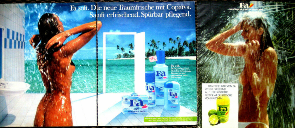
Die ersten Werbetexte auf nackten Frauenrücken gab es bereits um 1880. Etwa 10 Jahre später wurde bereits direkte Nacktheit eingesetzt, um auf die Anzeigen aufmerksam zu machen.

Auch wenn sexuelle Werbung heute nicht mehr so häufig für Skandale sorgt wie in ihren Anfängen, wird sie dennoch oft kritisiert. Nämlich dann, wenn die Erotik in eine sexistische Richtung geht.
Diese Form der Werbung erreichte in den 70er Jahren ihren Höhepunkt – sexuelle und erotische Reize waren aus der Werbung nicht mehr wegzudenken. Fast jedes Produkt wurde mit Sex beworben, auch wenn es keinen Zusammenhang mit der Werbebotschaft gab. Selbst öffentliche Institutionen und politische Parteien griffen auf sexuelle Werbung zurück.

Menschen antworten auf erotische Reize mit physiologischen Reaktionen. Wird männlichen Versuchspersonen zum Beispiel die Abbildung einer nackten Frau gezeigt, erweitern sich die Pupillen des Betrachters.
Das heißt aber nicht, dass erotische Reize in der Werbung generell die Werbewirkung verbessern. Es kommt auch darauf an, ob der Betrachter eine Verbindung zwischen dem erotischen Appell und der Werbebotschaft herstellen kann.

Weitere Erkenntnisse aus der Werbeforschung
zitiert aus Schierl, Thomas: Text und Bild in der Werbung. Halem Verlag, Köln 2001

Erotische Appelle entfalten ihre Wirkung auf Männer wie auch auf Frauen. (Messaris 1997, S.48f.)

Werbung mit Sex muss nicht in jedem Fall zu einer besseren Markenerinnerung führen als eine Werbung ohne Sex. (Steadman, nach Mayer 1979).

Der Grad von Nacktheit in der Werbung wirkt sich nicht negativ auf die Markenerinnerung aus. (Alexander/Judd 1978)

Die Erinnerungsleistung des Rezipienten bei erotisch getönter Werbung hängt auch von der jeweiligen grundsätzlichen Einstellung des Betrachters zu sexueller Werbung ab. Wer Sex in der Werbung positiv oder zumindest neutral sieht, erinnert sich besser an derartige Werbung. (Steadman) Unter Umständen ist die Markenerinnerung sogar bei einem neutralen Standpunkt am größten. Wer solche Werbung dagegen ablehnt, der erinnert sich weniger daran (Alexander/Judd 1978).

Die Verwendung expliziter sexueller Motive in der Werbung hat keinen negativen Einfluss auf die Markenerinnerung, wirkt sich aber unter Umständen negativ auf die Erinnerung von Inhalt und Verstehbarkeit inhaltlicher Aspekte der Werbebotschaft aus (Severn/Belch/Belch 1990).

Insbesondere bei Produkten, die einem Rezipienten irgendwie sexuell relevant erscheinen, wird erotisch getönte Werbung als interessanter, origineller, unterhaltender aber auch aggressiver eingeschätzt und verstärkt die Kaufbereitschaft. (Severn/Belch/Belch 1990)

Wenn sexuelle Appelle effizient sein sollen, muss zwischen Marke und erotischem Motiv ein glaubhafter und nachvollziehbarer Bezug hergestellt werden können. (Eigler 2000, S.77)

Einfluss von erotischen Appellen auf die Wahrnehmung und Bewertung von Produkten

Erotische Reize können sowohl die Wahrnehmung als auch die Bewertung des beworbenen Produktes beeinflussen. Bei falscher Anwendung können sexuelle Appelle vom eigentlichen Zweck der Werbung ablenken, da sie den überwiegenden Teil der Aufmerksamkeit auf sich ziehen.

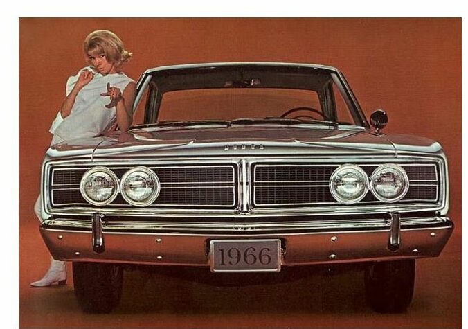
Auch die Bewertung von Produkten und Marken kann sowohl positiv als auch negativ beeinflusst werden. Bei der Analyse von Automobilwerbung wurde nachgewiesen, dass ein Auto, das mit einem attraktiven weiblichen Model beworben wurde, das Fahrzeug als ansprechender, jugendlicher, teurer, schneller, stärker und schöner im Design beurteilt wurde. Allerdings bewerteten die Betrachter das Fahrzeug auch unsicherer.

Autowerbung von 1966 für den Dodge Coronet.

Bevor man also erotische Reize in der Werbung einsetzt, muss man sich überlegen, welche Wirkung die Reize auf das Produktimage haben, wen man erreichen will, welche Verbindung man zur Marke herstellen kann und dass manche Menschen den Einsatz erotischer Werbung schlichtweg ablehnen.