Evaluierung einer Masterarbeit

Titel
South African Botanical Art: A Study of Nineteenth- and Twentieth-Century Imagery

Autor
Tamlin Blake

Datum
März 2001

Universität
University of Stellenbosch

Link zur Masterarbeit


Gestaltungshöhe
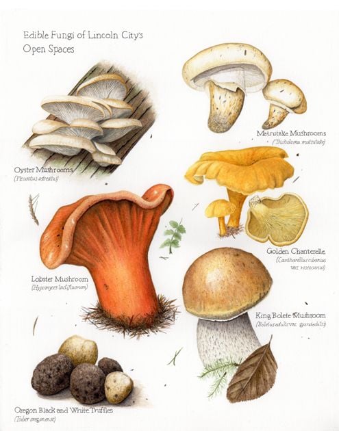
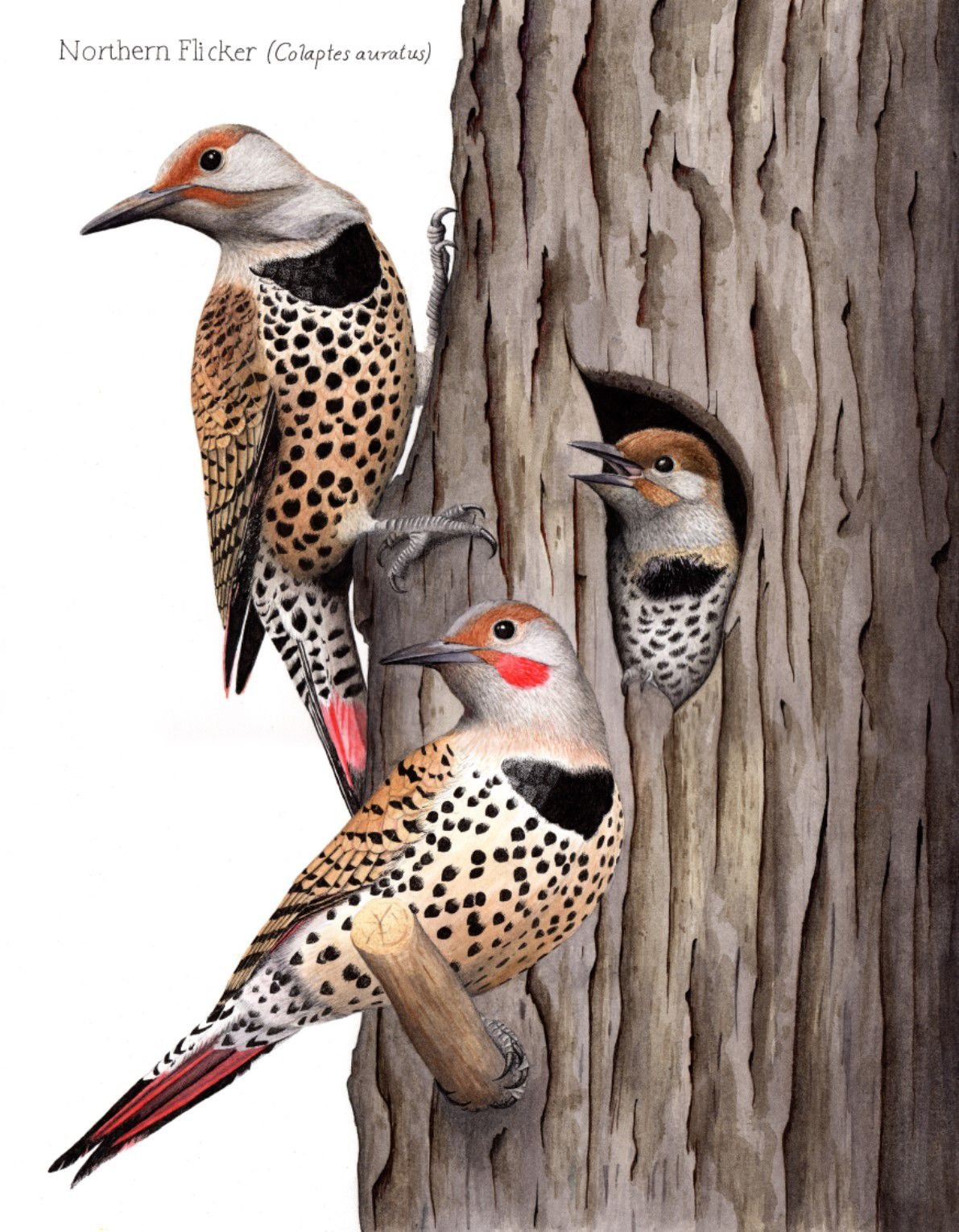
Die Masterarbeit ist sehr schlicht gehalten und wissenschaftlich formatiert. Es gibt keine zusätzlichen Designelemente o.ä. und im Text sind keine Bilder eingefügt. Diese sind ausnahmslos im Anhang zu finden. Direkte Zitate werden durch Einrückungen im Text hervorgehoben. 

Innovationsgrad
Der Autor behandelt in seiner Arbeit aus dem Jahr 2001 die Gesichte, aber auch die Zukunft der botanischen Kunst in Südafrika. Es wird daher keine neues Thema behandelt, aber ein Einblick in einen spezifischen Bereich der botanischen Illustration gegeben. 

Selbstständigkeit
Wie Selbstständig diese Arbeit einstanden ist, ist für mich schwer einzuschätzen. Bei den Danksagungen erwähnt der Autor die finanzielle Unterstützung durch die National Research Foundation (Südafrika) und die University of Stellenbosch. Er beteuert aber zugleich, dass seine Meinungen und die Ergebnisse der Arbeit nicht durch diese Finanzierung beeinflusst worden sind. 

Gliederung und Struktur
Die Arbeit ist in viert Kaptitel zzgl. Einleitung und Fazit gegliedert. Im ersten Kapitel wir der Begriff Botanische Kunst definiert. In Kapitel Zwei widmet sich der Autor dem Thema der kapstädtischen Gesellschaft, sowie den Pflanzenbildern des 19. Jahrhunderts. Das dritte Kapitel behandelt zeitgenössische botanische Kunst in Südafrika und im vierten Kapitel beschreibt der Autor seine persönliche Erfahrung mit verschiedenen Herangehensweisen an die botanische Kunst.

Zusätzlich ist ein Literaturverzeichnis, sowie ein Anhang in dem Biografien verschiedener KünstlerInnen, ein Bildverzeichnis und ein Katalog der Arbeiten des Autors. 

Der Text selbst ist sehr übersichtlich gegliedert und strukturiert. 

Kommunikationsgrad
Der Autor schweift beim Formulieren seiner Sätzen kaum aus, was den Text sehr gut lesbar und verständlich macht.  

Umfang der Arbeit
Die gesamte Arbeit umfasst 142 Seiten. Wenn man jedoch die diversen Anhänge, sowie Abstract, Deckblatt, Literaturverzeichnis o.ä. abzieht kommt man auf 75 Seiten puren Inhalts. 

Orthographie sowie Sorgfalt und Genauigkeit
Gut verständliche Formilierungen. Keine negativen Auffälligkeiten. 

Literatur
Der Autor hat für seine Arbeit 87 verschiedene literarische Werke herangezogen. Darunter befinden sich Geschichtsbücher, Botanische Aufzeichnungen, Bücher zu botanischer und afrikanische Kunst, usw. 

Es wird zum Teil sehr alte Literatur verwendet, die Älteste darunter von 1829. Am häufigsten wird jedoch Literatur in einem Zeitraum von 1980-2000 verwendet. 

Who inspires me #4

Daniel Shaffer (@danielhshaffer) is a freelance illustrator based in Atlanta, Georgia. His work in featured in many known magazines/papers like The New York Times, The Washington Post or Variety Magazine and his clients also include Cartoon Network, Samsung Publishing and many more.

I like his art mainly because it’s a bit weird (in the best way). Looking at his work is always fun and it makes me feel like not all art needs to be perfectly crafted and has to make sense. Seeing someone succeed which creating things they love without restricting themselves is refreshing. It gives me the courage to think about drawing shapes and characters that many people would label as strange without feeling ashamed of my desire to create something that just feels fun to create. Daniel Shaffer seems like he’s enjoying his job a lot and I strive to do the same.

Who inspires me #3

While looking at different artists/illustrators I realized that me liking their work has no connection to the fact if they create their work digitally, analog or with a mix of both. I find all three approaches equally fascinating, but might be personally leaning towards the mixed/digital approach with analog textures.

Ira Sluyterman van Langeweyde (@iraville) is an illustrator based in Munich with a passion for paper and watercolor. Most of her work is based around nature and landscapes but it also includes some character design. For her work she mostly uses earthy and natural colors. She mostly uses a white background and incorporates the white space into her compositions.

Who inspires me #2

Here I go again, trying to figure out what I like and why. Today’s illustrator is Beatrice Blue (@beatrice.blue) an Art Director and author/illustrator working both on publishing and the animation industry. Her work is very playful and colorful. What draws me to her work is her use of different analog textures in a digital setting. I like her the color palettes she chooses, they harmonize with her painting style and motifs. The illustrations she creates feel soft and comforting, but also very playful.

I think the biggest reason why I like someones work is if it triggers some sort of emotional reaction whether it’s curiosity, happiness, longing or a feeling of understanding. The work of Beatrice Blue definitely invokes happy emotions.

Who inspires me #1

I’ve been thinking a lot about different styles and in which direction I want to go with my personal illustration style in the future. Because the option are endless I’ve settled on looking at artists and illustrators who’s work inspires me or speaks to me in some way at the moment.

The first Timothy Von Rueden (@vonnart) an independent artist from Wisconsin. His main focus is pencil drawings and I think his work is inspiring to me because of the way he uses light and shadows as well as white space to enhance his pieces. The way he uses the medium to his advantage creates dynamic drawing the capture the eyes (or mine at least). Another reason why his artwork always captures my interest is because of his attention to detail and his intricate subjects.

Data Storytelling 02

Why storytelling is more trustworthy than presenting data
Karen Eber | TEDxPurdueU

For Karen Eber telling stories is helping people feel seen and a great way to connect with people. Eber starts off her talk by explaining the neurological process when listening to a story or data and how through listening to stories you gain empathy for the storyteller. She clarifies that data doesn’t change behavior, emotions do and that data never speaks for itself. It needs context.

According to Eber a great story answers three questions: What is the context? What is the conflict? What is the outcome? It also builds and releases tension, creates an idea and helps you see new things as well as communicates value. To connect your story and data you want to share you have to come up with the framework for your data and story first. By retelling stories and talking about her own experience in consulting others Eber makes you think about presenting data in a whole new way.  

Don’t wait for the perfect story. Take your stories and make it perfect.

Data Storytelling 01

Making data mean more through storytelling
Ted talk by Data Scientist Ben Wellington
@ TEDxBroadway

In his talk Ben Wellington tells the story of how he started doing data visualization of New York City. In 2011 a free public database called NYC Open Data was created. Using this data Evans created his first visualization about traffic accidents involving bikes, pinpointing hotspots in the city. After it got picked up by multiple online news sites, he realized that the closer you are to the data the more you care about it. You have to connect with people and their experiences and make it relatable. So the next data he visualized were which pharmacies cover which areas in the city, the percentage of male and female city bike riders as well as the percentage of parking tickets on cars with out-of-state plates. In his work he tried to focus on one idea, keep it simple and explore the things you know best to tell the most effective story. With data storytelling you should try and make an impact. Wellington does this by trying to impact city government and shows some of the best responses in his presentation. 


Turning Bad Charts into Compelling Data Stories
Ted talk by Data Storytelling Trainer Dominic Bohan
@ TEDxYouth@Singapore

Dominic Bohan is a data storytelling trainer talking about charts, studies, history and how to turn data into stories. He believes that data storytelling can save the world and even save lives. 

Data is useless unless human beings can interpret, analyse and understand it.

During his talk Bohan describes three simple principles to great data communication: Using a human friendly chart type, being ruthlessly minimalistic and having a clear key takeaway.

To dive into these principles Bohan describes an 1984 study by researchers Cleveland and McGill on which charts humans are good at interpreting. According to him, they found out that human beings are best at encoding numbers by length and position. By talking about history approaches, studies and their outcome as well as giving examples and using the recommended charts, Bohan shows how (not) to use data visualisation and how to utilize them to tell engaging stories that mean something to us. 


Additional Information:

Graphic recording

Graphic Recording is an american invention from the 70s. It is used at congresses, meetings, conventions, workshops and seminars to visually document the most important talking points and findings. It is done live at the event. The person recording is mostly using a big piece of paper and markers. Sometimes they can alternatively use a digital device that is streamed on a screen. Graphic recording has to be clear and conclusive, but can also be humorous.  

This visualization technique is supposed to summarize long, complicated or boring talks as well as lectures and captures the most important information visually. This is done by using keywords, metaphors and pictures. It also includes the audience in the creative process and thus amplifies concentration and motivation. Another important factor of graphic recording is that our brain loves visual information and tends to remember it easier. It also has a more long lasting effect on us, because we think about an event longer than we normally would if we have a visual connection in our mind. 

The art of human anatomy

The spellbinding art of human anatomy

Ted talk by Vanessa Ruiz | TEDMED 2015
Medical Illustrator

Vanessa Ruiz is a medical illustrator and  loves the human body and anatomy. This is the reason why she created Street Anatomy, a movement dedicated to showcasing how anatomy is visualized in art, design and pop culture. Through sharing these works of art she wants to lift anatomy out of the textbooks, make it tangible and take away the learned reaction of fear of anatomy and guts most of us have. 

In her Ted Talk at TEDMED 2015 she tells her story and relationship with anatomy, gives a short history recap and presents some of her favorite artists. Anatomy isn’t only relevant in the medical field and these artists bring it into the public space.

One of the artists Ruiz presents is the Austrian street artist and illustrator NYCHOS who created the Rabbit Eye Movement

How to Scientific Illustration

The main goal of scientific illustration is to translate scientific information into a visual representation that helps the reader or viewer to better understand the topic. Creating a scientific illustration involves multiple steps that may vary depending on the project.

At first the most important thing is to research the hell out of your subject! It may take some time, but it is extremely important to accurately share the information. When working with a scientist there will be provided information, but you still have to sit down and wrap your brain around it. Don’t forget to look at existing or similar work on the subject. It’s good to know what’s out there.

The next thing on your to-do list is to create preliminary sketches. Visualize what you have in mind and make as many sketches as you feel like. The more you sketch the more you can edit, revisit and adapt later on. You can also sketch the layout of the finished product (e.g. an informative poster) to get a feel for the needed space and dynamic of different parts. 

After doing your sketching you can try out different illustration techniques. Will it be digital or analog? What color palettes will you use? By practicing and using different types of media and get a feel for which style fits your project best and find out how to get the best result. 

Now that you made your sketches and tried different methods it is time to decide on the overall composition and transfer your drawing to editing software. Afterwards it’s time to start working on your final illustration. Once you get a first draft you can talk to the scientist that you cooperate with and discuss your illustration. Make it an iterative process and revise your illustration if needed. Once you and your collaborator are on the same page you can finalize the project. 

I got this information from an article by Kara Perilli about making a scientific illustration on the Current, a blog from The Franklin Institute. She writes about the process in more detail and via example from her own project. 

https://www.fi.edu/blog/making-a-scientific-illustration


I also found this video about Nora Sherwood on her journey and career as a scientific illustrator. She is talking about her creative process, her desire to make people think about the world and nature as well as her wish to invoke curiosity and pass on knowledge.