Design in the context of political events – The Gorilla Collective
A good example of how to put political events in the context of design and art so that they reach a broad audience regardless of background and culture is the Gorilla Collective made up of five Danish designers. They comment on news stories by remixing the visual symbols and icons that surround us.
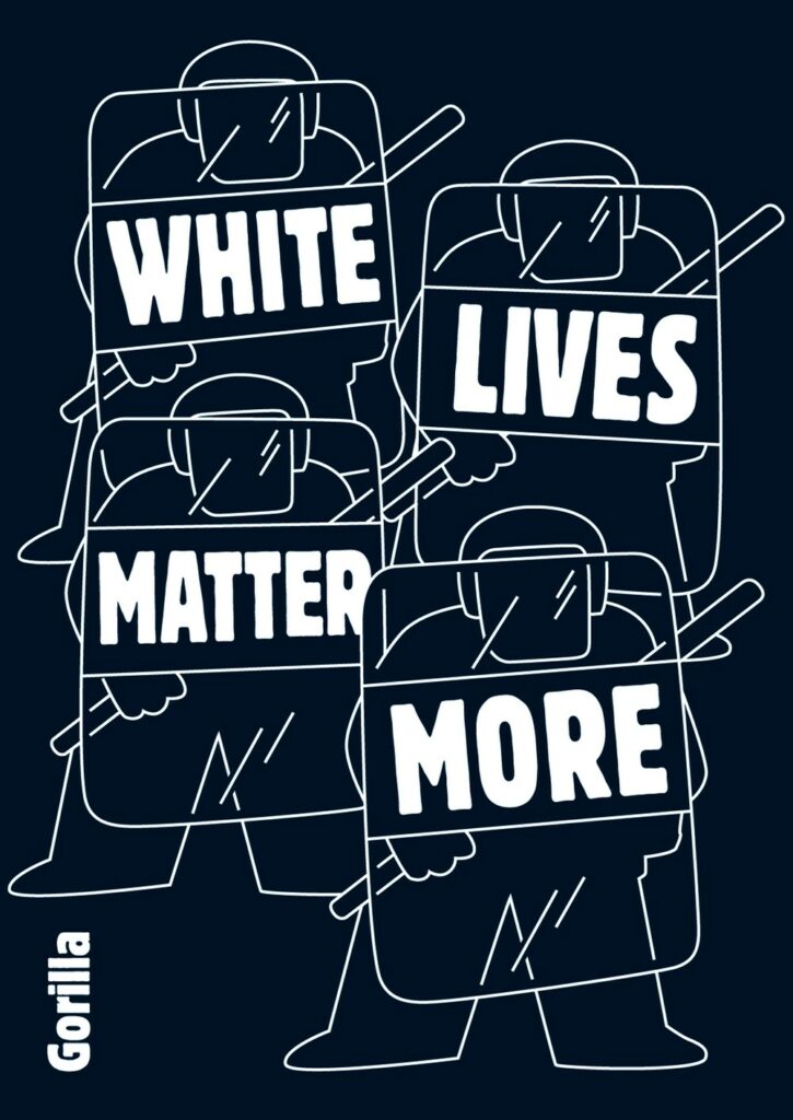
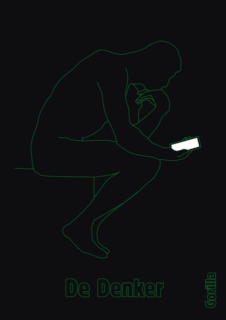
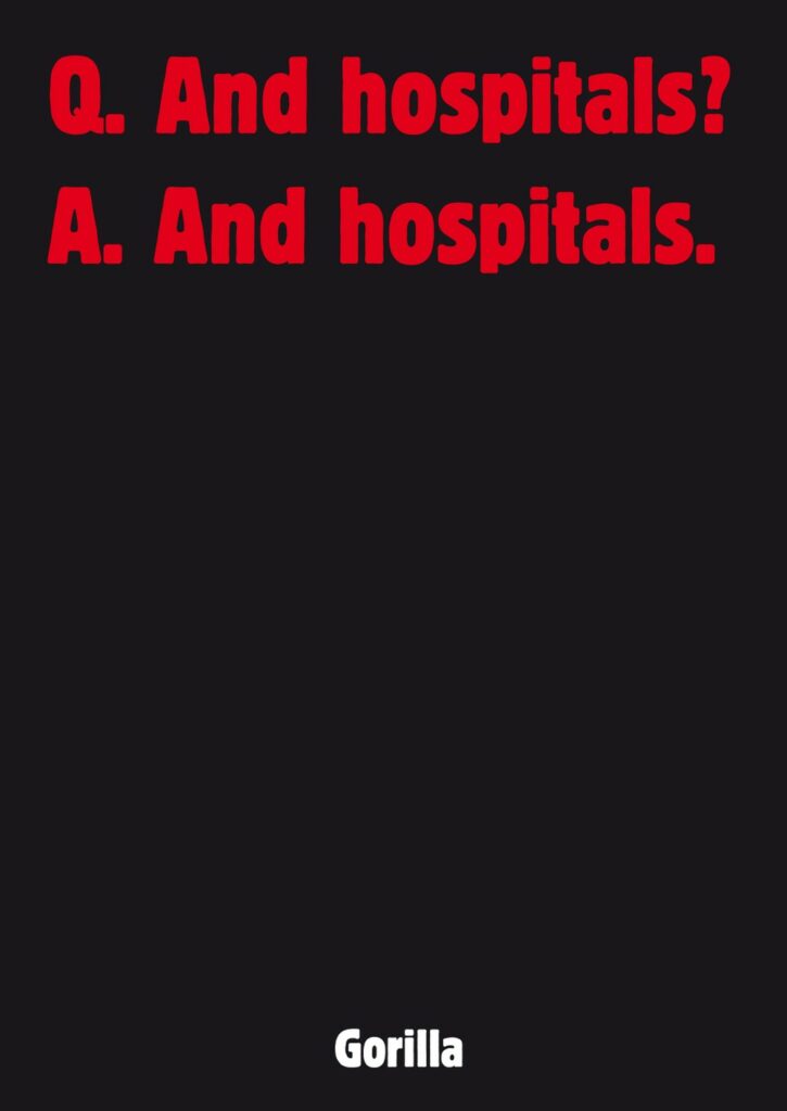
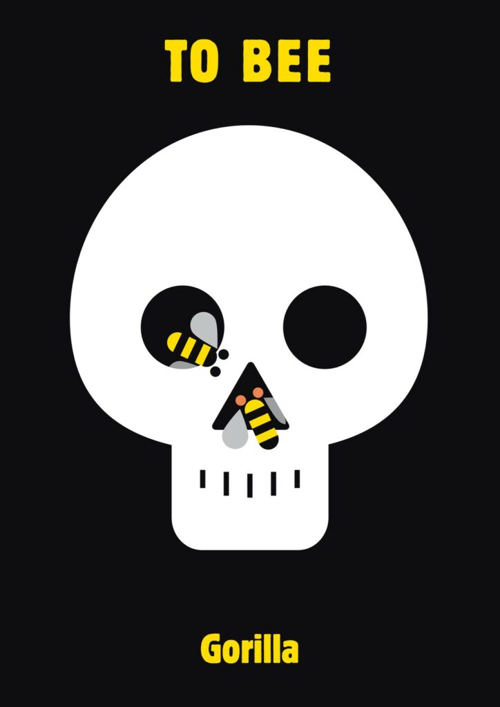
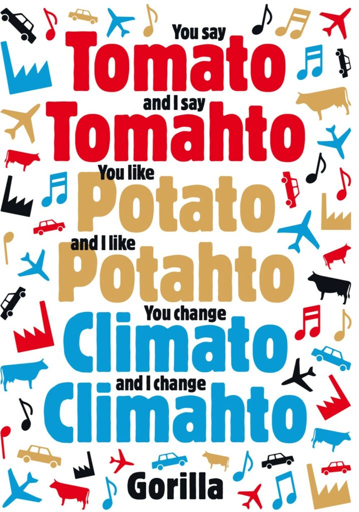
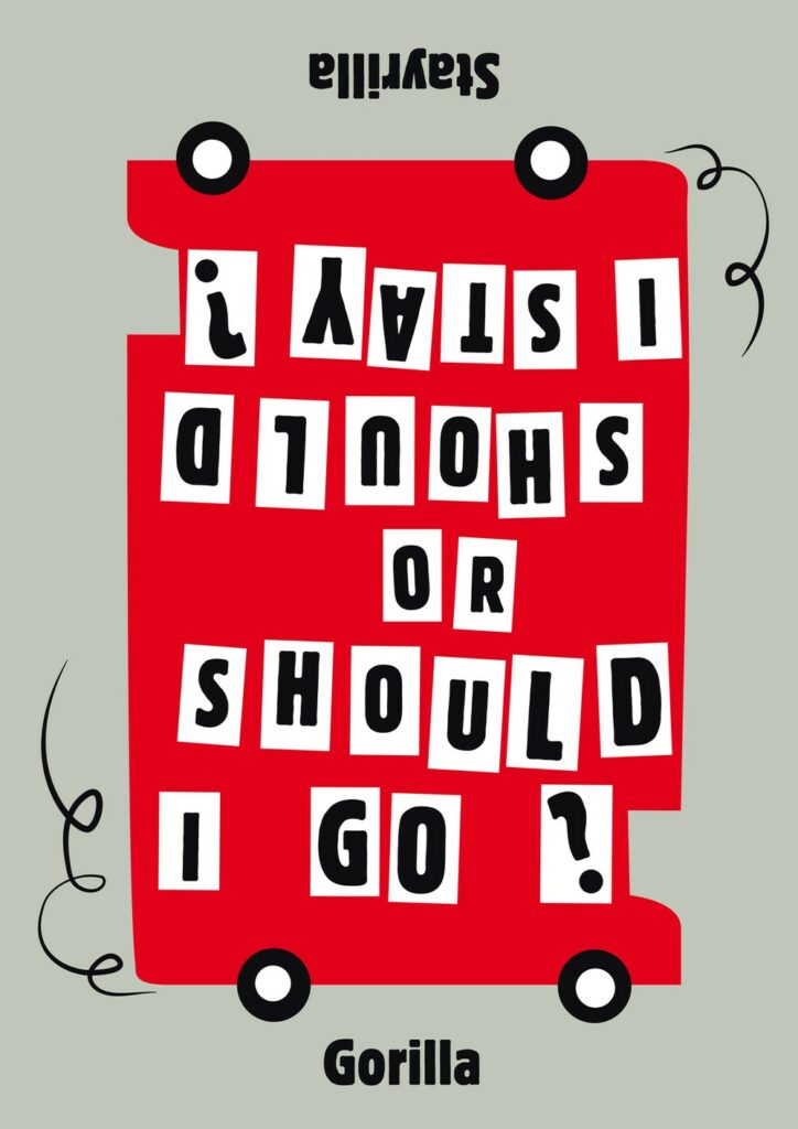
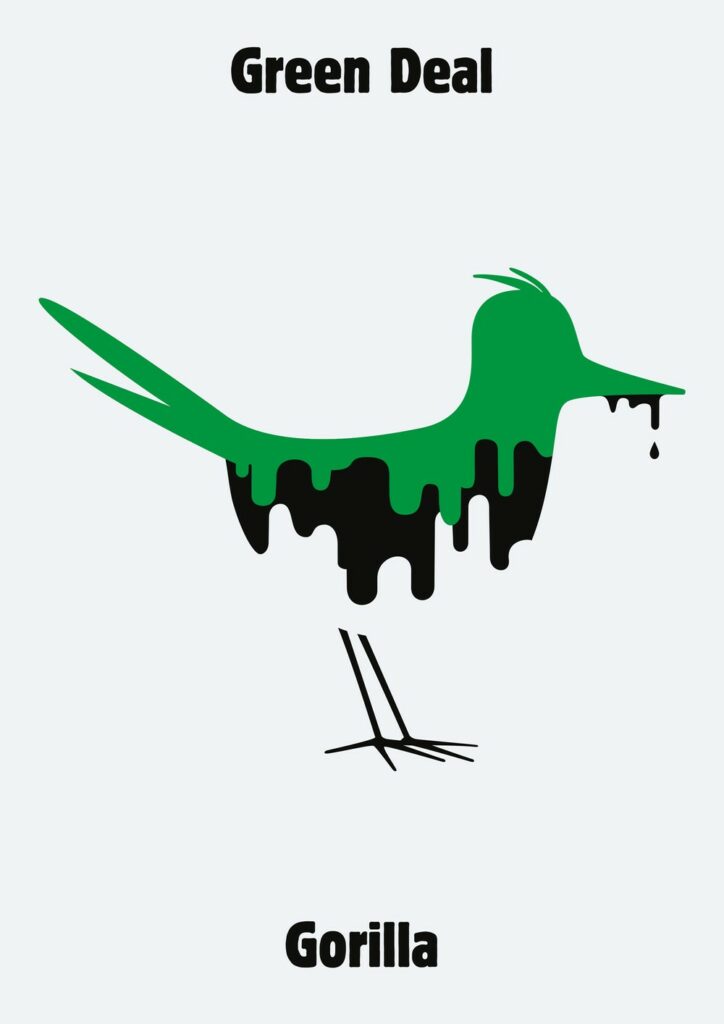
In 2006, they launched their visual column in the front page of Dutch daily newspaper de Volkskrant, commenting six times a week on current events through persuasive images. They still publish their work in the weekly magazine De Groene Amsterdammer. The power of Gorilla lies in translating complex stories, the chaos of the news, into direct and sometimes iconic visual language. It can be seen as a current affairs column in the form of a picture – if it works, it shifts the perception of reality, and gives an alternative world view. Appearing for over a decade, their work covers a period of global turmoil. They cover various topics, from Islamic State, Donald Trump, Brexit and Climate Change to Credit Crisis and Fake News. The Gorilla columns are a reflection of how quickly our world is changing. At the same time, however, they also show in an alarming way how topical some issues remain.
For the collective, there are only a few rules while doing their visual art. They only use graphic tools and try to avoid cartoon elements like speech bubbles as much as possible. Their only no-no is photography, so that Gorilla is a unique visual commentary on the news. They are playing with cliches to twist an image to create a picture that say it all in one fell swoop.
For the Gorilla Collective, cliches are a powerful tool, but you have to rework them to create a new image. A Gorilla always play on a familiar image taken from our collective memory bank. For examples, if you look on topics like America, Aids, EU, oil, environment, angry leaders, refugees or natural disasters, they always try to find the icon that captures the context immediately.

Graphicdesign&
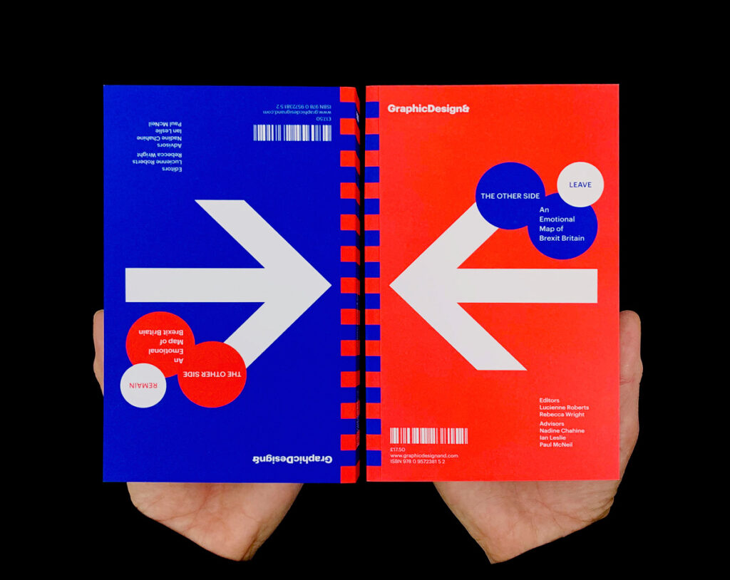
Two other designers, who deal with how graphic design can help mend a political divide are Lucienne Roberts and Rebecca Wright from the Designstudio Graphicdesign& in London. The studio advocates for what graphic design can do and why it matters. Intelligent books, vivid exhibitions and thought-provoking talks and events explore how graphic design connects with the wider world and the value that it brings. Informing, educating, entertaining, provoking – and challenging perceptions about what and who graphic design is for. GraphicDesign& has released several titles to date—books focusing on graphic design in the context of mathematics, health, social science, literature, and religion. With their new book The Other Side: An Emotional Map of Great Britain, they explore graphic design and politics and take on Brexit and the capacity of design for reconciliation.
For the title, 26 Leave and 24 Remain voters cite one loss and one gain from the UK’s 2016 referendum results, as well as their reasons for voting the way they did. The book is double-ended so that neither side is favored—it simply has two beginnings and no end. The intention behind The Other Side is not to change minds, it’s more about the intention to encourage readers to consider the perspectives of those who voted differently from them. At its most radical, the book might even prompt empathy, most often, it reveals the depth of emotions the UK has felt in recent years – the pride, anger, revenge, relief, fear, devastation, and hope—forming a snapshot of a volatile moment in national history.
Their projects are about brokering a different kind of conversation. ‘The Other Side’ is a GraphicDesign& title because it uses graphic design to try to frame the conversation. Graphic design is the language they’re using, as well as examining—it can help understand things, challenge things and question things.