The health of the oceans ecosystem

Human activities are damaging the health of oceans in profound ways. Global warming, overfishing and pollution are threatening aquatic ecosystems, and a number of species face extinction.

PLASTIC POLLUTION
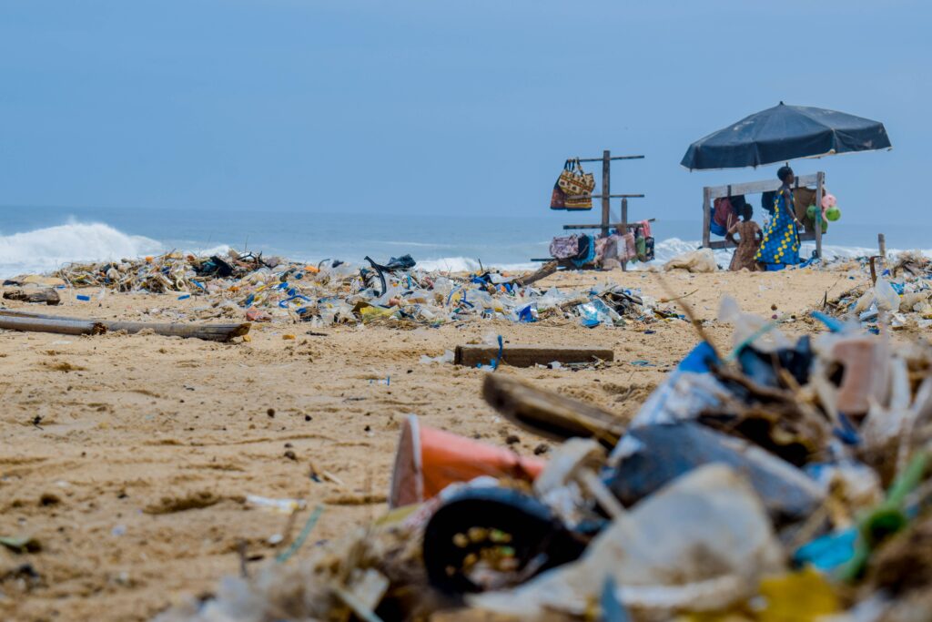
In simple terms, plastic pollution refers to plastic waste being found where it shouldn’t. In the context of oceans, this is anywhere. Still, according to estimates, an additional 8 million items of plastic enter the ocean each day. In total, almost 300,000 tonnes of plastic can be found in the oceans, and the weight of plastic is predicted to exceed the weight of all populations of ocean-dwelling fish by 2050.

The majority of the plastic comes from littering – from the fishing industry, waste left on beaches, rivers and in drains, among other things. Poorly managed landfill waste sites and industry discharges also contribute significantly. Despite the indisputable impact on marine life, the oil industry (one of the biggest sources of plastic pollution) is increasing its plastic production. Currently, the demand for plastics requires 12 million barrels of oil per day for manufacturing. By 2050, this figure is predicted to increase to 50 million barrels of oil per day due to rising demands.

The durability of plastic makes the environmental issue more pressing. Indeed, the US Environmental Protection Agency has stated that all plastic ever created likely still exists. The impact of this can especially be seen at the Great Pacific Garbage Patch, the largest collection of plastic waste in the world with an area of almost 700,000 square miles and growing every day.

This has a huge toll on aquatic species. In the North Pacific alone, it is estimated that fish are ingesting up to 24,000 tonnes of plastic every year. This affects the wider food web and, ultimately, humans. A 2015 study for the Scientific Reports journal found that around a quarter of all fish in Californian and Indonesian fish markets contained plastic microfibres.

Fish are not the only species at risk from plastic pollution. It is estimated that as much as 99 per cent of all seabird species will have ingested some form of plastic by the year 2050. Additionally, sea turtles and monk seals are at risk of mistaking plastic debris for food. Indeed, an increasing number of ocean animals are found dead or entangled as a result of plastic waste, with estimates suggesting that around 100,000 marine mammals are killed each year.

A further concern for plastic pollution is that clean-up operations can be very hard to execute effectively. Plastic accounts for between 60 to 90 percent of all marine debris, but only 1 per cent of all marine debris floats. This makes extracting it a costly and difficult task.

CORAL REEF DEGRADATION

https://images.app.goo.gl/HPCvDpZ6FQAq2PaE8

The destruction of coral reefs has been increasing at alarming rates in the last decade, with a third of all corals in danger of extinction. Coral reefs are important for maintaining diverse marine environments, as they provide nourishment and shelter for many aquatic species. Conserving coral reefs is also important for human populations around the world, with many areas dependent on the livelihood provided by corals (such as fisheries and tourism).

A number of anthropogenic influences are responsible for the ongoing coral reef crisis. The main culprit is climate change. Warming ocean temperatures are responsible for nearly 50 per cent of coral destruction and reef bleaching in the Great Barrier Reef. Reef bleaching refers to the loss of vibrant colour from coral organisms as a result of changing water conditions. It is possible for corals to recover from bleaching, but a bleached coral reef is more susceptible to disease and may indicate impending death.

Dynamite fishing is also responsible for the degradation of coral reef ecosystems. The use of cyanide to stun and capture fish has a devastating impact on coral polyps as they are unable to metabolize the poison. This practice of fishing is commonly practiced in Indonesia and the Philippines, two countries considered hotbeds of coral reef populations.

Other anthropogenic factors that damage coral reefs are irresponsible tourism and sedimentation. An increase in coral reef tourism has seen a tantamount rise in reef mismanagement, where tourists often damage reefs by stepping on them or inadvertently touching them. Tourism boats vessels used for exploration trips or recreational activities are also damaging reefs through the misplacement of anchors and reckless route planning. Sedimentation refers to the transfer of harmful particles from land surfaces to the ocean. It is caused by increased urbanisation, land use change and coastal mining. The increase in ocean sediment has led to diminished sunlight and nourishment for coral reefs.

information, conservation diploma course COE

Realtime Automotive Rendering using Unreal Engine

Since PCs and especially their GPU-Units are getting more and more powerful, realtime rendering comes easier accessible for everyone. Rendering always has been very complex when it comes to absolute photorealism, but with realtime raytracing a milestone in terms of realsitic rendering has been set. The production of models, scene setup and shading is still very challenging, but with engines like Unity or Unreal, rendering is becoming less of a hassle as long rendering times are eliminated.

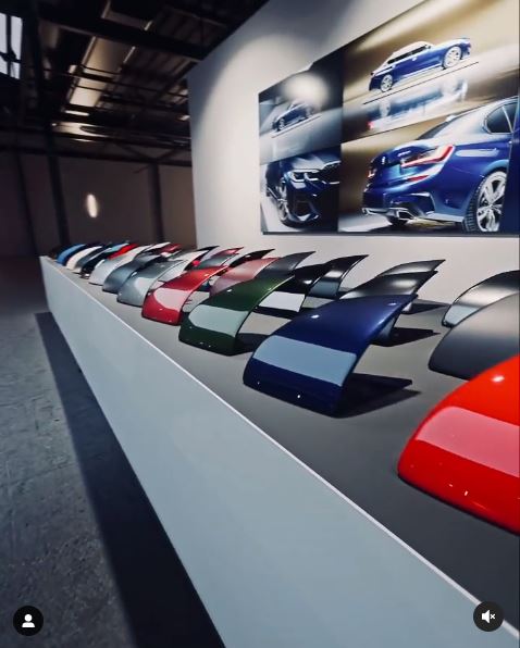
As an example of how powerful the Unreal Engine can be, I’ve attached two links from Duron Automotive, a professional 3D artist, with focus on realtime automotive renderings.

https://www.instagram.com/p/CLhcEI4i4Sy/
https://www.instagram.com/p/CLbgUOZiATf/

As the examples show, even the tiniest details like the structure of an aluminium surface inside of a car’s headlight, can be rendered perfectly. This opens up a totally new world with an encredibly hig level of detail.

https://www.instagram.com/p/CLEfJzupg6R/

This can be used to create videos, but also still images, which offer a grade of realism, where most people cannot tell the difference between a real photograph and a 3D rendered image.

Automotive CGI // Projekt Porsche 911 Carrera 964 // Modellierung 01

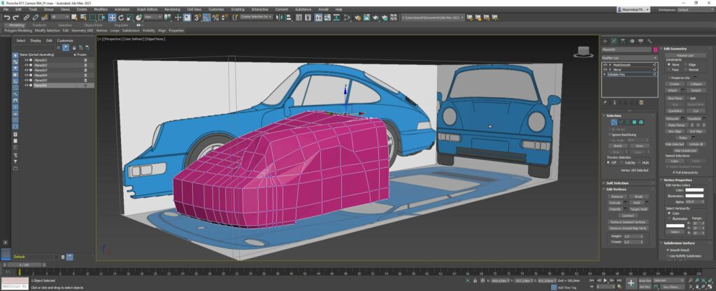
Nach korrekter Szeneneinrichtung kann die Modellierung des Fahrzeugs beginnen. Dabei wird üblicherweise von vorne nach hinten gearbeitet, beginnend mit der Motorhaube des Fahrzeugs.

Erster Teil der Front.

Im Verlauf der Modellierung ist es besonders wichtig, die Kanten des 3D Models so akkurat wie möglich entlang der Linienführung des Fahrzeugs zu setzen. Je präziser dies ausgearbeitet ist, desto hochwertiger wird das finale Ergebnis. Des weiteren ist darauf zu achten, dass nur Polygone mit 4 Eckpunkten verwendet werden. Dreiecke oder mehreckige Polygone, sogenannte N-Gons, führen zu unsauberen Ergebnissen im Rendering.

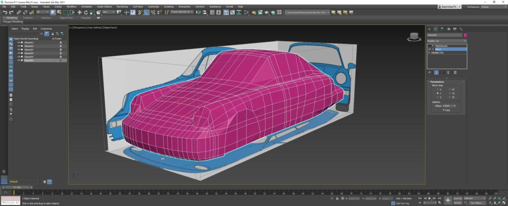
Rohe, ungeglättete Karosserie

Um eine durchgängige Linienführung am Fahrzeug zu gewährleisten, werden funktionale Kanten wie zb. Türkanten, Aussparungen für die Radkästen usw. im ersten Schritt ignoriert und lediglich eine zusammenhängende Hülle geformt. Die Karosserie wird dann erst in einem späteren Schritt in ihre einzelnen Stücke zerteilt.
Um den Modellierungsprozess zu beschleunigen ist es nicht nötig, beide Seiten zu modellieren, sondern mithilfe eines einfachen Modifikators die zweite Seite des Fahrzeugs zu spiegeln. So wird auch gewährleistet, dass beide Seiten des Models exakt gleich sind.

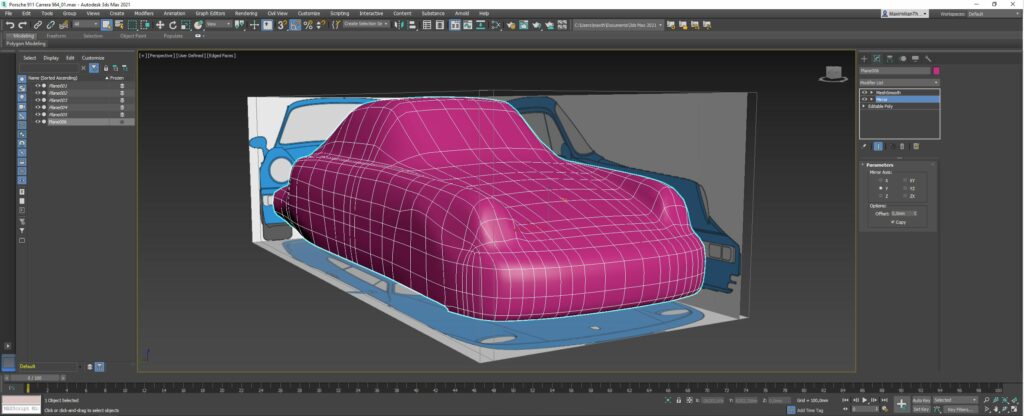
Geglättetes Modell der rohen Karosserie.

Ist die Karosserie grundlegend fertig modelliert, wird ein sogenannter “MeshSmooth” Modifikator angewendet. Dabei werden alle Polygone um einen selbst gewählten Faktor (üblicherweise 2) unterteilt und so das ganze Modell geglättet.

Neben der Karoserie, beinhaltet ein Fahrzeug eine Vielzahl an weiteren Teilen, die ebenfalls von Hand modelliert werden müssen.
Dazu habe ich parallel zu der Karosserie, eine Felge des Porsche 964 in Cinema4D modelliert und gerendert. Diese wird im weiteren Verlauf des Projekts in das Modell in 3DSMax eingefügt.

Porsche Felge, gerendert und modelliert in Cinema4D

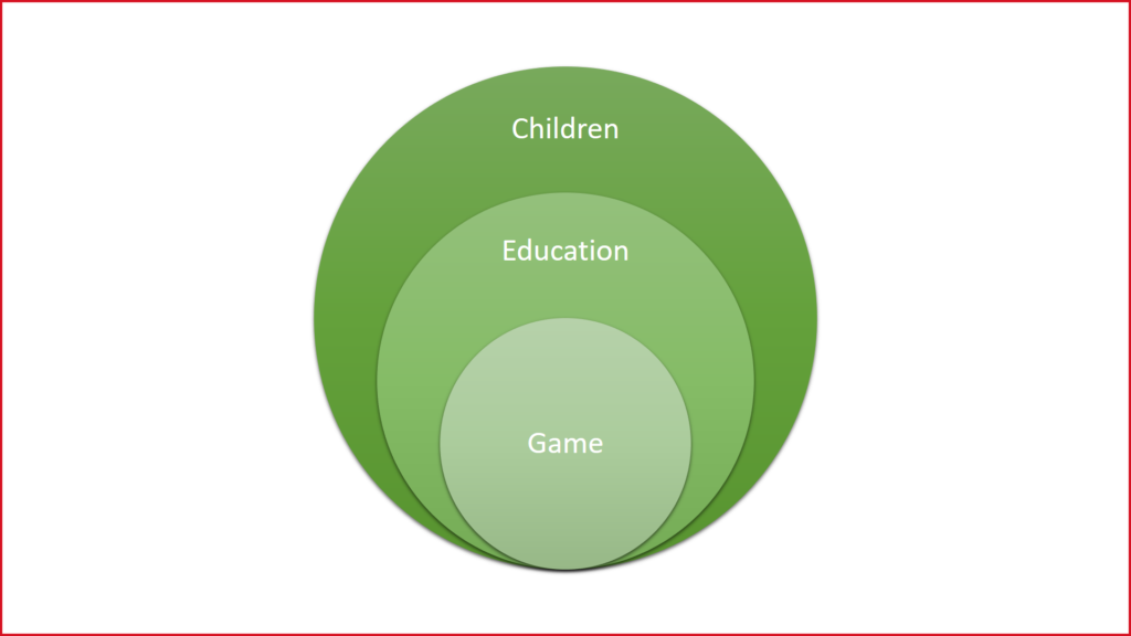
Games and Education

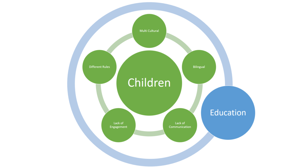
My target group is Immigrant/refugee children in the age of primary school and my goal is to design an interactive education system.

I thought the best approach will be using games and education in conjunction.

During my research I found that these children facing different challenges such as Lack of efficient Communication, Bilingual, Multicultural problems and …, until they get adopted to the new atmosphere and system.

Designers can facilitate the path for every user to gain their goals as in the education system designing new methods based on games.

Typografie als visuelles Kommunikationmittel – 4

Themenbezogene Literaturfunde:

Buch: Handwritten: Expressive Lettering in the Digital Age
von Mirko Illic und Steven Heller, 2004

Handgezeichnete Grafiken markieren eine Rückkehr zur Unmittelbarkeit und zum Handwerk des Schöpfers. Werbekampagnen, CD-Cover und Branding nehmen zunehmend den rauen Stil der handgezeichneten Typografie auf. Dies ist die erste Publikation, die einen vollständigen Überblick über handgeschriebene Typografie bietet und dabei auf ein umfangreiches Spektrum an Buchstabenformen aus der ganzen Welt zurückgreift – im Mittelpunkt des Buches stehen Hunderte Beispiele, die in kreativen Themen präsentiert werden. In einem Zeitalter der digitalen Typografie kehrt Handlettering zu den Werten des Handwerks zurück.


Buch: Type Tells Tales
Steven Heller und Gail Anderson, 2017

Dieses Buch konzentriert sich auf Typografie, die integraler Bestandteil der Botschaft oder einer Geschichte ist, welche sie zum Ausdruck bringt. Typografie ist buchstäblich die Stimme des Erzählers und die Erzähler sind Typografen.


Buch: Typography Scetchbooks
Steven Heller und Lita Talarico, 2011

Dieses Buch bietet spannende Einblicke in typografische Skizzenbücher aus aller Welt. Über hundert renommierte Desiger und Typografen haben ihre Skizzen für die Veröffentlichung in diesem Buch freigegeben.


Buch: The Elements of Typographic Style
Robert Bringhurst, erstmals 1992 veröffentlicht, mehrmals überarbeitet, neueste Version 4.0 – 2012

Der renommierte Typograf und Dichter Robert Bringhurst bringt mit diesem Style Guide Klarheit in die Kunster der Typografie. Dieses Buch kombiniert praktische, theoretische und historische Aspekte und ist ein Muss für Grafiker, Redakteure und alle, die mit der gedruckten Seite mit digitalen oder traditionellen Methoden arbeiten.


Webseite: https://www.slanted.de/

Ist ein unabhängiger deutscher Verlag mit Sitz in Karlsruhe und veröffentlicht die Zeitschrift für Typografie “Slanted” und weitere Publikationen, die sich mit Illustration, zeitgenössischer Kunst, Design, Fotografie und Typografie beschäftigen.


Buch: BRIGHT! Typography between Illustration and Art
Julia Kahl, Hrsg. Slanted Publisher

“Kuratiert von Slanted präsentiert BRIGHT! eine einzigartige Auswahl an Typo-Kunst. Ästhetische Dimensionen stehen hier ebenso im Fokus wie die Auseinandersetzung auf inhaltlicher Ebene – wenn Sprache das Material der Arbeit darstellt. Nach einem einleitenden Essay von Christine Hartmann und sieben Interviews mit international renommierten Künstlern, folgen 344 Seiten mit Abildungen von typografisch inszenierten Kunstwerken, Objekten, Installationen und Experimenten.”

– Beschreibung zum Buch von Slanted Publisher auf dessen Webseite.

The Conventions of TV Commercials

In my recent blogposts I have covered a lot of rules and techniques that established themselves over the time in the filmmaking landscape but as you could probably already guess, we only touched the tip of the iceberg. I briefly wrote about story structure, light, composition, look and even took a deep dive into the work of an award winning cinematographer in order to get a glimpse on how to create something that is not only cinematic but also valuable, emotional and simply works.

Over the years we learned and perfected the art of manipulating the audiences emotions, opinions and views through film. As this can be a quite a powerful tool, you would be right to assume that it’s not only used by artists that strive to tell compelling stories but also by states, religions, idealogies and also companies that want to sell their product. Commercial films are especially in todays world a very viable branch for filmmakers. The market is quite large and bigger commercials can actually come close to the production size and quality of triple A films, yet when watching a lot of commercials you might stumble upon a few recurring elements. In this blogpost I want to throw light on these elements and get an understanding for what conventional commercials are and how they look like.

The Story: 12 Types of Advertising

Every piece of film needs some sort of story, script or idea. Back in 1978 former creative director Donald Gunn identified 12 seperate categories of advertisments, convinced that every commercial applies to one of these types. To keep it short, here is a brief overview of the types:1

  1. Demo
  2. Show the problem
  3. Symbolise the problem
  4. Contrast with competition
  5. Exemplary story “show the actual benefit”
  6. Benefit causes story
  7. Presenter testimonial “tell it”
  8. Ongoing character & celebrities
  9. Show benefit through a symbol, analogy or exaggerated graphic
  10. Associated user imagery
  11. Unique personality property
  12. Parody or borrowed format

In the earlier days of TV Commercials we have seen a lot of demonstrations, problem showings, contrast with competition and exemplary stories. This changed when Marlboro introduced their ad campaign with the Marlboro man, as they were the first company to associate a lifestyle with a product.

How Marlboro Changed Advertising Forever by Coffee Break

Marlboro’s successful campaign quickly influenced other companies to put a message first, rather than the product they are trying to sell. Connecting the audience with a positive emotion to a brand instead of just information. This type of advertising allowed for more creative approaches and broke the seal for unconventional types of TV-Commercials.

Apple AirPods “Bounce” Ad

The Look: Equipment, Light, Color…

Television commercials usually look different than your classic Hollywood movie. This is due to many factors, for example nearly every advertisement is shot digitally and with sharp modern lenses whilst movies sometimes still get shot on film and/or with more stylized vintage lenses, as we learned in the previous blog entry about cinematographer Hoyte van Hoytema. Mostly because it’s cheaper and more versatile in production and post-production.

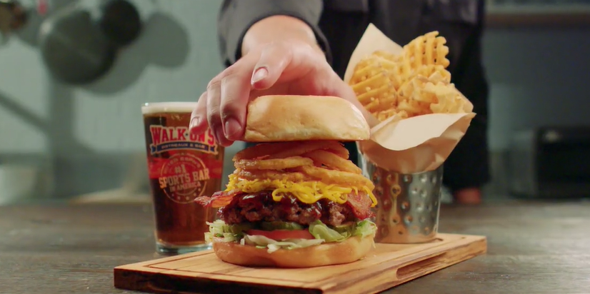
Advertisements tend to stay on the brighter spectrum. High-key lighting, vibrant colors and strong contrast seems to be the dominant commercial look.

Walk-On’s Bistreaux & Bar Commercial

This makes sense since companies like to appear modern, open and overall friendly whilst movies usually want to further enhance the emotion and mood with lighting and color. This is the reason why most TV-Commercials look very similiar, there a simply not a lot of options to choose from in order to make something that appears friendly and modern. Yet there are also some other more subtle reasons, for example eye sight gets instinctly drawn to points that are brighter and have more contrast. This is important to stick out in an 15 minutes ad block.

To show you what exactly I’m talking about I went ahead and compared two similar office scenes using the parade color scopes:

Movie: “Her” by Spike Jonze
Commercial: “Bruffen Office TVC” by Karol Kołodziński

When looking at the image itself we can see that the movie look is more washed out and stylized with its warm and soft approach whilst the commercial keeps it more neutral, bright and with more contrast. This gets further proven by the color scopes – the movie screenshot is keeping its values rather low with less colors in the heights aswell as in the shadows. The commercial on the other side is clipping on both fronts and doesn’t has a color that is more dominant, like the reds in the movie scene. It’s using the whole color range of Rec709 which is the color space most of our TVs and phone monitors have.

Ever since Marlboro proved that a emotion can be advertised and tied to a product, companies tend to further dive into the world “cinematic advertising”. Allowing for more creative freedom, telling interesting stories that actually have meaning and putting the product or company second. This is usually the point where the line between the look of advertisements and movies gets blurred, something we tend to see more and more in todays marketing world . Commercials like these have proven to be cabable of going viral, in fact even more than informational ads.

Edeka’s Christmas Commercial from 2015 which is now sitting at around 68 million views

Breaking the Conventions

Speaking about ads that did it different – there are quite a few of those that cleverly broke those conventions I mentioned earlier and went viral or atleast created a little fanbase around them.

One commercial that sticks out as an unconventional ad is Volvo’s “The Parents”. It tells a relatable story of young parents that face the hard times in the upbringing of their kids with the car beeing the solution in the end.

Volvo’s “The Parents” Commercial

It’s well written and the cast also provides a great perfomance, yet what makes this piece so unconventional is that it’s shot on 35mm film in a 4:3 format. They also used Japanese vintage lenses to further enhance this quite unconventional retro look. On Vimeo director Niclas Larsson pointed out that he liked the 4:3 format as he and DoP Linus Sandgren thought it fitted well to the way it framed the humor and characters in the commercial. Although in this case Volvo did decide to only release a 16:9 version of the film on their media channels, despite the vision of the director.

Sources:
1) https://chloewalkermedia.wordpress.com/simons-project-2/unit-19-advertising-production/12-types-of-advertising/


Design in Politics

If designers want to have the right to lead or even participate in the transformation of social systems, they have to develop a political competence, which, however, is often still lacking. Concepts, framework conditions, tools and, above all, a sensitivity must be developed in order to participate as a designer in the political dimension of society and to deal with it, to understand and question it. As in graphic design or product design, the designer has to learn a kind of vocabulary in order to familiarize himself with the field of knowledge and understand the needs and laws of politics – just not to remain a non-specialist in this field.
Design is political, that’s hardly a question these days. Many authors report on this fact again and again, whether Langdon Winner with his report on the discriminatory effects of the deep bridges in Long Island or Ruben Pater with his collection of examples in visual communication.

Ruben Pater, The Politics of Design

Everyone designs who devise courses of action aimed at changing existing situations into preferred ones. The intellectual activity that produces material artifacts is no different fundamentally from the one that prescribes remedies for a sick patient or the one that devises a new sales plan for a company or a social welfare policy for a state.

The Sciences of the Artificial, 1969 Herbert A. Simon

Like Eames, Herbert A. Simon describes design as a universal tool for all areas. Industrial design, medicine, business design, or government service design are all the same type of intellectual activity. Design thinking can address challenges in the entire area between material objects and social systems.
Design is what people do to reduce or eliminate the difference between the world as it is and what the desired state is. Political conflicts arise when there are different, competing interests and thus also ideas of the preferred system. If some actors consider the current system, or something similar, to be preferred, attempting to change that system can lead to conflict.

But political conflicts are not the only challenge that design in politics has to face. Another is the power aspect. At any point in time in any social system there is a different distribution of power among the social actors. This means that some of them will be able to either maintain the existing situation or determine which preferred situation suits their interests and realize such a preferred situation.

Every order is always an expression of a specific configuration of power relations.

Chantal Mouffe, Ernesto Laclau – Agonistics: Thinking the World Politically

This means that no design project targeting social systems takes place without a power factor. They are always trying to establish a new order in the social area, in which respect design and politics can no longer be distinguished.

It becomes possible in such a system to speak of the power of each actor, for power is a measure of the value within a system of the resources with which each actor begins (with that value itself deriving from the interests of other actors in these resources) and thus of the weight that the system applies to that actor’s interest in the aggregate satisfaction that is realized.

James S. Coleman – Foundations of Social Theory

Historical example of design in politics and society

The Nazi Aesthetics

Design is often seen as a contribution to creating a better world. But it can be used very well for propaganda purposes. In Nazi times, the design of all things was subject to a regime-stabilizing objective, that is, every design was careful to present the government in a positive and embellishing way. It is also said that there was no innocent design.

The history of design therefore consists of re-occurring subject matter representing moral correctness. However, design reflects the whole of the world, with all its good and bad sides. The Nazis were masters in using design to achieve their goal, to both convince and destroy huge numbers of people.

Designmuseum Den Bosch, NL

Design during the Third Reich was essentially contradictory. The main theme was purity, which meant that various population groups such as Jews, homosexuals and Roma had to be exterminated. National Socialism developed and relied on its own history, but at the same time focused fanatically on the future. It was full of romance, but also obsessed with modern technology. For the outside world, National Socialism presented a seductive picture of prosperity and carefree entertainment, while the first concentration camps were established in 1933.

On November 27, 1933, the “Amt der Schönheit” was founded. The tasks included the beautification of workplaces, the improvement of working conditions, ergonomics and occupational safety. At least, these were the obvious tasks. In fact, changes served to increase productivity, the increased exploitation of labor and means of production, the advance of a Nazi national community of leadership and workforce, and the saving of metals, which should be reserved for the armaments industry.

The quality mark for exemplary factory equipment.

In the case of graphics, the influence of the communist propaganda aesthetic on National Socialists can be traced, whose imagery, for example, is still used by the North Korean regime today. Through the combination of text and graphics, the poster became an important medium for propaganda at the time. The use of Fraktur was common in Germany until 1941. Modern sans serif fonts have been condemned as cultural Bolshevism. The images were often based on heroic realism: the National Socialist youth and the SS were depicted monumentally, with the lighting bringing out the size.

Current example of design in politics and society

Black Lives Matter Movement

The aim of a protest is always to clearly draw attention to a maladministration. And these moments of protest, of disagreement with the situation should not remain moments, but rather stay in the mind and change something.
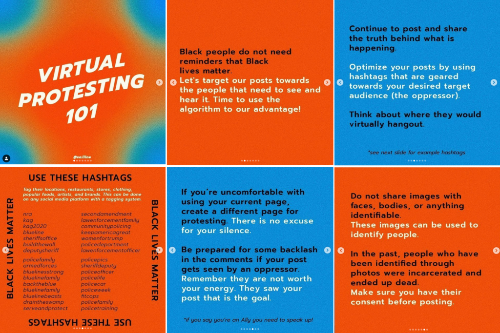
Traditionally, art has supported protests by creating posters, t-shirts and pins with impactful messages and eye-catching graphics. Currently, whether due to corona restrictions or the increasingly digital world, one sees a different tenor of social activism, especially on Instagram.
Movement guides appear, instructions for virtual protesting, reading black authors, unlearning the white savior, and many more. These guides are not just about expanding the visual landscape of a moment of protest, but also finding a way forward and asking: what’s next? And this question is asked precisely to those with privileges and power.

So the question is how can we continue sharing but do it in an effective way? We have to think about our target audience (the oppressor) and where they hang out virtually. We have to use their hashtags to meet them virtually.

Manassaline Coleman on Instagram https://www.instagram.com/p/CAyFgY6jdE0/

While there are specific measures to defuse and abolish the police force, these demands are being addressed by advocates, activists, policymakers, bureaucrats and the courts. The changes requested by the design community require more personal forms of accounting if there are no legal provisions. They require recognition and accounting with undeserved privileges and powers. The demand for humanity and justice; the right to have the same vote in decision-making.
The designers who created Movement Guides demand that colleagues in privileges and powers equally grapple with these ideas about who you are and what privileges you have. The goal is to mutually change and allow yourself to be changed. Trying to say and do the right things. Clear, understandable but above all factually correct to communicate and protest and thus to bring about changes.