Generative Design and Print?

Während den letzten Recherchen über DATA, CODE, DESIGN bin ich auf an diversen Social Media Accounts gestoßen, deren Arbeiten ich in nächster Zeit präsentieren werde. Mein Hauptaugenmerk möchte ich aber auf die verschiedenen Tools und Herangehensweisen im Generativen Design bzw. Creative Coding widmen und etwas tiefer eintauchen.

Hier eine Entdeckung, welches man als klassisches Ausgabemedium bezeichnen kann. Es kombiniert Creative Coding mit Print? What could go wrong?

Pen-plotter

From evilmadscientist | Pen-Plotter AxiDraw V3

Wie es der Name schon beeinhaltet, ist ein Pen-Plotter ein “Plotter” mit einem Stift. Was ist nun der Unterschied zu Druckern? Im Vergleich zu regulären Druckern können Plotter Vektorgrafiken direkt weiterverarbeiten, ohne diese davor in eine Rastergrafik umwandeln zu müssen. Perfekt für meine Code Designs.

Diese Pen-Plotter stehen in der Regel auf einer flachen Oberfläche und können je nach ihrer Dimension verschiedene Oberflächen “bezeichnen”.

Je nach eingespanntem Stift, variiert das Zeichenergebnis: Von Textmarker, Lackstift bis Füllfeder. So können verschiedenene (flache) Materialien, wie Plakstik oder Metall mit einem Lackstift bezeichnet werden. Die Qualität der Oberfläche und des Stifts sind hier maßgeblich und beeinflussen das Endergebnis.
Diese Kombination aus analoger Qualität und Ästhetik fasziniert mich.

From generativehut.com | Paper plotter in Arbeit

Einsatzgebiete

Die Einsatzgebiete dieser Pen-Plotter variieren:
– Artwork
– Unterschriften, von Promis oder andere die oft unterschreiben haha
– “Handgeschriebene” Briefe
– “Personalisierte” Post/Kuvers
– und viele mehr

Sogar Smartphone und Hardware Hersteller verwenden dieses Tool um etwa mittels Stylus deren Hardware zu testen.

Preise

Preise für diese Pen-Plotter variieren, von 70 $ Ali-Express bis hin zu ersten Roboterarmen für mehrere Hundert Kröten:

https://www.amazon.com/pen-plotter/s?k=pen+plotter&s=price-desc-rank&qid=1618837298&ref=sr_st_price-desc-rank

Branded content

Branded content is a form of creating brand stories that have a non-product or non-service focussed storyline. The brand itself and the values are the focus of the message. 

In times where it’s more and more important as a brand to tell a unique story, the mainstream channels were to reach consumers are outdated. The audience, that is forced to watch tv commercials is about to decrease. Through the rise of on-demand streaming platforms, ad blockers, and blind watching, the ad itself is harder to bring to potential consumers. Branded content tries to turn the idea of classic commercials around. It transforms from something you had to watch into something you want to watch. It also comes in a new variety of mediums. Podcasts, video games, or in forms of getting involved with the consumer directly. Branded content tries to put the brand’s history in the foreground and communicate its values in a way that is appealing to the customer even beyond the product. Through this approach of creating content, brands can stay relevant, independently from the product or service they are selling. Especially for reaching young adults, branded content is interesting. They are the ones who consume less established media, like classic tv or radio, so brands need to adapt their forms of communication. A new generation of consumers is interested in how brands deal with social, racial, and environmental issues. Furthermore, the covid crises chanced the way we consume in a radical way and brands need to react on that to stay relevant. 

Link: www.shots.net/news/view/why-branded-content-is-the-future

A new generation of consumers

While emotional branding and the “tribe” that comes with it worked for previous generations, the GenZ seems to be different. Generation Z is born between 1997-2015 and is the first fully grown digital generation. Therefore their personal expression differs from previous generations. The digital self comes to the fore. Regarding consumption habits, GenZ tends to be more aware of environmental and social issues. Second-hand shopping and renting mobility devices are more common than the desire of calling certain products their own. Studies show that a majority of this generation thinks that companies have a social and environmental responsibility, so they are more likely to choose brands that are aware of these issues and set actions. GenZ also searches for individuality, when it comes to consumption. Their own individual identity is at the center of their decisions. So they reach for brands that underline that individual expression. 

In the future, it will be much more important that brands get active and become aware of their actions and responsibilities, and do their part. Through the possibility of access to information it will get easier for consumers to recognized inauthenticity in a brand’s behavior and actions, so to stay or become relevant brands need to deal with these topics. 

Link: www.shots.net/news/view/for-gen-z-consumption-is-about-self-expression

Picture: www.commbox.io/the-customer-service-experience-for-millennials-and-gen-z/

What is emotional branding?

Brands use emotional branding to create a connection between the brand and the consumer by using emotions in a specific way. Advertisers try to generate content that can be triggered by a consumer’s personality, needs, goals, or experiences. It also describes a supportive tool in marketing that is used to strengthen a brand’s perception. It helps to support the brand’s identity and public image. In a world, with global competitors, it’s important for brands to deliver an individual language and gain the trust of the consumer. Emotional branding gives the brand a character and makes it possible to pull clear from competitors. The goal is to create full brand loyalty towards the consumer. 

BBC-story-works did research on the topic of emotional branding. In “The science of memory” the researchers describe how brands can create big moments in advertising that can manifest themselves in the consumer’s long-term memory. The study proves that if very personal stories or experiences of a protagonist in advertisements are promoted, the consumer connects these emotions to the brand. Especially if the issues portrayed are somehow relevant for the individual consumer. 

Emotional branding is an important tool not only for the brand’s image itself but also for a new generation of consumers, that tend to be more interested in a brand’s social and environmental attitude than generations before. 

Links:

www.bbcglobalnews.com/media/3174/bbc-science-of-memory-2018.pdf 

www.marconomy.de/emotional-branding-warum-marken-geschichten-erzaehlen-a-832350/ 

Tabletop photography II

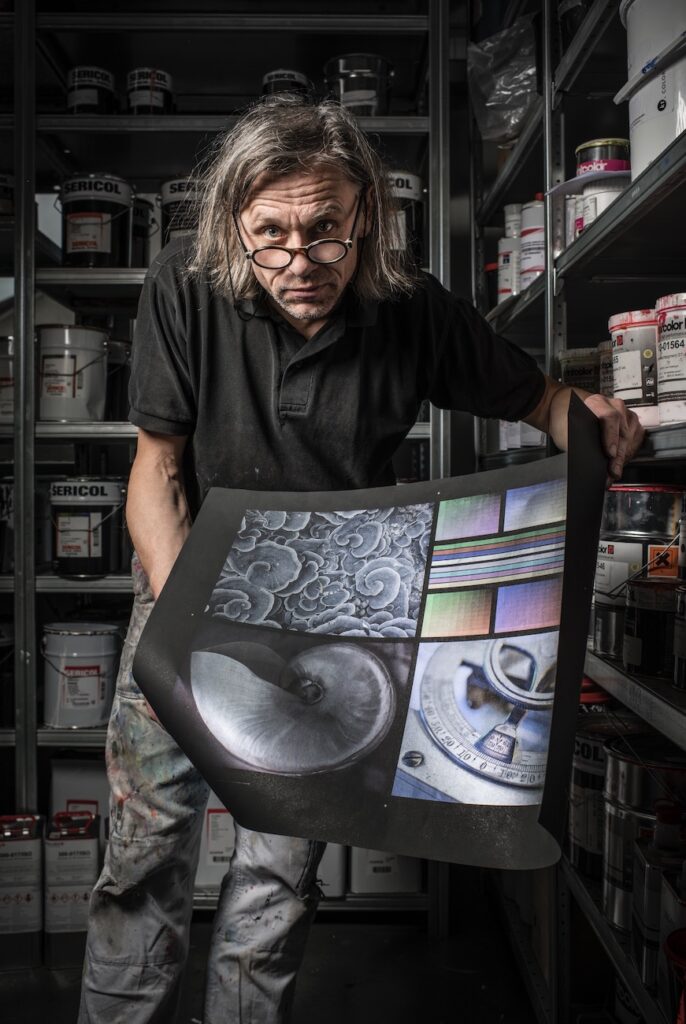
The tabletop photography gives photographers the chance to hone their craft and develop their abilities and skills regardless of time, weather and lighting situation. Lights, backgrounds, props-in short, everything that defines an picture are under the control of the creator, who can design scenes that range from objective to realistic to elaborate. 

Tabletop photography basics

Whether there is the intention to take pictures for products, foundation exposures for composite images, or you just want to capture a culinary scene, shoe-mount flashes can take you quite far.  These flash units are small, light, and battery operated. Therefore you don’t have to worry about extension cords and power outlets. But more important is the fact that these types of flashes are widespread. A lot of photographers have these flashes as a part of the basic equipment.

There are only a few things that influence the exposure of a photo. The focal length of the lens determines the perspective, the aperture defines the depth of field, the focus determines what will appear sharp in the picture and the lighting is basically the mood of an image. The advantage working in a studio means the photographer is in the position of being able to control all these factors and there are countless variations for exposing a single subject. 

Sharpness and Blur

Furthermore to determining the depth of field, the aperture also defines the degree of blur. Blur and sharpness have an quite big influence on the the look and vibe of the photography. As a result they could make an objective impression or otherwise a romantic impression. Because all elements of the tabletop shoot are under the control of the photographer, there is no limit to affect the sharpness and blur by changing the aperture. There is also the possibility to adjust the composition of the picture or the relative distances among each of the elements of the image. This means, for example, that an element can be placed by intention, beyond the depth of field to give the impression of a greater space or to separate the elements of the image more clearly. 

The distance of the main subject from the background of an image and the positioning of the focus lines during an exposure are of the utmost importance. They help you to develop the sense of space in your pictures, or in other words lead the viewer to pay attention to important details.

Focal length

The choice of focal length also affects the effect of an exposure. A wide angle lens makes objects in the foreground appear larger and allows you to include a larger background. In contrast, a telephoto lens compresses a photo to make it appear more compact and also shows less background in relation to the main subject of the image. A standard lens, often a macro lens for tabletop photography, displays objects the same way the human eye sees them, so it is useful for product shots where you want an objective perspective.

The wider the opening, the smaller the depth of field at which the subject appears acceptably sharp.

Light

The most important design tool of a photographer is light or the ability to change the quality of light through shapes. Shaping light in this sense has two meanings: First, photographers can shape the light themselves to be flat, pointed, hard, soft, scattered, etc. Second, light shapers enable photographers to stylize their subjects by modulating the lighting to match their photographic ideas. This is the exact process – what we call photography – that enables us to create two-dimensional images of objects based solely on the interplay of light and shadow.

Design with a purpose

Last but not least, a photographer’s creative instinct and effective composition are essential factors for a successful image. This includes choosing the right background, taking appropriate props and establishing a visual style that matches the subject/object. The photographer needs to stay objective when creating product shots and knowing when it is appropriate to use the photography to tell an emotional story.

When working professionally, the intended purpose of a photo should always be the primary influence on the visual design. The elaborate staging of a screw with multi-colored lighting and strong focus could work very well for the cover of a product catalog, but the same image would not be suitable for conveying objective information. To do this, it is better to make a clear product shot in which all the details of the screw are presented neutrally.

This also applies to the world of amateur photography, of course. Whether you are creating a product collection or taking a picture for an invitation, you should always consider the context in which the photo will be used and the effect the picture is going to have on the Person who sees it.

Know technology by heart

Proper use of the required technology requires both knowledge of how it works and a certain amount of experience from its regular use. The combination of this knowledge and experience helps to use the devices in a targeted and intuitive manner.

Therefore it is a great idea to set up some assignments for yourself from time to time and practice creating multiple photographic variations of the same subject. Your subject can be an everyday object staged under different lighting conditions, or it can be a broader theme, e.g. B. Representations of glass or transparent objects or even abstract images of aroma, coolness, softness or the like. Compare the results of the images you have created and determine which techniques have produced the best results.

After all, it is always good to ask yourself the following questions before starting a shoot:

– Will my plan achieve the desired result?

– Will the background and props serve the message you want?

– Are the subject and the background properly lit?

– Is the viewer’s gaze drawn to the important details of the picture?

– Does the selected focal length, perspective and depth of field match the subject?

– Is the focus on the optimal shot?

Quelle:

https://fixthephoto.com/tabletop-photography.html

https://www.amazon.de/dp/B00VB46CK6/ref=as_li_ss_tl?dchild=1&keywords=Tabletop+Photography+book&language=en_US&sr=8-1&linkCode=gs2&linkId=85d6c21259fd88d66db1bdb417f5376c&tag=expertphoto02-21&asin=B00VB46CK6&revisionId=4ce23c0c&format=1&depth=1

Analog/Digital – RGB Print

As recently mentioned in the entry about colours for digital and analog media there are two different color systems in use. While for digital applications the system is of additive nature (=the sum of colours will show a white display), the analog use of colours is of subtractive nature (=adding and mixing colours will end up in black colour).

Thus in print production it seemed impossible to represent the RGB color space that obviously contains a broader variety of colours than the CMYK, Pantone or any other subtractive colour system used for printing.

This fact has changed recently: referring to the article on Page magazine about Swiss screen printer Lorenz Boegli, there are special colours for screen print which are capable of representing the RGB colour space.

When Boegli used the Spectraval™ pearlescent pigments by Merck, he found out that the colours turn into a tertiary colour when overprinting them. Red on blue turned magenta, green on red turned yellow. His logic conclusion was that the sum of red, green and blue has to turn out white – and that’s just what happened.

However the revolutionary RGB-printing for now works only with screen printing and also only on black backgrounds. The reason for this is that the reflective power of the pigments only gets visible on black – on white paper the colours are more or less invisible.

Of course the RGB printing result is not exactly what would be emitted by screens – the pictures seem quite metallic and silverish. Additionally not only a lot of printing experience but also a suitable picture and the surface you print on has an effect on the result. But still it gets close and the system is the same, opening the addtive colour system to the analog world.

Full article: https://page-online.de/tools-technik/rgb-drucken/
More about Spectraval™ Colours: Merck Group

The Art of Food Illustration

Die Darstellung von Lebensmitteln hat eine enorm lange Tradition in der Kunst und unserer Geschichte. Die Darstellung von Nahrungsmitteln hat schon immer eine wichtige Rolle gespielt: in Ägypten wurden z.B. Piktogramme von Pflanzen und Getreide und Lebensmitteln wie Brot in sehr reduzierter Form in Hieroglyphentafeln geschlagen. In der Renaissance waren die Darstellungen von Lebensmitteln im Vergleich dazu viel aufwendiger und naturalistischer gestaltet und dienten natürlich auch einem anderen Zweck. In dieser Zeit sind beispielsweise skurrile rätselhafte Porträts entstanden, in denen Gesichtszüge aus Obst, Gemüse und Blumen zusammengesetzt waren, wie in den Werken von Guiseppe Arcimboldo.

“Autumn Beard Man” von Guiseppe Arcimboldo

Doch die heutigen Darstellungen von Lebensmitteln gehen vor allem auf die Blütezeit der niederländischen Renaissance-Malerei zurück. Die großen, wunderschönen Stillleben dieser Zeit sind immer noch Vorbilder und Orientierungshilfen besonders in der modernen Food Photography, aber natürlich auch in der illustrativen Darstellung von Lebensmitteln. Noch heute gelten sehr ähnliche, aber in allem Fall vergleichbare, Prinzipien, Regeln und Überlegungen in der Komposition, dem Aufbau und der Gestaltung solcher Darstellungen.

Auch das zugrundeliegende Ziel ist dasselbe geblieben: In den Gemälden wurde jede Oberfläche sorgfältig gerendert, um die Illusion zu erzeugen, dass das Fest direkt vor dem Betrachter steht und ihm das Wasser im Mund zusammenläuft. Der hyperrealistische Stil der klassischen Stilleben hat das natürlich extrem gefördert und viele der damals entstandenen Gemälde wirken durch diese Detailgetreue eher wie ein Foto als eine Illustration.

“Still Life with Oysters and Grapes” von Jan Davidsz. de Heem – 1653

Im Vergleich zu den hyperrealistischen Stilleben der Niederländischen Renaissance stehen z.B. die illustrativen Darstellungen von Lebensmitteln von Paul Cezanne. Für postimpressionistische Maler wie Cezanne war die Beobachtung aus dem Leben nur der Beginn eines weitgehend einfallsreichen Prozesses. Sie haben lebendige Farben und lebhafte Pinselstriche mehr geschätzt als den Hyperrealismus der Vergangenheit. 

In der Zeit der Pop Art wurde Essen zu einer sozialen Metapher. Die Gemälde von Wayne Thiebaud spiegelten eine Wandergesellschaft wieder, in der üppige Desserts für amerikanische Fülle und Wohlstand standen. Er malte Kuchen- und Tortenreihen in leuchtenden Pastellfarben, die an Werbung und Kinderspielzeug erinnerten. 

Wayne Thiebaud – 1920

Insgesamt besteht in der zeitgenössischen Lebensmittelkunst eine gesunde Spannung zwischen Tradition und Bildersturm. Vor allem in der illustrativen Darstellung gibt es alles – von hyperrealistischen bis hin zu abstrakten Darstellungen von Lebensmitteln – hier ist jeder Zugang ok.

Angesichts dessen, dass hyperrealistische Gemälde und Illustrationen schon sehr nah an Fotografie rankommen, jedoch viel zeitaufwändiger sind und man nicht noch realistischer zeichnen kann, werden Darstellungen, die diese Qualitäten aufweisen sollen (Detailgetreue, Realitätsnähe, Darstellung der Wirklichkeit,…) oft mit Hilfe von Fotografie erzielt. 

Klassische Stillleben – natürlich auch eine Illustration — sind der Ausgangspunkt für beide Arten der Darstellung, wobei die illustrative Darstellung mit dem Aufkommen der Fotografie in den Hintergrund gerückt ist, aber als Kunstform nach wie vor Bestand hat. Illustration hat sich immer weiter entwickelt und verschiedene abstrakte, unrealistische und imaginative Ansätze hervorgebracht. Illustrative Lebensmitteldarstellungen haben zeitgenössisch betrachtet nicht unbedingt Anspruch auf Realität, sondern werden als Kunstform bzw. in Hinblick auf grafische Illustration als Teil von Design verstanden. Dieser Wahrheitsaspekt wird heute vor allem von Fotografie übernommen, die aufgrund des Mediums immer diesen hyperrealistischen Aspekt beibehält und in der Art des Stylings und der Komposition variieren kann, aber weniger Spielraum hat wenn es um die Darstellung von Nicht-Realem geht.

Daraus ergibt sich aber, dass Food Photography heutzutage oft nur eine veranschaulichende Funktion zugesprochen wird und nicht als Kunstform verstanden wird. Im Allgemeinen werden Aktfotos schnell als Kunst bezeichnet, während Lebensmittelfotografie in der „Illustrationsfunktion“ zu stecken scheint. Jedoch hat die „natural beauty“ Bewegung der letzten Jahre der Disziplin der Lebensmittelfotografie und Lebensmittelkompositionen sehr viel Anerkennung verliehen. 

Links:

www.smithsonianmag.com/travel/food-art-cultural-travel-180961648/

Tabletop photography

Generally speaking for photographers, still life photography or, among them, tabletop photography is a good medium for further practice and to improve the technical and artistic skills . The following blog post explains tips from photographers on how to set up and design a tabletop photography. Since the still life photography basically benefits from inanimate objects such as decoration, plants, food, etc., it is a very thoughtful and calm type of photography that is not based on spontaneity or random snapshots.

Table photography is a type of still life photography that can be described by the composition of the elements on a table surface. Here, the disciplines of food photography and product photography come together. Since mostly the objects of these types are also on a surface or a table surface.

As already mentioned, many photographers do not always use the medium of tabletop photography purely for commercial purposes, as it gives you the opportunity to try out a lot. Here you can look closely at the various light situations and what influences the texture and color of a substrate have. For example, you would see how well a light from the side comes from a weaker light source that brings out textures and materials. In addition, you have a great responsibility as a designer, because ultimately every aspect of the image can be influenced by the photographer.

Away from the sales or presentation idea, table photography does not always have to advertise a product or food. It can also create a pure mood picture or try to tell a story. Because the objects themselves also have a strong narrative character.

What do you need for table photography? As a specialist, you naturally benefit from professional and correspondingly expensive equipment. Nevertheless, no designer should be stopped by this, as you can create amazing photographs alone in a living room with basic equipment. Here you can orientate yourself on many creative DIY solutions.

Guide to the necessary equipment

– Any kind of camera. Of course, the quality and the possibilities of post-processing increase if you use a digital camera and not your own mobile phone. However, you shouldn’t be limited to trying table photography even if you don’t have a professional camera model.

– Different materials in different colors and shades to line the sub and background for the scene.

– Reflectors are essential to guide the light back into the scene and thus to highlight it. Here, too, there are simple alternative solutions if you don’t have a reflector.

– A stable surface, which also fits in the format, is the base level for table photography, which with this medium always plays a role as a presentation surface.

– Props are crucial in order to steer the mood of the table photography into a certain style. Here it is of course interesting if you rummage through the attic or look for treasures at flea markets

– Light set ups decide in which direction the photo will develop. A low key setup creates a completely different mood compared to a high key set up and must also be made depending on the choice of object.

Quellen:

https://expertphotography.com/complete-guide-still-life-table-top-photography/

https://www.enjoyyourcamera.com/Blickschule/Foto-Tutorials/Foto-Tutorial-Tabletop-Fotografie::14865.html

https://de.wikipedia.org/wiki/Tabletop-Fotografie

Next Step: Building an Emotional Connection?

More and more waste is created all over the world from products that are replaced in shorter time periods. People tend to use certain products only for a minimum time, even though they still work perfectly fine. Some of the things land right in the garbage can others are placed in boxes or drawers. In these things lies a huge potential. The user is committed to the product but lost the emotional connection to it. This means that the product can still gain the attention of the owner/user back. Designers can help to support building this emotional relation from a product to the user. The goal is that people keep their products to extend the time of active usage. We know how to create and construct things that last for many years but how can we activate people to use their products longer and therefore extend the lifetime of a product? As designers, we can help to create emotions and boost the relationship between the consumer and the product/service. For the field of communication design, it’s important to detect the upcoming problems the world is facing and to find creatives ways to communicate them. 

Climate Crisis Foto: (Jonathan Nackstrand) / AFP
Child Poverty (Keepearth.com)
Global Pandemic (Picture alliance/ZUMA Press)
Organization: Moms Demand Action (AP Photo/Brennan Linsley)

Emotion in advertising

When it comes to emotion in advertising many people tend to think that this is all about making an unspectacular product more interesting or trying to sell a certain feeling connected to a product. But on a scientific level, it is more complex, than most people are aware of. In a world of globalized mass production, consumer decisions are more and more based on various criteria. Measuring emotional design and how it creates awareness for a certain topic is much harder to capture. 

When we think of emotions in advertising, we mostly associate good feelings and moods. But emotions in design are not always positive. The strongest emotions humans can detect are negative feelings like disgust, anger, fear, or sadness. If this information is not helpful to advertise a brand’s product it can help to raise awareness for issues like climate change, poverty, gender equality, or health issues. Most advertisers are following this approach because the institute of practitioners in advertising found out that when an ad is successful on an emotional level it is likely to double results on sales. Furthermore, depending on the topic, it can also lead to a wide discourse on social, environmental, or ethical problems and create awareness. The specific use of emotions in ads is also studied by scientific researchers. Ads based on emotions can lead to a more deeper and durable indentation on the memory center of the brain. For this research, marketers are using methods like facial coding, implicit response testing, eye tracking, and MRI. 

Charitywater Campaign
 New Ark Mission of India
Colin Kaepernick for Nike
Moms demand action

www.contently.com/2016/04/14/dangerous-power-emotional-advertising/

www.designwissen.net/voll-im-trend-emotionen-und-emotional-design/