Ursula Lagger held the course Proseminar Master Thesis and outlined the most important questions and considerations about the thesis.
After revising my expose, and the final conversation with Ursula Lagger, where I presented my topic, I feel quite confident that I’m on the right track.
However still I think I need to narrow the topic. For this I thought probably it would be better to start the focus already with the experts interviews. Instead of interviewing people from various fields probably it’s better to find more experts in a specific field like graphic design and print production. This would also fit the idea to produce a poster series and the printed hardcover as practical work piece. Thus I have probable interview partners in mind like graphic designers, typographers and illustrators who are experienced in both, digital and analog methods, processes and production.
Questions like the share of digital and analog for their work, experiences in perception, technical and aestehtic characteristics, special projects, general dis- and advantages, personal attitude on the topic seem to be a good start for the interviews.
However, I’m aware that there’s still more thinking about the questions and the aims of the thesis.
But I’m sure starting a proper research, getting in touch with interview partners and having all that material collected in March and April will again give another view on the topic and help to find a proper focus for the thesis.
Author: Marcelino Zus
Focusing on MA-thesis part IV – preliminary structure
Here’s the preliminary structure in German of the master thesis:
1.) Einleitung
2.) Theorie – Analog Digital
2.1) Genereller Medienbegriff
2.2) Wahrnehmungs-Psychologie
2.3) Function Complex
2.4) Geschichte und Beispiele Analoge Medien
2.5) Geschichte und Beispiele Digitale Medien
3.) Praxis – Meinungen und Erfahrungen aus Interviews
3.1) Video (Ocho Resotto)
3.2) Druckproduktion (P98a / Supersense / Dafi Kühne)
3.3) Audio (Stressstudio, Yeah!Yeah!Yeah! Studios)
4.) Praxisbeispiele – Grafiken, Artworks, Werkstück
5.) Fazit
6.) Literaturverzeichnis
7.) Abbildungsverzeichnis
8.) Anhang
Focusing on MA-thesis part III – expose
For the proseminar MA we had to draft an expose for the master thesis. After a peer review from my colleagues Jan Adams and Tobias Bettke the idea for my master thesis is getting more and more palpable.
Here’s a small summary:
Working title:
Augmented Analogy
The problem:
Differences between digital and analog media are questions that are dealt with in media theory and communication science since early computers in the 1930s. Since the emergence of CDs as digital audio recordings the differences cocerning characteristics, advantages and disadvantages of both kinds of media are also consumer concerns. While in the 1980s and 1990s the death of analog media was predicted, in recent years a hype around vinyl records and haptic products brings back analog media. Still on both sides you will find hardliners who propagate either analog as the better or digital products to be the future of media. A sophisticated view however shows that professional opinions ponder advantages and disadvantages, concerning characteristics, efficiency, target group and scope, of both representation systems to find the right method and media for their products.
Current state of research:
General media theory of the last century gives a good overview of perceptieve and psychologic aspects that are the foundation for the thesis. Furthermore there are a lot of current works about digitalisation. For the part of analog media, there are numerous practical applications giving an insight into todays production mechanisms but also practical literature from the last ten years.
Research questions:
What does digital and analog mean concerning the media?
What are characteristics of digital and analog media concerning perception, aesthetics, content, duplication and reproduction, what are the dis- and advantages of both?
In specific – how are analog products produced today?
How can we as communication designer ponder dis- and advantages of digital and analog production and choose the right method fitting the content?
Hypothesis:
The thesis shall rise awareness among designers for the different representation systems. Next to theoretical explanation the thesis should show that the analog, in whatever form, is still an important part of the media. The comparison to (all) digital media should create awareness, that
the virtual worlds based on 0s an 1s can’t offer a holistic solution, but the (reasonable) combination of both systems are the best possibility to convey contents. A poster series dealing with the topic and the master thesis as a book itself will show digital and analog approaches, depicting aesthetic characteristics and compare distribution mechanisms (e.g. social media vs. posting bills).
Theory:
Besides general media theory, the thesis deals with media theory approaches by Jens Schröter arguing the concepts of digital and analog.
In addition a philosophic approach comes with Otl Aicher, while David Sax gives insights into the working methods in Silicon Valley, and with selected interviews shows that just in the center of digtal production analog methods and approaches are extremely important. Victor Papanek’s function complex (methods, association, aesthetics, need, telesis, use) are also applied to both systems and Thomas and Martin Poschaukos practical approaches towards designing with coincidence (Nea Machina) are also part of the theory.
Method:
Besides (media-) theory, sepcific examples show characteristics of analog and digital media. Besides expert interviews, specifically manufactured graphics and artworks the differences are explained and depicted. Thus a poster series shall become the practical work piece, related to the findings of the thesis. In addition the hardcover will be another reference for an analog product based on digital data.
Material:
Primary literature, expert interviews (e.g.: Ocho Resotto, P98a, Supersense, Dafi Kühne, Yeah!Yeah!Yeah! Studios…), related posters from own production with adequate documentation.
Master Thesis Evaluierung
Titel: Autonomie im Umgang mit digitalen Medien: Strategien für den Philosophieunterricht
Autorin: Cornelia Riegler
Datum: Juni 2021
Universität: Karl-Franzens-Universität Graz
Gestaltungshöhe
Die Arbeit bietet keine besonderen Gestaltungsmerkmale. Sie ist als schlichte, klassische Diplom-Arbeit formatiert und bedient sich einer serifenlosen Schrift (vermutlich Arial Regular für den Text, Bold für Überschriften) mit erhöhtem Zeilenabstand. Weiters ist der Text in Blocksatz gehalten, was nicht unbedingt zum verbesserten Lesefluss beiträgt, jedoch dem universitären Standard wissenschaftlicher Arbeiten entspricht. Abgesehen von einer handvoll Abbildungen und zwei exemplarischen Zeichnungen im Anhang weist die Arbeit keine (unterstützenden) grafischen Elemente auf.
Innovationsgrad
Das behandelte Thema hat sehr hohen aktuellen Wert, da sich die Autorin mit den Auswirkungen digitaler Medien auf unsere Verhaltensweisen und insbesondere auf den Einfluss auf Kinder und Jugendliche beschäftigt. Die Verdeutlichung des Medienbegriffs im allgemeinen, die Erörterung spezieller Aspekte moderner, digitaler Medien bilden den Grundstock der Arbeit. Die philosophische Auseinandersetzung mit dem Begriff menschlicher Autonomie sowie Kreativität und dessen Beziehung zu (digitalen) Medien lässt die Autorin im Zeichnen eine praktische Anwendung erörtern, gewissen problematischen Aspekten unseres Medienkonsums entgegen zu wirken und diese auch schon im Unterricht von Kindern und Jugendlichen einzubinden. Sind viele Aspekte der Arbeit nicht unbedingt neu, so finde ich dass die Kombination, bzw. die Herangehensweise and die Forschungsfrage einen innovativen Charakter hat und das Thema auch aus einem äußerst interessantem Blickwinkel betrachtet. Weiters stellt die Autorin in ihrem Fazit wichtige weitere Fragen, die es zum Thema zu untersuchen gilt und gibt somit auch innovative Ansätze zur weiteren Forschung vor.
Selbstständigkeit
Die Autorin beweist durch umfassende Recherche in verschiedenen Themengebieten einen selbstständigen Untersuchungsansatz, verknüpft gefundene Informationen gekonnt und nutzt Primär-Quellen und Statistiken zur Untermauerung ihrer Forschungsfrage und eigenen Thesen.
Gliederung und Struktur
Die Arbeit ist übersichtlich gegliedert und weist einführende Kapitel als Grundlage für den Hauptteil, der zum einen eine kritische Auseinandersetzung mit digitalen Medien behandelt, vielseitige philosophische Ansätze miteinbezieht und schließlich eine praktische Anwendungsmöglichkeit bietet. Abgesehen von Gliederung und Struktur geben Einleitung wie Fazit einen sehr guten Überblick über das Thema und die Erkenntnisse der Arbeit.
Kommunikationsgrad
Die Autorin hat ihre Arbeit in gut verständlichen, relativ kurzen Sätzen formuliert. Paraphrasierung, Vergleiche und Bezugnahme auf verschiedene Quellen wurden gekonnt eingesetzt, direkte Zitate benutzt die Autorin wo nötig. Dem Thema gemäß ist speziell in der Behandlung der Philosophen die Sprache nicht die einfachste aber von der Autorin doch auch greifbar und verständlich verfasst.
Umfang der Arbeit
Die Arbeit umfasst inklusive Deckblatt, Inhalts-, Abbildungs- sowie Literaturverzeichnis und Anhang 109 Seiten. Somit würde ich die Arbeit als umfangreich bezeichnen, vor allem auch weil es der Autorin gelingt eine gute Auswahl an Themengebieten interessant miteinander zu verknüpfen.
Orthographie und Genauigkeit
Orthographisch ist die Arbeit einwandfrei verfasst, auch formal wurde auf Gendering sowie durchgehende Formatierung geachtet.
Literatur
Das Literaturverzeichnis ist mit ca. 90 Quellen, zum Großteil aus Büchern und Fachliteratur zuzüglich einiger Online-Quellen, sehr umfangreich. Ebenso wirkt der Forschungsstand aktuell, da sich viele aktuelle Quellen finden lassen, der Großteil der Literatur nicht älter als 7 Jahre ist und dennoch auch ältere Schriften bis hin zu den Anfängen des 20. Jahrhunderts nicht außer acht gelassen werden.
Focusing on MA-thesis part II – conversation with Gabriele Lechner
Today I had a meeting with Gabriele Lechner from Werbelechner to get input for my planned master thesis.
After thinking more about how to approach the thesis I came up with the idea that I would rather focus on analog products, but still outlining digital tools and approaches, as nowadays analog products are often based on digital data. Therefore I explained the project as followed:
My work deals with analog media, conquering with digital media. For this my thesis gives an insight in media theory and history, dealing with the specific characteritics of both representation systems. Besides, analog and digital processes and methods, various media and formats will be described to give basic information on all analog and all digital but also hybrid forms of media and their design. For the practical part an analog product based on digital data based on analog ideas is planned.
Gabriele Lechner mentioned that I should be more focused on the general method and a concrete practical piece for the thesis than on a wide range of content.
The conversation was very constructive, helping me to outline the structure for my thesis in a better way: the theoretical part can be followed by examples of use in film, sound, graphic design and photography. To get interesting content it would be good to find experts in the field and ask them for an interview. The results of the interviews will help to outline not only aesthetic and technical characteristics of d+a media, but also in means of range and scope, quality and aspects of perception. The practical workpiece could be the printed master thesis – the book can feature various papers and analog production methods to underline the theoretical findings.
Focusing on MA-thesis part I – general idea
For the last semester of the master program it’s time to focus on the master thesis.
So far I got an overview about various fields of analog and digital philosophy, methods and production.
My plan is to write a thesis giving an idea of analog and digital media showing their characteristics, advantages and disadvantages. While the theoretical part deals with media history and theory, the practical part will on the one hand show a digital approach (like an instagram account) and on the other hand display analog processes and products (like printed posters and/or the book of the thesis itself).
For the analog part my all analog print experiment of last semester is already a good base to start with, while still I’m thinking of how to present the digital equivalent.
Re: Print experiment: “reality is analog”, part VII–posters in public space
Yesterday I was at the Druckzeug, helping for Lange Nacht der Museen. As there are copies left of my poster, a friend of mine asked me if I made the posters. After a while it turned out that a friend of her picked one of the posters that were hanging in public space to put it on her wall at home.
So at least one proof that the public noticed the posters and did what should be done by taking the posters to their homes.
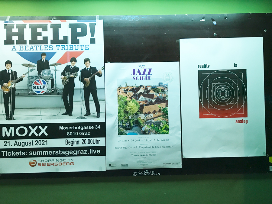
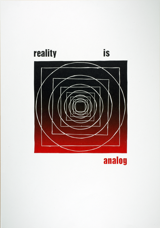
Print experiment: “reality is analog”, part VII–posters in public space
For the final part of the experiment the posters were hanged in (semi-)public space. Next to posters promoting various events, the advertisement-free letterpress prints aimed at raising awareness for the topic and reflecting the viewers perception.
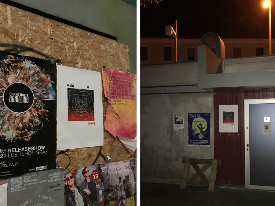
Additionally, putting them in the real world was the analog equivalent to a digital posting on social media. However as the poster walls in public space aren’t capable of tracking likes, the only measure for public perception was if the posters disappeared. Though again, only the disappearance of the posters can’t tell specifically the viewers opinion, my hope was that people would take the posters to hang them in there homes.
At least I could observe that most of the posters were gone after a while – either they went to trash or they found a new home on another wall.
Print experiment: “reality is analog”, part VI–repro photography of print edition
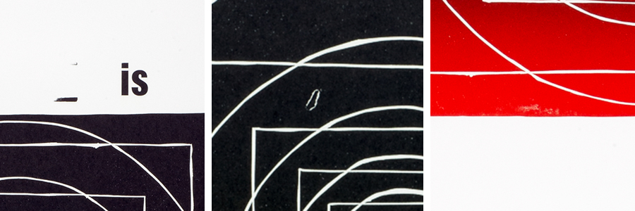
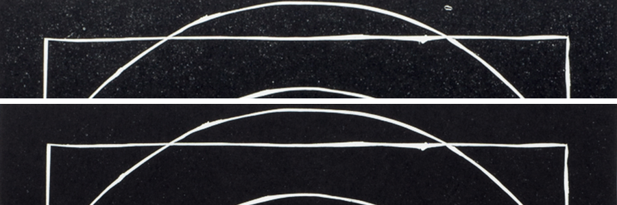
After the printrun and final cut, I documented the print edition with a repro camera to find out about the fluctuation of the printing process.
The animated clip below shows that besides minimal changes of the position (also possible because of not 100% accurate positioning for repro photography), the print result of each poster varies slightly.
Differences in color application, but also minor flaws like particles on the printing rollers or inked blind material (in German printing jargon refered to as “Spieß”) that touches the paper in the print run, show a range of stuff that may happen during analog print production.
Of course, for high quality printing jobs print operators are aware of these mistakes and know how to avoid them.
Still, for the experiment, the flaws add to the topic. On the one hand it shows what parameters have to be taken account, while on the other side minor mistakes can be seen as coincidental effects, adding an individual and unique note to each of the posters. Besides these little imperfections underline the characteristics of analog products.
Print experiment: “reality is analog”, part V–print edition on OHZ
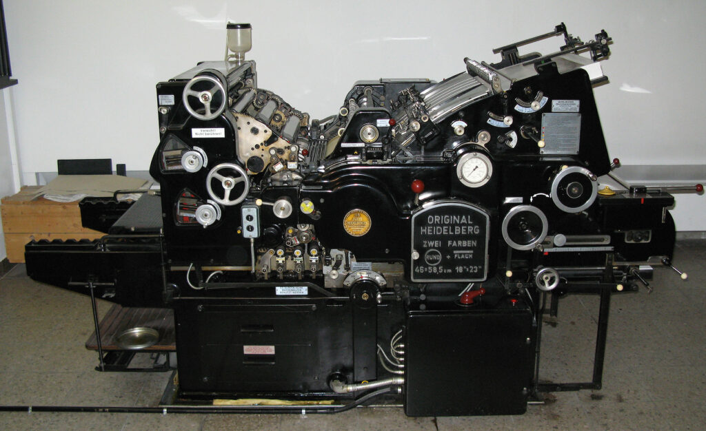
After I had set the letters and printed a variety of prints together with the lino cut on the Asbern proof press, everything was ready for the print edition of about 100 460x660mm posters on the Heidelberg Zylinder at Druckzeug.
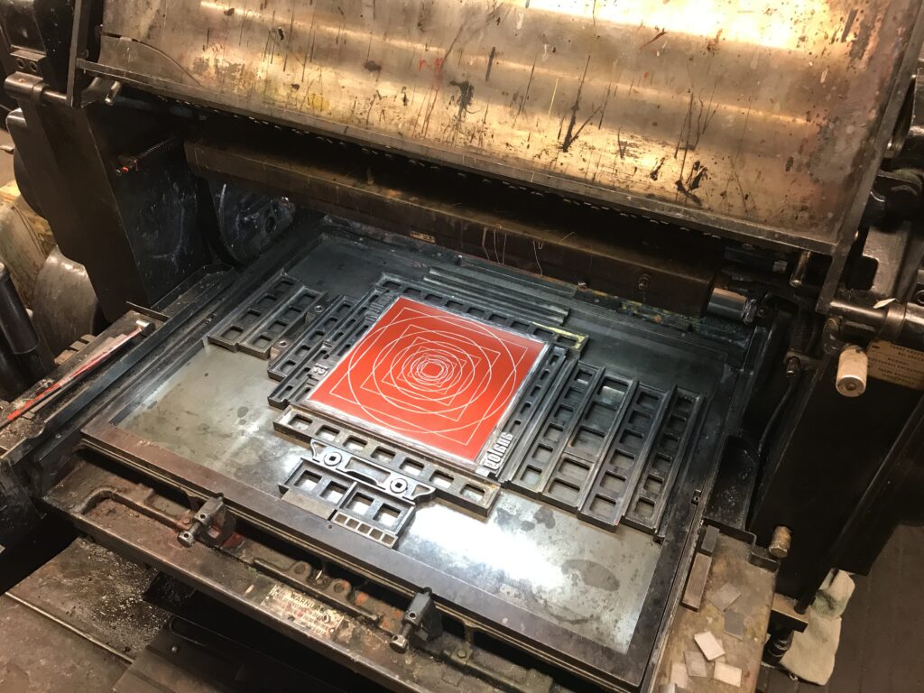
The Original Heidelberger Zylinder (OHZ) was produced between 1935 and 1979 and could print sheets of paper, depending on the machine mode, up to 104 x 72! Heidelberg Cylinders are fully mechanical (automatic) printing machines that improved the technical principles of earlier mechanical cylinder presses (which again were the results of technical improvement of manual cylinder presses).
In general the press is driven by a set of gears, which run the “paper run” (Papierlauf), a system of various picker arms transporting the paper, an inking unit, the moving fundament with the attached print forms and of course the central cylinder. Though later models were able to print two colours in one run, with the most common OHZ-S printers it’s only possible to print one colour on one side of the paper per printing run, though still it is possible to combine letterset with other printing forms in the same run.
How each unit of the machine work together in a synchronous way is as fascinating as it is ingenious: on the one side of the machine an aspirator is taking one sheet of the paper stack, which slightly moves up step by step. From the aspirator the first picker arm transports the sheet to the next picker on the cylinder. At the same time, on the other side of the machine there’s an inking unit that distributes a certain amount of colour over a set of metal and rubber rolls. On this side the printing block is set on a fundament that is running like a sleigh in and out the machine. By passing the inking unit the block takes the right amount of colour for the print, which happens while the sleigh is running beneath the rotating cylinder. After one rotation the cylinder forwards the printed sheet of paper to another set of pickers that eventually release the print below the unprinted paper stack.
The adjustments that are necessary to properly operate the OHZ are in general the run of the paper (adjusting the replenishment of paper), setting the right position of the printing image by adjusting printing block and paper (again the “Anlage” needs to be fine tuned to guarantee the same position on each print), preparing the printing block on the fundament, strengthening the “Aufzug” (a sheet of paper that’s tightened to the metal cylinder) on the cylinder to adjust pressure, as well as the adjustment of the inking unit.
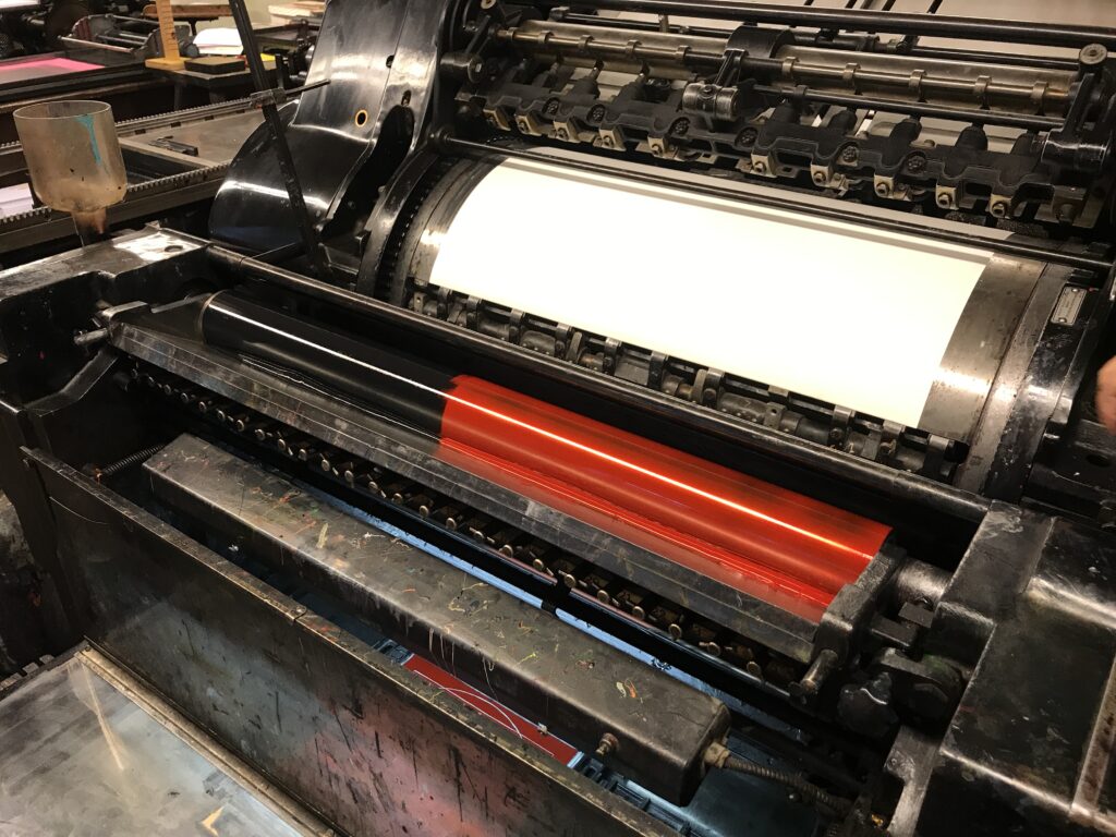
As I already had the proof prints, I didn’t have to adjust the height of letters and lino cut and being instructed by a skilled and experienced printer who learned the processes of letterpress before it became an extinct job, we decided to make use of the adjustable zones of the inking unit to print a black and red gradient. Again within the inking unit you’re able to adjust the amount of colour you need for specific areas of your print. Too little colour for bigger areas will result in little saturation, while too much colour, e.g. for small types, will result in blurry edges. As the ink is manually put in to the inking unit you can decide on the position of your gradient.
For my printing experiment we also adjusted the position of the gradient, turning more into black towards the last few copies. Therefore the next part of my print experiment aims at investigating the appearance of the gradient, but also at looking for various inaccuracies that may come with using analog materials and printing techniques – stay tuned for part six, repro photography of print edition.
Sources:
https://digital.deutsches-museum.de/item/78462/
https://de.wikipedia.org/wiki/Zylinderpresse