All over history numerous personalities in arts and science have dealt with the science of colors. This science on the one hand deals with the colors of the spectrum of light as well as with the (human) ability to perceive colours in combination with charecteristics of light under specific circumstances and surrounding factors.
Besides controversial discussions about the spectrum of colors and the “most probable“ ground colors or „unique hues“ adressing the three color receptors (sensitive to short-, middle- and long-wave rays) of the human eye, it is clear that in digital and analog media we use different systems to create specific colors for representation.
Additive color mixing
Speaking of digital media and the use of screens and projectors, the colorsystem is of additive nature. Every screen is set up with a specific amount of pixels, each containing three segments or phosphores – red, green and blue, which make the primary colors. So for red color on the screen only the red segment is actively emitting (red) light, while for blue color only the blue one and for green light only the green segment is actively lit via cathode rays. Combining two light emitting segments results in secondary colors – cyan, yellow and magenta – and combining all three segments results in the tertiary, achromatic color white. The second achromatic color black however appears on screen where no pixels are emitting light.
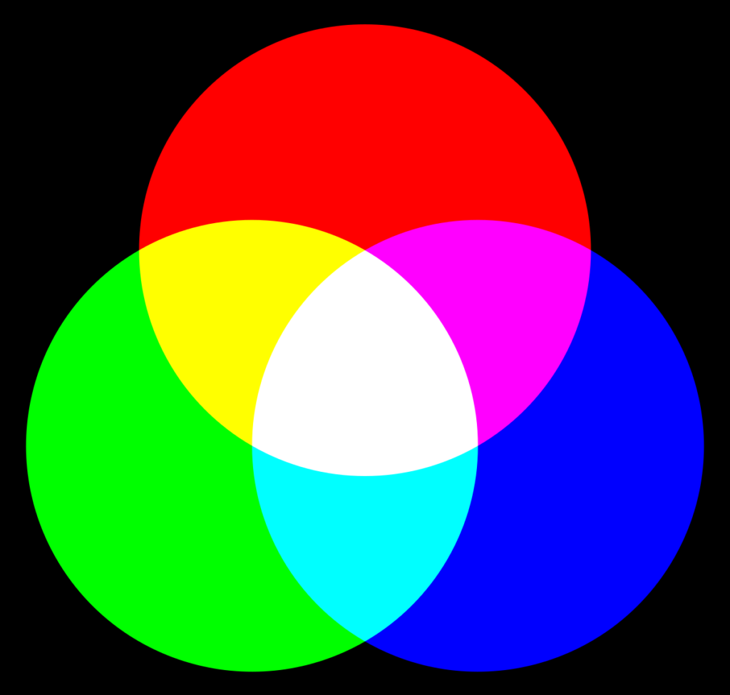
Combining the three primary colors at various levels of intensity or luminance makes it possible to display almost every color of the spectrum of light.
However, according to Küppel, the phosphores cannot fulfill the exact theoretic requirements and thus the secondary colors, especially yellow and cyan, appear slightly dull and „whiteish“ on screen.
Subtractive color mixing
For analog media such as print and (printed) photography we speak of subtractive color mixing using transparent colors. Here the primary colors are cyan, magenta and yelllow. Applied and combined on white (!) backgrounds these colors absorb specific wave-lenghts of light rays and result in a color stimulus we perceive after the light is reflected by the background that’s capable of reflecting the whole spectrum of color. In addition, to create the perception of the right color, not only the background has to be white, but also the light source itself has to be white. If the color spectrum of light is shifted, or the background has a (slight) colorful hue, the appearance of mixed colors will not satisfy demands.
As cyan absorbs long-wave rays (= red), it fully stimulates the receptors for green and blue on the retina. Magenta absorbs middle-wave rays (=green) stimulating red and blue receptors, while yellow absorbs short-wave rays (=blue) stimulating green and red receptors.
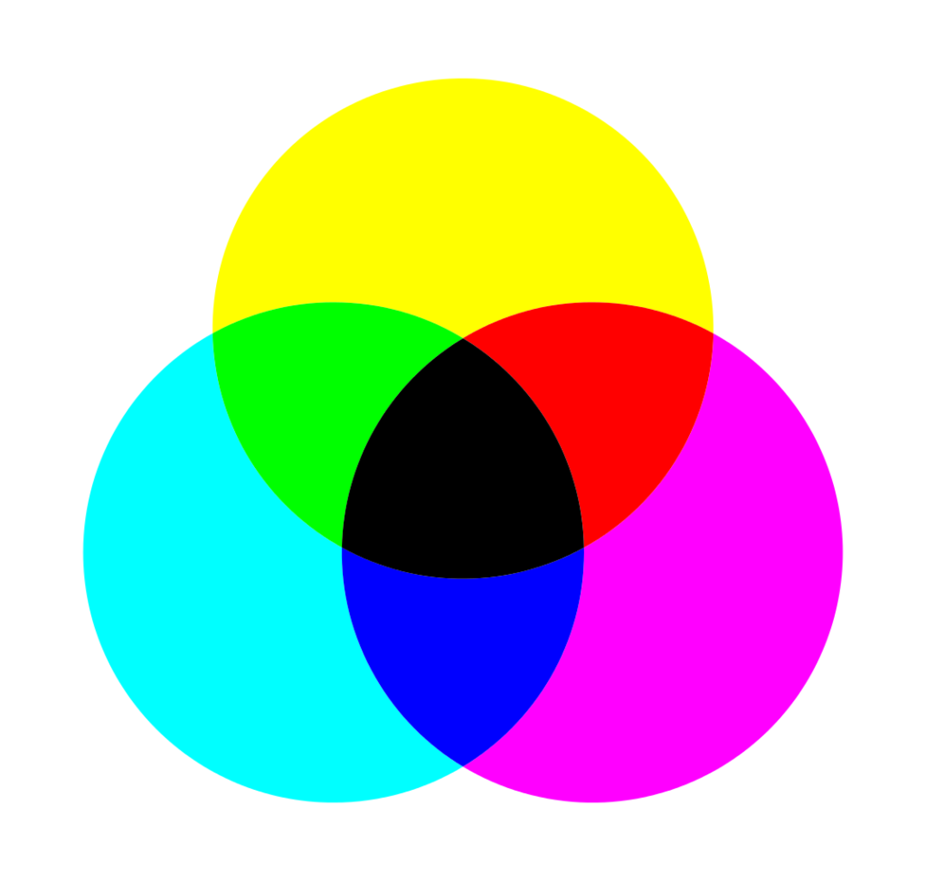
In subtractive mixing the secondary colors originate from the overlapping of primary colors. Thus magenta and yellow make red, magenta and cyan make blue, yellow and cyan make green and all the primary colors combined resolve into the tertiary color black, also referred to as „key“.
While the primary colors used for printing appear brillant and luminous, due to misabsorbtions the secondary colors are not as satisfying and appear rather dull and tainted.
Integrated color mixing
In addition to the use of transparent colors for print, Küppers states that for other analog techniques like painting on colored, not white backgrounds, opaque colors are needed. These colors contain specific pigments that directly reflect the light at specific wave-lengths. To mix these opaque colors we need the eight basic colors – red, green, blue, cyan, magenta, yellow, white and black – as due to the lack of transparence overlapping basic colors will not result into a mixed color.
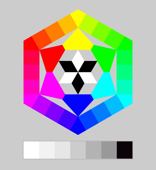
When mixing opaque colors, according to Küppers, the neighbouring colors in the spectrum can be mixed and resolve into new colors. Adding grey tones between the achromatic colors black and white makes it possible to create a wide range of hues and colors.
Sources
Farbe verstehen und beherrschen – Harald Küppers, 2004.
https://www.leifiphysik.de/optik/farben/grundwissen/additive-farbmischung
https://www.itp.uni-hannover.de/fileadmin/arbeitsgruppen/zawischa/static_html/farbeinf.html
https://www.itp.uni-hannover.de/473.html