Trying out the LeapMotion

As I got to know hand tracking from the HoloLens2 and a little bit trough one of my lectures “Interaction Design”, I wanted to try out the tracking with the LeapMotion Controller. The Leap Motion Controller from the company ultraleap is an optical hand tracking module which captures the movements of hands and fingers even if they move unparallel to each other. It is used for development and deployment of various applications.
own image

Set up

I borrowed out a leapmotion controller at the mediacenter from the FH and downloaded the accompanied software from the website.

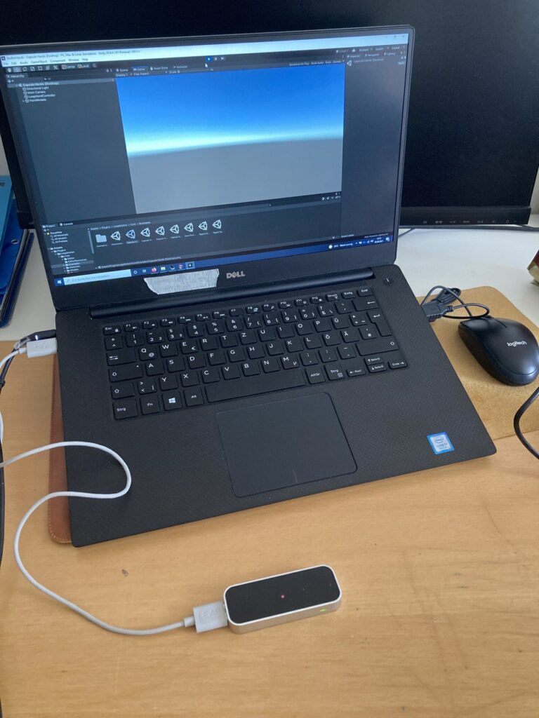
You plug in the controller per USB and install it as well. There are various possibilities you can choose from to try out the LeapMotion. As my topic of learning sign language deals with viewing or tracking – not only – but mainly hands, I wanted to see how I can interact and which movements can be tracked preciously. With the information for setting up and trying out with the Unity engine given trough one of the many helpful YouTube videos, and after the installation, you can open Unity. In the program you install the XR Plugin Management under the package manager to prevent problems when downloading the packages for the LeapMotion controller. You import the unity packages that are provided by ultraleap into the assets folder and can try out the different examples given.

https://www.youtube.com/watch?v=WwHrXwGyMt8

Try out and conclusion

It was very helpful for me to try out specific movements for a better understanding of how systems are tracking and which parts of the hand brings the most valid information for the systems to possibly translate it into sign language.

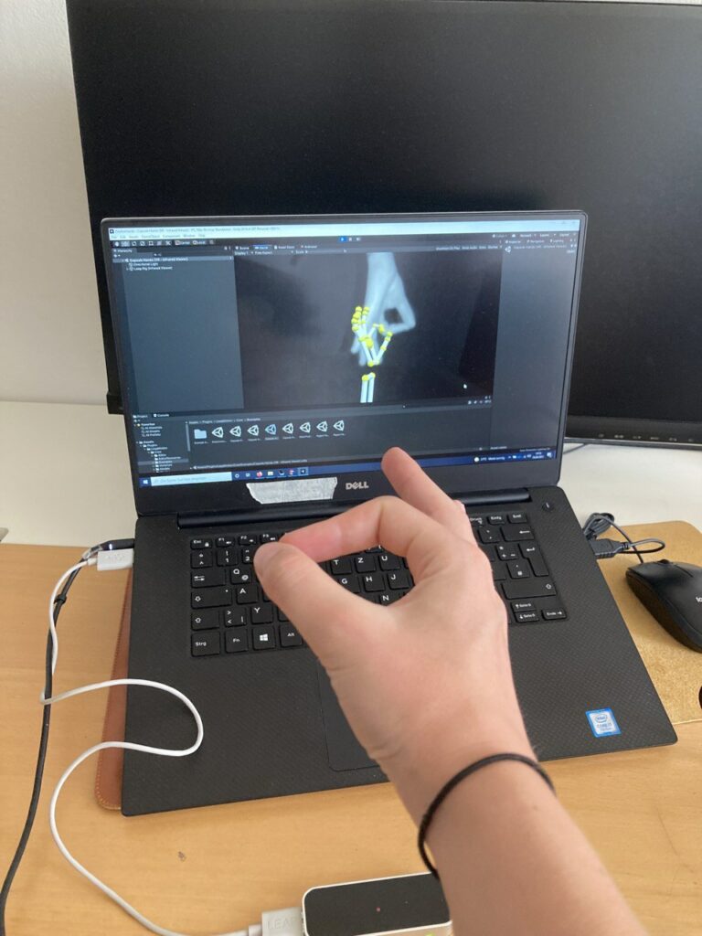
I got to know that the parallel tracking of both hands works very well but there are some difficulties for the controller to track preciously when the signs are to complex and have many overlapping fingers or else. After just randomly moving and changing the positions of my hands and the fingers, I tried to spell my first name consisting of five letters. The controller tracked three of them without any problems but with the other two, it could not recognize the position of the thumb or index finger and this is why it showed a different gesture than the one I was doing. I tried to readjust it by turning or giving the controller itself another angle to read the gesture as well as turning the hands around to view it from the other side but it always set back to the wrongly tracked gesture.
own image

Heuristics for LeapMotion Interaction

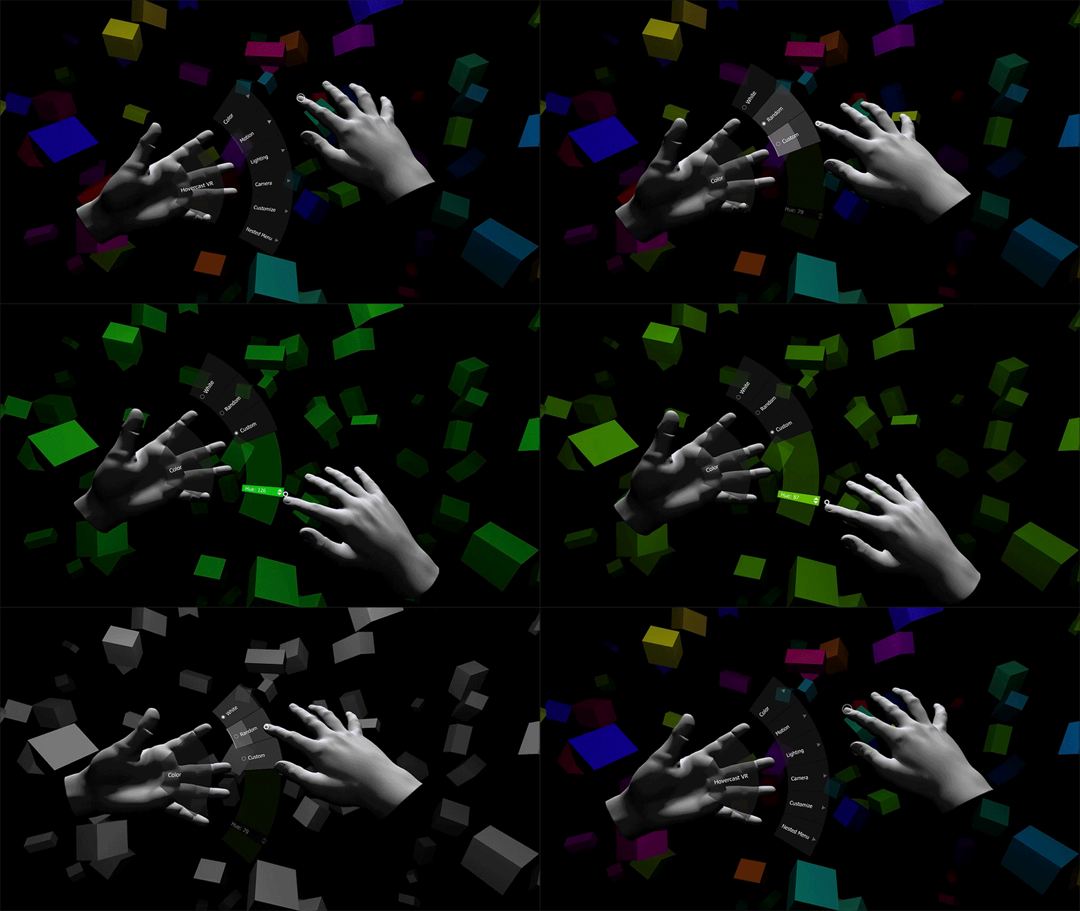
As already mentioned a couple of years ago from the LeapMotion developers, it is important to evolve applications with the focus on the following points which I can now relate to and understand better after trying out the LeapMotion:

1. consistency in tracking: working constantly on accuracy and consistency of tracking by having multiple people perform actions, motions and gestures

2. ease of detection: create a concept of how easy the motions are detected and what is important to detect as obvious conditions which define the motion but are separated from other things around which could also be detected
source: https://medium.com/@LeapMotion/6-principles-of-leap-motion-interaction-design-98bddff77a53

3. occlusion: the controller should be able to detect the environment but if the sensor is covered by physical objects, tracking is not accurate or not possible at all. If motions involve occluded parts, the system can not visibly see a part of the hand and makes assumptions trough available data. A diagnostic visualizer can help to test a variety of detectable areas around the field of view to prevent occlusion.

4. ergonomics: improving posture and working environments but not on a physical object. A consideration of affordances and guestures adjusted to the movements of the humans and users body without harming or straining is necessary by having the environment and comfortable positions on mind.

5. transitions: creation of a concept for the interaction with the application. Every interaction should be defined and differ so that the gesture can be detected from the system as well as be more memorable for the user. If actions have similar results the usage of slightly similar interactions is acceptable, otherwise they should differ. It depends on the beginning and ending of a motion in the space in front of the body if the user can perform the action in the air easily. It therefor should be looked for minimizing awkward switches by implementing an “initialization” or “resting” pose which initializes actions.

6. feedback: consideration of how providing a feedback from the application to the user who is performing the gesture because a lack of hardware-based physical feedback in motion-based interactions can leave the user unknowing of the current state of the application and state of the system. The user interface should communicate three things regarding the users interaction: Where am I now? Where do I need to be to complete? How fare and in what way do I need to move?
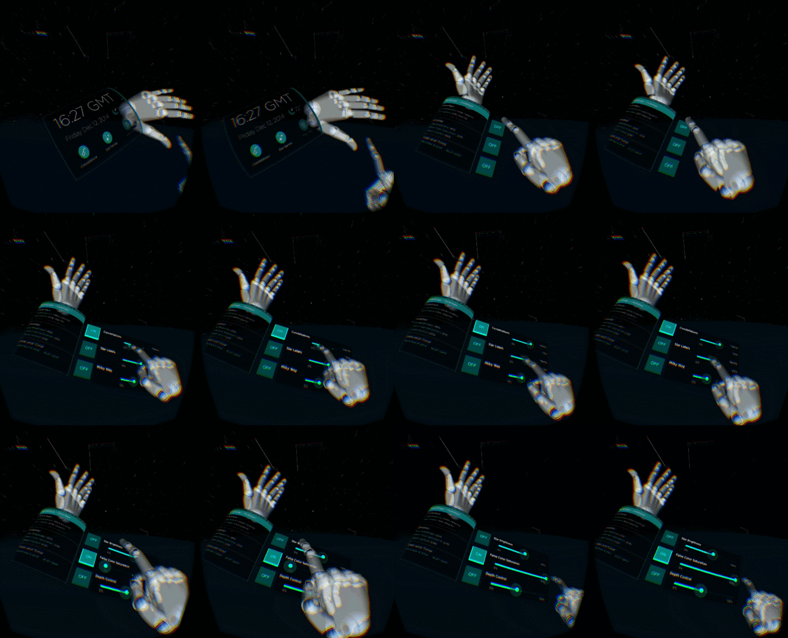
source: https://medium.com/@LeapMotion/6-principles-of-leap-motion-interaction-design-98bddff77a53
With the programm Unity I can in the end evolve the whole setup of a possible application as I already informed myself in the last semester as well as in this one about the developement of the final product. There are many possibilities how to do so, so that it is necessary to first develop a concept and designing the experience and interactions beforehand.

source:

https://medium.com/@LeapMotion/6-principles-of-leap-motion-interaction-design-98bddff77a53

Meditation App in the Market

In this blog entry, I am going to analyse a few apps that I considered the best examples for my project, with the purpose to see why they are successful in their market. Looking through these apps will also help to be critical with a possible app design and to think what could be the best fit for my project.

1. Headspace

Headspace isone of the most well-known meditation apps out there.

“There are hundreds of guided meditations, mini-meditations, sleep sounds, SOS meditations for emergencies, meditations for kids and animations to help you better understand meditation,” says Lindsey Elmore, PharmD, a pharmacist turned wellness expert (she’s known as “The Farmicist”).

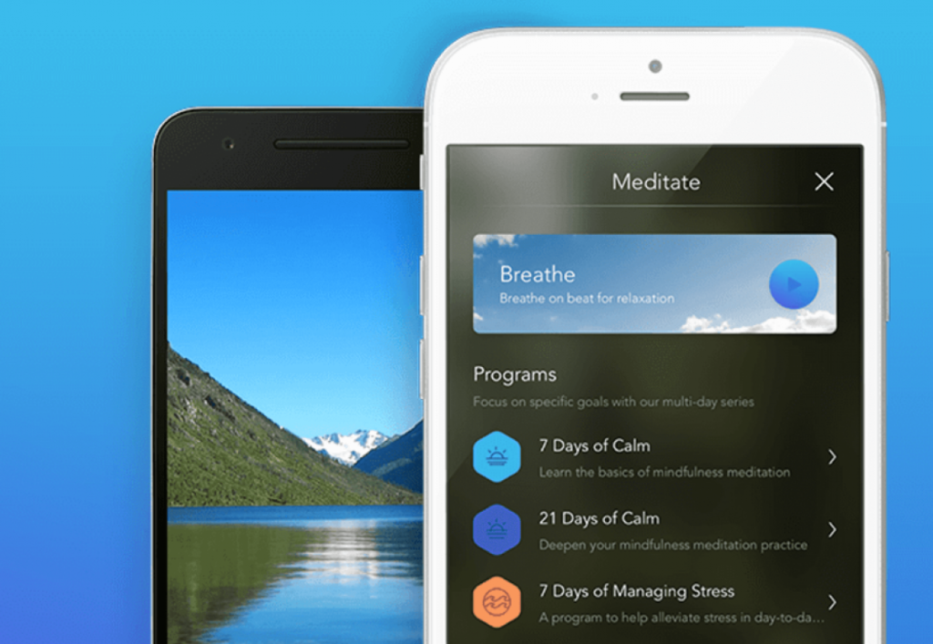
2. Calm

Calm app lets you choose between your meditation practice. After all, the app provides guided sessions ranging in time from 3 to 25 minutes. And with topics from calming anxiety to gratitude to mindfulness at work—as well as sleep sounds, nature sounds, and breathing exercises—you can really choose your focus. “There are new meditations every day, progress trackers, and seven-day and 21-day programs for beginners,” Elmore says.

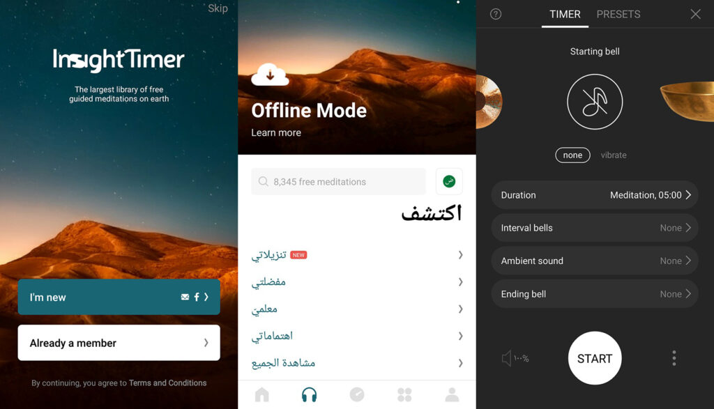
3. Insight Timer

Experts across the board agree that Insight Timer is primo when it comes to choosing a meditation app.

“This app has many of the most experienced mindfulness teachers on it, and allows you the freedom to pick and choose depending on how long you have to practice, what style you’d like (e.g. body scan, loving-kindness, anxiety/stress-reducing, etc.), or just set a timer and sit without guidance,” Tandon says.

the app is a go-to because, in addition to the variety of guided meditations, the app has a tracker that allows you to chart your progress and earn badges that keep you coming back for more.

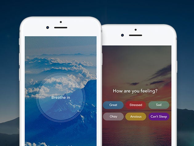
4.Aura

Fans of Aura like it for its daily meditations, life coaching, nature sounds, stories, and music, which are all personalized based on the mood you select when you open the app. There’s also an option to track your moods and review patterns in how you feel, and set reminders to breathe and take breaks for mindfulness throughout the day.

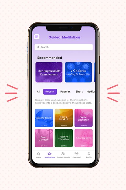
5.Sattva

Sattva is a mindfulness app that draws its mediations from ancient Vedic principles. In addition to 6-minute-plus guided meditations, the app features “sacred sounds, chants, mantras and music by Sanskrit scholars.”

Sattva is perfect for anyone looking to get more in touch with the history and origin of meditation in addition to starting their own practice.

Sources:

https://www.nytimes.com/wirecutter/reviews/best-meditation-apps/

https://www.verywellmind.com/best-meditation-apps-4767322

https://www.healthline.com/health/mental-health/top-meditation-iphone-android-apps

https://www.womenshealthmag.com/health/g25178771/best-meditation-apps/

INDEPTH Sound Design

Indepth Sound Design ist ein Sound Design Channel auf Youtube, der sich mit der Philosophie und den techniken des Sound Designs beschäftigt. Dafür werden Beispiele aus echten Filmen gezeigt und erklärt. Indepth Sound Design beschreibt sich selbst als eine Fundgrube für lehrreiche Sound-Dekonstruktionen, Audio-Stem-Breakdowns und andere klangliche Inspirationen. Die Seite wurde von Mike James Gallagher ins Leben gerufen.

Beispiele für Sound Design Dekonstruktion:

In diesem Beispiel wird auf den Film Independence Day eingegangen, wobei der Sound in die verschiedenen Layers aufgebrochen wird. Die Szene ist 3:45 lang und wird 4-mal gespielt.

Zuerst mit nur den Sound Effects, dann nur Dialog und Foley, anschließend nur die Music und zuletzt alles zusammen im Final Mix.

Im zweiten Beispiel geht es um eine 1:09 min lange Szene aus Terminator 2. Auch diese Szene wir mit den Layers Sound FX, Ambience, Foley, Music und Final Mix separat gezeigt.

Außerdem spricht im Anschluss der Sound Designer des Films Gary Rydstrom über den Entstehungsprozess des Sound Designs bei dieser Szene.

Quelle:

Indepth Sound Design

https://www.youtube.com/channel/UCIaYa00v3fMxuE5vIWJoY3w

Prozess-Update III

Woche 6 (24.06. – 01.07.)

Das Ziel von Woche 6 ist es wieder Follower zu gewinnen. Deshalb fokussiere ich mich in dieser Woche vor allem auf den Punkt Reels. Reels sind kurze Video Postings (maximal 30 Sekunden), die von TIkTok abgekupfert wurden. Weitere Infos über Reels findest du in einem separaten Blogeintrag. Ebenfalls wird es wieder Stories geben, wenn auch nicht täglich, jedoch super oft, um Follower wieder zurück auf mein Profil zu bringen.

In Woche 3 fragte ich meine Follower ob sie gerne eine Anleitung für das Erstellen eines Tierportraits in Photoshop hätten. 90% stimmten für ja und so entschied ich mich dafür eine Anleitung in Form eines Reels zu posten. Auch der Post in Woche 3 erhielt sehr viel Reichweite und konnte insgesamt 64 Likes ergattern. Das war der reichweitenstärkste und meist gelikteste Post, den es bis jetzt auf meinem Profil gibt.

Ich postete dass Reel am 25.6 gegen 21 Uhr (eigentlich schon viel zu spät für meine Followerschaft) und er hielt über Nacht 1248 aufrufe. Das ist für mein Profil mit nun 131  Follower sehr stark. Weiters erhielt das Reel 34 Likes und insgesamt 6 Kommentare (Stand 26.6). 

Update (Stand 30.06.): 1.347 Aufrufe, 40 Likes, 6 Kommentare

Aufgrund des großen Erfolges des Reels am Vortag, entschied ich mich dazu am darauffolgenden Tag noch einmal ein Reel zu posten. Dieses zeigt die Arbeit mit Acryl Tusche in Wasser welches einen schönen Effekt ergibt. Das Video wurde im Zuge eines Uni-Kurses produziert.

843 Aufrufe, 46 Likes, 4 Kommentare (Stand 15.07.)

leica- Alexander Moser - User Experience Design - Grafikdesign

Coporate Haptics

Die Nutzung von haptischem Feedback, um Nutzer eines Produktes zu signalisieren, dass zum Beispiel eine Aktion erfolgreich ausgeführt wurde, kann das Produkt sowie das Markenerlebnis erheblich beeinflussen.

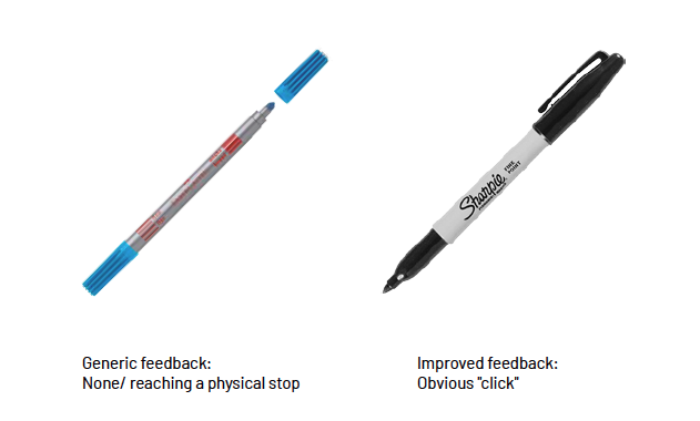
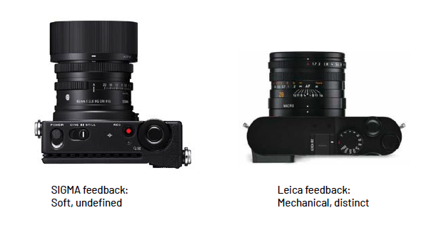
Im Vergleich sind beispielsweise die zwei Stifte sowie zwei Kameramodelle zu sehen. 

Oben sind zwei Produkte der gleichen Kategorie abgebildet, beide weisen allerdings unterschiedliche Charakteristiken im Bezug Haptik auf.

Der Stift „Sharpie“ ist dafür bekannt, dass es sehr auf die Rückmeldung beim Schließen des des Verschlusses einen deutlichen “Klick” von sich gibt. Das macht in diesem Fall

einen professionelleren und hochwertigeren Eindruck und verleiht dem Produkt Charakter.

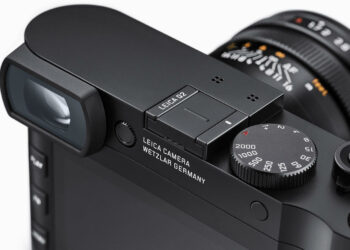
Die Einstellräder der SIGMA Kamera sind sehr schwammig und das Feedback fühlt sie sich undefiniert an. Bei der Leica Q2 haben die Bedienelemente einen sehr mechanischen, präzisen und klaren Charakter, der sicherlich zum Branding und Preisniveau passt.

https://sg.leica-camera.com/Photography/Leica-Q/Leica-Q2/Details

https://www.sharpie.com

https://www.alexander-moser.at/

How Music Producers Find Their “Sound”

Do you catch yourself recognising whose track/song you are listening to when you’re just shuffling randomly through Spotify, even before you look at the artist name? This is because successful music producers have a way to make sure you can instantly recognise them. This is quite beneficial, because it imprints into the listener’s mind and makes them more likely to recognise and share the artist’s future releases with their network.

So how do musicians/music producers do this? There are some key points that can easily help you understand this occurence better.

1) There’s no shortcut! 

You know the 10.000 hour rule? Or as some have put it in the musical context- 1,000 songs? There’s really no way around it! This aplies to any skill in life, not just music. However, usually the end consumer never really knows how many songs an artist actually never releases. Those are all practice songs. For every release that you see out there there might be 100s of other unreleased songs done prior to it. if the musician just keeps creating instead of getting hung up on one song, they will eventually grow into their own unique way of structuring, as well as editing songs.

2) They use unique elements 

So many producers/musicians use samples from Splice, which leads to the listener feeling like they’ve already heard a song even if they haven’t. Songs get lost in the sea of similar musical works, but every now and then, something with a unique flavour pops up and it’s hard to forget. Musicians who make their own synth sounds, play exotic instruments or even their own dit instruments are the ones that stick around in our minds.

3) Using the same sound in multiple songs

This is the easiest and most obvious way in which musicians/producers show their own style. You might hear a similar bass, or drum pattern in mutiple songs/tracks from the same musician. In rap/hiphop, you will also hear producer tags (e.g. “Dj Khaled” being said in the beginning of each track).

4) Great Musicians/Producers don’t stick to one style/trend

Music has existed for so long and progressed so fast lately, that it is hard to stand out, especially if you stick to genres strictly. Nowadays, great musicians will come up with their own subgenres or mix in few different ones into a musical piece. You won’t ever really remember the musicians or the producers who are just following in the footsteps of the greats who have already established a certain genre. If you can’t quite put your finger on why you like someone’s music so much and why they sound “different”, they are probably experimenting with a combination of different genres.

Harmor

The Basics

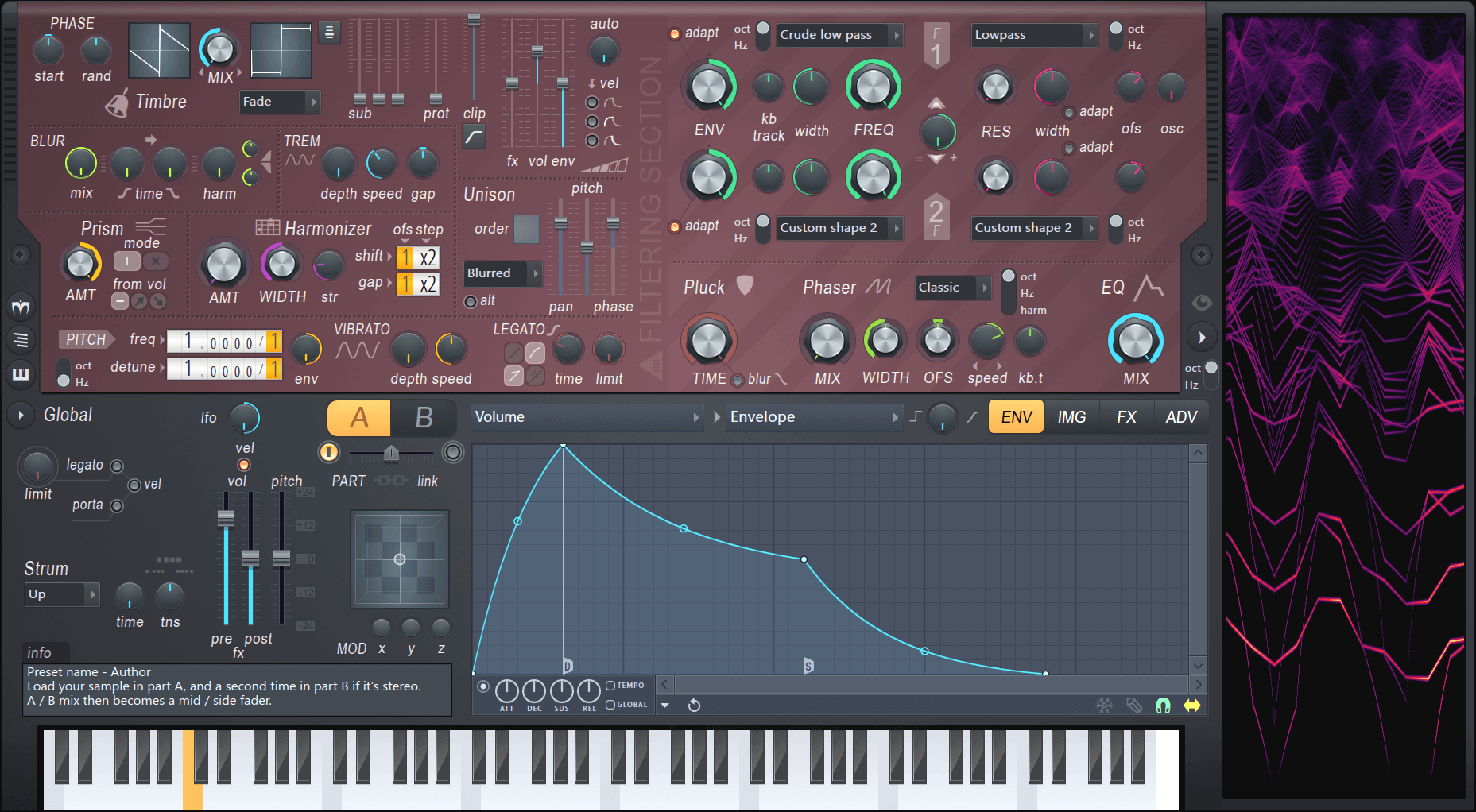
The picture above shows Harmor’s interface. We can group the Interface into three sections: The red part, the gray part and the window to the right. Firstly, the easiest section to understand is the window to the right. Harmor is an additive synthesizer, which means the sounds it generates are made up of sine waves added on top of each other. The window on the right displays the frequencies of the individual sine waves, played over the last few seconds. Secondly, the red window is where most of the sound is generated. There are different sections and color-coded knobs to be able to identify what works together. Left of the center you can see an A/B switch. The red section exists twice: once for state A and once for state B. These states can be mixed together via the fader below. Lastly the gray area is for global controls. The only exception is the IMG tab, which we will cover a little later. As you can see there are many knob, tabs and dropdowns. But in addition to that most most of the processing can be altered with envelopes. These allow the user to draw a graph with infinitely many points to either use it as an ADSR curve, an LFO, or map it to keyboard, velocity, X, Y & Z quick modulation and more. At this point it already might become clear that Harmor is a hugely versatile synth. It’s marketed as an additive / subtractive synthesizer and features an immense amount of features which we will take a closer look at now.

Additive or Subtractive?

As mentioned above Harmor is marketed as an additive / subtractive synthesizer. But what does that mean? While Harmor is built using additive synthesis as its foundation, the available features closely resemble a typical subtractive synth. But because Harmor is additive, there are no audio streams being processed. Instead a table of frequency and amplitude data is manipulated resulting in an efficient, accurate and partly very unfamiliar and creative way to generate audio streams. Harmor features four of these additive / subtractive oscillators. Two can be seen on the image above in the top left corner. These can be mixed in different modes and then again mixed with the other two via the A/B switch. In addition to the four oscillators, Harmor is also able to synthesize sound from the IMG section. The user can drag-and-drop audio or image files in and Harmor can act like a sampler, re-synthesizing audio or even generating audio from images drawn in Photoshop.

The Generator Section

As you can see in addition to the different subsections being walled in by dotted lines, this section is color coded as well. The Timbre section allows you to select any waveform by again drawing and then morphing between two of them with different mixing modes. Harmor allows you to import a single cycle waveform to generate the envelope. But you can import any sample and generate a waveform from it. Here is an example where I dragged a full song into it and processed it with the internal compressor module only:

The blur module allows you to generate reverb-like effects and also preverb. Tremolo generates the effect of a stereo vibrato, think about jazz organs. Harmonizer clones existing harmonics by the offset/octaves defined. And prism shifts partials away from their original relationship with the fundamental frequency. A little prism usually generates a detune-like effect, more usually metallic sounds. And here is the interesting part: As with many other parameters as well, you can edit the harmonic prism mapping via the envelopes section. This allows you to create an offset to the amount knob on a per frequency basis. Here is an example of a usage of prism:

As you can see in the analyzer on the right: There is movement over time. In the Harmonic prism envelope I painted a graph so that the knob does not modify lower frequencies but only starts at +3 octaves.
The other options from this section, unison, pitch, vibrato and legato should be clear from other synthesizers.

The Filter Section

As seen above, Harmor features two filters per state. Each filter can have a curve selected from the presets menu. The presets include low pass, band pass, high pass and comb filtering. Additionally you can draw your own curve as explained in the Basics section above. The filters can additionally be control the mix for the envelope, keyboard tracking, width, actual frequency and resonance. But the cool thing is how these filters are combined: The knob in the middle lets you fade between only filter 2, parallel processing, only filter 1, filter 1 + serial processing and serial processing only. In the bottom half there is a one-knob pluck knob as well as a phaser module with, again, custom shaped filters.

The Bottom Section

As you can see above the bottom section features some general global functions. On the left side most should be clear. The XYZ coordinate grid offers a fast way to automate many parameters by mapping them to either X Y or Z and then just editing events in the DAW. On the top right however there are four tabs that open new views. Above we have seen the ENV section where you can modulate about anything. The green tab is the image tab. We already know that Harmor can generate sound from images and sound (not that this is a different way of using existing sound, before I loaded it into an oscillator, now we are talking about the IMG tab). On the right you can see a whole lot of knobs, some of them can be modified by clicking in the image. C and F are course and fine playback speed adjustments, time is the time offset. The other controls are used to change how the image is interpreted and partially could be outsourced to image editors. I’m going to skip this part, as this post would get a whole lot more complicated if not. It would probably be best to just try it out yourself.

The third tab contains some standard effects. These are quite good but especially the compressor stands out as it rivals the easy-but-usefullness of OTT.

And finally, the last section: Advanced (did you really think this was advanced until now? :P) Literally the whole plugin can be restructured here. I usually only go in here to enable perfect precision mode, threaded mode (enables multi core processing) and high precision image resynthesis. Most of these features are usually not needed and seem more like debugging features so I will not go into detail about them, but like before I encourage you to try it out. Harmor can be very overwhelming and as many people mention in reviews: “Harmor’s biggest strength is also it’s greatest weakness, and probably why there are so few reviews for such an amazing synth. You can use Harmor for years, and still feel like a noob only scratching the surface. That makes writing a review difficult. How can you give an in-depth review, when you feel so green behind the ears? You only need to watch a few YT videos (e.g. Seamless) or chat with another user to discover yet another side to this truly versatile beast.”

Harmor on KVR ⬈
Harmor on Image-Line ⬈
Harmor Documentation ⬈ (a whole lot more details and a clickable image if you have more detailed questions)

Cultural body

When discussing the mind we also need to discuss our body. Interactions are not only processed in our minds but always use our body as the vehicle. In this article I refer to a paper that discusses the body and its cultural conjunction as well as and interesting gesture controller design that shows a designed outcome of of a philosophical point of view.

Sara Sithi-Amnuai has developed a custom built MIDI glove interface called NAMI that is designed for live electro-acoustic musical performances. It is a tool that extends her own multicultural background. Nami utilizes a force-sensitive-resistor, flex sensors, buttons, hall effect sensors, and a photoresistor. The purpose is to allow the user to use their own gestural vocabulary while being culture general and flexible valuing cross-cultural exploration and accommodating a variety of cultural gestural language.

In Sithi-Amnuais paper “Exploring Identity Through Design: A focus on the cultural body via Nami” she discusses the cultural body, its consideration in existing gestural controller design, and how cultural methods have the potential to extend musical/social identities and/or traditions within a technological context. She starts off by describing the metaphysics of agency, identity, and culture. The identity of a human-being is deeply linked to culture and sustained through creation and performance of music and dance. The agency describes an “… active entity constantly intervening in the course of events ongoing around [them]”. Our mind is inseparable from our body, while the body being the physical material through which we have access to the world. Sithi-Amnuai refers to a study by Steven Wainwright and Bryan Turner that shows that the identity of former dancers in Royal Ballet in London is deeply rooted in their own body. Once their career has ended, it is exceedingly challenging to reinvent themselves outside the company.

Sithi-Amnuais take on gestural controllers is very philosophical. Once again, I thought how important it is to have philosophical and meaningful foundation for the execution of a design. But also, the gadget itself is very interesting and makes up for an inspiring controller that enables users to put more of themselves into the music. She sparked my curiosity to explore and extend my own cultural body. In that regard, cultural etiquettes, movements, and experiences through sense, sight, and feel are affecting our instruments and tools as well.

Reference:
https://zenodo.org/record/4813188#.YOAqVS335QI

My thoughts on Vodhrán

The paper “Vodhrán: collaborative design for evolving a physical model and interface into a proto-instrument” was a short but interesting read into what could be explored more in the marriage of music making and interaction design.

The design itself is a box that consists of a touch sensitive plate for interaction, a micro computer for processing, and an AMP for sound production. It was effectively designed to create a new form of interaction for musicians and a new way of making music. It also can work connected to a computer with a special software. The authors write on their experience and the tools/methods they used throughout the building of this device and how it would function.

This type of a new interaction for music making is highly interesting in the field of interaction design in my opinion. Since making music generally has predefined methods and pretty commonplace conceptions it is both really interesting and difficult to experiment with a new form of interaction. This is the reason why I was interested in this paper. Also since this semester I had the chance to experiment with a new type of interaction with my project for this course, I could relate more with the process and findings of this paper. With the increasing amount of music production on computers it is hard to dismiss this topic. Human-computer interaction in this area is already highly saturated, with interaction methods that popped up in the last 2 decades but also with digitalisation of already existing centuries old musical instruments. This progress will only expand with increasing usage of digital devices in this area, hence the need and search for new and different interactions will always persist. I think this paper was the start of this kind of an approach where the authors wanted more out of the interaction and ability to create through creation. As an interaction designer it is crucial to understand and reflect on areas that can feel settled and unchangeable. This paper for me does exactly that and I highly appreciate it for it.

Auswahl von Filmen zur Analyse

In dem theoretischen Teil der Masterarbeit soll der Ansatz einer Kategorisierung von Mensch-Natur-Hybriden im Animationsfilm beschrieben werden. Diese Annäherung soll versuchen, das breite Spektrum dieser Hybrid-Formen zu skizzieren.

Das theoretische Kategorisierungs-Konzept soll dabei von kurzen Filmbeispielen sowie detailierten Filmanalysen untermauert werden. Die Auswahl der Filmbeispiele folgt drei Kategorien:

  • Westliche Mainstream-Animation (mit Fokus auf Disney)
  • Fernöstliche, etablierte Animation (mit Fokus auf Studio Ghibli)
  • Indie Animation (diverse Independent Filmmaker, ohne örtliche Beschränkung)

Während bei den beiden etablierten Animationsgruppen vor allem Langformate behandelt werden, zeichnen sich Indie Animationsfilme durch ihre Kürze aus. In diese Kategorie wird auch der praktische Teil der Masterarbeit, ein Animationsfilm, fallen.