In the process of my research, I came across a company that has presented a prototype of an augmented reality contact lens. The company, Mojo Vision, was founded in California in 2015 and has since been trying to bring to market a contact lens that sits so close to the pupil that the eye can’t see the lens, allowing virtual elements to become visible. The Mojo Lens is currently still a prototype and must first pass some testing to be certified and considered safe and effective to use. It will take probably a few more years before the first medical tests will start.
Mojo Lens
What is fascinating about the prototype is that technical components such as chips, displays or sensors can be made so small that they can be combined in a contact lens.
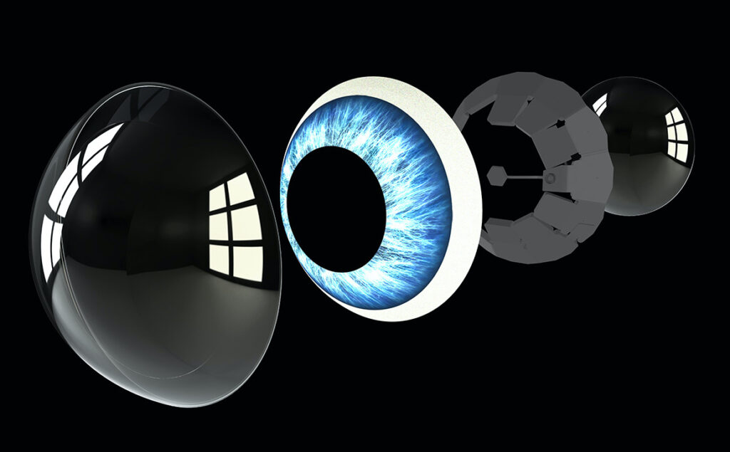
Visualization of the display of the lens through VR
The contact lens should only display information or items when they are wanted. The lens can therefore understand when it is needed and when it is more of a nuisance. The state of the current prototype (shown in 2020) – or more precisely – of the Display of the Mojo Lens can currently be tried out with a VR headset. In this world, you can see, for example, the current weather or weather forecasts, the amount of traffic or a calendar when you focus your eyes on a certain spot in the image.
The mission and goal of Mojo Lens, however, is to use this technology to help people who have severely impaired vision. The lens should be able to highlight important people or things or zoom in on objects to be of help. Only then would the lens be accessible to the public.
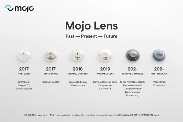
Plan of the past, present and future of the Mojo Lens
Sources
Mojo Vision’s Augmented Reality Contact Lenses Kick off a Race to AR on Your Eye, Jason Dornier (17.1.2020), https://singularityhub.com/2020/01/17/mojo-visions-augmented-reality-contact-lenses-kick-off-a-race-to-ar-in-your-eye/
Mojo Lens The World’s First True Smart Contact Lens, Mojo Lens (2021), https://www.mojo.vision/mojo-lens
The making of Mojo, AR contact lenses that give your eyes superpowers, Mark Sullivan (16.1.2020), https://www.fastcompany.com/90441928/the-making-of-mojo-ar-contact-lenses-that-give-your-eyes-superpowers
Design activism is about using one’s responsibility as a designer to draw attention to social, political and socially relevant issues. However, this does not mean influencing opinions. It’s about shining a light on areas that are still too much in the shadows. It is also important to research facts, backgrounds, motives, cultural differences, etc. In doing so, the contents should not be blindly and one-sidedly illuminated. Research and the comprehensive study of a topic are the prerequisites for quality work. Design activism aims to exert a positive influence in relation to a specific topic, not to be confused with (opinion) influencing. It is intended to create attention and an incentive for society to deal with certain topics.
Propaganda, on the other hand, intends to deliberately influence people’s thoughts, actions and even feelings according to the particular interest of the sender. Propaganda is mainly used by politicians and the military in war to convince the population of their own war, whereby there is a one-sided illumination of the necessity of the war and important aspects, such as own power and economic interests, war suffering, war crimes, etc. are disregarded. Another goal of propaganda, however, is to recruit soldiers for the war, to maintain the military’s readiness to fight, to weaken the enemy’s war morale and to deceive the enemy by spreading false information.
Forms of propaganda
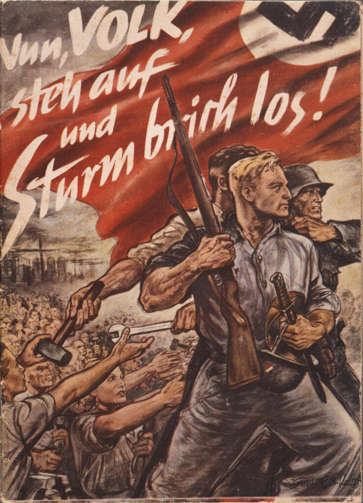
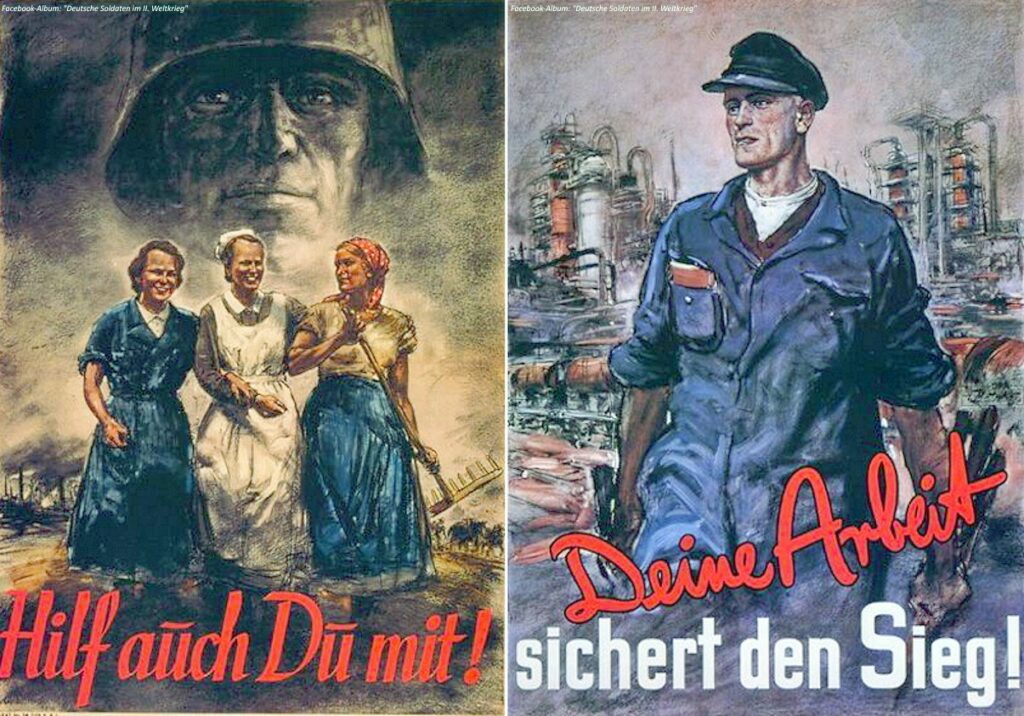
The means used for propaganda appear in different forms. Forms that have existed since ancient times and do not require the classical media are, for example, preachings, speeches or songs in front of an audience. In modern times, however, propaganda is carried out almost exclusively via the media, as this has the advantage of rapid and widespread dissemination. Specifically, these are propaganda messages in the form of leaflets, newspaper and Internet articles, posters, photographs, film recordings, radio broadcasts and even computer games.
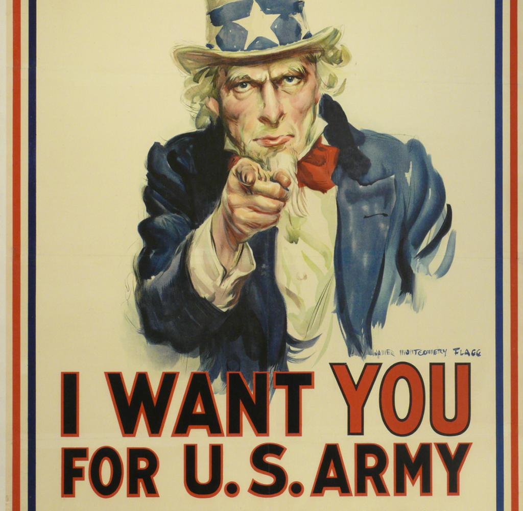
f. l. t. r.: Nazi propaganda poster with anti-espionage campaign, 1944; Magazine “Die Wehrmacht”, 1941; Nazi propaganda brochure on the “Total War, 1943War propaganda for the so-called home front.The legendary poster featuring Uncle Sam was designed by artist James Montgomery Flagg in 1917, shortly after the U.S. entered the First World War
Computational propaganda
In context of social media there is a specific form of propaganda called computational propaganda. The Oxford Internet Institute from the University of Oxford made a research project, where the use of social media for public opinion manipulation was examined. Referring to this research project, computational propaganda is a term and phenomenon that encompasses recent digital misinformation and manipulation efforts. It is the use of algorithms, automation, and human curation to purposefully distribute misleading information over social media networks (Woolley & Howard, 2016). It’s about learning from real people and to mimic them, so that the public opinion can be manipulated across different platforms and device networks (Woolley & Howard, 6: 2016). The research project from the Oxford Internet Institute demonstrates the origins and concrete consequences of computational propaganda. Social media platforms are the primary media over which (young) people develop their political identities, which is why social media is also actively used to manipulate public opinion in different ways and on different issues.
In summary, it can be said that computational propaganda is one of the most powerful tools against democracy. Social media firms are the platforms for it, so they also should take their responsibility to redesign themselves for democracy.
Samuel C. Woolley & Philip N. Howard, “Computational Propaganda Worldwide: Executive Summary.” Samuel Woolley and Philip N. Howard, Eds. Working Paper 2017.11. Oxford, UK: Project on Computational Propaganda. comprop.oii.ox.ac.uk. 14 pp.
Design as a discipline has an inherent dynamism that results from the constant development of the term and its different ways of looking at and interpreting it, which is why the nature of this discipline is also the subject of negotiation and dispute. At the core of design thus also lies a constant expansion and appropriation of new spaces for action, which can be observed constantly in the development of design since its beginnings in industrialization.
The development of new, social-entrepreneurial business fields and design perceptions are linked to terms such as Design Activism, Design as Politics, Transformation Design, Civic Design, Social or Transition Design, which means that design today stands in a context in which it is socially and politically engaged. It is endowed with the ability to contribute directly to changing social processes. So, design today is directly embedded in social and political changes, such as maker cultures, new economies and forms of production and use of technologies, shifting global power relations, crises, climate change, expanding war zones, civil society collectives and initiatives, etc., which means that design must also assume an interventionist role in shaping social reality.
Communication design and it’s essential role in our everyday life
For this time, I would like to take a closer look at the term communication design, because communication designers shape everyday culture.
The field of activity of the communication designer finds expression in the form of advertising posters, public signage, advertisements, television, newspapers, magazines, books, packaging, and much more. We even come across word or image marks in the label of our T-shirt, a glance at the dial of our wristwatch provides us with an example of information design, or we activate our smartphone to immerse ourselves in a digital media world designed by communication designers. By creating communication media, communication designers also influence the shape of our everyday culture. The goal is to convey specific content and messages to a specific group of people through media. To do this, designers must know, develop and structure the content as well as know about the communication channels in order to present the information and messages in the right way for the respective target group to understand. Since there is an incredibly large amount of information that reaches us every day, communication design is seen as an umbrella term for diverse, specialized disciplines. These include, for example, editorial design, branding, corporate design, identity design, packaging design, information design, interaction design, motion design, UX design and so on. What connects all disciplines is the competence for the design of visual communication, both in 2D for print and screen and increasingly as moving image in combination with sound.
Communication designers are design professionals who use visual codes to formulate or compose messages in such a way that they inform, convince, seduce, entertain, enlighten, warn, identify, personalize, organize, structure, provide orientation or are simply beautiful.
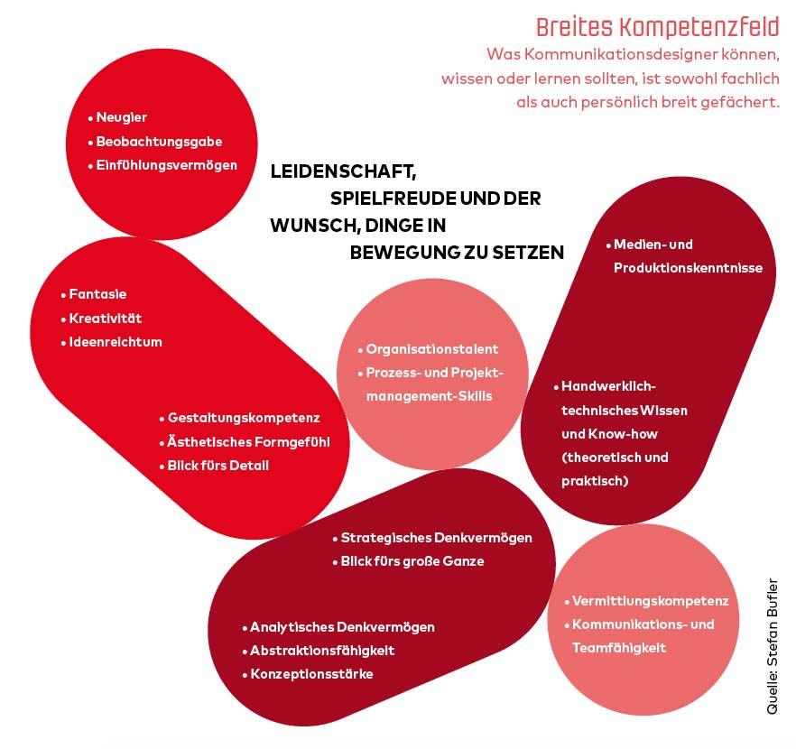
The following graphic shows the broad field of competence of a communication designer:
The supreme discipline
Among the clients of communication designers are actors from business, science, culture, etc. Looking at the field of competence, the need for the expertise of this discipline can also be found in politics. According to Gerda Füricht-Fiegl, head of the master’s program in political communication at Danube University Krems, political communication can also be considered the supreme discipline. Although there are many similarities with PR, a large number of interactions are triggered in political communication, and many more influencing variables must also be taken into account. Under great time pressure, one must nevertheless proceed very thoughtfully and analytically. Strategic and analytical thinking skills, an eye for the big picture, the ability to abstract and conceptualize as well as creativity, media and production skills and design skills are just some of the prerequisites for successful communication design, especially in the field of politics.
If we look at the past, design has already played an essential role in major, social change processes, such as in the modernist art movement of the Bauhaus. A particularly vivid example, however, can be found in the construction of national identities under National Socialism through the effective use of design strategies, whereby here we mostly speak of propaganda under National Socialism. These national identities were created through the targeted influencing of opinion. In which forms propaganda occurs and what exactly counts as propaganda will be discussed in the next blog entry.
The power of design
To conclude this blog entry, I would like to recommend the following Ted Talk, in which JD Hooge reflects the power of design in a very vivid way. In my opinion, exactly this power affects all areas of social, societal and political life.
Das Axoloti Board eignet sich hervorragend, um Prototypen von anzufertigen. Es ist ein Board mit vielen I/O Pins, stereo Audio in- und Output, A/D und D/A Wandlern. Das Board ist mit dem Axoloti Patcher programmierbar. Eine Software, mit der man komplexe Sound Algorithmen und Interaktionen auf einfache Art und Weise generieren kann, die man nach dem Erstellen einfach auf den Axoloty lädt und danach im Standalone Betrieb verwenden kann. Ein Nachteil ist, dass die Software seit Mac OS Catalina nicht mehr unterstützt wird, ansonsten hätte ich damit gerne einen ersten Prototypen programmiert.
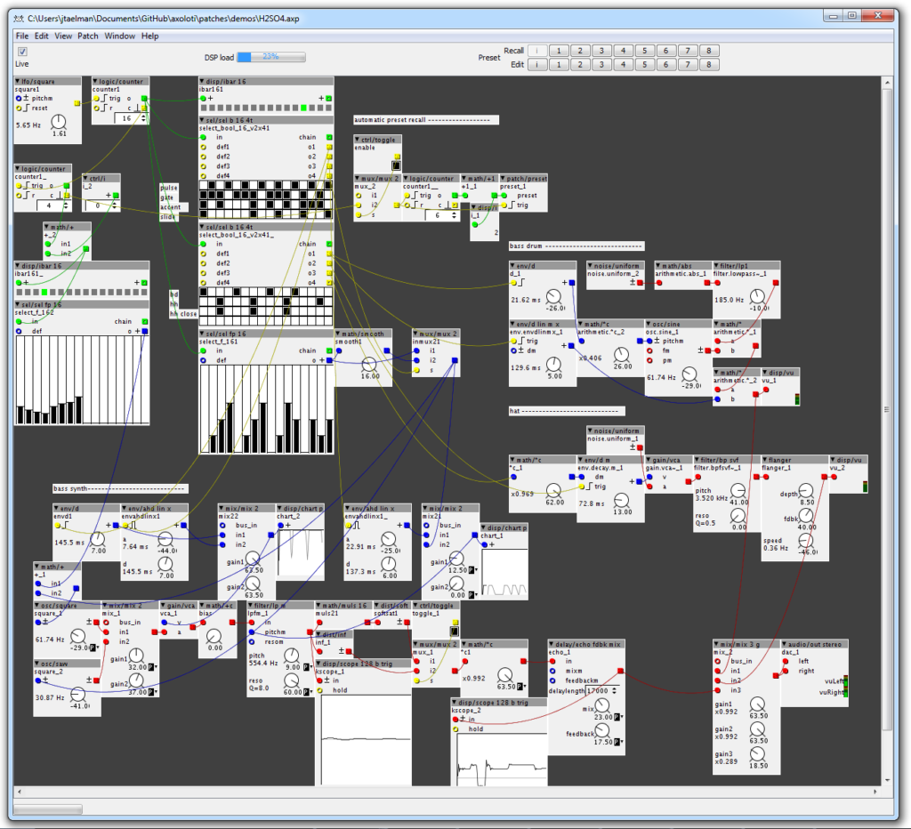
Axoloti Patcher
Der Axoloti Patcher funktioniert ähnlich wie MaxMSP oder Pure Data. Man hat verschiedene Objekte zur Verfügung, wie beispielsweise Input/output, LFO´s, Oscillators etc. Mit diesen Objekten kann man auf einer grafischen Oberfläche seine Signalkette programmieren.
Leider gibt es unter Mac OS Catalina und Big Sur Kompatibilitätsprobleme mit der Software.
As mentioned in recent posts there are multiple reasons for the rise and existence of false or misleading information in the digital age. Some of them occur because of a data void, but there are also other reasons like the so-called filter bubbles, where an algorithm selectively guesses what information a user would like to see based on information about the user, such as location, past click-behavior and search history. This term was coined by internet activist Eli Pariser in 2010 and also discussed in his 2011 book of the same name. As a result, users get isolated from information that might differ from their own opinion. This leads to less discourse of information and again might be harmful for our civic discourse.
The extrem negativ effects a filter bubble can have is shown in the following video THE MISEDUCATION OF DYLANN ROOF (Trigger warning: Violence, Racism and racial slurs, Hateful language directed at religious groups).
Here is a short video of things to look for when you are uncertain or just want to know what to look for when surfing the world wide web:
Spotting Bogus Claims
Despite the things to look for mentioned in the video, sometimes that is not enough. If you watched the video about the miseducation of dylann roof, you will clearly realize that websites which spread false information or hate speech are sometimes designed in a similar way to other reliable news pages, which can make it difficult for not savvy users to identify propaganda and misinformation.
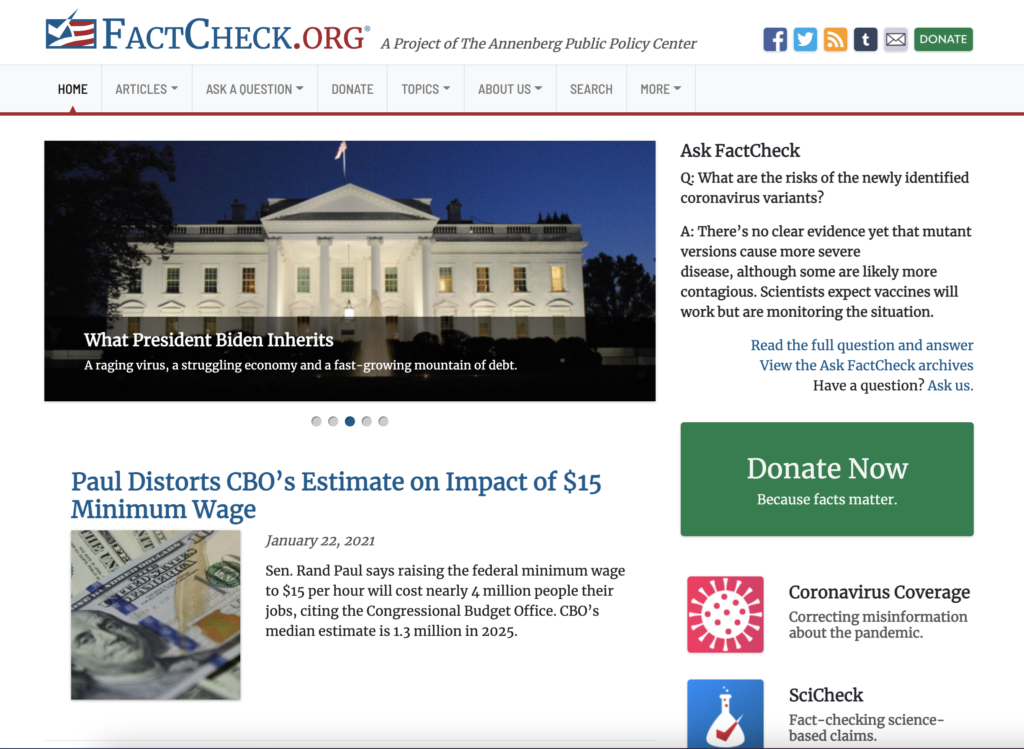
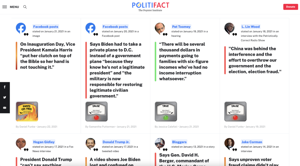
Since 2010 a lot of fact checking sites appeared. Most of them rely on the same principle. They use donations to do their work and they write articles about current rumors.
FactCheck.org
Fact checking sites like FactCheck.org or the The Washingtion Post Fact Checker like to comment on mostly false information spread by politicians and such. However, they do not show or label content compared to the social media platforms, on which false information is spread throughout the platforms and also shared to other social interaction platforms. You will find statistics about that here.
Other sites like PolitiFact show statements and their truthfulness in form of an “Truth-O-Meter”. In my personal opinion the design of the quotes and the “Truth-O-Meter” does not look really sophisticated and believable. In the next post I want to do a survey about the credibility of these sites and their designs.
PolitiFact
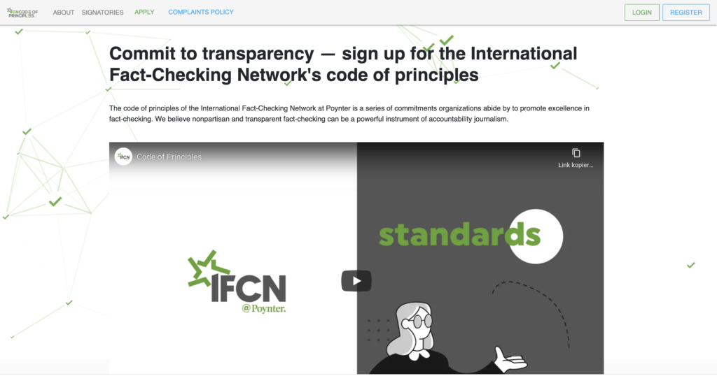
Another fact checking organization or institute is IFCN. This website is really transparent and well designed. Its function is described as follows: “The code of principles of the International Fact-Checking Network at Poynter is a series of commitments organizations abide by to promote excellence in fact-checking. We believe nonpartisan and transparent fact-checking can be a powerful instrument of accountability journalism.”
ifcncodeofprinciples.poynter.org
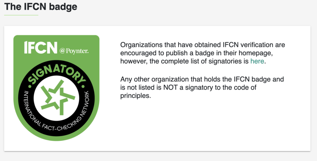
They use a clear and consistent design language, like corporate colors and fonts. The International Fact-Checking Network is a unit of the Poynter Institute dedicated to bringing together fact-checkers worldwide. Also they use a corporate badge to verify organizations, which looks like this:
IFCN Badge
Around 100 fact checking or news organizations all over the world use this service or way of validating, even tough it is not an easy application process. Next to other reasons why implementing such a verification is important, the good design is clearly making the site more sophisticated.
Illustrationen und Fotografien haben sehr viel gemeinsam, jedoch wird Illustration immer als Gegenteil oder Kontrast zur Fotografie gesehen. Dabei kann auch eine Fotografie einen Text »illustrieren«, und früher wurde all das, wofür heute die Fotografie eingesetzt wird, durch Illustrationen geleistet. Im Design wird häufig direkt zwischen grafischer Illustration und Fotografie entschieden.
Gleich wie Illustration wird bei einer Fotografie die Welt um uns herum eingefangen und kommentiert. Jedoch kann Fotografie im Design wirkungsvoller sein als Grafik oder Illustration, da sie die Botschaft mit einem Gefühl von Realismus vermittelt.
Die tieferliegende Ursache dürfte in der grundlegenden Wirkung der fotografischen Bilder liegen. Denn es scheint, dass wir Fotos als glaubwürdiger wahrnehmen – und das, obwohl wir über die Möglichkeit der Bildbearbeitung und -manipulation Bescheid wissen. Während eine Zeichnung oder ein Gemälde auf den ersten Blick »Kunst« oder nur »künstlich« ist, glauben wir dem Foto die Abbildung einer Realität selbst dann, wenn der Inhalt unmöglich erscheint. Dieses weitverbreitete Vorurteil kann an der Beschaffenheit des menschlichen Gehirns liegen oder vielleicht ist es kulturell verankert – auf jeden Fall muss es in Hinblick auf die Wirkung in Betracht gezogen werden.
Diese Realitätsgebundenheit, die als Vorteil der Fotografie gesehen wird, beschränkt allerdings auch erheblich ihre Möglichkeiten.
Aufgrund ihrer Eigenschaften eignen sich Fotografien im Allgemeinen besonders gut für:
01. Für die Genauigkeit
Natürlich gibt es auch Szenarien, in denen Fotografie für Designer die natürliche Wahl sein wird. Zum einen sind Genauigkeit und Vertrauen wichtig für die Ziele des Designs. Menschen vertrauen auf Fotos, um einen Ort, ein Produkt oder eine Person genau darzustellen. Wenn man also für ein Produkt wirbt, ist es oft eine gute Idee, es mithilfe von Fotografie darzustellen. Zum Beispiel reagieren die Leute besser auf ein Foto eines Tellers mit Lebensmitteln in einem Menü oder einem Kochbuch als auf eine Illustration von Lebensmitteln, weil sie glauben, dass das Essen, das sie bekommen, gleich aussehen wird wie auf dem Foto.
Bei Kochbüchern bzw. Food Photography hat die Darstellung einen Anspruch darauf, die Wirklichkeit abzubilden, daher werden hier vor allem Fotos eingesetzt. Sie vermitteln Glaubwürdigkeit und bilden eine Art Beweis-Ebene.
02. Professionell aussehen
Im weiteren Sinne kann die Fotografie auch dazu beitragen, ein Bild von Professionalität zu vermitteln. Bilder, die die Realität genau widerspiegeln, können dazu beitragen, die Verbraucher davon zu überzeugen, dass ein Unternehmen ernsthaft und verantwortungsbewusst ist, was beispielsweise für eine Investmentbank sehr wichtig wäre.
03. Um eine reale Sache zu zeigen
Fotografie kann auch die natürliche Wahl sein, wenn Sie die physikalischen Eigenschaften eines Produkts oder einer Dienstleistung vermitteln möchten, um eine viszerale Reaktion hervorzurufen. Zum Beispiel wird eine Fotografie eines luxuriösen Hotelzimmers effektiver und viel kraftvoller sein als eine stilisierte Illustration.
Wobei Produktdarstellungen/-fotografie ein interessantes Beispiel dafür ist, wo die natürlichen Grenzen entstehen. Für die Fotografie und Repräsentation eines Produkts werden fast ausschließlich Fotos verwendet. Wie man an diesem Beispiel jedoch sieht, wird für das Packaging und das Produkt selbst, grafische Illustration eingesetzt.
DIE VORTEILE VON FOTOGRAFIEN:
Der Betrachter nimmt das Motiv als Realität wahr. Auch wenn das Foto verfremdet oder nur leicht bearbeitet ist.
Der Betrachter kann sich besser mit dem Motiv identifizieren. Er wird in das Bild hineingezogen.
Produktfotos können mit der richtigen Inszenierung stark zum Kauf anregen.
Fotos eigenen sich bei der Abbildung bzw. Schaffung der Realität. Sie erzeugen echte Nähe und Identifikation.
Daraus ergeben sich die klassischen Anwendungsbereiche der Fotografie im Communication Design.
Produktfotografie
Modefotografie
Dokumentarfotografie
Landschaftsfotografie
Architekturfotografie
Portraits
Communication Design, das sich mit Mode befasst, arbeitet fast ausschließlich mit Fotografie
Bildbände sind ein klassisches Beispiel für ein Medium des Communication Design, das eigentlich ausschließlich für und wegen Fotografie existiert. Illustration kann natürlich auch verwendet werden, ist jedoch in vielen Fällen nur zusätzlich bzw. aufgrund der Vorteile, die es in der Darstellung bringt.
Die Wirkung von Fotos im Vergleich zu Illustration ist, dass sie im Allgemeinen strenger, professioneller und genauer. Auch die Tatsache, dass sie unbearbeitet immer ein geometrisches Element bilden macht sie innerhalb einer Komposition/einem Design statischer und schwerer, wodurch es auch manchmal sein kann, dass sie schwerer zu integrieren sind als Illustrationen. Fotos werden als Repräsentation von etwas Realem wahrgenommen, was wiederum super wertvoll sein kann und wie schon erwähnt, zu Kaufentscheidungen führen kann.
Methoden der Skandalisierung – die Palmers Werbung Masterarbeit Thomas Kepplinger CMS16
Der Verfasser der Arbeit hat folgende Kernfragen gestellt: Welche Rolle spielen Medien in der Skandalisierung? Inwiefern kann eine Emanzipation der Werbung festgestellt werden? Welche konkreten Auswirkungen der Werbung gibt es auf Betriebsergebnisse und den Bekanntheitsgrad der Marke?
Ebenso befasste er sich mit der Analyse der Wechselwirkungen zwischen Werbung und öffentlichem Diskurs an Hand der Werbung von Palmers.
Die Marke Palmers hat im Laufe seiner Firmengeschichte (Gründung 1914) mit 5 Skandalen für Aufsehen gesorgt.
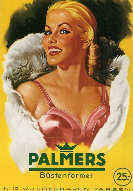
Die Darstellung der Frau in der Werbung im frühen 20 Jahrhundert
Die Rolle der Erotisch-Lockenden Das Abbild einer leicht bekleideten Dame soll für die Aufmerksamkeit der männlichen Käufer sorgen.
Frauenfigur als Allegorie Figuren der Antike oder der romantischen Märchenwelt ermöglichen die Darstellung unverhüllter Frauenkörper
Die Rolle der Frau als Dienende Wurde vor allem für Produkte eingesetzt die von Frauen verwendet wurden. …..Sie kocht den besten Kaffee….. …..Wäscht die weißeste Wäsche ….
Der Schriftsteller Karl Kraus beschrieb die Rolle der Frau zwischen „Arbeitstier“ und „Lustobjekt“
Die Darstellung der Frau wurde auch dadurch geprägt, dass nahezu keine Frauen in Entscheidungspositionen der Werbeagenturen waren obwohl rund 75% der Waren von Frauen gekauft wurden.
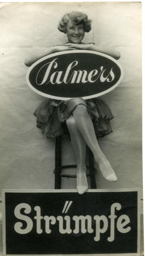
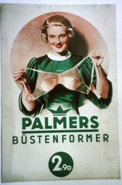
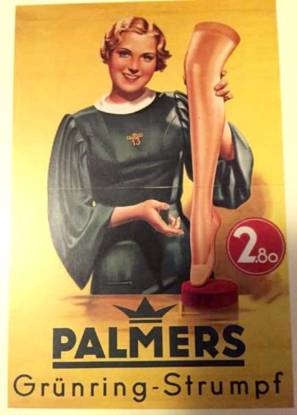
In der Werbung wurden die Produkte nicht vom Model am Körper getragen. Die Übliche Darstellung für Büstenhalter war etwa, dass ihn eine Frau in den Händen hält. Strumpfhosen wurden auf „Schaubeinen“ präsentiert.
1937
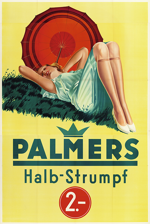
Skandal 1 _ Klerikaler Protest 1936
Ein Sujet einer liegenden jungen Frau mit Halbstrümpfen brachte die Bischöfe Wiens und Innsbruck dazu ein Verbot zu fordern.
Klerikaler Protest 1936
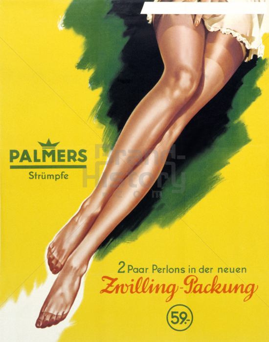
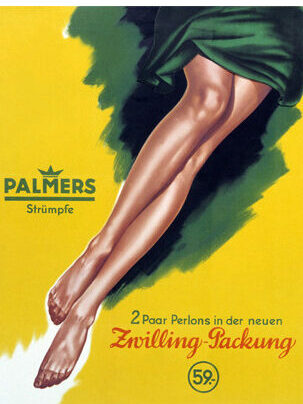
Skandal 3 _ Reizung der Lüsternheit 1953
Das Werbeplakat für die Zwillingspackung Perlonstrümpfe sorgte für Empörung. Es handelt sich um eine Abbildung von Frauenbeinen während sie sich das rechte Strumpfband hochzieht. Der Abschluss der Stümpfe wird von einem kurzen Unterkleid umspielt.
Reizung der Lüsternheit 1953
Da „Die Sittliche Entwicklung jugendlicher Personen, insbesondere durch Reizung der Lüsternheit“ gefährdet wurde, wurde das Plakat verboten.
Zur Wiederherstellung der Sittlichkeit wurde der Unterrock mit vorgedruckten Röcken überklebt
Überklebtes Plakat
Der für das Plakat verantwortliche Grafiker Gerhard Brause erhielt von Palmers eine Prämie in Höhe von 10.000 Schilling, da sich der Umsatz der Strümpfe innerhalb der ersten beiden Tage nach diesem Skandal versechsfachte.
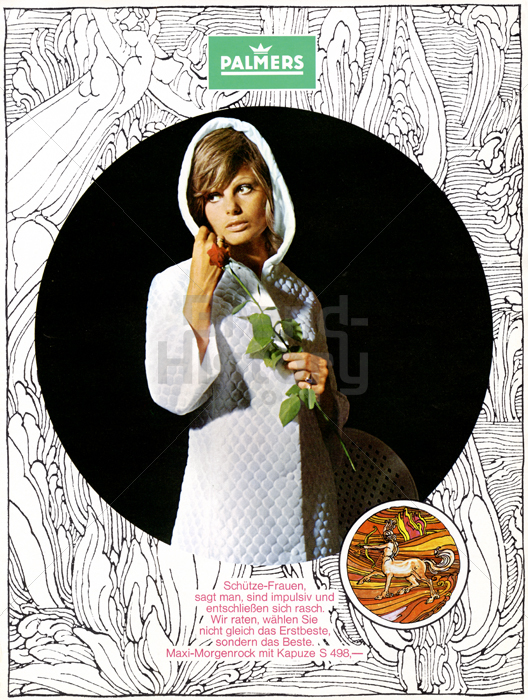
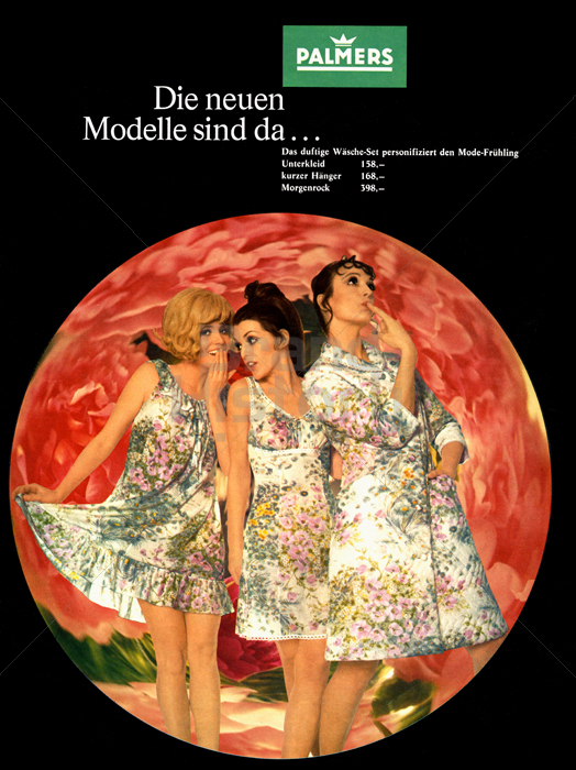
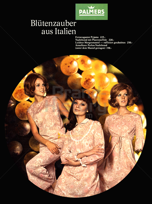
Die Darstellung der Frau 60er Jahre
Die Geschlechterrollen in der Werbung verändern sich langsam. Weibliche Models werden zunehmend freizügiger abgebildet. Der Abgebildete Alltag der Frauen ist dennoch von der Rolle als Hausfrau und Mutter geprägt. Doch auch wachsender Wohlstand und steigender Konsum nimmt Einfluss auf die Werbung.
Mitte der 1960er Jahre entstehen Gesetze, die die Gleichstellung der Frau begünstigen. Dies Veränderte das Frauenbild – und mit Verzögerung auch das Männerbild – in der Werbung.
1969
1971
Sexuelle Revolution Die sexuelle Befreiung welche unter anderem durch die Verhütungspille entstand, spielgelt sich in der Werbung mit besonderer „Offenheit“ gegenüber sexuellem Primärmerkmalen, ausschließlich weiblicher Art aus.
1953
Seit dem 60er Jahren wurde jedes erdenkliche Produkt mit weiblichem Sexappeal beworben. Zuvor galt diese Art der Werbung als „Verstoß ins Neuland“ und war nur bei Pin-Up Abbildungen gestattet. Frauen gingen auf die Straße um sich gegen die „symbolische Durchdringung ihrer Körper“ zu wehren.
Allmählich ist eine Veränderung von Tabus und Emazipationsströmungen zu erkennen. Das Körperideal tendiert nun Richtung schlankere Körperformen. Im Gegenzug zu Männerzeitschriften wiesen Zeitschriften, die an Frauen gerichtet waren einen deutlich geringeren Anteil an erotischer Frauenabbildung auf.
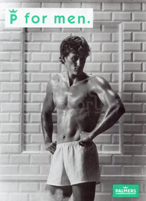
Männer als Zielgruppe Nackte Männerkörper wurden in der Werbung nur für Männerprodukte verwendet. In den 80er Jahren wurden für Palmers auch Männer als Zielgruppe interessanter. Männer wurden leicht von unten Fotografiert um selbstbewusst und stark zu wirken. Dieses antike Muster wurde durch Säulen und ähnliche Requisiten verstärkt. Plakate mit Männern waren fast immer Schwarz/Weiß.
Das Körperideal verwandelte sich über die Jahre zur „jungen, schlanken, gepflegten, trainierten, schönen Frau. Auch das Ideal der Karrierefrau findet zunehmend Anspruch. In den späten 1990er Jahren erreicht die Unzufriedenheit der Frauen mit dem eigenen Körper seinen Höhepunkt. Die Models wurden immer dünner und die Schönheitsideale immer unerreichbarer.
Der Zeitgeist der 1980er und 1990er Jahre zeigte eine allmähliche Vermischung der Geschlechtergrenzen „Gender Benders“. Man versuchte nun mit der Werbung möglich beide Geschlechter anzusprechen.
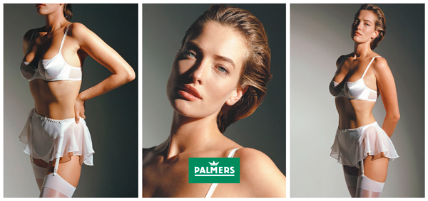
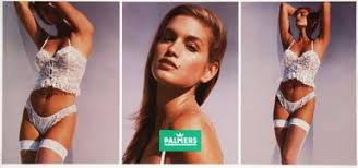
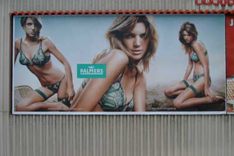
Palmers arbeitet oft mit Plakatserien. Das mittlere Sujet war meist eine Portraitaufnahme zum Blickfang. Auf einem Plakat war meistens eine Detailaufnahme zu sehen und am dritten ein Ganzkörperfoto.
Die heutige Palmers-Werbung soll diskret-unterschwellig wirken, Emotionen ansprechen und Wohlstand, Zufriedenheit, narzißtisches Körperleben, Exklusivität und Qualität widerspiegeln.
„Fridecky, Doris: Die Palmers Werbung im Zusammenhang mit dem Wandel des Rollenbildes der Frau, Wien, 1995, S.41“
Skandal 4 _ Mark Glassner 1997
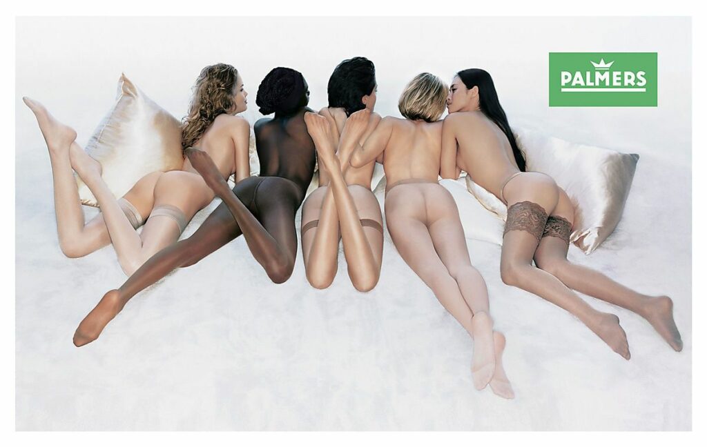
Für Mediale Aufmerksamkeit sorgte 1997 ein Plakat von mit der Rückenansicht von fünf Frauen, fotografiert von Mark Glassner.
Das Plakat wurde von Anhängern des Volksbegehrens zur Gleichberechtigung der Frauen überklebt und zahlreiche Beschwerden gingen beim österreichischen Werberat ein. Dieser entschied jedoch, dass gegen das Plakat keine Einwände bestehen. Es sei eine ästhetische, produktadäquate Darstellung, da die Präsentation von Strumpfmode nur hautnah möglich sei.
Der Umsatz stieg um 42%. Wegen der großen Nachfrage für das Plakat errichtete Palmers einen Postershop.
30 Euro. Für nichts. 2004 sorgte das Unternehmen mit der „Invisible“-Kampagne für Aufsehen. Palmers nutze das neue Medium des hinterleuchteten Plakates. Das Plakat zeigt das Model tagsüber mit Wäsche, welche besonders dünnen Stoff aufweist und nachts erscheint das Model nackt. Untertitelt wurde mit dem Werbeslogan: „30 Euro. Für nichts.“
„Invisible“-Kampagne 2004
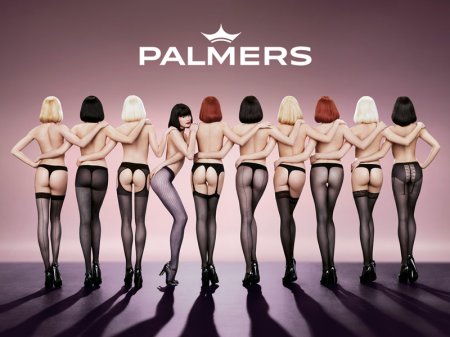
„Crazy for Passion“ Auch 2006 gab es mediale Aufmerksamkeit für ein Plakat. Die Kampagne „Crazy for Passion“ wurde von den Behörden in München und Hamburg als „zu freizügig bzw. „zu anstößig“ / „zu gefährlich“ für den Straßenverkehr eingestuft. In Wien zierte das 28×5 Meter große Plakat den Bauzaun einer sich im Umbau befindlichen Palmers-Filiale. Das Sujet zeigt zehn Tänzerinnen des Pariser Cabarets „Crazy Horse“ von hinten.
„Crazy for Passion“ 2006
Der Skandal ist immer nur ein Skandal im Spiegel seiner Zeit. Er sagt viel aus über die jeweiligen Moralvorstellungen, Schönheitsideale, Vorlieben und Tabus.
Hertreiter, Vollmuth 2017
Blind Date Für den ersten Werbespot nach 8 Jahren im November 2011 erntete Palmers Kritik seitens des Blindenverbands ÖBSV. Im Spot bewirbt ein blindes Model die haptische Wertigkeit der von ihr getragenen Wäsche.
Der Spot trug den Titel „Blind date“ / Sinnlichkeit, die man fühlt.“
Der Werberat konnte keinen Verstoß feststellen. Der ORF prämierte den Spot als bester inländischer Werbespot.
Skandal 5 _ Osterhöschen 2017
Sechs junge Frauen, nur mit Slip bekleidet liegen auf einem Teppich. Das Sujet wurde nur über Facebook publiziert.
Osterhöschen 2017
Der Werberat forderte Palmers zum sofortigen Stopp der Kampagne auf. Kritisiert wurden die Jugendlichkeit und Körpermaße der Frauen. Weiters fördere das Bild Assoziationen mit der Feilbietung der Ware von Menschenhändlerringen.
Wie Werbung Geschmacksdiktate verbreitet und ihnen folgt, was sie in ihren Blickpunkt rückt und was sie verbirgt, gibt Aufschluss darüber, welche Werte in einer Kultur gültig sind, und was tabuisiert wird.
Wilk, Nicole M.: Körpercodes. Die vielen Gesichter der Weiblichkeit in der Werbung.Frankfurt/Main: Campus Verlag 2002 S.21
Quelle: Masterarbeit Methoden der Skandalierung – die Palmers Werbung, Thomas Kepplinger CMS16
Especially young people are tempting to use new, unknown technology as they are more familiar with current things and more open for new things. Even if it is not true any more that social media is only used by young people, the majority is still According to a survey by Gfk, 45% of 19- to 28-year-old and 49% of 29 -to 38-year-old asked people said they would visit a retrail store which offers AR or VR experiences than one which does not. At the same time only 31% of 39- to 53-year-olds said the same.
If a AR application is well realized, a realistic effect can be reached, used for example to try new lifestyle products like clothing or make uo products.
Facebook Since late 2018 Facebook and Instagram started to offer a AR experience to their cunsumers by few selected brands. For the first experience, the consumers were able to try on different products like make up, lipstick or sungalsses directly on their newsfeed. Through a simple Call-to-action button consumers are able to start the AR-ad – provided by Facebooks own AR application Spark AR.
Snapchat While Snapchat set their focus from day one on a mobile social network with a big selection of virtual sticker and soon also the posibility of interaction with augmented reality objects. Now a days, Snapchat couldn’t be thinken of without its filters which lay on your face and being interactive when chanching your face expression. To be exact, already 2015 Snapchat presented the new feature “Lens” which made consumers able to take snaps with the technology of face recognition. While everybody started to send snaps of pictures while throwing up rainbows when opening the mouth, nobody know that days how far this will go.
Release of Snapchat Lens 2015
Only two years later, in april 2017 Snapchat released the feature “World Lenses” which brought 3D rendered objects to live. Now useres were able to build a little character of themself, a so called Bitmoji or simply use sticker or other objects and with help of AR they started to move, act and dance.
Release of Snapchat World Lenses 2017
3D Bitmoji
But those fun features of Snapchat were just the begining. The businesspart of this AR hype is the so called Shoppable AR which is a feature that makes consumers able to bring digital ads to life or even try out new products and buy it streight away. The marketing strategy about this feature is to discover products of brands in a fun way with not having the ad in the focus but the fun of interacting with the products. Because of high fun level, the consumer is tempting to send snaps with even those filters with product placement to friends and becoming kind of a brand representative.
Shoppable AR
Goals of AR-ads in social media Many reasons could be exist to choose AR for your ad but on social media there are for example following goals to be reached:
• brand awareness • traffic • conversions • rage
Some say social media was the main part why AR established this fast and well. For sure the target groupe on social media is perfect to use this new technology to find out its potential.
Since Zuckerberg described the AR features in Facebook “phase one” we can be sure there is more coming up. We will see what the future of AR and social media brings.
While Artificial Intelligence is getting used more now than ever before, the concept is not new. John McCarthy was already talking about “the science and engineering of making intelligent machines” back in the 1950s. Because of his numerous contributions to the field of Computer Science and AI he was also called the father of AI. Artificial Intelligence is a sub-field of Computer Science and is about how machines imitate human intelligence. It is rather about being human-like than becoming human. AI is also commonly described as any task performed by a machine that would have previously been done by a human, but there are a lot of different definitions. These definitions are shifting based on the goal the AI system has to achieve.
“The theory and development of computer systems able to perform tasks normally requiring human intelligence, such as visual perception, speech recognition, decision-making, and translation between languages.”
– Oxford Dictionary
“artificial intelligence (AI), the ability of a digital computer or computer-controlled robot to perform tasks commonly associated with intelligent beings.”
– The Encyclopedia Britannica
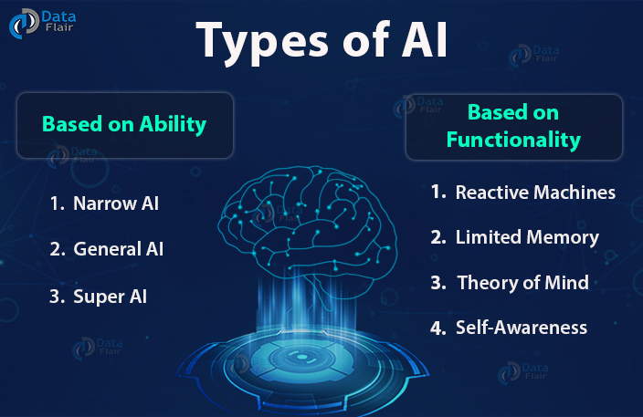
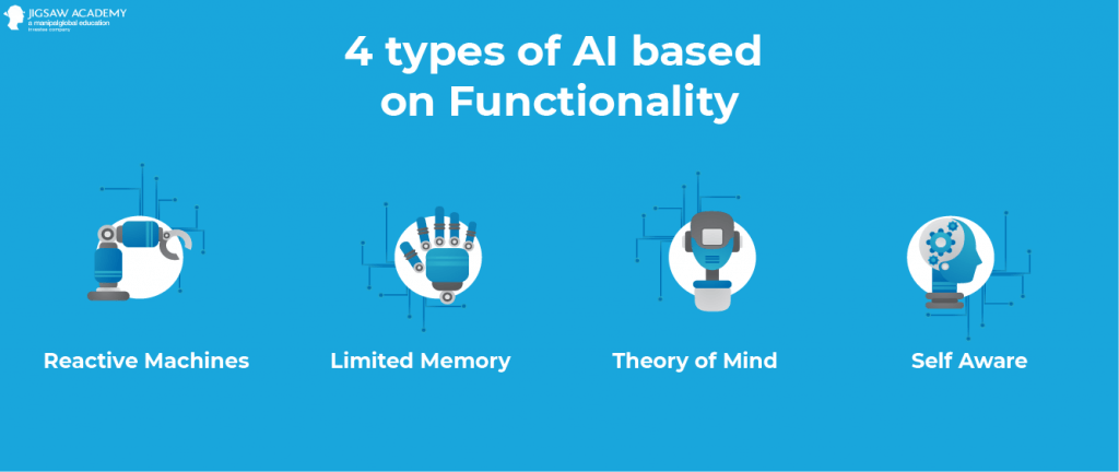
Types of AI
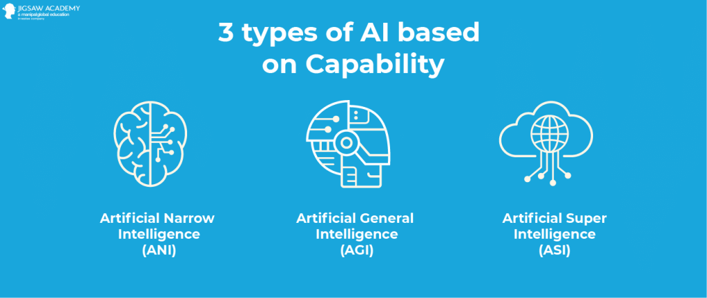
Artificial Intelligence can be divided into different types. These types can either be based on the abilities/capabilities or on the level of intelligence/functionalities of the system.
Narrow AI is also known as Weak AI or Artificial Narrow Intelligence (ANI) and is focused on one single “narrow” task. This type is not able to do anything that was not programmed and targets only a single subset of cognitive abilities.
The Artificial Narrow Intelligence (ANI) is the most common type of AI at the moment. It also includes more complex systems which are able to teach themselves with Machine Learning or Deep Learning. Most people nowadays are already using this type of AI on a daily basis. It is used in all personal assistants like Siri and Alexa, chatbots on websites, translating software, the Google page ranking system and many more. Narrow AI is also used in the health sector and is able to diagnose cancer and other illnesses with a very high accuracy by analyzing images from MRI’s.
General AI
General AI is also known as Artificial General Intelligence (AGI) and these systems will have the same capabilities as humans. They can learn, perceive and understand like a human being. But because there is currently not enough knowledge about the functionality of the human brain to develop these systems, they are still under development and will not be available anytime soon.
The best attempts on Artificial General Intelligence also include simulations on the fastest supercomputers. Back in 2011 the Fujitsu K computer was able to simulate one single second of neural activity in about 40 minutes. The successor of this supercomputer, the Fugaku, is the fastest supercomputer at the moment and has a processing power of about 415 petaFlops. But the US government is already building an even faster supercomputer named Frontier. Frontier will have a processing power of about 1.5 exaFlops and will go online later this year. This supercomputer will also be the first machine with more processing power than the human mind (about 1 exaFlop).
Super AI
Super AI is also called Artificial Super Intelligence (ASI) and will be more capable than any human. This technology is currently far away from becoming real but it would be the most capable form of intelligence on earth. Artificial Super Intelligence would also be able to perform incredibly well in creative tasks like design, decision making and even in emotional relationships. These systems will be better than any human at everything they do and may even take over the world.
Reactive Machines are the oldest form of Artificial Intelligence and therefore also have extremely limited functionalities. These systems do not have a memory and are not able to learn from previously gained experiences. Reactive Machines are only using present data for solving specific tasks.
One of the most popular examples would be IBM’s Deep Blue. This machine defeated chess grandmaster Garry Kasparov in 1997. Deep Blue is able to identify the pieces on a chessboard, knows how each of them is moving and makes predictions about the next moves. But it ignores everything that happened before the present moment. It is looking at the chessboard after every move and starts deciding from there.
Limited Memory
Limited Memory is the most common type of functionality based AI’s. It is able to learn from data and base the decisions on this data. This type of Artificial Intelligence is using data from big databases as a training for future problems. Limited Memory is currently used for voice assistants, image recognition, chatbots, cars with autonomous driving capabilities and self-driving cars.
Theory of Mind
Theory of Mind will be the next level of AI systems. This type of Artificial Intelligence will be able to understand needs, emotions, beliefs and thought processes and will therefore be especially useful for researchers. Theory of Mind will be successful when systems are able to truly understand human needs.
Self Awareness
Self Awareness will be the final stage of Artificial Intelligence and is currently just existing hypothetically. Systems of this type will also have emotions, needs, beliefs and even desires of its own. Despite this technology being decades away from becoming real, people are already thinking about these systems and if they will take over humanity and enslave all humans.
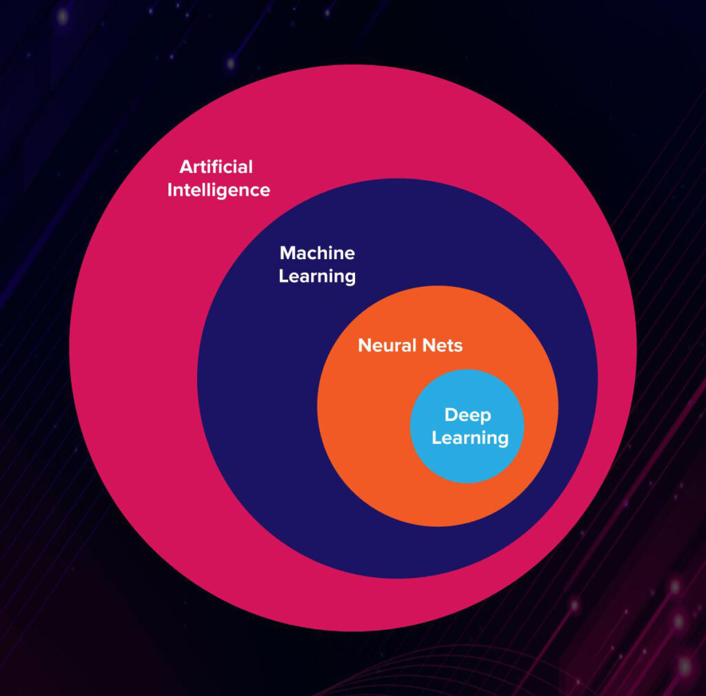
Machine Learning is one of the most popular and also most important subsets of AI. It helps AI systems to learn and improve their capabilities without being programmed. Systems are becoming better and better at specific tasks because of it.
We are already using systems with ML in our daily lives. The most popular technologies powered by Machine Learning include personal assistants, targeted advertisements on social media, image recognition software and traffic predictions on services like Google Maps.
ML uses Neural Networks and other algorithms and can be divided into the following categories: Supervised Learning, Unsupervised Learning and Reinforcement Learning.
Neural Networks
Neural Networks are a subset of Machine Learning. They are modeling themselves by creating an artificial network with an algorithm based on the human brain. Neural Networks are trained by databases with a large set of labeled data. The most common databases consist of images and the correlating labels.
If you feed a Neural Network with pictures of thousands of traffic signs and their label, it is able to inspect and analyze these pictures, learn a formula based on the data, divide it into different layers and finally put the signs into different categories. A Neural Network that was trained like this is able to recognize every common traffic sign next to the road, categorize it and show the driver the current speed limit for example.
Deep Learning
Deep Learning is a Machine Learning technique and teaches machines how to learn. It is also called Deep Neural Learning and is a subset of Neural Networks.
Deep Learning is also used in the automotive industry. Systems like driverless cars or voice assistants use it to analyze thousands of hours of videos and images. Self-driving cars can learn how to drive and navigate on specific roads by studying road patterns, driving habits of existing humans and other vehicles on the road. But this process also requires a lot of data to work properly.
Artificial Intelligence is already used across nearly all industries. AI is completing our words as we type them, vacuuming our floors in every corner of the room, providing directions while avoiding high traffic roads, matching up passengers for ridesharing services and recommending what we should buy next on Amazon or watch next on Netflix.
By injecting meaning and context to experiences, we trigger an emotional response that can either be happiness, compassion, surprise or amazement. Those emotional responses can in turn trigger a joyful experience. In the following we will explore design considering compassion/empathy to trigger a joyful experience.
There are two sides to consider, when speaking about compassion in design—this blogpost will outline the first one:
1) Design that shows compassion—which leads to a joyful experience because we feel understood by the Brand/Product/Design
2) Design that evokes compassion—and in a further (optional step) enables us to support a good cause, which can lead to an even more joyful experience.
Nowadays customers exactly want to be informed about brands values and goals—they want brands to feel their challenges, to feel friendly and trustworthy. And foremost, they want to feel a connection—being on a same wavelength, having the same mindest and ethical values—almost like a friendship.
Show Compassion
From a consumer point of view brands should be genuine and transparent. Transparency is a way to connect with the consumer on an emotional level and lead the consumer to believe that the brand understands their struggles, maybe even shares them—this creates compassion and connection, presenting a brand as “just like you.” [1]
By considering empathy in design strategy, a well-grounded base for creating joyful design experience can be established. Smartly used, empathy can create a strong connection to the customer, which turns brands into so called “love brands” and furthermore enables a joyful (brand) experience.
“If you think about your favorite ads or piece of content you couldn’t wait to share, a big part why it’s a favorite is, because there is some insight in there, some nuance that is so true, so funny or so relevant to who you are and where you are in that moment of time.”—Dana Neujahr.
Compassion in marketing is a crucial component in the creation of consumer personas and in establishing a deep connection to people on an emotional level.
Example: Pinterest [2]
Online searches for anxiety quotes on Pinterest increased 8x year-over-year and searches for how to support someone with depression have doubled. In consideration of those statistics Pinterest made some effort to ensure the well-being of users by developing in-app coping exercises with support from emotional health experts at Brainstorm at the Stanford Lab for Mental Health Innovation, Vibrant Emotional Health, and the National Suicide Prevention Lifeline.
The exercises provide interactive ideas for improving wellbeing with the help of tools that help to relax and exercise. As an example, a search for “stress relief” may populate options ranging from journaling, drawing or painting nature scenes, or making a playlist.” Fast-forward to today, 10 new exercises have been added targeted specifically towards people at risk of self-harm or injury.
“Everything we do is in service of helping people feel more inspired ….These experts continue to help us better understand different emotional states, including the unique needs of people who search for self-harm. If we can help even one person feel more optimistic, we know that’s time well spent,”—Co-Founder and Chief Creative and Design Officer Evan Sharp
Example: Hallmark “Just Because” Mini Greetings [3]
Showing appreciation and practicing empathy should not only be considered for major subjectives but also for little things in life—a message which has been considered by Hallmarks Mini Greetings Series “Just Because”. The Concept is the simple belief that every day we as humans encounter moments that are equally deserving celebration and recognition. A tiny, but smart gesture that sparks a moment of joy.
“We did some insightful work that let us understand that in today’s society, especially with all the divisive, challenging things around us, people are craving things that are positive and good…While the line is about putting more good in the world, it does not shy away from the dark times,”— Hallmark Cards CMO Lindsey Roy.
The backstory of this particular initiative hits home for Roy who was involved in a tragic boating accident that left her with an amputated left leg in addition to other severe injuries. The results were overwhelmingly positive, incentivizing current loyal customers to buy more cards, attracting new customers and spurring social media conversations.
“With so many ways to stay in touch, it’s amazing to see what a card can do to go above and beyond to show someone how you feel or to tell them you’re thinking of them.”—Hallmark Cards CMO Lindsey Roy
Hallmark ran a 20-week ‘Free Card Friday’ promotion allowing people to get a ‘Just Because’ card for free. This empathetic business cycle is an important one. “By tapping into a deep understanding of what matters to consumers, Hallmark found heightened success and business profitability, in turn, allowing the company to build more opportunities to serve their purpose of helping people find ways to care for their loved ones.”—Erica Perry.
By putting empathy first, Pinterest and Hallmark perfectly illustrate how to build a connection to people and how to use empathy as an approach to establish memorable, joyful experiences on a personal level.