Analog / Digital – Reality Is Analog

In my first posting on my research about analog and digital, I stated that in today’s tech companies there’s a high awareness for analog methods and processes. This interesting fact came out of the book The Revenge Of Analog by Canadian journalist David Sax in 2016. The book gives an overview about analog tools and media and how vinyl records, paper notebooks, films and board games conquer with their digital pendants. In addition Sax describes analog approaches in publishing, work and school.

However, the final chapter of the book deals with “The Revenge of Analog, in Digital“. For this chapter David Sax visited numerous high tech companies in Silicon Valley, speaking to project managers, designers and founders. Throughout the interviews Sax found out that in the very digital world of software developing giants, there’s not only a high level of appreciation for analog methods and processes, but also for the awareness of the analog nature that’s inherent to humans and their use of the five senses.

At Adobe Scott Unterberg, back then project manager for the Adobe Creative Cloud suite of programs, started with daily meditation sessions, which soon was attended by more and more employees, taking 15 minutes a day away from screens and technology. As the positive effects attendees’ stress levels were found to be lowered and likewise their health was improved. This seemed reason enough for Adobe to enroll the so called Project Breathe all over their global offices and meditation sessions became common, practically mandatory, throughout the Silicon Valley like Google’s Search Inside Yourself program.

On the more practical side, Kush Amerasinghe, scientist and strategic executive at Adobe helped to create the Adobe Kickbox Personal Innovation Kit. The kit is basically a box filled with post-it notes, instructions for taking an idea from scratch to reality, coffee and chocolate, pens and pencils, paper notebooks and $1,000 prepaid credit card. The initiative behind this emergency box was “…to focus on the idea, and not get constrained by the nitty gritty of technology. Programmers inherently have a bad habit of jumping into code and building when they get an idea.“


A similar phenomenon was described by John Skidgel, UX designer at Google – “Computer design software immediately looks real, and because of this, designers too often get caught up in precise but utterly pointless details.“ That’s why Skidgel, himself always sketching first drafts on paper, started courses for designers, where they would learn to draw vertical lines, horizontal lines, dotted lines, shadings or text boxes as tools in order to “enable Google’s designers to focus on quickly and effectively communicating new ideas, without getting mired in the infinitely adjustable variables that design software allows“. This sketching classes were so effective that Skidgel’s course is now taught to all Google UX and UI designers world-wide.

Besides meditation and analog approaches in developing ideas, David Sax, on his tour through Silicon Valley, also realized that in contrast to the very virtual software developed at the companies, the interior somehow seemed to ground the staff in the very real world of analog things. At Yelp he found classic white boards used as platforms to exchange ideas all over the place. At Pinterest he met brand design manager Evertett Katigbak, who had a background in letterpress printing. Katigbak told Sax about his time when he worked at Facebook. Together with designer Ben Barry they set up some printing equipment in the Facebook warehouse, initially to come over “frustration over an obsession with data and metrics [and the printshop being] an attempt to humanize the brand for an internal audience, and to humanize the user.“ For a joke they called it the Analog Research Laboratory, producing signs with slogans such as “If It Works, It’s Obsolete“ and “every possible variation on the word “hack“ and its use in phrase.“

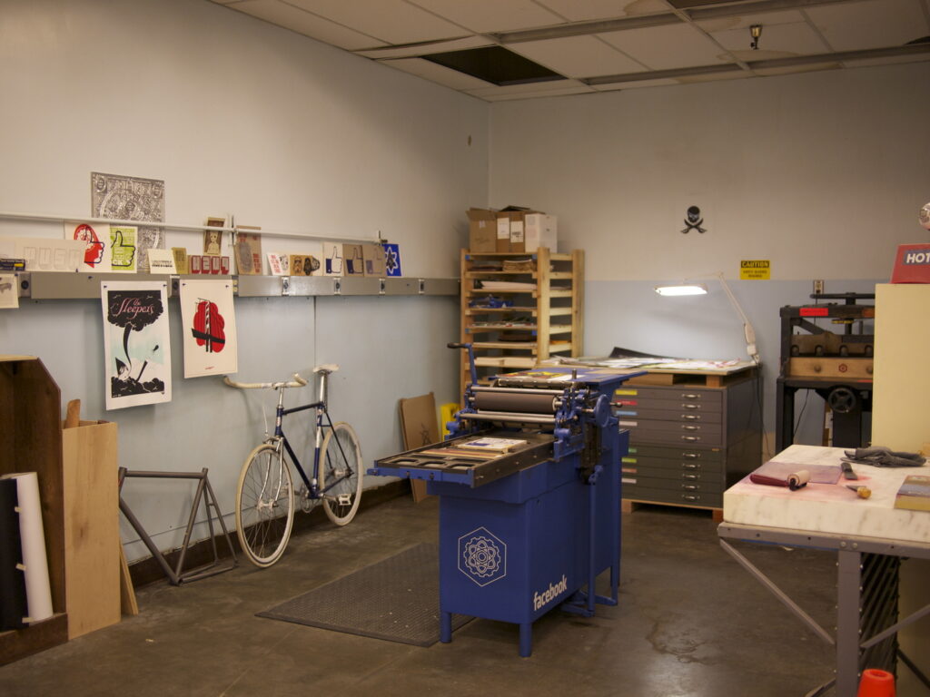
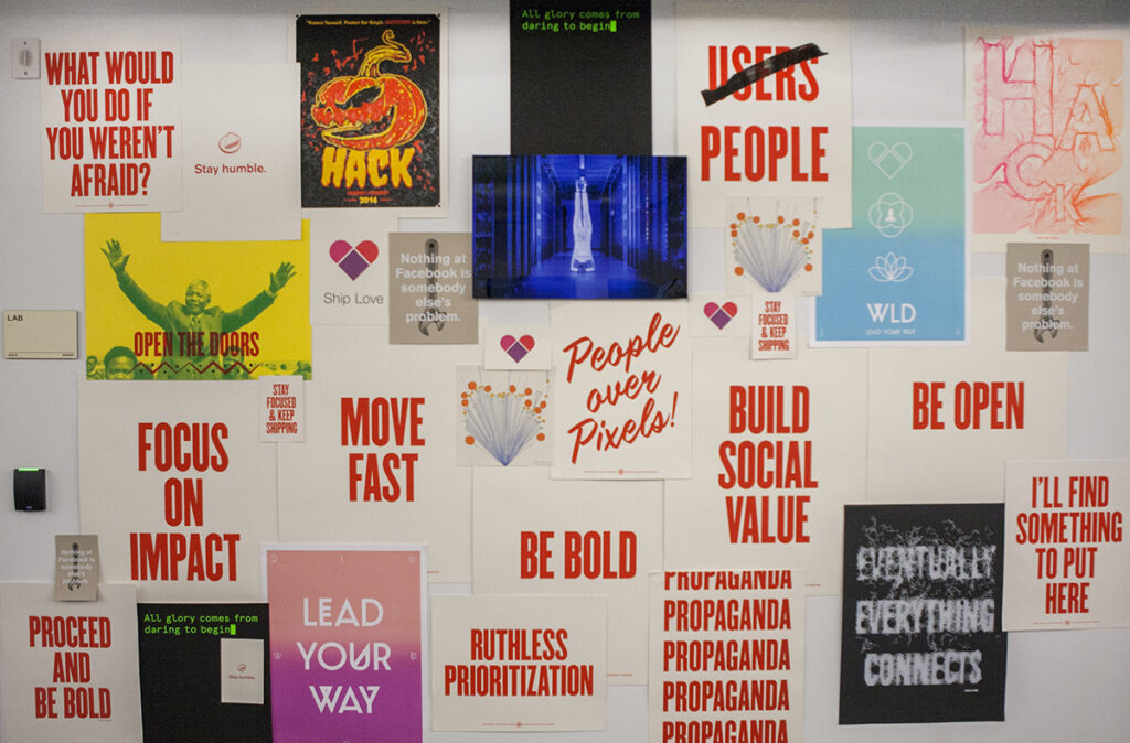
When Mark Zuckerberg heard about their signs, he asked them to produce two hand-printed signs for Facebook’s annual app developer conference. The popularity of these signs resulted in the Analog Research Laboratory becoming part of Facebook’s corporate structure with fixed space, budget and eventually full-time stuff.

Another aspect that David Sax mentioned was the limits of digital technology. Not only that human intelligence makes a good add on to artificial intelligence used to suggest contents on Twitter, Youtube or Instagram, the concept of human-in-the-loop is also part of critical infrastructure as nuclear power plants, military systems as well as airplanes. Besides, computer engineers have concerns that in digital computing, processors are constantly gaining in speed, while energy efficiency is relatively stagnant, which in future may result in problems with power supplies. A solution to this could be analog computing, a theoretic technology which doesn’t work with exact calculations of 1’s and 0’s but rather approximate calculations, recognizing patterns and thus using far less energy.

Finally, as digital media is screen based, it hardly addresses any sense but vision and hearing. Blaise Bertrand, director of industrial design at design firm IDEO warns that there is an “impoverishment of senses“ due to the attraction of digital media that pulls people into the screens. On the other hand Bertrand is confident that “those who would build the technologies that really could change the world were the ones who readily acknowledged the limits of digital and the benefits of analog.“ Dan Shapiro, founder of Glowforge that produces 3-D laser cutters, brings it to the point – “Reality is Analog.“ Digital is only a way to best possibly represent our world and the reality we live in.

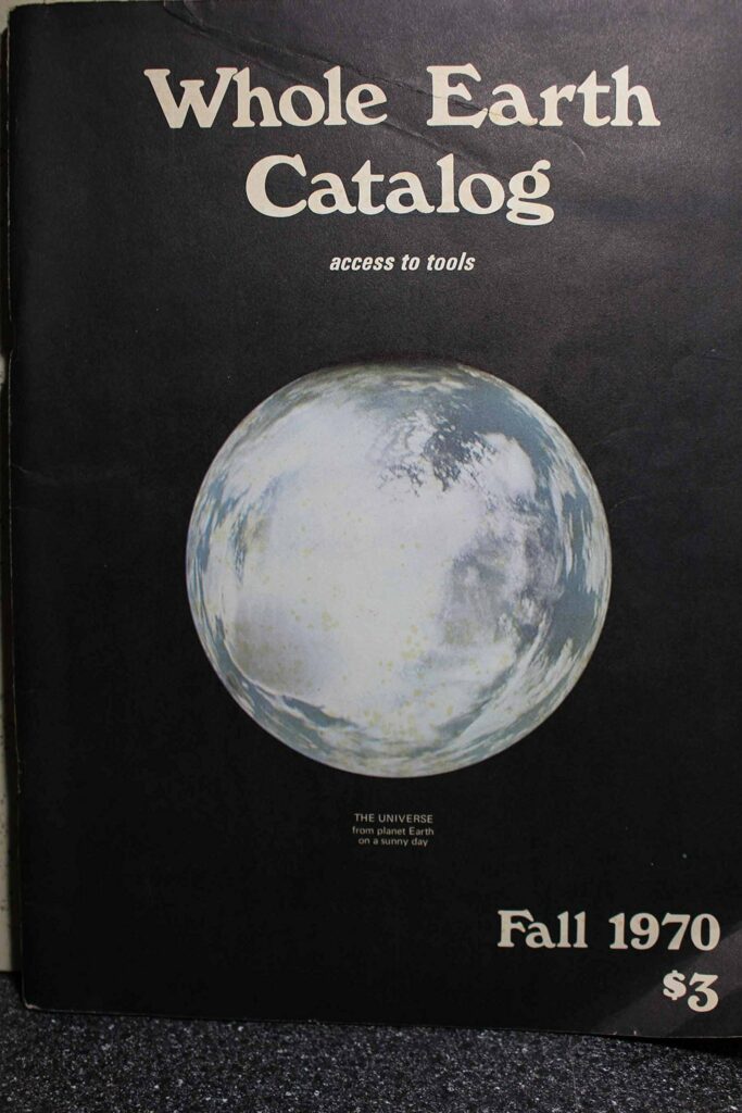
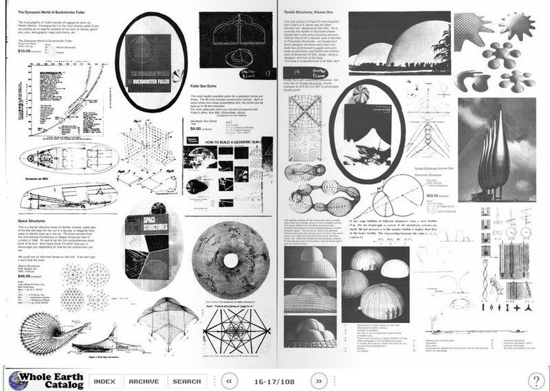
Kevin Kelly, founder of Wired magazine, a technology idealist who is known to “see digital technology as a force for ultimate good“, himself is aware of the multisensory fascination of analog. In the spirit of the Whole Earth Catalog, a collection of product reviews and (critical) essays from the 1960s and 1970s, Kelly started a blog called Cool Tools for which he reviewed one tool per day. However he kept feeling that there was a lack of experience, that “online simply couldn’t achieve“. Later, browsing through editions of the Whole Earth Catalog, he realized that the large format, rather mixed layout and the intuitive navigation through the book by simply turning the pages was the reason for the mesmerizing effect of the catalogs. Therefore in 2013 he published Cool Tools: A Catalog of Possibilities in printed, approximately A3 format to “recapture that missing 5 percent that the web couldn’t do.“

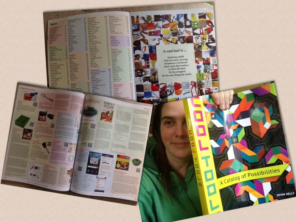
David Sax, who received a copy of Kelly’s book, didn’t only make the experience himself, but observed that visiting friends immediately got sucked in when they opened the large book that got their attention by simply lying on the coffee table. The reason for this Sax didn’t credit to the book’s content but rather “quirky appeal” and “ sheer analog nature of the damn thing.” However Kelly added that “right now, Cool Tools had to be on paper. But in fifty years that may not be true.”

Source:
Revenge Of The Analog, David Sax, 2016


Modern still life photography

Still life photography became an unbelievable big field of photography and it is always good the explore some contemporary artworks.

Freakebana

Freakebana is an attempt to make a still life relatively ugly and cool at the same time. Originally, this newly discovered fun can be traced back to a Japanese art form. Conventional flower arrangements are usually only draped with simple plants, so that the important flowers stand out. With this form, however, it is much more about using form, color and lines dominantly and loudly and still reducing the elements to the bare essentials.

Florist Brittany Asch collaborated with photographer Bobby Doherty on this series. The plants were chosen for their symbolism. This new style wants to provide surprises and makes use of objects that are not intended. The style can be channeled easily while sitting at a table with friends. You don’t need acres of land or deep pockets, just a willingness to see the potential in banal produce, flowers, and stray detritus – remixing them to seem intentional, maybe even beautiful. See photographer Bobby Doherty’s take on the trend, paired with luxury jewelry, below. 

Series by Lauren Bamford 

Photographer in Melbourne who creates images with a floral composition combined with beer cans.

Quellen:

https://www.laurenbamford.com/infolaurenbamford

https://www.curbed.com/2020/10/what-is-freakebana-the-new-style-of-arranging-flowers.html

Food Photography

Food photography [fo͞od][fə-tŏgˈrə-fē] (n.) – Photography that focuses on food, or uses food as a photographic subject in its expression of a non-food related idea.

Das erste gemeldete Foto von Lebensmitteln wurde von Nicéphore Niépce im Jahr 1832 gemacht und seitdem hat die Praxis eine ganze Branche hervorgebracht, die sich der Erfassung der Schönheit und Symbolik von Lebensmitteln widmet. Bei meiner Recherche hab ich leider kein Beispiel bzw. genaue Zahlen gefunden, aber das erste Kochbuch in dem Fotografien zur Darstellung von Essen verwendet wurden, dürfte irgendwann in den 1950er Jahren entstanden sein – was natürlich auch mit den Entwicklungen in der Fotografie zu tun hatte.

Nicéphore Niépce – 1832

Im Bereich der kommerziellen Fotografie ist die Lebensmittelfotografie ein relativ neues Thema, das sich jedoch am schnellsten entwickelt. Das Bestreben ist es, Lebensmittel in ihrer appetitlichsten Form einzufangen. Im Marketing, egal ob es sich um Lebensmittel oder etwas anderes handelt, ist es für den Verbraucher von entscheidender Bedeutung, den Wert dessen zu erkennen, was er kaufen soll. Fotografie hat den Anspruch Wirklichkeit abzubilden und gute Lebensmittelfotografie kann die Qualität des verkauften Produkts klar und konsistent zeigen. 

Grundsätzlich gibt es in der Lebensmittelfotografie zwei verschiedene Ansätze:

Food-Fotografie im Marketing 

= Fotografie für Print, TV oder digitale Medien, die Kunden und Kunden anzieht und sie zum Kauf eines Produkts motiviert. Commercial Food Photography umfasst nur Fotos mit der Absicht, ein Lebensmittelprodukt zu verkaufen und eine Lebensmittelmarke gut aussehen zu lassen. Dabei haben die visuellen Aspekte der vorgestellten Lebensmittel bei der Werbung für Lebensmittel Priorität. Seine Farbe und Textur müssen den Menschen das Wasser im Mund zusammenlaufen lassen und sie zu treuen Kunden machen.

Es gibt einige grundlegende ästhetische Tendenzen bei der Werbung für Lebensmittelfotografie. Im Gegensatz zu editorial Food- / Rezeptfotografie wird selten eine geringe Schärfentiefe verwendet. Um auf saftige und frische Texturen aufmerksam zu machen, verwenden Werbefotografen scharfe Linsen und focus stacking. Die Details eines Lebensmittels oder einer Zutat werden gezeigt und Kunden vertrauen darauf, dass sie eine genaue Darstellung dessen sehen, was sie in einem Restaurant oder in einer Verpackung erwartet. Food Photography wird jedoch oft in der post production stark nachbearbeitet und tritt manchmal sogar in den Bereich der Fantasie ein.

Food Photography wird oft digital manipuliert und in Fantasie verwandelt

On White Seamless Food Photography [ȯn●hwīt●ˈsēm-ləs] [fo͞od][fə-tŏgˈrə-fē] – Isolated image of a food dish, food ingredient or a food product on a pure white background.

Kurz gesagt, es handelt sich um leere Leinwände, die jederzeit auf unzählige verschiedene Arten geändert werden können. On White Seamless Food Photography kann langweilig sein. Diese Bausteine sind jedoch nicht zu unterschätzen. Die Beliebtheit von Produkten hängt oft davon ab, wie gut diese Aufnahmen Textur, Farbe, Geschmack und Persönlichkeit erfassen. 

Kunstfotografie (Fine Art Food Photography): 

Hier wird ein künstlerischen Ansatz für das Fotografieren und Bearbeiten von Lebensmittelfotografie verfolgt. In der Fine Art Photography wird mithilfe von Beleuchtung, Komposition und Styling eine ausgeprägte Stimmung geschaffen und die Bilder können realistisch sein oder auch nicht. Die Food Photography, ob im Studio oder vor Ort, ist letztendlich ein Genre, das seit den Anfängen der Kunst existiert – in dem, was wir Stillleben nennen – und Stillleben erfordert Reflexion, Organisation und Zeit, um Absichten, die wir haben, und den Eindruck, den wir erzeugen wollen.

Gleich wie bei der illustrativen Darstellung von Lebensmitteln geht es nicht nur um ein hübsches Bild, es geht darum, ein Bild zu erstellen, das beim Betrachter ein Gefühl auslöst. Die Lebensmittelfotografie ist ein sehr spezifisches Genre, da sie eine Leidenschaft und ein tiefes Verständnis für die Produkte erfordert. In der Food Photography kann relativ leicht eine bestimmte Stimmung erzeugt werden. Im Gegensatz zu Lebensmittelillustration wird hier sehr viel dieser Stimmung durch Licht, dem Zusammenspiel und der Auswahl von Farben und der Bildkomposition gearbeitet. In der Food Photography schafft vorwiegend die Umgebung und das Setting die gewünschte Stimmung, während in der illustrativen Darstellung oft das Objekt/Lebensmittel selbst auf eine bestimmte Art und Weise repräsentiert und stilistisch dargestellt wird. 

Ein Beispiel dafür ist die dunkle und launische Lebensmittelfotografie. Hierbei wird durch einen „dunklen“ Ansatz Stimmung geschaffen, wodurch das Foto ein künstlerisches Gefühl bekommen kann – wie bei einem Stillleben. Oder beispielsweise wie das  Zusammenspiel von Licht und Schatten in Gemälden von Vermeer und Rembrandt. Der Kontrast zwischen Schatten und Licht in einem Bild sorgt für eine dramatische Stimmung. Das kann helfen das Auge zu einem bestimmten Bereich in der Komposition zu lenken.

Gleich wie bei der Illustration von Lebensmitteln ist auch in der Fotografie die Wiedergabe von Textur enorm wichtig. Bei der Aufnahme von Food-Photography ist oft ein einfacher Ansatz am besten. Hier geht es nicht nur um Komposition, sondern auch um das Thema. Lebensmittel in ihrem natürlichen Zustand – wie Obst und Gemüse – sind von Natur aus fotogen.  Durch Beleuchtung und einfache Komposition kann man die lebendigen Farben und Texturen verbessern. 

Für einige geht es in der Food-Fotografie um die Botschaft, die vermittelt wird, vom bleibenden Eindruck von Gourmet-Covers bis zu wichtigen historischen Momenten, die die Art und Weise widerspiegeln, wie wir essen. Für andere ist großartige Food-Fotografie Kunst und wieder andere konzentrieren sich auf die Zutaten selbst und argumentieren, dass das Bild einfach ein Kanal für ihre inhärente Schönheit ist. 

Fine Art Photography wird vor allem im Editorial Bereich eingesetzt. Editorial Photography kann schwer zu definieren sein. Per Definition kann redaktionelle Lebensmittelfotografie keine Werbung sein oder von einem Lebensmittelunternehmen bezahlt werden. Diese Art der Fotografie erscheint auch in Magazinen, Zeitungen und Online-Veröffentlichungen, im Grunde überall dort, wo Informationsartikel veröffentlicht werden. Lebensmittelmagazine sind redaktioneller Natur, da sie Originalinhalte produzieren, die nicht direkt werben, sondern vielmehr anweisen oder informieren.

Links:

www.phoode.com/blog/simple-rembrandt-food-photography-lighting-technique-adds-drama-to-images-of-single-vegetables/

www.phoode.com/blog/the-balance-of-bright-and-dark-as-the-key-to-successful-chiaroscuro-food-photography/

www.phoode.com/blog/keeping-it-simple-with-on-white-seamless-food-photography/

www.firstwefeast.com/eat/2013/06/the-most-iconic-food-photographs-of-all-time/

Was ist ein Bild?

Bilder sind ein wesentlicher Bestandteil der menschlichen Ausdrucksform. Doch was macht ein Bild zu einem Bild?

Dieser scheinbar simplen Frage ging der Bildtheoretiker W.J.T. Mitchell 1986 nach. Laut Mitchell ist unser Verständnis der Bildlichkeit durch zeitliche, kulturelle, soziale und individuelle Wahrnehmungen, aber auch durch unserer Vorerfahrungen geprägt.

Bild von Tracy Lundgren auf Pixabay

Am Beispiel eines Apfel ist diese Beobachtung gut zu erklären: Betrachten drei Menschen das Bild eines Apfels, so sieht Person A darin das Apple Logo, Person B denkt an den Sündenfall und Person C einfach nur an die visuelle Repräsentation eines Apfels. Aby Warburg hat schon auf diese Verbindung zwischen materiellem Abbild und immateriellem Denkbild hingewiesen. Grundsätzlich müsste aber zuerst einmal die Frage gestellt werden, was genau mit dem Wort Bild gemeint ist.

Mitchell unterscheidet fünf Kategorien von Bildern und erklärt die Einteilung der Bilder anhand eines Stammbaumes.

Man stelle sich Bilder als eine weit verzweigte Familie vor, die sich mit der Zeit zeitlich und räumlich auseinander gelebt hat und in diesem Prozess grundlegende Veränderungen durchgemacht hat. Jeder Zweig dieses Stammbaumes repräsentiert einen Typ von Bildlichkeit, der von einer bestimmten Disziplin betrachtet wird. Geistige Bilder fallen beispielsweise in den Zuständigkeitsbereich der Psychologie, optische Bilder werden in der Physik untersucht, grafische Bilder in der Kunstgeschichte, sprachliche Bilder in der Literaturwissenschaft und perzeptuelle Bilder gehören einem Grenzgebiet mehrerer Disziplinen an. Die Darstellung (siehe Abbildung) zeigt wie schwierig es ist den Begriff Bild eindeutige zu erklären. Bei der Beschäftigung einzelner Disziplinen mit ihren jeweiligen Bildern ist es daher nicht sinnvoll einen gemeinsamen, übergeordneten Bildbegriff anzuwenden. Für ein allgemeines Verständnis des Phänomens „Bildlichkeit“ ist eine grundlegende gemeinsame Definition sowie eine theoretische Fundierung essentiell. Beschäftigt man sich aber mit einem gewissen Typus von Bild und mit seinen individuellen, konkreten Fragestellungen ist die grundlegende Definition nicht differenziert genug. 

Zur Gruppe der materiellen Bilder zählen:

Zur zweiten Gruppe zählen die immateriellen Bilder.

Während grafische und optische Bilder eindeutig zur Visuellen Kommunikationsforschung zählen, ist es fraglich, wie nun die nicht greifbaren Bildkategorien eingereiht werden können. Hier befindet sich die visuelle Kommunikation in einem Dilemma, denn werden diese immateriellen Bilder integriert, stellst sich die Frage, was nun die richtige begriffliche Beschreibung ist.

Quelle:
Lobinger Katharina Lobinger: Was ist ein Bild? Was ist ein Medienbild? In: A. Hepp, F. Krotz, W. Vogelgesang (Hrsg.): Visuelle Kommunikationsforschung. Medienbilder als Herausforderung für die Kommunikations- und Medienwissenschaft. Wiesbaden: Springer VS 2012, S. 47-70

Müller, Geise Marion G. Müller, Stephanie Geise: Grundlagen der visuellen Kommunikation. München: UVK 2015, S. 19-28

Joyful Design

Expanding product life cycles by Joyful Design

As a consequence of our throwaway society products often get discarded even if they are still fully working. Joyful Design may be a practice to counteract by stimulating a more enduring product-owner relationship.

A study of Dept. of Ind. Des. Faculty of Industrial Design Engineering, Delft University of Technology, Delft, NL. and Dept. of Prod. Innov. Mang. Faculty of Industrial Design Engineering, Delft University of Technology, Delft, NL analyzed the possibility of expanding product life cycles by design. [1]

One of the most important attributes of product attachment was found to be symbolic meaning. This important insight served as the base for the research, which focuses specifically on happiness-related symbolic meaning. It is simples as that: “If a product symbolizes aspects of a person’s happiness, he/she is more likely to keep it, because losing the product implies that the strong symbolic meaning and thus the ‘happiness trigger’ is lost.” (Csikszentmihalyi & Rochberg-Halton, 1981; Belk, 1988) [2]. Therefore, the study was based on a framework with six types of symbolic product meanings (based on Ryff’s (1989) model of psychological well-being) [3]: positive relations with others, personal growth, purpose in life, environmental mastery, autonomy, and self- acceptance. Those directions should act as a source of inspiration for designing long-term meaningful product-owner relationships by creating relevance and value for users.

1) symbolic meaning of positive relations with others
possessions that represent meaningful affiliations which provide a sense of belongingness

— support meaningful affiliations
example: facilitating the practice of specific belongingness activities

— embody characteristics of a group
example: using unique characteristics of users

2) symbolic meaning of personal growth
possessions that symbolize transitions, acceptance of past experiences, and continued self-development

— support active personal development
example: providing a platform for active reflection on lessons learned and future expectations

— embody personal growth
example: provide an adaptable design that can accommodate physical and psychological change

— support acceptance and growth from past experiences
—enhance memories
example: offering a positive context or activity to reflect on memories

3) symbolic meaning of purpose in life
possessions that symbolize the individual’s goals and aspirations in life

—encourage positive change
example: providing a external trigger that suggests beneficial activities or behaviours

—provide a sense of control
example: allowing users to manage progress towards personally significant goals, or to eliminate or mitigate obstacles that threaten their fulfilment

—keep track of progress
example: providing visual feedback to keep track of progress towards personally significant goals

4) symbolic meaning of environmental mastery
possessions that symbolize the individual’s ability to master his/her context and build beneficial networks

—improve multi-sensorial communication
example: Improving communication mediums by translating a message into a sensorial experience, for example by simulating intimate physical behaviours

—provide a context for meaningful interaction
example: Facilitating interaction by making use of the context, or props as an advantage

5) symbolic meaning of autonomy
possessions that symbolize particular ways of living and life choices

—destigmatize
example: Focusing on and enhancing the aesthetic qualities of physically enabling products

—Design for mindfulness
example: Slowing down processes or disclosing the mechanisms behind how products work to promote a mindful living

—redirect the user’s attention
example: Designing a product that actively requires attention from the user to mitigate or distract from negative situations

6) the symbolic meaning of self-acceptance
possessions that symbolize the positive aspects of the individual, promoting a positive self-image

—allow shared transformation
example: Providing tools for user input at aesthetic and functional level, in a permanent or temporary way.

—allow self-expression
example: Providing a tangible platform to wear, share, or display aspects of identity, personally significant ideas, principles, relationships, etc.

Several publications on the topic of emotional durability have explored the role of symbolic meaning in fostering durable user-product relationships (e.g., Chapman, 2005; van Nes & Cramer, 2005) [4]. While offering an important and novel perspective on durability, these explorations have not yet resulted in practical directions that support designers in their attempts to design emotionally durable products. The set of design directions is rather intended as exploratory than normative, ideally offering inspiration by displaying a diversity of opportunities to design with symbolic meaning.

However according to the study a product’s inability to respond to the user’s evolving aspirations (e.g., for technological or aesthetical upgradability) can promote premature discarding, but ultimately, the ending of a product’s life is a consumer decision. The challenge resides, therefore, in designing products that support durable user-product relationships (van Nes, 2010) [5] by focusing on durability of meaning and value (Chapman, 2005).

Sources:
[1]Extending product life by introducing symbolic meaning: an exploration of design strategies to support subjective well-being. URL: https://www.researchgate.net/publication/281119272_Extending_product_life_by_introducing_symbolic_meaning_an_exploration_of_design_strategies_to_support_subjective_well-being?enrichId=rgreq-33f579a37ee576710a6f476dd27eeece-XXX&enrichSource=Y292ZXJQYWdlOzI4MTExOTI3MjtBUzoyNjQ5MjM2MjQyNDMyMDJAMTQ0MDE3NDEyMjYyMA==&el=1_x_3&_esc=publicationCoverPdf

[2] Csikszentmihalyi, M. (1990). Flow: The psychology of optimal experience. New York: Harper and Row.

[3] Ryff, C. (1989). Beyond Ponce de Leon: New directions in quest of successful ageing. International Journal of Behavioral Development, 12(1), 35-55.

[4] Chapman, J. (2005). Emotionally durable design: Objects, experiences and empathy. London: Earthscan.

[5] van Nes, N. (2010). Understanding replacement behaviour and exploring design solutions, In T. Cooper (ed.), Longer lasting products. Surry: Gower Publishing.

Generative Design and Sound?

Um der Verrostung entgegenzuwirken habe ich entschlossen im Sound&Visual Seminar mit Generativem Design (Processing) zu arbeiten.

Die Sound-Designerin, Isabel Witting hat im Rahmen einer Übung 5 Klänge bzw. Klangfolgen vorgegeben.

Mein Ziel war es, ein immersives, audio-visuelles Erlebnis zu generieren, da die gegeben Audio-Files sehr intensiv gestaltet sind.

Im ersten Schritt habe ich eine simple Vektorgrafik erstellt, welche wenige Kanten besitzen sollte und von einem Kreis umgegeben ist. Mein Ziel war es eine Form zu generieren, welche ich in schöne Schwinungen versetzen kann.

Visual Adams | Unförmige simple “Startform”

Im zweiten Schritt habe ich diese Vektorgrafik in Processing eingelesen und im Code zusätzliche Ankerpunkte gesetzt. Diese Ankerpunkte habe ich mit Ellipsen bestückt.

Visual Adams Jan, Sound Witting Isabel

Zu allerletzt habe ich die Audiodatei von Isabel eingelesen und mittels Sound-Library ausgelesen. Je nach Pegelwert werden die Kreise in Schwingung versetzt.

Durch den Einsatz von leichten Transparenzen auf schwarzem Hintergrund und verschiedenen Größen wird das Visual sehr dynamisch.

Joyful Design

Positive Design

Some of the following design cases focus on individuals, others on groups. Some help us to rediscover our talents, some support us in forming meaningful relationships, and others enable us to invest in the happiness of ourselves and of the people we care about.

Little Proba [1]

Little Proba is an initiative created to empower children’s creativity and help kids in need. The project emerged from Studio Probas first creative workshop for Portland and NYC kids, in which kids were guided through the process of making colorful, cut-out paper collages.

“The results were so inspiring, that we transformed them into rugs with all proceeds going to Save the Children and the Young Center for Children’s Immigrant Rights. This first collaboration is just one in a long-term series of philanthropic initiatives we’ve planned to foster creativity in children and, in turn, help those in need across the globe—a process we like to refer to as #kidsdesigningforkids.” —Studio Proba

Goedzak [2]

Goedzag is a way to do good and offer products a second chance—sharing and re-use as easy as taking out the trash. The concept is currently used as a pilot-project in Amsterdam and Eindhoven.

How much do we actually use of the stuff that we own and how much do we really actually need? We all hold on to many material things we no longer use. But what is even worse is, that we sometimes throw away things that are still in perfect and working condition. From a sustainability point of view unwanted goods should be re-used as much as possible. From a social point of view, these items offer an enormous potential for positive social behaviour; sharing. 

Designer Simon Akkaya dealt in the development process with questions such as: Is it possible to design a product that brings out and stimulates a positive human behaviour? And to make things a bit more complex;  is this possible when this particular behaviour does not serve the user’s direct needs. In this case; altruism. Understanding the principles and mechanics of a specific human trait is essential when translating these abstract values into tangible form. This specific project was deliberately pushing the envelope by setting a very abstract goal, without setting a defined domain for the product at the start.

How it works:

Basically, Goedzak is a carrier of a sustainable message: It offers a visual stage to social deeds by “lightening up” the streets with bright yellow bags. Goedzak should encourage individuals to take their time and make an effort to fill up a bag with things which otherwise would be simply thrown away.

Goedzakken (the bags) are distributed in a specific area. With the bag people also receive information and an explanation on how to use Goedzak. People can then fill up the bag and place it outside on the pavement, no different from taking out the trash. The bright yellow colour will attract attention, while the transparent side of the bag will reveal the content without the need for rummaging through the bag. Passers-by can then take from the bag anything to their liking. The remainder of the goods are at the end of the day collected by the second hand store (or service from the city) to be either sold or recycled. Goedzak creates a new waste-stream that precedes recycling and eventually discarding, keeping the integrity of the products in tact an maximising the lifecycle. Goedzak allows you to fill up a bag and place it in a designated spot; this can be anywhere from a local mall, to the pavement in front of your house. Others (neighbours, passers-by) can take whatever they find valuable from the Goedzak.

Hospital Facilities [3]

According to latest research music, humor, light, and scent have the power to decrease pain or influence medical outcomes—especially nature has a huge impact on healing. A finding that dates back to Roger Ulrich’s seminal study of post-surgical gall bladder patients. The research found that people who had a green view out their window were able to leave the hospital sooner and required less pain medication than those facing a brick wall. According to latest research even natural sounds (birds, etc.) may have an influence on pain.

Inspired by that latest findings the university of Oslo hospital, designed by Snøhetta, built an exclusive Outdoor Care Retreat, which can be booked by patients. The retreat has been designed to mimic a tree house and allows to full open windows for fresh air and a “being on holiday” experience.

Another issue in hospitals is a downbeat color scheme—which has especially a bad influence on children’s wellbeing. Children’s bedrooms at home are usually bright and colorful and by considering that fact in design of hospital facilities, a patients room can feel more “normal” and support wellbeing and therefore an individuals healing process.

Sources:

[1] https://www.studioproba.com/studio
[2] https://www.waarmakers.nl/projects
[3] https://aestheticsofjoy.com/2019/03/22/imagining-a-more-joyful-childrens-hospital/

Modern still life photography

Still life photography is a complex genre in which one can often create meaningful work with few materials. However, if you simply depict your inanimate objects without ulterior motives or the right know-how, this can result in a rather uninteresting picture. It is also always important to learn from contemporary artists and to see what messages they convey through their still lifes. The following photographers have created particularly interesting still lifes, although some are more or less well known:

Henry Hargreaves

Henry is a contemporary photographer currently based in Brooklyn, originally from New Zealand. He is best known for his still life and food photographs. His connection to photography came about when he worked as a professional model and got to know many photographers and their techniques. His still life photographs focus on depicting food and often contain humorous or critical messages. His photographs have been shown at the Venice Biennale, MAXXI in Rome and the Lunch Box Gallery in Miami.

Mat Collishaw

Mat is a contemporary artist who also does still life photography. He attends Goldsmiths College and has had various solo and group shows over the past three years. His works are exhibited in many famous art institutions such as the Center Georges Pompidou in Paris, the Museum of Contemporary Art and the Tate Museum in London. His work is often provocative, but you have to take a second look to see it.

Evelyn Bencicova

Evelyn is a visual creative from Bratislava. She specializes in photography and art direction. Evelyn studies at the University of Applied Arts in Vienna. It uses a visual language that is full of symbolic elements. In this way, the viewer looks at her still life photography for a long time, trying to understand its different depths. Evelyn’s pictures are always more than you think. She works with Gucci, Cartier and Nehera. She has also won several awards and her work has appeared in Vogue Portugal, Vogue Spain and Elle magazines.

Jonathan Knowles

He is a well-known commercial photographer who specializes in still life photography. He has a unique style and lighting technique. He mainly works commercially with drinks and liquids, as he has had a weakness for these representations since childhood. His work earned him multiple awards and Jonathan worked with clients such as Coca Cola, Smirnoff, Nescafe and Guiness. Here you can see a still life series of his, which is completely in the spirit of dark subjects with the name “Derelichte”. The other series shows a combination of organic objects with plastic.

Suzanne Saroff

Suzanne is a photographer based in New York, who is known for elegant and modern product photography. She perfectly represents recent trends which are based on visual weight and balance. As well as a specific vibe created through a thoughtful color scheme. In this series, she plays with the transparency and effects of glass materials. 

Quellen:

https://www.weekend-creative.com/thoughts/inspiration25

https://henryhargreaves.com

https://jknowles.com/photography/food/temptation/

https://matcollishaw.com/works/last-meal-on-death-row-texas/

http://evelynbencicova.com/vogue-still-life/

Joyful Design

Positive Design

How can design contribute to the field of positive psychology? How can we consciously and deliberately use design skills in contributing to the happiness of individuals and communities?

Positive design deals with answering those questions and focuses on research and development of solutions that increase people’s subjective well-being and thus happiness. The goal is to stimulate and enhance positive emotions and reduce negative ones. [1]

Happiness drives people to flourish—according to a research the performance of happy people can increase up to 12% whilst maintaining quality of work, but on the other hand performance can also lose up to 10% when people are unhappy. Therefore, that finding not only takes an important part when it comes to employee’s happiness and thus on productivity—subjective well-being plays a significant role in performance. And, of course, consumers are likely to value offered solutions/products better when they are happier, and vice versa when they are unhappy. Positive design is based on design theory and psychology. The latter is the science that focuses on understanding what makes people happy and what makes them flourish. Research has found that happiness is determined by three factors, and that two of these three determinants are possible to design for. [2]

Positive Design Framework [3]

Positive design enhances positive emotions and reduces negative ones. That can be achieved by engaging personal character strengths and weaknesses, and by taking on evidence-based opportunities and threats as measures for a scientific design approach rather than a single designer’s perception. It is about providing solutions that helps people satisfy their growth-needs whilst taking into account their deficiency-needs. The Positive Design framework offers an overview of possible design applications for happiness, consisting of 3 layers that can be designed:


Design for Pleasure

Here, the focus is on happiness, achieved by a person’s pleasures and derived from enhanced positive feelings or decreased negative feelings. There are four types of pleasures: physical, social, psychological, and ideological.

Design for Personal Significance
Design for Personal Significance is about personal goals and aspirations. A positive affect can also be gained from achieving and remembering goals and getting a sense of accomplishment from certain behaviors. The focus clearly is on an individual’s interpretation of what makes life worth living and having the freedom in doing so.

Design for Virtue
Virtuous behavior is about what is perceived as good and what is perceived as bad. “It is based on the proposition that there is an ideal mode of behavior, or a sense of excellence or perfection towards which one should strive, that leads to a virtuous life.” Correct translation of believes and values into design processes can be beneficial to people’s happiness.

Positive Design Ingredients [4]

Besides the above-mentioned framework in which one can apply positive strategic design, there is a set of ingredients of which the effect on someone’s happiness is proven to be successful. These ingredients are derived from research in positive psychology and act as important rules of thumb to incorporate in design and prevent obstruction.

Positive Emotion
Positive emotion is simply about feeling good. The focus is on gaining positive experiences by satisfying deficiency need to a pleasurable experience and satisfying growth need to an enjoyable experience.

Engagement
Engagement is about the activities an individual is engaging in. If one is acting in full envlolvement, that holistic sensation is called the flow state. The focus clearly is on challenging, fulfilling and interesting activities that captivate people to be fully engaged in the moment. Individual values and preferences have to be considered in this process.

Relationships
There is a causality between social relationships and health, thus that aspect plays an important role. People want are in need of authentic connection and social cohesion and reacquire emotional and physical interaction.

Meaning
Meaning defines understanding and making sense of ones existence and its impact on others—to have a purpose and goal to strive for.

Accomplishments
The positive effect form having goals can be enhanced by achievement of those goals. Interest, ability and perseverance are therefore important factors to consider.

Sources:

[1] https://www.positivestrategicdesign.com/positive-design

[2] https://issuu.com/delftinstituteofpositivedesign/docs/issuu

[3] ebda.

[4] ebda.

Food Illustration

Um die Jahrtausendwende sind immer mehr Fernsehkochprogramme entstanden und der Zugang zu Rezepten bzw. Kochtechniken wurde über das Internet immer leichter. Bald darauf sind große Online-Communities entstanden, die sich mit Lebensmitteln beschäftigten, wodurch natürlich auch bildliche Darstellungen von Nahrung und Essen wichtiger wurden. 

Zum Beispiel wurden in Kochsendungen spielerische Illustrationen von Essen, der Zubereitung und anderen Bildern eingespielt. Auch in Print- und Online-Magazinen wurde angefangen, lebendige Illustrationen zu präsentierten, um Rezepte und Artikel zu verbessern und den Trend auch ins Editorial Design zu bringen. 

Die Zeit zwischen 1950 und 1980 war besonders wichtig für Food Illustration – schon damals wurde Food Illustration im Editorial Bereich immer beliebter. Heute ist Food Illustration überall.

Food Illustrations haben eine starke Entwicklung durchgemacht. In den Anfangszeiten, bevor es Kochshows im Fernsehen und Starköche gab, hatten illustrative Lebensmitteldarstellungen eine didaktische Aufgabe – sie mussten vor allem Informationen liefern und dem Betrachter ein Rezept oder bestimmte Handgriffe lehren und veranschaulichen – sie dienten rein als Infografik bzw. Anleitung. Dennoch waren sie stilvoll, elegant und einprägsam. Es waren vor allem Schwarz-Weiß-Linienillustrationen, die zeigten, wie man z.B. eine Hühnerbrust entbeint.

Illustrationen von Sidonie Coryn in “Mastering the Art of French Cooking” von Julia Child – 1961

Das Kochbuch „Mastering The Art of French Cooking“ (1961) von Julia Child hatte großen Einfluss auf die Art und Weise wie Kochbücher gestaltet und auch heute noch gestaltet werden – das Kochbuchkonzept wurde von sechs Rezepten pro Seite auf ein Rezept pro sechs Seiten geändert – damit alle illustrativen Details Platz hatten, die erforderlich sind, um die richtige französische Vorgehensweise zu vermitteln. Die visuelle Darstellung von Essen wurde immer wichtiger. 

Wie man in dem nächsten Beispiel sieht gibt es schon allein bei Schwarz-Weiß-Illustrationen verschiedene Stile und Interpretationen der Illustratoren. Am einen Ende des Spektrums befindet sich “Craig Claiborne’s Kitchen Primer” (1969) mit Illustrationen von Tom Funk. Seine Linienzeichnungen sind ausgezeichnet.

Illustrationen von Tom Funk – 1969

Am anderen Ende ist das klassische italienische Kochbuch von Marcella Hazan (1976), das Zeichnungen von George Koizumi featured. Diese heben die Kunst der lehrreichen Schwarz-Weiß-Kochbuchillustration auf eine andere Ebene – sie sind bereits viel anspruchsvoller und detaillierter. 

Illustrationen von George Koizumi – 1976

Wie man hier gut sieht, ist die Textur in der Lebensmittelillustration sehr wichtig, da sie dazu beiträgt, die Elemente, die man darstellen will, vom Untergrund zu trennen und dem Betrachter ein Gefühl für das tatsächliche Lebensmittel vermittelt, das man darstellen will – und sie sehen beispielsweise die Textur des Brotes und denken darüber nach, wie knusprig echter Toast ist. 

Nur weil die Darstellung der Textur von Lebensmitteln wichtig ist, bedeutet das aber nicht unbedingt, dass man den realistischen Weg gehen muss – vor allem geht es darum die Textur von Lebensmitteln auf künstlerische Art zu interpretieren. Denn bei der Illustration von Lebensmitteln ist das Wichtigste, dass es sich lohnt Illustration zu verwenden. 

Eine gute Frage, die man sich stellen muss ist, warum man kein Foto verwendet. Die Lebensmittelfotografie ist offensichtlich der führende Konkurrent der Lebensmittelillustration. Wenn man Illustrationen verwendet, muss der Vorteil offensichtlich sein. Die Illustration von Lebensmitteln ist am aufregendsten, wenn man die Interpretation des Künstlers sieht und ein Gefühl für seine Beziehung zu Lebensmitteln bekommt. Bei der illustrativen Darstellung ist es nicht unbedingt genug, realistisch zu sein, es muss einen Charakter haben und zwar so einen, den ein Foto niemals einfangen könnte.

Viele Magazine verwenden Fotografie, um Essen zu zeigen – Food-Fotografie kann wirklich erstaunlich und inspirierend sein, aber sie können oft auch ein bisschen langweilig sein. Die Illustration von Lebensmitteln ist in der Redaktion und im Verlagswesen am weitesten verbreitet, daher sind dies die Schlüsselbereiche für die Illustration von Lebensmitteln.

Ein illustriertes Rezept kann viele Dinge darstellen, die ein Foto nicht kann. Es kann Erinnerungen wecken und eine Geschichte erzählen. Es kann lustig, süß, nostalgisch, albern, hübsch und total lecker sein. Es kann uns mit verschiedenen Kulturen verbinden und uns einen neuen Geschmack vorstellen.

Damit die Illustration von Lebensmitteln besser ist als die Fotografie von Lebensmitteln, muss man versuchen, eine Illustration zu erstellen, die nicht durch Aufnehmen eines Fotos erfasst werden kann. Die Illustration von Lebensmitteln kann mehr Emotionen, Geschichten und Übertreibungen vermitteln als mithilfe von Fotografie. Maßstab und Perspektive können in einer Illustration spielerisch geändert werden. Man sollte sich nicht nur darauf konzentrieren, das Essen genau nachzubilden. Mit illustrativer Darstellung hat man die Möglichkeit eine Geschichte in einer Szene zu erzählen und bestimmte Emotionen zu vermitteln.

Jose Garcia

Die Illustration von Lebensmitteln muss die Aufmerksamkeit der Menschen auf sich ziehen und nicht nur versuchen, schön auszusehen. Dabei gilt jedoch trotzdem, dass das Wichtigste an Lebensmittelillustrationen ist, ob die dargestellten Objekte gut genug aussehen um sie zu Essen, ob sie ansprechend oder abstoßend sind.

Es gibt viele verschiedene Arten von Lebensmittelillustration, einige davon sind z.B.: grafisch, stilisiert, animiert, gestisch, realistisch,… Solange ein Foto nicht die gleiche Stimmung (oder besser) einfangen kann, spielt es grundsätzlich keine Rolle, auf welche Weise Essen illustriert wird. In Bezug auf realistische Darstellungen von Lebensmitteln, die durch Fotografie super leicht erzeugt werden können, müsste man die Illustration NOCH realistischer machen als das reale Ding/Objekt, um in dieser Hinsicht Fotografie als Medium zu übertreffen. 

Aber grundsätzlich geht es eh nicht darum, Lebensmittel so realitätsnah wie möglich zu gestalten – Lebensmittelillustration muss überhaupt nicht realitätsnah sein. Es können die natürlichen Farben verbessert werden, die Dinge durcheinander gebracht werden, aber es muss immer noch appetitlich sein.

Maïté Franchi

Ein klarer Vorteil von Lebensmittelillustration ist, dass sie erfrischend und verspielter ist. Insbesondere bei Rezepten ermöglichen Lebensmittelabbildungen dem Leser eine Anleitung, wie das Lebensmittel aussehen soll, aber es ist völlig ok, wenn es am Ende etwas anders aussieht. Bei fotografischen Abbildungen kann es sein, dass man möglicherweise vom Endergebnis enttäuscht ist. 

Links:

www.medium.com/one-table-one-world/cookbook-illustrations-of-yesteryear

Q&A with Holly Exley (Food Illustrator) on YouTube

www.erudit.org/en/journals/cuizine/