Inhalt und Kontext der Botschaft, die man vermitteln möchte, wird durch Typografie in der visuellen Kommunikation beeinflusst. Typografie ist überall. Wenn wir durch die Straßen spazieren, in Zeitungen, im Fernsehen, in der Werbung, in diesem Blog, Infografiken, bei Ausstellungen, als Kunst, in jedem Material, das Text enthält.
Das geht über eine einfache oder zufällige Anordnung von Buchstaben hinaus, es ist eine Kunst, die Marken hilft, etwas auszusagen, eine Botschaft zu vermitteln. Typografische Formen sind nicht mehr ausschließlich phonetische Symbole. Im Laufe der Zeit werden sie von verschiedenen Künstlern und Designern auch als grafisches Objekt an sich betrachtet und erforscht. Ein Ansatz, der mit der Demokratisierung des Computers, der digitalen Möglichkeiten noch weiter zunehmen wird.
Typografie als Kunst definiert jede Form von Kunst, die Buchstaben, Wörter oder Sätze beinhaltet. Sie wird in verschiedenen Medien und Ansätzen eingesetzt, Dazu gehören Malerei, Skulputur, digitales Rendering oder jede andere kreative Technik, die der Künstler/die Künstlerin verwenden möchte.
Im professionellen Grafikdesign bezieht sich die visuelle Sprache auf die Bedeutungen, die durch das visuelle Erscheinungsbild von Text und Bild erzeugt werden. Im Vergleich ist mit verbaler Sprache die wörtliche Bedeutung eines Wortes, Sätzen und Phrasen gemeint.
Der Bildsprache Typografie übernimmt in diesen Fällen als visuelle Sprache das Verbale und dient somit als effektives Kommunikationstool.
Kommunikation einer Marke
Jede Schrift erzählt eine eigene Geschichte. Die Wahl der Font, die man für eine Brand verwendet, beinhaltet stets ein Konzept dahinter. Dieses Konzept muss nicht immer sehr laut sein. Zuerst wird die Typografie gefühlt und danach verstanden. Die Wahl der Font sagt sehr viel über eine Brand aus, ob sie modern oder klassisch ist, konservativ oder verspielt oder auch beides.
Durch die Gestaltung einer individuellen Typografie kann eine Ambivalenz von Werten zusammengebracht werden, welche leicht identifizierbar ist und die sich aus der Masse der visuellen Identitäten herausheben lässt.
Man kommuniziert mit der Schrift und vermittelt mit ihr Botschaften und Informationen. Durch Formensprache und Farbe, werden Assoziationen und Emotionen geweckt.
Dieser Technik kann man sich in der Werbung und in der Erstellung von Brand Identities zu nutze machen und kann damit eine bestimmte Wirkung beim Betrachter erzielen und das, ohne sich selbst erklären zu müssen.
All over history numerous personalities in arts and science have dealt with the science of colors. This science on the one hand deals with the colors of the spectrum of light as well as with the (human) ability to perceive colours in combination with charecteristics of light under specific circumstances and surrounding factors.
Besides controversial discussions about the spectrum of colors and the “most probable“ ground colors or „unique hues“ adressing the three color receptors (sensitive to short-, middle- and long-wave rays) of the human eye, it is clear that in digital and analog media we use different systems to create specific colors for representation.
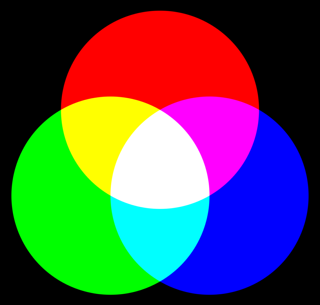
Additive color mixing
Speaking of digital media and the use of screens and projectors, the colorsystem is of additive nature. Every screen is set up with a specific amount of pixels, each containing three segments or phosphores – red, green and blue, which make the primary colors. So for red color on the screen only the red segment is actively emitting (red) light, while for blue color only the blue one and for green light only the green segment is actively lit via cathode rays. Combining two light emitting segments results in secondary colors – cyan, yellow and magenta – and combining all three segments results in the tertiary, achromatic color white. The second achromatic color black however appears on screen where no pixels are emitting light.
Combining the three primary colors at various levels of intensity or luminance makes it possible to display almost every color of the spectrum of light.
However, according to Küppel, the phosphores cannot fulfill the exact theoretic requirements and thus the secondary colors, especially yellow and cyan, appear slightly dull and „whiteish“ on screen.
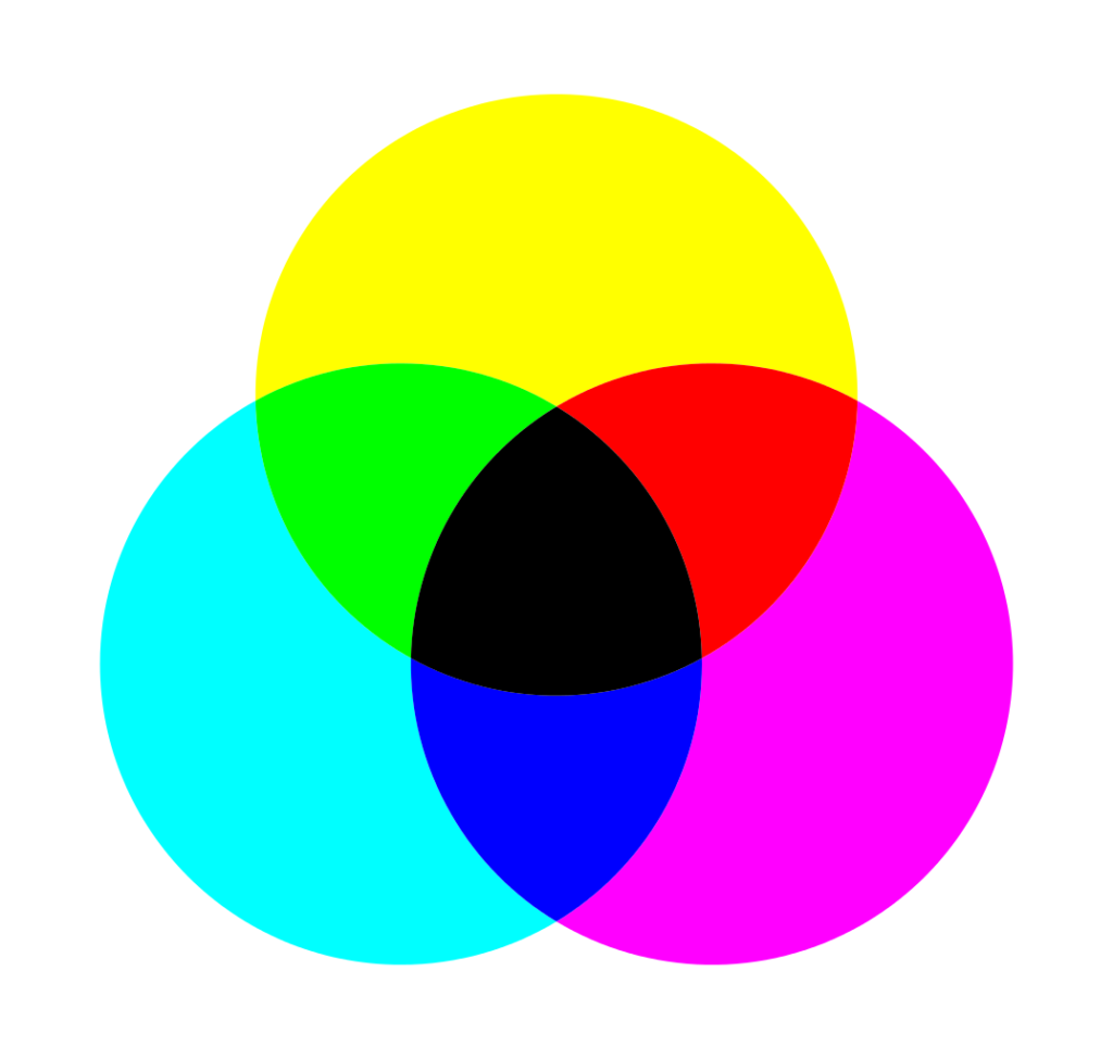
Subtractive color mixing
For analog media such as print and (printed) photography we speak of subtractive color mixing using transparent colors. Here the primary colors are cyan, magenta and yelllow. Applied and combined on white (!) backgrounds these colors absorb specific wave-lenghts of light rays and result in a color stimulus we perceive after the light is reflected by the background that’s capable of reflecting the whole spectrum of color. In addition, to create the perception of the right color, not only the background has to be white, but also the light source itself has to be white. If the color spectrum of light is shifted, or the background has a (slight) colorful hue, the appearance of mixed colors will not satisfy demands.
As cyan absorbs long-wave rays (= red), it fully stimulates the receptors for green and blue on the retina. Magenta absorbs middle-wave rays (=green) stimulating red and blue receptors, while yellow absorbs short-wave rays (=blue) stimulating green and red receptors.
In subtractive mixing the secondary colors originate from the overlapping of primary colors. Thus magenta and yellow make red, magenta and cyan make blue, yellow and cyan make green and all the primary colors combined resolve into the tertiary color black, also referred to as „key“.
While the primary colors used for printing appear brillant and luminous, due to misabsorbtions the secondary colors are not as satisfying and appear rather dull and tainted.
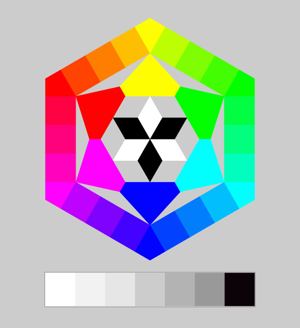
Integrated color mixing
In addition to the use of transparent colors for print, Küppers states that for other analog techniques like painting on colored, not white backgrounds, opaque colors are needed. These colors contain specific pigments that directly reflect the light at specific wave-lengths. To mix these opaque colors we need the eight basic colors – red, green, blue, cyan, magenta, yellow, white and black – as due to the lack of transparence overlapping basic colors will not result into a mixed color.
When mixing opaque colors, according to Küppers, the neighbouring colors in the spectrum can be mixed and resolve into new colors. Adding grey tones between the achromatic colors black and white makes it possible to create a wide range of hues and colors.
Illustrationen sind besonders wirksam bei Abstraktionen, Vereinfachungen oder humorvollen Themen und bei der Darstellung des Abstrakten oder Fiktiven. Fotos hingegen eigenen sich bei der Abbildung bzw. Schaffung von Realität. Sie erzeugen echte Nähe und Identifikation. Beide Werkzeuge sind auf jeden Fall starke Träger für Emotionen. Und positive Emotionen sind die ersten Träger für Kaufimpulse von Kunden.
Vor allem im Produktdesign wirkt Illustration komplett anders als Fotografie. Hier kann grafische Illustration oft eine viel stärkere Wirkung erzielen und dem Produkt mehr Persönlichkeit geben. Fotografie auf der Verpackung selbst lässt die Produkte in den meisten Fällen plump und qualitativ eher minderwertig erscheinen.
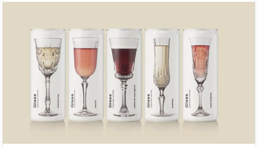
Im Vergleich dazu schafft es dieses Package Design von “Glass Canned Wines” erfolgreich Fotografie in ihr Sujet einzubauen. Durch die stark reduzierte Formensprache und das Gedankenspiel, das mit den realen Darstellungen der Fotos unterstützt wird, funktioniert dieses Beispiel extrem gut und schafft es auch Qualität zu kommunizieren.
Gerade bei abstrakten Themen oder der Darstellung von Analogien oder Überhöhungen sind Illustrationen besser geeignet. Und manche Inhalte würden als Foto ziemlich schlecht aussehen oder einfach nicht ausreichen, um eine bestimmte Botschaft zu übermitteln.
Fotografie kann mit den heutigen Technologien jedoch auch super erfolgreich und relativ wirtschaftlich zur Darstellung des Fiktiven eingesetzt werden.
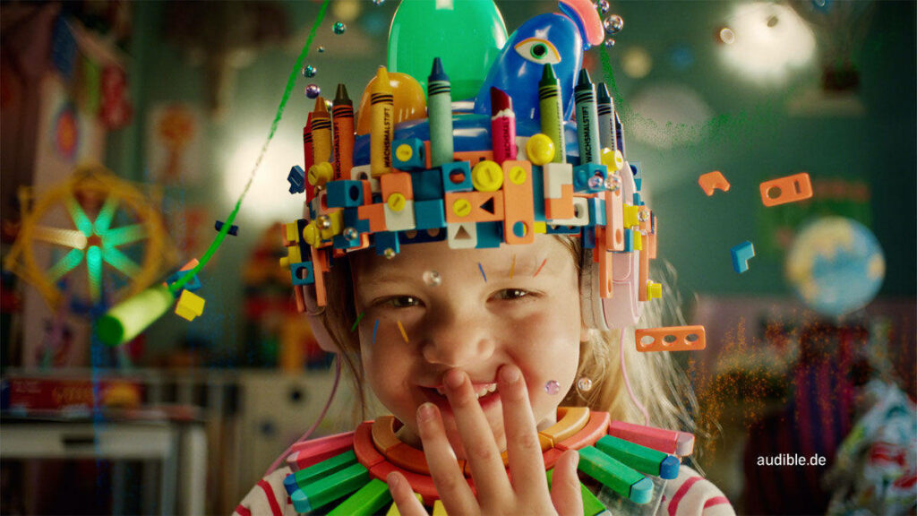
In dem Werbespot von Audible Deutschland entstehen durch Fotografie und manipulierte Visuals Sujets, die als Inspirationsquelle dienen, die Phantasie beflügeln und starke Empfindungen auslösen.
Wie bereits erwähnt, ergeben sich aus den Eigenschaften der Medien „natürliche“ Einsatzgebiete. Wird jedoch z.B. Illustration in einem Bereich eingesetzt, in dem Klassischerweise Fotografie verwendet wird, ergeben sich sowohl Vorteile als auch Nachteile. Als klarer Vorteil, kann die Generation von Aufmerksamkeit genannt werden, da solche Sujets oft provokativ und ungewohnt wirken können.
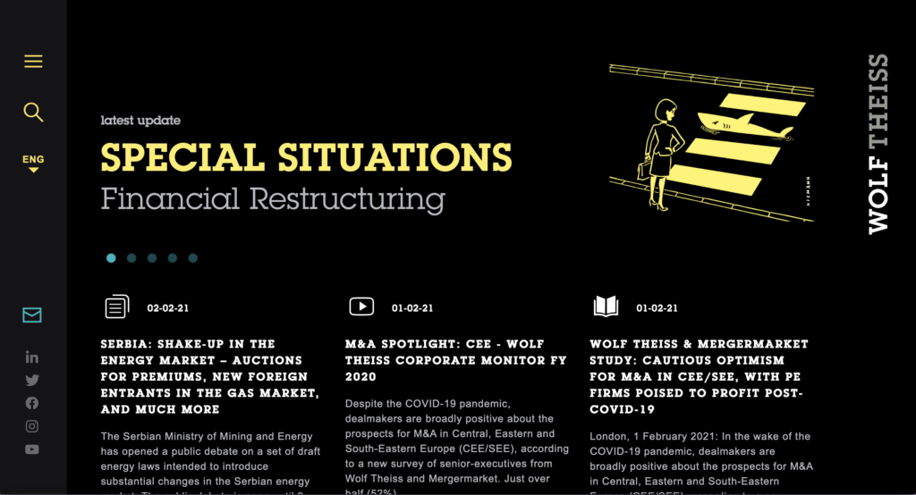
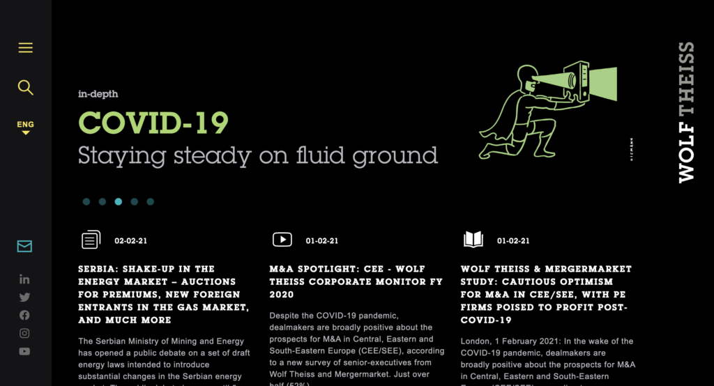
Webseite von Anwaltskanzlei Wolf TheissWebseite von Anwaltskanzlei Wolf Theiss
In der Kommunikation einer Anwaltskanzlei ist es wichtig professionell aufzutreten, weswegen Illustration als bildgebendes Mittel nicht unbedingt die beste oder erste Wahl ist. An diesem Beispiel sieht man jedoch, wie erfolgreich grafische Illustration hier eingesetzt werden kann. Aufgrund des Stils und der minimalistischen und reduzierten Sprache in Kombination mit Schwarz wirkt das Auftreten professionell. Die Illustrationen von Christoph Niemann fügen dem Ganzen auf alle Fälle noch Persönlichkeit und Charakter hinzu und helfen dabei Werte der Kanzlei zu vermitteln und generieren klarerweise auch Aufmerksamkeit. Der Einsatz von Illustration macht die Gestaltung informativ und unterhaltsam.
Illustration zur Darstellung des Realen:
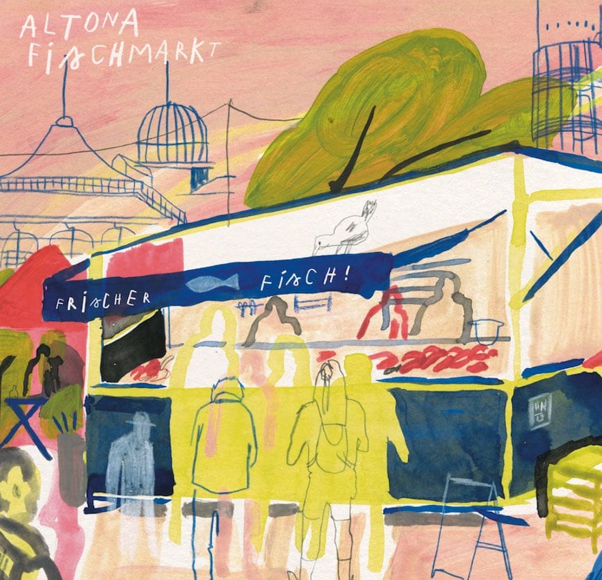
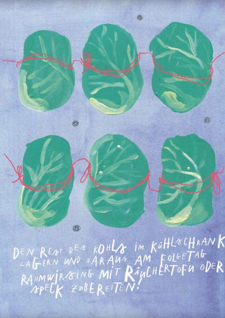
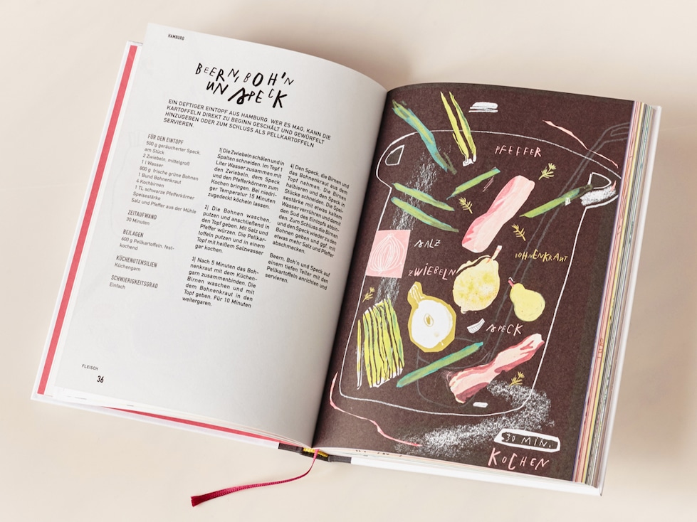
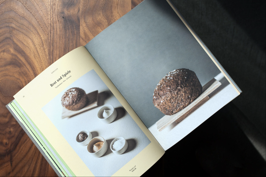
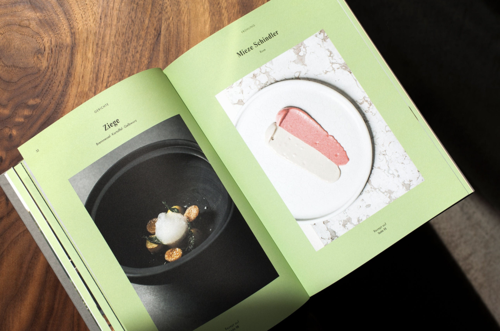
Vor allem bei Darstellungen von Essen in Kochbüchern oder ähnlichem wird Illustration klassischerweise eher nicht verwendet – hier tut sich Illustration schwer “Reales” abzubilden. Wie kann das Problem der Wiedergabe von Realität bzw. Ausdruck von Fiktivem gelöst werden?
Einerseits funktioniert Illustration als visuelle Sprache wenn die Darstellungen extrem abstrahiert werden, wodurch es natürlicherweise zu einem Stimmungsbild bzw. einer Dekoration wird. Andererseits auch in Fällen wo man die Gerichte bereits kennt und weiß wie sie aussehen sollen/werden und wenn sie keinen Anspruch auf Realismus bzw. Wiedergabe der Realität haben. An diesem Beispiel eines illustrierten Kochbuchs sieht man, wie gut Illustrationen Stimmung und Emotionen abbilden können. Da es um traditionelle deutsche Küche geht, die die meisten Menschen innerhalb Deutschlands wahrscheinlich kennen, funktioniert diese abstrahierte Form auch extrem gut.
Das oben gezeigte Beispiel von Anni von Bergen ist ein ausschließlich mit Illustrationen bebilderter Rezepte-Reiseführer.
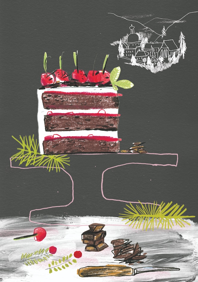
Diese Assoziation von Illustration mit Fiktivem kann auch relativ leicht gelöst werden. Darstellungen von Essen oder Gerichten funktionieren auch, wenn es super detaillierte und fotorealistische Illustrationen sind. In solchen Fällen kann das auch in Kochbüchern funktionieren. Wenn man die Ansprüche, die Menschen an ein Medium stellen kennt und die Schwächen bzw. Nachteile, die Illustration in diesem Kontext möglicherweise haben kann, ausgleicht funktioniert auch Illustration in diesem Bereich super.
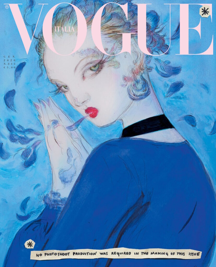
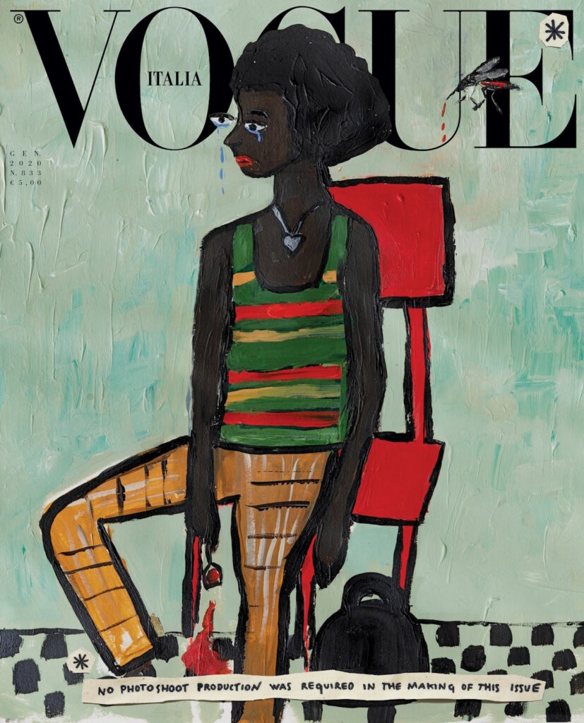
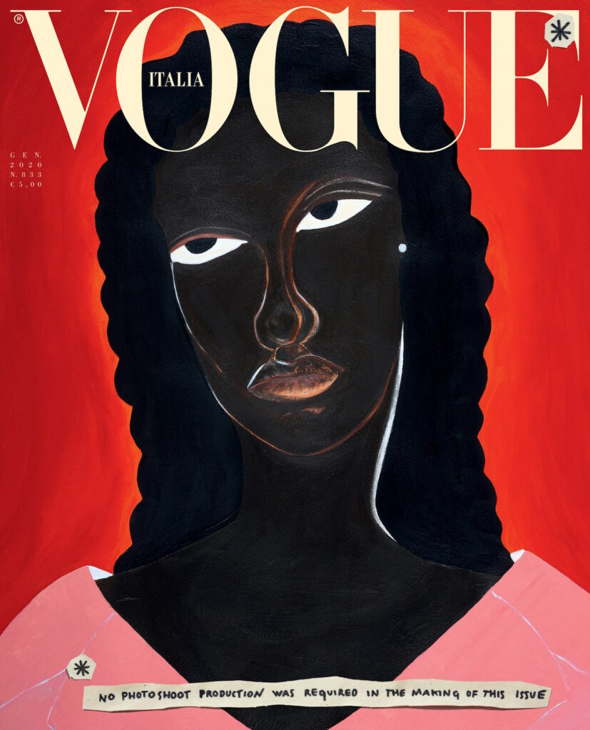
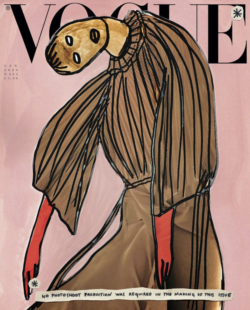
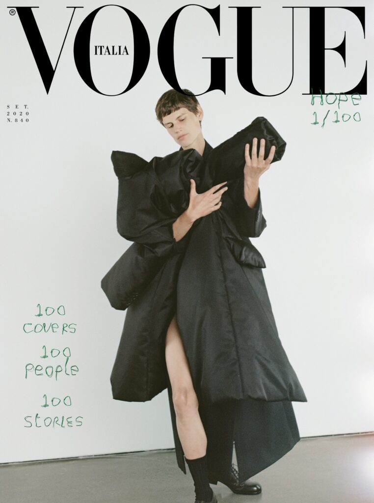
Ein weiteres Beispiel sind Magazincover für Modezeitschriften, die traditionellerweise ausschließlich mit Fotografie bespielt werden. Wie man hier sieht kann der Einsatz von Illustration gezielt als Statement verwendet werden. In der Januar-Ausgabe 2020, machte die Vogue Italia darauf aufmerksam, wie viel Energie Modeproduktionen verbrauchen und wurde aus diesem Grund komplett illustriert. Durch den Einsatz von Illustration bekommt das Design eine ganz andere Sprache, regt eher zum Nachdenken an, bekommt einen künstlerischeren Charakter und steht für eine Idee, ein Konzept und in diesem Fall eine Kritik.
Round shapes, colors, nostalgia, beauty in skilled performances—all those terms are indicators for joyful design—and when looking at Jeff Koons art we cannot deny that all those elements synergize in his works of art—making Jeff Koons a perfect example of how to consciously use all those “ingredients” to create joyful experiences.
Jeff Koons finds beauty in the ordinary and overlooked things of our life and is considered the most bankable contemporary artist alive—his stainless steel Rabbit (1986), sold for $91.1 million in 2019, is the most expensive artwork by a living artist to ever be sold at auction. The concept of the readymade—displaying an ordinary object in a new context as a work of art, is the foundation for most of Jeff ’s work. He says the idea that he “could acquire things and let them just display themselves” was a revelation. Knickknacks, comic books, ceramic figurines, and domestic appliances act as a springboard for his imagination. His works are clearly inspired by pop culture, consumer desire, sexual freedom, childhood wonder and self-acceptance. While other artists only stay relevant for a short time, nobody else has stayed so relevant for so long.
His pieces provoke smiles, gasps, cringes, laughs, and, above all else, the individual’s investigation of those reactions. He doesn’t shy away from candy-colored excess. His signature motif, the high-polish surface, reflects our experience of his art back onto us.
“It’s really the quality of his work, interlocking with economic and social trends, that makes him the signal artist of today’s world.”—New Yorker art critic Peter Schjeldahl.
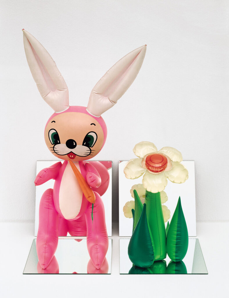
Inflatable Flower and Bunny (Tall White, Pink Bunny), 1979
Nostalgia, Colors, Round Shapes Inflatable Flower and Bunny was the first piece of art that brought toys and mirrors into Jeff’s artistic vocabulary. He picked the bunny because it reminded Jeff of the Easter decorations in his hometown. Several motifs, namely the cartoon iconography and use of reflective surfaces, are still central to Jeff’s work today.
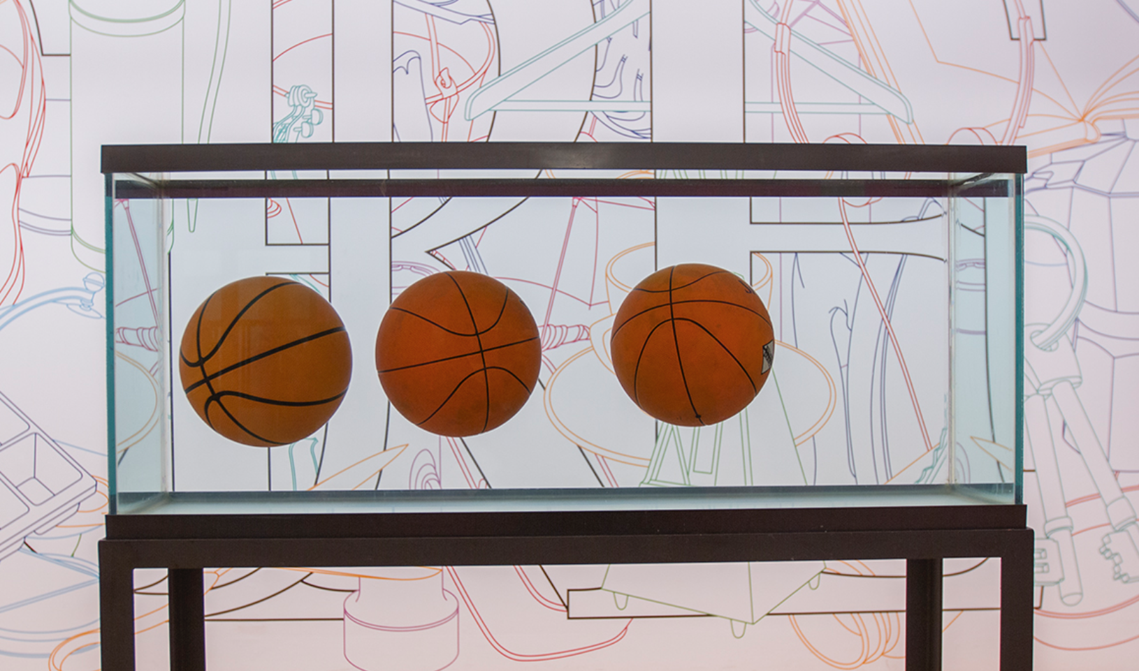
Three Ball Total Equilibrium Tank, 1985
Skilled Performance, Round Shapes, Nostalgia “I wanted to keep it a very womb-like situation with water,” Jeff Koons commented in a 1992 Taschen monograph. But this vision proved to be incredibly challenging. To bring his idea to life, Jeff consulted Richard P. Feynman, a Nobel Prize–winning physicist, to devise a method of filling the balls and tank with the correct proportions of distilled water and highly refined salt so the balls would float. Temperature fluctuations and visitors’ footsteps blend the water and sodium, causing the balls to sink; the artwork has built into it an inevitable failure, requiring reinstallation every six months.
“Ideas come from sensations. You don’t have ideas without having sensations.”—Jeff Koons
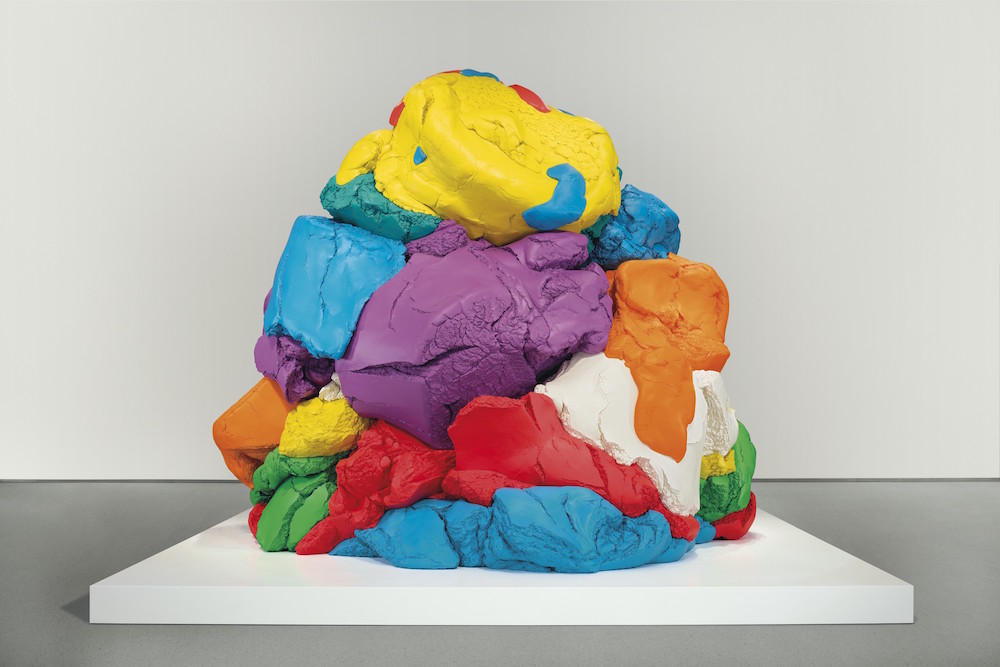
Play-Doh 1994–2014
Colors, Nostalgia, Skilled Performance Play-Doh took Jeff Koons 20 years from conception to completion. The piece of art is his memorial to innocent creativity—made up of 27 individual pieces of polychromed aluminum, it re-creates at monumental scale a colorful mound of modeling putty once given to Jeff by his son Ludwig. Play-Dohrepresents an inflection point of Jeff’s preoccupation with superrealistic, large-scale sculpture.
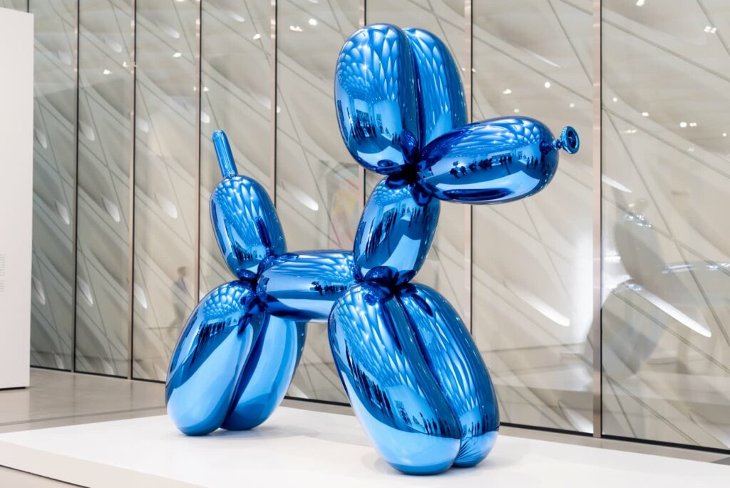
Balloon Dog (Blue), 1994-2000
Skilled Performance, Round Shapes, Shininess Balloon Dogstarted as a simple idea for Jeff: create something that would imbue adults with the delight that children feel at birthday parties. The execution proved more complex. In a feat of modern fabrication, Jeff translated this concept into an 11-foot-tall stainless steel sculpture whose dimensions precisely replicate its reallife latex counterpart.
Like many of Jeff’s high-polished works, these pieces engage the spectator and celebrate the surroundings of their installation with the intent of bringing joy to audiences the world over.
Source Jeff Koons on Masterclass. URL: https://www.masterclass.com
An important factor to create joyful experiences is empathy. Speaking of empathy in design we have to consider that there are people (as well as brands) with different archetypes to consider. Those archetypes have very different personalities and priorities. Knowing about their mindset is the key to tailored and hence empathic design which acts as a base for joyful design.
In Branding the wheel of twelve archetypes by Carl Jung is a popular tool to explore and figure out where a brand is positioned—which also helps to find a brands voice. Carl Jung developed this concept because of his conviction that archetypes are universal, archaic patterns and image that derive from our collective unconscious. He interpreted them as our psychic counterpart of instinct, which manifests in behavior on interaction with the physical world. Therefore those archetypes not only can be connected with brands but with characteristics of people in general.
People as well as brands can be classified to one specific archetype but they can also identify with a mixture of archetypes. (such as Apple) However, classifying a brand helps to shape its character and therefore enables the audience to identify with the brand and elicit the emotional response creating a sense of belonging—competing on a more instinctive, deeper level.
Those archetypes clearly show that we not only have to consider (universal) aesthetics only to create joyful experiences, but that the emotional layer which corresponds to the feeling of belonging, identification and self-actualization is an important factor to consider too. Plus, with the help and consideration of those archetypes a personal connection to the consumer can be easier established, which in turn sets the base for creating joyful experiences as well as satisfying consumers expectations of a brand.
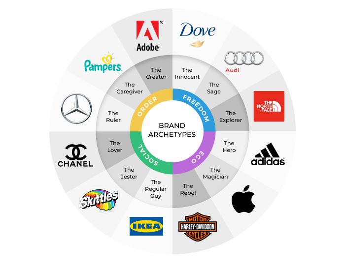
The twelve archetypes
The creator
The Creator brand is visionary, non-conformist and authentic. Those brands want to craft something meaningful and special—they love new ideas and to make them happen and are driven by their desire do produce and create—they are afraid of everything mediocre. Most marketing, design and technology brands are creator brands.
Goal: To realise a vision Strategy: To Develop artistic control and skill Greatest Fear: Mediocre vision or execution Personalities: Artisan, Innovator, Inventor Key Attributes: Innovative, Imaginative, Creative, Artistic, Experimental, Willing to take risks, Ambitious, Desire to turn ideas into Reality, Inventor, Musician, Writer, or Dreamer.
Successful brands will develop a very loyal fan base, for example, Apple and have great chances to become so called “love brands”.
Creator brands promise Authenticity.
“Creator brands often position themselves as the key to unlocking a creator’s creativity. Their main focus is self-expression. The worst thing that could happen to a Creator archetype would be to be seen as inauthentic or a ‘sell-out’.”—Vision One market research
Examples: Apple, Adobe, Lego, Nintendo
The Jester The Joker, The Fun, The Comedian
Jesters live in the moment and fear boredom. They life on the wild site and often use outrageous imagery. They are high on energy, vibrant colors, are playful and entertaining.
Goal: To enjoy the journey and to stand out Strategy: To live in the moment and not be too serious Greatest Fear: To come across boring Personalities: Comedian, Practical Joker, The Fool Key Attributes: Joker, Playful, Carefree, Joyful, Original, Teaser and Foolish
Examples: M&Ms, Doritos, Skittles
The Sage The Teacher, The Investigator, The Mentor
Sage brands strive for truth and want to find the good and the wisdom in all situations. They will promise learning, teaching, knowledge and an open mind. They find fulfillment in finding answers to the most challenging questions and therefore demonstrate intelligence, knowledge and keen problem-solving skills. Charateristics: positivity, wisdom, truth, knowledge, provides intelligence, solutions.
Goal: To use intelligence and wisdom to understand the world Strategy: Seek out information and knowledge Greatest Fear: Being misled or ignored Personalities: Expert/Guru, Investigator, Mentor Key Attributes: Expert, Thinker, Philosopher, Reflective, Advisor, Teacher, Confident, In-control, Wisdom, Intelligence, Planner
Examples: Google, TED, BBC
The Innocent The Honest, The Optimistic, The Pure
Innocent brand have the desire to be free and happy and to keep things simple—they communicate a positive worldview. Because of the optimistic character they are often successful because of moving through barriers, that would stop others. Another characteristic is that those brands aim to motivate others. Brand in health, cleanliness and natural products work with this archetype.
Goal: To be happy Strategy: To do things right Greatest Fear: To come across unhappiness Characteristics: Wholesome, Pure, Forgiving, Trusting, Honest,Happy, Optimistic, Simple.
Innocent brands will promise Simplicity.
“They will offer a somewhat simple solution to any problem associated with goodness, morality, simplicity, nostalgia, and childhood. Innocent brands will strive to do what is right and positive. Most of the time, their simplistic view of the world can be perceived as a weakness. They fear to do something immoral and to see the world being influenced by something negative or unnatural.”—Vision One market research
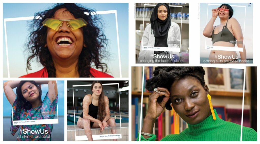
Examples: Dove, Ford, Coca Cola, Disney
“Dove aims to make women feel confident by using beauty products. Their recent #ShowUs campaign celebrates women in media and advertising. The result is a gallery of women who shatter stereotypes and redefine the meaning of beauty.”—Faith Lisondra [3]
The Lover The Idealist, The Sensualist, The Seducer
Lover brands are all about creating relationships and creating emotions. They want to make people feel special to celebrate the physical joys of being human, fostering intimacy and bliss. Those brands are aesthetically pleasing are passionate and represent anything that pleasures the senses.
Goal: To be in a relationship with the people, work and surroundings. Strategy: To become more and more physically and emotionally attractive Key Attributes: Seek true love, intimacy, Sensuality, Passionate, Sexy, Seductive, Erotic, Seek Pleasure, To Indulge, Follow Emotions. Greatest Fear: Being alone or feeling unwanted Personalities: Harmoniser, Connector, Partner
“The Lover Archetype are customers who value the aesthetic appearance of goods and services. They are likely to be drawn to premium brands that will make them seem more attractive to others.”—Vision One market research
Lover brands will promise Passion
Examples: Lindt, Chanel, Victoria’s Secret
Perfume and Cosmetic Brands core desires are evoking emotions through their cosmetic products and fragrances—as example Chanels branding itself focuses glamour and experiencing the best things in life and therefore representing a Lover brand archetype perfectly.
Through the combination of perfect storytelling and the power of scent—since smell is one of our senses which is deeply connected with emotions, memories and imagination—perfume brands can be considered to be the most powerful brands evoking feelings of joy.
The Hero The Warrior, Champion Or Superhero
Hero brands are successful brands at producing consistent results. They are competent and courageous—they are winner and achievers that get things done effectively, in their mission to improve the world and foremost to leave a mark on the world.
Goal: Expert mastery in a way that improves the world Strategy: To be as strong and competent as possible Greatest Fear: Vulnerability and weakness Personalities: Competitor, Achiever, Coach
“Hero customers value the quality and trust in their products. They like to think that their consumer choices will put them ahead of everyone else, making them less likely to be drawn in by funny or cute adverts.”—Vision One market research
Examples: BMW, Amazon, Adidas
The Rebel The Revolutionary, The Powerful, The Liberated
Many Rebel brands are seen as revolutionary. They bring fresh perspectives, new outlooks and inspirational changes—they are anything but mainstream and make an efforts to stand out. Successful Rebel brands have a cult like following of people attracted by their energy.
Goal: To overturn what isn’t working Strategy: Disrupt, Destroy or Shock Greatest Fear: To be powerless Personalities: The Troubleshooter, Game Changer, The Challenger
The Rebel brand archetype really reflects those who were born to be wild. Rebel customers appreciate the unconventional and forcefully reject the status quo. They are likely to value shocking content or advertisements that are unique with no obvious ‘selling point’.
“The worst thing that could happen to the rebel brand would be to be bought out or for the brand to become too popular. If something isn’t working, the Rebel will destroy it. If they want revenge, they will take it. If they want to start a revolution, they will just do it. […] They won’t stick to industry conventions, they introduce a new attitude and let their customers know that it’s acceptable not to be a sheep in society.”—Vision One market research
Rebel brands will promise Revolution
Examples: Vans, Harley Davidson, Snickers, Jack Daniel’s
The Regular The Realist, The Everyman, The Friend
Regular brands are empathic, humble and put honesty first. Many people feel a belonging towards those brands.
Goal: To belong Strategy: Be down-to-earth and develop solid virtues Greatest Fear: To be left out or stand out from the crowd Personalities: Realist, Democrat, Comrade
“The most effective products or services that a brand can channel the Regular guy archetype are those that give people a sense of belonging with a high degree of practicality, functionality, and low to mid-degree of complexity. The Regular Guy archetype helps customers be OK just as they are.”—Vision One market research
Examples: VW, GAP, Levis
The Magician The Healer, The Wizard, The Visionary
Magician Brands have a deep impact on the customer and give imagination a reason to go wild. They tend to think out of the box and unexpected. They promise transformative experiences and focus on individuals and motivates people to trust their instincts.
Goal: To make dreams come true Strategy: Develop a vision and live by it Greatest Fear: Negative consequences Personalities: The Envisioner, Healer, Catalyst
“Audi have promoted themselves through this commercial as the magician brand archetype by firstly, the choice of the soundtrack ‘Pure Imagination’ By Willy Wonka, a magical film of mystique and enchantment. The advertisement takes you through the technological processes of building the new A5, but with the idea that it has been created and innovated along the lines of your imagination and therefore magical, making dreams come true.”—Vision One market research
The Explorer The Explorer, Trailblazer, Pioneer or Adventurer
Explorer brands are restless, independent and self-motivated—they define freedom and are ambitious. Most of us love to travel and discover new things and people. When a brand does that as a person, people love to look forward to what they bring next. Explorer brands create products that promote individuality, excitement, and a way to experience new things.
Goal: To experience a more authentic and fulfilling life Strategy: To journey, seek and experience new things Greatest Fear: To be trapped and conform Personalities: Individualist, seeker, Trailblazer
“The Explorer aims to make people feel free and nonconformist and also helps people express their individuality. Explorer brands are innovative and ambitious. They seek out the new, pushing boundaries and delighting in unexpected discoveries, whilst embracing a “no limit” philosophy.”—Vision One market research
The Explorer brand archetype promise Freedom.
Examples: RedBull, Northface, Jeep, GoPro
“As soon as you press play on this advertisement by GOpro, you can already sense through the soundtrack that it is all about discovery and freedom. GOpro brand themselves through nature, outdoor hobbies and exploration and they advertise their products to be an essential of this world in the most extreme environments. They aim to inspire travel in people, to go and find themselves and of course to capture every moment with their products.”—Vision One market research
The Ruler The Leader, The Powerful, The Role Model
Ruler brands are leaders in their field—they show authority, create order out of the mess and care a legacy.
Goal: To create a prosperous, successful community Strategy: To exercise power Greatest Fear: Chaos and being overthrown Personalities: Peacemaker, Powerbroker, Conductor
Key Attributes: Manager, Organiser, Productive, Confidence, Responsible, Role Model, The boss, The leader.
Examples: Starbucks, Rolex, Apple
The Caregiver The Caregiver, Nurturer, Parent, Angel
Caregiver Brands are driven by their need to protect and care for others. Their values are empathy, protection, safety and support.
Goal: To help and care for others Strategy: Protecting and doing things for others Greatest Fear: Selfishness and Ingratitude Personalities: Supporter, Advocate, Nurturer
Key Attributes: Altruistic, Selfless, Nurturing, Compassionate, Empathetic, Supportive and Generous
Examples: Innocent, Nivea
Sources
[1] Medium. 12 Brand Archetypes You Can Use to Effectively Position Your Brand. URL: https://medium.com/better-marketing/12-brand-archetypes-you-can-use-to-effectively-position-your-brand-75e0bce0adc6
Nowadays the movies are full of animations, never mind if it’s a kids movie or a sci-fi blockbuster.
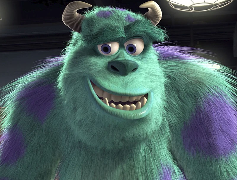
In the fully animated movie Monsters, Inc., released in 2001, all the figures, landscapes and effects were digitally created on the computer. The success of the movie came not only because of the funny story, but was also due to the incredibly high details the characters and the whole “set” showed. The monster Sullivan, for example, was rendered with a fur containing 2.3 million hairs!
Now, twenty years later, the possibilities to trick the audiences of course have increased. For movie studios it’s easy to put real actors into completely animated sceneries. Due to the increase in computing power everybody who’s capable of using a smartphone can easily morph their self portraits into younger or older versions of themselves. With some experience you should even be able to produce deepfake videos – a technique where mostly (famous) peoples’ faces are mapped onto faces in real videos or images. Taking the fact that these deepfakes, generated with help of machine learning and artificial intelligence, seem extremely realistic, the method of deepfake should be handled with care even though really funny things are possible.
Besides highly detailed digital effects, 3D-animations and renderings connecting reality and imagination on a level never reached before, all the movies we watch still make use of pretty easy tricks. Simple cuts and montage do not only create concise coherence but also create specific atmospheres and evoke emotions in the audience.
These methods are nothing new and neither connected to digital processes nor analog techniques – actually they have been used since the very early beginnings of film and movies in the early 20th century.
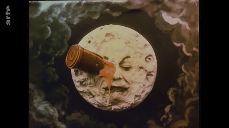
One of the pioneers of film was Georges Méliès, a French magician and manager-director of the Théâtre Robert-Houdin. Inspired by the Lumiere brothers’ performance of early motion pictures showing real life scenes, Méliès started to film scenes and experimented with the matter, which lead him to develop camera techniques such as stop-motion, slow-motion, superimposition or double exposure.
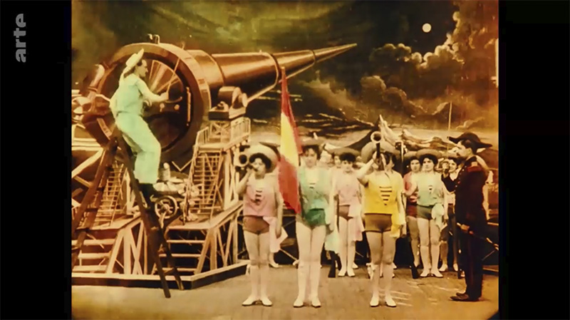
In a glass studio he built in the surroundings of Paris, Georges Méliès started to create theatrical sceneries, which in combination with film and camera made fictional narratives possible, like his most famous film Le Voyage dans la Lune from 1902. This movie showed the story of a handful of astronomers taking an adventurous journey to the moon via a cannon capsule and returning back to earth and thus can be seen as the first science fiction movie.
However as movies became more and more popular, big commercial film studios entered the market and forced Méliès out of business. In 1923 Georges Méliès burnt his entire life’s work with over 500 films, featuring partially hand colored movies, combining magic tricks, theatrical stage props and a variety of fantastic stories.
Luckily some (master) copies of his films survived around the globe and the genius of Méliès was rediscovered and the importance of his work was acknowledged by critics in the 1930s.
Almost one century after its first release, a colored copy of Méliès’ master piece was restored by Lobster Films. Between 1999 and 2010, up to date digital tools were used to carefully refurbish each of the 13,375 frames of the film, for which missing frames – lost or too damaged – have been taken from the black and white version and colored afterwards.
Taking into account that this movie reel was lost for decades, the digitally restored version partially resembles a hi-resolution short film, using numerous effects to make it look like it’s 100 years old.
Eventually Méliès’ Le Voyage Dans La Lune is a great example for what effects and analog techniques have been used from the beginning of film til nowadays as well as the resilience of analog media. Additionally the carefully restored version shows the possibilties of digital editing and it’s depth and accuracy.
Why storytelling is more trustworthy than presenting data Karen Eber | TEDxPurdueU
For Karen Eber telling stories is helping people feel seen and a great way to connect with people. Eber starts off her talk by explaining the neurological process when listening to a story or data and how through listening to stories you gain empathy for the storyteller. She clarifies that data doesn’t change behavior, emotions do and that data never speaks for itself. It needs context.
According to Eber a great story answers three questions: What is the context? What is the conflict? What is the outcome? It also builds and releases tension, creates an idea and helps you see new things as well as communicates value. To connect your story and data you want to share you have to come up with the framework for your data and story first. By retelling stories and talking about her own experience in consulting others Eber makes you think about presenting data in a whole new way.
Don’t wait for the perfect story. Take your stories and make it perfect.
Making data mean more through storytelling Ted talk by Data Scientist Ben Wellington @ TEDxBroadway
In his talk Ben Wellington tells the story of how he started doing data visualization of New York City. In 2011 a free public database called NYC Open Data was created. Using this data Evans created his first visualization about traffic accidents involving bikes, pinpointing hotspots in the city. After it got picked up by multiple online news sites, he realized that the closer you are to the data the more you care about it. You have to connect with peopleand their experiences and make it relatable. So the next data he visualized were which pharmacies cover which areas in the city, the percentage of male and female city bike riders as well as the percentage of parking tickets on cars with out-of-state plates. In his work he tried to focus on one idea, keep it simple and explore the things you know best to tell the most effective story. With data storytelling you should try and make an impact. Wellington does this by trying to impact city government and shows some of the best responses in his presentation.
Turning Bad Charts into Compelling Data Stories Ted talk by Data Storytelling Trainer Dominic Bohan @ TEDxYouth@Singapore
Dominic Bohan is a data storytelling trainer talking about charts, studies, history and how to turn data into stories. He believes that data storytelling can save the world and even save lives.
Data is useless unless human beings can interpret, analyse and understand it.
During his talk Bohan describes three simple principles to great data communication: Using a human friendly chart type, being ruthlessly minimalistic and having a clear key takeaway.
To dive into these principles Bohan describes an 1984 study by researchers Cleveland and McGill on which charts humans are good at interpreting. According to him, they found out that human beings are best at encoding numbers by length and position. By talking about history approaches, studies and their outcome as well as giving examples and using the recommended charts, Bohan shows how (not) to use data visualisation and how to utilize them to tell engaging stories that mean something to us.
Triggering the emotional response of surprise can be an effective practice to create joyful experiences. In the following we will explore design considering surprise—one of the six primary emotions identified by Paul Ekman—with the intention to create a joyful experience.
Joyful experiences often happen to us at moments we do not expect them to happen—sometimes even tiny moments can capture our attention and turn into a memorable and joyful experience. According to Ingrid Fetell Lee those moments can be especially powerful in moments of stress or sadness—turning negative emotions into moments of opportunity/perspective. Those small bursts of joy can have an enormous impact on somebody’s mood. Unforeseen pleasures having the power to shift a bad mood are rooted in the nature of surprise: surprise has the purpose to quickly redirect our attention. [1]
“It acts like a warning bell for the brain, alerting us to a gap between what’s happening in front of us and what we had anticipated […] An unexpected noise or tap in the shoulder brings the mind and senses into a state of sudden vigilance.”—Ingrid Fetell Lee
Some suprises can be threads, but lets focus on the positive ones. If surprises signal opportunity our increased alertness and arousal of the surprise response can prepare us to take advantage of sudden joys. Those tiny moments of joy seem to be of short duration but they can have lasting effects because of their power to support upward spirals of positive emotions. [2]
“Joyful suprises bring our attention away from ourselves and back out into the world, prompting us to approach and engage. They incite curiosity, spur exploration, and increase the chances we’ll interact with others in ways that keep the positive vibes flowing.”—Ingrid Fetell Lee
Surprise acts as a magnet for joy by breaking the monotony of routines.
Even studies show, “that the majority of test subjects of a student population reported positive associations with surprise […] and also that variation in the level of surprise has a direct effect on consumers’ satisfaction. Since impulse purchasing implies an approach behaviour towards a product we can assume a positive connotation of surprise.”—Dorothea Baun, European University Viadrina, Germany [3]
Packaging ideas considering surprise to catch the eye and trigger not only a feeling of curiosity but also a feeling of joy:
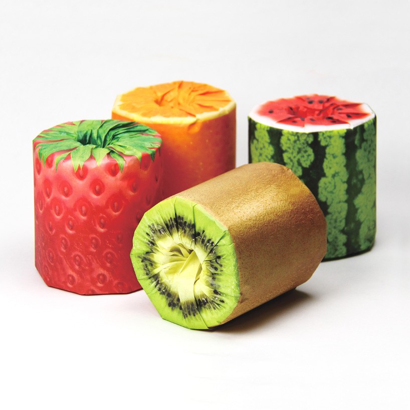
Toilet paper rolls by Kazuaki Kawahara [4]
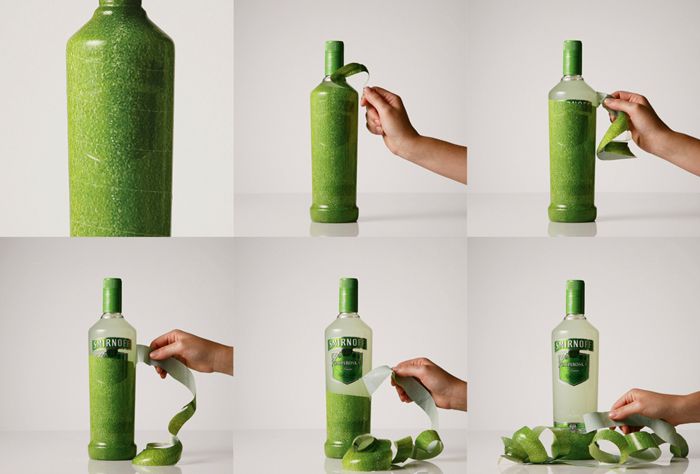
Smirnoff Vodka: “Peel The Bottle” Design & Branding by J. Walter Thompson. [5]
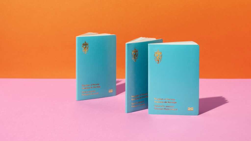
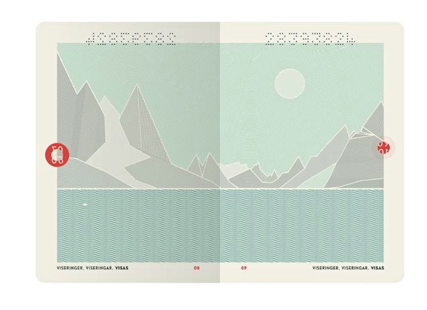
Norwegian Passport by Neue Design Studio [8]
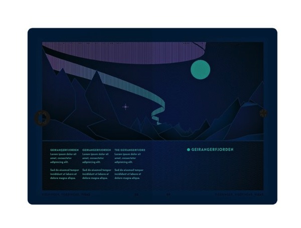
Norways passport design is a sleek and modern approach, which already separates its visual appearance from the rest—but the actual surprise hides inside. The passports pages illustrate in an artistic way the country’s natural wonders. Another surprising and playful element: put them under UV light and day scenes turn into night—the sun turns into moon, northern lights and a hidden text appear.
[1]Fetell Lee, Ingrid: Joyful: The Surprising Power of Ordinary Things to Create Extraordinary Happiness. New York: Hachette Book Group 2018, p. 164 ff.
[2] ebda.
[3] Baun, Dorothea/Groeppel-Klein, Andrea: The Association for Consumer Research. Joy and Surprise As Guides to a Better Understanding of Impulse Buying Behaviour. URL: https://www.acrwebsite.org/volumes/11252/volumes/e06/E-06
[4] Designboom. kazuaki kawahara wraps toilet paper roll with juicy fruit packaging. URL: https://www.designboom.com/design/kazuaki-kawahara-fruits-toilet-paper-latona-packaging-japan-05-01-2016/
[5]. Canva.50 insanely creative and stunning packaging designs. URL: https://www.canva.com/learn/packaging-design/
Illustrationen und Fotografien haben sehr viel gemeinsam, jedoch wird Illustration immer als Gegenteil oder Kontrast zur Fotografie gesehen. Dabei kann auch eine Fotografie einen Text »illustrieren«, und früher wurde all das, wofür heute die Fotografie eingesetzt wird, durch Illustrationen geleistet. Im Design wird häufig direkt zwischen grafischer Illustration und Fotografie entschieden.
Gleich wie Illustration wird bei einer Fotografie die Welt um uns herum eingefangen und kommentiert. Jedoch kann Fotografie im Design wirkungsvoller sein als Grafik oder Illustration, da sie die Botschaft mit einem Gefühl von Realismus vermittelt.
Die tieferliegende Ursache dürfte in der grundlegenden Wirkung der fotografischen Bilder liegen. Denn es scheint, dass wir Fotos als glaubwürdiger wahrnehmen – und das, obwohl wir über die Möglichkeit der Bildbearbeitung und -manipulation Bescheid wissen. Während eine Zeichnung oder ein Gemälde auf den ersten Blick »Kunst« oder nur »künstlich« ist, glauben wir dem Foto die Abbildung einer Realität selbst dann, wenn der Inhalt unmöglich erscheint. Dieses weitverbreitete Vorurteil kann an der Beschaffenheit des menschlichen Gehirns liegen oder vielleicht ist es kulturell verankert – auf jeden Fall muss es in Hinblick auf die Wirkung in Betracht gezogen werden.
Diese Realitätsgebundenheit, die als Vorteil der Fotografie gesehen wird, beschränkt allerdings auch erheblich ihre Möglichkeiten.
Aufgrund ihrer Eigenschaften eignen sich Fotografien im Allgemeinen besonders gut für:
01. Für die Genauigkeit
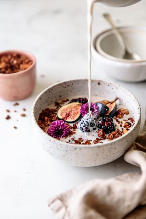
Natürlich gibt es auch Szenarien, in denen Fotografie für Designer die natürliche Wahl sein wird. Zum einen sind Genauigkeit und Vertrauen wichtig für die Ziele des Designs. Menschen vertrauen auf Fotos, um einen Ort, ein Produkt oder eine Person genau darzustellen. Wenn man also für ein Produkt wirbt, ist es oft eine gute Idee, es mithilfe von Fotografie darzustellen. Zum Beispiel reagieren die Leute besser auf ein Foto eines Tellers mit Lebensmitteln in einem Menü oder einem Kochbuch als auf eine Illustration von Lebensmitteln, weil sie glauben, dass das Essen, das sie bekommen, gleich aussehen wird wie auf dem Foto.
Bei Kochbüchern bzw. Food Photography hat die Darstellung einen Anspruch darauf, die Wirklichkeit abzubilden, daher werden hier vor allem Fotos eingesetzt. Sie vermitteln Glaubwürdigkeit und bilden eine Art Beweis-Ebene.
02. Professionell aussehen
Im weiteren Sinne kann die Fotografie auch dazu beitragen, ein Bild von Professionalität zu vermitteln. Bilder, die die Realität genau widerspiegeln, können dazu beitragen, die Verbraucher davon zu überzeugen, dass ein Unternehmen ernsthaft und verantwortungsbewusst ist, was beispielsweise für eine Investmentbank sehr wichtig wäre.
03. Um eine reale Sache zu zeigen
Fotografie kann auch die natürliche Wahl sein, wenn Sie die physikalischen Eigenschaften eines Produkts oder einer Dienstleistung vermitteln möchten, um eine viszerale Reaktion hervorzurufen. Zum Beispiel wird eine Fotografie eines luxuriösen Hotelzimmers effektiver und viel kraftvoller sein als eine stilisierte Illustration.
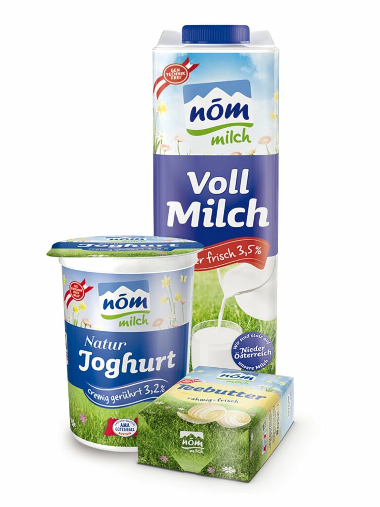
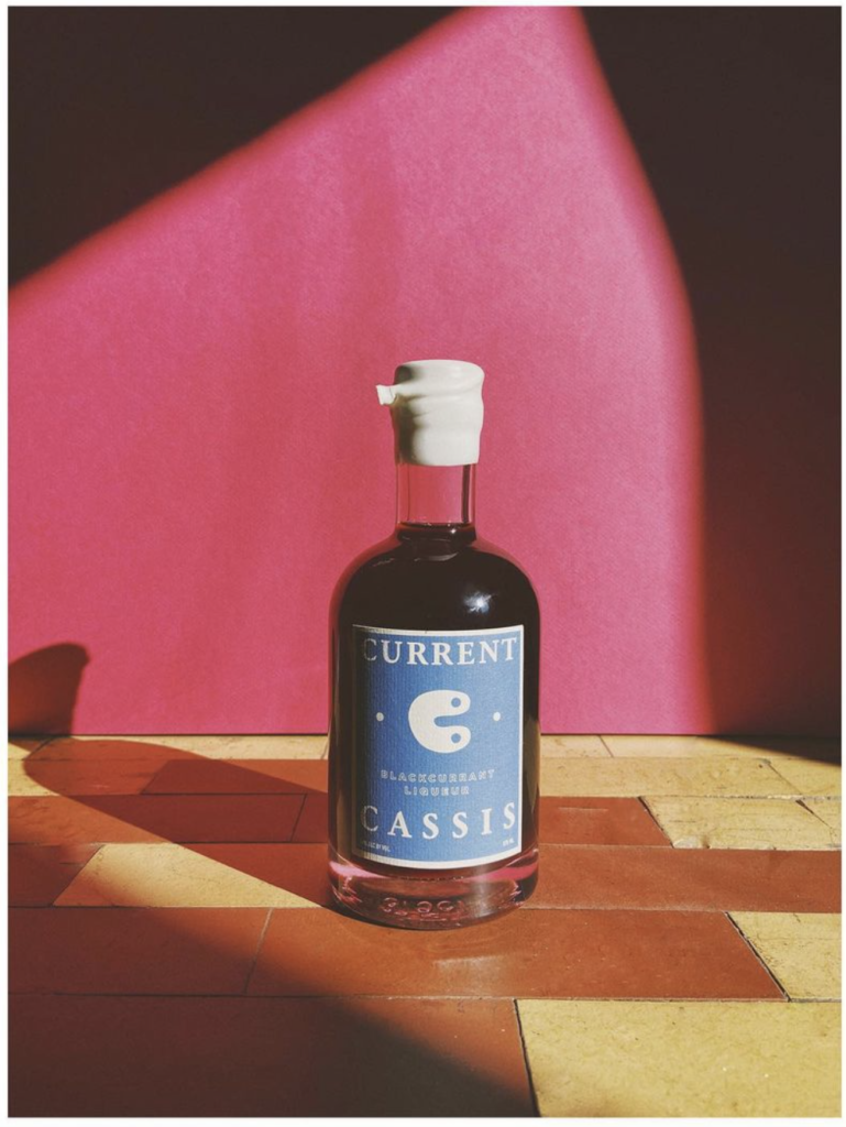
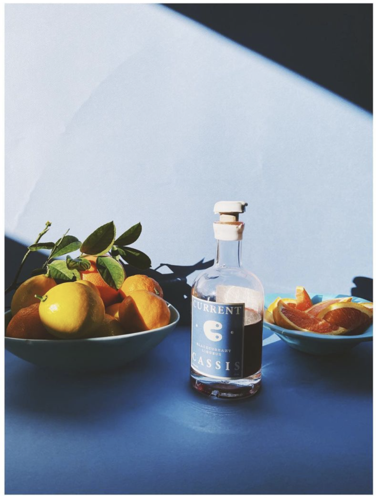
Wobei Produktdarstellungen/-fotografie ein interessantes Beispiel dafür ist, wo die natürlichen Grenzen entstehen. Für die Fotografie und Repräsentation eines Produkts werden fast ausschließlich Fotos verwendet. Wie man an diesem Beispiel jedoch sieht, wird für das Packaging und das Produkt selbst, grafische Illustration eingesetzt.
DIE VORTEILE VON FOTOGRAFIEN:
Der Betrachter nimmt das Motiv als Realität wahr. Auch wenn das Foto verfremdet oder nur leicht bearbeitet ist.
Der Betrachter kann sich besser mit dem Motiv identifizieren. Er wird in das Bild hineingezogen.
Produktfotos können mit der richtigen Inszenierung stark zum Kauf anregen.
Fotos eigenen sich bei der Abbildung bzw. Schaffung der Realität. Sie erzeugen echte Nähe und Identifikation.
Daraus ergeben sich die klassischen Anwendungsbereiche der Fotografie im Communication Design.
Produktfotografie
Modefotografie
Dokumentarfotografie
Landschaftsfotografie
Architekturfotografie
Portraits
Communication Design, das sich mit Mode befasst, arbeitet fast ausschließlich mit Fotografie
Bildbände sind ein klassisches Beispiel für ein Medium des Communication Design, das eigentlich ausschließlich für und wegen Fotografie existiert. Illustration kann natürlich auch verwendet werden, ist jedoch in vielen Fällen nur zusätzlich bzw. aufgrund der Vorteile, die es in der Darstellung bringt.
Die Wirkung von Fotos im Vergleich zu Illustration ist, dass sie im Allgemeinen strenger, professioneller und genauer. Auch die Tatsache, dass sie unbearbeitet immer ein geometrisches Element bilden macht sie innerhalb einer Komposition/einem Design statischer und schwerer, wodurch es auch manchmal sein kann, dass sie schwerer zu integrieren sind als Illustrationen. Fotos werden als Repräsentation von etwas Realem wahrgenommen, was wiederum super wertvoll sein kann und wie schon erwähnt, zu Kaufentscheidungen führen kann.


