11 Significant Sound Art Projects

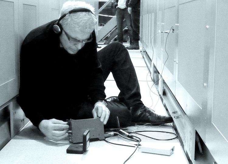
This article talks about some of the Sound Art projects/installations that serve as an essential guide to the art of sound design. The list contains diverse types of works featuring interesting perspective and a different approach to sound.

Luigi Russolo, Gran Concerto Futuristico (1917)

Luigi Russolo (1885 – 1947) the futurist artist with his assistant Piatti and the noise machine invented by him for futurist ‘symphonies’, one of which was performed at the London Coliseum in June 1914. (Photo by Hulton Archive/Getty Images)

Luigi Russolo is perhaps best known as a painter associated with the Futurist movement in Italy. However, he is also considered one of the earliest (maybe even first) experimental noise painters. Inspired by World War I factory equipment and guns, he invented and built an acoustic noise generator called Intonarumori (meaning “noise source” in Italian). In 1913 he published the Art of Noises, in which he argued that the evolution of urban industrial soundscapes required a new approach to music. For Russolo, melodic music limited the human potential for appreciating more complex sounds. In 1917 he attempted to correct this in his play Gran Concerto Futuristico, for which he put together a noise orchestra playing offending sounds (Music did not sound classical.) Despite the widespread criticism he faced in connection with this piece, he continued to perform well after World War I. Today, his manifesto is considered one of the most important texts in 20th-century music theory.

Marcel Duchamp, Erratum Musical  (1913)

50 Years Ago Today, Marcel Duchamp and John Cage Played Chess. Photo: Shigeko Kubota, courtesy the John Cage Trust

Marcel Duchamp was fascinated by how he was able to visualise sound. He said: “You can’t hear the gossip.” Despite being untrained, he was composing music between 1912 and 1915. The end result was radically different from the off-the-shelf Dada model that made him famous. He developed one purely conceptual piece and two conceptual exercises to play, including the Erratum Musical, a randomly arranged sheet music composed for three voices. Duchamp created three sets of 25 cards. F (from F below middle C to F high) with 1 entry per card. Cards are shuffled in the hat and then drawn one at a time. Then I wrote a series of notes in the order in which I removed the cards from the hat. Performers can decide how they want to perform their piece. Duchamp did not give a score in this regard.

John Cage, 4’33”  (1952)

John Cage performing his silent piece at the Maverick hall. Courtesy of Getty Images

For his masterpiece, Cage explored the potential of silence, revolutionising sound art and performance. He is best known for his composition of 4:33 seconds, a three-part composition of 4:33 seconds of silence. Inspired by a visit to the anechoic chamber at Harvard University, the work is not known to contain anything special. The performer is invited not to play the instrument or make any noise. However, no silence is truly silent, and the audience is keenly aware of the sounds of the environment during pauses. This koan-like paradox was based on what Cage heard in a Harvard auditorium. He discovered that he could hear his own heartbeat. He wrote of the experience, “I will hear it until I die.” “And they will continue after I die. You don’t have to be afraid of the future of music.”

Bill Fontana, Distant Trains (1984)

Fontana prepairing and installing his public piece

By the 1960s and early 1970s, advances in digital media increased the opportunities of visible artists and composers running on the intersection of sound and sculpture. Bill Fontana become a pioneer in growing sculpted sound maps for city environments. At the “Remote Trains” exhibition in Berlin for a month in 1984, a loudspeaker become buried withinside the web website online of the previous Anhalter Bahnhof Station, one in every of Europe’s busiest teach stations earlier than World War II. It become destroyed with the aid of using bombing at some stage in the conflict and become formally decommissioned in 1952. A stay microphone become housed withinside the Köln Hauptbahnhof, which recreates the phantom sound surroundings with the aid of using transmitting acoustics in actual time from the noisy station to the deserted Anhalter Bahnhof.

Max Neuhaus, Times Square (1977–92)

Neuhaus’ work constantly playing from a Manhattan subway steam hatch

Max Neuhaus’s most famous work is a pulsating drone that fires 24 hours a day, 7 days a week from a subway steam hatch at the northern tip of Manhattan’s triangular pedestrian island. (Thanks to the MTA and the Dia Art Foundation, this work is permanent near Times Square.) Inside it, the pitch and pitch change as passers-by move around the block. “A rich harmonic sound texture reminiscent of a large bell after a bell is ringing is impossible in this context,” Neuhaus said. “For those who discover and embrace the impossibility of sound, the island becomes another place that includes its surroundings but is separate.”

Carsten Nicolai, Reflektor Distortion (2016)

Excerpt from Nikolai’s visible sound installation. Photo courtesy of Zhi Art Muesum

Berlin and Chemnitz artist Karsten Nikolai has been working since the 1980s at the intersection of sound media, science and the visual arts. Nikolai, co-founder of the influential “sound not sound” electronic music label RasterNoton, has exhibited sound and video installations twice: at Documenta X in Kassel, Germany and at the Venice Biennale, Italy. Much of his work is aimed at creating sound and light phenomena perceived by the human eye and ear. In 2016 he presented the Reflektor Distortion at Galerie Eigen + Art Berlin, where a rotating water bass strikes through a speaker at a low audible frequency. The ripples in the water reflected the frequency of the waves, making the sound visible only for a short period of time.

Jem Finer, Longplayer (1999)

First live performance on the Longplayer at the Trinity Buoy Wharf, where it is stationed. 2009

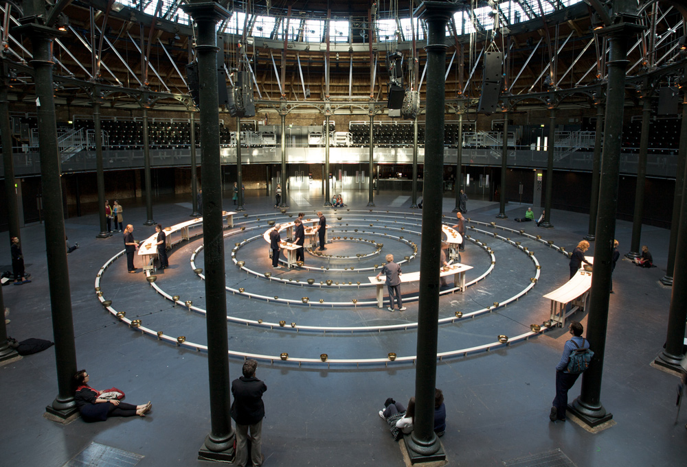
On December 31, 1999, the British musician and artist Jem Finer began playing a piece of ambient music that will finish in the year 3000. Provided humanity endures another 1,000 years, Longplayer will be the most epic piece of music ever performed, outstripping John Cage’s 639-year-long organ concert currently taking place in a church in Halberstadt, Germany. Longplayer is housed in a lighthouse in London and processed by a computer algorithm that mechanically extends the sound of a single instrument consisting of 234 Tibetan singing bowls. The sound is without repetition or break. “The intention [of Longplayer] is that its droning and parping will, like this year’s eclipse, make the hearers ponder the passing of time in a way that makes you feel both mortal and insignificant,” wrote the Evening Standard on the night of its commencement in 1999.

Christian Marclay, Recycled Records (1980–86)

Marclay created new pieces by combining parts of different vinyl records. Photo courtesy of Paula Cooper Gallery, New York

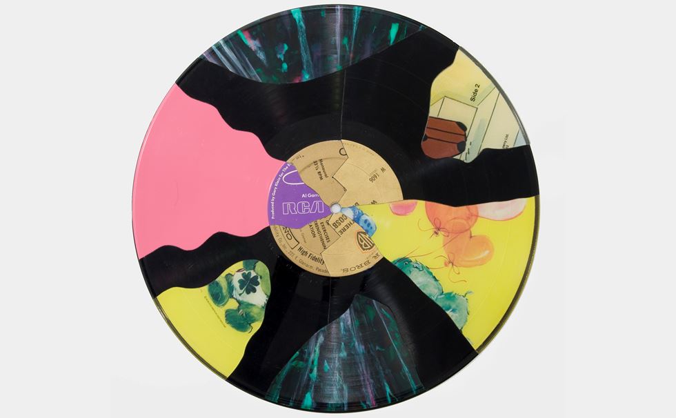
For nearly 40 years, Swiss-American sound artist and experimental DJ Christian Marclay has manipulated sound into physical form through photography, sculpture, installation, and performance. The artist is credited with pioneering an experimental form of turntablism, in which sound is altered through multiple turntables. Inspired by the noise experiments of composer John Cage and early hip-hop DJs, Marclay began incorporating prerecorded dissonant sounds produced by vinyl records in motion into his turntable performances. In the seminal series “Recycled Records,” the artists sliced apart vinyl records and reassembled the pieces to create new arrangements. 

Susan Philipsz, Lowlands (2010)

Turner Prize.Artist Susan Philipsz inside her sound installation ‘Lowlands’, after being named as the winner of the Turner Prize 2010, at Tate Britain, in central London. Picture date: Monday December 6, 2010. See PA story ARTS Turner Philipsz. Photo credit: Dominic Lipinski (Press Association via AP Images)

The Scottish-born, Berlin-based artist Susan Philipsz uses site-specific sound installations to probe the link between sense and memory. “Sound is materially invisible but very visceral and emotive,” she once said. “It can define a space at the same time as it triggers a memory.” In 2010, she was awarded the Turner Prize for the sound installation Lowlands, the first work of its kind ever to earn an artist the famed award. In the winning iteration of the piece, Philipsz performed three variations of a Scottish lament about a drowned lover who returns to her lover’s dreams, beneath three bridges over the River Clyde during the Glasgow International Festival of Visual Art. The Turner judges also considered Long Gone, in which a recording of the artists singing the eponymous Syd Barrett song played at the entrance of the Museo de Arte Contemporánea de Vigo in Spain. Her win attracted criticisms from detractors who argued that she should be classified as a singer, not an artist. The judges, however, insisted otherwise.

Samson Young, For Whom the Bell Tolls: A Journey Into the Sonic History of Conflict (2015)

Young on his journey across 5 continents , recording historically significant bells

A traditionally trained composer, Hong-Kong based Young has been on the rise since he won the inaugural edition of Art Basel’s BMW Art Journey Award in 2015 for his project For Whom the Bell Tolls: A Journey Into the Sonic History of Conflict. Over two-months, he documented the chime of iconic bells across five continents. He then crafted responses which explored the bells’ status as musical instruments and political, social, and religious representations of their communities. In June 2016, he drew critical acclaim at Art Basel Unlimited for a similar exploration into the militarization of sound. Seated atop a booth-sized cube and dressed in police uniform, Young performed with a Long Range Acoustic Device, a sonic weapon used to disperse crowds at protests. A low level form of the weapon is also used to repel birds from private properties, which Young represented by recreating distressed bird calls. 

Christine Sun Kim, Close Readings (2015)

Exceprt from the collection of captions Sun Kim collected from her deaf friends

Berlin-based artist Christine Sun Kim centers the systemic barriers attached to deafness. Kim was selected for the 2013 MoMA exhibition “Soundings,” the museum’s first major show dedicated to sound art. In 2019, a group of charcoal drawings by Kim were included in the Whitney Biennial. The work, along with the piece One Week of Lullabies for Roux (2018), became the first sound art installations acquired by the Smithsonian American Art Museum in 2020.

Resources

www.artnews.com/feature/sound-art-guide-most-famous-works-1234572580

Critical Evaluation of a Master’s Thesis – “Stilisierung des digitalen Kostüms – Auf der Suche nach Untertritt und Nahtzugabe im Animationsfilm”

Level of design

The master thesis has the layout of a standard thesis that is common in master theses with no art or design background. It follows a predefined layout from the University that doesn’t take into account individual layout design necessities due to the art/design focus of the degree program in which the thesis was written.

The complementary work piece, an animation film, on the other side has an appropriate level of design. However, the author does only include it at one point in the theoretical work.

Degree of innovation

The author analyzes existing works and therefore needs an analysis scheme. She took existing schemes and created an extended adaption to comply with the analysis’s needs.

Independence

The thesis was written as a solo work and the developed adaptation/extension of the analysis scheme was also done by herself.

Outline and structure

The structure of the master thesis is logical and the arrangement / order of chapters is comprehensible. The author starts with sketching the context of the theme, theoretical basics, the main topic in general, presentation of existing analysis schemes, her own adapted/extended scheme, the analysis and finally the conclusion.

Degree of communication

The author communicates clearly what the thesis is about. The language used is still comprehensible even though one might not be familiar with the topic. There are many passages within the thesis where she explains what certain things mean, but there is no general glossary which could also be helpful if one doesn’t read the entire thesis from start to finish.

Scope of the work

The main part of her theoretical master thesis is 58 pages, which is a common and average length for students who choose to have a practical master project as well.

Orthography and accuracy

As mentioned previously, the language used in the thesis is comprehensible and there are no noticeable spelling or grammar errors.

Literature 

The author cited a total of 105 resources of which 31 were literature and 40 audio-visual media. The large amount of audio-visual media stems from her extensive analysis of animated films and other references to animated media throughout her thesis.

New Master Thesis + Overview over App Design

My research question at the beginning of the study was whether and how XR can be a help for people with prosopagnosia. Since then, my focus and also my topic for the master’s thesis has changed. The only thing that has stayed the same is that the new topic is also in healthcare. A super short explanation of what future blog posts will be about: For my Master’s thesis, an app is being developed with several people involved and in group work on the topic of preventing dementia. The research topics will revolve around the topics app and dementia.

Link to an article about the topic of the Master Thesis (Language: German): https://www.fh-joanneum.at/presse/fh-joanneum-und-medizinische-universitaet-wien-bringen-neues-eu-projekt-ueber-demenzforschung-nach-oesterreich/

This first blog entry will be about what aspects we need to consider when designing our app and what points are particularly important to us with regard to the topic dementia and the requirements we received from the project managers. Further blog posts will delve deeper into specific areas. This blog entry is intended as a first start.

  1. User Experience

User experience describes all the impressions and aspects that the user experiences when interacting with a product, like a kind of cycle. The goal should be to make the product (in our case an app) a permanent part of the user’s life. To achieve this goal and start the cycle, the user must first learn about the product, so it means that the presentation of the product must be great. He must be able to immediately understand the benefits that using the app will bring him. The most important thing in the whole cycle is that the user is not frustrated or unnecessarily strained at any time. Otherwise, the product may not be used. (cf. Schilling, Apps machen, 37).

This infographic by Magnus Revang breaks down the user experience design process into several phases. It is intended to answer the question “what is user experience? (Revang, The User Experience Wheel).
The model starts with the word ‘value’ in the middle and implies that for both the providers of the product and the customers, the product’s goal is to create added value and thus it can bring benefits to both groups. The six coloured words are defined terms that should be focused on most. The 30 words are factors that contribute to a positive user experience (cf. Revang, The User Experience Wheel).

The User Experience Wheel (Magnus Revang)

2. Three states of an Appscreen

When designing an app, three conditions must always be considered and observed (cf. Basecamp, Getting Real, 48):

  1. What does the screen look like normally, when everything works and the action can be carried out
  2. How the screen looks empty, without data
  3. What does the screen look like when an error message appears

The blank screen at first use is especially important. If this screen is not adequately considered, it can lead to the app not being used or the user being frustrated because they do not know what task they have to complete. Examples of how to fill this page are instructions, help texts, example screens, FAQ, explanations of how the screen looks filled in and so on (cf. Basecamp, Getting Real, 49).

3. Important factors to consider

  • Efficiency when using the app
  • Efficiency when using the app
  • User satisfaction during use
  • What the app should do must be clearly defined
  • Navigation within the app must make sense
  • Errors should either be undetectable or undoable by the user
  • Short interactions and understandable and short language in order to avoid being a distraction
  • Consider Internet/GPS failures and show for example a solution
  • Respect different screen sizes
  • Few to no background processes to not drastically affect battery life
  • Offer data input on a voluntary basis or do not disturb the flow

(cf. Schilling, Apps machen, 45-47)

4. Structure and display information correctly

To ensure that the user is not overwhelmed by information or actions after opening the app, it is important to consider what and when something is displayed. For example, if the goal of the app is to create a new to-do point, this should be immediately executable after opening the app (cf. Schilling, Apps machen, 234). A guideline can be 3 to a maximum of 5 steps to be able to carry out an action. The fewer steps, the better. To take the example of the to-do app again, step one means opening the app, step two would be that the user sees what he wants to do. Step three is that the to-do is saved (cf. Schilling, Apps machen, 239). 
Another important point is how certain actions that the user can perform are labelled. To give a concrete case study, the magnifying glass as a sign for the search tool. The great advantage for designers is that the use of this symbol without text requires little space. Nevertheless, there are always problems that users have with this sign. Just the sign itself often makes it difficult to find the search function. People start looking in the upper right-hand corner for the search function. If they don’t find it there, they start searching the top of the page. So if the function is poorly labelled, it can quickly lead to frustration. It is also important to mention that using the icon without text adds interaction, as the user has to tap on it, wait for the input field to appear and only then start typing. The realisation is that many symbols still need some kind of label or short description (cf. The Magnifying-Glass Icon in Search Design: Pros and Cons).
For another case study, the sidebar in apps. These digital drawers, which can usually be opened by a hamburger menu icon, often tend to be overloaded with rather pointless functions. Problems with this method are also reaching the icon, as it is usually in the upper right or left corner of the screen, there is an additional interaction and the user has to remember which functions are in the sidebar (cf. Li, Please, Don’t Replace the Bar with the Drawer).

5. Smartwatches

Smartwatches play an increasingly important role nowadays and are often an extension of apps. Since the interaction surface is much smaller, it is important to work with high contrast and to display information on a very light or dark background because it is harder to read if the screen size is so small. For Android watches in particular, information should be displayed in the middle, as there is not one watch shape but several. For buttons, the entire width of the interaction area should be used to make interaction easier. Since both Android and Apple have UI guidelines, these should be followed. Especially in terms of font sizes (cf. Schilling, Apps machen, 302).

6. App project phases

These project phases were defined by Karolina Schilling in her book ‘Apps machen’. They have been slightly modified by me to fit our Master’s topic. These project phases are meant to help me to design a good product:

  1. Idea generation & research
    1. Search & find problems
    2. Competition
    3. Solve problems better and create a USP
  2. Target group and market test
    1. Buyer Persona
    2. MVP
    3. Target group
  3. Definition/Research for User Centered Design
    1. Context Scenarios & User Stories
    2. Research
    3. User Personas
    4. User Journeys
  4. Rough conception
    1. Scribbles
    2. Functional requirements
    3. Tap Streams
    4. Concept check
    5. Developer talk
    6. Feature priotisation
  5. Detailed design
    1. Core benefit shibbling
    2. Core benefits wireframes
    3. Prototype core benefits with real visuals or templates
    4. Scribble all other screens, create wireframes, elaborate
    5. Define interactions & transitions and prototype relevant ones
    6. Create and prototype animations
    7. Determine screen transitions
  6. User tests
    1. Tests
    2. User test
    3. Make improvements
  7. Create user interface and deliver graphics
    1. Create and export graphics for the different platforms
    2. Store graphics in a meaningful way
    3. Create visuals for app stores
    4. Design and test user touch points with the app (MVP feedback)
      1. The app logo
      2. Gather app store page material

Sources

  • Schilling, Karolina: Apps machen. Munich: Carl Hanser Verlag GmbH & Co. KG, 2016
  • Revang, Magnus. „The User Experience Wheel“ Last modified April 17, 2007. https://userexperienceproject.blogspot.com/2007/04/user-experience-wheel.html
  • Basecamp. Getting Real, Chicago: Basecamp, (n.d.). Accessed November 09, 2021. https://basecamp.com/gettingreal/09.3-three-state-solution, Three State Solution, chap. 48.
  • Basecamp. Getting Real, Chicago: Basecamp, (n.d.). Accessed November 09, 2021. https://basecamp.com/gettingreal/09.4-the-blank-slate, The Blank State, chap. 49.
  • Nielsen Norman Group. „The Magnifying-Glass Icon in Search Design: Pros and Cons“ Last modified February 23, 2014. https://www.nngroup.com/articles/magnifying-glass-icon/
  • Li, Simon. “Please, Don’t Replace the Bar with the Drawer” Last modified March 31, 2019. http://www.simon-li.com/design-and-code/please-dont-replace-the-bar-with-the-drawer/.

Why do Piezo microphones sound “small”?

Piezo microphones are also called contact microphones, this means that they are attached to a surface and can perceive audio vibrations through it. They are not sensitive to air vibrations, but only transduce the sound transmitted by the structure.

They have many applications, they are used to detecting drums hits, to trigger electronic samples or even underwater. For these applications they work fine.

They are often used to amplify acoustic musical instruments, and this is where the problems begin.

Contact microphones are not well-matched to typical audio inputs. They cannot drive a 50 kilohm input, which is the typical line input.

Most Piezos are tuned speaker elements used in reverse, the microphone is glued to a brass disc designed to resonate between 2-4kHz so that with a small power input you get a great audio output.

The problem is that they are often paired with a standard audio load, which normally loses low frequencies.

The Piezo sensor presents its signal through a series capacitance of approximately 15nF. When connected to a regular 50 kilohm line input, this forms a 200 Hz high pass filter, so here’s the main problem!

And, when connected to a consumer plug-in microphone input with an impedance of about 7 kilohms, the result is a 1kHz high-pass filter.

This should be inserted into a load that is higher than the impedance of the series capacitor at the lowest frequency of interest. If this is 20Hz, since the capacitor impedance is 1 / 2pifreq * C, then it should be above 530k.

This means that a high impedance input gets the blue line in the graph above.

Maybe you might think about EQing it later, but you will also start increasing the noise and hum at low frequencies.

Resources

R. Mudhar – Using Piezo Contact Mics right

Wikipedia – Contact Microphones

Impulse Response

IR, an old term for professional producers, but also studio owners, has today found its way from studio rooms to stages and even to the musician’s live equipment.

What is that? It is a sonic measurement of the sound of a speaker, room or microphone in relation to a sound source. [1]

Well, more detailed, it is the output of a dynamic system (a system that depends on the past and future value of the signal at any instant of time) when a impulse (short input signal) is presented.

So this “system” could be an electronic current, an economic calculation or a sound.

For example, Impulse Responses (IR) are used as a “replacement” for a guitar or bass speaker, both to digitally record the instrument without having to mic a real cab, and in a live situation, going directly to PA. Also, no microphone, no cab and, more or less, always the same sound.

There are several things that need to be taken into consideration when thinking about creating / choosing an IR. Many things affect the sound such as the type of speaker, the space we are in, which microphone we are using, its location, the microphone preamp and many other things.

With an IR you can capture all of this information, so you can instantly recall that setting.

An IR is normally a .wav file, and you can find a lot of them online, many companies / studios are releasing theirs, to let you have their tone.

How to use them? Simply load them with an IR Loader into your DAW (Use Space designer in Logic or there is the free VST IRLoader from LePou) or hardware (e.g. modeling amps like Kemper, AX FX, Line6 Helix).

Another use is with Convolution Reverb. CR is a simulation of a reverb or sound quality of a space using IRs. How? A short sound is played, the response is then measured and recorded, then recreated using algorithms. Some CR plugins are Space Designer (included in Logic Pro) or Waves IR1.

If you are interested in this topic, you can find more information in this interesting article https://www.bonedo.de/artikel/einzelansicht/impulse-responses-und-gitarrenboxen.html

Resources

1 Andertons – What Is A Guitar Amp Impulse Response?

2 Wikipedia – Impulse Response

3 Wikipedia – Dynamic System

4 Bonedo – Impulse Responses und Gitarrenboxen

Bacterial lamps by Jan Klingler

Swedish designer Jan Klingler has created unusual lamps: bacteria live in them, which color the light in different shades. For this project, the designer had to do a lot of research and gain relevant experience, but now he can control the growth of bacteria so as to “grow” the desired color or pattern in his lamp bulbs.

To create these lights, Klingler himself grows bacteria, fungi and yeast, allowing them to grow naturally on a resin disc for 24 to 48 hours. Its “home” bacteria feed on agar-agar, a gelatin obtained from seaweed. At the beginning of the process, the culture medium becomes liquid, but by the time Klingler adds bacteria to grow, it begins to solidify.

The colors are provided either by food or by the bacteria themselves, for example, the serratia bacterium (such as live in the human mouth) gives an orange-red color. When the desired effect is achieved, the biomaterial discs are sealed to deprive the cultures of oxygen and stop their growth. The resin plates are then connected to the LED disk or module. It turns out that light is poured through a translucent layer of bacteria.

Bacteria lamps are manufactured entirely in Sweden and come in four variations, reminiscent of laboratory equipment. One is inspired by a Petri dish, one is a Collet flask that looks like a flattened light bulb, and two are made in the shape of a Fernbach flask in two sizes.

According to Klingler, the project challenges the user to “see a new connection between the object he created and himself, creating a visible connection through bacteria, shedding light on what we think should remain hidden, and exposing it to the public.”

Klingler clarifies that every living creature and even its place of residence has its own unique microbiological imprint. Combining science, art and industrial design, his Bacteria lamp harnesses this tangible fact to present a unique piece to the world, provoking thought and discussion.

The goal of the designer is to offer in the future personalized lamps made to order from biological samples of a specific client who wants to perpetuate himself in this way and make a part of himself a piece of contemporary decorative art.

Gehmacher Home

Introduction to our Master Thesis Project

Customer Experience app with focus on AR-enhanced marketing opportunities and creation of a new unique selling point for the company Gehmacher based in Salzburg, by Janina Schindler and Carina Steindl.

About the company.

Our environment influences us. No matter if material or immaterial. We want to inspire you to surround yourself with beautiful things and thus create quality of life. With furniture and accessories in your home, the clothes you wear and beauty in your encounters. We believe that the beauty affects our life in a positive way.

There is hardly any other city that fits “living in beauty” as well as Salzburg. Beauty and excellence can be found in the impressive architecture, the style of the Salzburgers and in nature in the form of the mighty mountains and the Salzach. The Gehmacher house on the Alter Markt is located right in the heart of the city and has been owned by the Gehmacher family for over 100 years.

There are now three main areas at Gehmacher: HOME, CLOTHING and a Café. But there is a common philosophy behind this: to create quality of life through beauty. To create places where you can recharge your batteries, enjoy and experience joie de vivre. To create an atmosphere that inspires with the right interior and to underline the inner beauty with the right outfits. We are constantly in the process of developing our range and finding new things. Timeless and yet in tune with the times.

Gehmacher – a family company characterized by tradition and constant change. Once a specialist shop for bedding and curtains, which, after remaining undamaged in World War II, has developed into the address for furniture and lifestyle products. Today there are eight stores: HOME, CLOTHING, LIFESTYLE, RETTL X GEHMACHER, HIGH FASHION, OUTDOOR & CAFÉ, CLASSICS and N°8 reaching from Alter Markt to Waagplatz.

Gehmacher Salzburg Map

The persistent longing for beauty, atmosphere and experience has always driven us. Gehmacher changes with every generation. However, always with the aim of carrying on the legacy and giving it an individual touch. Gehmacher – a family company that is deeply anchored in its own values ​​and has its heart and focus on the future.

Social Media
Website Gehmacher

Briefing

In order to turn the Gehmacher customers into fans and family and thus to bind them even more to the company Gehmacher, a Gehmacher customer app is going to be developed that will provide the customer with information, inspiration and other benefits. The app should also support the Gehmacher team with different features and create another USP for the company Gehmacher.

Concept Requirements
  • Web-based App
  • Marketing Tool
  • Easy to use and aesthetically appealing
  • Privacy
  • Support for the team and enrichment for the customers
  • UX Testing
  • Working Prototype ready for implementation
Features
  • VIP (Stammkunden) speacial Discounts etc.; QR or NFC (according to individual sales)
  • Personalized Newsletter
  • „Personalized“ Posts – Feed (bsp. LinkedIn, etc.) Inspiration for the 3 areas (HOME, CLOTHING, CAFÉ)
  • Scheduling with salesperson (Private Shopping/ Interior Design Appointments)
  • Private event invitations via App
  • Stores and Contact persons are introduced (favorite advisor/salesperson)
  • Map cooperation opportunities (Products, Shootings, SM, etc.)
  • Link to SM Accounts & Website (Blog etc.)
  • Possibility for interactive outdoor advertising (AR, etc.)
Team

Janina and me are starting with the project in the third (this) semester.

  • Janina Schindler B.A. & Carina Steindl B.Sc. (Research, Conception, UI/UX, Prototype, Basic Programming, Testing)
  • Project management & communication – Carina Steindl B.Sc.
  • Client: Otto Gehmacher G.m.b.H & CoKG – Julia Gehmacher B.A. (CEO), Franziska Lüdtke (Marketingteam), etc.

We split up the research into different topics and assigned them like follows (changes can happen during the research):

Research topics for the WS21/22:
  • Introduction to the Topic – Carina Steindl
  • AR in the Marketing field – Janina Schindler
  • General Market Research – Carina Steindl
  • Web or native App – Janina Schindler
  • CX & UX for apps in retail – Carina Steindl
  • USP enhanced CX – Janina Schindler
  • Personas, User Research – Carina Steindl
  • User/Customer journey, scenarios – Janina Schindler
  • Concepts for backend/team support – Carina Steindl
  • User Interface of comparable App – Janina Schindler
  • Image Tracking in AR – Carina Steindl
  • General CX in retail – Janina Schindler
  • User/Customer Journey on site in the store – Carina Steindl
  • AR critical consideration – Janina Schindler
Milestones WS21/22:
  1. Topic Assignments and Planning – 24.10.2021
  2. First discussion of research Results – 29.11.2021
  3. Presentation and workshop at the company – 06.12.2021
  4. Research & first ideation presentation online – 20.12.2021
  5. evtl. additional presentation & feedback round at the company – 21.01.2022
  6. Concept presentation – 31.01.22/KW6 2022

Additionally to the milestones we have a weekly jour fixe.

Bewusste Mediennutzung und die Design Ethik Polizei

Wie ich im vorangegangenen Blogpost erklärt habe, möchte ich mein aktuelles Recherche Thema in Frage stellen und entsprechend anpassen. Um meiner Arbeit eine Richtung zu geben habe ich zum Ende des zweiten Semesters meine ‘Vision’ als Designerin niedergeschrieben und auch wenn das ein wenig kitschig klingt bin ich nach wie vor überzeugt davon. 

Es lautet wie folgt:

As a media designer, I am aware how all kinds of media channels work and what they are capable of: Influencing our life positively but also negatively. I want to share this knowledge with others in order to make them benefit from media usage instead of suffering (mentally).

Diese Statement bezieht sich vor allem auf die mentalen Auswirkungen von Mediennutzung. Das beinhaltet Manipulation von Inhalten (Fake-News, Photoshop, …), Aufmerksamkeitsgenerierung (Clickbaits) sowie süchtig machenden Mechanismen von Apps und Websites (insbesondere Social Media und Gaming). Stundenlanges Social Media Scrollen, Realitätsflucht durch Serien Marathons bis hin zu körperlichen Beschwerden durch extensive Mediennutzung. Diese Phänomene sind heutzutage weit verbreitet und kosten uns einige Stunden unserer täglichen Lebenszeit. 

Wir leben in einer Zeit, die unsere volle Aufmerksamkeit fordert. Komplexe Themen wie den fortschreitenden Klimawandel oder eine globale Pandemie zwingen uns, Informationen, Berichte und Fakten zu bewerten und eine eigene Meinung zu bilden. Doch gerade jetzt gibt es vermehrt Unsicherheiten darüber, was oder wem man Glauben schenken kann und wie sich die eigene Meinung schlussendlich festigen soll. Anstatt sich einen Fokus zu setzen, Entscheidungen zu treffen und aktiv zu Handeln wird nach dem Smartphone oder der Fernbedienung gegriffen. 

Die Frage nach der richtigen oder eher bewussten Mediennutzung ist daher sehr essentiell. Und genau hier sehe ich Gestalter*innen in der Pflicht. All jene, die Medien konzipieren, mit Content füllen und in der Zielgruppe verbreiten sollten sich bewusst werden, welche Auswirkungen ihre digitale Produkte haben. Geht es nur noch darum, die User so lange wie möglich im Webshop zu halten? Wird dieser Gamification-Mechanismus das Suchtpotenzial des Spiels noch weiter steigern? 

Ich möchte auf keinen Fall die Design Ethik Polizei sein. Dennoch denke ich dass die ‘User’ am Ende des Tages Menschen sind, die mehr Transparenz verdient haben. Denen klar werden muss, dass Medien in den meisten Fällen so konzipiert werden, dass sie süchtig machen – oder zumindest so lange wie möglich Aufmerksamkeit auf sich ziehen wollen. Dass sie immer subjektiv sind. Dass sie niemals 1:1 die Realität abbilden. Gleichzeitig  sind es gerade digitale Medien die unsere Zukunft beeinflussen. Die das Potenzial haben den zuvor genannten komplexen Problemen die Stirn zu bieten. Die endlose, digitale Vernetzung von Menschen, deren Wissen und Informationen sind essentiell für das heutige globalisierte Miteinander. 

Das Ganze klingt im ersten Moment sicherlich sehr abstrakt. Dennoch möchte ich mich mehr in diese Richtung bewegen. Vor allem die Mechanismen, die uns nach digitalen Medien  wie Social Media oder Spiele süchtig machen interessieren mich. Warum sind diese Plattformen das erste, was ich am morgen checke? Warum hänge ich am Iphone anstatt im Zug einfach mal aus dem Fenster zu sehen? Warum kann ich die Stille nicht mehr ertragen und muss beim Putzen Musik oder Podcast hören? Zu dieser Thematik gibt es bereits viel Literatur und ich möchte auch einen Selbstversuch (Digital Detox) starten.

Bücher, die auf meiner Liste stehen:
– Seductive Interaction – Stephen P. Anderson (2011, New Riders)
– Social Media, a critical introduction – Christian Fuchs (2014, SAGE Publications)
– Soziologie vernetzter Medien – Andreas Schelske (2007, Oldenbourg Wissenschaftsverlag GmbH)
– Hooked: Wie Sie Produkte erschaffen, die süchtig machen – Nir Eyal (2014, Redline Verlag)

David Tudor – Neural Network Synthesizer

David Tudor war in den 19050er einer der führenden Pianisten. In 1960er- Jahren wandte er sich immer mehr der Live-Elektronik zu und lies das Klavier immer mehr außen vor. Er entwickelte sich nun von einem ausführenden Interpreten zu einem eigenständigen Komponisten und Live-Elektroniker, wobei er sich in seiner Arbeit trotzdem immer mit anderen Künstlern zusammengeschlossen hat. Seine Werke reichen von Komposition und Performance bis zu Installationen.


Neural Network Plus

Eines seiner Werke/Instrumente ist „The Neural Network Synthesizer“. Mit dem Neural Network Synthesizer entstanden die Werke „Neural Synthesis (Nos. 1-9)“ und „Nerual Network Plus“.

Als Vorreiter für die CD „Neural Synthesis (Nos. 1-9)“ gilt David Tudors Performance „Neural Network Plus“. Diese entstand in Zusammenarbeit mit Merce Cunningham und dessen Dance Company und wurde an der Pariser Oper 1992 uraufgeführt. Diese Aufführung ist auch zugleich die erste mit dem Neural Network Synthesizer. Besonders daran ist, dass 16 Lautsprecher über den Raum verteilt wurden, welches eine Immersion erzeugte und es den Performern erlaubte mit dem Raum als Musikinstrument zu spielen.

Neural Network Plus:


Neural Synthesis (Nos. 1-9)

Neural Synthesis (Nos. 1-9) ist eine Arbeit die zwischen 1992 und 1994 in Zusammenarbeit mit Forrest Warthman, Mark Holler und Scot Gresham-Lancaster entstanden ist. Grundlage für diese Komposition ist ein komplexer Synthesizer, dessen Chip von Intel bzw. Mark Holler entwickelt wurde. Wie der Name „Neural Network“ schon erahnen lässt, ist dies ein System, welches dem menschlichen Gehirn und dem Nervensystem nachempfunden wurde. Dadurch entstehen folgendermaßen komplexe Schwingungen und somit auch Klänge. „The chip electronically emulates neuron cells in our brains and can process many analog signals in parallel. “[1] (Der Chip emuliert elektronisch die Neuronenzellen in unserem Gehirn und kann viele analoge Signale parallel verarbeiten.) Während der Performance standen David Tudor bis zu 14 Output-Channels zur Verfügung, welche er alle mit seinen anderen Geräten modelliert hat. Bei der Performance für „Neural Synthesis“ wurde der Chip wohl nicht zum vollen Potential genutzt. So war wohl David Tudor derjenige der sozusagen das Machine Learning übernommen hat, was schlussendlich den speziellen Klang formte. „The chip itself is not used to its full potential in this first synthesizer. It generates sound and routes signals but the role of learner, pattern-recognizer and responder is played by David, himself a vastly more complex neural network than the chip.”

Neuronales Netz

Die Technik, welche hinter dem Neural Network Synthesizer steckt, ist recht komplex. Grundsätzlich sind Neuronale Netzwerk von der Funktionsweise des menschlichen Gehirns geprägt und kommen vor allem in den Bereichen maschinelles Lernen und künstlicher Intelligenz zum Einsatz.

„Stark vereinfacht kann der Aufbau und die Funktionsweise eines Neuronalen Netzes folgendermaßen beschrieben werden: Das abstrahierte Modell eines Neuronalen Netzes besteht aus Neuronen, auch Units oder Knoten genannt. Sie können Informationen von außen oder von anderen Neuronen aufnehmen und modifiziert an andere Neuronen weiterleiten oder als Endergebnis ausgeben.“

Auf folgender Seite werden Neuronale Netze im Allgemeinen erklärt.: https://www.bigdata-insider.de/was-ist-ein-neuronales-netz-a-686185/

In den Liner Notes der CD wird die komplexe Funktionsweise des Chips für den Synthesizer genauer erklärt:

„Der Neuronennetz-Chip bildet das Herzstück des Synthesizers. Er besteht aus 64 nichtlinearen Verstärkern (den elektronischen Neuronen auf dem Chip) mit 10240 programmierbaren Verbindungen. Jedes Eingangssignal kann mit jedem Neuron verbunden werden, dessen Ausgang über On-Chip- oder Off-Chip-Pfade, jeweils mit variabler Verbindungsstärke, zu jedem Eingang zurückgeführt werden kann. Die gleichen Floating-Gate-Bausteine, die in EEPROMs (elektrisch löschbare, programmierbare Festwertspeicher) verwendet werden, werden in einer analogen Betriebsart eingesetzt, um die Stärken der Verbindungen zu speichern. Der Synthesizer fügt R-C (Widerstand-Kapazität)-Tankschaltungen auf den Rückkopplungspfaden für 16 der 64 Neuronen hinzu, um die Schwingungsfrequenzen zu steuern. Die R-C-Schaltungen erzeugen Relaxationsschwingungen. Durch das Zusammenschalten vieler Relaxationsoszillatoren werden schnell komplexe Klänge erzeugt. Globale Verstärkungs- und Vorspannungssignale auf dem Chip steuern die relativen Amplituden der Neuronenschwingungen. In der Nähe des Beginns der Oszillation sind die Neuronen empfindlich für inhärentes thermisches Rauschen, das durch zufällige Bewegungen von Elektronengruppen, die sich durch das monolithische Siliziumgitter bewegen, erzeugt wird. Dieses thermische Rauschen fügt den Ausgängen des Synthesizers Unvorhersehbarkeit hinzu, etwas, das David besonders reizvoll fand.“

1995 erschien schlussendlich eine CD mit 12 aufgenommen Tracks. Die CD wurde speziell für Kopfhörer entwickelt und verwendet binaurale Technik. Die Tracks wurden von David Tudor performt und mit John D.S. Adams aufgenommen und produziert. Das Werk umfasst zwei verschiedene Versionen einen Stereo Mix und einen Binauralen Mix.

Neural Synthesis No. 2

Neural Synthesis No. 6


Quellen:

Composer Inside Electronics (o. J.): David Tudor exhibition. Online im Internet: URL: http://composers-inside-electronics.net/dtudor/legacy/neural_synthesis.html (Zugriff am: 08.11.2021).

„DAVID TUDOR: Recordings (electronic)“ (o. J.): DAVID TUDOR: Recordings (electronic). Online im Internet: URL: http://davidtudor.org/Works/recordings1.html (Zugriff am: 08.11.2021).

kultur-online (2021): kultur-online. kultur-online – Teasing Chaos – David Tudor. Online im Internet: URL: https://www.kultur-online.net/inhalt/teasing-chaos-david-tudor (Zugriff am: 08.11.2021).

Luber, Stefan (2018): Was ist ein Neuronales Netz? Online im Internet: URL: https://www.bigdata-insider.de/was-ist-ein-neuronales-netz-a-686185/ (Zugriff am: 08.11.2021).

„Neural Network Syntheszer“ (o. J.): Neural Network Syntheszer. Online im Internet: URL: http://davidtudor.org/Articles/warthman.html (Zugriff am: 08.11.2021).

Nitschke, Mathis (2020): Mathis Nitschke. Analoge Neuralsynthese. Online im Internet: URL: https://mathis-nitschke.com/analoge-neuralsynthese/ (Zugriff am: 08.11.2021).

Soundohm (o. J.): David Tudor – Neural synthesis n. 6-9 (2CD) – Soundohm. Online im Internet: URL: https://www.soundohm.com/product/neural-synthesis-n-6-9-2c (Zugriff am: 08.11.2021).

David Tudor’s Pepsibird & David Tudor’s Microphone

David Tudor – Pepsibird

Pepsibird is an 18 minutes long soundscape made for the Pepsi Pavillion in Osaka. It features sounds resembling typical outdoor atmospherics like birds chirping and wind blowing. These sounds however are generated from the following nine different recordings of neural activity and similar sources:

  • A cat’s eye
  • A nerve firing
  • Bats
  • Brainwaves (slow / regular)
  • EKG
  • Alpha waves AM-FM
  • Modified nightjar (slow)
  • Modified nightjar (regular)
  • Demodulated Alpha waves

To accomplish the result show above. A sound processor by Gordon Mumma has been used to heavily manipulate the source recordings. Below is an image of how David Tudor intended to use the sounds.

“Score” for Pepsibird
A & B side of David Tudor’s Microphone

Similarly to “Pepsibird”, “Microphone” was also made for the Pepsi Pavilion in Osaka. The tracks are however much more abstract being described by David Tudor himself as “sounding like primordial beasts”. Although still relying on Microphones and Gordon Mumma’s sound processor, instead of using pre-recorded source material Tudor decided to make use of a feedback loop. This feedback loop is powered by tow shotgun microphones and an ambisonics-like distribution of 37 in the dome of the pavilion. The image below shows how Tudor accomplished the feedback loop.

Sources:
https://composers-inside-electronics.net/dtudor/legacy/pepsibird.html
https://composers-inside-electronics.net/dtudor/legacy/microphone.html
+ references shown in the post