My research question at the beginning of the study was whether and how XR can be a help for people with prosopagnosia. Since then, my focus and also my topic for the master’s thesis has changed. The only thing that has stayed the same is that the new topic is also in healthcare. A super short explanation of what future blog posts will be about: For my Master’s thesis, an app is being developed with several people involved and in group work on the topic of preventing dementia. The research topics will revolve around the topics app and dementia.
Link to an article about the topic of the Master Thesis (Language: German): https://www.fh-joanneum.at/presse/fh-joanneum-und-medizinische-universitaet-wien-bringen-neues-eu-projekt-ueber-demenzforschung-nach-oesterreich/
This first blog entry will be about what aspects we need to consider when designing our app and what points are particularly important to us with regard to the topic dementia and the requirements we received from the project managers. Further blog posts will delve deeper into specific areas. This blog entry is intended as a first start.
- User Experience
User experience describes all the impressions and aspects that the user experiences when interacting with a product, like a kind of cycle. The goal should be to make the product (in our case an app) a permanent part of the user’s life. To achieve this goal and start the cycle, the user must first learn about the product, so it means that the presentation of the product must be great. He must be able to immediately understand the benefits that using the app will bring him. The most important thing in the whole cycle is that the user is not frustrated or unnecessarily strained at any time. Otherwise, the product may not be used. (cf. Schilling, Apps machen, 37).
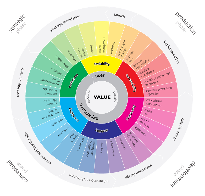
This infographic by Magnus Revang breaks down the user experience design process into several phases. It is intended to answer the question “what is user experience? (Revang, The User Experience Wheel).
The model starts with the word ‘value’ in the middle and implies that for both the providers of the product and the customers, the product’s goal is to create added value and thus it can bring benefits to both groups. The six coloured words are defined terms that should be focused on most. The 30 words are factors that contribute to a positive user experience (cf. Revang, The User Experience Wheel).
2. Three states of an Appscreen
When designing an app, three conditions must always be considered and observed (cf. Basecamp, Getting Real, 48):
- What does the screen look like normally, when everything works and the action can be carried out
- How the screen looks empty, without data
- What does the screen look like when an error message appears
The blank screen at first use is especially important. If this screen is not adequately considered, it can lead to the app not being used or the user being frustrated because they do not know what task they have to complete. Examples of how to fill this page are instructions, help texts, example screens, FAQ, explanations of how the screen looks filled in and so on (cf. Basecamp, Getting Real, 49).
3. Important factors to consider
- Efficiency when using the app
- Efficiency when using the app
- User satisfaction during use
- What the app should do must be clearly defined
- Navigation within the app must make sense
- Errors should either be undetectable or undoable by the user
- Short interactions and understandable and short language in order to avoid being a distraction
- Consider Internet/GPS failures and show for example a solution
- Respect different screen sizes
- Few to no background processes to not drastically affect battery life
- Offer data input on a voluntary basis or do not disturb the flow
(cf. Schilling, Apps machen, 45-47)
4. Structure and display information correctly
To ensure that the user is not overwhelmed by information or actions after opening the app, it is important to consider what and when something is displayed. For example, if the goal of the app is to create a new to-do point, this should be immediately executable after opening the app (cf. Schilling, Apps machen, 234). A guideline can be 3 to a maximum of 5 steps to be able to carry out an action. The fewer steps, the better. To take the example of the to-do app again, step one means opening the app, step two would be that the user sees what he wants to do. Step three is that the to-do is saved (cf. Schilling, Apps machen, 239).
Another important point is how certain actions that the user can perform are labelled. To give a concrete case study, the magnifying glass as a sign for the search tool. The great advantage for designers is that the use of this symbol without text requires little space. Nevertheless, there are always problems that users have with this sign. Just the sign itself often makes it difficult to find the search function. People start looking in the upper right-hand corner for the search function. If they don’t find it there, they start searching the top of the page. So if the function is poorly labelled, it can quickly lead to frustration. It is also important to mention that using the icon without text adds interaction, as the user has to tap on it, wait for the input field to appear and only then start typing. The realisation is that many symbols still need some kind of label or short description (cf. The Magnifying-Glass Icon in Search Design: Pros and Cons).
For another case study, the sidebar in apps. These digital drawers, which can usually be opened by a hamburger menu icon, often tend to be overloaded with rather pointless functions. Problems with this method are also reaching the icon, as it is usually in the upper right or left corner of the screen, there is an additional interaction and the user has to remember which functions are in the sidebar (cf. Li, Please, Don’t Replace the Bar with the Drawer).
5. Smartwatches
Smartwatches play an increasingly important role nowadays and are often an extension of apps. Since the interaction surface is much smaller, it is important to work with high contrast and to display information on a very light or dark background because it is harder to read if the screen size is so small. For Android watches in particular, information should be displayed in the middle, as there is not one watch shape but several. For buttons, the entire width of the interaction area should be used to make interaction easier. Since both Android and Apple have UI guidelines, these should be followed. Especially in terms of font sizes (cf. Schilling, Apps machen, 302).
6. App project phases
These project phases were defined by Karolina Schilling in her book ‘Apps machen’. They have been slightly modified by me to fit our Master’s topic. These project phases are meant to help me to design a good product:
- Idea generation & research
- Search & find problems
- Competition
- Solve problems better and create a USP
- Target group and market test
- Buyer Persona
- MVP
- Target group
- Definition/Research for User Centered Design
- Context Scenarios & User Stories
- Research
- User Personas
- User Journeys
- Rough conception
- Scribbles
- Functional requirements
- Tap Streams
- Concept check
- Developer talk
- Feature priotisation
- Detailed design
- Core benefit shibbling
- Core benefits wireframes
- Prototype core benefits with real visuals or templates
- Scribble all other screens, create wireframes, elaborate
- Define interactions & transitions and prototype relevant ones
- Create and prototype animations
- Determine screen transitions
- User tests
- Tests
- User test
- Make improvements
- Create user interface and deliver graphics
- Create and export graphics for the different platforms
- Store graphics in a meaningful way
- Create visuals for app stores
- Design and test user touch points with the app (MVP feedback)
- The app logo
- Gather app store page material
Sources
- Schilling, Karolina: Apps machen. Munich: Carl Hanser Verlag GmbH & Co. KG, 2016
- Revang, Magnus. „The User Experience Wheel“ Last modified April 17, 2007. https://userexperienceproject.blogspot.com/2007/04/user-experience-wheel.html
- Basecamp. Getting Real, Chicago: Basecamp, (n.d.). Accessed November 09, 2021. https://basecamp.com/gettingreal/09.3-three-state-solution, Three State Solution, chap. 48.
- Basecamp. Getting Real, Chicago: Basecamp, (n.d.). Accessed November 09, 2021. https://basecamp.com/gettingreal/09.4-the-blank-slate, The Blank State, chap. 49.
- Nielsen Norman Group. „The Magnifying-Glass Icon in Search Design: Pros and Cons“ Last modified February 23, 2014. https://www.nngroup.com/articles/magnifying-glass-icon/
- Li, Simon. “Please, Don’t Replace the Bar with the Drawer” Last modified March 31, 2019. http://www.simon-li.com/design-and-code/please-dont-replace-the-bar-with-the-drawer/.