A world wide knowned best practice example : the Exploratorium

History :

The Exploratorium is a museum of science, technology and arts in San Francisco.  

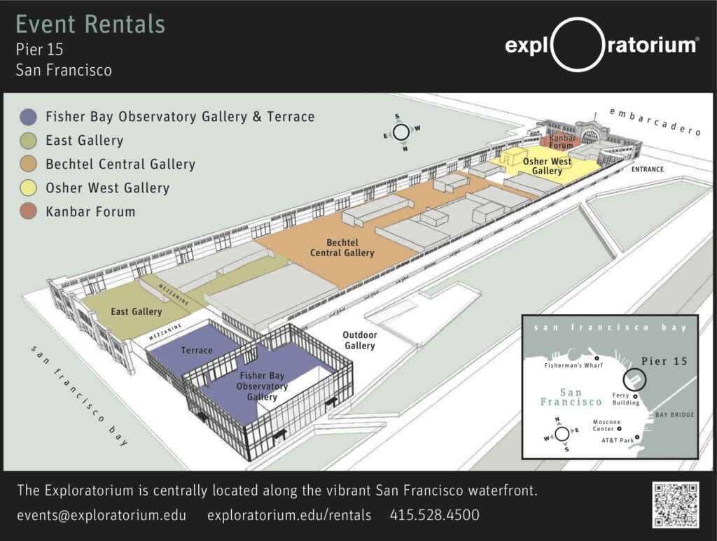
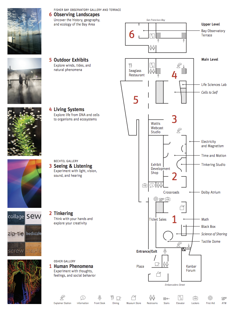
The Exploratorium was founded by the physicist and educator Frank Oppenheimer and opened in 1969 at the Palace of Fine Arts its home until January 2, 2013. On April 17, 2013, the Exploratorium reopened at Piers 15 and 17 on San Francisco bay. The historic interior and exterior of Pier 15 was renovated extensively prior to the move, and is divided into several galleries mainly separated by content, including the physics of seeing and listening (Light and Sound), Human Behavior, Living Systems, Tinkering (including electricity and magnetism), the Outdoor Gallery, and the Bay Observatory Gallery, which focuses on local environment, weather, and landscape.

Frank Oppenheimer

Since the museum’s founding, over 1,000 participatory exhibits have been created, approximately 600 of which are on the floor at any given time. The exhibit-building workshop space is contained within the museum and is open to view. In addition to the public exhibition space, the Exploratorium has been engaged in the professional development of teachers, science education reform, and the promotion of museums as informal education centers since its founding. Since Oppenheimer’s death in 1985, the Exploratorium has expanded into other domains, including its 50,000-page website and iPad app. It has also inspired an international network of participatory museums working to engage the public with general science education. The new Exploratorium building is also working to showcase environmental sustainability efforts as part of its goal to become the largest net-zero museum in the country. He has a major solar pannel to furnish its energy [1].
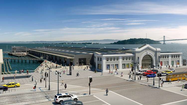
View of the Eploratorium on the bay

Field trip with explainers :

Dr Oppenheimer, the founder of the exploratorium had a special conviction about learning science. For him, having a real experience out of school was really important to learn. But he also knowed how it could be frustrated for someone not trained to understand it. That’s why he created this explainer program. Since 20 years, the explainers, special employees help the visitors to go through the museum. They are group of educators which help the visitor during the arrival : they guides the group to the check-in entry and help the teacher when they have classes. They will then guide the visitors through the museum and can help them when they have questions. There’s also some parts of the exhibitions where visitors can go through freely; but in case of need they always can find explainers at some special points inside the museum [2].
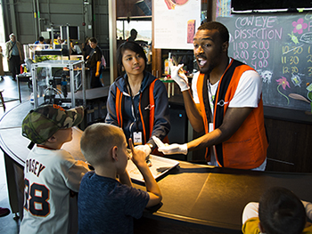
An explainer in action. They have a special uniform to be recognized.

Plan and journey of the visitor :

Exhibits in the Exploratorium cover a range of subjects areas including human perception (vision, hearing, learning, cognition), the life sciences, physical phenomena (light, motion, electricity, waves, resonance, magnetism), local environment (water, wind, fig, rain, sun..) and the human bevior (cooperation, competition, sharing) [3].
Exploring a few examples of interaction of the exploratorium

Human perception : the Black Box Space of the exploratorium

A place for presenting artwork that inspires and astounds in mysterious and wondrous ways, the Black Box is a darkened 800-square-foot space that provides an ideal environment for media art installations. A commonly used metaphor in science and engineering, a black box describes something that has observable inputs and outputs and unseen inner workings. Something goes in and something comes out, but the process by which transformation occurs is “black” or unknown to the observer.

Drawing on the Exploratorium’s unique province as a hybrid museum presenting and developing artworks at the juncture of art, science, and technology, the Black Box features dynamic, innovative multimedia exhibitions to prompt curiosity and transformation.
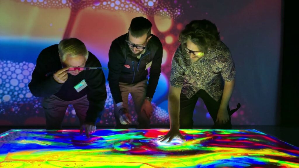
Experience a landscape of astonishing visual effects. Constructed as an 8-foot-square light box, artist Karina Smigla-Bobinski’s Kaleidoscope invites you to push and press on its surface to reveal an infinite pattern of vibrant colors. Each touch generates hyperdynamic images that visualize motion energy [4].

Living systems : See the plankton populations that multiply or die in response to changing ocean conditions

This interactive display presents microscopic marine organisms called phytoplankton. Visitors use special lenses to see what the plankton look like and to find out which live in different parts of the ocean at various times of year.
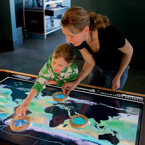
Child playing with the device. By zooming on a specific area of the map, you can see the proportion of phytoplankton present in this zone in relation to the climate change [5].

“We adapted a scientific model created at MIT” says Associate Curator Jennifer Frazier. ”Because the exhibit is based on real data, if you were able to look in the ocean with a microscope, this is what you’d be likely to see. I’m excited about this exhibit because it continues the Exploratorium’s tradition of engaging people with amazing phenomena of the natural world—but with new scientific data, visitors can explore worlds at a scale they normally can’t see.”

Human behavior : cooperation through the survival game

Players struggle to keep their livestock herds alive and thriving—despite disease, drought, and other dangers. When your neighbor suffers a major loss, the question arises: Can you afford to share? But the real question may be, can you afford not to?
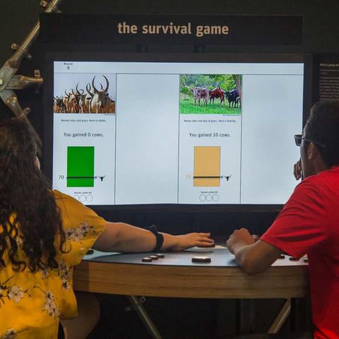
Two players playing the survival game. This game is based on the lives of the Masaai in Africa. They live with milk and meat. But sometimes the cows they have got sick so the Masaai have to help each other in order to survive. This game is showing the cooperation process [6].

Tinkering

The Tinkering Studio is the heart of this gallery. In this immersive space, visitors use tools and materials to explore the intersection of science, art, and technology. They try experiments for the first time, or play along with other makers and artists. Whether expert of novice, they’re all learning together by making something that is personally meaningful.

Adjacent to the gallery is the museum’s exhibit-building workshop, where most of the exhibits are made. Open to public view, you’ll see our staff working with a variety of materials—woodworking tools, drills, and lathes, for example—and some of our exhibits in various stages of development [7].
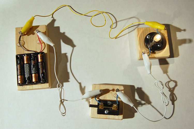
Here you can see a project to work with electricity. https://www.exploratorium.edu/tinkering/projects/circuit-boards

After dark Tuedays : the museum is not only for kids !

Experience life After Dark, an evening series exclusively for adults that mixes cocktails, conversation, and playful, innovative science and art events.
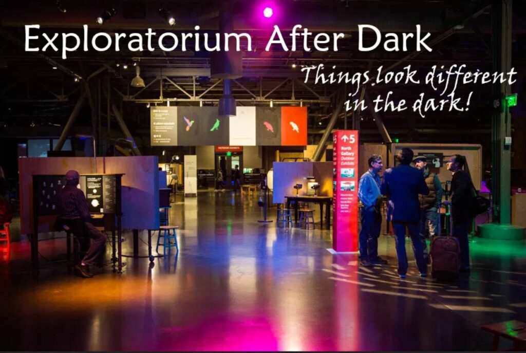
Not a theater, cabaret, or gallery, After Dark contains aspects of all three. Each evening showcases a different topic—from music to sex to electricity—but all include a cash bar and an opportunity to play with our hundreds of hands-on exhibits.

This exhibition remains activ by distance during corona times with explainations about a different topic every thursday night on the american hour at 7 pm[8].

https://www.exploratorium.edu/video/electrified-plants?autoplay=true

And what about outside the museum ?

The exploratorium science snacks activities :

These Science Snack videos from the Teacher Institute should do just that, offering hands-on science activities you can do at home or in the classroom using easily-accessible materials [9].
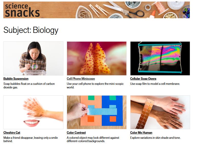
https://www.exploratorium.edu/snacks

https://www.exploratorium.edu/video

The exploratorium application :
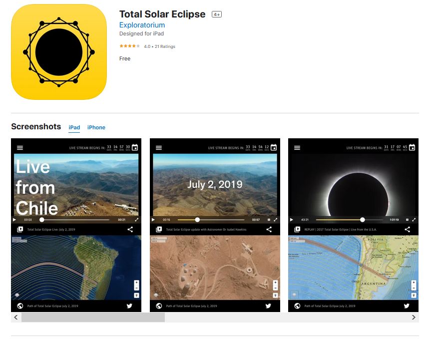
https://apps.apple.com/us/app/total-solar-eclipse/id1230195450

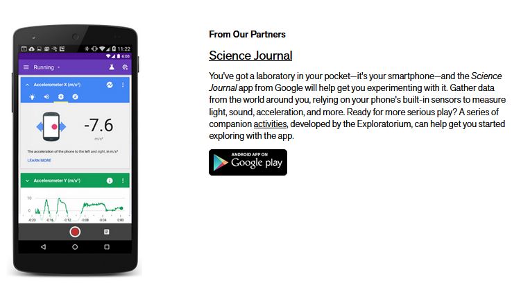
In this first application showed in live stream the solar eclipse that happened the 2 of July 2019.
[10]

Conclusion and opening about the exploratorium :

By analysing the different means of communication and interaction, I think I have found what makes the exploratorium a magical and particularly attractive place. Firstly, the interactions play on the multi-sensory appeal of touch, vision and sound. Visitors are fully active and can visualise scientific concepts in a simple way by manipulating objects. I have the impression that this museum makes particular use of the kinesthetic sense, and is very much focused on these hands on approaches. What I also find very impressive is the ability that this museum developped on all fronts: both in physics in the exhibitions with the galleries, but also with all the virtual content that can be found with the tickering, science snacks, applications and thursday evenings. I would really like to have the opportunity to visit this museum to learn more about these experiences.

With all that we have seen so far about science centres, I wonder what are the most effective ways to learn science and whether in the long run science centres will not revolutionise the way science is taught in schools.

Sources :

[1] https://en.wikipedia.org/wiki/Exploratorium

[2] https://www.youtube.com/watch?v=789BkLDm_2o

[3] https://www.exploratorium.edu/

[4] https://www.exploratorium.edu/visit/calendar/kaleidoscope

[5] https://www.exploratorium.edu/visit/gallery-4

[6] https://www.exploratorium.edu/visit/gallery-4

[7] https://www.exploratorium.edu/tinkering

[8]https://www.exploratorium.edu/visit/calendar/after-dark

[9] https://www.exploratorium.edu/snacks

[10] https://www.exploratorium.edu/explore/apps

Dance Music Culture Pt. 2 – The History of Rave

Raves are an integral part of today;’s Dance Culture. But how did they come to be? What resulted in a need to “get down” on the dance floor and forget reality for one night? This articles explores the unique and crazy history of raves.

The term “rave” was first used to describe wild bohemian parties in the late 1950s, but it wasn’t until the 80s that the term gained lasting popularity. It still took a few years until the late 80s, when Acid House was born in Chicago, which marks the beginning of raves as we know them today. These raves started out as illegal warehouse parties full of attendees of enhanced states of mind influenced by drugs. Today, raves are much more common and much less often illegal.

In 1985 DJ Pierre (Nathan Jones) bought a Roland TB-303 bass synth at a second-hand shop and experimented with it until he accidentally got the squelchy bassline, which is such a characteristic sound of Acid House. From there on, the number of raves exploded, causing so much late-night ruckus that they attracted police. Laws in England particularly resulted in more and more illegal raves, which made it hard for promoters to organise events in Clubs.

This new sound began with a record produced by Phuture, a group founded by DJ Pierre, Earl “Spanky” Smith Jr., and Herbert “Herb J” Jackson. Newly turned on to the unique sounds of the TB-303, the trio released a demo of ‘Acid Tracks’.

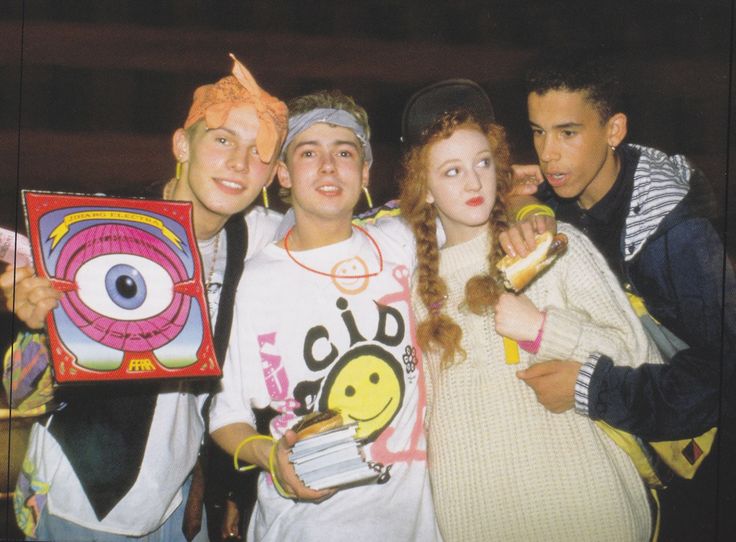
Acid house hadn’t really made a big impact, until a group of four DJs (Paul Oakenfold, Danny Rampling, Nicky Holloway and Johnny Walker) took a trip to Ibiza to visit the acclaimed club Amnesia.  This is where they heard resident DJs play the “balearic” style- a blend of multiple genres, including the Chicago Acid House. This inspired Danny to start a rave called Shoom in a gym. The sound system used was provided by Carl Cox, another DJ who went on to become a House legend. Ravers were obsessed with a then-new drug called ecstasy. This drug went on to become tightly related to the rave scene. One of the Shoom part tickets had a smiley face on it, which went on to become a trademark sign of the Acid House scene. The late 80s and early 90s was when the era of “dressing down, not dressing up” started. Club-goers were dressing increasingly tribalistic and laid-back.

Teenagers and young adults in a warehouse, dressed up in the recognisable Acid House Smiley gear, as well as other psychedelic-looking outfits.

Organized by production companies, raves began to gain press attention. A popular fanzine written by Paul Oakenfold called Boy’s Own was responsible for publishing the first article on acid house . Boy’s Own also held the first documented outdoor acid rave in 1988. Legend has it that the young Norman Cook – aka Fatboy Slim – was turned onto house music during one of their parties.

Sunrise and Revolution in Progress groups started making bigger parties. They brought raves out of the darkness of illegal warehouses into the light of big public events. Freedom to Party was a huge campaign in Trafalgar Square which influenced the loosening of UK’s licensing laws. Clubs and dance venues were finally allowed to stay open all night long.

The rise of use of drugs and psychedelics in parties gave them a lot of negative press. During the backlash, a UK acid house record managed to break into the mainstream. Produced by a mysterious artist called Humanoid, ‘Stakker Humanoid’ reached #17 on the UK charts in 1988.

During the early 90s, it became much harder to hold one-off events due to new bylaws. However, organizations such as Fantazia, Universe, N.A.S.A. (Nice and Safe Attitude), Raindance, Amnesia House, ESP, and Helter Skelter still managed to hold large-scale legal raves in warehouses and fields.

Genre styles started developing in the scene, and thus happy hardcore was born. In 1992 a bill was passed that allowed police to stop open air parties, or events organised by more than one promoter, as well as people on their way to raves. After 1993, most raves took place in licensed venues, including Helter Skelter, Life at Bowlers, the Edge, The Sanctuary, and Club Kinetic.

During this time, drum and bass emerged from a combination of techno, house and hardcore genres, originating in the UK. Records like The Prodigy’s ‘Jericho’Rebel MC ‘The Wickedest Sound and A Guy Called Gerald ‘Anything’ helped to shape the sound of this genre.

After 1995, DnB got more and more often into house-oriented clubs, starting from the Ministry of Sound. However, the rave as it was back in the day was on a decline due to bad press. An organization called World Dance put on their “last” rave at Lydd Airport. “Here is your last chance before another chapter in ‘Rave History’ comes to an end!” the adverts posted around London proclaimed.

Meanwhile in the US during the 90s the timeline was as follows. A rave scene legend, DJ Scotto, made Manhattan’s first rave at Studio 54 (the Ritz back then). Frankie Bones started his famous Storm Raves in Brooklyn, with DJs Like Josh Wink and Sven Väth. Franky may have been the person behind PLUR

Frankie Bones would go on to start his own successful series of raves in Brooklyn, Storm Raves – where future international DJs like Josh Wink and Sven Väth got a chance to perform. Frankie also allegedly was the man behind the concept of PLUR, having once famously yelled on the microphone during a fight at a Storm Rave: “If you don’t start showing some peace, love, and unity, I’ll break your faces.”

Global Underworld Network was the most famous rave promotion crew. They are behind the OPIUM and NARNIA Festivals that were attended by an astounding 60.000 people. Narnia was featured on MTV and Life Magazine, as well as winning event of the year in 1995. It was dubbed the “Woodstock of Generation X”.

In the 80s and 90s raves were extremely popular in the Bay Area. There was no curfew and soon enough venues had up to 20.000 visitors every weekend. ‘Homebase’, and ’85 & Baldwin’ were two of the biggest venues that raves were held in the Bay Area. California also became notorious for raves.

After a few tragic incidents, the scene was brought to an end- watch this Fox News report from 1998. Even though illegal drugs were part of the scene, most people were there for more than just non-stop partying. It was an experience in its own: seeing your favourite DJs live, as well as MCs from abroad.

The rave scene influenced the emergence of electronic music and made it more mainstream. Even though the golden rave era was back in the 80s and 90s, we still carried over most of its principles into the new age. It is not the same, but all the core principles are still. there. People will always gather in unity to let go of worries and dance together like the unhinged animals we are.

Resources:

Helen Evans. “OUT OF SIGHT, OUT OF MIND: An Analysis of Rave culture”. Retrieved 25 October 2007.

Phil Cheeseman-fu. “The History of House”DJ Magazine. Retrieved 13 August 2013.

Connected Cars | part 1

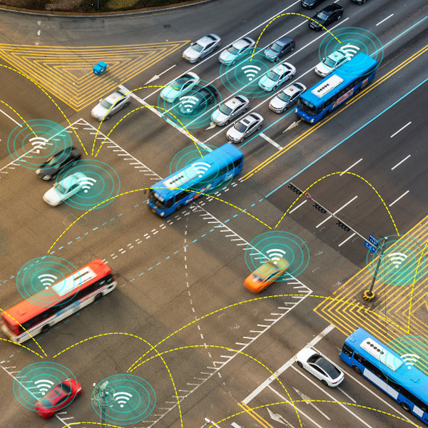
Connected cars are vehicles that are able to connect with different services, devices or other connected cars over a network. They are able to connect to smartphones, laptops, traffic signals and many more. Another important feature of connected cars is the emergency call function. This feature is able to register accidents based on the data from different sensors and automatically calls emergency hotlines. It is also called eCall in the European Union and all new car models, approved for manufacture after 31 March 2018, must have the emergency call function installed.

source: https://www.elektronikpraxis.vogel.de/connected-cars-loesungen-fuer-das-auto-der-zukunft-a-552575/

Communication Systems

DSRC and C-V2X

Reliable networks for connected cars can only be established with powerful telematic systems. Dedicated short-range communication (DSRC) and cellular vehicle to everything communication (C-V2X) are the most promising systems that are able to handle the workload while still staying fail-safe.

DSRC is based on the newest wifi standard and tailored to the needs of the automotive industry. It is a highly secure and high-speed communication channel that is able to see around corners and operate in extreme weather conditions. The main goal of DSRC is a seamless communication between vehicles and roadside infrastructure.

Cellular-V2X is a relatively new worldwide standard by the 3rd Generation Partnership Projects (3GPP) using cellular standards of the fourth and fifth generation (4G and 5G). It enables direct communication between road users and infrastructure to ensure a more fluent traffic flow and more traffic safety. C-V2X uses the same spectrum like DSRC for the communication between two devices but is also able to connect to cellular frequencies.

At the moment it is not clear which of these two technologies is going to be used for connected cars in the future. It could be either of them or a combination of both of them. Automakers from different countries could also use different technologies based on the country’s infrastructure.

source: https://carrealtime.com/all/automotive-vehicle-to-everything-v2x-market-worth-2815-5-million/

Vehicle-to-Everything (V2X)

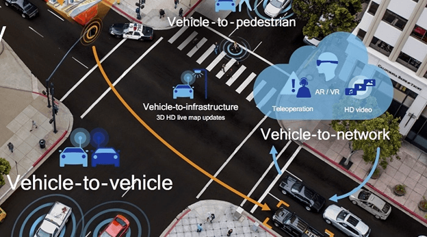
While the concept of the “Connected Car” is not new in the automotive industry, the necessary technologies and communication standards have only been made available in the last few years. The vehicle to everything communication (V2X) is the umbrella term for the following categories of communication technologies that are needed for connected cars.

Vehicle to Network (V2N)

The V2N communication allows vehicles to connect to cellular networks and therefore also the communication with the V2X system. Because of the vehicle to network connectivity vehicles are becoming a device, just like smartphones and tablets. V2N allows cars a reliable interaction with other vehicles, devices, pedestrians and important infrastructure.

Vehicle to Infrastructure (V2I)

V2I communication is an important part of intelligent transportation systems (ITS) and allows bidirectional communication between cars and roadside infrastructure. It includes detailed data about the traffic gathered by different vehicles, data from sensors used in infrastructure like traffic lights, cameras, parking meters and broadcasted data like weather conditions, speed limits and road conditions. The main goal of this communication is to enhance safety and prevent accidents with real-time information for the drivers. But this information gets even more important in the future, when autonomous vehicles get available to the public.

Vehicle to Vehicle (V2V)

The V2V communication enables different vehicles to connect to each other. Because this communication is done wirelessly with DSRC frequencies it works similar to a mesh network. Its main advantage is that every car becomes a node and can therefore capture and send data and even retransmit data from other cars. This system allows the cars to get a 360 degree representation of the surroundings (about 300m radius) in real-time. Because of this overview it is able to inform drivers of other cars or autonomous vehicles. This overview could include information like speed, destinations and locations of traffic jams or accidents. V2V communication enhances road safety and could, according to NHTSA, prevent more than 600.000 accidents in the United States per year.

Vehicle to Cloud (V2C)

V2C communication uses the access to cellular networks to exchange data with the cloud. This data could include navigation services depending on the current traffic situation, remote diagnostic for car maintenance, over the air (OTA) updates for the vehicles software and communication with internet of things devices or digital assistants. V2C could also play an important role in carsharing in the future. The car from the carsharing service could download the drivers preferences and automatically adjust seat, mirrors, ambient lights and music playlists according to his past usages of the service.

Vehicle to Pedestrian (V2P)

The V2P communication is one of the newest and probably also hardest technologies to master. Its main goal is the reduction of accidents with pedestrians. While the other categories allow communication with smart sensors in different objects and devices, pedestrians and children are not wearing sensors to create awareness about their presence. That is the reason why automakers are currently using systems like LiDAR, 360 degree cameras and blind spot warning to detect pedestrians and cyclists. Another part of the vehicle to pedestrian communication gets more important when autonomous cars get available to the public. Currently, the driver can signal pedestrians that they are able to cross the street but if there is no driver left the autonomous car has to communicate with the pedestrian as well.

Vehicle to Device (V2D)

V2D is one of the most popular and well known communication categories. It allows vehicles to exchange data with smart devices, usually via Bluetooth. The most popular applications of this technology are Apple CarPlay and Android Auto. They allow smartphones, tablets and smart watches to seamlessly interact with the vehicles infotainment system and are already available in a lot of different cars.

Vehicle to Grid (V2G)

The V2G communication is especially useful for all electrified vehicles. It allows bidirectional data exchange between the different types of electric vehicles (PHEV, BEV, FCEV) and the smart grid. V2G will allow the next-gen electric grid to balance loads more efficiently, reduce utility bill costs and shorten waiting times.

source: https://www.everythingrf.com/community/what-is-c-v2x

Current state of In-Car Infotainments

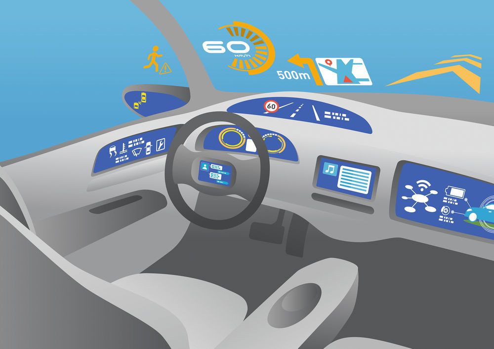
Connected cars are also transforming the in-car experiences like never before. While digital interfaces are still tiny and have a horrible usability in a lot of cars, some automakers are already improving their in-vehicle infotainment systems and therefore also the whole in-car experience.

Tesla

Despite Tesla being known for their tech-first approach and their great software, their in-car infotainment is actually not that great if you take a closer look. Tesla’s car interface will be great somewhen in the future, when the cars are driving autonomously but not at the moment. The Model 3 for example has only one large screen in the center of the cockpit. There are nearly no additional buttons, switches or levers. Everything is displayed and controlled on the huge display. The driver has to look at the screen for every interaction and therefore also has to take the eyes off the road. One Tesla owner in Germany even recently (August 2020) got a one month driving ban because he crashed into trees while trying to change the speed of his windshield wipers.

Because the infotainment system of the Model 3 just got a huge UI Update (2020.48.26)  in the last weeks, there is no up-to-date video about the detailed functionality of the new version. There is only a video about the previous version of the software. But while the new interface looks a lot nicer now, it still has a similar functionality. The windshield wiper settings for example now got a dedicated button in the bar on the bottom. Detailed changes will be analyzed and published by a lot of Tesla Model 3 owners soon.

Mercedes Benz

Because the first version of Mercedes MBUX was already a good system with multiple screens and a decent experience, especially for such an old and traditional company, there were high hopes for the following generations of MBUX. While the visual style may look outdated to some designers, the functionality was still a huge step forward in the right direction and created an advantage over infotainment systems of similar brands. The second generation of MBUX will be released alongside the new S-Class and started shipping a few weeks ago. Because of this there is currently no full review of the new infotainment system..

Mercedes also recently announced another new version of the MBUX infotainment system for the upcoming EQS. The EQS will be the electric counterpart of the new S-Class and is announced for later this year.

Porsche

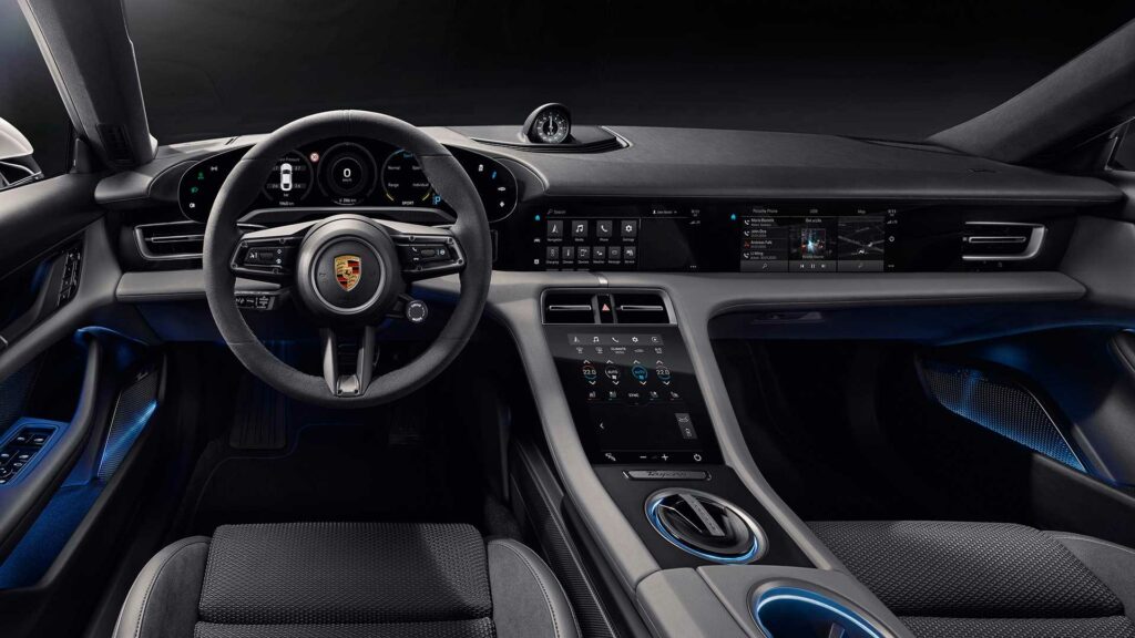
Porsche’s first electric car, the Porsche Taycan, also has a completely new infotainment system. Because the Volkswagen group has just recently started to create their own infotainment software in-house and plans on hiring 10.000 designers, analysts and engineers to build one platform for all subsidiaries, the Porsche Taycan Infotainment is still using another system. (https://www.kurbos.com/de/projekt/porsche)

The Taycan infotainment is minimalistic, well structured and also usable. This infotainment has one main goal – supporting the user. While it currently is one of the best infotainment systems on the market, the lower central screen can also lead to a lot of driver distraction and therefore also decrease the safety.

source: https://de.motor1.com/news/366676/porsche-taycan-interieur/

A detailed UX evaluation of the Porsche Taycan infotainment is available here:

https://www.sbdautomotive.com/en/porsche-taycan-ux

Conclusion

Creating the perfect in-car infotainment system is nearly impossible, but a lot of different automakers are already working on improving their in-car experience. While there is no perfect system at the moment, there are a lot of different good solutions for specific problems available. Each system has unique advantages and disadvantages. The main goal of the next generation in-vehicle interfaces should be to provide a safe, usable and enjoyable experience for the driver and passengers. With the release of new electric vehicles like the Lucid Air, Byton M-Byte and Rivian R1S in Europe later this year, the development of in-car experiences will get more and more interesting and competitive in the upcoming years. Another interesting change for in-vehicle infotainment systems will be the change from human drivers to autonomous vehicles.

source: https://www.elektrobit.com/newsroom/user-experience-and-infotainment-software-for-sony-vision-s/

Resources | part 1

https://www.bmw.com/de/innovation/connected-car.html

https://europa.eu/youreurope/citizens/travel/security-and-emergencies/emergency-assistance-vehicles-ecall/index_en.htm

https://www.springerprofessional.de/automatisiertes-fahren/automobilelektronik—software/dsrc-und-c-v2x-im-vergleich/15476434

https://www.everythingrf.com/community/what-is-dsrc

https://www.mes-insights.com/what-is-dsrc-dedicated-short-range-communications-a-931536/

https://www.lightreading.com/connected-car-industry-struggles-with-c-v2x-vs-dsrc-questions/d/d-id/756970

https://www.electronicdesign.com/markets/automotive/document/21805670/dsrc-vs-cv2x-looking-to-impress-the-regulators-pdf-download

https://www.ip-insider.de/was-ist-cellular-v2x-c-v2x-a-943952/

https://blog.rgbsi.com/7-types-of-vehicle-connectivity

https://medium.com/@theBIOagency/accelerate-now-how-connected-cars-are-transforming-the-in-car-customer-experience-36e9e9b1b2e8

https://uxdesign.cc/the-state-of-automotive-in-car-user-experience-in-2020-57cc307abd9c

https://www.sbdautomotive.com/en/porsche-taycan-ux

Analog / Digital – Print

The earliest printing method came up around the year 200 in China. Back then, wooden blocks were carved and arranged, inked and then printed. Since then the printing process was adjusted and improved via new and more accurate methods that made it more and more easy to reproduce bigger editions and thus distribute information and knowledge faster among the people. For all these printing techniques from litography, letterpress, offset to screen printing it is and always was necessary to create some kind of model like a set of letters, printing plates, stencils or a screen through wich color can be applied to various media like paper but also other applicable printing substrates.

early wood block printing – manually carved, analog information reproduced via an analog printing process

Every printing technique, where a model of the printing image is necessary belongs to analog printing methods. Digital printing on the other hand refers to methods where the data is directly transferred to the printer which then applies ink or toner particles to the paper. DDP or direct digital printing are most commonly electrography methods using ink jet or laser print technology. A major difference to analog printing methods is that within a single pass more colors like cyan, magenta, yellow and black can be applied to printing substrates. Additionally with digital printing the printing image can be adjusted and customised from one print to the next and thus small editions from 1 – 500 pieces can be printed more economically than it would be the case with analog printing methods where for each color another physical template like a printing plate needs to be produced for the separate printing runs.

In traditional letterpress, for example, a CMYK print of a photography would need four printing plates that are used in four passes for which the position of the print and the right amount of color needs to be adjusted for each run after which you have to clean the machine and fill in the next ink. The same would apply if you wanted to print a 4c photo using the screen printing method. In offset printing, you also need four printing plates, however most offset printing machines have four or more inking units through which the printing substrate will run subsequently.

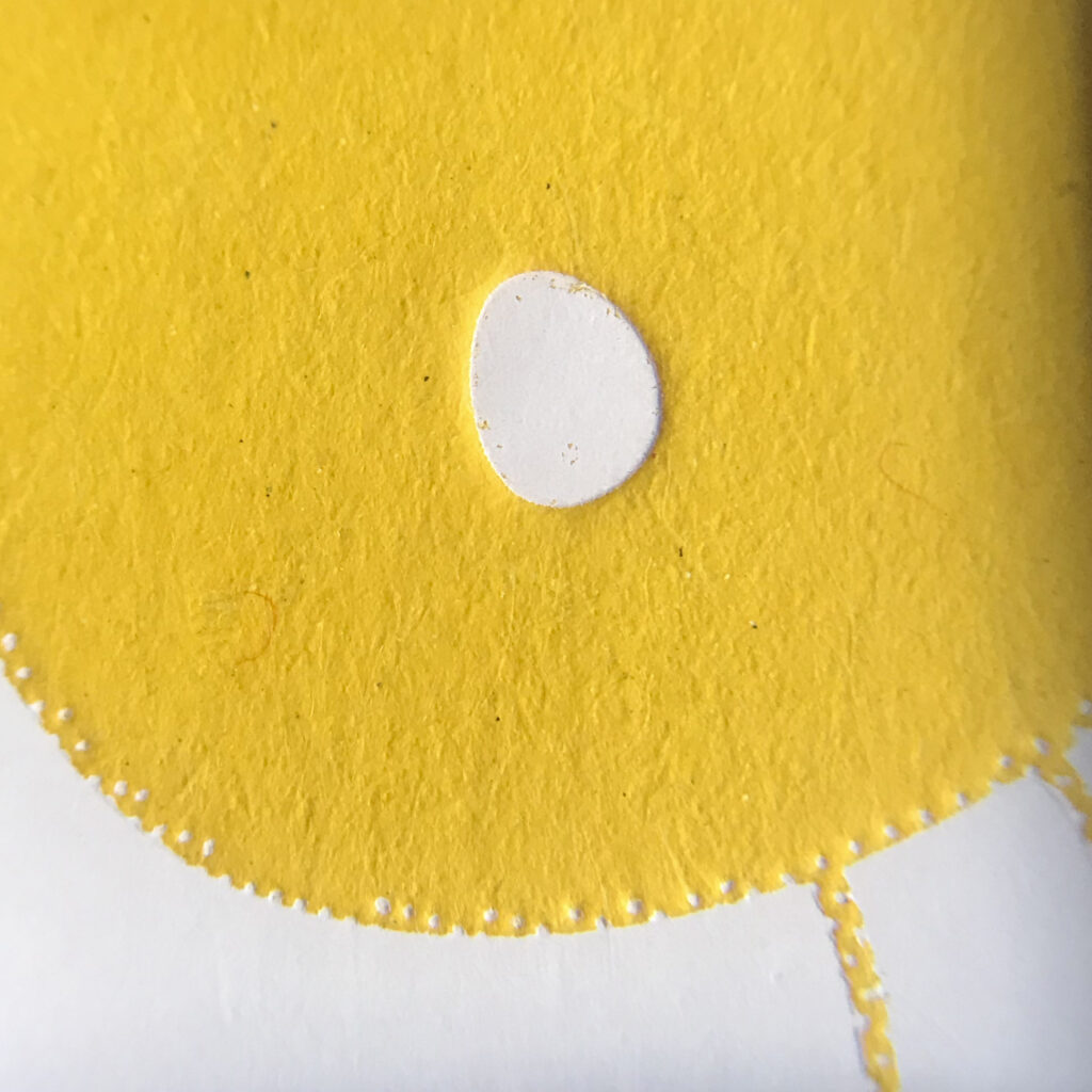
white hotfoil embossing on uncoated yellow graphic cardboard and hotfoil magnesium printing plate based on digital data

For both, analog and digital printing methods the source of the printing image can be digital, though for analog printing methods you can also use „data“ from purely analog sourcese like wooden and leigh letters or hand carved linocuts for letterpress. For screen printing hand drawn foils and analog templates can be used to prepare the screens and analog films can also be used to produce printing plates for printing methods like letterpress or offset printing.

2c letterpress print and hand carved (= analog data) lino cut

Advantages and disadvantages

The various characteristics of digital and analog printing techniques offer different advantages and disadvantages. As with digital methods the print image can be easily adjusted from one print to another, the biggest advantage of ink jet and laser print is the economic setup for small editions starting from one copy. For bigger editions from more than 500 copies, analog printing machines provide fast and highly accurate reproduction as soon as the machines are set up properly.

Besides economic considerations the various printing methods provide different features concerning the print:

Digital Print

Depending on the printing device, ink jets and laser printers may provide a bigger color space that can closely represent the RGB color space. Therefore digital printing methods are best to reproduce colorful photographies consisting of numerous pixels, though printing solid color (areas) may not provide satisfying results unless printed on prepared printing substrates like specially coated papers. Hp-Indigo printing machines offer another great feature, as with this digital printing method light colors can be printed on dark colored (primed) papers like white text on black paper. This can usually only be achieved using screen print or hot foils.

magnified 4c digital picture printing on coated affiche paper (120 gsm)

Analog Print

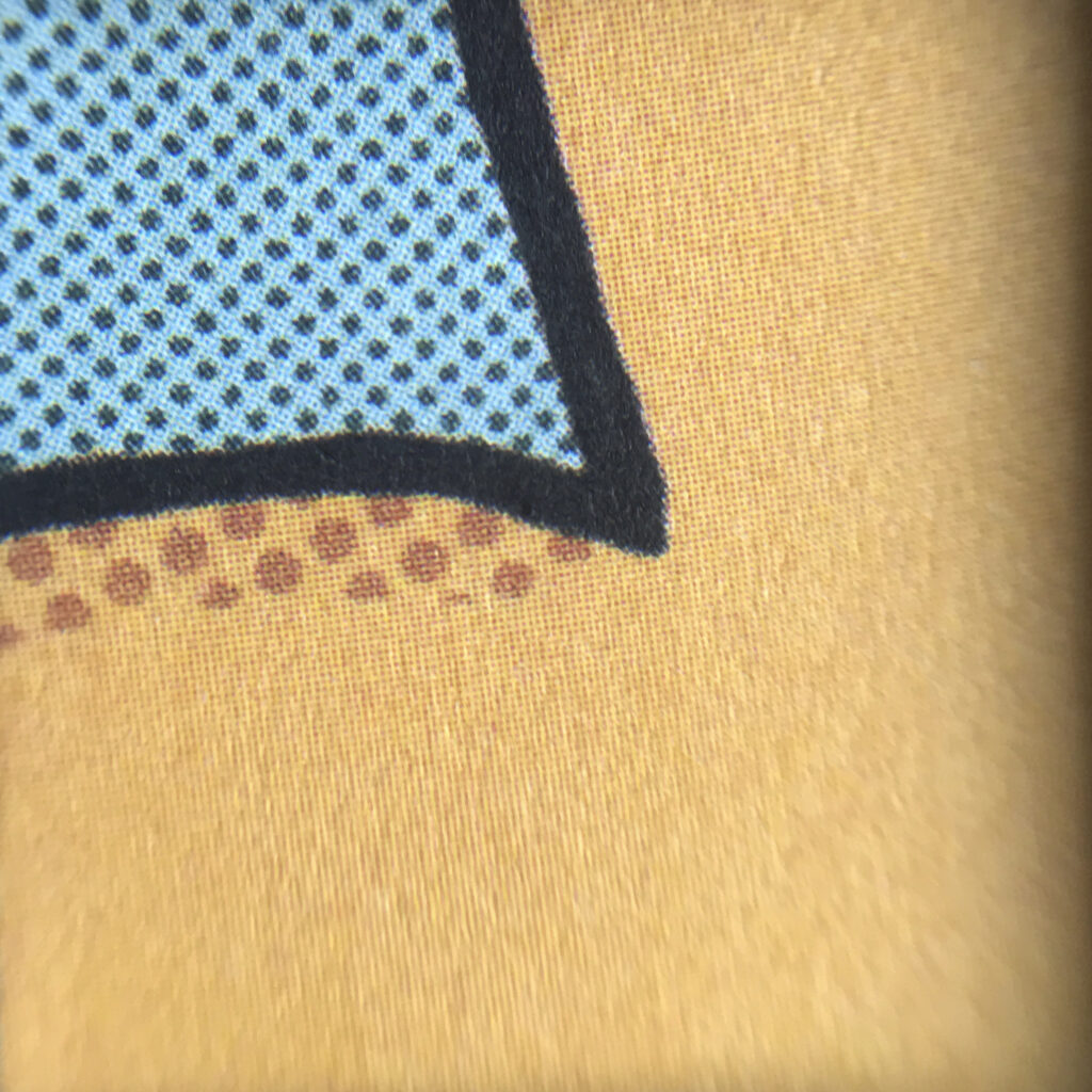
The various analog printing techniques, from offset, flexo or gravure printing over letterpress, screen print to risography also offer different advantages and disadvantages. While offset print features sharp prints and great solid color areas even on uncoated papers, letterpress printing (with hotfoil or color) nowadays is mainly used wherever the printing substrate is embossed, adding on the haptic value of the printed product. For both methods colors can be mixed by hand and thus especially spot colors can be printed providing high accuracy. In screen print colors can also be mixed and customised by hand, resulting in highly saturated long lasting color prints on various surfaces.

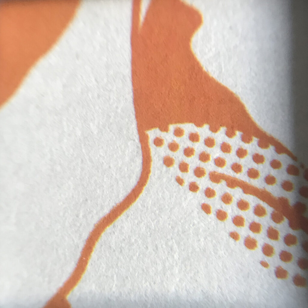
magnified 4c offset print on uncoated paper (110 gsm)
magnified 1c screen print on uncoated cardboard (300 gsm)
magnified 1c white hotfoil embossing on yellow graphic cardboard (approx. 600 gsm)

In analog printing however, the visual appearance from print to print may vary, resulting in more or less charming print effects and styles, especially when printing manually or in small editions where a proper preparation and set up of the printing machine is not applicable.

magnified 2c letterpress print on 600 gsm uncoated cotton paper

Finally besides the choice of the printing method, not only the number of copies but also various components in the printing process, like colors (e.g. transparent or opaque), features of the printing substrate (e.g. thickness, smoothness of surface, coated or uncoated papers) but also physical features of materials used for printing plates or stencils are to be considered for the accurate purpose and style of the final priting result.

Sources:
https://en.wikipedia.org/wiki/Printing
https://sites.google.com/site/historyofprinting/the-invention-of-wood-block-printing
https://de.wikipedia.org/wiki/Digitaldruck
https://www.derdruckoptimierer.at/offsetdruck-vs-digitaldruck/
https://de.wikipedia.org/wiki/Offsetdruck
https://www.wired.com/story/how-letterpress-printing-came-back-from-the-dead/


Taking back control

The individualization shift of the last decades was caused by three major developments. The first is the increase of wealth by which nearly all demographic groups elevated to a higher living standard. Secondly, shortening working hours brought more spare time in which citizens could pursue their interests, hobbies, political engagement, or further education. Eventually, an educational achievement brought social climbing and cognitive competencies that encouraged us to think about ourselves and our lives more profoundly.

Nowadays everybody has to answer their questions in life on their own instead of just following the path of their milieu like it was in former days. Life, death, identity, gender, physicality, religion, marriage, parenthood, social binding – everything is decided in detail by our selves, which can be overwhelming. Since we do not identify with a set of traditions anymore, everything could’ve been arranged differently, everything is questionable, there is always an alternative. We lost the cultural binding that led our way through the jungle of options.

Now, how can design make a difference here? Well, what if there is something that could help us guide the way through all those options? Help either to see the effects of a decision beforehand or simply help feeling comfortable with already made decisions.

One of the beautiful things about machine learning is that massively large data sets can be processed. And instead of using online profiling data for marketing intentions, it could be used to empower the very person whose profile it is. By creating online profile transparency and offering insight through an interface one would be able to understand themself, to make better decisions, and to understand their effects. Like laying out branches of actions that converge to a butterfly effect.

The butterfly effect basically describes how a small event can have a huge impact later on. Using an interface that computes your personal life could either predict the future or will let you understand your past. I personally find that idea fascinating even though it’s unclear how well machine learning and AI can execute it at this stage. I do not propose a destiny forecast but rather a tool to understand themself and to gain an overview of personal behaviors instead of offering it to companies that then forecast your consuming future for you.

References:

Ralf Dahrendorf: Der moderne soziale Konflikt. Essay zur Politik der Freiheit, Stuttgart 1994

https://www.bpb.de/politik/grundfragen/deutsche-verhaeltnisse-eine-sozialkunde/137995/individualisierung-der-lebensfuehrung?p=2

https://de.wikipedia.org/wiki/Schmetterlingseffekt

Drawing & Thinking

How drawing helps you think

Ted Talk by Ralph Ammer | TEDxTUM

Ralph Ammer shows how drawing can support our thinking in five ways and why drawing doesn’t have to be perfect. In his opinion drawing, like language, is a way to think and get in touch with other people. For him, drawing is not about art – it is bigger than art. It’s a way to think visually. 

  1. Drawing can ignite our intuition
    By doing little repetitive exercises we can improve the connection between our hand and eyes as well as give our hand a physical workout. The stronger the hand, the better we may control it to draw. These exercises can also function as some sort of meditation and soothe our minds. This can give more room for intuition. 

  1. Drawing can make the world more beautiful
    Normally the brain tunes out any unnecessary information. When we draw, we actually have to look and concentrate on the world around us. We see what is actually there. By drawing our surroundings we can store information in our mind and remember far better than as if we had just taken a photograph.
    One problem we might encounter is that our drawing doesn’t end up looking like our reference. The reason for this is that we tend to draw what we already know and not what we really see. By drawing the spaces between objects instead of the object itself we can trick our brain into not recognising shapes and make it easier for us to observe.
     
    _

We don’t find beauty. We make the world beautiful by paying attention.

  1. Drawing helps us understand
    We can try to draw what is unseen, like our thoughts and emotions. By choosing a subject and placing it on different positions within our canvas we can create different contexts. Ammer tries to draw his thoughts every day. They represent his thoughts about the world and can be grouped and rearranged to see connections and patterns.
    _
  1. Drawing can help us to imagine new things
    For Ammer an idea is what happens if two or more thoughts collide. By combining one thought with many other different thoughts you get a lot of ideas. After just writing everything down that you came up with you can sort out what might not work. An idea that seemed bad at first might turn out as the one that fits best for your purpose. 
    _

Creativity really is like breathing. You take in information and knowledge and you combine it to new ideas that you emit.   

  1. Drawing helps us communicate with others
    Images help to make words stick in your mind, because words alone are sometimes hard to take in. With drawings you can lead others through your thought process and help them to connect the dots and understand your idea. For that to work, the drawing has to be original and personal.
    _

Our drawings do not have to be pieces of art. If they help us to think, they are good enough.

Ralph Ammer

On Ralph Ammer’s website he writes about about all those topics and many others more in detail. Some interesting articles of his:

Sound Design und akustische Illusionen in der Praxis

Shepard Skala

Die Shepard Skala ist die Illusion einer unendlich steigenden/ fallenden Tonleiter, welche 196 von Roger Shepard vorgestellt wurde. Der Effekt beruht auf mehreren Sinustönen, die langsam an Frequenz zunehmen/ abnehmen und an den Grenzbereichen der Hörschwelle die Lautstärke abnimmt. Die Töne sind eine Oktave voneinander entfernt und verändern sich Parallel mit der selben Intensität. Die ständig sich erhöhenden Töne geben den Effekt der sich immer steigernden/fallenden Frequenz. Ist der übergang fließend spricht man von einem Shepard-Risset-Glissando. Der Effekt wurde in leichten Variationen bereits von vielen Komponisten in Film Szenen verwendet, da er sich gut für den Aufbau von Spannung anbietet.

Im folgenden Videobeispiel wird die Umsetzung verdeutlicht:

Ein weiteres gutes Beispiel für guten Einsatz von Sound Design im Film, ist der Film “Eraserhead” aus dem Jahre 1977 von David Lynch. Viele der einprägsamsten Soundscapes sind im Horrorgenre zu Hause. Eine unheimliche Geräuschkulisse kann eine großartige Möglichkeit sein, die Gruseligkeit der Bilder auf dem Bildschirm zu verstärken. In den Filmen von David Lynch finden sich einfallsreiche Geräuschkulissen, die er oft selbst herstellt.

Im Film “Eraserhead” werden die Atmosphäre und das Grauen durch die kraftvolle und bedrückende Geräuschkulisse erzeugt. Die dröhnenden, surrealen Töne werden mit industriellen Geräuschen überlagert, die die düstere Natur der Umgebung des Protagonisten sehr effektiv verstärken.

Das dritte Beispiel für eine ausdrucksstarke Sound Design Umsetzung ist der Film “District 9” von Neill Blomkamp. Vorallem im Science Fiction Genre wird besonders viel mit komplizierten und umfangreichem Sound Design gearbeitet um die Kulisse möglichst hyperrealistisch und außerirdisch wirken zu lassen. Besonders in Filmen mit vielen Animationen ist es besonders wichtig. In diesem Ausschnitt des Films ist fast jedes Geräusch in der Postproduktion hinzugefügt und bietet dadurch deutlich mehr Action als ohne Sound.

Quelle für Inspirationen: https://www.studiobinder.com/blog/author/samkench/ August 2020

Clumsy Interactions through everyday objects 04: Is it dependent on the object?

In this article we will discuss the different design elements that make an object can generate awkward interactions.

The 5 Psychological Concepts Creating Good Interaction

In the previous article, we talked about the principle of discoverability, for this principle is the result of 5 fundamental psychological concepts: affordance, signifiers, mappings, constraints, and feedback. It is these 5 concepts that will allow us to create when discovering an object, an experience coupled with optimal use of the object. Let’s now discover what these 5 concepts are and their implications in clumsy interactions.

Affordance :

We live in a world full of all kinds of objects, we use and discover new ones every day. Whatever the object we manage to master, and affordance is one of the first things that allow us to explain this. First named by the psychologist James J. Gibson, it refers to the relationship between a physical object and a person, a relationship that will help that person determine how to use an object. It describes all the actions made physically possible by an object. We can take the example of a closet, we know we can pull its doors open or push them shut. Don Norman brings a specification to the term affordance, he talks about perceived affordance, this point is very important because it is he who can show us how an affordance error can generate a clumsy interaction. This new term designates the actions that the user perceives as possible, as opposed to those that are actually possible. I was looking for a common example of a situation generated by an affordance problem, so I remembered buying a pair of pants some time ago. The pants had pockets on them, or at least that’s what I thought until I wore them and realized that they were fake pockets. This is an example showing that the action that I wanted to perform, that is to say to put my hand in my pocket, could not be done because the object did not allow it. But it is just as valid in the other direction sometimes actions cannot be performed because the user does not perceive them as possible. And this is where the concept of signifier comes into play.

The Signifiers :

If the affordances allow us to determine the possible actions, the signifiers tell us where we will be able to carry out this action. If one takes again the example of the pants it is the false pockets that were significant for me and led me to think that the action to put my hand in my pocket was possible at this precise place. These two concepts can be difficult to differentiate today in a world of new technology. For example, in the presence of a screen, we may tend to think that touching an icon is an affordance but this idea is false because the affordance corresponds to the action of touching the screen (wherever it is), the icon will represent the place where the action must take place, it is the signifier. Nowadays, for aesthetic reasons, it can be complicated to identify the signifiers, and therefore interacting becomes difficult. This is what we can observe with handleless closets; where should we take our opening action? Similarly, how do we choose which action to take, should we pull or push?
The handle answers all the questions, in addition to indicating where the action should be carried out, because of its location it shows us where the action is going to act, this is where the concept of mapping comes in.

The Mappings :

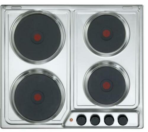
Mapping indicates the relationship between the two elements. For example, if we use baking trays with knobs, the mapping allows us to understand which knob is connected to which baking tray. The mapping is essential for the layout of the controls and displays. When the signifiers give a clear view of where to touch, the mapping allows us to instinctively understand what each control corresponds to. We will keep the example of the plates and see two interactions, one will be clumsy and the other not.

Here is a first hob composed of four plates. The buttons to operate each plate are placed next to each other. It is quite easy to realize that the two buttons on the left correspond to the left plates and the two buttons on the right to the right plates. However, to know which button corresponds to the top or bottom plate is more complicated, it is not possible to guess it naturally and therefore it must be tested with the risk of burning yourself.


Here is a second hob, more modern and based on tactile contact. The buttons to activate the plates are positioned like the plates, when we want to activate a plate we don’t ask ourselves and we are sure that it is the right one with this model.


It is important to specify that today, the majority of cooking tables with physical buttons have pictograms that make their understanding easier. Nevertheless, having this kind of hob I can attest to the fact that even with regular use I almost always check the pictogram to identify the right hob, so it’s simple but not intuitive. Let’s remember that the intuitive aspect of an object depends on the ability of the designer to provide the essential elements to understand the object and its limits.
These limits can be constraints.

The Constraints :

The constraint in itself does not need to be explained, it is known to everyone. On the other hand, we can explain the different types of constraints that are applied to objects by creators in order to limit the possible actions. There are four of them: physical, cultural, semantic, and logical.
The physical constraint is simple to understand, it is the one that limits the possible operations. For example, it is easy to realize that the wrong key is used to open the door because it will not make the lock work.
Cultural constraint is more difficult to grasp. Indeed, each culture defines a set of authorized actions in social situations. So if we misunderstand a culture, it is easy to make mistakes and create things that can be considered inappropriate. What’s more, these constraints are likely to change over time.
The semantic constraint is based on meaning, it is based on the knowledge of a situation in order to codify possible actions. For example, a windshield is there to protect the face of a person in a car, so it makes sense to put it in front of her. However, like cultural constraints, semantic constraints are also likely to evolve.
Finally, there is the logical constraint, based as its name suggests on logic. This constraint is particularly related to the principle of mapping. If we take again the example of the hob, it is logical to think that the knob on the top right will correspond to the plate on the top right and if this is not the case it is because there is a problem in the conception.

The Feedback

Finally, our last concept is feedback. When an object is designed so that we can identify affordance using the signifier, the mapping is clear and the constraints identified, the feedback will ensure that we have an understanding of the other four concepts. Feedback is the element that allows us to understand that our action has been taken into account. For example, when I use my oven and start my program, I hear a sound signal or see the oven light come on. Without this feedback, I am likely, in doubt, to repeat the action or even modify it, which can lead to awkward interactions. An obvious example is that of the elevator, if there is no visual or audible indication that the call has been answered we are likely to press the button again and again until the elevator arrives. Attention, this feedback must be thought to correspond to the action. Thus, if when we call the elevator an alarm sound is triggered we will certainly not stay waiting for it.

The Conceptual Model

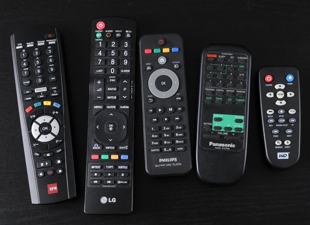
The conceptual model allows explaining the functioning of an object in a simple way. It is the one that will allow us to create a simple mental model and make it easier to use: for example, when we see the “folder” or “file” icon on a computer. The simplest conceptual models are those that should be used for everyday objects because they remain in our memory and become our mental models. Beware, however, analyzing a conceptual model will create different mental models for different people, so let’s remember the engineer from the previous article who just forgot that his mental model is different from the users’ one. Conceptual models derive from the devices themselves and are created by the experience. Since an experience differs from one individual to another and unforeseen things can happen, the mental models it generates often end up being erroneous.s This is where the awkward interaction happens, if I have an erroneous conceptual model of an object, so will my use of it. A good conceptual model is used to understand how the elements will behave together and why they should be operated in a particular way. Let’s take the remote control, no matter what its shape or model I don’t know anyone who has used all the buttons on that object, let alone someone who can explain to me what each button corresponds to. In my opinion, the majority of people using remote control have a faulty conceptual model of it. Indeed, for it to be right, the person would have to understand all the actions that can be performed which is complicated when you don’t need to use them.

Conclusion

We have seen that many elements can influence our experience and our interactions with an object, negatively or positively. The concepts we have just mentioned are major points of vigilance when designing an object, to limit clumsy interactions.

Definition, in progress

  • A clumsy interaction doesn’t happen at the moment we use the object, it was there before and can come from the designer and his personal vision of the use of the object.
  • A Clumsy interaction can depend on the conception of an object and more specifically on the design of the experience related to this object when trying to manipulate it, activate it, make it work, and understand it.

Sources :
Book: The Design of Everyday Things, Don Norman, 2020
Article: Affordance in user interface design, UX Collective, 2017

Impact of VR on our emotions

As I want to use XR (extended reality includes AR, VR & MR) for my master thesis and since the current topic is prosopagnosia and I want to influence their lives for the better, I thought it would be useful to research if and how much VR or MR can influence our emotions. Actually there exist a few various studies on the subject by now and I looked into a few of them. But first it is important to clarify the terms mood and emotion because the two are not the same. Mood does not have to have a specific cause, but is long-term and has low intensity where emotions are triggered by specific things, are short-lived and much more intense.
Emotions can be differently measured or recognized because each person responds differently based on their lifestyle and culture. However, the main characteristics to be able to measure emotions are in most cases subjective evaluation and perception, actions, facial or vocal expressions, heart rate, skin reactions and a few others. This is where user experience comes into play, especially in VR. In order to ensure a good UX some areas need to be included. This includes the feeling of presence within the environment or immersion, the system’s ability to interact with user input, and the user’s involvement in the virtual environment. It can be both passive and active. However, the user must always be a part of the environment or able to do something with it.

But back to the studies.

The Virtual Counselling Environment

The first study deals with the extent to which virtual people can have an influence on the emotions of the user.

To investigate this, a computer-generated counselling environment was created. Furnishings were oriented on a normal therapy room, which means sofas, paintings, books, a table and a chair on which the user can sit down. The user should feel as if he is in this virtual world and sitting on a real chair. The patient is a virtual human called ‘Justin’. The therapist is the user wearing the headset. So a training environment has been set up where virtual patients can be treated by novice clinicians and those therapists can practice challenging situations. To make it more realistic, it is important that the complete process is included in the virtual environment. This includes coming in, reactions, statements and leaving the room. The virtual human has basic movements, human facial features and a human voice. The whole system works only if speech recognition is built in, because only then a positive response is possible and the user is not frustrated.
Surprisingly, the virtual human could simulate human emotions so well that the user could recognize them.

Virtual Counselling Environment [1]

Study results

  • VR has a strong influence on the emotions of the user
  • A natural human computer interaction has an impact on the user
  • Speech recognition is important, because only then it seems more natural and the emotional level is much stronger
  • The use by controllers has less influence on the emotional response

Virtual Park Scenarios

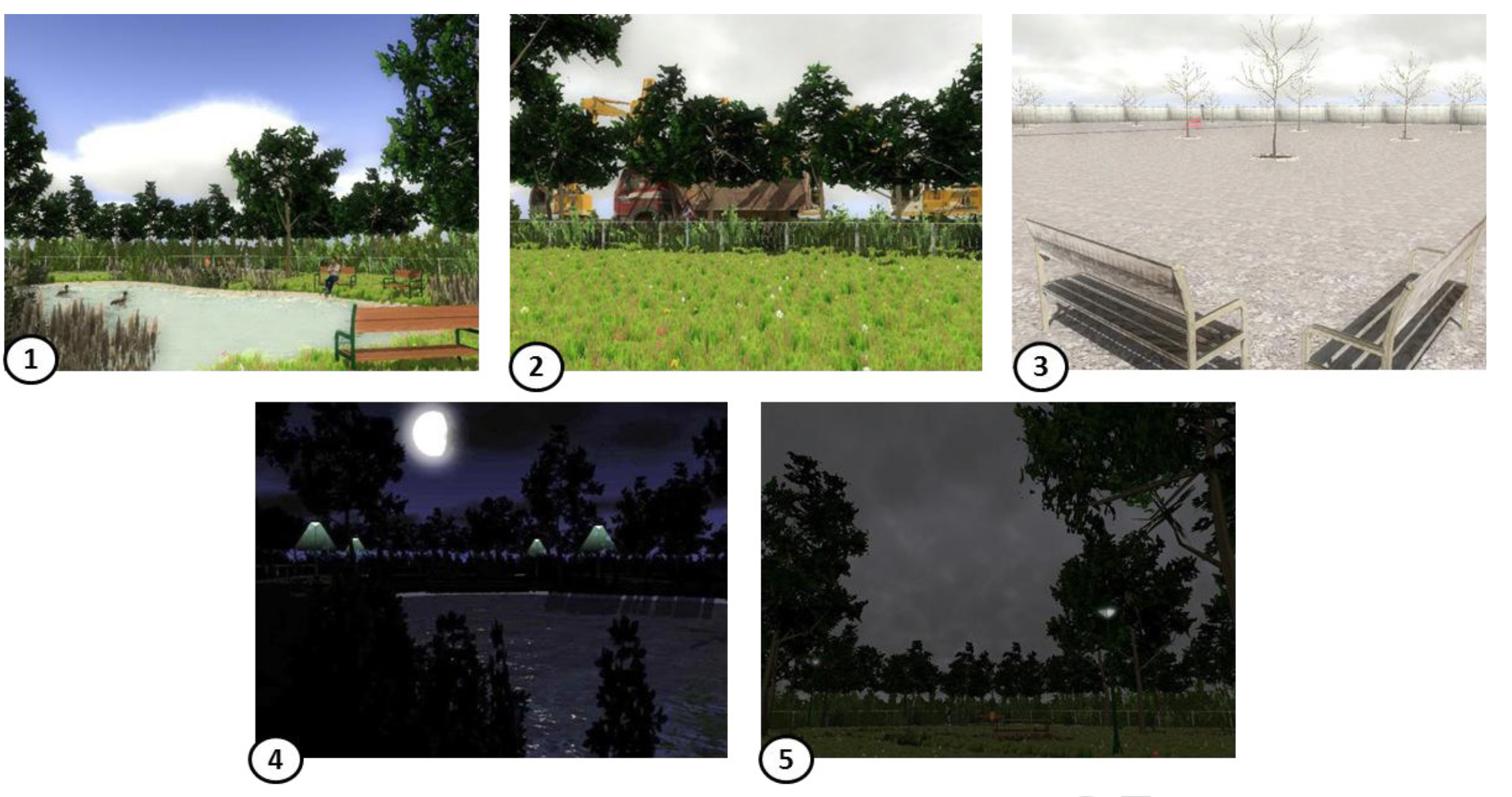
The next study is about whether a scenario of a fictional VR park can evoke joy, sadness, boredom, anger and anxiety. 
The Velten Mood Induction Procedure method was chosen, which means that under controlled conditions images, film clips or music are shown which evoke temporary emotional states. This method tests effects of emotional states, memory or change in information processing.
In addition, electrodermal activity (EDA) was applied for this study. 

„Electrodermal activity (EDA) refers to the variation of the electrical properties of the skin in response to sweat secretion. By applying a low constant voltage, the change in skin conductance (SC) can be measured non-invasively (Fowles et al., 1981).“[3]

To be able to evoke emotions, the feeling of presence must be considered above all. Presence is often defined as the sense of being there in a Virtual Environment and because of this feeling, an emotion can occur. So, a greater presence would create a much greater reaction and the user would behave, feel or think as if he or she were in a similar situation, because it does not feel as if what he or she is experiencing is only from technology. Frame Rate actually affects the feeling of being present as well. 
For the study, 120 students were selected to first of all relax for 5 minutes and then explore the park in the VE environment in first-person view for 5 minutes.

Scenarios [2]
  1. Joy: sunny, calm, quit, daytime scenario with chirping birds, non-playing characters
  2. Anger: constant, unnerving sound of heavy construction work
  3. Boredom: dull and boring scenario with sound of distant traffic
  4. Anxiety: gloomy night-time, dim light, owl sound, non-playing characters silhouettes
  5. Sadness: grey, rainy day, rain dripping sound, non-playing characters carrying umbrellas and walking hastily 

Study results

  • Joy, anger, anxiety and boredom have triggered the planned emotional states
  • The Park vor sadness failed because boredom and sadness are often accompanied by one another
  • Most negative emotions are accompanied to a small degree by other negative emotions

Feelings of fear and anger in VR

The purpose of this study was to find out to what extent the user’s emotions depend on the medium used, in this case VR and computer screen. To be even more specific, fear and anger were selected and compared with each other. Because especially from these two negative-valance emotions it is possible to see clear differences. The willingness to take risks increases with anger, while it decreases with fear. Both emotions have in common that they are negative and that we are strongly aroused by both. The differences are not only the willingness to take risks but also the control over the body and the awareness of the emotion.
To trigger anger, a short film clip from the movie ‘My Bodyguard’ was chosen, in which a group of teenagers bully weaker people. For the emotion fear, the subjects had to play the VR horror game ‘Play with me’. Both emotions were shown to the subjects on a computer screen as well as in VR.

Trailer My Bodyguard (1980)
Trailer Play with me (Game)

Study results

  • Decisions can change depending on the emotional state in which the person is at the time
  • People take more risk when they are angry
  • VR has a much higher impact on decision-making behavior compared to the use of a computer

Emotional reactions are intensified much more by VR

To get to the bottom of this, the GAPED picture database was used. GAPED stands for Geneva Affective Picture Database. In this database 730 pictures were collected, which are supposed to trigger different states of mind. These included negatively affected pictures such as snakes or pictures about mistreatment (injured animals or butchering), positive ones such as puppies, nature scenes or laughing faces, and neutral pictures such as non-living objects (bicycle spokes).
Participants had to answer three questions and rate their emotional state on a scale after viewing 24 selected images for 4 seconds.

Study results

  • For all images, the arousal was much higher with VR than with a computer screen
  • Photos with snakes or spiders where associated with phobias so the arousal was even higher
  • By diving into the world and blocking out the reality, the much higher arousal of the user could be explained
  • The attention span could be much higher when virtual reality is used

Sources:

  1. The effect of two different types of human-computer interactions on user’s emotion in virtual counseling environment, Tu Ziqi, Weng Dongdong, Cheng Dewen, Shen Ruiying, Fang,Hui, Bao Yihua (10.2019), https://booksc.org/book/80763010/fcb00e
  2. Is virtual reality emotionally arousing? Investigating five emotion inducing virtual park scenarios, Anna Felnhofera, Oswald D.Kothgassnera, Mareike Schmidt, Anna-Katharina Heinzle, Leon Beutl, Helmut HlavacsbIls, Kryspin-Exner (10.2020), https://www.sciencedirect.com/science/article/abs/pii/S1071581915000981
  3. A continuous measure of phasic electrodermal activity, Mathias Benedek, Christian Kaernbach (30.06.2010), https://www.ncbi.nlm.nih.gov/pmc/articles/PMC2892750/
  4. The Feeling is Real: Emotion Elicitation in Virtual Reality, Sahinya Susindar, Mahnoosh Sadeghi, Lea Huntington, Andrew Singer, Thomas K. Ferris (11.2019), https://journals.sagepub.com/doi/pdf/10.1177/1071181319631509
  5. Can Virtual Reality Increase Emotional Responses (Arousal and Valence)? A Pilot Study, Sergio Estupiñán, Francisco Rebelo, Paulo Noriega, Carlos Ferreira, Emília Duarte (2014), https://link.springer.com/chapter/10.1007/978-3-319-07626-3_51
  6. Physiological Measures of Presence in Stressful Virtual Environments, Frederick Phillips Brooks Jr., Michael Meehan, Brent Insko, Mary C. Whitton (08.2002), https://www.researchgate.net/publication/2529722_Physiological_Measures_of_Presence_in_Stressful_Virtual_Environments

Redesign of familiar things

Redesign is live. Everything we see has been or will be redesigned for the modern aims. Nevertheless, some things become so iconic that they don’t need any redesign. Moreover, serve as inspiration for new ideas.

Thats why this topic will be defined on two parts: chairs, that have become part of culture and design icons redesigned in a new way. 

Enjoy reading:)

CHAIR DESIGNS: 5 most famous models in history

Why these types of chairs still have a modern design and will not become obsolete by your retirement?

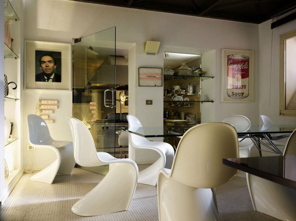
PANTON CHAIR (VITRA)

The first ever Verner Panton chair without the usual legs, made from one piece of plastic.

The chair designed by Verner Panton became a symbol of the 1960s and 70s, the era of space exploration, the invention of new polymers and the sexual revolution: a streamlined S-shape, hinting at a resemblance either to tongue or to a woman’s silhouette, made him a sexual fetish and a frequent hero of advertising campaigns and glossy magazines. Over the years, the Panton Chair has graced the cover of 1995 Vogue with seated nude Kate Moss.

Despite the fact that this chair is included in the collections of the world’s leading design museums, it does not pose a big threat to the wallet. Not a lot of people know that there are Panton Chairs in different “plastics”. So, the version of Vitra in matte polypropylene is cheaper than the classic glossy one.

THONET No.14 (THONET)

The “chair of chairs” on which the greatest people of the 20th century sat — Picasso, Einstein, Lenin … 

The name of its creator has become a household name: our grandmothers still had such “thonet” made of bent wood. Officially known as Model №14, this chair is as much an “unbreatheable classic” as Chanel №5. Originally from Austria (hence another name — “Viennese chair”), these models of wooden chairs produced by the factory of the Tonet brothers, are an indispensable attribute of traditional cafes in Vienna, Paris or Berlin — therefore it is often called “bistro chair».

LOUIS GHOST (KARTELL)

This chair made of transparent plastic is a child of our time, but since its appearance in the early 2000s, it has gained immense popularity and has become a frequent guest in restaurants (in fact, it was invented for the trendy Kong restaurant in Paris), cafes and private interiors. It is not surprising, because any project — be it a chair or a yacht — by the most famous designer of the planet Philippe Starck is doomed to success.

In this case, the Frenchman Stark pays tribute to history, referring to the era of Louis XVI and the brilliant Marie Antoinette: the chair formally, but in a somewhat exaggerated form, interprets the armchair-medallion with an oval-shaped back, that came into use in the second half of the 18th century. In his usual playful manner, the designer makes an elegant classic model in inexpensive transparent plastic, due to which the new chair only vaguely resembles its high-society prototype — it is only the “ghost of Louis” (hence the name).

NAVY CHAIR (EMECO)

Designed in the 1940s for the US Navy, this chair is an icon of American design. One-piece cast aluminum chair, super lightweight and fireproof, virtually indestructible, has an unprecedented lifespan – 150 years warranty! This opened the way for him to libraries, police stations, prison cells and other places where his vandal-resistant essence is in demand.

Architects and designers love the naval chair for combining brutal industrial chic and elegance with a touch of glamor. According to legend, the anthropomorphic shape of the seat was sculpted by the standards of pin-up actress Betty Grable, the owner of the most beautiful legs in Hollywood.

TULIP CHAIR (KNOLL)

The author of this futuristic-looking chair, Finnish architect and designer Eero Saarinen, was worried about the “visual noise” in the interior created by the intricate interweaving of table and chair legs (four for each item — just imagine how many there are in the room). To rid the house of clutter and large unnecessary details, a Finn invented a chair on one leg — “pedestal”, reminiscent of its streamlined shapes either a tulip bud (hence the name, once again), or a pot-bellied wine glass. To pair with the chair, Saarinen provided the same one-legged table.

The Tulip Chair is not monolithic as it might seem at first glance. Due to the limited technology available to designers in the mid-1950s, the chair was made from fiberglass (a type of plastic) and aluminum. Although the designer dreamed that someday this object could be produced from one material — plastic. Actually, more than one generation of designers dreamed about the integrity of the structure. The task, as we now know, was destined to cope only with Verner Panton in his S-shaped chair …

Saarinen was convinced that the chair should not only be perceived as a sculpture in the interior when no one is sitting on it, but it should also serve as a good backdrop for the person sitting in it. 

P.S. You can read about the rest of the chairs in the second part.