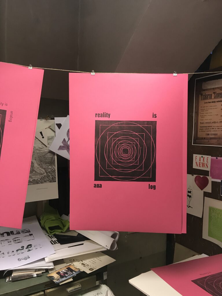
Print experiment: “reality is analog”, part VII–posters in public space

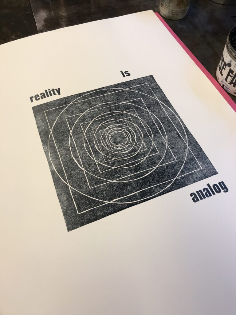
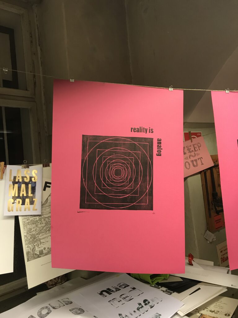
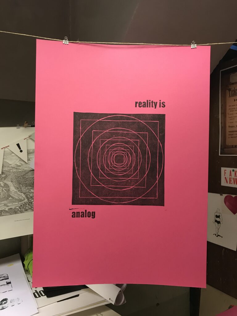
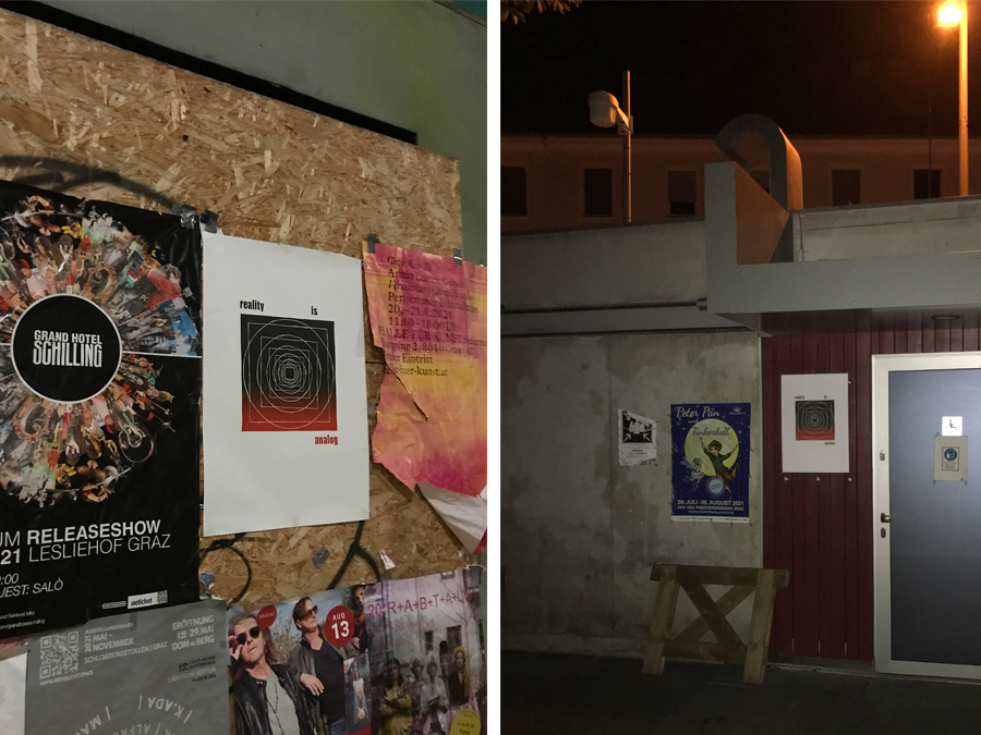
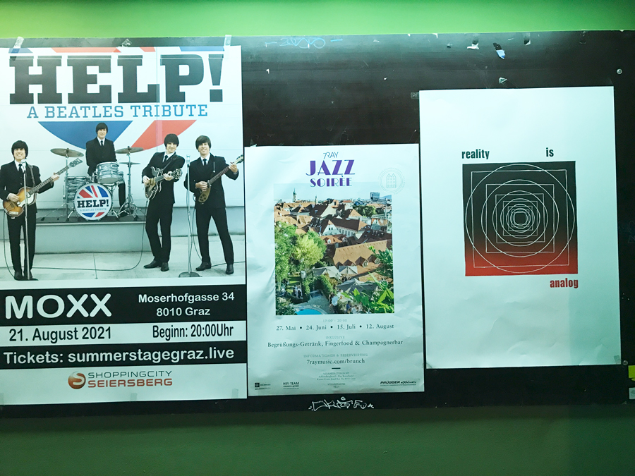
For the final part of the experiment the posters were hanged in (semi-)public space. Next to posters promoting various events, the advertisement-free letterpress prints aimed at raising awareness for the topic and reflecting the viewers perception.

Additionally, putting them in the real world was the analog equivalent to a digital posting on social media. However as the poster walls in public space aren’t capable of tracking likes, the only measure for public perception was if the posters disappeared. Though again, only the disappearance of the posters can’t tell specifically the viewers opinion, my hope was that people would take the posters to hang them in there homes.

At least I could observe that most of the posters were gone after a while – either they went to trash or they found a new home on another wall.

Print experiment: “reality is analog”, part VI–repro photography of print edition

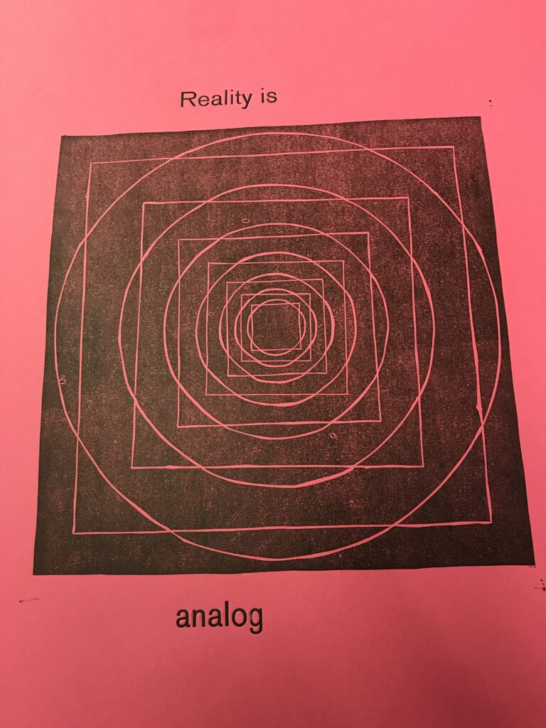
After the printrun and final cut, I documented the print edition with a repro camera to find out about the fluctuation of the printing process.

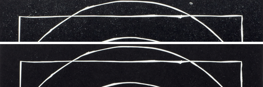
The animated clip below shows that besides minimal changes of the position (also possible because of not 100% accurate positioning for repro photography), the print result of each poster varies slightly.

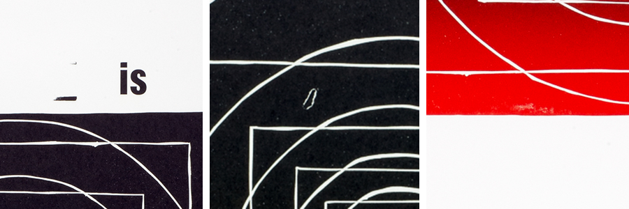
Differences in color application, but also minor flaws like particles on the printing rollers or inked blind material (in German printing jargon refered to as “Spieß”) that touches the paper in the print run, show a range of stuff that may happen during analog print production.

example for print flaws in letterpress printing.
colour application can variy, especially in printing with letterpress materials. however color application can be adjusted during print run.

Of course, for high quality printing jobs print operators are aware of these mistakes and know how to avoid them.

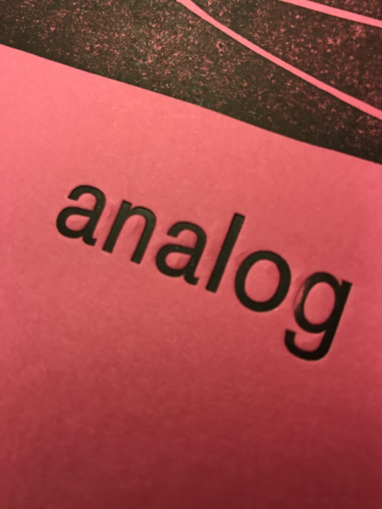
Still, for the experiment, the flaws add to the topic. On the one hand it shows what parameters have to be taken account, while on the other side minor mistakes can be seen as coincidental effects, adding an individual and unique note to each of the posters. Besides these little imperfections underline the characteristics of analog products.

Print experiment: “reality is analog”, part V–print edition on OHZ

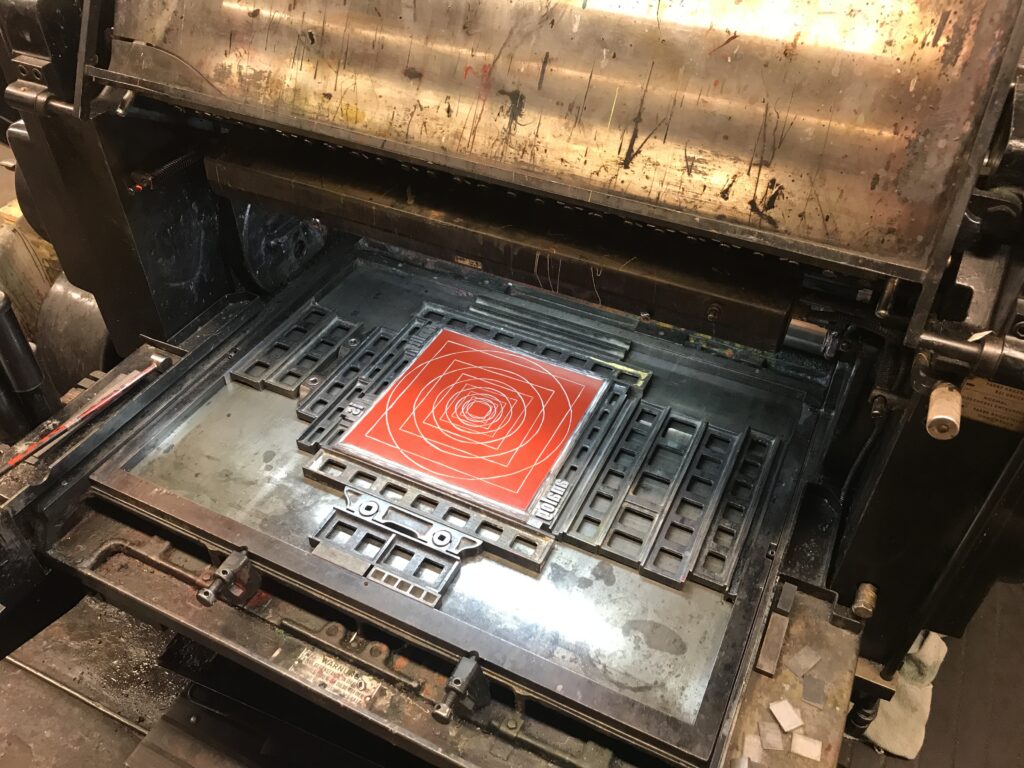
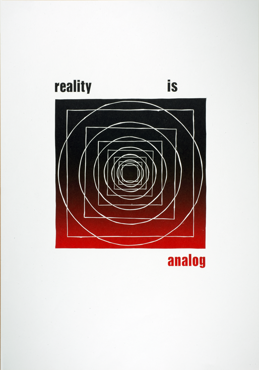
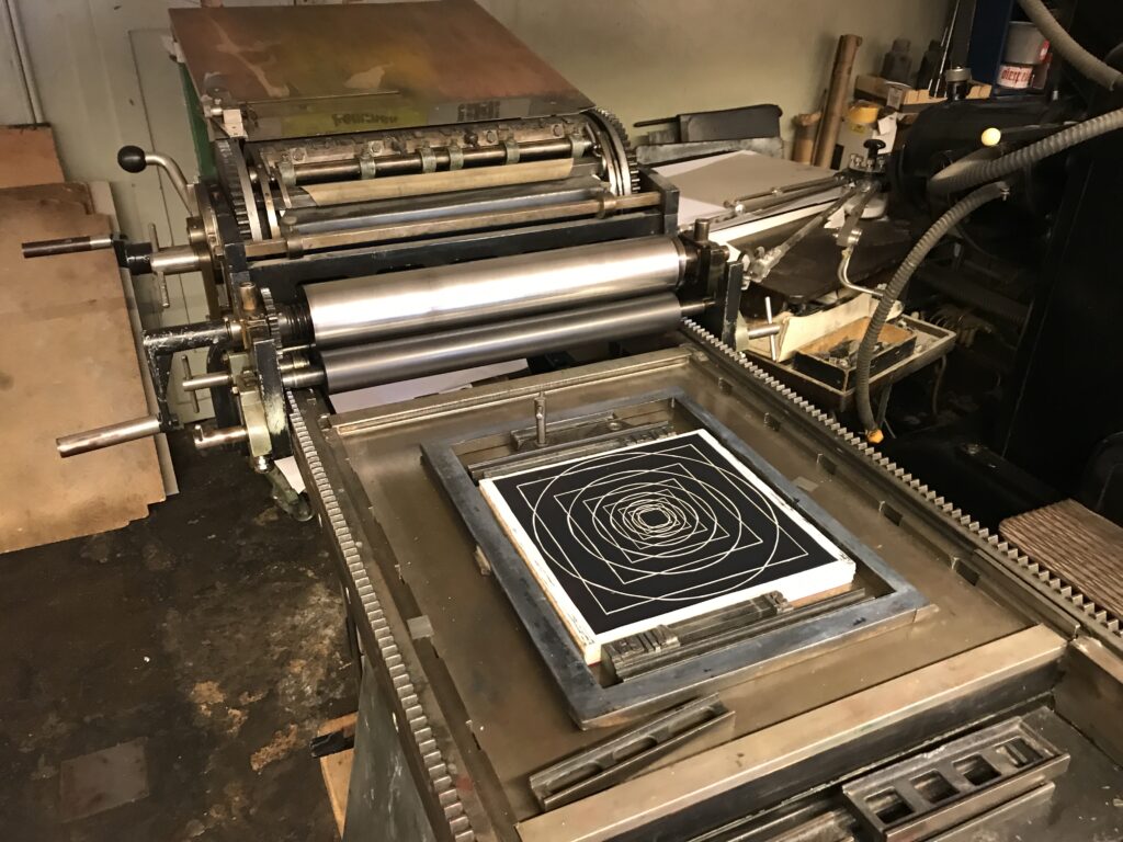
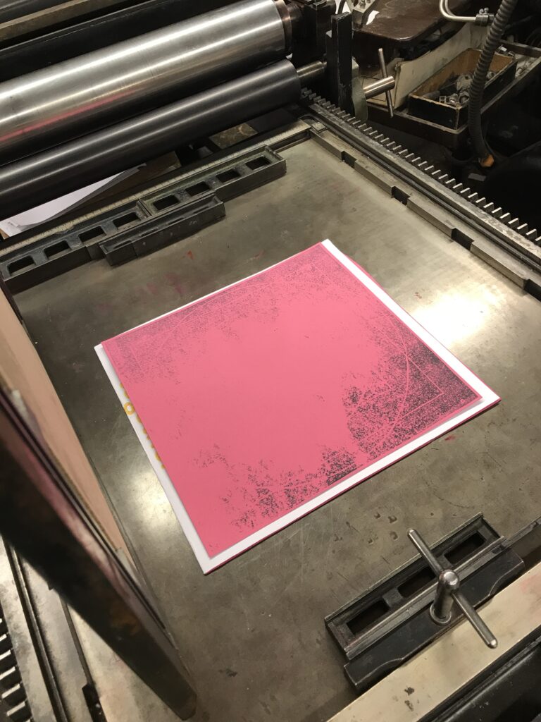
After I had set the letters and printed a variety of prints together with the lino cut on the Asbern proof press, everything was ready for the print edition of about 100 460x660mm posters on the Heidelberg Zylinder at Druckzeug.

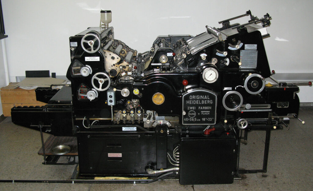
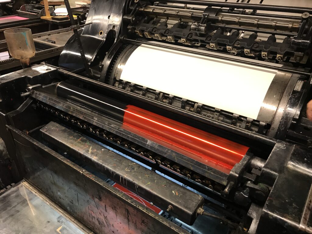
The Original Heidelberger Zylinder (OHZ) was produced between 1935 and 1979 and could print sheets of paper, depending on the machine mode, up to 104 x 72! Heidelberg Cylinders are fully mechanical (automatic) printing machines that improved the technical principles of earlier mechanical cylinder presses (which again were the results of technical improvement of manual cylinder presses).

In general the press is driven by a set of gears, which run the “paper run” (Papierlauf), a system of various picker arms transporting the paper, an inking unit, the moving fundament with the attached print forms and of course the central cylinder. Though later models were able to print two colours in one run, with the most common OHZ-S printers it’s only possible to print one colour on one side of the paper per printing run, though still it is possible to combine letterset with other printing forms in the same run.

OHZ for printing two colours in on printing run

How each unit of the machine work together in a synchronous way is as fascinating as it is ingenious: on the one side of the machine an aspirator is taking one sheet of the paper stack, which slightly moves up step by step. From the aspirator the first picker arm transports the sheet to the next picker on the cylinder. At the same time, on the other side of the machine there’s an inking unit that distributes a certain amount of colour over a set of metal and rubber rolls. On this side the printing block is set on a fundament that is running like a sleigh in and out the machine. By passing the inking unit the block takes the right amount of colour for the print, which happens while the sleigh is running beneath the rotating cylinder. After one rotation the cylinder forwards the printed sheet of paper to another set of pickers that eventually release the print below the unprinted paper stack.

The adjustments that are necessary to properly operate the OHZ are in general the run of the paper (adjusting the replenishment of paper), setting the right position of the printing image by adjusting printing block and paper (again the “Anlage” needs to be fine tuned to guarantee the same position on each print), preparing the printing block on the fundament, strengthening the “Aufzug” (a sheet of paper that’s tightened to the metal cylinder) on the cylinder to adjust pressure, as well as the adjustment of the inking unit.

In the inking unit you can place various colours to print gradients.

As I already had the proof prints, I didn’t have to adjust the height of letters and lino cut and being instructed by a skilled and experienced printer who learned the processes of letterpress before it became an extinct job, we decided to make use of the adjustable zones of the inking unit to print a black and red gradient. Again within the inking unit you’re able to adjust the amount of colour you need for specific areas of your print. Too little colour for bigger areas will result in little saturation, while too much colour, e.g. for small types, will result in blurry edges. As the ink is manually put in to the inking unit you can decide on the position of your gradient.

For my printing experiment we also adjusted the position of the gradient, turning more into black towards the last few copies. Therefore the next part of my print experiment aims at investigating the appearance of the gradient, but also at looking for various inaccuracies that may come with using analog materials and printing techniques – stay tuned for part six, repro photography of print edition.

Sources:
https://digital.deutsches-museum.de/item/78462/
https://de.wikipedia.org/wiki/Zylinderpresse

Who inspires me #4

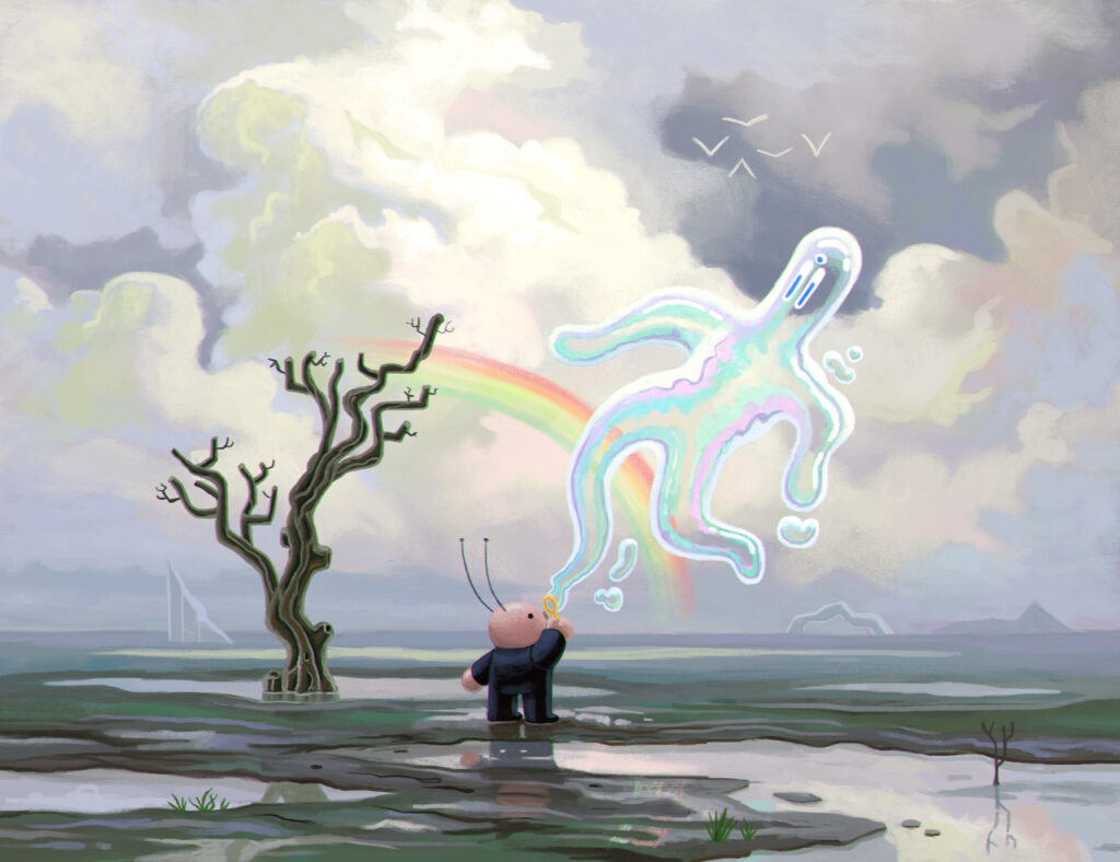
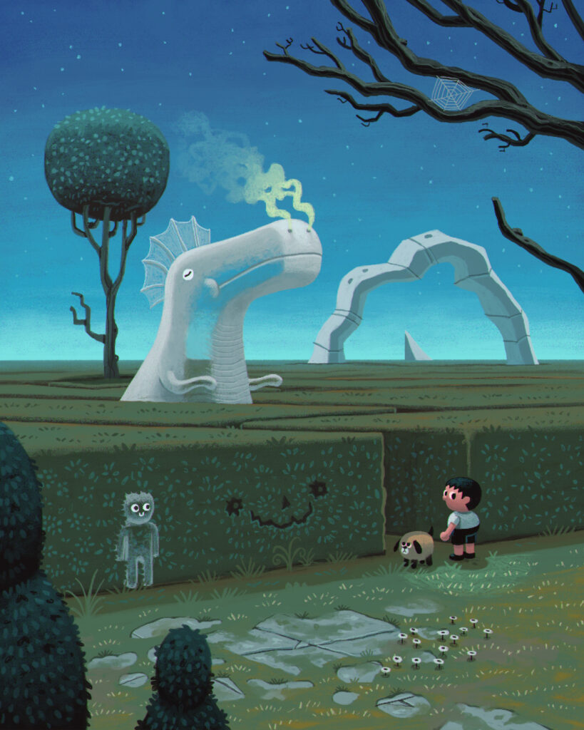
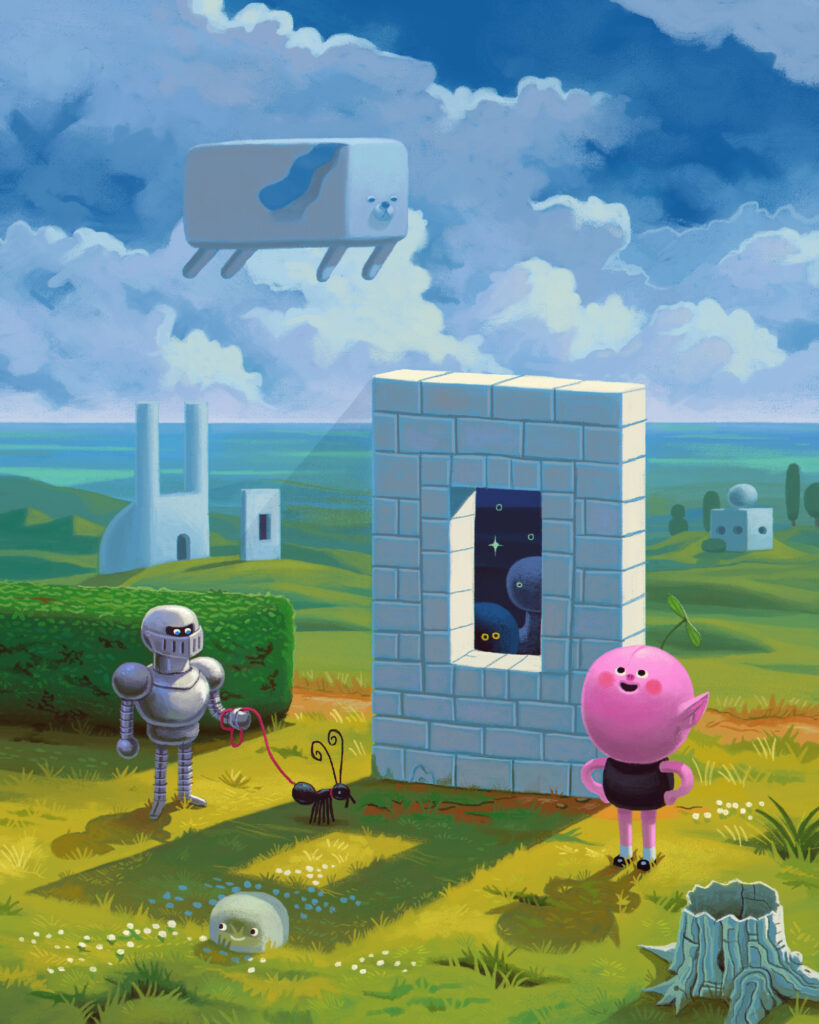
Daniel Shaffer (@danielhshaffer) is a freelance illustrator based in Atlanta, Georgia. His work in featured in many known magazines/papers like The New York Times, The Washington Post or Variety Magazine and his clients also include Cartoon Network, Samsung Publishing and many more.

I like his art mainly because it’s a bit weird (in the best way). Looking at his work is always fun and it makes me feel like not all art needs to be perfectly crafted and has to make sense. Seeing someone succeed which creating things they love without restricting themselves is refreshing. It gives me the courage to think about drawing shapes and characters that many people would label as strange without feeling ashamed of my desire to create something that just feels fun to create. Daniel Shaffer seems like he’s enjoying his job a lot and I strive to do the same.

Mein Versuch

Ich habe mich in den letzen beiden Semestern mit folgenden Fragen beschäftigt:

Wie können Bildinhalte erfasst werden?
Was ist Bildkompetenz und welche Ebenen der Bildkompetenz gibt es?
Welche Grundlagen der Bildkommunikation gibt es und welche Vorteile bieten die Verwendung von Bild oder Text?
Was ist Visuelle Kompetenz und „Visual Literacy“?
Was ist eigentlich ein Bild?
Was ist die Multimodalität medialer Botschaften?
Welche psychologische Theorien des Bildverstehens gibt es?
Wie wird aus der Sicht der Gestalt- und Wahrnehmungspsychologie ein Bild betrachtet?
Welche Bedeutung hat die Informationstheorie für die Bildgestaltung?
Welche Rolle spielt die Emotion bei der Bildbetrachtung?

Nach der theoretischen Bearbeitung dieser Themen schnappte ich mir den Fotoapparat und versuchte Bilder mit eindeutigen Botschaften zu schaffen.

Hier sind nun meine Versuche:
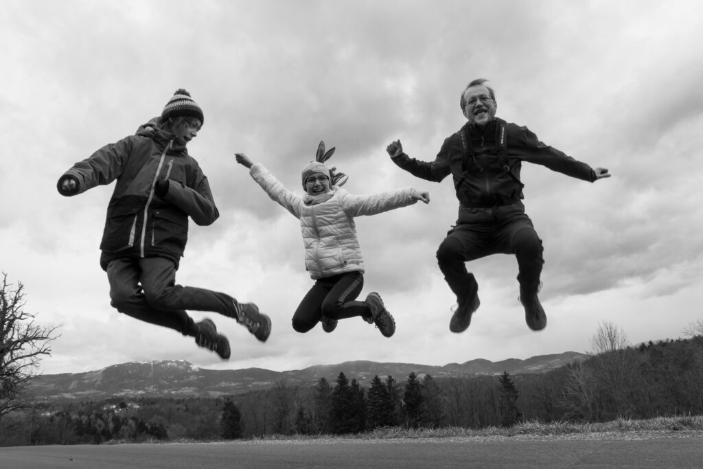
Leise / Laut

Leise
Laut

Vertraut / Fremd

Vertraut
Fremd

Ruhig (Statisch) / Bewegt (Dynamisch)

Ruhig (Statisch)
Bewegt (Dynamisch)

Positiv / Negativ

Positiv
Negativ

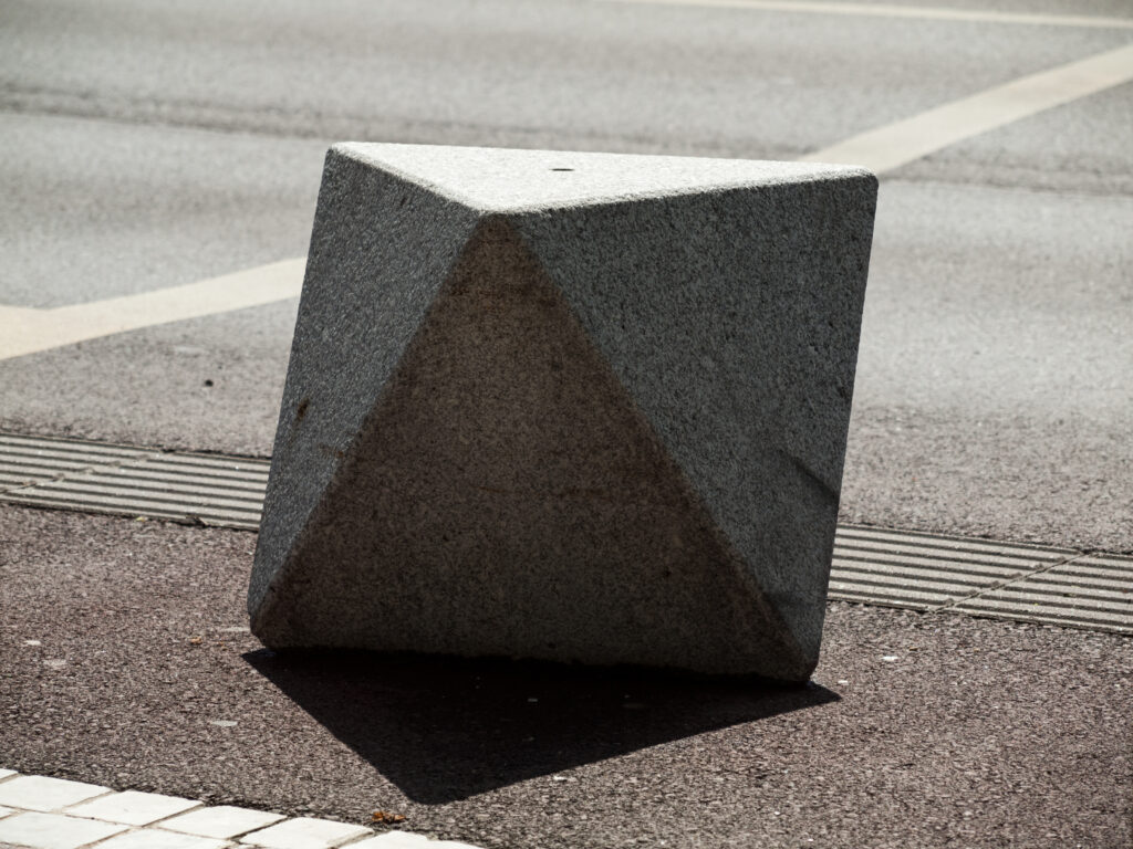
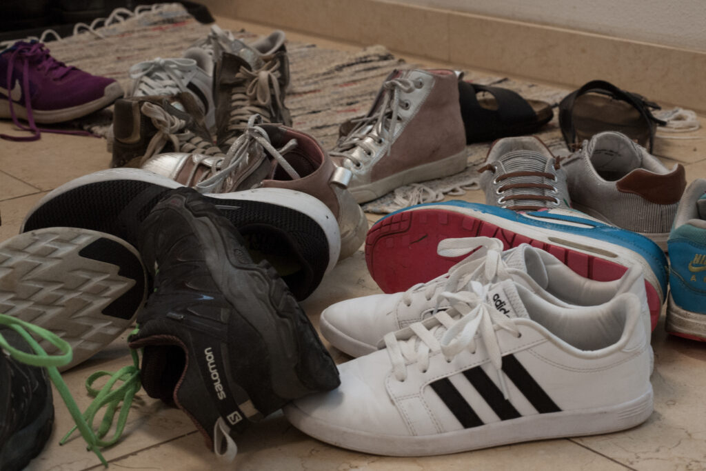
Einfach / Komplex

Einfach
Komplex

Bilder:
Sonja Zechner

Die Emotionsthese

In den letzten beiden Beiträgen wurden zur Beurteilung von Bildern die Informationstheorie und die Gestalttheorie vorgestellt. Dieser Beitrag zeigt nun den Zugang mittels Emotionsthese. 

Ein Faktor der die Beurteilung von Bildern stark beeinflusst und in den beiden bereits vorgestellten Theorien nicht berücksichtigt wird, ist der emotionale Gehalt von Bildern. Dieser Wert ist zwar noch schwer messbar, aber nicht minder wichtig. In diese Kategorie der Bildbeurteilung fallen Bilder, die weder wegen ihrer hervorragenden Bildgestaltung noch wegen ihres Informationsgehaltes eine Ausstrahlung auf den Bildbetrachter ausüben, sondern ausschließlich das Gefühl des Betrachters ansprechen. Wie intensiv ein Gefühl beim Betrachten eines Bildes entsteht hängt von der Sensibilität des Betrachters ab. 

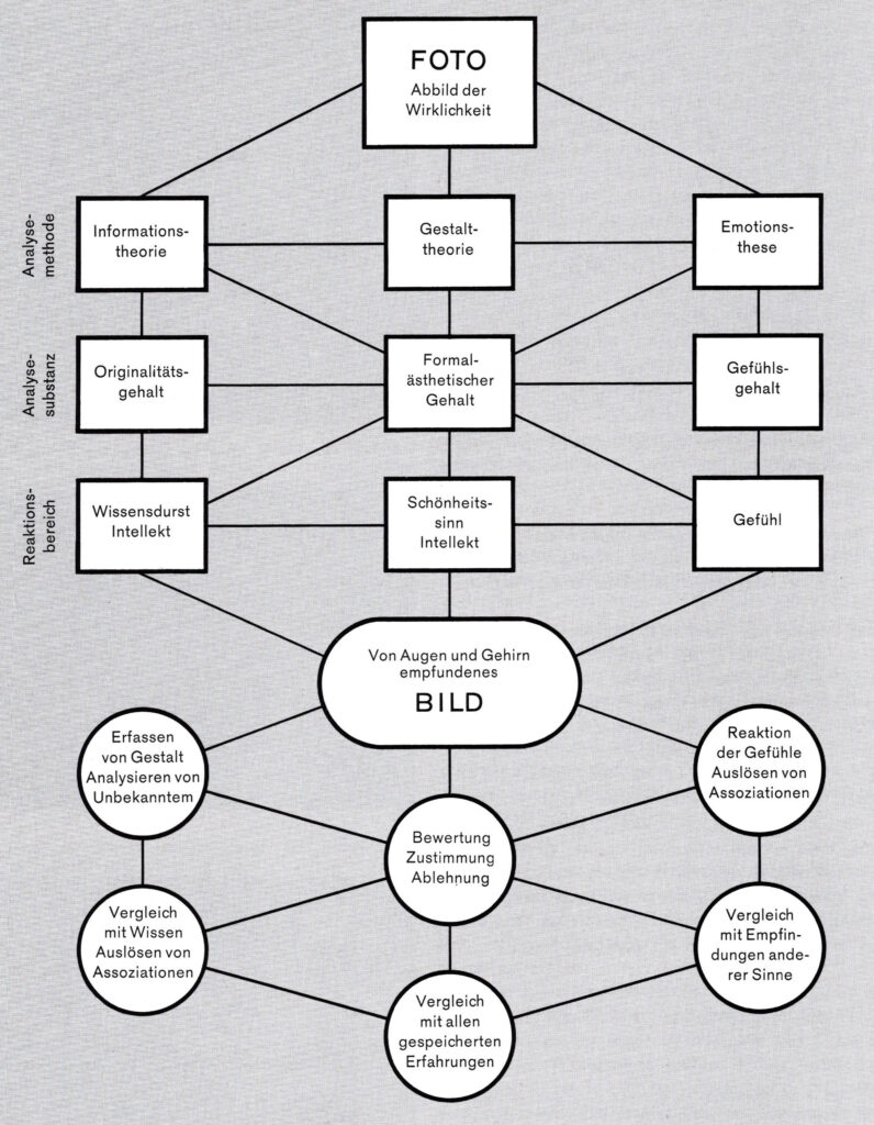
Im folgenden Bild wird der Verlauf der Betrachtung und Wahrnehmung eines Bildes dargestellt. Ausgehend von den drei Kategorien Informationstheorie, Gestalttheorie und Emotionsthese der Bildbeurteilung.

Die grafische Darstellung zeigt die Abhängigkeiten und Querverbindungen, die während dieses Vorganges wirksam werden können. (Weber 1990, S. 30)
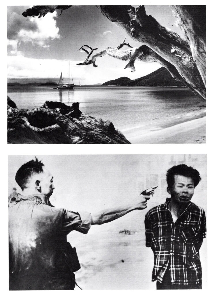
Diese beiden Bildbeispiele sollen die Emotionsthese erläutern helfen. Das Bild von der Karibik löst ein schönes Gefühl aus, man möchte sofort dort hinfahren. Beim zweiten Bild ist beinahe der Schuss aus der Pistole zu hören und man glaubt den Mann im nächsten Moment in einer Blutlache liegend zu sehen. Diese Bild ruft ein beklemmendes Gefühl hervor. (Weber 1990, S. 31)

Keine einzelne Disziplin kann im Alleingang das komplexe Verhältnis von Bildern und Emotionen untersuchen. Kappas und Müller schlagen in ihrer Publikation „Bild und Emotion — ein neues Forschungsfeld“ (Kappas, Müller 2006) einen interdisziplinären Ansatz vor, der Emotionswissenschaft, Bildwissenschaft und Kommunikationswissenschaft verbindet. Für psychologische, bildwissenschaftliche und kommunikationswissenschaftliche Fragestellungen werden als gemeinsamer Ansatzpunkt die visuellen ‚Bedeutungsstrukturen‘ thematisiert. Zwischen den beiden anderen Disziplinen bildet die Kommunikationswissenschaft eine verbindende Brücke.
Nachzulesen in: https://www.researchgate.net/publication/227336636_Bild_und_Emotion_-_ein_neues_Forschungsfeld

Quelle:
Weber 1990 Ernst A.Weber: Sehen, Gestalten und Fotografieren. Basen; Boston; Berlin: Birkhäuser, 1990
Kappas, Müller 2006 Kappas, Arvid & Müller, Marion. (2006). Bild und Emotion — ein neues Forschungsfeld. Publizistik. 51. 3-23. 10.1007/s11616-006-0002-x.In: https://www.researchgate.net/publication/227336636_Bild_und_Emotion_-_ein_neues_Forschungsfeld, (zuletzt aufgerufen am 26.6.21)

Bilder:
Weber 1990, Seite 30, 31

Joyful Design

Survey Part 02

The following post will examine the findings of my survey on the topic of joyful design. The goal of this survey was to outline characteristics and/or differences in perception of joyful design/a joyful object.


Method: Interview/Survey

Goal: Find characteristics and/or differences in perception of joyful design.

Number of Participants: 10

Age: 23—65


Question 01:
Which possession is of most importance to you?

4x Photo Album
2x Plush Toy
1x Casket (gift from great-grandma)
1x Pendant
1x Posters, Books
1x Camera

According to my previous research I decided to group the results as follows:

8x Symbolic Meaning through Memories / Nostalgia / Positive Relations (Photo Album, Plush Toy, Casket, Pendant)
2x Hedonic View (Posters, Books)
1x Symbolic Meaning of Mastery (Camera)

Question 02:
Why is the possession of most importance to you?

5x Memories / Nostalgia (Family, Friends, childhood)
2x Pleasure
1x New Experiences, Adventure
1x Guard, Trust

Question 03:
Which possession makes you especially happy?

1x Passport
1x DIY Plantpot
1x Cats
1x Plants
1x Rings
1x Horn
1x Collection of Music records
1x House
1x PC

According to my previous research I decided to group the results as follows:

2x Hedonic View (DIY Plantpot, Collection of Music records)
2x Human Need of Responsibility / Self-Confidence (Plants, Cats)
1x Symbolic meaning of Purpose in Life (Horn instrument)
1x Symbolic meaning of Mastery (Pc)
1x Symbolic Meaning of Personal Growth (House)
1x Symbolic Meaning of Autonomy (Passport)
1x Symbolic Meaning through Memories / Nostalgia / Positive Relations (Rings)

Question 04:
Why does it make you happy?

1x Memories (Life, Study time, youth)
1x Freedom
1x Trust, Connectivity
1x Pleasure
1x Inspiration
1x Confidence
1x distraction from daily life
1x personal growth 

Throughout the survey, the theories of my previous research got confirmed. The main reasons why a possession was chosen to be important is symbolic meaning through memories (nostalgia) and the symbolic meaning of positive relations. However, symbolic meaning through memories (nostalgia) and the symbolic meaning of positive relations were not necessarily connected to the feeling of joy. Possessions that were connected with happiness were objects which can be described with the “hedonic view” and the human need of taking responsibility (as mentioned in my blogpost “Possibility Driven Design”).

Hedonic View [1]
The focus is on happiness that stems from savoring life’s pleasures. This requires an ability to enjoy beautiful sunsets, a delicious meal, a warm bath and good company. Hedonic happiness arises from the experience of positive feelings, per se. It involves not only the pursuit of activities that are pleasurable, but also the pursuit of one’s ability to truly enjoy these activities. In other words, becoming happier does not necessarily require more pleasurable activities, but can also be realized by taking more pleasure in our activities.

Symbolic Meaning through Memories [2]
[…] the literature of industrial design suggests that symbolic meaning can arise through memory retrieval and associations (Desmet & Hekkert, 2007) and seems to be one of the determinants of product attachment (Mugge et al., 2008; Schifferstein & Zwartkruis-Pelgrim, 2008). Consumer behavior research shows that symbolic meaning is important to users mainly because they want to maintain, enhance and express their identity and ideal image of themselves. It has been shown that symbolic meaning arises when products support user values (Allen, 2006). The sociological literature suggests that the goal can also be a feeling of communion (Cova, 1997).” —Kujala, S. / Nurkka, P.

Symbolic meaning of positive relations with others [3]
possessions that represent meaningful affiliations which provide a sense of belongingness

Survey:

https://docs.google.com/forms/d/e/1FAIpQLSe9bs06weEihFmH5nQdUv-5maDB3wymeLUoHY63TRp4ITTABw/viewform?usp=sf_link


Sources
[1] Desmet, Pieter / Hassenzahl, Marc: Towards Happiness. Possibility-Driven Design. Delft University of Technology 2012. URL: https://www.researchgate.net/publication/233850646

[2]Kujala, S. / Nurkka, P. (2012). Sentence Completion for Evaluating Symbolic Meanin. URL: https://www.researchgate.net/publication/286834130_Sentence_Completion_for_Evaluating_Symbolic_Meaning

[3]Extending product life by introducing symbolic meaning: an exploration of design strategies to support subjective well-being. URL: https://www.researchgate.net/publication/281119272_Extending_product_life_by_introducing_symbolic_meaning_an_exploration_of_design_strategies_to_support_subjective_well-being?enrichId=rgreq-33f579a37ee576710a6f476dd27eeece-XXX&enrichSource=Y292ZXJQYWdlOzI4MTExOTI3MjtBUzoyNjQ5MjM2MjQyNDMyMDJAMTQ0MDE3NDEyMjYyMA==&el=1_x_3&_esc=publicationCoverPdf
Who inspires me #3

While looking at different artists/illustrators I realized that me liking their work has no connection to the fact if they create their work digitally, analog or with a mix of both. I find all three approaches equally fascinating, but might be personally leaning towards the mixed/digital approach with analog textures.
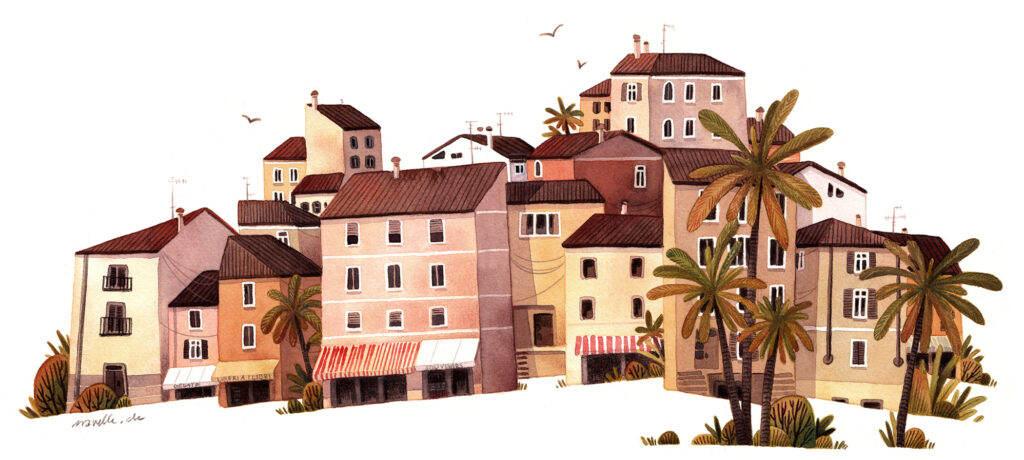
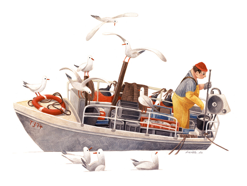
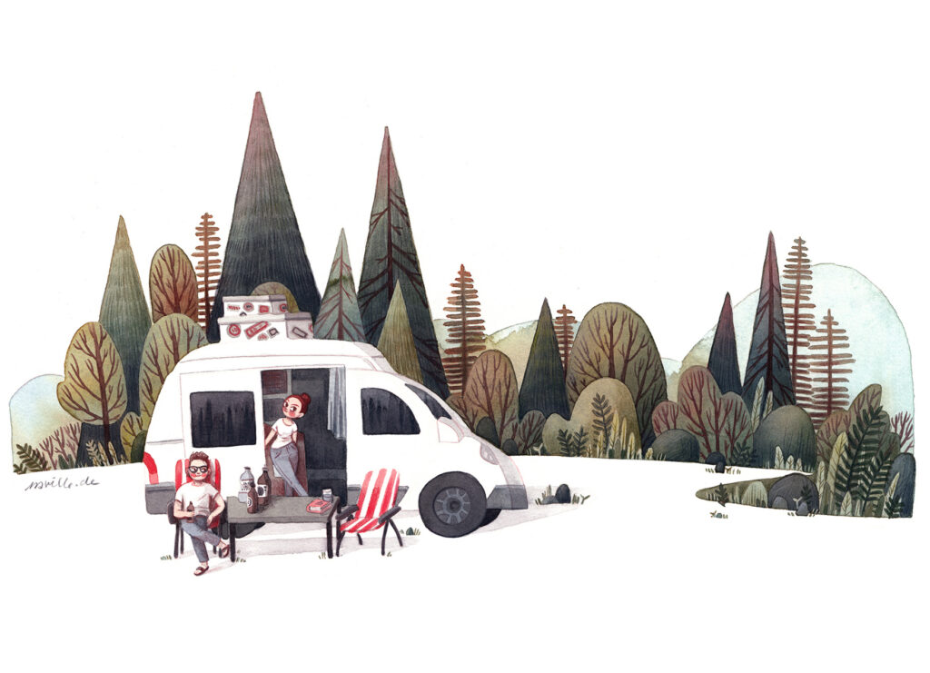
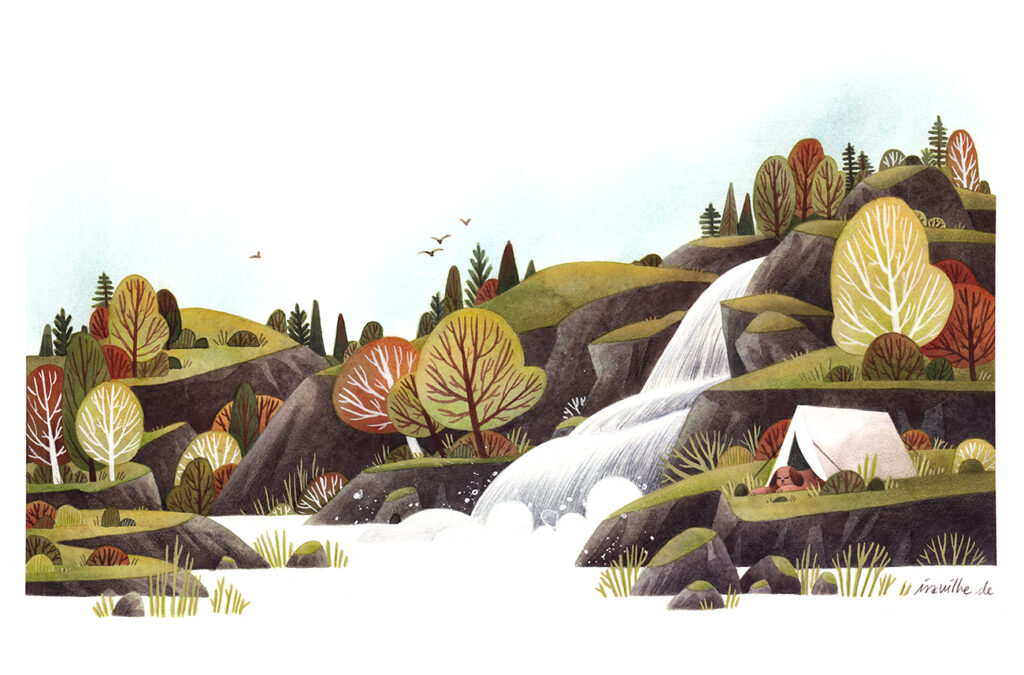
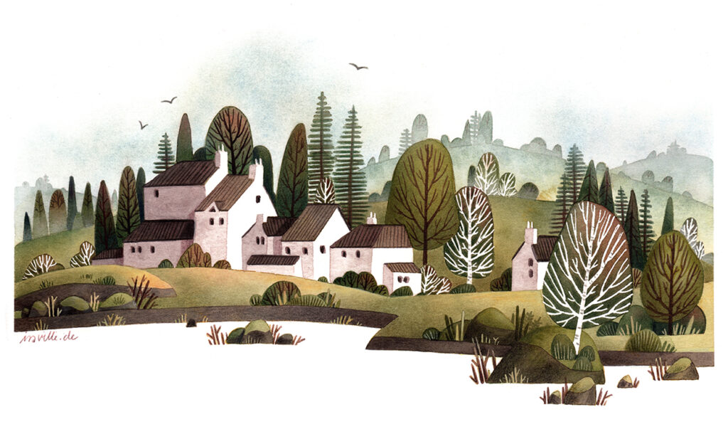
Ira Sluyterman van Langeweyde (@iraville) is an illustrator based in Munich with a passion for paper and watercolor. Most of her work is based around nature and landscapes but it also includes some character design. For her work she mostly uses earthy and natural colors. She mostly uses a white background and incorporates the white space into her compositions.

Test: Digital theremin

Dieses Programm habe ich schon vor längerer Zeit geschrieben, nun habe ich es erweitert und umgeschrieben. Eigentlich wurde dieses Beispiel für die Anbindung einer Kinect Kamera und einer Beamer-Leinwand erstellt (Immersives Theremin) und aus diesen Daten eine Visualisierung zu generieren.

Beispiel

Ein User bewegt sich vor einer (Beamer)Leinwand und steuert ein Theremin. Visualisiert wird dies durch eine Kette an Kuben welche stereoskopisch dargestellt werden und den User beim Musizieren verfolgen.

Beim Tragen einer stereoskopischen 3D Brille sollte ein 3D-Effekt sichtbar sein.

Geht der User vor der Leinwand auf der X-Achse auf und ab (Lautstärkeänderung).

Die Größer der Boxen ändert sich durch die Entfernung des Nutzers zur Kinect.

Der User hebt den rechten Arm und die Frequenz ändert sich.

Ziel:

  1. Nachdem der stereoskopische Effekt mehr, oder weniger gut am Beamer funktioniert hat, möchte ich diesen nun überarbeiten und stärker hervorheben, um diesen Effekt direkt in Zukünftigen 3D Visualisierungen übernehmen zu können.

2. Das Programm nun für die Mausnutzung abwandeln und die Z/T-Tastenvariante einfügen, um die Z Achse zu simulieren.

X-Achse –> Mouse
Y-Achse –> Mouse

Z-Achse à Z/T – Taste

Ergebnis:

Die Überarbeitung des stereoskopischen 3D-Effekts hat sich bewährt, der Effekt tritt nun viel stärker hervor. Die Abstände der Rot/Blaulinien wurde etwas vergrößert. Des Weiteren habe ich die weißen Würfel auf einen leicht grauen Hintergrund platziert um diese so hervorzuheben.

Während dem Umbau für die Mausnutzung, habe ich auch das Z-Achsenhandling abgeändert und verbessert.

by ADAMS

Print experiment: “reality is analog”, part IV–proof press

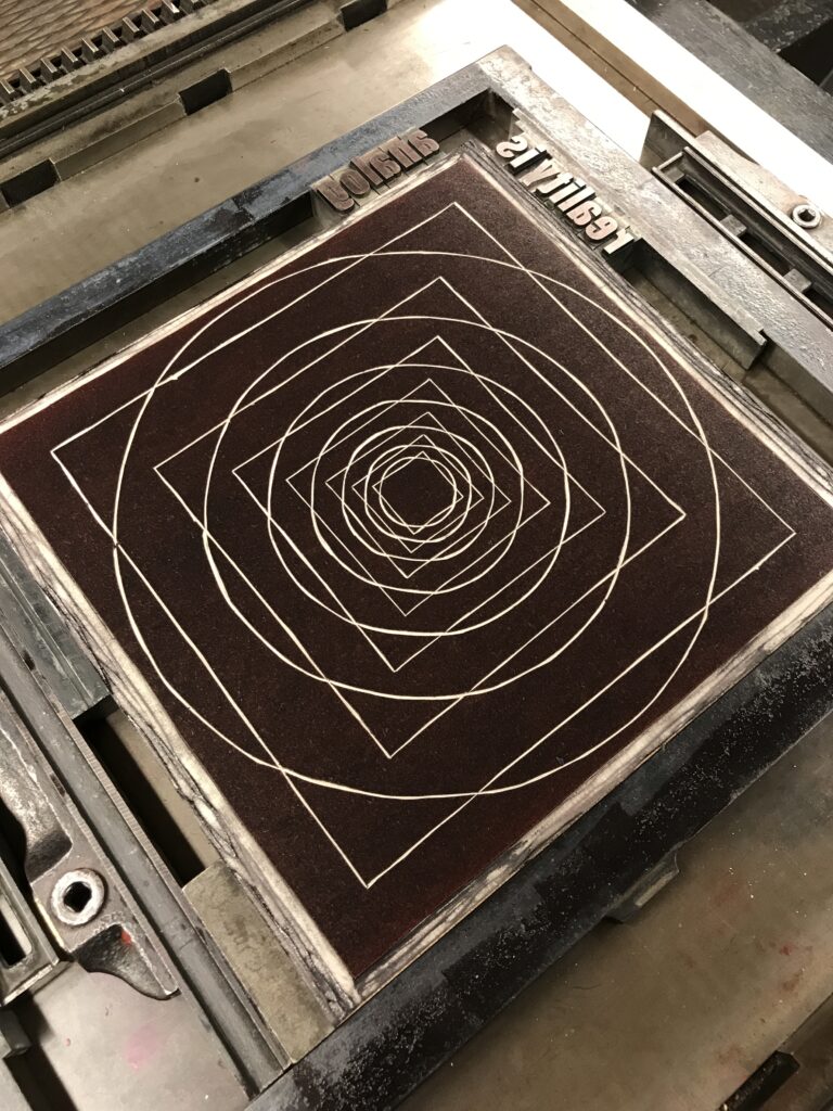
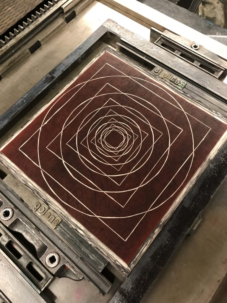
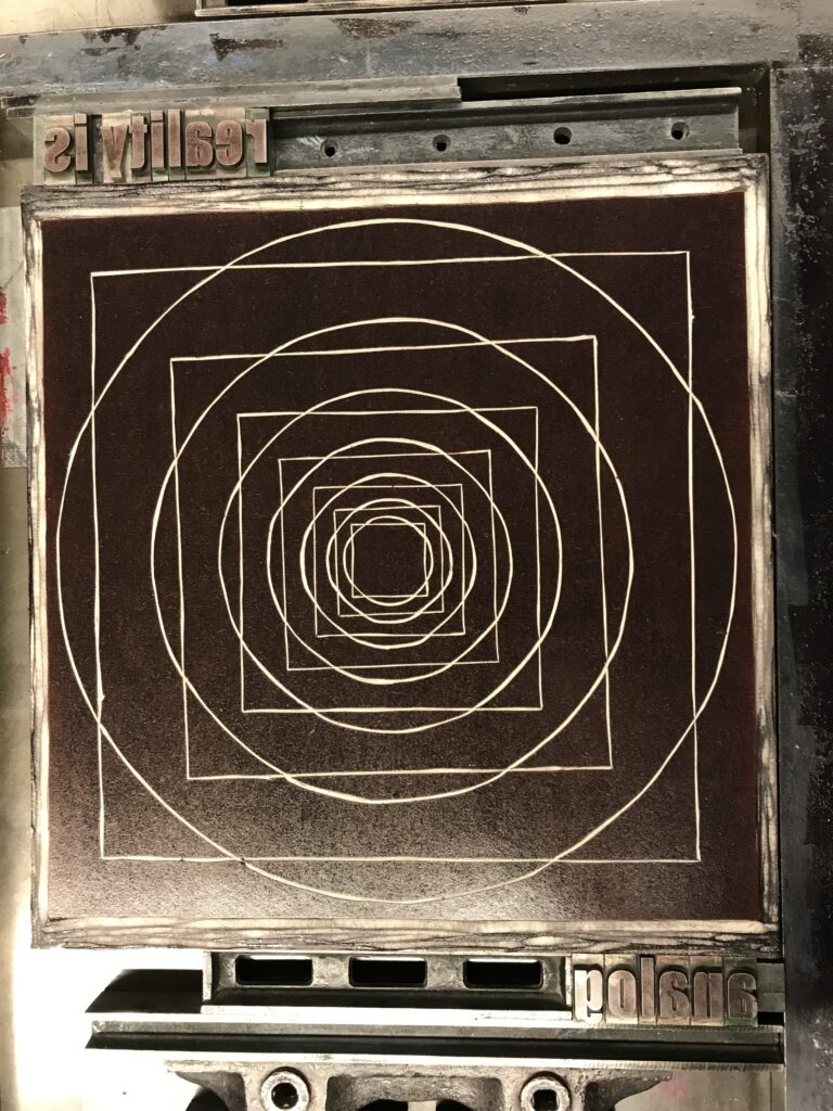
Together with the linocut I placed and fixed the sets of lead letters on an Asbern Proof Press from 1959. Presses like these have originally been used to make a first proof print to see if adjustments to your set and additional printing blocks were needed.

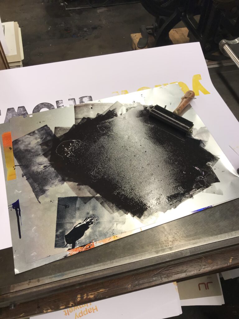
Although this manually driven press provides it’s own inking unit, I decided to colour the letters and linocut by hand, using offset printing colours and a silicon covered hand roller. By this I was able to put on more colour on the area of the linocut and only very little colour on the comparably small letters–for printing it’s always important to ink bigger areas properly, as they physically do not provide as much pressure as small forms pressing the colour deeper into the structure of your paper or printing fabric.

More features of the Asbern proof press are the adjustable cylinder, with which you can adjust the height of the cylinder that runs over the printing image. This function helps again to increase or decrease pressure and thus optimizing your print result without the need to strengthen your whole set with paper or cardboard from beneath. In addition the so called “Anlage” is a feature that’s part of almost any printing as well as book binding machine (and can also be found in the extended field of crafts and production). From historic ones to high tech offset machines, this technical feature enables you to fine-tune the position of your print not by moving the printing set, but adjusting the position of the paper in order to have the print in the same position on every sheet. This feature is extremely important if you have to print more colours in separate print runs next to each other, but also if you want to print on the back of your sheet on the right position.

As mentioned in the previous post, the first proof of your letter set, reveals the correct reading direction of your text and letterings, including spacing. Besides, the proof will also show if the letters still have sharp edges or are rather worn out. Especially big wooden letters easily take on wear and due to minimal irregularities in height they may not take colouring evenly, resulting in a rather vintage look.

For the lino-cut I had to put quite a lot of paper beneath the print block to increase the height and thus gain pressure for a better printing result.


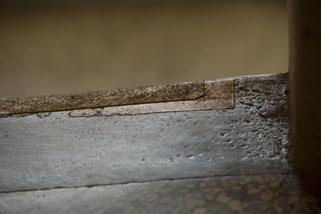
The inexact height of the letters (from various fonts), but also printing blocks and the combination of both often makes adjustment necessary. By simply putting thin pieces of paper like wrapping paper beneath forms that do not take colour and thus won’t appear in the print, it’s possible to raise the height of the single letters or areas of printing forms. Adjusting the height will not only make previously uninked areas visible, but will also increase pressure and thus create a better printing image. Here it’s interesting to mention that putting a single strip of adhesive tape beneath a letter can make a difference of a not printing, a printing or even an embossed letter in your print.

A simple rule for letterpress printing is that little pressure and little colouring will result in a rather “cloudy” appearance, while more pressure and more colour will give your image a more saturated look. Too much pressure may exceed the possibility of embossing, which may result in cracks of the paper. Also too much colour (in combination with high pressure) will result in blurry edges.

As soon as you’re happy with the result of your print proof, you’re ready for the actual print run.

For small editions you can go on with the proof press. If you ink your letter sets and printing blocks by hand you can make use of possibilities like varicoloured areas or adding different analog effects on purpose to your print.

However, as this again is a quite time consuming work, for higher editions, of more or less constant colouring and quality it’s the time to move on to a fully automated press. Get to know the Original Heidelberger Zylinder in my upcoming post: part five–print edition on OHZ.