Analog / Digital – Print

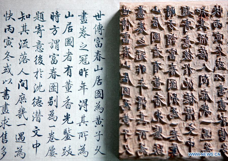
The earliest printing method came up around the year 200 in China. Back then, wooden blocks were carved and arranged, inked and then printed. Since then the printing process was adjusted and improved via new and more accurate methods that made it more and more easy to reproduce bigger editions and thus distribute information and knowledge faster among the people. For all these printing techniques from litography, letterpress, offset to screen printing it is and always was necessary to create some kind of model like a set of letters, printing plates, stencils or a screen through wich color can be applied to various media like paper but also other applicable printing substrates.

early wood block printing – manually carved, analog information reproduced via an analog printing process

Every printing technique, where a model of the printing image is necessary belongs to analog printing methods. Digital printing on the other hand refers to methods where the data is directly transferred to the printer which then applies ink or toner particles to the paper. DDP or direct digital printing are most commonly electrography methods using ink jet or laser print technology. A major difference to analog printing methods is that within a single pass more colors like cyan, magenta, yellow and black can be applied to printing substrates. Additionally with digital printing the printing image can be adjusted and customised from one print to the next and thus small editions from 1 – 500 pieces can be printed more economically than it would be the case with analog printing methods where for each color another physical template like a printing plate needs to be produced for the separate printing runs.

In traditional letterpress, for example, a CMYK print of a photography would need four printing plates that are used in four passes for which the position of the print and the right amount of color needs to be adjusted for each run after which you have to clean the machine and fill in the next ink. The same would apply if you wanted to print a 4c photo using the screen printing method. In offset printing, you also need four printing plates, however most offset printing machines have four or more inking units through which the printing substrate will run subsequently.

white hotfoil embossing on uncoated yellow graphic cardboard and hotfoil magnesium printing plate based on digital data

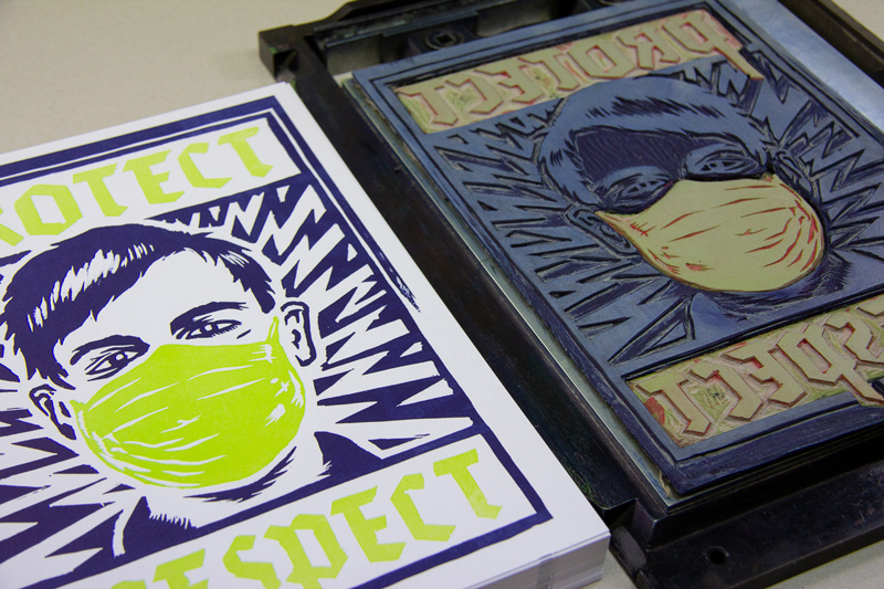
For both, analog and digital printing methods the source of the printing image can be digital, though for analog printing methods you can also use „data“ from purely analog sourcese like wooden and leigh letters or hand carved linocuts for letterpress. For screen printing hand drawn foils and analog templates can be used to prepare the screens and analog films can also be used to produce printing plates for printing methods like letterpress or offset printing.

2c letterpress print and hand carved (= analog data) lino cut

Advantages and disadvantages

The various characteristics of digital and analog printing techniques offer different advantages and disadvantages. As with digital methods the print image can be easily adjusted from one print to another, the biggest advantage of ink jet and laser print is the economic setup for small editions starting from one copy. For bigger editions from more than 500 copies, analog printing machines provide fast and highly accurate reproduction as soon as the machines are set up properly.

Besides economic considerations the various printing methods provide different features concerning the print:

Digital Print

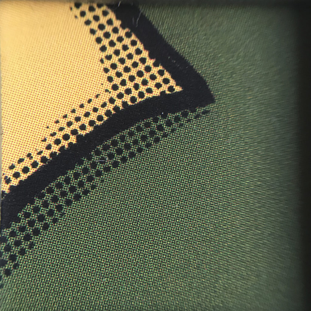
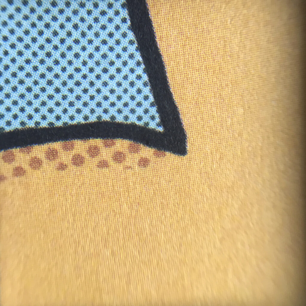
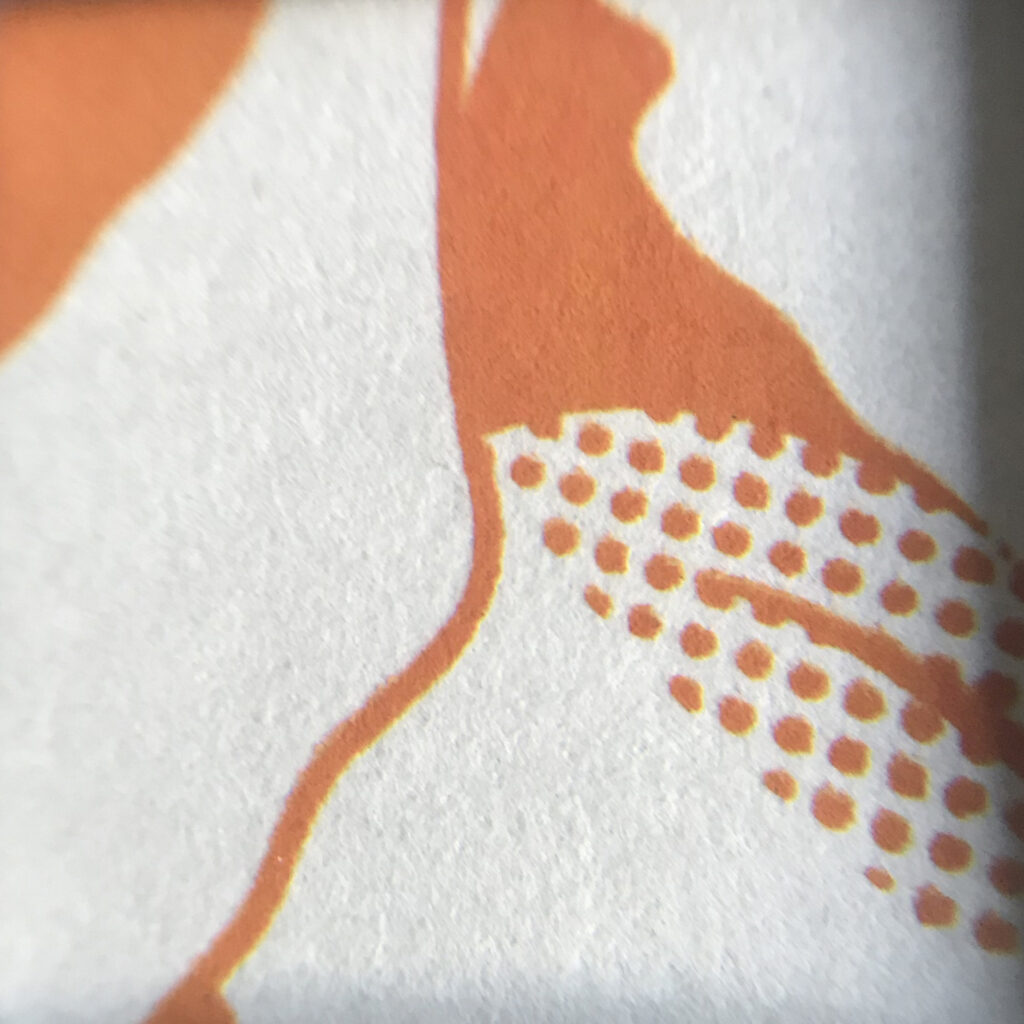
Depending on the printing device, ink jets and laser printers may provide a bigger color space that can closely represent the RGB color space. Therefore digital printing methods are best to reproduce colorful photographies consisting of numerous pixels, though printing solid color (areas) may not provide satisfying results unless printed on prepared printing substrates like specially coated papers. Hp-Indigo printing machines offer another great feature, as with this digital printing method light colors can be printed on dark colored (primed) papers like white text on black paper. This can usually only be achieved using screen print or hot foils.

magnified 4c digital picture printing on coated affiche paper (120 gsm)

Analog Print

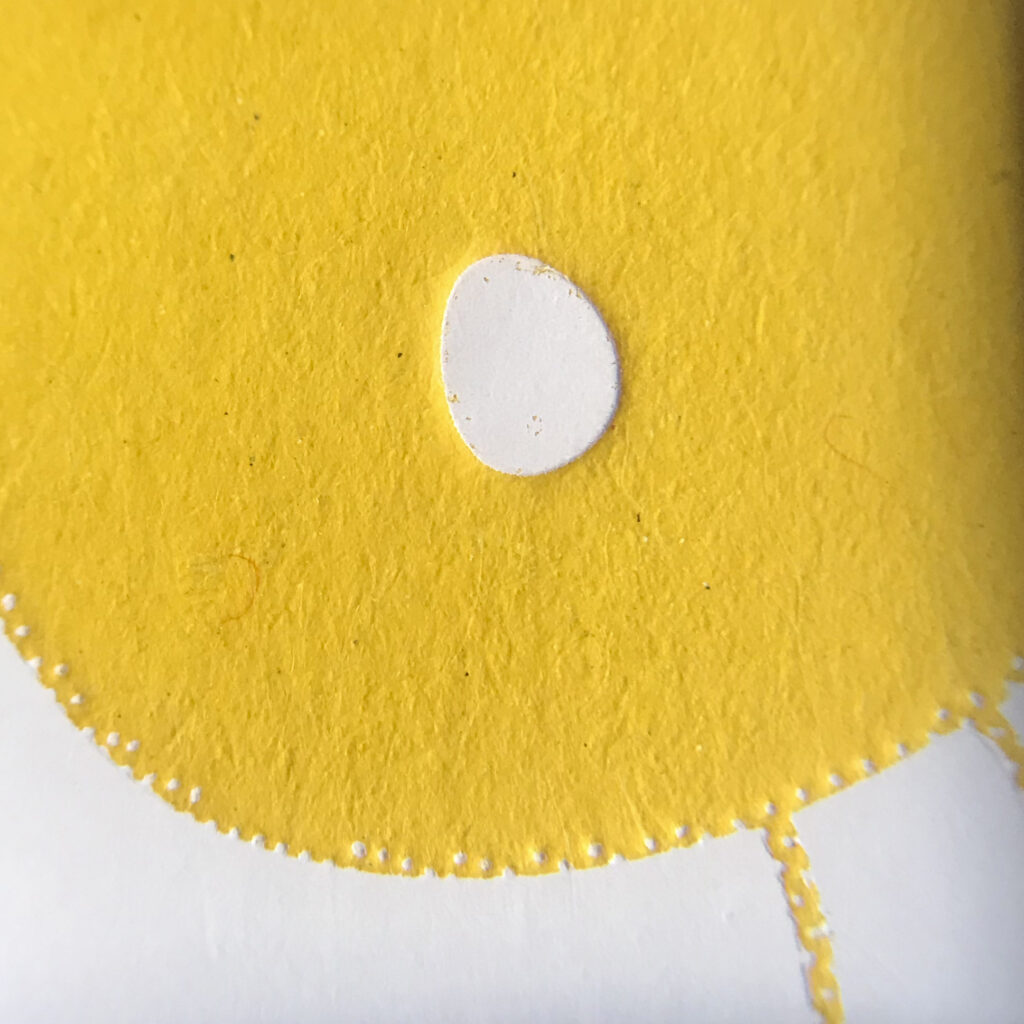
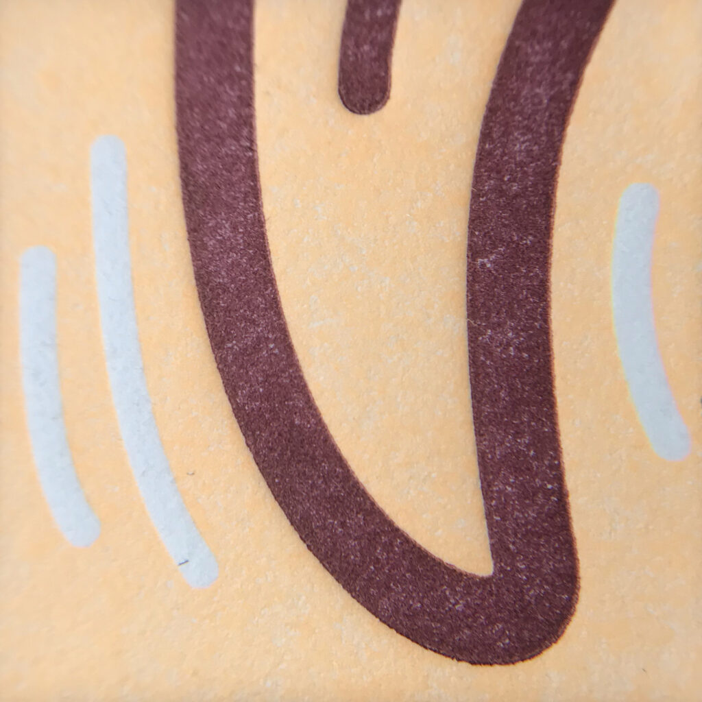
The various analog printing techniques, from offset, flexo or gravure printing over letterpress, screen print to risography also offer different advantages and disadvantages. While offset print features sharp prints and great solid color areas even on uncoated papers, letterpress printing (with hotfoil or color) nowadays is mainly used wherever the printing substrate is embossed, adding on the haptic value of the printed product. For both methods colors can be mixed by hand and thus especially spot colors can be printed providing high accuracy. In screen print colors can also be mixed and customised by hand, resulting in highly saturated long lasting color prints on various surfaces.

magnified 4c offset print on uncoated paper (110 gsm)
magnified 1c screen print on uncoated cardboard (300 gsm)
magnified 1c white hotfoil embossing on yellow graphic cardboard (approx. 600 gsm)

In analog printing however, the visual appearance from print to print may vary, resulting in more or less charming print effects and styles, especially when printing manually or in small editions where a proper preparation and set up of the printing machine is not applicable.

magnified 2c letterpress print on 600 gsm uncoated cotton paper

Finally besides the choice of the printing method, not only the number of copies but also various components in the printing process, like colors (e.g. transparent or opaque), features of the printing substrate (e.g. thickness, smoothness of surface, coated or uncoated papers) but also physical features of materials used for printing plates or stencils are to be considered for the accurate purpose and style of the final priting result.

Sources:
https://en.wikipedia.org/wiki/Printing
https://sites.google.com/site/historyofprinting/the-invention-of-wood-block-printing
https://de.wikipedia.org/wiki/Digitaldruck
https://www.derdruckoptimierer.at/offsetdruck-vs-digitaldruck/
https://de.wikipedia.org/wiki/Offsetdruck
https://www.wired.com/story/how-letterpress-printing-came-back-from-the-dead/


Drawing & Thinking

How drawing helps you think

Ted Talk by Ralph Ammer | TEDxTUM

Ralph Ammer shows how drawing can support our thinking in five ways and why drawing doesn’t have to be perfect. In his opinion drawing, like language, is a way to think and get in touch with other people. For him, drawing is not about art – it is bigger than art. It’s a way to think visually. 

  1. Drawing can ignite our intuition
    By doing little repetitive exercises we can improve the connection between our hand and eyes as well as give our hand a physical workout. The stronger the hand, the better we may control it to draw. These exercises can also function as some sort of meditation and soothe our minds. This can give more room for intuition. 

  1. Drawing can make the world more beautiful
    Normally the brain tunes out any unnecessary information. When we draw, we actually have to look and concentrate on the world around us. We see what is actually there. By drawing our surroundings we can store information in our mind and remember far better than as if we had just taken a photograph.
    One problem we might encounter is that our drawing doesn’t end up looking like our reference. The reason for this is that we tend to draw what we already know and not what we really see. By drawing the spaces between objects instead of the object itself we can trick our brain into not recognising shapes and make it easier for us to observe.
     
    _

We don’t find beauty. We make the world beautiful by paying attention.

  1. Drawing helps us understand
    We can try to draw what is unseen, like our thoughts and emotions. By choosing a subject and placing it on different positions within our canvas we can create different contexts. Ammer tries to draw his thoughts every day. They represent his thoughts about the world and can be grouped and rearranged to see connections and patterns.
    _
  1. Drawing can help us to imagine new things
    For Ammer an idea is what happens if two or more thoughts collide. By combining one thought with many other different thoughts you get a lot of ideas. After just writing everything down that you came up with you can sort out what might not work. An idea that seemed bad at first might turn out as the one that fits best for your purpose. 
    _

Creativity really is like breathing. You take in information and knowledge and you combine it to new ideas that you emit.   

  1. Drawing helps us communicate with others
    Images help to make words stick in your mind, because words alone are sometimes hard to take in. With drawings you can lead others through your thought process and help them to connect the dots and understand your idea. For that to work, the drawing has to be original and personal.
    _

Our drawings do not have to be pieces of art. If they help us to think, they are good enough.

Ralph Ammer

On Ralph Ammer’s website he writes about about all those topics and many others more in detail. Some interesting articles of his:

Analog / Digital – Audio

Besides the theoretical or rather philosophical differentiation of analog and digital features, the media we use today, from audio, video, over photography to print, offers more practical explanations.

Speaking of analog and digital in the field of audio, from recording to playback, the differentiation only concerns the features of the audio signal. The signal, either analog or digital, will at least need an analog device for output – e.g. analog speakers resembling the audio signal into acoustic sound waves.

However the audio signal can be either an analog or digital model of a real (recorded) sound wave but also a model for a real sound wave – playing a string of an electric guitar creates an analog audio signal that runs through a cable and after being amplified will result in sound waves created by the vibrating membranes of the speaker. Similiar like this the audio signal can also be created digitally, e.g. by using a midi-keyboard.

Technical charecteristics
On the one side, for analog audio, soundwaves are converted to an electromagnetic signal that’s stored as data on a magnetic tape. The sound quality or the amount of information that can be stored on the recording tape refers to the tape width and tape speed.

On the other hand digital audio uses so called pulse code modulation or PCM which is the primary method to store digital information. This method creates a model of sound waves by „storing a sequence of numerical values that represent the amplitude or intensity at various points along the wave“, referred to as samples. The two crucial factors for sound quality in digital audio is bit-depth, through wich the amount of possible values is defined and the sample rate defined in kHz.

Advantages and disadvantages
The major disadvantage of digital audio is that there will always be a finite amount of samples. Even if you raise the bit depth and sample rate you will never be able to resemble anything between two samples or values. As analog audio with the electromagnetic signal resembles the sound waves more naturally it can „catch infinitesimally small variations in amplitude“ and thus smoothly fill the gap that would be between two digital samples.

However analog audio signals will always be featuring a certain ground noise coming from the recording components. Even if this noise floor is very low on tape, it will increase by running through more analog components like cables, analog effects or (pre-)amplifiers and can become a major distracting noise. In digital audio the noise floor of a 24-bit sound file is -144 dB which is practically no noise, though it still can add up running through analog components (in playback).

Besides the quality of information stored on analog media or digital sound files there’s more practical features that add on the advantages of digital audio.

Firstly, magnetic tapes can not only be physically damaged or destroyed but stored information will be deleted immediately when approaching them with a magnet.

Digital files on the other hand are nowadays immune to magnetic fields and additionally from one digital sound recording infinete copies can be made without losing information in contrast to tapes that will lose sound quality from copy to copy. Thus digital audio files can be easily reproduced and distributed enormously fast around the globe without the needs of physical storage.

Acoustic Features
The acoustic features of analog and digital audio signals are subtile and often highly subjective but there are obvious differences. First of all, in this discussion you will very often hear that audio coming from an analog source (tape, vinyl) has something like a more warm and soft sound, whereas digital signals coming from digital media (CD, wav or mp3 files passing the sound card) feature a rather cold and harsh sound. Depending on how trained your ears are you will most certainly hear some differences like these when comparing the same audio played via different media.

However the acoustic features are rather connected to the nature of the playback device and nature of the media (vinyl = analog, CD = digital) than to how the acoustic signal was originally recorded. Because still it is possible to record and mix a song with analog equipment and put it on CD (after digitalisation) and of course digitally recorded sound can for example also be reproduced on vinyl after converting the signal into grooves cut into vinyl (a process that’s also necessary when converting audio signals from analog tape for vinyl).

Summing it up analog and digital sound recording, audio signals, reproduction and playback are simply different ways to model and resemble sound waves. Both have different physical and technical features resulting in more or less different acoustic perception of basically the same sound – call it the analog charme and warmth due to infinite small intersecting vibrations or the digital precision and sharpness due to the isolated samples.

The question is not which one is better in general, but which one suits your purpose best.

Sources:
ANALOG AUDIO vs DIGITAL AUDIO: The REAL Difference
Analog vs. Digital As Fast As Possible
Analogue vs Digital – Episode 9 | The Mastering Show Podcast

Joyful Design 05

In my last blogpost I mentioned that by injecting meaning and context to experiences, we trigger an emotional response that can either be happiness, compassion, surprise or amazement. Those emotional responses can trigger a joyful experience. In the following you will find typical examples for joyful design considering and working with happiness as an emotional response to trigger a joyful experience.

Happiness

When working with “happiness” as a trigger for a joyful experience we can especially refer to a wide selection of visual cues. Visual cues that evoke a feeling of happiness, leading to a joyful experience can be the use of bright colors, multi-colored color palettes, round shapes, symmetrical shapes, abundance and multiplicity.

Colors, sprinkles, rainbows, bubbles and confetti–as embodiments of happiness–are perceived by a majority of people as joyful. [1]

M&Ms

A perfect example of design, working with all the visual cues arousing happiness is M&Ms (as well as Smarties, Skittles and Sixlets, to mention a few). The multi-colored (even if they all have the same taste), round-shaped, “chocolate beans” are amongst the most popular candies and their “happy” design for sure is a factor of success.

Over the years, marketing has helped build and expand the M&M’s brand. Computer-animated graphics, personification of the candies as characters with cartoon-like storytelling, and various merchandising techniques including the introduction of new flavors, colors and customizable merchandise have helped to increase the brand’s recognition as a (happy) candy icon. [2]

The perfect mix of happiness: multi-colored, round shaped and furthermore the use of mascots, humour and storytelling

As in the case of M&Ms, happiness and in consequence joyful experiences can be triggered by working with “visual cues of happiness” which are in most cases simply colorful, playful design approaches. But we can also arouse happiness by working with nostalgia or humor.

Happiness—Colorful, Playful Design

“HIKI is a fun, fresh brand for every body and everybody. The wonton color scheme is playful, and without direct logic. This allows the tall, chunky, san-serif typeface of the logo to be the hero of the design. This is a brand that doesn’t present itself as too masculine or feminine, meaning it is for every consumer at every age. HIKI is a masterclass in how a brand can have a blast without skewing too youthful. This is a deodorant brand that is sure to charm it’s way into the homes and hearts of consumers everywhere.”— Shawn Binder. [3]

The Brand Design of Hiki is a great example of how color can be used to create a fun, fresh and open minded brand (appealing) to everyone–just by working with simple visual cues that arouse happiness.

Happiness—Nostalgic Design

Many of the visual cues creating happiness remind us of lighthearted, past times and can evoke feelings of nostalgia. Those cues can remind us of our childhood, teenage days or let our minds travel to distant times or/and cultures. The feeling of nostalgia gets willingly triggered to create joyful experiences. [4]

Designers can use nostalgia to appeal to their audience on a feel-good level. By tapping into people’s desire to feel a sense of belonging, meaning, and security, designers can endow their creations with emotion and sentimentality that connects with their audience and elicits a pleasurable feeling. [5]

Happiness—Fun, Humorous Design

Humor has been recognized as being important in promoting people’s wellbeing and happiness. By thinking out of the box we can use this knowledge to create a joyful experience using fun and humour as a central element of design.

The illustrations of “Beak Picks” packaging got a fun twist by covering the birds head with the individual fruit/ingredient. This simple but clever and suprising twist brings not only a smile on the consumers face but can also create a spark of joy. [6]

Sources

[1] TED. Fetell Lee, Ingrid: Where joy hides and where to find it. URL: https://www.ted.com/talks/ingrid_fetell_lee_where_joy_hides_and_how_to_find_it (last retrieved November 08, 2020)

[2] Wikipedia. M&Ms. URL: https://en.wikipedia.org/wiki/M%26M%27s (last retrieved on 06.01.2020)

[3] The Dieline. Playful But Not Childish Hiki Sweat Products Know How To Have Fun. URL: https://thedieline.com/blog/2020/12/11/-playful-but-not-childish-hiki-sweat-products-know-how-to-have-fun? (last retrieved on 06.01.2020)

[4] The Dieline. VT Beauty & Health Lifestyle Brand. URL: https://thedieline.com/blog/2016/8/24/vt-beauty-and-health-lifestyle-brand?(last retrieved on 06.01.2020)

[5] Canva. URL: https://www.canva.com/learn/nostalgia/ (last retrieved on 06.01.2020)

[6] The Dieline. Vibrant Playful Illustrations Bring The Packaging For “Beak Pick !” To Life. URL: https://thedieline.com/blog/2019/10/11/vibrant-playful-illustrations-bring-the-packaging-for-beak-pick–to-life? (last retrieved on 06.01.2020)

DATA, code, design | Daten

In unserer Zeit sind wir von Daten und Informationen umgeben. Rund um die Uhr werden in jeder Sekunde Daten generiert. Dies veranschaulicht der DOMO report aus dem Jahr 2018:

“Over 2.5 quintillion bytes of data are created every single day, and it’s only going to grow from there. By 2020, it’s estimated that 1.7MB of data will be created every second for every person on earth.”

Via socialmediatoday.com | DOMO, How much data is generated every minute?

Testdaten

Einer der wichtigsten Punkte der Daten-Visualisierung sind die Daten selbst. Um realistische Testdaten zu analysieren wurden folgende Seiten recherchiert:

THE WORLD BANK

Explore. Create. Share: Development Data

DataBank is an analysis and visualisation tool that contains collections of time series data on a variety of topics. You can create your own queries; generate tables, charts, and maps; and easily save, embed, and share them. Enjoy using DataBank and let us know what you think!

THE WORLD BANK bietet eine Vielzahl an Datenbanken und vorgefertigte Report Tools welche die Analyse erleichtern.

Beispiel:

https://databank.worldbank.org/source/gender-statistics

Google Datasetsearch

“Die Datensatzsuche soll Datensätze allgemein zugänglich und nutzbar machen und die folgenden Aufgaben erfüllen:

  • Sie soll ein System schaffen, das die Publisher geteilter Daten dazu motiviert, die Best Practices für Speicherung und Veröffentlichung von Daten anzuwenden
  • Sie soll Wissenschaftlern die Möglichkeit geben, anhand der Zitierung der von ihnen erstellten Datensätze zu zeigen, welche Wirkung ihre Arbeit hat

Da immer mehr Datensatz-Repositories schema.org und ähnliche Standards verwenden, um ihre Datensätze zu beschreiben, werden Nutzer im Laufe der Zeit in der Datensatzsuche zunehmend umfangreichere und vielfältigere Datensätze finden.”

https://datasetsearch.research.google.com/help

Source

https://www.socialmediatoday.com/user_media/diveimage/internet_minute_info2.jpg

https://datasetsearch.research.google.com/help

https://databank.worldbank.org/

Science & Art

The art of science and the science of art

Ted talk by Ikumi Kayama
Medical and scientific illustrator

Ikumi Kayama shares what scientific illustration means to her and what motivates her to keep going. In her work she creates illustrations of “dead things”. They could be plants, animals or humans. One of her focuses is human anatomy and she loves to give new insight about the human body to other people. Kayama emphasizes that the advantage of illustration over photography is that she can breath life into her drawings, make things see-through and direct the viewer’s eye to a specific point of the picture.

Some of Ikumi Kayamas work:


Integration of Art and Science

Ted talk by Yoko Shimizu
Contemporary artist and biochemist

Yoko Shimizu talks about the beauty of science, the way it inspires her and how she uses scientific principles to create fascinating installations. In her talk she shows three art installations about gravity, surface tension and sound waves. With her work she wants to show everyone that inspiration is all around us and that combining things that seem on different ends of a spectrum can lead to astonishing and beautiful creations. Visualizing the unseen is one of her key motivations.

Inside Futurelab – BioArt

Video by Ars Electronica

In this video Yoko Shimizu presents the Ars Electronica Futurelab, where they create creative and innovative technology with clients from around the world. Shimizu gives the viewers a quick tour of the Ars Electronica Biolab, which consists of two floors, a museum/galerie and laboratory. Afterward Shimizu talks about BioArt, her motivation and projects. She loves that in BioArt you start with something you designed but in the end you end up with something you couldn’t even imagine by co-creating with nature and living things.

It’s much more beautiful than something that you could’ve created on your own.


When science meets art

Ted talk by Fabian Oefner
Artist

Fabian Oefner presents two of his projects inspired by science. The first one is based on sound waves. Tiny crystals are placed on a plastic foil above a speaker. They jump in the air once a sound is played. Using a camera that can take 2000 pictures per second he photographs this phenomenon. In his second project he uses ferrofluids (fluids that react to magnetic fields) and watercolors to create amazing organic images. Each of his projects is somehow inspired by science, because he doesn’t just want to create stunning images but wants to make people curious as well. His goal is to make the viewer stop for a moment and wonder how he did it and what the physical properties are.

Content Types of Visual Communication

Einsatz von Illustration und Fotografie nach Content Type

Wie im vorherigen Post bereits erwähnt ist der Inhalt neben der Form eines der beiden Mittel, mit dem Informationen vermittelt und kommuniziert werden kann. Dabei gibt es drei verschiedene Inhaltstypen und Ansprüche an ein Design in der visuellen Kommunikation:

informativ, überzeugend und unterhaltsam

Je nach Anforderungen an das Design sollten die grafischen Mittel so gewählt werden, dass sie die Inhaltsansprüche erfüllen. Das wiederum heißt, dass je nach Content Type die bestmögliche Visual Language und die entsprechenden grafischen Elemente gewählt werden sollten. Für gewisse Content-Typen eignen sich Illustration bzw. Fotografie aufgrund ihrer Charakteristiken besser. 

Content Types der visuellen Kommunikation:

Informativ – informative 

Ein Zweck, den Design erfüllt, ist die Bereitstellung von Informationen für das Publikum. Das Vermitteln von Wissen, das Geben von Fakten und das Verbessern des eigenen Verständnisses fallen in den Zuständigkeitsbereich einer der folgenden Aufgaben:

  • Schilder
  • Verzeichnisse
  • Pläne
  • Anleitungen
  • Bedienungsanleitungen
  • Handbücher
  • Museen
  • Ausstellungen

Überzeugend – persuasive 

Die kommerziellen Designanwendungen sollen das Verbraucherverhalten und die Entscheidungsfindung beeinflussen.Design mit kommerzieller Absicht kann und wird häufig Elemente aus der obigen „informativen“ Liste einmischen.

Die folgende Liste ist häufig mit Überzeugungsarbeit und einer Handelsaufforderung im Design verbunden:

  • Zeitungen
  • Zeitschriften
  • Jahresberichte
  • Broschüren
  • Plakate
  • Werbung
  • Geschäftsauslagen
  • Verpackungen

Unterhaltsam – entertaining

Durch unterhaltsames Grafikdesign soll eine emotionale Reaktion bei den Betrachtern ausgelöst werden. Das Publikum anzuspornen, zu engagieren oder anzulocken kann sehr mächtig sein, wenn es richtig gemacht wird.

DesignerInnen können ihre visuellen Kommunikationsfähigkeiten nutzen, um die Aufmerksamkeit einer Person mit amüsanten oder ablenkenden visuellen Informationen/Sprachen zu erhalten. Dabei gilt, wenn man über ein Stück Design lachen kann, ist man auf etwas fixiert. Emotionen spielen eine entscheidende Rolle für Menschen, die die Welt verstehen können. Form und Inhalt können nicht nur informativ und überzeugend sein, sondern auch viszeral. 

Der Content Typ gibt dabei die Art des Mediums bis zu einem gewissen Grad bereits vor. Es ergeben sich Bereiche, in denen klassischerweise Illustration bzw. klassischerweise Fotografie als bildgebendes Element verwendet wird. Häufig werden diese „natürlichen“ Grenzen auch bewusst überschritten, um sich bewusst und gezielt von der Masse bzw. der Konkurrenz, Mitbewerber abzuheben. 

Produktbewerbungen bzw. Produktfotografie, Bildbände, Kochbücher bzw. Food Photography, Reiseführer und Filmposter sind klassischerweise Bereiche in denen Fotografie als Visual Language bevorzugt wird. Hier muss Design oft einen Wahrheitsanspruch erfüllen und zum einen sind Genauigkeit und Vertrauen wichtig für die Ziele des bestimmten Designs. Menschen vertrauen auf Fotos, um einen Ort, ein Produkt oder eine Person genau darzustellen. Wenn man also für ein Produkt wirbt, ist es oft eine gute Idee, es mithilfe von Fotografie darzustellen. Hier ist es oft eine Kombination aus informativem und überzeugendem Content.

In Magazinen, Zeitschriften, Werbekampagnen, Sachbücher, auf Filmpostern, Key Visuals werden Illustrationen und Fotografie gleich häufig verwendet. Wobei für Podcast-Cover und Buchcover in der Regel Illustrationen häufiger verwendet werden. Natürlich kann auch immer eine Kombination aus beiden verwendet werden.

Illustrierte Magazine, Magazincover, Illustrationen in Zeitschriften bzw. Zeitschriftencover, Zeitungsillustrationen, Kinderbücher, Illustrierte Werbekampagnen, Bedieunungsanleitungen/Handbücher, Buchcover bzw. Buchillustrationen, naturwissenschaftliche Sachbücher bzw. Grafiken, Darstellungen über Botanik, des menschlichen Körpers und seiner Funktion, biologische Experimente, Chemie, Physik, technische Instrumente, Erklärvideos, Broschüren, Produktverpackungen, illustrierte Landkarten, Icons auf Webseiten und in Apps, Logos und Theaterplakate sind klassische Anwendungsgebiete für Illustrationen. Hier steht oft überzeugender und unterhaltsamer Content im Vordergrund.

Illustration kann natürlich auch für informative Zwecke eingesetzt werden.

Auch für Branding-Projekte eignet sich Illustration bzw. grafische Illustration hervorragend. Durch Illustrationen kann die visuelle Sprache einer Marke bereichert und differenziertere Dinge kommuniziert werden, die ein Logo, ein Farbschema, eine Schrift oder sogar Wörter nicht alleine vermitteln können. Illustrationen können einer Marke Leben, Energie und Emotionen verleihen.

Quellen:

  • https://studiobruch.com/de/neumeister-website/
  • https://studiobruch.com/de/terroir/
  • https://studiobruch.com/de/eisperle/

Scientific Illustration 02

The American Museum of Natural History created two informative videos about Natural Histories, an exhibition about scientific illustration, naming historically important pieces. Curator Melanie Stiassney states that illustration is able to subtly highlight the features which are important for a particular species in a way photography necessarily can’t. In some cases the depicted species is extinct today, so our only way to learn about them is to read and look at the historic illustration.

Natural Histories: Scientific Illustration on Display by the American Museum of Natural History
Natural Histories: Rare Books from the AMNH Library by the American Museum of Natural History

Additionally they created a video about printing techniques for historic scientific illustration. It explains how woodcut, engraving, lithography and chromolithography work.

Woodcut: Originally used as a fabric printing technique, but got adopted by book illustrators. It worked like a stamp.

Engraving: Gravers or burins were used to inscribe lines into copper plates. Ink would be spread onto the plate. Excess ink would be wiped off and a damp sheet of paper would be placed on top of the plate. A roller would be used to put pressure on the paper to press the ink onto the sheet.

Lithography: For lithography very fine grained stone, usually lime, was used. 

Chromolithography: Printing in color by using multiple stones: one stone for each color. Later on a technique using only four stones (three colors + black) was invented.

Rare Book Collection: Printing Techniques for Scientific Illustrations by the American Museum of Natural History

Ein Vorschlag zur theoretischen Dimensionierung der Erfassung von Bildinhalten

Es stellt sich die Frage, wie kann ein Bild unter Berücksichtigung der besonderen Logik Visueller Kommunikation inhaltsanalytisch erfasst werden? Folgender Beitrag aus der Reihe „Methodeninnovationen in der Kommunikationswissenschaft“ soll Antworten liefern: 

Visuelle Inhaltsanalyse (nomos-elibrary) Ein Vorschlag zur theoretischen Dimensionierung der Erfassung von Bildinhalten Stephanie Geise / Patrick Rössler

Abstract: Der steigenden Bedeutung visueller Kommunikation steht ein bislang noch unbefriedigendes analytisches Instrumentarium zur Erfassung von Bildern gegenüber. Vor diesem Hintergrund diskutiert der Beitrag theoriegeleitet die Bedingungen, Möglichkeiten und Grenzen einer Methode der standardisierten visuellen Inhaltsanalyse. Im Fokus steht die Entwicklung eines Untersuchungsrasters, das für kommunikationswissenschaftliche Bildanalysen unterschiedlichen Durchdringungsgrades nutzbar ist. Ziel dieser theoretischen Reflexion ist es, einen konzeptionellen Rahmen aufzuspannen, innerhalb dessen sich die spezifischen Anwendungen der visuellen Inhaltsanalyse verorten lassen. Ausgehend von einer Diskussion des bisherigen Methodenstands zur standardisierten Bildinhaltsanalyse wird ein Modell zur theoretischen Dimensionierung von Bildinhalten entwickelt.

Wie analysiert man den Inhalt von Bildern?

Die Bedeutung der visuellen Kommunikation nimmt mit der Nutzung der digitalen Medien immer mehr zu. Der Anteil der Bilder in der Medienberichterstattung wächst von Tag zu Tag. Es stellt sich die Frage: Wie können diese visuellen Medieninhalte erfasst und analysiert werden? Die Schwierigkeit liegt in der Festlegung einer sinnvollen Messbarkeit von Bildkommunikation. Bei den gängigen Inhaltsanalyseverfahren wird meist der Fokus auf den Textinhalt gelegt und inhaltsanalytische Untersuchungen von Bildern nur selten durchgeführt. Meist werden dabei nur formale Elemente beschrieben ohne den tatsächlichen Inhalt des Bildes und sein visuelle Darstellung zu berücksichtigen. In der Praxis werden Bilder methodisch und inhaltlich bevorzugt auf Basis einer textlichen Analyselogik untersucht, aber inwieweit lässt sich diese Logik auf Bildkommunikation übertragen? Im folgenden Beitrag soll eine Methode der visuellen Inhaltsanalyse nahe gebracht werden. Dabei wird auf die Möglichkeiten und Grenzen einer solchen Methode eingegangen.

Eine indirekte Möglichkeit der Erfassung des Bildinhalts erfolgt über die thematische Kategorisierung. Dabei wird das kommunizierte Bild mit dem textlich thematischen Inhalt verglichen. Problematisch ist dabei, dass eine klare Zuordnung eines Bildmotivs zu einem Bildthema in vielen Fällen nicht eindeutig möglich ist und damit vom jeweiligen textlichen Kontext und der Interpretation des Rezipienten abhängt. Es gibt noch andere Möglichkeiten, auf die hier nicht näher eingegangen wird. Grundsätzlich ist zu sagen, dass in den letzten Jahren Studien zu diesem Thema zugenommen haben, diese aber noch eine zu geringe Analysetiefe aufweisen. Bei vielen Bildinhaltsanalysen liegt der Fokus auf formalen Merkmalen der Bilder. Bilder werden nicht ganzheitlich, sondern auf der Ebene der inhaltlichen Merkmale über grobe Kategorien erfasst. Damit konzentrieren sich die wenigsten quantitativen inhaltsanalytischen Studien auf das Bildmotiv selbst. Das Problem ist, dass es noch zu wenig methodische Standardisierungen von quantitativen Bildinhaltsanalyseverfahren gibt, dass die Kategorisierung nur bedingt dazu geeignet ist, das Bild in seiner Komplexität intersubjektiv zu erfassen, dass die Besonderheiten der Visuellen Kommunikation vernachlässigt werden, dass sie eine unzureichende methodisch-theoretische Fundierung aufweisen und dadurch häufig mit einer geringen Analysetiefe einhergehen, dass sich durch diese Methode problematische Inferenzschlüsse in der Kategorisierung, Erfassung und Analyse ergeben. 

Stephanie Geise und Patrick Rössler (Müller, Geise 2015) schlagen ein „Modell zur theoretischen Dimensionierung der Bildebene“ vor, dabei wird das Bild unter Berücksichtigung der besonderen Logik Visueller Kommunikation inhaltsanalytisch erfasst. Dieses Modell empfiehlt eine analytische Differenzierung der verschiedenen Inhaltsebenen eines Bildes in drei Strukturebenen. Eine Ebene beschreibt die Oberflächenstruktur, eine weitere die Binnenstruktur und letztere die Tiefenstruktur. Es ergeben sich für jede Strukturebene spezifische theoretische Dimensionen zur Erfassung der Bildinhalte. 

Abb. 1  Dimensionierung der Bildebenen (nomos-elibrary)

Was bedeutet manifest, quasi-manifest und latent? (Müller, Geise 2015)

In Anlehnung an inhaltsanalytische Auslegungen gilt ein visueller Inhalt als manifest, wenn sein Bedeutungspotenzial von verschiedenen RezipientInnen bzw. KodiererInnen intersubjektiv einheitlich erfasst und verstanden werden kann. Als quasi-manifest werden materielle Inhalte bezeichnet, deren Bedeutungspotenzial kulturell konventionalisiert und damit im Rahmen einer visuellen Sozialisation prinzipiell sozial tradiert sind. Mit der Zwischeneben quasi-manifest soll eine inhaltsanalytische Erfassung von Bildern, die mehrdeutige Kommunikationsformen darstellen auch analytisch-begrifflich abgebildet werden können. Wenn ein Bedeutungspotenzial mehrdeutig ist, gilt der Inhalt als latent. Das bedeutet RezipientInnen bzw. KodiererInnen nutzen hier einen größeren Interpretationsspielraum für die Bedeutungszuweisung.

Quellen: nomos-elibrary nomos-elibrary.de: Visuelle Inhaltsanalyse. In: www.nomos-elibrary.de/10.5771/1615-634x-2012-3-341/visuelle-inhaltsanalyse-ein-vorschlag-zur-theoretischen-dimennnsionierung-der-erfassung-von-bildinhalten-jahrgang-60-2012-heft-3, (zuletzt aufgerufen am 30.12.20)

Müller, Geise 2015 Marion G. Müller, Stephanie Geise: Grundlagen der visuellen Kommunikation. München: UVK 2015

Joyful Design 04

Context creates Joy

In his Ted Talk about “How beauty feels” Richard Seymour affirms the importance of creating context to achieve a joyful or “beautiful” experience. As an example he mentions lights in cars slowly turning off. “I’ve never found anybody that doesn’t like the light that goes out slowly. I thought, well what the hell’s that about?“ – Richard Seymour. [1]

Lights slowly turning off in cars are a perfect example of a subtle but joyful experience. In general, people describe this experience as natural, or just nice. But there is much more behind this experience design than just a nice “gimmick”. Lights slowly turning off – light to dark in six seconds – in fact, this experience perfectly imitates the experience of going to cinema or theater, which triggers a sense of relaxation tempered with anticipation. When the lights turn slowly dark within six seconds when being in cinema or the theater, that is exactly the moment of experiencing great anticipation – this characteristic gets automatically stored in our unconscious mind and therefore in further consequence connoted with a positive feeling. This theory even gets strengthened through the fact, that the experience of the lights turning slowly off in 6 seconds was experienced much more positive by people who are used to go to cinema or the theater. [2]

Hence, to create something joyful we have to trigger an emotional response – often aroused through poignancy, which can too trigger a sad emotional response. „It isn’t just about nice. And this is the dilemma, this is the paradox of beauty.“ as Seymour states. Joy can be aroused through triggering good, bad (pathos), exciting (triumph) or even frightening emotions. [3] Those emotions arise in our unconscious mind, even before we can manipulate them – smart design takes that knowledge in consideration to guide the experience.

A story, a work of art, a face, a designed object — how do we tell that something is beautiful? And why does it matter so much to us? Designer Richard Seymour explores our response to beauty and the surprising power of objects that exhibit it.

It is hard to find universal characteristics of joy or beauty. As mentioned in the previous post, there for sure is something like an universal experience of beauty, which is deeply related to our evolution. Related to evolution is humans fascination for:

Pastoral landscapes
(= safe, propitious and liveable environment)

Skilled performances
(= increase status, desirable personal qualities: intelligence, conscientiousness, access to rare materials)

Rare materials, Symmetry
(= wealth)

However, there is much more to consider in addition to this “predefined fascination” – particularly the details lie in our individual experiences, knowledge and preferences, that we develop over time. By injecting meaning and context to experiences, we trigger an emotional response:

Happiness, Compassion, Surprise, Amazement

Which can lead to a joyful experience. The creation of meaning and context can be achieved by considering elements that refer to our universal values, collective knowledge and/or individual preferences.

A water bottle by Ross Lovegrove [4] – pretty close to intrinsic beauty – an embodiment of water, something refreshing and delicious. People who are aware of how hard it is to design and produce a bottle of this shape enjoy this product even more.

Sources

[1] TED. Richard Seymour: How Beauty Feels. URL: https://www.ted.com/talks/richard_seymour_how_beauty_feels (last retrieved December 29, 2020)

[2] ebda.

[3] ebda.

[4] Ross Lovegrove. URL: http://www.rosslovegrove.com/custom_type/ty-nant/ (last retrieved December 30, 2020)