When designing User Interfaces, there are several ways to implement Neumorphism or Glassmorphism. In this blog post, I will look at how to develop neumorphic elements like cards and Icons in interface design tools like figma but also briefly in code.
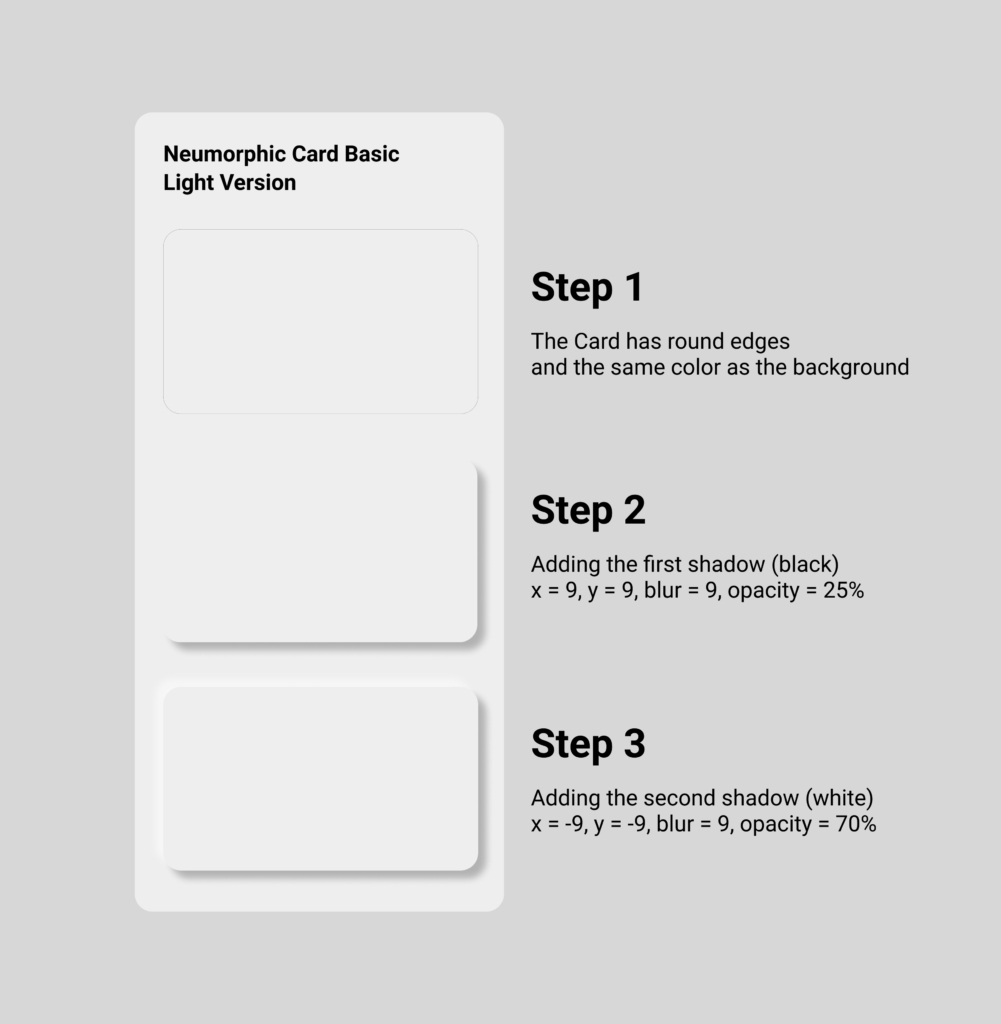
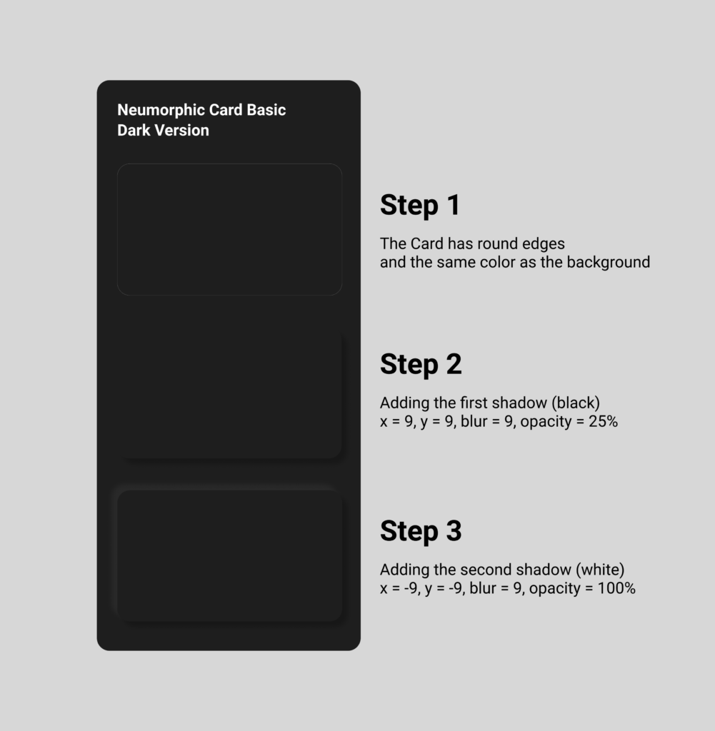
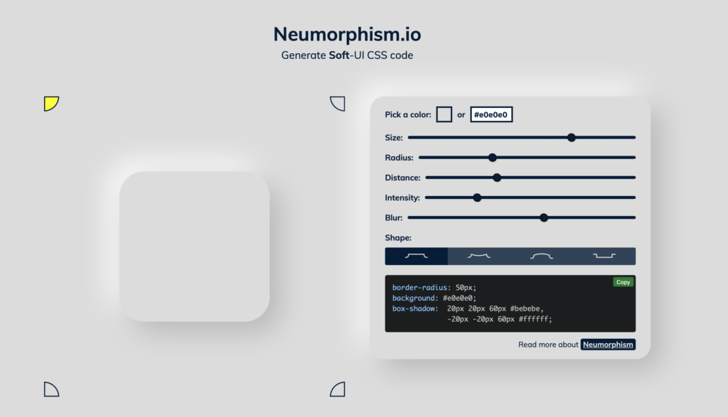
First, let’s start with Neumorphism by looking at card elements, which is the most present UI element of this style. The factors that have to be considered are the size, radius, distance, intensity and blur. It has all to do with the shadows, that generate the look of „attaching to the ground“. Due to its reduced color scheme it works best, if the neumorphic card has the same color as the background. Also rounded borders help the effect to stand out more. I tried it out myself in figma, it is very easy to do and by playing around with the blur value, the distance to the background seems to change. The more blur, the farer away from the background the neumorphic card seems to be.
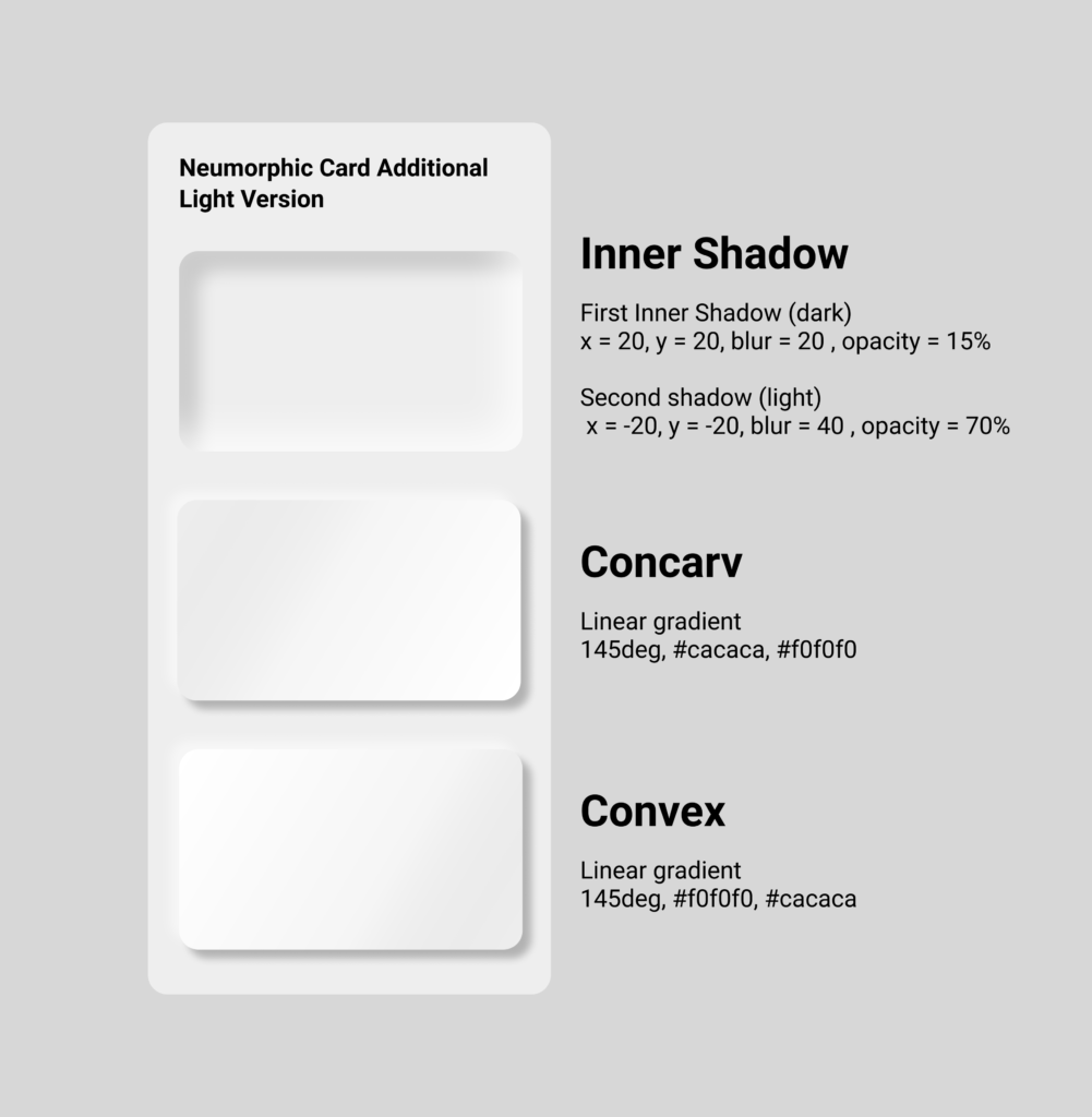
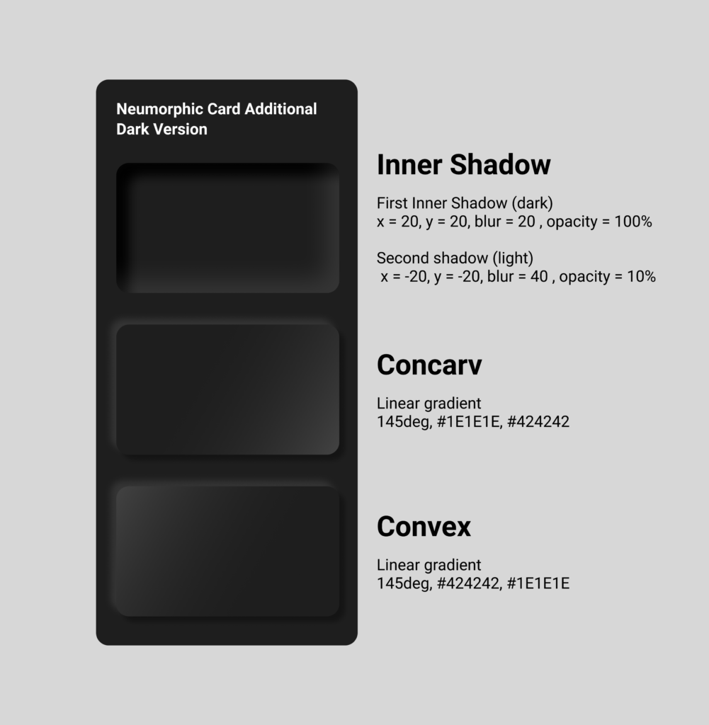
By adding gradients, it makes the card element seem to become convex or concarv. Adding the shadows within the card instead of outside has the effect that the card generates kind of hole or window in the interface.
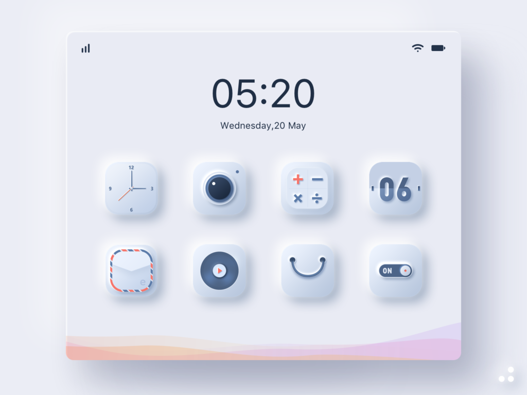
One of the goals of Neumorphism is to include the skeuomorphic approach, which means to combine the minimalistic design style with familiar objects of the analog world not only in the design aspect but also in their function, as I already analyzed in previous blog posts. The skeuomorphic approach also can be part of the icons. All the icon parts themselves have adjusted background shadows and lie on card elements with shadows, which gives them a 3D look and complete their connection to their real world counterparts. For realization in figma, the same rules as for the cards are implemented onto the icon elements.
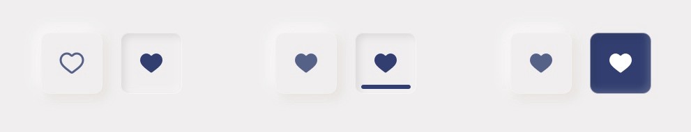
For a button, you can also apply the rules mentioned before. The default button can simply stay in the normal or concarv mode, while the active button should seem like it is really pressed and attaches itself deeper into the interface, for which the inner shadows should be used. Additionally to imply the „active status“, the color can also change when pressed. It is important to keep an eye on the contrast and differences between the states of the buttons. It has to be very clear to e functional.
There are several tutorials how to do Neumorphism, there even is a Neumorphism card generator available online, where you can try out yourself and also see how it should be implemented in css code. You also can do this easily in code and don’t need a lot of lines. It is basically the same principle as it is in figma just translated.
Sources
https://uxdesign.cc/neumorphism-in-user-interfaces-b47cef3bf3a6
https://lukasckuehne.medium.com/trying-out-soft-ui-12153537dc50
https://www.simpleguides.de/soft-ui-neumorphism/
https://youtu.be/KlSLdEB3lzg
Neumorphism CSS Generator: https://neumorphism.io/#e0e0e0
Images and Videos
Image 01 – 04: Neumorphic cards – own creation
Image 05: Neumorphic-Icons
https://dribbble.com/shots/11473239/attachments/1509448?mode=media
Video 01: Neumorphic Icons
https://dribbble.com/shots/10746021-Neumorphism-Social-Buttons
Image 06: Neumorphic Buttons
https://uxdesign.cc/neumorphism-in-user-interfaces-b47cef3bf3a6