How to Glassmorphism

In this blog entry I will have a look on how to implement Glassmorphism in figma, but also briefly in code. 

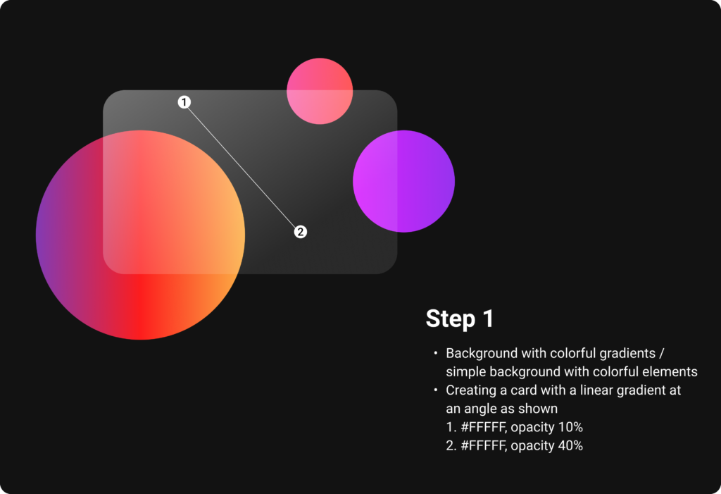
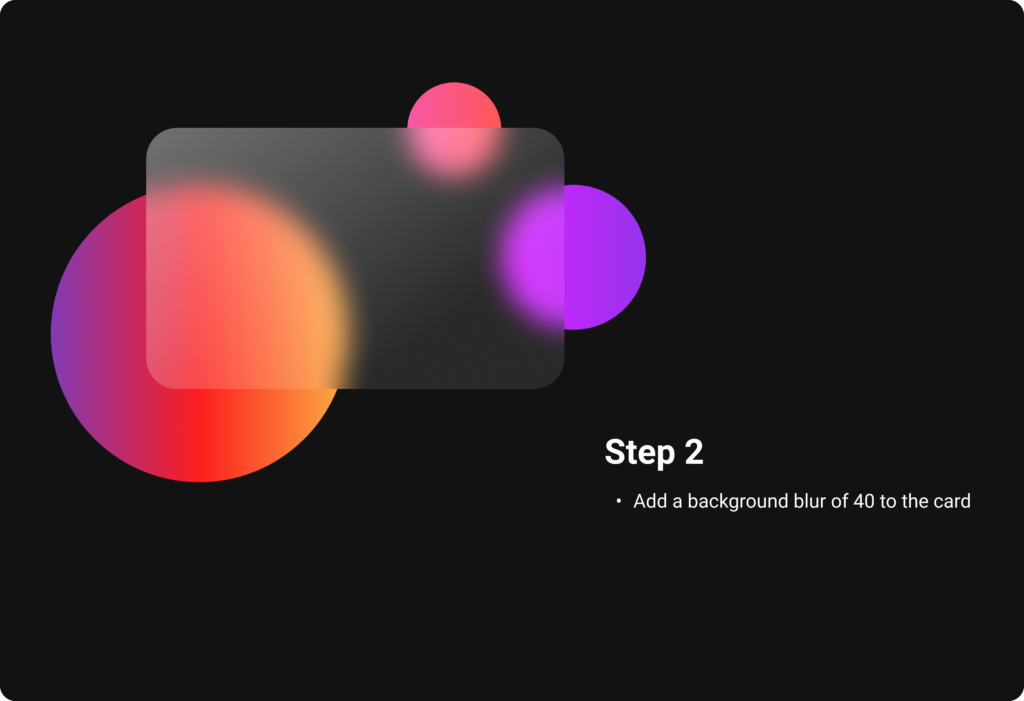
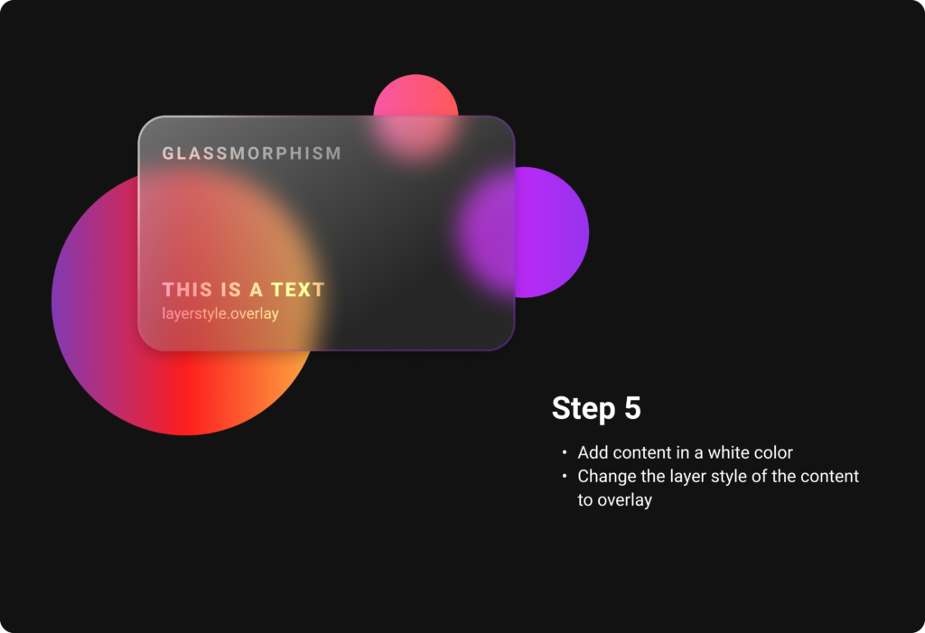
First you start off by choosing a colorful background or a simple background with colorful elements, which will be seen partly due to the transparency of the glassmorphic card element in front. It works very good with gradients, why I have chosen them for my example. Ones the background is set, create a card and choose a linear gradient for the fill, which consists of two white colors of different opacities. It is important to change the opacity of the fill, but not the opacity of the whole object. With a background blur, the glass optic becomes visible and you get a first preview of the look. 

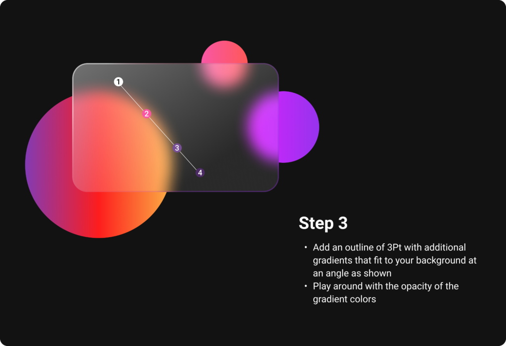
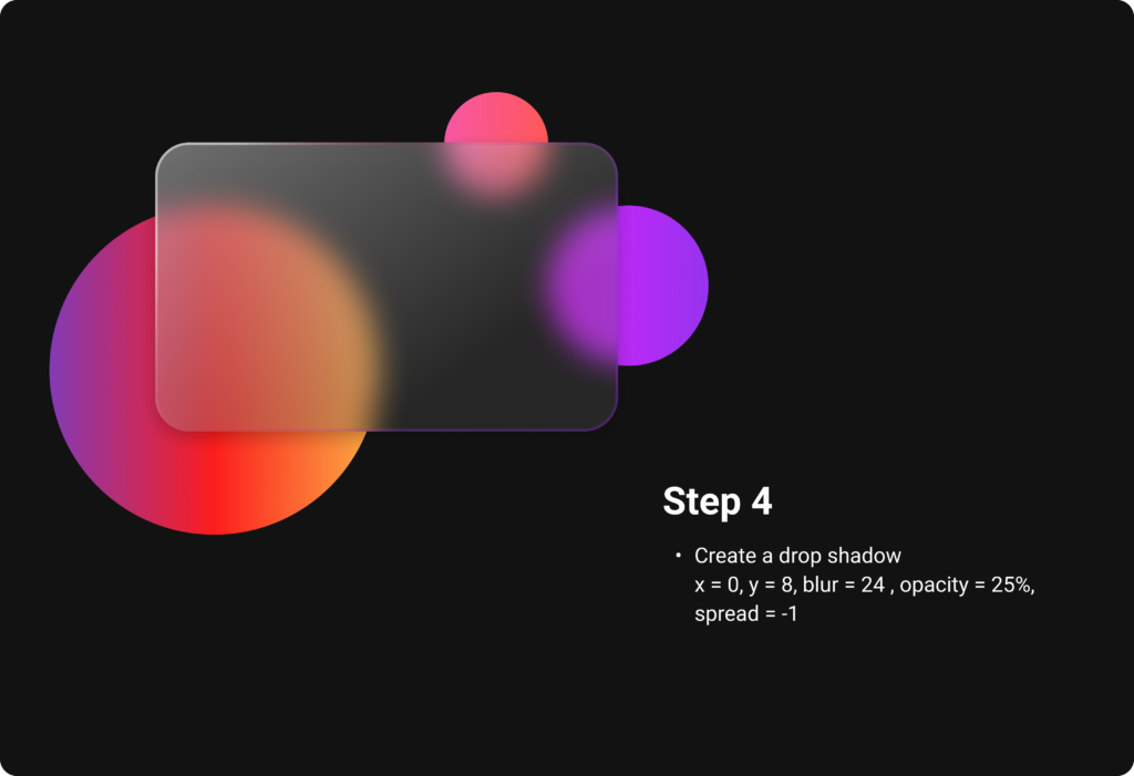
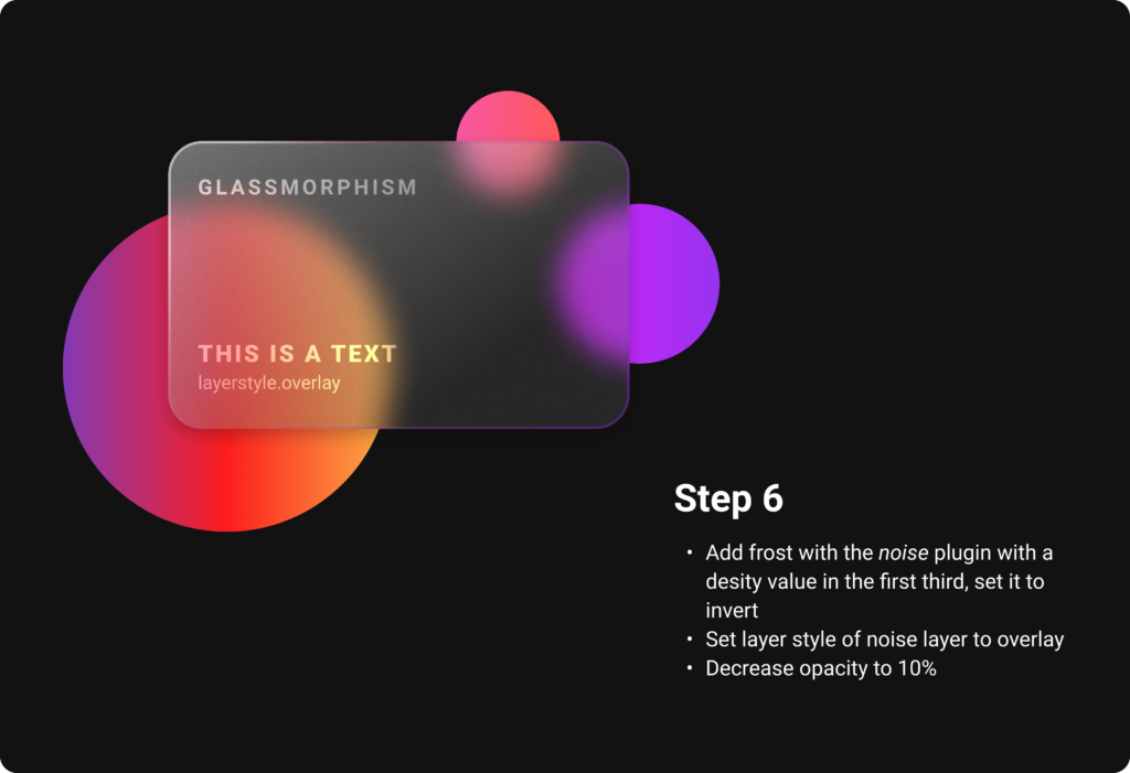
Add an outline to indicate the borders of the object. It later helps to establish the hierarchy. For a better illusion of depth, additional linear gradients that fit to the background can also be applied to the outline. A subtle shadow rounds everything off and helps to distinguish all the layers. Also the content is placed in an Overlay layer mode, which attaches it more into the card. By using noise, the frosting effect is created and gives the card the perfect glass optic. 

But what about the visual hierarchy with this transparent elements? 
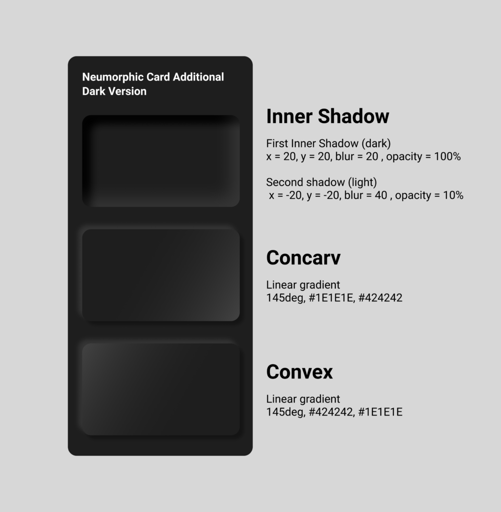
As in Neumorphism, also Glassmorphism uses the skeuomorphic approach of the real world counterpart, which in this case is of course glass, as a guideline for shadows and blur effects. When there are multiple layers of glassmorphic cards, each of them should receive a subtle shadow as described above. 

The differentiation of the blur helps to show which element is at the top, middle and back. As in the real world, the farer away a frosted glass is from the background, the more blur the background seems to be through the glass. For applying this, just start with the back element and give it a blur value of 15, the middle one has to be a little more blurred, around 25 and the top one can be around 40. To make the hierarchy totally clear, it is also necessary to decrease the opacity from the top card to the lowest. In the image below, the top card has an opacity value of 36, while the bottom one has only 16. To complete everything, add the borders applying the rules from above or just use a white outline. Either way the outline has to have a lower opacity from the top card to the lowest card, for which one can orientate on the applied blur as well.

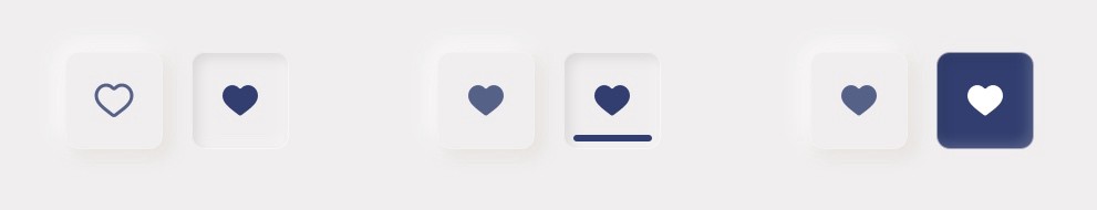
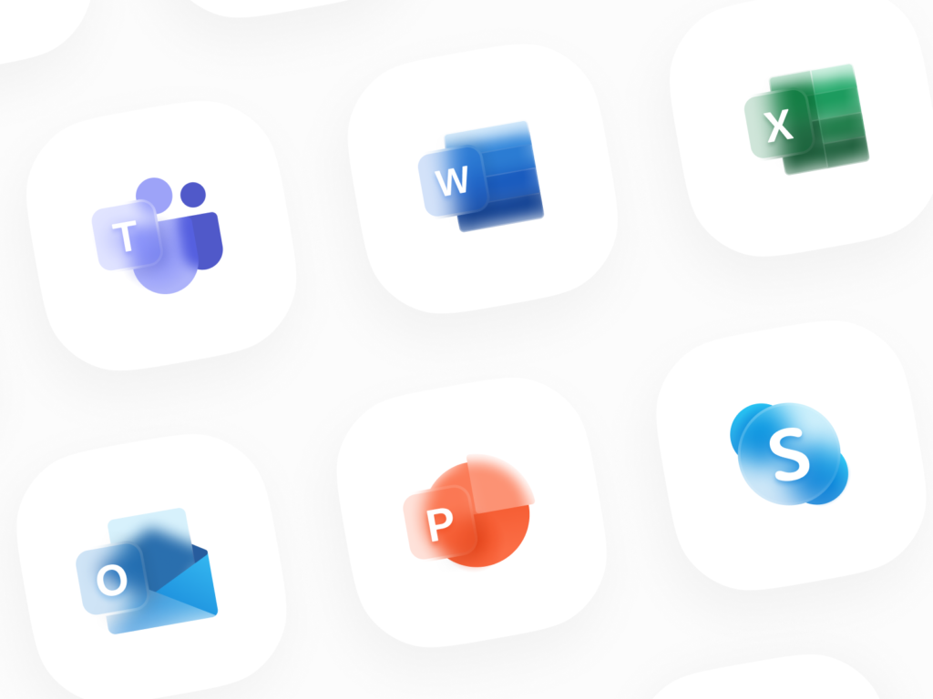
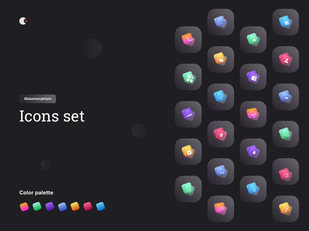
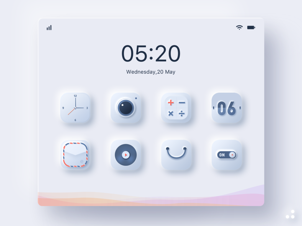
To make glassmorphic icons, the rules showed in the figma file above are usually implemented in a single element of the icon, which is placed in front of colorful background elements. The actual color of the icon is sometimes also displayed in the transparent glass surface. In the images below, you can see various examples of how Glassmorphism is implemented on icons. The simple step by step guide from above can be used to create the glassmorphic icons from scratch.

While Neumorphism is mostly used for interactive elements like buttons, cards, toggles and sliders, Glassmorphism is more used in a passive way. It is supposed to give the interface a smooth and modern look by reducing the style to only small and non interactive background elements like cards, icons, overlays etc. 

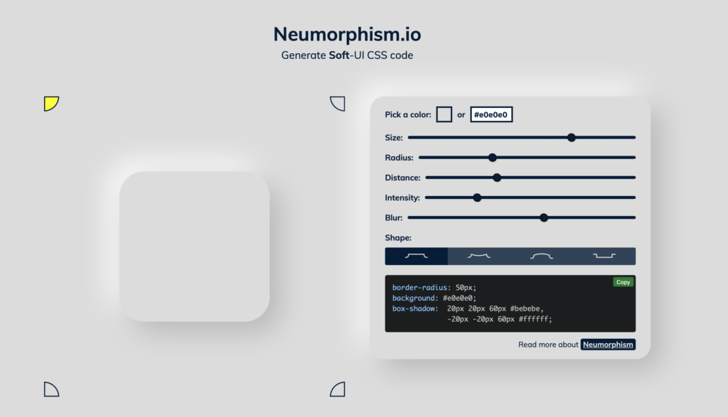
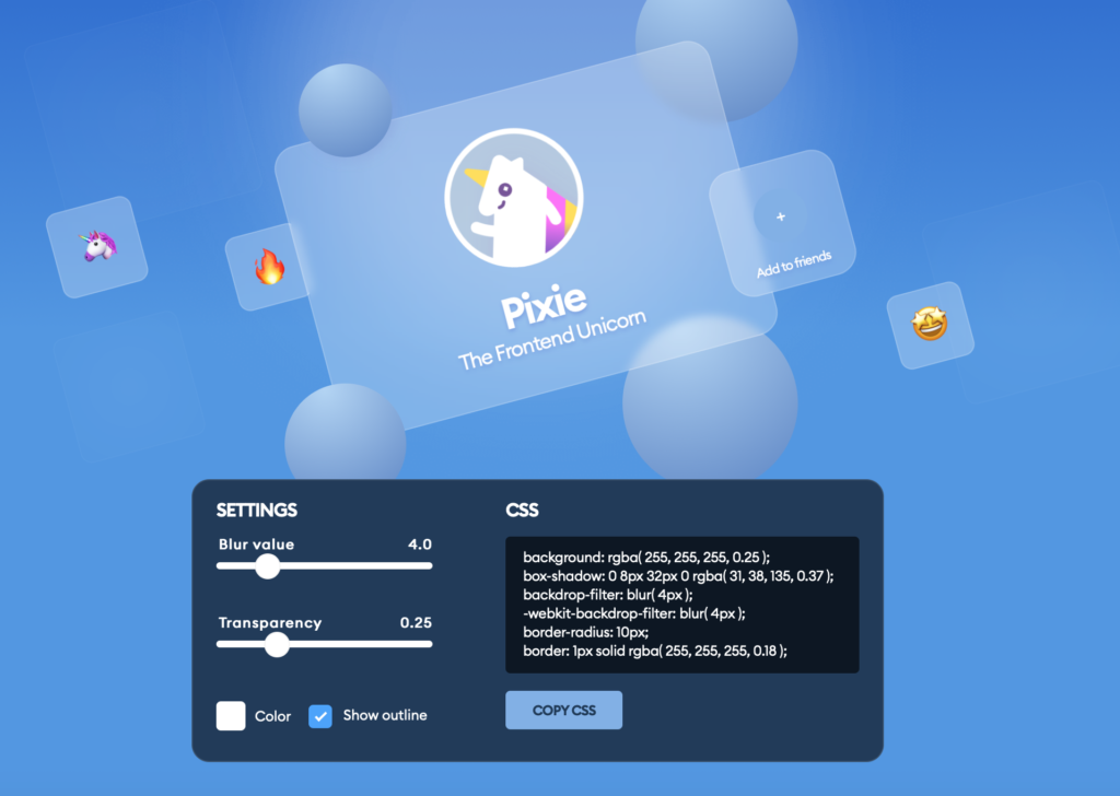
As with Neumorphism, there is a generator for glassmorphic card elements available online which gives a preview and generates code to copy for your css code.

https://glassmorphism.com

I found lots of tutorials how to implement Glassmorphism in code, one of the examples how to do it you can see below. Basically there are only a few lines of code in html and css (focus is on css) which are very similar to the principle of creating this style in figma.

Sources

https://www.youtube.com/watch?v=8UWkR1H5E4o
https://www.cmarix.com/blog/glassmorphism-the-new-trendsetter-in-2021-for-ui-design/
https://uxmisfit.com/2021/02/03/glassmorphism-guide-to-visual-hierarchy/
https://www.crafted.at/b/3-ui-design-trends-im-check-teil-3-glassmorphism/
https://uxdesign.cc/glassmorphism-in-user-interfaces-1f39bb1308c9

https://www.youtube.com/watch?v=HfKBKQOyWHM
Generator: https://glassmorphism.com
https://youtu.be/Li2apfUzKeE
https://youtu.be/IJrLL3G6xQc
https://youtu.be/rLeCNS1jfwM

How to Neumorphism

When designing User Interfaces, there are several ways to implement Neumorphism or Glassmorphism. In this blog post, I will look at how to develop neumorphic elements like cards and Icons in interface design tools like figma but also briefly in code.

First, let’s start with Neumorphism by looking at card elements, which is the most present UI element of this style. The factors that have to be considered are the size, radius, distance, intensity and blur. It has all to do with the shadows, that generate the look of „attaching to the ground“. Due to its reduced color scheme it works best, if the neumorphic card has the same color as the background. Also rounded borders help the effect to stand out more. I tried it out myself in figma, it is very easy to do and by playing around with the blur value, the distance to the background seems to change. The more blur, the farer away from the background the neumorphic card seems to be.

By adding gradients, it makes the card element seem to become convex or concarv. Adding the shadows within the card instead of outside has the effect that the card generates kind of hole or window in the interface.  

One of the goals of Neumorphism is to include the skeuomorphic approach, which means to combine the minimalistic design style with familiar objects of the analog world not only in the design aspect but also in their function, as I already analyzed in previous blog posts. The skeuomorphic approach also can be part of the icons. All the icon parts themselves have adjusted background shadows and lie on card elements with shadows, which gives them a 3D look and complete their connection to their real world counterparts. For realization in figma, the same rules as for the cards are implemented onto the icon elements. 

For a button, you can also apply the rules mentioned before. The default button can simply stay in the normal or concarv mode, while the active button should seem like it is really pressed and attaches itself deeper into the interface, for which the inner shadows should be used. Additionally to imply the „active status“, the color can also change when pressed. It is important to keep an eye on the contrast and differences between the states of the buttons. It has to be very clear to e functional. 

There are several tutorials how to do Neumorphism, there even is a Neumorphism card generator available online, where you can try out yourself and also see how it should be implemented in css code. You also can do this easily in code and don’t need a lot of lines. It is basically the same principle as it is in figma just translated.

https://neumorphism.io/#e0e0e0

Sources

https://uxdesign.cc/neumorphism-in-user-interfaces-b47cef3bf3a6
https://lukasckuehne.medium.com/trying-out-soft-ui-12153537dc50
https://www.simpleguides.de/soft-ui-neumorphism/
https://youtu.be/KlSLdEB3lzg
Neumorphism CSS Generator: https://neumorphism.io/#e0e0e0

Images and Videos

Image 01 – 04: Neumorphic cards – own creation
Image 05: Neumorphic-Icons
https://dribbble.com/shots/11473239/attachments/1509448?mode=media
Video 01: Neumorphic Icons
https://dribbble.com/shots/10746021-Neumorphism-Social-Buttons
Image 06: Neumorphic Buttons
https://uxdesign.cc/neumorphism-in-user-interfaces-b47cef3bf3a6


How to Scientific Illustration

The main goal of scientific illustration is to translate scientific information into a visual representation that helps the reader or viewer to better understand the topic. Creating a scientific illustration involves multiple steps that may vary depending on the project.

At first the most important thing is to research the hell out of your subject! It may take some time, but it is extremely important to accurately share the information. When working with a scientist there will be provided information, but you still have to sit down and wrap your brain around it. Don’t forget to look at existing or similar work on the subject. It’s good to know what’s out there.

The next thing on your to-do list is to create preliminary sketches. Visualize what you have in mind and make as many sketches as you feel like. The more you sketch the more you can edit, revisit and adapt later on. You can also sketch the layout of the finished product (e.g. an informative poster) to get a feel for the needed space and dynamic of different parts. 

After doing your sketching you can try out different illustration techniques. Will it be digital or analog? What color palettes will you use? By practicing and using different types of media and get a feel for which style fits your project best and find out how to get the best result. 

Now that you made your sketches and tried different methods it is time to decide on the overall composition and transfer your drawing to editing software. Afterwards it’s time to start working on your final illustration. Once you get a first draft you can talk to the scientist that you cooperate with and discuss your illustration. Make it an iterative process and revise your illustration if needed. Once you and your collaborator are on the same page you can finalize the project. 

I got this information from an article by Kara Perilli about making a scientific illustration on the Current, a blog from The Franklin Institute. She writes about the process in more detail and via example from her own project. 

https://www.fi.edu/blog/making-a-scientific-illustration


I also found this video about Nora Sherwood on her journey and career as a scientific illustrator. She is talking about her creative process, her desire to make people think about the world and nature as well as her wish to invoke curiosity and pass on knowledge.