»If you want a great site, you’ve got to test. After you’ve worked on a site for even a few weeks, you can’t see it freshly anymore. You know too much. The only way to find out if it really works is to test it.«
– Steve Krug in Don’t make me think (2000)
To observe, if a (digital) product really fits the user’s needs and what are potential problems and pain points, there is a method called usability testing. I watched a talk of Steve Krug, experience professional and author, in which he explains why usability testing is so important and runs through some tips for improving your own usability tests. To break it down usability testing basically is watching people trying to use what you have created, even if it is just a prototype, and let them think out loud in order to have access to their cognitive process and looking for the frustration points, questions etc. It should start at an early state of the project and includes the user’s direct feedback into the creation process, to figure out the problems before you build them into your project and discover them at a (too) late status.
Why are we doing usability testing?
They take a lot of time to build, get the data, cost money and the main question is, is it all worth it? It is! There are many reasons for you to test your product in order to have a good user experience and improve your work. Steve Krug said:
»Usability is an attribute of good design«
Steve Krug
He defined a thing as usable if:
A person of average – or even below average – ability and experience (i.e., most people)
can figure out how to use the thing for the intended purpose
without it being more trouble than it is worth.
A common issue is that a deeply involved person e.g. a designer is very into the subject and gathered a lot of information throughout the research phase of the project. While designing the product, she/he of course uses all that knowledge and creates the prototype as if the user has all that knowledge too, because it is just obvious to her/him and why should anybody think of it different? Usability testing gives the creators the opportunity to watch somebody else have the experience without former knowledge about it and let the participant use it in their own individual, intuitive manner. This discovers lots of problems in best case at an early state of the project and can happen in only a very short amount of time if well planned and organized. As Leisa Reichelt, Head of Research and Insights at Atlassian, said:
»You are not your user and you cannot think like a user unless you are meeting users regularly.«
Leisa Reichelt
In his talk, Krug also mentions that we are basically all users and we imagine that everybody uses it the same way as we do, but we are not our users. He says that users are incredibly diverse and all use is idiosyncratic (depending on prior knowledge, situation, goals…). Sometimes it can be very hard for us creators to remember that the user does not know what we know.
Usability issues can slow down the whole process of use, it can cause anxiety, be annoying and sometimes even scare people of to use something any further at all. Usability testing can prevent the product from all this, in order to guarantee a good user experience and usability throughout the process of use. Most usability issues and problems are contextual, it depends on the thing that you are building, there are only a few absolute truths in therms of usability and UX, says Krug. He gives a good example, talking about that people mostly get their jobs because of who they are as a person. He describes that e.g. people become a developer, because they like complicated stuff and figure out how things work. For a pure developer, interfaces can totally look different as if a designer or another involved person in the process looks at it and it can also differ from how the user would look at it. If you now take into consideration every member of a team, including developers, designers, project managers etc. it is sometimes just very hard to agree on something and make a decision and proofs the idiosyncratic use. A good solution can be to just test it and see how the user can cope with the discussed particular element.
In his talk, Krug gives a short introduction in DIY usability testing (nutshell version) and goes on by a live usability testing to demonstrate how easy it can be. After that, he goes on and introduces his 6 maxims, which you can also see in the video beneath.
For user centered design, it is necessary to be aware how the user would interact with your product or service, whether it is a website, an app, a streaming service or anything else. For me it influences my design decisions and helps to discover usability problems, that I sometimes would have never imagined to be a problem at all. Every design decision kind of starts off with a hypothesis, that this is how the user would like to experience something and this is also very much influenced by own assumptions and previous knowledge. User Testing proves your decision wrong or right and puts yourself in the user’s shoes to see the project from his point of view.
Sources:
Don’t make me think : Web usability – das intuitive Web by Steve Krug
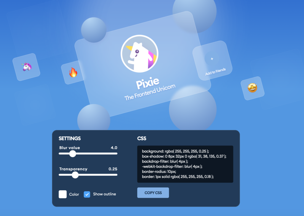
In this blog entry I will have a look on how to implement Glassmorphism in figma, but also briefly in code.
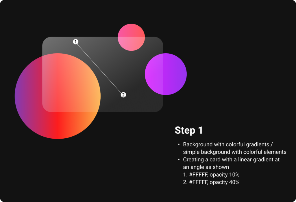
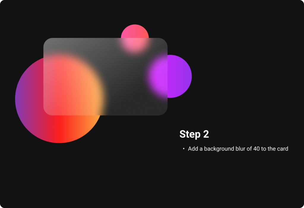
First you start off by choosing a colorful background or a simple background with colorful elements, which will be seen partly due to the transparency of the glassmorphic card element in front. It works very good with gradients, why I have chosen them for my example. Ones the background is set, create a card and choose a linear gradient for the fill, which consists of two white colors of different opacities. It is important to change the opacity of the fill, but not the opacity of the whole object. With a background blur, the glass optic becomes visible and you get a first preview of the look.
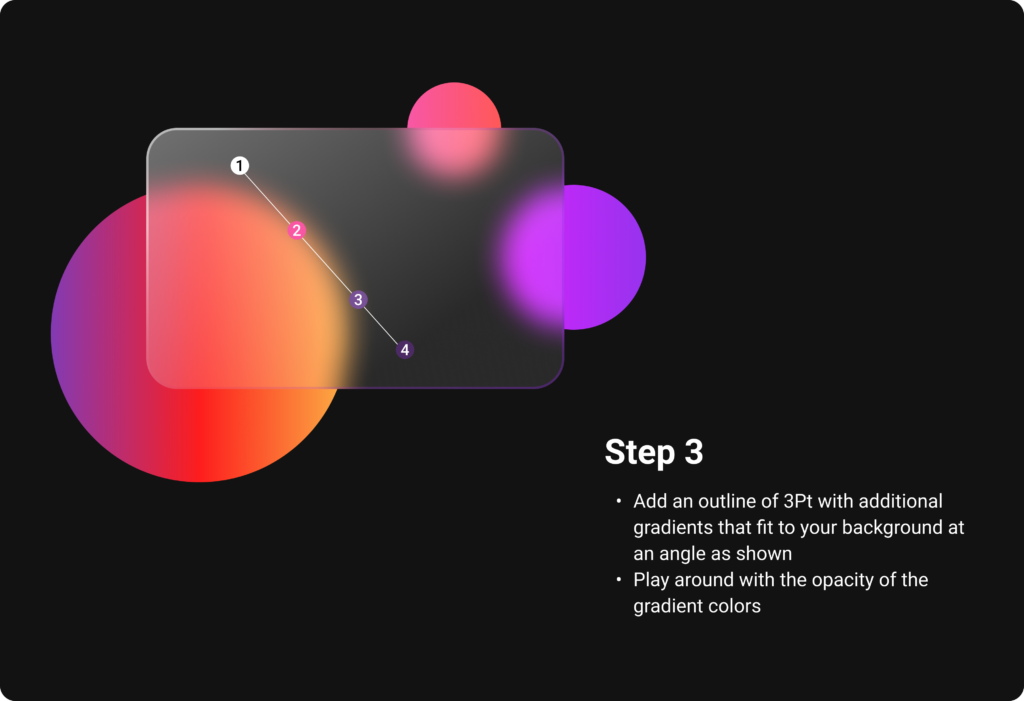
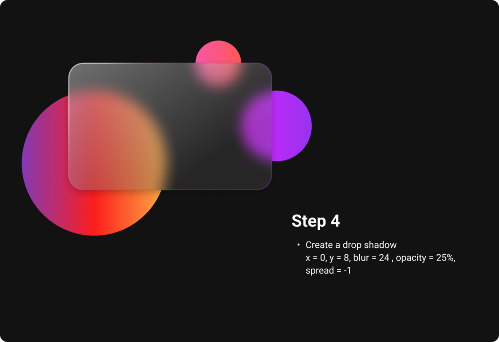
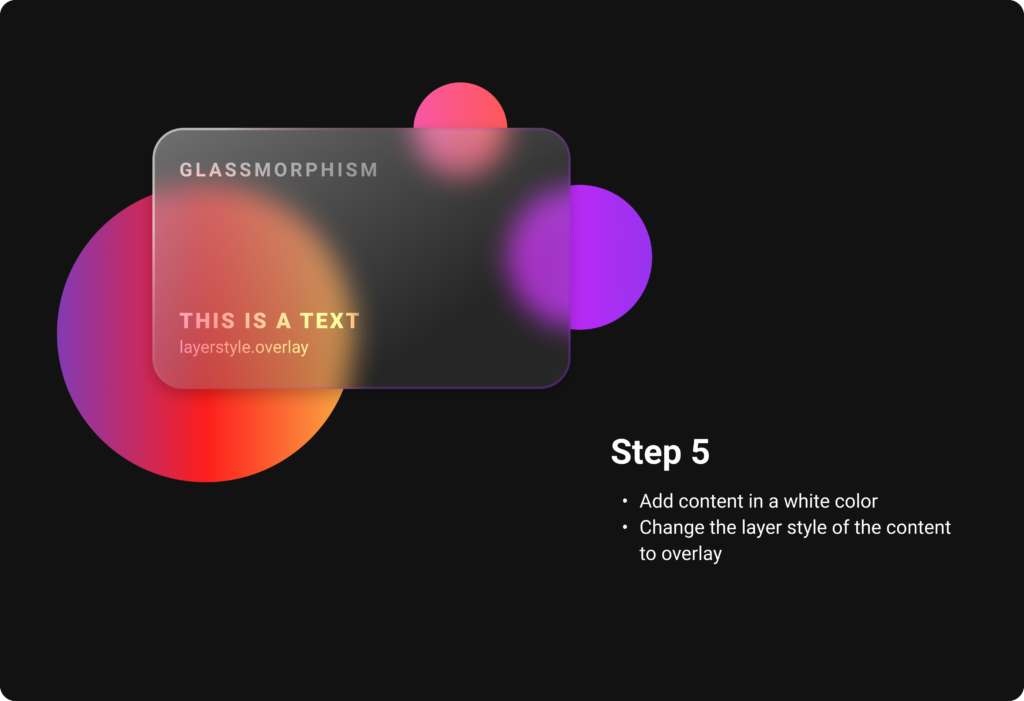
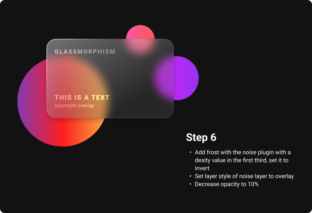
Add an outline to indicate the borders of the object. It later helps to establish the hierarchy. For a better illusion of depth, additional linear gradients that fit to the background can also be applied to the outline. A subtle shadow rounds everything off and helps to distinguish all the layers. Also the content is placed in an Overlay layer mode, which attaches it more into the card. By using noise, the frosting effect is created and gives the card the perfect glass optic.
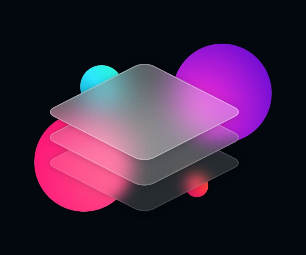
But what about the visual hierarchy with this transparent elements? As in Neumorphism, also Glassmorphism uses the skeuomorphic approach of the real world counterpart, which in this case is of course glass, as a guideline for shadows and blur effects. When there are multiple layers of glassmorphic cards, each of them should receive a subtle shadow as described above.
The differentiation of the blur helps to show which element is at the top, middle and back. As in the real world, the farer away a frosted glass is from the background, the more blur the background seems to be through the glass. For applying this, just start with the back element and give it a blur value of 15, the middle one has to be a little more blurred, around 25 and the top one can be around 40. To make the hierarchy totally clear, it is also necessary to decrease the opacity from the top card to the lowest. In the image below, the top card has an opacity value of 36, while the bottom one has only 16. To complete everything, add the borders applying the rules from above or just use a white outline. Either way the outline has to have a lower opacity from the top card to the lowest card, for which one can orientate on the applied blur as well.
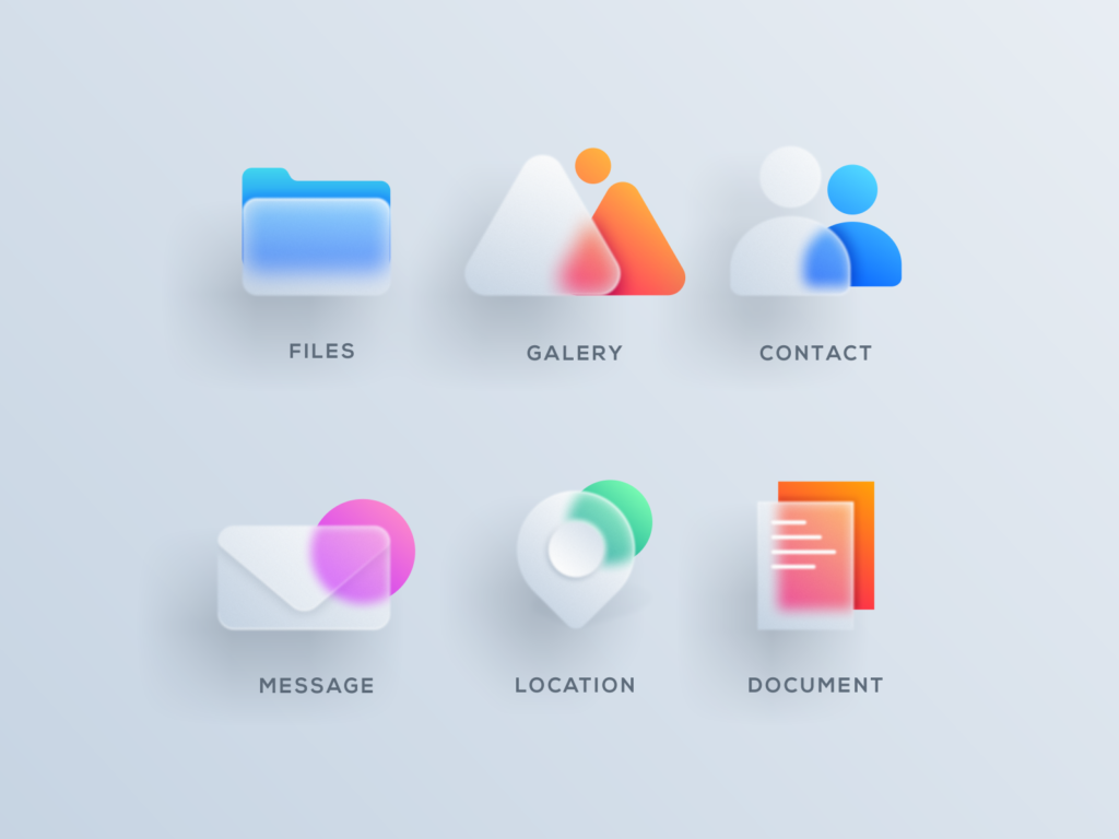
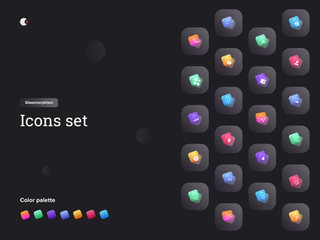
To make glassmorphic icons, the rules showed in the figma file above are usually implemented in a single element of the icon, which is placed in front of colorful background elements. The actual color of the icon is sometimes also displayed in the transparent glass surface. In the images below, you can see various examples of how Glassmorphism is implemented on icons. The simple step by step guide from above can be used to create the glassmorphic icons from scratch.
While Neumorphism is mostly used for interactive elements like buttons, cards, toggles and sliders, Glassmorphism is more used in a passive way. It is supposed to give the interface a smooth and modern look by reducing the style to only small and non interactive background elements like cards, icons, overlays etc.
As with Neumorphism, there is a generator for glassmorphic card elements available online which gives a preview and generates code to copy for your css code.
I found lots of tutorials how to implement Glassmorphism in code, one of the examples how to do it you can see below. Basically there are only a few lines of code in html and css (focus is on css) which are very similar to the principle of creating this style in figma.
When designing User Interfaces, there are several ways to implement Neumorphism or Glassmorphism. In this blog post, I will look at how to develop neumorphic elements like cards and Icons in interface design tools like figma but also briefly in code.
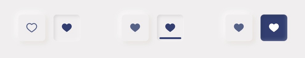
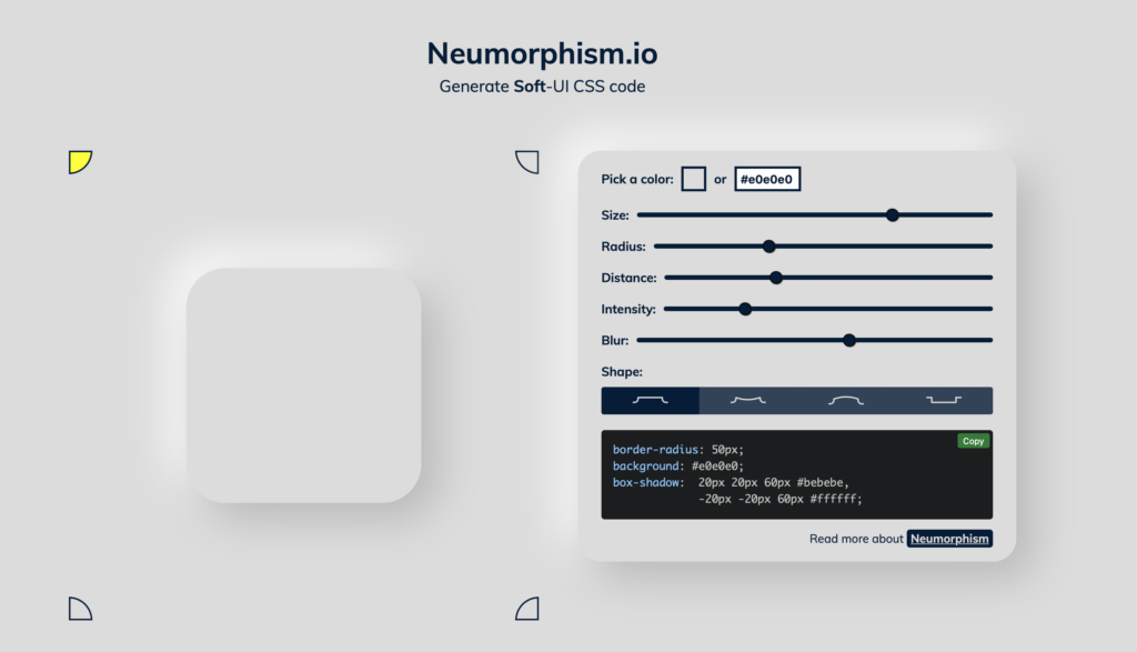
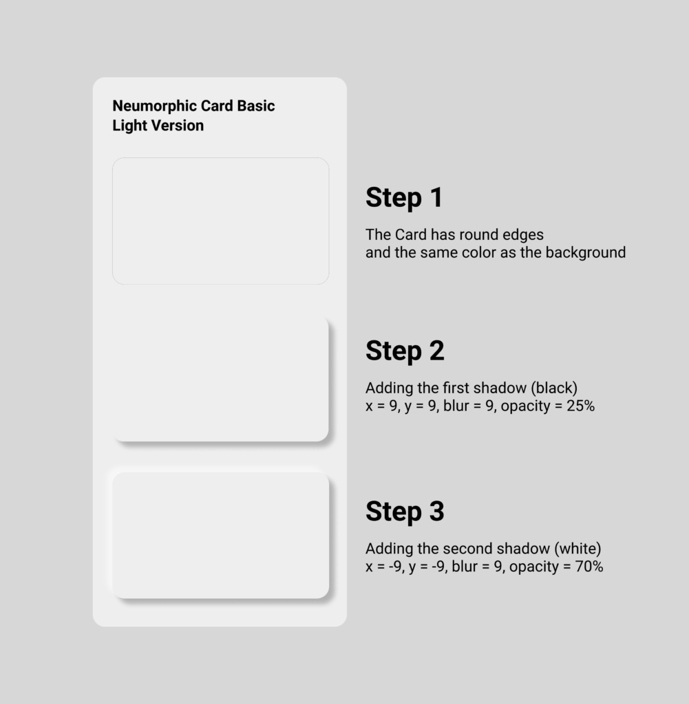
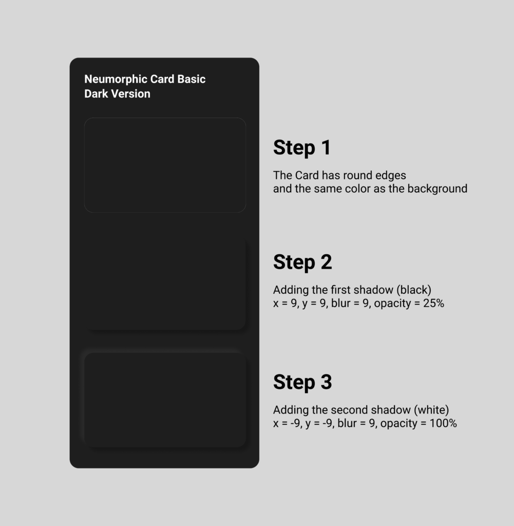
First, let’s start with Neumorphism by looking at card elements, which is the most present UI element of this style. The factors that have to be considered are the size, radius, distance, intensity and blur. It has all to do with the shadows, that generate the look of „attaching to the ground“. Due to its reduced color scheme it works best, if the neumorphic card has the same color as the background. Also rounded borders help the effect to stand out more. I tried it out myself in figma, it is very easy to do and by playing around with the blur value, the distance to the background seems to change. The more blur, the farer away from the background the neumorphic card seems to be.
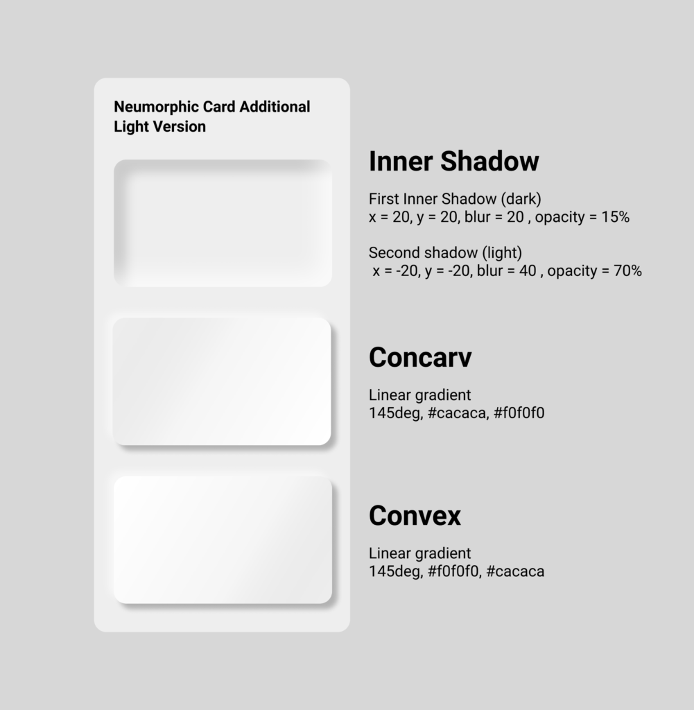
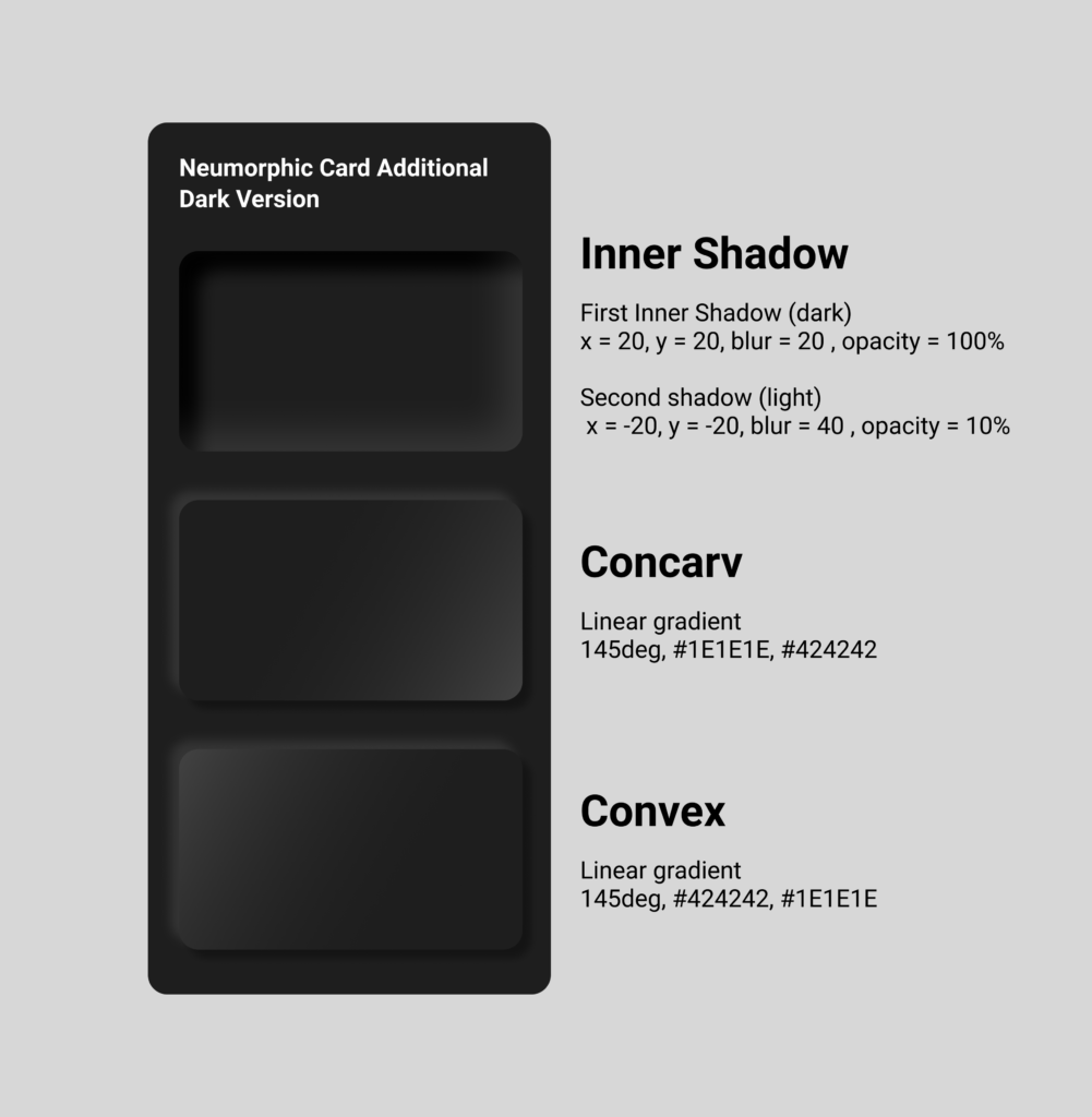
By adding gradients, it makes the card element seem to become convex or concarv. Adding the shadows within the card instead of outside has the effect that the card generates kind of hole or window in the interface.
One of the goals of Neumorphism is to include the skeuomorphic approach, which means to combine the minimalistic design style with familiar objects of the analog world not only in the design aspect but also in their function, as I already analyzed in previous blog posts. The skeuomorphic approach also can be part of the icons. All the icon parts themselves have adjusted background shadows and lie on card elements with shadows, which gives them a 3D look and complete their connection to their real world counterparts. For realization in figma, the same rules as for the cards are implemented onto the icon elements.
For a button, you can also apply the rules mentioned before. The default button can simply stay in the normal or concarv mode, while the active button should seem like it is really pressed and attaches itself deeper into the interface, for which the inner shadows should be used. Additionally to imply the „active status“, the color can also change when pressed. It is important to keep an eye on the contrast and differences between the states of the buttons. It has to be very clear to e functional.
There are several tutorials how to do Neumorphism, there even is a Neumorphism card generator available online, where you can try out yourself and also see how it should be implemented in css code. You also can do this easily in code and don’t need a lot of lines. It is basically the same principle as it is in figma just translated.
In one of my former blog entries, I talked about the potential strengths and weaknesses of Neumorphism, also called soft UI. The most significant issue was obviously the accessibility. Also due to the skeuomorphic elements, it was not as flexible in its design style as for example a flat design approach. It has to be used restricted, in order to obtain a nice accessible und understandable interface. It works best with a simple UI and a strict limited hierarchy.
Say Hello to Glassmorphism In comparison to the extruding/intruding optically plastic effect of neumorphism, a more vertical trend Glassmorphism has evolved. It’s most defining characteristics are:
Light thin outline: visibility of the borders of transparent object
One of the strengths of this design trend is, that the user can identify the hierarchy of the elements quickly. It is very easy to detect, which layer is in the front, middle and back because of the see-through objects. Just as with neumorphism, this style shines especially bright when it’s used on just one element. The right amount will ensure, that also people with vision problems will be able to still understand the user interface. With over-usage, such as integrating it as a default material design for the background, card elements and Icons, it restricts the accessibility and also can lead to a boring and unoriginal design.
Neumorphism is best used for buttons, sliders and toggles, whereas this should be avoided Glassmorphism. Glassmorphic elements work best as (floating) cards and overlays, which we know is problem for neumorphism, because all elements attach themselves to the background. As with all UI designs, it is important to visually group all elements on the cards and define a hierarchy for this as well.
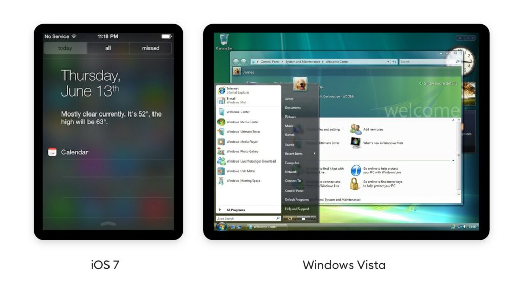
History and Future The system behind Glassmorphism is not as new as one might think, the panel blur is being used in several ways since 2007, where it was first introduced by Windows vista with Windows Aero and later integrated by Apple in iOS 7 in 2013.
Pulling down notifications and see the icons fade out behind a panel is nowadays integrated in the standard UI. Microsoft’s Fluent design system goes heavy on this effect as well. They call this particular element The Acrylic and showcase it as an integral part of their design system. Apple has since greatly reduced the blurry-glass effect in their mobile OS, but recently brought transparent-blurs back with Mac OS Big Sur. However, on Dribbble – a platform for discovering and connecting with designers, Glassmorphism is used for desktop applications as well as mobile devices and seems to be not at all limited to a specific device. But also Dribbble is more about the design being pretty instead of accessible, therefore there are also lots of examples where Glassmorphism is definitely overused and also the designs are not restricted to an operating system.
Since Glassmorphism is used in the current Mac OS version Big Sure and also on Microsoft Fluent Design, I would predict the trend will definitely become more popular and rise, to also be more present on our mobile devices.
This post will be another comparison of fake fact-checking sites with real fact-checking sites and how there are differences in their design language (Typography, Images, etc.), the content (Expertise, Rigour, Transparency, Reliability) and the overall usability. It’s hard to find similarities that apply to the various pages, but this post will try to show the most common ones. Therefore I decided to compare InfoWars with ProPublica in the previous post and in this one Global Research with Fact Check.
Globalresearch is an “anti-Western” website that has troubles distinguishing between serious analysis and discreditable junk and so just publishes both. While some of GlobalResearch’s articles discuss legitimate humanitarian concerns, its view of science, economics, and geopolitics is conspiracist. The website under the domain names globalresearch.ca, globalresearch.org, globalresearch.com etc., is run by the non-profit The Centre for Research on Globalisation (CRG), which was founded by Michel Chossudovsky (1946–), a professor emeritus of economics at the University of Ottawa.
Fact Check is a nonpartisan, nonprofit project of the Annenberg Public Policy Center of the University of Pennsylvania monitors the factual accuracy of what is said by U.S. political players, including politicians, TV ads, debates, interviews and news releases. Their goal is to apply the best practices of both journalism and scholarship, and to increase public knowledge and understanding.
As you can clearly see common rules of distinguishing if a site is a false information spreading site or not, do not apply to these pages. Some governments already started to implement laws or similar actions against misinformation. Also other scientist and artist startet to visualize this problem.
So last but not least the comparison. Both pages use he SSL certificate which means they should be “safe to use”. While FactCheck.org always has their sources on the end of each article, GlobalResearch.ca only has sources to some articles and also these are called footnotes. Overall both sites do what they are supposed to do, but design related there are some differences. Global Research is really jam-full with articles. There is almost no space in-between the preview blocks and also the font is pretty small. Whereas Fact Check uses a lot more white space and also fonts and images are bigger. So in points of accessibility and readability Fact Check is the clear winner. The website of Global Research just feels like they need to give you all the information in one screen. To describe this phenomenon visually, it feels like some stranger is screaming to your face, but you actually do not understand a thing. The overall usability of both sites is good, but the Fact Check page has a clearer visual structure and a better design language. In terms of functionality everything works fine. Both websites more or less follow the common design principles, even though both sites could be better. During my research I experienced a lot of stuffed content websites and this mainly occurs on fake-news or hoax spreading sites, but unfortunately also some proper fact-checking sites have a really bad visual appearance. So that fact does not tear them apart.
This post will be a comparison of fake news pages with real fact-checking sites and how there are differences in their design language (Typography, Images, etc.), the content (Expertise, Rigour, Transparency, Reliability) and the overall usability. It’s hard to find similarities that apply to all the various fake news pages, but this post will try to show the most common ones. Therefore I decided to compare InfoWars with ProPublica and in the next post Global Research with Fact Check.
I chose those two pages because both of them are or seem to be news based, journalistic websites. The fist thing most of the users check is the domain. It could be weirdly long, maybe not include s SSL certificate or just plainly weird. In this case both websites seem to have normal looking domains ending with .org (ProPublica) and .com (InfoWars). When taking a closer look you will certainly notice a difference in the web design, advertisment placement and how the content is presented.
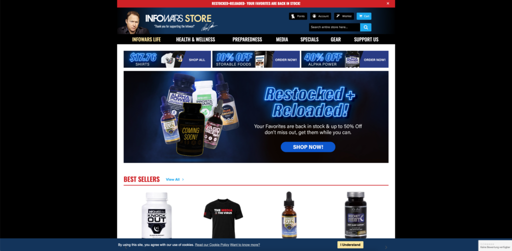
First of I want to talk about the adds. ProPublica is almost third party add free, but they ask for donations a lot, while InfoWars has gun industry related or other free-speech newsletter adds. Also, they try selling dietary supplements through Amazon despite being banned from other platforms. They also created their own online shop to sell their products and merchandise.
InfoWars Online Store
This might seem just to be because of audience they are clearly approaching: the right wing conservatives (InfoWars), whilst ProPublica tries do debunk hoaxes through thorough research.
Screen recording of InfoWars Landingpage
The design language of pages is clear and straight. InfoWars uses a sans-serif bold black font for their headlines and. In comparison to ProPublica, which use a serif bold black font for headlines, which is more likely to be associated with news papers and sans-serif for text, because of the readability.
Screen recording of ProPublica Landingpage
The overall usability of both sites is pretty good and clear. Everything works fine. Both websites follow the common design principles, except that the article design of ProPublica is much clearer and less busy than the one of InfoWars. In the following videos you can see the difference.
Screen recording of ProPublica ArticleScreen recording of InfoWars Article
After spending some time on InfoWars it becomes clear that their main resource is social media (Screenshots of postings) or other false- and misinformation spreading websites or media channels. Most of the time there is no research behind the claimed statements, it is just plainly personal opinion sold as researched facts. There are no credible sources or the only source given is a book or a podcast of the site owner Alex Jones or some other far-right conspiracy theorists.
In the past few years, haptic feedback has spread strongly to the digital world and accompanies us on almost all smart surfaces. There are three classes of tactile displays, distinguished by the type of input that is delivered to the skin. Input is delivered by either static pressure (where the skin is pressed), vibration, or tangential skin stretching. This is made possible by different technologies. Electromagnetic motors present vibrotactile cues, for example in wearable displays. Electrotactile displays are based on a dense array of electrodes.
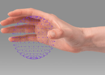
However, haptic feedback can also be obtained without touching the display at all and perceive it through mid-air contactless interaction. Not only can one touch the computer like this, but the computer touches one back as well by simulating the touch through the air. So the user doesn’t have to be in contact with any physical surface.
Turning ultrasound into virtual touch Ultraleap is a company that is on the mission to make digital worlds feel more human. They have united the world’s most advanced hand tracking with the only haptic technology that creates the sensation of touch in mid-air. They have a team of more than 150 spread across the world, with locations in Silicon Valley, US and Bristol, UK. Ultraleap has developed a virtual touch technology, that works with sound waves through ultrasonic speakers. These sound waves are timed specifically, so that at one point in the air, they all add up together at the same time. Sound waves are just pressure waves moving through the air and all the different pressures that come together at one point enable to have a very localized point of high pressure, which generates enough force to slightly displace one’s skin.
https://www.ultraleap.com/haptics/#how-it-works
See yourself, how this is working.
https://youtu.be/XnDoej4mnHU
This technology opens endless possibilities and is a real step to make interfaces more accessible and human. From the automotive industry, to gaming techniques in all areas of application (like VR, AR, XR etc.), interactive Installations, museums, but also future mobile device applications and interactions for visually impaired people.
Ultraleap also enabled a touchless interactive play experience for LEGO. Using the Ultraleap‘s haptic technology, LEGO fans and families were able to move, rotate and build virtual LEGO bricks on an Ocean Outdoor digital billboard, while feeling the bricks in mid-air. The haptic sensations consisted of circles and lines: users could touch the stud on top of virtual LEGO bricks and feel the edges of the blocks. Different sensations were produced for wheels of different sizes and also there were “crumbling” sensation when builds were broken down.
https://youtu.be/aNl8UchT9h4
Ultraleap has taken haptic feedback to a new level. Skeuo- and neumorphism could benefit extremely from this immersive technology. Their lack of accessibility could use this particular mid-air form of interactive haptic feedback as an advantage to be more inclusive and place themselves in the design world. I think most mobile devices like we have now will continue to be more interactive in the future, but just not in the touch way we are used to now. Technologies like this are the future, and also because of the pandemic in today’s world, I think the development of these devices will continue and become more widespread around the world, and just possibly replace common ways of interaction completely.
Not only are our interfaces becoming increasingly flat, but so are the devices on which the interface is presented. The analog, haptic factor is diminishing, because what was previously a physical button, for example, has evolved into a digital button on a flat screen. In an exchange with Konrad Baumann, we talked about the areas in which the flattening of devices has changed the most or is becoming increasingly prevalent. Of course, it is present in almost all industries due to digitalization, but the mobile devices and also the automotive industry caught our attention the most in its change.
In our conversation about the automotive industry, we mainly looked at the car dashboard, as well as its functions, and addressed the following factors:
The aesthetic, digital and futuristic factor of displays
Flat and smart design changes interaction and functions
Distraction factor is much greater, due to expanded range of functions
Physical and haptic advantages of, for example, push or turn knobs and analog buttons are almost completely eliminated
New use of senses, since the sense of touch is not as effective due to the flat interface (you can no longer look at the road and feel the rotary knob with which you want to adjust the volume, but must actively direct your gaze away from the road to the display or act via voice control)
tactile feedback while driving (lane assistant)
simple intuitive display that does not require any special instruction
These factors of the touch display brought me back to required haptic feedback. A flat display allows much less access because you can’t feel the interface the way you would like to intuitively with your hands. The flatness of the digital interface would prevent you from feeling surface textures, materials, elevations, etc. of the input options. Therefore, a digital interface requires and includes haptic feedback. Haptic feedback in digital interfaces, as mentioned in my last blog post, means that forces, vibrations or movements are applied to the user via the interface. This allows the user to haptically feel what they are seeing and doing through a digital interface. We can perceive familiar objects very quickly and also very accurately if we use only our sense of touch. This action of “active touch” is called haptic sensation or simply haptics. Since we use our hands primarily to explore the world tactilely, haptic sensation is closely related to the function of our hands and the way we use them. Often it does not require explanation of how to use the sensed object, as this is intuitively applicable based on the texture and properties – picked up by the sense of touch.
»Haptic exploration enables us to perceive both the geometric and material properties of objects. The former refers to features such as size, shape, orientation, and curvature, whereas the latter includes attributes such as surface texture, compliance, and thermal characteristics. The size and shape of objects that fit within the hand can be perceived on the basis of skin indentation and the pose of the fingers, because the hand can enclose the object.« – Lynette A. Jones (Senior Research Scientist in the Department of Mechanical Engineering at MIT, 2018).
Just by touching and feeling, the surface texture and interaction with a particular element can be made out. Compared to hearing or seeing, we can perceive bidirectional signals through haptic perception. The information we can extract about the properties of an object is closely related to the movements we make to perceive those properties.
»Haptic sensing is critical to our experience of the world, from providing us with information that enables us to use just the right amount of force to lift a glass of water from a table, to finding the light switch on the bedroom wall in the dark.« – Lynette A. Jones (2018)
However, the sense of touch is thought to have a narrower bandwidth than vision or hearing, meaning that the amount of information it can process in time is less than that of the other two senses. In everyday life, it is mainly hearing and vision that dominate our interaction with the world, which is why we often rely on the information we pick up with them. Especially when interacting with digital displays, however, haptic feedback is a way to integrate the sense of touch to provide information, and make the digital world more experiential and, most importantly, accessible. Concerning the car dashboard, the sence of touch and haptic feedback is very important. Everything that includes vision or audio, distracts the driver. Preparing tactile or haptic feedback can prevent directing the gaze away from the road.
»Understanding how we perceive these various aspects of a surface is important in a number of areas, from the feel of consumer products that we hold, such as phones, handles, paper, and fabrics, to creating such textures artificially on flat screens.« – Lynette A. Jones (2018)
Related to my starting point of researching the benefits of skeuo- and neumorphism in the field of Interaction Design, haptic feedback is an indispensable factor to consider when applying these design styles. These capabilities allow the real world signifier of a skeuo- and neumorphic objects to be felt, transferring the analog world into the digital display. The real world counterpart of skeuomorphism can thus be made more tangible, thereby mitigating the accessibility difficulties of neumorphism.
Heutzutage sind viele Unternehmen der Ansicht, dass sie keine Ressourcen für User Research haben oder keine Notwendigkeit in der User Research sehen und auch nicht den Mehrwert daran erkennen. Doch aus welchen Gründen1 betreibt man jetzt User Research? Man führt User Research wenn man folgende Ziele verfolgt:
Ein Produkt zu erschaffen, das einen echten Mehrwert für die Nutzer hat
Ein Design zu erstellen, dass intuitiv nutzbar ist (Usability) und Freude bereitet (Joy of Use)
Dass es Nachvollziehbar ist, wie sich die „Return on Investment“ ergibt.
Wie erreicht man nun diese Ziele? Die Antworten bekommt man nach dem durchführen der User Research, hierbei werden verschiedene Methoden aus der User Research angewendet (auf die verschiedenen Methoden werde ich in meinem nächsten Blog Eintrag genauer eingehen).
Doch was genau bedeutet das jetzt? Lassen Sie mich anhand eines Beispiels erklären warum die User Research wichtig ist:
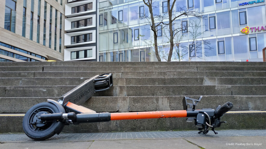
Betrachten wir die Markteinführung der E-Scooter: Man dachte, dass die E-Scooter eine Stadt umweltfreundlicher machen würden, es gäbe weniger Staus und der Mensch wäre dadurch mobil, ohne von den öffentlichen Verkehrsmitteln abhängig zu sein2 . Wer jedoch einmal in einer Stadt war, wo die E-Scooter verfügbar sind, der weiß, dass dadurch das Stadtbild merkbar beeinträchtigt wird.
Hierbei wird deutlich verständlich, wie wichtig es ist, eine User Research durchzuführen und sich folgendes Fragen: Welche Probleme treten hierbei für die Menschen und das Umfeld auf? Wie können wir helfen, dieses Problem zu lösen?
Das hier war nur ein Beispiel von vielen, jedoch wird einem hierbei bewusst, wie wichtig die User Research für unseren Alltag ist.
Neumorphism is definitely the design trend of 2020. It combines the skeuomorphic design with the famous flat design and thus creates a special flat but realistic 3D-looking effect. It is aesthetically very appealing, but what about the usability? To answer this question, I researched about the strengths and weaknesses of neumorphism and how it would be applicable in real world situations due to its intuitive design approach. I stumbled about the therm „signifiers“ and how hints contribute to good usability. This lead to a research based on the background of human perception and usability.
Signifiers, not affordances
„As time and technologies change, as we have moved from individual to group, social, and even cultural computing, and as the communication technologies have become as important as the computational ones, how well have our design principles kept up? We know how to behave by watching the behavior of others, or if others are not there, by the trails they have left behind.“ — Don Norman
Don Norman, co-founder and principal of the User Experience/Usability consulting firm „the Nielsen Norman Group“, World Leaders in Research-Based User Experience, wrote the article Signifiers, not affordances about powerful clues, that arise from what he calls „powerful signifiers“. He states that a “signifier” is some sort of indicator, some signal in the physical or social world that can be interpreted meaningfully. Signifiers signify critical information, even if the signifier itself is an accidental byproduct of the world. Social signifiers are those that are relevant to social usages. Some social indicators simply are the unintended but informative result of the behavior of others.
To understand social signifiers, he gives the example of catching a train: You know your train’s departure will be soon and rush to the train station. When you arrive and there is no train, you are automatically looking for clues, if you have missed the train or not. If there are still lots of people at the train station, you know, it may just not have arrived yet, if nobody is there anymore, you probably have missed it. So the state of the train station, the presence or absence of people there, works as a signifier. This is an example of an incidental, accidental signifier. That is the nature of signifiers: often useful, but of mixed reliability. Other examples for social signifiers can be a crosswalk or even trails that signify a shortcut through a park or a planted area.
If you think about that for a moment, everything we are doing is a learning process and to evolve we need constant signifiers and explanations how to continue. We permanently interpret clues or signs that enable us to proceed in a certain way, that especially show us how to proceed. We orient ourselves on the basis of our previous experiences, not only in the social environment, but also in our technical competencies. It has a lot to do with intuitive usage, that comes from signifiers provided for us. In the design field, this is essential for a good usability and a good user experience. People search for any signifier that might guide them through and help them to cope and understand, anything that might signify meaningful information.
„Forget affordances: what people need, and what design must provide, are signifiers. Because most actions we do are social, the most important class of these are social signifiers.“ — Don Norman
A signifier in the digital world is for example the scrollbar of websites on the side, which automatically gives you a clue about how much of the page you are viewing is remaining and on what point you are on the page. Also its length is showing what proportion is visible at the moment. The signifier is an important communication device to the recipient, whether or not communication was intended. For us to function in this social, technological world, we need to develop internal models of what things mean, of how they operate. We seek all the cues we can find to help in this enterprise, and in this way, we all act as detectives, searching for whatever guidance we might find. If we are fortunate, thoughtful designers provide the clues for us. Otherwise, we must use our creativity and imagination. But this is something users usually don’t want to do, which can also be an example for bad usability. The user’s mission is to not perceive the interface in that kind of way, that he has to think about how to use it. „Don’t make me think“ is usually the general view and approach, users follow.
Flat UI Elements Attract Less Attention and Cause Uncertainty?
To understand if this is really that significant for users and if so, how it affects them, I took a look at a study of 2017 on UIs with weak in comparison to UIs with strong signifiers on webpages by Kate Moran.
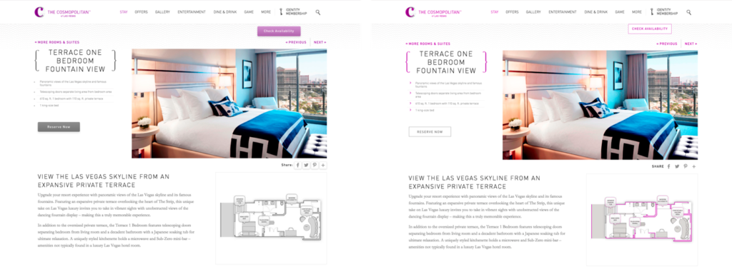
The study first points out that due to flat design, many websites have erased the cues for users to identify, whether something is clickable. Using eyetracking equipment to track and visualize users’ eye movements across interfaces, the researchers investigated how strong clickability signifiers (traditional clues such as underlined, blue text or a glossy 3D button) and weak or absent signifiers (for example, linked text styled as static text or a ghost button) impact the ways users process and understand web pages. They took 9 web pages from live websites and modified them to create two nearly identical versions of each page, with the same layout, content and visual style. The two versions differed only in the use of strong, weak, or absent signifiers for interactive elements (buttons, links, tabs, sliders). To drive the users attention to a certain area of the page, they gave them tasks on the page, for example: „You will see a page from a hotel website. Reserve this hotel room. Please tell us when you have found where you would click.” There were 71 general web-users, who participated in the study.
Two modified versions of a detail page for a hotel room: The strong version (left) included slightly 3D style buttons, and the light purple color was used only on interactive elements; The weak version (right) had flat ghost buttons instead.
The researchers tracked the eye movements of the participants as they were performing these tasks. They measured the number of fixations on each page, as well as the task time. (A fixation happens when the gaze lingers on a spot of interest on the page). Both of these measures reflect user effort: the more fixations and time spent doing the task, the higher the processing effort, and the more difficult the task. In addition, they created heat-map visualizations by aggregating the areas that participants looked at the most on the pages.
The results show that the average amount of time the user spent on the website with weak signifiers was 22% higher. Also, the fixation time was 25% higher than on the strong signifier pages, which shows the users had to look around more to get where they had to click.
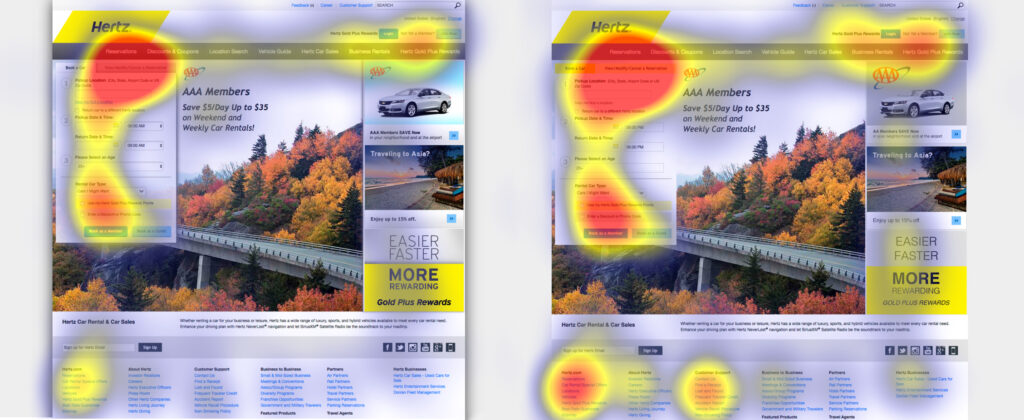
Strong-signifier version (left): Participants were asked to cancel their rental-car reservation on this page. The heat-map shows most fixations focused around the target tab (as indicated by the red area). Weak-signifier version: (right) In addition to the focus on the target tab, this heat-map shows many fixations concentrated on the footer links, promotional items, and other items on the reservation form near the target tab. The increased focus on the weak page’s footer is especially troubling, because it’s a signal that the users were getting desperate.
The results of the study were very clear. For a good usability and user experience, you need an easy, seamless, enjoyable and overall intuitive design. The users should understand their options and possible actions immediately, because designs with weak clickability signifiers waste time and patience. The potential negative consequences of weak signifiers are diminished when the site has a low information density, traditional or consistent layout, and places important interactive elements where they stand out from surrounding elements. So it really depends whether (ultra) flat or flat-ish design is suitable or not.
But now back to neumorphism, what is its potential and where are its weaknesses?
There was a huge hype around neumorphic design in 2020, but also some criticism due to its usability. Based on the research about signifiers and the supporting study, I analyzed why there could be problems and how these problems define themselves. Is neumorphism just pretty, but not usable?
The three simple actions associated with flat design are: click, move and swipe. When a shadow is placed behind a card element in flat design, the distance to the background is shown and makes it a floatable card. This gives a movable feeling to the cards, so users are more likely to interact with them, not just clicking, but also swiping or moving them. This is something the user has learned from his past experience with technical devices and interfaces, but it’s also an intuitive approach.
In comparison to that, neumorphic UI elements attach themselves firmly on the ground. This creates the effect, that the user is sure it can’t be moved, because its attached. The neumorphic design can somehow mislead people to perceive the components function in the wrong way and gives a missleading signifier to the user. It conveys that things are constant, even though things like a dropdown-menu are temporarily. The actions that usually are intended to do get lost because of the clinginess of components to the surface.
On the other side, due to the skeuomorphic elements in neumorphism it’s so much easier to understand actions like toggle, buttons, sliders or even joysticks. These are real world signifiers, that lead to an intuitive action on the user’s side.
This solves lots of clickability and click uncertainty problems, which is something that flat design is struggling with, as I mentioned previously in the summary of the study of Kate Moran. She uncovers that flat design often uses weak signifiers due to the minimalistic elements.
In neumorphism, there is only a small but meaningful color palette. One color is only used for interactive elements, one for active or inactive states and so on, which increases the findability of interactive elements or certain states. The color palette makes these elements stand out from the surface and save a lot of time to find and interact with them. As it has been said in many other articles, the main problem with neumorphism is accessibility. The components don’t have a proper contrast ratio with the background. That is because many practices of neumorphism design only use the shadows and subtle changes in transparency to differentiate components and hierarchy which don’t have proper contrast ratio with the background.
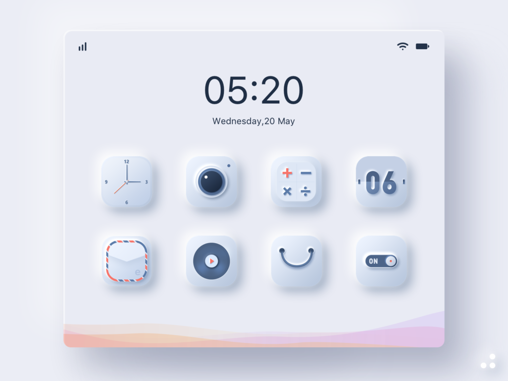
Personally I think, neumorphism is a fresh, modern, flat and minimal 3D-design which is very meaningful, because the skeuomorphic design elements are very intuitive to use. It will not be applicable to every website or app, especially when you have a lot of (complex) content. But most certainly it would be a great opportunity to use it for simple applications, like a calculator app, compass or even the general app overview on smartphones. It works best with clear interactive elements like sliders, buttons and toggles so it could also work great for smart home apps or music production. It definitely needs some adjustments to make it more usable and clear, but it is evolving and has a lot of potential to conquer the design world and give it a new modern touch.