»If you want a great site, you’ve got to test. After you’ve worked on a site for even a few weeks, you can’t see it freshly anymore. You know too much. The only way to find out if it really works is to test it.«
– Steve Krug in Don’t make me think (2000)
To observe, if a (digital) product really fits the user’s needs and what are potential problems and pain points, there is a method called usability testing. I watched a talk of Steve Krug, experience professional and author, in which he explains why usability testing is so important and runs through some tips for improving your own usability tests. To break it down usability testing basically is watching people trying to use what you have created, even if it is just a prototype, and let them think out loud in order to have access to their cognitive process and looking for the frustration points, questions etc. It should start at an early state of the project and includes the user’s direct feedback into the creation process, to figure out the problems before you build them into your project and discover them at a (too) late status.
Why are we doing usability testing?
They take a lot of time to build, get the data, cost money and the main question is, is it all worth it? It is! There are many reasons for you to test your product in order to have a good user experience and improve your work. Steve Krug said:
»Usability is an attribute of good design«
Steve Krug
He defined a thing as usable if:
A person of average – or even below average – ability and experience (i.e., most people)
can figure out how to use the thing for the intended purpose
without it being more trouble than it is worth.
A common issue is that a deeply involved person e.g. a designer is very into the subject and gathered a lot of information throughout the research phase of the project. While designing the product, she/he of course uses all that knowledge and creates the prototype as if the user has all that knowledge too, because it is just obvious to her/him and why should anybody think of it different? Usability testing gives the creators the opportunity to watch somebody else have the experience without former knowledge about it and let the participant use it in their own individual, intuitive manner. This discovers lots of problems in best case at an early state of the project and can happen in only a very short amount of time if well planned and organized. As Leisa Reichelt, Head of Research and Insights at Atlassian, said:
»You are not your user and you cannot think like a user unless you are meeting users regularly.«
Leisa Reichelt
In his talk, Krug also mentions that we are basically all users and we imagine that everybody uses it the same way as we do, but we are not our users. He says that users are incredibly diverse and all use is idiosyncratic (depending on prior knowledge, situation, goals…). Sometimes it can be very hard for us creators to remember that the user does not know what we know.
Usability issues can slow down the whole process of use, it can cause anxiety, be annoying and sometimes even scare people of to use something any further at all. Usability testing can prevent the product from all this, in order to guarantee a good user experience and usability throughout the process of use. Most usability issues and problems are contextual, it depends on the thing that you are building, there are only a few absolute truths in therms of usability and UX, says Krug. He gives a good example, talking about that people mostly get their jobs because of who they are as a person. He describes that e.g. people become a developer, because they like complicated stuff and figure out how things work. For a pure developer, interfaces can totally look different as if a designer or another involved person in the process looks at it and it can also differ from how the user would look at it. If you now take into consideration every member of a team, including developers, designers, project managers etc. it is sometimes just very hard to agree on something and make a decision and proofs the idiosyncratic use. A good solution can be to just test it and see how the user can cope with the discussed particular element.
In his talk, Krug gives a short introduction in DIY usability testing (nutshell version) and goes on by a live usability testing to demonstrate how easy it can be. After that, he goes on and introduces his 6 maxims, which you can also see in the video beneath.
For user centered design, it is necessary to be aware how the user would interact with your product or service, whether it is a website, an app, a streaming service or anything else. For me it influences my design decisions and helps to discover usability problems, that I sometimes would have never imagined to be a problem at all. Every design decision kind of starts off with a hypothesis, that this is how the user would like to experience something and this is also very much influenced by own assumptions and previous knowledge. User Testing proves your decision wrong or right and puts yourself in the user’s shoes to see the project from his point of view.
Sources:
Don’t make me think : Web usability – das intuitive Web by Steve Krug
Vipassana was taught in India more than 2500 years ago as a universal remedy for universal ills, i.e., an Art of Living.
In Pali, an ancient language of Buddhism, the word “Vipassana” means “seeing things as they really are.” The literal translation is “special seeing.”
Often, the term “Vipassana meditation” is used interchangeably with “mindfulness meditation,” but Vipassana is more specific. It involves observing your thoughts and emotions as they are, without judging or dwelling on them.
Vipassana, you simply observe your inner self instead of consciously controlling the experience. The goal is to help you:
Quiet your mind
Focus on the present
Accept thoughts, emotions, and sensations for what they really are
Reduce regrets by dwelling less on the past
Worry less about the future
Respond to situations based on reality, instead of worries or preconceived notions
Why it is better for a beginner?
Vipassana is a kind of meditation that doesn’t need much preparation to be done and it is a good starting point for a beginner because it is really easy to follow and to achieve.
That means that the guide for this kind of meditation can be optional. An app will be useful for the timer, sounds and in case of guide a guide. You can follow these steps to try to do it on your own.
Set aside 10 to 15 minutes to practice. It’s recommended that you do Vipassana when you first wake up in the morning.
Choose a quiet area with little to no distractions.
Sit in a comfortable position. Engage your core, straighten your back, and relax your body.
Close your eyes and breathe normally. Focus on your natural breath and what you feel.
Be mindful of each inhale and exhale. Observe your thoughts, feelings, and sensations without reacting or judging.
If you become distracted, simply observe the distraction and return to your breath.
Aim to do this for at least 5 to 10 minutes when you first start. As you get used to this practice, work up to 15 minutes or longer of Vipassana meditation.
Zen Meditation (Zazen)
Origin & Meaning
Zazen (坐禅) means “seated Zen”, or “seated meditation”, in Japanese. It has its roots in the Chinese Zen Buddhism (Ch’an) tradition, tracing back to the Indian monk Bodhidharma (6th century CE). In the West, its most popular form comes from Dogen Zenji (1200~1253), the founder of the Soto Zen movement in Japan. Similar modalities are practised in the Rinzai school of Zen, in Japan and Korea.
How to do it
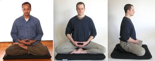
It is generally practised seated on the floor over a mat and cushion, with crossed legs. Traditionally it was done in the so-called lotus or half-lotus position, but this is hardly necessary. Nowadays most practitioners sit like this:
Vipassana Meditation
Origin & Meaning
“Vipassana” is a Pali word tha
t means “insight” or “clear seeing”. It is a traditional Buddhist practice, dating back to 6th century BC. Vipassana-meditation, as taught in the last few decades, comes from the Theravada Buddhist tradition, and was popularized by S. N. Goenka and the Vipassana movement.
Due to the popularity of Vipassanā-meditation, the “mindfulness of breathing” has gained further popularity in the West as “mindfulness”.
How to do it
[There is some conflicting information on how to practice Vipassana. In general, however, most teachers emphasize starting with mindfulness of breath in the first stages, to stabilize the mind and achieve “access concentration.” This is more like focused attention meditation. Then the practice moves on to developing “clear insight” on the bodily sensations and mental phenomena, observing them moment by moment and not clinging to any. Here goes an introduction, aimed at beginners. To know more I’d suggest following up the links provided or learning from a teacher (perhaps in a Vipassana retreat).]
Ideally, one is to sit on a cushion on the floor, cross-legged, with your spine erect; alternatively, a chair may be used, but the back should not be supported.
The first aspect is to develop concentration, through samatha practice. This is typically done through breathing awareness.
Focus all your attention, from moment to moment, on the movement of your breath. Notice the subtle sensations of the movement of the abdomen rising and falling. Alternatively, one can focus on the sensation of the air passing through the nostrils and touching the upper lips skin – though this requires a bit more practice, and is more advanced.
As you focus on the breath, you will notice that other perceptions and sensations continue to appear: sounds, feelings in the body, emotions, etc. Simply notice these phenomena as they emerge in the field of awareness, and then return to the sensation of breathing. The attention is kept in the object of concentration (the breathing), while these other thoughts or sensations are there simply as “background noise”.
The object that is the focus of the practice (for instance, the movement of the abdomen) is called the “primary object”. And a “secondary object” is anything else that arises in your field of perception – either through your five senses (sound, smell, itchiness in the body, etc.) or through the mind (thought, memory, feeling, etc.). If a secondary object hooks your attention and pulls it away, or if it causes the desire or aversion to appearing, you should focus on the secondary object for a moment or two, labelling it with a mental note, like “thinking”, “memory”, “hearing”, “desiring”. This practice is often called “noting”.
A mental note identifies an object in general but not in detail. When you’re aware of a sound, for example, label it “hearing” instead of “motorcycle,” “voices” or “barking dog.” If an unpleasant sensation arises, note “pain” or “feeling” instead of “knee pain” or “my back pain.” Then return your attention to the primary meditation object. When aware of a fragrance, say the mental note “smelling” for a moment or two. You don’t have to identify the scent.
When one has thus gained “access concentration”, the attention is then turned to the object of practice, which is normally thought or bodily sensations. One observes the objects of awareness without attachment, letting thoughts and sensations arise and pass away of their own accord. Mental labelling (explained above) is often used as a way to prevent you from being carried away by thoughts, and keep you in more objectively noticing them.
As a result one develops the clear seeing that the observed phenomena are pervaded by the three “marks of existence”: impermanence (annica), unsatisfactoriness (dukkha) and emptiness of self (annata). As a result, equanimity, peace and inner freedom are developed in relation to these inputs.
Loving Kindness Meditation (Metta Meditation)
Origin & Meaning
Metta is a Pali word that means kindness, benevolence, and goodwill. This practise comes from the Buddhist traditions, especially the Theravada and Tibetan lineages. “Compassion meditation” is a contemporary scientific field that demonstrates the efficacy of metta and related meditative practices.
Demonstrated benefits include: boosting one’s ability to empathize with others; development of positive emotions through compassion, including a more loving attitude towards oneself; increased self-acceptance; greater feeling of competence about one’s life; and an increased feeling of purpose in life (read more in our other post).
How to do it
One sits down in a meditation position, with closed eyes, and generates in his mind and heart feelings of kindness and benevolence. Start by developing loving-kindness towards yourself, then progressively towards others and all beings. Usually this progression is advised:
oneself
a good friend
a “neutral” person
a difficult person
all four of the above equally
and then gradually the entire universe
The feeling to be developed is that of wishing happiness and well-being for all. This practice may be aided by reciting specific words or sentences that evoke the “boundless warm-hearted feeling”, visualizing the suffering of others and sending love; or by imagining the state of another being, and wishing him happiness and peace.
Mantra Meditation (OM Meditation)
Origin & Meaning
A mantra is a syllable or word, usually without any particular meaning, that is repeated for the purpose of focusing your mind. It is not an affirmation used to convince yourself of something.
Some meditation teachers insist that both the choice of word, and its correct pronunciation, is very important, due to the “vibration” associated with the sound and meaning, and that for this reason, an initiation into it is essential. Others say that the mantra itself is only a tool to focus the mind, and the chosen word is completely irrelevant.
Mantras are used in Hindu traditions, Buddhist traditions (especially Tibetan and “Pure Land” Buddhism), as well as in Jainism, Sikhism and Daoism (Taoism). Some people call mantra meditation “om meditation”, but that is just one of the mantras that can be used. A more devotion oriented practice of mantras is called japa, and consists of repeating sacred sounds (name of God) with love.
How to do it
Like with most types of meditations, it is usually practised sitting with spine erect, and eyes closed. The practitioner then repeats the mantra in his mind, silently, over and over again during the whole session.
Sometimes this practice is coupled with being aware of the breathing or coordinating with it. In other exercises, the mantra is actually whispered very lightly and softly, as an aid to concentration.
As you repeat the mantra, it creates a mental vibration that allows the mind to experience deeper levels of awareness. As you meditate, the mantra becomes increasingly abstract and indistinct, until you’re finally led into the field of pure consciousness from which the vibration arose. Repetition of the mantra helps you disconnect from the thoughts filling your mind so that perhaps you may slip into the gap between thoughts. The mantra is a tool to support your meditation practice. Mantras can be viewed as ancient power words with subtle intentions that help us connect to spirit, the source of everything in the universe. (Deepak Chopra)
OM is a well-known example of a mantra. But there are thousands of others. Here are some of the most well-known mantras from the Hindu & Buddhist traditions:
om
so-ham
om namah shivaya
om mani padme hum
rama
yam
ham
You may practice for a certain period of time, or for a set number of “repetitions” – traditionally 108 or 1008. In the latter case, beads are typically used for keeping count.
As the practice deepens, you may find that the mantra continues “by itself” like the humming of the mind. Or the mantra may even disappear, and you are left in a state of deep inner peace.
There are many methods of mantra meditation. I explain them in detail, together with why mantras are powerful, in my article on mantra meditation.
Yogic Meditations
Origin & Meaning
There is no one type of meditation which is “Yogic Meditation”, so here it is meant the several meditation types taught in the yoga tradition. Yoga means “union”. The tradition goes as far as 1700 B.C, and has as its highest goal spiritual purification and Self-Knowledge. Classical Yoga divides the practice into rules of conduct (yamas and niyamas), physical postures (asanas), breathing exercises (pranayama), and contemplative practices of meditation (pratyahara, dharana, dhyana, samadhi).
The Yoga tradition is the oldest meditation tradition on earth, and also the one with the widest variety of practices.
How to do it
Here are some types of meditation practised in Yoga. The most common and universal Yoga meditation one is the “third eye meditation”. Other popular ones involve concentrating on a chakra, repeating a mantra, visualization of light, or gazing meditations.
Third Eye Meditation — focusing the attention on the “spot between the eyebrows” (called by some “the third eye” or “ajna chakra”). The attention is constantly redirected to this point, as a means to silence the mind. By time the “silent gaps” between thoughts get wider and deeper. Sometimes this is accompanied by physically “looking”, with eyes closed, towards that spot.
Chakra Meditation — the practitioner focuses on one of the seven chakras of the body (“centers of energy”), typically doing some visualizations and chanting a specific mantra for each chakra (lam, vam, ram, yam, ham, om). Most commonly it is done on the heart chackra, third eye, and crown chackra.
Gazing Meditation (Trataka) — fixing the gaze on an external object, typically a candle, image or a symbol (yantras). It is done with eyes open, and then with eyes closed, to train both the concentration and visualization powers of the mind. After closing the eyes, you should still keep the image of the object in your “mind’s eye”.
Kundalini Meditation — this is a very complex system of practice. The goal is the awakening of the “kundalini energy” which lies dormant on the base of the spine, the development of several psychic centers in the body, and, finally, enlightenment. There are several dangers associated with this practice, and it should not be attempted without the guidance of a qualified yogi.
Kriya Yoga — is a set of energization, breathing, and meditation exercises taught by Paramahamsa Yogananda. This is more suited for those who have a devotional temperament, and are seeking the spiritual aspects of meditation.
Sound Meditation (Nada Yoga) — focusing on sound. Starts with meditation on “external sounds”, such as calming ambient music (like Native American flute music), whereby the student focuses all his attention on just hearing, as a help to quieten and collect the mind. By time the practice evolves to hearing the “internal sounds” of the body and mind. The ultimate goal is to hear the “Ultimate Sound” (para nada), which is a sound without vibration, and that manifests as “OM”.
Tantra — unlike the popular view in the West, most Tantra practices have nothing to do with ritualized sex (this was practiced by a minority of lineages. Tantra is a very rich tradition, with dozens of different contemplative practices. The text Vijnanabhairava Tantra, for instance, lists 108 “meditations”, most of them more advanced (already requiring a certain degree of stillness and mind control). Here are some examples from that text:
Merge the mind and the senses in the interior space in the spiritual heart.
When one object is perceived, all other objects become empty. Concentrate on that emptiness.
Concentrate on the space which occurs between two thoughts.
Fix attention on the inside of the skull. Close eyes.
Meditate on the occasion of any great delight.
Meditate on the feeling of pain.
Dwell on the reality which exists between pain and pleasure.
Meditate on the void in one’s body extending in all directions simultaneously.
Concentrate on a bottomless well or as standing in a very high place.
Listen to the Anahata [heart chakra] sound.
Listen to the sound of a musical instrument as it dies away.
Contemplate on the universe or one’s own body as being filled with bliss.
Concentrate intensely on the idea that the universe is completely void.
Contemplate that the same consciousness exists in all bodies.
Pranayama — breathing regulation. It is not exactly meditation, but an excellent practice to calm the mind and prepare it for meditation. There are several different types of Pranayama, but the simplest and most commonly taught one is the 4-4-4-4. This means breathing in counting up to 4, holding for 4 seconds, breathing out for 4 seconds, and holding empty for 4 seconds. Breathe through your nose, and let the abdomen (and not the chest) be the one that moves. Go through a few cycles like this. This regulation of breathing balances the moods and pacifies the body, and can be done anywhere.
Yoga is a very rich tradition, with different lineages, so there are many other techniques. But the ones above are the most well-known; the others are more specific or complex.
In this blog entry I will have a look on how to implement Glassmorphism in figma, but also briefly in code.
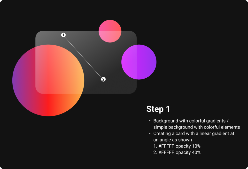
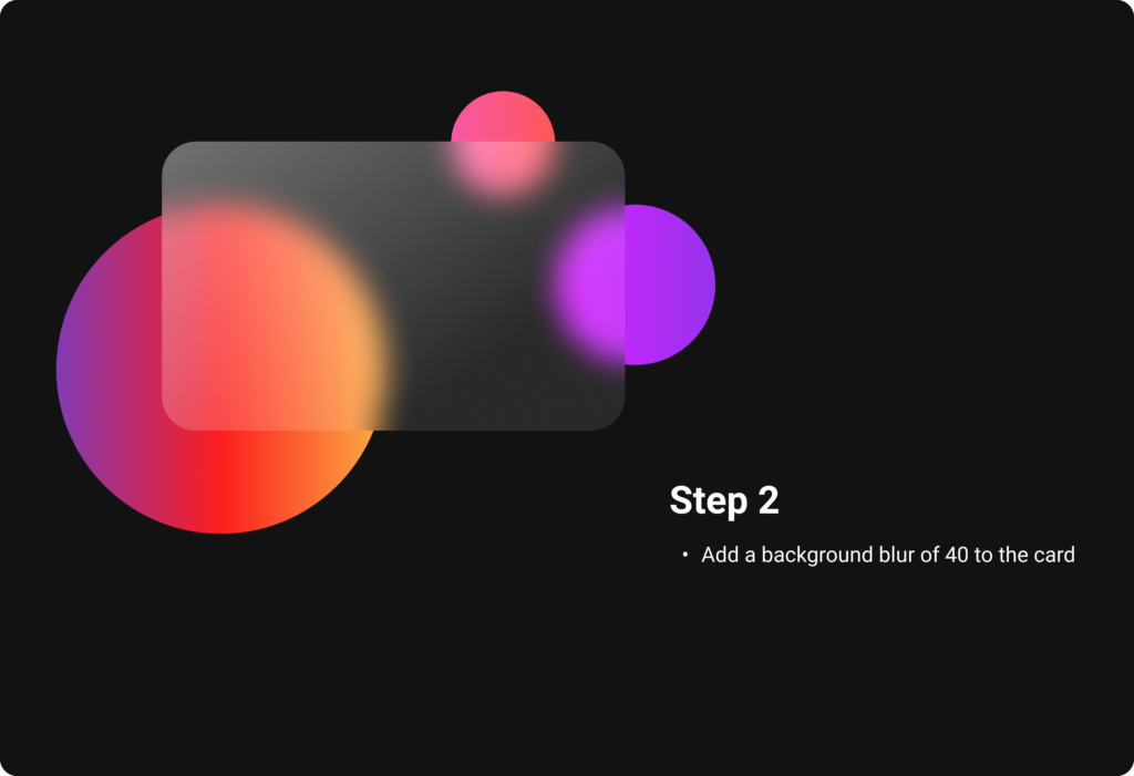
First you start off by choosing a colorful background or a simple background with colorful elements, which will be seen partly due to the transparency of the glassmorphic card element in front. It works very good with gradients, why I have chosen them for my example. Ones the background is set, create a card and choose a linear gradient for the fill, which consists of two white colors of different opacities. It is important to change the opacity of the fill, but not the opacity of the whole object. With a background blur, the glass optic becomes visible and you get a first preview of the look.
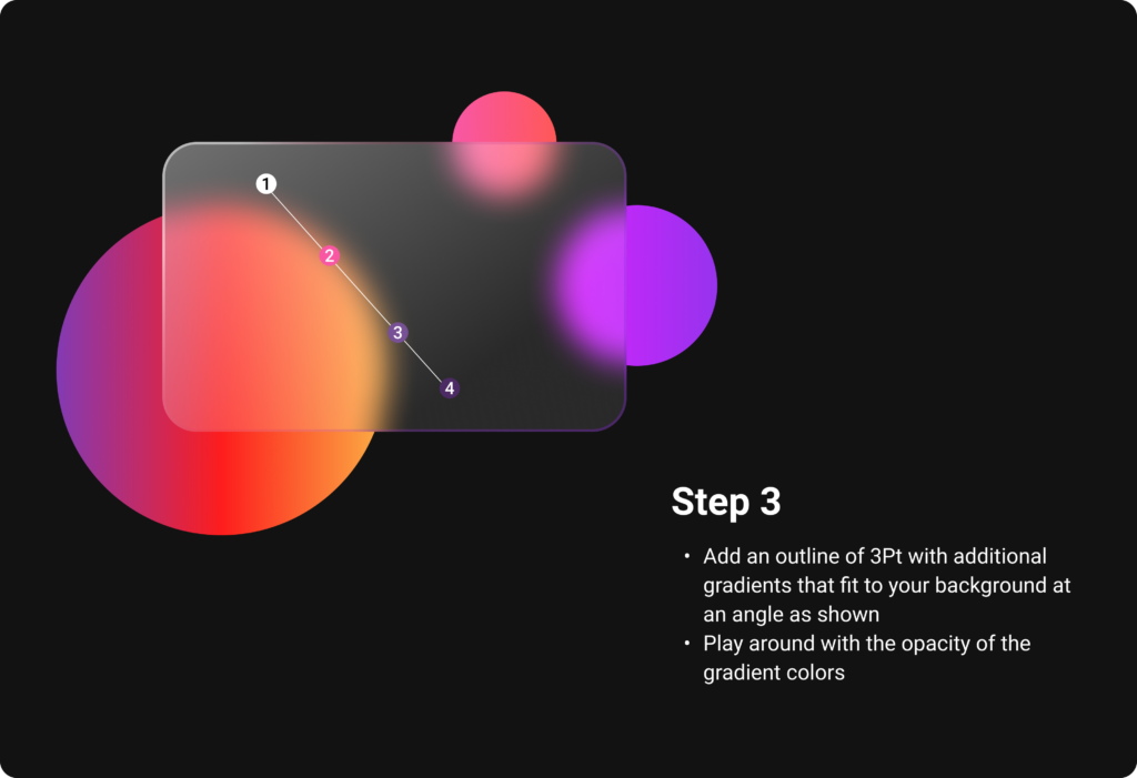
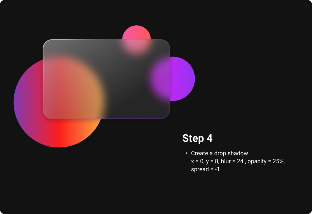
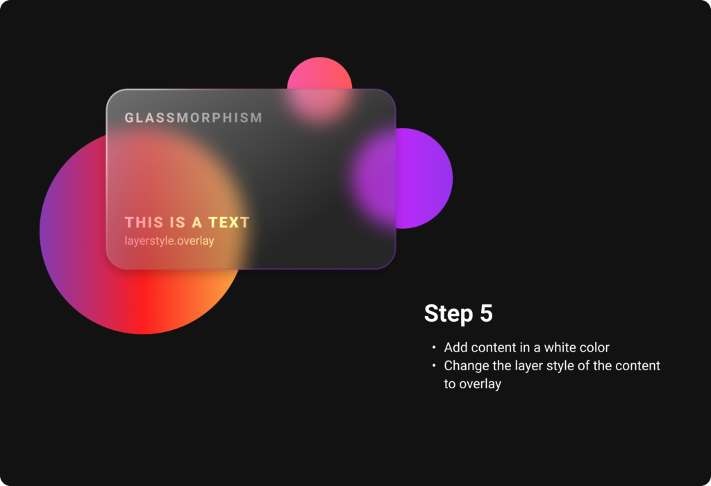
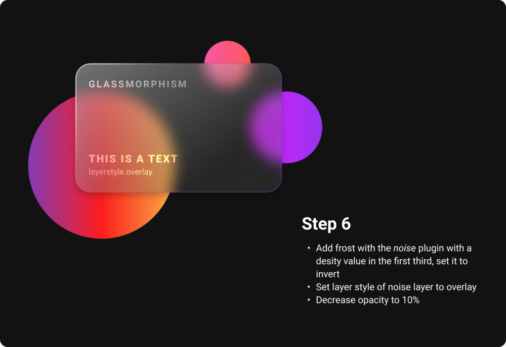
Add an outline to indicate the borders of the object. It later helps to establish the hierarchy. For a better illusion of depth, additional linear gradients that fit to the background can also be applied to the outline. A subtle shadow rounds everything off and helps to distinguish all the layers. Also the content is placed in an Overlay layer mode, which attaches it more into the card. By using noise, the frosting effect is created and gives the card the perfect glass optic.
But what about the visual hierarchy with this transparent elements? As in Neumorphism, also Glassmorphism uses the skeuomorphic approach of the real world counterpart, which in this case is of course glass, as a guideline for shadows and blur effects. When there are multiple layers of glassmorphic cards, each of them should receive a subtle shadow as described above.
The differentiation of the blur helps to show which element is at the top, middle and back. As in the real world, the farer away a frosted glass is from the background, the more blur the background seems to be through the glass. For applying this, just start with the back element and give it a blur value of 15, the middle one has to be a little more blurred, around 25 and the top one can be around 40. To make the hierarchy totally clear, it is also necessary to decrease the opacity from the top card to the lowest. In the image below, the top card has an opacity value of 36, while the bottom one has only 16. To complete everything, add the borders applying the rules from above or just use a white outline. Either way the outline has to have a lower opacity from the top card to the lowest card, for which one can orientate on the applied blur as well.
To make glassmorphic icons, the rules showed in the figma file above are usually implemented in a single element of the icon, which is placed in front of colorful background elements. The actual color of the icon is sometimes also displayed in the transparent glass surface. In the images below, you can see various examples of how Glassmorphism is implemented on icons. The simple step by step guide from above can be used to create the glassmorphic icons from scratch.
While Neumorphism is mostly used for interactive elements like buttons, cards, toggles and sliders, Glassmorphism is more used in a passive way. It is supposed to give the interface a smooth and modern look by reducing the style to only small and non interactive background elements like cards, icons, overlays etc.
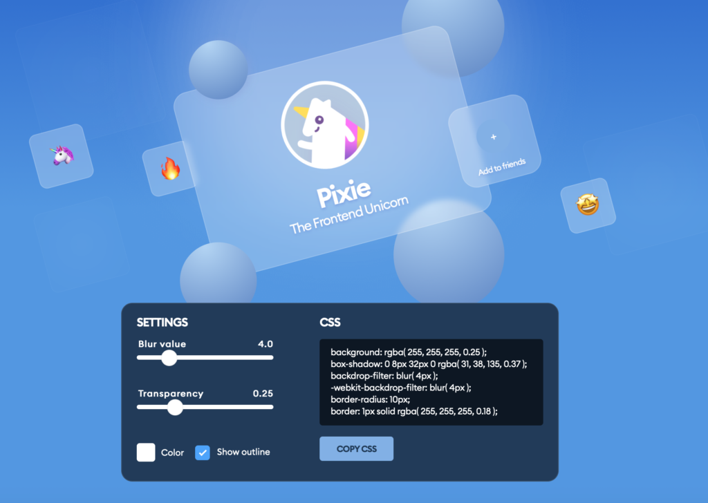
As with Neumorphism, there is a generator for glassmorphic card elements available online which gives a preview and generates code to copy for your css code.
I found lots of tutorials how to implement Glassmorphism in code, one of the examples how to do it you can see below. Basically there are only a few lines of code in html and css (focus is on css) which are very similar to the principle of creating this style in figma.
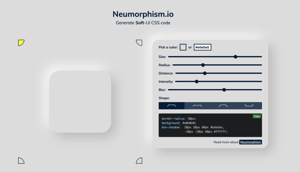
When designing User Interfaces, there are several ways to implement Neumorphism or Glassmorphism. In this blog post, I will look at how to develop neumorphic elements like cards and Icons in interface design tools like figma but also briefly in code.
First, let’s start with Neumorphism by looking at card elements, which is the most present UI element of this style. The factors that have to be considered are the size, radius, distance, intensity and blur. It has all to do with the shadows, that generate the look of „attaching to the ground“. Due to its reduced color scheme it works best, if the neumorphic card has the same color as the background. Also rounded borders help the effect to stand out more. I tried it out myself in figma, it is very easy to do and by playing around with the blur value, the distance to the background seems to change. The more blur, the farer away from the background the neumorphic card seems to be.
By adding gradients, it makes the card element seem to become convex or concarv. Adding the shadows within the card instead of outside has the effect that the card generates kind of hole or window in the interface.
One of the goals of Neumorphism is to include the skeuomorphic approach, which means to combine the minimalistic design style with familiar objects of the analog world not only in the design aspect but also in their function, as I already analyzed in previous blog posts. The skeuomorphic approach also can be part of the icons. All the icon parts themselves have adjusted background shadows and lie on card elements with shadows, which gives them a 3D look and complete their connection to their real world counterparts. For realization in figma, the same rules as for the cards are implemented onto the icon elements.
For a button, you can also apply the rules mentioned before. The default button can simply stay in the normal or concarv mode, while the active button should seem like it is really pressed and attaches itself deeper into the interface, for which the inner shadows should be used. Additionally to imply the „active status“, the color can also change when pressed. It is important to keep an eye on the contrast and differences between the states of the buttons. It has to be very clear to e functional.
There are several tutorials how to do Neumorphism, there even is a Neumorphism card generator available online, where you can try out yourself and also see how it should be implemented in css code. You also can do this easily in code and don’t need a lot of lines. It is basically the same principle as it is in figma just translated.
In one of my former blog entries, I talked about the potential strengths and weaknesses of Neumorphism, also called soft UI. The most significant issue was obviously the accessibility. Also due to the skeuomorphic elements, it was not as flexible in its design style as for example a flat design approach. It has to be used restricted, in order to obtain a nice accessible und understandable interface. It works best with a simple UI and a strict limited hierarchy.
Say Hello to Glassmorphism In comparison to the extruding/intruding optically plastic effect of neumorphism, a more vertical trend Glassmorphism has evolved. It’s most defining characteristics are:
Light thin outline: visibility of the borders of transparent object
One of the strengths of this design trend is, that the user can identify the hierarchy of the elements quickly. It is very easy to detect, which layer is in the front, middle and back because of the see-through objects. Just as with neumorphism, this style shines especially bright when it’s used on just one element. The right amount will ensure, that also people with vision problems will be able to still understand the user interface. With over-usage, such as integrating it as a default material design for the background, card elements and Icons, it restricts the accessibility and also can lead to a boring and unoriginal design.
Neumorphism is best used for buttons, sliders and toggles, whereas this should be avoided Glassmorphism. Glassmorphic elements work best as (floating) cards and overlays, which we know is problem for neumorphism, because all elements attach themselves to the background. As with all UI designs, it is important to visually group all elements on the cards and define a hierarchy for this as well.
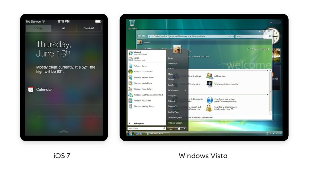
History and Future The system behind Glassmorphism is not as new as one might think, the panel blur is being used in several ways since 2007, where it was first introduced by Windows vista with Windows Aero and later integrated by Apple in iOS 7 in 2013.
Pulling down notifications and see the icons fade out behind a panel is nowadays integrated in the standard UI. Microsoft’s Fluent design system goes heavy on this effect as well. They call this particular element The Acrylic and showcase it as an integral part of their design system. Apple has since greatly reduced the blurry-glass effect in their mobile OS, but recently brought transparent-blurs back with Mac OS Big Sur. However, on Dribbble – a platform for discovering and connecting with designers, Glassmorphism is used for desktop applications as well as mobile devices and seems to be not at all limited to a specific device. But also Dribbble is more about the design being pretty instead of accessible, therefore there are also lots of examples where Glassmorphism is definitely overused and also the designs are not restricted to an operating system.
Since Glassmorphism is used in the current Mac OS version Big Sure and also on Microsoft Fluent Design, I would predict the trend will definitely become more popular and rise, to also be more present on our mobile devices.
Speaking of an extended product life cycle through joyful design in my last blogposts, we come to another important aspect that can enhance a products life: designing for prolonged pleasure.
The research paper “Enjoying Joy: A Process-Based Approach to Design for Prolonged Pleasure” by Anna E. Pohlmeyer deals on how to sustain and optimize positive emotions derived from a positive experience.
It is a fact that initial emotions fade over time because people eventually adapt to changes. This phenomenon of reduced affective intensity is called hedonic adaptation. Hedonic adaption can lead people to constantly desire something new without reaching lasting satisfaction—which is a huge problem of our “throw-away-society”.
Design for savoring According to Pohlmeyer there is an approach of designing joyful experiences called “design for savoring”. Design for savoring is not only about providingpleasurable experiences, but it is also about optimizingthese by appreciating the enjoyment. As a result, positive emotions of a given positive event can be increased in intensity and duration. Pohlmeyer also stated that savoring positive experiences can be understood as the counterpart of coping with negative experiences. However, design for savoring is less a matter of how experiences are designed, but rather of how a person deals with the resulting emotional experience. Savoring up-regulates positive emotions in order to extract an optimum level of positive emotions from an event and has been shown to counteract hedonic adaptation—the tendency of us mere humans to quickly return to a relatively stable level of happiness—and contribute to people’s well-being. Therefore, design for savoring, especially is a promising concept to consider in UX. [1]
Intensifying and Prolonging Positive Emotional Experiences through Design Speaking of design for savoring, the question on what can be done to intensify positive emotional experiences raises. According to Nélies [2] there are four broad categories of savoring strategies:
a) behavioral display of positive emotions b) focusing attention on the present moment c) capitalizing, i.e. sharing with others, d) positive mental time travel, i.e. vividly anticipating or remembering positive events.
These thoughts and behaviors have been shown to favorably affect the intensity and duration of positive feelings, which means that they can serve as valuable guides in design.
“Similarly, reliving an experience and the associated emotions in memory – be it a nostalgic recollection of the good old days or realizing what a loyal companion one’s laptop has been – reinforces pleasure efficiently and effectively. In this vein, it is also noteworthy to mention that positive emotional experiences can be enhanced not only in the moment but also in prospect and retrospect, e.g. by sharing with others. Hence, by looking into the underlying processes of experiencing pleasure, opportunities arise to proactively design for longer-term and enhanced positive experiences.” —Pohlmeyer
It is obvious that how we look at and interpret our world, hence, what we devote our attention to, affects our experiences and our well-being. When designing for joyful experiences it is therefore crucial to direct attention to the positive and to consider how positive emotions can be prolonged by increasing the intensity and duration of pleasure derived from positive experiences, rather than striving for a fast-paced consumption behavior of constant novelty seeking. [3]
Sources
[1] Nélis, D., Quoidbach, J., Hansenne, M., and Mikolajczak, M. Measuring individual differences in emotion regulation: The Emotion Regulation Profile- Revised (ERP-R). Psychologica Belgica, 51 (2011), 49- 91.
[2] Pohlmeyer, Anna E.: Enjoying Joy. A Process-Based Approach to Design for Prolonged Pleasure. Helsinki. 2014
As mentioned in my last blog post, symbolic meaning acts as one of the most important attributes of product attachment and can be considered as an important factor for positive design. For a better understanding I wanted to do further research on the term of symbolic meaning, outlined in the following text.
Symbolic meaning refers to the image and the associations that spring to mind in regard to a specific object/product. Objects can then act as symbols, providing personal meaning as well as communicating (the owner’s) personal characteristics to others. Those meaning that we attach to objects directly influence how we feel about objects and how we assess them. Researches developed various terms to describe this phenomenon of symbolic meaning, including meaning [1], personal meaning [2], symbolic meaning [3], product meaning [4], linking value [5] and symbolic qualities associated with products. [6]
Symbolic Meaning and User Experience
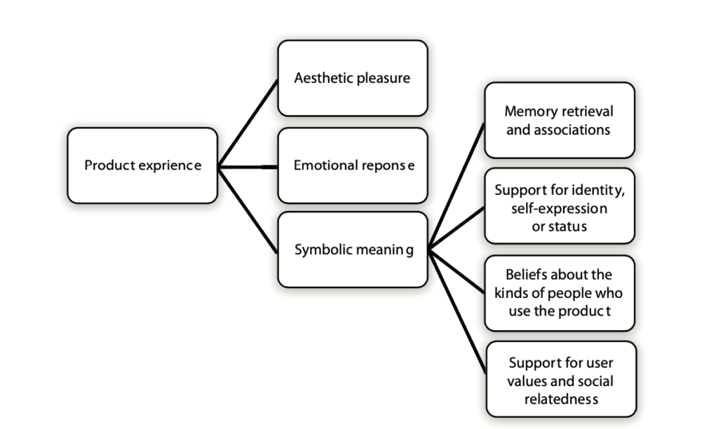
However, symbolic meaning has many dimensions and another concept strongly related with symbolic meaning is the user experience—user experience refers to the user’s perceptions and responses in regard to their interaction with a system or product (ISO 9241-110, 2010). That comes, because symbolic meanings and associations—dependent on personal interpretation—with a product seem to be an integral part of how users experience a product. Therefore the practice of user experience design has evolved to take into account more experiential aspects of user-product interaction, such as emotions, feelings and meanings. Nowadays many researchers agree that symbolic meaning acts as an important dimension of user experience.[7] Desmet and Heckert identify three levels of product experience [8]:
1) aesthetic pleasure 2) attribution of meaning happens through cognitive processes such as interpretation, memory retrieval and associations 3) emotional response
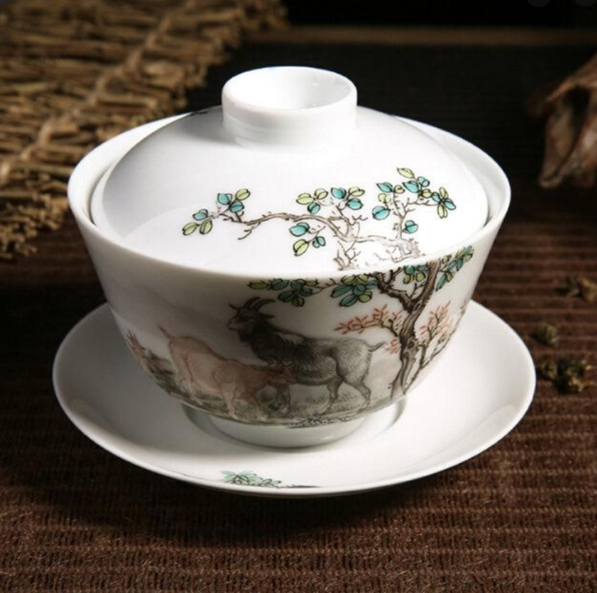
Desmet and Heckert state that meaning is related to the personal or symbolic significance of products or the possibility of assigning them personality or other expressive. As an example they mention a Chinese teacup that one of the authors is attached to because it represents his visit to China.
Hassenzahl on the other hand does not explicitly mention symbolic meaning as a component of user experience, but he describes aspects that are closely related. He categorizes the hedonic aspect of user experience as including [9]: 1) stimulation—personal growth, an increase or knowledge and skills 2) identification—self-expression, interaction with relevant others 3) evocation—self-maintenance, memories
Especially identification as well as other hedonic aspects can be seen as part of symbolic meanings.
Symbolic Meaning and Appearance
Symbolic meaning can also be related to a product’s form, appearance and use—that is especially the case in literature linked to Industrial Design. Product semantics there get related to a concern for the cognitive meanings, symbolic functions and cultural histories of form. [10]
Van Rompay gives an overview of studies regarding the relationships between a product’s formal features and symbolic meaning. In his example the rounded form of an object is generally perceived as being secure or emotional. Van Rompay’s conclusion is that meaning is not a fixed property of the world or mind, but results from interactions between individual and environment. One of his studies shows that forms connote different symbolic meanings across cultures. [11]
Symbolic Meaning / Product Meaning and Product Attachment
Product attachment gets best represented by products that have some profound and sustained meaning for users [12]. Already in 1923, Ogden and Richards defined product meaning as the relationship between mind, object and world. Product meaning is generally seen as subjective, suffused with affectivity and usually either utilitarian or symbolic. It has also been stated that a group of individuals have a tendency to make similar inferences about a product, suggesting that symbolic meaning is culturally shared. Symbols are formed by cultural principles, which can be: — norms — values — social categories
Sari Kujala states as example the American flag—the flag may symbolizes freedom or conservative American. [13]
In psychological and sociological literature it gets stated that individuals pay attention to object symbolism mainly because they want to express, maintain or enhance their self-concept—their identity and ideal image of themself. Sociological literature also gives examples of how symbolic meaning has been used to compensate for low self-esteem. [14] Zimmerman adds to sychological and sociological literature that people use products as self-extension—those product then act as an essential part of identity construction for a development of a coherent life story. [15] Mugge adds that people tend to develop a stronger attachment to products where they use them to express and maintain a unique personal identity. [16] In addition to identity, Allen shows by his survey studies that to some extent users form product preferences by evaluating whether their values are represented in product meanings. [17]
Symbolic Meaning and Postmodernity
In ethnosociology a new concept of thinking characterizing postmodernity constituted. Cova states that to satisfy their desire for community, modern individuals seek products and services less for their use value than for their linking value. Linking value results when a product facilitates and supports communion by providing a site, an emblem, the support for integration or recognition, and so forth. Cova states that “the postmodern individual can build an identity for themself with cultural symbols and all possible references (such as plays, exhibitions, films, and books, etc.). Linking value refers to product properties that cause users to experience a feeling of communion.[18] The same idea is presented in the consumer research literature. For example, Belk argues that identity is important not only on an individual level, but also on a collective level involving family group, subcultural and national identities. [19]
“[…] the literature of industrial design suggests that symbolic meaning can arise through memory retrieval and associations (Desmet & Hekkert, 2007) and seems to be one of the determinants of product attachment (Mugge et al., 2008; Schifferstein & Zwartkruis-Pelgrim, 2008). Consumer behavior research shows that symbolic meaning is important to users mainly because they want to maintain, enhance and express their identity and ideal image of themselves. It has been shown that symbolic meaning arises when products support user values (Allen, 2006). The sociological literature suggests that the goal can also be a feeling of communion (Cova, 1997).” —Kujala, S. / Nurkka, P.
Considering all the different definitions and fields of research there are various views of the concept of symbolic meaning. Symbolic meaning—one of the most important attributes of product attachment, especially happiness related symbolic meaning—is something intangible and subjective, but also culturally shared.
Summary of the identified factors of symbolic meaning and the relationship of symbolic meaning to product experience as presented by Desmet and Hekkert (2007). The identified factors overlap, but they describe the nature of phenomenon. [20]
Sources
[1] Crilly, N., Good, D., Matravers, D., & Clarkson, P. J. (2008). Design as communication: Exploring the validity and utility of relating intention to interpretation. Design Studies, 29(5), 425-457.
[2] Cupchik, G. C., & Hilscher, M. C. (2008). Holistic perspectives on the design of experience. In H. N. J. Schifferstein & P. Hekkert (Eds.), Product experience (pp. 241-256). Amsterdam, the Netherland: Elsevier.
[3] Desmet, P., & Hekkert, P. (2007). Framework for product experience. International Journal of Design, 1(1), 57-66.
[4] Allen, M. W. (2002). Human values and product symbolism: Do consumers form product preference by comparing the human values symbolized by a product to the human values that they endorse? Journal of Applied Social Psychology, 32(12), 2475-2501
[5] Cova, B. (1997). Community and consumption, towards a definition of the “linking value” of product or services. European Journal of Marketing,31(3/4), 297-316.
[6] Kujala, S. / Nurkka, P. (2012). Sentence Completion for Evaluating Symbolic Meanin. URL: https://www.researchgate.net/publication/286834130_Sentence_Completion_for_Evaluating_Symbolic_Meaning
[7] ebda.
[8] Desmet, P., & Hekkert, P. (2007). Framework for product experience. International Journal of Design, 1(1), 57-66.
[9] Hassenzahl, M. (2003). The thing and I: Understanding therelationship between user and product. In M. Blythe, C. Overbeeke, A. F. Monk, & P. C. Wright (Eds.), Funology: From usability to enjoyment (pp. 31-42). Norwell, MA: Kluwer Academic.
[10] Kujala, S. / Nurkka, P. (2012). Sentence Completion for Evaluating Symbolic Meanin. URL: https://www.researchgate.net/publication/286834130_Sentence_Completion_for_Evaluating_Symbolic_Meaning
[11] van Rompay, T. J. L. (2008). Product expression: Bridging the gap between the symbolic and the concrete. In H. N. J. Schifferstein & P. Hekkert (Eds.), Product experience (pp. 333-351). Amsterdam, the Netherland: Elsevier.
[12] Mugge, R., Schoormans, J. P. L., & Schifferstein, H. N. J. (2008). Product attachment: Design strategies to stimulate the emotional bonding to products. In H. N. J. Schifferstein & P. Hekkert (Eds.), Product experience (pp. 425-440). Amsterdam, the Netherland: Elsevier.
[13] Kujala, S. / Nurkka, P. (2012). Sentence Completion for Evaluating Symbolic Meanin. URL: https://www.researchgate.net/publication/286834130_Sentence_Completion_for_Evaluating_Symbolic_Meaning
[14] Allen, M. W. (2002). Human values and product symbolism: Do consumers form product preference by comparing the human values symbolized by a product to the human values that they endorse? Journal of Applied Social Psychology, 32(12), 2475-2501.
[15] Zimmerman, J. (2009). Designing for the self: Making products that help people become the person they desire to be. In Proceedings of the 27th International Conference on Human Factors in Computing Systems (pp. 395-404). New York, NY: ACM.
[16] Mugge, R., Schoormans, J. P. L., & Schifferstein, H. N. J. (2008). Product attachment: Design strategies to stimulate the emotional bonding to products. In H. N. J. Schifferstein & P. Hekkert (Eds.), Product experience (pp. 425-440). Amsterdam, the Netherland: Elsevier.
[17] Allen, M. W. (2002). Human values and product symbolism: Do consumers form product preference by comparing the human values symbolized by a product to the human values that they endorse? Journal of Applied Social Psychology, 32(12), 2475-2501
[18] Cova, B. (1997). Community and consumption, towards a definition of the “linking value” of product or services. European Journal of Marketing,31(3/4), 297-316.
[19] Belk, R. W. (1988). Possessions and the extended self. Journal of Consumer Research, 15(2), 139-168.
[20] Kujala, S. / Nurkka, P. (2012). Sentence Completion for Evaluating Symbolic Meanin. URL: https://www.researchgate.net/publication/286834130_Sentence_Completion_for_Evaluating_Symbolic_Meaning
In the past few years, haptic feedback has spread strongly to the digital world and accompanies us on almost all smart surfaces. There are three classes of tactile displays, distinguished by the type of input that is delivered to the skin. Input is delivered by either static pressure (where the skin is pressed), vibration, or tangential skin stretching. This is made possible by different technologies. Electromagnetic motors present vibrotactile cues, for example in wearable displays. Electrotactile displays are based on a dense array of electrodes.
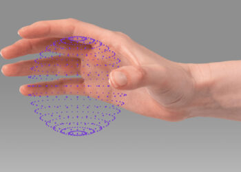
However, haptic feedback can also be obtained without touching the display at all and perceive it through mid-air contactless interaction. Not only can one touch the computer like this, but the computer touches one back as well by simulating the touch through the air. So the user doesn’t have to be in contact with any physical surface.
Turning ultrasound into virtual touch Ultraleap is a company that is on the mission to make digital worlds feel more human. They have united the world’s most advanced hand tracking with the only haptic technology that creates the sensation of touch in mid-air. They have a team of more than 150 spread across the world, with locations in Silicon Valley, US and Bristol, UK. Ultraleap has developed a virtual touch technology, that works with sound waves through ultrasonic speakers. These sound waves are timed specifically, so that at one point in the air, they all add up together at the same time. Sound waves are just pressure waves moving through the air and all the different pressures that come together at one point enable to have a very localized point of high pressure, which generates enough force to slightly displace one’s skin.
https://www.ultraleap.com/haptics/#how-it-works
See yourself, how this is working.
https://youtu.be/XnDoej4mnHU
This technology opens endless possibilities and is a real step to make interfaces more accessible and human. From the automotive industry, to gaming techniques in all areas of application (like VR, AR, XR etc.), interactive Installations, museums, but also future mobile device applications and interactions for visually impaired people.
Ultraleap also enabled a touchless interactive play experience for LEGO. Using the Ultraleap‘s haptic technology, LEGO fans and families were able to move, rotate and build virtual LEGO bricks on an Ocean Outdoor digital billboard, while feeling the bricks in mid-air. The haptic sensations consisted of circles and lines: users could touch the stud on top of virtual LEGO bricks and feel the edges of the blocks. Different sensations were produced for wheels of different sizes and also there were “crumbling” sensation when builds were broken down.
https://youtu.be/aNl8UchT9h4
Ultraleap has taken haptic feedback to a new level. Skeuo- and neumorphism could benefit extremely from this immersive technology. Their lack of accessibility could use this particular mid-air form of interactive haptic feedback as an advantage to be more inclusive and place themselves in the design world. I think most mobile devices like we have now will continue to be more interactive in the future, but just not in the touch way we are used to now. Technologies like this are the future, and also because of the pandemic in today’s world, I think the development of these devices will continue and become more widespread around the world, and just possibly replace common ways of interaction completely.
Sollte man eine Qualitative User Research mit einem persönlichen Interview durchführen oder doch besser eine Quantitative Research mit einer E-Mail-Umfrage? Oft ist es schwierig zu Wissen welche User Research Methoden man für den eigenen Prozess anwenden soll. Daher ist es um so wichtiger zu wissen, wann man welche Methode verwendet, um gute Ergebnisse zu erzielen.
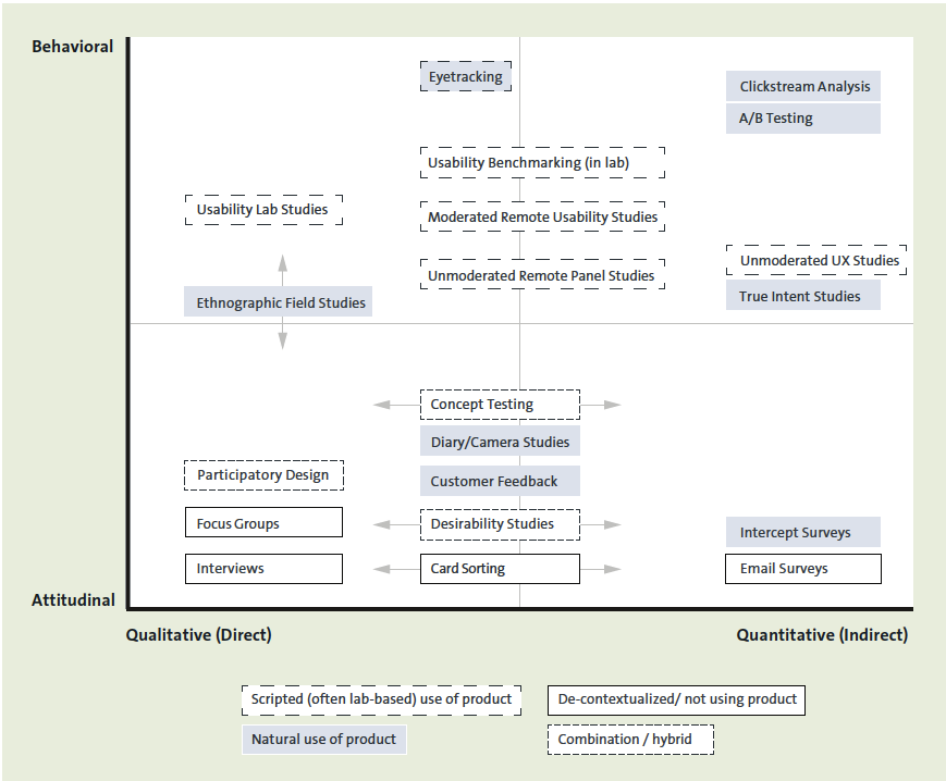
Auf der folgenden grafischen Darstellung sind die gängigsten Methoden der User Research zu sehen. Die Methoden lassen sich allgemein in folgende Bereiche einteilen: QUALITATIVE, QUANTITATIV, ATTITUDINAL und BEHAVIORAL RESEARCH wobei manche Methoden auch überschneidend sein können, so genannte Hybriden.
„Natural use of product“ ist die natürliche Interaktion mit einem Produkt, hier gibt es keine genaue Vorgehensweise, sondern man lernt hier aus dem Verhalten der Nutzer. Es wird beobachtet wie das Produkt genutzt wird und führt aus diesen Erkenntnissen Anpassungen am Produkt durch.
Das „Scripted“ ist die szenarienbasierte Interaktion mit einem Produkt. Hierbei wird ein Proband mit verschieden Szenarien konfrontiert und sollte diese mit dem Produkt lösen.
Bei der „De-contextualized” hat der Proband keinen direkten Kontakt mit dem Produkt.
„Combination” wird oft dann verwendet, wenn es um die Testung der Konzepte geht.
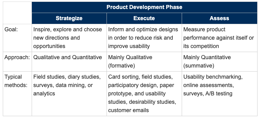
Zu beachten ist auch, dass gewisse Methoden nur in bestimmten Phasen der Produktentwicklung angewendet werden können. Hier ist eine Tabelle zu sehen, die zeigt wann welche Methode in welcher Prozessphase zum Einsatz kommt.
Welche Methode in einem speziellen Fall anzuwenden ist, ist abhängig von der aktuellen Prozessphase und von den Fragen, die durch die User Research beantwortet werden sollen.
Heutzutage sind viele Unternehmen der Ansicht, dass sie keine Ressourcen für User Research haben oder keine Notwendigkeit in der User Research sehen und auch nicht den Mehrwert daran erkennen. Doch aus welchen Gründen1 betreibt man jetzt User Research? Man führt User Research wenn man folgende Ziele verfolgt:
Ein Produkt zu erschaffen, das einen echten Mehrwert für die Nutzer hat
Ein Design zu erstellen, dass intuitiv nutzbar ist (Usability) und Freude bereitet (Joy of Use)
Dass es Nachvollziehbar ist, wie sich die „Return on Investment“ ergibt.
Wie erreicht man nun diese Ziele? Die Antworten bekommt man nach dem durchführen der User Research, hierbei werden verschiedene Methoden aus der User Research angewendet (auf die verschiedenen Methoden werde ich in meinem nächsten Blog Eintrag genauer eingehen).
Doch was genau bedeutet das jetzt? Lassen Sie mich anhand eines Beispiels erklären warum die User Research wichtig ist:
Betrachten wir die Markteinführung der E-Scooter: Man dachte, dass die E-Scooter eine Stadt umweltfreundlicher machen würden, es gäbe weniger Staus und der Mensch wäre dadurch mobil, ohne von den öffentlichen Verkehrsmitteln abhängig zu sein2 . Wer jedoch einmal in einer Stadt war, wo die E-Scooter verfügbar sind, der weiß, dass dadurch das Stadtbild merkbar beeinträchtigt wird.
Hierbei wird deutlich verständlich, wie wichtig es ist, eine User Research durchzuführen und sich folgendes Fragen: Welche Probleme treten hierbei für die Menschen und das Umfeld auf? Wie können wir helfen, dieses Problem zu lösen?
Das hier war nur ein Beispiel von vielen, jedoch wird einem hierbei bewusst, wie wichtig die User Research für unseren Alltag ist.