HOW MUSEUMS USE MUSIC TO DRAW IN NEW AUDIENCES

In a previous article I talked about businesses bringing in new audiences by creating impressionable soundscapes in their offices, but what is going on when it comes to museums? Soundscapes and sound installations are being used more and more to present important and relevant topics/exhibitions in museums.

Giles Martin- the son of Sir George Martin, Beatles’ notorious producer, created an experience with a new Dolby Atmos mix that brought back into the world that was created in Abbey Road studios. This event showed visitors a new angle of Beatles’ greatest hits. The succeed of this event definitely lead to an increase of popularity in immersive sound experiences, with which we can explore both art and history in a fascinating new way. These experiences can offer a unique and interesting way to learn about the past. 

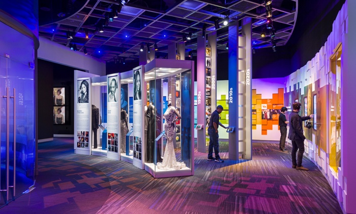
The Grammy Museum in LA opened up a new exhibition  called “Mono to Immersive Experience Room” in which visitors can relive the most famous performances of the Grammys. This audio-visual experience takes visitors on a journey from the 19th century phonographs to the immersive sound of Today. One can explore the most important parts of music history and experience how technology progressed with time.

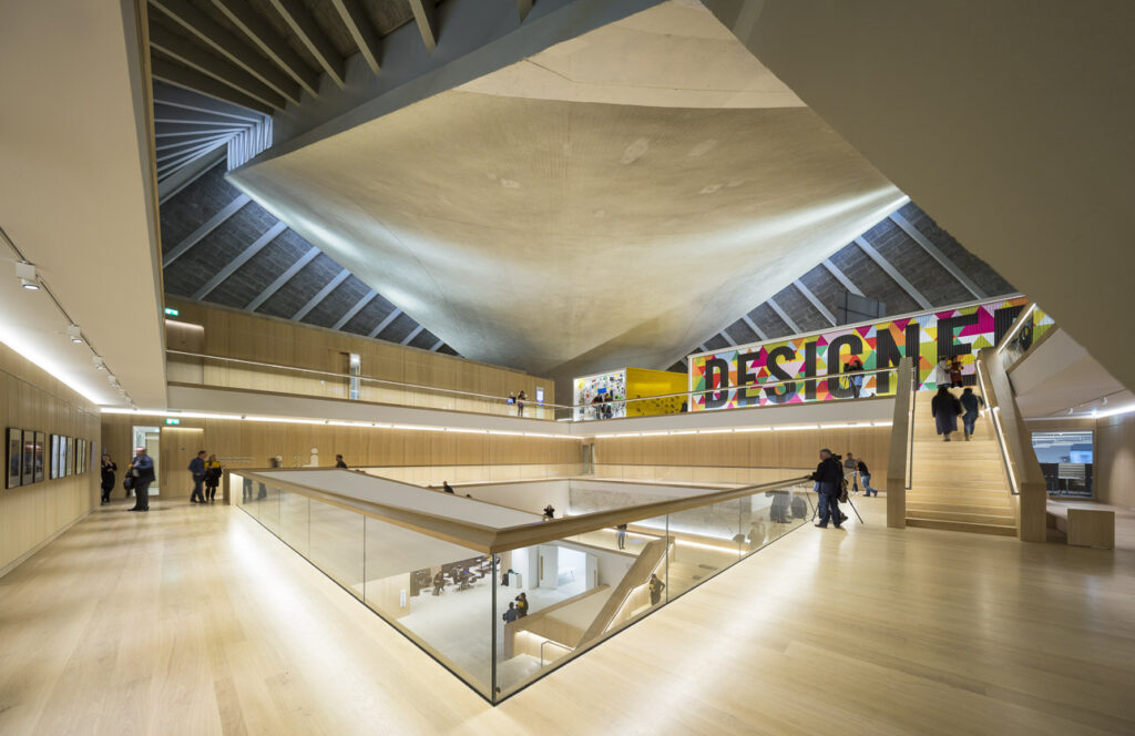
One of the most innovative experiences was done by the London Design Museum that went on from April to July 2020. It was designed to “transport” visitors into the Nightclubs of cities with a famous rave culture (e.g. Berlin, Detroit, Paris). It used a combination of music, strobe and flashing lights in order to create a club atmosphere.The experience called “Electronic” was using all these techniques to allow visitors to explore the art, design and photography that captured and shared the electronic music atmosphere. 

The exhibit features works from some of the most famous techno artists like Jeff Mills and Ellen Alien, along with BBC’s radiophonic workshop. It also features photography from a famous german event photographer Andreas Gursky, as well as the work of French DJ Laurent Garnier. The following video  gives a bit more detail from interviews and insight on the projects mentioned here.

Resources

https://www.soundoflife.com/blogs/design/how-museums-use-music-draw-new-audiences

Joyful Design

Master’s Thesis

When researching my master’s thesis topic, I found an article that tackles many ideas and issues of my master thesis. In the following blog posts, I will examine this article to integrate the insights and to build and develop upon those approaches in my final thesis.

“Can design be more joyful?”

Himanshu Baradwaj expresses in his article the conviction that every product experience, from creation to consumption can be designed in a joyful manner. He also highlights the importance of seeking a higher purpose than only solving problems in design which leads to my research on possibility-driven design—a design method that exactly sparked from that idea, that design should not only focus on problem-solving approaches.

Baradwaj also writes about the importance of creating positive feelings in order of fulfilling customer expectations and furthermore in order of creating successful experiences—experiences that trigger happy emotions “are more likely to be shared” and therefore more likely to be successful.

For Baradwaj Joyful Design means applying joy to everything.

“Joyful design is about novel approaches to problem-solving, detail-oriented work, consciously trying to be in the company of joyful people, and finding joy within.” —Himanshu Baradwaj

Whereas this holistic view on joyful design makes total sense I want to set my further focus on designing products that trigger joy. (Especially in regards to my master’s thesis). The thesis will not focus on a specific design discipline but rather on a general framework which can later be applied on designing products any form. Such as a social media campaign, a website, or even a whole brand identity.

Source: Himanshu Baradwaj. June 24, 2021. UX Collective. Can design be more joyful? URL: https://uxdesign.cc/can-design-be-more-joyful-540f28f6e1a6

Focusing on MA-thesis part V – conversation with Ursula Lagger

Ursula Lagger held the course Proseminar Master Thesis and outlined the most important questions and considerations about the thesis.

After revising my expose, and the final conversation with Ursula Lagger, where I presented my topic, I feel quite confident that I’m on the right track.

However still I think I need to narrow the topic. For this I thought probably it would be better to start the focus already with the experts interviews. Instead of interviewing people from various fields probably it’s better to find more experts in a specific field like graphic design and print production. This would also fit the idea to produce a poster series and the printed hardcover as practical work piece. Thus I have probable interview partners in mind like graphic designers, typographers and illustrators who are experienced in both, digital and analog methods, processes and production.

Questions like the share of digital and analog for their work, experiences in perception, technical and aestehtic characteristics, special projects, general dis- and advantages, personal attitude on the topic seem to be a good start for the interviews.

However, I’m aware that there’s still more thinking about the questions and the aims of the thesis.

But I’m sure starting a proper research, getting in touch with interview partners and having all that material collected in March and April will again give another view on the topic and help to find a proper focus for the thesis.

Was macht eine gute Pose aus?

Jeder Charakter hat eine eigene Seele, eigene Gefühle und eigene Ansichten zu bestimmten Themen. Um diese Gefühlszustände nach außen hin klar ersichtlich zu machen, braucht jede Aktion, welche dem Betrachter übermittelt werden soll, eine bestimmte Anzahl an key poses. Key poses stellen die ausdrucksstärksten Bilder einer bestimmten Bewegung dar und sind essentiell für die verständliche Übermittlung von Animationen.

Doch was ist nun eine gute key pose?

Prinzipiell spielen bei der Beantwortung dieser Frage einige wenige Faktoren eine wesentliche Rolle.

1. eine klare und eindeutige Erkennbarkeit
Eine key pose muss sofort lesbar sein, denn diese sind das Aushängeschild jeder Art von Bewegungen. Lässt eine key pose Spielraum für Interpretationsmöglichkeiten zu, darf man nicht mehr erwarten, dass diese Aktion vom Betrachter korrekt verstanden wird. Es soll klar erkennbar sein, was eine Figur tut, auch wenn man dabei nur ihre Silhouette sieht. Klarheit hat höchste Priorität.

Screenshot aus dem Animationsfilm „Encanto“, 2021.

Key poses helfen nicht nur den Animatoren bei der Entwicklung von ihren Animationen, sondern übermitteln dem Betrachter eine große Menge an Informationen in Bezug auf die derzeitigen emotionalen Zustände verschiedener Charaktere.

In Bild 1 befinden sich alle zu sehenden Figuren in eine ihrer ausdrucksstärksten Körperhaltungen – also in eine ihrer key poses. Fokussieren wir uns mal auf die Frau im blauen Rock. Auch wenn sie sich nahezu komplett von der Kamera abgewandt hat, ist man eindeutig in der Lage, ihren momentanen Gefühlszustand anhand ihrer Körpersprache zu identifizieren. Genau das macht eine gute key pose aus. Ihre Augen sind weit geöffnet, Der Mund offen und man merkt ihr ihre verspannte, nach hinten gelehnte Körperhaltung sehr schnell an. Die Positionierung der Hände vollenden die nonverbale Aussage, dass sie von dem Mann auf der linken Seite auf eine gewisse Weise erschreckt wird.

2. eine dynamische Aktionslinie
Ein weitere Sache, die eine gute key pose ausmacht, ist die Dynamik, welche eine Pose erst so richtig interessant macht. Hiermit ist eine starke Aktionslinie gemeint, die sich bei menschlichen Figuren durch den ganzen Körper zieht. Eine imaginäre Linie, die die Dynamik der Bewegungen zeigt. Wirkt diese Linie dynamisch und folgt der Charakter diese Züge, kann man davon ausgehen, dass man die Zielfigur um einiges “interessanter” gestaltet hat. Prinzipiell versucht man mithilfe der Aktionslinie, jegliche Art von Symmetrie zu vermeiden, um Dinge abwechslungsreicher und interessanter zu gestalten.

3. die Pose vermittelt den Charakter
Ein guter Charakter ist erst ein guter Charakter, wenn der Zuschauer in der Lage ist, jede kleinste Bewegung und jeden Gedankengang, den der Figur durch den Kopf geht, anhand der Animation ablesen zu können. Es ist wichtig, typische Klischees zu vermeiden, da jede Figur eine einzigartige Art hat, Dinge zu tun. Die Stärke in der Animation ist es doch, dem Charakter mit jeder noch so kleinen Bewegung, individueller und somit einzigartiger zu gestalten – was seiner eigenen Persönlichkeit zugute kommt. Genau wie ein Schauspieler ist es die Aufgabe eines Animators, die Figur in- und auswendig zu kennen und sie dem Publikum zu präsentieren. Wenn das Publikum mit einem einzigen Blick sofort eine Vorstellung davon bekommt, was eine Figur tut, ist es meist ein gutes Zeichen für verständliche und aussagekräftige Posen.

Ein stets wachsamer, in der besten Kaserne des Landes ausgebildeter General verdeutlicht sein furchtloses Schaubild mit kontrollierten und gezielten Ausführungen seiner Bewegungen. Arme und Beine sowie seine Körperhaltung müssen mit dem Charakter übereinstimmen, sofern er vom Betrachter als glaubwürdig wahrgenommen werden soll. Eine selbstbewusste Körperhaltung, ein kalter Blick und seine allgemeine Ausstrahlung machen den General erst zu dem, was er nach außen hin repräsentieren soll. Anders als der General kann das Auftreten einer alten Oma mit hellweißen Haaren, welche sie fast vollständig unter ihrem rot-schwarz kariertem Kopftuch zu verstecken versucht, funktionieren. Denn diese würde man beispielsweise mit zögerlichen und unkontrollierten Bewegungen als sehr zerbrechlich darstellen, um das fortschrittliche Alter der Oma hervorzuheben.

Quellen:

https://ars.electronica.art/aeblog/de/2015/03/04/animated-films-with-character/

https://www.gamedeveloper.com/design/conveying-character-personality-through-animation

https://the-artifice.com/animation-convey-character-traits/

https://www.youtube.com/watch?v=1EJSAm6OFOs

CMYK Project Work – Updates

The semester is coming to an end and by now, all Projects should be brought to an end and result should already be visible. For my project experiment part 1, I have finished collecting data from 30 test subjects. As mentioned in a previous post, there was a training process that had to be done for my specific experiment. The subjects all watched a training video for 20 days. Before the first video and the last one, they were asked to do a synesthesia test on Synesthesia.com . Afterwards, I sent one of my 4 tracks to each of the participants. I made sure to have approximately the same amount of answers for each track. So far I have not interpreted all data, but based on the synesthesia test, I am getting mixed results, from a very slight improvement, to a significant improvement. After analysing the answers to the questionnaires, I will see how much that change in answers impacts the real world answers. I presume that the real world presentation will have slightly better results than the test itself. In this article I want to explain what I did with the video and how I presented the songs. Each song was called “Track” with number extensions from 1 to 4. The numbers were mixed that they do not correspond to the order of the songs. Here is my training video to show you how it looked like. The subjects were instructed to watch it once a day for the duration of the test in hopes that it will train their brain for better synesthetic perception.

The window and my journey

Every human being has a hidden treasure in him/herself. As far as we know, it is not allowed to prejudge a person based on her nationality. But why do numerous misunderstandings happen when different people with different cultural backgrounds meet each other? Why do people need some time to adopt themselves to the new and unknown culture? According to Erin Meyer the author of the book the culture map we need to differentiate between character types such as introvert and extrovert with the cultural background of people. I suppose, an important part of each human being is a product of his society. Cultural values, norms, traditions and people who she faces everyday play an important role in order to shape her behavior. 

Since my childhood, Cultural and anthropological themes have been interesting for me because my parents come from different regions in Iran which are more than 1000 km far from each other. My mother always speaks Turkish with her family. However, we always talked Farsi at home. I was a curious child and eager to know what my mother was talking about with her siblings, so I learned Turkish by listening to her while she was talking with her family. Most of my relatives have been migrated to north America and we as cousins usually speak English with each other. Raising in a multicultural family and living alone for the past five years in the central Europe with a different culture, gave me opportunity to learn more about human beings than I expected. Despite many struggles and challenges that I need to deal with them, the curious child inside me is still alive and eager to treasure hunt middle European cultural beliefs.

Culture can influence different aspects of life. But if you ask me if culture comes first, I would say no. I think, there is one step before culture, which is language and literature. It is fascinating for me that there is an opportunity to decode a culture by decoding its language rules. Before getting into deeper examples I need to remind you that this assumption is personal and not scientifically proven yet. German language is heavily based on clear grammar and there is almost an exact word for every object. If you see the houses or the architecture, design and arts, cities or villages you easily see the clean and clear grammar in everything. If you offer people something, like food, they can say yes or no, based on what they need at that specific moment. Now let’s take a look at Farsi, which is an Indo-European language. Farsi is an open and visual language. People use an indirect language and if you ask them if they want to have some food, they always answer with no. It is considered that you need to ask them three times and if they say no after three times, then it really means no. Because accepting something straightforward is considered as impoliteness. It was a hard challenge for me to give direct answers in Austria and is still a challenge. 

There are numerous different cultural aspects and objects that could be investigated. I have chosen a well-known object that everybody around the world has it or has seen it during his life. The window. Windows are vanishing points of our daily lives. You can look through yourself or travel in your thoughts and inner self by looking outside through the window. It is impossible to live, study or work in a room without them. I would suggest to think about it as a prayer spot for the soul. Or let me change the prayer spot to flying spot. Human beings always dreamed about flying. Window is the starting point for the flying thoughts and imagination. 

From the visual point of view, windows have usually a uniform quarter shape around the world. Well, this sentence is very general. If you take a deeper look into the details, you will notice significant differences. For example, windows are usually placed all around the façade of the building in the Europe. People open windows and it is very normal. It was not like this in Iran before the beginning of the modern architecture. Windows always faced inner yard in private houses in Iran. Since 60s and 70s Iranian started living more in apartments that are covered with windows like in west. After the year 1979 and the beginning of Islamic revolution and the lack of freedom people started consuming curtains to cover their private lives and have parties and fun because due to the regime it is not allowed and even considered as a criminal act. Now after more than 40 years of an Islamic ideological government, curtains became a crucial decoration element in Iranian houses. It started with hiding the reality from the religion police and now is an important symbol of wealth and social milieu. I was informed last week about a surprising research that says, from the beginning of corona and lockdown people buy more heavy curtains in Austria to cover their windows. 

There are thousands of daily objects that we interact with them during our lives. Each of them has its own story and perception in different geographical areas. 

You can look through a window from inside or outside and every time you get a different cognition. It pictures my own life, my background and the journey that I have started.

Bibliography

Meyer, Erin. n.d. The Culture Map.

The Aphex Face

Aphex Twin is one of the most influential and important contemporary electronic musicians.

He is famous for his experimentations for for his unique style, where he combines elements from all kind of genres, mainly electronic genre, using atypical solutions/rythms to create a song.

His face, grinning or distorted, is a theme of his album covers, music videos and songs. He said it began as a response to techno producers who concealed their identities, as he stated:

“I did it because the thing in techno you weren’t supposed to do was to be recognized and stuff. The sort of unwritten rule was that you can’t put your face on the sleeve. It has to be like a circuit board or something. Therefore I put my face on the sleeve. That’s why I originally did it. But then I got carried away.”

He even put it on a song. On the second track, easily called just “Formula”, from the album Windowlicker, if we open it with a Spectrogram visualizer we will be able to see his face with his typical grin.

Even if it looks like something really hard to do it. At that time, 1999, there was a Windows program called Coagula that could transform any picture into soundwaves with minimum effort. Aphex Twin himself had used a Mac program called Metasynth to do his images.

He used the same technique to the first track of the album with this aural image.

This was also something that some other artists made on the same year, here some other example:

  • Plaid3Recurring

  • Venetian Snares Look

Resources

Wikipedia – Aphex Twin

Coagula – https://www.abc.se/~re/Coagula/Coagula.html

Bastwood – The Aphex Face

Atau Tanaka

Atau Tanaka is a composer and performer of live computer music and, at the same time, Digital Media professor at Newcastle University.

He was born in Tokyo but he soon moved with his family to America where he then studied Biochemistry and, later music.

At Stanford he studied Computer Music and then continued research at the IRCAM in Paris. Later he was Artistic Ambassador for Apple France, then researcher at Sony Computer Science Laboratory Paris, and was an Artistic Co-Director of STEIM ( Studio for Electro-Instrumental Music) in Amsterdam.

Tanaka had the fortune of attending lectures by John Cage, who according to him was one of the first musicians to have a strong conceptual approach. 

As Tanaka says “He made contact with the visual art world”.

His research is in embodied musical interaction. Also intersection of human computer interaction and gestural computer music performance.

This includes the use of physiological sensing technologies, muscle tension in the electromyogram signal, and machine learning analysis of this data.

On the other hand, he studies user experience through ethnographic methods of participatory design where activities of workshopping, scenario building, and structured brainstorming lead an understanding of a mediums affordances in bottom-up, emergent ways.

EAVI (Embodied AudioVisual Interaction) is a research group of which Atau belongs, which focuses on embodied interaction with sound and image. This group carries out research across topics including motion capture, eye tracking, brain computer interfaces, physiological bio-interfaces, machine learning, and auditory culture.

Another group that features Atau Tanaka is Sensorband, a trio of musicians using interactive technology. Gestural interfaces – ultrasound, infrared, and bioelectric sensors as musical instruments.  The other two members are Edwin van der Heide and Zbigniew Karkowski.

Atau plays the BioMuse, a system that tracks neural signals (EMG), translating electrical signals from the body into digital data.

Edwin plays the MIDIconductor, machines worn on his hands that send and receive ultrasound signals, measuring the hands’ rotational positions of and relative distance. 

Zbigniew activates his instrument by the movement of his arms in the space around him. This cuts through invisible infrared beams mounted on a scaffolding structure. 

They literally bring a visceral physical element to interactive technologies. 

He also did many installations, one of them is Global String, launched this installation in Rotterdam’s fifth bi-annual Dutch Electronic Arts Festival and made in cooperation with the Ars Electronica Center in Linz

Global String is a multi-site network music installation, connected via the internet, It is a musical instrument where the network is the resonating body of the instrument, by use of a real time sound synthesis server.

As he stated: 

“The concept is to create a musical string (like the string of a guitar or violin) that spans the world. Its resonance circles the globe, allowing musical communication and collaboration among the people at each connected site. The installation consists of a real physical string connected to a virtual string on the network. The real string (12 millimetres in diameter, 15 metres in length) stretches from the floor diagonally up to the ceiling of the space. On the floor is one end-the earth. Up above is the connection to the network, to one of the other ends somewhere else in the world. Vibration sensors translate the analog pulses to digital data. Users strike the string, making it vibrate.”

Here are some link to other works:

Bondage (Sonification and remix of a photo by Araki)

Biomuse (Biosignal sensor instrument performance)

Myogram (8 channel sonification of muscular corporeal states)

References

ataut.net

Music Hackspace – Atau Tanaka: Making music with muscle sensors

Goldsmiths University of London – Prof Atau Tanaka

Cafe Oto – Atau Tanaka

V2_Lab for the Unstable Media – Global String

V2_Lab for the Unstable Media – About Atau Tanaka

EUKLIDISCHER RHYTHMUS – Part II – Praxis

In diesem zweiten Teil zum euklidischen Rhythmus möchte ich den Music Pattern Generator und XronoMorph kurz vorstellen.

Music Pattern Generator

Der Music Pattern Generator ist eine kostenlose Webanwendung zur Erstellung musikalischer Rhythmusmuster, welche von Wouter Hisschemöller programmiert wurde. Die Patterns werden durch animierte Grafiken dargestellt, die es einfach machen, komplexe Polyrhythmen zu erstellen und zu verstehen.

Der Music Pattern Generator überträgt seine Patterns als MIDI-Daten, so kann man die App leicht in andere Musiksoftware und -hardware integrieren. Es gibt ihn als Webanwendung, als auch als Installationsprogramm, um die App auch als reguläre Desktop-Anwendung zu verwenden.

Auf dem Github des Programmieres findet man alle nötigen Informationen zum Download und zur Anwendung.

Hier eine kurze Einführung zum Music Pattern Generator

Der MPG in Verbindung mit externer Hardware

Download:

Online Application

Download

User Guide

XronoMorph

XronoMorph ist eine kostenlose macOS- und Windows-App zur Erstellung mehrschichtiger rhythmischer und melodischer Loops (Hockets). Jede rhythmische Schicht wird als ein in einen Kreis eingeschriebenes Polygon visualisiert, und jedes Polygon kann nach zwei verschiedenen mathematischen Prinzipien konstruiert werden: perfekte Balance und Wohlgeformtheit (auch bekannt als MOS). Diese Prinzipien verallgemeinern Polyrhythmen, additive und euklidische Rhythmen. Darüber hinaus können die Rhythmen nahtlos ineinander übergehen, und auch irrationale Rhythmen ohne regelmäßigen Puls können leicht konstruiert werden. Die Patterns lassen sich sowohl als Midi als auch Audio-Datei exportieren.

Einführung in XronoMorph:

XronoMorph: An Introduction

Perfectly Balanced Rhythms

“Ein Rhythmus oder eine Skala kann als Punkte auf einem Kreis dargestellt werden. Der Rhythmus ist perfekt ausbalanciert, wenn die mittlere Position (Schwerpunkt) dieser Punkte in der Mitte des Kreises liegt.

Komplexe, perfekt ausbalancierte Rhythmen können durch die Addition einer beliebigen Anzahl von einfacheren, perfekt ausbalancierten “Elementar”-Rhythmen erzeugt werden. XronoMorph enthält eine Vielzahl dieser elementaren, perfekt ausbalancierten Muster.”

perfectly balanced rhythms

Well-formed Rhythms

„Well-formed Rhythms (auch MOS genannt) enthalten zwei Schlaggrößen, die so angeordnet sind, dass der Rhythmus so gleichmäßig wie möglich ist. Jeder dieser Rhythmen hat einen übergeordneten Rhythmus, der die ursprünglichen Beats in zwei neue Größen aufteilt. Auf diese Weise lässt sich eine komplexe, verschachtelte Hierarchie von Rhythmen erstellen.

Well-formed Rhythms sind eine Obermenge der euklidischen Rhythmen. Sie umfassen zum Beispiel auch Rhythmen ohne regelmäßigen Puls.“

Well-formed rhythms

Quellen:

Hischemöller, Wouter. „Wouter Hisschemöller Music Pattern Generator v2.1“. Zugegriffen 15. Dezember 2021. https://www.hisschemoller.com/blog/2019/music-pattern-generator-v2-1/.

Hisschemöller, Wouter. „Music Pattern Generator“. Zugegriffen 15. Dezember 2021. https://www.hisschemoller.com/mpg/.

Hisschemöller, Wouter. Music Pattern Generator. JavaScript, 2021. https://github.com/hisschemoller/music-pattern-generator.

Milne, Andy. „XronoMorph: Loop generator“. dynamic tonality, o. J. https://www.dynamictonality.com/xronomorph.htm.

Milne, Andrew, Steffen Herff, David Bulger, William Sethares, und Roger Dean. „XronoMorph: Algorithmic generation of perfectly balanced and well-formed rhythms“, 2016. https://www.researchgate.net/publication/302345911_XronoMorph_Algorithmic_generation_of_perfectly_balanced_and_well-formed_rhythms.

SOUNDS OF

Sounds of ist ein Format in dem verschiedenste Künstler*innen, Foley Sounds an besonderen Plätzen sammeln und danach ins Studio gehen und daraus einen neuen Song machen.

Sounds of Trailer

Über Sounds of:

Ursprünglich ist das Format von Fynn Kliemann und dem Kliemannsland initiiert und auch moderiert worden. Die ersten Videos wurden noch im alten Studio des Kliemannsland aufgenommen. Mittlerweile wird das Format von Nisse Ingwersen moderiert und gehört zu Funk dem Content-Netzwerk der öffentlich rechtlichen Sender ARD und ZDF, wird jedoch immer noch vom Kliemannsland produziert.

Die Folgen laufen immer so ab, dass die Künstler*innen an einen von ihnen ausgewählten, besonderen Ort gehen und dort die Atmosphäre mittels Recorder als Foley Sounds aufnehmen. Danach bekommt man einen Einblick in die Produktion der neuen Songs und kann auch persönlichen Geschichten lauschen. Die Zuschauer bekommen auch immer wieder Tipps für eigene Produktionen.

Community:

Das tolle an dem Format ist, dass man sich auch als Zuschauer alle Sounds downloaden kann. So bekommt man zum Beispiel aus der Folge mit Severin Kantereit einzigartige Aufnahmen aus Äthiopien.

Die Zuschauer werden selbst dazu aufgefordert, nur mit den Sounds aus den Folgen neue Tracks zu produzieren. Diese können an das Kliemannsland geschickt werden und werden dann auf der SoundCloud Playlist veröffentlicht.

Sounds of Äthiopien

In einer Folge, war Nisse mit Deichkind sogar in der Hamburger Elbphilharmonie:

Sounds of Elbphilharmonie Hamburg

Quellen:

Funk. „soundsof“. funk. Zugegriffen 8. Januar 2022. https://www.funk.net/channel/soundsof-12144.

Kliemannsland GmbH. „Sounds of“. kliemannsland. Zugegriffen 8. Januar 2022. https://www.kliemannsland.de/blogs/soundsof?page=3.

soundsof. „soundsof – YouTube“. Zugegriffen 8. Januar 2022. https://www.youtube.com/.