Joyful Design

In this post, the concept of happiness as a basis for possibility-driven design and the challenges of happiness as a design goal and “possibilities” as key to reach this goal, will be addressed. While a problem-driven approach takes a problem as a start, a possibility-driven approach looks out for a possibility. The possibility has to be rooted in our knowledge of happiness, in human practice and human needs. 

Happiness

Happiness is an ultimate goal, for every human being. According to a study of Laura King and Sheri Broyles (1997) [1], where they invited people to make three wishes for “anything at all,” happiness was found to be the most common wish. In other words: a happy life is highly desirable.

To be happy is a quality in itself and a lot of research has been devoted to identify the conditions for, and the causes of, happiness. Moreover, in the last years, several beneficial consequences of happiness have been empirically demonstrated: happy people are successful in many life domains and these successes are at least in part due to their happiness. Happy people are more social, altruistic, active, like themselves and others more, have strong bodies and immune systems, and better conflict resolution skills. Moreover, happiness promotes constructive and creative thinking. Simply said, happy people are healthier, more successful, and contribute more to the lives of others. [2]

So it seems only natural to make happiness therefore a major objective for design. Designers need to find answers to questions such as: what causes happiness? How can people become happier? Can we deliberately make them happier? Even though the answers to these questions seem to be fundamental to our understanding of human functioning and flourishing, empirical re-search in the social and behavioral sciences on happiness is a rather recent phenomenon (Larsen & Eid, 2008). [3] This phenomenon led to a completely new discipline of psychology called Positive Psychology. Researchers working in this field argue that happiness has an affective and a cognitive component. The affective component is the balance of negative versus positive affect experienced on a day-to-day basis. The cognitive component is the amount of global satisfaction individuals express with their lives. In other words, a happy person is feeling good most of the time and is satisfied with life. An unhappy person is feeling bad most of the time and is dissatisfied with life. There is not one “ingredient for happiness” but there are several crucial ingredients, none of them alone sufficient to make a person happy. Within the research of happiness there are two views, which have been identified and labeled after Aristotle’s (350 B.C.E./1998 C.E.) classical distinction between Hedonism and Eudaimonia. [4]

Hedonic View [5]
The focus is on happiness that stems from savoring life’s pleasures. This requires an ability to enjoy beautiful sunsets, a delicious meal, a warm bath and good company. Hedonic happiness arises from the experience of positive feelings, per se. It involves not only the pursuit of activities that are pleasurable, but also the pursuit of one’s ability to truly enjoy these activities. In other words, becoming happier does not necessarily require more pleasurable activities, but can also be realized by taking more pleasure in our activities.

Eudaimonic View [6]
Also named virtue-based view, focuses on happiness that stems from the fulfillment through engaging in meaningful activity and the actualization of one’s true potential. This requires an ability to identify meaningful life goals, and to attain them. That means striving for something personally significant, whether it is learning a new craft, changing careers, or raising moral children. Those people are happier than those who do not have strong dreams or aspirations. Meaningful goals provide direction. Committed goal pursuit provides a sense of purpose and a feeling of control over our lives. The process of working towards a goal, participating in a valued and challenging activity, is as important to well-being as its attainment itself. Meaningful goals connect abstract values, such as being autonomous or feeling related, to everyday activities. Examples are: developing a drawing talent, contributing to the lives of others, bringing joy to people through music, raising children in the best possible way. Ed Diener and Eunkook Suh (1999) [7] proposed that effective meaningful goals involve approaching a desirable outcome (as opposed to avoiding an undesirable outcome), and enable a person to continually experience new challenges, take on new opportunities, and have a variety of experiences. In that sense, meaningful goals are possibilities rather than problems solved.

While Hedonism simply recommends identifying and enjoying the enjoyable, Eudaimonia takes a more normative stance. It prescribes ways of living in the world, which eventually lead to fulfillment and, thus, happiness, but may not be common practice or at least may not be easy to implement. It may need an “intervention,” that is, making someone doing something.

Hedonic Treadmill Theory [8]
A classic theory is the Hedonic Treadmill theory, originally proposed by Philip Brickman and Donald Campbell (1971). This theory suggests that people adapt to both good and bad events and return, over time, to their he- donic set point. For example, after an extremely good event, a person initially reacts with strong Positive Affect but eventually adapts and returns to his or her baseline level of Positive Affect. A similar adaption process occurs for negative events. A person reacts to a bad event with strong Negative Affect but eventually adapts and returns to his or her baseline level of Negative Affect. However, negative events produce relatively more intense and longer-lasting affective reactions than positive events: we adapt more quickly to good events than to bad events (Brickman et al., 1978). But, the rate and extent of adaptation to various events show wide variability across individuals, and there are opportunities to “overcome” the Hedonic Treadmill by employing strategies that stimulate cognitive reappraisals, that is, rethinking a given situation.
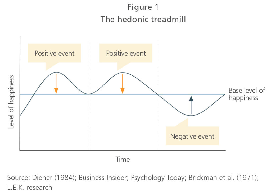
There is clearly an opportunity for design, by seducing, stimulating, or challenging people to overcome the Hedonic Treadmill and other barriers to their happiness through designed interventions.

An example: Martin Seligman and colleagues’ (2005) “gratitude visit” [9]: Participants had one week to write and deliver a letter of gratitude in person to someone, who had been especially kind to them but had never been properly thanked. This simple exercise led to a significant increase in happiness directly after the exercise—compared to a placebo control group—which then lasted for a month. While these kinds of activities make us happy—at least for a while—it requires some external impulse to actually do it. This is typical for eudaimonic happiness. The hedonic is more obvious to us and much easier to implement. [10]

The distinction between Hedonism and Eudaimonia is sometimes referred to as “the pleasurable life versus the good life”. This distinction is especially useful for possibility-driven design. Because we may need two different strategies to design for happiness [11]:

1) design for the pleasurable life/hedonism
the design of products that become direct sources of pleasure by creating pleasurable experiences rooted in human values and evidently pleasurable activities.

2) design for the good life/eudaimonia
the design of products that represent meaningful, but maybe non-obvious goals and help people attaining those goals.

Conclusion: Design can contribute to happiness by creating positive experiences (the pleasurable life/hedonism), but also by stimulating people’s awareness of their abilities to increase their happiness (the good life/eudaimonia). According to Desmet and Hassenzahl, products that create or mediate positive experiences can even rescript existing experiences to be more pleasurable. Products that increase one’s awareness, on the other hand, will challenge or inspire its user to act or think in a different, bus assumingly better way. [12]

Sources

[1] King, L.A., & Broyles, S.J. (1997). Wishes, gender, personality, and well-being. Journal of Personality, 65, 49-76.

[2] Desmet, Pieter / Hassenzahl, Marc: Towards Happiness. Possibility-Driven Design. Delft University of Technology 2012. URL: https://www.researchgate.net/publication/233850646

[3] Larsen, R.J., & Eid, M. (2008). Ed Diener and the science of subjective well- being. In: M. Eid, & R.J. Larsen (Eds.), The science of subjective well-being (pp. 1-16). New York: The Guilford Press.

[4] [5] [6]Desmet, Pieter / Hassenzahl, Marc: Towards Happiness. Possibility-Driven Design. Delft University of Technology 2012. URL: https://www.researchgate.net/publication/233850646

[7] Diener, E., & Suh, E.M. (1999). National differences in subjective well-being. In D. Kahneman, E. Diener, & N. Schwarz (Eds.), Well-being: The foundations of hedonic psychology (pp. 434-450). New York: Sage.

[8] Desmet, Pieter / Hassenzahl, Marc: Towards Happiness. Possibility-Driven Design. Delft University of Technology 2012. URL: https://www.researchgate.net/publication/233850646

[9] Seligman, M. E. P., Steen, T. A., Park, N., & Peterson, C. (2005). Positive psy- chology progress. Empirical validation of interventions. American Psycholo- gist, 60, 410-421.

[10] [11] [12]Desmet, Pieter / Hassenzahl, Marc: Towards Happiness. Possibility-Driven Design. Delft University of Technology 2012. URL: https://www.researchgate.net/publication/233850646

Joyful Design

Possibility Driven Design

When searching for articles about joyful and positive design I came across the article “Towards Happiness: Possibility-Driven Design” by Pieter Desmet and Marc Hassenzahl. [1] Possibility-driven design acts as an alternative to the common problem-driven approach. Throughout their research, Desmet and Hassenzahl hope to lay ground for an approach to design, which draws upon happiness to motivate the design of future technologies.

“This will help establishing a culture of humane innovation, which understands technology as a possibility to improve life directly.”—Desmet & Hassenzahl.

From problems to possibilities [2]

Today, design techniques mostly favour a problem-driven approach, where design acts as an activity focused on removing problems (i.e., to make something easier, cleaner, cheaper, safer or smaller). The goal: to make the world a better place through solving its problems—instead of focusing on what makes us happy. Desmet describes problem-driven design as the mere attempt to “keep the demons asleep.” Which means, that problem-driven design primarily is about avoiding, solving, or neutralizing the negative, the moment it arises—removing prevailing problems. But, removing the negative must not necessarily generate a positive experience. It only guarantees the transition from a negative state to a neutral state. But, to generate a positive state from neutral may requires more than a problem-driven approach. For example, there is a difference between facilitating well-being indirectly through a more functional kitchen and the direct joy from a family gathering that takes place in that kitchen. Therefore, Desmet and Hassenzahl propose a possibility rather than problem-driven approach to design, to unlock its full potential of contributing to human flourishing.

They mentioned an example regarding leg prosthetics. “Instead of understanding the absence of legs as primarily a problem to be solved, the designers used a seemingly problematic situation as a possibility to explore material and technology to create a new type of leg. For a while, these legs where even considered better than natural one’s, which led to Pistorius being ruled ineligible for competitions, including the 2008 Summer Olympics – a decision reversed later.”— Desmet & Hassenzahl.

Although the FlexFoot successfully turned a problem into a possibility, it is still very much rooted in an anomaly—the absence of legs

That perfectly states, that a possibility driven design approach strives for more—the goal is to design products without referring to a problem, but still rooted in human practice and needs.

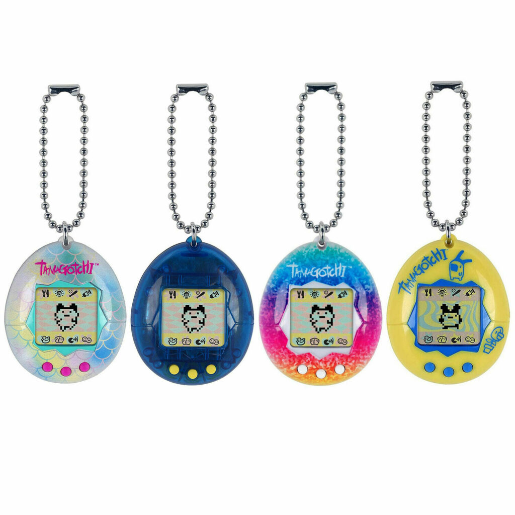
Another example from another industry—the game and entertainment industries—is Bandai’s Tamagotchi.

Tamagotchi—a little creature, which hatches from an egg when switching on the device for the first time. From then on, one must raise the Tamagotchi, feed it, play games with it, keep it healthy, clean it, punish and praise it. If left unattended, it will soon die.

The Tamagotchi was a cult in the mid 90ties of the last century, with an ongoing revival since 2004. The games concept inspired a range of games following the same basic principle, from Will Wright’s Sims published in 2000 to Sony’s recent EyePets. The Tamagotchi does not necessarily solve a problem, but appeals to the basic psychological need of relatedness and the associated interest in nurturing, care, and enjoyment created by taking on responsibility. Desmet & Hassenzahl compare it to the similarity of the enjoyment from having pets or from indulging in recreational gardening. Therefore, according to Desmet & Hassenzahl, a Tamagotchi is a possibility of fulfilling an everpresent need.

Even though, the Tamagotchi’s can be seen as a solution to the problem of “loneliness”. So, possibility driven design can also be seen as solving a problem on a more abstract level. However, Desmet & Hassenzahl disagree. “Relatedness, the need primarily addressed by the Tamagotchi, is sufficient and meaningful in itself. A technology that addresses relatedness will be, thus, meaningful, too. Now there are plenty of ways to satisfy relatedness, some more viable for certain people than others. As a result, people may prefer plants over pets or virtual pets over real ones. Or just have all the alternatives side by side. In other words, pets do not primarily solve a problem. It is just enjoyable to have them because they address important human needs […] TheTamagotchi is not a solution but a new way to craft technology to create a mean- ingful, fulfilling experience. Just for the sake of it.”—Desmet & Hassenzahl

There is an increasing interest in a possibility-driven approach to design, both with a focus on the pleasurable life and the good life. This interest is reflected in a broad focus on pleasure and enjoyment aka (positive) emotions as a design goal. All these new experimental design approaches primarily address humans, their experiences, joys and misfortunes and emphasize possibilities for new ways of happiness rather than the removal of problems.

Sources

[1] Desmet, Pieter / Hassenzahl, Marc: Towards Happiness. Possibility-Driven Design. Delft University of Technology 2012. URL: https://www.researchgate.net/publication/233850646

[2] ebda.

How Everyone is Capable of Making Synaesthetic Correlations

Synaesthesia has already been thoroughly described in my previous articles pertaining to my ProWorks Research. But today I want to present something fun and engaging in hopes that I will provoke you to explore your mind more.

Believe it or not, even people who have no synaesthetic tendencies often still subconsciously make multi-sensory correlations. Plainly put, perhaps we can say synesthesia has a big spectrum of intensity, and a lot of it is learned and acquired throughout our lives, through conditioning and cultural norms.

After going through this article, even if you feel like you still don’t relate to the examples shown, it is important to note that synaesthesia can be to some extent induced by meditation, practising and training oneself. Before reviewing the examples listed below, you should perform the synaesthesia test on the following link. Even though this type of test is a scientific method, the website discourages its users from self-diagnosing. This is because even if you test well or not, this test does not cover all types of synaesthesia. You might have some other form that is not being tested by this quiz.

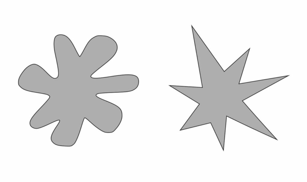
If you performed the test, you should have your suggested result and now you can proceed to check these examples. There is something called the Kiki-Bouba effect, which describes a form of ideasthesia- where we assign names and miraculously even personality traits to shapes. Below are 2 different shapes- if you assign them the correct one, you successfully relate to ideasthesia. So, which one is Kiki and which one is Bouba:

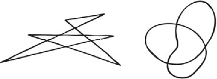
The correct answer is Bouba and Kiki respectively. Here is another one, just to drive the point home. Which one is Takete and which is Maluma:

Correct: Takete and Malouma respectively. What if I told you that 80% of people can correctly assign all these shapes a personality trait as well? The word Kiki is usually associated with the following words: happy, clever, small, tall, thin, young, unpleasant, nervous and upper class. This test also demonstrates the fat-thin effect (with most people stating Kiki is thin). This might be coming from a slew of popular Characters, like Don Quixote and Sancho Panza, Asterix and Obelix, etc. 

Usability Evaluation | part 3

Usability Testing Methods

Do-It-Yourself Usability Testing

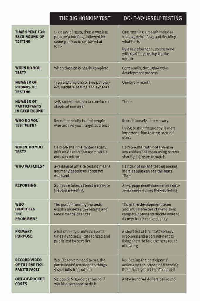
If a company does not want to spend the time and money on an unmoderated or moderated usability test, there is also the possibility to do a DIY usability test. Although the data you get from this method cannot be compared with the data you get from its bigger siblings, it’s still better to do it yourself than to do no testing at all.

In the following table, you can see all advantages and disadvantages of the Do-It-Yourself tests compared to the moderated and unmoderated tests (he calls them the big honkin’ tests).

source: Rocket Surgery Made Easy, Steve Krug, page 25f

For even more details about this method I recommend watching his workshop.

Card Sorting

Another very popular testing method, primarily used for evaluating the information architecture of a system, is card sorting. It helps to organize the content of a site to match it to the way the actual users think. That’s also the main reason why it is so important that you are using actual users of the system for card sorting.

A card sorting can either be done in-person on a large table or a magnetic wall or remotely with specific online tools. These tools also offer you to ask follow-up questions and help you with gathering additional qualitative data to the quantitative data from the card sorting. Either way, card sorting is a very quick usability testing method.

During card sorting, you hand your participants a stack of cards with different topics written on them and they have to sort them and organize them into different piles. Depending on the type of card sorting you do they get labeled groups by the creator (closed card sorting), can label their groups on their own (open card sorting) or they can modify the groups given to them by the creator (hybrid card sorting). Card sorting helps you to understand the mental models of your users.

Click Test

Click tests are also often called first click tests and help with identifying navigation problems. It is not used for creating the information architecture or navigation like the card sorting, but it is used for seeing if the navigation from the card sorting works and helps the users to accomplish different tasks.

Click tests are done with an image of a sketch, wireframe, or design of a system and are therefore easy to set up and done really quickly. The Participants are then asked to click where they think they need to click to complete a given task. These clicks and the times it takes them to click are also recorded in the background and can be visualized in a heatmap and helps with visualizing the areas where the most clicks occurred. Since it is easy to set up and it also works with low fidelity sketches, you can start doing them early in the design process and repeat them along the process.

An example of a click test would be to show them an image of the homepage and ask them to sign up. After they have clicked the element they think will bring them a step closer to the sign-up process, you normally also ask them why they clicked there. These questions also help with understanding their mental models and getting more qualitative data.

Another important result of a click test is that you can easily find areas that are clicked a lot but are not actually clickable. This helps you with minimizing the number of wasted clicks.

The biggest disadvantage of this method is that you can only use them for single screens or a few of them and you cannot do a click test with longer and more complicated task flows. Additionally, because you are using a static image it is also not simulating a realistic surfing or browsing behavior of a normal user and the results may be different when elements are located below the fold of the screen on the live version of the system.

Eye Tracking

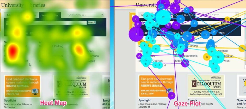
Eye-tracking is great for identifying elements that are helping and hurting the attention. It uses additional hardware and software to track the movement of the eye and measure the gaze points while a user is viewing the system. During this process, everything is recorded and can be presented as a heatmap or a gaze plot. The gaze plot can help you with identifying where the users are actually looking and where they are not looking. It also helps with identifying the order in which they are looking at different elements. Heatmaps are primarily used to visualize the elements that attract the most amount of attention and which elements are overlooked by the majority of users.

The main advantage of eye tracking is that you can identify how much attention every element gets. You cannot only identify important elements that get too little attention, but you can also identify elements that pull the attention away from the more important elements. For getting quantitative data out of the eye-tracking test it is also important that the facilitator also ask follow-up questions. 

The biggest disadvantage of eye tracking is that you need special hardware and software to actually start collecting data. That’s also the reason why you cannot do an eye-tracking test remotely and have to set up a room with your eye tracking device before the test starts.

source: https://medium.com/@TheRealTang/subtleties-of-eyetracking-heat-maps-and-gaze-plots-a7ba4207f20f

Preference Test

Another fast but effective method is the preference test. It helps to determine which design of several choices the users like best, why they liked it best and what they liked about this version. This method is especially helpful during the early stages of the design process or when the team is not able to decide which version they like best. A preference test can also be done online with a video call and screen sharing, without any special tools.

The biggest disadvantage of this method is that it does not mean that the users are also picking the version with the best usability or performance. Especially when you are presenting them with different high-fidelity designs, they will most likely focus on the aesthetics of the design.

Question Test and 5-Second-Test

The question test and the 5-second-test are similar methods. During both tests, you show the participant an image of the system and then ask questions about it. The biggest difference between the two is, that you only show them the picture for 5 seconds during the 5-second-test and during the question test they can look at it as long as they want. The 5-second limit is due to the fact that the vast majority of website visits are less than 10 seconds long and that users make up their mind about the quality of a website within 50 milliseconds.

The questions during these tests are mainly about the layout or content of a site but you can also ask them where they would complete a certain task or action on the page and what they would expect to happen if they click on a certain element.

Since these tests can also be done with only an image of the product, they are also fast to set up and can be easily done online with users from around the world. The biggest disadvantage of these tests is that they cannot solve design issues, they can just point out if there are potential problems somewhere.

Additional Methods

There are a lot more UX research methods out there that also help with testing the usability of a system. Additional examples include

  • Contextual Inquiries, Ride-Alongs, Field Visits, Ethnographic Field Studies
  • Diary Studies
  • Focus Groups
  • Surveys
  • Voice of the Customer (VoC) Tools including feedback forms, questionnaires, and ratings on websites, apps, or app stores
  • Interviews
  • Usability Lab Studies
  • Participatory Design
  • Concept Testing
  • Desirability Studies
  • Clickstream Analysis
  • A/B Testing, Multivariate Testing, Live Testing, Bucket Testing
  • True-Intent Studies
  • … and many more

Usability Benchmarking

Another really important summative testing method (end of the design process) is usability benchmarking. The main goal of this method is not to improve the usability of a system, it is about measuring the current usability of a system to provide a baseline against which future versions of the system can be compared.

It is a great tool to ensure that the changes you are making help you with moving in the right direction and that you have clear reference points. UX benchmarking involves collecting quantitative data that describes the current user experience. This data could include detailed numbers about the average time spent on the system, average time spent until they make a purchase or complete a certain task, the success rate or conversion rate, the retention rate, and many more.

Once you have done your UX benchmark, you can compare your data against an earlier version of the product, the data from a competitor, an industry standard, or a goal defined by the stakeholders of the product. Even when you just did your first benchmark, you can still compare your data to the competitors or the industry standard.

The main advantage of this method is that you can measure the progress you have made after a lot of design iterations and show this data also to stakeholders or clients to prove your good work along the process.

Conclusion

Since most of these methods can also be done remotely, there is currently a big boom in online tools that help companies with usability testing. These tools are offering different methods and different pricing models and are especially useful for testing with users all over the world. Popular testing services include UserTesting, Validately, UsabilityHub, UXTesting, Userlytics, and many more. Since I prefer to use the help of local companies, I would personally use Userbrain from Graz to do my usability tests.

Resources

Books

Just Enough Research
Erika Hall
2013

Usability Testing Essentials, Ready, Set…Test!
Carol M. Barnum
2021

UX Optimization, Combining Behavioral UX and Usability Testing Data to Optimize Websites
W. Craig Tomlin
2018

Inclusive Design for a Digital World, Designing with Accessibility in Mind
Regine M. Gilbert
2019

Articles

The Elements of Successful UX Design, Best Practises for Meaningful Products
UXPin
2015

Web

https://medium.com/adalab/the-importance-of-usability-10e9871a16d8

https://uxdesign.cc/usability-testing-in-design-and-why-is-it-important-cfddfbbdaac9

https://www.nngroup.com/articles/which-ux-research-methods/

https://www.interaction-design.org/literature/article/when-should-i-conduct-usability-testing-for-a-product

https://www.nngroup.com/articles/remote-usability-tests/

https://medium.com/thinking-design/usability-testing-moderated-vs-unmoderated-adbccc37404b

https://www.nngroup.com/articles/competitive-usability-evaluations/

https://xd.adobe.com/ideas/process/user-testing/top-7-usability-testing-methods/

How to Neumorphism

When designing User Interfaces, there are several ways to implement Neumorphism or Glassmorphism. In this blog post, I will look at how to develop neumorphic elements like cards and Icons in interface design tools like figma but also briefly in code.

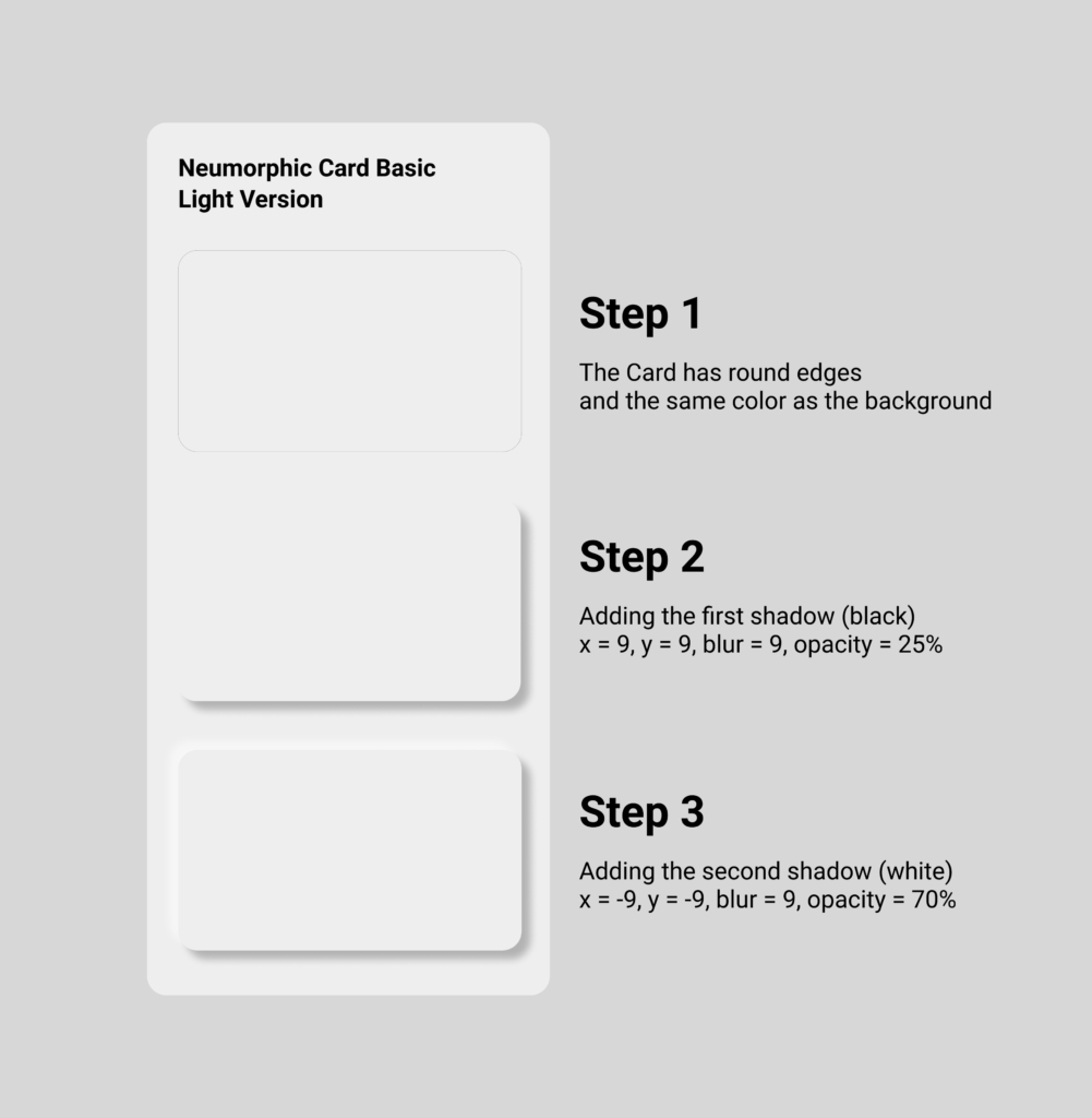
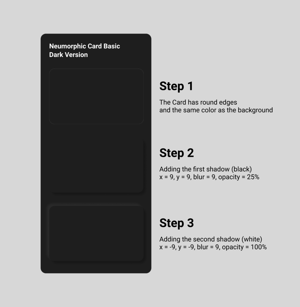
First, let’s start with Neumorphism by looking at card elements, which is the most present UI element of this style. The factors that have to be considered are the size, radius, distance, intensity and blur. It has all to do with the shadows, that generate the look of „attaching to the ground“. Due to its reduced color scheme it works best, if the neumorphic card has the same color as the background. Also rounded borders help the effect to stand out more. I tried it out myself in figma, it is very easy to do and by playing around with the blur value, the distance to the background seems to change. The more blur, the farer away from the background the neumorphic card seems to be.

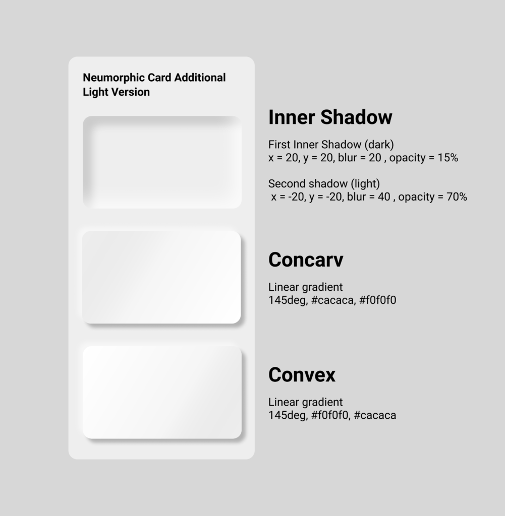
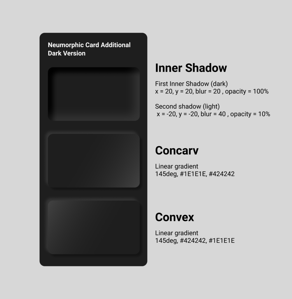
By adding gradients, it makes the card element seem to become convex or concarv. Adding the shadows within the card instead of outside has the effect that the card generates kind of hole or window in the interface.  

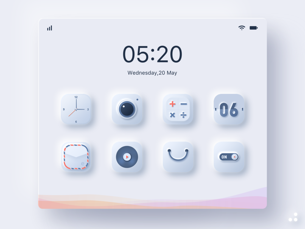
One of the goals of Neumorphism is to include the skeuomorphic approach, which means to combine the minimalistic design style with familiar objects of the analog world not only in the design aspect but also in their function, as I already analyzed in previous blog posts. The skeuomorphic approach also can be part of the icons. All the icon parts themselves have adjusted background shadows and lie on card elements with shadows, which gives them a 3D look and complete their connection to their real world counterparts. For realization in figma, the same rules as for the cards are implemented onto the icon elements. 

For a button, you can also apply the rules mentioned before. The default button can simply stay in the normal or concarv mode, while the active button should seem like it is really pressed and attaches itself deeper into the interface, for which the inner shadows should be used. Additionally to imply the „active status“, the color can also change when pressed. It is important to keep an eye on the contrast and differences between the states of the buttons. It has to be very clear to e functional. 

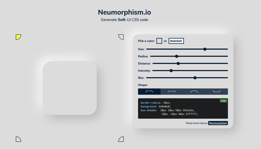
There are several tutorials how to do Neumorphism, there even is a Neumorphism card generator available online, where you can try out yourself and also see how it should be implemented in css code. You also can do this easily in code and don’t need a lot of lines. It is basically the same principle as it is in figma just translated.

https://neumorphism.io/#e0e0e0

Sources

https://uxdesign.cc/neumorphism-in-user-interfaces-b47cef3bf3a6
https://lukasckuehne.medium.com/trying-out-soft-ui-12153537dc50
https://www.simpleguides.de/soft-ui-neumorphism/
https://youtu.be/KlSLdEB3lzg
Neumorphism CSS Generator: https://neumorphism.io/#e0e0e0

Images and Videos

Image 01 – 04: Neumorphic cards – own creation
Image 05: Neumorphic-Icons
https://dribbble.com/shots/11473239/attachments/1509448?mode=media
Video 01: Neumorphic Icons
https://dribbble.com/shots/10746021-Neumorphism-Social-Buttons
Image 06: Neumorphic Buttons
https://uxdesign.cc/neumorphism-in-user-interfaces-b47cef3bf3a6


Print experiment: “reality is analog” // part I–concept & design

As an experiment for my research I came up with the idea to produce a poster edition using a linocut as well as a hand set lettering. In addition I’ve planned to make photos of every poster to see the development of the print run and finally will hang the posters in public space to observe how people will react to the poster.

Part I–concept & design

Inspired by the claim “Reality Is Analog” I wanted to create a poster, delivering the message via a typographic layout but also transporting the nuances and very own features of analog print production. For this I got in touch with Druckzeug, the local museum for antique and 20th century printing techniques and letterpress playground in Graz, who kindly supported me to implement the project by opening the workshop and giving instructions in operating the machines (more info about Druckzeug, hand set letterings and steps of printing to follow).

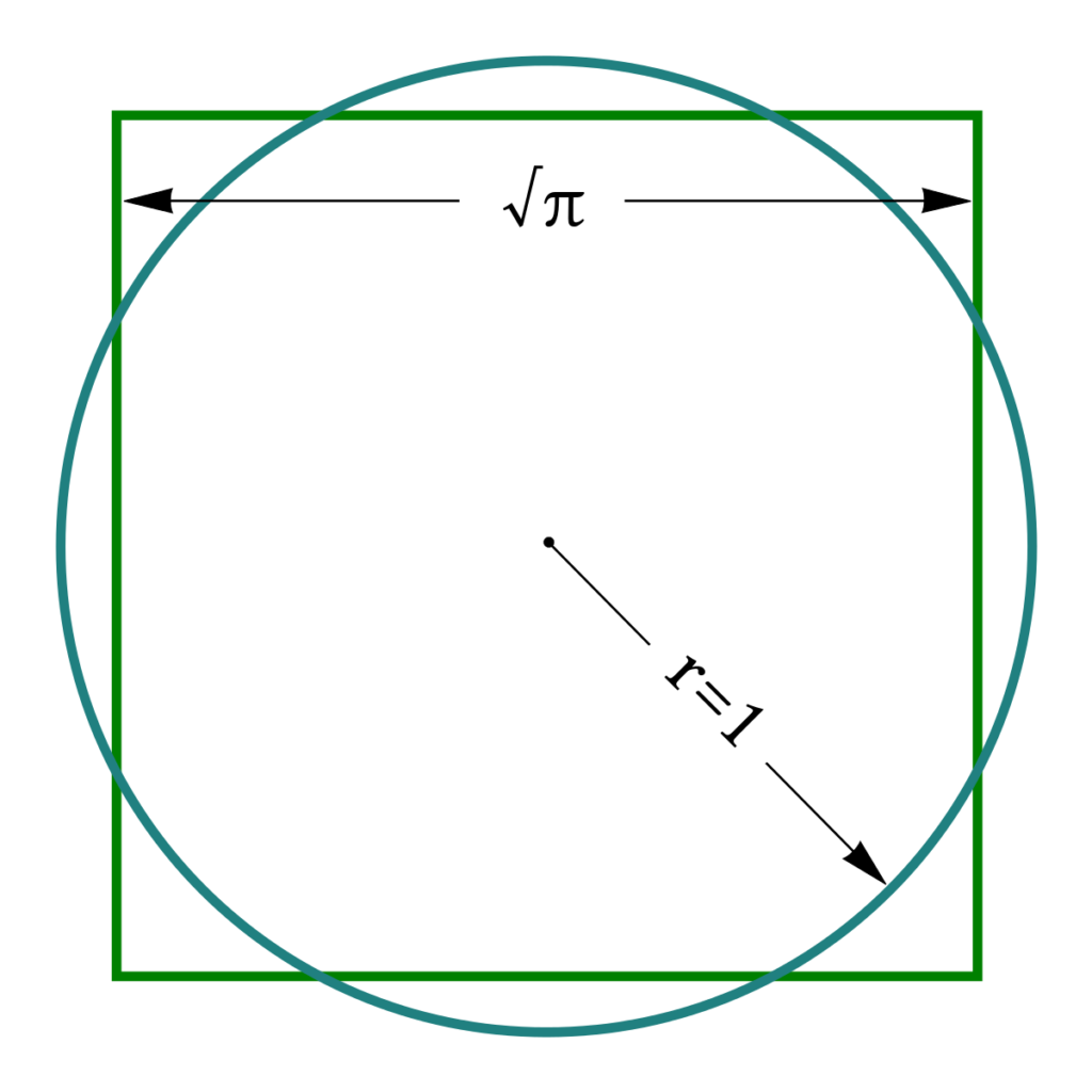
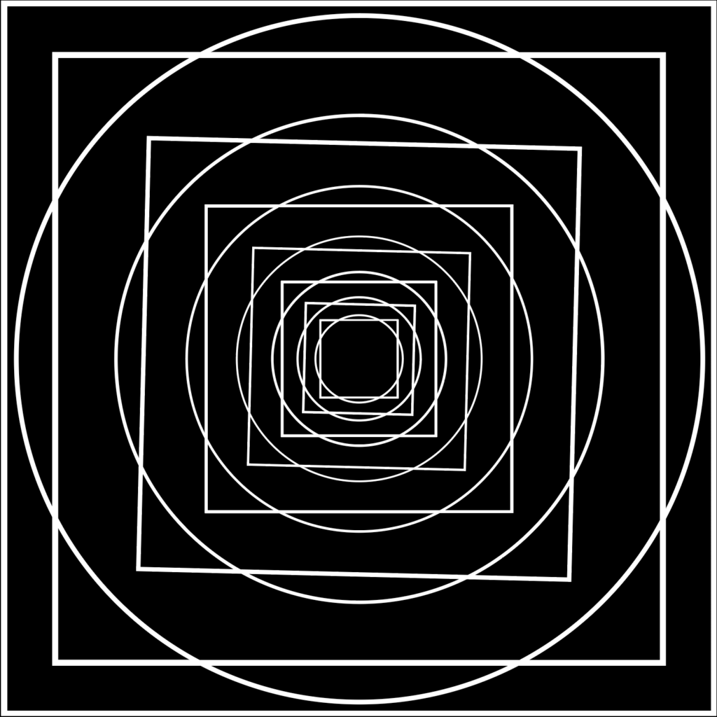
Aside from the various possibilities in using typography for the poster –fonts, cuts, font size, alignment and layout–for the main theme I dealt with the classical geometrical problem of the quadrature of the circle (Quadratur des Kreises). To me, this problem, describing the impossibility to create–with finitely many steps–a square and a circle that have the exact same area, just seemed like a perfect analogy to the imperfection that’s very likely to occur in analog production.

However, as only a square and a circle didn’t seem to be highly attractive, besides repeating the theme I also added a tilt to every second square in order to provoke the viewers’ visual perception and thus emphasize the optical effects of the poster.

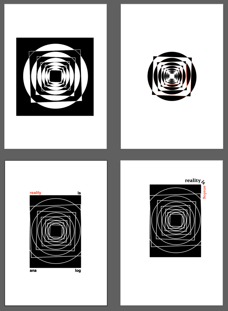
So for the first step I started to simulate a few variations and combinations of type and the graphic theme on the computer, offering infinite possibilities.

For the analog production however I had to decide on one variation and being quite inexperienced in the field of linocut I tried to keep it rather simple, which led me to this design for the main theme:

Check back soon for the next step: linocut.

Intercultural Communications 10

Persian Gardens or Persian Windows?

You can experience the paradise-like feeling of the garden when being under the scorching sun for some time. As soon as you cross the gate and pass the garden walls, you will notice the freshness of air, cool temperature under the shade, loving touch of the green and pleasant and gentle sound of water. No wonder Persian Garden represents Paradise (Sabetian, 2021).

The term pairidaēza which comes from Avesta, the holy book of Zoroastrian people, means garden. The same word has traveled through time and place to become the word Paradise in English, Paradies in German and paradis in French (Sabetian, 2021).

In fact this word is tied to the meaning of Garden of Eden and also the highest level of heaven in muslim belief, Firdause; both are gardens irrigated with 4 rivers or one river divided to four. Same description applies to definition of Persian Garden, a surrounded land divided to four sections (Char-bagh) by four aqueducts (Sabetian, 2021).

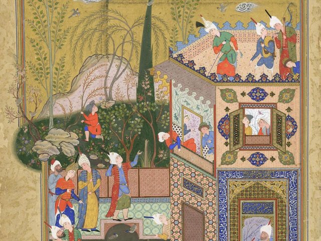
Gradens and Gardening is an old art in Iranian culture. Gardens have same map as carpets as well as Minakari. Carpets are the gardens at home, where you can see the garden from above. 

Bagh Eram, Shiraz, Iran

The purpose of Persian garden was to provide physical and spiritual relaxation. So, it is true to say that it was during the Achaemenid Empire that the idea of an earthly paradise came into reality. Later, the Sassanid created Persian gardens inspired by Zoroastrianism. Gardens are personal heavens that are separated from fruit and vegetable gardens, they are private places for leisure and meeting friends. 

Four elements including land, water, plants, and space are the important elements of an Iranian garden. Along with each other, these elements in a mental framework of Iranian architecture form the Iranian garden. 

The idea of having gardens reminds me of windows in Iranian culture. There is a strong border separating private and social life. The art of Persian gardening found its way to Europe during the history. 

After this introduction of gardening and private life art and culture in Iran, I would like to talk about modern artists that combined this style into their works.

One of these artists is Daniel Mirzapour, who combined “Negargari” (traditional painting) with collages for fashion design. There is an interesting question in his interview with the Tehran Times:

How did you experience your time at L’Ecole Bleu as an Iranian student studying in Paris? How has that influenced your Iranian identity?

I think, the first thing I noticed when I got at L’Ecole Bleue is that the French are not only a head of the time in terms of design, but that they are also very connected to their history and have a great deal of respect for their heritage. So automatically, this aspect of looking back at your culture and renewing it for its continuity resonated with me- naturally inspiring me to do the same with my Iranian background.

Daniel Mirzapour

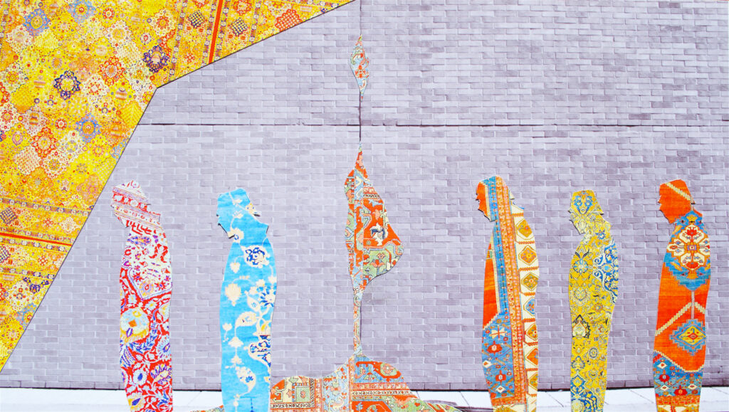
The second artist that I am inspired by his works is Sassan Behnam Bakhtiar. He created a bridge between Persian and western arts. He already used the patterns of Iranian gardens and life borders into his modern works and demonstrated the borders in contemporary people. Robert Musil mentioned it as a modern human being how lives in towers and love and family and feelings are all mixed in these big modern cities, we leave our own homes to reach our purposes that are planned for a short period of time, however the life is too short. Our happiness is not caused by what we want, but what we achieve. He also used a nice metaphor, what if we were in a train and we could take the train of the monarchy epoch in Austria and travel back home. It is not true that you can define a country with the character of its citizens, because every citizen has at least nine characters, for instance, worker, national, city, class, geography, sexuality, aware, unaware and maybe one privat characteristic. These are smoothly mixed together.

“To describe Sassan Behnam Bakhtiar’s artwork is to describe the country he belongs to and so passionately and justifiably champions: Iran. Multi-layered, complex, thoughtful, deeply historical yet utterly contemporary, colorful, positive, creative, unique. Viewing the world through the prism of Sassan’s carefully crafted compositions gives us a sense of his profound compassion for humanity.”

Janet Rady, Curator and Art Consultant, 2016
Sassan Behnam Bakhtiar, Walls series, Walls 01, Chromogenic print mounted on dibond, 2016

Sabetian, F., 2021. Persian Gardens – The Beauty of Traditional Iranian Architecture. [online] SURFIRAN. Available at: <https://surfiran.com/persian-gardens-iranian-architecture/> [Accessed 1 June 2021].

TIMES, T. and TIMES, T., 2021. SASSAN BEHNAM BAKHTIAR – THE ART OF CREATING BRIDGES AND BREAKING THE MOLD – THE TEHRAN TIMES. [online] THE TEHRAN TIMES. Available at: <https://thetehrantimes.com/sassan-behnam-bakhtiar-art-creating-bridges-breaking-mold/> [Accessed 17 June 2021].

Musil, R., 2021. Der Mann ohne Eigenschaften. Chicago: Otbebookpublishing.

Das Octalysis Framework von Yu-Kai Chou

Gamification ist nicht nur das Hinzufügen von Punkten, Belohnungssystemen oder Wettbewerb zu einem schon bestehenden Prozess, Vorgang oder Produkt. Es geht vielmehr darum, herauszufinden was Nutzer oder Kunden dazu motiviert ein bestimmtes Produkt zu verwenden oder Prozess zu nutzen.

Um einen erfolgreichen Prozess oder ein erfolgreiches Produkt zu entwickeln ist es wichtig zu wissen, welche Anreize es für Nutzer braucht um dieses auch zu verwenden.

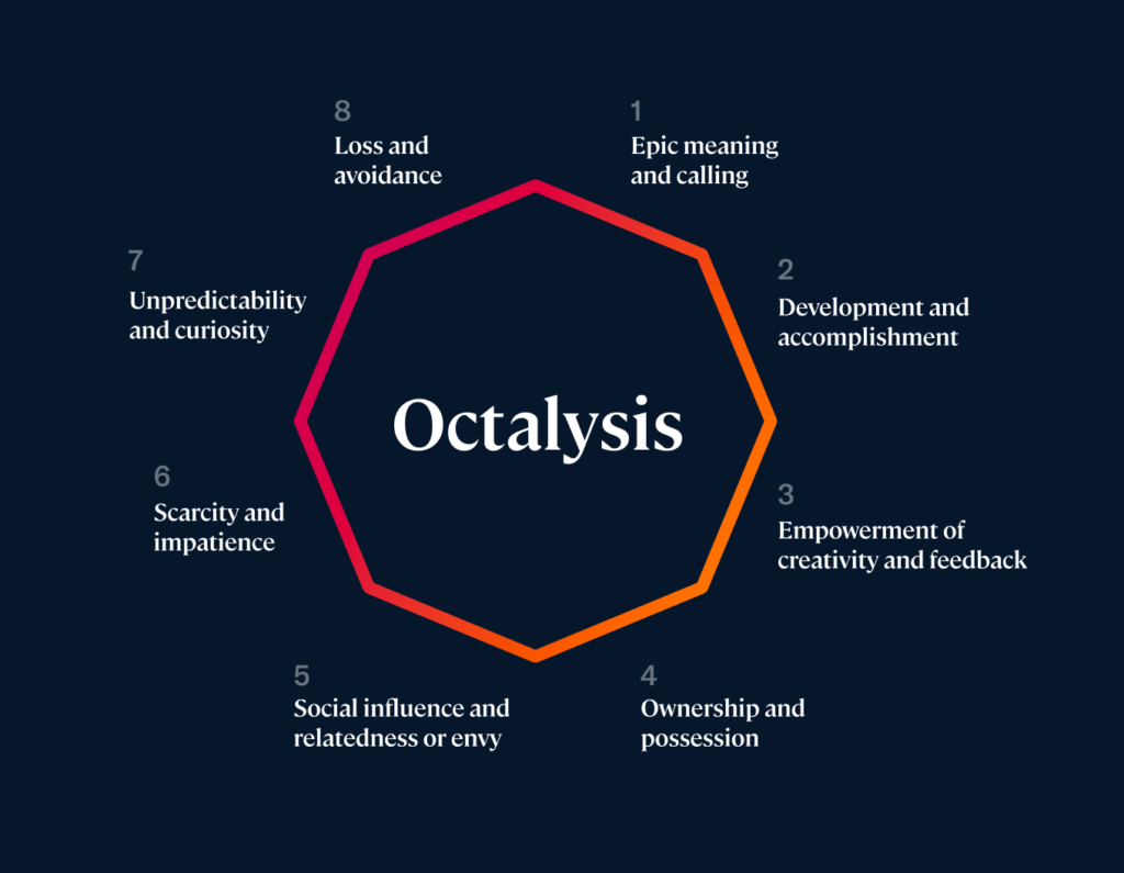
Das Octalysis Framework von Yu-Kai Chou ist ein Gamification Framework, das 8 Hauptfaktoren identifiziert, die für das Handeln von Nutzern verantwortlich sind. In diesem Blogpost soll näher auf diese 8 Faktoren, sowie die Schlüsse die man daraus für beliebige Gamification Projekte ziehen kann, eingegangen werden. Fehlen diese Faktoren hat der Nutzer keine Motivation mit dem Vorgang, Prozess oder Produkt zu interagieren.

  1. Bedeutung und Berufung

Bei diesem Anreiz haben Nutzer das Gefühl in etwas involviert zu sein, was größer als sie selbst ist. Deshalb schreiben Menschen auch stundenlang kostenlose Wikipedia Artikel um Wissen zu dokumentieren und weiterzugeben. Um Vorteile aus diesem Prinzip für ein Produkt oder einen Vorgang zu ziehen ist es wichtig sich folgendes zu fragen:

Kann ich eine Möglichkeit finden um den Usern durch die Interaktion das Gefühl zu geben anderen Menschen helfen zu können und ihnen damit das Gefühl zu geben, dass sie wichtig sind und dass das was sie tun Bedeutung hat?

Kann ich durch die Interaktionen von Nutzern zu etwas größerem beitragen?

2. Entwicklung, Leistung und Erfolg

Dieser Punkt spricht das innere Verlangen Fortschritte zu machen, Fähigkeiten zu entwickeln, dazuzulernen, Herausforderungen zu bewältigen und das Gefühl Erfolg zu verspüren, an. Um dieses Gefühl zu verstärken muss es vor der Belohnung auch ein Hindernis oder eine Herausforderung geben, da die Belohnung sonst stark an Wert verliert. Deshalb funktioniert das Follower Prinzip auf Social Media auch so gut. Umso mehr Follower umso mehr Erfolgsgefühl stellt sich bei den Usern ein. Das verstärkt sich noch weiter, wenn der Fortschritt, in diesem Fall die Follower, gemessen werden kann. Anzeigen von Fortschritt bewegt auch viele Social Media User ihr Profil zu vervollständigen, da sonst ein Gefühl von Unvollständigkeit entsteht. Um dieses Prinzip zu verwenden sollte man sich folgende Fragen stellen:

Wie kann ich den Usern ein Gefühl von Erfolg und Bewältigung vermitteln?

Kann ich den Prozess visualisieren um einen zusätzlichen Anreiz zu geben, diesen auch zu vervollständigen?

Kann ich eine Herausforderung oder ein Hindernis einbauen um den Wert der Belohnung und das Gefühl von Erfolg zu steigern?

3. Bestärken von Kreativität und Feedback

Dieser Anreiz für Interaktion ist einer der größten Motivationen wenn es zu kreativen Prozessen kommt. Es ermöglicht den Nutzern selbst kreativ zu sein, ihnen Feedback zu geben und ihnen zu ermöglichen, Verbesserungen durchzuführen. Ein Beispiel dafür wäre Minecraft, da die Spieler kreativ sein, etwas erschaffen und das dann auch beliebig ändern können. Dieser Punkt ist Anreiz für das Spielen von verschiedensten Spielen. Um ihn auch für andere Zwecke nutzen zu können, sollte man sich folgendes fragen:

Wie schaffe ich kreativen Freiraum für die User?

Können die User auf verschiedenen Wegen zum Ziel kommen?

Kann ich Usern Möglichkeiten zur Verwendung verschiedener Tools, Fähigkeiten oder Personalisierung geben?

4. Eigentum

Bei diesem Anreiz kommt die Motivation aus einem Gefühl von Besitz. Wenn Nutzer das Gefühl haben, etwas gehört ihnen, ist die Motivation es zu verbessern, zu personalisieren und auch zu beschützen, größer. In der realen Welt ist das ein großer Faktor, der uns Geld verdienen lässt. Ein gamifiziertes Beispiel für den dieser Anreiz verantwortlich ist, ist beispielsweise das Sammeln von Pokemonkarten. Um ihn sich auch für andere Dinge zu Nutzen zu machen, sind folgende Fragen hilfreich:

Kann ich Usern einen Raum bieten, in dem er verschiedene Aspekte personalisieren kann?
Ist es möglich Dinge zu integrieren, die gesammelt werden können und ein Gefühl von Eigentum vermitteln?

Wie sonst kann man ein Gefühl von Eigentum und Besitz schaffen um die Nutzer dazu zu motivieren sein „Eigentum“ zu verteidigen und zu beschützen.

5. Sozialer Einfluss und Bezug

Das ist vor Allem ein Anreiz für Menschen, die sich viele Gedanken darum machen, was andere über sie denken. Bezug zu Dingen oder Themen kann erschaffen werden, wenn geteilte Erfahrungen, Interessen oder auch ein Gefühl von Erinnerung und Nostalgie vorhanden sind. Amazon zum Beispiel macht sich diesen Anreiz zu Nutze indem immer weitere Produkte vorgeschlagen werden, die Bezug zum vorherigen haben und es einen eigenen Bereich für Rezensionen gibt. Auch Memes beruhen auf diesem Prinzip. Deshalb sollte man sich immer fragen:

Wie ermögliche ich es den Usern untereinander zu kommunizieren und sich auszutauschen?

Kann man den Nutzern etwas geben, in dem sie sich selbst erkennen können oder das sie nachempfinden können?

Kann man eine Art Wettbewerb oder auch eine Möglichkeit zu Teamwork schaffen?

6. Mangel und Ungeduld

Man möchte etwas noch mehr, wenn man es nicht haben kann. Deshalb funktionieren limitierte Angebote so gut, Menschen denken, dass sie jetzt sofort handeln müssen um einen Vorteil daraus zu ziehen, da die Chance sonst wieder verfliegt. Um sich das zu Nutze zu machen, kann man sich folgende Fragen stellen:

Wie kann man ein Gefühl von Mangel hervorrufen um Mensch zu suggerieren, dass sie sofort handeln müssen?

Wie schaffe ich ein Gefühl von Exklusivität?

Kann ich limitierte Möglichkeiten, Angebote, Zugänge, etc. implementieren?

7. Unberechenbarkeit und Neugier

Die Menschheit ist von Natur aus Neugierig, außerdem leben die meisten Menschen nicht im Hier und Jetzt sondern immer in der Vergangenheit oder Zukunft, es wird immer spekuliert, was als nächstes passiert. Solange etwas ungewiss ist, sind Menschen sehr motiviert daran zu arbeiten bis die Situation geklärt ist und Gewissheit herrscht. Deshalb bringen Cliffhanger am Ende einer Serie Zuseher auch dazu stundenlang fernzusehen. Um dieses Prinzip auch auf andere Aspekte anzuwenden, sollte man sich folgende Fragen stellen:

Wie kann man den Zufall in etwas miteinbeziehen, wie schaffe ich eine unvorhersehbare Situation, die Menschen fesseln kann?

Wie gebe ich Raum zum Entdecken neuer Aspekte?

Kann man die Nutzer mit unerwarteten Belohnungen überraschen und somit zum Weitermachen motivieren?

8. Vermeidung und Verlust

Die Angst etwas zu verlieren und den Drang etwas Schlechtes zu vermeiden gehören ebenfalls zu den 8 Hauptmotivationen zum Handeln. In verschiedenen psychologischen Studien konnte nachgewiesen werden, dass das Vermeiden von Verlust mehr motiviert als das Gewinnen von neuen Dingen. Das beste Beispiel dafür ist der Black Friday, Menschen wird das Gefühl vermittelt, dass sie die Chance verlieren Rabatte zu bekommen. Limitierte Angebote schaffen die Dringlichkeit zu handeln. Um auch dieses Prinzip zu nutzen, können folgende Fragen hilfreich sein:

Wie vermittelt man ein Gefühl von Verlust, sobald die User aufhören?

Wie schafft man limitierte Möglichkeiten, die verschwinden, wenn nicht sofort gehandelt wird?

Gibt es eine Möglichkeit, dass das Weitermachen belohnt wird?

Um ein erfolgreiches Produkt, etc. zu schaffen, sollte man also immer zuerst analysieren, was die Menschen dazu bringt dieses auch zu verwenden oder zu bedienen. Erst wenn man weiß warum sie tun, was sie tun kann das Produkt oder der Prozess ein Erfolg werden. Diese Prinzipien können natürlich nicht nur im Verkauf verwendet werden, sondern auch als Motivation für weitaus bedeutungsvollere Handlungen sein. Hier liegt dann die Aufgabe des Designers ode der Designerin, die richtigen Anreize für die richtigen Handlungen zu identifizieren um so etwas erreichen zu können.

Wwise Events

Eine der wichtigsten Funktionen der Middleware Wwise sind die sogenannten Events. Das sind unterschiedliche Anweisungen, die zur Steuerung von Audiodateien dienen. Zu den häufigsten Anwendungen gehören vor allem das Abspielen, Pausieren und Filtern von Audiodateien.

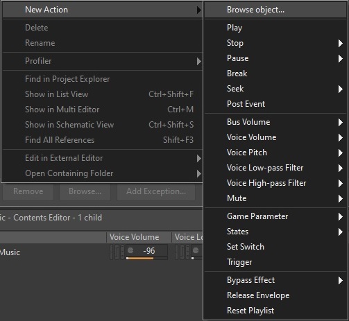
Auswahl an Aktionen, die in einem Event ausgeführt werden können

Zudem dienen Events auch als Bindeglied der jeweiligen Game Engine und der Audio Engine Wwise. Durch sogenannte Game Calls, die von der Game Engine an die Audio Engine geschickt werden und Events aufrufen, erkennt Wwise, dass Audiodaten verarbeitet werden sollen. Diese Game Calls werden im Programmcode an der passenden Stelle eingefügt. Dabei muss beachtet werden, dass die Schreibweise des Eventnamens mit dem String (Zeichenkette in einer Programmiersprache) im Programmcode übereinstimmt.

An dieser Stelle wird das Event Play_SFX_Ellen_Run aufgerufen

In Wwise können Events sowohl einzelne Soundeffekte aufrufen als auch ganze Wwise-Container. Dabei wird im Target-Feld des Event Editors der jeweilige Soundeffekt oder Container aus der Actor-Mixer Hierarchy ausgesucht. Dieser wird dann in Kombination mit der Anweisung (Type) aufgerufen.

Shotgun_Blast Soundeffekt wird im Event Fire_Shotgun_Player abgespielt

Quellen:

[1] https://www.audiokinetic.com/library/edge/?source=Help&id=managing_events_overview

[2] https://www.audiokinetic.com/courses/wwise101/?source=wwise101&id=creating_an_event