Survey Part 01
The following post will examine the findings of my survey on the topic of joyful design. The goal of this survey was to outline characteristics and/or differences in perception of joyful design/a joyful object.
Method: Interview/Survey
Goal: Find characteristics and/or differences in perception of joyful design.
Number of Participants: 10
Age: 23—65
Question 01:
Which color do you associate with joy? (multiple answers possible)
7 x yellow
2 x orange
2 x turquoise blue
1 x green, 1 x lightblue, 1 x white, 1 x melon


Question 02:
Which shapes do you associate with joy? (multiple answers possible)
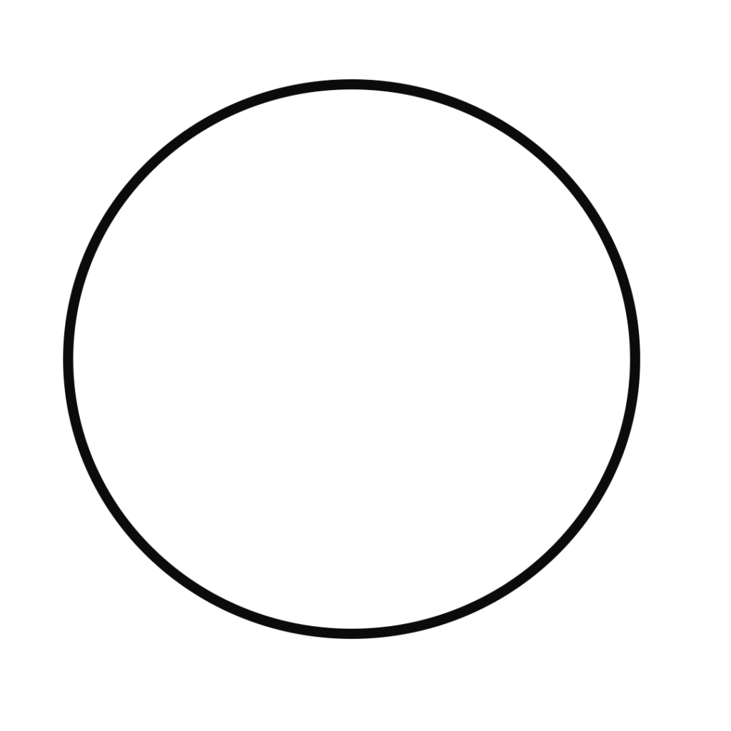
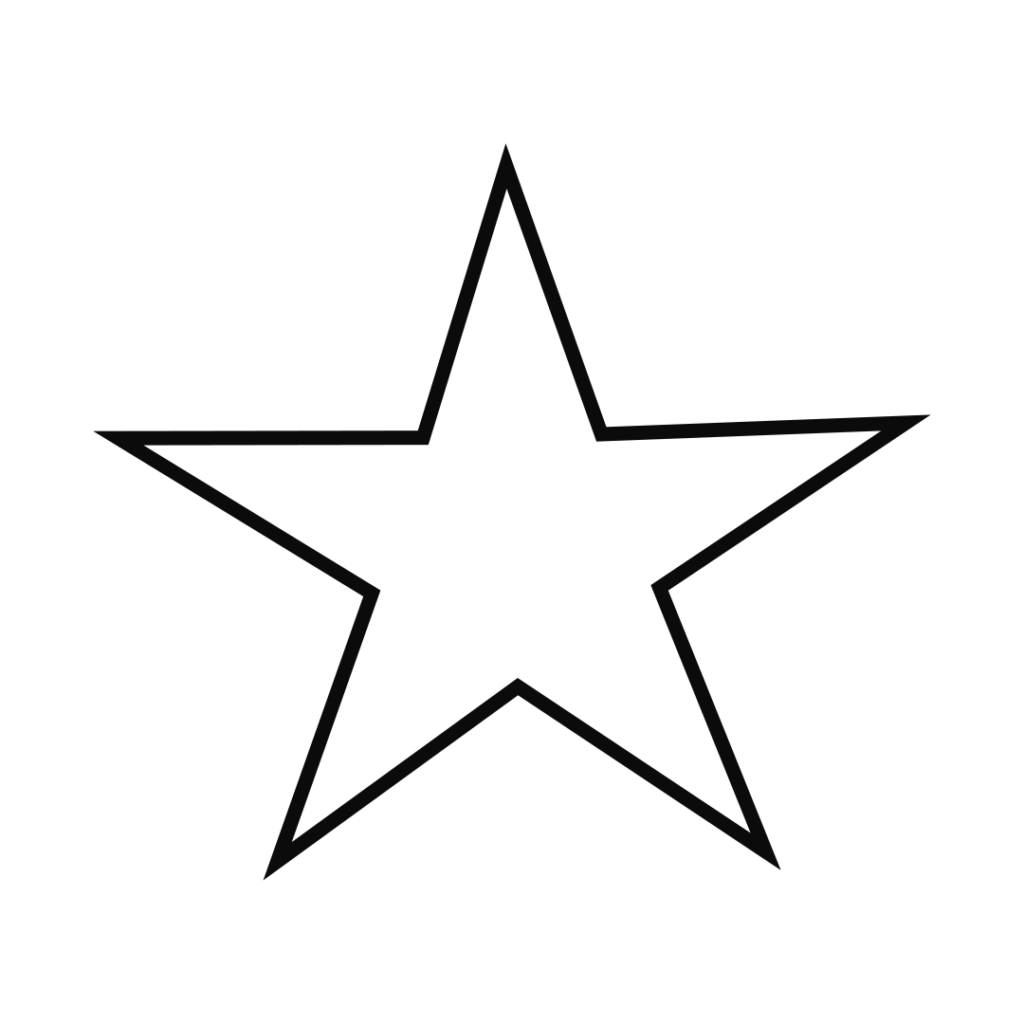
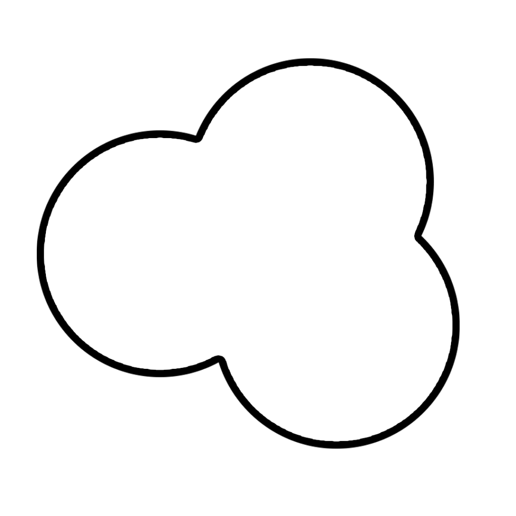
9 x round/circle
4 x star
3 x trefoil
2 x triangle, 2 x spiral
1 x half circle, 1 x heart, 1 x rhombus
Question 03:
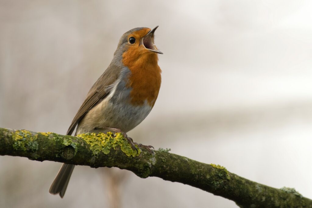
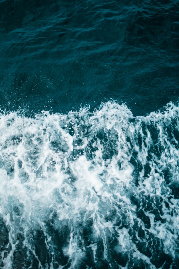
Which sounds do you associate with joy? (multiple answers possible)
4 x birds
3 x sea sounds
3 x wind/trees
2 x high, clear sounds, 2 x laughter
1 x Horn (note: participant is musician/plays horn), 1 x Bass, 1 x fast rhythms, 1 x cartoon sounds, 1 x cooking/roasting sounds, 1 x bright music , 1 x 60’s Mod Music, 1 x K-Pop, 1 x opening carbonated drinks, 1 x Popcorn
Question 04:
Which scents do you associate with joy? (multiple answers possible)
4 x flowers
2 x roses
2 x sea breeze
2 x fresh cut grass
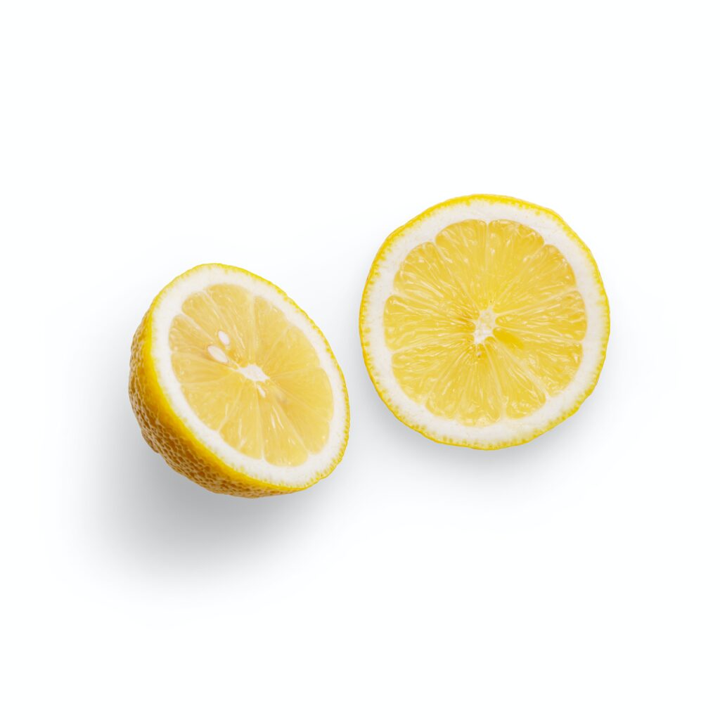
1 x lavender, 1 x new leather, 1 x computer water cooling, 1 x cinamon, 1 x fruit market, 1 x coconut, 1 x lemon, 1 x new furniture, 1 x books, 1 x sunscreen, 1 x fresh showered , 1 x fresh baked, 1 x candles, 1 x magnolia , 1 x forest, 1 x wood
Question 05:
Which taste do associate with joy? (multiple answers possible)
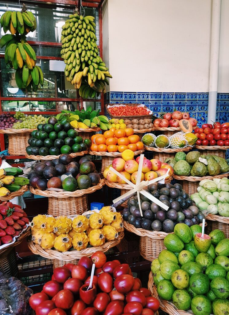
5 x fruity (watermelon, cherries, mango, raspberries)
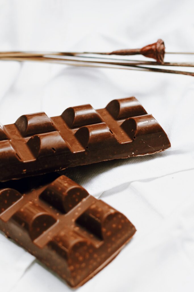
4 x chocolate/nougat
2 x sour
1 x vanille, 1 x umami, 1 x coconut water, 1 x churches, 1 x sushi, 1 x summer wine, 1 x fresh orange juice
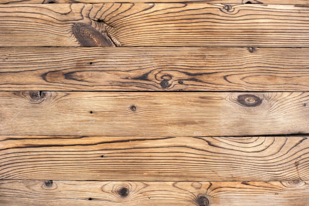
Question 06:
Which material feels better?
Options: glass, plastic, steel, wood, other
6 x wood
4 x glass
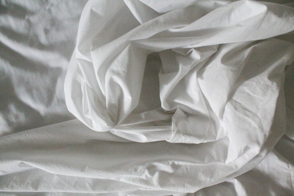
Question 07:
Which material feels better?
Options: silk, cotton, jute, faux fur, other
5 x cotton
4 x silk
1 x faux fur
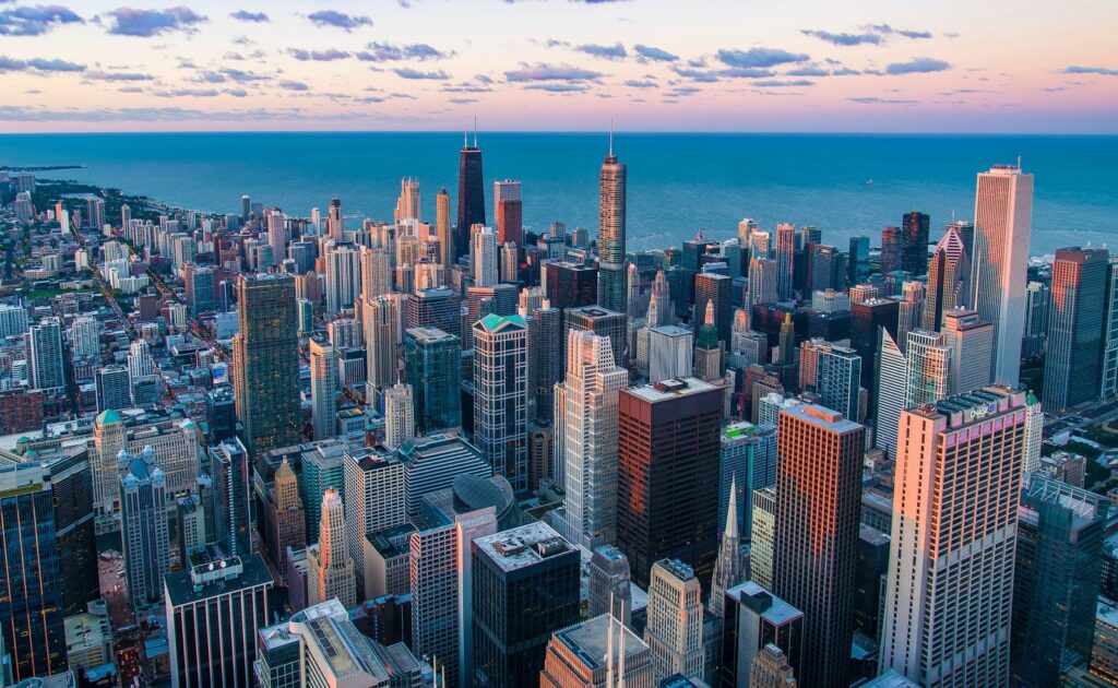
Question 06:
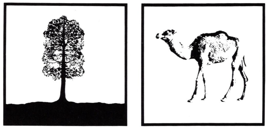
Which images evokes the most positive feeling?
2 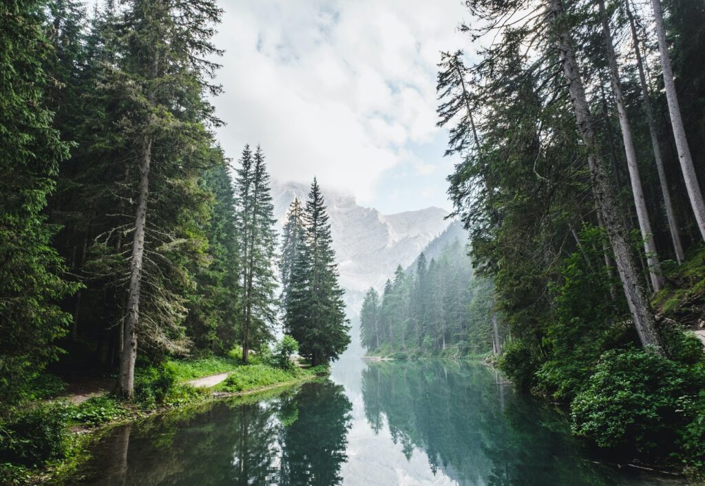
3
3 x

2 x

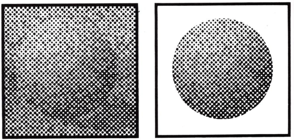
Question 06:
Which images evokes the most positive feeling?
9x
1 x
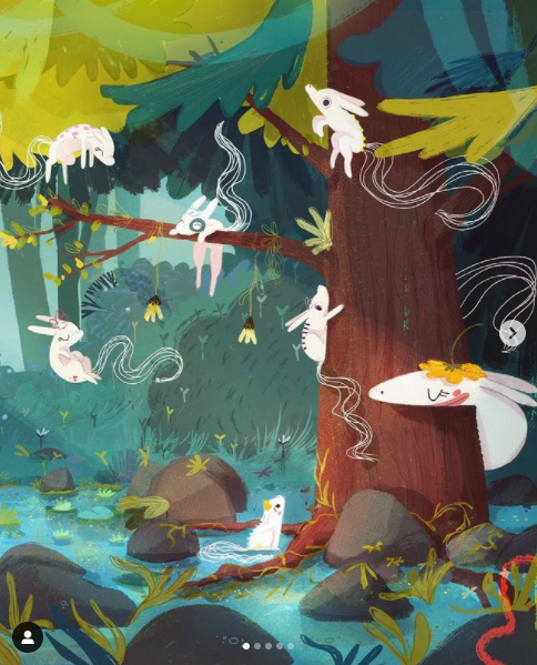
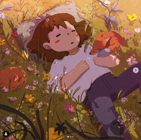
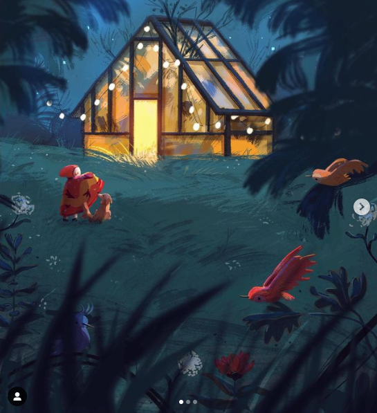
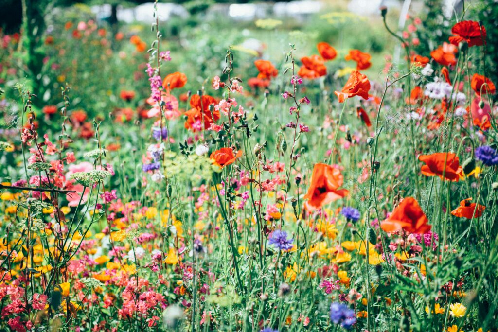
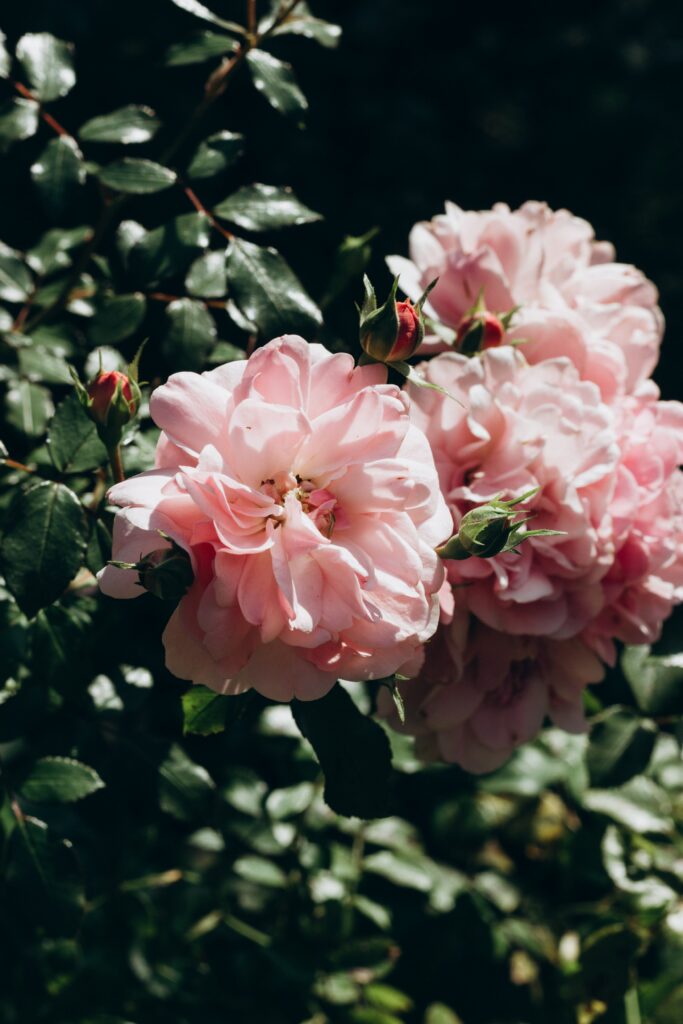
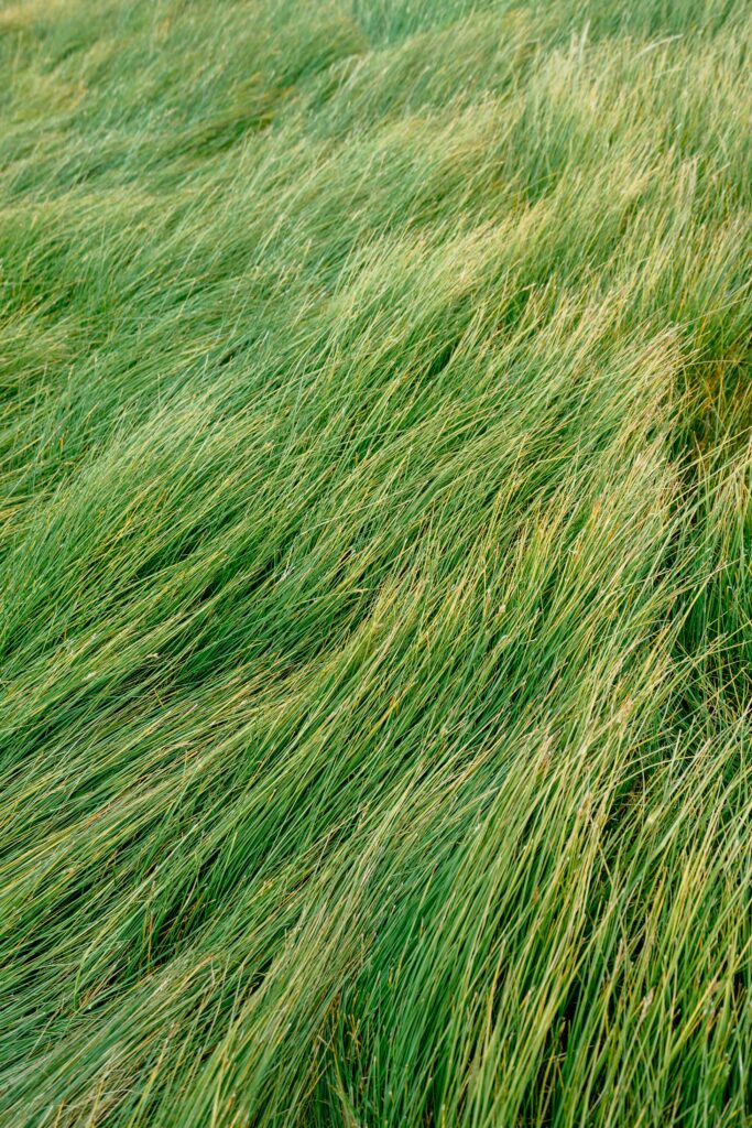
According to the survey a clear tendency to naturalistic elements is recognizable:
Color
Yellow, Orange, Turquoise:
According to my previous research, yellow could be described as the color of joy—that also reflects in my survey.
Orange and yellow make us feel alive and alert. Blue calms us down—this reactions may be rooted in our species quest for survive (this knowledge in turn connects to our joyful experience of rural landscapes—landscapes that where livable and therefore crucial environments for our survival). Also, we instinctively experience yellow as a happy or joyful color, because it is the color of sunshine and waking life. Whereas blue is connected with peacefulness and rest. [1]
Shapes
Round/circle, Star, Trefoil:
In general, organic shapes (round, trefoil) have been described as joyful—which can be linked to elements of nature. On the other hand the star also has been mentioned to be received as a joyful shape—that result can be described through cultural connotation. In our history they have become sacred and spiritual symbols and are symbolic for protection and guidance. Stars are connotated with many different meaning—the most recognised image is the star as a symbol of excellence.
Sounds
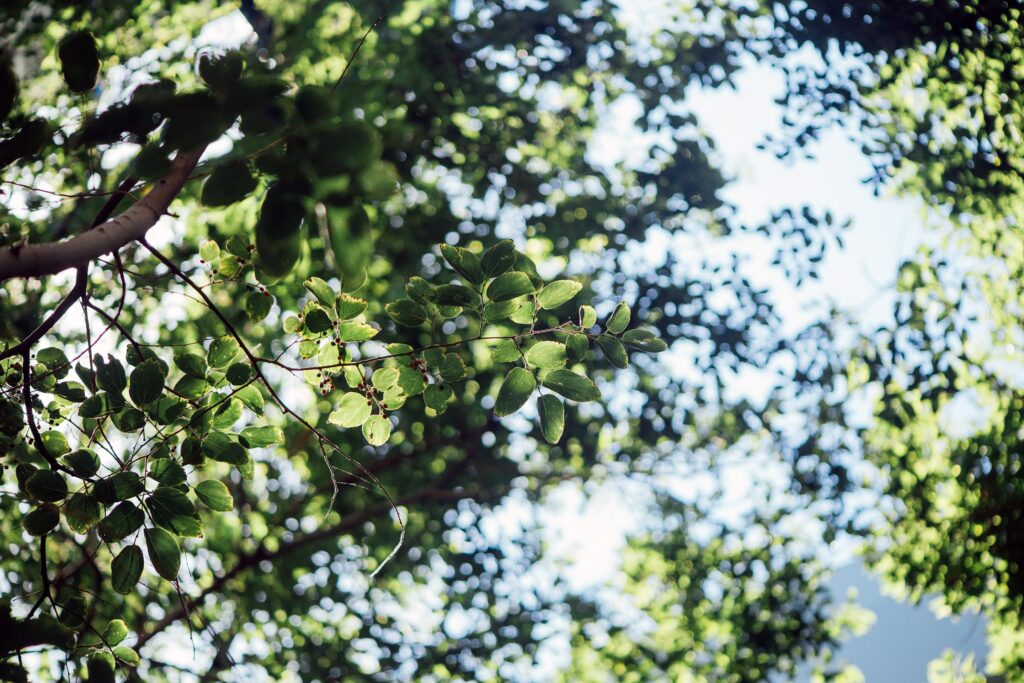
Birds, Sea sounds, Wind/trees:
Sounds from nature were described as most joyful. Also, sounds that are linked to positive experiences are remembered as joyful. (Popcorn, cooking, favorite music, etc.). Participants also mentioned to perceive bright, clear and high sounds as joyful.
Scents
Flowers, Roses, Sea breeze, Fresh cut grass:
Natural scents—especially flowers—where from a vast majority described as joyful.
Taste
Fruity (watermelon, cherries, mango, raspberries), Chocolate/nougat, Sour:
Primarily sweet has been described as a joyful taste, followed up by sour. Again, natural tastes—fruits—were mentioned by a vast majority.
Materials
Wood, Cotton:
Natural materials such as wood and cotton were preferred by the vast majority of participants.
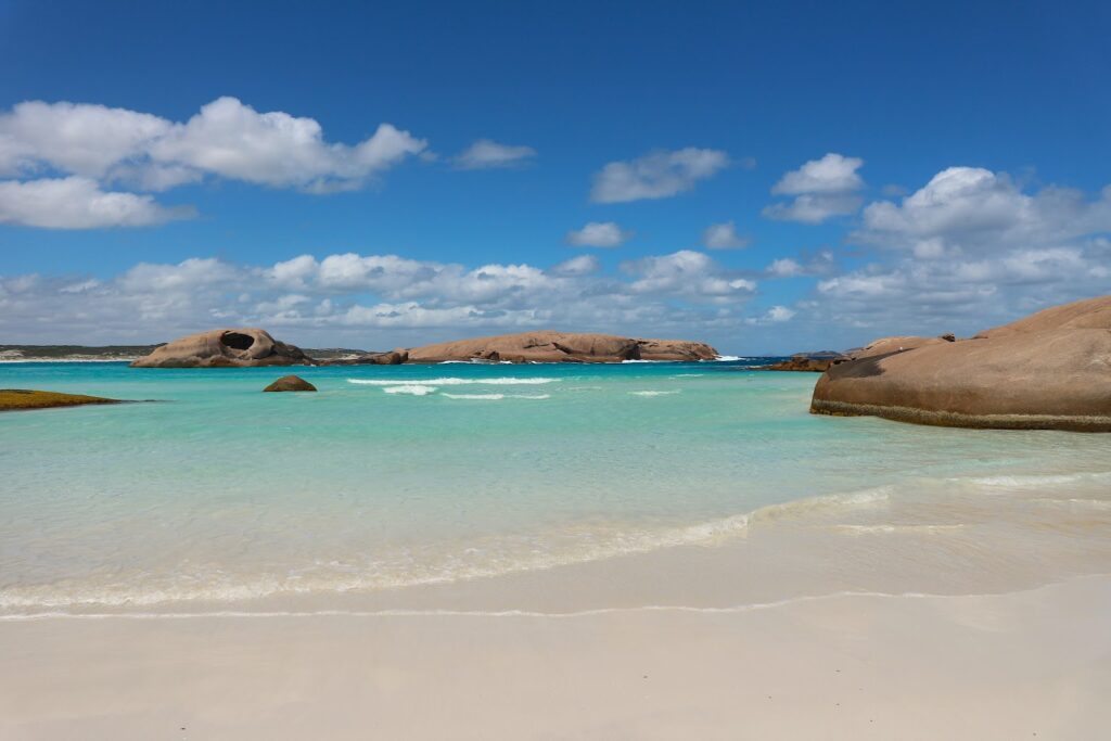
Environment
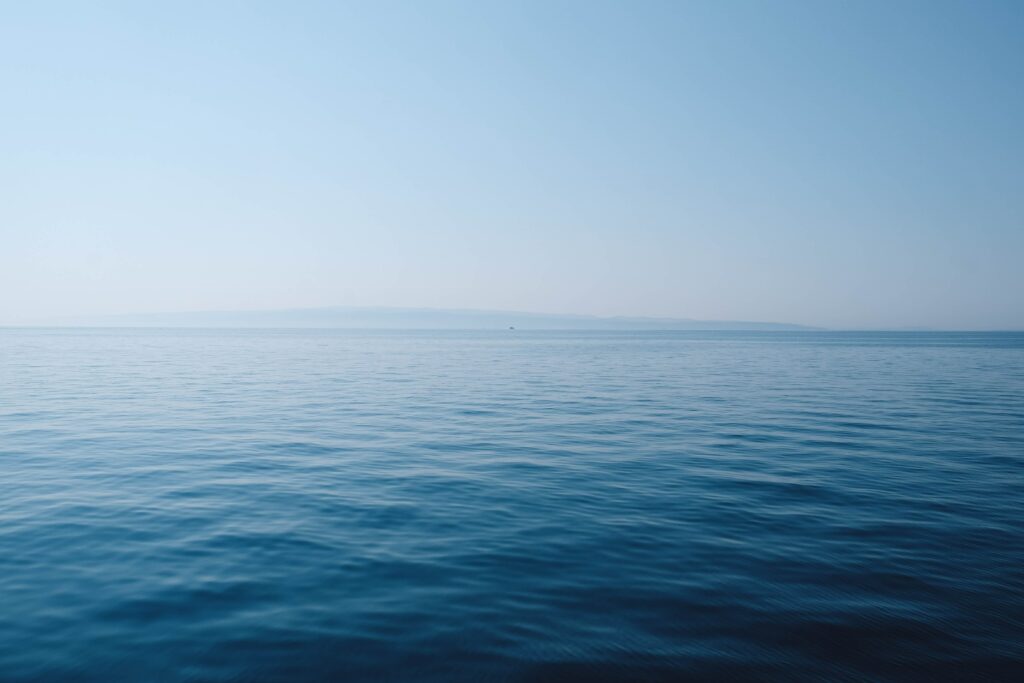
Woods, Beach:
The environment of woods with lake was perceived as most joyful, followed up by the image of a beach. That cresult an be described through the theory of our preference for Pastoral landscapes (= safe, propitious and liveable environment). Pastoral scenes are a part of our evolution, which is also the reason why we are so drawn to those scenes. Typical landscape scenes include, according to Denis Dutton, hills, water, trees, birds, animals and a path moving through the scene – an ideal landscape for humans, containing protection, water and food. Dutton notes that our species has evolved to feel a need for certain types of beauty in our lives and that this pull towards things such as theses landscapes has helped us to survive as a species. He also notes that all cultures value artwork that includes these scenes – regardless where people come from. [2]
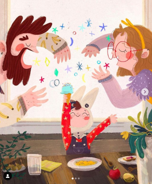
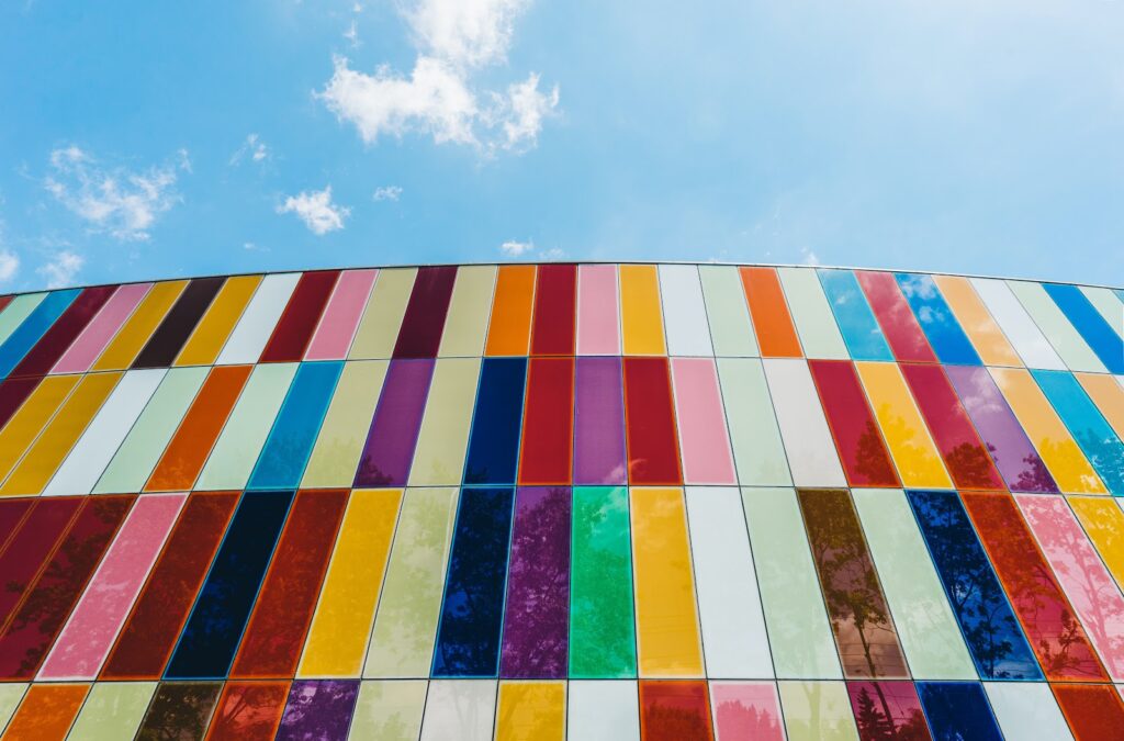
Colors/Multiplicity vs Minimalism
Colors, Multiplicity:
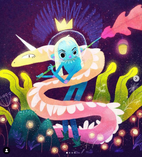
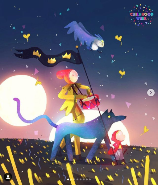
The picture of a building working with colorful elements and multiplicity was preferred by nine participants. Only one participant voted for the neutral, minimalistic option. This result matches with my previous research where visual cues that evoke a feeling of happiness work with bright colors, multi-colored palettes and multiplicity.
Survey:
Sources:
[1] Lupton, Ellen: Design is Storytelling. New York: Cooper Hewitt 2017, p. 108
[2] TED. Denis Dutton: A Darwinian theory of beauty. URL: https://www.ted.com/talks/denis_dutton_a_darwinian_theory_of_beauty (last retrieved November 14, 2020)