Symbolic in photography

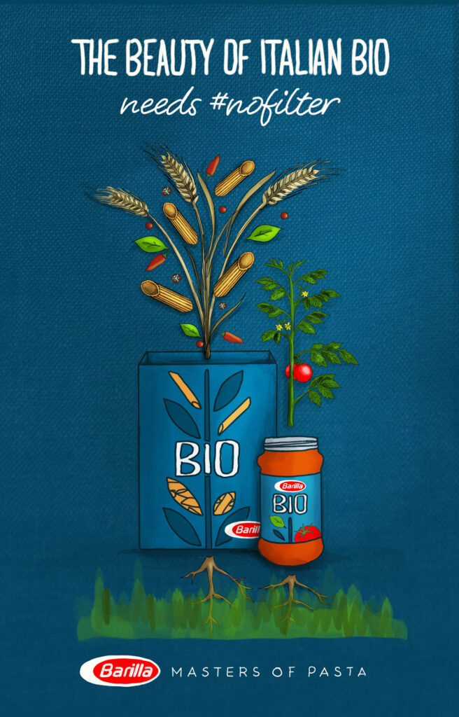
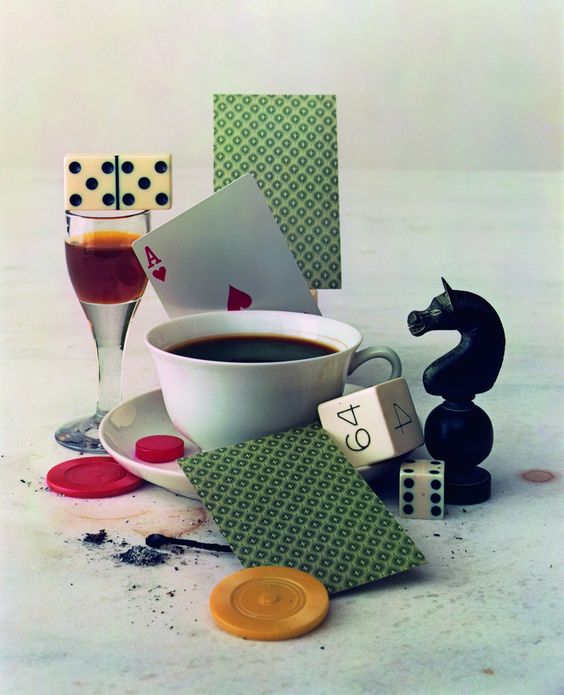
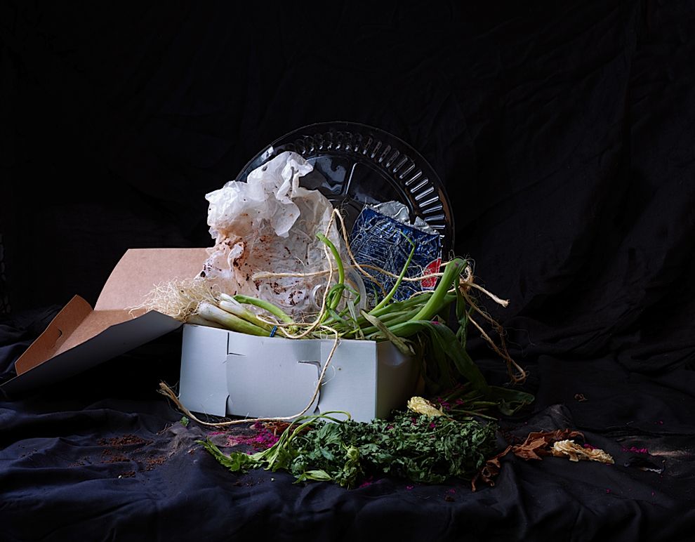
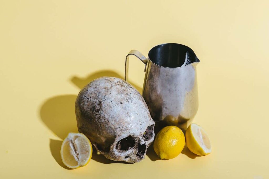
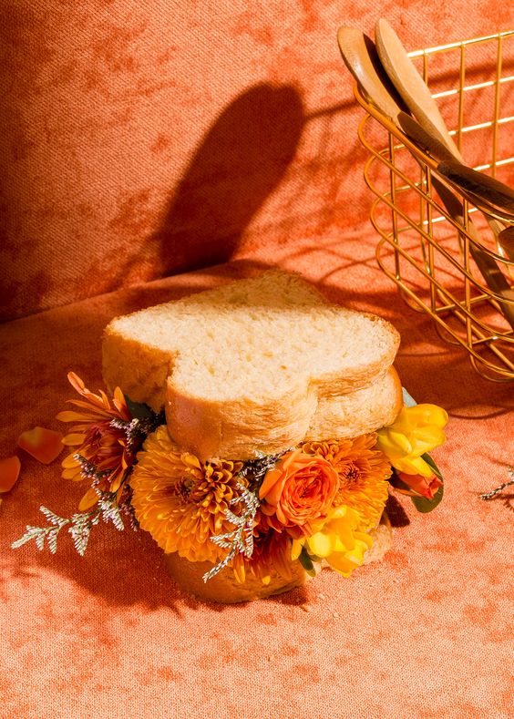
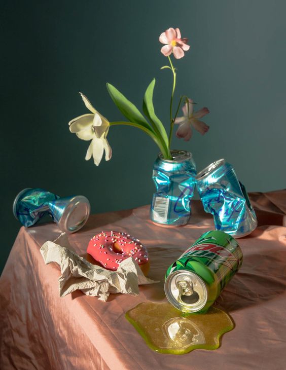
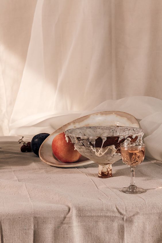
Meaning of the objects

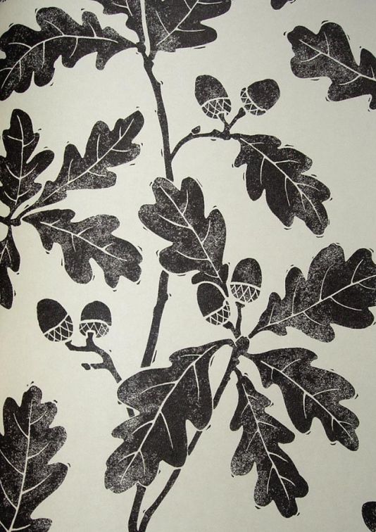
Almost all symbols or allegories are understood ambiguously. The meaning or allusion interpreted by the viewer only emerges within the context of the picture. The use of symbols in still lifes manifested itself in the 17th century. During this time still life painting experienced a high and during this time the use of the right motifs and what they mean played a major role. Even today, one would love to experience the vision of every design / photography and what it means. Thus, symbolically charged objects are still used in still life photography. In addition, it seems to be modern even in still life photography to increasingly use the classically defined subjects.
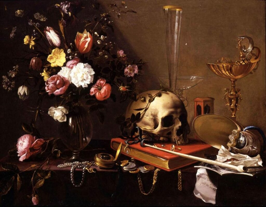
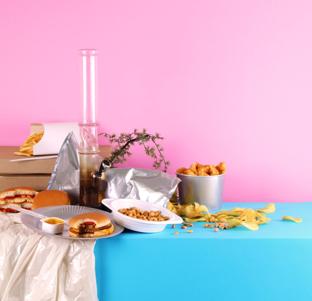
Examples:

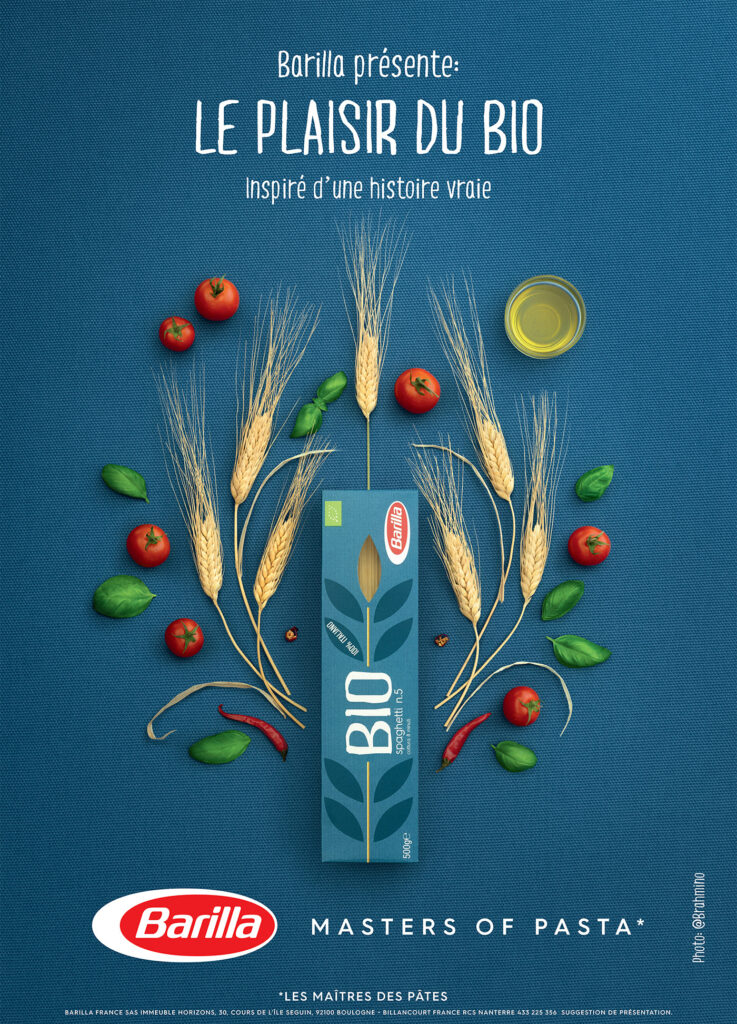
Broken vessels stand for the vanity of everything earthly and the commemoration of death.

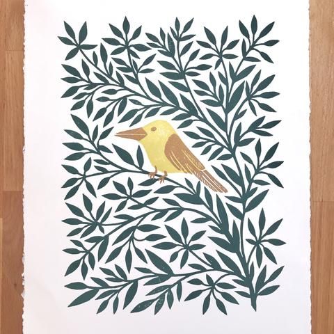
Flowers: transience of splendor and beauty, revelation.

Halved or bitten: refer to a fall, but also to the senses or taste.

Books: vain science or useless pastime.

Money: love that can be bought, often alludes to the female gender.
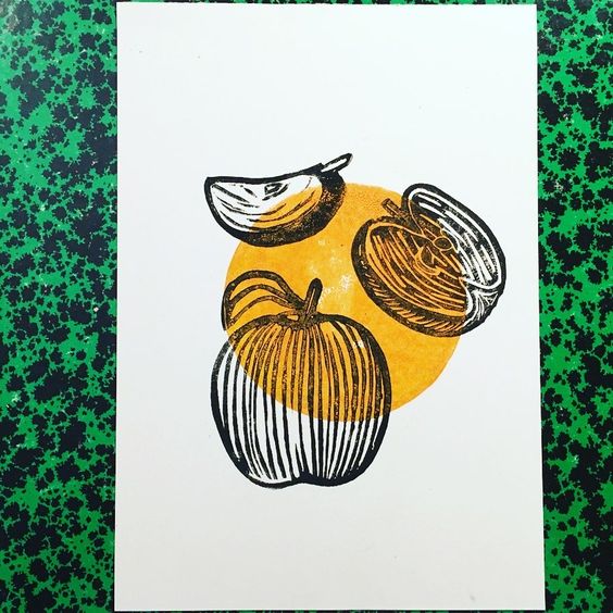
Sliced ​​lemon: questionable, symbol of the externally beautiful and internally deceptive.

Things upside down or upside down: empty life, death.

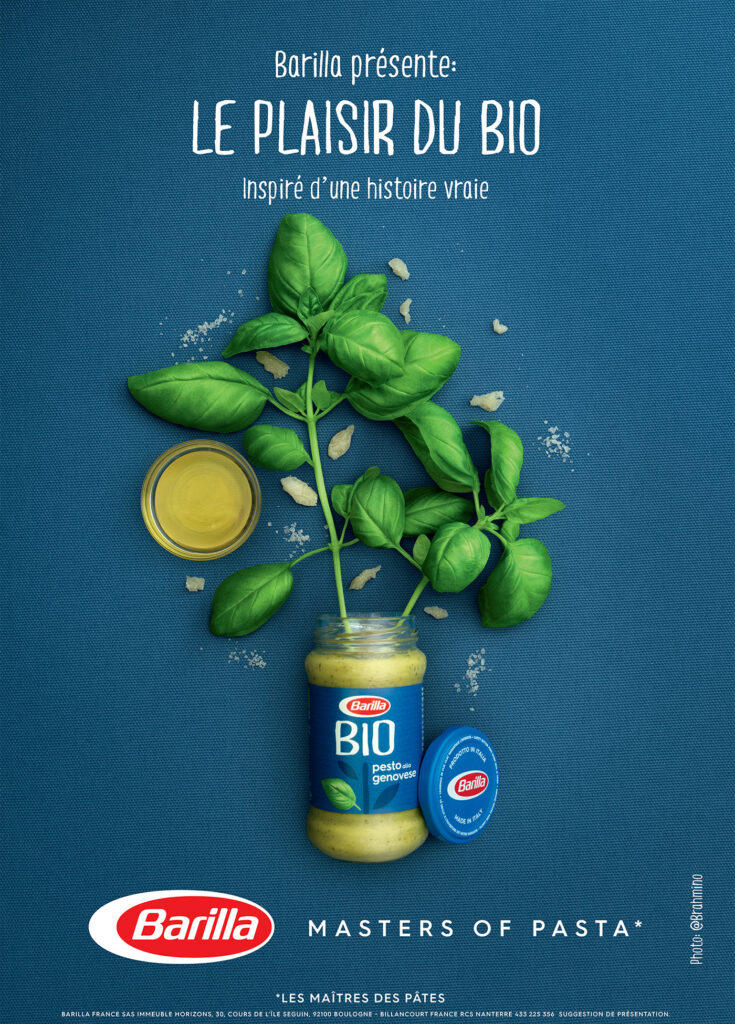
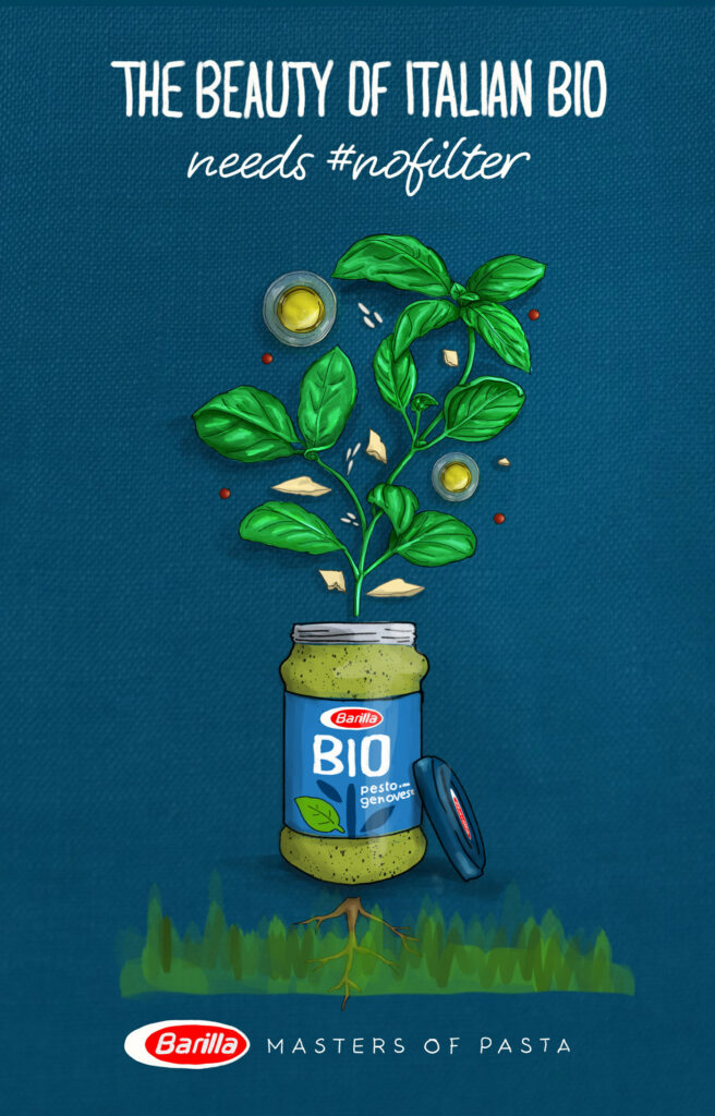
Effect of colors in photography

According to the photography legend Alexander Spoerl, a colorful photograph has the worst color effect. In photography, three possible types of design have become established with regard to color.

1: Conventional coloring, which is based on the objective appearance of the object.

2: Creative coloring, in which the attempt is made to achieve the “effective” color, does not have to be the same as the real color of the object.

3: Symbolic coloring, does not adhere to objective or effective color, but aims at the message of the end result.

Color is essential for the subject and therefore also for photography. In contemporary photography it can be seen that the common colors of our everyday life are by far not as exciting as unnatural colors. A strong and saturated picture beats pale tones by far. Delicate and soft pastel tones can be more pleasant to look at for a long time, but they are not as attractive at first glance. Shades that differ only by delicate nuances are very difficult to use. In addition, photographs in black and white or grayscale are less noticeable, unless they have a strong and concise contrast. However, the use of strong colors can also be a hindrance if one does not pay attention to the relationship between color and object. Furthermore, the color must support the meaning of the motif and be useful.

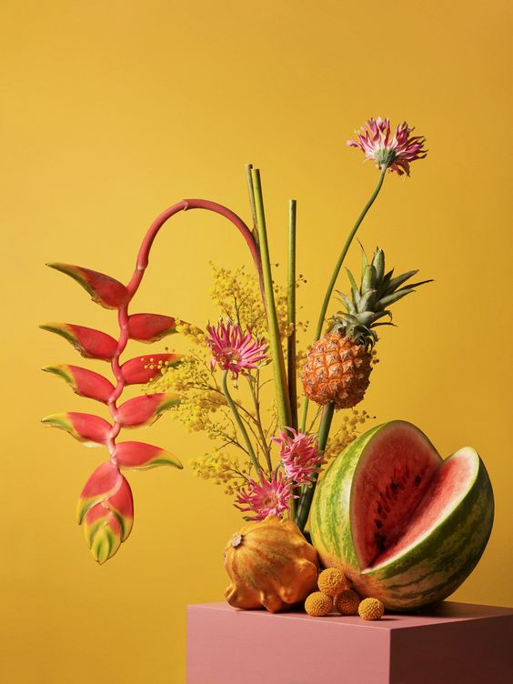
In the case of creative coloring, it is important to ensure that it is chosen in a way that is understandable. In addition, different materials have a different effect with different colors. It is advisable to choose an unusual color mood for not every material. This can irritate the viewer and lead to displeasure. Objects that can be used for creative coloring in still life photography are usually described as cheap, impersonal and short-lived.

Beispiele für Farbsymboli

Examples for the symbolic of colors

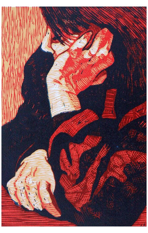
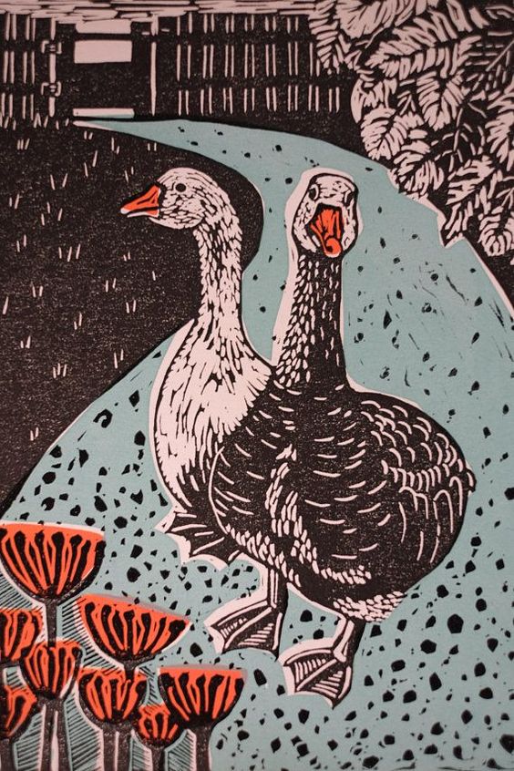
Red stands for energy, passion and danger / orange stands for creativity, youth and enthusiasm / yellow stands for happiness, hope and spontaneity / green stands for prosperity, stability and harmony / blue stands for trust, calm and intelligence / purple stands for luxury Mystery and spirituality

Beispiele für Farbsymbolik

Quellen:

http://dornhoefer-photography.de/bedeutungen-der-bildsymbole-im-barock/

https://www.bbc.com/culture/article/20180318-secret-symbols-in-still-life-painting

https://www.andreashurni.ch/bildgestaltung/farbe/gestaltung.htmhttps://99designs.de/blog/design-tipps/bedeutung-der-farben/

DATA, code, design | Klassische Daten-Visualisierungs-Tools

Um Daten zu visualisieren gibt es verschiedene professionelle Tools. Diese werden, je nach Anforderungen kategorisiert. Diese sehr komplexen Tools bieten eine Vielzahl an Report und Visualisierungsmöglichkeiten.

  • Code Tools
  • Visual Reporting or BI
  • Maps
  • Infographic Tool
  • Net-work graphs
  • Large-Screen Visualization

Code Tools

D3.js

Open Source JavScript library mit verschiedenen Visualisierungsmöglichkeiten (HTML, CSS, SVG)

From finereport.com | D3.js

Plotly

From finereport.com | Plotly

gglot2

From finereport.com | ggplot2

Visual Reporting or BI 

Excel

From finereport.com | Excel

FineReport

From finereport.com | FineReport

Tableau

From finereport.com | Tableau

Maps

Leaflet

From finereport.com | Leaflet

Power Map

From support.microsoft.com | PowerMap
From finereport.com | PowerMap

Infographic Tools

Piktochart

From finereport.com | Piktochart

Visme

From finereport.com | visme

Net-work graphs 

Keylines

From finereport.com | Keylines

Gephi

From finereport.com | Gephi

Large-Screen Visualization

Ali DataV

From finereport.com | Ali DataV

Last but not least FineReport itself

From finereport.com | FineReport

Source

https://towardsdatascience.com/top-16-types-of-chart-in-data-visualization-196a76b54b62

DATA, code, design | Klassische Diagrammtypen

Wie schon im vorherigen Blogeintrag beschrieben gibt eine Vielzahl an Diagrammtypen. Manche sind sehr einfach gestaltet, andere wiederum sehr komplex. Jedoch spielt die Verständlichkeit dabei eine viel größere Rolle als Komplexität.

Hier 16 davon:

Column Chart

From towardsdatascience.com | FineReport

Bar Chart

From towardsdatascience.com | FineReport

Line Chart

From towardsdatascience.com | FineReport

Area Chart

From towardsdatascience.com | FineReport

Pie Chart

towardsdatascience.com | FineReport

Scatter Plot

From towardsdatascience.com | FineReport

Bubble Chart

From towardsdatascience.com | FineReport

Gauge

From towardsdatascience.com | FineReport

Radar Chart

From towardsdatascience.com | FineReport

Frame Diagram

From towardsdatascience.com| FineReport

Rectangular Tree Diagram

From towardsdatascience.com| FineReport

Funnel Chart

From towardsdatascience.com| FineReport

Word Cloud Chard

From towardsdatascience.com| FineReport

Gantt Chart

From towardsdatascience.com| FineReport

Regional Map

From towardsdatascience.com| FineReport

Point Map

From towardsdatascience.com| FineReport

Flow Map

From towardsdatascience.com| FineReport

Heatmap

From towardsdatascience.com| FineReport

Soure

https://towardsdatascience.com/top-16-types-of-chart-in-data-visualization-196a76b54b62

„Design is adding content to content.“

Im Design hat man als Ausgangspunkt immer einen Inhalt oder Information, die man kommunizieren möchte. Um diesen Inhalt herum wird ein System aus visueller Sprache und grafischen Mitteln und Prozessen geschaffen, um diesen Inhalt optimal nach außen zu tragen. Jedes Element fügt dabei etwas zu diesem Inhalt hinzu – you add content to content. 

Für Design ist die Kommunikation von solchen aussagekräftigen Informationen von entscheidender Bedeutung, wobei die Art der visuellen Sprache eine entscheidende Rolle spielt und dem gesamten Design eine eigene Inhaltsebene hinzufügt. Im Vordergrund steht hierbei immer die Nachricht, die kommuniziert werden soll, weswegen die visuelle Sprache auch in Hinblick auf diese ausgewählt werden sollte. 

Ideen und Information

Der Zweck des Grafikdesigns besteht darin, einen nützlichen, funktionalen Zweck zu erfüllen. Es ist normalerweise kommerzieller Natur, aber nicht immer. 

Hierbei wird auf Grundlage eines Marketingplans ein Sujet erstellt, mit dem das Zielpublikum angesprochen und dort eine gewünschte Reaktion ausgelöst werden soll. Illustration und Fotografie als Werkzeuge sind auf jeden Fall starke Träger für Emotionen. Und positive Emotionen sind die ersten Träger für Kaufimpulse der Kunden.

Hier arbeitet oft ein/e TexterIn mit einer/einem DesignerIn zusammen, um die visuellen Bilder mit gut ausgewählten Worten zu unterstützen. Dabei gilt, dass bei allen Arten der Kommunikation – sei es die sprachliche durch Worte oder die bildliche Nachricht durch Fotografie oder Illustration – eine Nachricht mit Bedeutung gesendet wird – im besten Fall sollte diese bewusst gestaltet und geformt werden.

Illustration und Fotografie als rhetorisches Mittel

Visuelle Informationen sind ein mächtiges rhetorisches Mittel, wenn sie im richtigen Kontext eingesetzt werden. Im besten Fall bringen sie die Betrachter und Konsumenten dazu, Entscheidungen zu treffen.

Wie im Blogpost über „Visual languages im Communication Design“ schon angesprochen, hat jedes der bildgebenden Elemente eine informative bzw. inhaltliche, visuelle und symbolische Ebene. Für GestalterInnen ist es wichtig, durch die richtigen visuellen und mentalen Kanäle ein Design zu schaffen, das das Zielpublikum anspricht. Dies ist einerseits über die Form und andererseits über den Inhalt einer Darstellung möglich. 

Die Form – die visuelle Ebene

Die Art und Weise, wie etwas aussieht oder das physikalische Aussehen, ist Form. Bilder, die visuell anregend sind, lösen bei den Betrachtern eine physiologische Reaktion aus. Form ist schön. 

Diese Form wird im ersten Schritt bereits durch die Auswahl der bildgebenden Elemente und deren charakteristischen Merkmale beeinflusst, wobei bereits eine gewisse Richtung und Stimmung gesetzt wird. Wie bereits erwähnt wirkt Illustration als Medium an sich anders als Fotografie. 

Barilla Werbeplakat mit Fotografie
Barilla Werbeplakat mit Illustration

Der Inhalt – die inhaltliche Ebene 

Was etwas sagt oder welche Ideen eine Sache kommuniziert, ist Inhalt. Bilder mit bedeutungsvollen, wörtlichen Botschaften provozieren eine psychologische Reaktion, die auf symbolischen Assoziationen basiert. Hier gibt es Möglichkeiten, spielerisch, subversiv und intelligent zu sein. Inhalt ist nützlich. 

Wie man an den Barilla Werbesujets sieht, ist hier der Inhalt gleich, jedoch wird durch Illustration und Fotografie als Elemente jeweils eine andere Stimmung geschaffen bzw. visuelle Sprache gesprochen.

Die symbolische Ebene 

Jedes bildgebende Element hat eine symbolische Aussage, diese hängt sowohl mit der inhaltlichen, als auch der visuellen Ebene zusammen.  

Bei Grafischen Bildern bzw. Illustrationen wird bereits aufgrund ihrer Charakteristiken eine symbolische Ebene geschaffen – sie repräsentieren Ideen oder Konzepte. Fotografien im klassischen Sinn stehen eher für Wahrheit und bilden bzw. schaffen Realität. 

Zusätzlich können in beiden Medien visuelle Metaphern, Allegorien, bildhafte Symbole, Farbe und dergleichen eingesetzt werden, um dem Bild eine weitere symbolhafte Aussage zu geben.

Quellen:

Scientific Illustration 01

Discussing with an artist how best to depict a mechanism or process — what to include and exclude, how molecules, stars or fossils should be positioned relative to one another — can help researchers to hone their hypothesis, reveal points of disagreement between authors and even identify holes in understanding.

Jyoit Madhusoodanan

In her article Science illustration: Picture perfect Jyoit Madhusoodanan wrote about the experiences different scientists had while working with (scientific) illustrators for their papers and how “enlisting the help of an illustrator can add impact to research papers and outreach projects”.

Lost Worlds by Victor Leshyk

One of the mentioned scientists was the palaeobotanist Christopher M. Berry, who researched the Gilboa Fossil Forest in New York, the home of the Earth’s oldest forest, for years. The tree trunks fossils found there are roughly 380 million years old and the only known survivors of their type in the world. 

The illustrator Victor Leshyk was commissioned to create an illustration of this forest, which was to accompany a 2012 research paper by Berry and his colleagues in Nature, the world’s leading multidisciplinary science journal since 1869. It also was to appear on the cover of the journal and Berry features it in his talks as well. 

The cover of Nature 483

The digital oil painting titled ‘Lost Worlds’ was based on a sketch from researchers and made it possible for Berry to experience what the living forest might have looked like so many millennia ago.

Credit: Left: Frank Mannolini/New York State Museum. Right: Victor Leshyk

Furthermore Madhusoodanan also talks about other scientists in different fields and how their cooperation with illustrators turned out. There are many benefits for scientists working with illustrators:

  • Visually stunning images help raise the visibility of the scientist’s work and generate more online views
  • Papers including scientific illustration are more likely to be shared digitally or written about
  • They attract more students to a lab
  • They attract a wider audience than non-illustrated papers
  • Researchers are able to show a better the public-outreach, when applying for grants or funding
  • Working with the illustrator can reveal gaps in knowledge and inspire new experiments

Illustrators mentioned in the article

Victor Leshyk

Emily Damstra

Mary O’Reilly

Jessica Huppi


Sources:

Still life has a life of its own II

Still life photography is an area that requires an excellent eye for light and composition. There are already many excellent examples of the arrangement and staging of a still life in photography. If that is not enough for you, it is advisable to take a look at the history of still life painting. If you only know the classics and their rules, it is easier to achieve successful results in photography.

The lack of recognition for still lifes has always been a problem, since for many people they are only seen as copies, practically without any creative effort. This medium is often criticized, especially in photography. Because arranging inanimate objects and then taking a photo of them does not count as an artistic personal contribution for many, because theoretically one would have little effort in this endeavor. The lack of artistic imagination also contributes to the criticism of the still life. However, the still life lives from the magic of inanimate objects that arise between mimesis and symbolism.

Idea

Many modern still life photographs are very unique in their concept and execution. In order to understand the variety of different designs and their basic ideas, it is very advisable to deal with examples. Photography offers the designer the possibility of almost 1: 1 reproduction, which painting has been striving for for centuries. One is limited to the truthful appearance of the motifs. Of course, these can be abstracted to a certain extent on the basis of change or exposure to light. The modern still life tries less to aim for a true-to-original image than to create a meaningful and surprising staging.

Still life as practice

Thanks to the rigid lingering, the still life offers itself as an exercise motif. Whether painting or photography, taking pictures of the still objects seems easier for us and offers space to practice the creative craft without any time restrictions. Still life was part of the classical art class and got an upswing due to the continuous technical improvement of the cameras. In addition, the current social media world makes almost everyone a still life photographer. The need to photograph and post one’s possessions, food or found objects is stronger than ever. On the other hand, the symbolic content of these fast-moving forums declines, and the mass of representations reduces the viewer’s desire to decode each work with the greatest of accuracy.

DATA, code, design | Daten-Visualisierung, Art + Science = ?

Definitionssuche

„Mit Visualisierung oder Veranschaulichung (Sichtbarmachen) meint man im Allgemeinen, abstrakte Daten (z. B. Texte) und Zusammenhänge in eine graphische bzw. visuell erfassbare Form zu bringen.“
https://de.wikipedia.org/wiki/Visualisierung

Data visualization (often abbreviated data viz[1]) is an interdisciplinary field that deals with the graphic representation of data. It is a particularly efficient way of communicating when the data is numerous as for example a Time Series. From an academic point of view, this representation can be considered as a mapping between the original data (usually numerical) and graphic elements (for example, lines or points in a chart). The mapping determines how the attributes of these elements vary according to the data. In this light, a bar chart is a mapping of the length of a bar to a magnitude of a variable. Since the graphic design of the mapping can adversely affect the readability of a chart,[2] mapping is a core competency of Data visualization. Data visualization has its roots in the field of Statistics and is therefore generally considered a branch of Descriptive Statistics. However, because both design skills and statistical and computing skills are required to visualize effectively, it is argued by some authors that it is both an Art and a Science.[3]
https://en.wikipedia.org/wiki/Data_visualization

Art + Science = Informationdesign?

Als Informations Designer und angehender Communication Designer trifft diese Definition den Nagel für mich auf den Kopf:

Information design is the practice of presenting information in a way that fosters an efficient and effective understanding of the information. The term has come to be used for a specific area of graphic design related to displaying information effectively, rather than just attractively or for artistic expression. Information design is closely related to the field of data visualization and is often taught as part of graphic design courses.[1] The broad applications of information design along with its close connections to other fields of design and communication practices have created some overlap in the definitions of communication design, data visualization, and information architecture.”
https://en.wikipedia.org/wiki/Information_design


Wenn man von solchen multidisziplinär erstellten Diagrammen spricht, spricht man meist von solchen:

  • Line chart  
  • Bar chart
  • Histogram
  • Scatterplot
  • Boxplot
  • Pareto chart
  • Pie chart
  • Area chart
  • Control chart
  • Run chart
  • Stem-and-leaf display
  • Cartogram
  • Small multiple
  • Sparkline
  • Table
  • Marimekko chart

Charles Joseph Minard

Wenn wir von Informationsgrafik sprechen wird oft auf den “Erfinder” Charles Joseph Minard (1781 – 1870) verwiesen. Minard gilt als „a cartographic pioneer in many respects“.

Bereits 1825 studierte Minard Passagierflüsse/Frachtflüsse im Schienenverkehr und hat hierzu Balkendiagramme angefertigt.

Minards erste statistische Grafik

1845 visualisierte Minard die erste und revolutionäre Flow-Map, welche von Edward Tufte als „vermutlich beste Infografik aller Zeiten“ bezeichnet wird. Sie zeigt den Straßenverkehr zwischen Dijon und Mulhouse.

Minards erste Flow-Grafik

Seine Infografik, später bekannt als Sankey diagram, zeigt Napoleons Russlandfeldzug 1812 in der „Carte figurative des pertes successives en hommes de l’Armée Française dans la campagne de Russie 1812–1813

“The original description in French accompanying the map translated to English:[5]
Figurative Map of the successive losses in men of the French Army in the Russian campaign 1812–1813.
Drawn by M. Minard, Inspector General of Bridges and Roads (retired). Paris, November 20, 1869.
The numbers of men present are represented by the widths of the colored zones at a rate of one millimeter for every ten thousand men; they are further written across the zones. The red designates the men who enter Russia, the black those who leave it. — The information which has served to draw up the map has been extracted from the works of M. M. Thiers, de Ségur, de Fezensac, de Chambray and the unpublished diary of Jacob, the pharmacist of the Army since October 28th.

In order to better judge with the eye the diminution of the army, I have assumed that the troops of Prince Jérôme and of Marshal Davout, who had been detached at Minsk and Mogilev and have rejoined near Orsha and Vitebsk, had always marched with the army.“
https://en.wikipedia.org/wiki/Charles_Joseph_Minard

Minards Infografik über Napoleons Russlandfeldzug

Graphic Design Cake

Visual Languages als Basis von Grafikdesign 

Wenn man sich ein beliebiges Design als Kuchen vorstellt, von dem es drei Schichten gibt:

  • Visual Language – visuelle Sprache (Elemente wie Illustration/Grafik, Fotografie, Typografie)
  • Graphic Design (Mittel, Prozess)
  • Visual Communication – Visuelle Kommunikation (Ergebnisse)

Die visuelle Sprache oder Bildsprache bildet die Zutaten des Kuchens. Wenn diese visuelle Sprache verbalisiert würde, hätten wir Töne, Wörter, Pausen und Intonation.

Grafikdesign ist der fertige, vollständig gebackene Kuchen. Wenn Grafikdesign verbalisiert wird, haben wir Inhalte und gesprochene Nachrichten.

Die visuelle Kommunikation ist das Essen des Kuchens. In verbalen Begriffen entspricht dies einem Gespräch oder Dialog zwischen Menschen. 

Diese Metapher zeigt, wie Illustration und Fotografie als Gestaltungselemente, bzw. bildgebende Elemente in die Schicht der visuellen Sprache einzuordnen sind und welche Aufgabe sie im großen Ganzen übernehmen. Und je nachdem welche Elemente man verwendet, schmeckt der Kuchen anders.

Die visuelle Sprache von Illustration und Fotografie im Vergleich

Anhand der folgenden Beispiele sieht man sofort, wie unterschiedlich die Wirkung bzw. die Sprache und der Ausdruck der beiden Elemente ist. Hier muss jedoch dazugesagt werden, dass es sich hier um extrem reduzierte, flache und minimalistische Illustrationen handelt, was natürlich an sich schon eine sehr starke Bildwirkung erzielt.

Grundsätzlich lässt sich sagen, dass Illustration als Visual Language oft mehr Gefühl vermittelt, einem Design mehr Charakter verleiht, ihm mehr Stimmung gibt, oft nicht real wirkt, spielerischer, verspielt, kindlicher, humorvoll und lockerer. Illustrationen repräsentieren oft eher eine Idee, ein Konzept oder etwas Abstraktes oder Fiktives.

Das folgende Beispiel zeigt, wie viel Einfluss der verwendete Stil hat und wie schon allein dadurch die Wirkung einer Illustration beeinflusst werden kann. Illustration kann auch im Vergleich zur dokumentarischen Fotografie zusätzliche Information übermitteln. Man kann dadurch die Wahrnehmung und Wirkung beeinflussen, vor allem lassen sich durch die »Stimmung« einer Illustration bestimmte Gefühle erzeugen.

Eine Illustration hat immer eine stärkere emotionale Dimension als reine Fotografie, welche meist als sachlicher, und damit distanzierter und kühler empfunden wird. Illustrationen vermitteln eine gewisse Art von »Menschlichkeit«. Illustrationen werden meistens entweder positiv oder negativ wahrgenommen, wohingegen ein Foto meistens neutraler betrachtet wird. Die Assoziation mit abstrakten und allgemeinen Themen, die wir mit Illustration haben, führt dazu, dass dieses Medium eine stärkere emotionale Qualität hat. Im Gegensatz dazu sind konkrete Darstellungen eindeutig und klar und wir nehmen sie eher zur Kenntnis ohne darüber nachzudenken.

Eine Illustration muss man immer interpretieren und ist nie so schnell oder selbstverständlich wie ein Foto. Warum Illustrationen jedoch so beliebt sind, ist weil Illustrationen Gedanken anregen können, suggerieren, erzählen, narrativ wirken, Konzepte/Ideen abstrahieren, Geschichten komprimieren, Aussagen verdichten oder präzisieren können. Mit einer Illustration kann oft viel mehr ausgedrückt werden als mit einem Foto.

The Lord of the Rings: The Fellowship of the Ring by Matt Chase

Illustration Techniques 01

Linoleum print

How to make a linoleum print and possible outcomes.

Linoleum print is made by using tools to cut a design into a linoleum plate. Once the design is finished a roller is used to spread colour onto the plate. A sheet of paper is placed an top and pressed down on the plate to transfer the print.

One colour examples

Multi coloured prints

Linoleum prints with multiple colours are made by using multiple linoleum plates.

Using linoleum print to create patterns

Linoleum print in communication design

Still life photography has a life of its own

The tradition of “nature morte”, which has been established in painting and photography for a long time, goes far beyond the representation of the still life in its meaning. There is a possibility for the designers to give his work a strong narrative, complex and also enigmatic character. Thus, at best, a story should be created through the symbolic use of objects. For example, the portrayal of transience, called “Vanitas” in classic still life painting, and the portrayal of death were often used in order to create an elementary question.

Still life photography is only as meaningful as its motifs can work together as an overall concept. The things that surround us in everyday life define us. They also reflect our self-esteem. Objects we associate with properties and memories, and accordingly we evaluate fellow human beings and surroundings based on the objects that are there. As an example, we associate something different with a filigree porcelain bowl than with a Tupperware box. It also depends on whether you have already had experience with such objects and whether you like them visually.

In still life photography, either the attempt is made to support and strengthen the original association of the object, or it is placed in a completely new context. Here, an attempt is often made to give the staged thing a personality with a change of perspective. This new subject or this new personality can be influenced primarily with props and the composition, as well as colors and backgrounds. The aesthetics of the material play a major role and how “alien” the scenery is designed. An apple bedded on a piece of meadow with greenery as decoration has a completely different effect than an apple wrapped in packaging material on a concrete floor.

A big aspect of modern still life is provocation. From an artistic point of view, the urge for contrasts and opposites often predominates. While a product photography takes care to visually unite the object with the background and the props, the modern still life tends to attract attention in an unfamiliar and charming environment. Color contrasts and eye-catching combinations are extremely important here. It goes in a surrealistic direction, in which one wants to change the usual reality.