Meaning of the objects
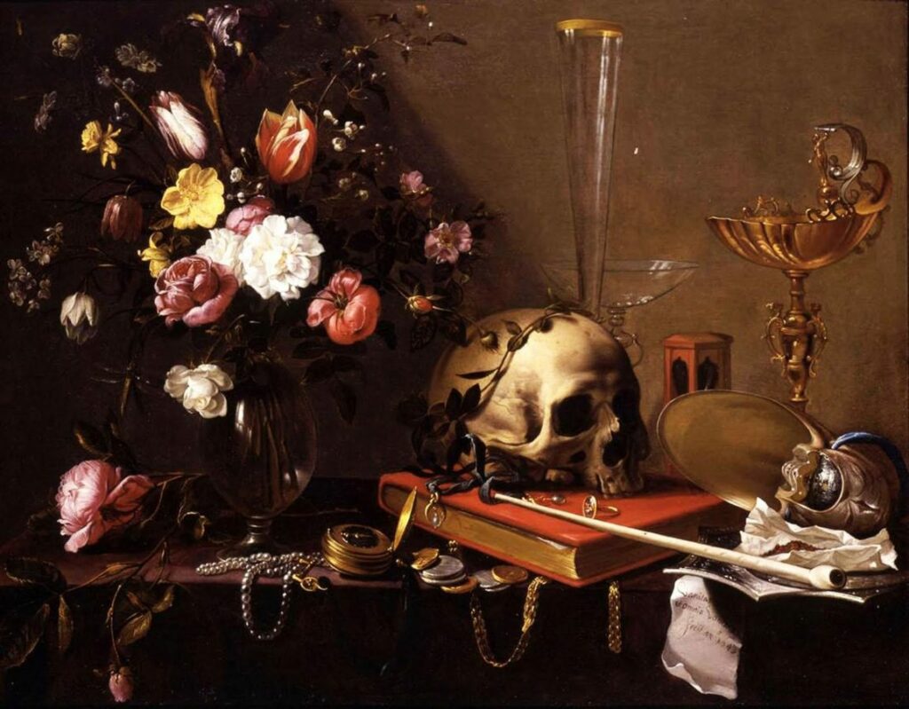
Almost all symbols or allegories are understood ambiguously. The meaning or allusion interpreted by the viewer only emerges within the context of the picture. The use of symbols in still lifes manifested itself in the 17th century. During this time still life painting experienced a high and during this time the use of the right motifs and what they mean played a major role. Even today, one would love to experience the vision of every design / photography and what it means. Thus, symbolically charged objects are still used in still life photography. In addition, it seems to be modern even in still life photography to increasingly use the classically defined subjects.
Examples:
Broken vessels stand for the vanity of everything earthly and the commemoration of death.
Flowers: transience of splendor and beauty, revelation.
Halved or bitten: refer to a fall, but also to the senses or taste.
Books: vain science or useless pastime.
Money: love that can be bought, often alludes to the female gender.
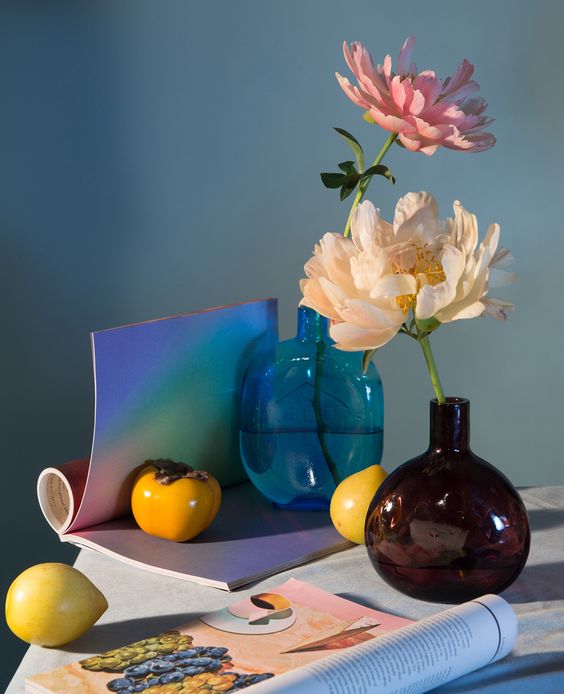
Sliced lemon: questionable, symbol of the externally beautiful and internally deceptive.
Things upside down or upside down: empty life, death.
Effect of colors in photography
According to the photography legend Alexander Spoerl, a colorful photograph has the worst color effect. In photography, three possible types of design have become established with regard to color.
1: Conventional coloring, which is based on the objective appearance of the object.
2: Creative coloring, in which the attempt is made to achieve the “effective” color, does not have to be the same as the real color of the object.
3: Symbolic coloring, does not adhere to objective or effective color, but aims at the message of the end result.
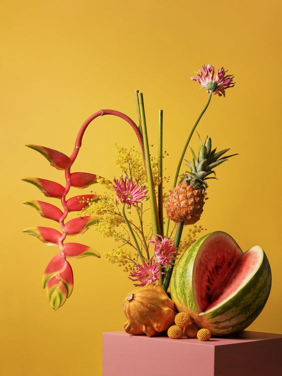
Color is essential for the subject and therefore also for photography. In contemporary photography it can be seen that the common colors of our everyday life are by far not as exciting as unnatural colors. A strong and saturated picture beats pale tones by far. Delicate and soft pastel tones can be more pleasant to look at for a long time, but they are not as attractive at first glance. Shades that differ only by delicate nuances are very difficult to use. In addition, photographs in black and white or grayscale are less noticeable, unless they have a strong and concise contrast. However, the use of strong colors can also be a hindrance if one does not pay attention to the relationship between color and object. Furthermore, the color must support the meaning of the motif and be useful.
In the case of creative coloring, it is important to ensure that it is chosen in a way that is understandable. In addition, different materials have a different effect with different colors. It is advisable to choose an unusual color mood for not every material. This can irritate the viewer and lead to displeasure. Objects that can be used for creative coloring in still life photography are usually described as cheap, impersonal and short-lived.
Beispiele für Farbsymboli
Examples for the symbolic of colors
Red stands for energy, passion and danger / orange stands for creativity, youth and enthusiasm / yellow stands for happiness, hope and spontaneity / green stands for prosperity, stability and harmony / blue stands for trust, calm and intelligence / purple stands for luxury Mystery and spirituality
Beispiele für Farbsymbolik
Quellen:
http://dornhoefer-photography.de/bedeutungen-der-bildsymbole-im-barock/
https://www.bbc.com/culture/article/20180318-secret-symbols-in-still-life-painting


