As an experiment for my research I came up with the idea to produce a poster edition using a linocut as well as a hand set lettering. In addition I’ve planned to make photos of every poster to see the development of the print run and finally will hang the posters in public space to observe how people will react to the poster.
Part I–concept & design
Inspired by the claim “Reality Is Analog” I wanted to create a poster, delivering the message via a typographic layout but also transporting the nuances and very own features of analog print production. For this I got in touch with Druckzeug, the local museum for antique and 20th century printing techniques and letterpress playground in Graz, who kindly supported me to implement the project by opening the workshop and giving instructions in operating the machines (more info about Druckzeug, hand set letterings and steps of printing to follow).
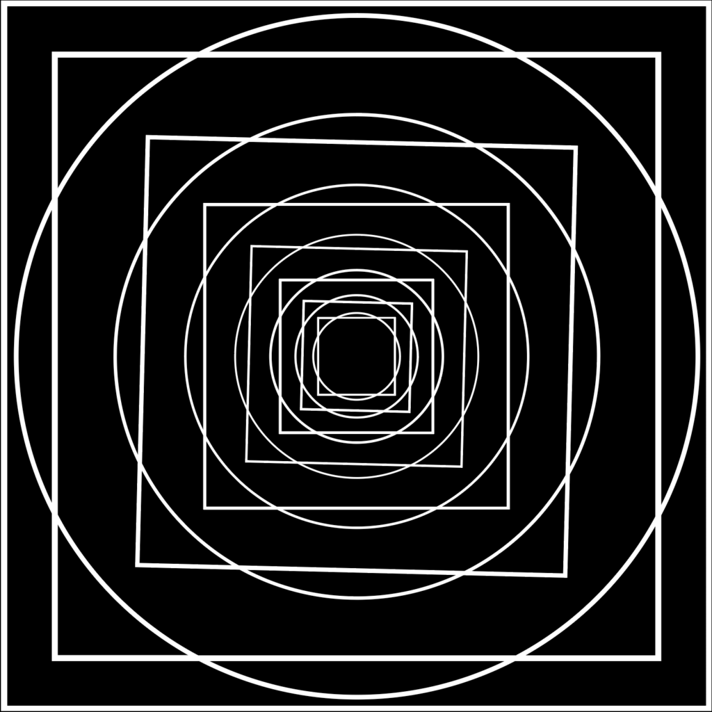
Aside from the various possibilities in using typography for the poster –fonts, cuts, font size, alignment and layout–for the main theme I dealt with the classical geometrical problem of the quadrature of the circle (Quadratur des Kreises). To me, this problem, describing the impossibility to create–with finitely many steps–a square and a circle that have the exact same area, just seemed like a perfect analogy to the imperfection that’s very likely to occur in analog production.
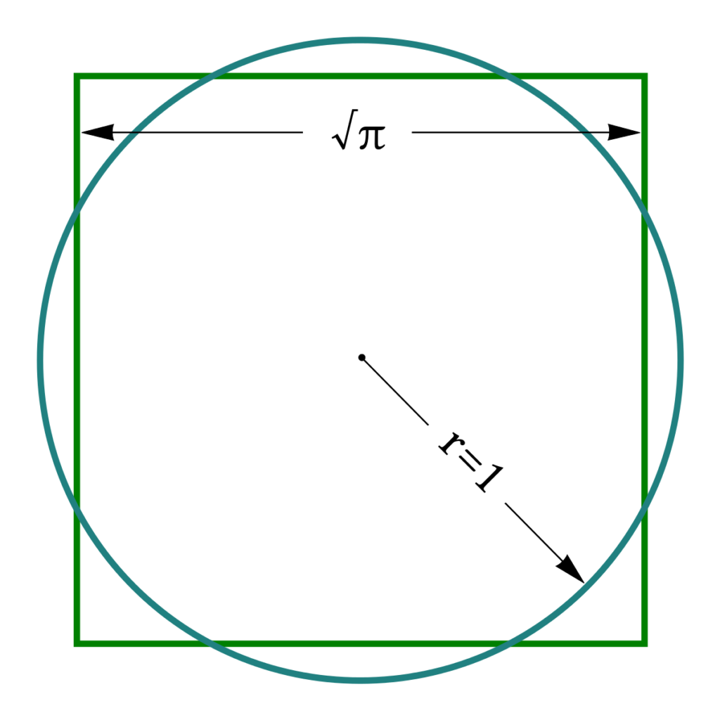
However, as only a square and a circle didn’t seem to be highly attractive, besides repeating the theme I also added a tilt to every second square in order to provoke the viewers’ visual perception and thus emphasize the optical effects of the poster.
So for the first step I started to simulate a few variations and combinations of type and the graphic theme on the computer, offering infinite possibilities.
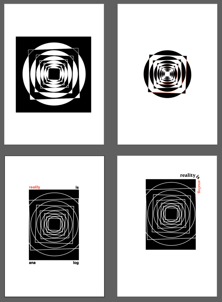
For the analog production however I had to decide on one variation and being quite inexperienced in the field of linocut I tried to keep it rather simple, which led me to this design for the main theme:
Check back soon for the next step: linocut.
