In one of my former blog entries, I talked about the potential strengths and weaknesses of Neumorphism, also called soft UI. The most significant issue was obviously the accessibility. Also due to the skeuomorphic elements, it was not as flexible in its design style as for example a flat design approach. It has to be used restricted, in order to obtain a nice accessible und understandable interface. It works best with a simple UI and a strict limited hierarchy.
Say Hello to Glassmorphism
In comparison to the extruding/intruding optically plastic effect of neumorphism, a more vertical trend Glassmorphism has evolved. It’s most defining characteristics are:
- Transparency: background blur generates (frosting) glass effect
- Multi-layered approach: objects floating in space
- Vivid colors: highlight the blurred transparency
- Light thin outline: visibility of the borders of transparent object
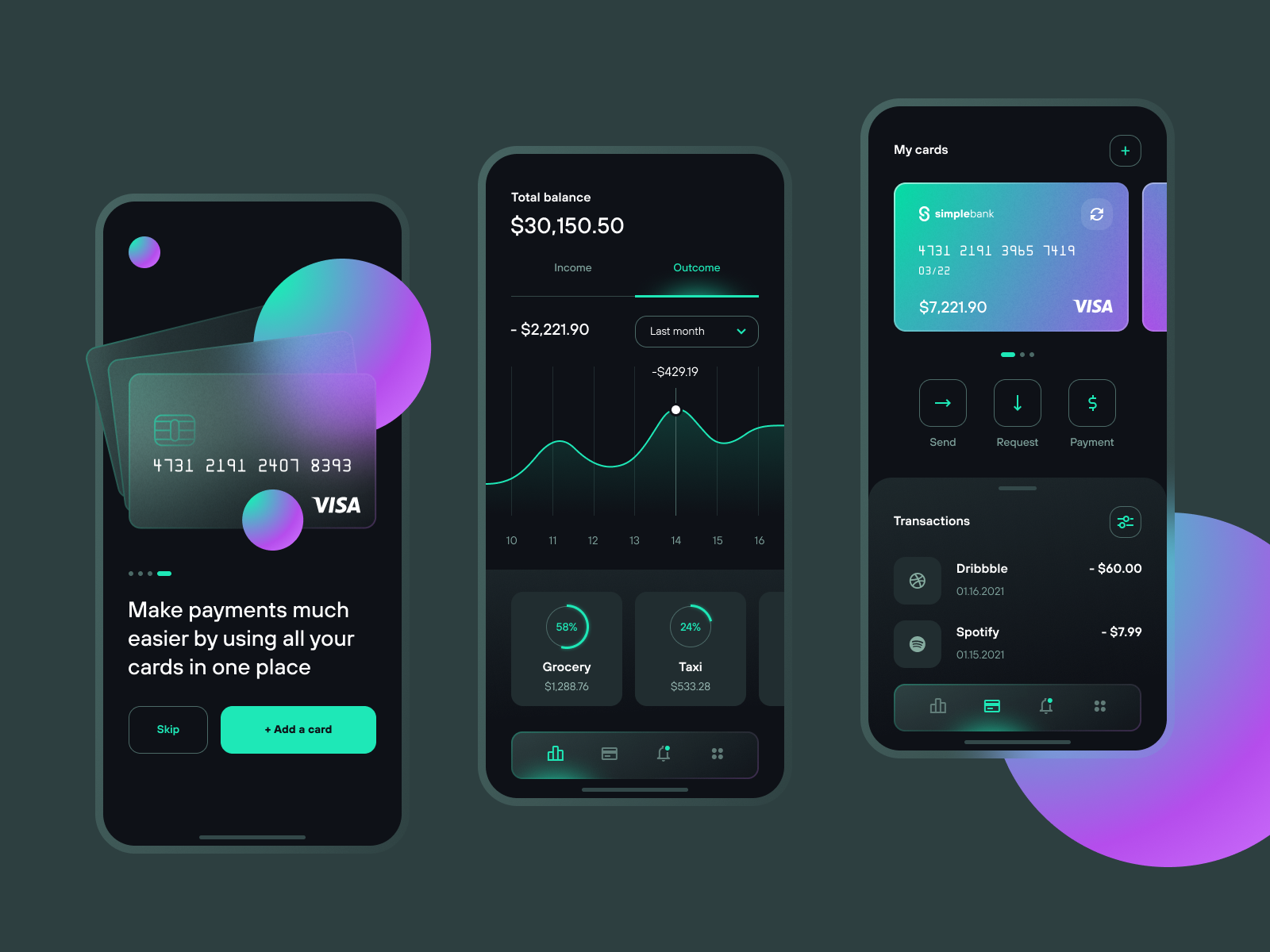
One of the strengths of this design trend is, that the user can identify the hierarchy of the elements quickly. It is very easy to detect, which layer is in the front, middle and back because of the see-through objects. Just as with neumorphism, this style shines especially bright when it’s used on just one element. The right amount will ensure, that also people with vision problems will be able to still understand the user interface. With over-usage, such as integrating it as a default material design for the background, card elements and Icons, it restricts the accessibility and also can lead to a boring and unoriginal design.
Neumorphism is best used for buttons, sliders and toggles, whereas this should be avoided Glassmorphism. Glassmorphic elements work best as (floating) cards and overlays, which we know is problem for neumorphism, because all elements attach themselves to the background. As with all UI designs, it is important to visually group all elements on the cards and define a hierarchy for this as well.
History and Future
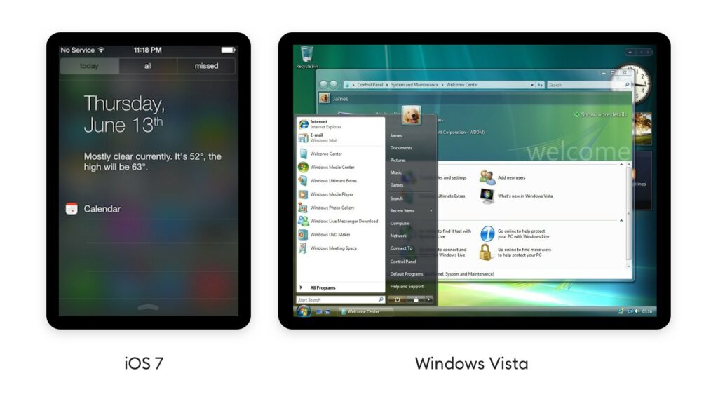
The system behind Glassmorphism is not as new as one might think, the panel blur is being used in several ways since 2007, where it was first introduced by Windows vista with Windows Aero and later integrated by Apple in iOS 7 in 2013.
Pulling down notifications and see the icons fade out behind a panel is nowadays integrated in the standard UI. Microsoft’s Fluent design system goes heavy on this effect as well. They call this particular element The Acrylic and showcase it as an integral part of their design system. Apple has since greatly reduced the blurry-glass effect in their mobile OS, but recently brought transparent-blurs back with Mac OS Big Sur. However, on Dribbble – a platform for discovering and connecting with designers, Glassmorphism is used for desktop applications as well as mobile devices and seems to be not at all limited to a specific device. But also Dribbble is more about the design being pretty instead of accessible, therefore there are also lots of examples where Glassmorphism is definitely overused and also the designs are not restricted to an operating system.
Since Glassmorphism is used in the current Mac OS version Big Sure and also on Microsoft Fluent Design, I would predict the trend will definitely become more popular and rise, to also be more present on our mobile devices.
Sources:
https://uxdesign.cc/glassmorphism-in-user-interfaces-1f39bb1308c9
https://uxmisfit.com/2021/02/03/glassmorphism-guide-to-visual-hierarchy/
https://www.cmarix.com/blog/glassmorphism-the-new-trendsetter-in-2021-for-ui-design/
Images:
Featured Image:
https://dribbble.com/shots/14944850-Wallet-App
History:
https://uxdesign.cc/glassmorphism-in-user-interfaces-1f39bb1308c9
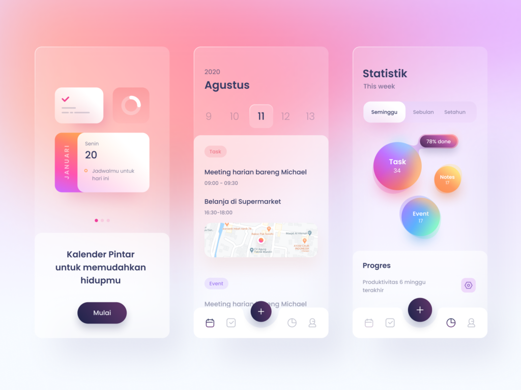
Smart Calendar App:
https://dribbble.com/shots/13842720-Smart-Calendar-App