Behavioural Differences (11)

It’s important to note that there are many different types of use cases and usage scenarios when it comes to these interactions. Different backgrounds, different jobs and different cultures effect experiences drastically. A senior who adapted into the digital world due to their involvement with computers because of their work will have a much easier experience compared to a senior who didn’t have any sort of connection it their early ages.

It’s difficult to produce something that can be used by every possible user. Universal design principles dictates that a design should be equitable and accessible by all but it’s already pretty hard to provide for the needs of one single demographic.

Design is much more likely to be the source of exclusion than inclusion. When we design for other people, our own biases and preferences often lead the way. When we create a solution that we, ourselves, can see, touch, understand, or hear, it tends to work well for people with similar circumstances or preferences to us. It also ends up excluding many more people.

(Gilbert, 2019)

According to the personas and user journeys I have created it can be seen that the main focus of the interaction is social media and usage of certain sites to stay connected to the world. Although in the aspect of content consumed by seniors is similar, the way it is consumed and the issues they can run into are vastly different.

There are 4 main points when it comes to these issues:

  • Visual
    • As people age, a number of changes commonly happen to their vision. Many older adults use reading glasses or opt for much larger font sizes when given the option. Shades of blue can also appear faded to seniors, potentially reducing contrast when blue elements are used in a design. Overall, color contrast should be increased in websites and apps that cater to older adults.
    • Text and button sizes should be kept large. Basically, anything that’s meant to be read or clicked should be scaled up. Although the ultimate solution is to make it easy for users to increase or decrease font sizes at will. Sans serif typefaces are often preferred for on-screen readability. And any website or web app should be tested with a screen reader before being made public.
  • Cognitive
    • There are cognitive declines that happen with age for many people. The speed at which seniors process information slows with age. They can still complete the same tasks, but it may take them a bit longer than it did when they were younger.
    • Different types of memory also decline with age, including the ability to remember to do things in the future (this is where app notifications can be really helpful).
  • Mobility
    • Since motor skills tend to decline with age, this makes things like complex gestures more challenging.
    • When designing for older adults, particularly those over the age of 70, keep gestures simple to perform. Forget complex gestures that require more than two fingers (those can be a pain to master regardless of age). Simple horizontal, vertical, or diagonal movement is fine, as these are all natural motions. But avoid incorporating gestures with quick movements, difficult positioning, or multiple gestures that require the use of both hands or more than two fingers. All of these can be frustrating to even tech-savvy older users as motor function declines.
  • Motivation

These issues can define how a senior perceive an interface and how they use it and these factors set the main differences between the population. These 4 elements needs to be considered fully and implemented well enough to accommodate every different need.

Sources

Gilbert, R. (2019). Inclusive design for a digital world : designing with accessibility in mind.

Polyuk, S. (2019, June 20). A guide to interface design for older adults. Toptal Design Blog. https://www.toptal.com/designers/ui/ui-design-for-older-adults. 

IBM accessibility REQUIREMENTS – IBM Accessibility. (n.d.). https://www.ibm.com/able/requirements/requirements/. 

Phiriyapokanon, T. (2011). Is a big button interface enough for elderly users? 

Sign learning education – depth perception and mirroring

Two important points that must be thought through are the depth perception and the mirroring for first time learners of sign language. I came across this topic through reading a project description of the SAIL (Signing Avatars and Immersive Learning) project which is lead by a team from the Gallaudet University in Washington, D.C., engaging in the topic of sign learning education.

As depth perception must be learned for first time learners who are not used to manoeuvre in the space in front of themselves, this team helps the users learn American Sign Language signs from both the first-person perspective and the third-person perspective with help of VR and using principles from embodied learning. Not only does it require to practice to move their body in a 3D environment, but also mirroring the instructor the other way round. The SAIL project team solves this mirroring thinking which is unusual for first time users by viewing both perspectives in form of a augmented teacher that is standing in front of you and also by showing augmented hands that are supposed to show you your own body movement you should do in front of your body.

The team itself states the great potential in this new way for learning ASL (American Sign Language) for native ASL users who will learn in the comfort of their own homes. Their next steps in their project are the conduction of EEG cognitive neuroscience experiments which should show the effects of embodied learning on ASL learning and also transfering their project ideas to an AR version after the VR version is developed entirely.

The use of the first person perspective helps learners especially in the beginning as I personally have seen that I have looked downwards and focused a lot on my hands and the precious movement while trying to sign for the first time. Watching videos of people who sign words while trying to sign by yourself and being unsure if you mirrored the sign correctly in your mind, would not be necessary and reassure you on what you are doing. Including this would also help the learner to keep on with the work as he would feel more confident throughout the learning process.

source: https://stemforall2020.videohall.com/presentations/1720

04 | How do we communicate online? part 2

In my last entry I was examining about the paper “Computer-Mediated Communication: Impersonal, Interpersonal, and Hyperpersonal Interaction” of Joseph B. Walther from 1996. In this second entry about it, I want to focus on the hyperpersonal interaction. Nowadays the research of Walther is the origin of the “hyperpersonal model” which basically suggests that CMC (computer-mediated communication) can transform our face-to-face based interpersonal relationships or even surpass them. But why should a relationship without the ability to see or hear someone be more intimate than interacting in real life? 

The hyperpersonal model is based on the classic communication elements: Sender, receiver, channel and feedback. Walther is examining about what happens to each of these elements if the communication happens computer mediated instead of FtF (= face to face).

  1. The receiver: Idealized perception

Because of the lack of social context cues communication receivers tend to search for every subtle social context or personality cue they can find and give them a particular great value – even an “over attribution”. The results are stereotypical impressions built on merger or rather unqualified information cues like misspellings or overdone punctuation (!!!). If the communication partners already know each other, they may already know the paralinguistic expressions and can decode them. And if the receiver likes the sender or even only got a positive impression of her/him in advance (e.g. checking a social media profile or hearing a positive reputation = “I could like her/him, she/he is like me”), the impression or decoding of the received message will be positively affected. In this case the receiver has no interfering or disproving nonverbal cues what leads to a strong idealisation of the sender and their attraction. 

2. The sender: Selective (and optimised) self-presentation

People tend to present themselves as optimal in order to be liked and accepted by others. Asynchronous CMC has many opportunities for self-optimization: Senders can reread, correct and optimise their messages and everything else they send out (like social media posts) to an unlimited extent. With that opportunity senders are able to show themselves in their desired manner and “censor” every unliked or unsuitable characteristic. Selective self-presentation is a natural FtF phenomenon (like preparing for a job interview or dating someone) but the opportunities of CMC enhance it in an already supernormal way. I think most of us know that in terms of social media this can have negative effects like for example presenting oneself as somebody else – maybe even someone more optimal. But thinking of communication only, this can be also a chance for the sender: Filtering everything unnecessarily out and focusing on the message and its expression. 

3. The channel

As mentioned the channels of asynchronous CMC gives the communication participants favourable opportunities to communicate and present themselves in the way they like. For Walther it is incorrect to try to make the CMC experience feel or adjust like FtF interaction because this is not possible to the full extent. The users should rather use CMC for its own advantages. The cognitive load during a FtF interaction is a lot higher than in CMC: It requires a higher level of psychic, sensory and emotional involvement. From this perspective asynchronous CMC leads to more conversational relaxation and a better focus of mental energy on the messages’ content. 

4. The feedback: Intensification loop

The examination of  the last element is for me the most interesting because I was not aware of the following argument. Feedback in the communication interaction is crucial for developing a relationship. In point 1 “the receiver” we saw that the users of CMC tend to magnify every minimal cues they can find, what is also valuable in terms of feedback. In combination with behavioural confirmation (having personal expectations from others and acting in a certain way in order to make them confirm them) this leads to an intensified feedback loop. The involved self-optimisation then leads to a positively enhanced picture of the other communication participant. In other words: By self-optimising our own messages we make our communication partner feedback something positive which then leads again to a positive answer from us. Over a long time, this loop eventually intensifies the relationship.

In order to enhance my research to more recent findings I include Walther’s recent viewpoint of the hyperpersonal model. If you are interested in this topics I recommend watching the following talk from the year 2018:

Computer-Mediated Communication and Hyperpersonal Interaction (2018), https://www.youtube.com/watch?v=CQEHU5ryPfQ

In the video Walther brings up some studies he did in the past. The insight I gained from one of them is that by trying to convince someone via CMC one is also convincing yourself about that topic. With that in mind we could go on with that and argue that self-optimisation should result in an optimised picture about our self. Assuming this were indeed the case this could not lead to an intensification loop but an self-optimisation loop in terms of presenting yourself without any communication partner (like posting something on social media): You optimise your image online and then try to even perfect that – just because that is the picture you created about yourself beforehand. Would this mean that computer mediated communication not only “hyperpersonalizes” your interpersonal relationships & communication but also enables you to transform into the person you aiming to be? Would this self-optimisation loop be endless and therefore become a disappointing and energy consuming delusion? 

Sources:
https://www.oxfordbibliographies.com/view/document/obo-9780199756841/obo-9780199756841-0160.xml#:~:text=Computer%2Dmediated%20communication%20(CMC),%2C%20and%2For%20video%20messages (last review: 02.05.2021)
– Joseph B. Walther: “Computer-Mediated Communication: Impersonal, Interpersonal, and Hyperpersonal Interaction”, 1996, https://journals.sagepub.com/doi/abs/10.1177/009365096023001001
https://www.youtube.com/watch?v=CQEHU5ryPfQ, 2018 (last review: 02.05.2021)

AR good examples

When thinking about Augmented Reality most people will probably think about games or entertainment but there are many helpful ways how AR can extend our daily life. In the following I want to show some good examples:

AR in Event Planning
Using a cube which is able to display multiple information about an event.

Information like the conference agenda, sponsors, information about the speakers and so on are displayed and visualized in an interactive a modern way. While reading through a simple flyer would ne far less fun and als much waste as people will likely throw those flyer just away.

Also there are many information that can be displayed because there is no limited space like there would be on a flyer.

AR for education
Basically everything that is printed has one big problem: the space is limited. AR is giving a whole new format to this. Because with the digitalization space is not a point to talk about anymore. This is also a big thing when thinking about education. While we had our books with images in when we went to school, AR apps can support those images in a three dimensional way. Things can be discovered and even interactive or showing a change of a state with animations. Also this means that education becomes cheaper and more accessible.

This way of education also engages the user and makes discovering and learning way more fun.

Especially at times like these where distance learning is a bigger topic than ever before, this is a helpful way to make learning at home more interesting and also support the teachers which cannot be in place to show certain things. There even can be animated person or tutors which help the user to explain the topic in an interactive way.

Gamification
AR can also be used to engage the users while using gamification like the video shows below. The user can help to keep the ocean clean while buying this product. To make it more tangible there is a game coming up when scanning the product which wants you to clean the beach while wiping over your smart phone screen.

Using the space on a product
Even if there are just some small animations shown you can use AR for transfering your product into a display where many informations can be shown. So you can keep your printed pagaging style simple and clean but still be able to show all the informations a user wants to see.

More advantages:

Real-time
Another big advantage is that since the AR apps using internet they run on realtime or better said if there is any reason to change something, it is just needed to update the app. As soon as it is update, everybody will get the new features or changes.

Higher customer propaganda
The already showed label of wine “19 crimes” where you can scan the label and a prisoner will tell you his story increased their social media interactions for about 2100% with not the campain but just having scannable labels.

Sources
https://arvrjourney.com/five-augmented-reality-usages-that-solve-real-life-problems-55e7a81f61b

Ar App
https://brutkasten.com/wikitude-und-constantia-flexibles-bringen-ar-aufs-packerl/

FactCheck vs. GlobalResearch

Comparative Analysis of fake and proper Fact-Checking Sites #P5

This post will be another comparison of fake fact-checking sites with real fact-checking sites and how there are differences in their design language (Typography, Images, etc.), the content (Expertise, Rigour, Transparency, Reliability) and the overall usability. It’s hard to find similarities that apply to the various pages, but this post will try to show the most common ones. Therefore I decided to compare InfoWars with ProPublica in the previous post and in this one Global Research with Fact Check.

Global Research vs. Fact Check.

Globalresearch is an “anti-Western” website that has troubles distinguishing between serious analysis and discreditable junk and so just publishes both. While some of GlobalResearch’s articles discuss legitimate humanitarian concerns, its view of science, economics, and geopolitics is conspiracist. The website under the domain names globalresearch.ca, globalresearch.org, globalresearch.com etc., is run by the non-profit The Centre for Research on Globalisation (CRG), which was founded by Michel Chossudovsky (1946–), a professor emeritus of economics at the University of Ottawa.

https://www.globalresearch.ca/

Fact Check is a nonpartisan, nonprofit project of the Annenberg Public Policy Center of the University of Pennsylvania monitors the factual accuracy of what is said by U.S. political players, including politicians, TV ads, debates, interviews and news releases. Their goal is to apply the best practices of both journalism and scholarship, and to increase public knowledge and understanding.

https://www.factcheck.org/

As you can clearly see common rules of distinguishing if a site is a false information spreading site or not, do not apply to these pages. Some governments already started to implement laws or similar actions against misinformation. Also other scientist and artist startet to visualize this problem.

So last but not least the comparison. Both pages use he SSL certificate which means they should be “safe to use”. While FactCheck.org always has their sources on the end of each article, GlobalResearch.ca only has sources to some articles and also these are called footnotes. Overall both sites do what they are supposed to do, but design related there are some differences. Global Research is really jam-full with articles. There is almost no space in-between the preview blocks and also the font is pretty small. Whereas Fact Check uses a lot more white space and also fonts and images are bigger. So in points of accessibility and readability Fact Check is the clear winner. The website of Global Research just feels like they need to give you all the information in one screen. To describe this phenomenon visually, it feels like some stranger is screaming to your face, but you actually do not understand a thing. The overall usability of both sites is good, but the Fact Check page has a clearer visual structure and a better design language. In terms of functionality everything works fine. Both websites more or less follow the common design principles, even though both sites could be better. During my research I experienced a lot of stuffed content websites and this mainly occurs on fake-news or hoax spreading sites, but unfortunately also some proper fact-checking sites have a really bad visual appearance. So that fact does not tear them apart.

User Journey Mapping (10)

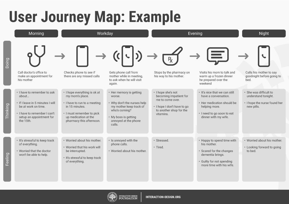
Customer journey maps are research-based tools which design teams use to reveal typical customer experiences over time and visualize the many dimensions and factors involved. In my case I will be assessing how is a senior citizens journey with an interface.

The map will consist of:

  1. A timescale
  2. Scenarios 
  3. Touchpoints 
  4. Channels 
  5. Thoughts and feelings 
Source: https://www.interaction-design.org/literature/topics/customer-journey-map

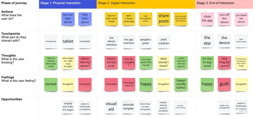
In this section what I wanted to focus on was the social media usage of the senior citizens. It’s one of the highest used mediums when it comes to digital usage amongst elderly. With increasing numbers in isolation and loneliness among seniors, it is a way to communicate and socialize with friends and relatives. The number one reason why older adults use smart devices and internet is keeping in touch and staying relevant through social media.

Social Media Journey

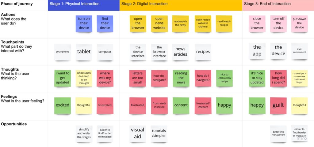
Another important journey would be “staying up to date”. It’s the number two reason why older adults use internet. Reading or watching the news, looking up new recipes or browsing through the web for new hobbies and updates. These activities can be summed up as keeping themselves updated. It is also important in the aspect of inclusion.

Keeping Updated Journey

ProPublica vs. InfoWars

Comparative Analysis of fake and proper Fact-Checking Sites #P4

This post will be a comparison of fake news pages with real fact-checking sites and how there are differences in their design language (Typography, Images, etc.), the content (Expertise, Rigour, Transparency, Reliability) and the overall usability. It’s hard to find similarities that apply to all the various fake news pages, but this post will try to show the most common ones. Therefore I decided to compare InfoWars with ProPublica and in the next post Global Research with Fact Check.

InfoWars vs. ProPublica

I chose those two pages because both of them are or seem to be news based, journalistic websites. The fist thing most of the users check is the domain. It could be weirdly long, maybe not include s SSL certificate or just plainly weird. In this case both websites seem to have normal looking domains ending with .org (ProPublica) and .com (InfoWars). When taking a closer look you will certainly notice a difference in the web design, advertisment placement and how the content is presented.

First of I want to talk about the adds. ProPublica is almost third party add free, but they ask for donations a lot, while InfoWars has gun industry related or other free-speech newsletter adds. Also, they try selling dietary supplements through Amazon despite being banned from other platforms. They also created their own online shop to sell their products and merchandise.

InfoWars Online Store

This might seem just to be because of audience they are clearly approaching: the right wing conservatives (InfoWars), whilst ProPublica tries do debunk hoaxes through thorough research.

Screen recording of InfoWars Landingpage

The design language of pages is clear and straight. InfoWars uses a sans-serif bold black font for their headlines and. In comparison to ProPublica, which use a serif bold black font for headlines, which is more likely to be associated with news papers and sans-serif for text, because of the readability.

Screen recording of ProPublica Landingpage

The overall usability of both sites is pretty good and clear. Everything works fine. Both websites follow the common design principles, except that the article design of ProPublica is much clearer and less busy than the one of InfoWars. In the following videos you can see the difference.

Screen recording of ProPublica Article
Screen recording of InfoWars Article

After spending some time on InfoWars it becomes clear that their main resource is social media (Screenshots of postings) or other false- and misinformation spreading websites or media channels. Most of the time there is no research behind the claimed statements, it is just plainly personal opinion sold as researched facts. There are no credible sources or the only source given is a book or a podcast of the site owner Alex Jones or some other far-right conspiracy theorists.

Human Machine Interfaces (HMI) in the Automotive Industry

Human Machine Interfaces, sometimes also called Man Machine Interfaces, help users to communicate with different machines. The term HMI is often just used for describing graphical interfaces, but theoretically, every interface that allows the user to interact with a machine is called HMI. Different buttons, knobs, levers, pedals, steering wheels and auditory displays are also common human machine interfaces, especially in cars. Like cars, some traditional machines also have multiple HMIs for different purposes. While some of them may allow the user to fulfill only one specific task, most of them will allow interaction with different parts of the machine. Because modern machines normally offer a lot of different functions, the people controlling them often need special training to be able to use the HMIs accordingly.

External Human Machine Interfaces (eHMIs)

The concept of External Human Machine Interfaces (eHMIs) is still relatively new in the automotive industry and not available yet. They will be used to communicate relevant information between pedestrians or other road users when drivers gradually become passengers in semi- and fully autonomous vehicles.

At the moment, the communication between drivers and road users is mostly facilitated by informal communicative cues like hand gestures, facial expressions and eye contact. Although eHMIs are not available yet, a lot of automakers and startups are already testing different colors, symbols, icons, lights, texts and where to place these interfaces so that the communication with all other road users works best.

smart vision EQ fortwo smart vision EQ fortwo
source: https://www.researchgate.net/publication/325464281_Autonomous_Vehicles_that_Interact_with_PedestriansA_Survey_of_Theory_and_Practice/figures?lo=1

Human Machine Interfaces (HMI) 

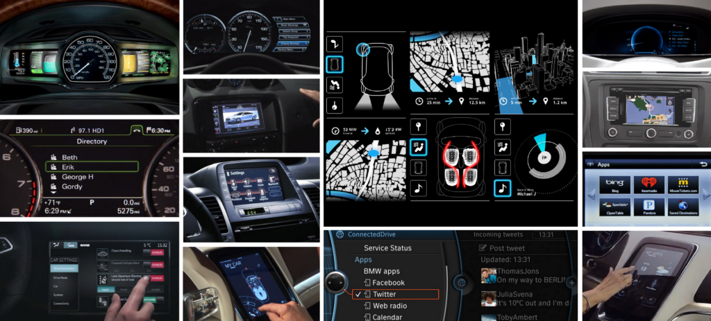
Modern cars are already offering a lot of different human machine interfaces. Drivers can control the direction the car is going with the steering wheel, the motor with the gas pedal, different lights with levers, air conditioning with buttons and knobs and the in-vehicle infotainment system with buttons, touch, voice- and gesture recognition. Most of the HMIs are placed in the head unit or the center console of the car and easily reachable for drivers and passengers.

source: https://medium.com/@autoustwo/the-near-future-of-in-car-hmi-5b34a76fc7a

Even in the future, when all cars are driving autonomously, these human machine interfaces will play an important role. Without proper HMIs, passengers would not even be able to tell the car where they want to go. While human machine interfaces will probably look completely different in the future, they will still serve their original purpose. HMIs should inform the passengers, ensure their safety, use their time more efficiently, entertain them and improve their overall driving experience.

source: https://www.bodyshopbusiness.com/vehicle-infotainment-systems-adding-distracted-driving-problem-aaa-says/

 The first human machine interfaces in cars were purely mechanical and provided the drivers with useful information about speed, gas level and the rev counter. At the moment, these HMIs are also strongly influenced by the technologies that passengers use on other devices during their daily lives. All automakers are already integrating more and more functions from smartphones like games, Netflix, app stores and other web-based applications.

source: https://www.teslarati.com/tesla-v10-firmware-smart-summon-release-date-august-2019/amp/

In-Vehicle Infotainment Systems (IVI)

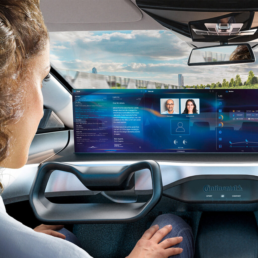
In-vehicle infotainment systems are one of the key selling points when purchasing a new car. Cars have already evolved from hardware-driven machines to software-driven electronic devices, just like our smartphones. The main purpose of the in-vehicle infotainment system is to deliver information and entertainment and ensure comfort and safety to all passengers. With the rise of advanced driver assistance systems (ADAS), it is also important that the drivers get more real-time driving information. This information also helps the system to get trust from the passengers but also makes IVIs more complex.

source: https://www.continental-automotive.com/en-gl/Passenger-Cars/Information-Management/Multimedia-Systems

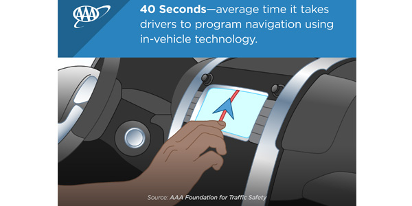
Because in-vehicle infotainment systems will get more and more functions in the coming years, the usability of the user interface and the performance will become even more important in the future. But responsible in-vehicle infotainment designs must also account for the risks of distraction. The distraction of the driver is not only based on the usability of the screen and the software, it is also influenced by the position, size, amount of screens in the car and the age of the driver. According to a study, especially older drivers from 55 to 75 years get distracted even longer by modern infotainment systems. Even though manufacturers are already working on minimizing driver distraction, there are still a lot of accidents happening every year that can be led back to this distraction.

To help avoid these and other accidents and make in-vehicle infotainment systems more user friendly in general, there are already different guidelines out there that should help automakers and OEMs to deliver a better user experience…

  • Different ISO norms like 15008:2017. It is about “Road vehicles – ergonomic aspects of transport information and control systems – specifications and test procedures for in-vehicle visual presentation” 
  • The Commission Recommendation of 26 May 2008 on safe and efficient in-vehicle information and communication systems: update of the European Statement of Principles on human-machine interface
  • NHTSA also released the Visual-Manual NHTSA Driver Distraction Guidelines for In-Vehicle Electronic Devices

Resources

Articles

External Human–Machine Interfaces for Autonomous Vehicle-to-Pedestrian Communication: A Review of Empirical Work
Alexandros Rouchitsas and Hakan Alm
10. Dezember 2019

How can humans understand their automated cars? HMI principles, problems and solutions
Oliver Carsten, Marieke H. Martens
12. Mai 2018

Designing infotainment systems that are interactive, not destructive
Mike Claassen
2019

Books

Automotive User Interfaces, Creating Interactive Experiences in the Car
Gerrit Meixner, Christian Müller
2017

Smart Automotive Mobility, Reliable Technology for the Mobile Human
Gerrit Meixner
2020

Web 

http://www.driverfocusedhmi.com

https://www.copadata.com/de/produkt/zenon-software-platform-fuer-industrie-energieautomatisierung/visualisierung-steuerung/was-ist-ein-hmi/

https://www.elektrotechnik.vogel.de/was-ist-human-machine-interface-definition-geschichte-beispiele-a-718202

https://www.intellias.com/what-s-really-important-about-designing-human-machine-interfaces-for-autonomous-vehicles/

https://www.infineon.com/cms/en/applications/automotive/infotainment/

https://www.ti.com/lit/wp/szzy012/szzy012.pdf?ts=1618695054661

https://newsroom.aaa.com/2019/07/vehicle-infotainment-systems-especially-distracting-older-drivers/

Bio-Architektur

Couple of days ago, I watched a Netflix Documentary about designers and artist around the world. All of the parts are inspired, but one of them caught my attention the most. It is called “Bio-Architektur mit Neli Oxman”.

Neli Oxman — is an American–Israeli designer and professor at the MIT Media Lab, where she leads the Mediated Matter research group. She is known for art and architecture that combine design, biology, computing, and materials engineering.

Oxman writes about the world and environment as organisms, changing regularly and responding to use, full of gradients of color and physical properties rather than sharp boundaries. She proposed developing a material ecology with “holistic products, characterized by property gradients and multi-functionality” – in contrast to assembly lines and “a world made of parts”.


The innovations developed by Oxman and her team have enabled a new age of ‘biological alchemy’ whereby micro-organisms can be designed to mimic ‘factories’ and materials strategically augmented at their basic biological properties. These technologies offer a radical new approach to design and production in which almost any biomass can be transformed into biomaterials to be used for a variety of purposes, from the production of wearable garments to the construction of buildings. For example, E coli, a bacterium that lives in the gut, can be transformed into edible sugar; grass converted into diesel; and corn transfigured into plastic.

In this particular film she was working on the Aguahoja  project. The aim of the product is to show the use of alternative materials, instead of plastic. The Aguahoja collection (pronounced: agua-hocha) offers a material alternative to plastic subverting the toxic waste cycle through the creation of biopolymer composites that exhibit tunable properties with varied mechanical, optical, olfactory and even gustatory properties. These renewable and biocompatible polymers leverage the power of natural resource cycles and can be materially ‘programed’ to decay as they return to the earth, for purposes of fueling new growth.

Neri Oxman is using another way: organic structures embody more efficient and adaptable material properties compared with human-made ones, and leave no environmental marks. From a limited palette of molecular components, including cellulose, chitin, and pectin―the very same materials found in trees, crustaceans and apple skins―natural systems construct an extensive array of functional materials with no synthetic parallels.

Chitin, for instance, manifests in the form of thin, transparent dragonfly wings, as well as in the soft tissue of fungi. Cellulose makes up more than half of plant matter planet-wide. These materials, and the living systems they inhabit, outperform human engineering not only through their diversity of functions but also through their resilience, sustainability, and adaptability.

“Imagine the possibility of being able to create a digitally-printed, biologically-augmented beating heart that will perfectly match its host, for those in need of a transplant. There is then new potential to save millions of lives.”

https://oxman.com/projects/aguahoja

https://en.wikipedia.org/wiki/Neri_Oxman

03 | How do we communicate online? part 1

In terms of researching communication models (specifically online) I came across different perspectives which in my eyes are worth examining in my entries. I found a lot of literature about online communication from the years of approx. 1990-2000 which mainly focused on the differences of online and offline communication. Even Though there are further researches in recent years I find this fundamental quintessential for completely understanding my topic.

Computer-Mediated Communication or short CMC is basically describing human communication via networked computers. This communication form can be synchronous or asynchronous and is used to exchange text, audio, and/or video messages. The number of participants can differ from one-to-one, one-to-many or many-to-many. The separation in synchronous or asynchronous communication is of great relevance in the term of CMC. Synchronous communication like via video or audio calls includes all participants in real time and happens simultaneously. As soon as the sender does not receive an immediate response from the receiver the communication is asynchronous. Examples for that would be mails and text messages. 

Early research focused on how the communication channel ‘computer’ changes our communication and how it differs from the way we used to communicate. At first, relatively negative aspects were highlighted, such as the lack of socio-contextual information (I touched on this in the first semester). Alternative models later emphasized that the user adapts to the limitations of the channels and develops alternative strategies (such as the use of emoticons). Furthermore it became clear that the boundary between the real and the virtual communication was more and more blurred and is now becoming interactive instead. But how does this affect our way of communicating? What are the advantages? The disadvantages? 

To find out more about this question I started with early research about CMC. I read the paper “Computer-Mediated Communication: Impersonal, Interpersonal, and Hyperpersonal Interaction” of Joseph B. Walther from 1996. In this paper, the term CMC includes only text-based communication. The main research question asked if CMC causes a limitation or liberation of communication and interaction. 

One common sense at that time was that CMC is highly impersonal, task-oriented and can only stay on an informative level due to the lack of social context cues. Alternative findings showed a contrasting picture: CMC was stated to be just as personal as FtF (face-to-face) interactions or even surpassed them. This was especially a conclusion of the examination of virtual communities, online friendships and online dating. With these perspectives in mind CMC seemed to have no consistent effects because of the contrasting results at that time. Walther wanted to identify common elements that play a role in all these outcomes. Therefore he first examines about the terms interpersonal and impersonal interactions regarding CMC:

Text-based CMC seems to be more impersonal because of the lack of nonverbal / social context cues. The message receiver cannot alter the mood of text messages and needs to interpret it. Alternative findings show that the user starts to adapt their communication to the limitation of only written communication and finds other cues in punctuation or language. Walther comes to the conclusion that CMC is not certainly less personal than FtF interaction but requires more time investment. The effective outcome of a CMC conversation is dependent on the familiarity of the participants and the conversation context (mediated, non-mediated). Regarding group work he suggests that it could be helpful to start the first brainstorm project phase via CMC and come together for the evaluation and decision phase in real life. In his point of view the first phase of brainstorming ideas can benefit from the non-hierarchical and more or less anonyme structure of CMC because each idea receives the same attention. For him, the second phase of evaluation and decision making needs more social context cues because the discussion enters a more personal level.

Of course the paper is a bit older and nowadays group work is not only limited to only CMC or FtF interactions. But I think it could be worthy to think about it a little closer since I came from a working background with old structures of endless mail and meeting conversations and discussion with no conclusion. Do we always choose the right media to communicate? Could we enhance our meetings with evaluating our communication channel from another, more thought through perspective? We are so used to communicate via text messages and sometimes forget that everyone has another ‘decoding’ system for it. For example exclamation marks: Sometimes we use them more or less unintentionally but they can have a major effect on the sender’s interpretation of the intonation. Just look at this sentence and reflect how you read it and how you felt while reading:

  1. I don’t think so!!
  2. I don’t think so.

I could bet that the first sentence feels more aggressive than the second one did. Or did it didn’t bother you at all? I will never know, because my decoding system will always differ (no matter if in a large or small scale) from others. The same goes with the usage of emojis. Some of them seem to have a single minded message but can be decoded in different ways. An example for that can be the winking smiley 😉 For some it is just a blink of an eye, for others something ambiguous and for some it is even a passive aggressive gesture of provocation.

Sources:
https://www.oxfordbibliographies.com/view/document/obo-9780199756841/obo-9780199756841-0160.xml#:~:text=Computer%2Dmediated%20communication%20(CMC),%2C%20and%2For%20video%20messages (last review: 18.04.2021)
– Joseph B. Walther: “Computer-Mediated Communication: Impersonal, Interpersonal, and Hyperpersonal Interaction”, 1996, https://journals.sagepub.com/doi/abs/10.1177/009365096023001001