Nine points to IDEAL object

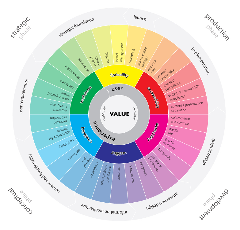
Neri Oxman, material ecology architect, has crystallised her practice’s naturecentric philosophy in a series of principles to which human clients will be asked to commit. The principles have undergone several revisions and are still in flux. The most recent version is “Nine Commandments for a Material Ecology”, that is correlated with design approach, centred not on human beings, but on nature as a part of system. Following those steps, maybe, we will be able to create better design objects, that I called “Ideal” in title, just for better perception. Because Ideal does not exist hehe.

So, the commandments in nevalogue are constructive, a declaration of intent for a new design practice. The early version were descriptive of Oxman’s intellectual process and juxtaposed old and new, considering design before and after digital computation and the advent of a so-called Century of Biology at the turn of the millennium.

Nature as Client

“The natural environment at large constitutes the client for every commissioned project, as well as its site and material sources.”

Okay, this one is hard to implement into product design. Buut, we can try our best to use ecological material and their microstructure, as well as macro. To build structures that respond to the environmental conditions and instead of being more fragile with the flow of time, started to be anti-fragile. What means better or not suffering, at least.

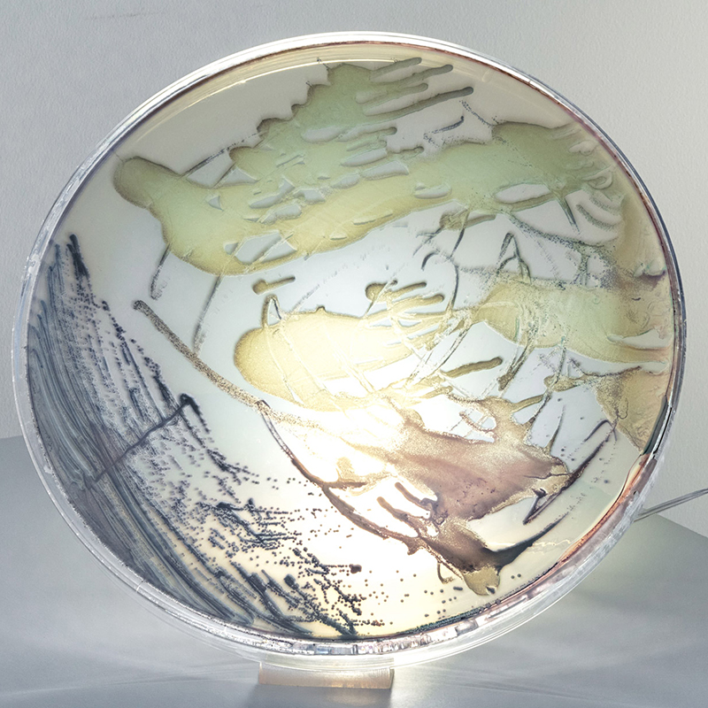
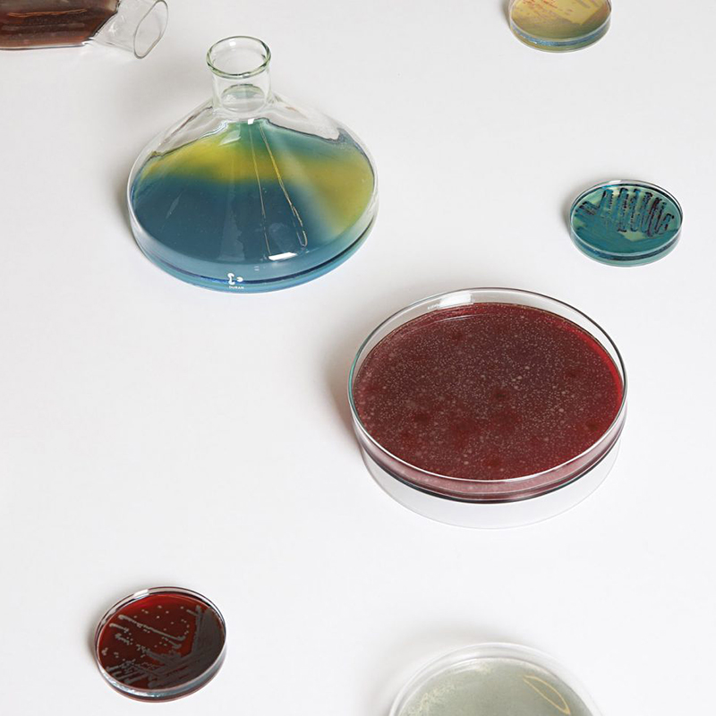
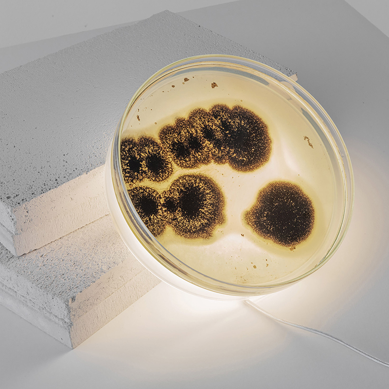
Growth over Assembly

“Nature grows things. We will be able to create objects that will respond to their users, adapt to their environment, and even grow over time after they have been printed”

Comment: this principle conceptually moves design and production into the new age of biology, from the assembly line to the wet lab.

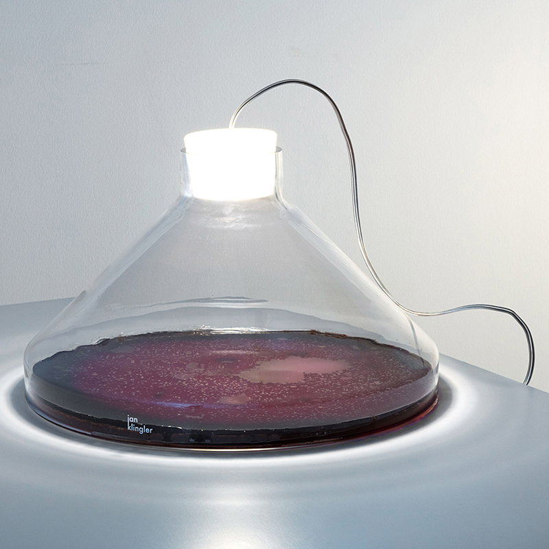
Neri Oxman team already were doing similar project, as Silk Pavilion, where caterpillars weaved the dome under the influence of light. Or the green bridge in Stuttgart.

Integration over Segregation

“The typical facade of building is made up of discrete parts fulfilling distinct functions. Stiff material provide a protective shell, soft material provide comfort and insulation, and – in buildings – transparent materials provide connection to the environment. In contrast, human skin utilises more or less constant material constituents for both barrier functions(small pores, thick skin on our backs) and filtering functions(large pores, thin skin on our face). In an ideal object, barrier and filtering functions are integrated into a single material system that can at any point respond and adapt to its enironment.

Comment: Oxman often describes her work as noncompositional, a whole in which the same material articulates dynamically the required functions.

Non-Human-Centered Design

“The group considers all living creatures as equals.” What is quite common in modern world and modern design approach. People start to make non-human-centered design to save ability to adapt to environment, not destroy it and create the new one. “The group aims to shift human-centric design to a design culture focused on conserving, improving and augmenting the natural environment though novel technological developments.”

Comment: The past decade has seen an increasing preoccupation with interspecies design and questioning of anthropocentric values, and Oxmans new practice chooses this position as its baseline.

Difference over Repetition

“Industrial products generated out of machines consist of repeatable parts with identical properties. Comprehending difference enables us to design repetitive systems — like bone tissue — that can vary their properties according to environmental constraints. As a consequence of this new approach we will be able to design behaviour rather then form.”

Comments: the form-giving design of yesteryear yields to the new concept of formation, in which a system adapts and performs — behaves.

Decay or Disposal

“The Practice implements design workflows in which matters is synthesised systems, and consumed by the same ecosystem upon obsolescence. Designed decay is the process by which matter is programmed to rejoin an ecosystems resource cycle and fuel new growth”.

For example, forest eco-system is working in this way. When the old tree is dying, it gives live for couple of new ones, for some mushrooms and batteries around. And the cycle repeats.

Comments: An embrace of circularity, this principle affirms the role of the architect within the ecosystem.

Activist Design

“Any design commission becomes associated with a particular technology, invented or improved upon by the Lab, which embodies the value system associated with the group, and is directly linked to design and construction processes relevant to the commission.”

Comments: Several enterprises, nonprofit and for-profit, are currently trying to integrate ethics and social and environmental responsibility into their practices, and to pass there values on to their customers — a brand of activism from within the system. Oxman’s group will use technology as a vessel for change.

Some of the companies are adjust ethics to their policies, and not vice versa. The desire to cheat and deceive disappears, when we put our skin in the game(reference to the Inu Anum sîrum).

System Over Object

“The product – be it a product, a wearable device, or a building – is considered part of a system of interrelations between natural and designed environments including interactions between the entity and the human body as well as the entity and its environment.”

The world as the fascial human body, where all elements consist from similar material, but in different proportion it gives absolute different result.

Technology over Typology

“Moving from the taxonomic classification commonly found in buildings and urban places… topology – the way in which constituent parts are interrelated or arranged – is the driving force behind the design process, promoting condition-based programming as the approach for organising spaces and making places.”

Or to be fragile or anti-fragile?

Thesis Evaluation – Mobile Applikationen in der orthopädischen Rehabilitation

The master thesis was written in cooperation with a fitness start-up in Graz and aims to show how several problems can be solved in and after orthopaedic rehabilitation with the help of a fitness and health app (Kendlbacher 2019, 8).

Title
Mobile Applikationen in der orthopädischen Rehabilitation

University and year of publication
Karl Franzens University Graz, 2019

Level of Design
The design of the work itself is structured but no importance was given to making it look appealing – whether colours, additional illustrations, etc. The design of the app (the outcome) is not up to date and is confusing.

Degree of innovation 
The idea behind a fitness app is nothing new, but the requirements within the app are different, which can increase the degree of innovation. To what extent, I cannot judge.

Independence
She wrote her thesis with the support of a start-up in Graz.

Outline and structure
She has worked hard on the topic, which is clearly noticeable. She has structured and organised her work into several sections. The work is clearly structured and the division is logical.

Degree of communication
It is clearly and simply structured. The author makes it clear what the thesis is about. 

Scope of the work
The thesis has 76 pages. The scope of the work is large in terms of research, but the design of the app (the final product) is clearly lacking. Unfortunately, the app was not realised but a low fidelity prototype was created and the section describing the app is very small and briefly formulated.

Orthography and accuracy
The work is error-free in spelling and comma placement. The language is good. All sources have always been cited. Abbreviations have been marked with a number and described in more detail at the bottom of the page.

Literature
The literature varies greatly between years of publication. The paper was published in 2019, there are two sources published in the same year (6 pages of bibliography). 

Kendlbacher, Julia. 2019. Mobile Applikationen in der orthopädischen Rehabilitation. Graz: Karl-Franzens-Universität Graz, 2019

Evaluation of Thesis “Material-based Design Computation” by Neri Oxman

Level of design

The doctor thesis has the layout of the philosophical work, academic framework and as an experimental practice. In the thesis author faces intellectual and technical challenges, as well as with theoretical framework. Design, in this case, is the combination of prosthetic device design and product design in general. Despite the fact that idea is crossing the borders of the design definition and incline more in technological aspects, it is still the art experiment. Maybe, even more it was before.


Degree of innovation

As I mentioned in previous paragraph, the borders of design erasing in this work. Author is experimenting with forms, techniques and ways to product. Everything is described in detailed and step-by-step way, plus comparing things between each other.


Independence

The work itself is the independent research, that is made on the base of other people work, opinion, educational level, comments and help. Author mentioned all the people and educational institutions, museums and groups, that inspired her during her life, work and this particular thesis. Since such work is quite extensive and necessarily requires help from the side.


Outline and structure

Structure is divided into nine main parts: pores of the synthesis of material form, where the material-based computation, form and structure are described; nature’s way from micro to macro organisms; the new materiality or the influence of form, how it changed and current problems; design computation; material-based design computation; natural artifice — natural design in new way with the reference to form again, but from the nature angle; natural fabrication; contributions.

All modules are supported with explanation, examples and authors own experiments.


Degree of communication

Communication is clear and easy structured. Modules are presented as modules with sub-modules, what makes orientation fast and whole topic understandable. Experimental designs employing suggested theoretical and technical frameworks, methods and techniques are presented, discussed and demonstrated.


Scope of the work

Huge. Research from different side, with all possible and impossible materials, graphs, digital models, that clearly demonstrates the work done. Design experiments shows the contribution and the potential future of a modern design structure and future research field.


Orthography and accuracy

I would say, that accuracy is on a high level. As I mentioned, the whole thesis is described in precise manner, so person, that is outside the topic, can understand.


Literature

Author is referring to 389 resources. Most of them are from the engineering, biology and architecture spheres. Neri is using the computation methods work, more philosophical works, as “Design and Elastic Mind” or “The Ideas of Biology”, surface structure and resources, combining both technology and biology.

Refugees and local people in host countries

I started my thesis research on the refugee’s problem and tried to go with designing an educational platform that can facilitate their educational challenges but when I went further with this idea I found it needs professional skills in psychology and educating, so I changed my way to work on the communicating problems so I did researches and also meet with refugees and a guy who was responsible for the young center which offered free programs and snacks to youngsters including refugees during the summer, I came to a conclusion of what I did till now so I found that there is a big gap between these two groups of people,

and what I want to do as an interaction designer is to bridge these gaps.

At this point, one of my colleagues and I decide to do the project together but with divided tasks, she will do the practical and technological part and I will do the theoretical part and do the researches, as the start point we did some brainstorming about what the gaps might be and did the short questionnaire, in this questionnaire, we categorized the gaps caused to cultural, lingual, … .

We will analyze the data in this step and I will plan to do some interviews with the refugees.

New Master Thesis + Overview over App Design

My research question at the beginning of the study was whether and how XR can be a help for people with prosopagnosia. Since then, my focus and also my topic for the master’s thesis has changed. The only thing that has stayed the same is that the new topic is also in healthcare. A super short explanation of what future blog posts will be about: For my Master’s thesis, an app is being developed with several people involved and in group work on the topic of preventing dementia. The research topics will revolve around the topics app and dementia.

Link to an article about the topic of the Master Thesis (Language: German): https://www.fh-joanneum.at/presse/fh-joanneum-und-medizinische-universitaet-wien-bringen-neues-eu-projekt-ueber-demenzforschung-nach-oesterreich/

This first blog entry will be about what aspects we need to consider when designing our app and what points are particularly important to us with regard to the topic dementia and the requirements we received from the project managers. Further blog posts will delve deeper into specific areas. This blog entry is intended as a first start.

  1. User Experience

User experience describes all the impressions and aspects that the user experiences when interacting with a product, like a kind of cycle. The goal should be to make the product (in our case an app) a permanent part of the user’s life. To achieve this goal and start the cycle, the user must first learn about the product, so it means that the presentation of the product must be great. He must be able to immediately understand the benefits that using the app will bring him. The most important thing in the whole cycle is that the user is not frustrated or unnecessarily strained at any time. Otherwise, the product may not be used. (cf. Schilling, Apps machen, 37).

This infographic by Magnus Revang breaks down the user experience design process into several phases. It is intended to answer the question “what is user experience? (Revang, The User Experience Wheel).
The model starts with the word ‘value’ in the middle and implies that for both the providers of the product and the customers, the product’s goal is to create added value and thus it can bring benefits to both groups. The six coloured words are defined terms that should be focused on most. The 30 words are factors that contribute to a positive user experience (cf. Revang, The User Experience Wheel).

The User Experience Wheel (Magnus Revang)

2. Three states of an Appscreen

When designing an app, three conditions must always be considered and observed (cf. Basecamp, Getting Real, 48):

  1. What does the screen look like normally, when everything works and the action can be carried out
  2. How the screen looks empty, without data
  3. What does the screen look like when an error message appears

The blank screen at first use is especially important. If this screen is not adequately considered, it can lead to the app not being used or the user being frustrated because they do not know what task they have to complete. Examples of how to fill this page are instructions, help texts, example screens, FAQ, explanations of how the screen looks filled in and so on (cf. Basecamp, Getting Real, 49).

3. Important factors to consider

  • Efficiency when using the app
  • Efficiency when using the app
  • User satisfaction during use
  • What the app should do must be clearly defined
  • Navigation within the app must make sense
  • Errors should either be undetectable or undoable by the user
  • Short interactions and understandable and short language in order to avoid being a distraction
  • Consider Internet/GPS failures and show for example a solution
  • Respect different screen sizes
  • Few to no background processes to not drastically affect battery life
  • Offer data input on a voluntary basis or do not disturb the flow

(cf. Schilling, Apps machen, 45-47)

4. Structure and display information correctly

To ensure that the user is not overwhelmed by information or actions after opening the app, it is important to consider what and when something is displayed. For example, if the goal of the app is to create a new to-do point, this should be immediately executable after opening the app (cf. Schilling, Apps machen, 234). A guideline can be 3 to a maximum of 5 steps to be able to carry out an action. The fewer steps, the better. To take the example of the to-do app again, step one means opening the app, step two would be that the user sees what he wants to do. Step three is that the to-do is saved (cf. Schilling, Apps machen, 239). 
Another important point is how certain actions that the user can perform are labelled. To give a concrete case study, the magnifying glass as a sign for the search tool. The great advantage for designers is that the use of this symbol without text requires little space. Nevertheless, there are always problems that users have with this sign. Just the sign itself often makes it difficult to find the search function. People start looking in the upper right-hand corner for the search function. If they don’t find it there, they start searching the top of the page. So if the function is poorly labelled, it can quickly lead to frustration. It is also important to mention that using the icon without text adds interaction, as the user has to tap on it, wait for the input field to appear and only then start typing. The realisation is that many symbols still need some kind of label or short description (cf. The Magnifying-Glass Icon in Search Design: Pros and Cons).
For another case study, the sidebar in apps. These digital drawers, which can usually be opened by a hamburger menu icon, often tend to be overloaded with rather pointless functions. Problems with this method are also reaching the icon, as it is usually in the upper right or left corner of the screen, there is an additional interaction and the user has to remember which functions are in the sidebar (cf. Li, Please, Don’t Replace the Bar with the Drawer).

5. Smartwatches

Smartwatches play an increasingly important role nowadays and are often an extension of apps. Since the interaction surface is much smaller, it is important to work with high contrast and to display information on a very light or dark background because it is harder to read if the screen size is so small. For Android watches in particular, information should be displayed in the middle, as there is not one watch shape but several. For buttons, the entire width of the interaction area should be used to make interaction easier. Since both Android and Apple have UI guidelines, these should be followed. Especially in terms of font sizes (cf. Schilling, Apps machen, 302).

6. App project phases

These project phases were defined by Karolina Schilling in her book ‘Apps machen’. They have been slightly modified by me to fit our Master’s topic. These project phases are meant to help me to design a good product:

  1. Idea generation & research
    1. Search & find problems
    2. Competition
    3. Solve problems better and create a USP
  2. Target group and market test
    1. Buyer Persona
    2. MVP
    3. Target group
  3. Definition/Research for User Centered Design
    1. Context Scenarios & User Stories
    2. Research
    3. User Personas
    4. User Journeys
  4. Rough conception
    1. Scribbles
    2. Functional requirements
    3. Tap Streams
    4. Concept check
    5. Developer talk
    6. Feature priotisation
  5. Detailed design
    1. Core benefit shibbling
    2. Core benefits wireframes
    3. Prototype core benefits with real visuals or templates
    4. Scribble all other screens, create wireframes, elaborate
    5. Define interactions & transitions and prototype relevant ones
    6. Create and prototype animations
    7. Determine screen transitions
  6. User tests
    1. Tests
    2. User test
    3. Make improvements
  7. Create user interface and deliver graphics
    1. Create and export graphics for the different platforms
    2. Store graphics in a meaningful way
    3. Create visuals for app stores
    4. Design and test user touch points with the app (MVP feedback)
      1. The app logo
      2. Gather app store page material

Sources

  • Schilling, Karolina: Apps machen. Munich: Carl Hanser Verlag GmbH & Co. KG, 2016
  • Revang, Magnus. „The User Experience Wheel“ Last modified April 17, 2007. https://userexperienceproject.blogspot.com/2007/04/user-experience-wheel.html
  • Basecamp. Getting Real, Chicago: Basecamp, (n.d.). Accessed November 09, 2021. https://basecamp.com/gettingreal/09.3-three-state-solution, Three State Solution, chap. 48.
  • Basecamp. Getting Real, Chicago: Basecamp, (n.d.). Accessed November 09, 2021. https://basecamp.com/gettingreal/09.4-the-blank-slate, The Blank State, chap. 49.
  • Nielsen Norman Group. „The Magnifying-Glass Icon in Search Design: Pros and Cons“ Last modified February 23, 2014. https://www.nngroup.com/articles/magnifying-glass-icon/
  • Li, Simon. “Please, Don’t Replace the Bar with the Drawer” Last modified March 31, 2019. http://www.simon-li.com/design-and-code/please-dont-replace-the-bar-with-the-drawer/.

Bacterial lamps by Jan Klingler

Swedish designer Jan Klingler has created unusual lamps: bacteria live in them, which color the light in different shades. For this project, the designer had to do a lot of research and gain relevant experience, but now he can control the growth of bacteria so as to “grow” the desired color or pattern in his lamp bulbs.

To create these lights, Klingler himself grows bacteria, fungi and yeast, allowing them to grow naturally on a resin disc for 24 to 48 hours. Its “home” bacteria feed on agar-agar, a gelatin obtained from seaweed. At the beginning of the process, the culture medium becomes liquid, but by the time Klingler adds bacteria to grow, it begins to solidify.

The colors are provided either by food or by the bacteria themselves, for example, the serratia bacterium (such as live in the human mouth) gives an orange-red color. When the desired effect is achieved, the biomaterial discs are sealed to deprive the cultures of oxygen and stop their growth. The resin plates are then connected to the LED disk or module. It turns out that light is poured through a translucent layer of bacteria.

Bacteria lamps are manufactured entirely in Sweden and come in four variations, reminiscent of laboratory equipment. One is inspired by a Petri dish, one is a Collet flask that looks like a flattened light bulb, and two are made in the shape of a Fernbach flask in two sizes.

According to Klingler, the project challenges the user to “see a new connection between the object he created and himself, creating a visible connection through bacteria, shedding light on what we think should remain hidden, and exposing it to the public.”

Klingler clarifies that every living creature and even its place of residence has its own unique microbiological imprint. Combining science, art and industrial design, his Bacteria lamp harnesses this tangible fact to present a unique piece to the world, provoking thought and discussion.

The goal of the designer is to offer in the future personalized lamps made to order from biological samples of a specific client who wants to perpetuate himself in this way and make a part of himself a piece of contemporary decorative art.

Gehmacher Home

Introduction to our Master Thesis Project

Customer Experience app with focus on AR-enhanced marketing opportunities and creation of a new unique selling point for the company Gehmacher based in Salzburg, by Janina Schindler and Carina Steindl.

About the company.

Our environment influences us. No matter if material or immaterial. We want to inspire you to surround yourself with beautiful things and thus create quality of life. With furniture and accessories in your home, the clothes you wear and beauty in your encounters. We believe that the beauty affects our life in a positive way.

There is hardly any other city that fits “living in beauty” as well as Salzburg. Beauty and excellence can be found in the impressive architecture, the style of the Salzburgers and in nature in the form of the mighty mountains and the Salzach. The Gehmacher house on the Alter Markt is located right in the heart of the city and has been owned by the Gehmacher family for over 100 years.

There are now three main areas at Gehmacher: HOME, CLOTHING and a Café. But there is a common philosophy behind this: to create quality of life through beauty. To create places where you can recharge your batteries, enjoy and experience joie de vivre. To create an atmosphere that inspires with the right interior and to underline the inner beauty with the right outfits. We are constantly in the process of developing our range and finding new things. Timeless and yet in tune with the times.

Gehmacher – a family company characterized by tradition and constant change. Once a specialist shop for bedding and curtains, which, after remaining undamaged in World War II, has developed into the address for furniture and lifestyle products. Today there are eight stores: HOME, CLOTHING, LIFESTYLE, RETTL X GEHMACHER, HIGH FASHION, OUTDOOR & CAFÉ, CLASSICS and N°8 reaching from Alter Markt to Waagplatz.

Gehmacher Salzburg Map

The persistent longing for beauty, atmosphere and experience has always driven us. Gehmacher changes with every generation. However, always with the aim of carrying on the legacy and giving it an individual touch. Gehmacher – a family company that is deeply anchored in its own values ​​and has its heart and focus on the future.

Social Media
Website Gehmacher

Briefing

In order to turn the Gehmacher customers into fans and family and thus to bind them even more to the company Gehmacher, a Gehmacher customer app is going to be developed that will provide the customer with information, inspiration and other benefits. The app should also support the Gehmacher team with different features and create another USP for the company Gehmacher.

Concept Requirements
  • Web-based App
  • Marketing Tool
  • Easy to use and aesthetically appealing
  • Privacy
  • Support for the team and enrichment for the customers
  • UX Testing
  • Working Prototype ready for implementation
Features
  • VIP (Stammkunden) speacial Discounts etc.; QR or NFC (according to individual sales)
  • Personalized Newsletter
  • „Personalized“ Posts – Feed (bsp. LinkedIn, etc.) Inspiration for the 3 areas (HOME, CLOTHING, CAFÉ)
  • Scheduling with salesperson (Private Shopping/ Interior Design Appointments)
  • Private event invitations via App
  • Stores and Contact persons are introduced (favorite advisor/salesperson)
  • Map cooperation opportunities (Products, Shootings, SM, etc.)
  • Link to SM Accounts & Website (Blog etc.)
  • Possibility for interactive outdoor advertising (AR, etc.)
Team

Janina and me are starting with the project in the third (this) semester.

  • Janina Schindler B.A. & Carina Steindl B.Sc. (Research, Conception, UI/UX, Prototype, Basic Programming, Testing)
  • Project management & communication – Carina Steindl B.Sc.
  • Client: Otto Gehmacher G.m.b.H & CoKG – Julia Gehmacher B.A. (CEO), Franziska Lüdtke (Marketingteam), etc.

We split up the research into different topics and assigned them like follows (changes can happen during the research):

Research topics for the WS21/22:
  • Introduction to the Topic – Carina Steindl
  • AR in the Marketing field – Janina Schindler
  • General Market Research – Carina Steindl
  • Web or native App – Janina Schindler
  • CX & UX for apps in retail – Carina Steindl
  • USP enhanced CX – Janina Schindler
  • Personas, User Research – Carina Steindl
  • User/Customer journey, scenarios – Janina Schindler
  • Concepts for backend/team support – Carina Steindl
  • User Interface of comparable App – Janina Schindler
  • Image Tracking in AR – Carina Steindl
  • General CX in retail – Janina Schindler
  • User/Customer Journey on site in the store – Carina Steindl
  • AR critical consideration – Janina Schindler
Milestones WS21/22:
  1. Topic Assignments and Planning – 24.10.2021
  2. First discussion of research Results – 29.11.2021
  3. Presentation and workshop at the company – 06.12.2021
  4. Research & first ideation presentation online – 20.12.2021
  5. evtl. additional presentation & feedback round at the company – 21.01.2022
  6. Concept presentation – 31.01.22/KW6 2022

Additionally to the milestones we have a weekly jour fixe.

Bewusste Mediennutzung und die Design Ethik Polizei

Wie ich im vorangegangenen Blogpost erklärt habe, möchte ich mein aktuelles Recherche Thema in Frage stellen und entsprechend anpassen. Um meiner Arbeit eine Richtung zu geben habe ich zum Ende des zweiten Semesters meine ‘Vision’ als Designerin niedergeschrieben und auch wenn das ein wenig kitschig klingt bin ich nach wie vor überzeugt davon. 

Es lautet wie folgt:

As a media designer, I am aware how all kinds of media channels work and what they are capable of: Influencing our life positively but also negatively. I want to share this knowledge with others in order to make them benefit from media usage instead of suffering (mentally).

Diese Statement bezieht sich vor allem auf die mentalen Auswirkungen von Mediennutzung. Das beinhaltet Manipulation von Inhalten (Fake-News, Photoshop, …), Aufmerksamkeitsgenerierung (Clickbaits) sowie süchtig machenden Mechanismen von Apps und Websites (insbesondere Social Media und Gaming). Stundenlanges Social Media Scrollen, Realitätsflucht durch Serien Marathons bis hin zu körperlichen Beschwerden durch extensive Mediennutzung. Diese Phänomene sind heutzutage weit verbreitet und kosten uns einige Stunden unserer täglichen Lebenszeit. 

Wir leben in einer Zeit, die unsere volle Aufmerksamkeit fordert. Komplexe Themen wie den fortschreitenden Klimawandel oder eine globale Pandemie zwingen uns, Informationen, Berichte und Fakten zu bewerten und eine eigene Meinung zu bilden. Doch gerade jetzt gibt es vermehrt Unsicherheiten darüber, was oder wem man Glauben schenken kann und wie sich die eigene Meinung schlussendlich festigen soll. Anstatt sich einen Fokus zu setzen, Entscheidungen zu treffen und aktiv zu Handeln wird nach dem Smartphone oder der Fernbedienung gegriffen. 

Die Frage nach der richtigen oder eher bewussten Mediennutzung ist daher sehr essentiell. Und genau hier sehe ich Gestalter*innen in der Pflicht. All jene, die Medien konzipieren, mit Content füllen und in der Zielgruppe verbreiten sollten sich bewusst werden, welche Auswirkungen ihre digitale Produkte haben. Geht es nur noch darum, die User so lange wie möglich im Webshop zu halten? Wird dieser Gamification-Mechanismus das Suchtpotenzial des Spiels noch weiter steigern? 

Ich möchte auf keinen Fall die Design Ethik Polizei sein. Dennoch denke ich dass die ‘User’ am Ende des Tages Menschen sind, die mehr Transparenz verdient haben. Denen klar werden muss, dass Medien in den meisten Fällen so konzipiert werden, dass sie süchtig machen – oder zumindest so lange wie möglich Aufmerksamkeit auf sich ziehen wollen. Dass sie immer subjektiv sind. Dass sie niemals 1:1 die Realität abbilden. Gleichzeitig  sind es gerade digitale Medien die unsere Zukunft beeinflussen. Die das Potenzial haben den zuvor genannten komplexen Problemen die Stirn zu bieten. Die endlose, digitale Vernetzung von Menschen, deren Wissen und Informationen sind essentiell für das heutige globalisierte Miteinander. 

Das Ganze klingt im ersten Moment sicherlich sehr abstrakt. Dennoch möchte ich mich mehr in diese Richtung bewegen. Vor allem die Mechanismen, die uns nach digitalen Medien  wie Social Media oder Spiele süchtig machen interessieren mich. Warum sind diese Plattformen das erste, was ich am morgen checke? Warum hänge ich am Iphone anstatt im Zug einfach mal aus dem Fenster zu sehen? Warum kann ich die Stille nicht mehr ertragen und muss beim Putzen Musik oder Podcast hören? Zu dieser Thematik gibt es bereits viel Literatur und ich möchte auch einen Selbstversuch (Digital Detox) starten.

Bücher, die auf meiner Liste stehen:
– Seductive Interaction – Stephen P. Anderson (2011, New Riders)
– Social Media, a critical introduction – Christian Fuchs (2014, SAGE Publications)
– Soziologie vernetzter Medien – Andreas Schelske (2007, Oldenbourg Wissenschaftsverlag GmbH)
– Hooked: Wie Sie Produkte erschaffen, die süchtig machen – Nir Eyal (2014, Redline Verlag)

Krebs Cycle as Design Thinking Approach

According to Wikipedia, the reverse Krebs cycle (also known as the reverse tricarboxylic acid cycle) is a sequence of chemical reactions that are used by some bacteria to produce carbon compounds from carbon dioxide and water by the use of energy-rich reducing agents as electron donors.

Regardless of how you choose to call this cycle, it is the main engine of cellular respiration.

The tricarboxylic acid cycle is the center, where almost all metabolic pathways converge. Thus, the Krebs cycle is a common final pathway for the oxidation of acetyl groups (in the form of acetyl-CoA), into which most of the organic molecules that play the role of “cellular fuel” are converted during catabolism: carbohydrates, fatty acids and amino acids.

The tricarboxylic acid cycle is a closed cycle. The last stage of which transforms the molecule used in the first stage, if we calculate the total energy effect of glycolytic degradation of glucose and the subsequent oxidation of the two formed pyruvate molecules to CO2 and H2O, then it will turn out to be much greater. As well as the Design cycle starts from the Ideation and, passing all stages, finished with Definition. The cycle is closed system, so it can go on indefinitely.

In Design Thinking Cycle — the solution of the problem is divided into couple of steps, that are following each other, transforming and decaying into small and simple elements.

Six steps of the cycle are Ideate, Prototype, Test, Implement, Empathise and Define.

  1. Emphathise

At the first stage of the cycle, acetyl-CoA combines with a 4-carbon acceptor molecule, oxaloacetate, to form a 6-carbon molecule, — citrate.

I would say (if no one throws stones in me), that designer is always an empath. He is looking for the most comfortable solution. It’s easy to do projects that you understand. If you are into rap, making a rapper landing page is easy. But if a customer trades on a financial exchange, he will have to delve into his business, understand the processes and understand how he feels when communicating with people. So, designer is forming with a client mind, to form an overall idea of a project.

2. Define

After small transformations, this 6-carbon molecule enters into two successive similar reactions, as a result of each of which one carbon atom is split off (it is released in the form of a carbon dioxide molecule), while producing one molecule each time.

Organize the information you get through empathy, analyze the observations, and highlight the user’s key problems. The purpose of focusing is to formulate a question to which you will produce an answer in the next step.

3. Ideate

Once you’ve identified the user’s problem, come up with and work out non-standard solutions. Give up the critical thinking we are all so used to. Criticism can ruin a good idea. Write down everything, even the most delusional thoughts. Once the creative is over, pick out viable ideas and move on to the next stage. Idea, in this case, — is the enzyme(isocitrate dehydrogenase) plays a very important role in regulating the rate of the tricarboxylic acid cycle.

4. Prototype

Here the task is to test the performance of ideas in practice. It is enough to make a budget version or low fidelity prototype of the product with functions that will help solve the indicated problem.

Prototype, as the enzyme, responsible for this stage is built into the inner membrane of the mitochondria, due to which it can transfer its electrons directly into the electron transport chain.

5. Test

Pretty understandable, right? Either it works, either not. And we adding, involving more people to it, as chemistry adds water to the fumarate molecule, resulting in another 4-carbon molecule – malate.

6. Implement

At the last stage of the tricarboxylic acid cycle, oxidation of malate again yields oxaloacetate — the original 4-carbon molecule that entered the tricarboxylic acid cycle, but with bigger amount of energy. Our small thought is still the same, but it is a big working project in reality now!

Ist online & offline Kommunikation vergleichbar?

Exclaimer: Sorry for all the english persons – I switch to german with the hope of writing more blog entries with that. If you are interested in the topic feel free to hit me up or use deepL (since I also use that a lot I guess you won’t feel any difference).

Meine zu Beginn des ersten Semesters gestellte Frage war, ob und wie Online Kommunikation mehr ‘menschlich’ gestaltet werden kann und so den realen Kontakt ersetzen kann. Meine subjektive, vorläufige Antwort darauf ist nein, ein Ersetzen ist nicht möglich. Werden Zeit, Raum, Technik in Betracht gezogen, ist ein ‘mehr menschlicher Gestalten’ bis zu einem gewissen Grad durchaus möglich. Die Frage ist nur, ob das tatsächlich nötig ist. Im Laufe meiner Recherche wurde immer deutlicher, dass Online Kommunikation ganz eigene Qualitäten hat, die sich grundsätzlich (und zu Recht) von realer Unterhaltung unterscheiden. Ein Vergleich ist daher in meinen Augen hinfällig. 

Hinfällig ist daher auch der Versuch auf Teufel komm raus die digitalen Kommunikationsmittel auf unsere realen Treffen anzugleichen. So ist es – in meinen Augen – beispielsweise nicht zwangsläufig notwendig eine weitestgehend theoretische/input Vorlesung als Live-Übertragung zu halten. Eine Videoaufzeichnung macht es Studierenden (Quelle: Informelle Befragung im eigenen Umfeld) durch die Vor-und Zurückspulen Option leichter mitzuarbeiten. Eine Live-Q&A Session kann im Anschluss die offen gebliebenen Fragen klären. Durch die vorgezogene Produktion können die Videos neben der Effektivität für Studierende auch den Dozent_Innen Zeit sparen (z.B. kein Überziehen der Stunde durch ständiges Wiederholen) und immer wieder verwendet werden. 

In Hinblick auf eine Gruppenarbeit können Online – Tools wie digitale Whiteboards (z.B. Miro, Mural,…) den Projektstatus dokumentiert. Gerade in einer Phase der Entscheidungsfindung kann es für die Gruppe effizienter sein, dass sich jeder Teilnehmende für sich Gedanken macht, diese niederschreibt, mit den anderen (digital) teilt und erst dann im Plenum darüber gesprochen und entschieden wird. So kann jeder die eigenen Argumente sorgfältig überdenken. Das führt dazu,  dass die anschließende Entscheidungsfindung zügig und zielgerichtet geführt wird. Ein durchdachter Wechsel aus realer, synchroner und asynchroner Kommunikation kann also die Online Medien zur idealen Ergänzung zu bisherigen Zusammenarbeit machen. 

Im Bereich des eher persönlichen, eins zu eins Kontaktes gibt es ebenfalls verschiedene Aspekte zu beachten. In einem früheren Eintrag habe ich über den ‘Intensification-Loop’ geschrieben: Die asynchrone Kommunikation verleitet uns durch die eigene, optimierte Selbstdarstellung dazu, mit dem Gegenüber (ebenfalls selbst optimiert dargestellt) intensivere und intimere Gespräche als in der Realität zu führen. Die digitale Anonymität oder zumindest das ‘Verstecken’ hinter einem Bildschirm können uns außerdem zu mehr Ehrlichkeit und Mut verleiten (was teilweise im Kontrast zur optimierten Selbstdarstellung steht). Das kann sich im negativen (z.B. Hass-Kommentare oder Cybermobbing) als auch im positiven Sinne (z.B. Introvertierte kommen endlich auch zu Wort) entwickeln. Insgesamt ist zu beachten, dass sich vor allem asynchrone Korrespondenz von realer Kommunikation unterscheidet und prinzipiell nicht vergleichbar ist. Dass diese digitale Kommunikationsart teilweise jegliche reale Unterhaltung ersetzt kann in manchen Fällen folgenschwer sein. So werden durch fehlende nonverbale Hinweise falsche Interpretationen angestellt, die wiederum zu weitreichenden Missverständnissen werden können. 

Unabhängig von realer Konversation betrachtet bieten Online Medien sehr viele ‘Safe-Places’: Plattformen sind oftmals leicht erreichbar und können je nach Stimmungslage aktiv oder passiv sowie anonym genutzt werden. Die Ortsunabhängigkeit macht uns sehr flexibel und erreichbar. Zusammengefasst haben digitale Kommunikationsmittel einzigartige Qualitäten, die sich oftmals nur schwer mit der direkten, verbalen Kommunikation vergleichen lassen. In Kombination können sie jedoch unsere Unterhaltung, Zusammentreffen und Zusammenarbeit effizienter, innovativer und effektiver gestalten.

Rückblickend auf die letzten zwei Semester konnte ich durch die Recherche viele nützliche Insights über die Kommunikation in Online Medien erlangen. Ein Verbesserungspotenzial sehe ich vor allem bei der Aufklärung. Welche Kommunikationsmittel eignet sich für das aktuelle Gespräch am besten? Welche Folgen für mich und mein Umfeld hat meine Entscheidung für eines der Kommunikationsmittel? Um fundierte Antworten auf diese Fragen zu finden fehlt mir entscheidendes Wissen in anderen Fachbereichen – was natürlich nicht unmöglich zu erlangen ist. Da ich jedoch weder Soziologin noch Psychologin bin und sein will, weiß ich nicht, ob ich die Thematik in meiner Masterarbeit 1:1 bearbeiten möchte. Für das dritte Semester und die anstehende Thesis werde ich also meine Augen offen halten und weiterhin die Themen recherchieren, die mich begeistern und motivieren. Ich freue mich wie immer über Kommentare, Hinweise oder Nachrichten von euch 🙂