Documentary scripts tend to evolve over the course of production. In the case of programs that are significantly driven by narration, the script might begin to take shape during pre-production, only to be significantly revised and rewritten during editing. On programs in which narration augments visual storytelling, scripts are not usually written until editing or shooting is complete (or nearly complete). At that point, filmmakers will assemble a paper script. This script builds on the original treatment but takes into account changes to the story as filmed, and it incorporates interview, sync, and archival material in proposed screen order as a blueprint for the editor to follow. As editing progresses, this script is revised and rewritten, until no more changes are made. Not all films are edited this way. (Curran Bernard 2004, p.122)
Tag: media
The Conventions of TV Commercials
In my recent blogposts I have covered a lot of rules and techniques that established themselves over the time in the filmmaking landscape but as you could probably already guess, we only touched the tip of the iceberg. I briefly wrote about story structure, light, composition, look and even took a deep dive into the work of an award winning cinematographer in order to get a glimpse on how to create something that is not only cinematic but also valuable, emotional and simply works.
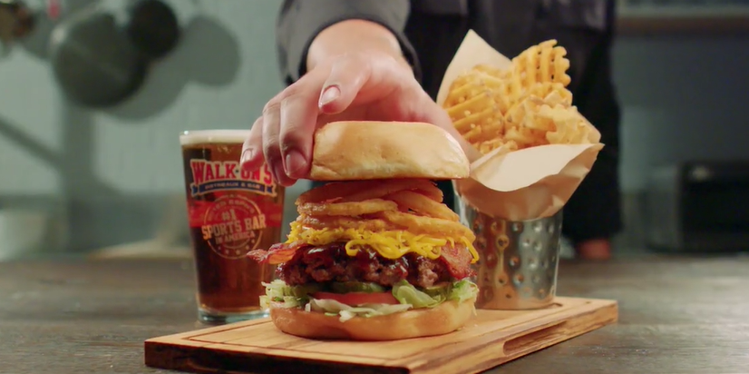
Over the years we learned and perfected the art of manipulating the audiences emotions, opinions and views through film. As this can be a quite a powerful tool, you would be right to assume that it’s not only used by artists that strive to tell compelling stories but also by states, religions, idealogies and also companies that want to sell their product. Commercial films are especially in todays world a very viable branch for filmmakers. The market is quite large and bigger commercials can actually come close to the production size and quality of triple A films, yet when watching a lot of commercials you might stumble upon a few recurring elements. In this blogpost I want to throw light on these elements and get an understanding for what conventional commercials are and how they look like.
The Story: 12 Types of Advertising
Every piece of film needs some sort of story, script or idea. Back in 1978 former creative director Donald Gunn identified 12 seperate categories of advertisments, convinced that every commercial applies to one of these types. To keep it short, here is a brief overview of the types:1
- Demo
- Show the problem
- Symbolise the problem
- Contrast with competition
- Exemplary story “show the actual benefit”
- Benefit causes story
- Presenter testimonial “tell it”
- Ongoing character & celebrities
- Show benefit through a symbol, analogy or exaggerated graphic
- Associated user imagery
- Unique personality property
- Parody or borrowed format
In the earlier days of TV Commercials we have seen a lot of demonstrations, problem showings, contrast with competition and exemplary stories. This changed when Marlboro introduced their ad campaign with the Marlboro man, as they were the first company to associate a lifestyle with a product.
Marlboro’s successful campaign quickly influenced other companies to put a message first, rather than the product they are trying to sell. Connecting the audience with a positive emotion to a brand instead of just information. This type of advertising allowed for more creative approaches and broke the seal for unconventional types of TV-Commercials.
The Look: Equipment, Light, Color…
Television commercials usually look different than your classic Hollywood movie. This is due to many factors, for example nearly every advertisement is shot digitally and with sharp modern lenses whilst movies sometimes still get shot on film and/or with more stylized vintage lenses, as we learned in the previous blog entry about cinematographer Hoyte van Hoytema. Mostly because it’s cheaper and more versatile in production and post-production.
Advertisements tend to stay on the brighter spectrum. High-key lighting, vibrant colors and strong contrast seems to be the dominant commercial look.
This makes sense since companies like to appear modern, open and overall friendly whilst movies usually want to further enhance the emotion and mood with lighting and color. This is the reason why most TV-Commercials look very similiar, there a simply not a lot of options to choose from in order to make something that appears friendly and modern. Yet there are also some other more subtle reasons, for example eye sight gets instinctly drawn to points that are brighter and have more contrast. This is important to stick out in an 15 minutes ad block.
To show you what exactly I’m talking about I went ahead and compared two similar office scenes using the parade color scopes:
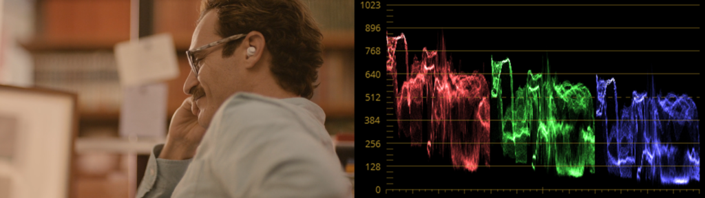
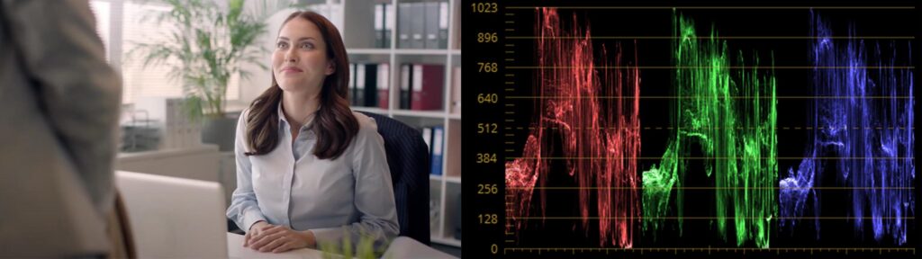
When looking at the image itself we can see that the movie look is more washed out and stylized with its warm and soft approach whilst the commercial keeps it more neutral, bright and with more contrast. This gets further proven by the color scopes – the movie screenshot is keeping its values rather low with less colors in the heights aswell as in the shadows. The commercial on the other side is clipping on both fronts and doesn’t has a color that is more dominant, like the reds in the movie scene. It’s using the whole color range of Rec709 which is the color space most of our TVs and phone monitors have.
Ever since Marlboro proved that a emotion can be advertised and tied to a product, companies tend to further dive into the world “cinematic advertising”. Allowing for more creative freedom, telling interesting stories that actually have meaning and putting the product or company second. This is usually the point where the line between the look of advertisements and movies gets blurred, something we tend to see more and more in todays marketing world . Commercials like these have proven to be cabable of going viral, in fact even more than informational ads.
Breaking the Conventions
Speaking about ads that did it different – there are quite a few of those that cleverly broke those conventions I mentioned earlier and went viral or atleast created a little fanbase around them.
One commercial that sticks out as an unconventional ad is Volvo’s “The Parents”. It tells a relatable story of young parents that face the hard times in the upbringing of their kids with the car beeing the solution in the end.
It’s well written and the cast also provides a great perfomance, yet what makes this piece so unconventional is that it’s shot on 35mm film in a 4:3 format. They also used Japanese vintage lenses to further enhance this quite unconventional retro look. On Vimeo director Niclas Larsson pointed out that he liked the 4:3 format as he and DoP Linus Sandgren thought it fitted well to the way it framed the humor and characters in the commercial. Although in this case Volvo did decide to only release a 16:9 version of the film on their media channels, despite the vision of the director.
Analog / Digital – Tricks & Film
Nowadays the movies are full of animations, never mind if it’s a kids movie or a sci-fi blockbuster.
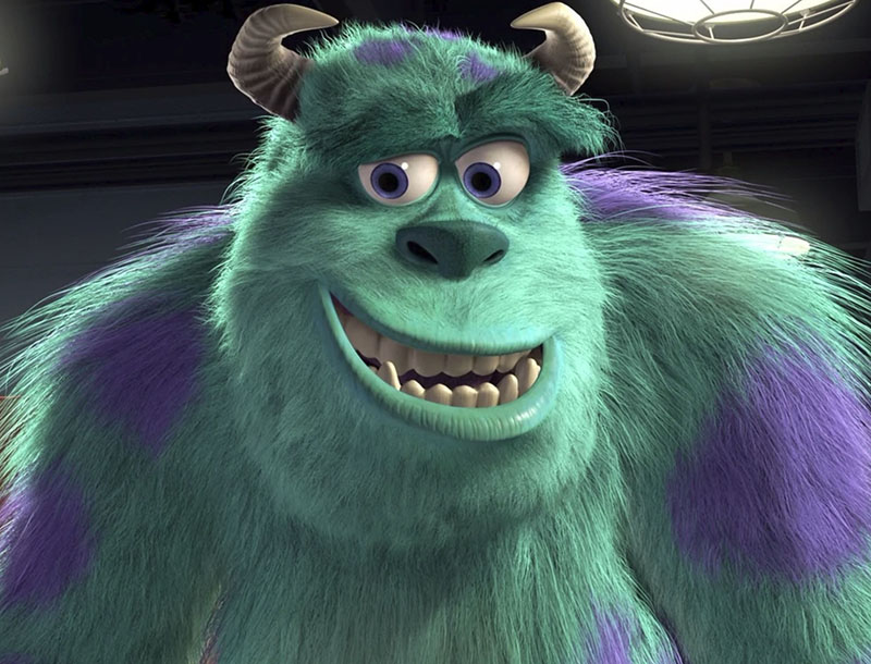
In the fully animated movie Monsters, Inc., released in 2001, all the figures, landscapes and effects were digitally created on the computer. The success of the movie came not only because of the funny story, but was also due to the incredibly high details the characters and the whole “set” showed. The monster Sullivan, for example, was rendered with a fur containing 2.3 million hairs!
Now, twenty years later, the possibilities to trick the audiences of course have increased. For movie studios it’s easy to put real actors into completely animated sceneries. Due to the increase in computing power everybody who’s capable of using a smartphone can easily morph their self portraits into younger or older versions of themselves. With some experience you should even be able to produce deepfake videos – a technique where mostly (famous) peoples’ faces are mapped onto faces in real videos or images. Taking the fact that these deepfakes, generated with help of machine learning and artificial intelligence, seem extremely realistic, the method of deepfake should be handled with care even though really funny things are possible.
Besides highly detailed digital effects, 3D-animations and renderings connecting reality and imagination on a level never reached before, all the movies we watch still make use of pretty easy tricks. Simple cuts and montage do not only create concise coherence but also create specific atmospheres and evoke emotions in the audience.
These methods are nothing new and neither connected to digital processes nor analog techniques – actually they have been used since the very early beginnings of film and movies in the early 20th century.
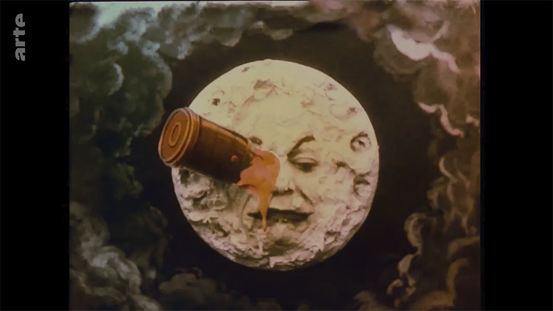
One of the pioneers of film was Georges Méliès, a French magician and manager-director of the Théâtre Robert-Houdin. Inspired by the Lumiere brothers’ performance of early motion pictures showing real life scenes, Méliès started to film scenes and experimented with the matter, which lead him to develop camera techniques such as stop-motion, slow-motion, superimposition or double exposure.
In a glass studio he built in the surroundings of Paris, Georges Méliès started to create theatrical sceneries, which in combination with film and camera made fictional narratives possible, like his most famous film Le Voyage dans la Lune from 1902. This movie showed the story of a handful of astronomers taking an adventurous journey to the moon via a cannon capsule and returning back to earth and thus can be seen as the first science fiction movie.
However as movies became more and more popular, big commercial film studios entered the market and forced Méliès out of business. In 1923 Georges Méliès burnt his entire life’s work with over 500 films, featuring partially hand colored movies, combining magic tricks, theatrical stage props and a variety of fantastic stories.
Luckily some (master) copies of his films survived around the globe and the genius of Méliès was rediscovered and the importance of his work was acknowledged by critics in the 1930s.
Almost one century after its first release, a colored copy of Méliès’ master piece was restored by Lobster Films. Between 1999 and 2010, up to date digital tools were used to carefully refurbish each of the 13,375 frames of the film, for which missing frames – lost or too damaged – have been taken from the black and white version and colored afterwards.
Taking into account that this movie reel was lost for decades, the digitally restored version partially resembles a hi-resolution short film, using numerous effects to make it look like it’s 100 years old.
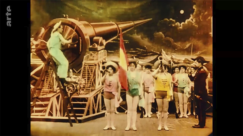
Eventually Méliès’ Le Voyage Dans La Lune is a great example for what effects and analog techniques have been used from the beginning of film til nowadays as well as the resilience of analog media. Additionally the carefully restored version shows the possibilties of digital editing and it’s depth and accuracy.
Sources
https://de.wikipedia.org/wiki/Die_Monster_AG
https://disney.fandom.com/wiki/James_P._Sullivan?file=Profile_-_Sully.jpeg
https://www.britannica.com/biography/Georges-Melies
https://www.arte.tv/de/videos/099870-000-A/das-geheimnis-georges-melies/
https://www.arte.tv/de/videos/041651-000-A/die-reise-zum-mond/
The “Rules” in Film
Over the last 70 years people in the industry learned what usually works and what not, doesn’t matter if its in the field of storytelling, cinematography or in the post productions sector. Most mainstream films in cinema, especially those from Hollywood, seem to have a lot in common with each other and we don’t seem to get a lot of new ideas from there. To answer why that is, is very simple – production companies love a guaranteed success! This why most of what we see in the cinema nowadays is always pretty familiar. From story structure, character developments to the way it’s filmed and edited. In this blog post I’d like to focus on the most common practices, or as some people like to call them rules, that are used in film.
Storytelling
It’s not necessary to to reinvent the wheel in order to write the story for a box-office hit. In fact it’s probably even better to stick to the rules of a three act story structure or also called a seven point story structure according to american screenwriter and author Blake Snyder. In “Save the Cat” Snyder gives clear instructions on how to write a entertaining story and even provides a so called beat-sheet. It determines what should vaguely happen at what page of the script and is pretty strict about it. All though he is also criticized for his harsh approach, it’s clear that most films follow these guidelines. He also points out that he didn’t invent those rules, they come from his observation and colleagues that he met over the years. Basically saying that those rules and guidelines for a good story where always there, he just wrote them down.
Blake Snyders Beatsheet:1
Opening Image (p.1), Theme (p.5), Set-Up (p.1-10), Catalyst (p.12), Debate (p.12-25), Act II (p.25-30), B Story (p.30), Fun & Game (p.30-55), Midpoint (p.55), Bad Guys Close In (p.55-75), All is Lost (p.75), Dark Night of the Soul (p.75-85), Act III (p.85), Finale (p.85-110), Final Image (p.110)

Without context the beat-sheet is probably a bit meaningless to most people but in the right hands a very strong tool for making an exciting and entertaining story. Blake Snyder also states that there are only ten types of movies. Every movie that exists can be assigned to one of those types. A few of his types are for example “Dude with a problem”, “Superhero” or “Buddylove”.
Composition
There are many ways to composite an image, yet some compositions just work and are a great basis to begin with. There’s no official rule book on this topic but the following “rules” or suggestions are probably the most common and used ones in film and television.
- Rule of Thirds
Divides the picture into a 3×3 raster that serve as a guideline on how to frame objects, people or points of interests in your frame. - The 180 Degree Rule
Depicts the radius in which you should place the camera when shooting dialogue between people. - Shot Types
There are 3 type of shots with several variations of it, the wide, medium and the close-up. They define how much of the person or object is visible in the frame. - Size Equals Power
This rule gives important information about the perception of size in the frame. If it’s important or mighty, it should be filmed in a close-up. - Leading Lines
Any objects, structures or textures can shape lines in the frame. This rule says to frame for having those lines run into our point of interest, e.g. into the actor. 3

Editing
Walter Murch, who is famous for his editing work with names like Francis Ford Coppola and George Lucas describes in his book “In the Blink of an Eye” a good edit as one that respects “The Rule of Six”. But what exactly does he mean when he talks about “The Rule of Six”?
The “Six” he is referring to are Emotion, Story, Rythm, Eye-trace, Two-dimensional plane of screen and Three-dimensional space of action. Those are the six elements that, if respected, make an ideal cut to him. He explains that in traditional cinema, especially back in the beginnings of sound film, the common practice was to always stay true to the position of the actors in between cuts. Back then jump cuts were seen as a mistake which, as we can see in films and shows nowadays is no longer the case. For Murch the most important thing in an edit is the emotion, as the only thing the audience will remember in the end is not the editing, camerawork or the performances but what they felt when watching it. He continues with providing a percentage of importance for his six criteria that make a good edit.
- Emotion = 51%
- Story = 23%
- Rythm = 10%
- Eye-trace = 7%
- Two-dimensional plane of screen = 5%
- Three-dimensional space of action = 4% 5
Murch’s “Rule of Six” should help editors on what to look out for when putting a scene together and also gives a sense for prioritization. But apart from the “Rule of Six” there are also some other common techniques that go more into the detail, for example:
- The “J-Cut / L-Cut”
Other than the “Hard-Cut”, which cuts the audio and visuals at the same time from one clip to the next, the L or J-Cut interpolates the audio in between two clips. Often used for dialogue scenes or to make a cut more seamless.

- The “Third Person at the Table Technique”
This technique is a powerful tool to get a sense for when to cut between people having a dialogue. I learned this trick in school while working on a documentary but haven’t found a name for it on the internet so I came up with this one. The “Third Person at the Table” is referring to the audience that is in the position of the camera – when would the audience look where in the scene? Naturally people don’t always look at the person speaking, sometimes they get a reaction or other times they stay on someone a bit longer before switching to the one speaking. Nothing happens immediately! To follow this technique the editor has to imagine to actually be in the room and cut between shots like if he was looking around. I recently also found this video from CineD going into futher detail on this technique. - The “One Frame Trick”
Another useful technique I learned in my bachelor years is the “One Frame Trick”. It states, that when cutting to a beat, music or SFX, the visuals should always come (at least) one frame earlier than the audio. It seems to most people that it just matches better than cutting on beat.7 - Cutting Patterns
Some patterns of switching between shot types (wide, medium, close-up) established to work better than others. The website “cuvideoedit” gives a breakdown on the most common cutting patterns:
Conventional
wide > medium > close-up (working closer towards the action)
Reveal
close up > medium or wide (slowly revealing more information)
Matching Action
cutting on movement for dynamic and seamless edits.8
Conclusion
I strongly believe that everything in this blog post is very fundamental and important knowledge for everyone working in the field of film creation. Although it’s a discussion worthy topic whether you you want to call them rules or not- I’d rather call them differently but calling them “techniques that have already proven to work reliable” is quite a long way to phrase it. The more interesting question is, if you rather want to stick to those conventions or not and even the professionals in the field don’t have an agreement on this.
For example, let’s go back to the Snyder and Murch. Blake Snyder is convinced about his strict approach in order to get a working story. He is sticking to what has already been done before him and deviations from his instructions are conceived as mistakes to him (which he clearly points out in his book). Walter Murch on the other side is a lot more vague when giving instructions. He is strongly referring to the emotional aspect of editing a film which is very hard to define and break down. He is also very much deviating from the traditional way of editing a film, which (if you remember) was very strict about the position of the characters in space and traditional cutting patterns. Before the french new wave happened, most of the rules in this blog-post were established and back then they were without a doubt rules, no quotation marks needed.
Sources:
1) Snyder, Blake: Rette die Katze! Das ultimative Buch übers Drehbuchschreiben, 2. Auflage, Autorenhaus Verlag, Berlin 2015
2) https://blog.reedsy.com/three-act-structure
3) https://www.studiobinder.com/blog/rules-of-shot-composition-in-film/
https://www.diyphotography.net/five-composition-rules-filmmaking-break/
https://motionarray.com/learn/filmmaking/shot-composition-framing-rules/
4) https://mediamakeracademy.com/rule-of-thirds-in-film/
5) Murch, Walter: In the Blink of an Eye – A perspective on film editing, 2nd Edition, Page 17 – 18
6) https://www.techsmith.com/blog/how-to-edit-videos-l-cuts-and-j-cuts/
7) https://youtu.be/7E_mi_xNYOk
8) http://www.cuvideoedit.com/rules-of-editing.php