
Altough the printing method using movable letters has already been known in Eastern parts of the world it was the German goldsmith Johannes Gutenberg who improved this technique in 1450 which lead to a revolution in print setting and production of books and thus made the spread of information and knowledge available to a broader public. Before Gutenberg’s invention, in Europe it was the job of clerics to write and design (religious) stories and especially copies of the bible by hand, which of course was a slow but also quite expensive process. Due to this only the very wealthy part of the population was able to afford books and the contents they conveyed.
Compared to nowadays spread of information Gutenberg’s invention was also very slow and expensive, but his invention did not only speed up the reproduction of knowledge–by giving craftsmen the possibility to produce books and newspapers, the catholic church subsequently lost control over publishing and thus knowledge and science, leading to an empowerment of the bourgeoisie.
For over 500 years then, the method of letterpress printing was the predominant form to combine texts with woodcuts and later linocuts, or metallic printing plates.
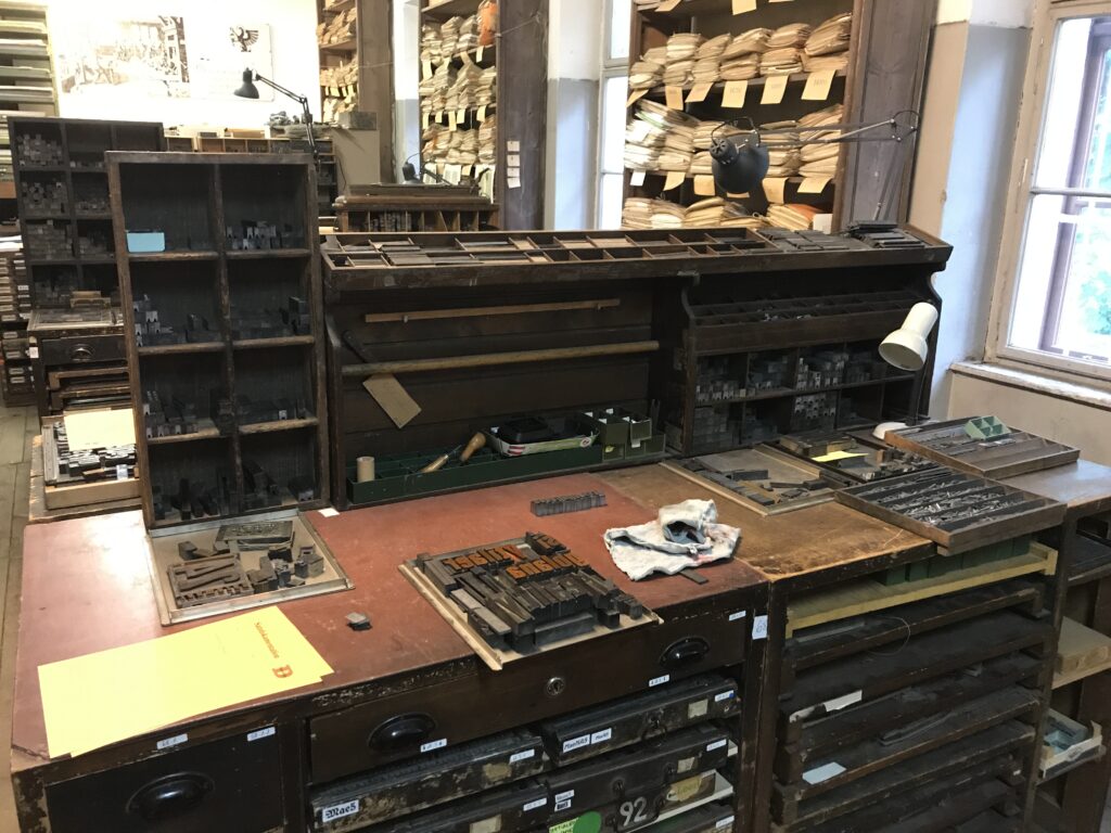
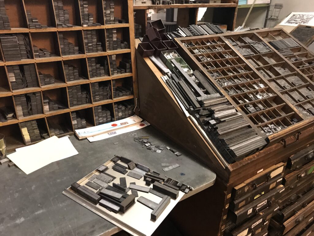
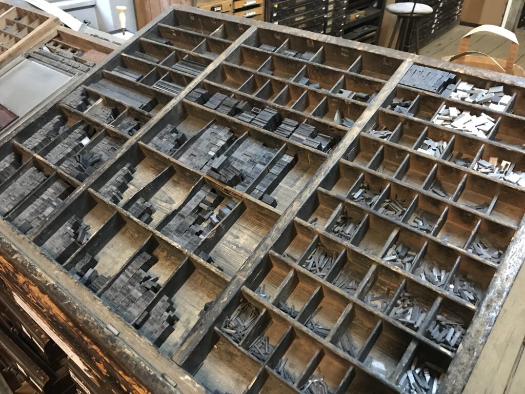
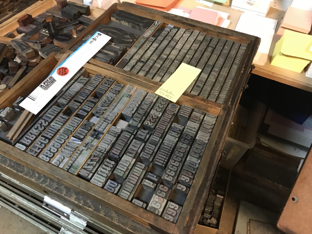
In Graz the Druckzeug is the local museum for antique and 20th century printing techniques, that besides numerous printing machines holds a huge collection of wooden and lead letters. In addition to the moveable letters in various fonts, sizes and cuts, the typeset workshop is fully equipped with spacebands and leads, as well as all the tools you need to prepare everything from a single one word lettering, abstract type-sets and full page texts for your personal letterpress print experience.
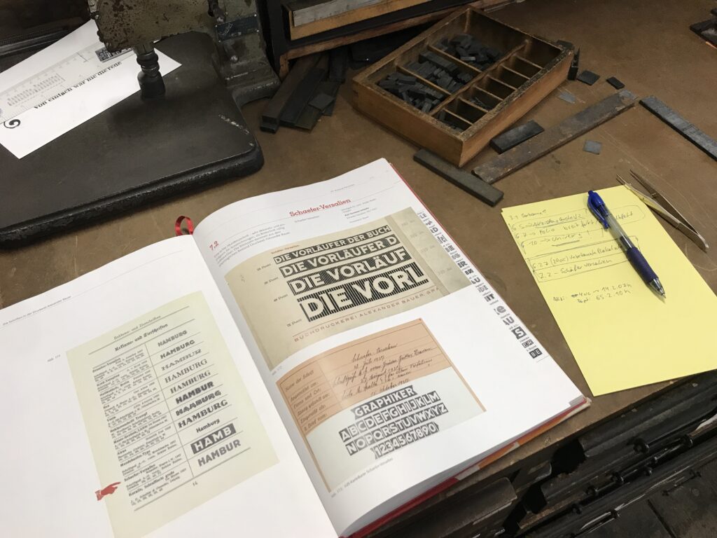
Browsing through Allez hopp! Buchstaben aufräumen : die Handsatzschriften in der Buchdruckerei Alexander Bauer, Graz by IND10 student Ursula Bogner, a font catalog containing the biggest part of fonts and typefaces available at Druckzeug, you can learn more about the history, categorization and use of the fonts. Besides depiction of the typefaces the catalog also contains a register in which drawer you will find the various fonts.
At first for my experiment I planned to test four to five different fonts, but soon found out that not every font provides a complete set of letters and also you won’t find every cut or font size that you would need for your desired printing purpose.
Besides, for the unexperienced type setter, working with hand set letters is another quite time consuming and intense work–first you need to pick out the letters you need for your text, then find suitable spacebands and fill your set with non printing pieces of normed lead to fix your letters, so they won’t fly away during the print run. In addition you should always keep in mind that after printing you have to put back in place every piece you used!
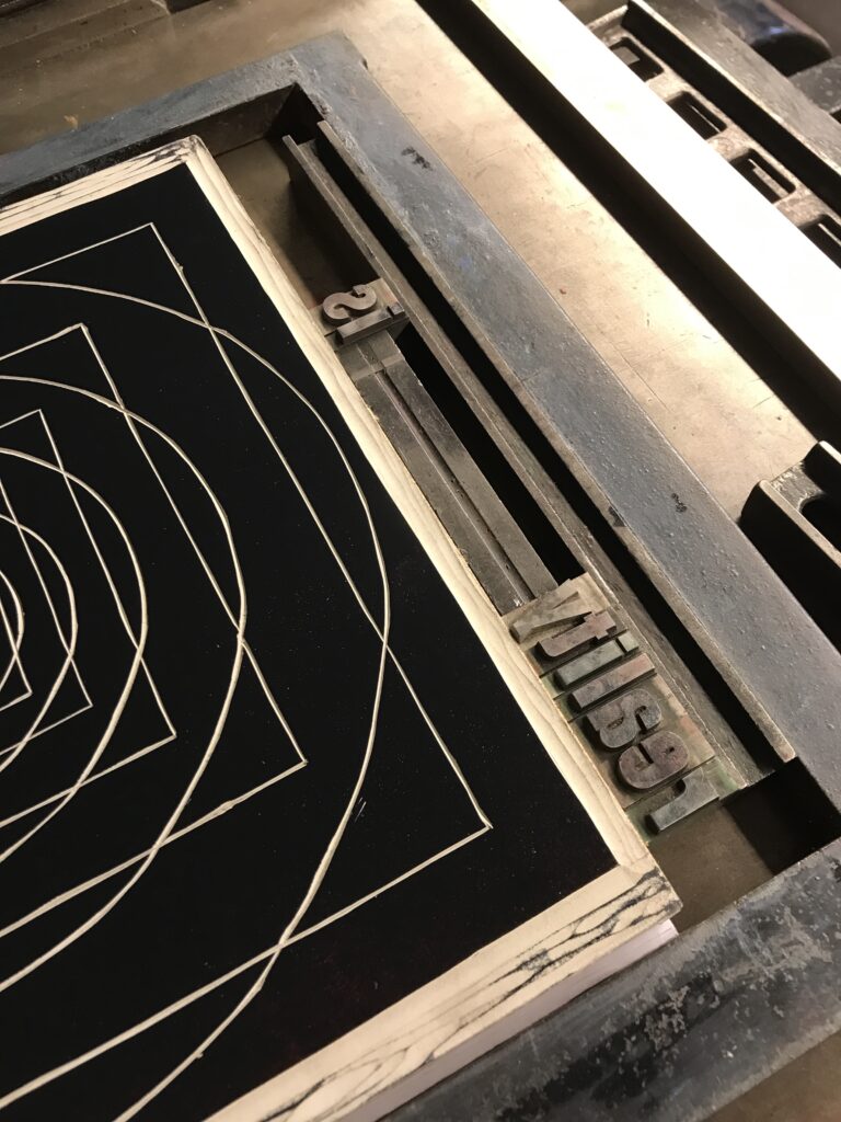
So in general it’s good to think about font, cut and size first and to begin with this printing method it’s a great deal to keep it simple, as the more material you use, the more adjustments you will need for a proper printing image. (Not only that various fonts may have slightly different printing heights, you will find that especially bigger wooden letters need a lot of adjustments as they can be rather worn, resulting in a vintage print look).
However, I finally decided to use a set of 14pt Akzidenz Grotesk regular as well as (assumably) 60pt Anzeigen-Grotesk bold to test some arrangements and layouts for the proof press.
In general the method working with single letters and truly manual spacing seemed to give another perspective for typography, but also for the necessity of white space and it’s arrangement. On the one hand the use of physical letters sharpens the perception of typographic characteristics, while creating an awareness for the advantages of well made digital fonts. Secondly, the use of standardized sizes of fonts and leads, provides a rather intuitive approach to efficient use of spacing and proportions, compared to seemingly unlimited possibilities offered by a screen based layout.
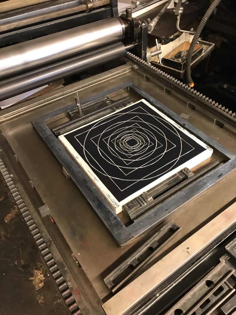
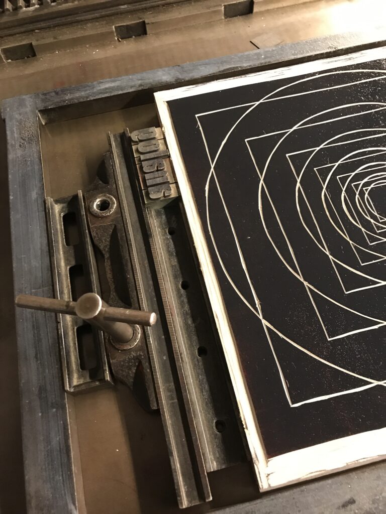
However, compared to working on the digital desktop, to see the result of your letterset it’s even more important to make a proof print–first of all, only the proof print will reveal the right reading direction as the printing letters are always mirror-inverted. Additionally the font size of the letters appear bigger in their physical than in printed state. And of course, while you can add spacing to your letter set before the first print, only the print will show if spacing is used properly.
In the case of my experiment, although some adjustment in spacing between the letters was need, the typefaces turned out to be a great choice as the lead letters still had sharp edges for a clean and clear printing image.
To see the printed results, look out for part four of the experiment: proof press.