Print experiment: “reality is analog”, part IV–proof press

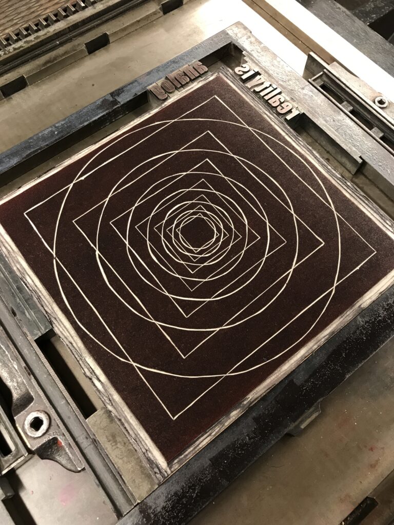
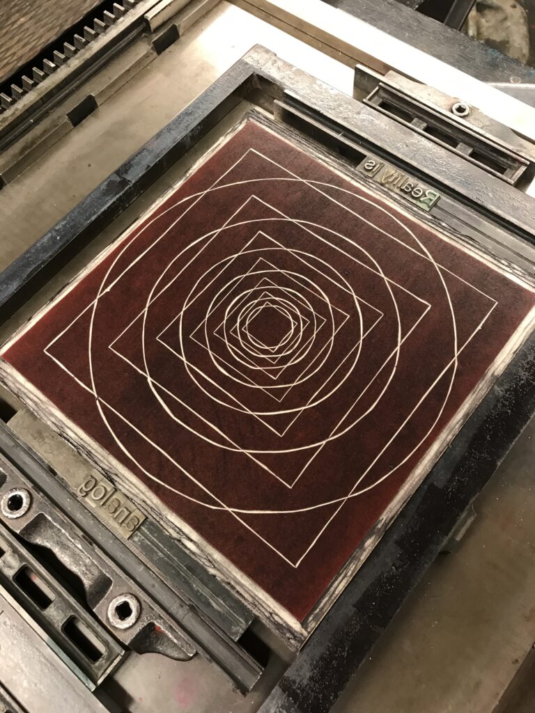
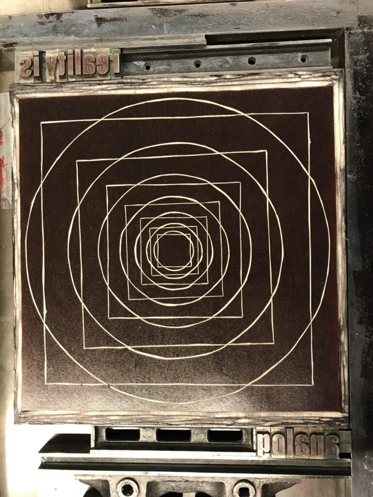
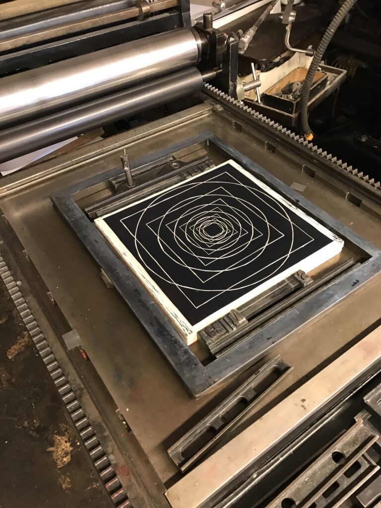
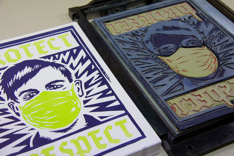
Together with the linocut I placed and fixed the sets of lead letters on an Asbern Proof Press from 1959. Presses like these have originally been used to make a first proof print to see if adjustments to your set and additional printing blocks were needed.

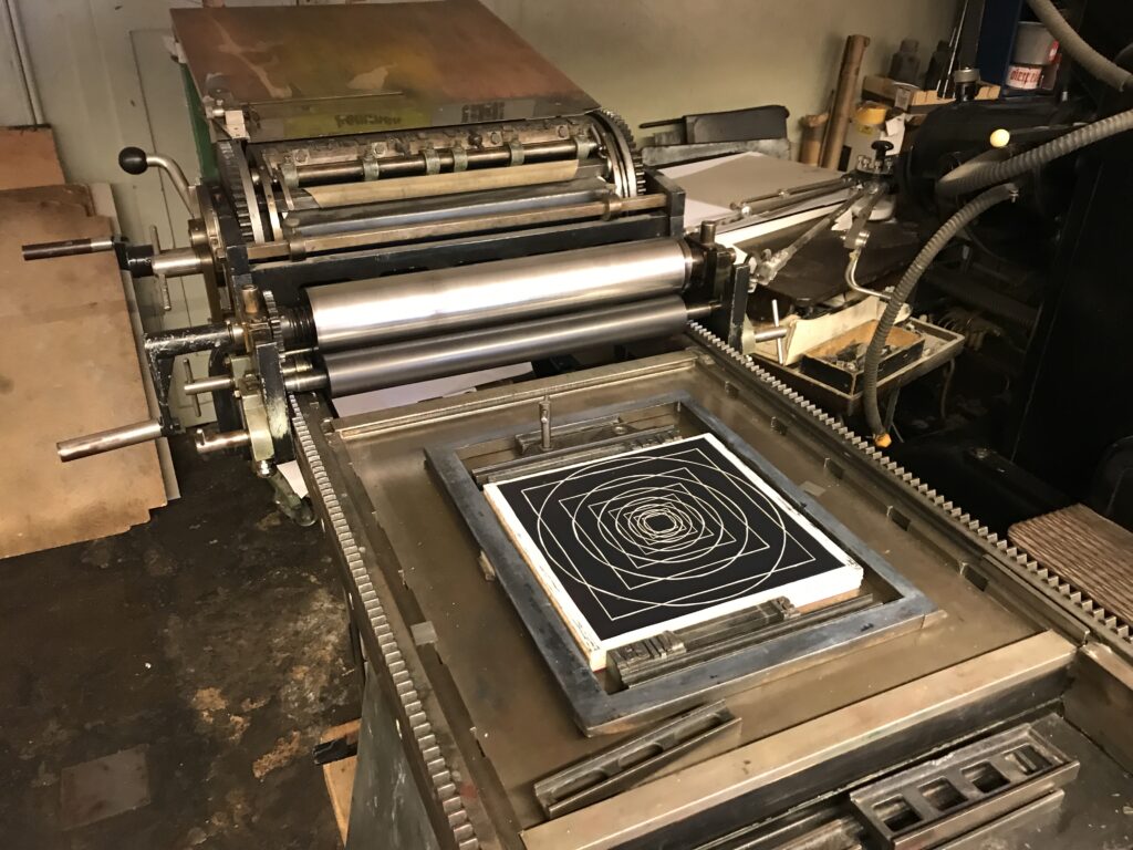
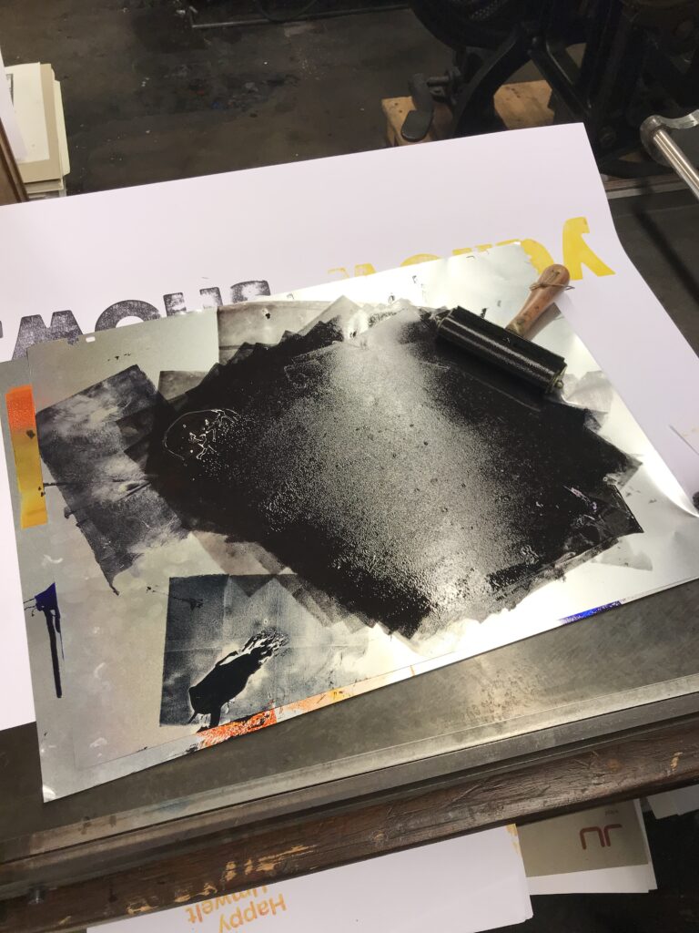
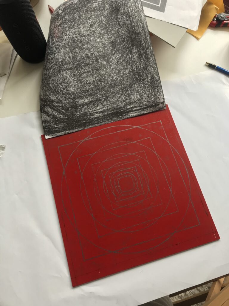
Although this manually driven press provides it’s own inking unit, I decided to colour the letters and linocut by hand, using offset printing colours and a silicon covered hand roller. By this I was able to put on more colour on the area of the linocut and only very little colour on the comparably small letters–for printing it’s always important to ink bigger areas properly, as they physically do not provide as much pressure as small forms pressing the colour deeper into the structure of your paper or printing fabric.

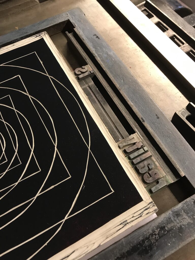
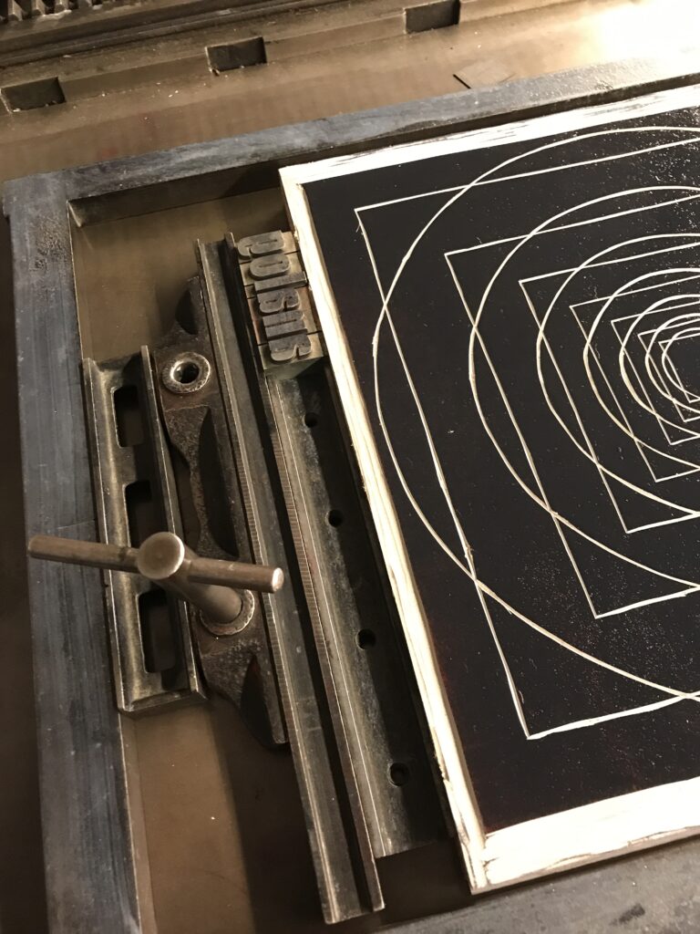
More features of the Asbern proof press are the adjustable cylinder, with which you can adjust the height of the cylinder that runs over the printing image. This function helps again to increase or decrease pressure and thus optimizing your print result without the need to strengthen your whole set with paper or cardboard from beneath. In addition the so called “Anlage” is a feature that’s part of almost any printing as well as book binding machine (and can also be found in the extended field of crafts and production). From historic ones to high tech offset machines, this technical feature enables you to fine-tune the position of your print not by moving the printing set, but adjusting the position of the paper in order to have the print in the same position on every sheet. This feature is extremely important if you have to print more colours in separate print runs next to each other, but also if you want to print on the back of your sheet on the right position.

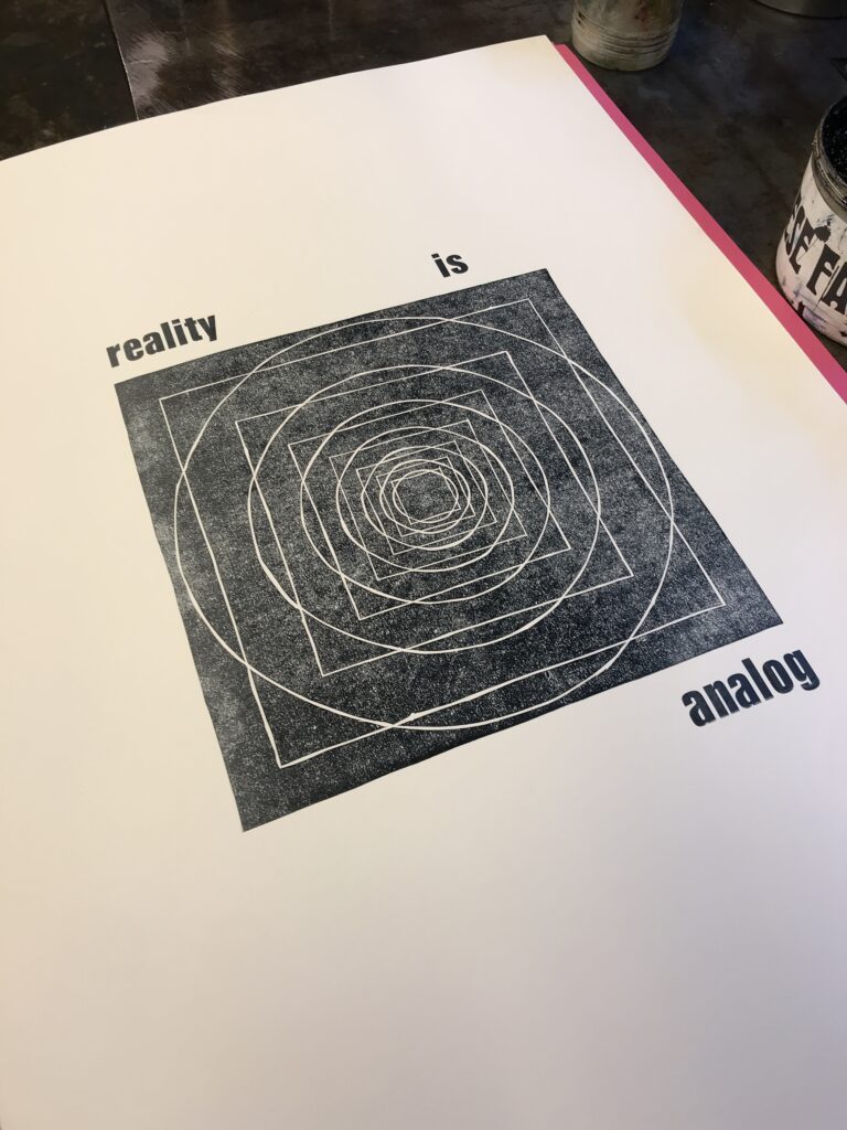
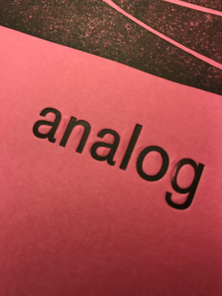
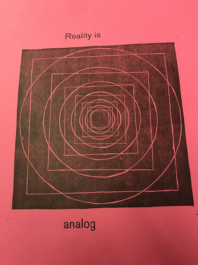
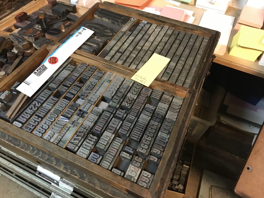
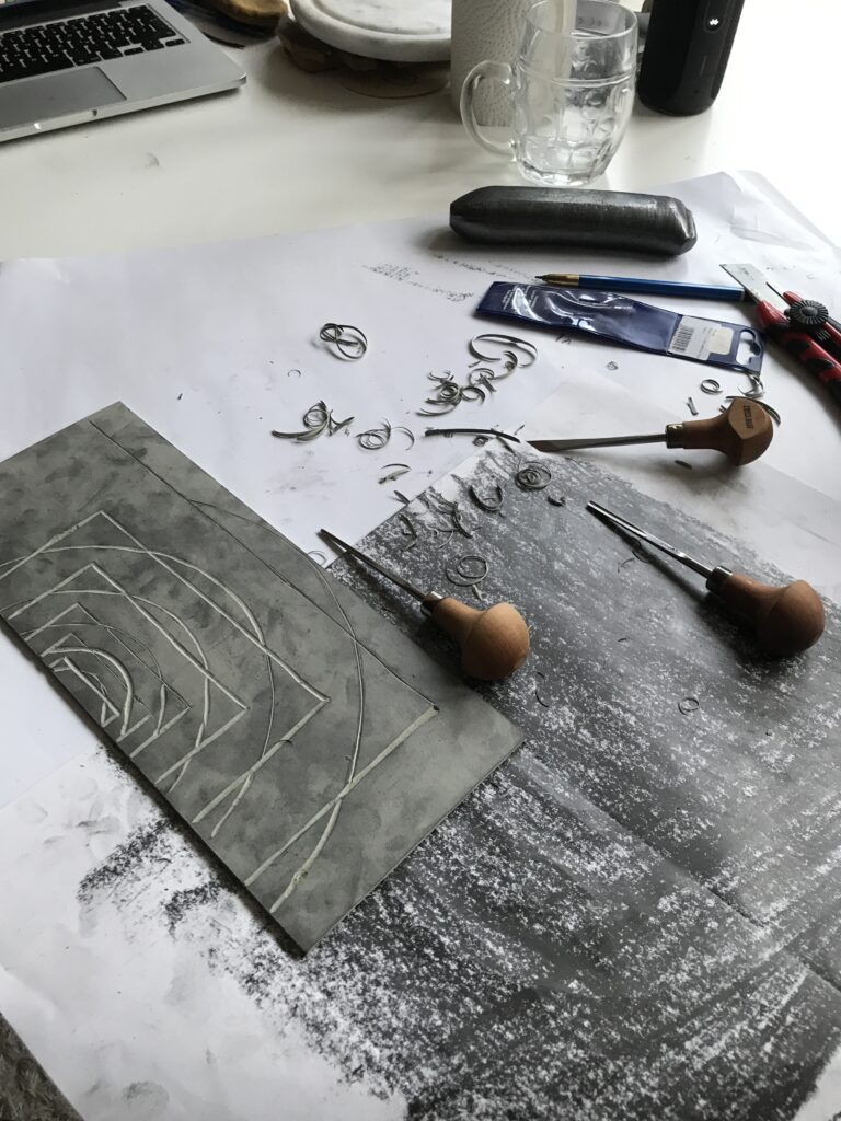
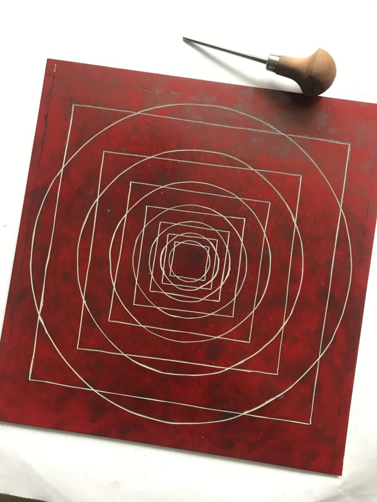
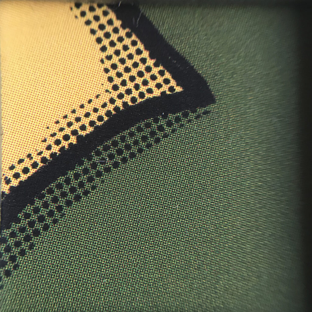
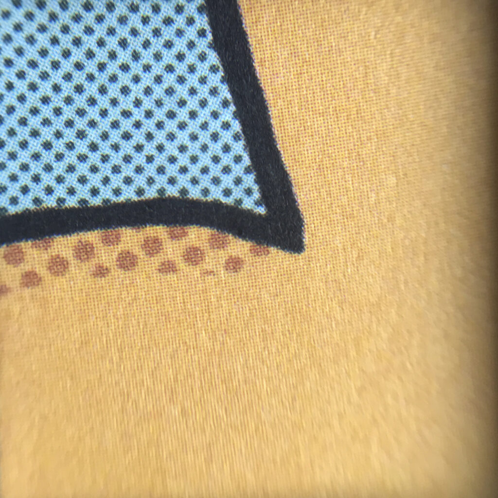
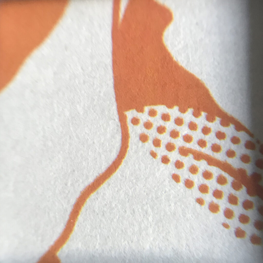
As mentioned in the previous post, the first proof of your letter set, reveals the correct reading direction of your text and letterings, including spacing. Besides, the proof will also show if the letters still have sharp edges or are rather worn out. Especially big wooden letters easily take on wear and due to minimal irregularities in height they may not take colouring evenly, resulting in a rather vintage look.

For the lino-cut I had to put quite a lot of paper beneath the print block to increase the height and thus gain pressure for a better printing result.


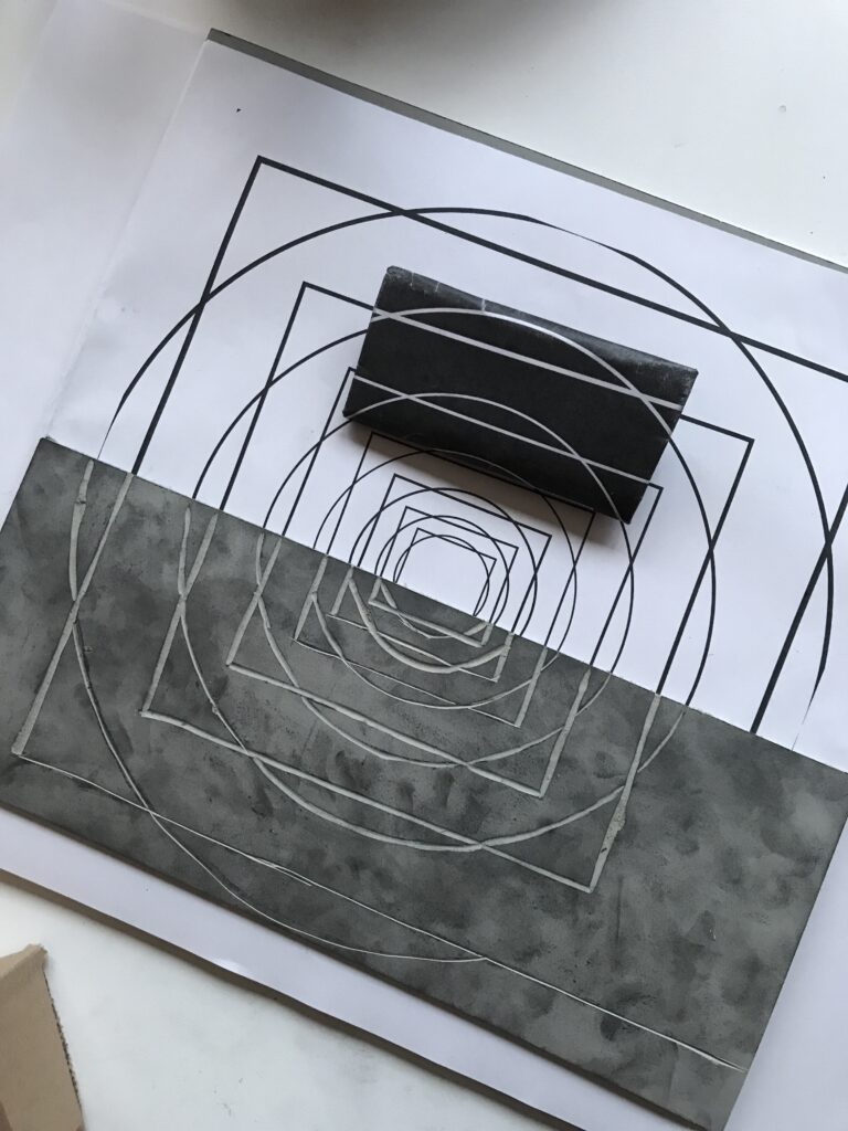
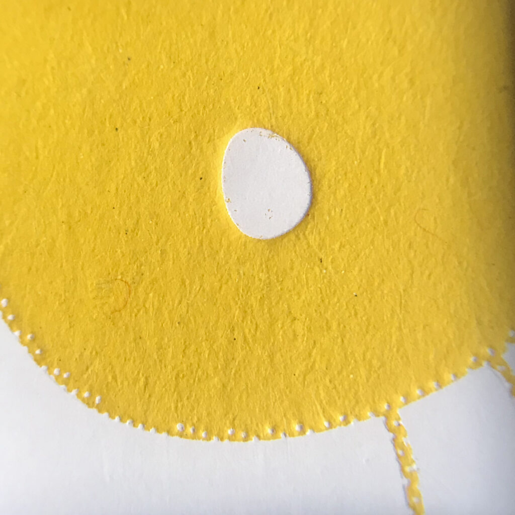
The inexact height of the letters (from various fonts), but also printing blocks and the combination of both often makes adjustment necessary. By simply putting thin pieces of paper like wrapping paper beneath forms that do not take colour and thus won’t appear in the print, it’s possible to raise the height of the single letters or areas of printing forms. Adjusting the height will not only make previously uninked areas visible, but will also increase pressure and thus create a better printing image. Here it’s interesting to mention that putting a single strip of adhesive tape beneath a letter can make a difference of a not printing, a printing or even an embossed letter in your print.

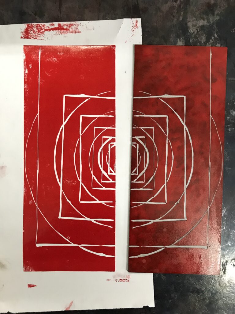
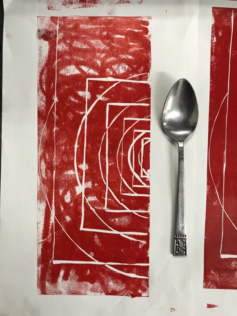
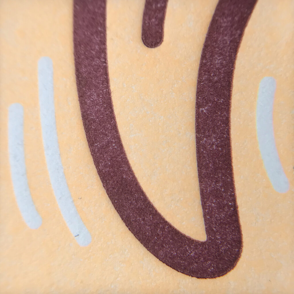
A simple rule for letterpress printing is that little pressure and little colouring will result in a rather “cloudy” appearance, while more pressure and more colour will give your image a more saturated look. Too much pressure may exceed the possibility of embossing, which may result in cracks of the paper. Also too much colour (in combination with high pressure) will result in blurry edges.

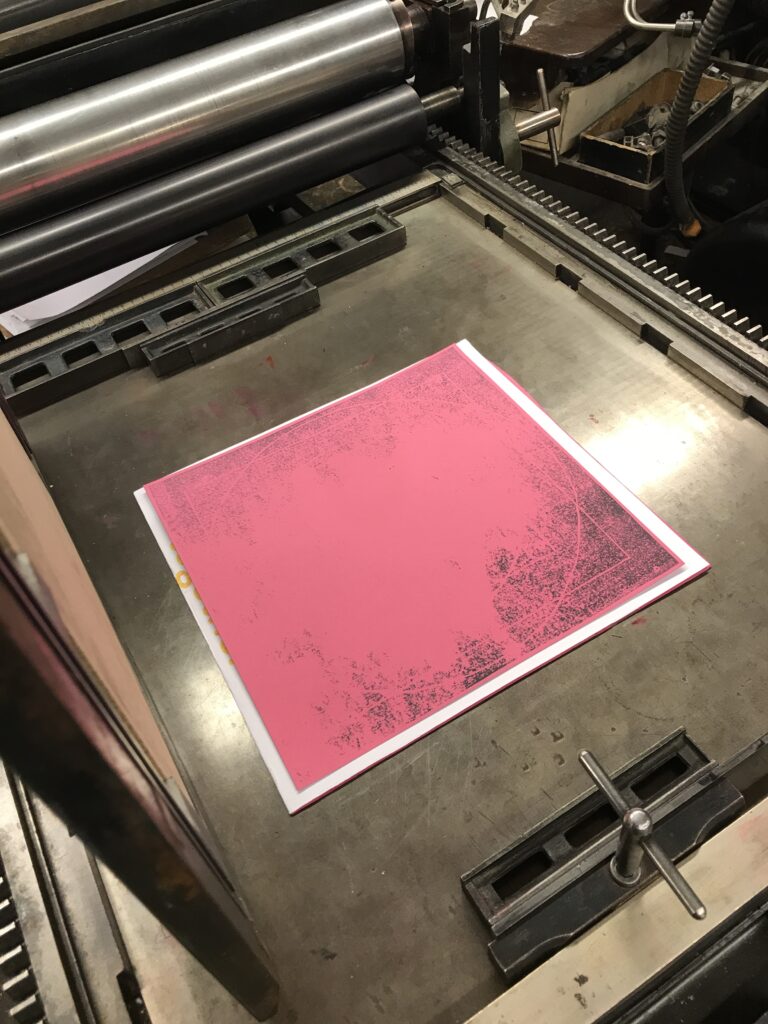
As soon as you’re happy with the result of your print proof, you’re ready for the actual print run.

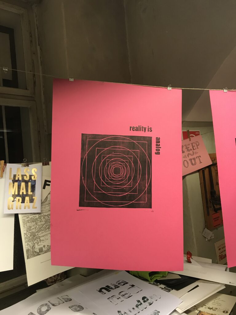
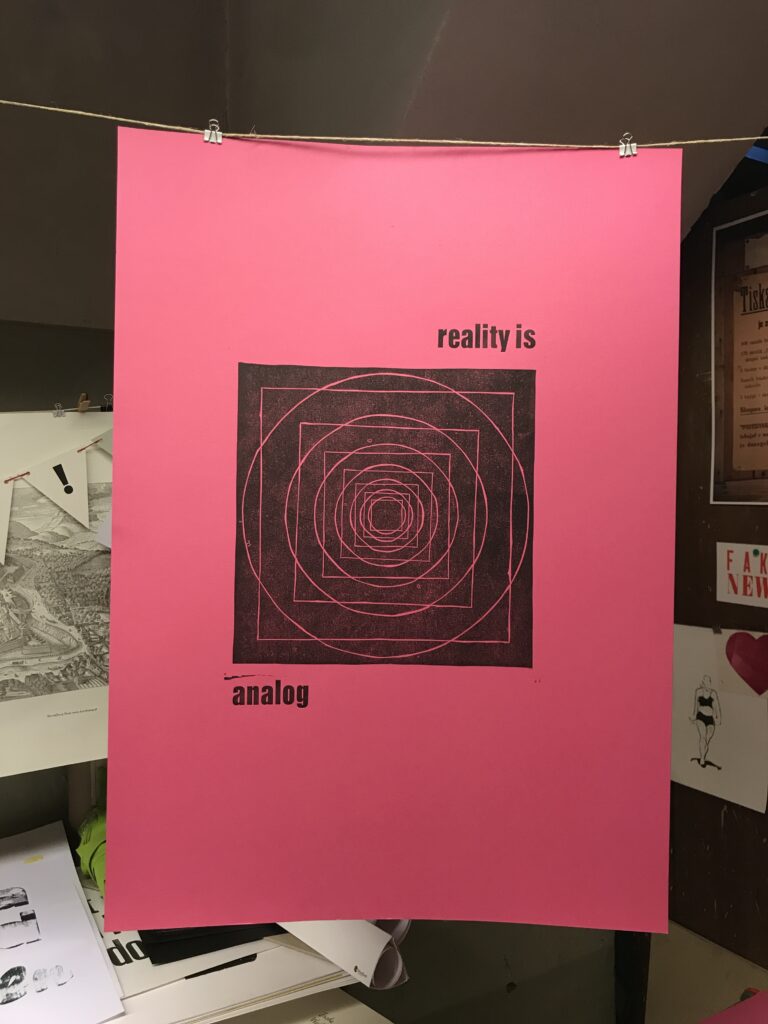
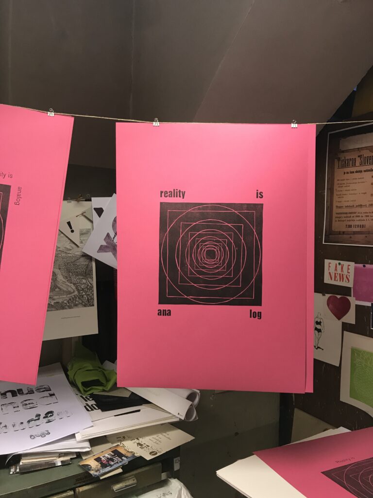
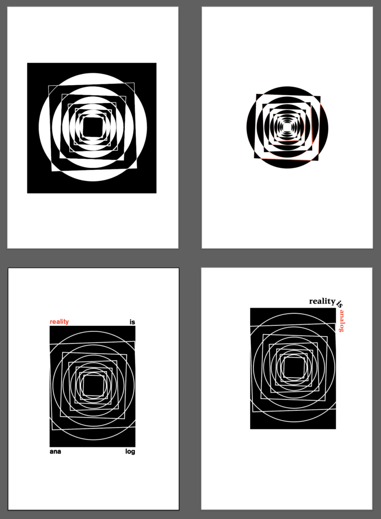
For small editions you can go on with the proof press. If you ink your letter sets and printing blocks by hand you can make use of possibilities like varicoloured areas or adding different analog effects on purpose to your print.

However, as this again is a quite time consuming work, for higher editions, of more or less constant colouring and quality it’s the time to move on to a fully automated press. Get to know the Original Heidelberger Zylinder in my upcoming post: part five–print edition on OHZ.

Print experiment: “reality is analog”, part III–hand set lettering

Altough the printing method using movable letters has already been known in Eastern parts of the world it was the German goldsmith Johannes Gutenberg who improved this technique in 1450 which lead to a revolution in print setting and production of books and thus made the spread of information and knowledge available to a broader public. Before Gutenberg’s invention, in Europe it was the job of clerics to write and design (religious) stories and especially copies of the bible by hand, which of course was a slow but also quite expensive process. Due to this only the very wealthy part of the population was able to afford books and the contents they conveyed.

Compared to nowadays spread of information Gutenberg’s invention was also very slow and expensive, but his invention did not only speed up the reproduction of knowledge–by giving craftsmen the possibility to produce books and newspapers, the catholic church subsequently lost control over publishing and thus knowledge and science, leading to an empowerment of the bourgeoisie.

For over 500 years then, the method of letterpress printing was the predominant form to combine texts with woodcuts and later linocuts, or metallic printing plates.

In Graz the Druckzeug is the local museum for antique and 20th century printing techniques, that besides numerous printing machines holds a huge collection of wooden and lead letters. In addition to the moveable letters in various fonts, sizes and cuts, the typeset workshop is fully equipped with spacebands and leads, as well as all the tools you need to prepare everything from a single one word lettering, abstract type-sets and full page texts for your personal letterpress print experience.

Browsing through Allez hopp! Buchstaben aufräumen : die Handsatzschriften in der Buchdruckerei Alexander Bauer, Graz by IND10 student Ursula Bogner, a font catalog containing the biggest part of fonts and typefaces available at Druckzeug, you can learn more about the history, categorization and use of the fonts. Besides depiction of the typefaces the catalog also contains a register in which drawer you will find the various fonts.

At first for my experiment I planned to test four to five different fonts, but soon found out that not every font provides a complete set of letters and also you won’t find every cut or font size that you would need for your desired printing purpose.

Besides, for the unexperienced type setter, working with hand set letters is another quite time consuming and intense work–first you need to pick out the letters you need for your text, then find suitable spacebands and fill your set with non printing pieces of normed lead to fix your letters, so they won’t fly away during the print run. In addition you should always keep in mind that after printing you have to put back in place every piece you used!

So in general it’s good to think about font, cut and size first and to begin with this printing method it’s a great deal to keep it simple, as the more material you use, the more adjustments you will need for a proper printing image. (Not only that various fonts may have slightly different printing heights, you will find that especially bigger wooden letters need a lot of adjustments as they can be rather worn, resulting in a vintage print look).

However, I finally decided to use a set of 14pt Akzidenz Grotesk regular as well as (assumably) 60pt Anzeigen-Grotesk bold to test some arrangements and layouts for the proof press.

In general the method working with single letters and truly manual spacing seemed to give another perspective for typography, but also for the necessity of white space and it’s arrangement. On the one hand the use of physical letters sharpens the perception of typographic characteristics, while creating an awareness for the advantages of well made digital fonts. Secondly, the use of standardized sizes of fonts and leads, provides a rather intuitive approach to efficient use of spacing and proportions, compared to seemingly unlimited possibilities offered by a screen based layout.

However, compared to working on the digital desktop, to see the result of your letterset it’s even more important to make a proof print–first of all, only the proof print will reveal the right reading direction as the printing letters are always mirror-inverted. Additionally the font size of the letters appear bigger in their physical than in printed state. And of course, while you can add spacing to your letter set before the first print, only the print will show if spacing is used properly.

In the case of my experiment, although some adjustment in spacing between the letters was need, the typefaces turned out to be a great choice as the lead letters still had sharp edges for a clean and clear printing image.

To see the printed results, look out for part four of the experiment: proof press.

Sources:
https://de.wikipedia.org/wiki/Buchdruck

Print experiment: “reality is analog”, part II–linocut

For letterpress printing linoleum makes a great and very affordable opportunity to create your own printing plate. Equipped with a special set of knifes with various widths to carve from thin lines to bigger areas, you can easily draw your design on the lino or transfer your layout from a simple inkjet print–either by using acetone to transfer the toner from print to lino, using carbon paper or simply by covering the back of the print with graphite and tracing your image by hand. For this be aware, that the image on your linocut has to be mirror inverted!

As mentioned before I wasn’t highly experienced in the field of linocuts, so I checked the web to find these highly useful tips:

– Always cut in the direction away from your body and hands, not to injure yourself!

– Before transfering your image you can prepare the lino plate and slightly grind the surface. Putting a solid layer of printing ink on your piece of linoleum will help you make your design better visible for carving and is also likely to improve your print result as eventually the surface of the lino-plate is evenly smooth.

– Attaching your lino-plate to some cutting board or just a big sheet of paper will help you to turn your plate and likewise fix the lino with your second hand in a rather safe area, away from the carving knife.

– There’s two possibilities to create your printing image. Number one is the so called “Weißlinienschnitt” (white line cut) which results in the cut lines not to be printed. Second to that you can also make a “Schwarzlinienschnitt” (black line cut) for which you cut out areas resulting in lines and shadings to carry ink and appear on your print. The second option is of course more time consuming but provides better possibilities in creating detailed pictures. Whatever you do, keep in mind that what is cut out from the linoleum will not be visible on your print.

– After you have carved your design into the lino, you can ink the printing plate and by pressing a sheet of paper on it you will have a first impression of what the print is going to look like and help you to find out if you need to extend line-widths or clean up your image if needed.

– If you don’t have a printing press at hand, for small editions it is also possible to use a spoon to wear through your printing plate on paper or even use a rolling pin to print your image.

– As soon as your happy with your printing result you’re ready for the print run. Working with letter press machines you will have to attach your linocut to a piece of wood in order to achieve printing height–the linoleum is 3mm thick, so you can get a piece of 18mm thick press board to attach your linocut and put cardboard or paper under it to reach the standard height of 23,6mm.

So as I had a linoleum plate size A3, I cut away a piece that I didn’t use for my design and before starting the proper linocut, I had a first test to see how transferring the image works and also to check out various knives and see how thick the lines have to be for the print and use the chance to get a little feeling for handling the knives and carving in linoleum. I was quite astounded how thin the lines for my white line cut could be and still be perfectly visible in print. After the first test cut and print I started working on the final linocut.

As you can imagine the circles were rather tricky to carve but also for the straight lines a calm hand was needed. In general I had the feeling for doing a linocut you should relax and take your time, but definitely don’t carve hastily, especially when your a rookie in the field. The good thing about this is, as long as your not in a hurry, the process of cutting has quite a relaxing effect anyway.

After about three and a half hours in total–transferring the design, first careful cut followed by a second carving run to broaden the lines and do some corrections, the lino cut was finished and I was ready for the next step: choice of fonts and preparing the lettering.


In general I can say that I was amazed by the result and even if I wasn’t able to create a highly precise printing plate with perfect lines and circles, the appearance of the linocut was just what I expected with all it’s inaccuracies but specific characteristics that come with the method, all adding up to the topic of this experiment.

For all who are interested in doing their first linocuts I can recommend this tutorial on Youtube.

Besides you should also check out Maarit Hanninen’s prints to see possibilities in linocut printing and get a better impression about the process of hand made linocut printing.

Print experiment: “reality is analog” // part I–concept & design

As an experiment for my research I came up with the idea to produce a poster edition using a linocut as well as a hand set lettering. In addition I’ve planned to make photos of every poster to see the development of the print run and finally will hang the posters in public space to observe how people will react to the poster.

Part I–concept & design

Inspired by the claim “Reality Is Analog” I wanted to create a poster, delivering the message via a typographic layout but also transporting the nuances and very own features of analog print production. For this I got in touch with Druckzeug, the local museum for antique and 20th century printing techniques and letterpress playground in Graz, who kindly supported me to implement the project by opening the workshop and giving instructions in operating the machines (more info about Druckzeug, hand set letterings and steps of printing to follow).

Aside from the various possibilities in using typography for the poster –fonts, cuts, font size, alignment and layout–for the main theme I dealt with the classical geometrical problem of the quadrature of the circle (Quadratur des Kreises). To me, this problem, describing the impossibility to create–with finitely many steps–a square and a circle that have the exact same area, just seemed like a perfect analogy to the imperfection that’s very likely to occur in analog production.

However, as only a square and a circle didn’t seem to be highly attractive, besides repeating the theme I also added a tilt to every second square in order to provoke the viewers’ visual perception and thus emphasize the optical effects of the poster.

So for the first step I started to simulate a few variations and combinations of type and the graphic theme on the computer, offering infinite possibilities.

For the analog production however I had to decide on one variation and being quite inexperienced in the field of linocut I tried to keep it rather simple, which led me to this design for the main theme:

Check back soon for the next step: linocut.

Analog / Digital – Reality Is Analog

In my first posting on my research about analog and digital, I stated that in today’s tech companies there’s a high awareness for analog methods and processes. This interesting fact came out of the book The Revenge Of Analog by Canadian journalist David Sax in 2016. The book gives an overview about analog tools and media and how vinyl records, paper notebooks, films and board games conquer with their digital pendants. In addition Sax describes analog approaches in publishing, work and school.

However, the final chapter of the book deals with “The Revenge of Analog, in Digital“. For this chapter David Sax visited numerous high tech companies in Silicon Valley, speaking to project managers, designers and founders. Throughout the interviews Sax found out that in the very digital world of software developing giants, there’s not only a high level of appreciation for analog methods and processes, but also for the awareness of the analog nature that’s inherent to humans and their use of the five senses.

At Adobe Scott Unterberg, back then project manager for the Adobe Creative Cloud suite of programs, started with daily meditation sessions, which soon was attended by more and more employees, taking 15 minutes a day away from screens and technology. As the positive effects attendees’ stress levels were found to be lowered and likewise their health was improved. This seemed reason enough for Adobe to enroll the so called Project Breathe all over their global offices and meditation sessions became common, practically mandatory, throughout the Silicon Valley like Google’s Search Inside Yourself program.

On the more practical side, Kush Amerasinghe, scientist and strategic executive at Adobe helped to create the Adobe Kickbox Personal Innovation Kit. The kit is basically a box filled with post-it notes, instructions for taking an idea from scratch to reality, coffee and chocolate, pens and pencils, paper notebooks and $1,000 prepaid credit card. The initiative behind this emergency box was “…to focus on the idea, and not get constrained by the nitty gritty of technology. Programmers inherently have a bad habit of jumping into code and building when they get an idea.“


A similar phenomenon was described by John Skidgel, UX designer at Google – “Computer design software immediately looks real, and because of this, designers too often get caught up in precise but utterly pointless details.“ That’s why Skidgel, himself always sketching first drafts on paper, started courses for designers, where they would learn to draw vertical lines, horizontal lines, dotted lines, shadings or text boxes as tools in order to “enable Google’s designers to focus on quickly and effectively communicating new ideas, without getting mired in the infinitely adjustable variables that design software allows“. This sketching classes were so effective that Skidgel’s course is now taught to all Google UX and UI designers world-wide.

Besides meditation and analog approaches in developing ideas, David Sax, on his tour through Silicon Valley, also realized that in contrast to the very virtual software developed at the companies, the interior somehow seemed to ground the staff in the very real world of analog things. At Yelp he found classic white boards used as platforms to exchange ideas all over the place. At Pinterest he met brand design manager Evertett Katigbak, who had a background in letterpress printing. Katigbak told Sax about his time when he worked at Facebook. Together with designer Ben Barry they set up some printing equipment in the Facebook warehouse, initially to come over “frustration over an obsession with data and metrics [and the printshop being] an attempt to humanize the brand for an internal audience, and to humanize the user.“ For a joke they called it the Analog Research Laboratory, producing signs with slogans such as “If It Works, It’s Obsolete“ and “every possible variation on the word “hack“ and its use in phrase.“

When Mark Zuckerberg heard about their signs, he asked them to produce two hand-printed signs for Facebook’s annual app developer conference. The popularity of these signs resulted in the Analog Research Laboratory becoming part of Facebook’s corporate structure with fixed space, budget and eventually full-time stuff.

Another aspect that David Sax mentioned was the limits of digital technology. Not only that human intelligence makes a good add on to artificial intelligence used to suggest contents on Twitter, Youtube or Instagram, the concept of human-in-the-loop is also part of critical infrastructure as nuclear power plants, military systems as well as airplanes. Besides, computer engineers have concerns that in digital computing, processors are constantly gaining in speed, while energy efficiency is relatively stagnant, which in future may result in problems with power supplies. A solution to this could be analog computing, a theoretic technology which doesn’t work with exact calculations of 1’s and 0’s but rather approximate calculations, recognizing patterns and thus using far less energy.

Finally, as digital media is screen based, it hardly addresses any sense but vision and hearing. Blaise Bertrand, director of industrial design at design firm IDEO warns that there is an “impoverishment of senses“ due to the attraction of digital media that pulls people into the screens. On the other hand Bertrand is confident that “those who would build the technologies that really could change the world were the ones who readily acknowledged the limits of digital and the benefits of analog.“ Dan Shapiro, founder of Glowforge that produces 3-D laser cutters, brings it to the point – “Reality is Analog.“ Digital is only a way to best possibly represent our world and the reality we live in.

Kevin Kelly, founder of Wired magazine, a technology idealist who is known to “see digital technology as a force for ultimate good“, himself is aware of the multisensory fascination of analog. In the spirit of the Whole Earth Catalog, a collection of product reviews and (critical) essays from the 1960s and 1970s, Kelly started a blog called Cool Tools for which he reviewed one tool per day. However he kept feeling that there was a lack of experience, that “online simply couldn’t achieve“. Later, browsing through editions of the Whole Earth Catalog, he realized that the large format, rather mixed layout and the intuitive navigation through the book by simply turning the pages was the reason for the mesmerizing effect of the catalogs. Therefore in 2013 he published Cool Tools: A Catalog of Possibilities in printed, approximately A3 format to “recapture that missing 5 percent that the web couldn’t do.“

David Sax, who received a copy of Kelly’s book, didn’t only make the experience himself, but observed that visiting friends immediately got sucked in when they opened the large book that got their attention by simply lying on the coffee table. The reason for this Sax didn’t credit to the book’s content but rather “quirky appeal” and “ sheer analog nature of the damn thing.” However Kelly added that “right now, Cool Tools had to be on paper. But in fifty years that may not be true.”

Source:
Revenge Of The Analog, David Sax, 2016


Analog/Digital – RGB Print

As recently mentioned in the entry about colours for digital and analog media there are two different color systems in use. While for digital applications the system is of additive nature (=the sum of colours will show a white display), the analog use of colours is of subtractive nature (=adding and mixing colours will end up in black colour).

Thus in print production it seemed impossible to represent the RGB color space that obviously contains a broader variety of colours than the CMYK, Pantone or any other subtractive colour system used for printing.

This fact has changed recently: referring to the article on Page magazine about Swiss screen printer Lorenz Boegli, there are special colours for screen print which are capable of representing the RGB colour space.

When Boegli used the Spectraval™ pearlescent pigments by Merck, he found out that the colours turn into a tertiary colour when overprinting them. Red on blue turned magenta, green on red turned yellow. His logic conclusion was that the sum of red, green and blue has to turn out white – and that’s just what happened.

However the revolutionary RGB-printing for now works only with screen printing and also only on black backgrounds. The reason for this is that the reflective power of the pigments only gets visible on black – on white paper the colours are more or less invisible.

Of course the RGB printing result is not exactly what would be emitted by screens – the pictures seem quite metallic and silverish. Additionally not only a lot of printing experience but also a suitable picture and the surface you print on has an effect on the result. But still it gets close and the system is the same, opening the addtive colour system to the analog world.

Full article: https://page-online.de/tools-technik/rgb-drucken/
More about Spectraval™ Colours: Merck Group

Analog / Digital – Books

Since Gutenberg, books have been one of the major sources to distribute knowledge and information. Though still books are printed and thus can be seen as analog sources of texts, graphics and photographs, in the last few years e-books became more and more popular.

These digital siblings of sometimes heavy, large format keepers of knowledge, are available as PDFs easily accessible via electronic devices like desktop computers, laptops, tablets and smartphones, but there are also devices specially designed for the use of reading e-books, like Kindle, Tolino or Pocketbook.

While reading on LCD screens can be very exhausting for the readers’ eyes, these specially designed e-readers provide gentle contrasts, using a special paperlike screen, emitting no to very little light, while the devices are very energy-efficient and the e-paper surfaces make it possible to read books in the daylight, without distracting reflections of the screen. In addition a single device can hold thousands of books saved on a memory card and via wi-fi connection users can also buy e-books from online retailers or get access to online libraries such as the Open Publication Distribution System. Furthermore users can adjust font size and spacing, enhancing readabilty, which especially makes an advantage for people with reading disabilities or dyslexia. Besides, e-readers automatically save the last position so that readers easily can continue their reading without using bookmarks or other ways to find the page where they stopped reading.

No wonder that the appearance and development of e-books and e-readers have been seen critically by the traditional book industry, as fears arose that the sales of traditional books will heavily decrease, making physical books an obsolete medium.

However, though digital approaches to producing and reading books may bring a variety of practical usage, books in form of PDFs or other special formats provided by e-readers, lack of a thing that nowadays is still reserved for analogue media – haptics.

Due to the fact that 40% of the stimuli processed by the human brain are of haptic nature, people tend to give higher credit to things that they can touch, feeling something in your hands makes it more real and thus more valuable – „the sense of touch is our ‘sense of truth’“.

Besides, the design of printed books can make up to a multisensory experience, taking into account that all the ingredients for this experience are well balanced – from an attractively designed cover, over the careful choice of papers, optimized typography and readability to the right format as well as appropriate and high quality binding and production, alltogether set in perfect reference to the content.

Similar to a vinyl record with a printed cover, carrying additional information to the artist, recording session and further insights, compared to a directory with the album as .mp3, a printed book bears the possibilities to be something rather personal, more valuble and memorable then digital files.

Sources:

https://en.wikipedia.org/wiki/E-reader
https://www.printpower.eu/experts/olaf-hartmann/

Analog / Digital – Colors

All over history numerous personalities in arts and science have dealt with the science of colors. This science on the one hand deals with the colors of the spectrum of light as well as with the (human) ability to perceive colours in combination with charecteristics of light under specific circumstances and surrounding factors.

Besides controversial discussions about the spectrum of colors and the “most probable“ ground colors or „unique hues“ adressing the three color receptors (sensitive to short-, middle- and long-wave rays) of the human eye, it is clear that in digital and analog media we use different systems to create specific colors for representation.

Additive color mixing

Speaking of digital media and the use of screens and projectors, the colorsystem is of additive nature. Every screen is set up with a specific amount of pixels, each containing three segments or phosphores – red, green and blue, which make the primary colors. So for red color on the screen only the red segment is actively emitting (red) light, while for blue color only the blue one and for green light only the green segment is actively lit via cathode rays. Combining two light emitting segments results in secondary colors – cyan, yellow and magenta – and combining all three segments results in the tertiary, achromatic color white. The second achromatic color black however appears on screen where no pixels are emitting light.

Combining the three primary colors at various levels of intensity or luminance makes it possible to display almost every color of the spectrum of light.

However, according to Küppel, the phosphores cannot fulfill the exact theoretic requirements and thus the secondary colors, especially yellow and cyan, appear slightly dull and „whiteish“ on screen.

Subtractive color mixing

For analog media such as print and (printed) photography we speak of subtractive color mixing using transparent colors. Here the primary colors are cyan, magenta and yelllow. Applied and combined on white (!) backgrounds these colors absorb specific wave-lenghts of light rays and result in a color stimulus we perceive after the light is reflected by the background that’s capable of reflecting the whole spectrum of color. In addition, to create the perception of the right color, not only the background has to be white, but also the light source itself has to be white. If the color spectrum of light is shifted, or the background has a (slight) colorful hue, the appearance of mixed colors will not satisfy demands.

As cyan absorbs long-wave rays (= red), it fully stimulates the receptors for green and blue on the retina. Magenta absorbs middle-wave rays (=green) stimulating red and blue receptors, while yellow absorbs short-wave rays (=blue) stimulating green and red receptors.

In subtractive mixing the secondary colors originate from the overlapping of primary colors. Thus magenta and yellow make red, magenta and cyan make blue, yellow and cyan make green and all the primary colors combined resolve into the tertiary color black, also referred to as „key“.

While the primary colors used for printing appear brillant and luminous, due to misabsorbtions the secondary colors are not as satisfying and appear rather dull and tainted.

Integrated color mixing

In addition to the use of transparent colors for print, Küppers states that for other analog techniques like painting on colored, not white backgrounds, opaque colors are needed. These colors contain specific pigments that directly reflect the light at specific wave-lengths. To mix these opaque colors we need the eight basic colors – red, green, blue, cyan, magenta, yellow, white and black – as due to the lack of transparence overlapping basic colors will not result into a mixed color.

When mixing opaque colors, according to Küppers, the neighbouring colors in the spectrum can be mixed and resolve into new colors. Adding grey tones between the achromatic colors black and white makes it possible to create a wide range of hues and colors.

Sources

Farbe verstehen und beherrschen – Harald Küppers, 2004.
https://www.leifiphysik.de/optik/farben/grundwissen/additive-farbmischung
https://www.itp.uni-hannover.de/fileadmin/arbeitsgruppen/zawischa/static_html/farbeinf.html
https://www.itp.uni-hannover.de/473.html

Analog / Digital – Tricks & Film

Nowadays the movies are full of animations, never mind if it’s a kids movie or a sci-fi blockbuster.

In the fully animated movie Monsters, Inc., released in 2001, all the figures, landscapes and effects were digitally created on the computer. The success of the movie came not only because of the funny story, but was also due to the incredibly high details the characters and the whole “set” showed. The monster Sullivan, for example, was rendered with a fur containing 2.3 million hairs!

Now, twenty years later, the possibilities to trick the audiences of course have increased. For movie studios it’s easy to put real actors into completely animated sceneries. Due to the increase in computing power everybody who’s capable of using a smartphone can easily morph their self portraits into younger or older versions of themselves. With some experience you should even be able to produce deepfake videos – a technique where mostly (famous) peoples’ faces are mapped onto faces in real videos or images. Taking the fact that these deepfakes, generated with help of machine learning and artificial intelligence, seem extremely realistic, the method of deepfake should be handled with care even though really funny things are possible.

Besides highly detailed digital effects, 3D-animations and renderings connecting reality and imagination on a level never reached before, all the movies we watch still make use of pretty easy tricks. Simple cuts and montage do not only create concise coherence but also create specific atmospheres and evoke emotions in the audience.

These methods are nothing new and neither connected to digital processes nor analog techniques – actually they have been used since the very early beginnings of film and movies in the early 20th century.

One of the pioneers of film was Georges Méliès, a French magician and manager-director of the Théâtre Robert-Houdin. Inspired by the Lumiere brothers’ performance of early motion pictures showing real life scenes, Méliès started to film scenes and experimented with the matter, which lead him to develop camera techniques such as stop-motion, slow-motion, superimposition or double exposure.

In a glass studio he built in the surroundings of Paris, Georges Méliès started to create theatrical sceneries, which in combination with film and camera made fictional narratives possible, like his most famous film Le Voyage dans la Lune from 1902. This movie showed the story of a handful of astronomers taking an adventurous journey to the moon via a cannon capsule and returning back to earth and thus can be seen as the first science fiction movie.

However as movies became more and more popular, big commercial film studios entered the market and forced Méliès out of business. In 1923 Georges Méliès burnt his entire life’s work with over 500 films, featuring partially hand colored movies, combining magic tricks, theatrical stage props and a variety of fantastic stories.

Luckily some (master) copies of his films survived around the globe and the genius of Méliès was rediscovered and the importance of his work was acknowledged by critics in the 1930s.

Almost one century after its first release, a colored copy of Méliès’ master piece was restored by Lobster Films. Between 1999 and 2010, up to date digital tools were used to carefully refurbish each of the 13,375 frames of the film, for which missing frames – lost or too damaged – have been taken from the black and white version and colored afterwards.

Taking into account that this movie reel was lost for decades, the digitally restored version partially resembles a hi-resolution short film, using numerous effects to make it look like it’s 100 years old.

Eventually Méliès’ Le Voyage Dans La Lune is a great example for what effects and analog techniques have been used from the beginning of film til nowadays as well as the resilience of analog media. Additionally the carefully restored version shows the possibilties of digital editing and it’s depth and accuracy.

Sources

https://de.wikipedia.org/wiki/Die_Monster_AG
https://disney.fandom.com/wiki/James_P._Sullivan?file=Profile_-_Sully.jpeg
https://www.britannica.com/biography/Georges-Melies
https://www.arte.tv/de/videos/099870-000-A/das-geheimnis-georges-melies/
https://www.arte.tv/de/videos/041651-000-A/die-reise-zum-mond/

Analog / Digital – Print

The earliest printing method came up around the year 200 in China. Back then, wooden blocks were carved and arranged, inked and then printed. Since then the printing process was adjusted and improved via new and more accurate methods that made it more and more easy to reproduce bigger editions and thus distribute information and knowledge faster among the people. For all these printing techniques from litography, letterpress, offset to screen printing it is and always was necessary to create some kind of model like a set of letters, printing plates, stencils or a screen through wich color can be applied to various media like paper but also other applicable printing substrates.

early wood block printing – manually carved, analog information reproduced via an analog printing process

Every printing technique, where a model of the printing image is necessary belongs to analog printing methods. Digital printing on the other hand refers to methods where the data is directly transferred to the printer which then applies ink or toner particles to the paper. DDP or direct digital printing are most commonly electrography methods using ink jet or laser print technology. A major difference to analog printing methods is that within a single pass more colors like cyan, magenta, yellow and black can be applied to printing substrates. Additionally with digital printing the printing image can be adjusted and customised from one print to the next and thus small editions from 1 – 500 pieces can be printed more economically than it would be the case with analog printing methods where for each color another physical template like a printing plate needs to be produced for the separate printing runs.

In traditional letterpress, for example, a CMYK print of a photography would need four printing plates that are used in four passes for which the position of the print and the right amount of color needs to be adjusted for each run after which you have to clean the machine and fill in the next ink. The same would apply if you wanted to print a 4c photo using the screen printing method. In offset printing, you also need four printing plates, however most offset printing machines have four or more inking units through which the printing substrate will run subsequently.

white hotfoil embossing on uncoated yellow graphic cardboard and hotfoil magnesium printing plate based on digital data

For both, analog and digital printing methods the source of the printing image can be digital, though for analog printing methods you can also use „data“ from purely analog sourcese like wooden and leigh letters or hand carved linocuts for letterpress. For screen printing hand drawn foils and analog templates can be used to prepare the screens and analog films can also be used to produce printing plates for printing methods like letterpress or offset printing.

2c letterpress print and hand carved (= analog data) lino cut

Advantages and disadvantages

The various characteristics of digital and analog printing techniques offer different advantages and disadvantages. As with digital methods the print image can be easily adjusted from one print to another, the biggest advantage of ink jet and laser print is the economic setup for small editions starting from one copy. For bigger editions from more than 500 copies, analog printing machines provide fast and highly accurate reproduction as soon as the machines are set up properly.

Besides economic considerations the various printing methods provide different features concerning the print:

Digital Print

Depending on the printing device, ink jets and laser printers may provide a bigger color space that can closely represent the RGB color space. Therefore digital printing methods are best to reproduce colorful photographies consisting of numerous pixels, though printing solid color (areas) may not provide satisfying results unless printed on prepared printing substrates like specially coated papers. Hp-Indigo printing machines offer another great feature, as with this digital printing method light colors can be printed on dark colored (primed) papers like white text on black paper. This can usually only be achieved using screen print or hot foils.

magnified 4c digital picture printing on coated affiche paper (120 gsm)

Analog Print

The various analog printing techniques, from offset, flexo or gravure printing over letterpress, screen print to risography also offer different advantages and disadvantages. While offset print features sharp prints and great solid color areas even on uncoated papers, letterpress printing (with hotfoil or color) nowadays is mainly used wherever the printing substrate is embossed, adding on the haptic value of the printed product. For both methods colors can be mixed by hand and thus especially spot colors can be printed providing high accuracy. In screen print colors can also be mixed and customised by hand, resulting in highly saturated long lasting color prints on various surfaces.

magnified 4c offset print on uncoated paper (110 gsm)
magnified 1c screen print on uncoated cardboard (300 gsm)
magnified 1c white hotfoil embossing on yellow graphic cardboard (approx. 600 gsm)

In analog printing however, the visual appearance from print to print may vary, resulting in more or less charming print effects and styles, especially when printing manually or in small editions where a proper preparation and set up of the printing machine is not applicable.

magnified 2c letterpress print on 600 gsm uncoated cotton paper

Finally besides the choice of the printing method, not only the number of copies but also various components in the printing process, like colors (e.g. transparent or opaque), features of the printing substrate (e.g. thickness, smoothness of surface, coated or uncoated papers) but also physical features of materials used for printing plates or stencils are to be considered for the accurate purpose and style of the final priting result.

Sources:
https://en.wikipedia.org/wiki/Printing
https://sites.google.com/site/historyofprinting/the-invention-of-wood-block-printing
https://de.wikipedia.org/wiki/Digitaldruck
https://www.derdruckoptimierer.at/offsetdruck-vs-digitaldruck/
https://de.wikipedia.org/wiki/Offsetdruck
https://www.wired.com/story/how-letterpress-printing-came-back-from-the-dead/