Analog / Digital – Reality Is Analog

In my first posting on my research about analog and digital, I stated that in today’s tech companies there’s a high awareness for analog methods and processes. This interesting fact came out of the book The Revenge Of Analog by Canadian journalist David Sax in 2016. The book gives an overview about analog tools and media and how vinyl records, paper notebooks, films and board games conquer with their digital pendants. In addition Sax describes analog approaches in publishing, work and school.

However, the final chapter of the book deals with “The Revenge of Analog, in Digital“. For this chapter David Sax visited numerous high tech companies in Silicon Valley, speaking to project managers, designers and founders. Throughout the interviews Sax found out that in the very digital world of software developing giants, there’s not only a high level of appreciation for analog methods and processes, but also for the awareness of the analog nature that’s inherent to humans and their use of the five senses.

At Adobe Scott Unterberg, back then project manager for the Adobe Creative Cloud suite of programs, started with daily meditation sessions, which soon was attended by more and more employees, taking 15 minutes a day away from screens and technology. As the positive effects attendees’ stress levels were found to be lowered and likewise their health was improved. This seemed reason enough for Adobe to enroll the so called Project Breathe all over their global offices and meditation sessions became common, practically mandatory, throughout the Silicon Valley like Google’s Search Inside Yourself program.

On the more practical side, Kush Amerasinghe, scientist and strategic executive at Adobe helped to create the Adobe Kickbox Personal Innovation Kit. The kit is basically a box filled with post-it notes, instructions for taking an idea from scratch to reality, coffee and chocolate, pens and pencils, paper notebooks and $1,000 prepaid credit card. The initiative behind this emergency box was “…to focus on the idea, and not get constrained by the nitty gritty of technology. Programmers inherently have a bad habit of jumping into code and building when they get an idea.“


A similar phenomenon was described by John Skidgel, UX designer at Google – “Computer design software immediately looks real, and because of this, designers too often get caught up in precise but utterly pointless details.“ That’s why Skidgel, himself always sketching first drafts on paper, started courses for designers, where they would learn to draw vertical lines, horizontal lines, dotted lines, shadings or text boxes as tools in order to “enable Google’s designers to focus on quickly and effectively communicating new ideas, without getting mired in the infinitely adjustable variables that design software allows“. This sketching classes were so effective that Skidgel’s course is now taught to all Google UX and UI designers world-wide.

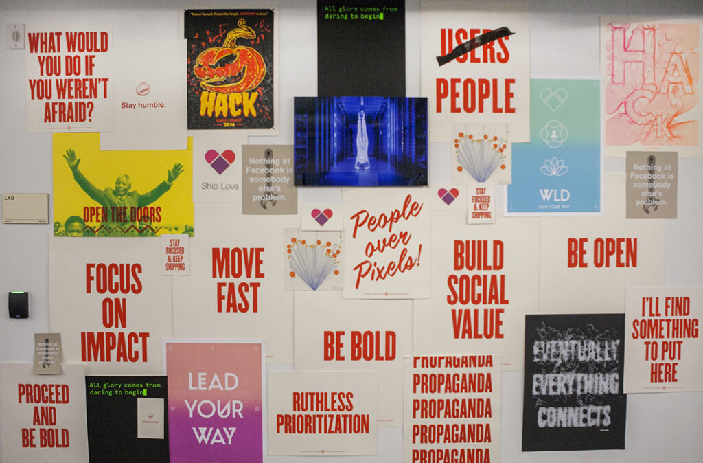
Besides meditation and analog approaches in developing ideas, David Sax, on his tour through Silicon Valley, also realized that in contrast to the very virtual software developed at the companies, the interior somehow seemed to ground the staff in the very real world of analog things. At Yelp he found classic white boards used as platforms to exchange ideas all over the place. At Pinterest he met brand design manager Evertett Katigbak, who had a background in letterpress printing. Katigbak told Sax about his time when he worked at Facebook. Together with designer Ben Barry they set up some printing equipment in the Facebook warehouse, initially to come over “frustration over an obsession with data and metrics [and the printshop being] an attempt to humanize the brand for an internal audience, and to humanize the user.“ For a joke they called it the Analog Research Laboratory, producing signs with slogans such as “If It Works, It’s Obsolete“ and “every possible variation on the word “hack“ and its use in phrase.“

When Mark Zuckerberg heard about their signs, he asked them to produce two hand-printed signs for Facebook’s annual app developer conference. The popularity of these signs resulted in the Analog Research Laboratory becoming part of Facebook’s corporate structure with fixed space, budget and eventually full-time stuff.

Another aspect that David Sax mentioned was the limits of digital technology. Not only that human intelligence makes a good add on to artificial intelligence used to suggest contents on Twitter, Youtube or Instagram, the concept of human-in-the-loop is also part of critical infrastructure as nuclear power plants, military systems as well as airplanes. Besides, computer engineers have concerns that in digital computing, processors are constantly gaining in speed, while energy efficiency is relatively stagnant, which in future may result in problems with power supplies. A solution to this could be analog computing, a theoretic technology which doesn’t work with exact calculations of 1’s and 0’s but rather approximate calculations, recognizing patterns and thus using far less energy.

Finally, as digital media is screen based, it hardly addresses any sense but vision and hearing. Blaise Bertrand, director of industrial design at design firm IDEO warns that there is an “impoverishment of senses“ due to the attraction of digital media that pulls people into the screens. On the other hand Bertrand is confident that “those who would build the technologies that really could change the world were the ones who readily acknowledged the limits of digital and the benefits of analog.“ Dan Shapiro, founder of Glowforge that produces 3-D laser cutters, brings it to the point – “Reality is Analog.“ Digital is only a way to best possibly represent our world and the reality we live in.

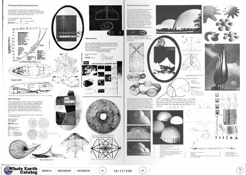
Kevin Kelly, founder of Wired magazine, a technology idealist who is known to “see digital technology as a force for ultimate good“, himself is aware of the multisensory fascination of analog. In the spirit of the Whole Earth Catalog, a collection of product reviews and (critical) essays from the 1960s and 1970s, Kelly started a blog called Cool Tools for which he reviewed one tool per day. However he kept feeling that there was a lack of experience, that “online simply couldn’t achieve“. Later, browsing through editions of the Whole Earth Catalog, he realized that the large format, rather mixed layout and the intuitive navigation through the book by simply turning the pages was the reason for the mesmerizing effect of the catalogs. Therefore in 2013 he published Cool Tools: A Catalog of Possibilities in printed, approximately A3 format to “recapture that missing 5 percent that the web couldn’t do.“
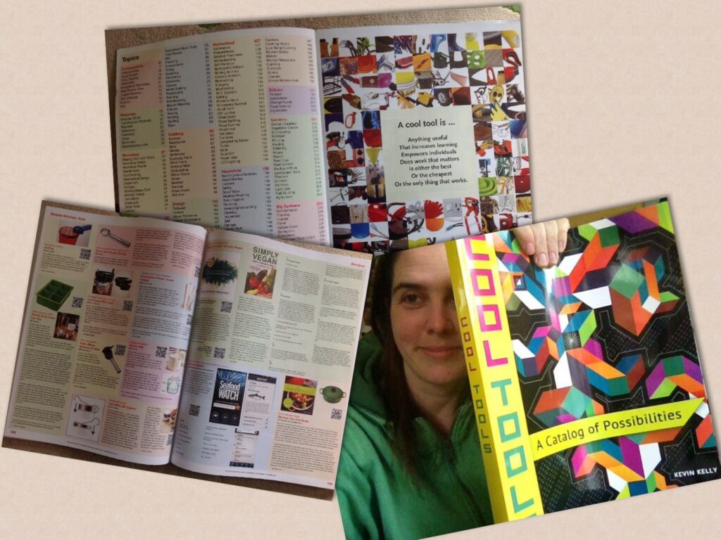
David Sax, who received a copy of Kelly’s book, didn’t only make the experience himself, but observed that visiting friends immediately got sucked in when they opened the large book that got their attention by simply lying on the coffee table. The reason for this Sax didn’t credit to the book’s content but rather “quirky appeal” and “ sheer analog nature of the damn thing.” However Kelly added that “right now, Cool Tools had to be on paper. But in fifty years that may not be true.”

Source:
Revenge Of The Analog, David Sax, 2016



Data Voids

“Data voids are a security vulnerability that must be systematically, intentionally, and thoughtfully managed.”

When talking about data voids, people often forget that there are different kind of information and most importantly the process of getting information. Search engines, for example, use another strategy compared to social media platforms. Search engines like Google or similar have lots and lots of data, but people’s approaches to search engines typically begin with a query or question in an effort to seek new information. However, not all search queries are equal. So, if you’re searching for a term like “ironing”, you’ll most certainly get some adds and some organically produced output (SEO), but nothing about “extrem ironing” (although it is quite fun to look at these pictures). In comparison to that social media, where users primarily consume an algorithmically curated feed of information. When there is not enough, too little or no data at all about a certain topic it is called a data void. When search engines have little natural content to return for a particular query, they are more likely to return low quality and problematic content. As already mentioned before, bad or low quality content ist harmful to our society.

According to datasociety.net there are five types of data voids in play:

  • Breaking News: The production of problematic content can be optimized to terms that are suddenly spiking due to a breaking news situation; these voids will eventually be filled by legitimate news content, but are abused before such content exists.
  • Strategic New Terms: Manipulators create new terms and build a strategically optimized information ecosystem around them before amplifying those terms into the mainstream, often through news media, in order to introduce newcomers to problematic content and frames.
  • Outdated Terms: When terms go out of date, content creators stop producing content associated with these terms long before searchers stop seeking out content. This creates an opening for manipulators to produce content that exploits search engines’ dependence on freshness.
  • Fragmented Concepts: By breaking connections between related ideas, and creating distinct clusters of information that refer to different political frames, manipulators can segment searchers into different information worlds.
  • Problematic Queries: Search results for disturbing or fraught terms that have historically returned problematic results continue to do so, unless high quality content is introduced to contextualize or outrank such problematic content.

So how can we fill these voids with qualitativ data?

The biggest problem with these newly occurring data voids is the enormous speed in which they are spread and some of them are spread through apps like WhatsApp or Telegram. So the main problem is how can we know if there is a data void in development. In the following video it is explained why fast response to search engines most searched questions with fact checking is so important.

At the end of this research post the most important question for me is how can we filter and label all of this content properly and fast enough to not let these kinds of data voids arise.

Image for post
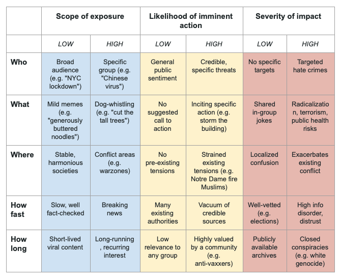
Harms framework to explore the risks posed by data voids

One and in my personal opinion the most promising solution could be a browser based plugin which would have to be operated by an independent platform fo experts. This platform must have its own funding so that there can be no rumors of corruption, propaganda and so on. This means it could be like an individually paid virus detection software, but for detecting false information, filtering and labelling it and also filling data voids as soon as they arise.

Links:

https://medium.com/@Assembly_Program/into-the-voids-exploring-data-voids-af101e228784

https://datasociety.net/wp-content/uploads/2018/05/Data_Society_Data_Voids_Final_3.pdf

Clumsy Interactions through everyday objects 04: Is it dependent on the object?

In this article we will discuss the different design elements that make an object can generate awkward interactions.

The 5 Psychological Concepts Creating Good Interaction

In the previous article, we talked about the principle of discoverability, for this principle is the result of 5 fundamental psychological concepts: affordance, signifiers, mappings, constraints, and feedback. It is these 5 concepts that will allow us to create when discovering an object, an experience coupled with optimal use of the object. Let’s now discover what these 5 concepts are and their implications in clumsy interactions.

Affordance :

We live in a world full of all kinds of objects, we use and discover new ones every day. Whatever the object we manage to master, and affordance is one of the first things that allow us to explain this. First named by the psychologist James J. Gibson, it refers to the relationship between a physical object and a person, a relationship that will help that person determine how to use an object. It describes all the actions made physically possible by an object. We can take the example of a closet, we know we can pull its doors open or push them shut. Don Norman brings a specification to the term affordance, he talks about perceived affordance, this point is very important because it is he who can show us how an affordance error can generate a clumsy interaction. This new term designates the actions that the user perceives as possible, as opposed to those that are actually possible. I was looking for a common example of a situation generated by an affordance problem, so I remembered buying a pair of pants some time ago. The pants had pockets on them, or at least that’s what I thought until I wore them and realized that they were fake pockets. This is an example showing that the action that I wanted to perform, that is to say to put my hand in my pocket, could not be done because the object did not allow it. But it is just as valid in the other direction sometimes actions cannot be performed because the user does not perceive them as possible. And this is where the concept of signifier comes into play.

The Signifiers :

If the affordances allow us to determine the possible actions, the signifiers tell us where we will be able to carry out this action. If one takes again the example of the pants it is the false pockets that were significant for me and led me to think that the action to put my hand in my pocket was possible at this precise place. These two concepts can be difficult to differentiate today in a world of new technology. For example, in the presence of a screen, we may tend to think that touching an icon is an affordance but this idea is false because the affordance corresponds to the action of touching the screen (wherever it is), the icon will represent the place where the action must take place, it is the signifier. Nowadays, for aesthetic reasons, it can be complicated to identify the signifiers, and therefore interacting becomes difficult. This is what we can observe with handleless closets; where should we take our opening action? Similarly, how do we choose which action to take, should we pull or push?
The handle answers all the questions, in addition to indicating where the action should be carried out, because of its location it shows us where the action is going to act, this is where the concept of mapping comes in.

The Mappings :

Mapping indicates the relationship between the two elements. For example, if we use baking trays with knobs, the mapping allows us to understand which knob is connected to which baking tray. The mapping is essential for the layout of the controls and displays. When the signifiers give a clear view of where to touch, the mapping allows us to instinctively understand what each control corresponds to. We will keep the example of the plates and see two interactions, one will be clumsy and the other not.

Here is a first hob composed of four plates. The buttons to operate each plate are placed next to each other. It is quite easy to realize that the two buttons on the left correspond to the left plates and the two buttons on the right to the right plates. However, to know which button corresponds to the top or bottom plate is more complicated, it is not possible to guess it naturally and therefore it must be tested with the risk of burning yourself.


Here is a second hob, more modern and based on tactile contact. The buttons to activate the plates are positioned like the plates, when we want to activate a plate we don’t ask ourselves and we are sure that it is the right one with this model.


It is important to specify that today, the majority of cooking tables with physical buttons have pictograms that make their understanding easier. Nevertheless, having this kind of hob I can attest to the fact that even with regular use I almost always check the pictogram to identify the right hob, so it’s simple but not intuitive. Let’s remember that the intuitive aspect of an object depends on the ability of the designer to provide the essential elements to understand the object and its limits.
These limits can be constraints.

The Constraints :

The constraint in itself does not need to be explained, it is known to everyone. On the other hand, we can explain the different types of constraints that are applied to objects by creators in order to limit the possible actions. There are four of them: physical, cultural, semantic, and logical.
The physical constraint is simple to understand, it is the one that limits the possible operations. For example, it is easy to realize that the wrong key is used to open the door because it will not make the lock work.
Cultural constraint is more difficult to grasp. Indeed, each culture defines a set of authorized actions in social situations. So if we misunderstand a culture, it is easy to make mistakes and create things that can be considered inappropriate. What’s more, these constraints are likely to change over time.
The semantic constraint is based on meaning, it is based on the knowledge of a situation in order to codify possible actions. For example, a windshield is there to protect the face of a person in a car, so it makes sense to put it in front of her. However, like cultural constraints, semantic constraints are also likely to evolve.
Finally, there is the logical constraint, based as its name suggests on logic. This constraint is particularly related to the principle of mapping. If we take again the example of the hob, it is logical to think that the knob on the top right will correspond to the plate on the top right and if this is not the case it is because there is a problem in the conception.

The Feedback

Finally, our last concept is feedback. When an object is designed so that we can identify affordance using the signifier, the mapping is clear and the constraints identified, the feedback will ensure that we have an understanding of the other four concepts. Feedback is the element that allows us to understand that our action has been taken into account. For example, when I use my oven and start my program, I hear a sound signal or see the oven light come on. Without this feedback, I am likely, in doubt, to repeat the action or even modify it, which can lead to awkward interactions. An obvious example is that of the elevator, if there is no visual or audible indication that the call has been answered we are likely to press the button again and again until the elevator arrives. Attention, this feedback must be thought to correspond to the action. Thus, if when we call the elevator an alarm sound is triggered we will certainly not stay waiting for it.

The Conceptual Model

The conceptual model allows explaining the functioning of an object in a simple way. It is the one that will allow us to create a simple mental model and make it easier to use: for example, when we see the “folder” or “file” icon on a computer. The simplest conceptual models are those that should be used for everyday objects because they remain in our memory and become our mental models. Beware, however, analyzing a conceptual model will create different mental models for different people, so let’s remember the engineer from the previous article who just forgot that his mental model is different from the users’ one. Conceptual models derive from the devices themselves and are created by the experience. Since an experience differs from one individual to another and unforeseen things can happen, the mental models it generates often end up being erroneous.s This is where the awkward interaction happens, if I have an erroneous conceptual model of an object, so will my use of it. A good conceptual model is used to understand how the elements will behave together and why they should be operated in a particular way. Let’s take the remote control, no matter what its shape or model I don’t know anyone who has used all the buttons on that object, let alone someone who can explain to me what each button corresponds to. In my opinion, the majority of people using remote control have a faulty conceptual model of it. Indeed, for it to be right, the person would have to understand all the actions that can be performed which is complicated when you don’t need to use them.

Conclusion

We have seen that many elements can influence our experience and our interactions with an object, negatively or positively. The concepts we have just mentioned are major points of vigilance when designing an object, to limit clumsy interactions.

Definition, in progress

  • A clumsy interaction doesn’t happen at the moment we use the object, it was there before and can come from the designer and his personal vision of the use of the object.
  • A Clumsy interaction can depend on the conception of an object and more specifically on the design of the experience related to this object when trying to manipulate it, activate it, make it work, and understand it.

Sources :
Book: The Design of Everyday Things, Don Norman, 2020
Article: Affordance in user interface design, UX Collective, 2017

Clumsy Interactions through everyday objects 03: The birth of clumsy interactions

Our goal through the next articles will be to evolve our definition of a clumsy interaction in order to build one as complete as possible.

The controller

Recently I bought a new controller, very classic and battery operated. Here’s what happened to me when I decided to put batteries in. Locating the battery compartment was simple but opening it was more complicated. I first tried to open it by pressing the little button on top, it was my first instinctive action and it didn’t work. I tried again, 2, 3 times, and decided to read the instructions to see if I was using the right technique. The good point is that the instructions told me that what I was doing was what I was supposed to do, the bad point is that I didn’t know why it didn’t work. After several more attempts, I realized that I had to press the button while moving the compartment. This action could be instinctive but the pressure to be put on the button being quite important I didn’t dare to do it because of the risk of breaking the lever. This was my new clumsy interaction of the week.

Initially, I had analyzed this operation in the following way: “I decided to use an object, by interacting with it I make a mistake or can’t get what I want, that’s where the awkward interaction is born”. This was my starting point, when there is a problem in our interaction it becomes awkward, yet after reading the book The Design of Everyday Things by Don Norman I realize that this is not correct. The awkwardness in the use of the object comes from its creation but I only recognized it as such when I realized that there was a problem.
So to understand clumsy interactions, it is first necessary to understand their origin and to do this we must go back to the creation of the object or even the birth of the idea.

Origin of the object

To understand the origin of the objects, I researched who were the creators of the objects of our everyday life. Were they engineers, researchers, designers, salesmen, or just everyone who had an idea?
Following my investigations, I would say that the objects of our everyday life have been largely thought of by specialists; by this, I mean engineers, researchers, and designers.
It is important to know that it is mostly specialists who design everyday objects because this explains the origin of certain awkward interactions. Indeed, when an engineer, an expert, creates an object, he uses his experience and technical knowledge of this type of object to design it. His approach is strongly influenced by his way of thinking and is therefore mainly aimed at people who think like him. As Don Norman says, “Engineers are formatted to think logically. As a result, they come to imagine that all people think the same way and they design their machine based on that idea”. Therefore a casual user, who is not trained as an engineer, may have difficulty using the object, and that’s where the awkwardness comes in.
In the next article, we will go deeper into the errors in object design that cause clumsy interaction.

At the extreme, this conception mode, which excludes the user experience, may explain the lack of usefulness or meaning of some objects. So during my research, I discovered an article called “35 inventions that will change everything”, it’s an old article from 2010. In this article, the author evaluates the different inventions he exposes according to two criteria: the probability that these objects will end up existing and their usefulness. This second criterion says a lot, let’s keep in mind that an object must meet a need.

Recognize clumsy interactions

Now that we have been able to establish a first cause for the appearance of awkward interactions. How can we identify, as users, the awkward interactions of our daily life?
Don Norman in his book addresses 2 key notions: discoverability and understanding. These 2 notions are part of our interactive experiences. Discoverability occurs when we are facing an object for the first time, we quickly analyze it in order to know how to use it and what are our possible actions. With this first notion, it is easier to spot the awkwardness because we do not know the object and we will therefore notice quite quickly the problems we have to use it. Let’s observe ourselves:

  • Do we need to publish a manual?
  • Do we need to analyze its signage?
  • Do we instinctively know what not to touch?
  • Finally, if it is a new model of an object we already have, does it have the same codes as the previous ones?

Let’s now take an object we have already been around for a long time: How can we know if it is clumsy? Our study of the object must be more thorough, and we must try to understand why we use it like this, and moreover, if we have the right use for it, even the same use as our neighbor. In the same way, do we know all the uses? Let’s take the concrete example of the washing machine: very few people know all its functionalities and each one uses only the ones they need. Here the question is even to know if the sum of our partial uses is equal to total use. So many questions that will generate so many different answers depending on the users.

Conclusion

Conceptor, therefore, bear a major responsibility for creating awkward interactions, of which we users can be the victims. If we wish we can recognize very quickly a clumsy interaction thanks to the discoverability we can apply to objects we have been using for a long time.

Definition, in progress

  • A clumsy interaction doesn’t happen at the moment we use the object, it was there before and can come from the designer and his personal vision of the use of the object.

Now that we have established our first draft definition, with the designer’s role as a starting point, one may wonder about the importance of design in awkward interactions.

Source :
Book: The Design of Everyday Things, Don Norman, 2020
Article: 35 inventions that will change everything, L’actualité, 2010

The basics of exhibition design #1 the research phase

Before explaining in detail the strategies used by Science Centers to promote learning and conveying message, it is necessary to have more insights about what are the basics of exhibition design, and what is the process used by exhibition designers.

I’ll present this methodology showing first the early research phase of the exhibition, the consideration of the space, light and graphics to emphasize the content, and the basics of interactivity and some tools used in exhibition design. Then, I will present the basics of science exhibition history and properties and I’ll show and analyze a few best pratices examples.

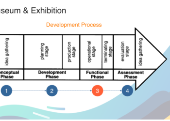
The 3 phases of the exhibition design process :

In his book, Exhibition design, David Dernie explains that the exhibit design processes goes through 3 phases :

  • Research phase : the exhibition idea or concept is created, tested and refined. The principal outcome of this phase is a deep institutional understanding of what the exhibition is about and why the museum is doing it at this time ; in this way, and at this scale. This understanding is recorded in the exhibition brief.
  • Design phase : is when the interpretive plan and all the research conducted to date is transformed into 3D through the creativity and insight of the designers working collaboratively with representatives of museum departments, interpretive planners, and evaluators.
  • Implementation phase : is the building and installation of the exhibition. Project and financial management are crucial to ensure on time and on budget culmination of the exhibition process.

Exhibition design is a reccurent and iterative process, adapting and adjusting to exhibitions of varying sizes and budets, level of complexity, purpose.

But why are exhibitions created in the first place ?

Exhibition are the principal means by which museums can be of service to us. They can confirm, question or shake our beliefs or they may arouse a new interest or deepen our understanding of ourselves and the world we live in. The purpose of museum exhibitions should be both educational and entertaining.

The first questions that the designers have to consider are ; why is the exhibition necessary, what is the best way to communicate content, who are the visitors and what kind of experience do they want to offer ?

Where does Museum Exhibition Ideas come from ?

Successful museum exhibition program should be both research based and market driven : the idea of an exhibition can come internally from the analysis and interest of the museum staff or can be oriented from the public interest and demand. The target audience depends on the type of exhibition, and sometimes designers need the insights of other professionnals such as educators when designer exhibits for children, for example.

Each museum staff member who wishes to do research  should prepare an annual personal research plan. It should propose a methodology that addresses both the academic and the pratical implications, financial and project a schedule for completion of the research. Each individual’s research plan should be subject to review and approved.

Who is the exhibition for and why ?

Surveying visitors is crucial to learn who they are and why they attend, as well as which museum offering attracted their visit on that particular day. With this information, museums can better communicate with their current audiences and expand them, learn how to be relevant to their needs and to the needs of the communities in which they live, and determine how better to serve them [1].

The research phase : writing the brief

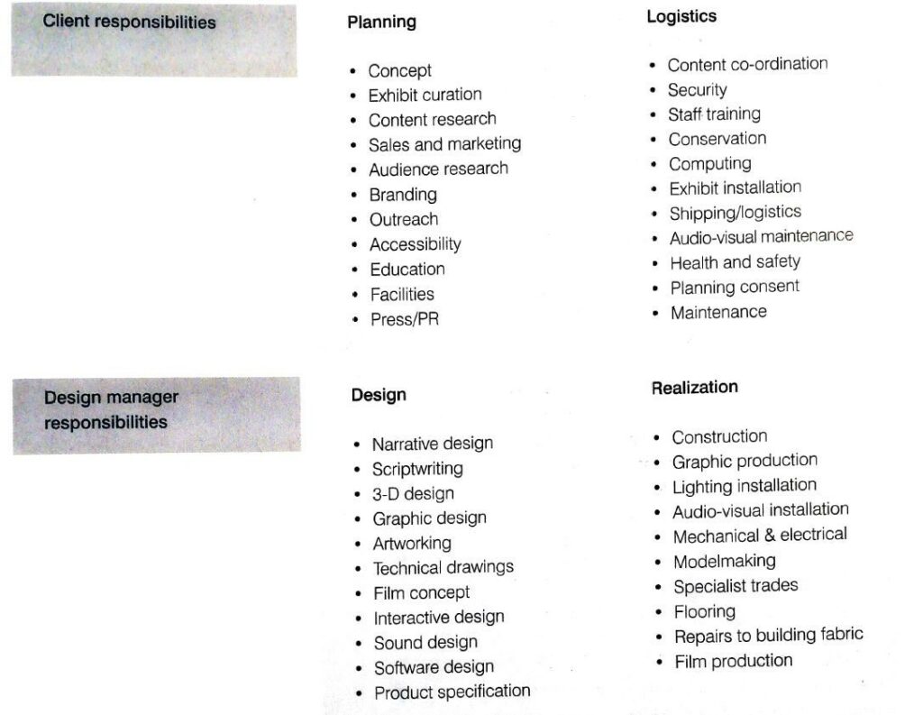
The development of an exhibit begins with a planning stage and meetings with the client to discuss their expectations of the exhibit. Every detail should be described in what is called a brief. It is the formulation of the understanding of the project by the designer, and it specify the tasks and details the informations to take in account. The client and the designer have different roles that can be resumed as follows :

When writing a brief, the designer has to consider those inputs :

visual identity and brand information: it is important for the designer to understand the client’s identity so that he can then design content in accordance with this vision.

target audience research: another important step is to obtain information about the main target(s) of the exhibition. The target audience depends on the type of exhibition, so for a science center, children are more likely to be targeted, whereas an art gallery would be more targeted at adults. The designer often uses external research teams to learn about the learning styles of his visitors, what he likes and dislikes, and what he does not like.

reception of visitors: another preliminary step is to take into account the arrival areas and the organization of the arrival and visits according to the number of visitors. It is all the more crucial nowadays in times of covid to limit visitor entries.

storyline: the storyline is a document describing the elements of the exhibition and quickly retracing the exhibition in zones, or different stages. It is a way of tracing the exhibition’s route. At this stage it is superficial.

the tone of the exhibition: the tone of the exhibition is as important as the exhibition itself. It differs according to the type of content, and must be taken seriously especially for historical museums recounting wars or other dramatic events.

the content document: this is a detailed descriptive list listing the different contents, their types and description that should be present in the exhibition. It can be more or less provided depending on the museum, and serves as a basis for the designer to design the museum experience.

back home messages: the designer must discuss and agree with the client on the purpose of the exhibition and the key messages to be conveyed to visitors. The designer is not only responsible for the style of the exhibition but also for its comprehension and the overall visitor experience. It is also necessary to ensure continuity between the information displayed on the various media: the website, the leaflets and the content present in the exhibition. All this must allow the visitor to have a global view of the message to be retained.

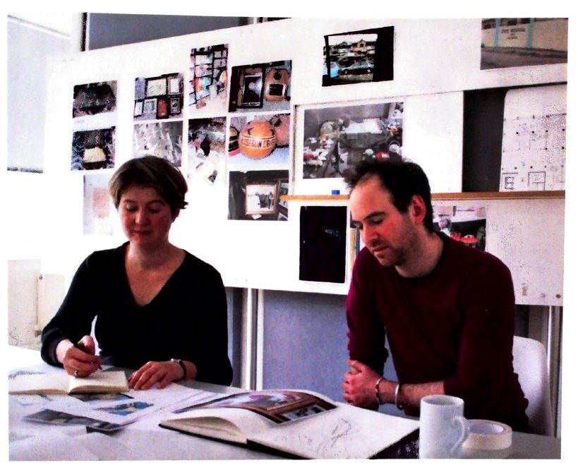
creative workshops: In general, designers designing an exhibition create creative workshops where they share their ideas and inspiration on their vision of the exhibition. This is the starting point of the creative phase but it also help the designer and the client to make sure they have the same language and tone when thinking about the exhibition [2].

Creative workshop of an exhibition design

Sources :

[1] Exhibition design, David Dernie

[2] Exhibition Design, Philip Hughes