Utility + Usability = Usefulness
Utility is another important attribute and is about if the system provides the features the users actually need. If you are integrating a really usable feature with nearly none of your users’ needs, it’s going to be useless after all. Usability and utility together determine if a system is useful or not.
For analyzing and optimizing the utility of a system you can use the same methods and data you can use for improving usability.
The importance of Usability
Usability is actually not just important, it is a necessity. Especially the success of digital products strongly depends on the usability of the system. Websites and apps are a really good example of products that rely on good usability. Because if the usability of your product is not great, they will move on and use another system. That’s also the reason why bad usability is directly connected to losing users or customers.
If users
… are not able to accomplish their goals efficiently, they leave.
… cannot find what you are offering them, they leave.
… get lost, they leave.
… get stuck, they leave.
… cannot easily recover from an error, they leave.
… have difficulties using the system, they leave.
But usability is not only important for the number of users interacting with your product. It also directly affects how they feel about your product and is, therefore, an essential part of the user experience. Because of that, usability should also be an important part of your budget.
According to Jakob Nielsen, you should spend about 10% of a design project budget on usability. On average, this budget for usability will more than double the quality metrics of your website. Although the outcome might not be as great, it is also really important to emphasize usability in the design process of software or even physical products. Good usability will always improve the user experience and also increase the ROI significantly. According to Nielsen, businesses that spend only 10% of their budget on usability improvements will see, on average, a 135% increase in their desired metrics.
So spending money on usability is not only better for the users, but it also brings a lot of benefits for the company. Another reason for spending money on usability is that bad usability will cost you even more money. Dissatisfied users will not come back, tell their friends about it, stop using your product or even ask for a refund. Spending money on usability will not only make your customers happy and make them recurring customers, but it will also help you to grow your business.
According to Forbes, Jeff Bezos invested about 100 times more money in usability design than he invested in marketing during the first years of Amazon. In his eyes that is also the reason that led to such overwhelming access.
Another great example from the Interaction Design Foundation is
”When McAfee started integrating usability testing to learn more about its customers and their needs, the company saved 90% in support expenses costs.”
The Interaction Design Foundation also created a great list on how to design for good usability. This list is mainly about usability on websites, but most of the steps listed below are also important for other digital products and software.
- Work with a clear understanding of users’ goals and show it in your design.
- Mimic the real world regarding concepts, icons, and language.
- Present instantly understandable, jargon-free messages and actions users can take – one chief action per screen.
- Limit options to give a strong information scent on an uncluttered display – show essential information for completing tasks.
- Keep content consistent.
- Follow established norms regarding function and layout (e.g., logo positioning, tappable buttons).
- Use proper font size, color, contrast, whitespace, etc. to:
- combine aesthetic appeal with scanning readability,
- present a clear, logical information hierarchy,
- design for accessibility
- Use chunking and emphasize key information at the beginning and end of interactive sequences.
- Offer informative feedback about the system status.
- Include helpful navigation systems and search functionality.
- Allow for customizable controls, including shortcuts.
- Avoid disruptions – e.g., forced logins/pop-ups.
- Make forms easy to complete.
- Include warnings and autocorrect features to minimize errors.
- Make errors easy to diagnose.
- Offer easy-to-understand help documentation.
- Show clear contact options.
- Provide a back button to undo actions.
- Include ALT tags to show more information about images.
- Consider server abilities regarding page-loading time and downtime.
- Beware of in-app browsers and restrictions (e.g., scrolling) in mobile design.
- Make links active.
- Describe links accurately
- Use user personas.
- Do thorough usability testing
Accessibility, Usability and Inclusion
Accessibility, usability, and inclusive design are closely related topics and help with creating systems that work for everyone. All of their goals, approaches, and guidelines overlap significantly. That’s also the main reason why you should focus on them together. There are only a few cases where you should only focus on one of them.
Although the emphasis on these topics has been steadily growing in the last few years, it’s unfortunately still far away from becoming the new normal. That’s especially true for accessibility and inclusion. For a lot of designers and developers, accessibility is just a set of boxes they have to check before releasing the product. But actually it is a really big part of the usability of a product.
Accessibility
The term accessibility is officially defined as
“the quality of being easy to approach, reach, enter, speak with, use, or understand”,
“the quality of being usable, reachable, obtainable, etc.:” and
“the quality of being suitable or adapted for use by people with disabilities:”
Accessibility in the context of design is related to the discriminatory aspects of the user experience for people with disabilities. Good accessibility means that they can contribute equally without any additional barriers. Despite the fact that accessibility is mainly focusing on people with disabilities, most of these requirements are also improving the usability for everyone else. For example, if a website is optimized for low vision, you can also see the content better if the sun is shining directly on your screen or when you’re sitting in a completely dark room.

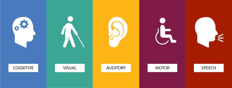
Accessibility focuses on the following disabilities:
Visual
- Low Vision
- Blindness
- Color Blindness
- Red-Green Color Blindness
- Blue-Yellow Color Blindness
- Complete Color Blindness
Hearing/Auditory
- Hard Hearing
- Deafness
Speech
- Speech Disorders
Motor
- Slow Response Times
- Limited Motor Controls (inability to use a mouse, touch, …)
Cognitive
- Learning Disabilities
- Distractibility
- Inability to focus on a large amount of information
The Web Content Accessibility Guidelines (WCAG) 2.1 from 2018 are already addressing these disabilities and are focusing on four key principles:
- Perceivable
- Operable
- Understandable
- Robust
They even offer web tools for websites to check if your own website is compliant with their guidelines. These guidelines are also defined as an international standard in the ISO 40500 norm.
Inclusive Design
Inclusive design was already defined as
“The design of mainstream products and/or services that are accessible to, and usable by, as many people as reasonably possible … without the need for special adaptation or specialised design.”
by the British Standard Institute back in 2005.
Inclusive design is not about designing a product that addresses the needs of the entire population, it is more about creating an appropriate design for the diversity of the population. According to the Inclusive Design Toolkit of the University of Cambridge, it is about:
“Developing a family of products and derivatives to provide the best possible coverage of the population.“,
“Ensuring that each individual product has clear and distinct target users.” and
“Reducing the level of ability required to use each product, in order to improve the user experience for a broad range of customers, in a variety of situations.”
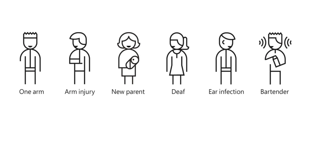
To sum that up it is about taking a product to as many users as possible. In some regions, it is also called universal design or design for all. Another big advantage of inclusive design is that it also works great for people with temporary disabilities (injuries) or situational limitations (while carrying a baby or grocery bag).

Inclusive design is addressing a wide range of issues:
- accessibility for people with disabilities;
- access to and quality of hardware, software, and Internet connectivity;
- computer literacy and skills;
- economic situation;
- education;
- geographic location;
- culture;
- age, including older and younger people;
- and language.
Resources
Books
Inclusive Design for a Digital World, Designing with Accessibility in Mind
Regine M. Gilbert
2019
Articles
The Elements of Successful UX Design, Best Practises for Meaningful Products
UXPin
2015
The Basics of User Experience Design
Interaction Design Foundation
2020
Web
https://www.nngroup.com/articles/usability-101-introduction-to-usability/
https://www.interaction-design.org/literature/article/an-introduction-to-usability
https://medium.com/adalab/the-importance-of-usability-10e9871a16d8
https://medium.com/@bluehair.co/the-real-importance-of-usability-and-user-experience-c7bfd4cef11
https://www.interaction-design.org/literature/topics/usability
https://uxdesign.cc/usability-testing-in-design-and-why-is-it-important-cfddfbbdaac9
https://www.toptal.com/designers/ui/inclusive-design-infographic
https://www.dictionary.com/browse/accessibility
https://www.w3.org/WAI/fundamentals/accessibility-usability-inclusion/
http://www.inclusivedesigntoolkit.com/whatis/whatis.html
