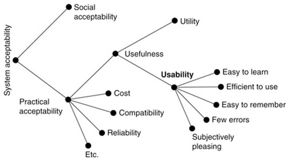
Jakob Nielsen already defined the components of usability in his book Usability Engineering back in 1993. His “model of the attributes of system acceptability” already defined the following 5 quality components that are still in use:
- Easy to learn (Learnability)
- Efficient to use (Efficiency)
- Easy to remember (Memorability)
- Few errors (Errors)
- Subjectively pleasing (Satisfaction)

Whitney Quesenbery also described five similar qualities that a product needs to be usable in 2001. Although his criteria may look different at the first glance, they describe basically the same things. His 5 e’s are:
- Effectiveness
- Efficiency (Efficiency)
- Engagement (Satisfaction)
- Error Tolerance (Errors)
- Ease of Learning (Learnability)
Learnability and Ease of Learning
Good learnability helps the users accomplish their tasks without the need to learn how to use the system first. The easier it is to fulfill the tasks, the better the learnability of the system. The ease of learning can also be divided into the following five components.
Familiarity
Familiarity is about the way the users expect things to happen while they are using the system.
Consistency
Consistency basically describes that elements that look the same should also do the same. An example of internal consistency would be an “Ok” or “Next” button. They should always have the same label, look the same and also work the same throughout the whole system.
Generalizability
Generalizability is strongly connected to consistency and sometimes even called external consistency. It mainly refers to established conventions beyond our own system. A good example of that would be the logo on a website. People expect it to be on the top of your website and that it is linked to the homepage when you click on it because that’s what they learned from the other websites they are using on a daily basis.
Predictability
Predictability is about building a system that works the way the users expect it to. But since there are a lot of different user levels out there it is much harder to achieve than it sounds like. Because of these different user levels, it is also common to test a system with the “most stupid user possible”. An example for predictability would be that users on a Mac expect to personalize a program by clicking on the name of it in the top left corner and going to preferences.
Simplicity
Simplicity is all about simplifying the system and only displaying necessary elements. A good example of that is the Safari Browser. If you open it the first time it looks super basic and does not have a lot of functions for experts, but if you are an expert you already know that you can enable additional features in the preferences that allow you to use it for the development process. Android phones for example also have a similar feature. If you tap on the build number in the settings seven times you will get the additional android developer functions.
These and similar components are often also mentioned as part of one of the 5 principles for good website usability. There they are part of the “clarity” of a website.
The learnability of a system is also important when releasing new features or functionality so that users familiar with the system don’t become frustrated with it after an update. This frustration happens a lot when social media companies like Facebook or Instagram are releasing new features. Regular users are often complaining about new functions or layout because they are already used to the old one, even when the new one is much better and easier to learn.
To achieve good ease of learning it is important to match the system to the existing mental models of a user.
Mental Models
A mental model represents a person’s thought process for how something works and helps people to understand life and make better decisions. Although mental models need to be learned through previous experiences, assumptions, and observations, we are unconsciously working with a broad base of different mental models throughout our day.
In combination with usability, mental models are often described as a simple representation of something in the real world. For example, we all know that we need to push a button if we want something to happen and these physical buttons are also translated to the digital buttons we are using on a daily basis. The form of an unknown object should already trigger the appropriate action in the user.
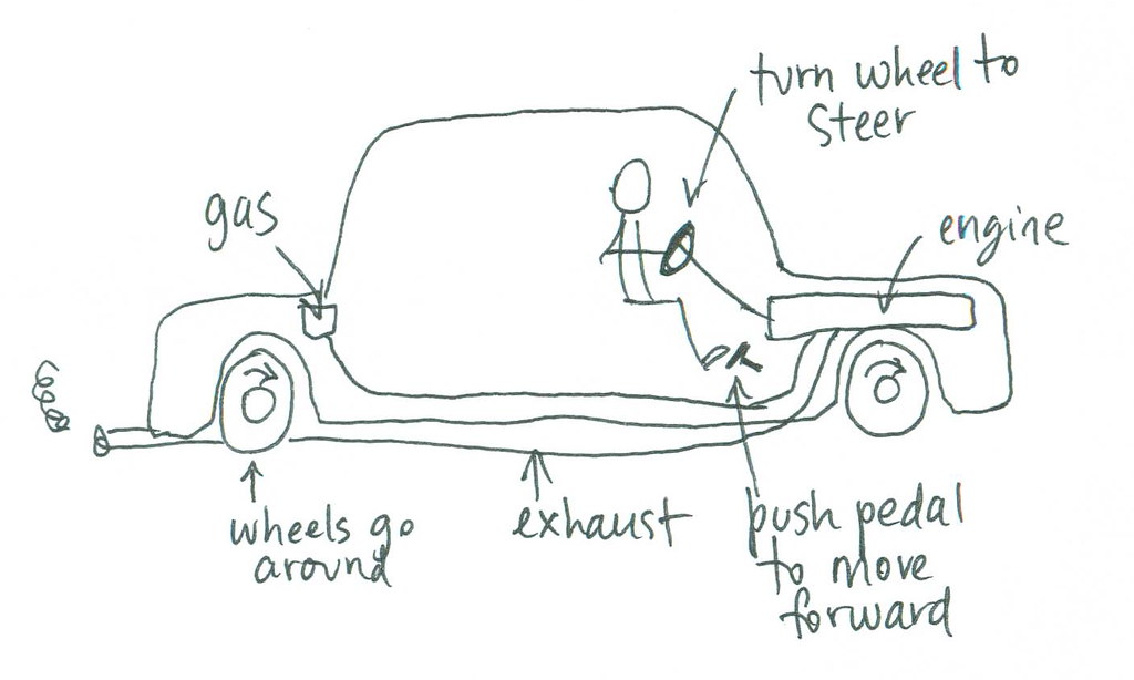
A car also consists of a lot of different mental models. Users expect an ignition or start button to start the car, they also expect to turn the steering wheel for changing the direction to left and right and to find a gas and brake pedal at the same position most cars have. Because of all these mental models, you can use basically every car after learning how to use one.

Memorability
Memorability is also strongly connected to the learnability of a system. It describes how easy it is to reestablish proficiency after a longer period of not using the system. Memorability is especially important for systems that are not being used on a daily basis. A good example of a system that would need good memorability in Austria is “FinanzOnline” because most users just use it once a year when they do their income tax. Although they have completely redesigned it earlier this year, there is still room for improvement.
Efficiency
Efficiency is about how quickly a user can perform their tasks once they know the system and learned how to use it. It is not only about the speed, it is also about the number of steps they need to accomplish their tasks. The ultimate goal of optimizing the efficiency of a system is to reduce the number of clicks.
For achieving this goal, it is important to use clearly labeled buttons, navigations with meaningful titles and also adapt the system to the users’ main interaction method. Elements designed for fingers on the smartphone or tablet should feel and look differently than elements that are mainly used with a keyboard and mouse. Another possibility to improve the efficiency is to integrate meaningful shortcuts like “cmd + a”, “cmd + c” and “cmd + v” on Mac or “strg + a”, “strg + c” and “strg + v” on Windows.
Effectiveness
Effectiveness and efficiency are commonly used interchangeably and it is not easy to separate them, but they are not the same. While efficiency is about how quickly a task can be accomplished, effectiveness is about how well the work is done.
An important point to improve effectiveness is about assisting the user to complete their goal with a high degree of accuracy. A good example would be to tell the users during the sign-up process which criteria the password has to fulfill and which criteria are already fulfilled while typing it in. This does not only reduce data entry errors but also prevents the user from getting frustrated.
Another point to optimize effectiveness would be to offer multiple ways to get to the same page because it makes it more likely that the user gets there. But you also have to pay attention to not offer too many ways because that would decrease the efficiency again.

Errors
This component is primarily about preventing errors from happening. It is also about minimizing the number of errors users make, how severe they are, and how easily they can recover from them. Creating a system without any errors would be the ultimate goal, but especially for digital products, it is nearly impossible to achieve because there are a lot of factors beyond the control of the designer, as the ecosystem.
According to Whitney Quesenbery, the system has to restrict the user from opportunities to do the wrong thing. Good examples for that would be disabled buttons, distinct labels, clear language, and meaningful instructions.
Another important part of errors is how to recover from them. Good systems offer the users support to get back to the right path if something went wrong. For example on a Mac, you can go back after deleting a file with “cmd + z” and recover the file without using the bin.
Error messages are also a key factor in helping the user to recover from them. They should consist of a description of the error with additional information on how to fix it like “The upload was not possible because the file is too big. You can upload files with a maximum file size of 100 MBs.”. If the system created the error, there should also be a way to report it to the developers. This reporting function is a free way to get hints from real users about what is not working and the users also get the feeling that their opinion is valuable and that something changes based on their feedback.

Satisfaction and Engagement
This quality is about the satisfaction of the user while and after using the system and how pleasant and engaging the experience is. Aesthetics play an important role in this component. But it’s not just about looking nice, it should also look proper and avoid them from using systems from competitors.
To achieve this goal it is important that the system is intuitive and works like the users think it works. It is also important to know that a system may satisfy just a small number of users so it is important to measure the satisfaction with real users and not the developers of the system. Although it is nearly impossible to satisfy all users all the time, the goal should be to satisfy most users most of the time. Therefore it is also crucial to know the target audience, their technical proficiency, and how they are interacting with the system.
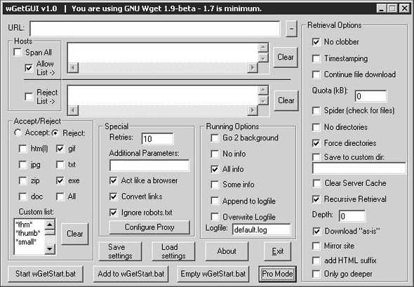
Another way to come to this goal a bit closer is that developers, designers, and usability professionals have to work hand in hand. There is still a lot of software out there, especially open-source software, that is just done by programmers and is neither usable nor aesthetically pleasing at all.

Resources
Books
Usability Engineering
Jakob Nielsen
1993
Articles
The Elements of Successful UX Design, Best Practises for Meaningful Products
UXPin
2015
The Basics of User Experience Design
Interaction Design Foundation
2020
Web
https://www.nngroup.com/articles/usability-101-introduction-to-usability/
https://www.interaction-design.org/literature/article/an-introduction-to-usability
https://www.crazyegg.com/blog/principles-website-usability/
https://www.wqusability.com/articles/getting-started.html
