Gehmacher Home

Introduction to our Master Thesis Project

Customer Experience app with focus on AR-enhanced marketing opportunities and creation of a new unique selling point for the company Gehmacher based in Salzburg, by Janina Schindler and Carina Steindl.

About the company.

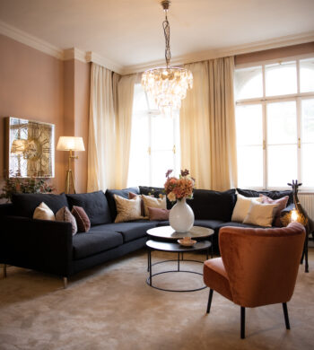
Our environment influences us. No matter if material or immaterial. We want to inspire you to surround yourself with beautiful things and thus create quality of life. With furniture and accessories in your home, the clothes you wear and beauty in your encounters. We believe that the beauty affects our life in a positive way.

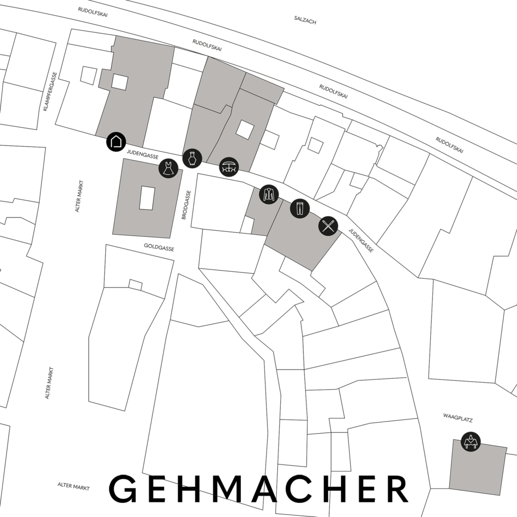
There is hardly any other city that fits “living in beauty” as well as Salzburg. Beauty and excellence can be found in the impressive architecture, the style of the Salzburgers and in nature in the form of the mighty mountains and the Salzach. The Gehmacher house on the Alter Markt is located right in the heart of the city and has been owned by the Gehmacher family for over 100 years.

There are now three main areas at Gehmacher: HOME, CLOTHING and a Café. But there is a common philosophy behind this: to create quality of life through beauty. To create places where you can recharge your batteries, enjoy and experience joie de vivre. To create an atmosphere that inspires with the right interior and to underline the inner beauty with the right outfits. We are constantly in the process of developing our range and finding new things. Timeless and yet in tune with the times.

Gehmacher – a family company characterized by tradition and constant change. Once a specialist shop for bedding and curtains, which, after remaining undamaged in World War II, has developed into the address for furniture and lifestyle products. Today there are eight stores: HOME, CLOTHING, LIFESTYLE, RETTL X GEHMACHER, HIGH FASHION, OUTDOOR & CAFÉ, CLASSICS and N°8 reaching from Alter Markt to Waagplatz.

Gehmacher Salzburg Map

The persistent longing for beauty, atmosphere and experience has always driven us. Gehmacher changes with every generation. However, always with the aim of carrying on the legacy and giving it an individual touch. Gehmacher – a family company that is deeply anchored in its own values ​​and has its heart and focus on the future.

Social Media
Website Gehmacher

Briefing

In order to turn the Gehmacher customers into fans and family and thus to bind them even more to the company Gehmacher, a Gehmacher customer app is going to be developed that will provide the customer with information, inspiration and other benefits. The app should also support the Gehmacher team with different features and create another USP for the company Gehmacher.

Concept Requirements
  • Web-based App
  • Marketing Tool
  • Easy to use and aesthetically appealing
  • Privacy
  • Support for the team and enrichment for the customers
  • UX Testing
  • Working Prototype ready for implementation
Features
  • VIP (Stammkunden) speacial Discounts etc.; QR or NFC (according to individual sales)
  • Personalized Newsletter
  • „Personalized“ Posts – Feed (bsp. LinkedIn, etc.) Inspiration for the 3 areas (HOME, CLOTHING, CAFÉ)
  • Scheduling with salesperson (Private Shopping/ Interior Design Appointments)
  • Private event invitations via App
  • Stores and Contact persons are introduced (favorite advisor/salesperson)
  • Map cooperation opportunities (Products, Shootings, SM, etc.)
  • Link to SM Accounts & Website (Blog etc.)
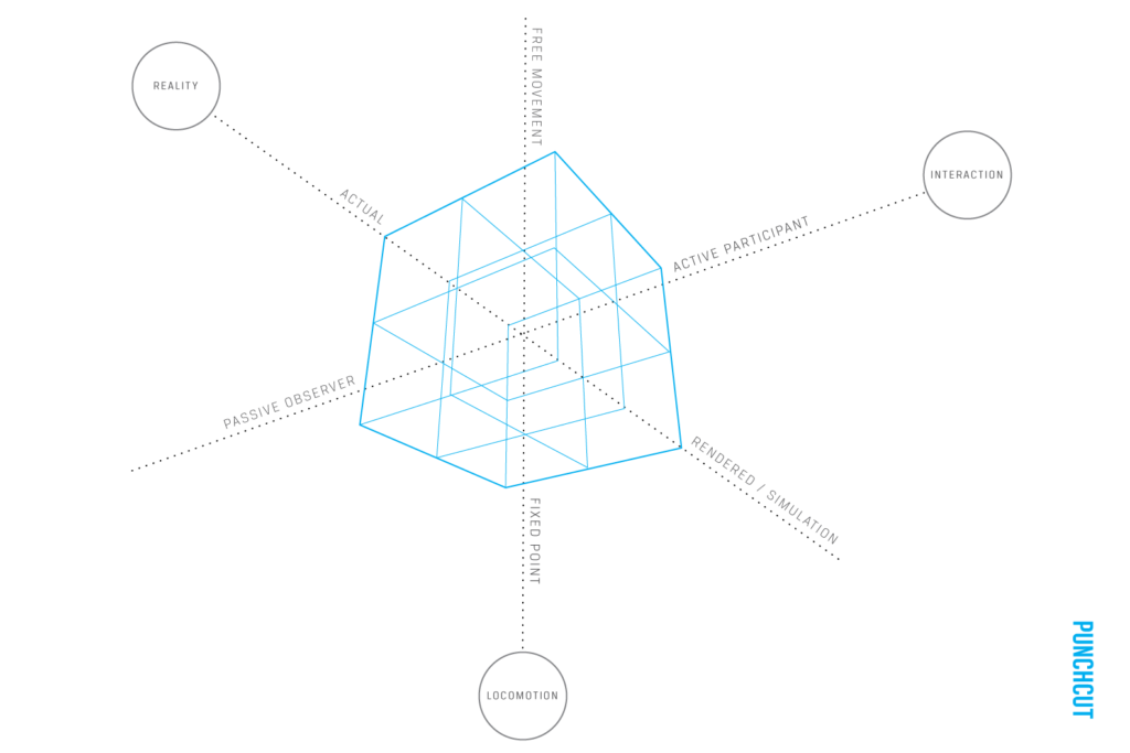
  • Possibility for interactive outdoor advertising (AR, etc.)
Team

Janina and me are starting with the project in the third (this) semester.

  • Janina Schindler B.A. & Carina Steindl B.Sc. (Research, Conception, UI/UX, Prototype, Basic Programming, Testing)
  • Project management & communication – Carina Steindl B.Sc.
  • Client: Otto Gehmacher G.m.b.H & CoKG – Julia Gehmacher B.A. (CEO), Franziska Lüdtke (Marketingteam), etc.

We split up the research into different topics and assigned them like follows (changes can happen during the research):

Research topics for the WS21/22:
  • Introduction to the Topic – Carina Steindl
  • AR in the Marketing field – Janina Schindler
  • General Market Research – Carina Steindl
  • Web or native App – Janina Schindler
  • CX & UX for apps in retail – Carina Steindl
  • USP enhanced CX – Janina Schindler
  • Personas, User Research – Carina Steindl
  • User/Customer journey, scenarios – Janina Schindler
  • Concepts for backend/team support – Carina Steindl
  • User Interface of comparable App – Janina Schindler
  • Image Tracking in AR – Carina Steindl
  • General CX in retail – Janina Schindler
  • User/Customer Journey on site in the store – Carina Steindl
  • AR critical consideration – Janina Schindler
Milestones WS21/22:
  1. Topic Assignments and Planning – 24.10.2021
  2. First discussion of research Results – 29.11.2021
  3. Presentation and workshop at the company – 06.12.2021
  4. Research & first ideation presentation online – 20.12.2021
  5. evtl. additional presentation & feedback round at the company – 21.01.2022
  6. Concept presentation – 31.01.22/KW6 2022

Additionally to the milestones we have a weekly jour fixe.

Skeuomorphism in digital music production programs | Part 1

Digitalization has not only brought a technical change that has affected almost all areas of life, but also a social and cultural change. Dealing with technology is assumed as a matter of course nowadays, because that’s what modern life consists of. Everything should work as quickly and easily as possible, be intuitive to use, and best of all, everyone can use it themselves without a lot of external tools. But what does intuitive design mean for different industries and at this point in time? 

In view of this question and under the aspect of skeuo- and neumorphism, I had a discussion about the music industry in cooperation with a hobby music producer. Indeed, this very industry is characterized by skeuomorphic design elements in digital music production programs, mainly in plugins. 

Music production is of course a field that is very hardware related. It therefore made sense to take a skeuomorphic design approach in digital music production programs to represent digitally, often almost 1:1, how it works in analog. The target audience for programs, such as FL Studio, Ableton, Cubase, Logic Pro X, are not amateurs who have not handled an instrument or a mixing console before. Musicians and producers, with a passion for music, composition and analog instrument and mixing console knowledge are the ones who (should) use these programs. 

However, this raises a question for me: as has been shown through the research in my previous blog posts, there has of course always been modernization, other design styles, other approaches to design, especially at the level of interaction and intuition. Interfaces that we use every day are constantly changing and trying to adapt more and more to the needs of their target audience. However, I could hardly observe this very change in digital music production programs, especially in plugins. These interfaces adapted to the new technical requirements, but many of them remained almost unchanged in their operation and the design elements used. 

A knob still looks like a knob, a slider like a slider and a deployable instrument can be operated just like in real life only via digital inputs or buttons. Cables provide the right connections and show how the digital elements would be connected to each other in an analog way. Why is that? 

For me, as a layman in this field, it is not really intuitive to use, as I partly feel I have to learn the instrument or mixing console first, to be able to use the interface. Not only through the instruments, but also the design elements that are based on the mixing console, I can not comprehend without a minimum knowledge in this industry or by trying out a lot. In the interview with the hobby music producer we came to talk exactly about this and in some areas he simply could not imagine any other design solution than the one just used, because it is intuitive for musicians and producers, which as a layman can not be understood at first sight. For example, there are still ten elements next to each other, as it is on a real mixing console, rather than making it a flat dropdown menu to select individual wanted elements.

Intuitive does not mean the same thing for all industries and depends on existing prior knowledge. Other types of intuition also require a different type of interface. However, I think it also has a lot to do with Never change a running system, which indicates the little change in the music production programs and their plugins.

There are some changes going on and there are some other approaches, which I will talk about in my next blog entry. I am not interested in showing or telling what is better or more intuitive, because that is subjective. I want to explore how things are and have changed, how they could be different and how other approaches affect people in the music business, but also laymans.

Sources:

Links:

FL Studio: (30.01.2021)
https://www.image-line.com

Logic Pro X: (30.01.2021)
https://www.apple.com/de/logic-pro/

Cubase: (30.01.2021)
https://new.steinberg.net/de/cubase/

Ableton:(30.01.2021)
https://www.ableton.com/de/live/


Images:

Featured Image: Logic Pro X
https://www.apple.com/de/logic-pro/

Image01: FL Studio:
https://www.image-line.com

Image02: Plugin – Guitar-Amplifiers – Standalone / VST:
https://www.thomann.de/at/positive_grid_bias_fx_2_professional.htm

Image03:Plugin Sylenth1:
https://lennardigital.com/sylenth1/

UX, UI in VR, MR

Framework for VR

In terms of user experience, the rules for 3D are different from those for 2D. Therefore, there must also be other or new design processes or models that incorporate this very option of interaction.
The important thing in VR or MR is to find the perfect balance between interaction in the virtual world and using the most suitable tools.  Since VR or MR only works if users can interact with the virtual world, it is important to consider to what extent the user has influence. For example, a very poor user experience is when intermediate scenes last too long and the user switches from being an active participant to a passive one. So if both the visualization of the world, the sound or the acoustics and all haptic stimuli are right, the user can move seamlessly through the world. A big help can be when a spacious and familiar environment is used, as well as changing, natural sound or acoustics, and that the user gets feedback when they do certain things or when the world changes, for example. Since the virtual world usually seems very large and the user has too much freedom it is useful to include directional cues as orientation. These guide the user in a certain direction, tell that user what to do or show him/her certain destinations. This helps to give the user a greater immersion and the purpose of this experience is more easily understood.

The company Punchut developed a VR Experience Framework in which any interactive world can be placed. The framework consists of the 3 axes actual to rendered/simulated reality, fixed point to free movement and the interaction in passive to active participant. Another important key point in VR or MR plays the time, because the environment and the experiences are constantly changing. So this must also be taken into account.

A user can only trust the environment, empathize with the world, or change if the physics of the world are developed far enough. By changing, it is meant that the user can learn or develop certain skills in, for example, medical applications or the rehearsal of difficult situations in VR. Since medical applications rather rarely contain narrative elements, it is nevertheless necessary to follow the basic rules when designing for VR. Emotions can also be generated by very simply designed rooms.
It has been shown that a customizable avatar with different skin color, gender or body type can be freeing for some users, making them more likely to drop inhibitions and feel braver or more adventurous. Most importantly, however, are the hands, as these are used to interact with the virtual world. The most suitable interaction option is hand tracking, which means no attached UI elements like controllers for example. The reason for this is that it allows the user to completely put themselves in the avatar’s shoes. Especially when the feeling of presence is very strong, it is important to let the user reacclimatize after the VR experience to be able to get used to real life again. This can take a few seconds to even minutes. It can be helpful to accompany the user slowly from the virtual to the real world by taking off the headset, slowly bringing in the sound of the real world or the awareness of one’s own orientation. 
It can happen that people hesitate before using VR, because they are either put off by the headset, the controllers or the fact that they dive with their whole body into another world. To convince potential users otherwise, you can try to introduce them to VR slowly and let them explore the world and its features first. In the best case, virtual reality can even seem like magic.
Furthermore, motion or simulation sickness is a big issue. People can suffer from nausea or vomiting, paleness, dizziness, and headaches if their physical perception of themselves differs from what they experience in VR. For example, the eyes think the body is moving even though it is not. To prevent this disease, all consequences and impacts must be prevented or recognized in advance.

UX principles

Bill West came up with 8 best practice principles to ensure a good user experience in VR. This is a summary:

  1. The virtual world should resemble a real world as much as possible. Components of this are, for example, lighting mood, shadows or backgrounds 
  2. Users must have a clear role and know exactly what the goal and task of the VR application is
  3. The user is only truly integrated when he forgets that he is in a virtual environment. Users must therefore be involved through interactive elements 
  4. The more senses are engaged, the better the VR experience is
  5. Users can quickly become overwhelmed, which is why it is so important to focus the attention on the important things. If something does not serve a purpose, it should be left out
  6. To avoid confusing users, interactions should be consistent and cues should be introduced in both visual and audio forms
  7. The correct placement of objects is important in order not to cause discomfort to the user. The best distance between the user and the object is between 1 and 20 meters
  8. Safety and comfort are important issues. There should be enough space for the user to move around safely. Motion sickness can be avoided by eliminating all conflicts between different sensory inputs. In addition, it should always be possible to pause the VR experience

Ergonomics in XR

Iron Man

The subject of VR has been addressed in movies like Iron Man for quite some time. However, a helmet like the one Tony Stark wears would be very exhausting after 10 minutes at the latest, because the user interface is too much and would overwhelm the user. The following two diagrams should help to make the VR experience as ergonomic and pleasant as possible:

Sources:

  1. An Experience Framework for Virtual Reality, Jared Benson, Ken Olewiler, Joy Wong Daniels, Vicky Knoop, Reggie Wirjadi (02.06.2016), https://medium.com/punchcut/an-experience-framework-for-virtual-reality-f8b3e16856f7
  2. Design Insights for Virtual Reality UX, Jared Benson, Ken Olewiler, Joy Wong Daniels, Vicky Knoop, Reggie Wirjadi (08.06.2016), https://medium.com/punchcut/design-insights-for-virtual-reality-ux-7ae41a0c5a1a
  3. 8 Ways to Create a Better UX in Virtual Reality, Bill West (20.06.2019), https://learningsolutionsmag.com/articles/8-ways-to-create-a-better-ux-in-virtual-reality
  4. Designing User Experience for Virtual Reality (VR) applications, Sourabh Purwar (04.03.2019), https://uxplanet.org/designing-user-experience-for-virtual-reality-vr-applications-fc8e4faadd96
  5. Picture Iron Man: https://www.pearlriverflow.com/the-mire/2019/5/6/the-iron-man-hud-is-terrible