Clumsy Interactions through everyday objects 03: The birth of clumsy interactions

Our goal through the next articles will be to evolve our definition of a clumsy interaction in order to build one as complete as possible.

The controller

Recently I bought a new controller, very classic and battery operated. Here’s what happened to me when I decided to put batteries in. Locating the battery compartment was simple but opening it was more complicated. I first tried to open it by pressing the little button on top, it was my first instinctive action and it didn’t work. I tried again, 2, 3 times, and decided to read the instructions to see if I was using the right technique. The good point is that the instructions told me that what I was doing was what I was supposed to do, the bad point is that I didn’t know why it didn’t work. After several more attempts, I realized that I had to press the button while moving the compartment. This action could be instinctive but the pressure to be put on the button being quite important I didn’t dare to do it because of the risk of breaking the lever. This was my new clumsy interaction of the week.

Initially, I had analyzed this operation in the following way: “I decided to use an object, by interacting with it I make a mistake or can’t get what I want, that’s where the awkward interaction is born”. This was my starting point, when there is a problem in our interaction it becomes awkward, yet after reading the book The Design of Everyday Things by Don Norman I realize that this is not correct. The awkwardness in the use of the object comes from its creation but I only recognized it as such when I realized that there was a problem.
So to understand clumsy interactions, it is first necessary to understand their origin and to do this we must go back to the creation of the object or even the birth of the idea.

Origin of the object

To understand the origin of the objects, I researched who were the creators of the objects of our everyday life. Were they engineers, researchers, designers, salesmen, or just everyone who had an idea?
Following my investigations, I would say that the objects of our everyday life have been largely thought of by specialists; by this, I mean engineers, researchers, and designers.
It is important to know that it is mostly specialists who design everyday objects because this explains the origin of certain awkward interactions. Indeed, when an engineer, an expert, creates an object, he uses his experience and technical knowledge of this type of object to design it. His approach is strongly influenced by his way of thinking and is therefore mainly aimed at people who think like him. As Don Norman says, “Engineers are formatted to think logically. As a result, they come to imagine that all people think the same way and they design their machine based on that idea”. Therefore a casual user, who is not trained as an engineer, may have difficulty using the object, and that’s where the awkwardness comes in.
In the next article, we will go deeper into the errors in object design that cause clumsy interaction.

At the extreme, this conception mode, which excludes the user experience, may explain the lack of usefulness or meaning of some objects. So during my research, I discovered an article called “35 inventions that will change everything”, it’s an old article from 2010. In this article, the author evaluates the different inventions he exposes according to two criteria: the probability that these objects will end up existing and their usefulness. This second criterion says a lot, let’s keep in mind that an object must meet a need.

Recognize clumsy interactions

Now that we have been able to establish a first cause for the appearance of awkward interactions. How can we identify, as users, the awkward interactions of our daily life?
Don Norman in his book addresses 2 key notions: discoverability and understanding. These 2 notions are part of our interactive experiences. Discoverability occurs when we are facing an object for the first time, we quickly analyze it in order to know how to use it and what are our possible actions. With this first notion, it is easier to spot the awkwardness because we do not know the object and we will therefore notice quite quickly the problems we have to use it. Let’s observe ourselves:

  • Do we need to publish a manual?
  • Do we need to analyze its signage?
  • Do we instinctively know what not to touch?
  • Finally, if it is a new model of an object we already have, does it have the same codes as the previous ones?

Let’s now take an object we have already been around for a long time: How can we know if it is clumsy? Our study of the object must be more thorough, and we must try to understand why we use it like this, and moreover, if we have the right use for it, even the same use as our neighbor. In the same way, do we know all the uses? Let’s take the concrete example of the washing machine: very few people know all its functionalities and each one uses only the ones they need. Here the question is even to know if the sum of our partial uses is equal to total use. So many questions that will generate so many different answers depending on the users.

Conclusion

Conceptor, therefore, bear a major responsibility for creating awkward interactions, of which we users can be the victims. If we wish we can recognize very quickly a clumsy interaction thanks to the discoverability we can apply to objects we have been using for a long time.

Definition, in progress

  • A clumsy interaction doesn’t happen at the moment we use the object, it was there before and can come from the designer and his personal vision of the use of the object.

Now that we have established our first draft definition, with the designer’s role as a starting point, one may wonder about the importance of design in awkward interactions.

Source :
Book: The Design of Everyday Things, Don Norman, 2020
Article: 35 inventions that will change everything, L’actualité, 2010
The basics of exhibition design #3

Appraising the visitors by the use of interaction through films, sounds and materials

What is the engagement and what are the different types of visitor’s content apprehension ?

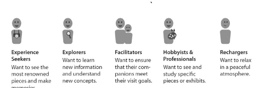
Engagement is the process of addressing a visitor directly by stimulating them and create positive memories or give new insights. For this to happens the designer has to make sure that he adresses all the target groups. The diverse audiences can be classified depending on the length of the visit (short, medium, long) or by the different interests and knowledges they have :

  • The expert : it’s a specialist, with a lot of knowledge around the topic. He often wants to sit and have specific informations to pursue his researches.
  • Frequent traveller : He has a reasonable foundation of knowledge and a general curiosity and is aware of museums.
  • The scout : he wants to travel freely in the space and have its own path to see the top layer informations. The challenge for the designer is to help him have a big picture without confusion.
  • The orienter : someone who has been here thanks to someone else or who doesn’t have any knowledge about the topic. He doesn’t know what to look for so is looking for something meaningful to them. Often children [1].

Falk’s different types of visitors [2]. To see which type of visitor you are go on this page : https://jewishmuseummd.org/intern-weekly-response-identity-and-the-museum-visitor-experience/

Depending of the type of museum, the visitor can go through different types of interaction and content :

  • Comprehension : History and natural science are more likely to feature contextual or thematic exhibitions where the artifacts, specimens or other objects on display are not intended to be studied as individual objects but related to each others. Graphics may be multilayered and combine words and images to aid visitor comprehension. The visitor is more actively engaged in the process of making relationships, studying tje graphics and labels as well as relating or comparing the objects to one another.
  • Discovery : An other mean of visitor engagement is the one in which the visitor explores a range of specimens appreciating individual examples. This is found in many  natural history museums that have adapted visible storage means of display.
  • Interaction : the most kinesthetically involving mode of visitor apprehension is the one favored by many science centers and children’s museums ; in which staff, volunteers, exhibition apparatus or duplicate specimens identified as hands on Education Collection may be used to elicit a visitor response that  triggers the transformative visitor experience, the discovery of meanings that affects the visitor’s values, interests, or attitude

Where is there interactivity in museums ?

Digital and multimedia techniques are currently providing more ways in which a museum can be participatory. Interactivity in museums can be found through materials, electronic devices, interactive displays, films and sounds. The museum experience becomes a high controlled environment with multi media and multi sensorial stimulis, immersing the visitor in the themes and contents of the exhibition.

In order to be efficient, there are several things to take in account when designing interaction for exhibitions.

For all interactives, visitors need to gain an idea of what they are interacting with, what is does and how it works in as short a time as possible, so approachability is important.

Visitors have limited time and patience for exploring and expending mental effort on an exhibit. There has to be some kind of reassuring feedback within seconds of the visitor beginning to use an interaction, so that he or she can see that their actions have had an effect.

If a new interface is introduced, this should be done consistently. The controls either have to be consistent with the way things are already done, and therefore rely on the visitor’s previous experience to help him or her to know what to do. It is also important to consider that some interfaces are intuitive to use, and call for learning whereas other are not [3].

The Wii controller in A is more intuitive than the PS3 controller in B for non initiate users

Benefits of sound and films :

Moderne audiences have become accustomed to ambient sound and moving images. Exhibitors are increasingly aware of the diverse learning styles of the visiting public. Many visitors are reluctant to read labels and many are primarily driven by visual and aural stimuli. For them, film and sound are the preferred means of engaging with a subject. Increasingly, film, video and sound are used as scenographic elements in an exhibition theme, as part of an overall immersive environment.

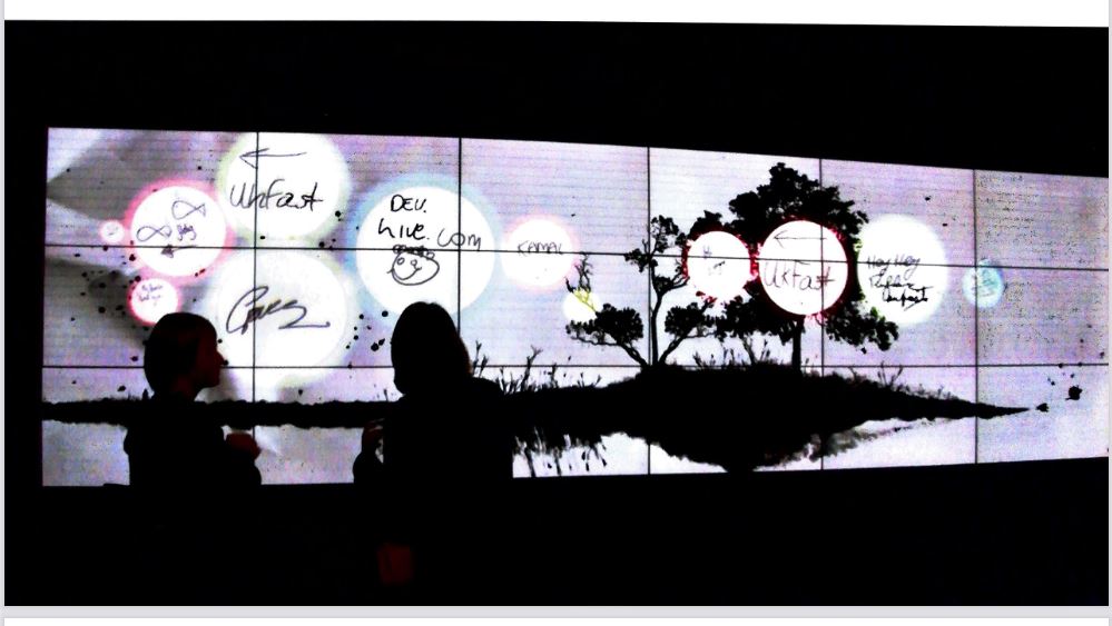
Interactive screen are more and more common nowadays in expositions

Designers use every tool available to create a total display that communicates the storyline throught every element : light, materials, moving images, and sound. Projections or videos are often used to create a visual backdrop that overwhelms the senses of visitors and immerses them in the subject of the display. Powerful images and ambient sound effectively isolate visitors and draw their attention to a particular theme or idea. Overwhelming them with images, sounds, smells and textures forces them to engage directly with exhibition and its theme. This approach which is common to art installations as well as exhibitions often involves interactives devices.

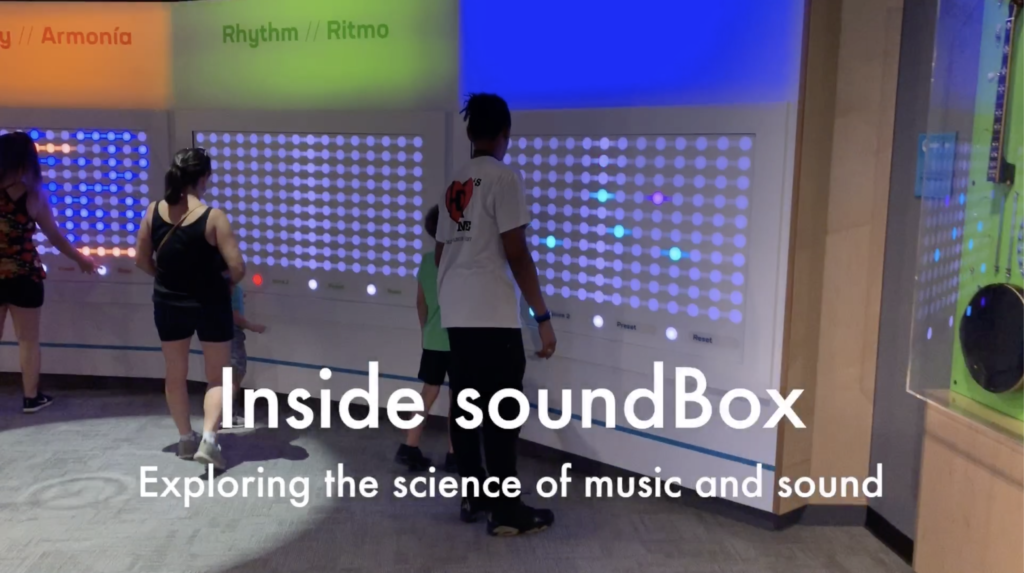
Inside soundBox, interactiv experience using sound at the Adventure Science Center in Nashville. In this display, a group of people can mix a recording by standing our crouching to affect the levels of different parts. At another, motion sensors follow your hands and you can, like a conductor, influence the tempo of a virtual Nashville Symphony [4].

Devices such as acoustic guides, pda (personal digital assistants) sound booths and kiosks are useful additions to any exhibition and are important in enabling the visitors with different learning styles (auditory) to engage with its subject. But there are number of limitating factors that the designer must take in account when designing the experience, and the help of specialists is requiered.

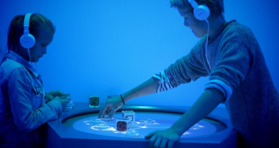
Digitarium – Game Science Center in Berlin. The center shows applications with nex technologies, everything is based arounf interaction and implies the activ participation of the visitor with body movements, voice, occulary movement etc [5].

Materials :

The designer must consider a lot of things when deciding on which materials he will put on an exhibition, especially when for childrens. They must evaluate their fire rating, durability an whether they are suitable for a specific purpose. In addition to fire retardancy, and a material’s aesthetic properies, the designer must check its durability, order times, price, sheet sizes, ease of maintenance and assembly time and the skills of the contractors involved.

Fire retardancy is an important consideration to have when choosing a material

In reality, many designers develop a palette of materials they use consistently, introducing new ones cautiously and only when they are sure they will perform. A sample board, materials glued to a board is useful to show the range of materials used for each different aspect of an exhibition and is often shown to the client as part of a design presentation. It allows the designer to make minute adjustments to colours and finishes to ensure a good result.

One material data base among the one that exist, https://materio.com/[6]

In many cases, the materials that are chosen will last for the duration of just one exhibition. Howevber in the light of green design imperatives, materials that can easily be reused for future shows are preferred. Particularly for commercial exhibitors, it is essential that colours and textures are consistent with the visual identity of the company, and that finishes are consistent with its branding material.

For museum displays some materials particularly those used inside showcases are tested for conservation purpose. A toxic glue that fixes a laminate or a painted surface might be a potential source of pollutants that can accelerate the deterioriation of sensitive artifacts.

Technical drawing and implementation of the exhibition

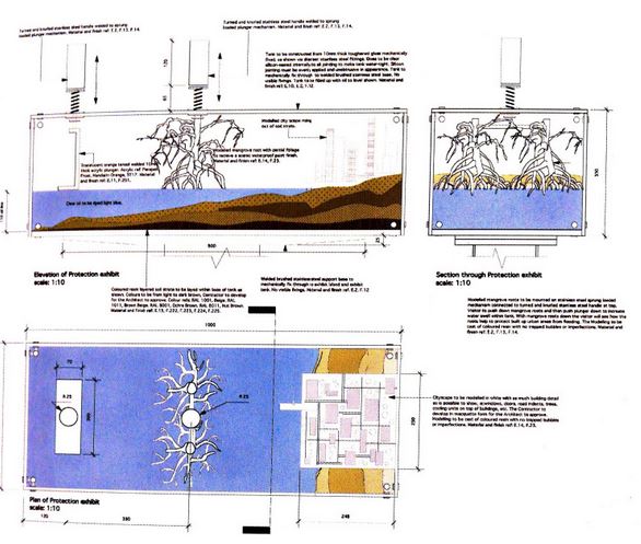
The models, sketches and drawing are important means of showing a coherent design strategy and to discuss and share important ideas with the client. At the end of the discussion the designer has to turn the provisional drawings into technical drawings that can be read by contractors and suppliers and provide the information for the final built project.

For each part of the exhibit, the designer produces drawings at different scales starting with the largest which show the overall site and how the built project will fit in. hese drawings are collected, numbered and given titles. It should include measures perspective and any technical details.

Example of detailed plan [3]

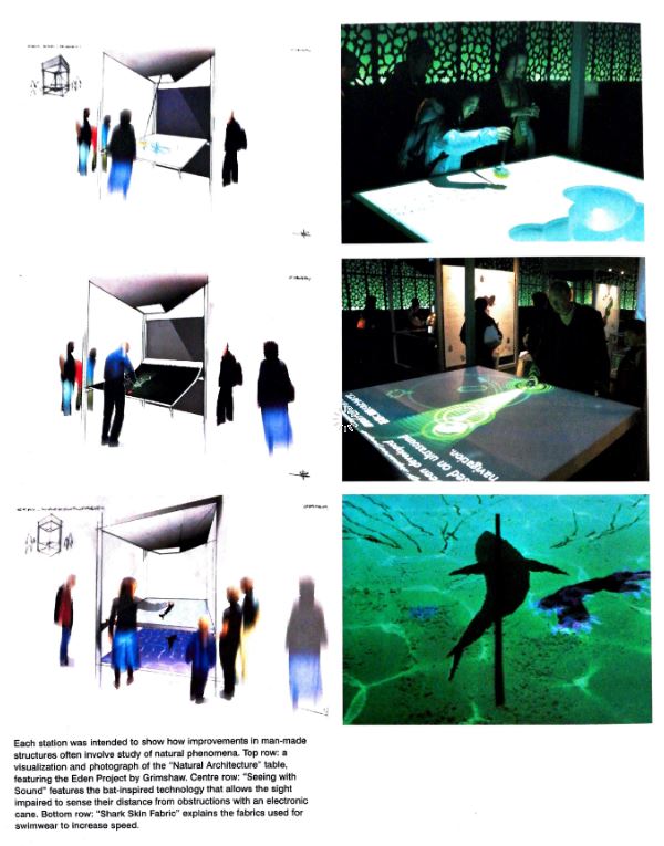
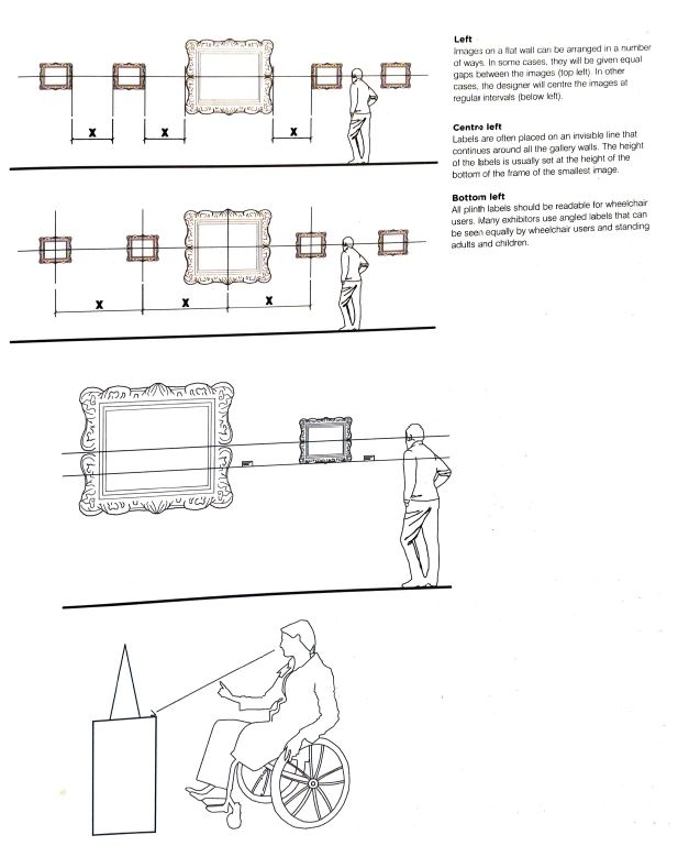
Technical drawings for exhibitions are similar to those produced by architects and interior designers. With all exhibition drawings, figures superimposed on section drawings speak very eloquently about the relationship of the exhibits to visitors. Drawing of a range of visitors interacting with displays helps to determine the correct height for display panels, controls, buttons, screens and other interactions points.

Interaction drawing of the setup of the UK Pavilion Expo in Aichi, Japan [3].

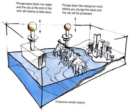
Drawing for interaction devices often need to show the exhibit or display in a number of modes to make clear how the user interacts with it and what changes are triggered by the interaction. This may also be specified in words on the drawings, detailing the stages in an interaction and the intended visitor experience.

Before a completed design is handed over, the designer produces a checklist, called a snagging list which highlights snags or construction defects. Then the last step of the exhibition can go with the assembly of all the contents of the exhibition.

Sources :

[1] Exhibition design, David Dernie

[2] https://www.researchgate.net/figure/Figure-8-Falks-visitors-categories-Sources-Adapted-from-Falk-J-2004_fig2_323987626

[3] Exhibition design, Philip Hughes

[4] https://www.wmot.org/post/tune-your-audio-awareness-new-adventure-science-center-exhibit#stream/0

[5] https://www.berlin-welcomecard.de/de/partner/digitarium-das-gamesciencecenter

[6] https://materio.com/

[Non]verbal communication | 02

Verbal and nonverbal communication in web-meetings

In order to give my research a framework of theoretical background, I am going to have a closer look on the sociological context of communication. Regarding the topic of web-meetings I want to find out, which communication channels we are using in presence meetings and which of them are used in web-meetings. Hopefully this will lead to the outcome of finding out what makes meetings “human” and which parts of it are missing in web-meetings. 

Having a look on the way we communicate includes the research on verbal and nonverbal communication. What is exactly the difference between those two?

Verbal communication is often defined by communicating a message through one single channel: the usage of words. This happens distinctively meaning in a linear way. As soon as the words are written or said, the verbal communication ends. Meanwhile, nonverbal communication uses multiple channels such as physical action, sound appearance and motion to convey a message by combining them. This simultaneous usage of channels happens continuously. This means, that nonverbal communication happens without a spoken word and rather unconsciously. Next, nonverbal communication is often independent of any specific language or dialect. If we smile for example, it will be automatically understood as a friendly gesture (if this is the initial meaning).

We use regularly kinesics, haptics, appearance, proxemics, environment, chronemics, paralanguage and silence while communicating nonverbal. 

Kinesics
The study of how we use body movement and facial expressions. 
Example: A raised eyebrow as a sign for disapproval.

Most web-meetings are held with video streaming. Sometimes with all of the participants can be seen and sometimes only the main speaker turns the video in order to give the rest of the participants the chance to concentrate and to enable a stable connection. What we see is often the head and parts of the upper body. According to that, we could have the chance to read a facial expression and some movement of the upper body. We slightly can assume the body posture and can see the hand and arm movement from time to time. Do we actually need to see the lower body of our meeting partners? Usually we sit on tables while talking to each other and are used to read the body language in the upper body areas like face, hands and overall body posture.

Haptics
The study of touch
Example: A firm handshake as a sign of confidence.

Touching each other in online meetings is definitely not possible. The only thing the participants touch is their own input devices such as a mouse, trackpad or keyboard. We need them to write a comment or mute and unmute our microphone. Therefore the haptic input devices are connected to the meeting but do not really differ from the usual interaction with the computer outside of the meeting. What would happen, if we are able to send a small vibrations in order to greet  to each other?

Appearance
The use of personal appearance, objects and artefacts to communicate
Example: Wearing a suitable outfit or constantly playing with a pen.

Turning on the video gives us the chances to check the appearance of our meeting partners. Does the outfit fit the meeting occasion? Web-meetings are often held in homeoffice environments, so the web-meeting dress code often does not exactly reflect the office styling. How does this affect the actual communication? If we are looking at an informal meeting occasion we can observe the usage of filters and background in order to dress up. This often leads to funny moments and can be easily understood without verbal communication. In addition to the ‘fashionable’ appearance also the natural appearance can be seen through video communication. The participants show themselves only from the front and in a sitting position in usual web-meetings. We do not get any information about their body height, the way they walk into the room and sit down or the side and back view of their appearance.

Proxemics 
The study of the use of interpersonal space
Example: We get uncomfortable if somebody enters our personal space unexpected or unwanted.

Web-meetings are usual held in distance, so personal or relational space does not really matter. Each participant is has its own virtual space on the meeting interface. Beside the “only one person is talking with video input” situation, each participant gets an equal placement in the conversation. For example there is no group building by standing a bit nearer to each other. Therefore, we can assume that in comparison to the presence meeting there is no personal hierarchy because the participants can not show off their relational space between them. Does this make web-meetings even more impersonal or is this supporting a more equal conversation? If we think of a meeting situation of participants around one big table, we recognise, that we can not concentrate on all participants at the same time. We are not able to check the facial expressions of the neighbours next to us if we are not looking it them. In web-meetings environment we are confronted with the front view of all participants. In the presence meeting we maybe start a small side conversation with the person that randomly sits next to us. Beside the non-existence of multiple audio channels it is not usual in web-meetings to start such personal side conversation. Also it is not possible to address a message to a certain person through eye contact or other gestures, this has to be communicated verbally.

Environment 
The influence of the current space we occupy
Example: A messy room or desk distract us from focused and concentrated work.

Imagine you plan a date. You probably think about your own appearance or possible topics to talk about. What you definitely will think of is an appropriate place to go to. Environments matter and can influence the nonverbal communication – even in group meetings. In web-meetings, the participants meet in a virtual space. As I mentioned before, there are usually no specific placement order. In comparison to that, presence meetings are strongly influenced be the conditions of the environment. Do we sit on a round table equally and can face each other directly? Or do we sit in a lecture hall and are facing the lecture but not each other? Are we influenced by the sound environment of a crowded restaurant? In my point of view the aspects of space and environment seems to be an important topic that is only barely touched in current web-meeting tools. Often there is the possibility of changing the background of the own video appearance. But that usual happens individually and intensifies the feeling of separation. The ‘together mode’ of Microsoft Teams brings all participants equally together in one virtual space what creates a sense of nonverbal cohesion. How does such virtual spaces affect the nonverbal ‘human’ aspects of web-meetings in detail?

Chronemics 
The study of the role of time in communication
Example: Being on time creates another picture than being late

Regarding web-meetings with a lot of participants and/or with a lecturer, time can be an important considerable aspect. We can check the appearance of the participants mainly with their video or audio stream. Otherwise we can not be sure, if they are really joining the meeting and participate or listen. This affects especially the beginning of the meeting. Also breaks differ from presence meetings: There the participants are free to recharge energy on their own or to use their breaks to connect and reflect the information with each other, web-meetings do not naturally give the opportunity to network or connect. This also true for the end of the meeting, unless there is a follow-up meeting with certain participants.

Paralanguage 
The influence of vocal characteristics
Example: The meaning of a verbal communicated message can be inverted by vocally expressed sarcasm.

As long as the audio is turned on and the internet connection is stable, participants of web-meetings are able to register paralanguage aspects of the speakers verbal communication. But as soon as they write comments in the chat, this aspects can not be included. Nowadays we therefore use emojis to underline the certain meaning of our written message. Sometimes, we even use only emojis to express our reaction and give our interlocutor the chance to detect our nonverbal communication characteristics.

Silence 
The influence not use words or utterances
Example: Stop speaking in an argument can be a sign of resignation

Refusing verbal communication and being silent on purpose can be as effectual as the spoken word itself. In web-meetings the participants are often asked to mute their audio while not speaking. This can lead to a lack of participation: Turning the microphone on and off can be exhausting after a long timespan. If the video streaming is not possible, the muted participants also lead to a lack of reaction like hearable laughter or other auditive reactions. This can lead to a somehow silent meeting and end in a rather unemotional meeting vibe. It could be an interesting point to research how to ‘overcome’ the web-meeting silence in the case of bigger participant numbers.

In conclusion, video and audio streaming can already convey a lot of nonverbal clues. But there are also a lot of constraints that interferer them like muted microphones or seeing only the front view of participants. In my opinion there are already good solutions for some constraints and also a lot of potential so explore new ways of improving the communication possibilities and the human aspects within web-meetings (e.g. environment, reactions).

Thank you for reading! For the next entry I am planning to get an overview on the current web-meeting tools on the market. If you have any thought, idea or comment on that topic (or just for chatting), feel free to contact me – I would be happy to get in touch 🙂

Source
Survey of Communication Study/Chapter 3 – Nonverbal Communication: Laura K. Hahn, Scott T. Paynton, Humboldt State University
https://en.wikibooks.org/wiki/Survey_of_Communication_Study/Chapter_3_-_Nonverbal_Communication last review 05.01.2021


Keywords
non-verbal communication, verbal communication, kinesics, haptics, appearance, proxemics, environment, chronemics, paralanguage, silence, online meeting, web meeting, web conferencing, telecommunication, virtual communication, connectivity, remote communication media

DESIGN AN EDUCATION SYSTEM BASED ON GAMIFICATION.

Statement of the problem

I was born and raised during the IRAN_IRAQ war that’s why I care more about children, as I think children have missed their childhood in countries suffering from war and as an Iranian woman who has a history of working with marginalized and immigrant children in Iran, I think that one of the most important problems of recently immigrated children is the lack of effective and appropriate communication with local children, as well as unfamiliarity with the new rules, culture, and environment, which can cause much bigger problems in the long term.

In most cases even the language of these children is different, so teaching will be a difficult task for them, one of the methods that have been effective in my work experience is teaching through games and doing group art, so designing an educational method based on gamification for immigrant and refugee children can be on of the topics which I am interested into search and develop for my master thesis.

The basics of exhibition design #2 the design development

Developing the design using sketches, models and plans

Once the exhibition strategy has been decided on, most designers start to develop their designs using scale models, sketches and rough drawings of layouts. At this stage, it is important to be aware of all obstructions and height restrictions int the exhibition space. The next phase is drawing and modelling, to create and test 3D solutions. During this second phase of the design, they have to evaluate the objects and doings includings graphics, materials and lighting.

The medium of communication in a museum exhibition consist of 3D objects in 3D spaces trough which the visitor moves. The way things are agenced depends of the type of exhibition and of the building.

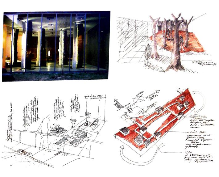
During the early stages, it is important to show ideas quickly and intuitively to clients and collaborators without going too far down the wrong track. Scale human figures glued into models help the designer to appreciate how individual visitors will experience the exhibition. Individual interactions with single exhibits are best developed through sketches.

Early phase sketches

Once the rough sketches and models have been made, the final plan will begin to take shape.

It is very important in spatial design to show all elements involved in the exhibition. The factors to consider are : visitor navigation, how the exhibitions relate to each other, the ease and comfort of visitor circulation, the duration of the exhibition and the ease with which fire exit can be found.

The activities that take place in the exhibition suite are the exhibitions themselves and their accompanying programming such as openings, performances, lectures, guided or audio tours, and in gallery activities for families and schools.

Museum visitors come in all ages and sizes, bringing their diverse needs, interests, abilities and limitations such as : visitors ranging from 2 to 9 years old, visitors with mobility, visual, hearing or cognitive disabilities.

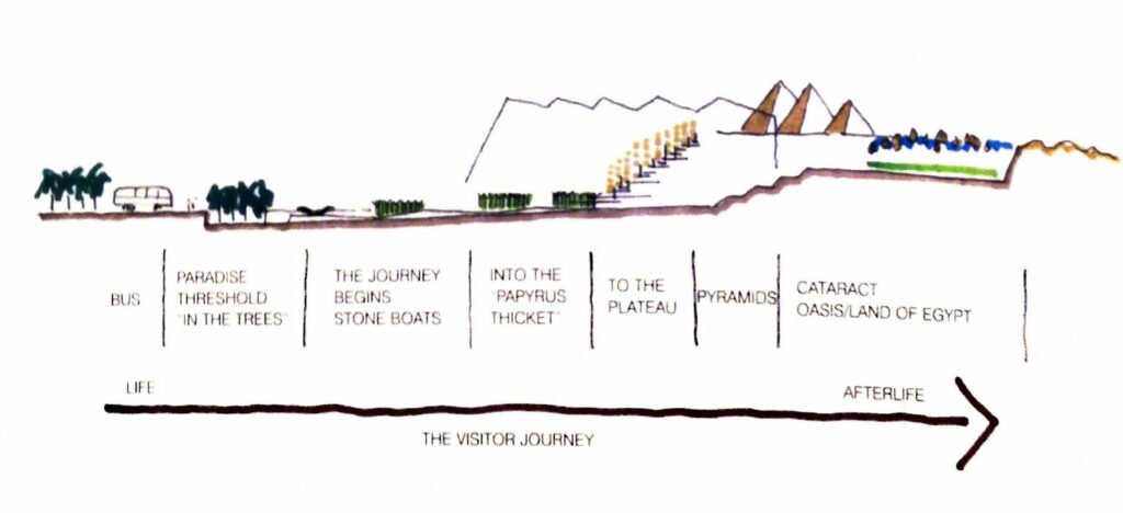
A very useful way of exploring the effectiveness of the access, adjancy and circulation design of the exhibition facilities in their entirety is to conduct a real or imaginary walk through of the space, putting yourself in the place of a particular category of user. The real walk through is to follow and crate visitor from the point of unloading through all the museum spaces and process, observing, listening to the comments of the the profesionnal staff, and taking note of concerns and difficulties as they arise [1].

Planning the jouney of the visitor [2]

All types of exhibition spaces or interpretive spaces have the common denominators of being structured to facilitate the visitor’s experience of art through the use of spatial design, light and color, material and finishes, smart technology, exhibit support.

Galleries for permanent display are planned to remain relatively unchanged for  a number of years, spreading the cost of initial finishes, or exhibit elements over a longer period of time. Changing or temporary exhibition spaces are envisoned to permit a complete change of content and exhibitry up to several times a year, and often to allow the space to acommodate exhibitions of different scales and sizes, sometimes concurrently. The need for constant change means that such galleries need high level of flexibility and technological support.

Planning circulation :

Circulation planning enables the designer to determine what experiences visitors will have and the sequence in which they have them. Its quality has a major impact on visitor satisfaction and has to be carefully thinked.

Spatial organization [3]

The basic rules of spatial organiation are to create separate routes through a display, avoid pincpoints and blockages (too narrow blocages), to test how many individuals can move comfortably through the exhibition at one time, and how many visitors can see the displays. Every circulation plan should anticipate the need for visitors to find toilets or other commodities and should conform to local building regulations.

Designer should aim to create 3 m between displays whenever possible, leaving lots of clear space. Indeed, open spaces with good circulation are an invitation to the user. It is interesting to note that depending on the culture, the visitors don’t have the same way to progress through the rooms, sot his has to be taken into consideration when designing the space [2].

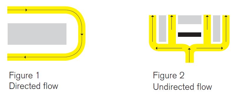
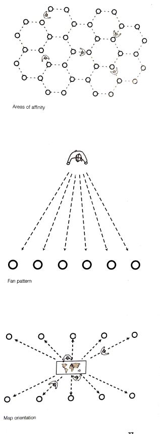
There are several organization paths possible :

Enhancing information : The role of graphics and lighting in an exhibition :

Graphics :

Graphics are a key part of the visual theatre of exhibitions and visitor communication. The appropriate treatment of text is essential to good exhibition design and if mishandled, the most likely cause of difficulties for visitors.

Directional signs that draw people into an exhibition are often called wayfinding graphics. These are intended to tease and entice visitors but they also serve the practical purpose of showing them where to go.

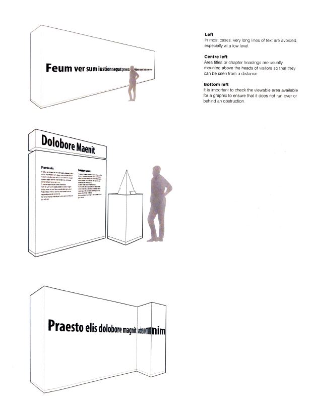
The graphics has to be read and understood from distance. Graphic designers develop a hierarchy of signs of different scales in a consistent style : external signage, medium sized areas headings, subheadings and diminushes to object labels [2].

[3]

To be effective, exhibition graphics should communicate a clear and consistent use of imagery and text avoiding confusion.

In many instances, the design of exhibition graphics is constrained by the client identity. Sometimes designers must follow the corporate font and  use standardized layouts [2].

Designing for legibility :

Legibility refers to the clarity of letterforms, individually and when composed to form words and lines. It is related to the environment in which the text is situated. If it is mounted high on a wall, it must be bigger and clearer than text that is at eye level and can be read from close distance. The legibility is influenced by the contrast between the text colour and the colour of the background. Strong contrasts and good lighting can enhance legibility.

Designing for readability :

Readability refers to the ease with which a piece of text can be comprehended and is influenced by the words used and the complexity of the sentence structure.

The Ekrav method is a proven set of guidelines adressing legibility and readability issues, with recommandations for text writing and layouts. Designers should avoid long, densely written paragraphs.

A few graphic Rules :

  • Use simple language to express complex ideas
  • Use normal spoken word order
  • One main idea per line
  • Lines of above 45 letter, text broken into short paragraphs of 4 to 5 lines
  • Use the active form of verbes and subject early in the sentence
  • Avoid complicated constructions
  • Read text aloud and note natural pauses
[2]

Lighting :

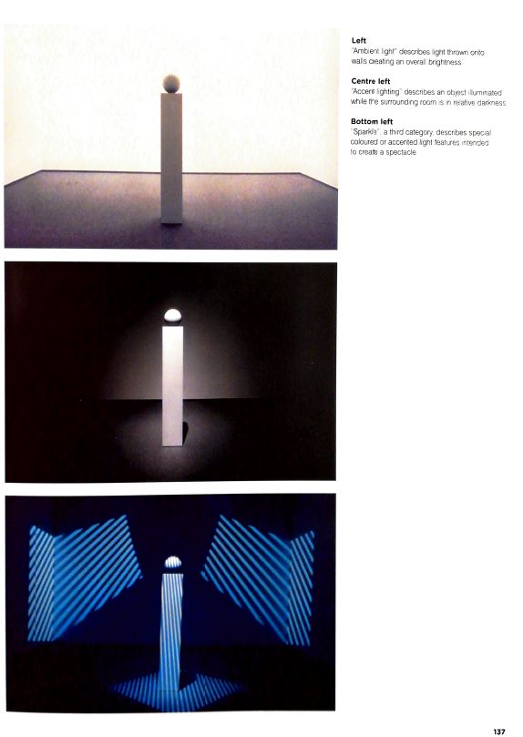
The visual perception of exhibits, spatial relationships, surfaces and graphic treatments is governed by how they are lit. Designer uses lighting to interpret displays and to shape visitor’s perceptions of their experience. It plays central roles in exhibitions. Lighting is adjusted to emphasize changes in mood and tone.

The approach to lighting is determined by the nature of the exhibition venue. Daylight is powerful but has to be exluded if there are conservation considerations, because the UV emitted by the sun are harmful to many material and make then degrade. An other approach is to blank out all the windows and create a full artificial environment. The lighting design is recorded on a lighting plan and may be demonstrated with a 3D visual rendering.

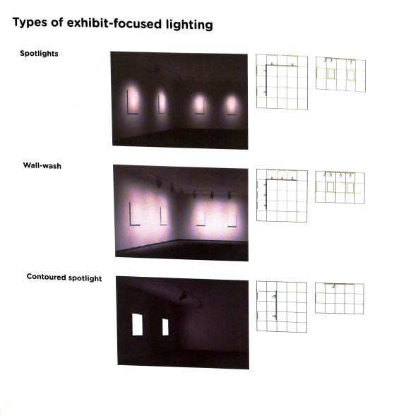
For most exhibitions, the light focused on displays to emphasize the content.

In some cases, it may be important to create an even distribution of light throughout the space, regardless of the displays. Relaxation, teaching areas and important circulation routes are examples., but also when visitors are expected to do some physical activities such as interacting with some devices. It is interesting to note that visitors tend to find ambiant light more comfortable. The transition from low ambient light levels to areas of high ambient light must be carefully managed, to avoid sudden increases in light levels that are uncomfortable to the eyes [1,2].

Sources :

[1] Exhibition Design, David Dernie

[2] Exhibition Design, Philip Hughes

[3] How to design your exhibition

Clumsy Interactions through everyday objects 02

We are surrounded by objects in our daily life, thought by us, to be as useful as possible. However, we do not exploit all their potential. Why is this?

What’s more common than a pot, a juice carton or a bag of take-out food? What if I told you that most of us don’t know how to use them as their designer intended? You think you’re in the category of those who know. Are you sure about that?


Did you know that the hole on the tip of the pan allows the spatula to rest?


Or were you aware that most of us use the orange juice bottle upside down?


And finally, did you think that a doggy bag could unfold to become a plate?


Through these 3 objects, we realize that the solutions that the creators have found to simplify our lives are totally unknown to us.
While being anchored in our daily life, the interactions we have with these objects are awkward.
Indeed, while these objects are simple and practical, we have found other ways to interact, more instinctive but less optimal.
Faced with this paradox, we can begin to ask ourselves many questions about the way we apprehend the objects around us. After all, we are not so sure we know our everyday life so well.

Here are the various questions that these awkward interactions raise:
How to recognize a clumsy interaction?
How do awkward interactions with everyday objects arise?

  • Does it depend on me/user?
  • Does it depend on the object?
  • Does it depend on the emotion linked to the object?
  • Does it depend on how we saw the object used by the other?
  • Does it depend on our curiosity about the object?

Do they have an influence on our behavior and habits?

  • Why do we reproduce them ad infinitum?
  • Do we need them?
  • Do they generate progress?

If we interact so awkwardly with such simple objects, we may wonder how awkward we can be with more complex objects?

For the articles to follow I will try to answer these different questions.

Labeled Content – A “State of the art” Analysis

Analyzing the state of the art of content labels.

State of the art refers to the highest level of general development at a particular time. In this case we will take a look at currently used design method and interaction process when interacting with misleading information. Some of the examples have already been shown in prior postings in a different context.

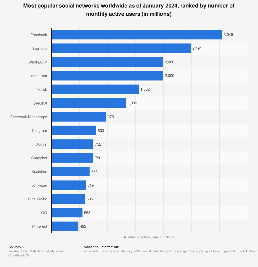
Since there are a lot of social platforms around, only the most popular ones will be analyzed. In this statistic you can clearly see which platforms have the most active users.

Statistic: Most popular social networks worldwide as of October 2020, ranked by number of active users (in millions) | Statista
Find more statistics at Statista

Clearly the market leader is Facebook, which is why it is the first social media platform in this analysis.

Facebook

Facebook is not only the market leader, it is also the biggest platform for misleading content in any forms. As most people already know, Facebook was a part of a major election scandal in the presidential election 2016, but this was not at all unpredictable. Some studies from 2012 showed that Facebook was a powerful, non-neutral force in electoral politics. Back then the “I Voted” button had driven a small but measurable increase in turnout, primarily among young people.

The research showed that a small design change by Facebook could have electoral repercussions, especially with America’s electoral-college format in which a few hotly contested states have a disproportionate impact on the national outcome.

With this knowledge it is even more important to be really careful about design changes on this platform, because the priorly described effect does not only happen on Facebook. It is happening all over the social platforms.

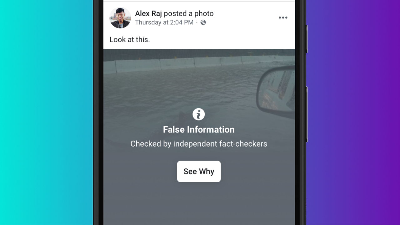
Facebook Content Labeled as False Information

This is an example of an as false information labeled content. Facebook uses a dark or greyish overlay or a blur effect to let you see the picture and also puts some information onto it. This information includes an icon, a clear bold headline with a subtitle and a link, which leads you to an independent fact-checker site or some other article.

The research questionnaire should help understand how people interact with this kind of content, if they really click the link and how it makes them feel. Furthermore it should show how and if the design of information makes a difference on how trustworthy it is and also which key factors need to be in place to make information believable.

Instagram

Instagram uses the same technique as Facebook for labelling content. This may come from the fact that Instagram belongs to Facebook, which is also why I am not going to analyze this any further.

Comparison of Labeled Content

Youtube

What about Youtube? Youtube is the not only one of the largest social media platforms, it is also often used as a search engine. Most people love it because it offers so much, like tutorials or short explanations and you can even watch some movies for free. However, this might not be as great as at it was because of all the commercials. Just remember the “Good old Days”.

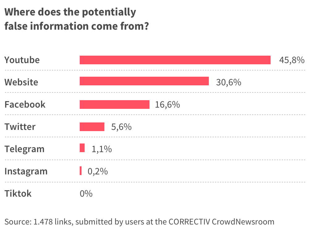
Despite the fact that Youtube is a big player, it is often overlooked when it comes to misleading information, but this statistic shows that a great share of the potentially false information which is flowing around about the corona virus actually has its roots on Youtube.

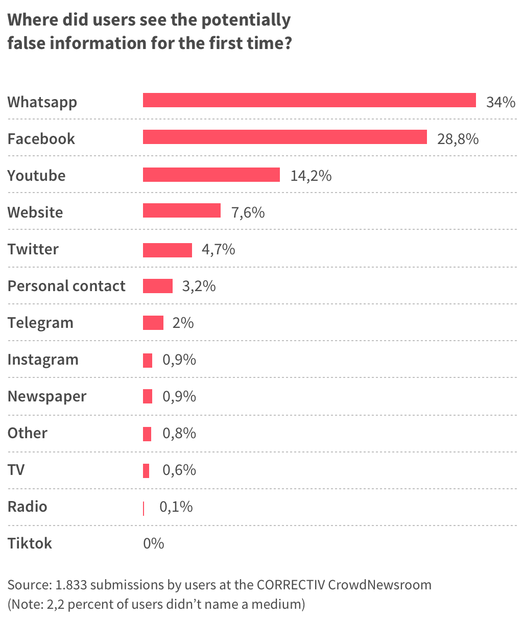
Data analysis: users find questionable information on the coronavirus  especially on Youtube and disseminate it via Whatsapp

Not only does this mean that that by far the most frequent source of potentially false information reported to correctiv.org by readers are Youtube videos. It also means that most of them share exactly this false information through other apps like WhatsApp.

Graphic

So how does Youtube label their content?

YouTube expands its fact checking feature to the UK | Daily Mail Online
Youtube – Labeled Content about Covid-19

Today, Jan 4th 2021, the dailymail.co.uk wrote that YouTube has started displaying fact-check information panels to users in the UK, in an attempt to stop the spread of misinformation on the video platform.

UK users will start seeing the independent, fact-checked information from third-party organisations on the Google-owned platform from Thursday.

Panels will appear above search results, offering ‘more context’ and links to reputable sources of information relating to whatever users are searching for.

Facit

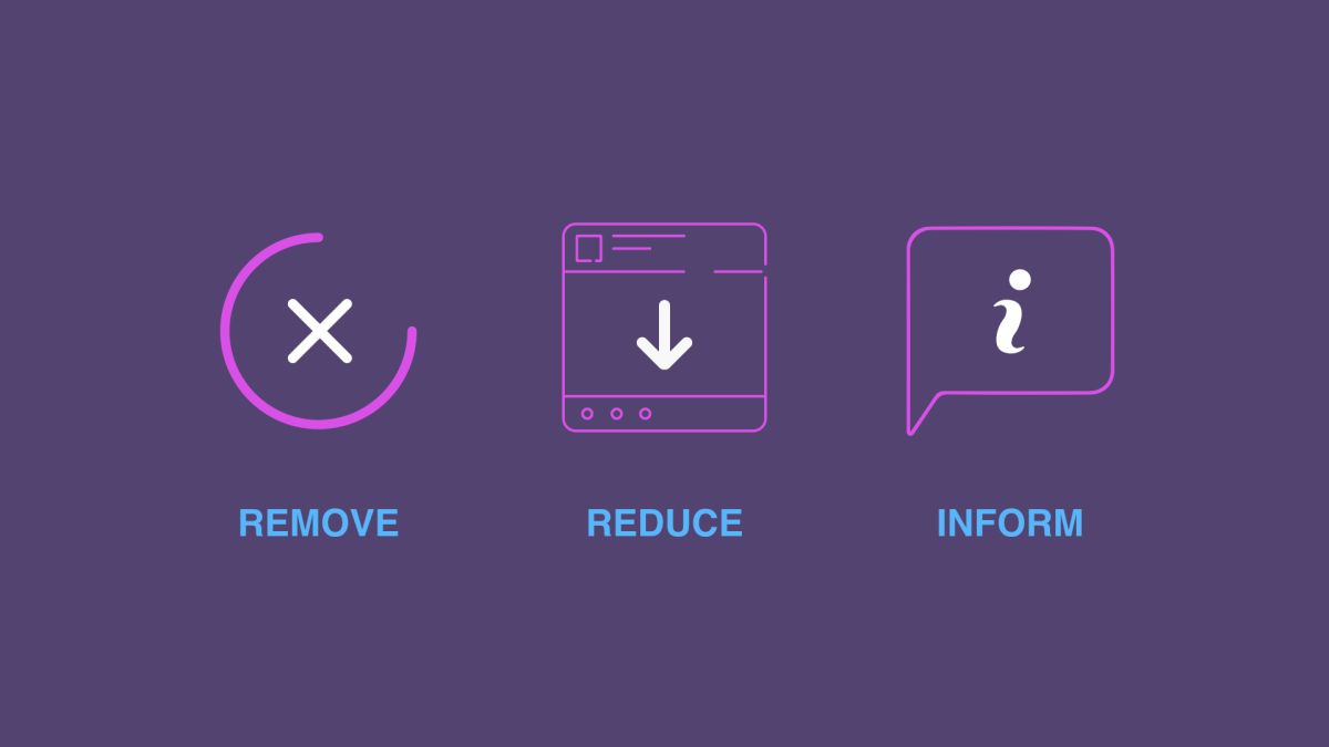
Most platforms use more or less the same technique or process for misleading or false content. Even the design looks similar on all of these platforms. The strategy most of them use looks like this:

Hard Questions: What's Facebook's Strategy for Stopping False News? - About  Facebook
Facebook’s Strategy for Stopping False News

Links

https://www.theatlantic.com/technology/archive/2017/10/what-facebook-did/542502/

https://www.statista.com/statistics/272014/global-social-networks-ranked-by-number-of-users/

https://correctiv.org/en/latest-stories/fact-checking/2020/05/18/data-analysis-users-find-questionable-information-on-the-coronavirus-especially-on-youtube-and-disseminate-it-via-whatsapp/

https://www.dailymail.co.uk/sciencetech/article-8764835/YouTube-expands-fact-checking-feature-UK.html

The basics of exhibition design #1 the research phase

Before explaining in detail the strategies used by Science Centers to promote learning and conveying message, it is necessary to have more insights about what are the basics of exhibition design, and what is the process used by exhibition designers.

I’ll present this methodology showing first the early research phase of the exhibition, the consideration of the space, light and graphics to emphasize the content, and the basics of interactivity and some tools used in exhibition design. Then, I will present the basics of science exhibition history and properties and I’ll show and analyze a few best pratices examples.

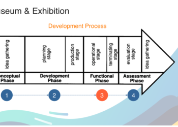
The 3 phases of the exhibition design process :

In his book, Exhibition design, David Dernie explains that the exhibit design processes goes through 3 phases :

  • Research phase : the exhibition idea or concept is created, tested and refined. The principal outcome of this phase is a deep institutional understanding of what the exhibition is about and why the museum is doing it at this time ; in this way, and at this scale. This understanding is recorded in the exhibition brief.
  • Design phase : is when the interpretive plan and all the research conducted to date is transformed into 3D through the creativity and insight of the designers working collaboratively with representatives of museum departments, interpretive planners, and evaluators.
  • Implementation phase : is the building and installation of the exhibition. Project and financial management are crucial to ensure on time and on budget culmination of the exhibition process.

Exhibition design is a reccurent and iterative process, adapting and adjusting to exhibitions of varying sizes and budets, level of complexity, purpose.

But why are exhibitions created in the first place ?

Exhibition are the principal means by which museums can be of service to us. They can confirm, question or shake our beliefs or they may arouse a new interest or deepen our understanding of ourselves and the world we live in. The purpose of museum exhibitions should be both educational and entertaining.

The first questions that the designers have to consider are ; why is the exhibition necessary, what is the best way to communicate content, who are the visitors and what kind of experience do they want to offer ?

Where does Museum Exhibition Ideas come from ?

Successful museum exhibition program should be both research based and market driven : the idea of an exhibition can come internally from the analysis and interest of the museum staff or can be oriented from the public interest and demand. The target audience depends on the type of exhibition, and sometimes designers need the insights of other professionnals such as educators when designer exhibits for children, for example.

Each museum staff member who wishes to do research  should prepare an annual personal research plan. It should propose a methodology that addresses both the academic and the pratical implications, financial and project a schedule for completion of the research. Each individual’s research plan should be subject to review and approved.

Who is the exhibition for and why ?

Surveying visitors is crucial to learn who they are and why they attend, as well as which museum offering attracted their visit on that particular day. With this information, museums can better communicate with their current audiences and expand them, learn how to be relevant to their needs and to the needs of the communities in which they live, and determine how better to serve them [1].

The research phase : writing the brief

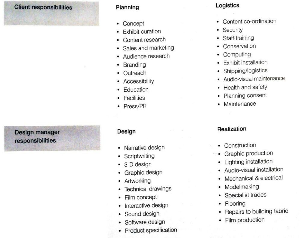
The development of an exhibit begins with a planning stage and meetings with the client to discuss their expectations of the exhibit. Every detail should be described in what is called a brief. It is the formulation of the understanding of the project by the designer, and it specify the tasks and details the informations to take in account. The client and the designer have different roles that can be resumed as follows :

When writing a brief, the designer has to consider those inputs :

visual identity and brand information: it is important for the designer to understand the client’s identity so that he can then design content in accordance with this vision.

target audience research: another important step is to obtain information about the main target(s) of the exhibition. The target audience depends on the type of exhibition, so for a science center, children are more likely to be targeted, whereas an art gallery would be more targeted at adults. The designer often uses external research teams to learn about the learning styles of his visitors, what he likes and dislikes, and what he does not like.

reception of visitors: another preliminary step is to take into account the arrival areas and the organization of the arrival and visits according to the number of visitors. It is all the more crucial nowadays in times of covid to limit visitor entries.

storyline: the storyline is a document describing the elements of the exhibition and quickly retracing the exhibition in zones, or different stages. It is a way of tracing the exhibition’s route. At this stage it is superficial.

the tone of the exhibition: the tone of the exhibition is as important as the exhibition itself. It differs according to the type of content, and must be taken seriously especially for historical museums recounting wars or other dramatic events.

the content document: this is a detailed descriptive list listing the different contents, their types and description that should be present in the exhibition. It can be more or less provided depending on the museum, and serves as a basis for the designer to design the museum experience.

back home messages: the designer must discuss and agree with the client on the purpose of the exhibition and the key messages to be conveyed to visitors. The designer is not only responsible for the style of the exhibition but also for its comprehension and the overall visitor experience. It is also necessary to ensure continuity between the information displayed on the various media: the website, the leaflets and the content present in the exhibition. All this must allow the visitor to have a global view of the message to be retained.

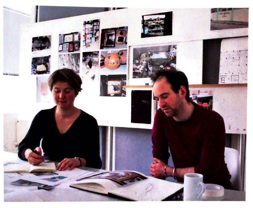
creative workshops: In general, designers designing an exhibition create creative workshops where they share their ideas and inspiration on their vision of the exhibition. This is the starting point of the creative phase but it also help the designer and the client to make sure they have the same language and tone when thinking about the exhibition [2].

Creative workshop of an exhibition design

Sources :

[1] Exhibition design, David Dernie

[2] Exhibition Design, Philip Hughes

augmented reality – application for learning a language | 2

Augmented reality and virtual reality in the educational sector are rising more than ever. While there are challenges AR and VR are facing like the question of cost, effectiveness and health both educator and student benefit from these new technologies which bring interactivity and are currently developing and expanding their availability.

AR and VR in education provide the learner or student with a variety of functionalities at one time and bring a greater experience through immersion and overall visualization. A lesson does not consist of listening and looking at something because with these technologies students experience a topic and participate in a given subject. Travelling through cities, showing the anatomy of a human body or technical systems excite the students and are more memorable, tangible, understandable and learnable after all.

Students can see 3D objects and disassemble them instead of seeing a single 2D picture which is limited to viewing just one perspective and does not include the option to interact with the object itself. In general AR accelerates a higher preoccupation with the topic. Information can be absorbed better if it is perceived visually and students learn in a more efficient way especially if 3D models are designed appealing and they are engaged in the process.

image from https://www.cleveroad.com/blog/augmented-reality-in-education

Looking on the possibility of showing the signing gesture-movement of the visual language learners might also select specific parts of the body to concentrate on the movement of only one hand or the specific facial expression (like disassembling an engine into small pieces). To oversee every single aspect in the signing movement which comes within a short time the selection of specific parts, the possibility to slow down the movement and viewing it from the side would benefit the learning process. The complex signs which work through the movement of the whole upper body with fingers, hands, arms, shoulders, torso, head and the face could be understood and learned more easily and intuitive. This is more effective and understandable than reviewing 2D videos or pictures taken from one perspective which are aligned to show the whole complexity of a sign, phrase or sentence.

Sources:

https://www.cleveroad.com/blog/augmented-reality-in-education

https://theappsolutions.com/blog/development/ar-vr-in-education/

Impact of VR on what we think and do

VR, AR or MR is already changing the way we think. The experiences, thoughts and emotions we have while using VR for example, keep us engaged long after we take off the headset and return to the real world. Because these experiences in the interactive, virtual world affect us just as much as face-to-face interactions, we feel the same way. VR can trigger emotions and feelings as if you were really physically there. This experiences are such powerful tools for building empathy because it makes little difference in our brains whether we perform an action ourselves or someone else does; the mirror neurons do the same. Our brains can’t tell the difference between real and virtual, which is why both bad and good experiences can have real, emotional effects. It may happen that our brain thinks that we have a different body. This can happen when sensory, visual and perceptual feedback matches. To give an example, it has been discovered that people who had an avatar with lighter or darker skin color while using VR had less racist prejudice after leaving the virtual world. Other advantages of it are, for example, trainings for very dangerous situations, because these virtual experiences trigger real emotional and physical reactions. However, it may be necessary to include real-world elements or constraints to remind the user of the virtual nature of their world or to ground the user over and over again. Should no limitations or assistances be built in and the brain becomes too accustomed to the virtual body, it can cause the user to lose control and make decisions that they would never actually make in the real environment. To prevent the brain from no longer recognizing boundaries, it can help for the user to put on a kind of vest and slip into the avatar’s body or walk across some kind of bridge. The goal, should VR be used for therapies, is for the user to benefit and learn from the scenario and fully embrace the experience as as his or her own.

Because VR can do both good and bad, Michael Madary and Thomas Metzinger drafted two lists and recommendations for the research ethics of VR and for the use of VR by the general public. These lists are at least first steps because the extent to which VR impacts us is very complex to understand. And because it is so complex, there is a need to think about ethics.

Super short summary of both lists into one.

  1. No permanent or serious harm should be caused to the subject or user.
  2. Every participant needs to be informed about lasting and serious behavioural impacts resulting from VR and that not every consequence is known.
  3. Media and Researches should be transparent especially when virtual reality is being discussed as medical treatment and they should avoid overstating the benefits of VR.
  4. There must be awareness of dual use, which is when the technology is used for something other than its original intent. „Torture in a virtual environment is still torture.“ (Madary & Metzinger, 2016, p. 19).
  5. Responsible handling of sensitive data that can be recorded through VR (eye movement, emotions, body movements) must be ensured and the trust of users must not be abused by researchers or commercial companies.
  6. When it comes to advertising, data protection must also be taken into account. Consumer behavior can be seriously influenced, since advertising can be precisely adapted to the user and could therefore influence entire mental mechanisms.

Sources:

  1. VR changes how we think. Now what?, Artefact group (n.d.), https://www.artefactgroup.com/ideas/vr-changes-how-we-think/
  2. We’re Already Violating Virtual Reality’s First Code of Ethics, Daniel Oberhaus (06.03.2016), https://www.vice.com/en/article/yp3va5/vr-code-of-ethics
  3. Recommendations for Good Scientific Practice and the Consumers of VR-Technology, Michael Madary, Thomas Metzinger (02.2016), https://www.researchgate.net/publication/295083641_Recommendations_for_Good_Scientific_Practice_and_the_Consumers_of_VR-Technology