Clumsy Interactions through everyday objects 07: Are we curious about our daily life?

In this article we are going to talk about curiosity, this faculty that allows us to be interested in the environment that surrounds us and that could prove to be a key element in our way of apprehending the latter and thus in the understanding of clumsy interactions.

What is curiosity?

Curiosity is described as a “tendency to learn, to know new and hidden things” by the Robert dictionary. It is a faculty that we exercise in different ways and that can be stimulated, these are its first characteristics that we are going to study.

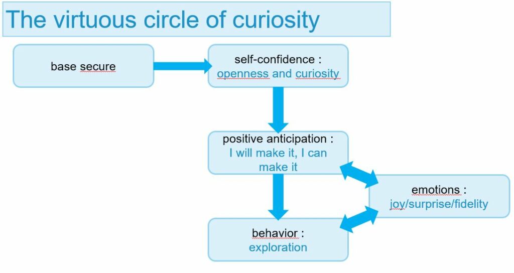
First of all, we can establish that curiosity is an innate quality that we all possess and have had since birth. Indeed when we are babies it is this faculty that makes us want to experiment and interact with the objects that surround us through our touch and our taste. When we observe a baby with a toy he is most of the time testing it either by shaking it or by putting it in his mouth, by doing this he explores the object. This phase of experimentation and study of the object, the actions it can perform with it and its effects are called “the stage of active experimentation” by Jean Piaget. It is very important to understand that curiosity is an innate faculty that develops over time and that depending on the context we will not all have the same level of curiosity. One of the key elements in its development comes from the presence or not of a “secure base”, it is its presence that will, for example, reassure a child and give him the confidence to go exploring. During childhood, this secure base often corresponds to the parents, if they are not there the child will not try to venture into a new environment because he will consider it potentially dangerous. The relationship with our parents can also influence the development of curiosity, if this secure base is not stable then the child will be only slightly curious. We can also note that this secure base evolves over time and can become a group of friends, a spouse, co-workers, etc …


The second source of the development of curiosity will have an important role in awkward interactions, it is the result of interactions with the environment. Through the environment, curiosity is awakened and reinforced in the child through positive emotions that follow successes in his explorations. Indeed, when a child begins to interact with what surrounds him, he discovers that among the multiple interactions he experiences, some generate positive sensations and emotions. For example, by putting a pacifier in his mouth he will realize that this contact generates a sensation of pleasure, he will want to find or reproduce this sensation by bringing other objects to his lips. As Jean Piaget has shown, we can only evolve thanks to and through exchanges with our environment. If curiosity is essential to the discovery of our environment, the latter is essential to the development of our capacities. Let’s take the example of language, we are pre-programmed to develop it yet without an environment requiring communication it is tough to acquire it.

Let us recall the important elements of the development of curiosity:

  • the secure base gives the human being confidence to explore his environment for the first time.
  • Interactions with the environment are a source of emotions, when the emotion generated is positive it makes one want to start again.

What is the place of curiosity in the awkward interactions of everyday life?

We have seen that curiosity is both an innate and learned capacity, we have explained its development in childhood but what about its place in our adult life and in our daily life. We will therefore study this curiosity in our daily life through 2 aspects, the first corresponds to the appearance of a novelty, and the second to a habit.

Facing something new

In our lives, we have all the time the opportunity to experience new things, new activities, to use new objects. Curiosity is a key element that allows us to progress, invent and innovate. However, when we are faced with something new, the behavior we adopt is not always that of someone who is curious. On the contrary, we can be rather refractory for various reasons. The first one is due to our brain which likes to save itself and therefore does not necessarily appreciate the novelty that will require it to use cognitive resources for understanding. For example, I will persuade myself to buy the same model of the coffee maker because the others are full of new functions that will be useless to me, but the real reason is that I don’t want to waste energy learning how to use a new coffee maker.
The second is negative anticipation of what might happen, in which case we prefer not to change anything for fear that this novelty might trigger negative emotions or sensations. This negative anticipation blocks curiosity. For example, a new printer has just arrived in our company, we have received like all the other employees its instructions and have read them. If we anticipate a bad manipulation on our part when we first use this printer, we can remain blocked until one of our colleagues has shown us how to do so. We see here that negative anticipation abolishes all confidence, we anticipate a clumsy interaction that does not yet exist.

Curiosity in our daily life

In our everyday life we use a lot of objects but why? Primitive man developed an “interested” curiosity, his objective was to acquire a knowledge of the environment sufficiently important to be able to use it afterward by bending it to his requirements. That’s how objects were born and since then we have been progressing year after year to create more and more sophisticated ones. This curiosity that pushes us to invent allows us to feel a feeling of pleasure when we manage to build the object and then to make it work. It is this same pleasure, this same pride that we feel when we find an answer to a question or a problem. We have learned through curiosity to create and master new objects, but nowadays, with the number of objects that populate our lives, we do not necessarily feel this pleasure towards all the objects we possess. Here is an example, my parents have a washing machine, my mother learned to use it quite quickly while my father has not developed any interest in it. Today, he doesn’t master it and systematically asks my mother which button he has to press to start the washing machine. As he has no feeling of satisfaction when he interacts with this washing machine he has no curiosity about how it works, unlike my mother who, when she turns on a machine, feels satisfaction in mocking a line on her to-do list. That’s how we all work, we don’t master all the everyday objects by choice, but only what interests us. This is a clumsy interaction due to a lack of voluntary curiosity.

Conclusion

In this article, we have seen that our level of curiosity is related to the emotions generated by our interactions with our environment. It is interesting to deepen the link between emotion and object.

Definition, in progress

  • A Clumsy interaction doesn’t happen at the moment we use the object, it was there before and can come from the designer and his personal vision of the use of the object.
  • A Clumsy interaction can depend on the conception of an object and more specifically on the design of the experience related to this object when trying to manipulate it, activate it, make it work, and understand it.
  • A Clumsy interaction has several causes, one of which is mostly conceptual. When the origin of the awkward interaction is inappropriate and deliberate behavior, it is then a human error of the user.
  • A Clumsy interaction can be the result of a lack of curiosity.

Sources :
Book: Les Pouvoirs de la curiosité, Flavia Mannocci, 2016
Article: Jean Piaget, Wikipedia

Usage of Digital Accessibility (5)

There are different laws that are put in place to mandate web accessibility. Accessibility standards across softwares and certain web pages are set. Different governments, universities, industries, etc. have their own methods and ways of accessibility implementation. There’s not a common language that covers all.

Adoption or acceptance of technology? Adoption is more of a process of embracing and experiencing through time while acceptance is just the attitude. Full acceptance brings adoption and full acceptance can only be achieved by full usage ability, hence accessibility.

Benefits of using a technology must outweigh the effort of learning to use it for most elderly this is why usability is so important for user interfaces that seeks inclusion.

The Web Accessibility Directive

Directive (EU) 2016/2102, in force since 22 December 2016, will provide people with disabilities with better access to the websites and mobile apps of public services.[1]

The European Commission states that approximately 10–15% of the population of Europe suffers from some disability, and it acknowledges that “[t]here is a strong correlation between disability and ageing” ( EC, 2014 ).[2]

“Web Accessibility for Older Adults: A Comparative Analysis of Disability Laws”

Some examples for digital accessibility:

  • Screen readers that parse a website for a user with visual impairments
  • Videos on websites are closed-captioned for individuals with hearing impairments
  • Images include “alt text” for individuals with visual impairments
  • Websites must be navigable by keyboard for users who may not be able to operate a mouse (i.e., navigating using the “Tab” on a keyboard)

71% of web users with a disability will simply leave a website that is not accessible, users without disabilities find accessibility features help them navigate your site more effectively. When you maintain an accessible digital presence, all your visitors benefit.

Siteimprove

Sources

  • Kulkarni, Mukta. “Digital Accessibility: Challenges and Opportunities.” IIMB Management Review 31.1 (2019): 91-98. Web.
  • Vigouroux, Nadine, Campo, Eric, Vella, Frédéric, Caroux, Loïc, Sacher, Mathilde, Istrate, Dan, Lompré, Nicole, Gorce, Philippe, Jacquier-Bret, Julien, Pinède, Nathalie, Serpa, Antonio, and Van Den Bossche, Adrien. “Multimodal Observation Method of Digital Accessibility for Elderly People.” Ingénierie Et Recherche Biomédicale (2020): Ingénierie Et Recherche Biomédicale, 2020-04. Web.
  • Adriano, Adrian. “Digital Accessibility for All.” Design Cost Data 63.3 (2019): 51-52. Web.
  • Ferreira, Simone, Sacramento, Carolina, Da Silva Alves, Aline, Leitão, Carla, Maciel, Denise, Matos, Simone, and Britto, Talita. “Accessibility and Digital Inclusion.” Proceedings of the XVI Brazilian Symposium on Human Factors in Computing Systems (2017): 1-6. Web.
  • Abascal, Julio, Abascal, Julio, Barbosa, Simone D. J, Barbosa, Simone D. J, Nicolle, Colette, Nicolle, Colette, Zaphiris, Panayiotis, and Zaphiris, Panayiotis. “Rethinking Universal Accessibility: A Broader Approach considering the Digital Gap.” Universal Access in the Information Society 15.2 (2016): 179-82. Web.
  • Duplaga, Mariusz. “Digital Divide among People with Disabilities: Analysis of Data from a Nationwide Study for Determinants of Internet Use and Activities Performed Online.” PloS One 12.6 (2017): E0179825. Web.
  • Da Silva, Viviane, Silva De Souza, Ranniéry, Oliveira, Mafalda, and Medeiros, Rafael. “Web Accessibility for Elderly.” Proceedings of the 9th International Conference on Theory and Practice of Electronic Governance (2016): 367-68. Web.
  • https://uxdesign.cc/accessible-ui-and-inclusive-design-38fe6e680282
  • https://www.codecademy.com/articles/what-is-digital-accessibility
  • https://siteimprove.com/en-ca/accessibility/what-is-accessibility/
  • [1] https://ec.europa.eu/digital-single-market/en/web-accessibility
  • [2] Y. Tony Yang, LLM, LLCM, ScD, MPH, Brian Chen, JD, PhD, Web Accessibility for Older Adults: A Comparative Analysis of Disability Laws, The Gerontologist, Volume 55, Issue 5, October 2015, Pages 854–864, https://doi.org/10.1093/geront/gnv057

Clumsy Interactions through everyday objects 06:A Typical Day of Clumsy Interaction

I have devoted all my previous articles to research, it is time to see if my conclusions are in line with the reality of everyday life. I have therefore decided to analyze all the interactions of my daily life in order to unearth those that are awkward, to study them, and to understand them.

Let’s take one of my typical days and start my analysis in the kitchen. This is the first space where I start my day and the one where I think I am most likely to find awkward interactions. My first action in the morning is to grab a bottle of milk from the fridge. A clumsy action and interaction that appears.

Refrigerator

The first awkward interaction of my day comes from my fridge and more specifically from the way I can open it. My fridge doesn’t have a handle, I’ve known that since I’ve had it, and yet I never tried to find out if there was a hidden handle and where it could be. I finally realized that the handle that had been created by the designers was a recess at the bottom, just above the freezer opening. I tried to open the door with this handle and soon realized that the location of the handle required a lot more effort. So the awkwardness comes from two things, first finding the handle was not easy because there was no indication and no meaning. Second, the location of the handle does not make it easy to open the door, which makes the interaction even more awkward.

Oven

Right next to the fridge I can find the oven, connected to the hob. Its use is simple and the pictograms are all understandable. The problem I find with this oven comes from the indicator lights. One is accompanied by a pictogram related to the hob and the other to the oven. However, when the oven is activated the indicator light of the baking trays lights up, the one concerning the oven is even stranger, it lights up when I change the temperature, seeming to indicate when the oven has reached the temperature but never goes out. With this oven, it is therefore very complicated for me to establish when the oven is turned on and especially when it has reached the requested temperature, this is where the awkward interaction is.

Washing Machine

My next clumsy interaction concerns my washing machine, it is composed of 4 buttons offering the following commands: fragile, color, cotton, normal. At first glance, the use seems simple, but as I don’t have the manual, I don’t know what each button corresponds to in terms of temperature and spin power. It is this lack of information that generates awkward interaction because every time I choose a program it seems to me to be a random choice. Here there is an object with buttons, therefore affordances, and annotations or signifiers, the problem lies in the understanding of these signifiers.

Earring

Another of the awkward interactions I may have had come from one of my earrings. I recently bought myself an earring, the saleswoman put it on without me looking at how the mechanism was made. When I got home I tried to take it off and realized that it didn’t work when I was pulling, so I figured it was an earring specific to the piercing store and I would have to go back and get it removed. It wasn’t until two days later that I realized that it was a screw earring and so I had to turn it around to get it removed. This awkward interaction is peculiar because its source comes from the fact that I didn’t see the person putting the earring on me, so I couldn’t have a conceptual model to understand how to remove it but also from my own knowledge because until then I didn’t know this type of clasp and therefore I hadn’t tried to turn the earring because I didn’t see the need for it.

Piles

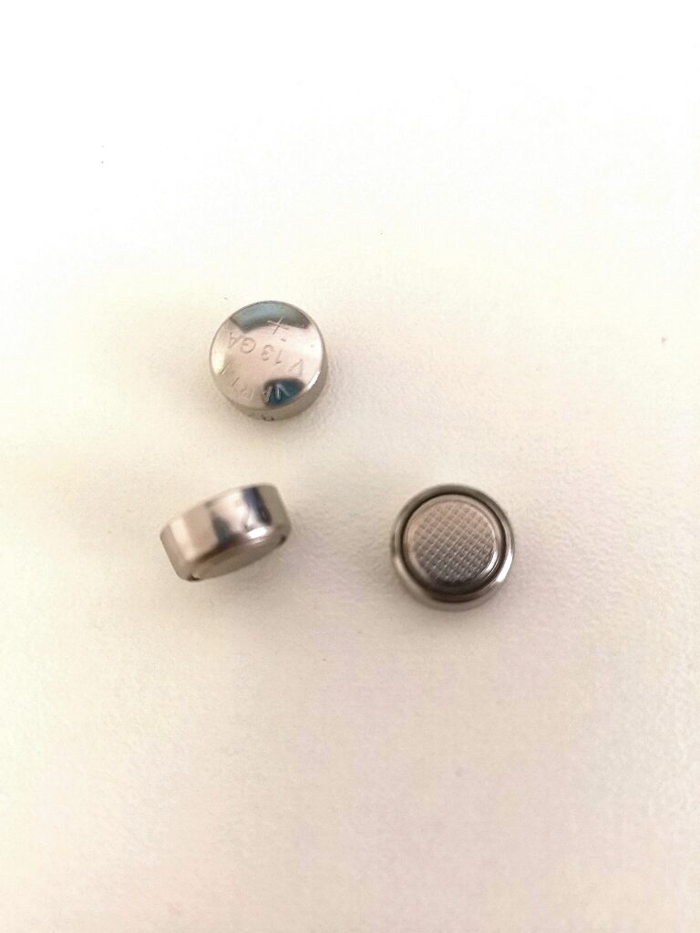
One of the awkward interactions of my day was with a simple object that we all know: batteries. They come in all shapes and sizes, and the ones I’m interested in are the smallest ones that are round. The awkward interaction with batteries is quite obvious, it knows which way we’re going to put them, where is the least, and where are the most. What I find particularly complex with batteries is that it’s an object that needs a lot of meaning. You need both 2 signifiers on the stacks to understand where is the least and where is the most, and you also need these same signifiers on the object that will contain the stacks in order to understand in which direction to put them. The peculiarity of small batteries is that the sign is complicated to read, it is only indicated on one side, and moreover when handling them if we touch both sides at the same time, with our fingers, we risk to discharge them. And all this information is not easy to find.

The tramway

Finally, let’s leave my apartment and take the streetcar. Being used to Parisian public transportation, I didn’t expect to be confronted with a clumsy interaction in the Graz streetcar. Indeed, Parisian transports have a wide variety of door openings ranging from the manipulation of a handle to an automatic opening, with no action to perform. I must confess that I did not understand what triggers the opening of the Graz streetcar door between the automatic opening and the action of pressing the door button. Here I may not have had the codes to understand what triggers this opening.

I have just described 6 clumsy interactions that populate my daily life but I am sure that there are still others that I have not yet spotted.

This intensive research on the objects that surround me, has allowed me to reflect on my way of perceiving them, and the importance that awkward interactions have in my daily life. It made me realize one thing, these clumsinesses have been there for a long time but I only started to notice them when I looked for them. Why wasn’t I curious about these objects earlier?

Neumorphism in the field of intuitive design

Neumorphism is definitely the design trend of 2020. It combines the skeuomorphic design with the famous flat design and thus creates a special flat but realistic 3D-looking effect. It is aesthetically very appealing, but what about the usability? To answer this question, I researched about the strengths and weaknesses of neumorphism and how it would be applicable in real world situations due to its intuitive design approach. I stumbled about the therm „signifiers“ and how hints contribute to good usability. This lead to a research based on the background of human perception and usability.

Signifiers, not affordances

„As time and technologies change, as we have moved from individual to group, social, and even cultural computing, and as the communication technologies have become as important as the computational ones, how well have our design principles kept up? We know how to behave by watching the behavior of others, or if others are not there, by the trails they have left behind.“ — Don Norman

Don Norman, co-founder and principal of the User Experience/Usability consulting firm „the Nielsen Norman Group“, World Leaders in Research-Based User Experience, wrote the article Signifiers, not affordances about powerful clues, that arise from what he calls „powerful signifiers“. He states that a “signifier” is some sort of indicator, some signal in the physical or social world that can be interpreted meaningfully. Signifiers signify critical information, even if the signifier itself is an accidental byproduct of the world. Social signifiers are those that are relevant to social usages. Some social indicators simply are the unintended but informative result of the behavior of others.

To understand social signifiers, he gives the example of catching a train: You know your train’s departure will be soon and rush to the train station. When you arrive and there is no train, you are automatically looking for clues, if you have missed the train or not. If there are still lots of people at the train station, you know, it may just not have arrived yet, if nobody is there anymore, you probably have missed it. So the state of the train station, the presence or absence of people there, works as a signifier. This is an example of an incidental, accidental signifier. That is the nature of signifiers: often useful, but of mixed reliability. Other examples for social signifiers can be a crosswalk or even trails that signify a shortcut through a park or a planted area.

If you think about that for a moment, everything we are doing is a learning process and to evolve we need constant signifiers and explanations how to continue. We permanently interpret clues or signs that enable us to proceed in a certain way, that especially show us how to proceed. We orient ourselves on the basis of our previous experiences, not only in the social environment, but also in our technical competencies. It has a lot to do with intuitive usage, that comes from signifiers provided for us. In the design field, this is essential for a good usability and a good user experience. People search for any signifier that might guide them through and help them to cope and understand, anything that might signify meaningful information.

„Forget affordances: what people need, and what design must provide, are signifiers. Because most actions we do are social, the most important class of these are social signifiers.“ — Don Norman

A signifier in the digital world is for example the scrollbar of websites on the side, which automatically gives you a clue about how much of the page you are viewing is remaining and on what point you are on the page. Also its length is showing what proportion is visible at the moment. The signifier is an important communication device to the recipient, whether or not communication was intended. For us to function in this social, technological world, we need to develop internal models of what things mean, of how they operate. We seek all the cues we can find to help in this enterprise, and in this way, we all act as detectives, searching for whatever guidance we might find. If we are fortunate, thoughtful designers provide the clues for us. Otherwise, we must use our creativity and imagination. But this is something users usually don’t want to do, which can also be an example for bad usability. The user’s mission is to not perceive the interface in that kind of way, that he has to think about how to use it. „Don’t make me think“ is usually the general view and approach, users follow. 

Flat UI Elements Attract Less Attention and Cause Uncertainty?

To understand if this is really that significant for users and if so, how it affects them, I took a look at a study of 2017 on UIs with weak in comparison to UIs with strong signifiers on webpages by Kate Moran.

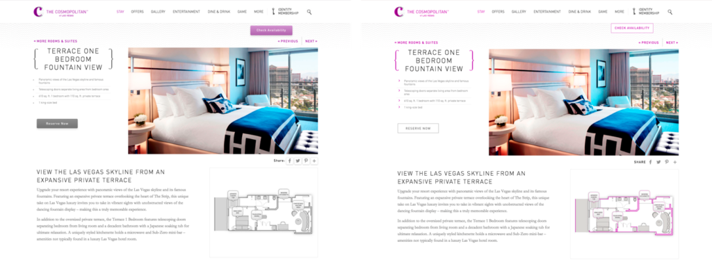
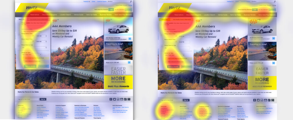
The study first points out that due to flat design, many websites have erased the cues for users to identify, whether something is clickable. Using eyetracking equipment to track and visualize users’ eye movements across interfaces, the researchers investigated how strong clickability signifiers (traditional clues such as underlined, blue text or a glossy 3D button) and weak or absent signifiers (for example, linked text styled as static text or a ghost button) impact the ways users process and understand web pages. They took 9 web pages from live websites and modified them to create two nearly identical versions of each page, with the same layout, content and visual style. The two versions differed only in the use of strong, weak, or absent signifiers for interactive elements (buttons, links, tabs, sliders). To drive the users attention to a certain area of the page, they gave them tasks on the page, for example: „You will see a page from a hotel website. Reserve this hotel room. Please tell us when you have found where you would click.” There were 71 general web-users, who participated in the study. 

Two modified versions of a detail page for a hotel room: The strong version (left) included slightly 3D style buttons, and the light purple color was used only on interactive elements; The weak version (right) had flat ghost buttons instead.

The researchers tracked the eye movements of the participants as they were performing these tasks. They measured the number of fixations on each page, as well as the task time. (A fixation happens when the gaze lingers on a spot of interest on the page). Both of these measures reflect user effort: the more fixations and time spent doing the task, the higher the processing effort, and the more difficult the task. In addition, they created heat-map visualizations by aggregating the areas that participants looked at the most on the pages.

The results show that the average amount of time the user spent on the website with weak signifiers was 22% higher. Also, the fixation time was 25% higher than on the strong signifier pages, which shows the users had to look around more to get where they had to click. 

Strong-signifier version (left): Participants were asked to cancel their rental-car reservation on this page. The heat-map shows most fixations focused around the target tab (as indicated by the red area).
Weak-signifier version: (right) In addition to the focus on the target tab, this heat-map shows many fixations concentrated on the footer links, promotional items, and other items on the reservation form near the target tab. The increased focus on the weak page’s footer is especially troubling, because it’s a signal that the users were getting desperate.

The results of the study were very clear. For a good usability and user experience, you need an easy, seamless, enjoyable and overall intuitive design. The users should understand their options and possible actions immediately, because designs with weak clickability signifiers waste time and patience. The potential negative consequences of weak signifiers are diminished when the site has a low information density, traditional or consistent layout, and places important interactive elements where they stand out from surrounding elements. So it really depends whether (ultra) flat or flat-ish design is suitable or not.

But now back to neumorphism, what is its potential and where are its weaknesses?

There was a huge hype around neumorphic design in 2020, but also some criticism due to its usability. Based on the research about signifiers and the supporting study, I analyzed why there could be problems and how these problems define themselves. Is neumorphism just pretty, but not usable? 

The three simple actions associated with flat design are: click, move and swipe. When a shadow is placed behind a card element in flat design, the distance to the background is shown and makes it a floatable card. This gives a movable feeling to the cards, so users are more likely to interact with them, not just clicking, but also swiping or moving them. This is something the user has learned from his past experience with technical devices and interfaces, but it’s also an intuitive approach. 

In comparison to that, neumorphic UI elements attach themselves firmly on the ground. This creates the effect, that the user is sure it can’t be moved, because its attached. The neumorphic design can somehow mislead people to perceive the components function in the wrong way and gives a missleading signifier to the user. It conveys that things are constant, even though things like a dropdown-menu are temporarily. The actions that usually are intended to do get lost because of the clinginess of components to the surface.

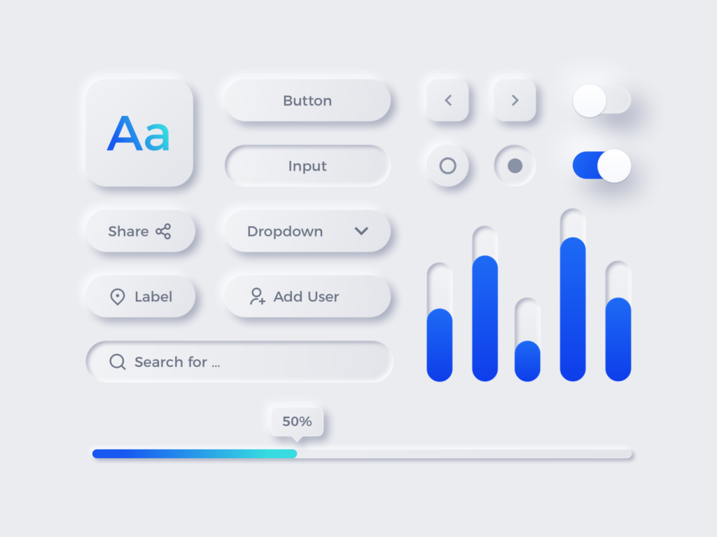
On the other side, due to the skeuomorphic elements in neumorphism it’s so much easier to understand actions like toggle, buttons, sliders or even joysticks. These are real world signifiers, that lead to an intuitive action on the user’s side.

This solves lots of clickability and click uncertainty problems, which is something that flat design is struggling with, as I mentioned previously in the summary of the study of Kate Moran. She uncovers that flat design often uses weak signifiers due to the minimalistic elements. 

In neumorphism, there is only a small but meaningful color palette. One color is only used for interactive elements, one for active or inactive states and so on, which increases the findability of interactive elements or certain states. The color palette makes these elements stand out from the surface and save a lot of time to find and interact with them. As it has been said in many other articles, the main problem with neumorphism is accessibility. The components don’t have a proper contrast ratio with the background. That is because many practices of neumorphism design only use the shadows and subtle changes in transparency to differentiate components and hierarchy which don’t have proper contrast ratio with the background.

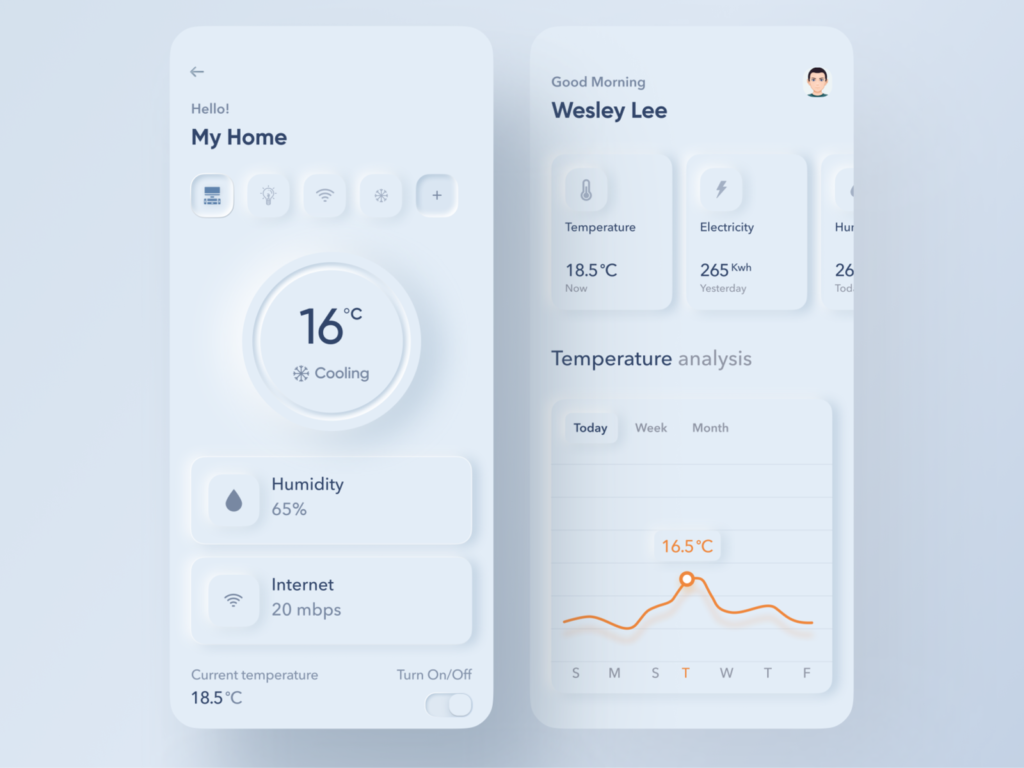
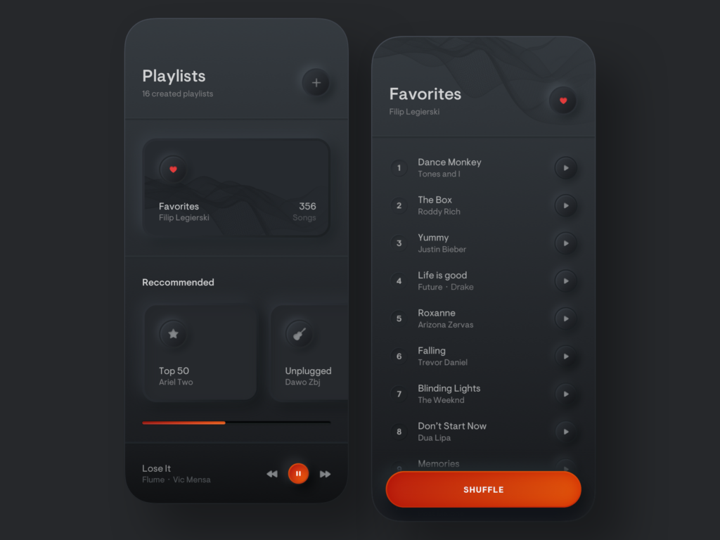
Personally I think, neumorphism is a fresh, modern, flat and minimal 3D-design which is very meaningful, because the skeuomorphic design elements are very intuitive to use. It will not be applicable to every website or app, especially when you have a lot of (complex) content. But most certainly it would be a great opportunity to use it for simple applications, like a calculator app, compass or even the general app overview on smartphones. It works best with clear interactive elements like sliders, buttons and toggles so it could also work great for smart home apps or music production. It definitely needs some adjustments to make it more usable and clear, but it is evolving and has a lot of potential to conquer the design world and give it a new modern touch. 

Sources:

Signifiers, not affordances
https://jnd.org/signifiers_not_affordances/ (19.01.2021)
by Don Norman, published in ACM Interactions, volume 15, issue 6

Flat UI Elements Attract Less Attention and Cause Uncertainty
https://www.nngroup.com/articles/flat-ui-less-attention-cause-uncertainty/ (19.01.2021)
by Kate Moran

Anti-neumorphism or pro-neumorphism? Well, here is a better solution
https://uxdesign.cc/anti-neumorphism-or-pro-neumorphism-here-is-a-better-solution-f7bd18f22fb5 (19.01.2021)

Images:

image01 and image02: https://www.nngroup.com/articles/flat-ui-less-attention-cause-uncertainty/ (19.01.2021)

image03: https://dribbble.com/shots/9527558-Freebie-Neumorphic-UX-UI-Elements (19.01.2021)

image04: https://dribbble.com/shots/8568745-Smart-Home-App (19.01.2021)

image05: https://dribbble.com/shots/9544415-Playlists-Simple-Music-Player (19.01.2021)

video01: video: https://dribbble.com/shots/13241875-Neumorphic-Joystick (19.01.2021)

video02: https://dribbble.com/shots/10494263-Skeuomorph-Smart-Home-App (19.01.2021)


Clumsy Interactions through everyday objects 05: Is it dependent on the user?

We have identified in the previous articles that clumsy interactions depend largely on a bad concept of an object, but let’s not forget that during an interaction there are at least two interacting elements: the human and the object. Thus we can wonder what is the place of the human in the clumsiness. Today we attribute to a human the responsibility of a clumsy interaction is when an incident occurs and that his action is questioned, we speak of human error. It is estimated that 75 to 95% of industrial accidents are caused by human error. However, we can wonder if the error really comes from human beings, perhaps it is a bad design that has not been detected? This is what we will try to understand in this article.

Origin of the Errors

What is human error? It is a drift of a so-called “appropriate” behavior. This drift comes from the fact that the so-called appropriate behavior is not known or is only defined after the fact.
Today, there are several factors at the origin of human errors, the most common one comes from the nature of the tasks we have to do, which may require a mechanical behavior: to remain attentive over too long a period of time or to follow procedures that are much too specific. As we said earlier, when we create an object or a mechanism, we very easily take into account the physical limitations because they are tangible, the mental limitations remain intangible and much more difficult to apprehend. Without them our mental conceptual model is inconceivable. However, if we are unable to develop a conceptual model, it amounts to asking a user to behave artificially. In our example, we did not consider the idea that the resemblance between the buttons and their layout made them identical and therefore the distinction between the commands was impossible.

When an error occurs, it can cause various effects, serious or not, such as injury, financial loss, or material damage. This error, therefore, needs an explanation, we are looking to find its cause, not to understand it. And that is how some errors become human errors. Let’s take the example of a person who works in a warehouse, one night when leaving he makes a mistake with some orders and instead of closing the doors he opens one. The next day, when he returns to the warehouse, he realizes that things were stolen because the door was open. This person will be designated as the culprit, so he will be considered the cause of the problem. However, this reasoning is erroneous because we have not considered here that there could be more than one cause for a mistake and that the person responsible for the problem may only be the immediate cause and not the root cause of the problem, which is the underlying cause.

We must try to understand why this error occurred so that we can find a real solution.
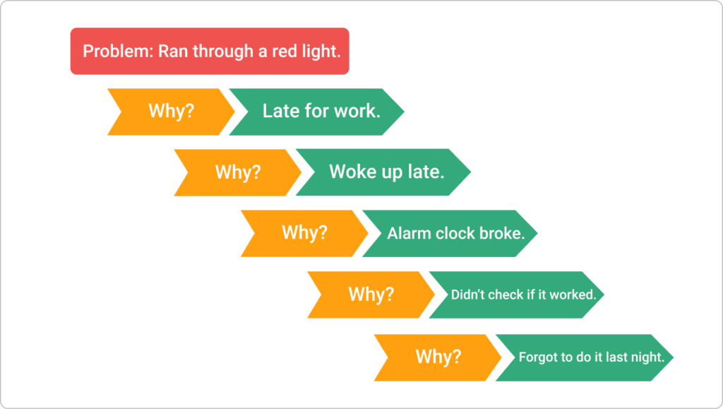
It is with this goal of discovering that it is the root cause of an error that Japanese people use the Kaizen method called “the five whys”. This means that there can always be a cause hidden behind another cause and that one can find the root cause by asking the question why 5 times. This is a very efficient process and must be done by a team close to the field.

Now that we have a first approach to the root cause of an error we need to understand its link with humans. Generally speaking, an error is not considered as a technical problem or a bad design, it is seen as a personal failure, which means that we do not have the ability to understand how to interact well. A person making an error will therefore tend to blame himself and be blamed yet if we make errors it is because the design focuses on the needs of the system and not those of humans. So we may make errors out of fear of making them or out of fear of being held responsible for some of them.

Slips and Mistakes

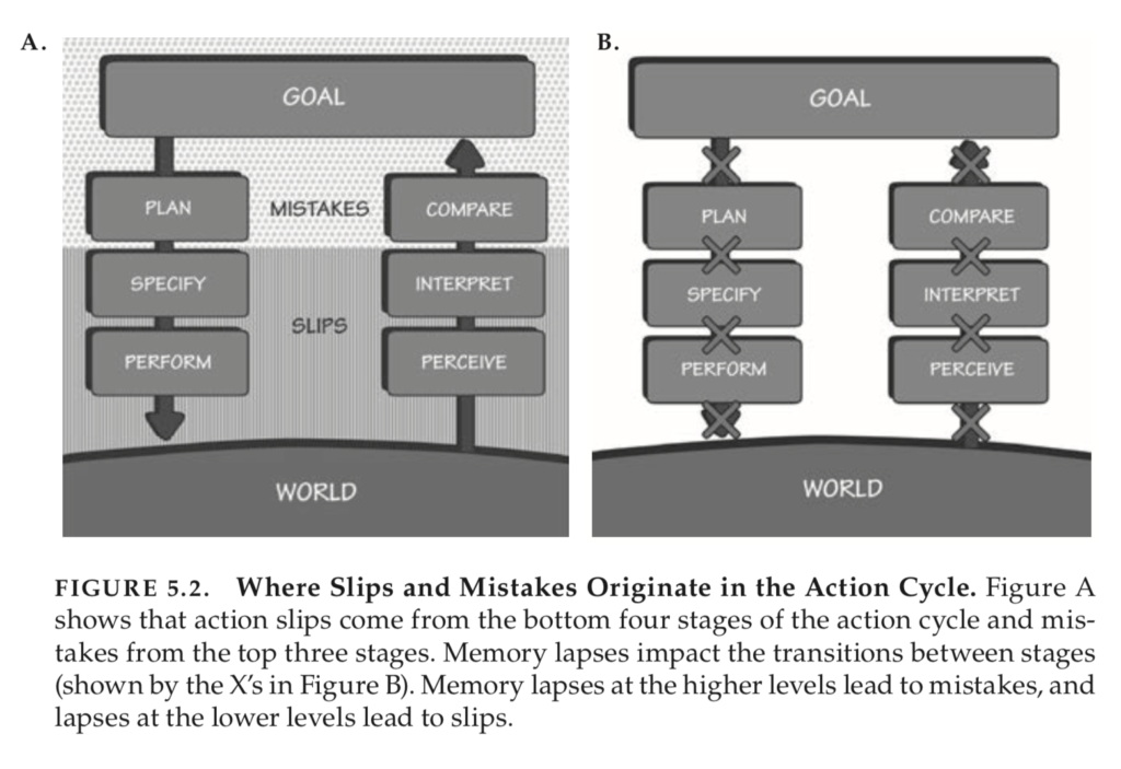
Human error can be divided into two categories: slips and mistakes. “Slips occur when a person tries to do one action and ends up doing another. A mistake occurs when the goal set is not the right one or when the plan is not correct,” defines Don Norman.
These types of error do not occur at the same stages of the action. It is important to understand that an action is divided into 7 stages which are divided into two distinct categories: the first one is instinctive and subconscious and the second one is perceived and conscious. The failures correspond to the subconscious stages of action and the misunderstandings to the conscious ones.

Slips are mostly everyday mistakes: when we are used to doing a task, we tend to do it automatically and therefore lack attention, so we can make the wrong action. For example, I go to work every morning turning right, on Saturday I have to run my errands going left, yet I go right. These misfires can lead to clumsy interactions if the design doesn’t take them into account. So designers should avoid procedures that are similar and start with the same steps because there is a risk of confusing them.
Mistakes are due to a human decision. They happen when we are faced with a new situation that does not fit our routine. We are going to have the first type of mistake when we use a new device that we think we know because we had one that looked like it, in this case, the mistake comes from the fact that we are going to use it based on the knowledge of our first device and it may be inappropriate. The second type of mistake comes from a rigid and underdeveloped procedure. For example, I instruct security guards to block anyone who runs out if the guards follow this procedure in case of fire and everyone stays in the burning building.

The user may be responsible

So far, we have been able to understand that what we mostly call human errors are in fact design errors generating awkward interactions. However, this is not the case for all human errors. The human is responsible when the root cause corresponds to a deliberate action on his part. For example an alcoholic person causing an accident is responsible for it and the design of the car is not to be questioned.

Conclusion

There is a tendency to label all awkward interactions as a human error even though they have a conceptual origin, human error should only correspond to inappropriate and deliberate behavior.
We were therefore able to establish a link between the user and his role in the generation of awkward interactions. All this allows us to understand that when we design something, we need to create disaster scenarios in order to detect potential awkward interactions and avoid them.

Definition, In progress

  • A Clumsy interaction doesn’t happen at the moment we use the object, it was there before and can come from the designer and his personal vision of the use of the object.
  • A Clumsy interaction can depend on the conception of an object and more specifically on the design of the experience related to this object when trying to manipulate it, activate it, make it work, and understand it.
  • A Clumsy interaction has several causes, one of which is mostly conceptual. When the origin of the awkward interaction is inappropriate and deliberate behavior, it is then a human error of the user.

Sources :
Book: The Design of Everyday Things, Don Norman, 2020

Getting into your mind

To achieve the aim of benefitting mental well-being, behavioral science and its application to design are essential. Understanding how choices are made is crucial to change user behaviors. To do so, I will take a closer look into heuristics and the behavioral design toolbox.

Humans run, and ruin, the world, and behavioral science helps us understand and drive changes in human behavior.

Monica Parker
Founder, HATCH Analytics

Heuristics

To simplify our day-to-day decision making and to speed up thinking, we use cognitive “shortcuts”. There is a great variety of shortcuts, but here are some teasing examples:

Social proof:
Have you ever matched a response of another person to a social media post, even though you didn’t truly feel the same way? The reason for that is, that being social animals makes us constantly search for social proof and the reward of the tribe.
Availability:
People create judgments only based on their available information. I.e. hearing of multiple plane crashes in the news might make you cancel upcoming flights. Because plane crashes are relatively rare it could be seen as an incorrect evaluation but generally, the availability heuristic also allows us to draw quick conclusions when needed.

Priming:
If you read the word EAT, how would you likely complete the word fragment SO_P? Even if you don’t intend to, external stimuli such as words or body language prime your idea of something.


Behavioral Design Techniques

Optimal challenge
If you make a task too easy for someone they might not continue and if you make it too difficult you could induce fatigue or surrender. The right balance between difficulty and ease of use engages users and makes them achieve their goals.

Personalization
To predict and change behavior machine learning utilizes your data and learns about you. Asking for preferences and making recommendations will make up for a personalized experience you are likely to revisit.

Stopping rules
I oftentimes don’t notice how much time has passed when scrolling through Instagram, which is due to the infinite scroll. It is by design that we don’t know when to stop consuming more content. If you want to reduce the habit of the user you can use the stopping rule vice versa.

Takeaway

UX designers have to ensure that products are being created with fairness and positivity in mind. Heuristic and behavioral design techniques should be applied for beneficial purposes to the users only. The last decades have shown us the tremendous power of applied behavioral science to do good. Applications save our time and some products even save lives. But recently shady manipulations have risen to change our behavior just to consume and gain profit for the industry. It is our responsibility as designers to work on our code of ethics to consider the consequential outcome of our designs.

References:
https://medium.com/behavior-design-hub/behavioral-design-2020-and-beyond-dc88a87f3b97

https://uxdesign.cc/the-behavioural-design-toolbox-of-20-ideas-and-techniques-3372d31f2803

https://uxdesign.cc/getting-into-the-minds-of-our-users-c5500b49da92

BPE of Science centers in Austria 1

I will continue the exploration of a few Best Pratice Examples (BPE) by showing in those 2 articles an analysis of two science centers I had the chance to visit here before lockdown in Graz and Salzburg.

The COSA Science Center of Graz

In december, I could go through the COSA science center of Graz during around 2 hours. Unfortunately, I could’nt access to the AR/VR part because of covid restriction, but I could go through the main rooms and get the main idea of the museum here.

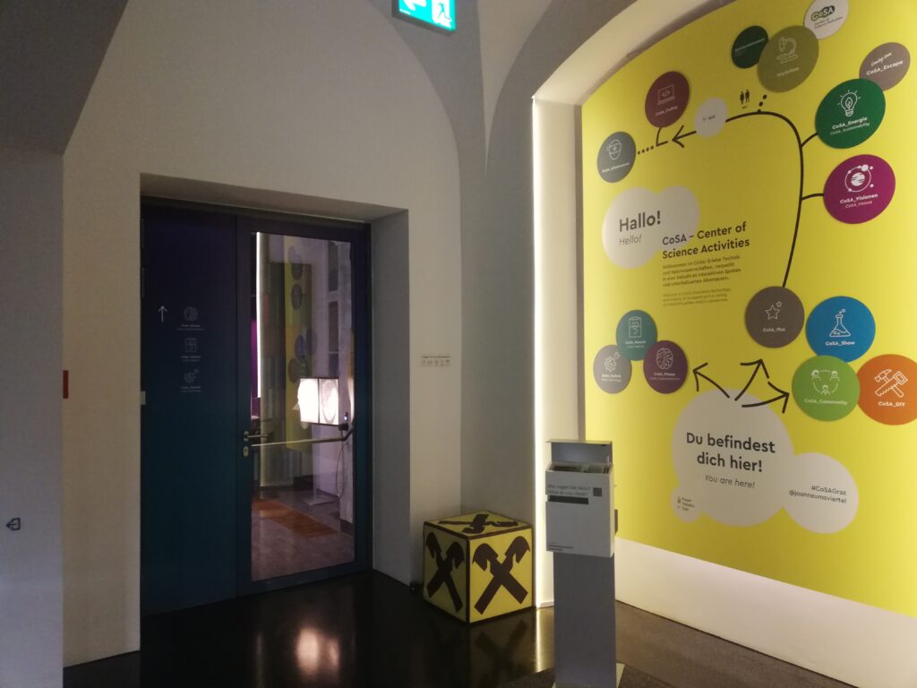
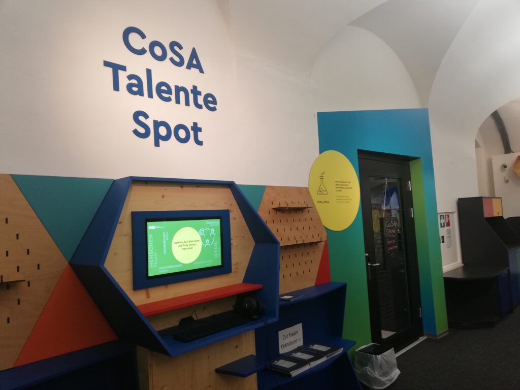
Entry of the COSA building. On the yellow print you can have an overview of the topics presented in the science center.

There are different rooms in the COSA Center. In the Experimentarium, you can find a lot of hands on approaches and explanations about scientific phenomenas. I’ll detail the medecine experince presented in the cosa MedLab. You can also learn about technology and how are made cars.

I could only attend those, but the science center also proposes special exhibitions and contents through the COSA Plus program and COSA community. Those are social events when you can talk to different partners or guests, and there is also some special workshops and sciences show where professional can explain experiments.

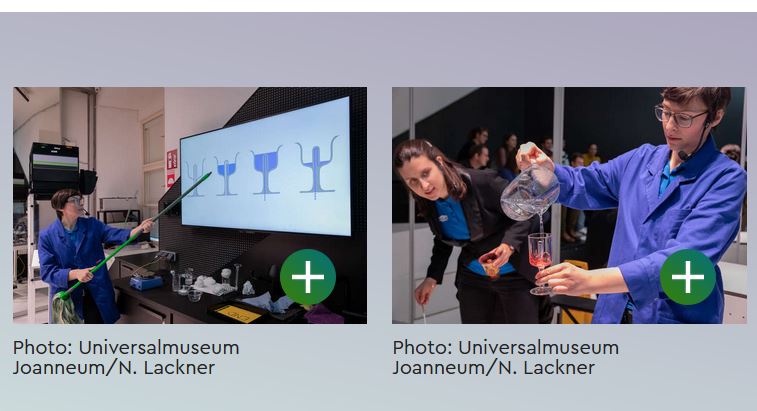
Example of Science Show of the COSA museum
Cosa Community place where you can seat, discuss and practice hands-on experiments

The Experimentarium

We accessed the exhibit with a guide and an other familie. He explained us a bit about the content of each room and then we could go through the content freely and separated from the other familie and guide due to the corona situation.

Entrance of the exploratorium room

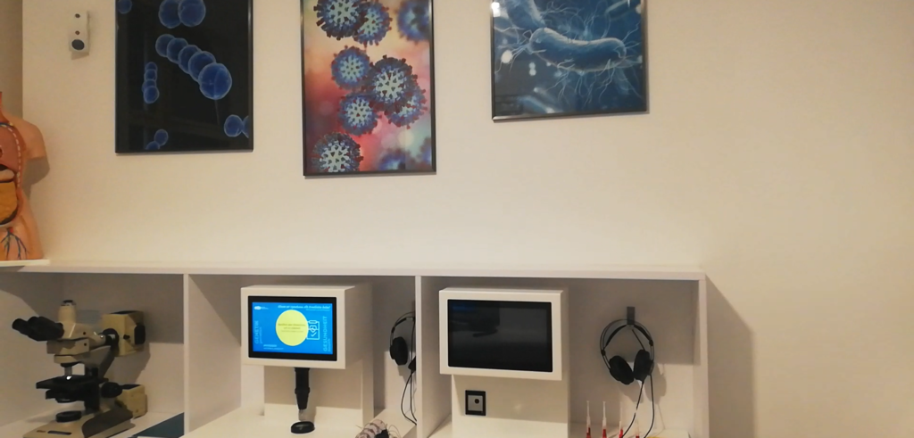
Hands-on best practice example : learn how to be a doctor in the MedLab

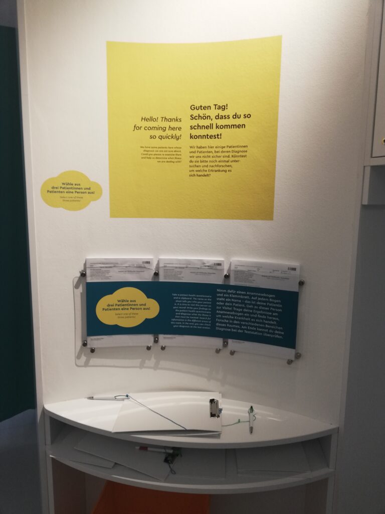
Material to start the experience

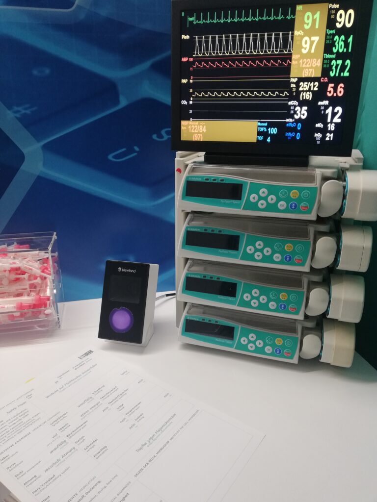
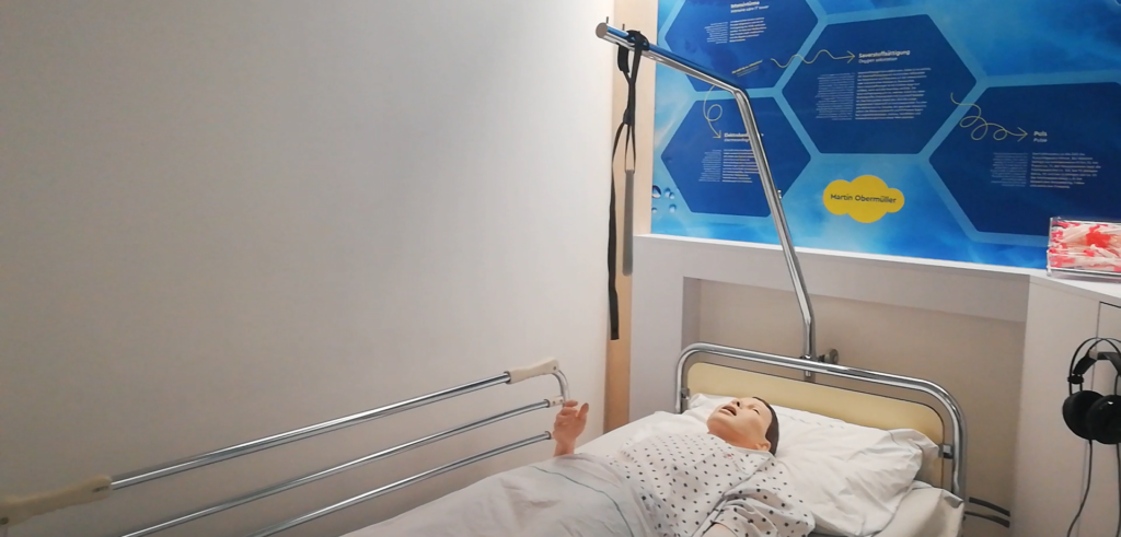
When entering this room I was particularly interested in this hands-on play approach where you are supposed to play a doctor. I was really impressed by the realism and details it got, and It really reminded me some parts of my previous biology cursus. This experience starts with this desk where you can pick up a pencil and a tablet. Then you can enter the rooms where sits the patients and pick one of them to play the doctor with.

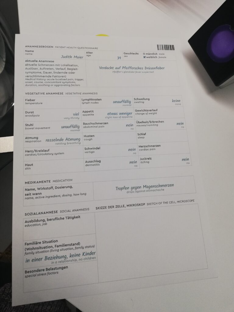
First I took the paper here, then I went next to the patient and put the headphones on. When putting it ou can hear the story of the patient. Mine went trough a journey in the wild and went back with terrible stomachaches.

Detail paper of the patient where you can collect informations for further analysis
Monitor next to the patient

In the headphone it is explained that you can write the informations here and you have to take a blood sample. This part was really funny because the model had fake blood in it and I could really take something from its body so it added realism in the gesture.

Then, you have to enter to the analysis where you will have to make some research with the sample, and gather information.

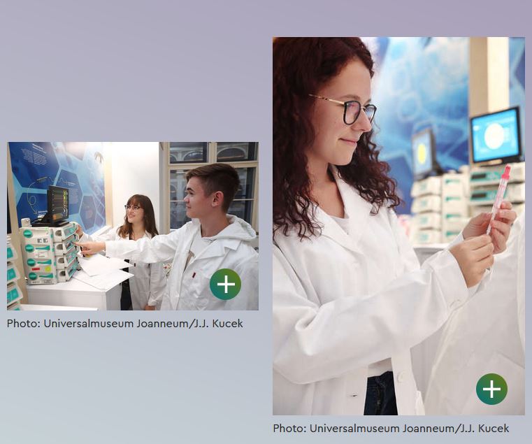
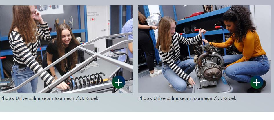
Pictures of the hands-on experiment on the website

I knew how to proceed until this step but got a little blocked through the analysis room. I remember that I didn’t understood how to analyze the blood sample, I was quite afraid to break the material. It would have been great to have more explainations about this part, but everything else was really comprehensible.

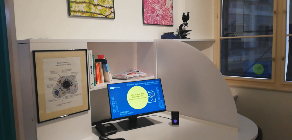
Monitor where you can search for different types of sickness and find symptomes associated

After my researches through the monitor I thought I had the good diagnostic, but couldn’t be really sure since I didn’t have the feedback from the blood sample analysis. The last step was to use those screen to note everyinformation. I remember that everything was in German so it was quite complicated to note every information. I think I would definitely have less problem if some english information where written.

Hands-on pratice example : what is green energy ?

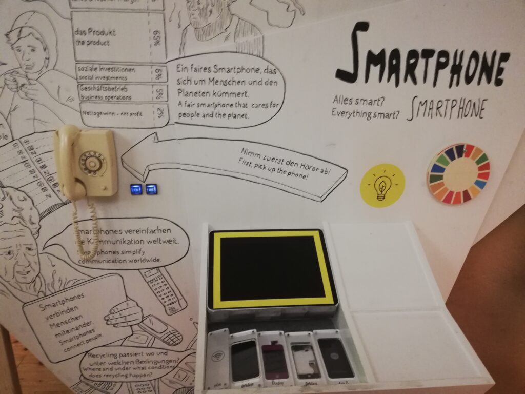
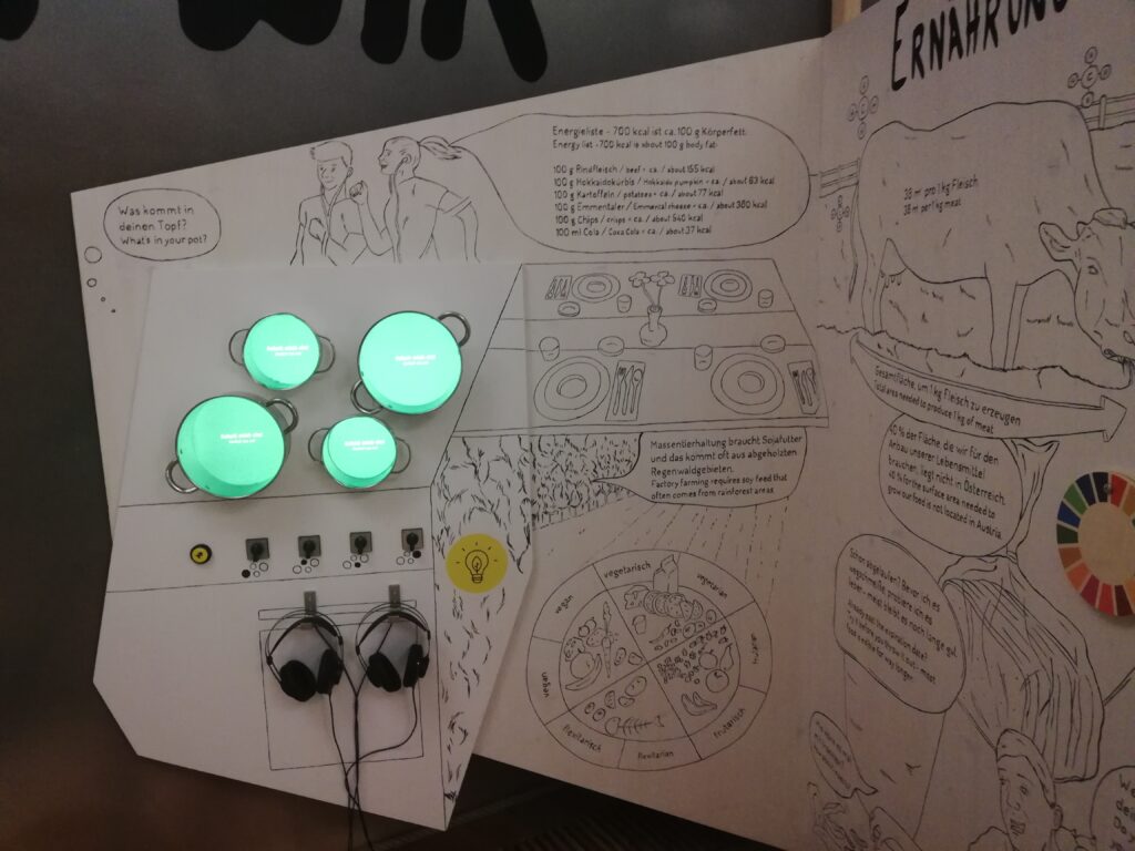
After exploring the Experimentarium space, I went throught the sustainability room. Here is an other ambiance, with a lot of information on the wall. The graphics were really great but I think it was a bit too much to understand quickly the goal of each device. We could’nt really tell the difference between usefull explainations for the experiences and just basic information and drawing about the topic.

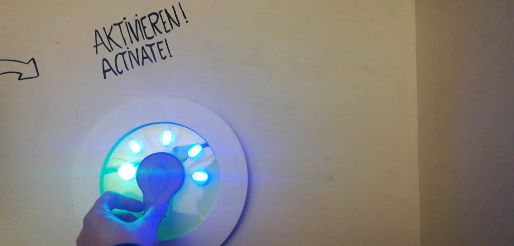
When entering this room, you have to collect a connected lamp, which allows you to access to the experiments. I liked the idea because it showed the physical aspect behind energy.

One of the wall you can see entering the room. As you can see there are many informations

I tried to get through this activity and really had problems. Every information was written in German again, and the main information about the experiment was hidden under this round block, which was not really logical. An other thing that really confused me was that what seems like an ipad, was non interactiv. I finally understood that the goal of the experiment was to put the phones you can see here on the tablet, which is not what you are expected to do when seeing a tablet. So it reminded me that in order for an experiment to work, you always have to consider the affordance of the device you are using, and here the tablet was non appropriate for me. I would have understood if it was something like the lamp example we showed before. An other thing, was this old phone that I found quite unpractical because it needed my left hand. I would have prefered a headphone as it was used for the other experiments.

Experiment to compare phones and their energy consuption

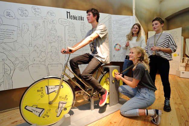
Underneath you can see a bicycle experiment, which I understood as a sensibilisation to consider more about cyclists and showing it as a good way to save energy.

Picture of the activity from the website

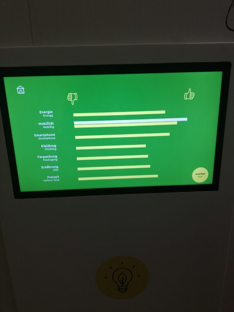
At the end of the room, you can have an otherview of all your results through the key you used for all activites. I liked the idea and sensibilisation behind it.

Summary/tracking of all your datas collected on the different experiments through the sustainability room

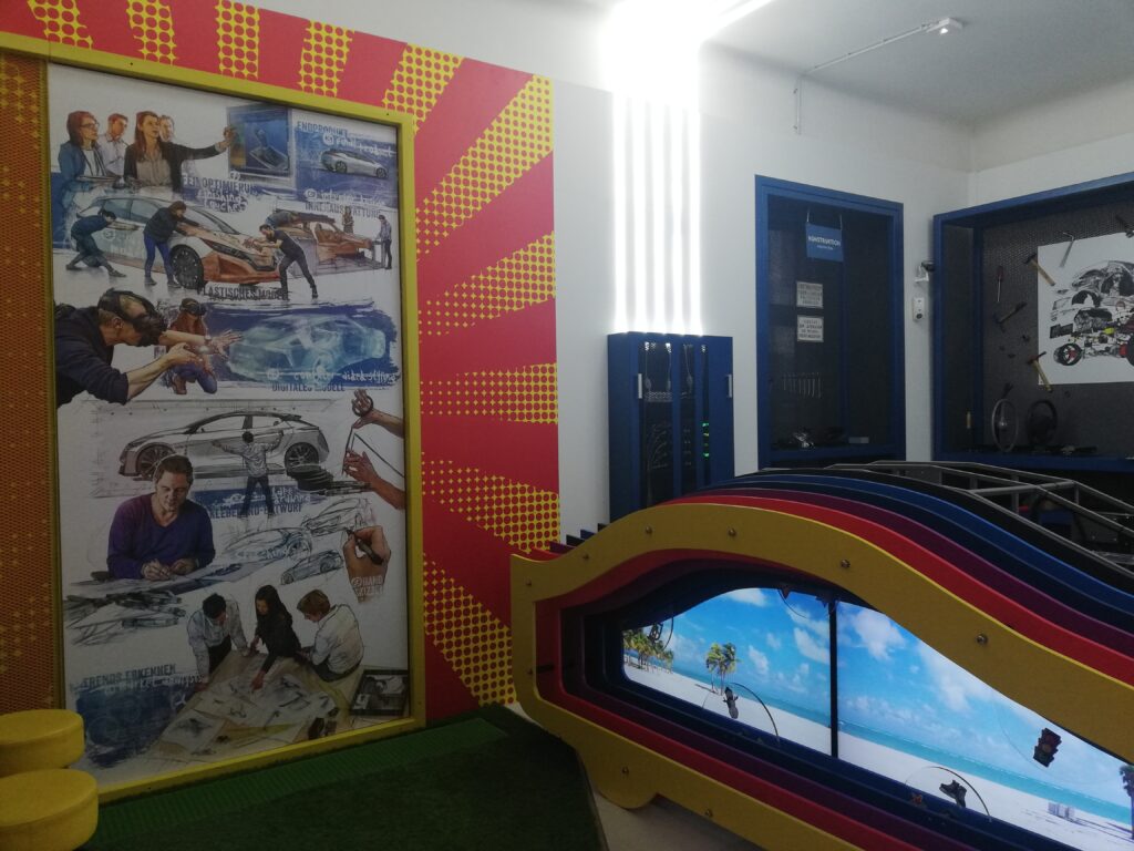
Hands on approach : what is a car anyway ?

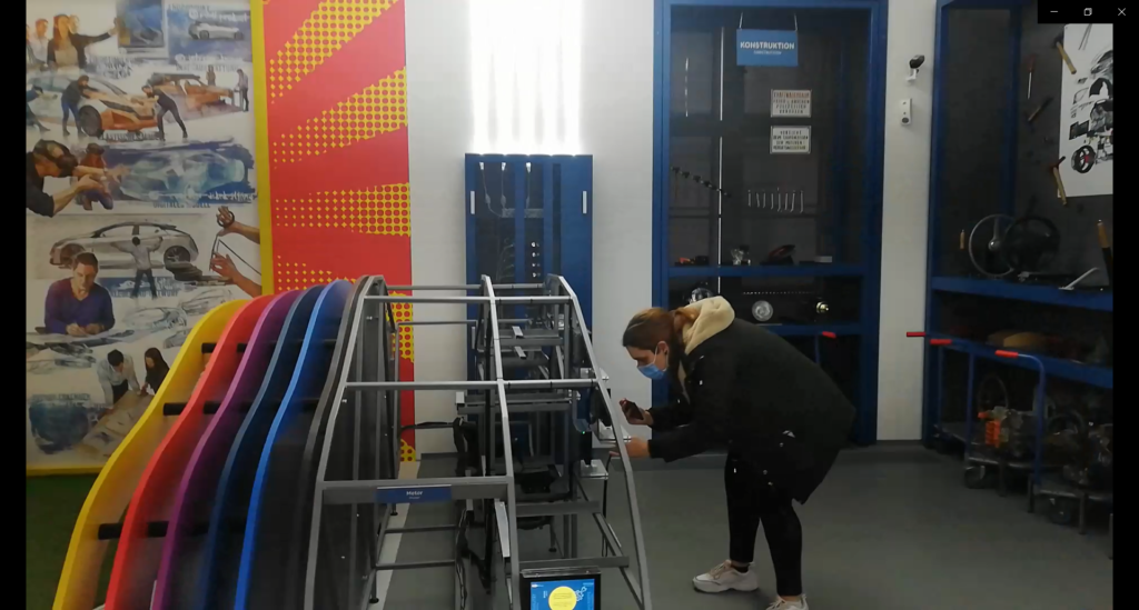
In the Cosa technology space, you can develop your own vehicle and get to know the technical components. I find it was really explaining the process behind the construction of the car : through the design that we can see on this print on the wall, to the engineering part with the material construction.

Dark box : escape pause through the space and sea

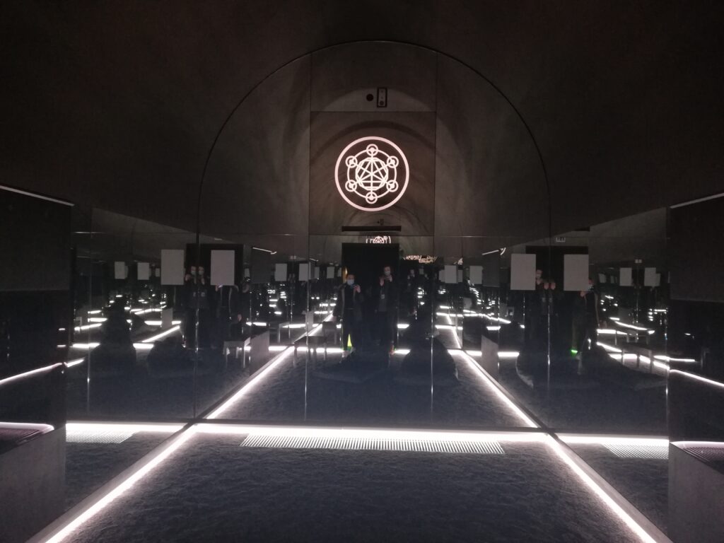
To finish my journey in the museum, I went trough the dark space big media installation. I was really impressed by the setup and really appreciated the experience. It allowed me to relax and change environment. I think this part is more entertaining than teaching, I can’t say I really rememberd the content about the story, but it was still appreciating.
Dark room

Conclusion about the Cosa :
I was really impressed by the COSA center and would definitely like to go back to it with more time, and with all the facilities opened. The strenght of this museum for me, are the hands-on approaches and vision of a few professions related to science with the medical experiment and the car building. I could find a lot of similitudes between this museum and the previous example about the exploratorium because it axed on the hands on approach, there was an explainer and the center also proposes diverses activies and shows. The negative points were for me the accessibility to non german speaking people, the lisibility of information, and a few some affordance problems : there was a lot of information in each room and the hierarchy between the titles and content were not really visible. An other thing for me was the experience during the corona situation. I felt a bit unsecure doing the experiments since there was many hands on approaches, and I really question myself about the close future of science centers if this pandemie continues on a long term level.

Through this visit I really understood the social aspect behind science center. I think I may be part of those people which learn through interaction of social person and by mimicking things. Since I experienced problems without any guide (which was due to the corona situation), I really think it is something to take in account when designing an exhibition, in particular in science center. It reminds me of the questions about learning I mentioned at the begining of this subject about : what are the different types of learning, and how to imply every type in an exhibition ?

To finish, an other point to take into consideration is the affordance, continuity and conceptual models we have with the devices. It reminded me those principles from the Don Norman book , the design of everyday things that I read for my research on the portemonnaie project.

Sources :

https://www.museum-joanneum.at/en/cosa-graz

Don norman, the design of everyday things

augmented reality – application for learning a language | 4

There are many devices or physical objects trying to include options for deaf or hard-hearing people. Currently apps for learning the sign language are mostly without AR so without objects or signing avatars which are computer-animated virtual humans built through motion capture recordings. As described in the previous blogs, there are options showcasing the content with videos or pictures and predominantly showing the hands. In videos on various apps and on YouTube real individuals are signing and their whole upper body is shown which is more helpful to get to know the language better.

Overall there are four phases which are important when learning the language of signing:

  1. First of all learn one chosen alphabet and fingerspell it
  2. Secondary learn common signs
  3. Afterwards or meanwhile phase 2 you will get to know and learn the grammar and stucture of sentences
  4. Lastly sign with other people

The final concept should educate on and help with phase 1, 2 and 3 to prepare for phase 4.

AR objects and avatars

AR possibilities and concepts which are currently developed to help the sign language learners differ depending on the showcased AR objects within the apps. As you can see in the next examples, some are using flashcards, physical cards you have to buy beforehand. The flashcards have different illustrations like hand guestures or fingerspelling to learn the alphabet. By hovering the smartphone over the cards avatars start to sign letters and words or augmented 3D objects appear to represent the sign (like a augmented bear or heart is appearing when the signs are showed).

It was interesting to see that most avatars occur as whole individuals. On one side the lower body does not contain any relevant information when looking at the facial expression and arms but on the other side it personifies the real conversation with a whole communication counterpart. In my opinion the facial expressions of the avatars in these examples are not recognizable enough even though they are essential. But it is difficult to animate mouth and facial movement and only with huge effort precise and realistic enough. After all it is significant to think about which information is important for the communication and learning process in the end. Also how objects or avatars should be displayed and animated or could be beneficial to include in the final concept. Furthermore should be analysed how AR could be used to support the learning process.

Examples

Sources

https://virtualrealitypop.com/learn-american-sign-language-using-mixed-reality-hololens-yes-we-can-e6e74a146564

https://child1st.com/blogs/resources/113559047-16-characteristics-of-kinesthetic-and-tactile-learners

This M’sian App Makes A Sign Language Class Out Of Cards, Complete With A Lil’ Teacher

Redesign of familiar things

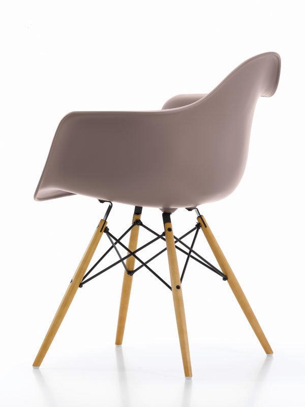
One of the most hackneyed sources of inspiration for young people is Michael Tonet’s long-suffering chair No. 14.

Designers turn it not only into other chairs, but also into things that are fundamentally different in type. The Englishman Darren Lago, for example, decided that such a recognizable object could be used as a lamp and just screws the bulbs to it.

Designer Ron Gilad has used scaled-down models of the chair, made of steel, for the wardrobe legs and bench, that he created for the Adele-C brand.

The fate and legacy of Charles and Ray Eames was redesigned as well.
Designer Carl Sanford modified the chair to use a garden wheelbarrow as a seat.

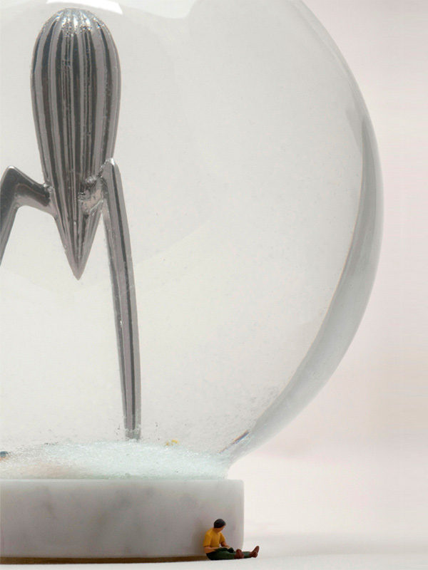
The sovereignty of designer products  — hat was suggested by the German Hiob Haaro, who released a crystal souvenir ball, inside which, instead of the usual snowman or the Eiffel Tower, there is a Juicy Salif juicer designed by Philippe Starck.

Czech designer Jan Čtvrtník has created a new version of Alvar Aalto’s famous vase, which aims to remind the world of the challenges of global warming.

The outer contour of the vase (sketched by Aalto from the outlines of one of the Finnish lakes) remained the same, but the inner one shows how the lake should have shrunk over the past decades.

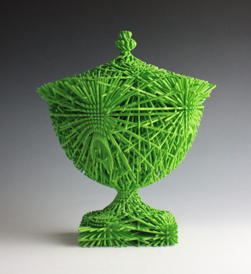
And last, but not the least, the Englishman Michael Eden remade the classic Wedgwood vase.

He chose the same material for its new interpretation — porcelain, but instead of burning the vase in the oven, he printed it on a 3D printer. To highlight the possibilities of modern technology, Eden painted the vase in acid colors.

haptik - sense of touch

Was ist Haptik?

Haptisches Feedback oder auch als taktiles Feedback bezeichnet tritt auf, wenn Vibrationsmuster und Wellen verwendet werden, um Informationen an den Nutzer eines elektronischen Geräts zu übertragen. 

“Taktil” bedeutet “berühren”, was hier angemessen ist, wenn man bedenkt, dass viele Produkte heutzutage darauf ausgelegt sind, Informationen per Berührung an ihre Benutzer weiterzuleiten. Telefone und Tablets mit Touchscreens sind hervorragende Beispiele für Produkte, die taktiles Feedback verwenden. 

In der Vergangenheit waren Audiofeedbacks in Form von Glocken und Alarmen häufiger. Taktiles Feedback ist ein zeitgemäßer Ansatz für dasselbe Grundprinzip.

Haptik ist ein physisches Signal, welches vom menschlichen Körper wahrgenommen werden kann. Haptische Feedbacks werden beispielsweise dazu genutzt, um Nutzer eines Mobiltelefons mitzuteilen, dass gerade im Moment ein Anruf eingeht oder eine Nachricht empfangen wurde. 

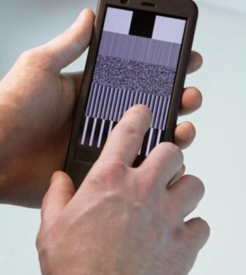
Es kann aber durchaus im Kontext von Accessibility angewendet werden. Die Einführung von berührungsgesteuerten Benutzerschnittstellen im öffentlichen Raum, am Beispiel eines Geld- oder Ticketautomaten, erleichtert zwar die Reinigung der Geräte und ermöglicht die Individualisierbarkeit der dargestellten Inhalte, allerdings wurde dadurch die Gestaltung von inklusiven Benutzerschnittstellen wesentlich erschwert. 

Die Einbindung von haptischen Feedbacks hilft Nutzern mit eingeschränktem Sehvermögen beim Bedienen von Touchscreens an öffentlichen Geld- oder Ticketautomaten mit Touchscreen. 

Dabei wird das haptische Feedback verwendet, um konventionelle mechanische Bedienelemente, auf berührungsempfindlichen Benutzerschnittstellen zu emulieren. Nutzer haben so den Eindruck, als würde eine mechanische Taste ausgelöst werden.

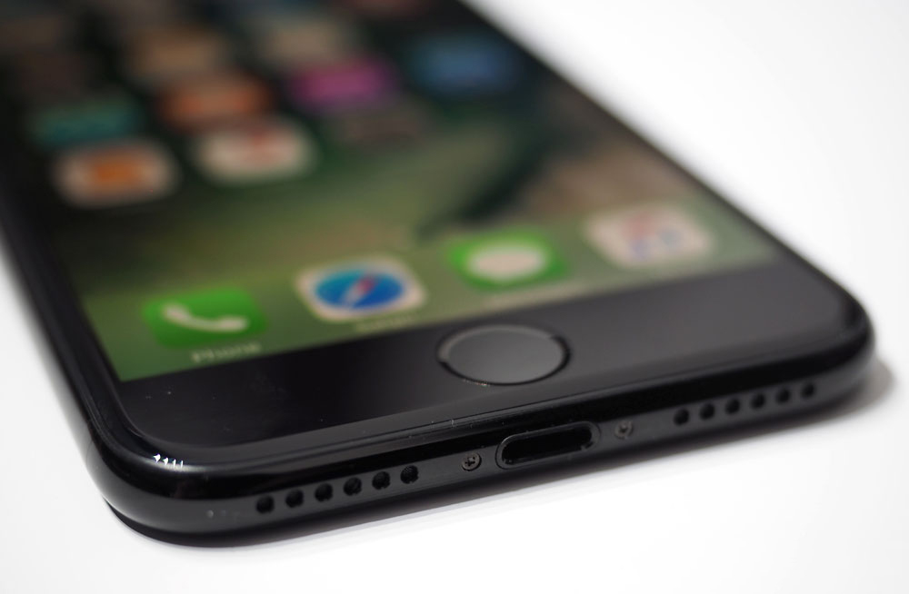
Das Apple iPhone 7 war das erste Smartphone von Apple ohne mechanischem Home-Button. Der mechanische Knopf wurde durch eine drucksensitive elektronische Komponente ersetzt. Der “Klick” wird durch ein haptisches Feedback eines Vibrationsmotors simuliert. So lassen sich auch unterschiedliche Druckstufen parametrieren.

Beispiel – Nextsystem

Das österreichische Unternehmen „nextsystem“ konzentriert sich auf die Entwicklung von Touchscreens mit einem fühlbaren haptischen Feedback für medizinische, industrielle und öffentliche Einsatzzwecke.

Haptik - Taktil - Barrierefrei
Barrierefreie Bedienung am Geldautomaten

Quellen

https://www.nextsystem.at/wp-content/uploads/2020/01/haptic-touch

https://www.nextsystem.at/portfolio-item/haptics/

https://medium.muz.li/haptic-ux-the-design-guide-for-building-touch-experiences

https://medium.com/@martynreding/

https://www.hallmarknameplate.com/tactile-feedback-works/

https://citeseerx.ist.psu.edu

Alexander Moser
https://www.alexander-moser.at/