Neumorphism is definitely the design trend of 2020. It combines the skeuomorphic design with the famous flat design and thus creates a special flat but realistic 3D-looking effect. It is aesthetically very appealing, but what about the usability? To answer this question, I researched about the strengths and weaknesses of neumorphism and how it would be applicable in real world situations due to its intuitive design approach. I stumbled about the therm „signifiers“ and how hints contribute to good usability. This lead to a research based on the background of human perception and usability.
Signifiers, not affordances
„As time and technologies change, as we have moved from individual to group, social, and even cultural computing, and as the communication technologies have become as important as the computational ones, how well have our design principles kept up? We know how to behave by watching the behavior of others, or if others are not there, by the trails they have left behind.“ — Don Norman
Don Norman, co-founder and principal of the User Experience/Usability consulting firm „the Nielsen Norman Group“, World Leaders in Research-Based User Experience, wrote the article Signifiers, not affordances about powerful clues, that arise from what he calls „powerful signifiers“. He states that a “signifier” is some sort of indicator, some signal in the physical or social world that can be interpreted meaningfully. Signifiers signify critical information, even if the signifier itself is an accidental byproduct of the world. Social signifiers are those that are relevant to social usages. Some social indicators simply are the unintended but informative result of the behavior of others.
To understand social signifiers, he gives the example of catching a train: You know your train’s departure will be soon and rush to the train station. When you arrive and there is no train, you are automatically looking for clues, if you have missed the train or not. If there are still lots of people at the train station, you know, it may just not have arrived yet, if nobody is there anymore, you probably have missed it. So the state of the train station, the presence or absence of people there, works as a signifier. This is an example of an incidental, accidental signifier. That is the nature of signifiers: often useful, but of mixed reliability. Other examples for social signifiers can be a crosswalk or even trails that signify a shortcut through a park or a planted area.
If you think about that for a moment, everything we are doing is a learning process and to evolve we need constant signifiers and explanations how to continue. We permanently interpret clues or signs that enable us to proceed in a certain way, that especially show us how to proceed. We orient ourselves on the basis of our previous experiences, not only in the social environment, but also in our technical competencies. It has a lot to do with intuitive usage, that comes from signifiers provided for us. In the design field, this is essential for a good usability and a good user experience. People search for any signifier that might guide them through and help them to cope and understand, anything that might signify meaningful information.
„Forget affordances: what people need, and what design must provide, are signifiers. Because most actions we do are social, the most important class of these are social signifiers.“ — Don Norman
A signifier in the digital world is for example the scrollbar of websites on the side, which automatically gives you a clue about how much of the page you are viewing is remaining and on what point you are on the page. Also its length is showing what proportion is visible at the moment. The signifier is an important communication device to the recipient, whether or not communication was intended. For us to function in this social, technological world, we need to develop internal models of what things mean, of how they operate. We seek all the cues we can find to help in this enterprise, and in this way, we all act as detectives, searching for whatever guidance we might find. If we are fortunate, thoughtful designers provide the clues for us. Otherwise, we must use our creativity and imagination. But this is something users usually don’t want to do, which can also be an example for bad usability. The user’s mission is to not perceive the interface in that kind of way, that he has to think about how to use it. „Don’t make me think“ is usually the general view and approach, users follow.
Flat UI Elements Attract Less Attention and Cause Uncertainty?
To understand if this is really that significant for users and if so, how it affects them, I took a look at a study of 2017 on UIs with weak in comparison to UIs with strong signifiers on webpages by Kate Moran.
The study first points out that due to flat design, many websites have erased the cues for users to identify, whether something is clickable. Using eyetracking equipment to track and visualize users’ eye movements across interfaces, the researchers investigated how strong clickability signifiers (traditional clues such as underlined, blue text or a glossy 3D button) and weak or absent signifiers (for example, linked text styled as static text or a ghost button) impact the ways users process and understand web pages. They took 9 web pages from live websites and modified them to create two nearly identical versions of each page, with the same layout, content and visual style. The two versions differed only in the use of strong, weak, or absent signifiers for interactive elements (buttons, links, tabs, sliders). To drive the users attention to a certain area of the page, they gave them tasks on the page, for example: „You will see a page from a hotel website. Reserve this hotel room. Please tell us when you have found where you would click.” There were 71 general web-users, who participated in the study.
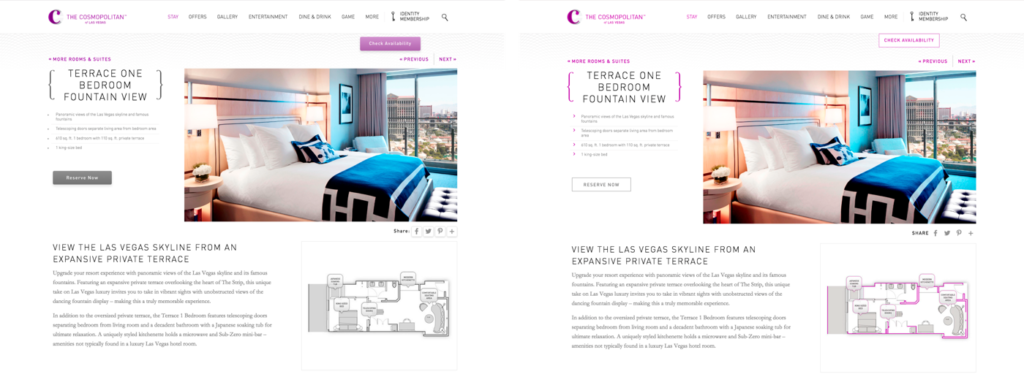
Two modified versions of a detail page for a hotel room: The strong version (left) included slightly 3D style buttons, and the light purple color was used only on interactive elements; The weak version (right) had flat ghost buttons instead.
The researchers tracked the eye movements of the participants as they were performing these tasks. They measured the number of fixations on each page, as well as the task time. (A fixation happens when the gaze lingers on a spot of interest on the page). Both of these measures reflect user effort: the more fixations and time spent doing the task, the higher the processing effort, and the more difficult the task. In addition, they created heat-map visualizations by aggregating the areas that participants looked at the most on the pages.
The results show that the average amount of time the user spent on the website with weak signifiers was 22% higher. Also, the fixation time was 25% higher than on the strong signifier pages, which shows the users had to look around more to get where they had to click.
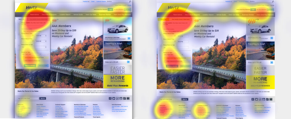
Strong-signifier version (left): Participants were asked to cancel their rental-car reservation on this page. The heat-map shows most fixations focused around the target tab (as indicated by the red area).
Weak-signifier version: (right) In addition to the focus on the target tab, this heat-map shows many fixations concentrated on the footer links, promotional items, and other items on the reservation form near the target tab. The increased focus on the weak page’s footer is especially troubling, because it’s a signal that the users were getting desperate.
The results of the study were very clear. For a good usability and user experience, you need an easy, seamless, enjoyable and overall intuitive design. The users should understand their options and possible actions immediately, because designs with weak clickability signifiers waste time and patience. The potential negative consequences of weak signifiers are diminished when the site has a low information density, traditional or consistent layout, and places important interactive elements where they stand out from surrounding elements. So it really depends whether (ultra) flat or flat-ish design is suitable or not.
But now back to neumorphism, what is its potential and where are its weaknesses?
There was a huge hype around neumorphic design in 2020, but also some criticism due to its usability. Based on the research about signifiers and the supporting study, I analyzed why there could be problems and how these problems define themselves. Is neumorphism just pretty, but not usable?
The three simple actions associated with flat design are: click, move and swipe. When a shadow is placed behind a card element in flat design, the distance to the background is shown and makes it a floatable card. This gives a movable feeling to the cards, so users are more likely to interact with them, not just clicking, but also swiping or moving them. This is something the user has learned from his past experience with technical devices and interfaces, but it’s also an intuitive approach.
In comparison to that, neumorphic UI elements attach themselves firmly on the ground. This creates the effect, that the user is sure it can’t be moved, because its attached. The neumorphic design can somehow mislead people to perceive the components function in the wrong way and gives a missleading signifier to the user. It conveys that things are constant, even though things like a dropdown-menu are temporarily. The actions that usually are intended to do get lost because of the clinginess of components to the surface.
On the other side, due to the skeuomorphic elements in neumorphism it’s so much easier to understand actions like toggle, buttons, sliders or even joysticks. These are real world signifiers, that lead to an intuitive action on the user’s side.
This solves lots of clickability and click uncertainty problems, which is something that flat design is struggling with, as I mentioned previously in the summary of the study of Kate Moran. She uncovers that flat design often uses weak signifiers due to the minimalistic elements.
In neumorphism, there is only a small but meaningful color palette. One color is only used for interactive elements, one for active or inactive states and so on, which increases the findability of interactive elements or certain states. The color palette makes these elements stand out from the surface and save a lot of time to find and interact with them. As it has been said in many other articles, the main problem with neumorphism is accessibility. The components don’t have a proper contrast ratio with the background. That is because many practices of neumorphism design only use the shadows and subtle changes in transparency to differentiate components and hierarchy which don’t have proper contrast ratio with the background.
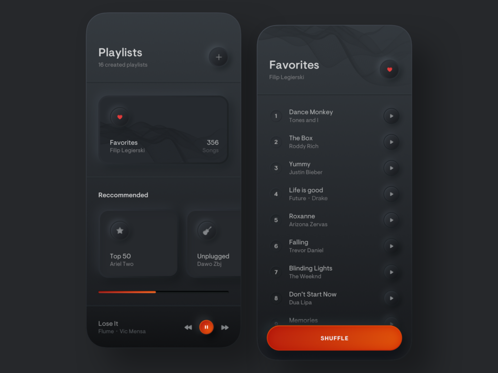
Personally I think, neumorphism is a fresh, modern, flat and minimal 3D-design which is very meaningful, because the skeuomorphic design elements are very intuitive to use. It will not be applicable to every website or app, especially when you have a lot of (complex) content. But most certainly it would be a great opportunity to use it for simple applications, like a calculator app, compass or even the general app overview on smartphones. It works best with clear interactive elements like sliders, buttons and toggles so it could also work great for smart home apps or music production. It definitely needs some adjustments to make it more usable and clear, but it is evolving and has a lot of potential to conquer the design world and give it a new modern touch.
Sources:
Signifiers, not affordances
https://jnd.org/signifiers_not_affordances/ (19.01.2021)
by Don Norman, published in ACM Interactions, volume 15, issue 6
Flat UI Elements Attract Less Attention and Cause Uncertainty
https://www.nngroup.com/articles/flat-ui-less-attention-cause-uncertainty/ (19.01.2021)
by Kate Moran
Anti-neumorphism or pro-neumorphism? Well, here is a better solution
https://uxdesign.cc/anti-neumorphism-or-pro-neumorphism-here-is-a-better-solution-f7bd18f22fb5 (19.01.2021)
Images:
image01 and image02: https://www.nngroup.com/articles/flat-ui-less-attention-cause-uncertainty/ (19.01.2021)
image03: https://dribbble.com/shots/9527558-Freebie-Neumorphic-UX-UI-Elements (19.01.2021)
image04: https://dribbble.com/shots/8568745-Smart-Home-App (19.01.2021)
image05: https://dribbble.com/shots/9544415-Playlists-Simple-Music-Player (19.01.2021)
video01: video: https://dribbble.com/shots/13241875-Neumorphic-Joystick (19.01.2021)
video02: https://dribbble.com/shots/10494263-Skeuomorph-Smart-Home-App (19.01.2021)
