In Part 1 of the topic Skeuomorphism in digital music production programs I talked about the little development of skeuomorphic design elements in common music production programs and their plugins for musicians and producers.
One of the effects of social and cultural change is that, for current generations, it is often no longer really a question of how the hardware works in detail, but simply of being able to get active in the selected area as quickly as possible and get started straight away. Music in pop culture often consists of digitally generated sounds, where the link to the original sound of an instrument is sometimes hardly recognizable anymore. What kind of access to the interface would be needed today that laymen or people without this presupposed access to analog music could use the interface intuitively, and does something like this already exist? What would an interface look like that is suitable for the complex demands of musicians and producers, but is oriented towards current design trends and new approaches?
For my research, it was also important to me to examine current music programs that may be approaching music production programs and their plug-ins with a modern design and a different, more up-to-date design. My focus is to look at other design approaches in this area and see what the possibilities are. I looked at the following examples from this field regardless of their exact function, intuition and interaction in the music industry. This was purely about new design approaches and visualizations in music production programs and plugins that stand out from the sea of similarity because of their visualization.
Example 1 | Arcade by Output: Arcade is a sample playground with a Flat Design approach and simple interaction methods. It uses a Spotify- similar design for music production and looks much simpler than comparable music production programs for this function.
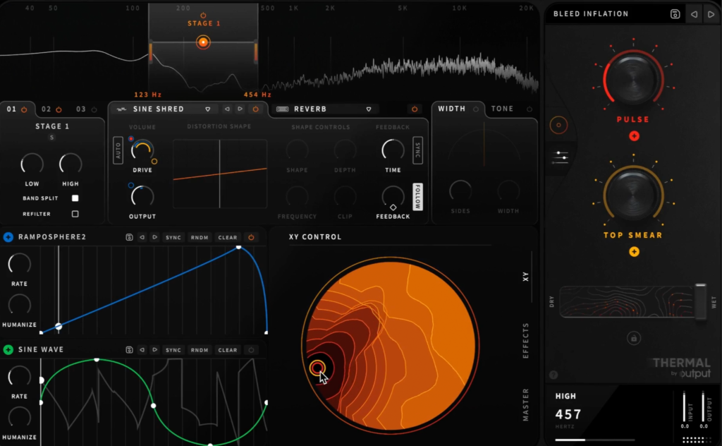
Example 2 | Thermal by Output: Thermal is an interactive distortion plugin. It makes it easy to experiment and dial in new distortion sounds. A user-friendly experience is key to controlling the deeply powerful, multi-stage engine. A Flat Design approach is used for the modern and aesthetic distortion visualization, in combination with the skeuomorphic interaction tools.
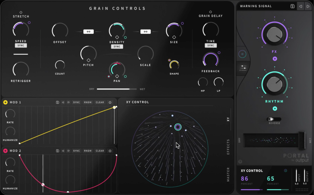
Example 3 |Portal by Output: Portal is a granular FX Plugin. It also has a Flat Design Approach and rather simple interactions. The interaction tools are part skeuomorphic, part flat. It visualizes the granular sound like Thermal in a flat but in an interactive and modern manner.
The examples shown above provide an insight into how music production programs and their plug-ins can also look different. At first glance, it seems that the interface is much easier to use due to the reduction of elements and the visualization of sounds in this way allows one to experience one’s own composition visually as well. It gives a glimpse into the possible future and modernization of music production programs and their plugins.
Interfaces are getting flatter and flatter. New design approaches like the flat 3D effect of neumorphism go back to the skeuomorphic direction and give flat design a new direction. These very effects of “getting flatter” and “going back” lead to a loop in design where we constantly reflect old values and thereby come back to them in new ways. These effects require haptic feedback (at least in mobile devices), because the boundaries of an analog operable element blur in digital implementation. Haptic feedback means that forces, vibrations or movements are exerted on the user via the interface. This allows the user to haptically feel what he/she is seeing and doing through a digital interface.
Through my previous blog posts, I’ve noticed the opportunities and possibilities of using the modern and intuitive design elements of neumorphism and flat design for interactions, especially in the field of music production. It would be a great experiment to see how this design approach affects music production programs and their plugins. By potentially combining this with haptic feedback or sound for controls and allowing the elements to be flatter, but still maintain their sublimity and realism for interactive use, could revolutionize the design of music production programs. At best, the results would be improving usability and an overall better user experience. By incorporating the new design trends and the simplification that comes with “going flatter“, it would also be possible to make programs more easily accessible to non-professionals or amateurs in the field.
Neumorphism is definitely the design trend of 2020. It combines the skeuomorphic design with the famous flat design and thus creates a special flat but realistic 3D-looking effect. It is aesthetically very appealing, but what about the usability? To answer this question, I researched about the strengths and weaknesses of neumorphism and how it would be applicable in real world situations due to its intuitive design approach. I stumbled about the therm „signifiers“ and how hints contribute to good usability. This lead to a research based on the background of human perception and usability.
Signifiers, not affordances
„As time and technologies change, as we have moved from individual to group, social, and even cultural computing, and as the communication technologies have become as important as the computational ones, how well have our design principles kept up? We know how to behave by watching the behavior of others, or if others are not there, by the trails they have left behind.“ — Don Norman
Don Norman, co-founder and principal of the User Experience/Usability consulting firm „the Nielsen Norman Group“, World Leaders in Research-Based User Experience, wrote the article Signifiers, not affordances about powerful clues, that arise from what he calls „powerful signifiers“. He states that a “signifier” is some sort of indicator, some signal in the physical or social world that can be interpreted meaningfully. Signifiers signify critical information, even if the signifier itself is an accidental byproduct of the world. Social signifiers are those that are relevant to social usages. Some social indicators simply are the unintended but informative result of the behavior of others.
To understand social signifiers, he gives the example of catching a train: You know your train’s departure will be soon and rush to the train station. When you arrive and there is no train, you are automatically looking for clues, if you have missed the train or not. If there are still lots of people at the train station, you know, it may just not have arrived yet, if nobody is there anymore, you probably have missed it. So the state of the train station, the presence or absence of people there, works as a signifier. This is an example of an incidental, accidental signifier. That is the nature of signifiers: often useful, but of mixed reliability. Other examples for social signifiers can be a crosswalk or even trails that signify a shortcut through a park or a planted area.
If you think about that for a moment, everything we are doing is a learning process and to evolve we need constant signifiers and explanations how to continue. We permanently interpret clues or signs that enable us to proceed in a certain way, that especially show us how to proceed. We orient ourselves on the basis of our previous experiences, not only in the social environment, but also in our technical competencies. It has a lot to do with intuitive usage, that comes from signifiers provided for us. In the design field, this is essential for a good usability and a good user experience. People search for any signifier that might guide them through and help them to cope and understand, anything that might signify meaningful information.
„Forget affordances: what people need, and what design must provide, are signifiers. Because most actions we do are social, the most important class of these are social signifiers.“ — Don Norman
A signifier in the digital world is for example the scrollbar of websites on the side, which automatically gives you a clue about how much of the page you are viewing is remaining and on what point you are on the page. Also its length is showing what proportion is visible at the moment. The signifier is an important communication device to the recipient, whether or not communication was intended. For us to function in this social, technological world, we need to develop internal models of what things mean, of how they operate. We seek all the cues we can find to help in this enterprise, and in this way, we all act as detectives, searching for whatever guidance we might find. If we are fortunate, thoughtful designers provide the clues for us. Otherwise, we must use our creativity and imagination. But this is something users usually don’t want to do, which can also be an example for bad usability. The user’s mission is to not perceive the interface in that kind of way, that he has to think about how to use it. „Don’t make me think“ is usually the general view and approach, users follow.
Flat UI Elements Attract Less Attention and Cause Uncertainty?
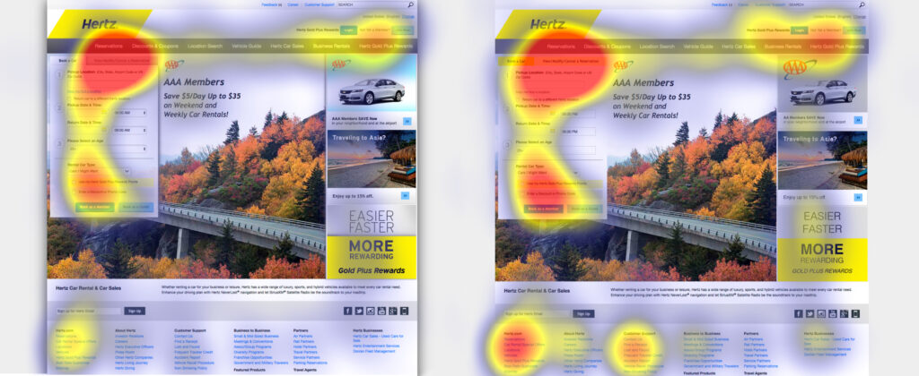
To understand if this is really that significant for users and if so, how it affects them, I took a look at a study of 2017 on UIs with weak in comparison to UIs with strong signifiers on webpages by Kate Moran.
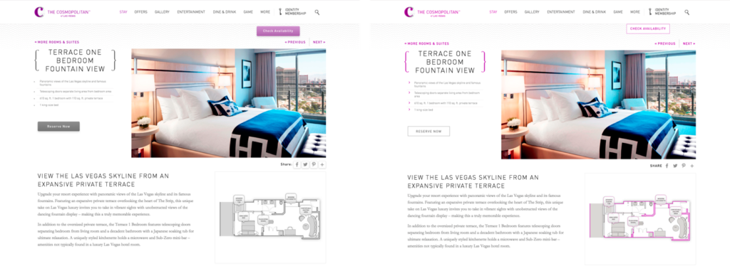
The study first points out that due to flat design, many websites have erased the cues for users to identify, whether something is clickable. Using eyetracking equipment to track and visualize users’ eye movements across interfaces, the researchers investigated how strong clickability signifiers (traditional clues such as underlined, blue text or a glossy 3D button) and weak or absent signifiers (for example, linked text styled as static text or a ghost button) impact the ways users process and understand web pages. They took 9 web pages from live websites and modified them to create two nearly identical versions of each page, with the same layout, content and visual style. The two versions differed only in the use of strong, weak, or absent signifiers for interactive elements (buttons, links, tabs, sliders). To drive the users attention to a certain area of the page, they gave them tasks on the page, for example: „You will see a page from a hotel website. Reserve this hotel room. Please tell us when you have found where you would click.” There were 71 general web-users, who participated in the study.
Two modified versions of a detail page for a hotel room: The strong version (left) included slightly 3D style buttons, and the light purple color was used only on interactive elements; The weak version (right) had flat ghost buttons instead.
The researchers tracked the eye movements of the participants as they were performing these tasks. They measured the number of fixations on each page, as well as the task time. (A fixation happens when the gaze lingers on a spot of interest on the page). Both of these measures reflect user effort: the more fixations and time spent doing the task, the higher the processing effort, and the more difficult the task. In addition, they created heat-map visualizations by aggregating the areas that participants looked at the most on the pages.
The results show that the average amount of time the user spent on the website with weak signifiers was 22% higher. Also, the fixation time was 25% higher than on the strong signifier pages, which shows the users had to look around more to get where they had to click.
Strong-signifier version (left): Participants were asked to cancel their rental-car reservation on this page. The heat-map shows most fixations focused around the target tab (as indicated by the red area). Weak-signifier version: (right) In addition to the focus on the target tab, this heat-map shows many fixations concentrated on the footer links, promotional items, and other items on the reservation form near the target tab. The increased focus on the weak page’s footer is especially troubling, because it’s a signal that the users were getting desperate.
The results of the study were very clear. For a good usability and user experience, you need an easy, seamless, enjoyable and overall intuitive design. The users should understand their options and possible actions immediately, because designs with weak clickability signifiers waste time and patience. The potential negative consequences of weak signifiers are diminished when the site has a low information density, traditional or consistent layout, and places important interactive elements where they stand out from surrounding elements. So it really depends whether (ultra) flat or flat-ish design is suitable or not.
But now back to neumorphism, what is its potential and where are its weaknesses?
There was a huge hype around neumorphic design in 2020, but also some criticism due to its usability. Based on the research about signifiers and the supporting study, I analyzed why there could be problems and how these problems define themselves. Is neumorphism just pretty, but not usable?
The three simple actions associated with flat design are: click, move and swipe. When a shadow is placed behind a card element in flat design, the distance to the background is shown and makes it a floatable card. This gives a movable feeling to the cards, so users are more likely to interact with them, not just clicking, but also swiping or moving them. This is something the user has learned from his past experience with technical devices and interfaces, but it’s also an intuitive approach.
In comparison to that, neumorphic UI elements attach themselves firmly on the ground. This creates the effect, that the user is sure it can’t be moved, because its attached. The neumorphic design can somehow mislead people to perceive the components function in the wrong way and gives a missleading signifier to the user. It conveys that things are constant, even though things like a dropdown-menu are temporarily. The actions that usually are intended to do get lost because of the clinginess of components to the surface.
On the other side, due to the skeuomorphic elements in neumorphism it’s so much easier to understand actions like toggle, buttons, sliders or even joysticks. These are real world signifiers, that lead to an intuitive action on the user’s side.
This solves lots of clickability and click uncertainty problems, which is something that flat design is struggling with, as I mentioned previously in the summary of the study of Kate Moran. She uncovers that flat design often uses weak signifiers due to the minimalistic elements.
In neumorphism, there is only a small but meaningful color palette. One color is only used for interactive elements, one for active or inactive states and so on, which increases the findability of interactive elements or certain states. The color palette makes these elements stand out from the surface and save a lot of time to find and interact with them. As it has been said in many other articles, the main problem with neumorphism is accessibility. The components don’t have a proper contrast ratio with the background. That is because many practices of neumorphism design only use the shadows and subtle changes in transparency to differentiate components and hierarchy which don’t have proper contrast ratio with the background.
Personally I think, neumorphism is a fresh, modern, flat and minimal 3D-design which is very meaningful, because the skeuomorphic design elements are very intuitive to use. It will not be applicable to every website or app, especially when you have a lot of (complex) content. But most certainly it would be a great opportunity to use it for simple applications, like a calculator app, compass or even the general app overview on smartphones. It works best with clear interactive elements like sliders, buttons and toggles so it could also work great for smart home apps or music production. It definitely needs some adjustments to make it more usable and clear, but it is evolving and has a lot of potential to conquer the design world and give it a new modern touch.
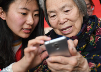
Population aging is taking place in nearly all of the countries around the world. Technologies and users change, which leads to some well-trained users in the digital environment. Metaphors are no longer needed to use or understand the icons, also the relation of a mapped object to its counterpart in the physical world is no longer necessary for the younger generation. As an increasing number of the elderly has moved from simple cell phones to smartphones, the industry sees this as an opportunity to create a new market segment. The smartphone industry becomes more competitive than ever before, and therefore studies on the elderly users are highly demanding.
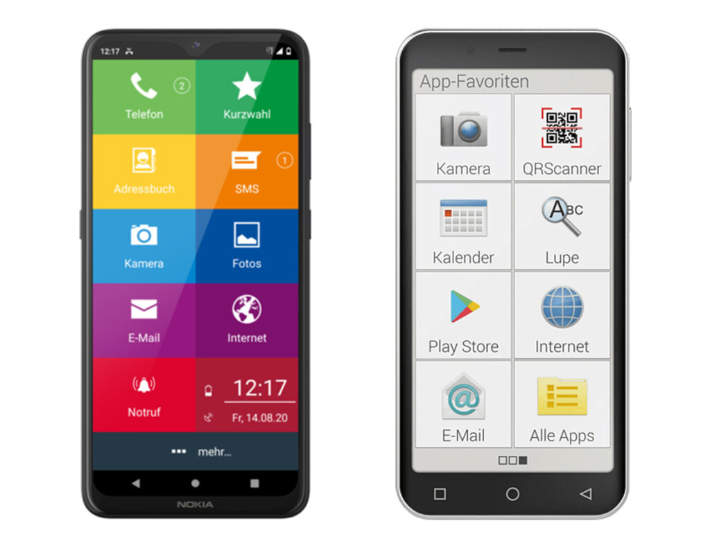
There are already graphic user interfaces (GUIs) that are especially designed for the elder generation. But the layout design is much bigger, simpler and not very appealing, transferring the message that the elderly are not capable to use smartphones.
To support such deficiency, it should be approached in a more positive way to gain trust in technology and above all also emotional satisfaction. Particularly for the elderly who start using the smartphones in their later years, an intuitive graphical guide is indispensable.
To understand what a GUI for the older generation of smartphone users should look like and how it can be used better, I looked at two studies that were conducted 5 years apart, one in 2015 and one in 2020 in Asia. These studies both deal with icon design and draw a connection to seniors’ preferences for skeuomorphic and/or flat design and show the different perceptions from designers and actual users.
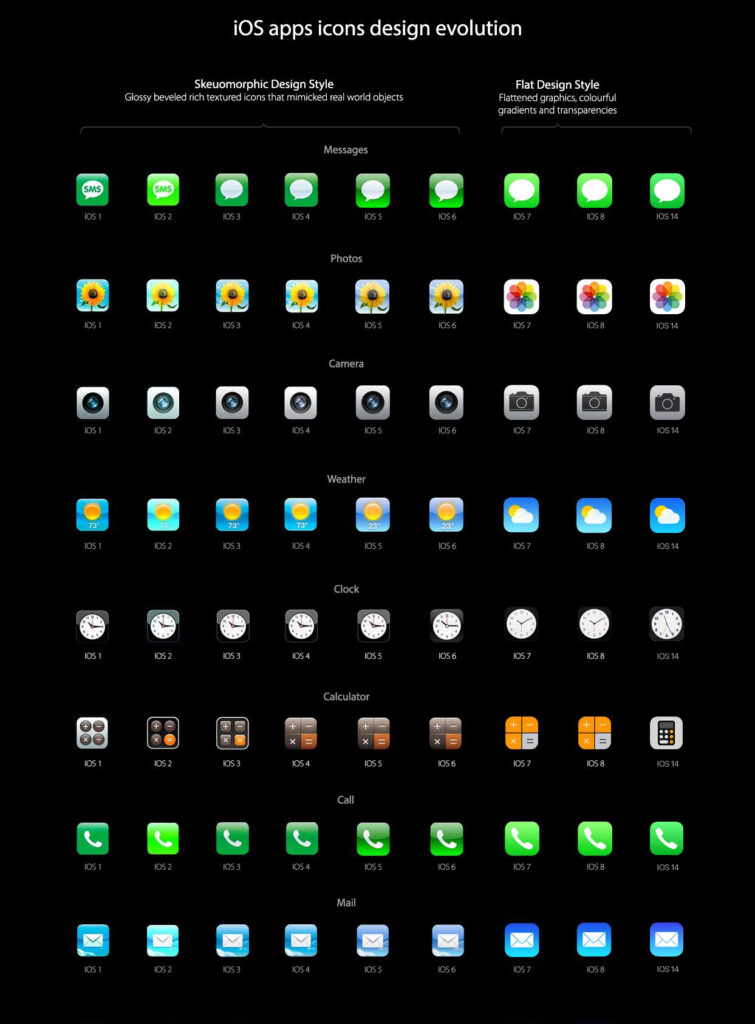
When Apple released iOS7, it set off a graphical style trend moving from skeuomorphic to a simpler flat design. How to manipulate the degree of realistic appeal strongly influenced the identity of GUI design. To trace how GUIs changed from skeuomorphic to flat icon design, I looked at the IOS apps icons evolution, where the development is very clearly visible.
The Elders Preference for Skeuomorphism as App Icon Style (2015, Korea)
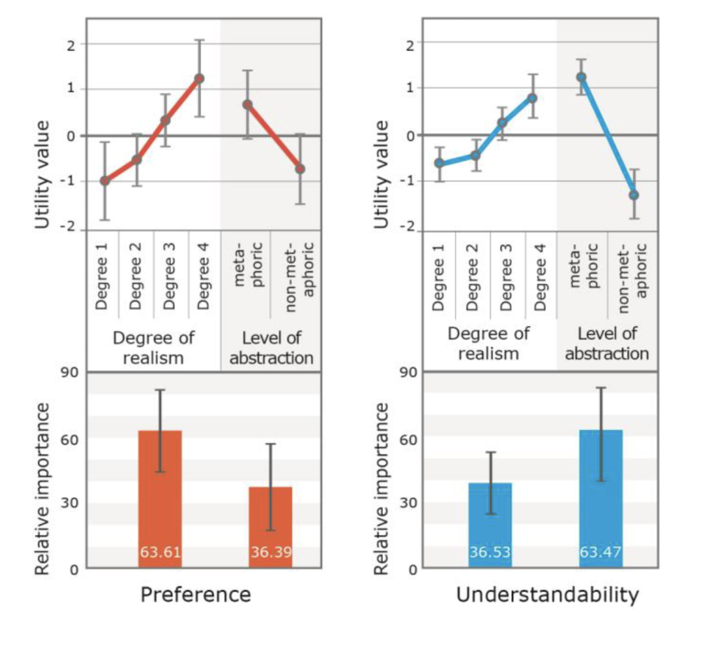
In a Korean study of 2015 researchers from the department of industrial design explored the value of skeuomorphism as an icon style particularly for the elderly people. For this study the researchers visited two senior centers in South Korea and recruited 38 participants ranging from 65 to 91 years. To identify the proper approach of skeuomorphism, they articulated two factors such as degree of realism and level abstraction.
The researchers identified what appeals more to the elderly smartphone users, particularly focusing on comparing the effects of skeuomorphism and minimalism. They picked Call, Contact and Camera icons in four different degrees of realism and metaphoric function each, in collaboration with designers. The first results were three tables and each displays the eight types of each Call, Contact and Camera icons according to the two abstraction levels and four degrees of realism. Considering the nature of elderly responses to the stimuli, the researchers planned a pairwise comparison to minimize cognitive workload. 84 cards with icons to compare were created and shown to the seniors. The first question the researchers asked was: „Which one looks better?“ (preference) followed by: „Which one do you think would perform the given feature?” (understandability).
The evaluation revealed that in deciding the preference for an icon, the degree of realism had twice the influence of the degree of abstraction. In particular, there was a positive correlation between the degree of realism and the preference. Regarding the degree of abstraction, the metaphorical style was preferred. Similarly, there was a positive correlation between degree of realism and understandability. Also the elderly considered the metaphoric style being better for understanding the meaning of an icon.
In conclusion, using the same metaphor from the real world has influence on the elders’ understandability, while illustrative and realistic representations play an important role on the elder preference. The elderly seem to prefer familiar expressions that look realistic, but still might need a cue to guess the function. In addition, this result indicate that there is a contradiction between actual usability and emotional judgment. It is expected for services targeting elderly users to depict an icon rather realistic and skeuomorphic than flat and abstract.
Skeuomorphic or flat icons for an efficient visual search by younger and older adults (2020, China)
In a Chinese study of 2020 three researchers from the department of industrial design investigated whether older or younger users perceive the aesthetics of icon styles in the same manner as designers and which style is preferred by which user age group. It also examines whether skeuomorphic or flat design is more suitable for the elder generation. The goal of this study was to help designers to find a suitable design style for people of all ages. There were 48 participants in total, 24 over the age of 60 (on average at the age of 72) 24 on average at the age of 23 years.
More than 97.8 million Internet users aged above 60 in China have installed an average of 28 applications on their smartphones. Icon images are intended to capture the user’s attention and thus play an essential role in target application searches. Nowadays, the trend of skeuomorphism in app icon design is giving way to flat design. But there is also a new design style evolving, which is called flat 2.0. This design type is almost flat but uses subtle 3D effects. The study emphasizes, that what the designer stresses is not always what the user notices or interprets. Sometimes user and designer have completely different perceptions. Examining this gap could help to reflect the role of this particular design elements.
Relating to previously created work in this sector, the researchers reflect that in terms of user experience and usability, younger adults prefer flat icon to skeuomorphism icon design. This has to do with the aesthetic and emotional satisfaction. The results from the older adults were the other way around. For the experiment, it was also important what kind of education, gender and level of smartphone usage the participants had.
The experiment started with a first task, where the participants had to rank the 72 shown icons with stars between flat or skeuomorphic impression. The second task was to click the icon that they considered to match the function name as fast and accurate as possible. The third task was to rate the perceived beauty of the flat and skeuomorphic icons on a scale.
The results imply that the younger participants could use the skeuomorphic icons more efficiently than they could use the flat icons and that they had an advantage over older participants in terms of this ability; however, aesthetically they appreciated flat icons more. In contrast, older participants searched skeuomorphic icons more quickly and accurately than they did flat icons, and aesthetically they appreciated skeuomorphic icons more.
What is the main and the most obvious difference between design in 2000 and 2020? Availability and existence.
Twenty years ago, users were not yet tempted with modern technologies. There were much fewer products, the variety was not boring yet. And each new product was innovative, opening new horizons and, important, exciting.
As we know, The World Wide Web system was invented near 30 years ago by Tim Berners Lee. His aim was to help people in faster and easier way share information all over the world. Now it has changed significantly. We don’t want just to share information nowadays. Interface should be user-friendly, environmental-friendly, clickable, fast, modern, colorful and convenient. We want technologies to work fast, without any bugs — ideal, so to say.
Web has start deeper involving in society and reflects the changing fashions, beliefs and technologies of the time.
First Design
The first website contained only text with hyperlinks explaining what the web was, how to use it, and basic set-up instructions. From those early days to the present, web design has taken a long and winding journey.
Firstly, possibility of adding images in 1990, later — Flash. Flash was a software platform that allowed designers to incorporate sound effects, video and animation into websites, making for a more dynamic audio-visual experience. Flash also gave designers more freedom to make websites interactive. This was indeed the era of a creative and technological breakthrough in web design. Splash pages, decorative animations, and beautifully rendered bubble buttons dominated the web design trend to make people stare.
People became sophisticated at browsing the Web, and the design elements no longer had to educate in a way that visually articulates the functionality, such as blue underlined hyperlinks.
Flat Design
Fast forward to 2010 when a new web design approach called responsive web design was created by Ethan Marcotte. This introduced a different way of using HTML and CSS.
The main idea underpinning responsive design was that a single website could respond and adapt to different display environments, facilitating use on different devices. People would have the same experience on their mobile device as on their desktop computer, meaning increased efficiency in web development and maintenance.This led to another wave of web design trend: flat design. A minimalist approach to design for usability was at the forefront. To put it otherwise, the bet is made on user comfort. This is a pronounced protest against Skeuomorph . The choice fell on more simplified and aesthetic solutions.In the modern world, designers need to create not only high-tech extensive functionality without visual overload, but also think not only about what we can do, but rather about what we should do. That means being considerate about how design can affect the people who use it, and designing websites that result in positive experiences for users.