In my last blogpost I mentioned that by injecting meaning and context to experiences, we trigger an emotional response that can either be happiness, compassion, surprise or amazement. Those emotional responses can trigger a joyful experience. In the following you will find typical examples for joyful design considering and working with happiness as an emotional response to trigger a joyful experience.
Happiness
When working with “happiness” as a trigger for a joyful experience we can especially refer to a wide selection of visual cues. Visual cues that evoke a feeling of happiness, leading to a joyful experience can be the use of bright colors, multi-colored color palettes, round shapes, symmetrical shapes, abundance and multiplicity.
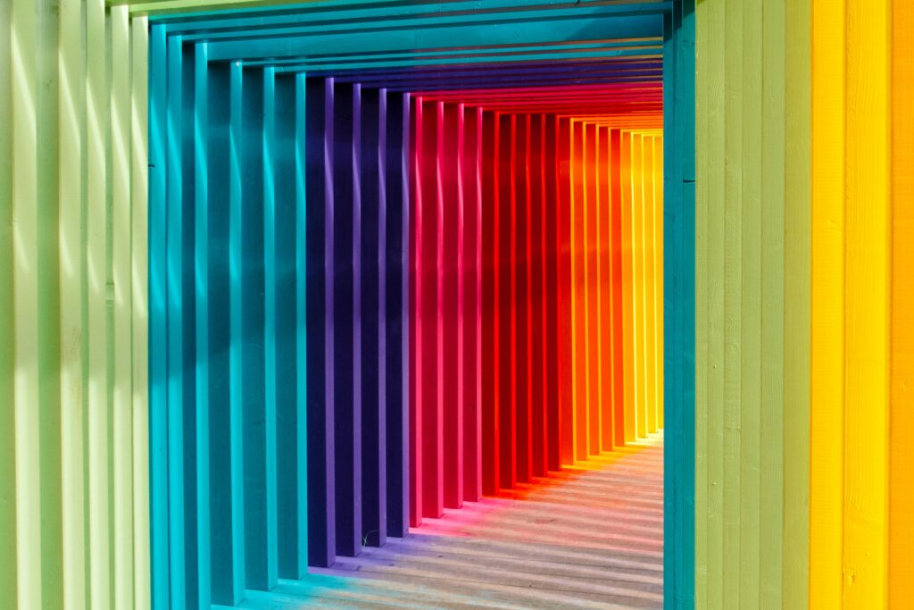

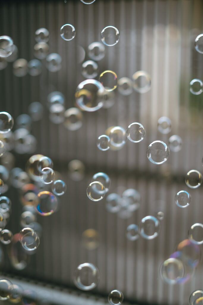
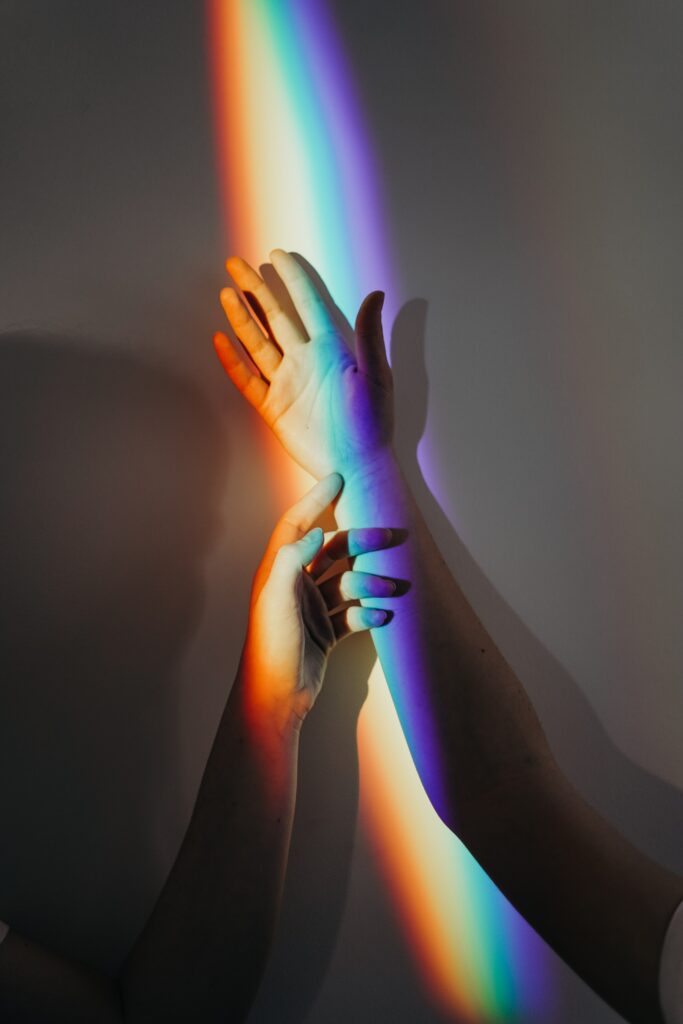
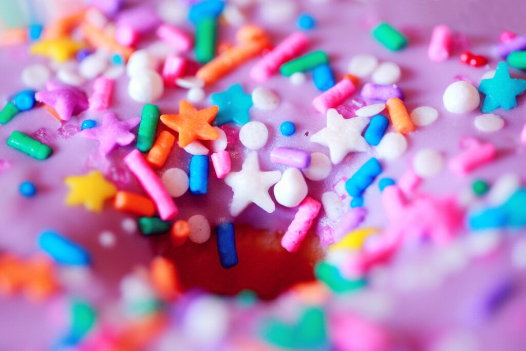
Colors, sprinkles, rainbows, bubbles and confetti–as embodiments of happiness–are perceived by a majority of people as joyful. [1]
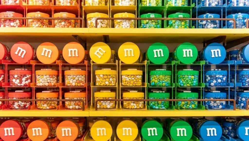
M&Ms
A perfect example of design, working with all the visual cues arousing happiness is M&Ms (as well as Smarties, Skittles and Sixlets, to mention a few). The multi-colored (even if they all have the same taste), round-shaped, “chocolate beans” are amongst the most popular candies and their “happy” design for sure is a factor of success.
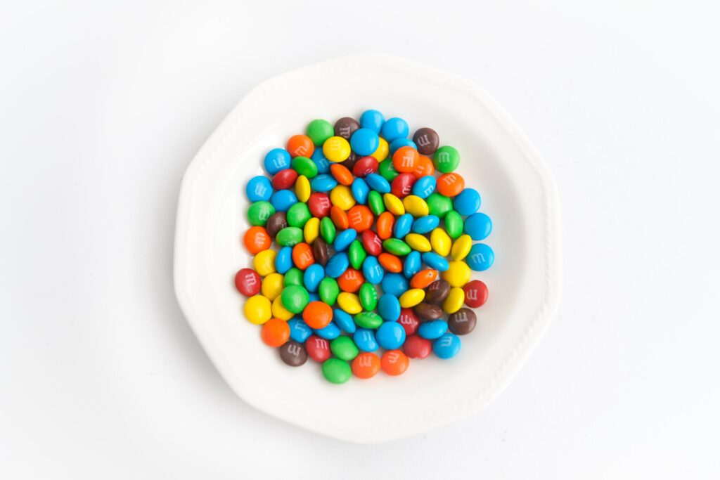
Over the years, marketing has helped build and expand the M&M’s brand. Computer-animated graphics, personification of the candies as characters with cartoon-like storytelling, and various merchandising techniques including the introduction of new flavors, colors and customizable merchandise have helped to increase the brand’s recognition as a (happy) candy icon. [2]
As in the case of M&Ms, happiness and in consequence joyful experiences can be triggered by working with “visual cues of happiness” which are in most cases simply colorful, playful design approaches. But we can also arouse happiness by working with nostalgia or humor.
Happiness—Colorful, Playful Design
“HIKI is a fun, fresh brand for every body and everybody. The wonton color scheme is playful, and without direct logic. This allows the tall, chunky, san-serif typeface of the logo to be the hero of the design. This is a brand that doesn’t present itself as too masculine or feminine, meaning it is for every consumer at every age. HIKI is a masterclass in how a brand can have a blast without skewing too youthful. This is a deodorant brand that is sure to charm it’s way into the homes and hearts of consumers everywhere.”— Shawn Binder. [3]
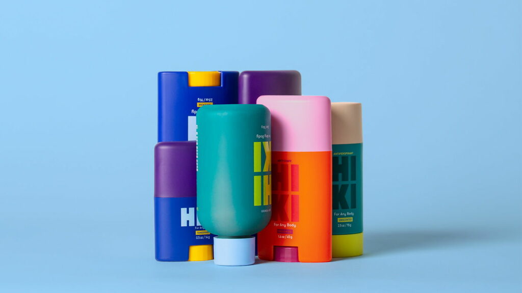
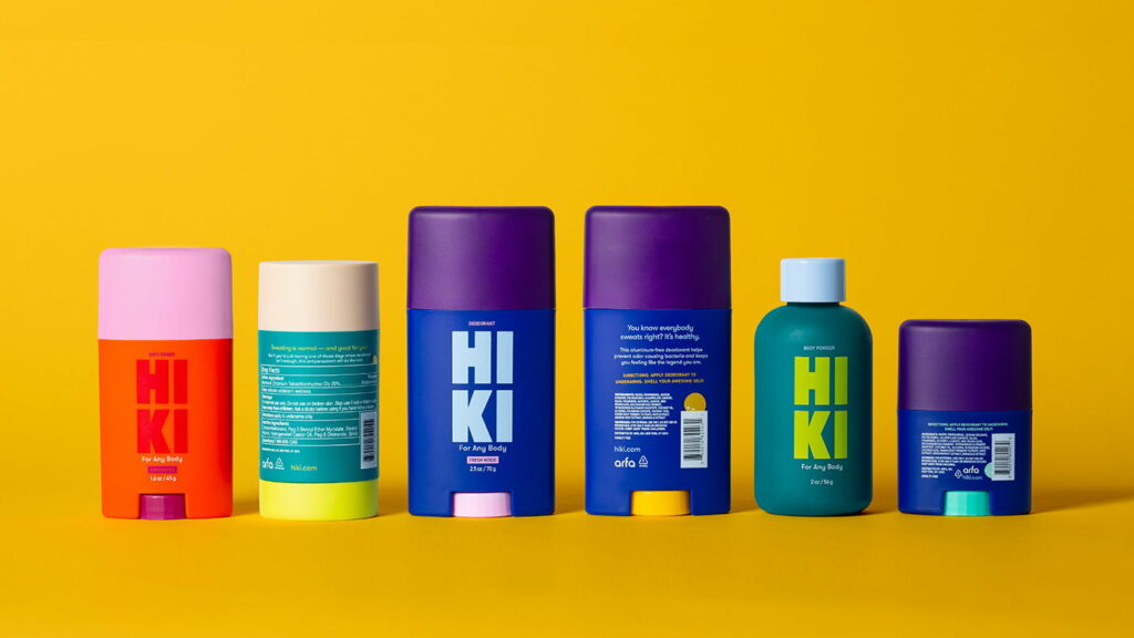
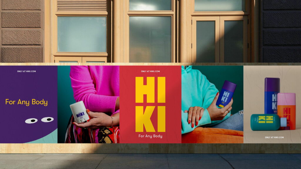
The Brand Design of Hiki is a great example of how color can be used to create a fun, fresh and open minded brand (appealing) to everyone–just by working with simple visual cues that arouse happiness.
Happiness—Nostalgic Design
Many of the visual cues creating happiness remind us of lighthearted, past times and can evoke feelings of nostalgia. Those cues can remind us of our childhood, teenage days or let our minds travel to distant times or/and cultures. The feeling of nostalgia gets willingly triggered to create joyful experiences. [4]
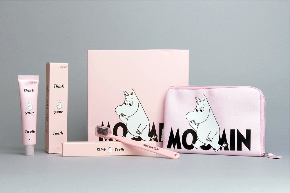
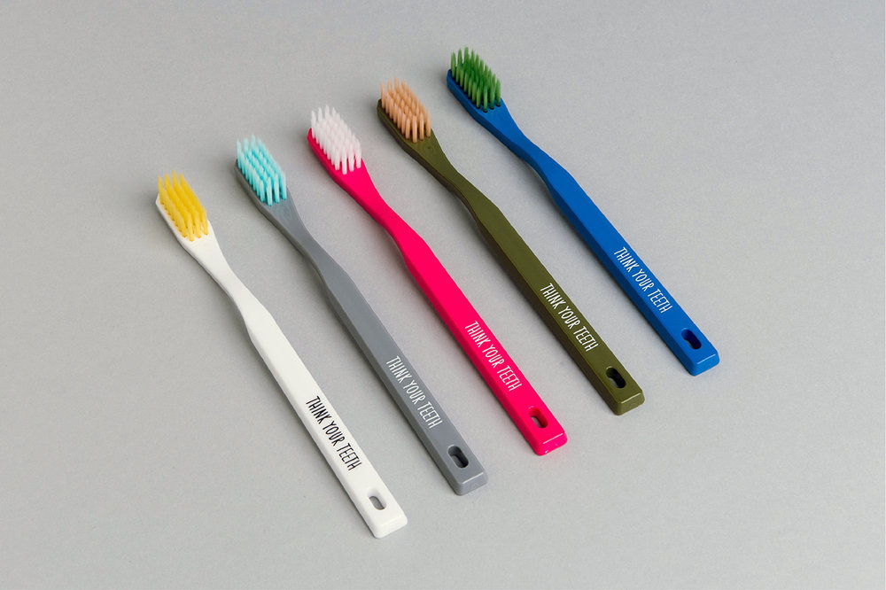
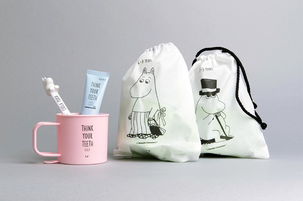
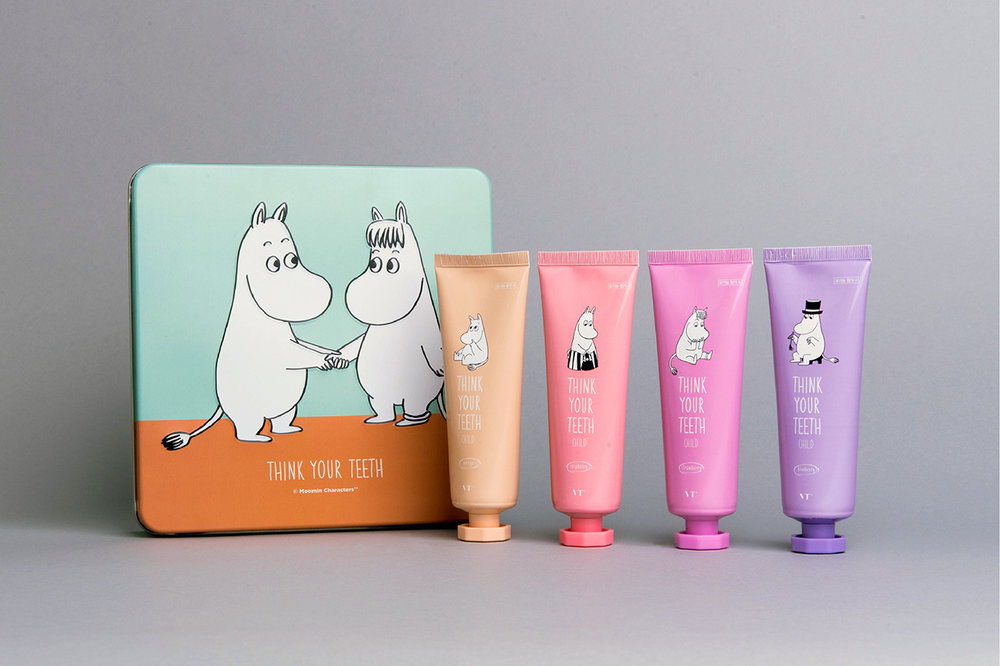
Brand Design by Eggplant Factory for VT Cosmetics using the characters of Moomins to trigger the feeling of nostalgia.
Designers can use nostalgia to appeal to their audience on a feel-good level. By tapping into people’s desire to feel a sense of belonging, meaning, and security, designers can endow their creations with emotion and sentimentality that connects with their audience and elicits a pleasurable feeling. [5]
Happiness—Fun, Humorous Design
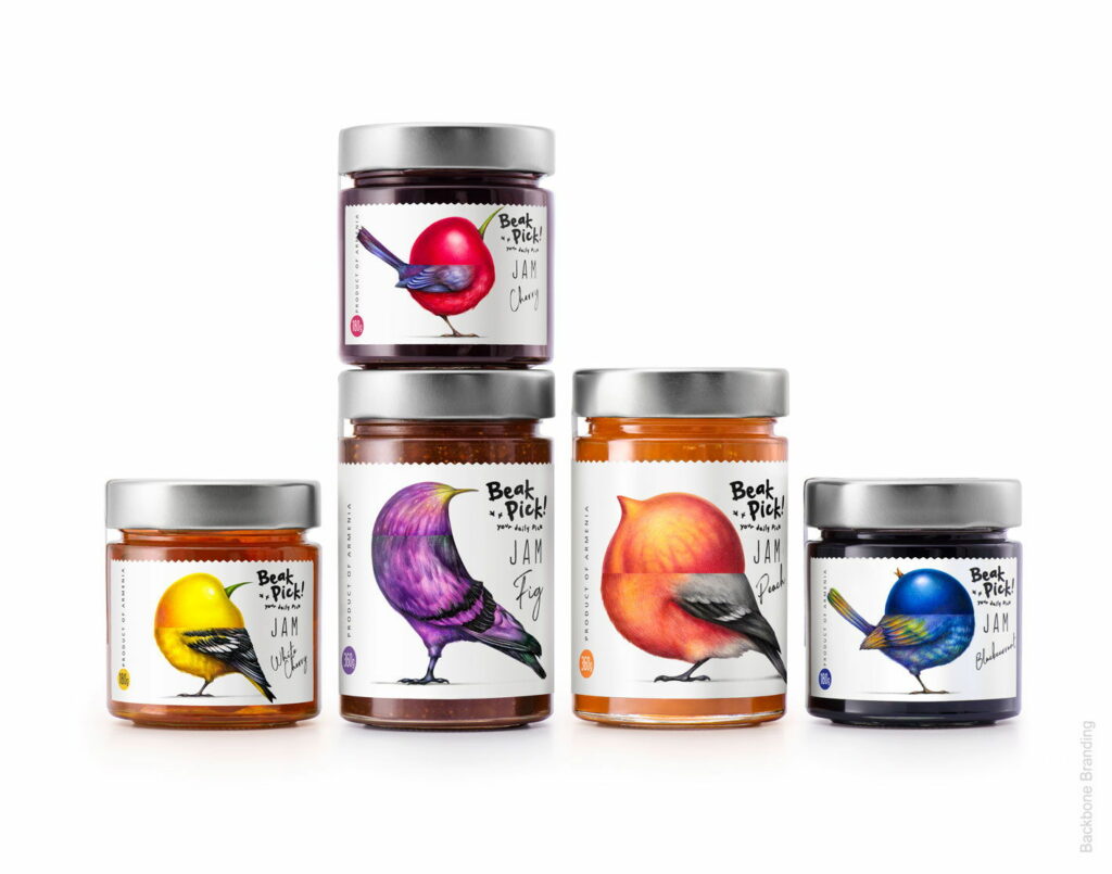
Humor has been recognized as being important in promoting people’s wellbeing and happiness. By thinking out of the box we can use this knowledge to create a joyful experience using fun and humour as a central element of design.
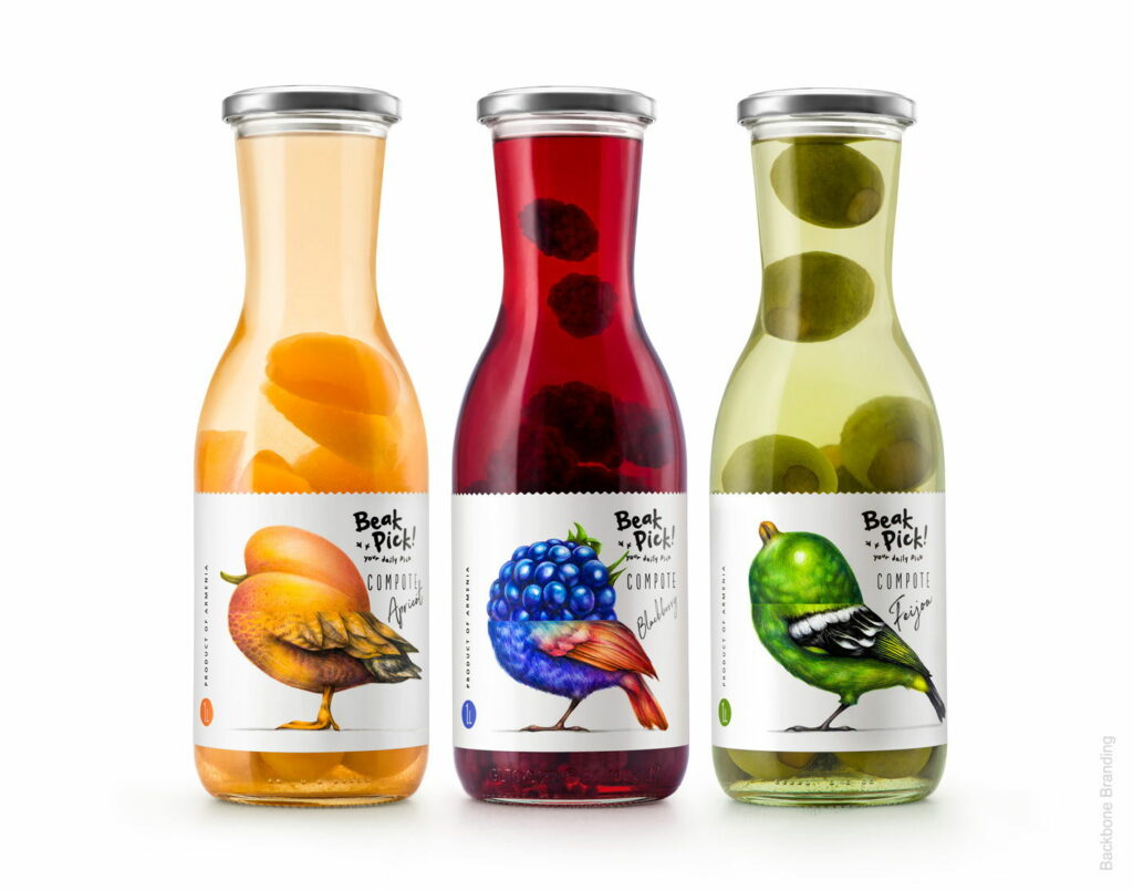
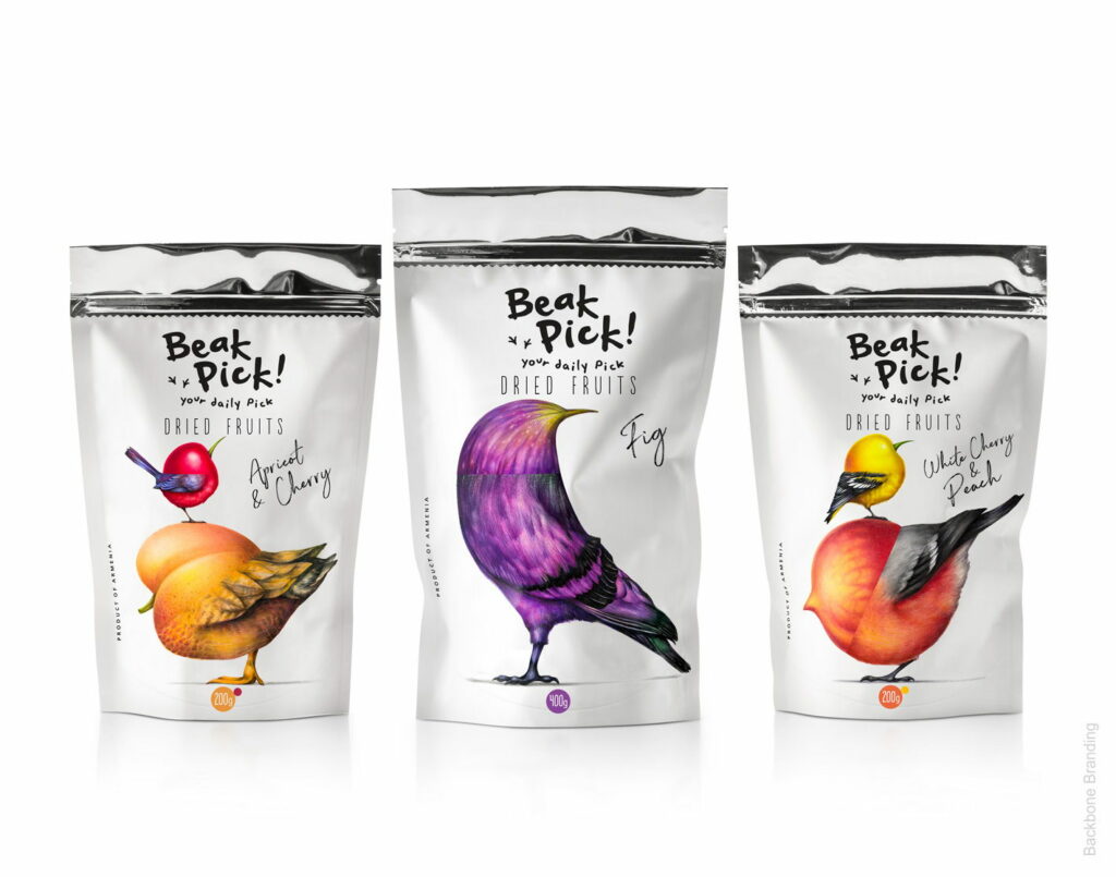
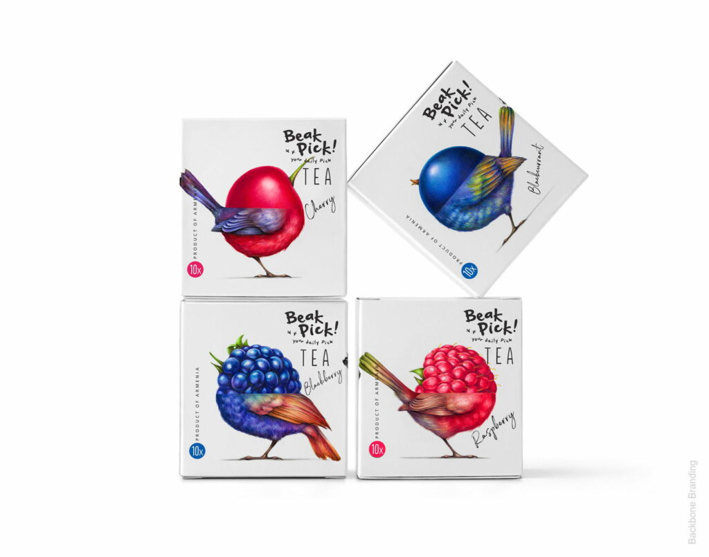
The illustrations of “Beak Picks” packaging got a fun twist by covering the birds head with the individual fruit/ingredient. This simple but clever and suprising twist brings not only a smile on the consumers face but can also create a spark of joy. [6]
Sources
[1] TED. Fetell Lee, Ingrid: Where joy hides and where to find it. URL: https://www.ted.com/talks/ingrid_fetell_lee_where_joy_hides_and_how_to_find_it (last retrieved November 08, 2020)
[2] Wikipedia. M&Ms. URL: https://en.wikipedia.org/wiki/M%26M%27s (last retrieved on 06.01.2020)
[3] The Dieline. Playful But Not Childish Hiki Sweat Products Know How To Have Fun. URL: https://thedieline.com/blog/2020/12/11/-playful-but-not-childish-hiki-sweat-products-know-how-to-have-fun? (last retrieved on 06.01.2020)
[4] The Dieline. VT Beauty & Health Lifestyle Brand. URL: https://thedieline.com/blog/2016/8/24/vt-beauty-and-health-lifestyle-brand?(last retrieved on 06.01.2020)
[5] Canva. URL: https://www.canva.com/learn/nostalgia/ (last retrieved on 06.01.2020)
[6] The Dieline. Vibrant Playful Illustrations Bring The Packaging For “Beak Pick !” To Life. URL: https://thedieline.com/blog/2019/10/11/vibrant-playful-illustrations-bring-the-packaging-for-beak-pick–to-life? (last retrieved on 06.01.2020)